
3. Hover-Crafting with CSS3
WE’VE SPENT the first two chapters in training, getting up to speed with what’s currently usable today in terms of CSS3. We also talked about how the experience layer is currently the most appropriate place to apply that usable CSS3.
To recap the important bits we’ve covered so far, let’s keep in mind that:
1. There are core CSS3 properties that are usable today.
2. Everyone can use these core properties in their own projects, especially when targeted at the experience layer.
3. Vendor prefixes allow us to push forward right now, helping test in-flux properties in real-world contexts.
4. CSS Transitions are no longer proprietary experiments, but draft specifications that other browsers are embracing. Let’s use ’em!
With all of this under our anti-gravity belts, it’s now time to have fun with all our new tools, and put them to work in the context of a full-page design.
Our Case Study
For most of the following examples I’ll be using a fictional case study I’ve designed: a humorous homage to all the things left on the moon by the astronauts lucky enough to have traveled there (FIG 3.1). There’s a story behind the subject matter that directly relates to the theme of this book, if you’ll bear with me for just a bit.

FIG 3.1: Our fictional case study, Things We Left on the Moon.
Messages in space and on the web
In 1969, astronauts Neil Armstrong and Buzz Aldrin became the first humans to set foot on the moon. I’ve been a casual fan of space travel and the NASA program, but hearing more about the Apollo 11 mission around the fortieth anniversary inspired me to read more about the history and events surrounding the landing. In particular, I was fascinated by all the stuff that was left on the moon and remains up there to this day.
Out of all the objects that have been left behind, there’s one in particular that I found extremely interesting, and it serves as a wonderful example of user experience design. It’s a small, silicon disc (about the size of a US half dollar). Etched on the disc are goodwill messages from the leaders of over seventy countries from around the world. You need a microscope to read them, but limitations in regard to what the astronauts could bring with them helped shape the design of a commemorative object that could be left on the moon for future visitors to discover (FIG 3.2).

FIG 3.2: The small (about the size of a U.S. half-dollar) silicon disc left on the moon by the Apollo 11 astronauts. (NASA/courtesy of nasaimages.org)
NASA was, in a sense, designing an object using the latest technology available at the time, for an unknown audience sometime in the future. Sound familiar?
Later, in 1977, a similar design problem was solved for the Voyager 1 and Voyager 2 spacecraft by way of the Golden Record: a gold-plated copper phonograph record that contains audio, images, and diagrams from life here on Earth (FIG 3.3). In a sense the record is a message in a bottle to potential civilizations beyond our solar system. On its case is etched symbolic language, depicting how to properly play the record, where in the galaxy it came from, and other instructions.

FIG 3.3: The gold-plated outer case of the golden Record, a phonograph record aboard the Voyager 1 and 2 spacecraft. (Courtesy NaSa/JPL-Caltech)
Like the silicon disc still resting in moon dust, the Golden Record was designed using the latest technology on hand at the time it was made, for a user experience with numerous unknowns. Would the alien retrievers of the record be able to see, feel, and listen to its contents?
We can learn a lot from the silicon disc left on the moon and the Golden Record hurtling into deep space—that utilizing the best technology possible can help support the message being sent to a largely unknown audience.
As web designers, we too are sending messages in a bottle when we create things for the web. We can make assumptions about who will be reading them, what they’re actually capable of understanding, etc.—but we’re never 100% informed. That shouldn’t prevent us from using the best technology available to deliver that message and the experience around it, letting the experience degrade gracefully in older or less capable devices.
Our job as designers is not to simply dress up the bottle and make it look pretty, but rather to find ways to enrich the story and enhance the message. CSS3 can help us do that today.
So now you know why our case study pays homage to those messages left on the moon or floating through space. It’s time to start dissecting the site, breaking it into bite-sized examples as they pertain to CSS3. I find it helpful to collect all the techniques we’ll be discussing in a single place. You’ll be able to reference this template and all the examples whenever you’d like in a living, breathing, one-page website.
You can download the case study’s example code at http://CSS3exp.com/code.
Each of the remaining chapters tackles a different set of examples related to CSS3. Instead of attempting to be all-inclusive, telling you everything there is to know about CSS3, I’m doing quite the opposite here: diving into very specific, targeted examples, while showing how they work in a simulated context—quick takeaways that you’ll be able to apply immediately and build upon after digesting these pages. Burp.
Surprise and Delight
Part of what makes designing for the web so different and interesting as opposed to static media is interaction. Things can react, move, and even surprise when experienced in pixels rather than paper.
And it’s the interaction that’s so easily enhanced by CSS3 for browsers that support it, yet not missed by those that don’t.
A wonderful example of surprising and delighting with CSS3 can be found on Dutch designer and developer Faruk Ateş’s personal site (http://farukat.es). In the sidebar is a list of links to various social networks that, on hover, expand and come alive with several CSS3 treatments and a smooth transition (FIG 3.4).

FIG 3.4: The sidebar and hover treatment found on Faruk Ateş’s site.
What looks like a normal list of text with images floated off to the right turns into something far more interesting when you interact with it. This is a prime example of enriching the experience layer, and Faruk uses a variety of CSS3 properties in order to make that happen (in the browsers that support them).
FIGURE 3.5 shows the same default and hover state as viewed in Internet Explorer 7, which doesn’t support CSS3 at all. But you’ll notice that, while the hover state isn’t as polished, it’s still a usable, readable, and functional experience—not to mention the default, non-hovered state is nearly identical.

FIG 3.5: Viewed in IE7, Faruk Ateş’s site doesn’t feature the same visual treatment via CSS3, but that’s perfectly OK.
Hovering over (or focusing on) an element is a wonderful place to enhance things with CSS3. Users of Internet Explorer will get a different experience (until it eventually folds in support for CSS3 properties). But this alternate experience is perfectly fine, not unexpected, and frankly IE users won’t know what they’re missing.
That is, until they fire this up in their friend’s copy of Safari, Chrome, Firefox, or Opera (and feel a flush of jealousy).
Do Websites Need to Be Experienced Exactly the Same in Every Browser?
It’s an important question (and an appropriate one to ask at this point), and I attempt to answer it on this enormously long domain (FIG 3.6): http://dowebsitesneedtobeexperiencedexactlythesameineverybrowser.com.

FIG 3.6: The curiously named http://dowebsitesneedtobeexperiencedexactlythesameineverybrowser.com.
Like Faruk’s example, it’s not until you start to interact with the site that things get interesting. On the surface, the site looks nearly identical in most browsers, but the moment you move the mouse across the screen and text (FIG 3.7), a series of CSS3 properties, transitions, and transforms are applied to make the experience a unique and memorable one.
Once again, it’s within the experience layer that we’re progressively enriching this web design. The core content, readability, usability, and markup remain consistent and uncompromised.

FIG 3.7: An enriched experience is revealed when the site is interacted with. Made possible by our friend CSS3.
Navigating the Moon
Let’s take the concept of adding CSS3 to the hover interactions of a design right to our case study. I’ll walk us through the creation of the top navigation of the site (FIG 3.8), where we combine border-radius, text-shadow, RGBA, and CSS transitions to create an experience that surprises and delights.
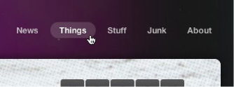
FIG 3.8: The top navigation of our case study, enriched with CSS3 when hovered.
First, the markup
Being good semanticians, we’ll markup the top navigation with a good ol’ unordered list.
<ul id="nav">
  <li><a href="#">News</a></li>
  <li><a href="#">Things</a></li>
  <li><a href="#">Stuff</a></li>
  <li><a href="#">Junk</a></li>
  <li><a href="#">About</a></li>
</ul>
Nothing earth-shattering here of course—just an appropriate structure we can use to start applying styles.
Floating the items
First, let’s float the entire list and use a bit of padding to position it over to the right of the page; then, let’s also float each list item.
#nav {
  float: right;
  padding: 42px 0 0 30px;
  }

#nav li {
  float: left;
  margin: 0 0 0 5px;
  }
FIGURE 3.9 shows the result. Our list is now horizontal.

FIG 3.9: A list of links, turned horizontal by a few CSS rules.
Styling the link color with RGBA
Next, let’s add some padding to each link, and change the color to a semi-transparent white. We’ll use RGBA to assign white (255, 255, 255) at 70% opacity (0.7), letting the text soak up some of the background color behind it (FIG 3.10).
#nav li a {
  padding: 5px 15px;
  font-weight: bold;
  color: rgba(255, 255, 255, 0.7);
  }

FIG 3.10: Links now styled with RGBA, blending the text into the background a bit.
FIGURE 3.11 shows a close up of the links, where the white at 70% opacity via RGBA lets the background shine through, ever so slightly.

FIG 3.11: A zoomed-in view of the semi-transparent links.
Providing a backup for RGBA
RGBA is an amazingly flexible way of specifying color along with a level of opacity, and it has support in recent flavors of Safari, Chrome, Firefox, Opera, and IE9+. But what about older browsers?
Here’s where specifying a backup color comes into play. When using RGBA to assign color values, it’s good practice to specify a solid color first, as a fallback for older browsers that don’t support RGBA.
#nav li a {
  padding: 5px 15px;
  font-weight: bold;
  color: #ccc;
  color: rgba(255, 255, 255, 0.7);
  }
Browsers that do support RGBA will override the solid color (a light gray #ccc in this case), while browsers that don’t yet support RGBA yet will ignore the RGBA rule.
So, an important point to remember: specify solid backups for RGBA colors in a separate rule that appears before the RGBA rule.
Adding text-shadow
For one last addition to the link styling, let’s add a very subtle text-shadow. We’ll use RGBA again here to define the shadow’s color, letting the semi-transparent black at 50% opacity blend into the background behind it.
#nav li a {
  padding: 5px 15px;
  font-weight: bold;
  color: #ccc;
  color: rgba(255, 255, 255, 0.7);
  text-shadow: 0 1px 1px rgba(0, 0, 0, 0.5);
  }
FIGURE 3.12 shows a comparison of the text links without text-shadow applied (left) and with text-shadow applied (right), as viewed in Safari. It’s an almost imperceptible detail, yet the tiny shadow gives the text just enough “lift” off the space background behind it.

FIG 3.12: Comparison of links without text-shadow applied (left) and with text-shadow applied (right).
Remember that text-shadow works in recent versions of Safari, Chrome, Firefox, Opera, and IE. Browsers that don’t support text-shadow will harmlessly ignore the rule. No shadow, no problem.
With the text-shadow in place, we’re now free to move on to the :hover treatment. And here’s where we’ll lean more heavily on CSS3.
Hover and focus styles
We’re going to add a color change and background color to the :hover state of each link. Once again, we’ll use RGBA to set a semi-transparent white background behind the text on :hover.
#nav li a {
  padding: 5px 15px;
  font-weight: bold;
  color: #ccc;
  color: rgba(255, 255, 255, 0.7);
  text-shadow: 0 1px 1px rgba(0, 0, 0, 0.5);
  }

#nav li a:hover,
#nav li a:focus {
  color: #fff;
  background: rgba(255, 255, 255, 0.15);
  }
So, on :hover, we’re changing the text color to solid white, and adding a background color of white at 15% opacity. I’ve also gone ahead and declared this style for when links are focused as well. Users navigating with the keyboard, for instance, will then see this change when each link is focused.
FIGURE 3.13 shows the new :hover (and :focus) state of the links. Browsers that support RGBA will get the semi-transparent white background behind brighter white text.
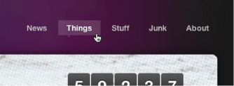
FIG 3.13: Showing the :hover state, now with a semi-transparent background via RGBA.
Rounding the hover with border-radius
Going a step further, we could round the corners of the hover background using the CSS3 border-radius property, creating a pill shape for browsers that support it. Specifying 50% here will ensure perfectly round ends, regardless of the font size.
Remembering what we learned back in Chapter 1 about the border-radius property and the vendor prefixes that enable us to use it today, we can add our stack to the default link declaration like so:
#nav li a {
  padding: 5px 15px;
  font-weight: bold;
  color: #ccc;
  color: rgba(255, 255, 255, 0.7);
  text-shadow: 0 1px 1px rgba(0, 0, 0, 0.5);
  -webkit-border-radius: 50%;
  -moz-border-radius: 50%;
  border-radius: 50%;
  }
#nav li a:hover,
#nav li a:focus {
  color: #fff;
  background: rgba(255, 255, 255, 0.15);
  }
FIGURE 3.14 shows the :hover background treatment now with rounded corners via border-radius, which will be seen in Safari, Chrome, Firefox, and Opera, as well as IE9. And remember, we’ve placed the non-prefixed border-radius property last in the list, ensuring the ultimate implementation will trump the vendor-prefixed ones. For example, from version 5, Safari supports both the non-prefixed border-radius property as well as –webkit-border-radius.

FIG 3.14: Rounding the corners of the background with border-radius.
You might be wondering why I’m placing the border-radius rules in the #nav li a declaration and not in the #nav li a:hover declaration (where it’s being revealed). The answer lies in the CSS transition we’re going to add next as a final bit of polish.
Adding a transition
Lastly, let’s take what we learned in Chapter 2 and add a transition to the :hover and :focus on the nav links. This will smooth out the appearance of the background pill, subtly bringing it into focus behind the text. The transition will also smooth out the text color change from semi-transparent white to fully white (FIG 3.15).

FIG 3.15: Imagine, if you will, the easing in and out when the transition is in place.
Here, we’ll add the stack for transitions that currently work in recent versions of the major browsers, with the non-prefixed transition property last in the declaration for eventual implementation by additional browsers (or future versions).
#nav li a {
  padding: 5px 15px;
  font-weight: bold;
  color: #ccc;
  color: rgba(255, 255, 255, 0.7);
  text-shadow: 0 1px 1px rgba(0, 0, 0, 0.5);
  -webkit-border-radius: 50%;
  -moz-border-radius: 50%;
  border-radius: 50%;
  -webkit-transition: all 0.3s ease-in-out;
  -moz-transition: all 0.3s ease-in-out;
  -o-transition: all 0.3s ease-in-out;
  transition: all 0.3s ease-in-out;
  }

#nav li a:hover,
#nav li a:focus {
  color: #fff;
  background: rgba(255, 255, 255, 0.15);
  }
Remember that we add the transition properties to the normal state of the element to be transitioned. Transitions are designed this way in order for the transition to happen not only on :hover, but also on :focus or :active states as well.
I’m using the all value in our transition to catch all the properties that change on :hover and :focus—in this case, color and background. Alternatively, we could’ve achieved the same transition by listing each of those properties explicitly in a comma-delimited list like this:
-webkit-transition:
  color 0.3s ease-in-out,
  background 0.3s ease-in-out;
-moz-transition:
  color 0.3s ease-in-out,
  background 0.3s ease-in-out;
-o-transition:
  color 0.3s ease-in-out,
  background 0.3s ease-in-out;
transition:
  color .3s ease-in-out,
  background .3s ease-in-out;
You can quickly see how the all value is a bit more compact and efficient for transitioning multiple changes on an element.
Hover-crafting the experience
We’ve just walked through a rather simple example, adding various CSS3 properties to the experience layer. Browsers that are capable will ease in a semi-transparent, rounded background color behind text-shadowed text links. Browsers that aren’t capable don’t get the enhanced hover experience, but that’s perfectly OK. What they do get is a semantically structured horizontal list of links—and that foundation is what’s most important here.
I think this little exercise also demonstrates how efficient it is to achieve something that previously would have required Flash and/or JavaScript to achieve. The CSS rules that we used are simple and straightforward, harmless for browsers that don’t yet support them.
We’ve also future-proofed our CSS3 by ensuring that the transition property from the spec is included last in our rules.
Duplicating these rules with the appropriate vendor-specific prefixes is a necessary effort, but one where the payoff is golden: getting to use CSS3 right now to enhance the experience for many users.
Simple and Flexible Hovering Using Opacity
We’re constantly looking for solutions that save time and offer additional flexibility. This is precisely what CSS3 offers us in spades: the ability to achieve, in a few lines of code, what used to take more time and resources to create and maintain.
Yet another tool for the hover-crafting arsenal is the opacity property. As mentioned in Chapter 1, opacity is a CSS3 property that allows you to specify how opaque a given element is. Coupled with the aforementioned RGBA, opacity offers another method to add transparency to the designs we create for the web.
One of the ways I like to use opacity is to create simple and flexible hover states for hyperlinked graphics, using the variation in transparency to create multiple states from a single image. Add a CSS transition into the mix and you now have a wonderfully rich experience for linked graphics on the page that’s easy to maintain.
Let’s take a look at how the opacity property is used on the moon case study.
Opacity on clickable images
FIGURE 3.16 shows the footer of the moon example site, where—underneath some legal copy and a shocking disclaimer—sit three clickable logos.

FIG 3.16: The footer of Things We Left on the Moon.
We’re going to use the opacity property to not only control the :hover and :focus treatment, but also to set the initial level of transparency. And a CSS transition will smooth out and animate that change for a complete effect.
The markup
Like the previous top navigation example, the markup for these footer logos is simple and semantic—just an unordered list of hyperlinked images:
<ul id="footer-logos">
  <li><a href="#"><img src="img/logo-sb.png" »
    alt="SimpleBits logo" /></a>
  </li>
  <li><a href="#"><img src="img/icon-feed.png" »
    alt="RSS feed" /></a>
  </li>
  <li><a href="#"><img src="img/icon-bitman.png" »
    alt="BitMan" /></a>
  </li>
</ul>
Opacity and image efficiency
I’ve actually created the icons themselves as fully white PNG images, knowing that I can later use the opacity property to adjust the level of transparency with CSS. This has changed the way I think about graphic assets for web projects in some situations.
Instead of saving semi-transparent PNGs, I’ll save fully opaque versions (FIG 3.17) that I can adjust in the browser. This not only saves time, it also allows us to vary that opacity level on :hover, :focus, and :active states without needing to create multiple sets of images.

FIG 3.17: The logo PNGs are created fully-white.
Styling the list
The first bits of style will center the images in the footer, and make them horizontal instead of vertical (FIG 3.18).
#footer-logos {
  text-align: center;
  }

#footer-logos li {
  display: inline;
  }

FIG 3.18: The white PNGs centered in the footer.
Next, let’s add the opacity values that will dim the icons in their default state, brightening them up a bit when hovered or focused.
#footer-logos a img {
  opacity: 0.25;
  }
#footer-logos a:hover img,
#footer-logos a:focus img {
  opacity: 0.6;
  }
Here we’re showing the images at 25% opacity, then bringing them up to 60% opacity when hovered or focused (FIG 3.19). Quite a simple thing, isn’t it? And it requires only one setof images.

FIG 3.19: Showing the :hover state of the icons in the footer by adjusting the opacity.
Note that the opacity property doesn’t require vendor prefixes, and will work in Safari, Chrome, Firefox, Opera, and IE9+.
Adding a transition
Lastly, adding a transition to the opacity swap will smooth out that value change, and provide a bit of animated richness that’ll tie this whole technique together.
Let’s add our (now familiar) transition stack to the declaration, this time transitioning the opacity property specifically. We’ll make it rather quick (just 0.2 seconds) and ease it in and then out again.
#footer-logos a img {
  opacity: 0.25;
  -webkit-transition: opacity 0.2s ease-in-out;
  -moz-transition: opacity 0.2s ease-in-out;
  -o-transition: opacity 0.2s ease-in-out;
  transition: opacity 0.2s ease-in-out;
  }

#footer-logos a:hover img,
#footer-logos a:focus img {
  opacity: 0.6;
  }
With the transition in place, we now have a simple technique for using opacity to craft a flexible hover experience using a single set of images.
Go Forth and Hover-Craft
As I mentioned before, this solution has affected the way I think about creating the asset graphics for a design. We can use opacity to control how the graphic appears by default, blending it into the background—then applying a different value for :hover, :focus, and :active states, tying it together with a transition for browsers that support it.
Keep the opacity property in mind next time you’re creating hover treatments for hyperlinked images in your own designs. You’ll save time, bandwidth, and the unnecessary complexity that other solutions might require.
Hover-crafting with CSS3 is about quickly and efficiently adding simple styles that enrich the experience layer, surprising and delighting users with the browsers that support those properties now and into the future. If the browser doesn’t support the high-fidelity experience you’ve created, that’s perfectly OK, as they won’t know what they’re missing.