Styles are cool. They allow you to define a set of attributes in one place and then apply them to as many widgets as you want. The downside of styles is that you have to apply them to each and every widget, one at a time. What if you had a more complex app with lots of buttons in lots of layouts? Adding your BeatBoxButton style to them all could be a huge task.
That is where themes come in. Themes take styles a step further: They allow you to define a set of attributes in one place, like a style – but then those attributes are automatically applied throughout your app. Theme attributes can store a reference to concrete resources, such as colors, and they can also store a reference to styles. In a theme, you can say, for example, “I want all buttons to use this style.” And then you do not need to find every button widget and tell it to use the theme.
When you created BeatBox, it was given a default theme.
Navigate to manifests/AndroidManifest.xml and look at the theme attribute on the application tag:
    <manifest xmlns:android="http://schemas.android.com/apk/res/android"
        package="com.bignerdranch.android.beatbox" >

        <application
            android:allowBackup="true"
            android:icon="@mipmap/ic_launcher"
            android:label="@string/app_name"
            android:roundIcon="@mipmap/ic_launcher_round"
            android:supportsRtl="true"
            android:theme="@style/AppTheme">
            ...
        </application>

      </manifest>
The theme attribute is pointing to a theme called AppTheme. AppTheme was declared in the styles.xml file that you modified earlier.
As you can see, a theme is also a style. But themes specify different attributes than a style does (as you will see in a moment). Themes are also given superpowers by being declared in the manifest. This is what causes the theme to be applied across the entire app automatically.
Navigate to the definition of the AppTheme theme by Command-clicking (Ctrl-clicking) on @style/AppTheme.
Android Studio will take you to res/values/styles.xml:
    <resources>

        <style name="AppTheme" parent="Theme.AppCompat.Light.DarkActionBar">
            ...
        </style>

        <style name="BeatBoxButton">
            <item name="android:background">@color/dark_blue</item>
        </style>
        ...
    </resources>
When you choose Use AndroidX artifacts in new projects created in Android Studio, they are given an AppCompat theme. AppTheme is inheriting attributes from Theme.AppCompat.Light.DarkActionBar. Within AppTheme, you can add or override additional values from the parent theme.
The AppCompat library comes with three main themes:
-
Theme.AppCompat – a dark theme
-
Theme.AppCompat.Light – a light theme
-
Theme.AppCompat.Light.DarkActionBar – a light theme with a dark app bar
Change the parent theme to Theme.AppCompat to give BeatBox a dark theme as its base.
Listing 21.6 Changing to a dark theme (res/values/styles.xml)
<resources>

    <style name="AppTheme" parent="Theme.AppCompat.Light.DarkActionBar">
        ...
    </style>
    ...
</resources>
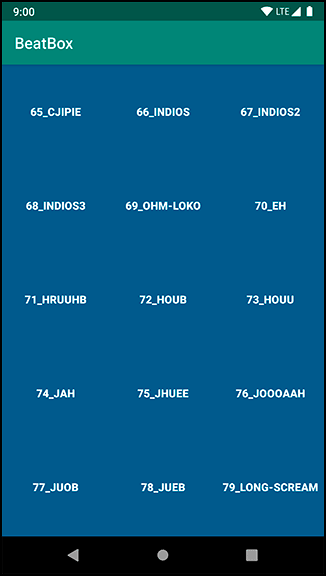
Run BeatBox to see your new dark theme (Figure 21.4).