
Click the tab for the layout file, activity_main.xml. This will open the layout editor in the editor tool window (Figure 1.9). If you do not see a tab for activity_main.xml, do not worry. Expand app/res/layout/ in the project tool window. Double-click activity_main.xml to open the file. If activity_main.xml opens but shows XML instead of the layout editor, click the Design tab at the bottom of the editor tool window.

By convention, a layout file is named based on the activity it is associated with:
Its name begins with activity_, and the rest of the activity name follows in all lowercase, using underscores to separate words (a style called “snake_case”).
So, for example, your layout file’s name is activity_main.xml, and the layout file for an activity called SplashScreenActivity would be named activity_splash_screen.
This naming style is recommended for layouts as well as other resources that you will learn about later.
The layout editor shows a graphical preview of the file. Select the Text tab at the bottom to see the backing XML.
Currently, activity_main.xml holds the default activity layout template. The template changes frequently, but the XML will look something like Listing 1.1.
Listing 1.1 Default activity layout (res/layout/activity_main.xml)
<?xml version="1.0" encoding="utf-8"?>
<androidx.constraintlayout.widget.ConstraintLayout
        xmlns:android="http://schemas.android.com/apk/res/android"
        xmlns:tools="http://schemas.android.com/tools"
        xmlns:app="http://schemas.android.com/apk/res-auto"
        android:layout_width="match_parent"
        android:layout_height="match_parent"
        tools:context=".MainActivity">

    <TextView
            android:layout_width="wrap_content"
            android:layout_height="wrap_content"
            android:text="Hello World!"
            app:layout_constraintBottom_toBottomOf="parent"
            app:layout_constraintLeft_toLeftOf="parent"
            app:layout_constraintRight_toRightOf="parent"
            app:layout_constraintTop_toTopOf="parent"/>

</androidx.constraintlayout.widget.ConstraintLayout>
The default activity layout defines two Views: a ConstraintLayout and a TextView.
Views are the building blocks you use to compose a UI. Everything you see on the screen is a view. Views that the user can see or interact with are called widgets. Some widgets show text. Some widgets show graphics. Others, like buttons, do things when touched.
The Android SDK includes many widgets that you can configure to get the appearance and behavior you want. Every widget is an instance of the View class or one of its subclasses (such as TextView or Button).
Something has to tell the widgets where they belong onscreen. A ViewGroup is a kind of View that contains and arranges other views. A ViewGroup does not display content itself. Rather, it orchestrates where other views’ content is displayed. ViewGroups are often referred to as layouts.
In the default activity layout, ConstraintLayout is the ViewGroup responsible for laying out its sole child, a TextView widget. You will learn more about layouts and widgets and about using ConstraintLayout in Chapter 10.
Figure 1.10 shows how the ConstraintLayout and TextView defined in Listing 1.1 would appear onscreen.

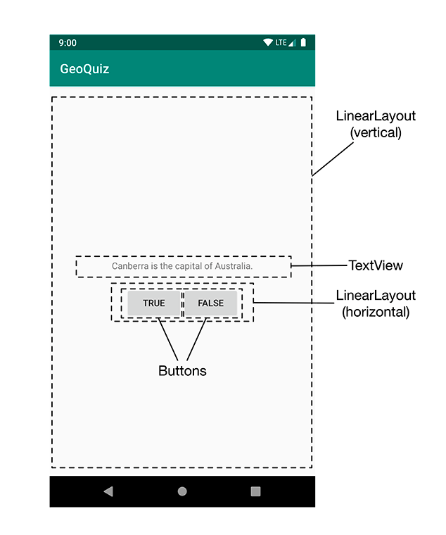
But these are not the widgets you are looking for. The interface for MainActivity requires five widgets:
-
a vertical LinearLayout
-
a TextView
-
a horizontal LinearLayout
-
two Buttons
Figure 1.11 shows how these widgets compose MainActivity’s interface.
Now you need to define these widgets in your layout XML. Edit the text contents of activity_main.xml to match Listing 1.2. The XML that you need to delete is struck through, and the XML that you need to add is in bold font. This is the pattern we will use throughout this book.
Do not worry about understanding what you are typing; you will learn how it works next. However, do be careful. Layout XML is not validated, and typos will cause problems sooner or later.
You will see errors on the three lines that start with android:text.
Ignore these errors for now; you will fix them soon.
Listing 1.2 Defining widgets in XML (res/layout/activity_main.xml)
<androidx.constraintlayout.widget.ConstraintLayoutxmlns:android="http://schemas.android.com/apk/res/android"xmlns:tools="http://schemas.android.com/tools"xmlns:app="http://schemas.android.com/apk/res-auto"android:layout_width="match_parent"android:layout_height="match_parent"tools:context=".MainActivity"><TextViewandroid:layout_width="wrap_content"android:layout_height="wrap_content"android:text="Hello World!"app:layout_constraintBottom_toBottomOf="parent"app:layout_constraintLeft_toLeftOf="parent"app:layout_constraintRight_toRightOf="parent"app:layout_constraintTop_toTopOf="parent"/></androidx.constraintlayout.widget.ConstraintLayout><LinearLayout xmlns:android="http://schemas.android.com/apk/res/android" android:layout_width="match_parent" android:layout_height="match_parent" android:gravity="center" android:orientation="vertical"> <TextView android:layout_width="wrap_content" android:layout_height="wrap_content" android:padding="24dp" android:text="@string/question_text" /> <LinearLayout android:layout_width="wrap_content" android:layout_height="wrap_content" android:orientation="horizontal"> <Button android:layout_width="wrap_content" android:layout_height="wrap_content" android:text="@string/true_button" /> <Button android:layout_width="wrap_content" android:layout_height="wrap_content" android:text="@string/false_button" /> </LinearLayout> </LinearLayout>
Compare your XML with the UI shown in Figure 1.11. Every widget has a corresponding XML element, and the name of the element is the type of the widget.
Each element has a set of XML attributes. Each attribute is an instruction about how the widget should be configured.
To understand how the elements and attributes work, it helps to look at the layout from a hierarchical perspective.
Your widgets exist in a hierarchy of View objects called the view hierarchy. Figure 1.12 shows the view hierarchy that corresponds to the XML in Listing 1.2.
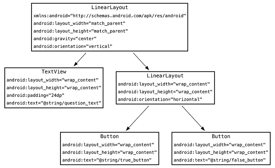
The root element of this layout’s view hierarchy is a LinearLayout. As the root element, the LinearLayout must specify the Android resource XML namespace at http://schemas.android.com/apk/res/android.
LinearLayout inherits from ViewGroup, which, as we said earlier, is a subclass of View that contains and arranges other views. You use a LinearLayout when you want views arranged in a single column or row. Other ViewGroup subclasses that you will meet later include ConstraintLayout and FrameLayout.
When a view is contained by a ViewGroup, that view is said to be a child of the ViewGroup. The root LinearLayout has two children: a TextView and another LinearLayout. The child LinearLayout has two Button children of its own.
Let’s go over some of the attributes that you have used to configure your widgets.
The android:layout_width
and android:layout_height attributes
are required for almost every type of widget.
They are typically set to either match_parent or wrap_content:
|
match_parent |
|
|
wrap_content |
For the root LinearLayout, the value of both the height and width attributes is match_parent. The LinearLayout is the root element, but it still has a parent – the view that Android provides for your app’s view hierarchy to live in.
The other widgets in your layout have their widths and heights set to wrap_content.
You can see in Figure 1.11 how this determines their sizes.
The TextView is slightly larger than the text it contains due to its android:padding="24dp" attribute.
This attribute tells the widget to add the specified amount of space to its contents when determining its size.
You are using it to get a little breathing room between the question and the buttons.
(Wondering about the dp units? These are density-independent pixels,
which you will learn about in Chapter 10.)
The android:orientation attribute on the two LinearLayout widgets determines whether their children will appear vertically or horizontally.
The root LinearLayout is vertical; its child LinearLayout is horizontal.
The order in which children are defined determines the order in which they appear onscreen. In a vertical LinearLayout, the first child defined will appear topmost. In a horizontal LinearLayout, the first child defined will be leftmost. (Unless the device is set to a language that runs right to left, such as Arabic or Hebrew. In that case, the first child will be rightmost.)
The TextView and Button widgets have android:text attributes.
This attribute tells the widget what text to display.
Notice that the values of these attributes are not literal strings.
They are references to string resources, as denoted by the @string/ syntax.
A string resource
is a string that lives in a separate XML file called a strings file.
You can give a widget a hardcoded string, like android:text="True", but it is usually not a good idea.
Placing strings into a separate file and then referencing them is better because it makes localization (which you will learn about in Chapter 17) easy.
The string resources you are referencing in activity_main.xml do not exist yet. Let’s fix that.
Every project includes a default strings file named res/values/strings.xml.
Open res/values/strings.xml. The template has already added one string resource for you. Add the three new strings that your layout requires.
Listing 1.3 Adding string resources (res/values/strings.xml)
<resources>
    <string name="app_name">GeoQuiz</string>
    <string name="question_text">Canberra is the capital of Australia.</string>
    <string name="true_button">True</string>
    <string name="false_button">False</string>
</resources>
(Depending on your version of Android Studio, you may have additional strings. Do not delete them. Deleting them could cause cascading errors in other files.)
Now, whenever you refer to @string/false_button in any XML file in the GeoQuiz project, you will get the literal string “False” at runtime.
The errors in activity_main.xml about the missing string resources should now be gone. (If you still have errors, check both files for typos.)
Although the default strings file is named strings.xml, you can name a strings file anything you want.
You can also have multiple strings files in a project.
As long as the file is located in res/values/,
has a resources root element, and contains child string elements, your strings will be found and used.
Your layout is now complete. Switch back to activity_main.xml and preview the layout in the Design pane by clicking the tab at the bottom of the editor tool window (Figure 1.13).
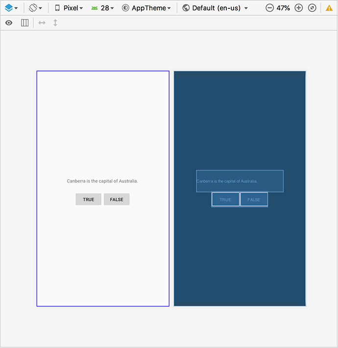
Figure 1.13 shows the two kinds of preview available. You can select from the preview types using a menu that drops down from the blue diamond button leftmost in the top toolbar. You can show either kind of preview individually or both together, as shown here.
The preview on the left is the Design preview. This shows how the layout would look on a device, including theming.
The preview on the right is the Blueprint preview. This preview focuses on the size of widgets and the relationships between them.
The Design pane also allows you to see how your layout looks on different device configurations. At the top of the pane, you can specify the type of device, the version of Android to simulate, the device theme, and the locale to use when rendering your layout. You can even pretend your current locale uses right-to-left text.
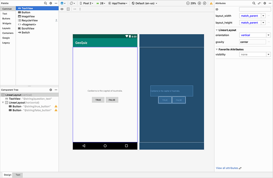
In addition to previewing, you can also build your layouts using the layout editor. On the left there is a palette that contains all of the built-in widgets (Figure 1.14). You can drag these widgets from the palette and drop them into your view. You can also drop them into the component tree in the bottom left to have more control over where the widget is placed.
Figure 1.14 shows the preview with layout decorations – the device status bar, app bar with GeoQuiz label, and virtual device button bar. To see these decorations, click the eyeball button in the toolbar just above the preview and select Show Layout Decorations.
You will find this graphical editor especially valuable when working with ConstraintLayout, as you will see for yourself in Chapter 10.