
Chapter 2
Model the data
In the previous chapter, we reviewed the skills necessary to get and transform data by using Power Query Editor—the process also known as data shaping. In this chapter, we explore the skills needed to model data.
Power BI allows you to analyze your data to some degree right after you load it, but a strong understanding of data modeling helps you perform sophisticated analysis using rich data modeling capabilities, which includes creating relationships, hierarchies, and various calculations to bring out the true power of Power BI. In Chapter 1, “Prepare the data,” in Power Query Editor we used the M language; once we loaded the data into the model, we used data analysis expressions, more commonly referred to as DAX, Power BI’s native query language.
In this chapter, we discuss the skills necessary to design, develop, and optimize data models. Additionally, we look at DAX and how you can use it to enhance data models.
Skills covered in this chapter:
Skill 2.1: Design a data model
A proper data model is the foundation of meaningful analysis. A Power BI data model is a collection of one or more tables and, optionally, relationships. A well-designed data model enables business users to understand and explore their data and derive insights from it. Before you create any visuals, you should complete this step by loading your data and defining the relationships between tables. Data modeling often occurs at the beginning phase of building a Power BI report to be able to create efficient measures that build upon your data model. In this section, we design a data model by focusing our attention on tables and their relationships.
Define the tables
Once a query is loaded, it becomes a table in a Power BI data model. Tables can then be organized into different data model types, also known as schemas. Here are the three most common schemas in Power BI:
Flat (fully denormalized) schema
Star schema
Snowflake schema
There are other types of data models, though these three are the most common ones.
Flat schema
In the flat type of data model, all attributes are fully denormalized into a single table. Because there’s only one table, there are no relationships, and in most cases there’s no need for keys.
In our Wide World Importers example, you have a single table that contains all columns from all tables, meaning that the Sale and Targets columns will be in the same table. Because the tables have different data granularity, you run into problems when comparing actuals and targets.
From the performance point of view, flat schemas are very efficient, though there are downsides:
A single table can be cumbersome and confusing to navigate.
Columns and data can often be duplicated, leading to a comparatively large file size.
Mixing facts of different grains results in more complex DAX formulas.
Flat schemas are often used when connecting to a single, simple source. However, for more complex data models, flat schemas should be avoided in Power BI as much as possible.
Star schema
When you use a star schema, tables are conceptually classified into two kinds:
Fact tables These tables contain the metrics you want to aggregate. Fact tables have foreign keys, which are required to create relationships with dimensions, and columns that you can aggregate. In the Wide World Importers example, the Sale and Targets tables are fact tables. Fact tables are sometimes also known as data tables.
Dimension tables These tables contain the descriptive attributes that help you slice and dice your fact tables. A dimension table has a unique identifier—a key column—and descriptive columns. In the Wide World Importers example, City, Customer, Date, Employee, and Stock Item are dimension tables. Dimension tables are also sometimes known as lookup tables.
In a star schema, fact tables are surrounded by dimensions, as shown in Figure 2-1.
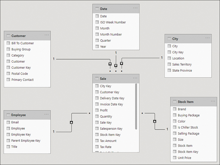
Figure 2-1 Star schema with Sale as the only fact table
The star schema has its name because it resembles a star, where the fact table is in the center and dimension tables are the star points. It’s possible to have more than one fact table in a star schema, and it will still be a star schema.
In most cases, the star schema is the preferred data modeling approach in Power BI. It addresses the shortcomings of the flat schema:
Fields are logically grouped, making the model easier to understand.
There is less duplication of data, which results in more efficient storage.
You don’t need to write overly complex DAX formulas to work with fact tables that have a different grain.
Snowflake schema
The snowflake schema is similar to the star schema, except it can have some dimensions that “snowflake” from other dimensions. You can see an example in Figure 2-2.
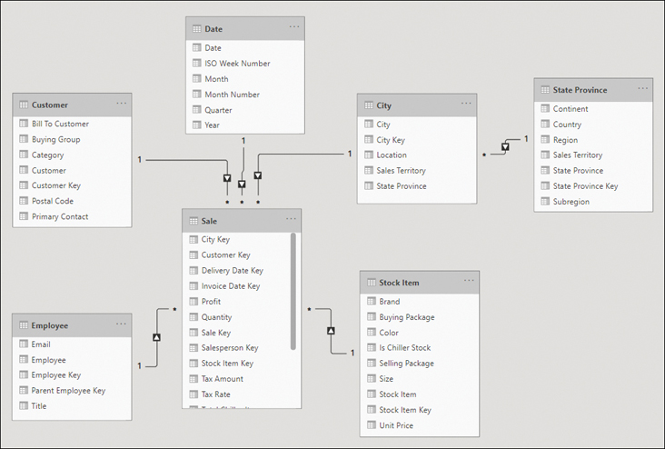
Figure 2-2 Snowflake schema with State Province snowflaking from the City table
In the Wide World Importers example, if you loaded the State Province query, the data model could be a snowflake schema. This is because the State Province table is related to the City dimension table, which in turn is related to the Sale fact table.
Snowflake schemas can be beneficial when there are fact tables that have different grains.
Configure table and column properties
Both tables and columns have various properties you can configure, and you can do so in the Model view. To see the properties of a column or a table, select an object, and you see its properties in the Properties pane.
Table properties
For tables, depending on the storage mode, you can configure the following properties:
Name Enter the table name.
Description This property allows you to add a description of the table that will be stored in the model’s metadata. It can be useful when you’re building reports because you can see the description when you hover over the table in the Fields pane.
Synonyms These are useful for the Q&A feature of Power BI, which we review in the next skill section. You can add synonyms so that the Q&A feature can understand that you’re referring to a specific table even if you provide a different name for it.
Row label This property is useful for both Q&A and featured tables, and it allows you to select a column whose values will serve as labels for each row. For example, if you ask Q&A to show “sales amount by product,” and you select the Product Name column as the Row label of the Product table, then Q&A will show the sales amount for each product name.
Key column If your table has a column that has unique values for every row, you can set the column as the key column.
Is hidden You can hide a table so that it disappears from the Fields pane.
Is featured table This property allows you to make a table featured, which will allow it to be used in Excel in certain scenarios.
Storage mode This property can be set to Import, DirectQuery, or Dual, as we covered in the previous chapter.
Column properties
For columns, depending on data type, you can configure the following properties:
Name Enter the column name.
Description This property is the same as for tables; you can add a column description.
Synonyms This property is the same as for tables; you can add synonyms to make the column work better with Q&A.
Display folder You can group columns from the same table into display folders.
Is hidden Hiding a column keeps it in the data model and hides it in the Fields pane.
Data type The available data types are different from those available in Power Query. For instance, Percentage, Date/Time/Timezone, and Duration are not available.
Format Different data types will show different formatting properties. For example, for numeric columns you’ll see the following additional properties: Percentage format, Thousands separator, and Decimal places.
Sort by column You can sort one column by another. For example, you can sort month names by month numbers to make them appear in the correct order.
Data category This property can be useful for some visuals, and the default is Uncategorized. Depending on the data type, you can also select one of the following:
Address
City
Continent
Country/Region
County
Latitude
Longitude
Place
Postal Code
Summarize by This property determines how the column will be aggregated if you put it into a visual. The options you can choose depend on the data type. For most data types, in addition to Don’t Summarize/None, you can choose Count and Count (Distinct)/Distinct Count, while for numeric columns, you can also choose Sum, Average, Minimum/Min, and Maximum/Max. Power BI will try to automatically determine the appropriate summarization, but it’s not always accurate.
Is nullable You can disallow null values for a column; if, during data refresh, a column is determined to get a null value, the refresh will fail.
Define quick measures
A measure in Power BI is a dynamic evaluation of a DAX query that will change in response to interactions with other visuals, enabling quick, meaningful exploration of your data. Creating efficient measures will be one of the most useful tools you can use to build insightful reports. If you are new to DAX and writing measures, or you are wanting to perform quick analysis, you have the option of creating a quick measure. There are several ways to create a quick measure:
Select Quick measure from the Home ribbon.
Right-click or select the ellipsis next to a table or column in the Fields pane and select New quick measure. This method may prefill the quick measure form shown next.
If you already use a field in a visual, select the drop-down arrow next to the field in the Values section and select New quick measure. This method also may prefill the quick measure form shown next. If possible, this will add the new quick measure to the existing visualization. You’ll be able to use this measure in other visuals too.
The following calculations are available as quick measures:
Aggregate per category
Average per category
Variance per category
Max per category
Min per category
Weighted average per category
Filters
Filtered value
Difference from filtered value
Percentage difference from filtered value
Sales from new customers
Time intelligence
Year-to-date total
Quarter-to-date total
Month-to-date total
Year-over-year change
Quarter-over-quarter change
Month-over-month change
Rolling average
Totals
Running total
Total for category (filters applied)
Total for category (filters not applied)
Mathematical operations
Addition
Subtraction
Multiplication
Division
Percentage difference
Correlation coefficient
Text
Star rating
Concatenated list of values
Each calculation has its own description and a list of field wells. You can see an example in Figure 2-3.
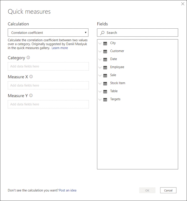
Figure 2-3 Quick measures dialog box
For example, by using quick measures, you can calculate average profit per employee for Wide World Importers:
Select Quick measure on the Home ribbon.
From the Calculation drop-down list, select Average per category.
Drag the Profit column from the Sale table to the Base value field well.
Drag the Employee column from the Employee table to the Category field well.
Select OK.
After you complete these steps, you can find the new measure called Profit average per Employee in the Fields pane.
If you select the new measure, you’ll see its DAX formula:
You can modify the formula, if needed. Reading the DAX can be a great way to learn how measures can be written.
Flatten out a parent-child hierarchy
Parent-child hierarchies are often used for employees, charts of accounts, and organizations. Instead of being composed of several columns, parent-child hierarchies are defined by two columns: node key and parent node key. In the Wide World Importers example, you can see a parent-child hierarchy in the Employee table, shown in Figure 2-4.

Figure 2-4 Employee table
For our purposes, you can ignore the “Unknown” employee. By observing the Parent Employee Key values, note the following:
Jai Shand is a director and has no “parent employee.”
Isabella Rupp, Henry Forlonge, and Jack Potter are all managers, and they all report to Jai Shand, their “parent employee.”
Isabella Rupp, Henry Forlonge, and Jack Potter all act as “parent employees” to various salespersons.
There are three levels in the hierarchy: director level, manager level, and salesperson level.
If you were to create additional columns with each column containing a hierarchy level, you would need to merge the Employee table with itself in Power Query, which would widen the table and create a more complex query. In Power BI, you can also solve this problem by using DAX and calculated columns.
To create a calculated column in a table, right-click the table in the Fields pane and select New column. In the Wide World Importers example, you can use the following formula to create a calculated column in the Employee table:
This adds a new column that has all hierarchy levels listed, and you can see it in Figure 2-5.
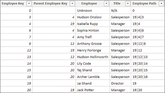
Figure 2-5 Employee Path column
The Employee Path column is only useful for technical purposes, so it can be hidden.
The next step is to add the following three calculated columns to the Employee table:
All three columns use the PATHITEM function to retrieve the employee key of the specified level and LOOKUPVALUE to look up the employee name based on their key.
After you add the columns, the table should look like the one in Figure 2-6.

Figure 2-6 The Director, Manager, and Salesperson columns in the Employee table
Note that some Manager and Salesperson column values are blank; Jai Shand, for example, is a director with nobody above him, so both Manager and Salesperson are blank. In the Wide World Importers example, this is not a big problem because only keys of salespersons are used in the Sale table. If this is undesirable, you can use the last parameter of LOOKUPVALUE, which provides the default value, as follows:
Using the last parameter of LOOKUPVALUE in this case ensures that all columns have values.
Define role-playing dimensions
In some cases, there may be more than one way to filter a fact table by a dimension. In the Wide World Importers example, the Sale table has two date columns: Invoice Date Key and Delivery Date Key, both of which can be related to the Date column from the Date table. Therefore, it is possible to analyze sales by invoice date or delivery date, depending on the business requirements. In this situation, the Date dimension is a role-playing dimension.
Although Power BI allows you to have multiple physical relationships between two tables, no more than one can be active at a time, and other relationships must be set as inactive. Active relationships, by default, propagate filters. The choice of which relationship should be set as active depends on the default way of looking at data by the business.
To create a relationship between two tables, you can drag a key from one table on top of the corresponding key from the other table in the Model view.
In the Wide World Importers example, you can drag the Date column from the Date table on top of the Invoice Date Key column in the Sale table. Doing so creates an active relationship, signified by the solid line. Next, you can drag the Date column from the Date table on top of the Delivery Date Key column from the Sale table. This creates an inactive relationship, signified by the dashed line. The result should look like Figure 2-7.
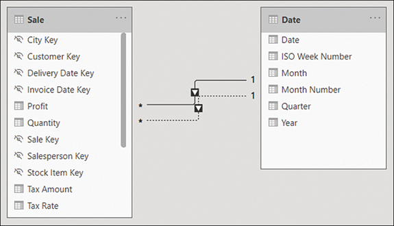
Figure 2-7 Relationships between Sale and Date
If you hover over a relationship line in the Model view, it highlights the fields that participate in the relationship.
In the Wide World Importers model, you should also create the relationships listed in Table 2-1.
Table 2-1 Additional relationships in Wide World Importers
From: Table (Column) |
To: Table (Column) |
|---|---|
Sale (City Key) |
City (City Key) |
Sale (Customer Key) |
Customer (Customer Key) |
Sale (Salesperson Key) |
Employee (Employee Key) |
Sale (Stock Item Key) |
Stock Item (Stock Item Key) |
Inactive relationships can be activated by using the USERELATIONSHIP function in DAX, which also deactivates the default active relationship, if any. The following is an example of a measure that uses USERELATIONSHIP:
To use USERELATIONSHIP, you must define a relationship in the model first so that the function only works for existing relationships. This approach is useful for scenarios such as the Wide World Importers example, where you have multiple date columns within the same fact table.
If you have several measures that you want to analyze by using different relationships, this may result in your data model having many similar measures, cluttering your data model to a degree.
Another drawback of using USERELATIONSHIP is that you cannot analyze data by using two relationships at the same time. For instance, if you have a single Date table, it won’t be possible to see which sales were invoiced last year and shipped this year.
An alternative to USERELATIONSHIP that addresses these drawbacks is to use separate dimensions for each role or relationship. In case of Wide World Importers, you would have Delivery Date and Invoice Date dimensions, which would make it possible to analyze sales by both delivery and invoice dates.
You have a few ways to create the new dimensions based on the existing Date table, one of which is to use calculated tables. For the Invoice Date table, the DAX formula would be as follows:
The benefit of using calculated tables instead of referencing or duplicating queries in Power Query is that if you have calculated columns in your Date table, they will be copied in a calculated table, whereas you would have to re-create the same columns if you used Power Query to create the copies of the dimension.
When you’re creating separate dimensions, it’s best to rename the columns to make it clear where fields are coming from. For example, instead of leaving the column called Date, rename it to Invoice Date. You can do so by right-clicking a field in the Fields pane and selecting Rename or by double-clicking a field. Alternatively, you can rename fields by using a more complex calculated table expression. For example, you could use the SELECTCOLUMNS function in DAX to rename columns.
Define a relationship’s cardinality and cross-filter direction
In the previous section, you saw how to create relationships between tables. In this section, we review the concepts of cardinality and cross-filter direction of relationships.
You can edit a relationship by double-clicking it in the Model view. For example, in Figure 2-8 you can see the options for one of the relationships between the Sale and the Date tables.

Figure 2-8 Relationship options
In the relationship options, you can select tables from drop-down lists. For each table, you get a preview of it, from which you can select a column that will be part of a relationship. Unlike for the Merge operation in Power Query, only one column from each table can be part of a relationship.
The Make this relationship active check box determines whether the relationship is active. Between two tables, there can be no more than one active relationship.
When using DirectQuery, the Assume referential integrity option is available, and it can improve query performance in certain cases.
Two options are worth reviewing in more detail: Cardinality and Cross-filter direction.
Cardinality
Depending on the selected tables and columns, you can select one of the following options:
Many-to-one
One-to-one
One-to-many
Many-to-many
Many-to-one and one-to-many are the same kind of relationship, and they only differ in the order in which the tables are listed. “Many” means that a key may appear more than once in the selected column, whereas “one” means a key value appears only once in the selected column. In our Wide World Importers example earlier, the Sale table was on the many side, whereas the Date table was on the one side; a single date appeared only once in the Date table, though there could be multiple sales on the same date in the Sale table.
One-to-one is a special kind of relationship in which a key value appears only once on both sides of the relationship. This type of relationship can be useful for splitting a single dimension with many columns into separate tables. You should use one-to-one only if you are confident that no duplicates will appear in this table, since duplicates would cause immediate errors in your data model.
Many-to-many relationships in this context refer to direct relationship between two tables, neither of which is guaranteed to have unique keys. We review this type of relationship later in this chapter.
Cross-filter direction
This option determines the direction in which filters flow. For many-to-one and one-to-many relationships, you can select Single or Both.
If you select Single, then the filters from the table on the “one” side will filter through to the table on the “many” side. This setting is signified by a single arrowhead on the relationship line in the Model view.
If you select Both, then filters from both tables will flow in both directions, and such relationships are also known as bidirectional. This setting is signified by two arrowheads on the relationship line in the Model view, facing in opposite directions. When this option is selected, you can also select Apply security filter in both directions to make row-level security filters flow in both directions, too.
To illustrate the concept, consider the data model shown in Figure 2-9.

Figure 2-9 Sample data model
From this data model, you can create two table visuals as follows:
Table 1: Distinct count of Stock Item by Year
Table 2: Distinct count of Year by Stock Item
Both table visuals are shown in Figure 2-10. The first four rows are shown for Table 2 for illustrative purposes.
You can see that in Table 1, the numbers are different for different years and the total, whereas in Table 2, the Distinct Count of Year is showing 6 for all rows, including the total.

Figure 2-10 Table visuals
The numbers are different in Table 1 because filters from the Date table can reach the Stock Item table through the Sale table; the Date table filters the Sale table because there is a one-to-many relationship; then the Sale table filters the Stock Item table because there is a bidirectional relationship. In 2017, 2018, and 2019, Wide World Importers coincidentally sold 219 stock items, whereas in 2020, they sold 227 stock items. At the total level you see 228, which is not the total sum of stock items sold across all years.
In Table 2, the numbers are the same because filters from the Stock Item table don’t reach the Date table since there is no bidirectional filter. Even though you only had sales in four years, you see 6 across all rows, which is the number of years in the Date table.
It’s also possible to set the cross-filter direction by using the CROSSFILTER function in DAX, as you can see in the following example:
The syntax of CROSSFILTER is similar to USERELATIONSHIP—the first two parameters are related columns. Additionally, there’s the third parameter—direction—and it can be one of the following:
BOTH This option corresponds to Both in the relationship cross-filter direction options.
NONE This option deactivates the relationship, and it corresponds to the cleared Make this relationship active check box.
ONEWAY This option corresponds to Single in the relationship cross-filter direction options.
Bidirectional filters are sometimes used in many-to-many relationships with bridge tables when direct many-to-many relationships are not desirable.
Design the data model to meet performance requirements
The way you design a Power BI data model ultimately affects the performance of reports. A well-designed data model takes into consideration both business requirements and the constraints of data sources. Performance tuning is a broad topic; we cover some key concepts you should keep in mind while designing your data model:
Storage mode
Relationships
Aggregations
Cardinality
Storage mode
As you saw in the first chapter, Power BI supports several connectivity modes:
Imported data
DirectQuery
Live Connection
Refer to the first chapter for more details.
Relationships
When you’re using composite models, it’s important to remember that relationships perform differently depending on the storage mode of the related tables.
You can use the concept of islands as an analogy of where data is queried to understand how data models work in practice. If you use two DirectQuery data sources, then each of them is a separate island. In contrast, all imported data resides in the same island regardless of where it originally came from, because all imported data is queried from memory. When you connect to data on the same island, you will have the fastest results since you don’t need to “swim” to another island.
You can see different kinds of relationships ordered from fastest to slowest in the following list:
One-to-many intra-island relationships
Direct many-to-many relationships
Many-to-many relationships with bridge tables
Cross-island relationships
We review many-to-many relationships in detail in the next section.
Aggregations
When using DirectQuery, you can import some summarized data so that the most frequently queried data resides in memory and is retrieved quickly, whereas detailed data is queried from the data source. This feature is called aggregations, and we review it later in this chapter.
Cardinality
The term cardinality, in addition to defining relationships, also refers to the number of distinct values in a column. Power BI stores imported data in columns, not rows. For this reason, the cardinality of each column affects performance. In general, the fewer distinct values there are, the better performance. We review ways to reduce cardinality later in this chapter.
Resolve many-to-many relationships
Many-to-many relationships occur very frequently in models. In general, many-to-many relationships happen in two cases:
Many-to-many relationships between dimensions For example, one client may have multiple accounts, and an account may belong to different clients.
Relationships between tables at different granularities For example, you may have a sales table at the date level and a targets table at the month level. Both tables could be related to a single date table. In this case, the relationship between the targets and date tables would be many-to-many since they are of different grain.
In the Wide World Importers example, a many-to-many relationship exists between the Date and Stock Item tables; on each date, multiple stock items could be sold, and each stock item could be sold on multiple dates. In this case, the relationship goes through the Sale table. Additionally, a many-to-many relationship exists between the Date dimension and the Targets fact table because the grain of the tables is different.
Power BI supports many-to-many relationships of two kinds:
Direct many-to-many relationships
Many-to-many relationships through a bridge table
Direct many-to-many relationships
As you saw earlier in this chapter, Power BI supports the many-to-many cardinality for relationships, allowing you to create a many-to-many relationship between two tables directly.
You will now create a relationship between the Targets table and the Customer table based on Buying Group, the same way you create other relationship types:
Go to the Model view.
Drag the Buying Group column from the Customer table on top of the Buying Group column from the Targets table.
Ensure the Make this relationship active check box is selected.
Set Cross filter direction to Single (Customer filters Targets). Figure 2-11 shows how your options should look.
Select OK.
You can see asterisks on both sides of the relationship that indicate the many-to-many relationship.
This method performs well when the number of unique values on each side of a relationship is fewer than 1,000; otherwise, the method may be slow and creating a bridge table would be a more efficient solution. The technical details on why this happens are out of the scope of the exam.
Another limitation that this kind of relationships has is that you cannot use the RELATED function in DAX since neither table is on the “one” side.
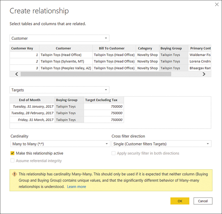
Figure 2-11 Relationship options
This creates a relationship, as shown in Figure 2-12.
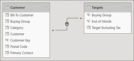
Figure 2-12 Relationship between Customer and Targets
Many-to-many relationships with bridge tables
A different way of creating a many-to-many relationship in Power BI is to use a bridge table. A bridge table is a table that allows you to create one-to-many relationships with each table that is in a many-to-many relationship. Bridge tables can be of two kinds:
A one-column table with unique values The bridge table is on the one side in each relationship. This is typical for relating facts or tables that have different grains.
A two-column table with unique combination of values The bridge table is on the many side in each relationship. This is common for many-to-many relationships between dimensions.
In the Wide World Importers example, the Date and Targets tables have different grains:
Targets has one row per Buying Group and the end-of -month date.
Date has one row per date.
Note that the Date table does not have a column that contains end-of-month dates. Dates are a special case, because you can create a one-to-many relationship between Date and Targets and avoid having a many-to-many relationship.
To illustrate this in practice, let’s create a many-to-many relationship between Date and Targets based on End of Month date. First, add the End of Month column to the Date table:
Launch Power Query Editor by selecting Transform Data on the Home ribbon.
Select the Date column in the Date query.
On the Add column ribbon, select From date & time > Date > Month > End of month.
There are several ways to create a bridge table through Power Query, calculated tables in DAX, or importing a new table that all achieve the same outcome. For our requirement, let’s create a bridge table between the Date and Targets table by using Power Query:
In Power Query Editor, right-click the Date query and select Reference.
Rename the newly created Date (2) query to End of Month.
Right-click the End of Month column header and select Remove other columns.
Right-click the End of Month column and select Remove duplicates.
On the Home ribbon, select Close & apply.
You can now relate the Date and Targets tables as shown in Table 2-2.
Table 2-2 Date, End of Month, and Targets relationships
From: Table (Column) |
To: Table (Column) |
Active |
Cross Filter Direction |
|---|---|---|---|
Date (End of Month) |
End of Month (End of Month) |
Yes |
Both |
Targets (End of Month) |
End of Month (End of Month) |
Yes |
Single |
You can see the relationships in Figure 2-13.
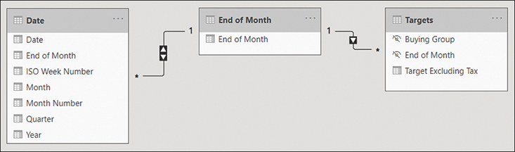
Figure 2-13 Date, End of Month, and Targets relationships
Create a common date table
By default, Power BI creates a calendar hierarchy for each date or date/time column from your data sources.
Although these can be useful in some cases, it’s best practice to create your own date table, which has several benefits:
You can use a calendar other than Gregorian.
You can have weeks in the calendar.
You can filter multiple fact tables by using a single date dimension table.
If you don’t have a date table you can import from a data source, you can create one yourself. It’s possible to create a date table by using Power Query or DAX, and there’s no difference in performance between the two methods.
Creating a calendar table in Power Query
In Power Query, you can use the M language List.Dates function, which returns a list of dates, and then convert the list to a table and add columns to it. The following query provides a sample calendar table that begins on January 1, 2016:
If you want to add the calendar table to your model, start with a blank query:
In Power Query Editor, select New Source on the Home ribbon.
Select Blank Query.
With the new query selected, select Query > Advanced Editor on the Home ribbon.
Replace all existing code with the code above and select Done.
Give your query an appropriate name such as Calendar or Date.
The result should look like Figure 2-14, where the first few rows of the query are shown.

Figure 2-14 Sample calendar table built by using Power Query
You may prefer having a table in Power Query when you intend to use it in some other queries, since it’s not possible to reference calculated tables in Power Query.
Creating a calendar table in DAX
If you choose to create a date table in DAX, you can use the CALENDAR or CALENDARAUTO function, both of which return a table with a single Date column. You can then add calculated columns to the table, or you can create a calculated table that has all the columns right away.
The CALENDAR function requires you to provide the start and end dates, which you can hardcode for your business requirements or calculate dynamically:
The CALENDARAUTO function scans your data model for dates and returns an appropriate date range automatically.
To build a table similar to the Power Query table we built before, we can use the following calculated table formula in DAX:
Define the appropriate level of data granularity
Data granularity refers to the grain of data, or the level of detail that a table can provide. For example, the Targets table in the Wide World Importers example provides a target figure for each month for each buying group, so the granularity is the month-buying group. If you filter the Targets table by a field that is at lower granularity—such as Customer or Date—you won’t get any meaningful results. Figure 2-15 shows targets by date.
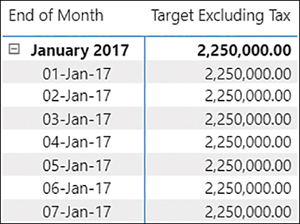
Figure 2-15 Targets by date
You can see that the same number is repeated at month level and date level, which can be confusing. To deal with this, you need to account for cases when targets are shown at unsupported levels of granularity.
There are a few ways of solving the problem. For example, you can make a measure return a result only when the unsupported grains are not filtered:
You can see the result in Figure 2-16.
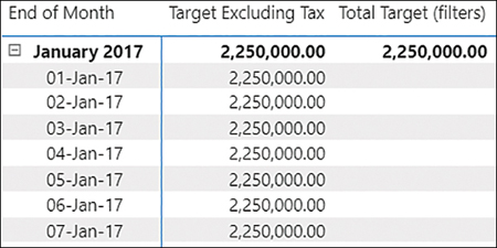
Figure 2-16 Total Target measure used in a table
Although this approach can work in many cases, it has a downside. If new columns are introduced and they aren’t at the supported level of granularity, then you’d need to modify your code. An alternative is to check the number of rows in the supported dimensions as follows:
You may still want to check whether unsupported tables are filtered, so you’re still using ISFILTERED for some tables. The result, shown in Figure 2-17, is the same as for the previous measure.

Figure 2-17 An alternative measure
Skill 2.2: Develop a data model
Data model development refers to enhancements you add to your model after you’ve loaded your data and created relationships between tables. In this section, we review the skills you need to create calculated tables, calculated columns, and hierarchies, and we show you how to configure row-level security for your report as well as set up the Q&A feature.
Apply cross-filter direction and security filtering
While editing table relationships, even if you set the relationship cross-filter direction to Both, by default the security filters are only applied in one direction. We mentioned earlier that there’s an option to control security filtering called Apply security filter in both directions. This means that role filtering applied to a table will also be passed to the filtered table. When this option is disabled, only the table with the filter applied will be affected. This option exists because applying security filters affects the performance of your data model, so in some cases applying it may be undesirable.
Create calculated tables
Earlier in the chapter, you saw that one way to create a calendar table is to create a calculated table, which is an alternative to using Power Query. Calculated tables are defined by using DAX, and they’re based on the data that is already loaded into the data model or on new data generated by using DAX. You won’t see calculated tables in Power Query Editor.
Calculated tables are especially useful when you are doing the following:
Cloning tables
Creating tables that are based on data from different data sources
Precalculating measures to improve report performance
This list is not exhaustive—there are other cases when you’ll find calculated tables useful.
Cloning tables
As you saw earlier when we discussed creating a calculated table, to clone a table you also need to reference it by its name by using DAX. If you want to create a table called Invoice Date that’s a clone of the Date table, follow these steps:
Go to the Data view.
Select New table on the Home ribbon.
Enter a calculated table expression. For example, this formula creates a table called Invoice Date by copying the Date table:
Invoice Date = 'Date'Press Enter.
Invoice Date = 'Date'
Creating tables that are based on data from different data sources
In the previous section, you created a bridge table by using Power Query. In that case, you took distinct values from one column of one table and used the bridge table to relate two fact tables.
Sometimes you want to extract distinct values from more than one table because the distinct values may be different in different tables. In this case, you must take distinct values from both tables, and if they come from different data sources or from different “islands,” or both, the performance may be slow. You can solve this issue by using a calculated table.
For example, you can retrieve the distinct Buying Group values from both the Customer and the Targets tables by using the following calculated table formula:
The outer DISTINCT ensures there are no duplicates, and UNION combines values from two tables that come from different sources. UNION acts similarly to appending tables in Power Query, though they combine tables differently:
UNION ignores column names and combines table columns based on their positions. The number of columns between tables must match.
Appending tables in Power Query combines tables based on column names, and it’s possible to combine tables that have a different number of columns.
In addition to UNION, other set functions available in DAX include EXCEPT and INTERSECT, which also require that tables have the same number of columns.
Since the data is already in memory, this process is usually much quicker compared to creating the same table using Power Query.
Precalculating measures to improve report performance
If you have complex measures that perform poorly, depending on the type of calculation you may want to precalculate them in a calculated table, and then create new measures that aggregate the precalculated values. This approach may not work for some types of calculations, though it usually helps with additive measures.
Aggregations, which we review later in the chapter, are an example of calculated tables that precalculate measures and improve performance.
Create hierarchies
Power BI allows you to group columns into hierarchies, which you can then use in visuals.
In the Wide World Importers example, you can create a hierarchy of employees:
Go to the Model view.
Right-click the Director column in the Employee table.
Select Create hierarchy.
Double-click the newly created hierarchy and rename it to Employee Hierarchy.
In the Fields pane, drag the Manager column on top of Employee Hierarchy.
Repeat the previous step for the Salesperson column.
Once the hierarchy is created, the result should look like Figure 2-18.
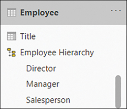
Figure 2-18 Employee Hierarchy
One column can be part of multiple hierarchies, and you can rename hierarchy items without affecting the original columns. At the same time, you do not need to sort a hierarchy element by another column, because it inherits this property from the original column. The original column can be hidden, if necessary.
A hierarchy can be created using existing columns only, and the columns must be in the same table. If you want to include columns from different tables in the same hierarchy, you’ll have to bring the columns into one table. For this, you can use Power Query or the RELATED function in DAX, for example.
Apart from the convenience of dragging multiple fields to a visual at once in the right order, a hierarchy does not provide any special benefits in Power BI compared to using columns individually, since you can use both hierarchies and multiple individual columns together in fields to achieve the same result.
Create calculated columns
Calculated columns are columns you create by using DAX. Similar to calculated tables, calculated columns can use only the data already loaded into the model or new data generated by DAX, and they don’t appear in Power Query Editor because they are generated after the data has been loaded into the model. By nature, creating calculated columns widens your table, and they are calculated after all your data is loaded, so multiple calculated columns can contribute to slow performance of your data model.
If you are experienced in Excel, creating calculated columns in DAX may remind you of creating columns in Excel, because DAX resembles the Excel formula language and there are many functions that appear in both DAX and Excel. There are some important differences, however:
In DAX, there is no concept of a cell. If you need to get a value from a table, you must filter a specific column down to that value.
DAX is strongly typed; it is not possible to mix values of different data types in the same column.
In our director, manager, and salesperson hierarchy example, you created calculated columns when you flattened out the parent-child hierarchy. In general, calculated columns are especially useful when you are:
Creating columns that are going to be used as filters or categories in visuals
Precalculating poorly performing measures
One way to create a calculated column is as follows:
Go to the Data view.
In the Fields pane, right-click a table where you want to create a calculated column.
Select New column.
Enter a calculated column expression by using DAX.
Press Enter.
Once you complete these steps, you’ll be able to see the results immediately. The formula that you write is automatically applied to each row in the new column. You can reference another column from the same table in the following way:
Though it’s possible to reference a column within the same table by using only the column name, it’s not considered a good practice and should be avoided.
For example, in Wide World Importers, you can calculate total cost in a calculated column in the Sale table by using the following expression:
If you want to reference a column from a related table that is on the one side of a relationship, you can use the RELATED function. For instance, in Wide World Importers, you can add a calculated column to the Sale table to calculate the price difference between the standard unit price and the price a product was sold for:
RELATED works on the many side of a relationship. If you want to add a column to the one side of a relationship and reference the related rows, you can use the RELATEDTABLE function. For instance, you can add a calculated column to the Customer table to count the number of related rows in the Sale table for each customer:
Implement row-level security roles
A common business requirement is to secure data so that different users who view the same report can see different subsets of data. In Power BI, this can be accomplished with the feature called row-level security (RLS).
Row-level security restricts data by filtering it at the row level depending on the rules defined for each user. To configure RLS, you first create and define each role in Power BI Desktop, and then assign individual users or Active Directory security groups to the roles in the Power BI service.
In this section, we discuss the skills necessary to implement row-level security roles in Power BI Desktop. We review assignment of roles in the Power BI service in Chapter 5, “Deploy and maintain deliverables.”
Creating roles in Power BI Desktop
To see the list of roles configured in a dataset in Power BI Desktop, select Manage roles from the Modeling ribbon in the Report view. To create a new role, select Create in the Roles section. You’ll then be prompted to specify table filters, as shown in Figure 2-19.

Figure 2-19 List of roles
When you create a role, you have the option to change the default name to a new one. It is important to give roles user-friendly names because you will see them in the Power BI service, and you should be able to assign users to the correct roles. All roles are listed in the Roles section of the Manage roles window.
If you right-click on a role or select the ellipsis next to a role, you’ll be presented with the following options:
Create This option creates a new role and is an alternative to the Create button below the list of roles.
Duplicate Use this option to create a copy of the currently selected role.
Rename Use this option to rename the currently selected role; you can also rename a role by double-clicking on its name.
Delete Use this option to delete the currently selected role; you can also perform this action by selecting Delete below the list of roles.
For each role, you can define a DAX expression to filter each table. When row-level security is configured, these expressions will be evaluated against each row of the relevant table, and only those rows for which the expressions are evaluated as true will be visible.
You can either enter a table filter DAX expression yourself or use the ellipsis menu next to each table to add an expression that you can then customize. The menu can also be accessed by right-clicking on a table. The menu offers three options:
Add filter This option lists all columns available in the table and allows you to hide all rows.
Copy table filter from This option copies a table filter DAX expression from another role that has a filter expression defined for the table.
Clear table filter This option removes any table filter DAX expression from the table. This is a shortcut to erasing all text from the Table filter DAX expression area manually.
For example, in the Wide World Importers data model, you can select the ellipsis next to City > Add filter > [Sales Territory]. Doing so inserts an expression, as shown in the Table filter DAX expression area:
The placeholder expression depends on the data type of the column, and it helps you to write the correct filter expression.
After you modify the expression, you can validate it by selecting the Verify DAX expression (check mark) button above the Table filter DAX expression area. If the expression is invalid, you will see a warning stating that the syntax is incorrect below the Table filter DAX expression area. Next to the check mark button is the Revert changes (cross) button, which reverts any changes that have not yet been applied.
If you want to hide all rows in a table, right-click the table and click Add filter > Hide all rows. This will add the following table filter DAX expression:
Because false is never going to be true for any row, no rows will be shown in this case.
You can configure row-level security in the Wide World Importers data model. First, create two roles as follows:
Create a new role and call it Southeast.
For the Southeast role, in the City table, enter the following table filter DAX expression:
Select the Verify DAX expression button above the Table filter DAX expression area.
Right-click the Southeast role and select Duplicate.
Rename the new role to Plains.
For the Plains role, update the table filter DAX expression in the City table as follows:
Select Save.
Next, let’s test the roles in Power BI Desktop.
Viewing as roles in Power BI Desktop
In Power BI Desktop, you can check what the users with specific roles will see even before you publish your report to the Power BI service and assign users to roles. To do so, once you have at least one role defined select View as on the Modeling ribbon in the Report view. You will then see the View as roles window shown in Figure 2-20.

Figure 2-20 View as roles
You can view as several roles simultaneously. This is because you can allocate a single user or a security group to multiple roles in the Power BI service; in this case, the security rules of the roles will complement each other. For example, if you select both the Plains and the Southeast roles, you’ll see data for both territories. For this reason, you should always have clear names for your RLS roles.
When viewing data as roles, you’ll see the bar at the top, as shown in Figure 2-21.

Figure 2-21 Now viewing report as
Another option in the View as roles window is Other user. With this option, you can test dynamic row-level security, which we cover next.
Dynamic row-level security
The roles you have created so far have been static, which means that all users within a role will see the same data. If you have several rules that specify how you should secure your data, this approach may mean you have to create many roles, as well as update the data model every time you introduce a new role or remove an old one.
There is an alternative approach, called dynamic row-level security, which allows you to show different data to different users within the same role.
For this approach, your data model must contain the usernames of people who should have access to the relevant rows of data. You will also need to pass the active username as a filter condition. Power BI has two functions that allow you to get the username of the current user:
USERNAME This function returns the domain and login of the user in the domainlogin format.
USERPRINCIPALNAME Depending on how the Active Directory was set up, this function usually returns the email address of the user.
To see how dynamic row-level security works in the Wide World Importers data model, create a new security role first:
Select Manage roles on the Modeling ribbon.
Create a new security role and call it Dynamic RLS.
For the Dynamic RLS role, specify the following table filter DAX expression for the Employee table:
Select Save.
Now you can test the new role:
Select View as on the Modeling ribbon.
Select both the Other user and Dynamic RLS check boxes.
Enter [email protected] in the Other user box.
Select OK.
Go to the Data view.
Select the Employee table.
Note that the Employee table is now filtered to just Jack Potter’s row, as shown in Figure 2-22.

Figure 2-22 Employee table viewed as Jack Potter
Although this approach may be good enough in certain cases, it’s a common requirement for managers to see the data of those who report to them. Since Jack is a Manager, he should be able to see data of the salespersons who report to him. For that, you should modify the table filter DAX expression of the Dynamic RLS role as follows:
This table filter DAX expression keeps those rows where Jack is part of the hierarchy path. You are leveraging the same calculated column you created earlier when you flattened the parent-child hierarchy of employees.
After you make this change, the Employee table will display four rows: Jack’s row and three rows of the salespersons who report to Jack, as seen in Figure 2-23.
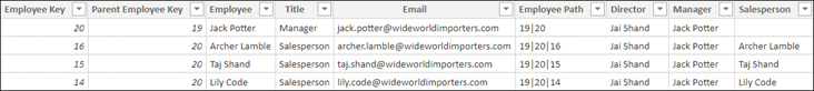
Figure 2-23 Employee table viewed as Jack Potter
So far, you’ve created the roles in Power BI Desktop. Once you publish the report, you’ll need to assign users or security groups to roles in Power BI service separately. We review these skills in Chapter 5.
Set up the Q&A feature
Both Power BI Desktop and the Power BI service allow you to create visualizations that provide answers to specific questions. This capability gives you great control over formatting, but it will not work if you have RLS set up and users only have read access to content.
Another way to explore data in Power BI is to use the Q&A feature, also known as natural language queries. This feature enables you to get answers to your questions by typing them in natural language. Even users with read-only access can query datasets in a natural language.
To start using Q&A in Power BI Desktop, you must be in the Report view. To insert the Q&A visual, double-click the empty space on the report canvas. Alternatively, you can select Q&A on the Insert ribbon. Either way, you’ll see a visual, as shown in Figure 2-24.
Although the suggestions may not be immediately useful, you can ask your own questions. For example, you can enter profit by sales territory as column chart, and the result will be as shown in Figure 2-25.
Note that the Q&A visual updates its result as you type. In Figure 2-25, before we typed “as column chart,” the Q&A visual was showing a bar chart.
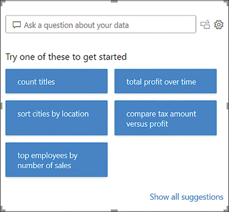
Figure 2-24 Q&A visual

Figure 2-25 Q&A showing profit by sales territory
If desired, you can turn the Q&A result into a standard visual by selecting the button between the question and the cog wheel in the upper-right corner of the Q&A visual.
The Q&A visual depends on the field names as they are defined in the data model. For example, entering revenue by sales territory in the Q&A visual won’t provide any meaningful results, as seen in Figure 2-26.
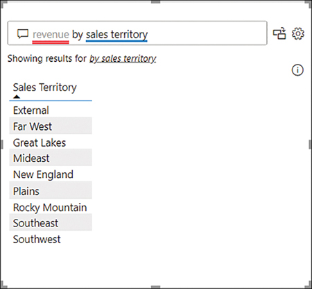
Figure 2-26 Q&A visual showing revenue by sales territory
This issue can be fixed by teaching Q&A, as outlined next.
Teach Q&A
The Q&A visual didn’t understand the term revenue because it doesn’t appear in the Wide World Importers data model. The Q&A visual underlines the terms it doesn’t understand with red. If you select revenue in the Q&A visual, you’ll be given suggestions to replace revenue with another term (such as profit in our example), or you can define the term. Selecting define revenue allows you to teach Q&A, as seen in Figure 2-27.

Figure 2-27 The Teach Q&A window
In the Define the terms Q&A didn’t understand section, you can teach Q&A that revenue refers to a certain field—for example, Total Including Tax:
Enter total including tax next to Revenue refers to.
Select Save.
Close the Q&A setup window.
The Q&A visual now understands the term revenue, as you can see in Figure 2-28.
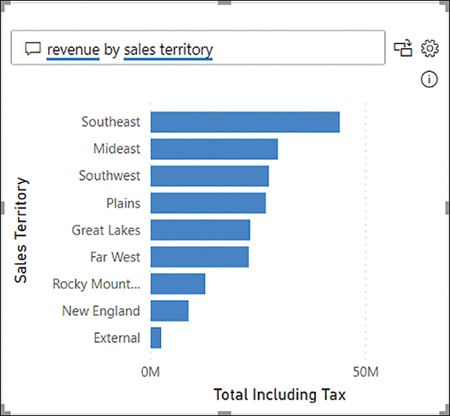
Figure 2-28 Q&A showing revenue by sales territory
Since teaching Q&A can be time-consuming, you can also add synonyms to your data model if you know them in advance, as covered next. Additionally, this is another example where naming columns in Power Query Editor with friendly names will make this process easier.
Synonyms
Separately from teaching Q&A, you can introduce your own Q&A keywords and make Power BI recognize them. This technique is especially useful if your business users use acronyms or unique terminology such as substituting units for quantity; in that case, you can create a synonym for the Quantity field that will reduce confusion for your report users.
In the Report view, select Q&A setup on the Modeling ribbon.
Select Field synonyms on the left.
Expand the Sale section. You should see a list of fields in the Sale table, as shown in Figure 2-29.

Figure 2-29 Field synonyms for the Sale table
Next to Quantity, select Add.
Enter units and press the Enter key. Note that Power BI automatically changed units to unit because it stores singular words and treats them the same as plural for Q&A purposes.
Close the Q&A setup window.
If you now enter units by color in the Q&A visual, you’ll see a bar chart showing Quantity by Color, despite not using the term quantity explicitly.
Additionally, in the Field synonyms section of Q&A setup, you can exclude specific tables and fields from Q&A if you don’t want Q&A to use the table or field. Hidden objects are excluded by default. This behavior is useful if you need to include staff data in your data model but don’t want users to query this data.
Skill 2.3: Create measures by using DAX
You used some DAX earlier in the chapter to create quick measures, calculated tables, and calculated columns, as well as to configure row-level security. In practice, DAX is most often used to create measures in Power BI.
Writing your own formulas is an important skill that allows you to perform much more sophisticated analysis based on your data compared to not using DAX.
In this section, we start by reviewing DAX fundamentals; then we look at CALCULATE, one of the most important functions in DAX, specifically in Time Intelligence or time-related calculations, which we review separately.
DAX can help you replace some columns with measures, allowing you to reduce the data model size. Not all DAX formulas have to be complex, and we review some basic statistical functions in this section as well.
Use DAX to build complex measures
Many things can be computed by using calculated columns, but in most cases it’s preferable to write measures, because they don’t increase the model size. Additionally, some calculations are simply not possible with calculated columns. For example, to calculate a ratio dynamically, you’d need to write a measure.
As you saw earlier, quick measures already allow you to perform basic calculations without writing DAX. In this section, you start using DAX to build complex measures.
It is important to understand that Power BI allows you to aggregate columns in visuals without using measures; this practice is sometimes called implicit measures. Implicit measures can be useful when you want to quickly test how a visual might look or perform a quick analysis on a column. However, it’s always best practice to create explicit measures by using DAX—even in case of trivial calculations such as SUM. Here are some of the reasons why it’s preferable to create measures yourself:
Implicit measures may provide unexpected results in some cases due to the Summarize by column property. For example, if you have a column that contains product prices and Power BI sets the summarization to Sum, then dragging the column in a visual will not produce meaningful results. Though you can change the summarization in the visual, following this approach means that you need to pay attention to this property every time you use implicit measures.
Explicit measures can be reused in other measures. This is beneficial because you can write less code, which saves time and improves the maintainability of your data model.
If you connect to your Power BI dataset from Excel, you cannot use implicit measures.
Implicit measures cannot leverage inactive relationships.
Implicit measures are not supported by calculation groups.
Measures are different from calculated columns in a few ways. The main difference is that you can see the results of a calculated column immediately after defining the calculation, whereas the results of a measure aren’t shown until you use it in a visual. This behavior allows measures to return different results depending on filters and where they’re used.
Another difference between calculated columns and measures is that calculated column formulas apply to each row of a table, whereas measures work on columns and tables, not specific rows. Therefore, measures most often use aggregation functions in DAX.
There are a few ways to create a measure in Power BI Desktop. One way is as follows:
Go to the Report view.
In the Fields pane, right-click a table in which you want to create a new measure.
Select New measure.
Enter the measure formula and press Enter.
You can also create a measure by selecting New measure on the Home ribbon, but make sure you have the right table selected in the Fields pane; otherwise, your measure may not be created in the correct table. If you created a measure in the wrong table, instead of re-creating the measure, you can move it by performing these steps:
Go to the Report view.
In the Fields pane, select the measure you want to move.
On the Measure tools ribbon, select the table your measure should be stored in from the Home table drop-down list.
For example, to compute the total profit of Wide World Importers, use the following measure formula:
You can compute total sales excluding tax by using the following measure formula:
If you want to compute the profit margin percentage, there are two ways of doing it. One is as follows:
However, this involves repeating your own code, which is undesirable because formulas become more difficult to maintain. You can avoid this by referencing the measures you created previously:
When you’re referencing measures, it’s best practice to not use table names in front of them. Unlike column names, measure names are unique; different tables may have the same column names, but it’s not possible to have measures that share the same name.
Another feature of DAX that allows you to avoid repeating yourself is variables. Think of a variable as a calculation within a measure. For instance, if you want to avoid showing zeros in your visuals, you can write a measure as follows:
By using a variable, you can avoid calling SUM twice:
Variables are especially useful when you want to store computationally expensive values, because variables are evaluated no more than once. As you’ll see later in this chapter, we can use many variables within the same formula.
Use CALCULATE to manipulate filters
Earlier in this chapter, you saw that the CALCULATE function can be used to alter relationships when paired with other DAX measures; the USERELATIONSHIP function with CALCULATE can activate inactive relationships, and CROSSFILTER with CALCULATE can change the filter direction.
The CALCULATE function also allows you to alter the filter context under which measures are evaluated: you can add, remove, or update filters, or you can trigger context transition. We cover row context, filter context, and context transition in more detail later in this chapter.
CALCULATE accepts a scalar expression as its first parameter, and subsequent parameters are filter arguments. Using CALCULATE with no filter arguments is only useful for context transition.
Adding filters
CALCULATE allows you to add filters in several formats. To calculate profit for the New England sales territory, you can write a measure that you can read as “Calculate the Total Profit where the Sales Territory is New England”:
Importantly, you’re not limited to using one value per filter. You can calculate profit for New England, Far West, and Plains:
You can specify filters for different columns at once, too, which you combine by using the AND DAX function. For example, you can calculate profit in New England in 2020 like so:
Translated into plain English, this measure formula can be read as “Calculate Total Profit where the Sales Territory is New England and the Year is 2020.”
Removing filters
There are several DAX functions that you can use as CALCULATE modifiers to ignore filters, one of which is ALL. ALL can remove filters from:
One or more columns from the same table
An entire table
The whole data model (when ALL is used with no parameters)
For example, you can show profit for all sales territories regardless of any filters on the City[Sales Territory] column:
If you create a table that shows the new measure alongside Total Profit by Sales Territory, you’ll get the result shown in Figure 2-30.
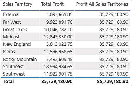
Figure 2-30 Total Profit and Profit All Sales Territories by Sales Territory
Note that the new measure displays the same value for any sales territory, which is the total of all sales territories combined regardless of sales territory.
Updating filters
When you specify a filter such as City[Sales Territory] = "New England", it’s an abbreviated way that corresponds to the following filter:
By adding this filter, you are both ignoring a filter by using ALL, and you’re adding a filter at the same time. This technique allows you to filter for New England regardless of the selected sales territory.
If you create a table that shows Total Profit and New England Profit by Sales Territory, the result should look like Figure 2-31.

Figure 2-31 Total Profit and New England Profit by Sales Territory
When you have Sales Territory on rows, each row from the Total Profit column is filtered for a single sales territory and the Total row shows values for all sales territories. In contrast, by using the measure above in the New England Profit column, you are filtering regardless of the current sales territory, showing only the New England Profit.
Context transition
Another important function of CALCULATE is context transition, which refers to transitioning from row context to filter context.
In DAX, there are two evaluation contexts:
Row context This context can be understood as “the current row.” Row context is present in calculated columns and iterators. Iterators are functions that take a table and go row by row, evaluating an expression for each row. For example, FILTER is an iterator; it takes a table, and for each row, it evaluates a filter condition. Those rows that satisfy the condition are included in the result of FILTER.
Filter context This context can be understood as “all applied filters.” Filters can come from slicers, from the Filter pane, or by selecting a visual element. Filters can also be applied programmatically by using DAX.
To review context transition, let’s create a sample table in the data model:
On the Home ribbon, select Enter data.
Enter Sample in the Name box.
Enter the data shown in Figure 2-32.
Select Load.

Figure 2-32 Entering data
Now that you have the table, you can add two calculated columns to it to see the effect of context transition:
Go to the Data view.
Select the Sample table in the Fields pane.
Create a calculated column with the following formula:
Create another calculated column with the following formula:
The result should look like Figure 2-33.

Figure 2-33 Calculated columns in the Sample table
SUM, as an aggregation function, uses filter context. Because there are no filters in the data model—there are no visuals, and you’re not adding any filters by using DAX—SUM aggregates the Whole Number column, so the result in the Sum Number column is 6 regardless of the row.
On the other hand, the Calculate Sum Number column uses the same formula as Sum Number but has been wrapped in CALCULATE. CALCULATE automatically performs context transition, so the result is different than using the SUM function alone. Context transition takes all values from all other columns and uses them as filters. Therefore, for the first row, you aggregate the Number column, where
Sample[Letter] is A
Sample[Number] is 1
Sample[Sum Number] is 6
Where the sum of 1 is equal to 1, since there’s only one such row that meets these filters, you get 1. Separately for row 2, the sum of 2 equals 2, and for row 3, the sum of 3 equals 3. You can make context transition even clearer by modifying the Sample table slightly:
On the Home ribbon, select Transform Data.
Select the Sample query.
Select the cog wheel in the Source step.
Change the third row to be the same as the second row, as shown in Figure 2-34.

Figure 2-34 Modified Sample table
Select OK.
On the Home ribbon of Power Query Editor, select Close & Apply.
If you now look at the Sample table in the Data view, the result will look like Figure 2-35.
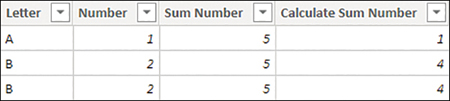
Figure 2-35 Sample table after update
Although the first row is calculated as you saw in the previous example, the second and third row are now both showing 4. Intuitively, you could expect to see 2 and 2 in each row, though you’re getting 4 and 4. This is because for each row, due to context transition triggered by CALCULATE, you’re summing the Number column, where
Sample[Letter] is B
Sample[Number] is 2
Sample[Sum Number] is 5
Because there are two such rows, you get 2 + 2 = 4 in both rows.
Implement Time Intelligence using DAX
It is common for business users to want to aggregate metrics—for example, revenue—across time, such as year-to-date revenue for a certain date, or prior-year revenue for the comparable period. Fortunately, DAX has a family of functions that facilitate such calculations, referred to as Time Intelligence.
All Time Intelligence functions require a calendar table that has a date type column with unique values. If the date column is not part of a relationship, the calendar table must be marked as a date table, which can be done as follows:
Go to the Report or Data view.
Select the calendar table in the Fields pane.
On the Table tools ribbon, select Mark as date table > Mark as date table.
Select the date column from the Date column drop-down list.
Select OK.
Most Time Intelligence functions return tables that can be used as filters in CALCULATE. For example, the DATESYTD function can be used to calculate a year-to-date amount as follows:
You can also combine Time Intelligence functions. For example, to calculate year-to-date profit for the previous year, use the following formula:
Some Time Intelligence functions, such as DATESYTD, can accommodate fiscal years. For example, if you had a fiscal year ending on June 30, you could calculate profit year-to-date for the fiscal year as follows:
The Total Profit, Profit YTD, Profit PYTD, and Profit FYTD measures can be seen together in Figure 2-36.

Figure 2-36 Time Intelligence calculations
Notice how the Profit YTD measure shows the cumulative total profit within each year. The Profit PYTD measure shows the same values as Profit YTD one year before. Profit FYTD shows the cumulative total profit for fiscal years, resetting on July 1 of each year.
Replace numeric columns with measures
It is sometimes possible to replace some numeric columns with measures, which can reduce the size of the data model. In the Wide World Importers example, several columns can be replaced with measures.
For example, the Total Chiller Items and Total Dry Items columns in the Sale table show quantity of chiller and dry items, respectively. Essentially, these columns show filtered quantities depending on whether an item is a chiller or a dry item.
Before you replace the two columns with measures, create the following measure, which you’ll reference and build upon later:
You can now create the following two measures and use them instead of columns:
If you remove the Total Chiller Items and Total Dry Items columns from the model, you’ll make it smaller and more efficient.
Another example of a column that can be replaced by a measure is Total Including Tax from the Sale table. Since Total Excluding Tax and Tax Amount added together equals Total Including Tax, you can use the following measure instead:
Again, once you have the measure, removing the Total Including Tax column reduces the size of the data model.
Use basic statistical functions to enhance data
As mentioned previously, it’s best practice to create explicit measures even for basic calculations such as SUM, because you can build on these to create more complex measures. Here are several basic statistical measures that are frequently used:
SUM
AVERAGE
MEDIAN
COUNT
DISTINCTCOUNT
MIN
MAX
As you’ll recall, we have frequently used SUM in our previous examples. All these functions take a column as a reference and produce a scalar value. In addition to this, every function except for DISTINCTCOUNT has an equivalent iterator function with the X suffix—for instance, SUMX is the iterator counterpart of SUM. Iterators take two parameters: a table to iterate through and an expression to evaluate for each row. The evaluated results are then aggregated according to the base function; for example, SUMX will sum up the results. When you’re learning the difference, it can be helpful to create sample tables similar to the examples shown in this book to visually compare the nuances of the different functions.
Create semi-additive measures
In general, there are three kinds of measures:
Additive These measures are aggregated by using the SUM function across any dimensions. A typical example is revenue, which can be added across different product categories, cities, and dates, as well as other dimensions. Revenue of all months within a year, when added together, equals the total year revenue.
Semi-additive These measures can be added across some but not all dimensions. For example, inventory counts can be added across different product categories and cities, but not dates; if you had five units yesterday and two units today, that doesn’t mean you’ll have seven units tomorrow. On the other hand, if you have five units in Sydney and two units in Melbourne, this means you’ve got seven units in the two cities in total.
Non-additive These measures cannot be added across any dimensions. For instance, you cannot add up the average price across any dimension, because the result would not make any practical sense. If the average sale price in Sydney was $4.50 and it was $3.50 in Melbourne, you cannot say that across both cities, the average price was $8.00 or even $4.00 because the number of units sold could be very different.
In this section, we’re focusing on semi-additive measures. There are several ways to write a semi-additive measure, and the correct way to do so depends on business requirements. Let’s say your business is interested in inventory counts, and you have the data model shown in Figure 2-37.
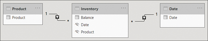
Figure 2-37 Inventory data model
If you have inventory figures for all dates of interest in your data, you can write the following measure:
In addition to LASTDATE and its sister function FIRSTDATE, there are some DAX functions that can help you retrieve the opening or closing balance for different time periods:
OPENINGBALANCEMONTH
OPENINGBALANCEQUARTER
OPENINGBALANCEYEAR
CLOSINGBALANCEMONTH
CLOSINGBALANCEQUARTER
CLOSINGBALANCEYEAR
The functions that start with CLOSING evaluate an expression for the last date in the period, and the functions that start with OPENING evaluate an expression for one day before the first date in the period. This means that the opening balance for February 1 is the same as closing balance for January 31.
For example, you can calculate the opening month balance for inventory as follows:
The date-based functions listed here work only if you have data for all dates of interest. If you’d chosen to use CLOSINGBALANCEMONTH but your data ends on May 23, 2020, as is the case for sample data, you’ll get a blank value for May 2020. For cases such as this, you can use LASTNONBLANKVALUE or FIRSTNONBLANKVALUE, as shown next:
This measure will show the latest available balance in the current context.
The Inventory Balance, Inventory Opening Balance Month, and Inventory Last Nonblank measures can be seen in Figure 2-38.

Figure 2-38 Inventory measures
Determining which calculation should be used strongly depends on the business requirements since there is no single correct answer that applies to all scenarios. Missing data may mean there’s no inventory, or it may mean that data isn’t captured frequently enough. The data modeler should understand the underlying data before writing the calculations to ensure that the data isn’t represented incorrectly.
Skill 2.4: Optimize model performance
Sometimes after you create the first version of your data model, you may realize that it doesn’t perform well enough. Because of the way Power BI stores data, it may mean that your data model isn’t performing as efficiently as it can. In this section, we review the skills necessary to optimize a model’s performance and show you how to identify measures, visuals, and relationships that are slow. Finally, we review aggregations in Power BI, which can dramatically speed up data models that use DirectQuery.
When working with imported data in Power BI, keep in mind that it’s a columnstore database, which means that the number of distinct values in a column—also known as cardinality—usually plays a more important role than the number of rows. Therefore, one way to address poor performance is to reduce cardinality levels, which you can do by changing data types or summarizing data.
Remove unnecessary rows and columns
In Power BI, it’s preferable to load only data that is needed for reporting and add more data later as required. In practice, you should disable loading of queries that aren’t required for reporting and filter the data to only the required rows and columns before loading into the model.
Removing unnecessary rows
Reducing the number of rows requires some filtering criteria, which can be based on attributes or dates. For example, instead of loading all Wide World Importers data, you could load data only for a specific sales territory if you’re only interested in analyzing that sales territory. You can use parameters when filtering to make the process more manageable; this approach will also make it possible to change filters once the dataset is published to Power BI service.
You can also filter by dates and load only some recent data in case you’re not interested in historical data. In addition to parameters, you can apply relative date filters, such as “is in the previous 2 years.”
Filtering rows after you create reports won’t break any visuals in the existing reports.
Removing unnecessary columns
Columns in a data model usually serve at least one of two purposes: they can be used to support visuals or calculations, or both. It’s preferable to not load columns that aren’t used for any purpose, especially if they have a high number of distinct values.
Some data warehouses include primary keys for fact tables. Although doing so may be useful for data audit purposes, you should remove primary keys from Power BI data models because they have a unique value for every row, and fact tables can be long. Primary keys of fact tables can occupy over 50 percent of data model size without bringing any benefit. In the Wide World Importers example, removing the Sale Key column from the Sale table reduces the file size by 43 percent.
If you need to count the number of rows in a fact table, using COUNTROWS rather than DISTINCTCOUNT of the primary key column is more efficient.
Removing columns that are used in visuals or calculations is going to break existing reports or even the dataset. You can use the Remove Other Columns functionality in Power Query Editor to have a step to refer to if you need to add a column to your model later. This step will also prevent columns added to the dataset being automatically brought into your model, such as a new column added to a SQL table by a database administrator.
Identify poorly performing measures, relationships, and visuals
Sometimes you may notice that the report performance is not optimal. Power BI Desktop has a feature called Performance Analyzer, which you can use to trace the slow-performing visuals and see the DAX queries behind them.
To turn on Performance Analyzer, go to the Report view and select View > Performance analyzer. This opens the Performance Analyzer pane shown in Figure 2-39.
Performance Analyzer works by recording traces, and it then shows you how long each visual took to render. To start recording traces, select Start recording. After that, you need to perform some actions, such as applying filters, that will recalculate the visuals, or you can select Refresh visuals to refresh the visuals as they are. You’ll then see the rendering duration for each visual.
To identify the slowest visuals, you can sort visuals in the Performance Analyzer pane by selecting the arrow next to Duration (ms).
Each visual that contains data has a DAX query behind it, which you can copy by expanding the line of the visual in the Performance Analyzer pane and selecting Copy query. You can analyze the query further in DAX Studio, for example. It’s also possible to export all traces by selecting Export.
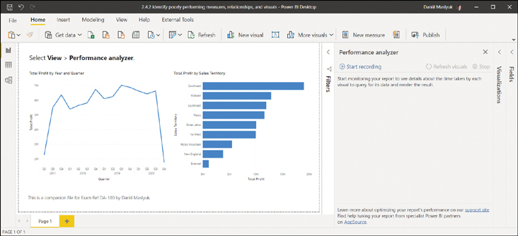
Figure 2-39 Performance Analyzer
To clear the Performance Analyzer pane, select Clear. Once you’ve finished recording traces, select Stop.
Improve cardinality levels by changing data types
Power BI employs several compression mechanisms to reduce the size of data, the details of which are outside the scope of this book. However, one way to decrease the data size is by reducing the cardinality of columns, which can be achieved by changing data types.
In Power BI, two data types can be used for decimal numbers:
Decimal number Can store more than four decimal places
Fixed decimal number Can store up to four decimal places only
If your data contains more than four decimal places for some values and you don’t need that level of precision, you should change the data type to Fixed Decimal Number to save space.
Another way to change the cardinality levels is to split decimal number columns into pairs of whole numbers and decimal numbers, which should be done as close to the data source as possible. Whole numbers can be of any range, whereas decimal numbers should be between 0 and 1. These two columns can then be aggregated by using SUMX in the following fashion:
Although you’ll get two columns instead of one, in many cases you’ll see improvements in cardinality levels and, as a result, a decrease in the data model size. For the same reasons, in Power BI it’s best practice to split Date/Time columns with Time components into two: Date and Time. This is because you are increasing the number of duplicates in each column, and therefore the column is more efficiently stored in memory.
Some text columns, such as invoice numbers that are stored as text, can also sometimes be reduced in size. For example, if your fact table contains a column for invoice numbers, which always have the INV prefix and eight numbers that follow it, such as INV01234567, you can remove the INV prefix and change the data type of numbers from Text to Whole Number. If the prefix is inconsistent, you can split it and move it to a different column. This is because storing whole numbers is usually more efficient than storing text.
Improve cardinality levels through summarization
If your source data provides the level of detail that’s not required by reporting, then you may want to consider summarizing your data to reduce cardinality. For example, if the source data contains daily sales information but you only report monthly values, you may want to summarize your sales data to be at the month level instead of the day level. This approach will reduce the size of your model dramatically, though it will make the reporting of daily data impossible.
It’s preferable to summarize your data as close to the data source as possible. Power Query also allows you to summarize data by using the Group by functionality on the Transform ribbon.
Data summarization involves a trade-off between data model size and the available level of detail; whether you should summarize data depends on business requirements. When working in DirectQuery mode, you can also use aggregations, covered in the next section.
Create and manage aggregations
By using composite models, you can optimize the performance of data sources that use the DirectQuery mode by using aggregations. For instance, if you’re using DirectQuery with a fact table containing data for each customer and you report on values for all customers combined, you can create an aggregation at the total customers level. For cases when you need to report data on individual customers, you can still use the original table, and Power BI will automatically determine whether it should use the aggregation or the original table.
An aggregation table can be a table created in a variety of ways:
Imported M query
Calculated table in DAX
Another table in DirectQuery mode
Once you have a suitable table, you can turn it into an aggregation table, as described next. The aggregation table should contain at least some of the same keys and columns you want to aggregate, and it does not have to come from the same source as the detail table.
For example, let’s say you’re using the Sale table in DirectQuery mode, and you have an aggregation table called SaleAllCustomers, which is the same as Sale, except it doesn’t have detailed information on each customer. Managing aggregations involves the following steps:
Right-click the Sale table in the Fields pane.
Select Manage aggregations.
In the Aggregation table drop-down list, select SaleAllCustomers. You’ll see the options presented in Figure 2-40.
For each column, you can select the appropriate summarization and the corresponding detail table and column, if relevant:
Count This can only be used for count, not for distinct count.
GroupBy This is used for relationship keys.
Max This corresponds to the maximum value.
Min This corresponds to the minimum value.
Sum This corresponds to sum.
Count table rows This counts rows in a table.
After you make your selections, select Apply all, and Power BI will hide the aggregation table.
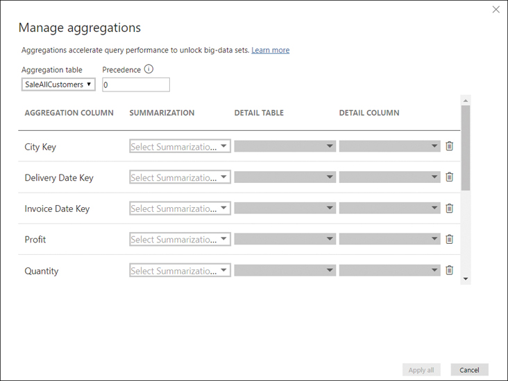
Figure 2-40 Manage aggregations
Queries that can be resolved by using the aggregation table will use the aggregation table. In case the aggregation is insufficient—as in our example that involved reporting values for individual customers—the detail table will be used automatically.
Chapter summary
Power BI supports various types of schemas: flat (fully denormalized), star, and snowflake. The preferred schema for Power BI is the star schema.
You can configure various column and table properties in the Model view.
Power BI has a feature called quick measures, which allows you to define calculations without writing any DAX code.
Power BI requires that self-referencing hierarchies (parent-child) are flattened before they can be used in visuals. You can use parent-child functions in DAX to flatten parent-child hierarchies, such as PATH and PATHITEM.
In some cases, it may be preferable to define role-playing dimensions, which allow you to use a single dimension to filter one fact table by using different keys in the table.
Power BI supports the following three cardinality types for relationships: one-to-one, one-to-many, and many-to-many. For one-to-one relationships, the cross-filter direction is always Both (each table filters the other). One-to-many dimensions can have their cross-filter direction set to either Single (the one side filters the many side) or Both. The cross-filter direction of many-to-many relationships is chosen by the data modeler depending on business requirements. Relationships whose cross-filter direction is set to Both are also known as bidirectional relationships.
For bidirectional relationships, security filters won’t flow in both directions automatically, though you can configure that in the relationship properties.
For best performance, the data model should look carefully at the storage mode of each table, cardinality and cross-filter direction of relationships, and cardinality of columns (number of distinct values). Aggregations can be helpful to improve the performance when using the DirectQuery mode.
Power BI supports both direct many-to-many relationships and many-to-many relationships via a bridge table.
You can create a common date table in Power BI by using Power Query or DAX, or you can load your table from a data source.
When measures don’t support a certain level of granularity, you should make them return blank so that you don’t confuse your users.
In addition to using measures, you can use DAX to create calculated tables and calculated columns in Power BI.
Power BI supports the creation of hierarchies, which can be useful to make models more user-friendly, though they have no technical advantages over several fields being used together in a visual without being combined in a hierarchy.
You can secure your data model by using row-level security, which can use static DAX filters on one or more tables, or dynamic row-level security that considers which user is viewing the report.
Power BI allows you to use natural language queries by using the Q&A visual. You can add synonyms to your data model to make Q&A work better.
CALCULATE is one of the most important functions in DAX, and it can be used to manipulate filters. More specifically, you can add, ignore, and update filters. CALCULATE is also used for context transition.
The Time Intelligence family of DAX functions allows you to aggregate values across time; for instance, you can use DATESYTD to calculate year-to-date values, or you can use DATEADD to calculate a value during the same period last year. There are also functions, such as OPENINGBALANCEMONTH, that allow you to create semi-additive measures.
In some cases, it may be preferable to replace numeric columns with measures to reduce the size of the data model.
In general, you should load only data that is necessary for analysis by removing columns or filtering rows in Power Query, especially for primary keys of fact tables.
Performance Analyzer in Power BI can help you identify performance bottlenecks.
You can improve the cardinality of columns by selecting appropriate data types as well as summarizing data.
Thought experiment
In this thought experiment, demonstrate your skills and knowledge of the topics covered in this chapter. You can find the answers in the section that follows.
You are a data analyst at Contoso responsible for creating Power BI reports. Management has requested a report based on the historical data available. Based on background information and business requirements, answer the following questions:
1. A data model has a fact table that has over 15 million rows. There is a date/time column called DateTime, which contains both date and time. You need to reduce the size of the data model. Your solution must preserve as much of the original data as possible. Which solution should you implement?
A. Change the data type of the DateTime column to Text.
B. Clean the DateTime column.
C. Split the DateTime column into two separate columns: one column that contains dates, and one column that contains the time portion.
D. Change the data type of the DateTime column to date.
2. You create a visual that is supposed to show revenue by year. You use the Year column from the Calendar table and the Revenue measure from the Sale table. The formula of the Revenue measure is as follows:
The result is shown in Figure 2-41. After checking data, you can see that in 2019, revenue was $50 million. How can you fix the visual? The solution must use minimum amount of DAX and ensure that the Calendar table can be used with other fact tables. The solution must also take into account that you may be interested in analyzing other measures based on the Sale table.
Figure 2-41 Revenue by Year
A. Use the TREATAS function in DAX.
B. Create a relationship between the Calendar and the Sale tables.
C. Merge the Sale and Calendar tables.
D. Create a calculated table that calculates revenue for each year.
3. There are two roles in a data model: CentralRegion, which filters the Region table to only show the Central region, and AppliancesDepartment, which filters the Department table to only show the Appliances department. A user is a member of both roles. What will they see in a sales report?
A. Sales from the Central region or the Appliances department: They will see all departments in the Central region and all regions in the Appliances department.
B. Sales from the Central region and the Appliances department: They will only see the Appliances department within the Central region.
C. Only one role will be applied, whichever was configured first.
D. The user will see an error message.
4. Your Date table currently consists only of one column called Date, which contains dates. You need to add a column to the Date table that shows month and year in the MMMM YYYY format, such as May 2021. What should you do? Your solution must require the minimum amount of effort and storage, and the solution must ensure that the values are sorted chronologically.
A. Create a calculated column that uses the FORMAT function.
B. Create a calculated column that uses the EOMONTH function format as MMMM YYYY.
C. Duplicate the Date column and apply a custom format string.
D. Create a new calculated table called “Date – MMMM YYYY” and format as MMMM YYYY.
5. You need to write a measure that calculates the monthly balance. Which formula should you use?
A. CALCULATE(SUM(Inventory[Balance]), ENDOFMONTH('Date'[Date]))
B. CALCULATE(SUM(Inventory[Balance]), MAX(Inventory[Date]))
C. CALCULATE(SUM(Inventory[Balance]), DATESMTD(Inventory[Date]))
D. CALCULATE(MAX(Inventory[Balance]), LASTDATE(Inventory[Date]))
6. You connect to a table in a database that has 900 million rows and that contains sales data for each line item. Importing all data resulted in a 15 GB PBIX file, and your company can only publish files that are up to 10 GB, so you opted for DirectQuery. Among the available dimensions are Date, Region, and Product. Most of the time, users view sales by Date and Region, though they still view data by Product in some cases. Users complain about report performance when they view summarized reports by Date and Region. What should you do? Your solution must minimize the amount of changes to the data model and ensure that users can still view sales data by product.
A. Use DirectQuery and connect to an aggregated view in the database.
B. Create an aggregation table.
C. Set the Storage mode of the Sales table to Dual.
D. Use the Group by functionality in Power Query to group the sales data by Date and Region.
7. You inherit a Power BI data model that contains several tables, one of which has many calculated columns that all use the RELATED function. You would like to reduce the size of the model. What should you do?
A. Append tables.
B. Merge tables.
C. Separate tables into several data models.
D. Hide unused columns.
8. You created a sales report and enabled row-level security on it. There are multiple roles, each filtering the dataset to one department. Each role has a corresponding Active Directory group. The report is primarily used by sales managers, each of whom can view their department only. One sales manager has recently moved from one department to another. What should you do?
A. Update role membership in Power BI service.
B. Change roles in Power BI Desktop.
C. Raise a request to remove the user from their old Active Directory group and add them to the new one.
Thought experiment answers
1. The answer is C. Splitting a date/time column into a date and a time column will keep the original data and reduce the number of distinct values in columns, resulting in a smaller data model. Changing the data type to Text, as option A suggests, won’t change the number of distinct values and therefore won’t reduce the size of the file. Option B, cleaning a column, removes nonprintable characters, which does not reduce the number of distinct values when applied to a column of type Date/Time. If you change the data type of the DateTime column to Date in accordance to option D, you’ll see a reduction in the size of the model, and you’ll lose the time portion, which goes against the requirements.
2. The answer is B. Creating a physical relationship is the best solution because it requires no DAX, it allows the Calendar table to be used with tables other than Sale, and you can use other measures from the Sale table together with fields from the Calendar table. Although using the TREATAS function that option A suggests may work, it requires using unnecessarily complex DAX, especially considering that you may be interested in analyzing measures other than Revenue. The merged table from option C will prevent the Calendar table from being used with other tables or it will duplicate data from the Calendar table unnecessarily. Option D would fix the graph, but it won’t solve the problem when other measures are analyzed by year.
3. The answer is A. Power BI supports multiple roles for a single user, and they are combined by using the union logic, so the user will see all departments within the Central region and all regions within the Appliances department.
4. The answer is B. If you use the EOMONTH function, you’ll get a calculated column that contains the end-of-month dates, and you can then apply a custom format string to show the values in the desirable format. Since the values will still be of type Date, they will be automatically sorted in the correct order. If you use the FORMAT function, you’ll get the values in the format that you want, though they will be text values that require a sorting column—otherwise, the values will be sorted alphabetically. A sorting column will use extra storage. If you apply a custom format string to a duplicated Date column, the values will look as desired, though underneath they will still be dates, so there will be more than one value for each month-year combination. By creating a new calculated table as in option D, you are increasing the data model size and introducing unnecessary complexity.
5. The answer is A. SUM will correctly aggregate inventory balances for all dimensions except Date, since ENDOFMONTH will pick the last date of month to show the monthly balance. In option B, MAX is used as a filter in CALCULATE, and it won’t work because it returns a scalar value instead of a table. Option C will provide incorrect values in cases where you have daily or weekly inventory balances. Option D won’t aggregate the balances correctly—it will pick the maximum balance across the available values.
6. The answer is B. Creating an aggregation table will require minimum changes to the data model, since Power BI will decide automatically whether to use an aggregated table or retrieve data by using DirectQuery. If you use DirectQuery to connect to an aggregated view that option A suggests, you’ll have to introduce new measures or change the existing ones to use the correct table. Setting the Storage mode to Dual, as in option C, will import data and result in a file that is too big to be published. Grouping data according to option D will prevent users from browsing sales data by product.
7. The answer is B. Using the RELATED function in a calculated column often means duplicating data. If columns need to be in the same table—for example, to build a hierarchy—then it may be preferable to merge tables into one. Appending tables, as in option A, would stack them vertically and wouldn’t provide the desired output. Separating tables in several data models, as option C suggests, will reduce the size of the model, though it won’t allow us to have the same data. Hiding unused columns as suggested in option D doesn’t reduce the size of the model.
8. The answer is C. Since the security is managed by Active Directory groups, the user should be removed from their old department security group and added to their new department security group. If you add them to a new role in the Power BI service without affecting their group membership, as in option A, they’ll see sales of both old and new departments. Changing roles in Power BI Desktop in option B won’t help because role membership is managed outside of Power BI Desktop.