
3
Plotting Basics
Data visualization is as much a part of the data processing step as the data presentation step. It is much easier to compare plotted values than to compare numerical values. By visualizing data we can get a better intuitive sense of the data than would be possible by looking at tables of values alone. Additionally, visualizations can bring to light hidden patterns in data, that you, the analyst, can use for model selection.
Learning Objectives
The concept map for this chapter can be found in Figure A.3.
Explain why visualizing data is important
Create various statistical plots for exploratory data analysis
Use plotting functions from the
matplotlib,seaborn, andpandaslibrariesIdentify when to use univariate, bivariate, and multivariate plots
Use different color palettes to make plots more accessible
3.1 Why Visualize Data?
The quintessential example for creating visualizations of data is Anscombe’s quartet. This data set was created by English statistician Frank Anscombe to show the importance of statistical graphs.
The Anscombe data set contains four sets of data, each of which contains two continuous variables. Each set has the same mean, variance, correlation, and regression line. However, only when the data are visualized does it become obvious that each set does not follow the same pattern. This goes to show the benefits of visualizations and the pitfalls of looking at only summary statistics.
# the anscombe data set can be found in the seaborn library
import seaborn as sns
anscombe = sns.load_data set("anscombe")
print(anscombe)
 data set      x      y
0       I   10.0   8.04
1       I    8.0   6.95
2       I   13.0   7.58
3       I    9.0   8.81
4       I   11.0   8.33
..    ...    ...    ...
39     IV    8.0   5.25
40     IV   19.0  12.50
41     IV    8.0   5.56
42     IV    8.0   7.91
43     IV    8.0   6.89

[44 rows x 3 columns]
3.2 Matplotlib Basics
matplotlib is Python’s fundamental plotting library. It is extremely flexible and gives the user full control over all elements of the plot.
Importing the matplotlib plotting features is a little different from our previous package imports. You can think of it as importing the package matplotlib, with all of the plotting utilities stored under a subfolder (or subpackage) called pyplot. Just as we imported a package and gave it an abbreviated name, we can do the same with matplotlib.pyplot.
import matplotlib.pyplot as pltThe names of most of the basic plots will start with plt.plot(). In our example, the plotting feature takes one vector for the x-values, and a corresponding vector for the y-values (Figure 3.1).
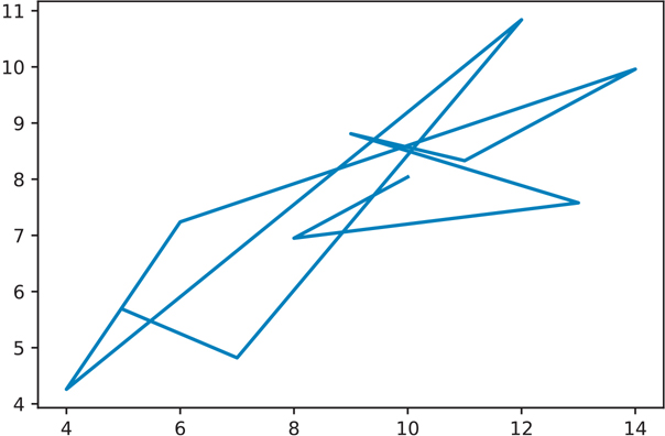
Figure 3.1 Anscombe data set I
# create a subset of the data
# contains only data set 1 from anscombe
data set_1 = anscombe[anscombe['data set'] == 'I']

plt.plot(data set_1['x'], data set_1['y'])
plt.show() # will need this to show explicitly show the plot
By default, plt.plot() will draw lines. If we want it to draw points instead, we can pass an 'o' parameter to tell plt.plot() to use points (Figure 3.2).
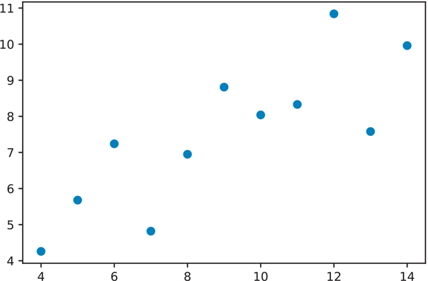
Figure 3.2 Anscombe data set I using points
plt.plot(data set_1['x'], data set_1['y'], 'o')
plt.show()
We can repeat this process for the rest of the data sets in our anscombe data.
# create subsets of the anscombe data
data set_2 = anscombe[anscombe['data set'] == 'II']
data set_3 = anscombe[anscombe['data set'] == 'III']
data set_4 = anscombe[anscombe['data set'] == 'IV']
3.2.1 Figure Objects and Axes Subplots
At this point, we could make these plots individually, but matplotlib offers a much handier way to create subplots. You can specify the dimensions of your final figure, and put in smaller plots to fit the specified dimensions. This way, you can present your results in a single figure.
The subplot syntax takes three parameters:
Number of rows in the figure for subplots
Number of columns in the figure for subplots
Subplot location
The subplot location is sequentially numbered, and plots are placed first in a left-to-right direction, then from top to bottom. If we try to plot this now (by running the following code), we will get an empty figure (Figure 3.3). All we have done so far is create a figure and split it into a 2 x 2 grid where plots can be placed. Since no plots were created and inserted, nothing will show up.
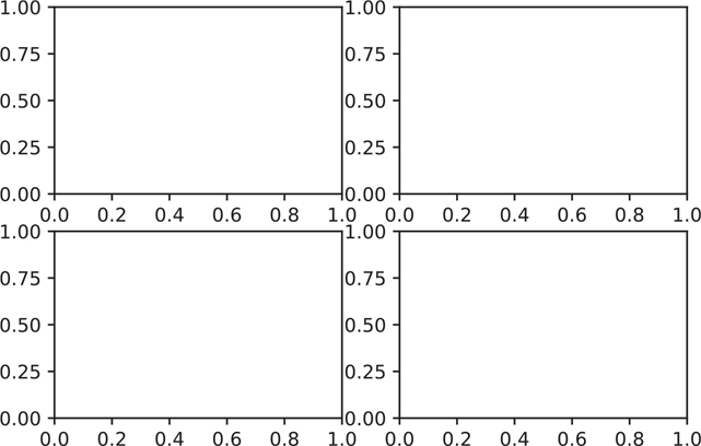
Figure 3.3 Matplotlib figure with four empty axes in a 2x2 grid
# create the entire figure where our subplots will go
fig = plt.figure()

# tell the figure how the subplots should be laid out
# in the example, we will have
# 2 row of plots, and each row will have 2 plots

# subplot has 2 rows and 2 columns, plot location 1
axes1 = fig.add_subplot(2, 2, 1)

# subplot has 2 rows and 2 columns, plot location 2
axes2 = fig.add_subplot(2, 2, 2)

# subplot has 2 rows and 2 columns, plot location 3
axes3 = fig.add_subplot(2, 2, 3)# subplot has 2 rows and 2 columns, plot location 4
axes4 = fig.add_subplot(2, 2, 4)
plt.show()We can use the .plot() method on each axis to create our plot (Figure 3.4).
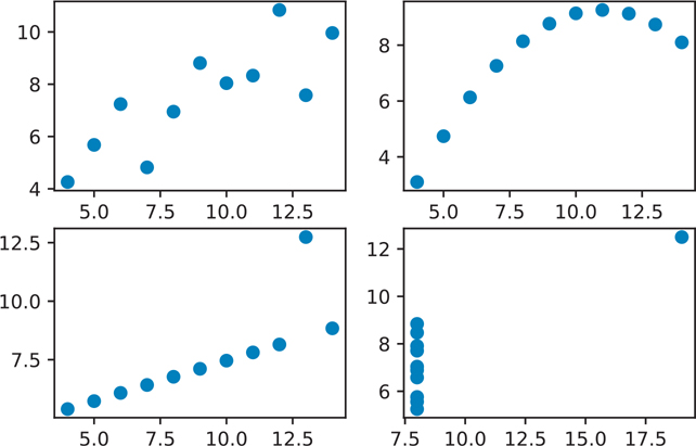
Figure 3.4 Matplotlib figure with four scatter plots
# you need to run all the plotting code together, same as above
fig = plt.figure()
axes1 = fig.add_subplot(2, 2, 1)
axes2 = fig.add_subplot(2, 2, 2)
axes3 = fig.add_subplot(2, 2, 3)
axes4 = fig.add_subplot(2, 2, 4)

# add a plot to each of the axes created above
axes1.plot(data set_1['x'], data set_1['y'], 'o')
axes2.plot(data set_2['x'], data set_2['y'], 'o')
axes3.plot(data set_3['x'], data set_3['y'], 'o')
axes4.plot(data set_4['x'], data set_4['y'], 'o')

plt.show()
Finally, we can add a label to our subplots, and improve the subplot spacing with fig.tight_layout(), but fig.set_tight_layout() is preferred (Figure 3.5).
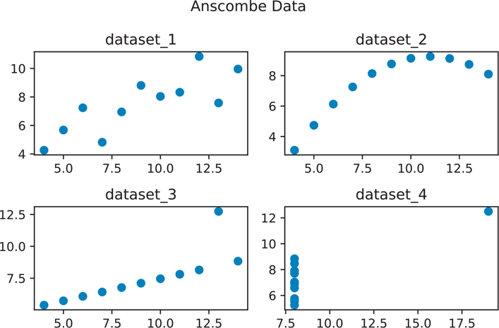
Figure 3.5 Anscombe data visualization
# you need to run all the plotting code together, same as above
fig = plt.figure()
axes1 = fig.add_subplot(2, 2, 1)
axes2 = fig.add_subplot(2, 2, 2)
axes3 = fig.add_subplot(2, 2, 3)
axes4 = fig.add_subplot(2, 2, 4)
axes1.plot(data set_1['x'], data set_1['y'], 'o')
axes2.plot(data set_2['x'], data set_2['y'], 'o')
axes3.plot(data set_3['x'], data set_3['y'], 'o')
axes4.plot(data set_4['x'], data set_4['y'], 'o')

# add a small title to each subplot
axes1.set_title("data set_1")
axes2.set_title("data set_2")
axes3.set_title("data set_3")
axes4.set_title("data set_4")

# add a title for the entire figure (title above the title)
fig.suptitle("Anscombe Data") # note spelling of "suptitle"

# use a tight layout so the plots and titles don't overlap
fig.set_tight_layout(True)

# show the figure
plt.show()
The Anscombe data visualizations illustrate why just looking at summary statistical values can be misleading. The moment the points are visualized, it becomes clearer that even though each data set has the same summary statistical values, the relationships between points vastly differ across the data sets.
To finish off the Anscombe example, we can add .set_xlabel() and .set_ylabel() to each of the subplots to add x- and y-axis labels, just as we added a title to the figure.
3.2.2 Anatomy of a Figure
Before we move on and learn how to create more statistical plots, you should become familiar with the matplotlib documentation on “Anatomy of a Figure.”1 I have reproduced its older figure in Figure 3.6, and the newer figure in Figure 3.7.
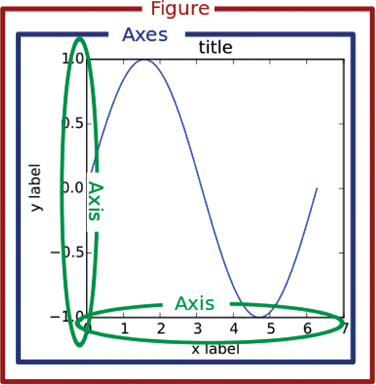
Figure 3.6 Matplotlib anatomy of a figure (old version)
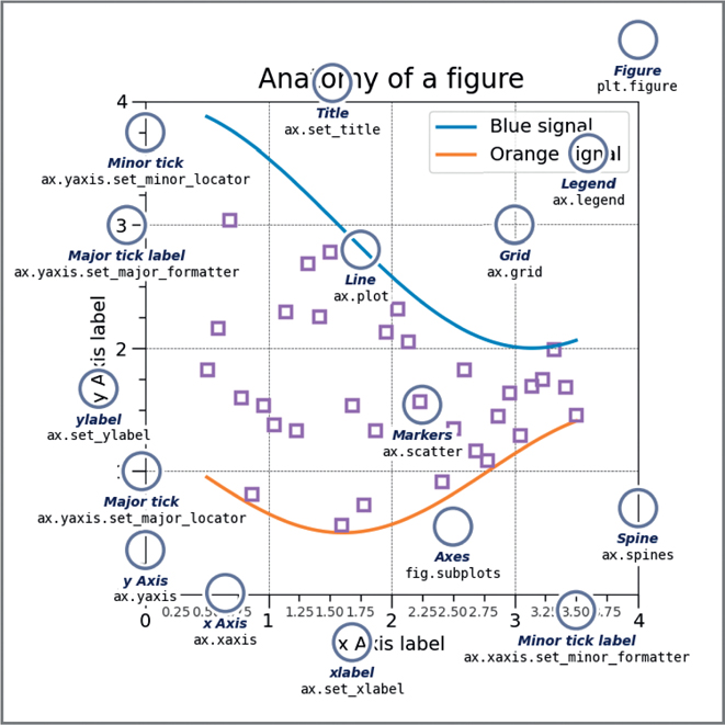
Figure 3.7 Matplotlib anatomy of a figure (new version)
1. Anatomy of a matplotlib figure: https://matplotlib.org/stable/gallery/showcase/anatomy.html
One of the most confusing parts of plotting in Python is the use of the terms “axis” and “axes” especially when trying to verbally describe the different parts (since they are pronounced similarly). In the Anscombe example, each individual subplot plot has axes. The axes contain both an x-axis and a y-axis. All four subplots together make the figure.
The remainder of the chapter shows you how to create statistical plots, first with matplotlib and later using a higher-level plotting library that is based on matplotlib and specifically made for statistical graphics, seaborn.
3.3 Statistical Graphics Using matplotlib
The tips data we will be using for the next series of visualizations come from the seaborn library. This data set contains the amount of the tips that people leave for various variables. For example, the total cost of the bill, the size of the party, the day of the week, and the time of day.
We can load this data set just as we did the Anscombe data set.
tips = sns.load_data set("tips")
print(tips)
total_bill tip sex smoker day time size
0 16.99 1.01 Female No Sun Dinner 2
1 10.34 1.66 Male No Sun Dinner 3
2 21.01 3.50 Male No Sun Dinner 3
3 23.68 3.31 Male No Sun Dinner 2
4 24.59 3.61 Female No Sun Dinner 4
.. ... ... ... ... ... ... ...
239 29.03 5.92 Male No Sat Dinner 3
240 27.18 2.00 Female Yes Sat Dinner 2
241 22.67 2.00 Male Yes Sat Dinner 2
242 17.82 1.75 Male No Sat Dinner 2
243 18.78 3.00 Female No Thur Dinner 2
[244 rows x 7 columns]3.3.1 Univariate (Single Variable)
In statistics jargon, the term “univariate” refers to a single variable.
3.3.1.1 Histograms
Histograms are the most common means of looking at a single variable. The values are “binned”, meaning they are grouped together and plotted to show the distribution of the variable (Figure 3.8).
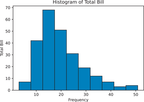
Figure 3.8 Histogram using matplotlib
# create the figure object
fig = plt.figure()

# subplot has 1 row, 1 column, plot location 1
axes1 = fig.add_subplot(1, 1, 1)

# make the actual histogram
axes1.hist(data=tips, x='total_bill', bins=10)

# add labels
axes1.set_title('Histogram of Total Bill')
axes1.set_xlabel('Frequency')
axes1.set_ylabel('Total Bill')

plt.show()
3.3.2 Bivariate (Two Variables)
In statistics jargon, the term “bivariate” refers to two variables.
3.3.2.1 Scatter Plot
Scatter plots are used when a continuous variable is plotted against another continuous variable (Figure 3.9).
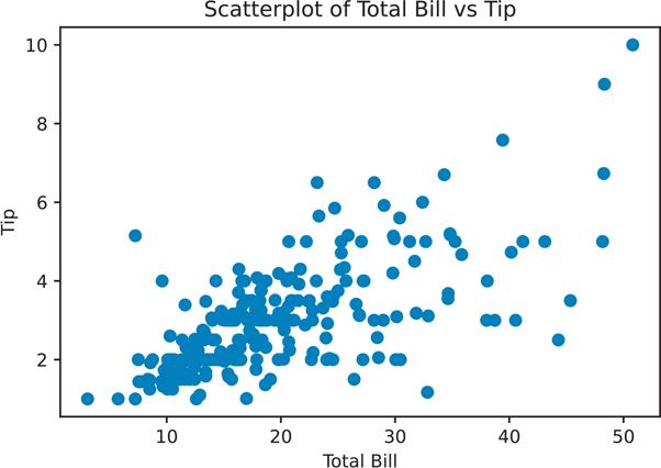
Figure 3.9 Scatter plot using matplotlib
# create the figure object
scatter_plot = plt.figure()
axes1 = scatter_plot.add_subplot(1, 1, 1)

# make the actual scatter plot
axes1.scatter(data=tips, x='total_bill', y='tip')

# add labels
axes1.set_title('Scatterplot of Total Bill vs Tip')
axes1.set_xlabel('Total Bill')
axes1.set_ylabel('Tip')

plt.show()
3.3.2.2 Box Plot
Box plots are used when a discrete variable is plotted against a continuous variable (Figure 3.10).
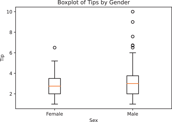
Figure 3.10 Box plot using matplotlib
# create the figure object
boxplot = plt.figure()
axes1 = boxplot.add_subplot(1, 1, 1)# make the actual box plot
axes1.boxplot(
# first argument of box plot is the data
# since we are plotting multiple pieces of data
# we have to put each piece of data into a list
x=[
tips.loc[tips["sex"] == "Female", "tip"],
tips.loc[tips["sex"] == "Male", "tip"],
],
# we can then pass in an optional labels parameter
# to label the data we passed
labels=["Female", "Male"],
)
# add labels
axes1.set_xlabel('Sex')
axes1.set_ylabel('Tip')
axes1.set_title('Boxplot of Tips by Gender')
plt.show()3.3.3 Multivariate Data
Plotting multivariate data is tricky because there is not a panacea or template that can be used for every case. To illustrate the process of plotting multivariate data, let’s build on our earlier scatter plot.
If we wanted to add another variable, say sex, one option would be to color the points based on the value of the third variable. If we wanted to add a fourth variable, we could add size to the dots. The only caveat with using size as a variable is that humans are not very good at visually differentiating areas. Sure, if there’s an enormous dot next to a tiny one, the relationship will be conveyed. But smaller differences are difficult to distinguish and may add clutter to your visualization. One way to reduce clutter is to add some value of transparency to the individual points, such that many overlapping points will show a darker region of a plot than less crowded areas.
A general convention is that different colors are much easier to distinguish than changes in size. If you have to use areas to convey differences in values, be sure that you are actually plotting relative areas. A common pitfall is to map a value to the radius of a circle for plots, but since the formula for a circle is πr2, your areas are actually based on a squared scale. That is not only misleading but wrong.
Colors are also difficult to pick. Humans do not perceive hues on a linear scale, so you need to think carefully when picking color palettes. Luckily matplotlib2 and seaborn3 come with their own set of color palettes. Tools like colorbrewer4 can help you pick good color palettes.
2. matplotlib colormaps: https://matplotlib.org/stable/tutorials/colors/colormaps.html
3. seaborn color palettes: https://seaborn.pydata.org/tutorial/color_palettes.html
4. colorbrewer color palettes: http://colorbrewer2.org/
Figure 3.11 uses color to add a third variable, sex, to our scatter plot. Since our values for sex only contain 2 values: Male and Female, we need to “map” the values to a color.
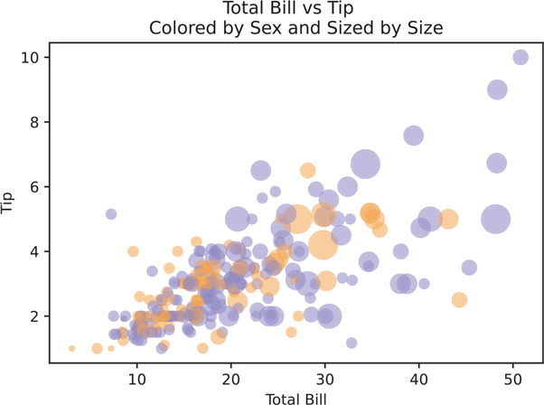
Figure 3.11 Matplotlib scatter plot with sex for the point color and size as point size
# assign color values
colors = {
    "Female": "#f1a340",  # orange
    "Male": "#998ec3",    # purple
}

scatter_plot = plt.figure()
axes1 = scatter_plot.add_subplot(1, 1, 1)

axes1.scatter(
  data=tips,
  x='total_bill',
  y='tip',

  # set the size of the dots based on party size
  # we multiply the values by 10 to make the points bigger
  # and also to emphasize the difference
  s=tips["size"] ** 2 * 10,


  # set the color for the sex using our color values above
  c=tips['sex'].map(colors),

  # set the alpha so points are more transparent
  # this helps with overlapping points
  alpha=0.5
)

# label the axes
axes1.set_title('Colored by Sex and Sized by Size')
axes1.set_xlabel('Total Bill')
axes1.set_ylabel('Tip')

# figure title on top
scatter_plot.suptitle("Total Bill vs Tip")

plt.show()
matplotlib is an imperative plotting library. We’ll see how other declarative plotting libraries allow us to make exploratory plots.
3.4 Seaborn
matplotlib is a core plotting tool in Python. seaborn builds on matplotlib by providing a higher-level declarative interface for statistical graphics. It gives us the ability to create more complex visualizations with fewer lines of code. The seaborn library is tightly integrated with the pandas library and the rest of the PyData stack (numpy, scipy, statsmodels, etc.), making visualizations from any part of the data analysis easier. Since seaborn is built on top of matplotlib, the user can still fine-tune the visualizations.
We’ve already loaded the seaborn library to access its data sets.
# load seaborn if you have not done so already
import seaborn as sns

tips = sns.load_data set("tips")
You will be able to look up all the seaborn plotting function documentation from the official seaborn site and then going to the API reference.5
5. seaborn website: https://seaborn.pydata.org/
For print, we are also going to set the "paper" context, to change some of the default font size, line width, axis tics, etc.
# set the default seaborn context optimized for paper print
# the default is "notebook"
sns.set_context("paper")
3.4.1 Univariate
Just like we did with the matplotlib examples, we will make a series of univariate plots.
3.4.1.1 Histogram
Histograms are created using sns.histplot() (Figure 3.12).
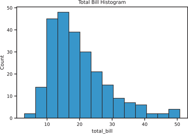
Figure 3.12 Seaborn histplot
Instead of two separate steps of creating an empty figure, and then specifying the individual axes subplots, We can create the figure with all the axes in a single step with the subplots() function. By default it will return two things back. The first thing will be the figure object, the second will be all the axes objects. We can then use the Python multiple assignment syntax to assign the parts to variables in a single step (Appendix Q).
From there we can use the Figure and axes objects just like before.
# the subplots function is a shortcut for
# creating separate figure objects and
# adding individual subplots (axes) to the figure
hist, ax = plt.subplots()

# use seaborn to draw a histogram into the axes
sns.histplot(data=tips, x="total_bill", ax=ax)

# use matplotlib notation to set a title
ax.set_title('Total Bill Histogram')

# use matplotlib to show the figure
plt.show()
3.4.1.2 Density Plot (Kernel Density Estimation)
Density plots are another way to visualize a univariate distribution (Figure 3.13). In essence, they are created by drawing a normal distribution centered at each data point, then smoothing out the overlapping plots so that the area under the curve is 1.
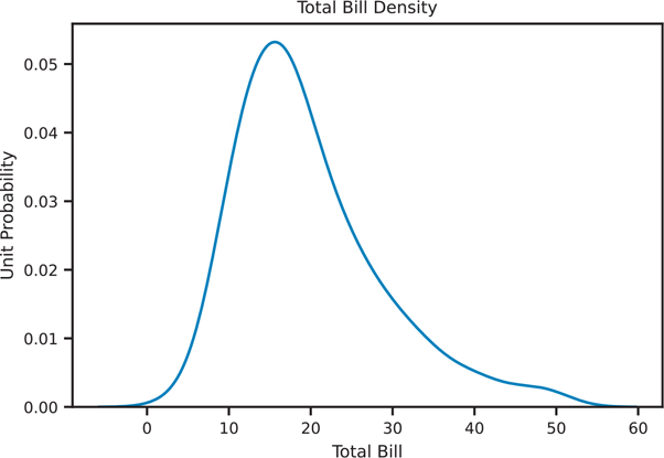
Figure 3.13 Seaborn kde plot
den, ax = plt.subplots()

sns.kdeplot(data=tips, x="total_bill", ax=ax)

ax.set_title('Total Bill Density')
ax.set_xlabel('Total Bill')
ax.set_ylabel('Unit Probability')

plt.show()
3.4.1.3 Rug Plot
Rug plots are a one-dimensional representation of a variable’s distribution. They are typically used with other plots to enhance a visualization. Figure 3.14 shows a histogram overlaid with a density plot and a rug plot on the bottom.
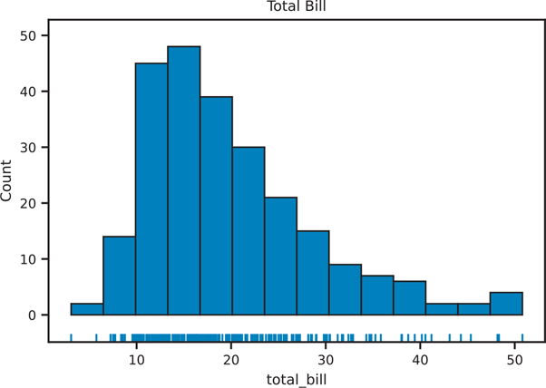
Figure 3.14 Seaborn rug plot with histogram
rug, ax = plt.subplots()

# plot 2 things into the axes we created
sns.rugplot(data=tips, x="total_bill", ax=ax)
sns.histplot(data=tips, x="total_bill", ax=ax)ax.set_title("Rug Plot and Histogram of Total Bill")
ax.set_title("Total Bill")
plt.show()3.4.1.4 Distribution Plots
The newer sns.displot() function allows us to put together many of the univariate plots together into a single plot. This is the successor to the older sns.distplot() function (note the very subtle difference in spelling).
The sns.displot() function returns a FacetGrid object, not an axes, so the way we have been creating a figure and plotting the axes does not apply to this particular function. The benefit of it returning a more complex object is how it can plot multiple things at the same time. Figure 3.15 shows how we can combine many of the distribution figures into a single figure.
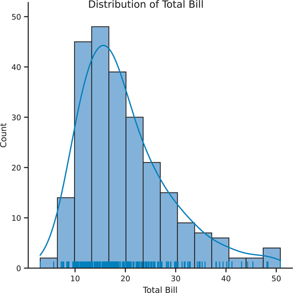
Figure 3.15 Seaborn distribution plot showing histogram, kde, and rug plots
# the FacetGrid object creates the figure and axes for us
fig = sns.displot(data=tips, x="total_bill", kde=True, rug=True)

fig.set_axis_labels(x_var="Total Bill", y_var="Count")
fig.figure.suptitle('Distribution of Total Bill')

plt.show()
3.4.1.5 Count Plot (Bar Plot)
Bar plots are very similar to histograms, but instead of binning values to produce a distribution, bar plots can be used to count discrete variables. Seaborn calls this a count plot (Figure 3.16).
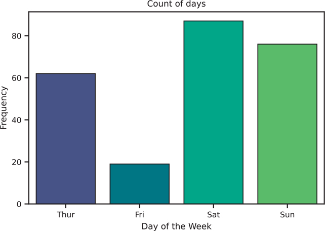
Figure 3.16 Seaborn count plot (i.e., bar plot) using the viridis color palette
count, ax = plt.subplots()

# we can use the viridis palette to help distinguish the colors
sns.countplot(data=tips, x='day', palette="viridis", ax=ax)

ax.set_title('Count of days')
ax.set_xlabel('Day of the Week')
ax.set_ylabel('Frequency')

plt.show()3.4.2 Bivariate Data
We will now use the seaborn library to plot two variables.
3.4.2.1 Scatter Plot
There are a few ways to create a scatter plot in seaborn. The main difference is the type of object that gets created, an Axes or FacetGrid (i.e., type of Figure). sns.scatterplot() returns an Axes object (Figure 3.17).
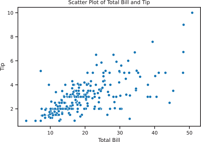
Figure 3.17 Seaborn scatter plot using sns.scatterplot()
scatter, ax = plt.subplots()

# use fit_reg=False if you do not want the regression line
sns.scatterplot(data=tips, x='total_bill', y='tip', ax=ax)

ax.set_title('Scatter Plot of Total Bill and Tip')
ax.set_xlabel('Total Bill')
ax.set_ylabel('Tip')

plt.show()
We can also use sns.regplot() to create a scatter plot and also draw a regression line (Figure 3.18).
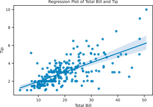
Figure 3.18 Seaborn scatter plot using sns.regplot()
reg, ax = plt.subplots()

# use fit_reg=False if you do not want the regression line
sns.regplot(data=tips, x='total_bill', y='tip', ax=ax)

ax.set_title('Regression Plot of Total Bill and Tip')
ax.set_xlabel('Total Bill')
ax.set_ylabel('Tip')

plt.show()
A similar function, sns.lmplot(), can also create scatter plots. Internally, sns.lmplot() calls sns.regplot(), so sns.regplot() is a more general plotting function. The main difference is that sns.regplot() creates an axes object whereas sns.lmplot() creates a figure object (See Section 3.2.2 for the parts of a figure). Figure 3.19 creates a scatter plot with a regression line, but creates the figure object directly, similar to the FacetGrid from sns.displot() in Section 3.4.1.4.
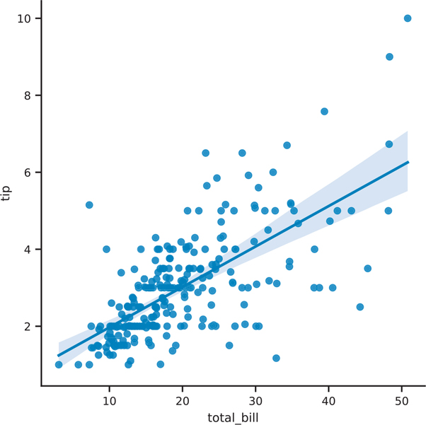
Figure 3.19 Seaborn scatter plot using sns.lmplot()
# use if you do not want the regression line
fig = sns.lmplot(data=tips, x='total_bill', y='tip')

plt.show()
3.4.2.2 Joint Plot
We can also create a scatter plot that includes a univariate plot on each axis using sns.jointplot() (Figure 3.20). One major difference is that sns.jointplot() does not return axes, so we do not need to create a figure with axes on which to place our plot. Instead, this function creates a JointGrid object. If we need access to the base matplotlib Figure object, we use the .figure attribute.
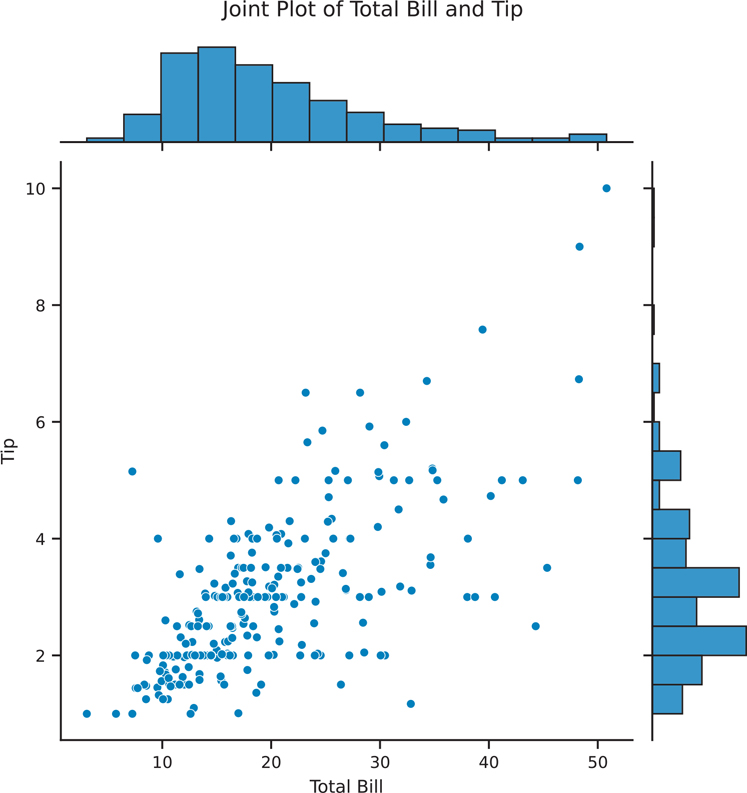
Figure 3.20 Seaborn scatter plot using sns.jointplot()
# jointplot creates the figure and axes for us
joint = sns.jointplot(data=tips, x='total_bill', y='tip')

joint.set_axis_labels(xlabel='Total Bill', ylabel='Tip')

# add a title and move the text up so it doesn't clash with histogram
joint.figure.suptitle('Joint Plot of Total Bill and Tip', y=1.03)

plt.show()
3.4.2.3 Hexbin Plot
Scatter plots are great for comparing two variables. However, sometimes there are too many points for a scatter plot to be meaningful. One way to get around this issue is to bin and aggregate nearby points on the plot together. Just as histograms can bin a variable to create a bar, hexbin plots can bin two variables (Figure 3.21). A hexagon is used for this purpose because it is the most efficient shape to cover an arbitrary 2D surface. This is an example of seaborn building on top of matplotlib, as hexbin() is a matplotlib function.
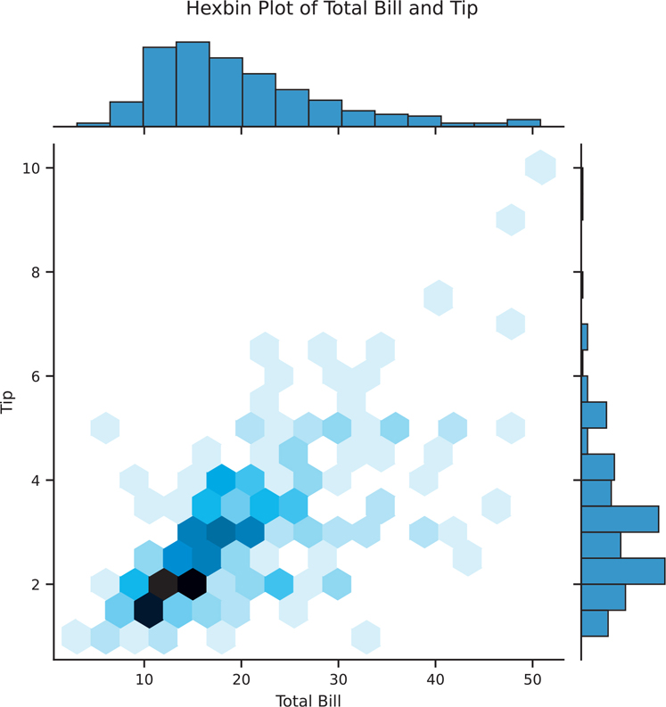
Figure 3.21 Seaborn hexbin plot using sns.jointplot()
# we can use jointplot with kind="hex" for a hexbin plot
hexbin = sns.jointplot(
  data=tips, x="total_bill", y="tip", kind="hex"
)

hexbin.set_axis_labels(xlabel='Total Bill', ylabel='Tip')
hexbin.figure.suptitle('Hexbin Plot of Total Bill and Tip', y=1.03)

plt.show()
3.4.2.4 2D Density Plot
You can also create a 2D kernel density plot. This kind of process is similar to how sns.kdeplot() works, except it creates a density plot across two variables. The bivariate plot can be shown on its own (Figure 3.22).
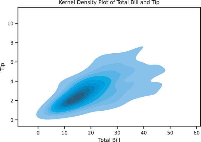
Figure 3.22 Seaborn KDE plot using sns.kdeplot()
kde, ax = plt.subplots()

# shade will fill in the contours
sns.kdeplot(data=tips, x="total_bill", y="tip", shade=True, ax=ax)

ax.set_title('Kernel Density Plot of Total Bill and Tip')
ax.set_xlabel('Total Bill')
ax.set_ylabel('Tip')

plt.show()
sns.jointplot() will also allow us to create KDE plots (Figure 3.23).
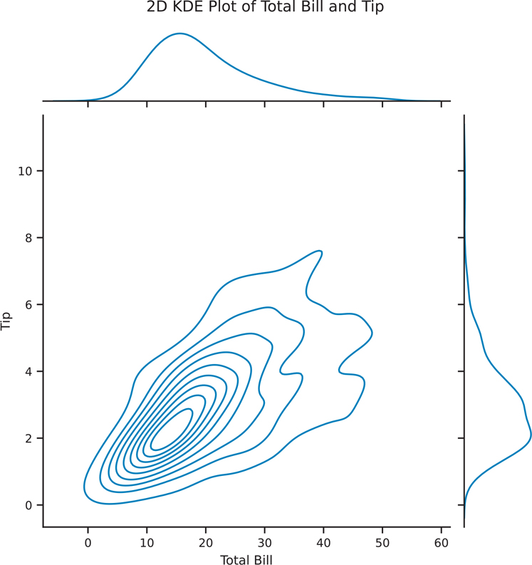
Figure 3.23 Seaborn KDE plot using sns.jointplot()
kde2d = sns.jointplot(data=tips, x="total_bill", y="tip", kind="kde")

kde2d.set_axis_labels(xlabel='Total Bill', ylabel='Tip')
kde2d.fig.suptitle('2D KDE Plot of Total Bill and Tip', y=1.03)

plt.show()
3.4.2.5 Bar Plot
Bar plots can also be used to show multiple variables. By default, sns.barplot() will calculate a mean (Figure 3.24), but you can pass any function into the estimator parameter. For example, you could pass in the np.mean() function to calculate the mean using the version from the numpy library.
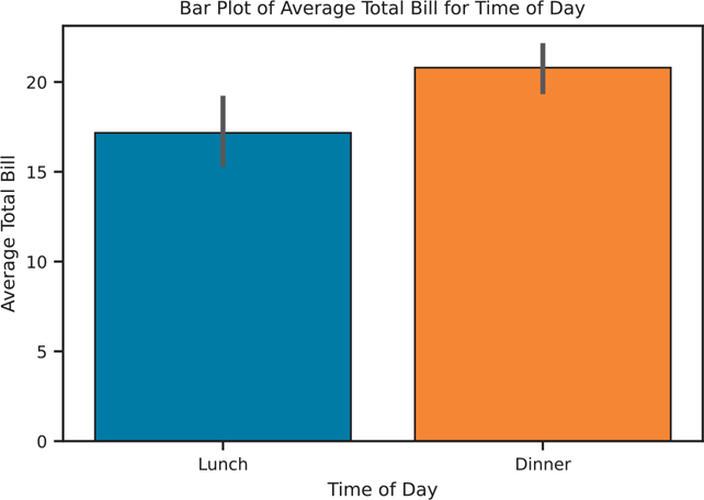
Figure 3.24 Seaborn bar plot using the np.mean() function
import numpy as np

bar, ax = plt.subplots()

# plot the average total bill for each value of time
# mean is calculated using numpy
sns.barplot(
  data=tips, x="time", y="total_bill", estimator=np.mean, ax=ax
)

ax.set_title('Bar Plot of Average Total Bill for Time of Day')
ax.set_xlabel('Time of Day')
ax.set_ylabel('Average Total Bill')

plt.show()
3.4.2.6 Box Plot
Unlike the previously mentioned plots, a box plot (Figure 3.25) shows multiple statistics: the minimum, first quartile, median, third quartile, maximum, and, if applicable, outliers based on the interquartile range.
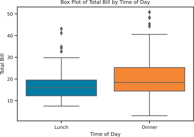
Figure 3.25 Seaborn box plot of total bill by time of day
The y parameter in sns.boxplot() is optional. If it is omitted, the plotting function will create a single box in the plot.
box, ax = plt.subplots()

# the y is optional, but x would have to be a numeric variable
sns.boxplot(data=tips, x='time', y='total_bill', ax=ax)

ax.set_title('Box Plot of Total Bill by Time of Day')
ax.set_xlabel('Time of Day')
ax.set_ylabel('Total Bill')

plt.show()
3.4.2.7 Violin Plot
Box plots are a classical statistical visualization, but they can obscure the underlying distribution of the data. Violin plots (Figure 3.26) can show the same values as a box plot, but plot the “boxes” as a kernel density estimation. This can help retain more visual information about your data since only plotting summary statistics can be misleading, as seen by the Anscombe quartet (Section 3.2.1).
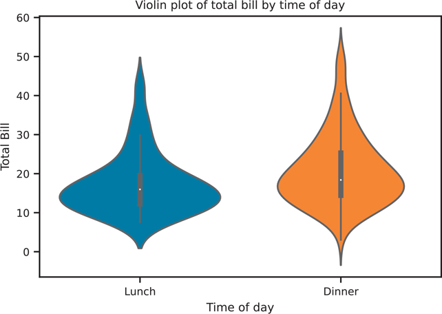
Figure 3.26 Seaborn violin plot of total bill by time of day
violin, ax = plt.subplots()

sns.violinplot(data=tips, x='time', y='total_bill', ax=ax)

ax.set_title('Violin plot of total bill by time of day')
ax.set_xlabel('Time of day')
ax.set_ylabel('Total Bill')

plt.show()
We can now see how the violin plot is related to the box plot. In Figure 3.27, we will create a single figure with 2 axes (i.e., subplots).
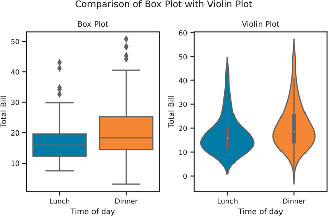
Figure 3.27 Comparing box plots with violin plots
# create the figure with 2 subplots
box_violin, (ax1, ax2) = plt.subplots(nrows=1, ncols=2)

sns.boxplot(data=tips, x='time', y='total_bill', ax=ax1)
sns.violinplot(data=tips, x='time', y='total_bill', ax=ax2)

# set the titles
ax1.set_title('Box Plot')
ax1.set_xlabel('Time of day')
ax1.set_ylabel('Total Bill')

ax2.set_title('Violin Plot')
ax2.set_xlabel('Time of day')
ax2.set_ylabel('Total Bill')

box_violin.suptitle("Comparison of Box Plot with Violin Plot")

# space out the figure so labels do not overlap
box_violin.set_tight_layout(True)

plt.show()
3.4.2.8 Pairwise Relationships
When you have mostly numeric data, visualizing all of the pairwise relationships can be performed using sns.pairplot(). This function will plot a scatter plot between each pair of variables, and a histogram for the univariate data (Figure 3.28).
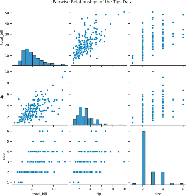
Figure 3.28 Seaborn pair plot
fig = sns.pairplot(data=tips)

fig.figure.suptitle(
  'Pairwise Relationships of the Tips Data', y=1.03
)

plt.show()
One drawback when using sns.pairplot() is that there is redundant information; that is, the top half of the visualization is the same as the bottom half. We can use sns.PairGrid() to manually assign the plots for the top half and bottom half. This plot is shown in Figure 3.29.
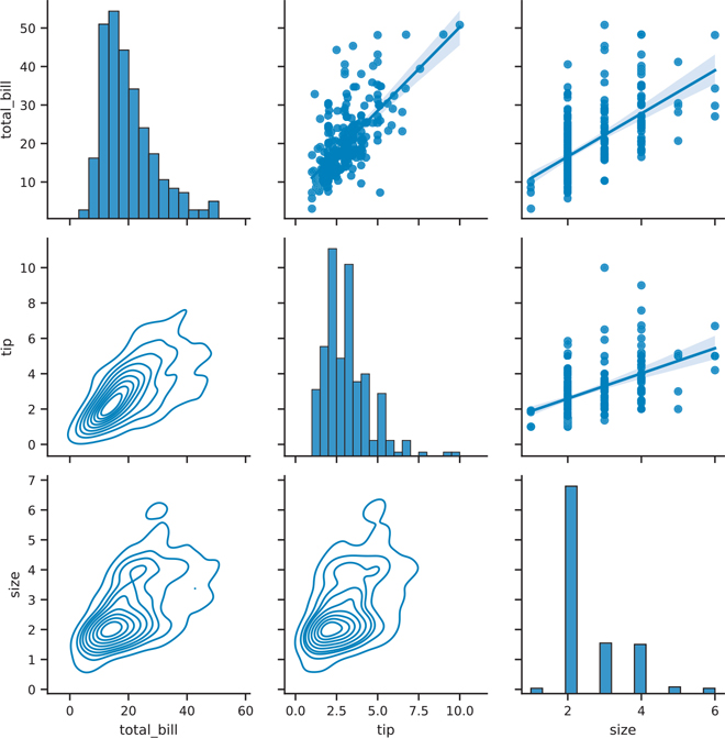
Figure 3.29 Seaborn pair plot with different plots on the upper and lower halves
# create a PairGrid, make the diagonal plots on a different scale
pair_grid = sns.PairGrid(tips, diag_sharey=False)

# set a separate function to plot the upper, bottom, and diagonal
# functions need to return an axes, not a figure


# we can use plt.scatter instead of sns.regplot
pair_grid = pair_grid.map_upper(sns.regplot)
pair_grid = pair_grid.map_lower(sns.kdeplot)
pair_grid = pair_grid.map_diag(sns.histplot)

plt.show()
3.4.3 Multivariate Data
As mentioned in Section 3.3.3, there is no de facto template for plotting multivariate data. Possible ways to include more information are to use color, size, or shape to distinguish data within the plot.
3.4.3.1 Colors
When we are using sns.violinplot(), we can pass the hue parameter to color the plot by sex. We can reduce the redundant information by having each half of the violins represent a different sex, as shown in Figure 3.30. Try the following code with and without the split parameter.
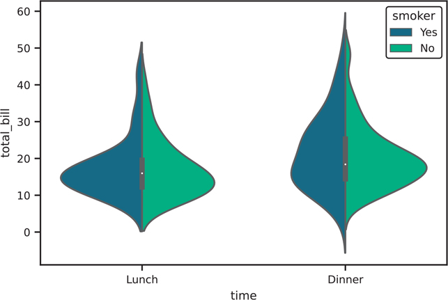
Figure 3.30 Seaborn violin plot with hue parameter
violin, ax = plt.subplots()

sns.violinplot(
  data=tips,
  x="time",
  y="total_bill",
  hue="smoker", # set color based on smoker variable
  split=True,
  palette="viridis", # palette specifies the colors for hue

  ax=ax,
)

plt.show()
The hue parameter can be passed into various other plotting functions as well. Figure 3.31 shows its use in a sns.lmplot().
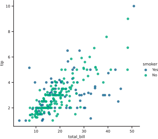
Figure 3.31 Seaborn lmplot plot with hue parameter
# note the use of lmplot instead of regplot to return a figure
scatter = sns.lmplot(
  data=tips,
  x="total_bill",
  y="tip",
  hue="smoker",
  fit_reg=False,
  palette="viridis",
)

plt.show()
We can make our pairwise plots a little more meaningful by passing one of the categorical variables as the hue parameter. Figure 3.32 shows this approach in our sns.pairplot().
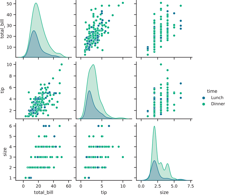
Figure 3.32 Seaborn pair plot with hue parameter
fig = sns.pairplot(
  tips,
  hue="time",
  palette="viridis",

  height=2, # facet height to make the entire figure smaller
)

plt.show()
3.4.3.2 Size and Shape
Working with point sizes can be another means of adding more information to a plot. However, this option should be used sparingly, since the human eye is not very good at comparing areas. Figure 3.33 shows using the hue for color and size for point sizes in the sns.scatterplot() function.
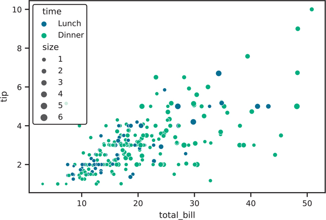
Figure 3.33 Scatter plot of tip vs total bill, colored by time of day, and sized by table size
fig, ax = plt.subplots()

sns.scatterplot(
  data=tips,
  x="total_bill",
  y="tip",
  hue="time",
  size="size",
  palette="viridis",
  ax=ax,
)

plt.show()
3.4.4 Facets
What if we want to show more variables? Or if we know which plot we want for our visualization, but we want to make multiple plots over a categorical variable? Facets are designed to meet these needs. Instead of individually subsetting data and lay out the axes in a figure (as we did in Figure 3.5), facets in seaborn can handle this work for you.
To use facets, your data needs to be what Hadley Wickham6 calls “Tidy Data,”7 where each row represents an observation in the data, and each column is a variable. More about tidy data is discussed in Chapter 4.
6. Hadley Wickham, PhD: http://hadley.nz
7. Tidy Data paper: http://vita.had.co.nz/papers/tidy-data.pdf
3.4.4.1 One Facet Variable
Figure 3.34 shows a re-creation of the Anscombe quartet data from Figure 3.5 in seaborn. The trick to faceted plots in seaborn is to look for the col or row parameter in the plotting function. Here, we use sns.relplot() to make our faceted scatter plot (the sns. scatterplot() documentation also points to use sns.relplot() for facets).
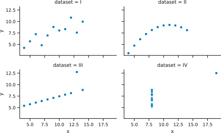
Figure 3.34 Seaborn Anscombe plot with facets
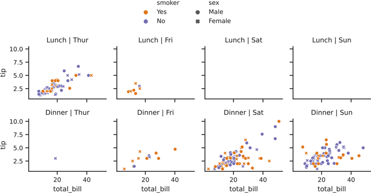
Figure 3.35 Seaborn tips scatter plot with hue, style, and facets
anscombe_plot = sns.relplot(
  data=anscombe,
  x="x",
  y="y",
  kind="scatter",
  col="data set",

  col_wrap=2,
  height=2,
  aspect=1.6, # aspect ratio of each facet
)

anscombe_plot.figure.set_tight_layout(True)

plt.show()
The col parameter is the variable that the plot will facet by, and the col_wrap parameter creates a figure that has two columns. If we do not use the col_wrap parameter, all four plots will be plotted in the same row.
3.4.4.2 Two Facet Variables
We can build on this to incorporate two categorical variables into our faceted plot. Additional categorical variables can be passed into the hue, style, etc. parameters.
'''python
colors = {
  "Yes": "#f1a340", # orange
  "No" : "#998ec3", # purple
}
# make the faceted scatter plot
# this is the only part that is needed to draw the figure
facet2 = sns.relplot(
  data=tips,
  x="total_bill",
  y="tip",
  hue="smoker",
  style="sex",

  kind="scatter",
  col="day",
  row="time",
  palette=colors,
  height=1.7, # adjusted to fit figure on page
)

# below is to make the plot pretty
# adjust facet titles
facet2.set_titles(
  row_template="{row_name}",
  col_template="{col_name}"
)

# adjust the legend to not have it overlap the figure
sns.move_legend(
  facet2,
  loc="lower center",
  bbox_to_anchor=(0.5, 1),
  ncol=2,   #number legend columns
  title=None,   #legend title
  frameon=False, #remove frame (i.e., border box) around legend
)

facet2.figure.set_tight_layout(True)

plt.show()'''
3.4.4.3 Manually Create Facets
Many of the plots we created in seaborn are axes-level functions. What this means is that not every plotting function will have col and col_wrap parameters for faceting. Instead, we must create a FacetGrid that knows which variable to facet on, and then supply the individual plot code for each facet. Figure 3.36 shows our manually created facet plot.
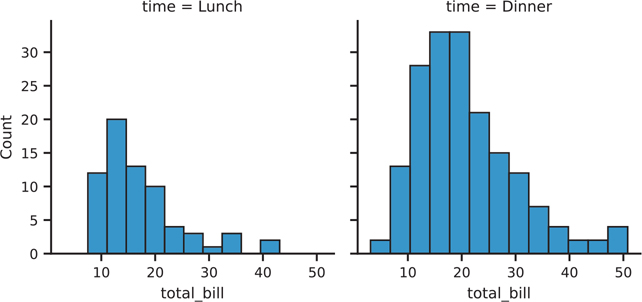
Figure 3.36 Seaborn plot with manually created facets
# create the FacetGrid
facet = sns.FacetGrid(tips, col='time')

# for each value in time, plot a histogram of total bill
# you pass in parameters as if you were passing them directly
# into sns.histplot()
facet.map(sns.histplot, 'total_bill')
plt.show()
The individual facets need not be univariate plots, as seen in Figure 3.37.
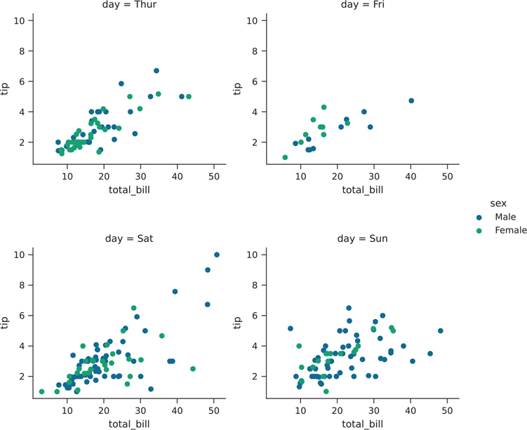
Figure 3.37 Seaborn plot with manually created facets that contain multiple variables
facet = sns.FacetGrid(
  tips, col='day', hue='sex', palette="viridis"
)
facet.map(plt.scatter, 'total_bill', 'tip')
facet.add_legend()
plt.show()
Another thing you can do with facets is to have one variable be faceted on the x-axis, and another variable faceted on the y-axis. We accomplish this by passing a row parameter. The result is shown in Figure 3.38.
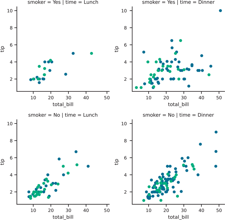
Figure 3.38 Seaborn plot with manually created facets with two variables
facet = sns.FacetGrid(
  tips, col='time', row='smoker', hue='sex', palette="viridis"
)
facet.map(plt.scatter, 'total_bill', 'tip')
plt.show()
If you do not want all of the hue elements to overlap (i.e., you want this behavior in scatter plots, but not violin plots), you can use the sns.catplot() function. The result is shown in Figure 3.39.
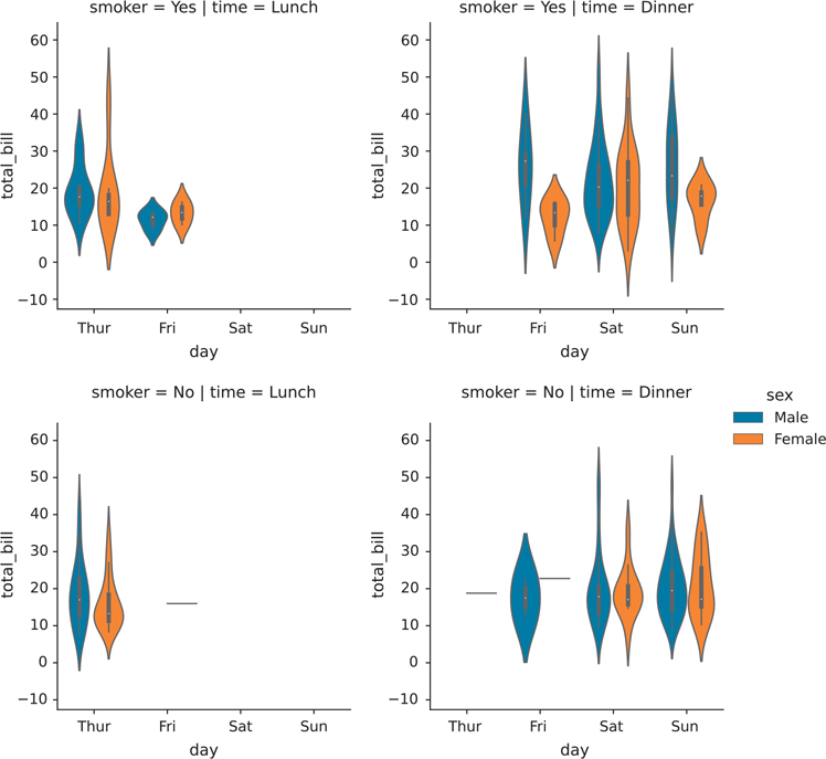
Figure 3.39 Seaborn plot with manually created facets with two non-overlapping variables
facet = sns.catplot(
    x="day",
    y="total_bill",
    hue="sex",
    data=tips,
    row="smoker",
    col="time",
    kind="violin",
)
plt.show()
3.4.5 Seaborn Styles and Themes
The seaborn plots shown in this chapter have all used the default plot styles. We can change the plot style with the sns.set_style function. Typically, this function is run just once at the top of your code; all subsequent plots will use the same style set.
3.4.5.1 Styles
The styles that come with seaborn are darkgrid, whitegrid, dark, white, and ticks. Figure 3.40 shows a base plot, and Figure 3.41 shows a plot with the whitegrid style.
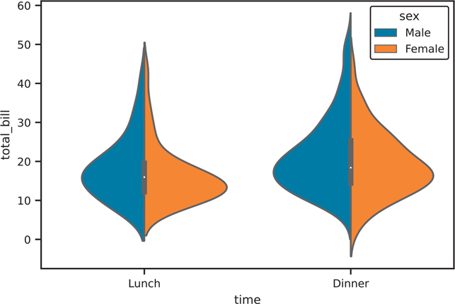
Figure 3.40 Baseline violin plot with default seaborn style
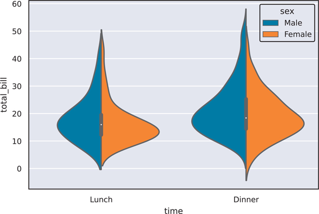
Figure 3.41 Violin plot with "darkgrid" seaborn style
The with block allow us to temporarily use a style without setting it as a default for all subsequent plots. If you want to set the style as a default you would use sns.set_style("whitegrid") instead of the with block.
# initial plot for comparison
fig, ax = plt.subplots()
sns.violinplot(
  data=tips, x="time", y="total_bill", hue="sex", split=True, ax=ax
)

plt.show()
# Use this to set a global default style
# sns.set_style("whitegrid")# temporarily set style and plot
# remove the with line + indentation if using sns.set_style()
with sns.axes_style("darkgrid"): fig, ax = plt.subplots()
sns.violinplot(
data=tips, x="time", y="total_bill", hue="sex", split=True, ax=ax
)
plt.show()The following code shows what all the styles look like (Figure 3.42).
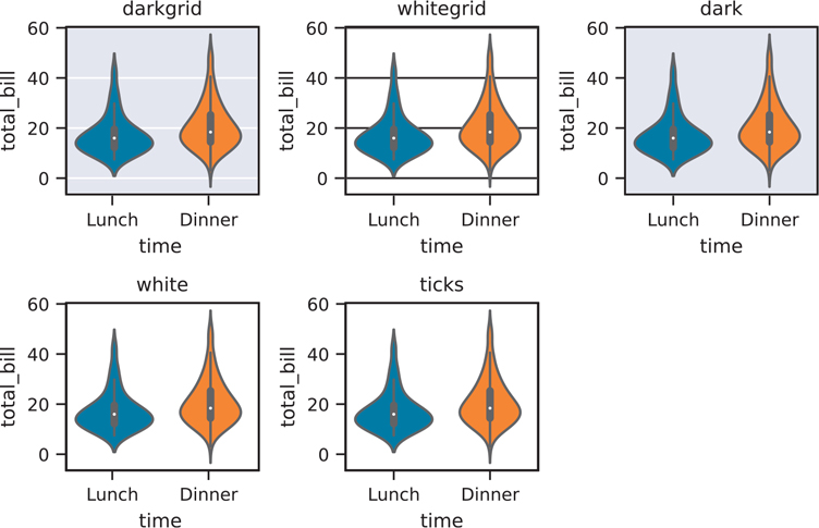
Figure 3.42 All seaborn styles
seaborn_styles = ["darkgrid", "whitegrid", "dark", "white", "ticks"]

fig = plt.figure()
for idx, style in enumerate(seaborn_styles):
  plot_position = idx + 1
  with sns.axes_style(style):
    ax = fig.add_subplot(2, 3, plot_position)
    violin = sns.violinplot(
      data=tips, x="time", y="total_bill", ax=ax
    )
    violin.set_title(style)
fig.set_tight_layout(True)
plt.show()
3.4.5.2 Plotting Contexts
The seaborn library comes with a set of contexts that quickly tweak various parts of the figure (text size, line width, axis tick size, etc.) for different “contexts.” This chapter uses the "paper" context since it is made for printed text, but the default context is "notebook". Below you will see the various parameters set for each context, and Figure 3.43 shows a quick preview of each context.
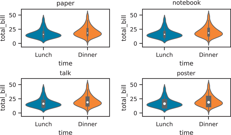
Figure 3.43 Example of seaborn figure contexts
contexts = pd.DataFrame(
  {
    "paper": sns.plotting_context("paper"),
    "notebook": sns.plotting_context("notebook"),
    "talk": sns.plotting_context("talk"),
    "poster": sns.plotting_context("poster"),
  }
)
print(contexts)
paper notebook talk poster
axes.linewidth 1.0 1.25 1.875 2.5
grid.linewidth 0.8 1.00 1.500 2.0
lines.linewidth 1.2 1.50 2.250 3.0
lines.markersize 4.8 6.00 9.000 12.0
patch.linewidth 0.8 1.00 1.500 2.0
xtick.major.width 1.0 1.25 1.875 2.5
ytick.major.width 1.0 1.25 1.875 2.5
xtick.minor.width 0.8 1.00 1.500 2.0
ytick.minor.width 0.8 1.00 1.500 2.0
xtick.major.size 4.8 6.00 9.000 12.0
ytick.major.size 4.8 6.00 9.000 12.0
xtick.minor.size 3.2 4.00 6.000 8.0
ytick.minor.size 3.2 4.00 6.000 8.0
font.size 9.6 12.00 18.000 24.0
axes.labelsize 9.6 12.00 18.000 24.0
axes.titlesize 9.6 12.00 18.000 24.0
xtick.labelsize 8.8 11.00 16.500 22.0
ytick.labelsize 8.8 11.00 16.500 22.0
legend.fontsize 8.8 11.00 16.500 22.0
legend.title_fontsize 9.6 12.00 18.000 24.0context_styles = contexts.columns
fig = plt.figure()
for idx, context in enumerate(context_styles):
plot_position = idx + 1
with sns.plotting_context(context):
ax = fig.add_subplot(2, 2, plot_position)
violin = sns.violinplot(
data=tips, x="time", y="total_bill", ax=ax
)
violin.set_title(context)
fig.set_tight_layout(True)
plt.show()3.4.6 How to Go Through Seaborn Documentation
Throughout this chapter discussing seaborn plotting, we’ve talked about different plotting objects that come out of the matplotlib library, mainly the Axes and Figure objects. For all plotting libraries that build on top of matplotlib, it’s important to know how to read aspects of the documentation, so you can customize your plots to your liking.
Let’s use the violin plot (Figure 3.27) and pair plot (Figure 3.28) in Section 3.4.2.7 and Section 3.4.2.8 as examples of how to walk through object documentation.
3.4.6.1 Matplotlib Axes Objects
A snippet of the code for Figure 3.27 is below:
box_violin, (ax1, ax2) = plt.subplots(nrows=1, ncols=2)

sns.boxplot(data=tips, x='time', y='total_bill', ax=ax1)
sns.violinplot(data=tips, x='time', y='total_bill', ax=ax2)

ax1.set_title('Box Plot')
ax1.set_xlabel('Time of day')
ax1.set_ylabel('Total Bill')

ax2.set_title('Violin Plot')
ax2.set_xlabel('Time of day')
ax2.set_ylabel('Total Bill')

box_violin.suptitle("Comparison of Box Plot with Violin Plot")

box_violin.set_tight_layout(True)
plt.show()
In this particular example, if we look up the documentation for the sns.violinplot(), we will see that the function returns a matplotlib Axes object.
Returns ax : matplotlib Axes
Returns the Axes object with the plot drawn onto it.We can also confirm that the ax2 object we created is an Axes object:
print(type(ax2))<class 'matplotlib.axes._subplots.AxesSubplot'>Since the Axes object is from matplotlib, if we want to make additional tweaks to the figure outside of the sns.violinplot() function, we would need to look into the matplotlib.axes documentation.8 This is where you would find the documentation for the .set_title() method that was used to create the figure title.
8. Axes API docs: https://matplotlib.org/stable/api/axes_api.html#module-matplotlib.axes
3.4.6.2 Matplotlib Figure Objects
Using the same reproduced code for Figure 3.27 above, we can see the type() of the box_violin object we created and go to the Figure documentation.9
9. Figure API docs: https://matplotlib.org/stable/api/figure_api.html#module-matplotlib.figure
print(type(box_violin))<class 'matplotlib.figure.Figure'>This is where we can find the .suptitle() method used to add the overall title to the figure.
3.4.6.3 Custom Seaborn Objects
The code for Figure 3.28 is reproduced below:
fig = sns.pairplot(data=tips)
fig.figure.suptitle(
  'Pairwise Relationships of the Tips Data', y=1.03
)
plt.show()
This is an example of an object specific to seaborn, the PairGrid object.10
10. seaborn.PairGrid docs: https://seaborn.pydata.org/generated/seaborn.PairGrid.html
print(type(fig))<class 'seaborn.axisgrid.PairGrid'>If we scroll down to the bottom of the documentation page, we can see all the attributes and methods for the PairGrid object. However, we know that .suptitle() is a matplotlib.Figure method. From the API documentation at the bottom of the page, we can see how we can access the underlying Figure object by using the .figure attribute. This is why we needed to write .figure.suptitle() to take the sns.FacetGrid object, access the matplotlib.Figure object, then the .subtitle() method.
3.4.7 Next-Generation Seaborn Interface
There is a new seaborn interface in the works.11 However, at the time of writing, the next-gen interface is not official yet. When the official change occurs and the API is stable, the book’s website will provide the updated code for the seaborn section.12
11. Next-generation seaborn interface: https://seaborn.pydata.org/nextgen/
12. Pandas for Everyone GitHub Page: https://github.com/chendaniely/pandas_for_everyone/
3.5 Pandas Plotting Method
Pandas objects also come equipped with their own plotting functions. Just as in seaborn, the plotting functions built into Pandas are just wrappers around matplotlib with preset values. In general, plotting using Pandas follows the DataFrame.plot.<PLOT_TYPE> or Series.plot.<PLOT_TYPE> methods.
3.5.1 Histogram
Histograms can be created using the Series.plot.hist() (Figure 3.44) or DataFrame.plot.hist() (Figure 3.45) function.

Figure 3.44 Histogram of a Pandas Series
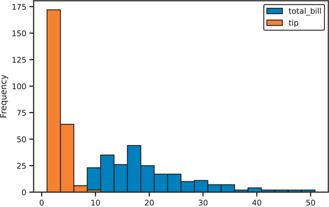
Figure 3.45 Histogram of a Pandas DataFrame
# on a series
fig, ax = plt.subplots()
tips['total_bill'].plot.hist(ax=ax)
plt.show()
# on a dataframe
# set alpha channel transparency to see through the overlapping bars
fig, ax = plt.subplots()
tips[['total_bill', 'tip']].plot.hist(alpha=0.5, bins=20, ax=ax)
plt.show()3.5.2 Density Plot
The kernel density estimation (density) plot can be created with the DataFrame.plot. kde() function (Figure 3.46).
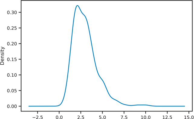
Figure 3.46 Pandas KDE plot
fig, ax = plt.subplots()
tips['tip'].plot.kde(ax=ax)
plt.show()
3.5.3 Scatter Plot
Scatter plots are created by using the DataFrame.plot.scatter() function (Figure 3.47).
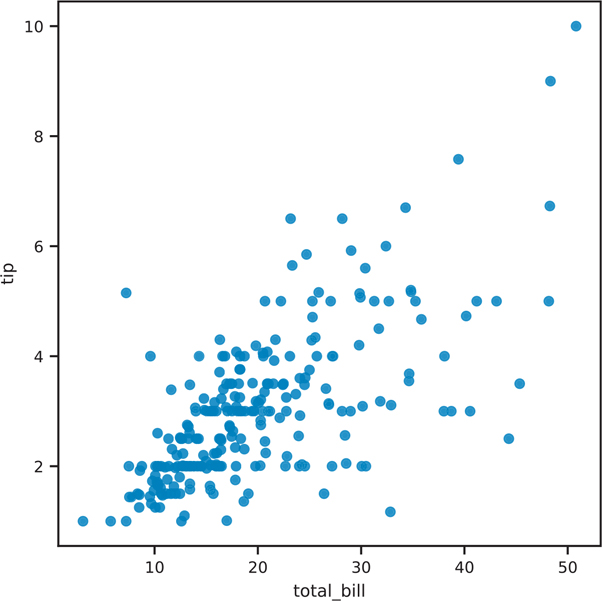
Figure 3.47 Pandas scatter plot
fig, ax = plt.subplots()
tips.plot.scatter(x='total_bill', y='tip', ax=ax)
plt.show()
3.5.4 Hexbin Plot
Hexbin plots are created using the Dataframe.plt.hexbin() function (Figure 3.48).
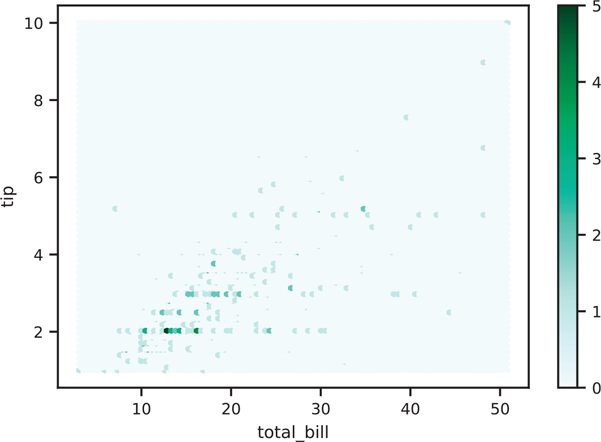
Figure 3.48 Pandas hexbin plot
fig, ax = plt.subplots()
tips.plot.hexbin(x='total_bill', y='tip', ax=ax)
plt.show()
Grid size can be adjusted with the gridsize parameter (Figure 3.49).
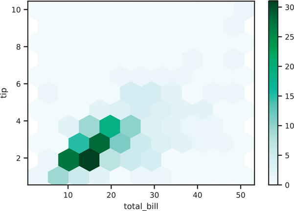
Figure 3.49 Pandas hexbin plot with modified grid size
fig, ax = plt.subplots()
tips.plot.hexbin(x='total_bill', y='tip', gridsize=10, ax=ax)
plt.show()
3.5.5 Box Plot
Box plots are created with the DataFrame.plot.box() function (Figure 3.50).
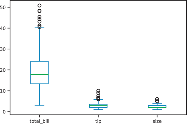
Figure 3.50 Pandas box plot
fig, ax = plt.subplots()
ax = tips.plot.box(ax=ax)
plt.show()
Conclusion
Data visualization is an integral part of exploratory data analysis and data presentation. This chapter provided an introduction to the various ways to explore and present your data. As we continue through the book, we will learn about more complex visualizations.
There are myriad plotting and visualization resources available on the Internet. The seaborn documentation, Pandas visualization documentation, and matplotlib documentation all provide ways to further tweak your plots (e.g., colors, line thickness, legend placement, figure annotations). Other resources include colorbrewer to help pick good color schemes. The plotting libraries mentioned in this chapter also have various color schemes that can be used to highlight the content of your visualizations.