
18
Clustering
Machine learning methods can generally be classified into two main categories of models: supervised learning and unsupervised learning. Thus far, we have been working on supervised learning models, since we train our models with a target y or response variable. In other words, in the training data for our models, we know the “correct” answer. Unsupervised models are modeling techniques in which the “correct” answer is unknown. Many of these methods involve clustering, where the two main methods are k-means clustering and hierarchical clustering.
18.1 k-Means
The technique known as k-means works by first selecting how many clusters, k, exist in the data. The algorithm randomly selects k points in the data and calculates the distance from every data point to the initially selected k points. The closest points to each of the k clusters are assigned to the same cluster group. The center of each cluster is then designated as the new cluster centroid. The process is then repeated, with the distance of each point to each cluster centroid being calculated and assigned to a cluster and a new centroid picked. This algorithm is repeated until convergence occurs.
Great visualizations1 and explanations2 of how k-means works can be found on the Internet. We’ll use data about wines for our k-means example.
1. Visualizing k-means: http://shabal.in/visuals.html
2. Visualization and explanation of k-means: https://www.naftaliharris.com/blog/visualizing-k-means-clustering/
import pandas as pd
wine = pd.read_csv('data/wine.csv')
We will drop the Cultivar column since it correlates too closely with the actual clusters in our data.
wine = wine.drop('Cultivar', axis=1)

# note that the data values are all numeric
print(wine.columns)Index(['Alcohol', 'Malic acid', 'Ash', 'Alcalinity of ash ',
'Magnesium', 'Total phenols', 'Flavanoids',
'Nonflavanoid phenols', 'Proanthocyanins', 'Color intensity',
'Hue', '0D280/0D315 of diluted wines', 'Proline '],
dtype='object')print(wine.head()) Alcohol Malic acid Ash Alcalinity of ash Magnesium
0 14.23 1.71 2.43 15.6 127
1 13.20 1.78 2.14 11.2 100
2 13.16 2.36 2.67 18.6 101
3 14.37 1.95 2.50 16.8 113
4 13.24 2.59 2.87 21.0 118 Total phenols Flavanoids Nonflavanoid phenols Proanthocyanins
0 2.80 3.06 0.28 2.29
1 2.65 2.76 0.26 1.28
2 2.80 3.24 0.30 2.81
3 3.85 3.49 0.24 2.18
4 2.80 2.69 0.39 1.82 Color intensity Hue 0D280/0D315 of diluted wines
0 5.64 1.04 3.92
1 4.38 1.05 3.40
2 5.68 1.03 3.17
3 7.80 0.86 3.45
4 4.32 1.04 2.93 Proline
0 1065
1 1050
2 1185
3 1480
4 735sklearn has an implementation of the k-means algorithm called KMeans. Here we will set k = 3, and use all the data in our data set.
We will create k=3 clusters with a random seed of 42. You can opt to leave out the random_state parameter or use a different value; the 42 will ensure your results are the same as those printed in the book.
from sklearn.cluster import KMeans
kmeans = KMeans(n_clusters=3, random_state=42).fit(wine.values)
Here’s our kmeans object.
print(kmeans)KMeans(n_clusters=3, random_state=42)We can see that since we specified three clusters, there are only three unique labels.
import numpy as np
print(np.unique(kmeans.labels_, return_counts=True))
(array([0, 1, 2], dtype=int32), array([69, 47, 62]))kmeans_3 = pd.DataFrame(kmeans.labels_, columns=['cluster'])
print(kmeans_3) cluster
0 1
1 1
2 1
3 1
4 2
.. ...
173 2
174 2
175 2
176 2
177 0
[178 rows x 1 columns]Finally, we can visualize our clusters. Since humans can visualize things in only three dimensions, we need to reduce the number of dimensions for our data. Our wine data set has 13 columns, and we need to reduce this number to three so we can understand what is going on. Furthermore, since we are trying to plot the points in a book (a non-interactive medium), we should reduce the number of dimensions to two, if possible.
18.1.1 Dimension Reduction with PCA
Principal component analysis (PCA) is a projection technique that is used to reduce the number of dimensions for a data set. It works by finding a lower dimension in the data such that the variance is maximized. Imagine a three-dimensional sphere of points. PCA essentially shines a light through these points and casts a shadow in the lower two-dimensional plane. Ideally, the shadows will be spread out as much as possible. While points that are far apart in PCA may not be cause for concern, points that are far apart in the original 3D sphere can have the light shine through them in such a way that the shadows cast are right next to one another. Be careful when trying to interpret points that are close to one another because it is possible that these points could be farther apart in the original space.
We import PCA from sklearn.
from sklearn.decomposition import PCAWe tell PCA how many dimensions (i.e., principal components) we want to project our data into. Here we are projecting our data down into two components.
# project our data into 2 components
pca = PCA(n_components=2).fit(wine)
Next, we need to transform our data into the new space and add the transformation to our data set.
# transform our data into the new space
pca_trans = pca.transform(wine)

# give our projections a name
pca_trans_df = pd.DataFrame(pca_trans, columns=['pca1', 'pca2'])

# concatenate our data
kmeans_3 = pd.concat([kmeans_3, pca_trans_df], axis=1)

print(kmeans_3)
cluster pca1 pca2
0 1 318.562979 21.492131
1 1 303.097420 -5.364718
2 1 438.061133 -6.537309
3 1 733.240139 0.192729
4 2 -11.571428 18.489995
.. ... ... ...
173 2 -6.980211 -4.541137
174 2 3.131605 2.335191
175 2 88.458074 18.776285
176 2 93.456242 18.670819
177 0 -186.943190 -0.213331
[178 rows x 3 columns]Finally, we can plot our results (Figure 18.1).
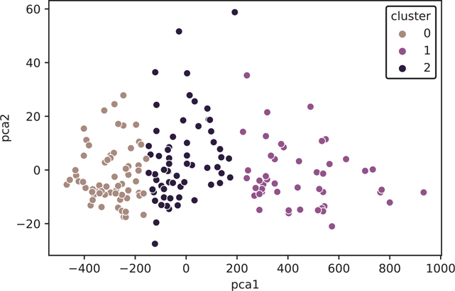
Figure 18.1 k-means plot using PCA
import seaborn as sns
import matplotlib.pyplot as plt

fig, ax = plt.subplots()

sns.scatterplot(
  x="pca1",
  y="pca2",
  data=kmeans_3,
  hue="cluster",
  ax=ax
)

plt.show()
Now that we’ve seen what k-means does to our wine data, let’s load the original data set again and keep the Cultivar column we dropped.
wine_all = pd.read_csv('data/wine.csv')
print(wine_all.head())
Cultivar Alcohol Malic acid Ash Alcalinity of ash
0 1 14.23 1.71 2.43 15.6
1 1 13.20 1.78 2.14 11.2
2 1 13.16 2.36 2.67 18.6
3 1 14.37 1.95 2.50 16.8
4 1 13.24 2.59 2.87 21.0 Magnesium Total phenols Flavanoids Nonflavanoid phenols
0 127 2.80 3.06 0.28
1 100 2.65 2.76 0.26
2 101 2.80 3.24 0.30
3 113 3.85 3.49 0.24
4 118 2.80 2.69 0.39 Proanthocyanins Color intensity Hue
0 2.29 5.64 1.04
1 1.28 4.38 1.05
2 2.81 5.68 1.03
3 2.18 7.80 0.86
4 1.82 4.32 1.04 0D280/0D315 of diluted wines Proline
0 3.92 1065
1 3.40 1050
2 3.17 1185
3 3.45 1480
4 2.93 735We’ll run PCA on our data, just as before, and compare the clusters from PCA and the variables from Cultivar.
pca_all = PCA(n_components=2).fit(wine_all)
pca_all_trans = pca_all.transform(wine_all)
pca_all_trans_df = pd.DataFrame(
  pca_all_trans, columns=["pca_all_1", "pca_all_2"]
)

kmeans_3 = pd.concat(
  [kmeans_3, pca_all_trans_df, wine_all["Cultivar"]], axis=1
)
We can compare the groupings by faceting our plot (Figure 18.2).
Figure 18.2 Faceted k-means plot
with sns.plotting_context(context="talk"):
  fig = sns.relplot(
    x="pca_all_1",
    y="pca_all_2",
    data=kmeans_3,
    row="cluster",
    col="Cultivar",
  )

fig.figure.set_tight_layout(True)
plt.show()
Alternatively, we can look at a cross-tabulated frequency count.
print(
  pd.crosstab(
    kmeans_3["cluster"], kmeans_3["Cultivar"], margins=True
  )
)
Cultivar 1 2 3 All
cluster
0 0 50 19 69
1 46 1 0 47
2 13 20 29 62
All 59 71 48 17818.2 Hierarchical Clustering
As the name suggests, hierarchical clustering aims to build a hierarchy of clusters. It can accomplish this with a bottom-up (agglomerative) or top-town (decisive) approach.
We can perform this type of clustering with the scipy library.
from scipy.cluster import hierarchyWe’ll load up a clean wine data set again, and drop the Cultivar column.
wine = pd.read_csv('data/wine.csv')
wine = wine.drop('Cultivar', axis=1)
Many different formulations of the hierarchical clustering algorithm are possible. We can use matplotlib to plot the results.
import matplotlib.pyplot as pltBelow we will cover a few clustering algorithms, they all work slightly differently, but they can lead to different results.
Complete: Tries to make the clusters as similar to one another as possible
Single: Creates looser and closer clusters by linking as many of them as possible
Average and Centroid: Some combination between complete and single
Ward: Minimizes the distance between the points within each cluster
18.2.1 Complete Clustering
A hierarchical cluster using the complete clustering algorithm is shown in Figure 18.3.
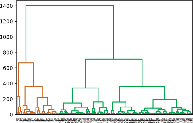
Figure 18.3 Hierarchical clustering: complete
wine_complete = hierarchy.complete(wine)
fig = plt.figure()
dn = hierarchy.dendrogram(wine_complete)
plt.show()
18.2.2 Single Clustering
A hierarchical cluster using the single clustering algorithm is shown in Figure 18.4.
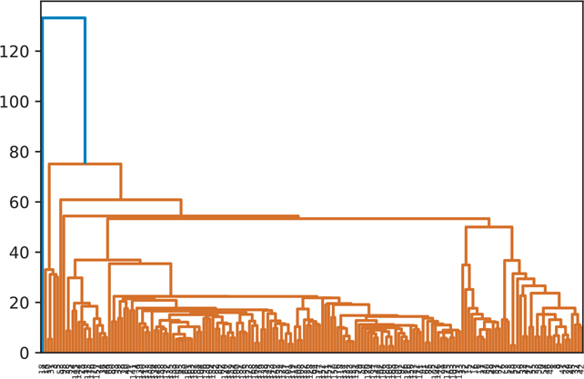
Figure 18.4 Hierarchical clustering: single
wine_single = hierarchy.single(wine)
fig = plt.figure()
dn = hierarchy.dendrogram(wine_single)
plt.show()
18.2.3 Average Clustering
A hierarchical cluster using the average clustering algorithm is shown in Figure 18.5.
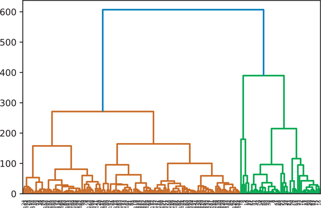
Figure 18.5 Hierarchical clustering: average
wine_average = hierarchy.average(wine)
fig = plt.figure()
dn = hierarchy.dendrogram(wine_average)
plt.show()
18.2.4 Centroid Clustering
A hierarchical cluster using the centroid clustering algorithm is shown in Figure 18.6.
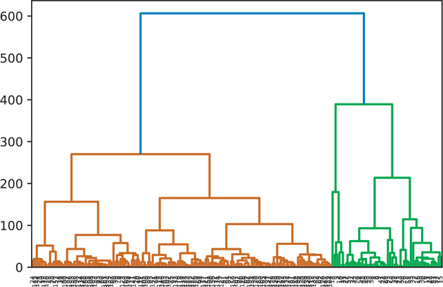
Figure 18.6 Hierarchical clustering: centroid
wine_centroid = hierarchy.centroid(wine)
fig = plt.figure()
dn = hierarchy.dendrogram(wine_centroid)
plt.show()
18.2.5 Ward Clustering
A hierarchical cluster using the ward clustering algorithm is shown in Figure 18.7.
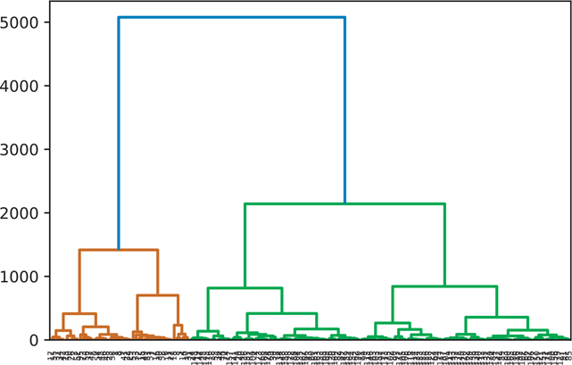
Figure 18.7 Hierarchical clustering: ward
wine_ward = hierarchy.ward(wine)
fig = plt.figure()
dn = hierarchy.dendrogram(wine_ward)
plt.show()
18.2.6 Manually Setting the Threshold
We can pass in a value for color_threshold to color the groups based on a specific threshold (Figure 18.8). By default, scipy uses the default MATLAB values.
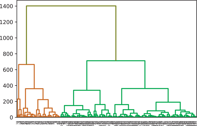
Figure 18.8 Manual hierarchical clustering threshold
wine_complete = hierarchy.complete(wine)
fig = plt.figure()
dn = hierarchy.dendrogram(
     wine_complete,
     # default MATLAB threshold
     color_threshold=0.7 * max(wine_complete[:,2]),
     above_threshold_color='y')
plt.show()
Conclusion
When you are trying to find the underlying structure in a data set, you will often use unsupervised machine learning methods. k-Means and hierarchical clustering are two methods commonly used to solve this problem. The key is to tune your models either by specifying a value for k in k-means or a threshold value in hierarchical clustering that makes sense for the question you are trying to answer.
It is also common practice to mix multiple types of analysis techniques to solve a problem. For example, you might use an unsupervised learning method to cluster your data and then use these clusters as features in another analysis method.