
Whether or not various items on the slide are in close proximity or not instantly tells the viewer whether or not those items are related. The spaces between elements are critical to our immediate understanding.
The closer together elements are physically, the closer they seem intellectually. As the elements move farther apart, they separate themselves intellectually. Keep that in mind as you arrange items on the slide.
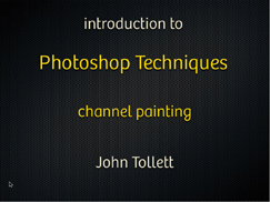
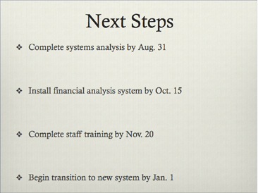
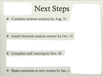
How many individual elements are on this slide? With all that space between each line, it looks like four separate and unrelated pieces of information.
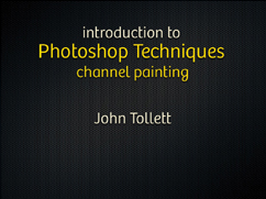
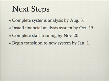
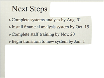
By simply grouping the items into closer proximity, we reduce the number of individual elements on this small slide from four to two.
And we can instantly see, even if this were in a foreign language, that we have a topic and a byline.
Proximity creates relationships. We automatically assume that items that are close together have connections, so be conscious of this on your slides. Think of human beings and how we make assumptions on their relationships based on their proximity (or not) to each other; next time you are in a group of people, consciously notice who has a relationship with whom, and why do you think that? Apply that thought to the pieces of information on your slide—who has relationships?
Combine proximity with alignment and you can’t go wrong. Your slides will not only look nicer, but your information will be presented more clearly.
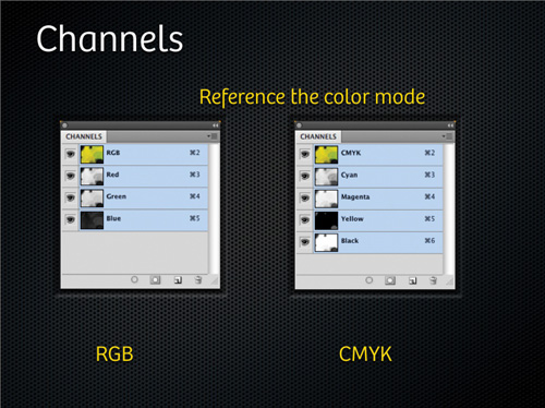
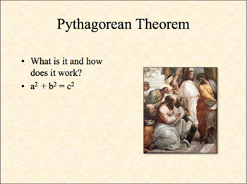
The subhead, above, is closer to the graphics than it is to the heading. And the captions, RGB and CMYK, are farther away than they should be.
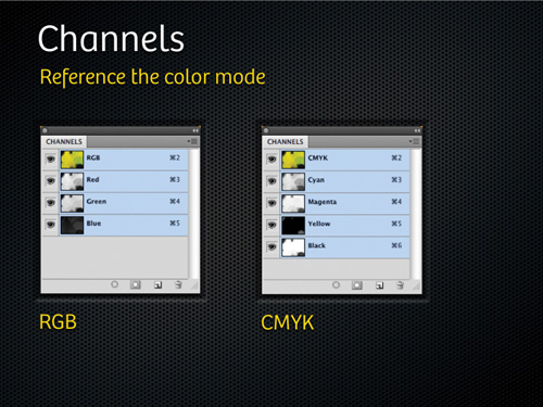
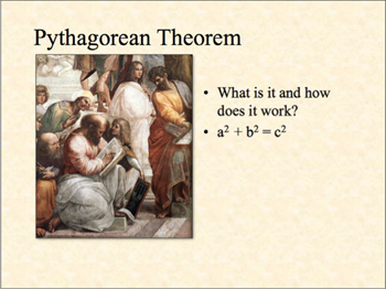
Simply by paying attention to the proximity of the elements (and their alignments), this slide is organized and communicates quickly and easily.
Don’t just randomly throw things on the slide! Group elements together that belong together.
Now your eyes don’t have to wander all over the page trying to make sure you’ve caught everything.
Do you also see the alignment used on this slide? (Centered.)
Sometimes presenters try to spread out the text to fill the empty space. You don’t need to do that. It’s okay to have empty space, or “white” space. In fact, one key feature of professional graphic design is organized white space; that is, the white space is as consciously placed as the individual elements.
You don’t need to worry about where your white space is—it will be organized and where it belongs if you follow the four basic principles. Notice the white space in the examples below. You can see that when we apply the principle of proximity, that very process organizes the white space as well, without even thinking about it. What you have to do is let the empty space be there.
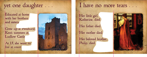
Can you see the empty space? Do you see how it’s forcing the separate elements apart? Even the bullets are too far away from their lines of text.
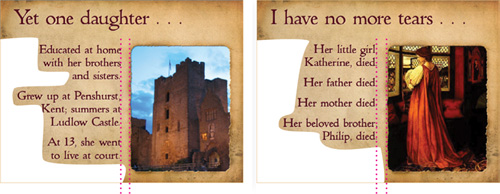
Now the white space is organized, but you didn’t have to do anything—it organized itself when you grouped elements into closer proximity.
I realize that when using a template in PowerPoint, it can automatically spread out the information like this. That’s why you have to learn how to use your software; learn how to make it do what YOU want it to do (see Chapter 12).
It’s okay to have lots of white space on the slide. You don’t have to try to fill the white space by spreading out the text (that doesn’t work, anyway).
When you combine proximity with alignment, you can ensure that you don’t have “trapped” white space, or space that is enclosed between two objects. White space needs to flow, needs to have an outlet. When you trap it, the space forces those objects apart, as you saw on the previous page.
A very common design situation is the one shown below, where you have text and a photograph together, side by side. The photograph has a strong alignment—both of its edges are straight and definite. The text (unless it’s centered) has a strong alignment on one of its edges, the edge against which it is aligned (typically, most text is lined up on the left side).
If you combine the strengths, combine the alignments—align the strong part of each object with the strong part of the other—you can do two things at once: eliminate any trapped white space, and add strength to your layout.
Above, the photographs have vertical lines, strong and straight. The text, being flush left, has a strong alignment on the left. The varied alignment on the right of the text creates “trapped” space between the text and the photo, pushing them apart.
If we align the strong lines (align the straight edge of the text along the straight edge of the photograph), it gives the white space room to flow off the page. And our design is strengthened because we’ve created groupings of information instead of having floating, random pieces.
Moving elements into appropriate groups immediately cleans up the slide and helps organize your information.
Always be conscious of how many times your eye must jump from one thing to another on a slide. In the example below, on the left, note your eye movements as you look at the slide. When you’ve looked at all five elements, can you feel your eyes still wandering around, trying to ensure you’ve seen everything? And can you imagine doing that while someone is talking and you need to take notes?
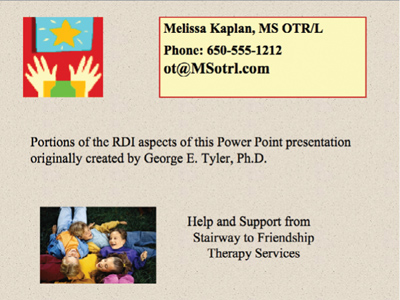
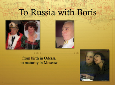
How many elements are on this small slide? Do any of them look related to any other? Intellectually, are there items that should be more closely connected?
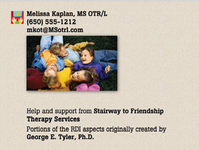
Obviously, I did a lot more than just group items into closer proximity. But it was in that process and to that end that I edited, removed the bordered box (which trapped space inside of itself), and resized elements according to their importance. I also changed the font from Times New Roman to Boton.
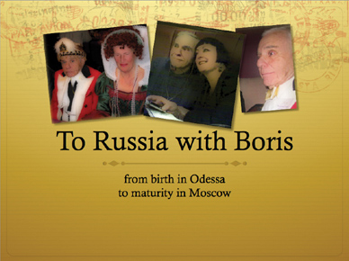
Now be conscious of your eye movement while looking at the slide on the right. Can you feel how your eye slides right down the information? Your brain doesn’t worry about missing parts because it knows it caught everything.
In this process of combining appropriate elements into closer proximity to each other, while separating others, you end up with clearer communication.
All four of these basic principles (contrast, repetition, alignment, and proximity) work together, but proximity is a great place to start. Find the relationships between the elements on the page and group them accordingly. Create space between elements that you want your audience to see as separate elements. From there, be conscious of the other principles—and how they interact between your entire deck of slides—as you build the presentation.
1. The presenter randomly dropped three items on the slide. They have no connection to each other.
2. Let’s start with grouping the items together and aligning them. Why not enlarge the beautiful image? Now we have a clear unit of information.

3. Do we really need the bullets in the text? By removing them, we get rid of unnecessary clutter, plus we can move the item closer to the image. A little more space between the paragraphs helps define the two separate thoughts.
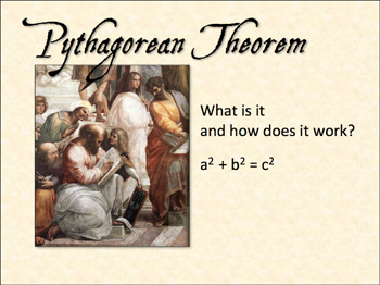
4. Instead of using the default font, Times New Roman, find something more visually interesting (and relevant) for the headline. Choose a clean sans serif for the body copy—for clarity, and to prevent a conflict between the two fonts.