In Excel 2007, charting is simpler than ever before. You can quickly turn your spreadsheet data into easy-to-read charts and customize the chart style to suit your needs. You can choose from a wide variety of chart types, and Excel makes it easy to determine exactly which type of chart works best for your data. After you create a chart, you can use the Chart Tools on the Ribbon to fine-tune the chart to best display and explain the data.
Create a Char

Note
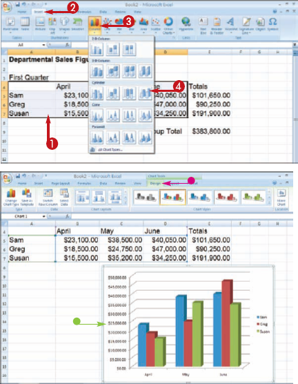
See Chapter 9 to learn how to select cells; see Chapter 11 to learn about ranges. You can include any headings and labels, but do not include subtotals or totals.


Note
You may need to move your chart. See the next task to learn how. You can include any headings and labels, but do not include subtotals or totals.
Note
Can I select noncontiguous data to include in a chart?
Yes. The data that you select for a chart do not have to be adjacent to each other. To select noncontiguous cells and ranges, select the first range and then press and hold

How do I create an organizational chart in Excel?
You can add an organizational chart to track the hierarchy of an organization or method. When you insert an organizational chart, Excel creates four shapes to which you can add your own text. You can add additional shapes and branches to the chart as needed. To create an organizational chart, click the Insert tab on the Ribbon, and then click the SmartArt button. To learn more about using this feature, see Chapter 3.


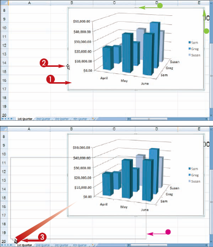
You can move and resize an embedded chart on your worksheet. For example, you may want to reposition the chart at the bottom of the worksheet, or resize it to make the chart easier to read.
Move and Resize Charts
MOVE A CHART

The


Excel moves the chart.
RESIZE A CHART
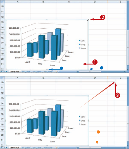
Excel resizes the chart.
Note
How can I move a chart to its own worksheet?
Select the chart, and then click the Design tab on the Ribbon. Click the Move Chart button at the end of the tab. This opens the Move Chart dialog box. Click the New Sheet option and click OK Excel adds a new worksheet to the workbook and places the chart on the worksheet.

How do I delete a chart that I no longer want?
To remove an embedded chart, simply select the chart and press

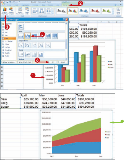
You can change the chart type at any time to present your data in a different way. For example, you might want to change a bar chart to a line chart.
Change the Chart Type
The Change Chart Type dialog box appears.
You can change the chart style to change the appearance of a chart. For example, you might prefer a brighter color scheme for the chart. You can choose from a wide variety of styles to find just the look you want.
Change the Chart Style
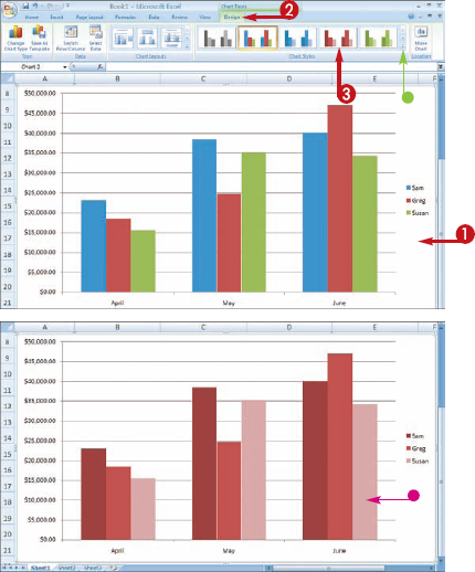
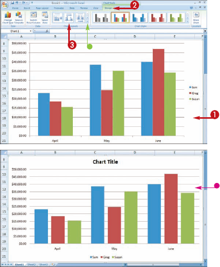
You can change the chart layout to change how chart elements are positioned. For example, you may prefer to show a legend on the top of the chart rather than on the side. You can use Excel's layout options to further customize your chart's appearance.

Change the Chart Layout
Axes are used to show the scale of all of the values in a chart. The x-axis is the horizontal value display in a chart, and the y-axis is the vertical value display.
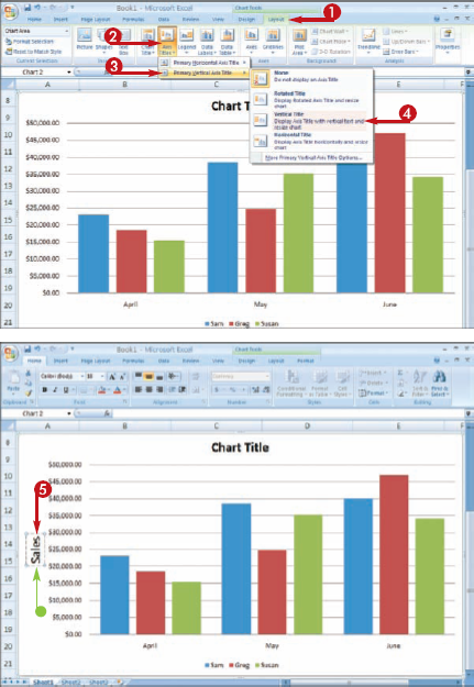
You can add x- and y-axis titles on your chart to identify your chart data. You can add axis titles in a variety of positions on the axes. If your chart has existing titles, you can change them to more descriptive titles, or if your titles are too long, you can shorten the title text.
Add Axis Titles
You can click anywhere outside the selected object to deselect the object.
Depending on which object you select, you can open the Format dialog box and display settings that are specific to that type of chart object. In this task, you learn how to change the data series and data labels. You can apply these same techniques to format other chart objects.
You can change the formatting for any of the elements, called objects in Excel, that are contained within a chart. For example, you can change the background color or pattern for the plot area, or change the color of a data series on the chart.
Format Chart Objects
FORMAT THE DATA SERIES OBJECTS
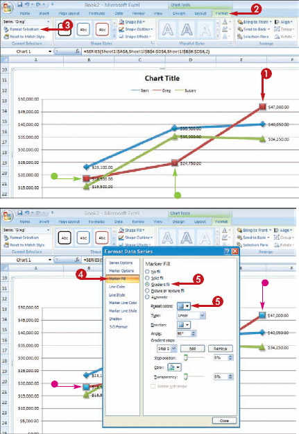
The Format Data Series dialog box appears.
In this example, the Marker Fill options appear.
FORMAT THE DATA LABELS
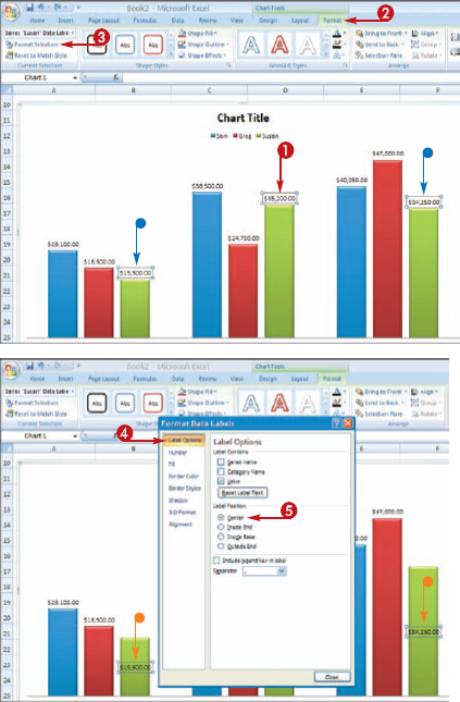
The Format Data Labels dialog box appears.
In this example, the Label options appear.
Note
How do I change the font for my chart text?
The quickest way to change the font is to first select the chart element that contains text, and then right-click the element to display the mini toolbar. You can then activate any of the formatting controls, including the Font
How do I print my chart?
To print only the chart, first select the chart on the worksheet, click the Office button, and then click Print The Print dialog box appears. Ensure that the selected chart option is selected (
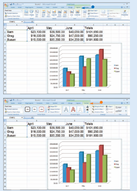
You can add objects to your charts, such as gridlines, using the tools on the Layout tab on the Ribbon. The Layout tab is one of three special tabs that appear when you select a chart on a worksheet. The tab lists chart objects that you can turn on or off in your chart

Although this task shows how to add gridlines to enhance the plotting of units on a chart, you can use this same technique to add other objects to your chart with the Layout tab tools. Keep in mind that you can add gridlines to all charts except pie charts.
Add Gridlines
Select Primary Horizontal Gridlines to add horizontal gridlines.
Select Primary Vertical Gridlines to add vertical gridlines.
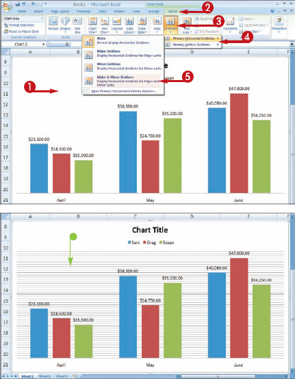
Excel adds the gridlines to the chart.
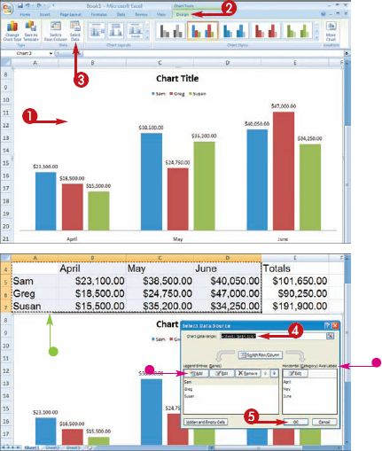
Whenever you change data that is referenced in your chart, Excel automatically updates the chart data. For example, if you change a value, the chart updates to reflect the new value. If you need to add more data to the chart, you can easily update the source cells.
Change the Chart Data
Note
You may need to move the dialog box to view the data
Excel updates the chart.
