
The first part of this section offers step-by-step tutorials for the following:
Creating a new Flex project
Laying out a simple application in Design view
Adding data to a chart using data binding
Running a Flex application
In order to cover more ground, the second portion walks you through some snippets of code and explains:
How to create additional views for existing data sources
How to change styles in a Flex application
How to add simple transitions
The sample application provided here can also serve as a resource for highlighting a more complex implementation of the Flex presentation tier. All code is documented with explanations for each of the components.
In order to complete the following examples, you need to download and install Flex Builder 2 and the Flex Charting Components. You can find a 30-day trial of both at this location: http://www.adobe.com/products/flex/
First install Flex Builder 2, and then install the charting components. Once you have both installed, start Flex Builder to begin building your first Flex application.
Flex Builder 2 is based on the Eclipse IDE, an open source Java-based development environment built by IBM. You can install Flex Builder as a plugin for an existing installation of Eclipse or as a standalone Eclipse application. If you have an existing installation of Eclipse on your system, you may want to install Flex Builder as a plug-in. Otherwise, install the standalone view, and you’re ready to start coding. Let’s begin by creating a new project.
From the main menu bar select File → New → Project. A wizard appears, walking you through a few easy steps to create a new Flex project.
Select Flex Project from the folder labeled Flex and press Next.
The wizard then asks, “How will your Flex application access data?” The default selection is Basic. Since we won’t be connecting to a server-side data source, leave Basic selected and press Next.
The subsequent screen prompts you to name the project. Pick a name for your project and then click Finish.
Your screen should look something like Figure 3.
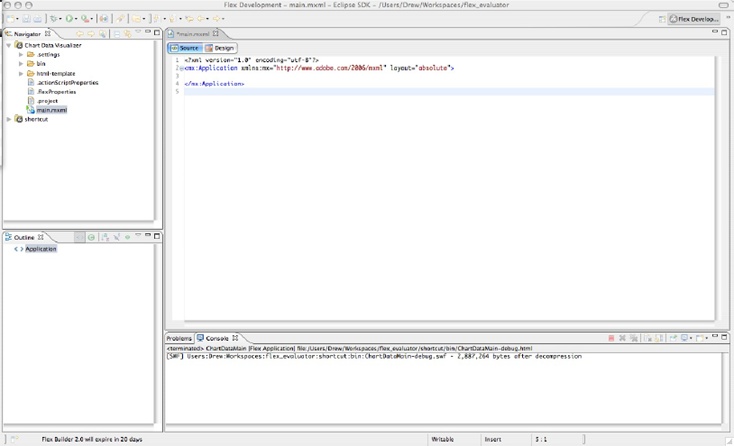
Flex Builder creates the application document, main.mxml. Flex organizes your application as groups of components and “main.xml” actually represents the Application component, which is the outermost level component in any Flex application. Later, we’ll nest a number of other components inside this Application component.
Flex offers two views for developing applications: Source view and Design view.
Source view is the traditional method of developing in most IDEs and it gives you direct ability to view and edit the code. Most developers use this view, as it offers maximum flexibility and prohibits an additional layer of abstraction from the developer to her code.
Design view is a WYSIWYG development view. It allows you to drag components from the Components panel onto the stage and see them rendered without having to compile the application. After you’ve placed a component on the stage, you can change the properties and styles of each component instance using the Flex Properties panel. We’ll build this section in Design view just to give you a feel for how it works, and then we’ll build the rest of the sections in Code view.
Directly below the tab header for main.mxml, you’ll see two buttons labeled Source and Design. Click the Design button and you should see something similar to Figure 4.
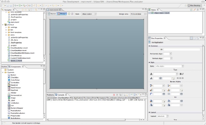
The Components panel is on the lower-left side of the screen. It contains a list of all the prebuilt Flex components provided by Flex Builder. The Flex Properties panel is on the righthand side of the screen. This is where you can edit each individual component. Located above the Flex Properties panel is the States panel, which allows you to create different view states for your application without writing a single line of code.
For this lesson, we’ll concern ourselves with only two panels: Components and Flex Properties.
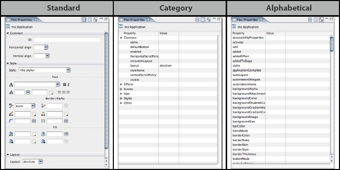
There are three view options in the Flex Properties panel: Standard, Category, and Alphabetical (Figure 5). Standard is the default view for properties. It has the appearance of an easy-to-read form. Category view displays a list of properties organized in their associated category. Alphabetical view is self-explanatory.
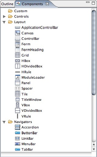
The Components panel is a library of components at your disposal. It’s accesible only when you’re in Design view. The components are organized by the function they serve. Any custom components you write can also be accessed from this panel in the Custom folder (Figure 6).
Flex relies on a number of layout components to organize the objects in an application. While developers are free to write their own layout components, Adobe has provided a well-rounded set of prebuilt components with various options on how to organize the application. The Flex Layout Manager considers the order of components within a layout component and the type of layout component being used when rendering the application. For instance, an HBox is a simple layout component that displays all of its children horizontally, adding subsequent children to the right of previous children. Similarly, the VBox component displays all of its children vertically, with the first child on top. The separation of layout components from other interactive components makes it easy to control and change the layout of your application without touching data processing code.
Our application simulates an RIA used by an automobile distributor to display the number of SUVs, Sedans, and Vans sold for the past few years. We’ll display the data first in an editable spreadsheet and then on a chart. Let’s get started.
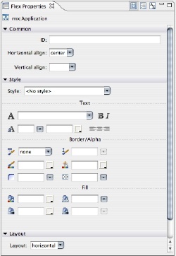
Click anywhere inside of the stage area to select the application object. You should see mx:Application at the top of the Flex Properties window (Figure 7).
With the Application object selected in Design view, set the following properties from the Properties panel:
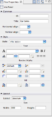
Drag a Panel component onto the stage. Using the Properties inspector on the left, set the Title property to Car Sales, the width to 800, and the height to nothing (Figure 8).
Setting the height to nothing causes the Flex Layout Manager to size the component to fit its children.
Drag another panel onto the stage. Set the following properties on the Properties inspector:
width: 100%
height: 100%
layout: vertical
title: Car Sales by Year
Drag a DataGrid component from the Components panel into the top panel. Set the following properties on the DataGrid:
width: 100%
editable: true
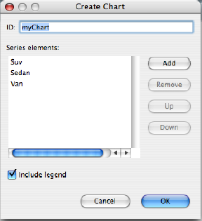
Drag a ColumnChart component from the Components panel into the bottom panel. A wizard appears, prompting you to set a few properties for the ColumnChart. Set the ID to myChart. Select the default series, series1, and click Remove. Then add three series named SUV, Sedan, and Van as shown in Figure 9.
Set the following properties on the ColumnChart:
width:
100%height:
60%id: myChart
Notice a legend component was added just below the ColumnChart. Drag the legend above the ColumnChart within the panel so that it rests above the ColumnChart.
If you switch back to Source view, you’ll see the MXML that Flex Builder generated. All of the components are created as open node tags. You’ll also notice that all the component properties are applied as attributes to the nodes.
<?xml version="1.0" encoding="utf-8"?>
<mx:Application xmlns:mx="http://www.adobe.com/2006/mxml" layout="vertical">
       <mx:Panel width="800" layout="absolute" title="Car Sales">
              <mx:DataGrid width="100%" editable="true">
              </mx:DataGrid>
       </mx:Panel>
       <mx:Panel width="100%" height="100%" layout="vertical"
              title="Car Sales by Year">
              <mx:ColumnChart id="myChart">
                     <mx:series>
                            <mx:ColumnSeries displayName="SUV" yField=""/>
                            <mx:ColumnSeries displayName="Sedan" yField=""/>
                            <mx:ColumnSeries displayName="Van" yField=""/>
                     </mx:series>
              </mx:ColumnChart>
              <mx:Legend dataProvider="{myChart}"/>
Now that we have a simple layout, it’s time to add some real data to the ColumnChart and DataGrid. The next section shows you how to bind the chart to an ActionScript data source.
A useful feature in Flex is the ability to bind a data source directly to a visual component’s dataProvider property. The Flex data-binding architecture has a built-in mechanism that automatically updates all binding destinations whenever the source data changes. We now need to add some ActionScript to create the data source.
Add the following block of code directly below the opening <mx:Application> tag:
<mx:Script>
    <![CDATA[
        import mx.collections.ArrayCollection;

        [Bindable]
        private var chartData:ArrayCollection;

        private function init() {
            chartData = new ArrayCollection();
            chartData.addItem( {year:2003, count:53});
            chartData.addItem( {year:2004, count:34});
            chartData.addItem( {year:2005, count:65});
        }
    ]]>
</mx:Script>
In order to initiate the chartData ArrayCollection, we need to call the “init()” method when “initialize” event is dispatched from the Application. Insert the initialize handler into the <mx:Application> tag as show in the last line of following figure:
<?xml version="1.0" encoding="utf-8"?>
<mx:Application xmlns:mx="http://www.adobe.com/2006/mxml"
    layout="horizontal"
    horizontalAlign="center"
    initialize="init()">
Now that we’ve created a data source, we can bind it directly to the dataProvider property of the ColumnChart and DataGrid using curly bracket notation, as shown here:
<mx:DataGrid width="100%" dataProvider="{ chartData }">The data binding for the controls is complete. After only a few more steps, we’ll be ready to run the application.
In order for the ColumnChart to render its data properly, we need to make some additions to the chart.
Inside the ColumnChart MXML tag, you’ll notice a child node named Series. The Series property is an Array of fields within the dataProvider that you’ll want to display in the chart. In the case of this dataProvider, we’ll want to display three series: “sedan,” “suv,” and “van.” Add the additional <mx:ColumnSeries> tags to the <mx:series> node. The Series node should look like this:
<mx:series>
    <mx:ColumnSeries displayName="Sedan" xField="year" yField="sedan"/>
    <mx:ColumnSeries displayName="SUV" xField="year" yField="suv"/>
    <mx:ColumnSeries displayName="Van" xField="year" yField="van"/>
/mx:series>
As you see in the sample above, the xField property for each series corresponds to the year field of the dataProvider. Now we need to add a horizontal axis to the chart. Add the following block inside of the of ColumnChart node:
<mx:horizontalAxis>
    <mx:CategoryAxis categoryField="year" title="Year" />
</mx:horizontalAxis>
The DataGrid needs some fine tuning to display data in a readable fashion. Since there are four fields in each item of the dataProvider, we need to make sure that the DataGrid has a column for each field.
Inside the <mx:DataGrid> tag, you’ll find three existing columns <mx:DataGridColumns>. Add an additional column so there are a total of four.
Format the columns to look like this:
<mx:columns>
       <mx:DataGridColumn headerText="Year" dataField="year" editable="false"/>
       <mx:DataGridColumn headerText="Sedan's" dataField="sedan"/>
       <mx:DataGridColumn headerText="SUV's" dataField="suv"/>
       <mx:DataGridColumn headerText="Van's" dataField="van"/>
</mx:columns>
The headerText property defines the label that shows up in the header of the column. The dataField property defines which field from the dataProvider it should display. The editable field in the year column is set to false because we don’t want to change the year in this case.
Your main.mxml file in its entirety should look like this:
<?xml version="1.0" encoding="utf-8"?>
<mx:Application xmlns:mx="http://www.adobe.com/2006/mxml"
       layout="vertical"
       horizontalAlign="center"
       initialize="init()" width="100%" height="100%">
       <mx:Script>
              <![CDATA[
                     import mx.collections.ArrayCollection;

                     [Bindable]
                     private var chartData:ArrayCollection;

                     private function init():void {
                            chartData = new ArrayCollection();
                            chartData.addItem( {year:2003, sedan:53, suv:32,
van: 23});
                            chartData.addItem( {year:2004, sedan:43, suv:32,
van: 43});
                            chartData.addItem( {year:2005, sedan:23, suv:32,
van: 53});
                     }
              ]]>
</mx:Script>

<mx:Panel width="800" title="Car Sales">
       <mx:DataGrid width="100%" dataProvider="{ chartData }" editable="true">
              <mx:columns>
                     <mx:DataGridColumn headerText="Year" dataField="year"
                            editable="false"/>
                     <mx:DataGridColumn headerText="Sedan's" dataField="sedan"/>
                     <mx:DataGridColumn headerText="SUV's" dataField="suv"/>
                     <mx:DataGridColumn headerText="Van's" dataField="van"/>
              </mx:columns>
       </mx:DataGrid>
</mx:Panel>

<mx:Panel width="100%" height="100%" title="Car Sales by Year">
             <mx:Legend dataProvider="{myChart}" color="0×000000"/>

             <mx:ColumnChart width="100%" height="100%" id="myChart"
                    dataProvider="{ chartData }" >
                    <mx:horizontalAxis>
                           <mx:CategoryAxis categoryField="year" title="Year" />
                    </mx:horizontalAxis>
                    <mx:series>
                           <mx:ColumnSeries displayName="Sedan" xField="year"
                                  yField="sedan"/>
                           <mx:ColumnSeries displayName="SUV" xField="year"
                                  yField="suv"/>
                           <mx:ColumnSeries displayName="Van" xField="year"
                                  yField="van"/>
                    </mx:series>
             </mx:ColumnChart>
      </mx:Panel>
</mx:Application>Now that we’ve written all that code, it’s time to run the application. Running an application in Flex Builder is a very simple process. Just like a Flash app, a Flex app consists of a compiled Flash movie (.swf), which is then embedded into a browser-friendly HTML page. Flex Builder handles initiating a command to the Flex compiler, which then compiles all MXML and ActionScript into an .swf. Flex Builder also automatically generates an HTML page with the Flash movie embedded in it.
Here are several different methods to run your application from Flex Builder:
From the main menu, select Run → Run As → Flex Application.
-or-
Right-click the main.mxml file in the Navigator. Select Run as → Flex Application
-or-
Press the button that’s highlighted below, located in the tool bar that lies at the top of the Flex Builder window (Figure 10).
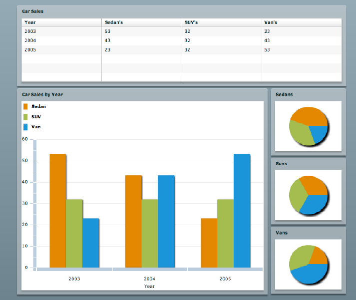
After performing one the previous actions, your default browser should open up with the application running inside of it. It should look like Figure 11.
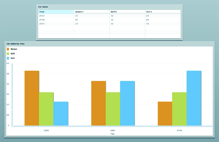
Here, you see a working RIA, with just a few lines of code. This application presents our data in a way that people will understand, and it was easy to code. Try updating the data by making a change to the DataGrid. The graph updates automatically, and we don’t have to email a single event handler to process the change, thanks to data binding.
This application works well, but it doesn’t look especially pretty. Let’s add another set of charts, some styles, and a few effects, to spruce it up.
First, we’ll add a set of pie charts. Let’s say that our car company wants to display the results for each car type in a separate pie chart. Flex does a great job at helping us separate views from data, so this is easily accomplished.
Let’s place the PieCharts on the right of our current chart with each chart in its own separate panel. We’ll begin by adjusting our layout to accommodate our new set of charts. First, wrap the lower panel in an HBox. Set the HBox’s width to 800 to match the width of our DataGrid above and set the height to 500. Then, after the panel, in the HBox, add a VBox. You can do this using either the Display view or by adding the code by hand. It should look like this when completed:
<mx:HBox width="800" height="500">
       <mx:Panel width="100%" height="100%" title="Car Sales by Year">
              <mx:Legend dataProvider="{myChart}" color="0×000000"/>
              <mx:ColumnChart width="100%" height="100%" id="myChart"
                     dataProvider="{ chartData }" >
                     <mx:horizontalAxis>
                            <mx:CategoryAxis categoryField="year" title="Year" />
                     </mx:horizontalAxis>
                     <mx:series>
                            <mx:ColumnSeries displayName="Sedan" xField="year"
yField="sedan"/>
                            <mx:ColumnSeries displayName="SUV" xField="year"
yField="suv"/>
                            <mx:ColumnSeries displayName="Van" xField="year"
yField="van"/>
                     </mx:series>
              </mx:ColumnChart>
       </mx:Panel>
       <mx:VBox width="30%" height="100%">
       </mx:VBox>
</mx:HBox>
Next, let’s add the PieCharts. Start by adding a single PieChart to the VBox. Add a new Panel to the VBox, and set its title to Sedans. Now add a PieChart to the panel. Add a PieSeries to the PieChart with the field set to sedan, like this:
<mx:Panel width="100%" height="100%" title="Sedans">
       <mx:PieChart width="100%" height="100%" dataProvider="{chartData}">
              <mx:series>
                     <mx:PieSeries field="sedan"/>
              </mx:series>
       </mx:PieChart>
</mx:Panel>
Repeat those steps for both SUVs and Vans, adding them after the Sedans. Run the application. It should now look like Figure 12.
Already, the application is looking much better, but there are a few improvements to make. You may have noticed our pie charts don’t have any labels specifying the year to which each slice of the pie corresponds. That’s because Flex can’t determine which field in the data to use in setting our label. To set the PieChart labels, we need to make use of a labelFunction. The PieChart has a labelFunction field, and all we need to do is write a function and point this attribute to it.
Back in the Script tag, add the following code:
private function displayYear(data:Object, field:String,
       index:Number, percentValue:Number):String {
              return data.year;
}
You can modify labels in any way, using any data available. All we really need is to return the year field on our data object. For more on using label functions, see Adobe Flex Documentation.
Another problem with our current view is that the colors are misleading. Flex has a set of colors it uses for each series of data by default, and it repeats this in all charts across an application. In our application, this feature is misleading, because the colors used to delineate different car types in our ColumnChart are the same colors used to delineate different years in our PieCharts.
Unfortunately, Flex doesn’t provide an easy way to specify colors for a ColumnChart using style sheets, so we need to change the colors by hand. This isn’t difficult, though. First, we need to change each of our ColumnSeries tags in the ColumnChart to have both an open and an end tag, rather than the single line tag we used previously. Next, nest a fill object inside of the ColumnSeries object, and then add a SolidColor object with the color you desire. I’ve chosen to do Sedans in red, SUVs in blue, and Vans in green. The code for the ColumnChart now looks like this:
<mx:ColumnChart width="100%" height="100%" id="myChart" dataProvider="{ chartData }" >
       <mx:horizontalAxis>
              <mx:CategoryAxis categoryField="year" title="Year" />
       </mx:horizontalAxis>
       <mx:series>
              <mx:ColumnSeries displayName="Sedan" xField="year" yField="sedan">
                     <mx:fill>
                            <mx:SolidColor color="#CC0000" />
                     </mx:fill>
              </mx:ColumnSeries>
              <mx:ColumnSeries displayName="SUV" xField="year" yField="suv">
                     <mx:fill>
                            <mx:SolidColor color="#0000CC" />
                     </mx:fill>
              </mx:ColumnSeries>
              <mx:ColumnSeries displayName="Van" xField="year" yField="van">
                     <mx:fill>
                            <mx:SolidColor color="#00CC00" />
                     </mx:fill>
              </mx:ColumnSeries>
       </mx:series>
</mx:ColumnChart>
Now, let’s add the rest of our style changes.
Flex allows a number of different ways to apply styles. I prefer to reference them in a separate file, because this helps keep separation between our data and our view and it sticks to the best practices for traditional web design.
Let’s start by adding a new CSS file to our project. Right-click the project in Flex Builder, and then select New → CSS file. Name the file whatever you want. Next, we need to reference our CSS file from the Flex application. To do this, add a style tag to the application just under the script block, like this:
<mx:Style source="Sample.css"/>
Back in our style sheet, let’s add some styles to the entire application. You add styles in the same way you would with traditional web applications. A full discussion of style sheets is beyond the scope of this document, but a number of simple guides are readily available on the internet.
We’ll set the text color to black, to ensure that all of the text in the application stays black. We’ll also change the background from the teal green Adobe uses by default to a shade of gray. Flex, by default, applies the background application color style as a gradient, so this makes for a very nice effect:
Application{
       color : #000000;
       backgroundColor: #333333;
}
Next, let’s style our data grid:
DataGrid {
   backgroundColor: #0066ff;
   alternatingItemColors: #cccccc, #e9e8e8;
   verticalGridLineColor: #00ccff;
   rollOverColor: #a7dffc;
   dropShadowEnabled: true;
   headerStyleName: "mydataGridHeaderStyle";
}
.mydataGridHeaderStyle {
   fontWeight: bold;
}
I made these styles using Adobe’s style explorer, which allows developers to graphically pick the styles they’ll use in their application. The styles are exported in CSS by the Style Explorer, which is itself a Flex application. You can find the Style Explorer at http://examples.adobe.com/flex2/consulting/styleexplorer/Flex2StyleExplorer.html.
Finally, let’s add styles to our PieCharts. Unlike ColumCharts, we can specify the colors used by PieCharts in CSS. Since we have Sedans in red in our ColumnChart, I’m going to use three different shades of red in our Sedans PieChart. Similarly, I’m going to use three shades of blue for SUVs, and three shades of green for Vans. The CSS looks like this:
PieSeries{
       labelPosition: outside;
}

.redPie{
       fills:#FF0000, #880000, #330000;
}
.bluePie{
       fills:#0000FF, #000088, #000033;
}
.greenPie{
       fills:#00FF00, #008800, #003300;
}
Finally, back in our application, we need to modify the PieSeries tags to reference our new styles. This is done by setting the styleName attribute for each PieSeries accordingly. Here’s an example of how this looks for the Sedans series:
<mx:PieChart width="100%" height="100%" dataProvider="{chartData}">
       <mx:series>
              <mx:PieSeries styleName="redPie" field="sedan"
labelFunction="displayYear"/>
       </mx:series>
</mx:PieChart>
Repeat this same change for both SUVs and Vans, using the bluePie and greenPie styles respectively, and our styling is complete. The application should now look like Figure 13.
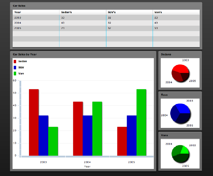
With just a few simple style additions, our application looks compelling and interesting.
Let’s make one final update to our application to enhance user experience: a simple transition. Right now, when our data changes, the graph suddenly changes without warning. While most people are probably used to this sort of behavior, they’ll appreciate and enjoy using our application more if we make this change a little more interesting, and Flex makes this easy.
Flex comes with a number of different, built-in transition functions. One of these functions is the SeriesSlide, which slides data in and out of a chart’s boundaries. Let’s declare two SeriesSlide transition objects in our application: a transition in, and a transition out. Add the following tags just below our style declaration:
<mx:SeriesSlide id="slideIn" direction="up" duration="500" />
<mx:SeriesSlide id="slideOut" direction="down" duration="300" />
Now we need to add these transitions to the series objects in our application. Set the showDataEffect attribute on each series to slideln and the hideDataEffect attribute to slideOut. These attributes in the mxml are really events fired by the series object when its data is updated. By setting them to transition objects, Flex implictly creates a set of event listeners and handlers which use the transition object to animate the data moving in and out of our chart. Set the attributes like this:
<mx:ColumnSeries displayName="Sedan" xField="year" yField="sedan"
showDataEffect="slideIn" hideDa-
taEffect="slideOut">
Set these attributes in all of the ColumnSeries and PieSeries objects, and run the application. Make some changes to the data in the data grid, and watch the application respond. Now people will feel like our application responds to them in a way that makes sense and makes using the application more enjoyable, but at the same time our transition isn’t so complicated that it distracts folks from the data.
Finally, here’s how the entire application file should look:
<?xml version="1.0" encoding="utf-8"?>
<mx:Application xmlns:mx="http://www.adobe.com/2006/mxml"
       layout="vertical"
       horizontalAlign="center"
       initialize="init()" width="100%" height="100%">
       <mx:Script>
              <![CDATA[
                     import mx.collections.ArrayCollection;

                     [Bindable]
                     private var chartData:ArrayCollection;

                     private function init():void {
                            chartData = new ArrayCollection();
                            chartData.addItem( {year:2003, sedan:53, suv:32,
van: 23});
                            chartData.addItem( {year:2004, sedan:43, suv:32,
van: 43});
                            chartData.addItem( {year:2005, sedan:23, suv:32,
van: 53});
                     }
                     private function displayYear(data:Object, field:String,
index:Number,
percentValue:Number):String {
             return data.year;
             }
             ]]>
       </mx:Script>

       <mx:Style source="Sample.css"/>

       <!-- Define custom charting effects to run when the chart
dataProvider gets updated. -->
       <mx:SeriesSlide     id="slideIn" direction="up" duration="500" />
       <mx:SeriesSlide     id="slideOut" direction="down" duration="300" />

       <mx:Panel width="800" title="Car Sales">
              <mx:DataGrid width="100%" dataProvider="{ chartData }" editable="true">
                     <mx:columns>
                            <mx:DataGridColumn headerText="Year" dataField="year"
editable="false"/>
                            <mx:DataGridColumn headerText="Sedan's"
dataField="sedan"/>
                            <mx:DataGridColumn headerText="SUV's" dataField="suv"/>
                            <mx:DataGridColumn headerText="Van's" dataField="van"/>
                     </mx:columns>
              </mx:DataGrid>
       </mx:Panel>
       <mx:HBox width="800" height="500">
       <mx:Panel width="100%" height="100%" title="Car Sales by Year">
                    <mx:Legend dataProvider="{myChart}" color="0×000000"/>

                    <mx:ColumnChart width="100%" height="100%" id="myChart"
dataProvider="{ chart-
Data }" >
                            <mx:horizontalAxis>
                                   <mx:CategoryAxis categoryField="year"
title="Year" />
                            </mx:horizontalAxis>
                            <mx:series>
                                   <mx:ColumnSeries displayName="Sedan"
xField="year" yField="sedan"
showDataEffect="slideIn" hideDataEffect="slideOut">
                                        <mx:fill>
                                        <mx:SolidColor color="#CC0000" />
                                   </mx:fill>
                                   </mx:ColumnSeries>
                                   <mx:ColumnSeries displayName="SUV" xField="year"
yField="suv"
showDataEffect="slideIn" hideDataEffect="slideOut">
                                        <mx:fill>
                                        <mx:SolidColor color="#0000CC" />
                                   </mx:fill>
                                   </mx:ColumnSeries>
                                   <mx:ColumnSeries displayName="Van" xField="year"
yField="van"
showDataEffect="slideIn" hideDataEffect="slideOut">
                                        <mx:fill>
                                        <mx:SolidColor color="#00CC00" />
                                   </mx:fill>
                                   </mx:ColumnSeries>
                            </mx:series>
                    </mx:ColumnChart>
             </mx:Panel>
             <mx:VBox width="30%" height="100%">
                    <mx:Panel width="100%" height="100%" title="Sedans">
                            <mx:PieChart width="100%" height="100%"
dataProvider="{chartData}">
                                   <mx:series>
                                          <mx:PieSeries styleName="redPie"
field="sedan" labelFunc-
tion="displayYear" showDataEffect="slideIn" hideDataEffect="slideOut"/>
                                   </mx:series>
                            </mx:PieChart>
                    </mx:Panel>
                    <mx:Panel width="100%" height="100%" title="Suvs">
                            <mx:PieChart width="100%" height="100%"
dataProvider="{chartData}">
                                   <mx:series>
                                          <mx:PieSeries styleName="bluePie"
field="suv" labelFunc-
tion="displayYear" showDataEffect="slideIn" hideDataEffect="slideOut"/>
                                   </mx:series>
                            </mx:PieChart>
                    </mx:Panel>
                    <mx:Panel width="100%" height="100%" title="Vans">
                            <mx:PieChart width="100%" height="100%"
dataProvider="{chartData}">
                                   <mx:series>
                                          <mx:PieSeries styleName="greenPie"
field="van" labelFunc-
tion="displayYear" showDataEffect="slideIn" hideDataEffect="slideOut"/>
                                   </mx:series>
                            </mx:PieChart>
                    </mx:Panel>
             </mx:VBox>
             </mx:HBox>

</mx:Application>
And that’s it. In just 93 lines of code and a few styles, we’ve built an entire application that’s easy to use and conveys our data in a way that’s easily understood.
Anthony Franco, President
blog: http://anthonyfranco.wordpress.com
web site: www.effectiveUI.com
RJ Owen, Flex Architect
John Wright, Flex Architect
Drew McLean, Flex Architect