Chapter 10
Web Content Management
WHAT’S IN THIS CHAPTER?
- Designing your taxonomy with SEO and meta data navigation
- Consuming content from multiple sites with search-driven publishing
- Using APIs to access content programmatically
- Using the new Design Manager to brand your site
- Working with usage analytics and multilingual support
WROX.COM CODE DOWNLOADS FOR THIS CHAPTER
The wrox.com code downloads for this chapter are found at www.wrox.com/remtitle.cgi?isbn=1118495829 on the Download Code tab. The code is in the chapter 10 download and individually named according to the names throughout the chapter.
The Web Content Management (WCM) features touch many aspects of SharePoint. There have been significant changes to the way WCM works inside of SharePoint 2013 especially in regards to content authoring and rendering that content. There are three major roles that each plays equally in the development of your WCM site. These roles are Information Architects, designers, and developers. Each role has actions highlighted on the homepage of the publishing site except for the developers who would deploy their modifications through SharePoint packages or with the JavaScript of the pages.
The primary goal of WCM sites is to enable users to create rich, dynamic websites. These sites can be customized for their design aspects and provide solutions for scenarios such as intranets, company websites, or e-commerce sites. Before the creation of WCM systems, websites consisted of static web pages that included the styling, layout, and content combined together on each page. This made it difficult to make changes to sites. Today’s WCM systems such as SharePoint 2013 provide a full feature set for maintaining these high traffic and visually pleasing sites. These sites also now serve multiple devices such as smartphones and tablets.
To create a WCM site you must ensure the WCM features are turned on. These features are called the publishing site features. When creating the site, you can select the Publishing Portal site that has the publishing features activated; although, you can manually turn them on within any SharePoint site. The publishing features add the WCM navigation links and required functionality to your site. To see if the features are enabled, you can look at the new Site Actions menu displayed with the gears similar to Internet Explorer. If there is a link for the new Design Manager, as shown in Figure 10-1, then the publishing features are turned on.
SharePoint 2013 provides a major overhaul of many of the WCM features from previous versions of SharePoint that are welcome. There have been updates to the way that content and data display on the page, as well as many additions to the publishing classes. The Publishing sites now leverage many of the features that have been enhanced in SharePoint 2013 such as the Managed Metadata Service and Search Service.
TAXONOMY AND THE INFORMATION ARCHITECT
The new features in SharePoint 2013 highlight the role of the Information Architect as a primary participant in WCM sites. The actions associated with the Information Architect are highlighted on the homepage of publishing portals with quick links to the actions they perform (refer to Figure 10-1). The role of the Information Architect within SharePoint sites focuses on three major areas: administration, content, and site navigation.
These major areas defined for the Information Architect center around the concept of the taxonomy of a site. The definition of taxonomy is to define a platform agnostic classification and definition of information as it relates to the content and consumption by end users. In plain English this means that taxonomy provides details for the terms, navigation, search, site structure, and content classification. The Information Architect is the planner of your site and defines what will be built with taxonomy that describes how things are organized and what fields are displayed.
There are entire practices around user experience and techniques that you can use to drive a good site design. When planning for the taxonomy of a site, you can use many techniques; some common tasks are as follows:
- Define a concept map.
- Perform a content audit of key information.
- Review search terms required for the site.
- Identify the vocabulary (that is, Terms) based on the site content.
Administration
The administration tasks required to be performed by an Information Architect are critical to the site and how the content displays to users. These tasks require clear planning around the permissions of the content and when it can be viewed. You must manage which apps are built for the site, such as e-commerce apps for online payments. Along with the permissions and apps, the Information Architect must plan the content for the site using the content types and the search settings.
New Management Pages
There are number of new management features provided at the Site Collection level that enable Information Architects to perform their jobs. Many of these pages were available at the Farm level previously, such as the Term Store Management pages, but have been moved to the Site Collection level to support the new WCM features added in SharePoint 2013.
Planning for WCM Sites
You can design a SharePoint site in many ways. You need to make sure that you determine the architecture and the plan for cross-site publishing if you want to use this new feature. This book focuses on the development aspects of SharePoint 2013 WCM, but Microsoft TechNet provides planning worksheets and guidance if you are interested in the architecture components.
Site Navigation
The majority of the sites using WCM features heavily rely on site navigation. This requires a structured global navigation within the Site Collection and a way to provide users with links to both site pages and subsites. Microsoft has made major improvements within these features to now use a dynamic set of navigation links defined within a Term Set.
SEO Improvements
The sites built with WCM features require a high-level discoverability for users to quickly consume pages. Actually, many external-facing websites on the Internet need a high level of search engine optimization (SEO) to help their pages to rise in search results of major providers such as Bing and Google. This was difficult in SharePoint 2010 and earlier due to the path that web content was stored in.
You have probably seen a site that has the /Pages in the URL that was a trademark of many SharePoint sites. The Pages library is still a part of the site structure for publishing sites, but the new managed navigation enables you to separate the content and the navigation of the site to provide excellent SEO for your publishing sites. The new pages created using the user interface create SEO structured URLs automatically for you.
Each page now has a set of SEO properties that are editable from the Edit SEO Properties menu. Figure 10-2 shows what items can be modified such as the Browser Title, Meta Description, and Keywords. The other options apply to the Sitemap settings, and you can even define if the page should be exposed to search engines.
In addition to the visible enhancements to the clean URLs on each page, the homepage now provides a clean redirect code. This redirect now provides a status update of HTTP 301 instead of the HTTP 302 that was returned in SharePoint 2010. This provides search engines with a better understanding of why the redirect occurs and can improve the ranking of pages because the search engine knows that the page is supposed to be redirected.
Managed Navigation Using Term Sets
The new managed navigation in SharePoint provides the site taxonomy within each site using the term store and managed meta data introduced in SharePoint 2010. There were improvements within the term store to enable each site to manage the navigation for that site. The ability to now select the inherited navigation from the parent and structural navigation is still available for use, but using the new managed navigation for top-level sites gives you full control of how the pages display no matter where the content is stored. This concept of separation of content and navigation is the key reason for the managed navigation. All of the options are clearly identified in the Navigation settings, as shown in Figure 10-3.
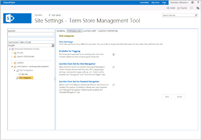
Terms’ Intended Use
With the addition of terms for navigation, Microsoft also added the ability to define what a term could be used for. Figure 10-4 shows this new concept of intended use. Each new term that is not part of the site navigation can now be designed for the type of intended use the Information Architect plans and how users can interact with the new defined terms. There are three ways that a term could be used when you create them. The first is for use as a tag, which was introduced in SharePoint 2010. The next two are with navigation, using the term for site navigation or faceted navigation. When selecting these check boxes, the term can then be incorporated into the navigation elements on the site.
PAGE CREATION
The page creation process used in SharePoint 2013 is designed for end users to build pages just as they would in a tool like Microsoft Word. You can paste your content directly into the site or convert file types to web content. The easiest way to create a page is by using the user interface. This creates the page directly on the site so make sure you publish content only if you are ready for it to be consumed. To create a page, use the following steps:
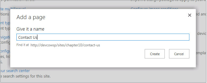
The Add a Page dialog uses the Article Page with a Body only as the default option when you enable the publishing features. This dialog is responsible for also creating the URL that the page is now associated with. The URL now displays as you type in the wanted page name and is added to the Site Navigation Term Set when you click the Create button. You can see an example of the new, friendly URLs that are generated for you in Figure 10-5.
In addition to the friendly URL, the generated URL does not have the /Pages or .aspx path for the SEO reasons previously discussed. This means that any time you create a new page you can assume you have clean URLs as you are generating the site. The structure of the navigation can be changed after the pages are created, and they do not have to all be structured as top-level sites from the pages library.
To make it easier for content owners to create and publish content, there is now a Save and Publish button. This enables you to quickly create a page, add content, and publish the content for viewing with a single-click. You no longer have to worry about the content not being shown due to it being in draft status. Many users didn’t even realize that the content they were creating was not published and they needed to perform any action on the Publish tab.
SEARCH-DRIVEN PUBLISHING
The introduction of search-driven publishing enables you to design pages and sites that can provide dynamic and rich pages generated based on tags. This style of displaying content has proven to be useful on sites that have changing content and need to change where the content is displayed. With this new type of publishing, all of the content is pushed into the search index and then displayed on the page with queries to the SharePoint search index. This ability to show content from the search index allows you create content in a single location and publish it to multiple places.
Catalogs for Site Publishing
A new concept introduced with this version of SharePoint 2013 to assist with publishing content across site collections is called a catalog. The catalog is a list that has been designated as a location for storing content that will be reused through the Cross-Site Collection Publishing features to present the same content somewhere else in the site.
You can create as many catalogs within your farm as you want. For an intranet with multiple departments publishing information, each site for the departments could have content it tags for publishing to the homepages. The architecture options are limitless and can be secured and distributed based on the Information Architecture you have defined.
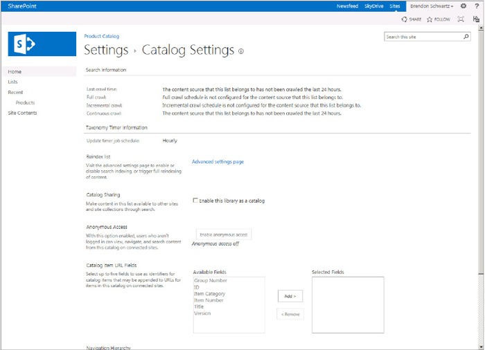
Creating a catalog on a site requires that you define the meta data you will use for indexing in the search engine and selecting a list or library that will store the content. If you use the new template called Product Catalog, you already have a list that has been established for you; otherwise, you must enable the Cross-Site Collection Publishing feature. In the list or library settings, you will have the Catalog Settings menu in the general settings, as shown in Figure 10-6.
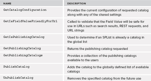
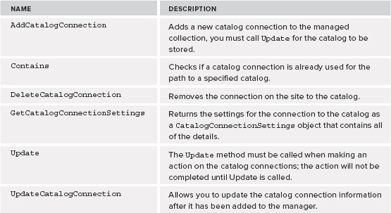
The ability to publish and unpublish catalogs can be done from within the user interface, but you also can control the site with a class called PublishingCatalogUtility. This class is responsible for providing access to the collection of catalogs on the server and providing statues about the catalogs. This class can also be used to start or stop sharing of the catalog and provide information about the lists that are connected to them. Table 10-1 shows the class members.
TABLE 10-1: PublishingCatalogUtility Class Members
Cross-Site Collection Publishing
The ability to display content from other site collections is based on the cross-site publishing features, sometimes referred to as XSP informally. When the content has been added to a catalog and then searched, it can then be consumed by a publishing site that can display that information on any page.
Cross-site collection enables true content reuse that can be added to the page either through a query, automatically generated based on the page name, or using a set of APIs. The primary class that manages the connections to the catalogs is the CatalogConnectionManager. This class enables you to consume catalogs from a search as well as provides information about the connections provided into the search. The manager is the central point to add or remove a catalog to be used for consumption. Just like many of the classes in SharePoint, you must call the Update method for any data to be changed on the server. Table 10-2 lists the class members.
TABLE 10-2: CatalogConnectionManager Class Members
CREATE AND EDIT CONTENT
Every WCM site is based on rich and well-designed content with the site pages. SharePoint provides a set of pages to accomplish this with a variety of layouts. The pages created with the publishing infrastructure have content types associated to them that define the content that will be input in the layout. The content types provided by SharePoint are Article Page, Catalog-Item Reuse, Enterprise Wiki Page, Error Page, Project Page, Redirect Page, and Welcome Page. The SharePoint publishing infrastructure provides fields that can be edited on a web page just like Microsoft Word.
Ribbon Enhancements
The Ribbon was introduced with previous versions of SharePoint but has been enhanced with SharePoint 2013. The key focuses are around ease of use and more single-click actions. This means that for content editors there is a closer experience to Microsoft Word with content they create on the web. There is also the ability to easily hide the Ribbon from the content viewing area now. This enables content editors to open the Ribbon as needed and to move it out of the way when displaying the content.
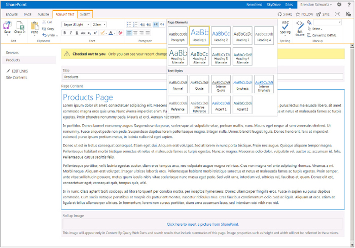
The new styles menu provides a quick and visual way of changing the text just like Microsoft Word. This helps to know what the page should look like and not just rely on HTML styles that might not have a direct mapping to Microsoft Word. You can even copy and paste your content from Microsoft Word directly into the Rich Text Editing area resulting in cleaner content. The new styles used on the page can be seen in Figure 10-7, providing the Microsoft Word-like editing experience within the Ribbon.
Publishing Field Controls
The page layouts define a set of content that is stored in the list and can be edited when creating a page. The most common type is the Publishing HTML Field control. You can see this control when you create an article page, which is the default, in the main Page Content area. These controls provide the rich editing experience without having to create an additional code, such a rich text editor.
These controls are not movable and require that they be placed on the page with the article type. You can think of these controls as editors to the list data that is contained on the page, which means you get versioning and approval of the content. If you have worked with web parts in the past, you will notice that the control feels similar to a web part, but the web part is strictly a control that is not directly tied to a list like the Field controls.
The controls are part of the Microsoft.SharePoint.Publishing.WebControls class, which contains many controls and web parts used within publishing for almost any type of interaction needed with the user. Table 10-3 shows some of the highly used controls.
TABLE 10-3: WebControls Class Members
| TYPE | DESCRIPTION |
| AssetUrlSelector | Provides a user interface for selecting a link or image URL from the site collection. |
| ContentByQueryWebPart | This web part has been used as the primary content roll-up web part and has multiple options. |
| MediaFieldControl | Used to display media such as a media player. |
| RichHtmlField | Provides an Editor like Microsoft Word for entering text and HTML-based content. |
| RichImageField | Enables selection and displaying of an image field. |
| TableOfContentsWebPart | Provides the table of contents web part used for the roll-up of site structure. |
To add fields to your pages with the Publishing Field types, you need to create a site content type using site columns. This means that the WCM data must be predefined prior to the page layout being created. Figure 10-8 shows the fields in the site columns that can be added as part of the publishing infrastructure.
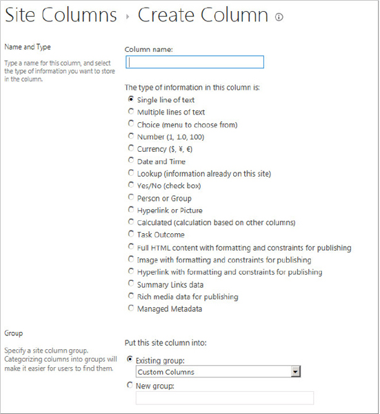
Image Renditions
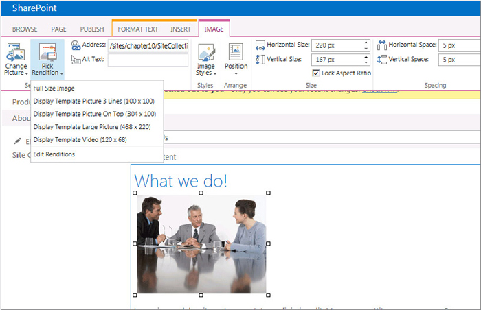
The introduction of image renditions provides a way to control the look of the web content you are creating when using images. Images on the web have always displayed in their default size format unless you specify a predefined width and height. This works if you can resize every image placed into content, but many times there is a predefined size that is wanted or mandated by style guides. This becomes difficult to manage when you want to use the same image using different sizes within the site. To assist with the challenges of image sizes on pages, SharePoint introduces image renditions. After you add an image to the page, you can then select the image rendition that you want using the Ribbon and the Image tab menu, as shown in Figure 10-9.
The image renditions are placed on the page using the same URL of the image with a query parameter added for the image rendition to use. This means that you can dynamically create URLs in your code to place the wanted image rendition using JavaScript or using the new device channels. To specify the URL use the RenditionID query string parameter. This ID and all image renditions are stored in a file named http://<site>/_catalogs/masterpage/PublishingImageRenditions.xml. The following sample code shows using the RenditionID of 2 that is listed in the xml file and defined using the Image Rendition site settings page:
http://www.wintiptoys.com/SiteCollectionImages/PR.gif?RenditionID=2
The BLOB cache is used to create multiple sizes of the image dynamically and must be enabled to use image renditions. To turn on the BLOB cache, set the enabled value to true in the web.config of the web application your site is in. In addition to enabling the BLOB cache, you should also select a good location for storing the images as they could increase in size quickly and take up valuable space on the default location. You can see in the list of file types that this does not apply only to images but could also be used with videos:
    <BlobCache location="C:BlobCache14" path=".(gif|jpg|jpeg|jpe|jfif|bmp|dib|
tif|tiff|ico|png|wdp|hdp|css|js|asf|avi|flv|m4v|mov|mp3|mp4|mpeg|mpg|rm|rmvb|wma|
wmv|ogg|ogv|oga|webm|xap)$" maxSize="10" enabled="true" />
The image renditions are exposed through the SharePoint API using the static class Microsoft.SharePoint.Publishing.SiteImageRenditions and providing the site collection you want the renditions from. This class uses the ImageRenditionCollection class and the ImageRendition class to add, remove, and update image renditions on the site. To add a new image rendition, use the following code:
            ImageRenditionCollection siteRenditions =
                SiteImageRenditions.GetRenditions(SPContext.Current.Site);

            ImageRendition addRendition = new ImageRendition();
            addRendition.Name = "New Product Image";
            addRendition.Width = 100;
            addRendition.Height = 100;

            siteRenditions.Add(addRendition);
            siteRenditions.Update();
DYNAMICALLY DISPLAYING CONTENT
Displaying content is one of the core principles for WCM, and this has been accomplished through publishing pages and Content by Query web parts in previous versions of SharePoint. You can still use those same techniques, but SharePoint 2013 introduces some additional capabilities that are designed to make it easier to build the pages using search and client-side techniques.
Building rich pages that have updated content requires that you build the WCM site correctly as well as construct the content correctly. The content needs to be tagged or labeled for you to programmatically find the data. You can do this by placing content in a specific location, giving the content a specific name, or adding common attributes such as tagging a document. With WCM the term document is a reference to any set of content you display on the web. The actual type of documents could be anything from web-based content (HTML) to Word documents or PDFs.
Content by Search Web Part
The new Content by Search web part provides the easy-to-use web part configuration of the Content by Query web part from the search index. You can think of this as the Core Search Results web part with easy-to-use and preconfigured results. The new Content by Search web parts have their own Query Builder user interface to make it easy to select the content you want with fine granularity. This also allows users that might not know search query syntax to use the wizard to pull back the correct data onto the page.
The Content by Search web part is an addition to the Content Rollup category web parts. You can still use the Content by Query web part if you want to use content that is located within the site collection. If you want to use content that is reusable across sites, you can use the new Content by Search web parts. Figure 10-10 shows how you can build your own query quickly within the user interface and see a preview of the results.
Search-Driven Web Parts
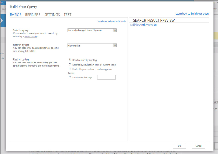
There are a number of web parts provided as part of the Search-Driven web parts category. These are web parts that have predefined search results already configured in their configuration and can be added to the page by end users. All of the web parts use the Content by Search web part with the custom query. You could create your own Search-Driven web part if you have a specific catalog or query that you would like on multiple pages. The current list of Search Driven web parts is shown here:
- Articles
- Catalog-Item Reuse
- Items from a Catalog
- Items Matching a Tag
- Pictures
- Popular Items
- Recently Changed Items
- Recommended Items
- Videos
- Web Pages
- Wiki Pages
ACCESS CONTENT PROGRAMMATICALLY
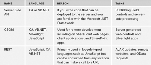
The entire SharePoint platform has provided more ways to connect to APIs and content of the site over the years. SharePoint 2013 continues to improve access by maintaining classes and adding new API methods. The publishing infrastructure builds on the core classes and adds publishing-specific APIs. The APIs available are Server Side, Client-Side Object Model (CSOM), and REST. This enables you as the developer to decide what languages and platforms you would want to use when building sites and content. There is a chance that you would use more than one of these APIs in your solution because they each have a different role. Table 10-4 shows what languages would be best for the development task at hand.
TABLE 10-4: API References for Publishing
Server-Side API
The Server-Side APIs are the most commonly used and have been around since SharePoint 2007 for the publishing infrastructure. The components provided by these APIs deliver the user interface, controls, and pages for creating WCM sites. To access these APIs you need to write code in Managed .NET using either Visual C# or Visual Basic. The code can run on the server and must be in a trusted location such as the GAC or the Bin. To access the classes for SharePoint publishing, reference the server DLLs in your project in addition to the SharePoint core DLL. The Microsoft.SharePoint.Publishing.dll contains the public classes specifically for the publishing framework. Here is the location of the server-side API DLL:
C:Program FilesCommon FilesMicrosoft SharedWeb Server Extensions15ISAPI
Microsoft.SharePoint.Publishing.dll
To access content from the publishing pages, you can use the built-in PublishingWeb class that is a wrapper for the SPWeb object on sites that have the publishing infrastructure enabled.
The first thing to do is create your project and add the SharePoint Publishing DLL as a reference. The following steps show how to do that:
With the project set up, you can now use the code in Listing 10-1 to display the pages in a publishing library. You will use the static methods from the PublishingWeb class and show the values on a web page.
LISTING 10-1: Display Pages in the Publishing Page Library
//Check if the Current Web is a Publishing Web
if (PublishingWeb.IsPublishingWeb(SPContext.Current.Web))
{
    //Get the Publishing Web Object
    PublishingWeb pubWeb = PublishingWeb.GetPublishingWeb(SPContext.Current.Web);

    //Loop through each Publishing Page to display information about the page
    PublishingPageCollection pubPageCollection = pubWeb.GetPublishingPages();
    lstPublishingPages.Rows = pubPageCollection.Count;

    foreach (PublishingPage pubPage in pubPageCollection)
    {
        //Display Info about the publishing Page
        lstPublishingPages.Items.Add(
            String.Format("{0}({1})", pubPage.Name, pubPage.Url));
    }
}
There are many classes within SharePoint for different purposes. When creating sites and content, there are a few other libraries that you can reference when working with WCM. The other Server-Side APIs that support the publishing framework are listed here:
- Document Management API — Microsoft.Office.DocumentManagement.dll
- Records Management API — Microsoft.Office.Policy.dll
- Search API — Microsoft.Office.Server.Search.Applications.dll
- Taxonomy API — Microsoft.SharePoint.Taxonomy.dll
Client-Side Object Model (CSOM)
The Client-Side Object Model (CSOM) provides a managed wrapper class that can make calls from the client using JavaScript. This is done through a WCF web service hosted on the server named _vti_bin/client.svc. This service is used for all client-based calls no matter which library you use. The libraries built for WCM publishing features are used in .NET, Silverlight, and Windows Phone. Referencing and using the .NET CSOM is just like referencing the Server-Side API. The major difference between the two is that the .NET CSOM must get a context object before making calls to the objects. This is because the code is translated into JavaScript and does not have the server-side objects readily available. The .NET CSOM DLL is located here:
C:Program FilesCommon FilesMicrosoft SharedWeb Server Extensions15ISAPI
Microsoft.SharePoint.Client.Publishing.dll
You can use the Client Publishing CSOM objects by adding the core SharePoint Client and Runtime DLL references. After you add these classes, you can add the Publishing Client DLLs and use the classes alongside the core CSOM classes. The following code shows how you can get the site image renditions and display the name of each:
            ClientContext context = new ClientContext(url);
            IEnumerable<ImageRendition> siteRenditions =
                      SiteImageRenditions.GetRenditions(context);

            context.ExecuteQuery();

            foreach (ImageRendition imgRendition in siteRenditions)
            {
                Console.WriteLine(imgRendition.Name);
            }
REST CSOM
Part of the new API set provided by SharePoint 2013 is an implementation of REST-based services using the CSOM server framework. This enables applications to make calls directly to a RESTful endpoint, which is especially useful in languages such as JavaScript; although, you can also use it from server code. The REST API provides new features around OData and maps the _api/ path to the _vti_bin/client.svc. Also, you should try to use the new API instead of the .asmx files for new development. The location for the Publishing and Search classes is shown in Table 10-5.
TABLE 10-5: Location for REST API
| NAME | LOCATION |
| Publishing | http://server/site/_api/publishing |
| Search | http://server/site/_api/search |
BRANDING SITES
Creating your own brand or look and feel of sites has been a goal for many organizations. You might even often hear someone ask, “How do I make this site not look like SharePoint?” There are now many options for achieving a fully branded site that is easy to build. There are full set of APIs and user interfaces to help designers build and deploy these packages. The APIs also enable developers to build rich content using the server or client-side programming using the Server API, .NET client object model (CSOM), JSON, JavaScript, and REST.
To build your own branding, use Master Pages and page layouts to design the look and feel of the site. These pages along with any automatically generated pages take the content stored in the content database and combine them together for the output to the browser. SharePoint combines the page layout with the Master Page to render the page to the browser. This means the page layout consists of content placeholder elements that instruct SharePoint where to place elements on the page inside the Master Page.
Master Pages
The global design elements along with the global controls such as navigation, search, and content area are defined in the Master Page. Each page can have a master page defined, but SharePoint makes it easy to assign Master Pages per site. The Master Page combined with a Page Layout can provide the entire site layout. This is where you would define your Cascading Style Sheets (CSS) as well as the HTML and content areas for all of your pages. When creating the Master Page, remember the file maintains the consistent user experience across your site. In SharePoint 2013, creating Master Pages has become easier with the introduction of the Design Manager and HTML Master Pages.
Page Layouts
The Page Layout is a template that is used to author content in your site. The template is designed to have two modes: a display mode and an edit mode. The display mode simply takes the data in a list item (that is, row of data) and maps the fields to the right location on the Page Layout. This means that you can have multiple Page Layouts for the same set of content and can change the Page Layout without modifying the underlying data.
You can modify the data by navigating to the page and using the Edit Page button to change the page into edit mode. This provides a way to modify the data that is stored in the content database but does not let you modify the page HTML. The Page Layout must be defined and created prior to the data being stored in the site, enabling separation of the content and layout. The advantage is that the author can edit content on the same location that the page will be rendered to visitors, and the designer can update the Page Layout as needed.
From a content-authoring perspective, the Page Layout dictates how the authoring experience functions. It accomplishes this in two ways. First, every Page Layout must be associated with a content type that is available in the Pages library and inherits from the Page content type. Second, the Page Layout implements editable fields that provide authoring areas on the page. These fields match up with the site columns defined in the content type. The HTML Page Layout enables you to quickly build page designs using the content types.
Composed Looks
Many sites such as intranets want to change the way the sites look but are not interested on taking on a fully branded project for their sites. The new Composed Looks feature brings together many concepts that were already provided to create a single point that users can use to modify the look of their site. This enables you to have more power directly within SharePoint and provide branding in a supported and structured way.
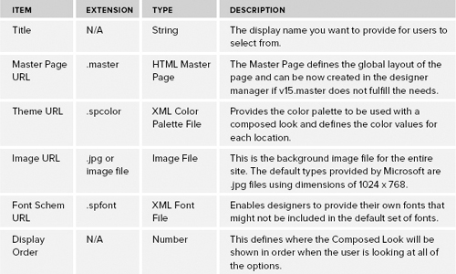
The Composed Looks provided with SharePoint 2013 use a combination of settings and show what your site could look like, as shown in Figure 10-11. Although this might look similar to the SharePoint 2010 Office Theme files (.thmx), the new engine separates the color palette and the fonts used on the site. The composed looks change the default look and feel by using different layouts, colors, images, and fonts. Table 10-6 shows the items used to create Composed Looks.
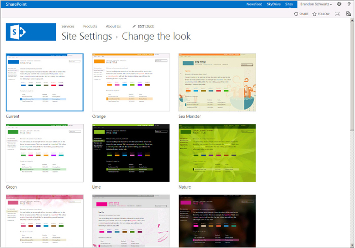
TABLE 10-6: Composed Looks File Types
The Composed Looks are just a starting point for users to brand their sites. When a look is selected, the Change the Look page will be provided for users to modify any of the elements they want to be different than the defined Composed Look.
To change the Color Palette or Font file, download one of the default files, and modify the colors or fonts that you would like to change. This would need to be done only if you want to deploy a Composed Look for multiple sites or automate applying the Composed Look on the site. Listings 10-2 and 10-3 show samples of the two files.
LISTING 10-2: From colorscheme0001.spcolor
<?xml version="1.0" encoding="utf-8"?>
<s:colorPalette isInverted="false" previewSlot1="BackgroundOverlay"
  previewSlot2="BodyText" previewSlot3="AccentText"
xmlns:s="http://schemas.microsoft.com/sharepoint/">
    <s:color name="BodyText" value="444444" />
    <s:color name="SubtleBodyText" value="777777" />
    <s:color name="StrongBodyText" value="262626" />
    <s:color name="DisabledText" value="B1B1B1" />
    <s:color name="SiteTitle" value="262626" />
    <s:color name="WebPartHeading" value="444444" />
    <s:color name="ErrorText" value="A83238" />
    <s:color name="AccentText" value="0072C6" />
    <s:color name="SearchURL" value="338200" />
. . .
LISTING 10-3: From fontscheme001.spfont
<?xml version="1.0" encoding="utf-8"?>
<s:fontScheme name="Bodoni" previewSlot1="title" previewSlot2="body"
xmlns:s="http://schemas.microsoft.com/sharepoint/">
    <s:fontSlots>
        <s:fontSlot name="title">
            <s:latin typeface="Bodoni Book" eotsrc="/_layouts/15/fonts/
              BodoniBook.eot" woffsrc="/_layouts/15/fonts/BodoniBook.woff"
              ttfsrc="/_layouts/15/fonts/BodoniBook.ttf"
              svgsrc="/_layouts/15/fonts/BodoniBook.svg"
              largeimgsrc="/_layouts/15/fonts/BodoniBookLarge.png"
              smallimgsrc="/_layouts/15/fonts/BodoniBookSmall.png" />
            <s:ea typeface="" />
            <s:cs typeface="Segoe UI Light" />
            <s:font script="Arab" typeface="Segoe UI Light" />
            <s:font script="Deva" typeface="Nirmala UI" />
            <s:font script="Grek" typeface="Segoe UI Light" />
            <s:font script="Hang" typeface="Malgun Gothic" />
            <s:font script="Hans" typeface="Microsoft YaHei UI" />
. . .
Custom Branding in Expression Web
Because users want to brand SharePoint sites and create a brand without SharePoint Designer, SharePoint includes that ability to use any web design tool or HTML editor to create the branding for your WCM site. One tool you can consider is Microsoft Expression Web when working with the web pages. This is one of the tools for designers that come with Expression Studio for taking your concept from design to HTML.
Install Microsoft Expression Web; then you can start creating your HTML from a blank page or download a style as a starting point from a website such as http://www.freecsstemplates.org. Make sure to check out the licensing restrictions with any web pages you download or plan to purchase before using them. When the page HTML and design are complete, you can transform it into a SharePoint design using the Design Manager.
Microsoft Expression Web refers to the collection of files as a site. You can use the site as a container for all of your branding elements, including your HTML Master Page. The site points directly to a set of files on the file system that can be mapped directly to the files in the Master Page gallery. To create your first brand with Microsoft Expression Web, follow these steps:
Your HTML Master Page should now look like the following code. The text that will be replaced was added to help show you where to replace content when adding the dynamic content later:
<!DOCTYPE html PUBLIC "-//W3C//DTD XHTML 1.0 Transitional//EN"
"http://www.w3.org/TR/xhtml1/DTD/xhtml1-transitional.dtd">
<html dir="ltr" xmlns="http://www.w3.org/1999/xhtml">

<head>
<title>Wrox Chapter 10 Branding with Expression Web</title>
<meta content="text/html; charset=utf-8" http-equiv="Content-Type" />
<link href="simpledesign.css" rel="stylesheet" type="text/css" />
</head>
<body>

<div id="masthead">//Replace with Header HTML
</div>
<div id="top_nav">//Replace with Global Navigation
</div>
<div id="container">
<div id="left_col">//Replace with Quick Launch Menu
</div>
<div id="page_content">//Replace with Page Contents
</div>
</div>
<div id="footer">//Replace with Footer HTML
</div>

</body>
</html>
If you are not a designer and want a great look and feel to your site, you can start with online templates. Download or purchase a site that is strictly CSS and HTML; then you can just open the site using the Site menu and the Open Site option. Ensure that any code or forms are removed from pages before you upload them, but this is a great way to quickly have your design in place. Some of the content you download might be in Adobe Photoshop (.psd) files because many designers develop the site as an image and then provide it to the developer to convert into the true HTML. Microsoft Expression Web provides the ability to import an Abode Photoshop file directly into your site design. These options provide you as the developer with many options and team structures for building your site design.
The finished site design will contain static content without any HTML form elements and would be viewable in an HTML browser such as Internet Explorer. Figure 10-12 shows what a branded site design might look like in Microsoft Expression Web. This shows how easy it is to create a brand even without being connected to SharePoint using tools already familiar to you and your team.
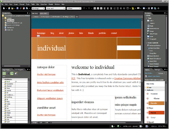
Even though tools such as Visual Studio and Microsoft Expression Web enable you to create rich web pages such as Master Pages and Page Layouts as well as add ASP.NET controls to your page, you will not want to add them at this time. The Master Page that this template will be transformed into will not have a code behind, and the server-side code you might write will not be uploaded with the files.
By using rich design tools such as Microsoft Expression Web that contain support for HTML5 and previewing pages in Internet Explorer 9 and Google Chrome, you can quickly build Internet-facing websites that users will appreciate.
DESIGN MANAGER
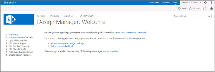
The Design Manager provides a set of steps that help you create a unique site design without installing any additional tools. Each step in the process provides information on what the step requires and links to the actions. The Design Manager is designed to enable you to create your brand for all devices and package the site design when you finish. You can see the Welcome page, which is Step 1, in Figure 10-13.
The Design Manager has changed the paradigm that SharePoint designers have used for years. Previously, designers for SharePoint would open a Microsoft SharePoint Designer (SPD) and directly modify the pages on a live site. This meant that you had to know about the specific SharePoint controls that were needed on the page and that you could use the simple drag-and-drop user interface to design. Some designers would just export the SharePoint Master Pages or start with the minimal set of controls required, called the Minimal Master Page. This meant there was little support for users that exported the site and many restrictions if you used SharePoint Designer. The change now aligns with many other website designs by enabling the design to be created outside of SharePoint and converted when it is ready for viewing. Keep in mind this does mean that the drag-and-drop functionality that many designers have used for many years will not be available in the new version of Microsoft SharePoint Designer 2013.
Using Device Channels for Mobile Experiences and Device Targeting
Over the past few years, devices of all shapes and sizes have become popular. From smartphones to tablets, users are now browsing the web in new ways. This market continues to be ever-changing and new devices such as the Microsoft Tablet are introduced frequently. This makes it extremely hard to create websites to fulfill the needs of both current and future devices, especially if you are not aware of what might be on the horizon.
Approximately 15 to 20 percent of web browsing is done from mobile devices, and the trend for mobile devices is going to increase over the next few years. In addition to the form factors, mobile devices have introduced multiple platforms and browsers. This means to account from all of the combinations of devices, platforms, and browsers, you must make many adjustments to site design.
Even large organizations have started to use tablets on a more regular basis, and many executives have tablets as their primary devices. This means that your WCM sites for the Internet or intranet must have the capability to provide an experience designed for the intended device — or as close as possible.
To deal with the growth of mobile devices for your WCM sites, you can use a new feature called Device Channels. This is a way to target the branding, content, and layout of your site to the type of browsers and devices defined in your site. There are two primary components for Device Channels to work. The first is defining the Master Page of the site that will be rendered when a mobile device makes a request. The second is to define which content will be displayed for each type of device based on available screen real estate.
Device Channels
The Device Channel is a list of settings that determines which Master Page to show based on user agent strings from their device. The Device Channel is set up to check if the device inclusion rules contain any of the elements in the user agent string and use the first channel found in the ordered list. The Design Manager provides a step to define and order your sites’ Device Channels.
The user agent string is a string defined in HTML browsers to describe to the web server information about the system viewing the data. There have been many changes over the years, but most browsers have the same common elements in the user agent string. Many of them have the following format:
Mozilla/[version] ([system and browser information]) [platform]
([platform details]) [extensions]
When looking at the user agent string for Internet Explorer, you might find the following depending on if you are on the desktop or mobile browsers. To learn about the history of the user agent string and how it has evolved, go to http://www.nczonline.net/blog/2010/01/12/history-of-the-user-agent-string/.
Mozilla/5.0 (compatible; MSIE 9.0; Windows NT 6.1; Trident/5.0)

Mozilla/5.0 (compatible; MSIE 9.0; Windows Phone OS 7.5; Trident/5.0;
IEMobile/9.0)
Creating a Device Channel requires setting a few values and then ordering the channels in which they should be executed. After the Device Channel is created, you can set a new Master Page to the channel when applying the site designs with the Design Manager. Use the following steps to create a Device Channel:
Device Channel Panel Control
To control the data on the page, you can use the new Device Channel Panel Control by specifying which channel you want to make specific changes for. This control can be added from the Snippet Gallery discussed in the “Snippet Gallery” section later in the chapter or as a SharePoint control. This could be useful if you want to display only a limited amount of content for a mobile browser but want more content added for the full desktop browser.
The Device Channel panel enables you to create HTML content that can be included in as many channels as needed by using the IncludedChannels attribute. The IncludedChannels attribute uses the Alias and not the display name of the Device Channels you defined earlier. You can use multiple channels by adding a comma in between the channels in the attribute. To use the control add the following code to your Master Pages or Page Layouts:
<PublishingWebControls:DeviceChannelPanel runat="server"
IncludedChannels="SmartPhones">
  <!-- Enter HTML in this section -->
  <div>This content only displays on the SmartPhone Device Channel</div>
When everything is configured you can test what the design looks like by forcing the site to use the desired Device Channel with a query string parameter. Using the Device Channel Alias again, you can specify which channel displays in the browser.
The query string template is located here:
http://<site>/products/?DeviceChannel=<DeviceChannelAlias>
Here is an example of a query string Device Channel:
http://tailspintoys.com/products/?DeviceChannel=SmartPhones
Working with Design Files and Assets
Every design is defined as a set of HTML, CSS, JavaScript, and image files, as well as any other supporting files. To create a design you need at least one HTML page that represents your Master Page known as your global layout.
One of the first thing you will do as a developer or designer of web pages is map the Master Page Gallery to the a network drive. SharePoint 2013 has enhanced the Master Page Gallery to work over WebDav and provide a filesystem interface for tools such as Microsoft Expression Web, Visual Studio, and Dreamweaver. This mapped drive enables you to edit any of the files from within Windows Explorer and especially the Master Pages and Page Layouts now.
To set up a connection to the Master Page Gallery, you could just click the link provided by the URL, which opens in your network drive locations. It is recommended that you create a mapped network location by following these simple steps. Included are steps from KB article 2445570 (http://support.microsoft.com/kb/2445570) for resolving slow responses on Windows Vista and Windows 7:
Now that you have designed your site and mapped the folder location, you next need to edit the files you created and modify them with the correct SharePoint elements. Using the Design Manager Wizard, you need to select the name of the file you created as your global brand and let SharePoint add the required elements. The name of the file is common across all of the pages, so you want to name it something unique. It is a good idea to store your files in a folder to keep them located together.
Converting HTML Master Pages
When you are at Step 4 Edit Master Pages, you have already created your HTML Master Page and the supporting files that will be converted using the Design Manager. The Master Page editor is a power tool that enables you to upload your HTML Master Page and provides information on the status of the conversion. If there are errors, the Design Manager displays them to you and enables you to try the conversion again when corrected.
Convert your HTML Master Page to a SharePoint Master Page by following these steps:
In the Design Preview you can change the page content that is being displayed to help see what elements need to be updated as you build your site. You also see a large, yellow rectangle explaining that there is a <div> tag that is automatically placed on the page to show the content of the Page Layouts. This is just a starting place for the HTML Master Page, and you need to make sure to add all of the dynamic content now as well as any styling you want to match the SharePoint design. Make sure to create a test page to display the content, and make sure your site design converted correctly.
The conversion of the HTML file added HTML to the file it converted, so you can update the elements already provided on the page. To edit the files, you need to open them in the HTML editor if they are not already open there. Navigate to the mapped path and create a site that opens directly from that location. Move the content placeholder to the correct location as well as any other HTML elements. As you edit the file, the SharePoint Master Page will also be updated, but you cannot directly modify the SharePoint Master Page file. To add the dynamic content, you need to use the Snippets link, which brings up the Snippet Gallery.
Snippet Gallery
Creating static site designs that require dynamic content or server tags creates an interesting problem. The Snippet Gallery assists in resolving this issue by enabling you to create dynamic content controls that can display in static HTML. The controls and their settings can be configured using an online form that can then be copied to HTML pages for your site design.
The Snippet Gallery works for both HTML Master Pages and HTML Page Layouts. The code that is generated can be edited prior to copying it, so you can adjust the components and their previews as needed. You can even fully brand the component in the Snippet Gallery that will be copied with the control when it is generated. After the pages are converted to SharePoint Master Pages and Page Layouts, the components will be converted into the actual controls.
The Snippet Gallery provides HTML markup for your HTML Master Page for many of the page elements. There is even an option to create your own snippet from custom ASP.NET controls. All of this is done through HTML comments that are marked up with special characters and sample HTML for the previews. Figure 10-14 shows the Snippet Gallery and what displays when Top Navigation is selected.
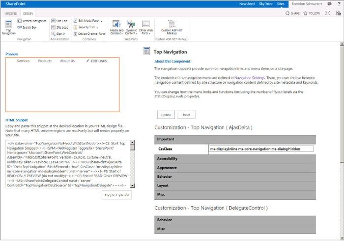
Each control has a unique set of customization options, and they each render differently. The rendering and conversion is done by using a set of HTML comments that have a SharePoint-specific token to notify the conversion engine on what action to take. The Snippet Gallery provides a standard interface no matter which control is selected.
- Design tab — This tab selects which control is being selected and edited by the Snippet Gallery. There are groupings for all the major components and even a Custom selection if a control is not listed.
- Preview window — The preview areas shows what the tag will look like in your HTML pages; it is not editable.
- HTML snippet — This snippet provides an area to view the HTML that is generated by the Snippet Gallery and provides a Copy button.
- Control description — This shows the name of the control and provides a description in the About this Component section.
- Customization options — You can see the set of HTML, CSS, Ajax, .NET, or Web Part settings depending on what the control provides.
The easiest way to understand how to use the Snippet Gallery is to try it. Using the following steps you can add the top navigation (ASP.NET control) and Search box (Web Part Control) to the simpledesign.html.
Start by navigating to the Snippet Gallery, which is located inside the Design Manager Preview Mode:
With the Snippet Gallery open, you can now select the controls you want and add them to your HTML Master Page. As soon as the control is updated on the WebDav location, the Master Page will also be updated. You can use the generated HTML snippets in any HTML web design tool; the output HTML is not specific to any Microsoft product. You can use the Microsoft Expression Web Design HTML editor, but there is nothing special between using this tool or NotePad in regards to the Snippet Gallery.
As you added the controls to the page, you probably noticed the use of the HTML comments and that each snippet is self-contained. This means that if the control required a delegate control or a register tag they were added with the control in the HTML snippet. To complete your page, finish adding all of the components you want to the page such as the site title, site logo, any device-specific containers, and any predefined web parts. If you look through all of the web part options, you can see the options for your pages are almost limitless, and you can create any page you could use with the user interface. The following code block shows what some of the snippet will look like:
<div id="top_nav" xmlns="http://www.w3.org/1999/xhtml">
<div data-name="TopNavigationNoFlyoutWithStartNode">
<!--CS: Start Top Navigation Snippet-->
<!--SPM:<%@Register Tagprefix="SharePoint" Namespace=
  "Microsoft.SharePoint.WebControls" Assembly="Microsoft.SharePoint,
  Version=15.0.0.0, Culture=neutral, PublicKeyToken=71e9bce111e9429c"%>-->
<!--MS:<SharePoint:AjaxDelta runat="server" CssClass="ms-displayInline
  ms-core-navigation ms-dialogHidden" BlockElement="True"
  ID="DeltaTopNavigation">-->
<!--PS: Start of READ-ONLY PREVIEW (do not modify)-->
<!--PE: End of READ-ONLY PREVIEW-->
<!--MS:<SharePoint:DelegateControl runat="server" Id="topNavigationDelegate"
  ControlId="TopNavigationDataSource">-->
<!--PS: Start of READ-ONLY PREVIEW (do not modify)-->
<span style="display: none">
<table cellpadding="4" cellspacing="0" style="font: messagebox; color: buttontext;
  background-color: buttonface; border: solid 1px; border-top-color:
  buttonhighlight;
  border-left-color: buttonhighlight; border-bottom-color: buttonshadow;
  border-right-color: buttonshadow">
<tr>
<td nowrap="nowrap"><span style="font-weight: bold">PortalSiteMapDataSource</span>
- topSiteMap</td>
All of the controls are easy to use and straightforward, but you should spend some time learning what you can do with the Custom ASP.NET Markup control. This snippet wraps the ASP.NET elements in the blank text into the properly commented snippet. The following code is from an ASP.NET AdRotator control that can be added to the left navigation directly under the search box. All of the HTML snippets are just text and can be edited or created by hand, but make sure to create invalid HTML or the HTML Master Page will have conversion errors and won’t display. If this happens the Design Preview tells you exactly which line of the HTML Master Page has the issue and what the problem is.
<!--CS: Start Create Snippets From Custom ASP.NET Markup Snippet-->
<!--SPM:<asp:AdRotator runat="server" id="AdRotator1"
  AdvertisementFile="~/Documents/adFile.xml">-->
<!--SPM:</asp:AdRotator>-->
<!--CE: End Create Snippets From Custom ASP.NET Markup Snippet-->
Package for Deployment
The last step in the process is to package your files for deployment on another server. This could be moving the files from development to production or providing them for download to other people. The packaging process takes the files you have created and puts them into a WSP file that can then be uploaded to any other SharePoint site.
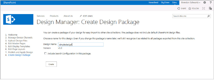
To make sure that you can package files, you need to publish them in the Master Page Gallery. You should also test your files by assigning them to the wanted device channels of the site. All of the files from the Master Page Gallery are placed into the package. You should try not to add any files for testing or that you do not want distributed to others in the library if you are packaging the files. The packages are versioned, and you can update the name of the package at any time without affecting the files inside of them. Figure 10-15 shows Step 8. Create Design Package after the package has been created. This is the last step in Design Manager, but you can navigate to any step at any time.
USAGE ANALYTICS
The ability to know what is working on your site and what is not is powerful. This ability allows you to have insight into how the content is used, what pages people visit, and how your site is consumed. This data is rolled up into 15 days’ worth of data, and user information is removed from the reports. To keep the servers running well, the daily data is purged from the system periodically.
All the data from the Usage Analytics is created from user actions such as clicks or viewed items. Due to the size of the reported data, the reports automatically trim the least-visited content and show the most recent data in the reports. The data that is aggregated together is moved to the reporting database for future reports. If you want the detailed data, you must store it in another location. These reports can easily be exported to Excel. The reports in Excel can be configured for either 15 days or 36 months depending on the settings configured for the report. The usage reports to use with your WCM site are Popularity Trends and Most Popular Items.
Architecture and Improvements
The Usage Analytics components are designed to work with the Search Analytics processing. To support the analytics architecture, there is a component to run the analytics processing jobs. These jobs process the information and store it in the correct locations. To store the content the Analytics architecture uses the Analytics reporting database. This database stores information such as usage event counts and views that provides the data to generate Excel reports.
The engine for analytics has been greatly improved on the Analytics Processing Component to scale with the farm and content. The new improvements to usage analytics include the ability to scale on collecting data, search relevance, and reporting size. These improvements allow the system to make search more relevant not only based on the content but also with the usage of the data. You will see the search relevance of your items improve over time without any changes to the Search settings.
The data that is stored in the Analytics database is also processed into the search engine to assist with search queries. The data affects the search rankings that are used for relevance, and you can directly call each item from the search index in your queries because they are sortable managed properties. The combination of the two sets of information, content, and usage makes it possible to determine the importance of your WCM content on the site. There are predefined usage events that SharePoint uses when you configure a site with default settings.
The default usage events in SharePoint 2013 are:
- Views
- Recommendations Displayed
- Recommendations Clicked
Using Usage Events in Code
Calling the default usage events can be done by adding the event into the HTML where it occurs. These events are defined by SharePoint 2013, and these events are used for the data in the reports created out of the box. There are classes in the Server-Side APIs, Client APIs, and JavaScript to enable you to create the events. There are also a number of default events that you must know the name and ID for in order to make the correct calls. The number order is important because you will use the integer for the one you want.
The default usage event types are:
- View
- Recommendation View
- Recommendation Click
- Search
The following code shows how you can add an event of Recommendation Click to an item when clicked. There are two areas where you need to add code. The first is the function to add the usage event, and the second is on the page when the item is clicked. First, here is the JavaScript function to add the event:
window.Log<RecommendationClick>ToEventStore = function(url)
{
    ExecuteOrDelayUntilScriptLoaded(function()
    {
        var chpt10_clientContext = SP.ClientContext.get_current();
        SP.Analytics.AnalyticsUsageEntry.logAnalyticsEvent(chpt10_clientContext,
        3, url);
        chpt10_clientContext.executeQueryAsync(null,
                    Function.createDelegate(this, function(sender, e)
                                                {
                                                    //Add Error message to page
                                                    e.get_message()
                                                }
                                               )
                                            );
    }, "SP.js");
}
Here is the button to click to add the usage event:
<input id="btnAddUsageEventClick" type="button" value="button"
onclick="Log<RecommendationClick>ToEventStore('http://www.bing.com')" />
Extending Usage Events
The usage architecture enables you to customize your WCM solutions by adding your own custom event types that can be recorded into the usage data. There can be up to 12 custom events per tenant that you are running. In addition to the custom usage events you can also influence the level of importance submitted to search when sending an event. The custom events you create can track metrics on pages, documents, catalog items, or even sites that users interact with. You could also incorporate third-party usage tracking applications but also have the option of using the custom events based on your needs.
To create the custom usage event, you must add the event to the Analytics Tenant Configuration. This can be done through any of the APIs, but you must have database access to write the event to the database. Here is how you create a custom usage event type:
            SPServiceApplicationProxy proxyService =
                SPServiceContext.Current.GetDefaultProxy
                  (typeof(SearchServiceApplicationProxy));
            SearchServiceApplicationProxy proxySearch = proxyService as
              SearchServiceApplicationProxy;

            AnalyticsTenantConfig config =
                proxySearch.GetAnalyticsTenantConfiguration
                  (SPContext.Current.Site.SiteSubscription.Id);

            config.RegisterEventType(Guid.NewGuid(), "CustomEvent", "Chapter10");
            config.Update(proxySearch);
MULTILINGUAL SUPPORT
Many sites using WCM features need the capability to support displaying content to many people with many languages. There have been updates to content translation along with the new Content by Search web part on how to create and manage multiple translations of content. There are a number of improvements that have been introduced in SharePoint 2013. The primary enhancements are around the stability and speed to the services, and the ability to replicate an entire list or library — not just the pages libraries.
You can create multilingual sites using the Site Variations feature in SharePoint 2013. If you used SharePoint Variations in SharePoint 2010, the features are still available to provide any needed modifications to your content. Site Variations provide a way to create a single source of content called a Source Variation label that can be copied to multiple target variation labels. When working with variations, you can create content that can be imported or exported using a third-party format called the XLIFF file format for content translation.
Navigation for a site with multilingual support previously required using a variation label or constructing your own redirection page at the variation root. The Host Header Site Collections provides a way to create unique URLs per language while still easily reusing content from a Site Variation label or search-driven content. This makes it easy to have a site that ends with a .com address as well as one from another top-level domain such as a German site of .de.
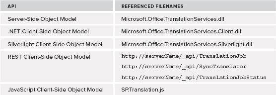
One major improvement with multilingual is the new Machine Translation Services that are now introduced into SharePoint 2013. This service enables you to automatically translate files using a Microsoft cloud-hosted translation service. The requests sent to the translation service can be done either synchronously or asynchronously. The APIs for this service can be used from a server-side object model, client-side object model, REST, or using the JavaScript API. Table 10-7 lists the APIs and the files to include when using them.
TABLE 10-7: Translation Service APIs
The three primary arguments you need for making a translation are the input file or file path, output file or file path, and the language to translate the content into. If you are not sure which language you are looking for, use the following code to determine which languages are supported:
        protected void lnkShowLanguages_Click(object sender, EventArgs e)
        {
            SPServiceContext serviceContext =
                SPServiceContext.GetContext(SPContext.Current.Site);
            StringBuilder sb = new StringBuilder();
            foreach (CultureInfo item in
              TranslationJob.EnumerateSupportedLanguages(serviceContext))
            {
                sb.AppendFormat("<li>{0} - {1}</li>", item.DisplayName,item.Name);
            }
            litLanguages.Text = String.Format("<ol>{0}</ol>", sb);
        }
To add a job to the translation queue using the asynchronous actions, you need to provide the input file that will be used for translation and an output file that will be modified with the translated content. The following code shows how this is done using the Server-Side Object Model:
        protected void btnTranslate_Click(object sender, EventArgs e)
        {
            String strTargetLanguage = "de";
            SPServiceContext serviceContext =
                SPServiceContext.GetContext(SPContext.Current.Site);
            TranslationJob job =
                new TranslationJob(serviceContext,
                  CultureInfo.GetCultureInfo(culture));
            job.AddFile(txtInputFile, txtOutputFile);
            job.Start();
        }
SUMMARY
Web Content Management in SharePoint 2013 has undergone some major changes that now provide compelling reasons that can be used for many scenarios. There are new techniques for creating, displaying, and editing content on the site as well as less restrictions on what content can be used. The WCM and publishing APIs have been extended for the new features and provide you with the ability to select the best API for the task. The new Design Manager and HTML design tools bridge the gap between HTML tools and SharePoint pages, enabling a more open and inviting environment. Finally, the services for Usage Analytics and multilingual support build on the foundation for improving your sites with a full set of developer APIs.