
20
Ten Keys to Mobile Web Design
In This Chapter
 Understanding different mobile devices
Optimizing for small screens
Designing for distracted users
Testing on different devices
There’s no doubt today that mobile devices have gone mainstream. Today’s marketplace boasts a wide array of products, many competing manufacturers, and oodles of innovative features. However, before we wax too eloquent, we should clarify that we aren’t talking about skimobiles, mobile homes, or even Mobile, Alabama. Rather, we’re talking about the mobile web, which serves those portable multi-use phones and other devices (such as the iPad or a Wi-Fi–connected portable GPS) that are so easy to carry around and integrate into everyday life.
Mobile devices are unbeatable for quick access to directions and maps, checking out product reviews or comparisons, finding contact information, or simply surfing the Internet while on the go. Because of this, we think understanding mobile web design is important, too. That way, you can use your new skills and knowledge to account for the many unique challenges that mobile access can pose, and perhaps build a better website as a result.
Design for Different Mobile Devices
Unfortunately, the more you look around at the different types of mobile devices, the more it seems like there’s no ready way to categorize them all or no single approach to implement web pages in their limited display space.
For example, you can find mobile devices categorized by one or more of the following characteristics:
 Input device (touchscreen, stylus, keyboard, or touchpad)
Operating system (Symbian, Windows Mobile, Apple iOS, Android)
Processor and memory
Screen size
Internet access
Connectivity (Bluetooth, USB)
Other cool features (camera, video, ringtones, games)
This list could go on and on. Basically, you get the idea that there are almost as many ways to profile mobile devices as there are mobile devices themselves.
On the most basic level, the safest and easiest way to classify mobile devices is into three groups:
Smartphone: A smartphone is a phone that includes computer-like features, such as an operating system integrated into the phone, more powerful processor and memory, the capability to install and run custom applications, wireless access, color display, and advanced input capabilities. Because of these features, it also comes at a higher costs — it’s more expensive to buy and costlier to use. The iPhone, shown in Figure 20-1, is one of the most popular smartphones.
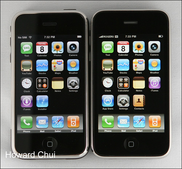
Figure 20-1: An Apple iPhone.
Feature phone: Feature phones usually incorporate less powerful processors and memory, have a basic and proprietary operating system, offer limited application possibilities (if any), and cost less than smartphones. (Feature phones often cost less than half of what smartphones do and, with more limited data handling capabilities, often cost about half as much for monthly service as well.) A typical example of a feature phone is the Nokia phone shown in Figure 20-2.
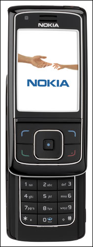
Figure 20-2: A standard Nokia feature phone.
Tablet: A tablet is generally larger than a phone and doesn’t have cellphone capabilities. More powerful tablets are beginning to replace laptops and even desktop computers for some users.
 Here’s the bad news: Not only do phones differ in features and prices, but they also display websites differently. Feature phones have extremely limited CSS and JavaScript support — if they have any such support at all. However, before you throw your hands up in the air, we recommend learning more about mobile website design in the following sections. Feature phones aren’t all bad, nor are smartphones all good. For both types of devices, some website compromises are necessary.
Design for People
When you start thinking about how to design mobile version(s) of your website so you can produce the best possible results for visitors using mobile devices, you need to ponder the unique challenges that the mobile web can pose for your site’s design and implementation. You also need to have a clear picture of who will be using your mobile website.
 Every single one of your mobile website’s users will be human, and there’s at least as much variation in people as there is in mobile devices. Unlike mobile devices, however, you can’t — and shouldn’t even try — to design with every possible user in mind.
Do your research and think about exactly who your target users are. Are they young or old? Male or female? Do they live in cities? Get as specific as you can when you define your users’ profiles and think about the scenarios in which they will use your mobile website.
Creating a profile of your target user and usage scenarios is called user-centric design.
Design for Small Screens
If every mobile phone had the same screen size, we might not have needed to write about mobile web design for this book. Although you have many other considerations to think about when creating mobile websites or pages, limited display real estate is one of the most important to keep in mind.
 Creating a single design with a fixed width doesn’t work if you want to take best advantage of real estate available on each screen. Also, remember that many smartphones can be rotated, so the user may view your page in both landscape and portrait views.
Design for Low Bandwidth
Smaller screen size isn’t the only thing that limits how well you can display images and multimedia on a cellphone; limited bandwidth is another important factor when designing and building a website for mobile access. Although a growing number of mobile users can take advantage of faster 3G and 4G mobile networks, many mobile device users are still hampered by connections best described as painfully slow.
The same challenges of limited bandwidth that throttled early web design and access for pioneering users in the early to mid-1990s now slow the mobile Internet. It lags far behind high-speed DSL and cable modem connections from a desktop or notebook computer.
As you design a mobile version of your site, follow these tips so that your site provides tolerable service for visitors with low-bandwidth connections:
Be ruthless with images and multimedia files. Limit your mobile site to a precious few images to help tell your story and add visual interest. Keep things small and simple.
Replace banners and button images with text links. Text links work on any device and consume only minimal storage space and bandwidth.
Be careful when including multimedia. For example, don’t put video or audio files on the front page of a mobile site. Instead, link to multimedia files so they’re optional for mobile browsers. Also, include warnings about file size and the way the media displays on different devices.
Design for Touch
Most smartphones today are touch enabled. Compared with a mouse pointer, a person’s finger is a pretty clumsy and imprecise instrument.
That means you need to do the following:
Make links easy to see and click. Buttons and links should be big enough and have enough space between them to make it easy to tap them with a fat fingertip.
Limit the total number of links, especially on the low-end version of your site. Help people move through your site by leading them from one short list of links to another until they reach the content that serves them best.
Organize link levels. Don’t include too many levels with your links. Consider adding breadcrumbs to help users find their way back through your site. Breadcrumbs are a list of links, usually at the top of a page, that help users identify where they are in the structure of the site. The links to each section and subsection are ahead of the current page in the site’s structure, from the home page all the way down to the current page (which is accessible through the browser’s address box).
Use a navigation menu, not a navigation bar. Although most desktop websites include a navigation bar that links to all main sections in a site at the top of every page, that's generally not the best use for real estate on a small screen. Instead, consider including one link at the top of every page with a name like Menu, and then link it to a navigation bar. Figure 20-3 shows this technique as it's used on the mobile version of this book's companion website, www.dummieshtml.com.
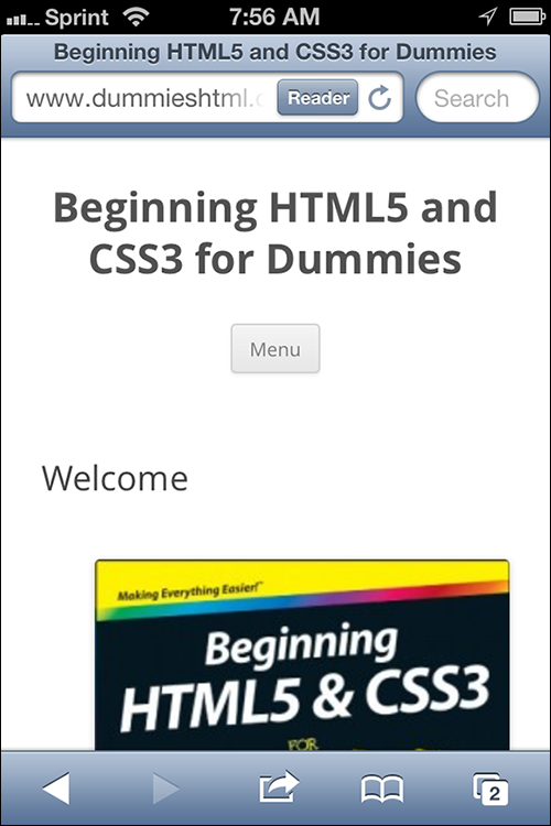
Figure 20-3: The mobile version of www.dummieshtml.com with a collapsed menu link.
Including a list of links to all the main pages of your site on every page may not be worth the download time, but creating a small site map and including a link to that page from every other page on the site provides a similar option without lots of extra overhead. Use this strategy to include a list of links at the bottom of each page along with a Menu link up top that jumps visitors to the links at the bottom.
Consider back and forward buttons. Back and forward buttons help users move through many pages of content or images.
Design for Distracted Surfers
One of the biggest differences between how people use mobile devices and how they use desktop computers is that when someone uses a mobile device, it’s often not the primary thing that they’re doing. For example, a user of your mobile website may be looking up your address while she’s on the way to a meeting with you. Or, she might be grocery shopping and looking up product information on the web. She even might be socializing with friends and trying to settle an argument over how old Tina Yothers is. (CelebrityAgeMachine.com works well for settling these arguments, by the way.)
The bottom line is that mobile users tend to be distracted. Here are a few quick tips to make your mobile site easier for distracted visitors to use:
Make key information, such as your address and phone number, easy to find right away.
Make all links big and easy to click.
Use text and contrasting background colors so the text is easy to read, even in low light (or on a display that’s hard to read in strong sunlight).
Test on Many Mobile Devices
To appreciate the challenges of the mobile web, surf to your own website on a mobile phone. However, don’t stop at one phone, especially if that phone is an iPhone or Android. The iPhone and Android may get all the headlines (and a majority of the traffic on the mobile web), but they’re not the only phones likely to visit your site. Those same sites viewed on a BlackBerry or a Windows Phone may be completely unreadable.
Although you can test your mobile site by using online emulators, such as the high-end testing site at DeviceAnywhere (www.deviceanywhere.com), the best way is to hold a device in your hand so you can see how your site feels and looks on that phone.
Visit a mobile phone store and be really nice to the salespeople while you test your sites on their phones. Better yet, compare notes with friends and family. Ask people to visit your website on different phones and watch what they do, how they find their way around (or where they get lost), and how hard it is for them to get to the information they need when they interact with your site.
Design for Simplicity
Even on the best mobile devices, typing and clicking links can be a challenge. Always make links big and easy to click for mobile visitors and don’t overload any page with too many options.
The best approach is to lead users through a series of simple choices, limiting options to no more than five to seven big links at any stage. Directing visitors to increasingly specific sets of links is best until users can choose the information they want or need.
When possible, avoid drop-down lists or anything else that uses AJAX or JavaScript around links. At the very least, provide alternatives when avoiding JavaScript is unrealistic. Because many mobile devices don’t support these types of web technologies, it makes these links impossible to use.
Some information, such as contact information, should never be more than one click away. In nearly all cases, including your phone number on the main page of your mobile site is good practice — after all, you know your visitor has a phone handy!
Set Up Mobile Web Addresses
So that everyone with a mobile phone can easily get to the URL of your mobile site (by typing as little as possible), set up multiple mobile addresses and direct them all to the mobile version of your site.
Until a clear winner appears in the mobile URL game, use all the most common addresses to increase the odds that your visitors find you on their first try.
The following are typical mobile URLs in common use on the mobile web:
m.yourdomain.com: Recommended for ease of typing.
wap.yourdomain.com: This is a common address for sites created using the WML (Wireless Markup Language).
yourdomain.com/mobile: Common alternative because of easy server setup.
yourdomain.com/i: For versions built specifically for the iPhone.
yourdomain.mobi: Requires registering a .mobi version of your domain name, which many sites don't seem to bother with.
Whatever you do, drop the www. — no one should ever have to type those three letters and that dot again on the modern web.
Your mobile site may not actually be a separate site. One popular alternative to creating separate sites for mobile and desktop users is to utilize media queries (as discussed in Chapter 19), to switch between different style sheets depending on the size of the user’s browser window. Web designers call this technique for creating mobile websites responsive design.
Include a Link to the Desktop Site
Always include a link to the full, desktop version of your site on your mobile site. This link helps people who may be familiar with your desktop site and prefer to use it even on their smartphone where it may not work as well.
In addition, it’s always possible that someone with a tablet device that receives the mobile site may find it easier to use the full version of the site rather than the mobile version.
Making it as easy as possible for the mobile user to use your website is the key to mobile web design.