Chapter 6
Getting the Picture: Graphing Categorical Data
IN THIS CHAPTER
![]() Making data displays for categorical data
Making data displays for categorical data
![]() Interpreting and critiquing charts and graphs
Interpreting and critiquing charts and graphs
Data displays, especially charts and graphs, seem to be everywhere, showing everything from election results, broken down by every conceivable characteristic, to how the stock market has fared over the past few years (months, weeks, days, minutes). We’re living in an instant gratification, fast-information society; everyone wants to know the bottom line and be spared the details.
The abundance of graphs and charts is not necessarily a bad thing, but you have to be careful; some of them are incorrect or even misleading (sometimes intentionally and sometimes by accident), and you have to know what to look for.
This chapter is about graphs involving categorical data (data that places individuals into groups or categories, such as gender, opinion, or whether a patient takes medication every day.) Here you find out how to read and make sense of these data displays and get some tips for evaluating them and spotting problems. (Note: Data displays for numerical data, such as weight, exam score, or the number of pills taken by a patient each day, are covered in Chapter 7.)
The most common types of data displays for categorical data are pie charts and bar graphs. In this chapter, I present examples of each type of data display and share some thoughts on interpretation and tips for critically evaluating each type.
Take Another Little Piece of My Pie Chart
A pie chart takes categorical data and breaks them down by group, showing the percentage of individuals that fall into each group. Because a pie chart takes on the shape of a circle, the “slices” that represent each group can easily be compared and contrasted.
 Because each individual in the study falls into one and only one category, the sum of all the slices of the pie should be 100 percent or close to it (subject to a bit of rounding off). However, just in case, keep your eyes open for pie charts whose percentages just don’t add up.
Before you make a pie chart, you can first summarize the data in table format. A frequency table shows how many individuals fall into each category (the sum of which is the total sample size). A relative frequency table shows what percentage of individuals fall into each category by taking the frequencies and dividing by the total sample size. The relative frequencies in the table and then in the pie chart should sum to 1, or 100 percent (subject to possible round-off error).
Tallying personal expenses
When you spend your money, what do you spend it on? What are your top three expenses? According to the U.S. Bureau of Labor Statistics Consumer Expenditure Survey, the top six sources of consumer expenditures in the U.S. were housing (33.9 percent), transportation (17.0 percent), food (12.8 percent), personal insurance and pensions (11.1 percent), healthcare (5.9 percent), and entertainment (5.6 percent). These six categories make up over 85 percent of average consumer expenses. (Although the exact percentages change from year to year, the list of the top six items remains the same.)
Figure 6-1 summarizes the U.S. expenditures in a pie chart. Notice that the “other” category appears a bit large in this chart (13.7 percent). However, with so many other possible expenditures out there (including this book), each one would only get a tiny slice of the pie for itself, and the resulting pie chart would be a mess. In this case, it is too difficult to break “other” down further. (But in many other cases, you can.)
Ideally, a pie chart shouldn’t have too many slices because a large number of slices distracts the reader from the main point(s) the pie chart is trying to relay. However, lumping the remaining categories into one slice that’s one of the largest in the whole pie chart leaves readers wondering what’s included in that particular slice. With charts and graphs, doing it right is a delicate balance.
FIGURE 6-1: Pie chart showing how people in the U.S. spend their money.
Bringing in a lotto revenue
State lotteries bring in a great deal of revenue, and they also return a large portion of the money received, with some of the revenues going to prizes and some being allocated to state programs such as education. Where does lottery revenue come from? Figure 6-2 is a pie chart showing the types of games and their percentage of revenue as recently reported by Ohio’s state lottery. (Note that the slices don’t sum to 100 percent exactly due to a slight rounding error.)
FIGURE 6-2: Pie chart breaking down a state’s lottery revenue.
You can see by the pie chart in Figure 6-2 that 49.3 percent of the lottery sales revenue comes from the instant (scratch-off) games. The rest comes from various lottery-type games in which players choose a set of numbers and win if a certain number of their numbers match those chosen by the lottery.
Notice that this pie chart doesn’t tell you how much money came in, only what percentage of the money came from each type of game. About half the money (49.3 percent) came from instant scratch-off games; does this revenue represent 1 million dollars, 2 million dollars, 10 million dollars, or more? You can’t answer these questions without knowing the total amount of revenue dollars.
I was, however, able to find this information on another chart provided by the lottery website: The total revenue (over a 10-year period) was reported as “1,983.1 million dollars” — which you also know as 1.9831 billion dollars. Because 49.3 percent of sales came from instant games, they therefore represent sales revenue of $977,668,300 over a 10-year period. That’s a lot of (or dare I say a “lotto”) scratching.
Ordering takeout
It’s also important to watch for totals when examining a pie chart from a survey. A newspaper I read reported the latest results of a “people poll.” They asked, “What is your favorite night to order takeout for dinner?” The results are shown in the pie chart in Figure 6-3.
FIGURE 6-3: Pie chart for takeout food survey results.
You can clearly see that Friday night is the most popular night for ordering takeout (and that result makes sense), with decreasing demand moving from Saturday through Monday. The actual percentages shown in Figure 6-3 really only apply to the people who were surveyed; how close these results mimic the population depends on many factors, one of which is sample size. But unfortunately, sample size is not included as part of this graph. (For example, it would be nice to see “n = XXX” below the title, where n represents sample size.)
Even though you have a good sample selected (i.e. it’s representative of the target population and is random), without knowing the sample size, you can’t tell how accurate the information is. Which results would you find to be more accurate: those based on 25 people, 250 people, or 2,500 people? When you see “10 percent,” you don’t know if it’s 10 out of 100, 100 out of 1,000, or even 1 out of 10. To statisticians, ![]() is not the same as
is not the same as ![]() , even though they both represent 10 percent. (Don’t tell that to mathematicians — they’ll think you’re nuts!)
, even though they both represent 10 percent. (Don’t tell that to mathematicians — they’ll think you’re nuts!)
 Pie charts often don’t include the total sample size. Always check for the sample size, especially if the results are very important to you; don’t assume it’s large! If you don’t see the sample size, go to the source of the data and ask for it.
Projecting age trends
The U.S. Census Bureau provides an almost unlimited amount of data, statistics, and graphics about the U.S. population, including the past, the present, and projections for the future. It often makes comparisons between years in order to look for changes and trends.
One recent Census Bureau population report looked at what it calls the “older U.S. population” (by the government’s definition, this means people 65 years old or over). Age was broken into the following groups: 65–69 years, 70–74 years, 75–79 years, 80–84 years, and 85 and over. The Bureau calculated and reported the percentage in each age group for the year 2020 and made projections for the percentage in each age group for the year 2050.
I made side-by-side pie charts for the years 2020 versus 2050 (projections) to make comparisons; you can see the results in Figure 6-4. The percentage of the older population in each age group for 2020 is shown in one pie chart, and alongside it is a pie chart of the projected percentage for each age group for 2050 (based on the current age of the entire U.S. population, birth and death rates, and other variables).
If you compare the sizes of the slices from one graph to the other in Figure 6-4, you see that the slices for corresponding age groups are larger for the 2050 projections (compared to 2020) among the older age groups, and the slices are smaller for the 2050 projections (compared to 2020) among the younger age groups. For example, the 65–69 age group decreases from 30 percent in 2020 to a projected 25 percent in 2050; while the 85-and-over age group increases from 14 percent in 2020 to 19 percent projected for 2050.
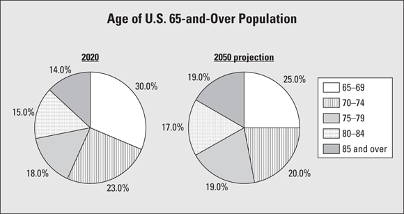
FIGURE 6-4: Side-by-side pie charts on the aging population, 2020 versus 2050 projections.
The results from Figure 6-4 indicate a shift in the ages of the population toward the older categories. From there, the medical and social research communities can examine the ramifications of this trend in terms of healthcare, assisted living, social security, and so on.
The operative words here are if the trend continues. As you know, many variables affect population size, and you need to take those into account when interpreting these projections into the future. The U.S. government always points out caveats like this in its reports; it is very diligent about that.
The pie charts in Figure 6-4 work well for comparing groups because they are side by side on the same graph, they use the same coding for the age groups in each chart, and their slices are in the same order for both charts as you move clockwise around them. They aren’t all scrambled up on each chart so you have to hunt for a certain age group on each chart separately.
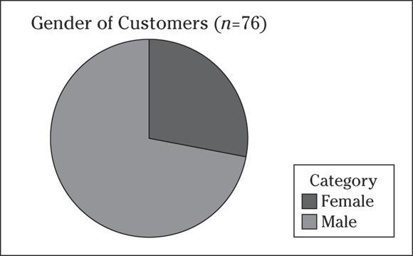
 Q. A hardware store wants to know what percentage of its customers are women. The manager takes a random sample of 76 customers who enter the store and records their gender. Twenty-two customers are females; the rest are males. I summarize the results in the following pie chart.
- Describe the results.
- How can this pie chart be improved?
A. Apparently, the DIY craze is popular with women, too.
- The results of the pie chart show that the percentage of female customers appears to be around 1/3 (or around 33 percent).
- You can improve the chart by showing the exact percentages in each slice. (The actual percentages are females: 28.9 percent; males: 71.1 percent.)
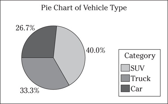
1 Suppose 375 individuals are asked what type of vehicle they own: SUV, truck, or car. The results are shown in the following frequency table.
Category | Frequency |
|---|---|
SUV | 150 |
Truck | 125 |
Car | 100 |
Total | 375 |
- Make a relative frequency table of these results.
- Make a pie chart of these results.
- Interpret the results.
2 Suppose Lewis, a restaurant owner, keeps track of data on when his customers patronize his restaurant: breakfast, lunch, dinner, or other times. For a month, he takes time to check off which category each customer falls into. He records data on 1,000 customers for the month. The pie chart in the following figure shows his results.
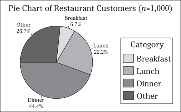
- What does this information tell him?
- Can you spot a problem with the “other” category? How can this study be improved in the future?
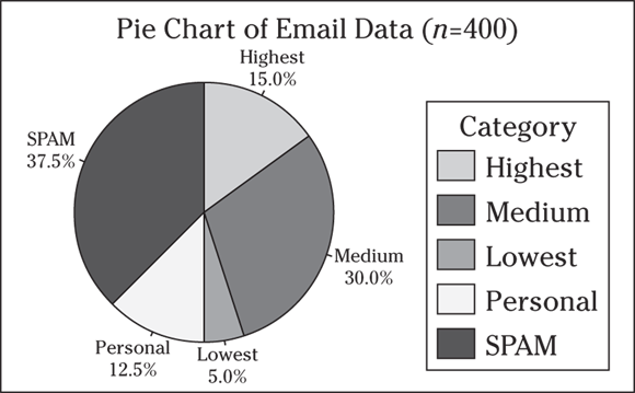
3 Suppose Susan, an office manager, wants to try to figure out a better way to multitask. She notices that answering emails is one of her most time-consuming duties, so she decides to categorize her emails into five groups: 1) highest priority, 2) medium priority, 3) very low priority, 4) personal, and 5) spam that she can delete immediately. You can see her results over a two-week period in the following frequency table.
Category | Frequency |
|---|---|
Highest | 60 |
Medium | 120 |
Lowest | 20 |
Personal | 50 |
Spam | 150 |
Total | 400 |
- Make a relative frequency table of this data.
- Make a pie chart of this data.
- Interpret the results for the office manager.
4 Suppose a survey is conducted to see what types of pets people own. The survey of 100 adults finds that 40 of the people own a dog, 60 own a cat, 20 own fish, and 10 own some sort of rodent (hamster, gerbil, mouse, and so on). Can this data be organized in a pie chart? Explain your answer.
5 Suppose as part of a driver’s education program, students have to observe drivers in the real world and see how consistently they come to a complete stop at intersections. The students sit at an intersection for four hours and record whether each driver comes to a complete stop, rolls through the stop sign slowly, or runs the stop sign altogether. You can see the data from the study in the following pie chart.
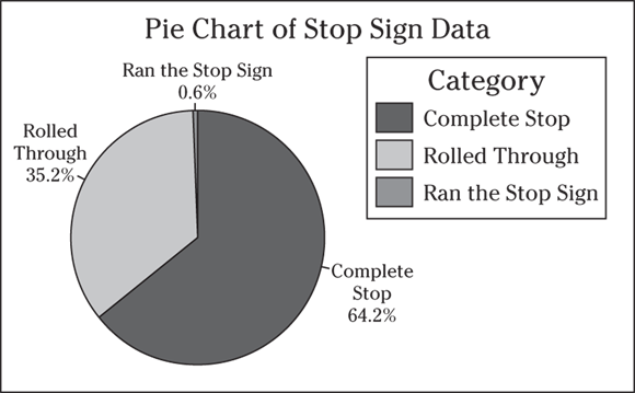
- Interpret the results.
- Do you see any issues with this pie chart?
- Is it a big deal if you don’t know the sample size?
- Can you make generalizations about all drivers from this data?
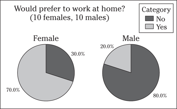
6 A survey is conducted to determine whether 20 office employees of a certain company would prefer to work at home, if given the chance. Of the ten women surveyed, seven say they would prefer to work at home and three say no. Of the ten men surveyed, eight say no and two say yes. Compare the results by using two pie charts. Does gender seem to be associated with one’s preference to work at home? Explain your answer.
7 Give an example of categorical data that you can’t summarize correctly by using a pie chart.
8 An employer/employee study website conducts a survey that asks employers and employees if they think surfing non-work-related websites compromises employee productivity. I summarize the results with the following pie charts.
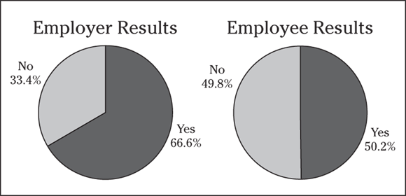
- Interpret these results.
- What important information is missing from these pie charts?
Raising the Bar on Bar Graphs
A bar graph (or bar chart) is perhaps the most common data display used by the media. Like a pie chart, a bar graph breaks categorical data down by group. Unlike a pie chart, it represents these amounts by using bars of different lengths; whereas a pie chart most often reports the amount in each group as percentages, a bar graph typically uses either the number of individuals in each group (also called the frequency) or the percentage in each group (called the relative frequency).
Tracking transportation expenses
How much of their income do people in the United States spend on transportation to get to and from work? It depends on how much money they make. The Bureau of Transportation Statistics (did you know such a department existed?) recently conducted a study on transportation in the U.S., and many of its findings are presented as bar graphs like the one shown in Figure 6-5.
This particular bar graph shows how much money is spent on transportation by people in different household-income groups. It appears that as household income increases, the total expenditures on transportation also increase. This makes sense, because the more money people have, the more they have available to spend.
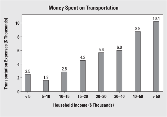
FIGURE 6-5: Bar graph showing transportation expenses by household income group.
But would the bar graph change if you looked at transportation expenditures not in terms of total dollar amounts, but as the percentage of household income? The households in the first group make less than $5,000 a year and have to spend $2,500 of that income on transportation. (Note: The label reads “2.5,” but because the units are in thousands of dollars, the 2.5 translates into $2,500.)
This $2,500 represents 50 percent of the annual income of those who make $5,000 per year; the percentage of the total income is even higher for those who make less than $5,000 per year. The households earning $30,000–$40,000 per year pay $6,000 per year on transportation, which is between 15 percent and 20 percent of their household income. So, although the people making more money spend more dollars on transportation, they don’t spend more as a percentage of their total income. Depending on how you look at expenditures, the bar graph can tell two somewhat different stories.
Another point to check out is the groupings on the graph. The categories for household income as shown aren’t equivalent. For example, each of the first four bars represents household incomes in intervals of $5,000, but the next three groups increase by $10,000 each, and the last group contains every household making more than $50,000 per year. Bar graphs using different-sized intervals to represent numerical values (such as Figure 6-5) make true comparisons between groups more difficult. (However, I’m sure the government has its reasons for reporting the numbers this way; for example, this may be the way income is broken down for tax-related purposes.)
One last thing: Notice that the numerical groupings in Figure 6-5 overlap on the boundaries. For example, $30,000 appears in both the fifth and sixth bars of the graph. So, if you have a household income of $30,000, which bar do you fall into? (You can’t tell from Figure 6-5, but I’m sure the instructions are buried in a huge report in the basement of some building in Washington, D.C.) This kind of overlap appears quite frequently in graphs, but you need to know how the borderline values are being treated. For example, the rule may be “Any data lying exactly on a boundary value automatically goes into the bar to its immediate right.” (Looking at Figure 6-5, that puts a household with a $30,000 income into the sixth bar rather than the fifth.) As long as they are being consistent for each boundary, that’s okay. The alternative, describing the income boundaries for the fifth bar as “20,000 to $29,999.99,” is not an improvement. Along those lines, income data can also be presented using a histogram (see Chapter 7), which has a slightly different look to it.
Making a lotto profit
That lotteries rake in the bucks is a well-known fact; but they also shell them out. How does it all shake out in terms of profits? Figure 6-6 shows the recent sales and expenditures of a certain state lottery.
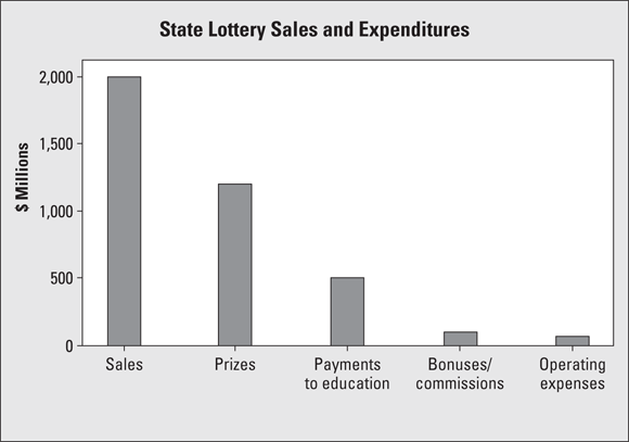
FIGURE 6-6: Bar graph of lottery sales and expenditures for a certain state.
In my opinion, this bar graph needs some additional info from behind the scenes to make it more understandable. The bars in Figure 6-6 don’t represent similar types of entities. The first bar represents sales (a form of revenue), and the other bars represent expenditures. The graph would be much clearer if the first bar weren’t included; for example, the total sales could be listed as a footnote.
Tipping the scales on a bar graph
Another way a graph can be misleading is through its choice of scale on the frequency/relative frequency axis (that is, the axis where the amounts in each group are reported) and/or its starting value.
By using a “stretched-out” scale (for example, having each half-inch of a bar represent 10 units versus 50 units), you can stretch the truth, make differences look more dramatic, or exaggerate values. Truth-stretching can also occur if the frequency axis starts out at a number that’s very close to where the differences in the heights of the bars start; you are, in essence, chopping off the bottom of the bars (the less exciting part) and just showing their tops — emphasizing (in a misleading way) where the action is. Not every frequency axis has to start at zero, but watch for situations that elevate the differences.
A good example of a graph with a stretched-out scale is shown in Chapter 2, regarding the results of numbers drawn in the “Pick 3” lottery. (You choose three one-digit numbers and if they all match what’s drawn, you win.) In Chapter 2, the percentage of times each number (from 0–9) was drawn is shown in Table 2-2, and the results are displayed in a bar graph in Figure 2-1a. The scale on the graph is stretched and starts at 465, making the differences in the results look larger than they really are; for example, it looks like the number 1 was drawn much less often, whereas the number 2 was drawn much more often, when in reality there is no statistical difference between the percentage of times each number was drawn. (I checked.)
Why was the graph in Figure 2-1a made this way? It might lead people to think they’ve got an inside edge if they choose the number 2 because it’s “on a hot streak,” or they might be led to choose the number 1 because it’s “due to come up.” Both of these theories are wrong, by the way, because the numbers are chosen at random; what happened in the past doesn’t matter. In Figure 2-1b you see a graph that’s been made correctly. (For more examples of where your intuition can go wrong with probability and what the scoop really is, see Probability For Dummies by Deborah Rumsey, also published by Wiley.)
Alternatively, by using a “squeezed-down” scale (for example, having each half-inch of a bar represent 50 units versus 10 units), you can downplay differences, making results look less dramatic than they actually are. For example, maybe a politician doesn’t want to draw attention to a big increase in crime from the beginning to the end of their term, so they may have the number of crimes of each type shown where each half-inch of a bar represents 500 crimes versus 100 crimes. This squeezes the numbers together and makes differences less noticeable. Their opponent in the next election would go the other way and use a stretched-out scale to emphasize a crime increase in dramatic fashion, and voilà! (Now you know the answer to the question, “How can two people talk about the same data and get two different conclusions?” Welcome to the world of politics.)
With a pie chart, however, the scale can’t be changed to over-emphasize (or downplay) the results. No matter how you slice up a pie chart, you’re always slicing up a circle, and the proportion of the total pie belonging to any given slice won’t change, even if you make the pie bigger or smaller.
Pondering pet peeves
A recent survey of 100 people with office jobs asked them to report their biggest pet peeves in the workplace. (Before going on, you may want to jot down a couple of yours, just for fun.) A bar graph of the results of the survey is shown in Figure 6-7. Poor time management looks to be the number-one issue for these workers (I hope they didn’t do this survey on company time).
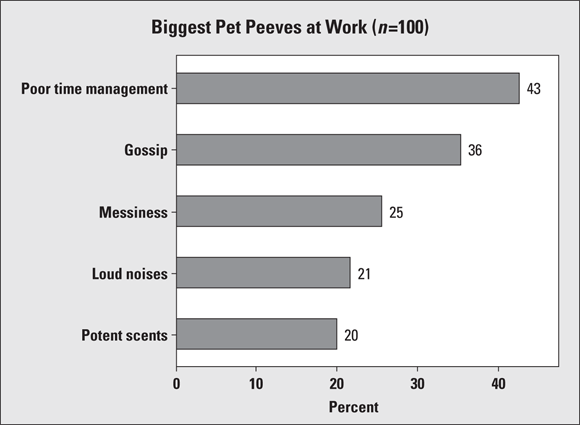
FIGURE 6-7: Bar graph for survey data with multiple responses.
If you take a look at the percentages shown for each pet peeve listed, you see they don’t sum to 1. That tells you that each person surveyed was allowed to choose more than one pet peeve (like that would be hard to do); perhaps they were asked to name their top three pet peeves, for example. For this data set and others like it that allow for multiple responses, a pie chart wouldn’t be possible (unless you made one for every single pet peeve on the list).
Note that Figure 6-7 is a horizontal bar graph (its bars go side to side) as opposed to a vertical bar graph (in which bars go up and down, as shown earlier in Figure 6-6). Either orientation is fine; use whichever one you prefer when you make a bar graph. Do, however, make sure that you label the axes appropriately and include proper units (such as gender, opinion, or day of the week) where appropriate.
Q. Following are a pie chart and bar graph (respectively) of scores from a quiz of ten questions, where the data shows the number of questions answered correctly. Name one advantage each has over the other.
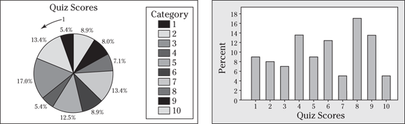
A. The pie chart shows everything as part of a whole, so you can make relative comparisons, and you know it all sums to 100 percent. The bar graph, however, makes it easier to compare the groups to each other. (And if the pie chart doesn’t show the percentages, you have a much harder time estimating the percent in each group.)
9 The following figure shows a frequency bar graph of 500 people who make up three categories (1: support a smoking ban; 2: oppose a smoking ban; and 3: no opinion).
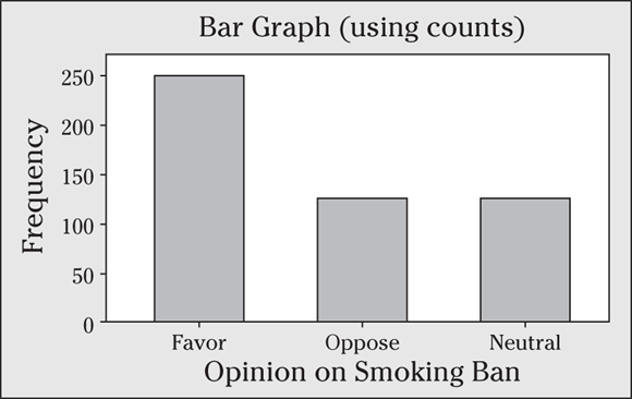
- Make a relative frequency table of this data.
- Use the relative frequency table to make a bar graph of this data.
- Interpret the results. (How do people in the sample feel about the smoking ban?)
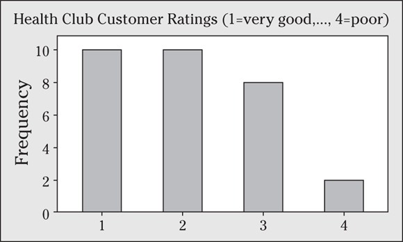
10 Suppose a health club asks 30 customers to rate the services as very good (1), good (2), fair (3), or poor (4). You can see the results in the following bar graph. What percentage of the customers rated the services as good?
11 A polling organization wants to find out what voters think of Issue X. It chooses a random sample of voters and asks them for their opinions of Issue X: yes, no, or no opinion. I organize the results in the following bar graph.
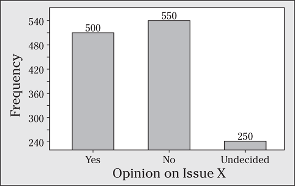
- Make a frequency table of these results (including the total number).
- Evaluate the bar graph as to whether or not it fairly represents the results.
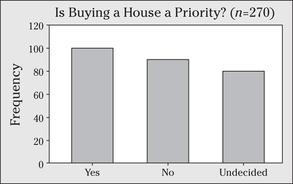
12 Suppose that a random sample of 270 graduating seniors are asked what their immediate priorities are, including whether or not buying a house is a priority. The results are shown in the following bar graph.
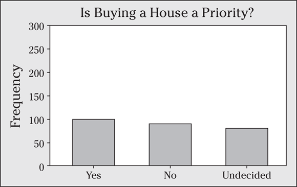
- The bar graph is misleading; explain why.
- Make a new bar graph that more fairly presents the results. Note that 100 said Yes, 90 said No, and 80 said Undecided.
13 A car dealership specializing in minivan sales conducts a survey to find out more about who their customers are. One of the variables the company measures is gender; the results of this part of the survey are shown in the following bar graph.
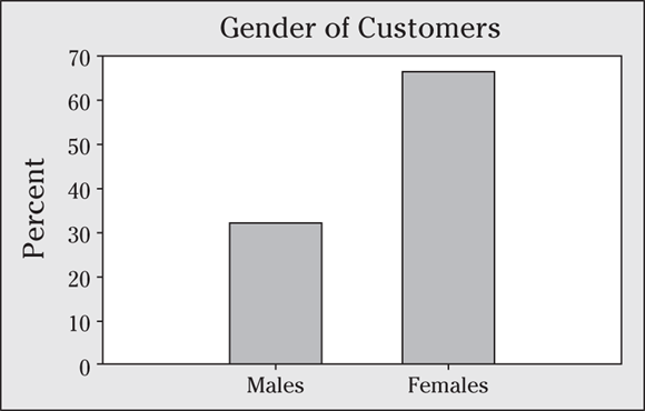
- Interpret these results.
- Explain whether or not you think the bar graph is a fair and accurate representation of this data.
14 A survey is conducted to determine whether 20 office employees of a certain company would prefer to work at home, if given the chance. The overall results are shown in the first bar graph, and the results broken down by gender are presented in the second.
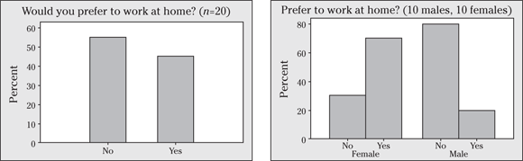
- Interpret the results of each graph.
- Discuss the added value in including gender in the second bar graph. (The second bar graph in this problem is called a side-by-side bar graph and is often used to show results broken down by two or more variables.)
- Compare the side-by-side bar graph with the two pie charts that you make for Problem 1. Which of the two methods is best for comparing two groups, in your opinion?
Practice Questions Answers and Explanations
1 Organizing the data in a relative frequency table before you make a pie chart is often helpful.
- See the following relative frequency table.
Category
Relative Frequency
SUV

Truck

Car

Total

- The following pie chart shows the results using Minitab. If you make your pie chart by hand, it should look similar, but it may not be exactly the same because it can be hard to gauge how big the slices should be.
 Although making pie charts by hand works fine (and on exams, you’ll likely have to do so), using a computer is the easiest and most accurate way to make a pie chart. The problem is getting the size of the slices just right. You can take the percentage for the category and multiply by 360 degrees to figure out how big of an angle to make, if you remember how to do that sort of thing from trigonometry. Or you can divide the pie into quarters (25 percent each) and divide each quarter into eighths (12.5 percent each), using dotted lines, to make your best estimate from there. Remembering that half the pie chart represents 50 percent can also be helpful.
 - From these results, you can see that 40 percent of the individuals have SUVs. Trucks and cars split up the remainder of the group, with 26.7 percent owning cars and the rest owning trucks.
2 Watch out for pie charts that have large, ambiguous “other” categories.
- The pie chart shows that of the three meals, dinner brings in the most business (44 percent for dinner compared to only 22 percent for lunch and around 7 percent for breakfast).
- The pie chart does have a problem. The “other” group is very large, comprising almost 27 percent of the business, but he has no idea when those people come in, so he has little information to work from. He may have received better results if he had broken the “other” category into more categories, such as between breakfast and lunch, between lunch and dinner, after dinner, bakery purchases on the go, and so on.
 Beware of slices of the pie labeled “other” or “miscellaneous” that become larger than many of the other slices. This discrepancy is a clue that the creator should have added more categories.
3 Pie charts do a nice job of summarizing data accurately and quickly.
- It didn’t take long for the office manager to realize that spam floods her inbox and crowds out the more important emails. The relative frequency table explains why.
Category
Relative Frequency
Highest

Medium

Lowest

Personal

Spam

Total

- The corresponding pie chart is shown in the following figure using statistical software. Your pie chart should look similar if you draw it by hand.
 If you plan to draw a pie chart by hand, try starting with the largest slice and working your way down. Your results should look similar to charts drawn by any computer software package.
 - The results tell the office manager that she gets a great deal of spam. She also gets quite a bit of personal email, which she can save for breaks and lunch to maximize her work time. She also sees that
 of her emails are high to medium priority, which can cause some stress.
4 No. The data appears to report ![]() pet owners, but the total number of people surveyed was only 100. Why? Because some folks are counted more than once if they own more than one different type of pet. The total doesn’t add up to n (the sample size), and the percents don’t add up to 100 if you divide each frequency by n (which is what you should do). Therefore, a pie chart doesn’t work for this survey. (A bar chart is a good alternative.)
pet owners, but the total number of people surveyed was only 100. Why? Because some folks are counted more than once if they own more than one different type of pet. The total doesn’t add up to n (the sample size), and the percents don’t add up to 100 if you divide each frequency by n (which is what you should do). Therefore, a pie chart doesn’t work for this survey. (A bar chart is a good alternative.)
All the percentages in a pie chart must add up to 100 percent or close to it (subject to round-off error).
5 Interpreting pie charts can seem so easy that you may be tempted to go too far at times.
- The pie chart shows that 64.2 percent of the drivers who approached the intersection came to a complete stop, 35.2 percent rolled through the stop sign, and 0.6 percent (or 0.006) actually ran the stop sign.
- You have no indication of how many cars the students examined (n, the sample size, isn’t known). They may have seen a small number of vehicles.
- Yes. Not knowing the sample size upon which a pie chart is based can lead to imprecise or even misleading results.
- No. The data came from only one intersection on a single day for a four-hour period, so you can’t make generalizations about all drivers from this very limited data set.
Look for the total sample size, which is related to the precision of your results.
6 The pie charts are shown in the following figure. Yes, gender does seem to be related to the preference to work at home (for this company). More females at this company prefer to work at home (70 percent) than males (20 percent).
7 Any example where the percentages don’t sum to 100 — where an individual or object can be in more than one group at the same time — can’t be summarized accurately in a pie chart. For example, suppose a group of adults are asked what kinds of activities they like to do on a Friday night: 41 percent say watch television, 50 percent say go to a movie, and 60 percent say go out to eat. The surveyor doesn’t ask what the people like to do best, so they can choose more than one at a time. A pie chart doesn’t make sense here.
8 A missing sample size is a common error with graphs and charts.
- More employers feel employee surfing compromises productivity by a 2-to-1 margin (67 percent yes to 34 percent no). But employees are equally split on the issue (about 50 percent yes to 50 percent no). That’s not surprising, is it?
- The sample sizes are missing. You don’t know whether 10 people or 10,000 people responded, which affects the precision of the results. The date of the survey is also missing. (Turns out the Internet company surveyed 451 employees and 670 employers.)
A pie chart should stand alone; all the necessary information should be included and labeled within the chart.
9 Relative frequencies (percents) allow you to make easy comparisons between groups.
- See the following relative frequency table.
Category
Relative Frequency
Support smoking ban

Oppose smoking ban

No opinion

Total

- The following figure shows the bar graph.
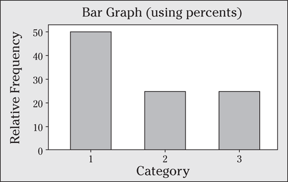
- Half the individuals support the smoking ban, and the rest of the people are evenly split between opposing the ban and having no opinion.
10 The bar graph shows that 10 out of 30 customers (![]() percent) rated the services as good. Notice that the answer isn’t 10 percent, because frequencies appeared on the y-axis, not relative frequencies.
percent) rated the services as good. Notice that the answer isn’t 10 percent, because frequencies appeared on the y-axis, not relative frequencies.
When interpreting the results of a bar graph, be sure that you know what the graph is meant to report: counts (frequencies) or percents (relative frequencies).
11 Starting point, scale, and sample size are three major ways a bar graph can mislead you.
- See the following frequency table of the results of the opinion poll on Issue X. The frequencies come from the bar graph and represent the height of each bar. A total of 1,300 people were surveyed.
Opinion
Frequency
Yes
500
No
550
No opinion
250
Total
1,300
- The bar graph appears to be misleading. Notice that the bar for the “no opinion” group is much less than 1/2 of the length of the bar for the “yes” group, because the frequency axis starts at 240 and not at 0. The following figure shows a better bar graph. The scale on this second bar graph is a little different (it uses increments of 100 rather than 30, which appear on the original bar graph). The new scale makes the graph easier to read, because it results in “nice” numbers on the tick marks like 300 and 400. The scale changes quite a bit, but the biggest problem with the original bar graph isn’t the scale; it’s the starting point. The total sample size is now included on the x-axis, making the results easier to interpret.
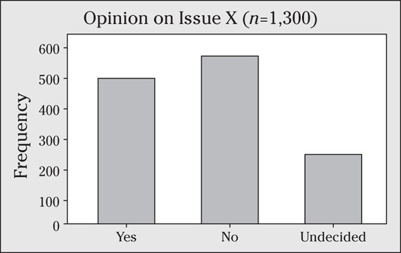
Watch the starting point on the counts/percents axis. If it doesn’t start at 0, the differences in the bar lengths may appear larger than they really are.
12 Scale and ending-point errors can squeeze the space in between bars and create extra, unnecessary space in the graph. Each makes the graph misleading.
- The bar graph is misleading because it makes the differences in the bars look smaller than they truly are. You can attribute this deception to two things. First, the scale on the y-axis is 50, which is bigger than it should be, squeezing the bars closer together in length and making differences appear relatively small. Also, the y-axis goes all the way to 300, when it could easily stop at half that distance. This creates a large portion of unused space in the graph, again making the lengths of the bars look smaller than they should be. The extra space also makes it appear that the sample size is smaller than it actually is (as if not very many people were in each group).
- A fairer and more informative bar graph is shown in the following figure.
 Watch the scale (size of the increments or tick marks) on the counts/percents axis. Look for scales that show differences as less or more dramatic than they should be.
13 Although percents allow you to make relative comparisons, you still need to have the sample sizes to determine how precise the results are.
- The bar graph shows that about twice as many of the minivan customers were females compared to males. The percentage of females seems to be around 67 percent (about 2/3), compared to around 33 percent males (about 1/3).
- The biggest problem with the bar graph is that because you see only the percentages in each group, you have no way of knowing the sample size. Sixty-seven percent females could mean the dealer sampled 3,000 people and 2,000 were female, or it could mean they sampled 30 people and 20 were female.
14 A second variable may be of critical importance and shouldn’t be left out.
- The first bar graph shows that about 55 percent of the office employees of this company would prefer to work at home, and 45 percent enjoy an at-work environment. The second graph shows that of the females, 70 percent would prefer to work at home, and 30 percent wouldn’t. (Notice the percents sum to 100 for each group separately, allowing you to make comparisons between groups.) Of the males, only 20 percent would prefer working at home, and 80 percent wouldn’t.
- The second bar graph is more interesting, because it shows that results differ depending on gender.
- The side-by-side bars are my personal choice over the two pie charts, because the former are shown using the same scale, making it easier to visually see the differences. Pie charts usually have different slices for all the groups, making it hard to compare them without an obvious difference.
If you’re ready to test your skills a bit more, take the following chapter quiz that incorporates all the chapter topics.
Whaddya Know? Chapter 6 Quiz
Quiz time! Complete each problem to test your knowledge on the various topics covered in this chapter. You can then find the solutions and explanations in the next section.
1 A pie chart is a graphical version of what type of table: a frequency table or a relative frequency table?
2 What are three ways in which a bar graph can mislead you?
3 Why is it so important to include the sample size (n) somewhere with your pie chart?
4 Can you make a pie chart out of the following data table?
Favorite Car Colors (choose all that apply) | Percentage of People Choosing That Color |
|---|---|
Red | 50% |
White | 20% |
Black | 40% |
Yellow | 10% |
Orange | 20% |
Blue | 70% |
Brown | 30% |
Green | 25% |
Purple | 15% |
Other | 5% |
5 Name two important items to add to your pie chart, other than the names of the slices and the percentage for each slice.
6 What is the impact of changing the scale on a bar graph?
7 The starting point on a bar graph can affect how the bar graph looks. How?
8 Is it wrong to have an “other” category in a pie chart? Explain your answer.
9 Three-dimensional pie charts are a great way to show categorical data. True or False?
10 You want to avoid having too many slices on your pie chart. Why is that?
Answers to Chapter 6 Quiz
1 A pie chart is a graphical version of a relative frequency table because both show percents and not counts.
2 Starting point, scale, and sample size are three ways in which a bar graph can mislead you.
3 Because pie charts only show the percentage in each group; it doesn’t tell you exactly how many are in each group. For example, the result 3/10 is based on much fewer data than the result 30/100, even though they both come out to 0.30.
4 No. This is because the percents add up to way more than 1. You could make a separate pie chart for each color, showing the percentage that did vote for it versus the percentage that didn’t vote for it. But you cannot make one single pie chart out of a data set whose percents sum to more than 1.
5 Each pie chart needs a title and the sample size, so the information can stand alone and the reader does not have to wonder what the pie chart is showing, or how much data went into it.
6 The scale of a bar graph affects how spread out the bars look, or how close together they are. If you have a scale in large increments, the bars will appear closer together in length or height, and if you have a scale in small increments, the bars will appear further apart in length or height.
7 Watch the starting point on the counts/percents axis. If it doesn’t start at 0, the differences in the bar lengths may appear larger than they really are. It may appear that you are just taking the top part off the graph and showing the results. It’s not always wrong to do that, but you need to watch for it, so you can put the results into proper perspective.
8 It’s certainly okay to include an “other” category in a pie chart. However, you don’t want the “other” category to be so large that it eclipses other slices of the pie that are clearly defined. You want to put all other choices into the “other” category, but you don’t want to include so many in the “other” category that it gets larger than the other pie slices.
9 False. Three-dimensional pie charts show the pie slices in an inappropriate proportion. The slices closest to the reader appear larger than their actual size, and the slices further from the reader appear smaller than their actual size.
10 You want to avoid having too many slices on your pie chart because the reader can get confused easily, it’s hard to have that many different colors or patterns for each different slice, and some slices could turn out to be so small that you can hardly see them. Better to keep fewer slices and have them be easy to read and distinguish.