
12
The Use of Logos in Post-Merger Identity Construction at Aalto University
Multimodality in general and visuality in particular play a central role in inter-organizational communication. In this chapter, we will exemplify the role of visuality in post-merger identity-building. We will focus on the role of logos, that is, emblems or symbols used by organizations to promote specific identities or images of themselves. The case in point is the recent university merger that led to the creation of Aalto University in Helsinki, Finland. Based on this case analysis, we elucidate the use of visual logos in internal and external identity-building and specifically argue that such identity deals with authenticity, distinctiveness, self-esteem, enabling/constraining future orientation, and power relations. What follows is based on a compilation of material from a larger research project following the creation of Aalto University, including participant observation by several researchers, interviews, and gathering of documentary material, and we especially make use of the analyses conducted by Aula in her dissertation and articles with colleagues (Aspara, Aula, Tienari, & Tikkanen, 2014; Aula, 2016; Aula & Tienari, 2011; Aula, Tienari, & Wæraas, 2015).
12.1 Identity-Building in Mergers and Acquisitions
Mergers and acquisitions (M&As) represent significant challenges for the actors involved (Graebner, Heimeriks, Huy, & Vaara, 2017), and this is especially the case with identity-building (Clark, Gioia, Ketchen, & Thomas, 2010; Drori, Wrzesniewski, & Ellis, 2013; Tienari & Vaara, 2016; Vaara et al., 2007; Vaara & Tienari, 2011). Organizational identity is a multifaceted and dynamic phenomenon, the essence of which is the sense of organizational members of what ‘we are as an organization’ (Gioia et al., 2013; Pratt, Schultz, Ashforth, & Ravasi, 2016). When the focus is on actors external to the organization, one can also talk about the external identity or image of the organization.
In this chapter, we will follow the trajectory of work that conceptualizes identity construction in M&As as a discursive process where dis-cursive resources are mobilized to construct, transform, and at times destruct senses of organizational identity (Tienari & Vaara, 2016). While prior research has typically focused on more abstract discursive resources such as stereotypes, tropes (e.g., metaphors and metonymies), or narratives, we follow the emergent stream of work that seeks to highlight the concrete visual or multimodal elements in this process.
In particular, we draw from the example of Vaara et al. (2007) who focus on the role of advertisements in the identity and image-building in post-merger integration. Their analysis concentrates on the pan-Nordic financial services sector that led to the creation of the Nordea group. In particular, their study uncovers how the visual images in advertisements serve identity-building along the following dimensions: authenticity, distinctiveness, self-esteem, enabling/constraining future orientation, and power relations. Such an approach can serve as a general framework as a constructed post-merger identity should ideally be authentic (‘we’ share something that is ‘real’ and meaningful for the actors), distinctive (‘we’ are unique and different from others), promote self-esteem (‘we’ are capable and ‘strong’ together), create an enabling future orientation (‘we’ can achieve positive things together), and help to deal with power struggles (‘we’ can work together even if tensions exist) (see also Tienari & Vaara, 2016). Nevertheless, often identity-building is complex, controversial, and ambiguous, which means that actors struggle with the new organizational identity—and interpret for instance visual messages in different ways.
12.2 Logos in Identity-Building
Logos may play an important role in identity-building in organizations. Nevertheless, research on logos has been limited to date. In an early exception, Floch (2000) examined the role of logos as key means of visual identity construction. The analysis focuses on IBM’s and Apple’s logos, which are seen as exemplifications of ‘logocentricism’ in visual communication (Chapter 2). Central in this analysis is the tension between continuity and change and what that means in terms of the narratives that can be constructed with the logos. Hodge (2003) has studied logos by taking McLuhan’s (1963) famous argument ‘the medium is the message’ as the starting point. By analysing the logo of America Online (AOL), he demonstrates how ‘messages’ are encoded in new visual forms associated with the new electronic media. On this basis, he argues that logos are key part of new spaces that can be linked with the ‘unconscious dimensions of media’. Thurlow and Aiello (2007) have examined airline tailfin design from a visual genre perspective. Although not focusing on logos alone, their analysis highlights how the designs are used both to construct international brands and to maintain or promote national identity (as ‘national carriers’). This is achieved by balancing cultural symbolism and iconicity, and different airlines have distinctive solutions to cater for these needs. Interestingly, their analysis highlights aspects such as a sense of movement that are rarely scrutinized in more conventional analyses.
More recently, Johannessen (2017) has argued for a focus on logos as key elements in organizational identity-building: “Corporate logos are an extremely important species of discourse in processes of globalization and in the post-industrial social order” (Johannessen, 2017, p. 2). He analyses the meaning potential in Topaz Energy (an energy group having gas stations in Ireland) and highlights the multiple ways in which the meaning potential of the logo makes a difference in identity and image construction around this group. In particular, he develops an approach that distinguishes between the ‘graphetic’ and ‘graphemic’ elements:
In order to fully come to terms with the meaning potential of logos, we must look beyond our preference for understanding meaning ‘from above’ and instead take a ‘from below’ look at graphetic (like phonetics interested in all material detail of the graphic expression such as bodily movements, qualities of tools and materials) and graphemic (like phonemics only interested in distinctive features of graphic form such as shape, colour, orientation) qualities of graphics.
(Johannessen, 2017, p. 2)
In this section, we will mostly focus on the graphemic elements, but maintain that a deeper analysis should also consider the graphetic aspects in future research. What we do draw from Johannessen (2017) is the view that logos—although simple in structure and visual affordances—can play a key part among other things in corporate identity-building in general and in post-merger identity-building in particular.
There are also other types of logos, and van Leeuwen (2017) has recently focused attention on ‘sonic’ logos. By using the case of the Australian ABC news signature tune, Eno’s Windows tune, AT&T’s tune, and INTEL’s sonic logo as examples, he elaborates on how these sonic logos combine a practical function with the expression of identity. In what follows, we shall not focus on this aspect of multimodality, but maintain that it is likely to be a very important part of organizational logos in the future.
While organization scholars have rarely examined logos, an interesting and useful exception can be found in the work of Drori, Delmestri, and Oberg (2016). They studied the role of emblems and logos as iconographic narratives of university identity. In a recent chapter (Oberg, Drori, & Delmestri, 2018), they identified five processes central to the creation of the visual identities of organizations: imprinting (enactment of the contemporary script), imprinting-cum-inertia (persistent enactment of epochal scripts), renewal (enactment of an up-to-date epochal script), historization (enactment of a recovered older epochal script), and multiplicity (simultaneous enactment of multiple epochal scripts). Interestingly, their analysis also includes the Aalto merger, although only as one of the examples. In particular, they point out that the Aalto case exemplifies ‘imprinting’ in the sense that that the themes of multiplicity and choice reflect current-day cultural norms of individuality and expressivity.
12.3 The Aalto Merger: Key Events
Aalto University was born from the idea to create an innovative, world-class university by merging science and technology, design and art, and business and economics. The Rector of the University of Art and Design at the time, Yrjö Sotamaa, first presented the idea in his opening speech for the academic year in 2005. A year and a half later the idea turned into a more concrete plan as the government’s Permanent Secretary Raimo Sailas presented it in the memorandum of the working group in February 2007. Soon after that, the preparations began after the new government had included the establishment of a new university into its program as part of the larger university sector reform. The merger was a priority project in a broader Finnish higher education reform, intended to create a multidisciplinary community fostering innovation in education and research.
In July 2007, preparations were made by 500 members from the three Schools that were to merge—Helsinki School of Economics (established 1911), Helsinki University of Technology (established 1849), and the University of Art and Design Helsinki (established 1871). The project had various working names at first, such as Innovaatioyliopisto (Innovation University) and Huippuyliopisto (Top University). The name Aaltoyliopisto (Aalto University) was selected in May 2009 as the result of a name competition that received 1600 entries.
Aalto as such means a wave in Finnish, and it thus signifies dynamism as a key characteristic of the new university. In addition, the name hon-ours the nationally and internationally renowned Finnish architect Alvar Aalto (1989–1976), famous for his architectural, design, and related entrepreneurial accomplishments. Aalto was also the main planner of the Helsinki University of Technology park campus that was built in Otaniemi in the 1950s and today forms Aalto University main campus. Not least because of this architectural heritage, the Otaniemi campus has been chosen as one of the most innovative areas in Europe twice, and it has received the EU Award of Excellence. The use of Aalto’s name for the university was accepted by the Aalto foundation and Aalto family.
In June 2008, the Minister of Education formally approved the merger by signing the Aalto University charter in the presence of representatives from Finnish industries and organizations, and in December of the same year, Professor Tuula Teeri was selected as the first President of Aalto University. Aalto University was officially formed and started operating on January 1st, 2010 when Helsinki School of Economics, Helsinki University of Technology, and the University of Art and Design Helsinki merged into a single university.
12.4 Aalto University’s Visual Identity
In spring 2009, as part of the preparations, a design contest was organized for a new logo and visual identity for the new university. An entry called ‘Invitation’, designed by graphic designer Rasmus Snabb, was chosen as the winner. After the contest, Snabb continued working on the design and on refining the university’s final visual identity which was then revealed in fall 2009. It is stated in Aalto University Visual Design Guidelines that Aalto University visual identity “reflects the essence of Aalto University” and “aims at the creation of a living, yet consistent whole”. The guidelines include a set of general principles and specific instructions, intended to help in creating a visual identity that is uniform in spirit yet flexible in the use of different visual elements. Particularly the following characteristics are central to the Aalto visual identity: fit for purpose (functional, well thought-out, practical), distinguished (uncomplicated, simplified, stylish), clear (fresh, colourful, strong, graphic), influential (sympathetic, narrative, informative, genuine, warm, honest), natural and easy (light, lively, unaffected, spontaneous, relaxed).
In the centre of Aalto University’s visual identity is its logo, the basic version of which is a capital A with a question mark. In addition to the basic form, the official logo has two variations where the capital A is followed by an exclamation mark and a quotation mark. Interestingly, these three versions are used randomly and appear equally often in Aalto visuals. The question mark in the basic version carries the central symbolism of Aalto University: It seeks not to predefine Aalto’s identity, but rather asks the viewer to form their own idea of it and participate in the identity creation. It is also noteworthy that the typographic character of the letter A and the punctuation marks that follow it are bold and expansive, which underscores the central role of A and Aalto in the university’s visual identity in a way that invites questioning and taking a stance. Aalto’s values such as being open for discussion, criticism and change are thus represented in the logo. Figure 12.1 below provides an illustration of these variants.
In addition to the form of the logo, colours are central to Aalto University visual identity. The primary colours blue, red, and yellow are used in the logo with the letter ‘A’ always written in black.1 This symbolizes the core idea of Aalto University as a combination of three basic elements and the vast potential this combination unlocks. In addition to the primary colours, Aalto uses six additional colours that have been selected from the traditional colour wheel with even difference in tone, and one neutral grey. The six additional colours are now used as the signature colours of the schools, even though the Aalto scheme originally had no school-specific colours. Like the logo, the broadness of the colour scheme symbolizes the values of Aalto University: being open, tolerant, and diverse. Figure 12.2 below offers a summary of the colours used.
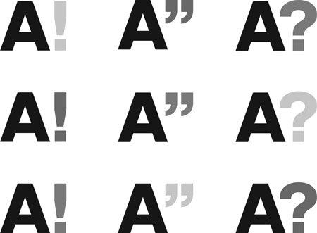
Figure 12.1 Aalto University’s Official Logo in Nine Variants
Source: Reproduced with permission from Aalto University
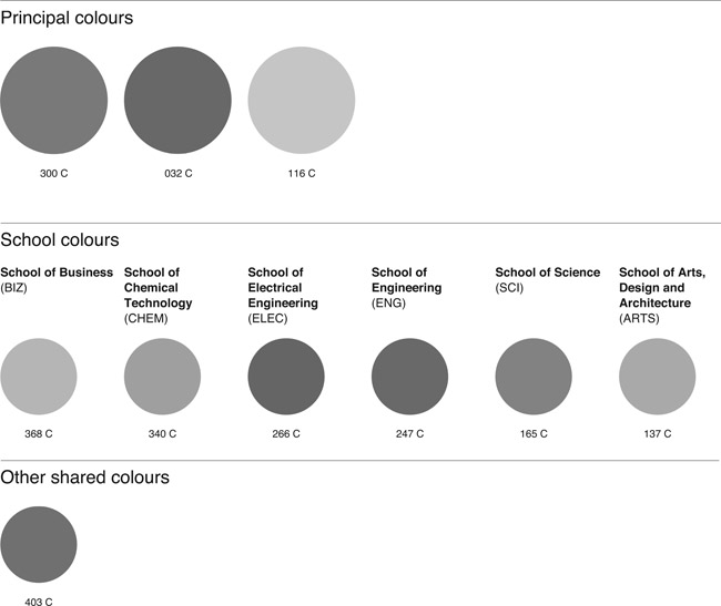
Figure 12.2
Colours Used in Aalto University’s Official Logo
Source: Reproduced with permission from Aalto University
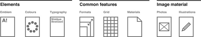
Figure 12.3 Guidelines for the Use of Aalto University’s Official Logo
Source: Reproduced with permission from Aalto University
These central visual elements are supported by guidelines for typography, formats, layout styles, materials, and imagery in line with the uniform visual spirit and its characteristics, ‘a neutral style and universal, basic visual elements’, as Snabb described the sustaining principles of Aalto University visual identity. Figure 12.3 above provides a summary of these guidelines.
12.5 Use of the Logo in Intentional Identity Construction in Internal and External Arenas
The intentional use of the logo was linked with other activities of identity construction to the extent that the logo itself became a key—although not the only—symbol through which issues related to identity were dealt with. Based on the information available, and especially the research by Aula and colleagues (Aspara et al., 2014; Aula & Tienari, 2011; Aula et al., 2015), we can develop an understanding of the ways in which the logo supported intentional identity-building along the dimensions discussed above: authenticity, distinctiveness, self-esteem, future orientation, and power aspects.
Authenticity. The new logo is in a way similar to those of other new (or merged) universities that intend to develop a new start with symbolism of the new era of globalization, where branding is a key tool to manage one’s identity and image. Thus, for instance Oberg et al. (2018) see Aalto’s visual identity-building primarily in terms of ‘imprinting’ linked with this era and as a ‘new start’. Such efforts, however, often run a risk in terms of authenticity as a constructed visual imagery that does not use elements of the past may appear as an artificial construction. This is also the case with Aalto’s logo as the decision was to deliberately break away from the past in terms of not using any of the elements in the emblems or logos of the three previously separate universities. Indeed, the new logo does not have anything in common with the old ones (see Figure 12.4 below).
However, there is an important element that does bring authenticity in terms of a connection to what the university is based on and stands for. The essential point is the letter A which refers to Aalto as the name of the university as well as to the famous architect-designer-entrepreneur (Alvar) Aalto, whose career and success are used to exemplify and personify what Aalto stands for. This connection is almost self-evident for most Finns, but not for all stakeholders of Aalto, which limits the logo’s meaning potential. Thus, this case—as many others—shows that the meaning potential of a logo may be different for different stakeholders.
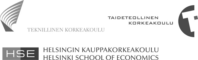
Figure 12.4 Logos of the Three Merger Partners
Source: Reproduced with permission from Aalto University
Distinctiveness. In several ways, the logo provides a distinctive identity for the new university. Making the university ‘distinguished’ or ‘distinctive’ was one of the initial objectives set for the new logo. The double meaning of the letter ‘A’ (wave and reference to Alvar Aalto) makes the logo distinctively different from others. In addition, aspects such as the randomly changing exclamation and question marks and the colours are quite unique features in university logos and thus provide a distinctive basis for Aalto’s identity and image. This is also supported by the colour scheme: not only are the colours differentiated, but they are also highly saturated, unmodulated, and bright (van Leeuwen, 2011). Indeed, in comparison with many other universities or business schools, Aalto’s visual identity comes across as quite distinctive—and one that can clearly be linked with openness, creativity, and innovativeness as explained above.
Self-esteem. In terms of the self-esteem, these same aspects (reference to Alvar Aalto and imagery supporting openness, creativity, and innovativeness) can be seen as very positive features for most of Aalto’s stake-holders. In particular, they offer a meaning potential for a construction of ‘world class’ university that focuses on innovation. Interestingly, this positivity can be linked with both the national heritage (Alvar Aalto) and the open global outlook that the simplistic corporate type of logo signifies—analogous to the case of national airline logos mentioned above (Thurlow & Aiello, 2007). This meaning potential is also reinforced by specific characteristics of the logo. For instance, the typographic character of the A and the following punctuation marks are bold and expansive (van Leeuwen, 2006), which supports the positive self-esteem that can be derived from visual design. The fact that the letter A is the first letter of the alphabet and can be associated with excellence (grade or category) further emphasizes this self-esteem.
Future orientation. These very elements also offer an enabling future orientation. What may be lost in terms of breaking away from the emblems and logos of the past, may be seen as enabling in terms of the future. This is shown in all elements of the logo, and especially the typography and the use of colour are characteristically novel and move away from those traditionally used in university or even corporate logos. The new visual imagery is clearly internationally or globally oriented when compared to those of the merging universities (focused on Helsinki). Nevertheless, because of the linkage with Alvar Aalto, the logo for the new university also combines nationalism with that of a global orientation. In this regard, the logo works in a manner that is somewhat similar to the case of Nordea mentioned above (Vaara et al., 2007; Vaara & Tienari, 2011).
Power aspects. One of the key issues in post-merger integration is the potential confrontation between the merger partners. As in many other cases, a break from the past may help to provide a basis that helps to go beyond ‘us versus them’ confrontation which could be more apparent with names or logos that would explicitly link with the previous ones. Also, as one of the merger partners (Helsinki University of Technology) was significantly bigger than the others, there has been a concern for domination among the others. Thus, rather than retaining names or visual images of the past linked with Helsinki University of Technology, the new name and logo imply a new fresh start based on equality and balance of power. In this respect, the visual identity strategy resembles that reported in other studies—for instance in the case of Nordea (Vaara et al., 2007; Vaara & Tienari, 2011) that sought to alleviate the risks of confrontation. The breakaway from the previous logos and the use of the changing colours and punctuation marks in Aalto’s case can be seen as helpful choices in this regard. Furthermore, the fact that Alvar Aalto can be associated with each of the three merger partners underscores the idea of cross-disciplinary collaboration in the merged university.
12.6 Reactions and Use of the Logo
This new visual and multimodal basis offered by the logo became a key part of the discussions about the new university (Aula, 2016; Tomperi, 2009). Without going into detail, three different kinds of reactions and uses of the logo can be distinguished. First, those behind and supporting the merger appeared by and large satisfied and enthusiastic about the new identity and image as crystallized in the logo. While key people could differ in terms of their orientation and could perceive specific issues in different ways, the new logo and the visual identity around it were seen as a useful tool for the construction of the new university. This included a new, more international orientation summarized in the term ‘world class’ (Aula & Tienari, 2011). Also, the fact that the new logo was a clear break-away from the past was seen as beneficial in terms of easing the tensions between the merger partners.
However, many people voiced concerns, especially in the schools, where a loss of independence was feared. In particular, many people in the former Helsinki School of Economics had come to value its heritage as symbolized by its logo, with its distinctive dark green colour, and by the architecture of its main building (not designed by Alvar Aalto, see Karhunen, Jyrämä, & Knuutinen, 2012). Aula’s (Aula et al., 2015; Aula & Tienari, 2011) research shows that these reactions were often linked to the transformation of the school in terms of the establishment of an Anglo-American tenure track system implying very limited career prospects for those not selected to be part of it. Often the new logo and the visual imagery became targets of criticism and resistance along these lines.
Finally, there were also reactions that were more ideological in terms of criticizing or resisting the new university reform in Finland per se. Aalto became the key symbol of this general transformation that many feared would lead to a decrease of public funding, establishment of fees for students, elitism, and/or a gradual privatization of the sector. In this connection, the logo—or versions of it—were used to criticize Aalto University and the university reform it was linked with. In particular, critics developed their own ironic representations as a form of resistance (Tomperi, 2009). Figure 12.5 below offers an example of such representations.
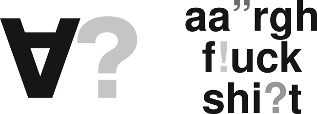
Figure 12.5
Use of Aalto’s Logo in Criticism and Resistance
Source: Tomperi, 2009, p. 14; left: reproduced with permission from Miika Salo and Sami Syrjämäki; right: reproduced with permission from Voima Magazine
The issue of reception and reaction to the new logo is one in which previous archaeological studies of the Aalto logo could usefully be complemented with other approaches, particularly from a practice and strategic perspective. Practice approaches would look in more detail into the way in which the logos are (ab)used and manipulated in actual organizational practice. The ironic representations as shown in Figure 12.5 are a good example of what can happen to a multimodal artefact if audiences do not agree with its intended meanings. Other interesting aspects could include when and how the logo is shown and by whom, to what degree the official guidelines are complied with, and how the logo is combined with other multimodal resources in public appearances of university members. Strategic approaches, on the other hand, might provide insights into how newcomers react to the logo, and how they respond cognitively and affectively. It would be interesting to examine, for instance, whether the use of specific punctuation marks and colours—and their combination—changes audience reactions when they first encounter the logo.
12.7 Conclusions
While it is difficult to provide a comprehensive overview of what has happened over time, some conclusions may be drawn. As is usually the case with post-merger integration, issues of identity and identification may be long-lasting. In Aalto’s case, even more so than initially planned, the logo has been extensively used in university branding, communication in international and external arenas, and in all kinds of design decisions ranging from internal processes to architecture in the main campus.
Nevertheless, several years after the initial merger the role of the logo seems to have changed. On the one hand, it has—for better or worse depending on the perspective—become an established part of the university alongside other aspects of its identity. Thus, the logo is no longer seen as a novel element that pushes the university’s identity to a new direction or provokes critical reactions. Rather, it seems to have stabilized as part of the university that has already become established both in Finland and internationally. On the other hand, the visual imagery still works as a tool with specific meaning potential. Interestingly, the logo and other elements of the visual identity are continuously and systematically used, and they are also playing a key role in the new architectonic and design decisions throughout the main campus.
Note
1. The complete Aalto University Visual Design Guidelines, which also contain the figures in colour, is available on http://materialbank.aalto.fi/BetterDownloader.ashx?rid=0207338b-a1c5-48af-8017-a1be012d05f6.