2
Keep it Simple
Don’t make it too hard for people to discern your narrative. Communicate a clear and consistent story, and offer data points over time that demonstrate progress towards your vision.
Steve Girsky, Chairman of General Motors, Harvard Business Review (August 2014)
More is Very Rarely More
Rhetoric is defined as “the art of effective or persuasive speaking or writing”, echoing Dan Pink’s contention that we’re all in the “moving business”. In Classical Greek and Roman times, as well as in Georgian and Victorian England, rhetoric was taught to prospective politicians and leaders. The focus of instruction for these elites often focused on form over content, and the use of compositional techniques including figures of speech, from anaphora to zeugma. Rhetoric was helpful in making the words of the privileged few sound elegant to their peers and impressive to those they governed on the rare occasions they came into contact with the masses. But as a skillset, it didn’t have much to do with how to use data and statistics to make a better case.
The mediation of public and business life through the press, radio, and TV – and more recently through interactive social and digital media channels – has changed the game for organisational storytellers. They need to be prepared to both sound good and deliver the killer evidence that persuades their audience to follow them, or vote for them, or buy their new product. Increasingly, they need to be able to do this live and in real time, responding to new developments or initiatives as they happen. To sound convincing, they have to be in complete control of their material. Though it’s not just what you say but how you say it. As I’ll explore in Chapter 4, to drive engagement, they need to deliver arguments rooted in data and statistics with energy, emotion, and empathy.
When organisational storytellers learn of the potential impact of the data-driven approach, many find it tempting to try to blind their audience with science. Whether you’re a scientist, a Government spokesperson, or the head of R&D at a cosmetics manufacturer, it’s hard to resist trotting out a roll call of evidence that supports your argument.
This is a trap you should work hard to avoid
Too much data, particularly too much unfiltered data delivered out of context, is more likely to be counter-productive. Many people find data and statistics to be confusing. This is in part because they were “badly taught” maths at school and find lists of statistics intimidating. And it’s in part because they believe Mark Twain’s maxim about “lies, damned lies, and statistics”. Politicians have been found too-often being “economical with the actualité”, a condition that rogue Tory MP Alan Clarke admitted to in a parliamentary question on the sales of arms to Iraq. Know what? He lied.
What’s more, as both 2016’s EU referendum in the U.K. and the U.S. presidential election demonstrated, the mere production and repetition of facts is not enough to convince voters to follow a desired course of action. While data delivered with honesty, authenticity, and credibility can help to swing contentious arguments, non-facts, anti-facts, and fake news (that’s lies again) can be a massive turn-off. Trouble is, it can be a turn-on when delivered with passion and gusto. With energy, emotion, and empathy for the intended audience.
When one side of an argument relies too heavily on data and statistics, it’s easy for their opponents to start picking their argument apart, one statistic at a time. Or, as Michael Gove scoffed to such memorable effect on the Brexit campaign trail, “people in this country have had enough of experts”. His staunchest defenders might argue he was talking about particular experts “with acronyms who have got it consistently wrong”, but this is not how Gove was heard or reported or interpreted. It’s worth watching on Channel 41 again, if you think I’m being unfair. He didn’t go quite as far as Republican politician Newt Gingrich who once infamously said “feelings are just as valid as facts”, but he wasn’t far off. The accusation from Gove and its impact at the ballot box led New Scientist to suggest, just a week after the EU referendum: “Trying to change someone’s mind by giving them the facts usually just makes them dig in. For reason to triumph, scientists need to learn to engage with emotion” – an argument we’ll return to in Chapter 4.
The fundamental problem is that facts are not, inherently, memorable. If you’re reporting polling or attitudinal data – about who intends to vote for which politician, or which new flavour of yoghurt is liked better by toddlers versus teens – you’re likely as not reporting a long list of percentages. And as brothers Chip and Dan Heath said memorably in their book Made to Stick: Why Some Ideas Survive & Others Die: “After a presentation, 63% of attendees remember stories. Only 5% remember statistics.” Had the EU referendum come out the other way, one of the statistics that would have been both memorable and negatively impactful was the overzealous, unsupportable “We send the EU £350m a week – let’s fund our NHS instead”. A factoid that Brexit cheerleader Nigel Farage was already disowning on breakfast TV on 24 June 2016, when the ballot papers were still warm.
The Kind of Stats that Work Hardest
Ironically, indeed, the Vote Leave campaign’s £350m a week statistic bears many of the hallmarks of the type of number – the type of core campaign statistic – that works hardest in data-driven storytelling. Whatever its veracity, whether anyone in the Vote Leave camp ever really pressure-tested it as a number that they would really be in a position to redirect from funding the EU to funding the NHS, the £350m figure does carry with it many of the criteria of a statistic with legs.
It’s simple
The figure is clear, it ends in a zero, it doesn’t include any decimal points or fractions. It’s an undemanding presence that doesn’t require much effort to remember it. This makes it easily repeatable and so easily transmissible. It has – in Susan Blackmore’s terms – memetic potential.
It’s big
Most people don’t have a concept of what it would be like to have a figure this large at their personal disposal. Several times bigger than even the biggest Euromillions Lottery win in history – itself an almost unimaginable amount of money – it’s clearly the kind of sum that a government could do a lot with. Government is big and spending on citizens costs money at scale, so £350m – and that amount each week – could clearly achieve something. What’s more, for those liable to be opposed to spending on the EU, it becomes an instant rallying cry against the body because it’s perceived to be such a waste.
It doesn’t show its workings out
The number £350m has clearly been rounded – up or down, it doesn’t matter which – but it’s not so suspiciously round as to be unbelievable or too obviously made-up. £400m would be more suspicious, and £500m/half a billion would feel too much like a figure plucked from the aether. But £350m feels much more like a number that has been worked on, but doesn’t demand too much of the audience or require them to come on the mathematical journey. It doesn’t show its workings out, but by its nature it feels like it has been worked out.
Some storytellers feel the need to give incredibly accurate numbers – sometimes to two or more decimal places – in order to show that they haven’t just made the numbers up. This is particularly irritating and unnecessary in the reporting of percentages – “99.82% of Iraqis voted for Saddam”. The trouble with being (too) accurate is that this starts to involve the audience into the process of calculation, and any set of figures that draws those listening into the process of calculation starts to feel like a maths lesson. Work hard to avoid this. Stories that give too many numbers and show too much working out don’t feel like stories. As Cole Nussbaumer-Knaflic says2 in the narrative structure chapter of her “data visualization guide for business professionals”: “A collection of numbers and words on a given topic without structure to organize them and give them meaning is useless.”
It’s worth saying that, although you should avoid volunteering your workings out as part of the core thrust of your storytelling, you should be able to produce them – immediately – if you’re challenged to do so by a journalist or an opponent or a client. If the data or statistics pique your audience’s interest sufficiently for them to ask a follow-up question or questions, fantastic. So, always keep that back of a fag packet, napkin, or spreadsheet handy just in case – joy of joys – your data-driven storytelling is so impactful that it stimulates further questions. Make that your goal in selecting the best statistics to start with, but don’t be surprised if further questions are the exception, not the rule.
In storytelling, it’s much better to stimulate intrigue and questions, rather than indulge in a lengthy bout of exposition and backstory without being invited to do so. As with good films and novels, so too with corporate and brand storytelling.
It’s a compound variable
Wherever possible, numbers and statistics that summarise stories should pull together many different elements of calculation into a single value, again without showing the working out. It’s fine to reference the fact that several different elements or line items were included in the calculation, but there’s no need to walk the audience through what those calculations actually were.
Voters in the EU Referendum were aware that member state funding is a complex equation. Remainers would point to a system of rebates which meant that net contributions were very much less than the headline membership figure: that the EU invested a huge amount in projects across the U.K. which made the actual cost of membership very much less than the dues. Brexiteers could have taken the same approach and shown a balance sheet of spend versus return, and perhaps mocked the projects that saw a return because they were pointless or wouldn’t have been necessary if the money had been targeted at the problem without having to be filtered via the EU. But instead, they chose to simplify all of the inputs and outputs into a single figure of almost unimaginable proportions, and a figure that represents weekly, not annual, contribution.
It’s understandable
Indeed, the focus on £350m a week does a much more powerful job than aggregating the figure up to an annual total. £350m * 52 = £18bn (rounded down, naturally). Imagine the arguments in the Vote Leave camp. “We sent £18bn a year to the EU – that’s an unimaginably large number – we should shout that from the rooftops, spatter that on our battle buses. Whaddayasay, Boris?” But the sheer size of the £18bn number makes it unusable or at least much less effective as a number on which to base a data-driven campaign. Not to mention – as we’ll see below – that, at best, this figure represents gross, not net, contributions.
When numbers get too big, they lose meaning. While a million of anything is hard to understand, a billion of anything is much harder to grasp. The fact that total U.K. government expenditure3 was almost £750bn in 2014–15 is hard to grasp. What that figure ends up meaning is little more than “it costs £750bn to run the U.K. each year”. It’s a number so far outside most people’s grasp or comprehension that it just becomes a circular definition.
It’s repeated ad nauseam and becomes an earworm
Peter Mandelson and Tony Blair made the Labour Party electable for the first time in nearly two decades in 1997 through a number of highly effective strategies. They dragged the party to the right (or the centre, depending on your starting point). This involved them repositioning the party as “new Labour”, mitigating Middle Englanders’ concerns that a Labour government would mean industrial action paralysing public services and the PM huddling with the TUC over beer and sandwiches at Number 10. They also successfully reassured the British public that new Labour could be trusted running the economy. One of the most effective arrows in their quiver was incredibly simple, direct, and of course data-driven.
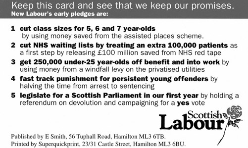
What Peter and Tony also did incredibly effectively ahead of the 1997 election campaign was agree on the six core areas where new Labour would make a difference. These were captured in a simple, straightforward pledge card. The pledge cards were wallet-sized and issued to all party members and campaign activists. They represented the summary of new Labour’s costed pledges for what it planned to do when it got into office. Each one of the pledges had numbers and statistics and targets attached to them – something that came back to haunt the party when in office.
All activists – whether on the doorstep or appearing on BBC TV’s Question Time – were expected and required to focus on the six areas. All were required to learn, know, and follow-up each pledge with the data and statistics that supported them, particularly as prospective voters or TV interviews showed some interest or challenge for any specific pledge. What the pledge card did was serve as a summary and a bridge and a jumping-off point for debate on the issues where new Labour felt safe and confident its policies would make a significant difference.
What new Labour created in the pledge card was a classic executive summary of a data-driven storytelling campaign, and the party foot soldiers deployed this weapon as intended and directed. It meant that the campaign stayed very much on-message. As an analogue piece of card in the wallet, it was less sinister and apparently controlling than pagers sharing soundbites and slogans, an early use of political tech that was used as a stick to beat new Labour once it took power. What the card ensured was that new Labour talked with one voice, dominated the debate on its terms, and won the first of two landslides, the first of three elections. The stuff of the Corbynistas’ wildest dreams.
The 1997 pledge card made new Labour’s pledges become a close-knit set of earworms. A general election is rarely about a single issue – whatever Theresa May’s declared motivation in calling the 2017 snap election – and this contrasts with referenda. While referenda in general – and the EU Referendum in particular – are about more than single issues, they do require voters to vote on a single question. Where the Brexiteers were so successful with their relentless focus on the “£350m a week” killer statistic is that they repeated it, ad nauseam, until it, too, became an earworm. The defining earworm and statistic of the campaign. When Remainers looked to rubbish or discredit it, they referenced it. It became shorthand for cost and value of EU membership. It was created and owned and championed by the winning side, even if they disowned and dropped it less than four hours after the result was confirmed. But that didn’t matter. By then, it had done its job.
It avoids the inconvenient truth of context
Sometimes, context is invaluable in data-driven storytelling. Setting data and statistics in their proper context can show how one course of action can have impact outside the immediate frame of reference. It’s more honest, holistic, and even-handed and shows that the storyteller has considered the issue in the round, rather than just from their own point of view. We’ll come back to empathy in Chapter 4.
At other times, avoiding context – hiding the full picture from the audience – can make the data and statistics chosen by the storyteller perform much more powerfully. This is exactly what the Vote Leave campaign did with the £350m figure, cunningly derived from the Government’s own data and based on gross and not net spend after rebates. They used a round (but not too suspiciously round), big (but not too big) figure to make their case. What they didn’t do or use or consider was the money the U.K. got back from the EU in the form of investment or rebates, agricultural, industrial, or regenerative. Nor did they choose to present what net expenditure meant in terms of overall Government expenditure.
The totality of U.K. Government expenditure after rebates and subsidies provided by the EU offer up the context that Vote Leave was so keen to omit. The official data show that the net cost of the U.K.’s membership of the EU for 2015 was the still impressively big figure of £3.7bn. But set in context, £3.7bn represents half of one percent. In statistical terms, 0.5% is a rounding error. A figure so vanishingly small as to be of no statistical or practical significance.
Let’s look at it another way. In psychological and medical trials, an experiment is not deemed to have been caused by anything other than chance if it doesn’t have a probability (or p) value of less than 5%. Convention has it that this is often written as p < 0.05. What this means is that, if we’d conducted the same experiment 100 times, we would have got a different outcome in fewer than five of the experiments. Flip that on its head and we see that, for every 20 times we did run the manipulation, it would come out differently in less than one experiment. And for psychologists, this means they’re pretty confident they’ve found something interesting; the manipulation achieved something of interest that is very unlikely to have happened by chance. In some medical experiments, the probability threshold is set twice as high, at p < 0.10.
If psychology is prepared to accept probability values ten times as large as the Brexiteers are prepared to invest in the EU – and medicine 20 times as large – this tells us that Vote Leave was street smart (if deceitful) not to put the true value of expenditure in its proper context.
Here’s another analogy. Let’s scale it down to salaries or mortgage payments. If you’re used to taking home £2,500 per month and one month your pay packet shows you’re being paid £2,487.50. Would you quibble? Would you notice? Or imagine your direct debit for mortgage payments is £1,250 per month and one month your mortgagor takes £1,256.25. Again, would you notice? Would it be worth raising?
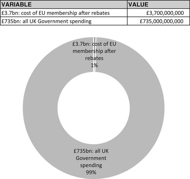
Cost of EU membership after rebates in the context of all U.K. Government spending: £3.7bn out of £735bn (2014–15)
Source: U.K. Government’s Public Expenditure Statistical Analyses for 2015
URL: www.gov.uk/government/statistics/public-expenditure-statistical-analyses-2015
That’s the scale of the cost of EU membership to the U.K. as a percentage of annual expenditure. If those numbers had been presented, the result might have been rather different – if the population at large had seen EU expenditure in its proper context. As it was, the Remain camp decided to embark on Project Fear and use literally incredible scare stories about what could happen to industrial output and jobs and tax receipts, and their over-reliance on too much fact presented in too much detail ran their campaign into the buffers. Thanks, Gideon and Dave. A poor, data-stuffed campaign was run by pushing statistic after statistic on a confused public with little emotional wrapping other than fear and dread.
The zombie status of “£350m a week”
Since its first, extensive outing during the EU Referendum campaign, £350m a week has taken on the status of a zombie statistic, one that refuses to die no matter how many credible, authoritative commentators try to kill it off. Independent analysts – including Government statisticians – have pawed over the statistic and its data sources and sought to discredit it. Three major points of contention have been its total lack of context, the fact that it ignores rebates and subsidies, and whether the carefully worded slogan on Boris’ battle bus implied a post-Brexit settlement would ever use the money “saved” to go directly to the NHS.
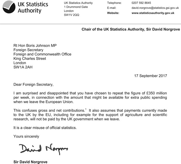
And just when it was thought that the victorious Brexit camp had wrung all that they could from it, Foreign Secretary Johnson gave it new life by repeating the number and again suggesting it be earmarked for the NHS. In a 4,000-word extended manifesto designed to undermine a major speech from PM Theresa May to European Leaders, he said in the Daily Telegraph4 on 15 September 2017:
And yes – once we have settled our accounts, we will take back control of roughly £350 million per week. It would be a fine thing, as many of us have pointed out, if a lot of that money went on the NHS, provided we use that cash injection to modernise and make the most of new technology.
This led Sir David Norgrove, Head of the U.K. Statistics Authority, to rebuke Johnson for confusing gross and net contributions and in so doing wilfully misleading the British public for a second time. A proper telling off and rap over the knuckles. Though I doubt it’s the last time BoJo will wheel out his favourite pet zombie.
Choosing the Killer Statistic
There are other criteria you can use to make sure you choose the perfect killer statistic. Data that can show trends – particularly trends that can project reliably into the future – are helpful. Done right and in a way that does, in the end, accurately predict the future, predictive analytics can be incredibly powerful.
The trouble here is that those in the prediction business generally have a very poor track record in accurately and reliably predicting the future, whether they’re stock market analysts, bookmakers, weather forecasters, or astrologers. They might get on a lucky roll and predict winners or weather right four or five times in a row. But the roll won’t carry on forever. The statistical law of regression to the mean will interfere and bring outcomes back to the average of what might be expected, and future-gazers’ models will be found lacking because they haven’t considered enough input variables in building their model. They’ll rely too heavily on cognitive heuristics or shortcuts that enable them to cope with huge volumes of data quickly but not necessarily effectively, making their incorrect predictions predictably incorrect. Daniel Kahneman’s Thinking, Fast and Slow explains how and why in detail, and for the truly committed, it’s worth going back to Kahneman and Tversky’s original papers.
And so, in summary, for its simplicity, its bigness (but not too-bigness), the omission of workings-out, the fact that it brought several data points together and was understandable, its earworm qualities, and the judicious decision not to set it in context … for all these reasons, Vote Leave’s “£350m to the NHS” truly was an inspired example of data-driven storytelling, however flawed or dishonest or downright wrong it was and I and the rest of the 48% may know it to have been. Remoaners, eh? Such sore losers.
Be Simplest of all in Your Language
So far in this chapter, we have considered the different criteria you should use when choosing the right data and the best statistics to tell your story. At the heart of what we’ve covered so far is the need to be simple, clear, and understandable. While complex mathematical and statistical techniques and processes need to be applied to numbers to build a rigorous, evidence-based story, these need to be stripped back and hidden away when it comes actually to telling the story. Just as important as the numbers chosen to make your point are the words you use to tell the story.
When physicist Richard Feynman was awarded the Nobel Prize for Physics, he was asked if he could explain in just three minutes why he’d won the prize. In a rare misstep, Feynman is reputed to have answered: “If I could explain it in three minutes, it wouldn’t have won the Nobel Prize.” With all due respect, Dr Feynman, you’re wrong. Anything can be explained top line – in an elevator pitch – in three minutes. It should be possible to explain it in a sentence and ideally in a phrase. e = mc2, anyone?
It’s always possible to make difficult concepts easier to understand by using simpler and more straightforward language. Note: this is not about dumbing down. It’s about talking human, a theme we will return to in Chapter 6. The words chosen by businesses and other organ-isations are very often far too complex and difficult to understand. Sometimes that’s to do with jargon (and we’ll come back to that, too). But more often it comes down to an overly complex writing style. As soon as they’re given the scope to write on behalf of or in the voice of an organisation, normally fluent communicators default to an obscure, fuzzy, pretentious form of words that’s never come out of any human’s mouth.
One of the most straightforward ways in which organisational storytellers can use data to make their storytelling more compelling is in writing in a simple and straightforward way. Fortunately, there are a several different diagnostic tools that you can use to check whether your language is telling your story simply, clearly, and effectively. And suitably enough for a book about telling stories with data and statistics, all of these produce – erm – data and statistics about the words you use.
The Gunning Fog Formula analyses text and generates a score that’s a school grade. This equates to the number of years of formal education a reader would need to have passed through to be able to understand the text with ease at first reading. The SMOG Index does something similar, though it also benefits from associations with London’s peasouper smogs (“smoke” + “fog”), worst in the so-called Big Smoke of 1952. For five days in December, pollution plus weather made it hard to see your hand in front of your face. The analogy with smoggy, unclear writing is almost too appealing. What’s more, SMOG is an acronym for Simple Measure of Gobbledygook. It, too, creates a school grade score. Other tests include the Automated Readability Index, the Fry Readability Formula, and the Coleman–Liau Index. There’s a world of text analysis to which most people are entirely oblivious. (Note: this paragraph scores 10.3 on the Gunning Fog, but 12.4 on the SMOG Index, as calculated using http://readable.io).
Perhaps the simplest, most widely used, and most useful of all the tools available is the Flesch–Kincaid ‘reading ease’ score. The FK score is based simply on the number of words per sentence and the number of syllables per word. The shorter your sentences, and the fewer long words you use, the higher your score.
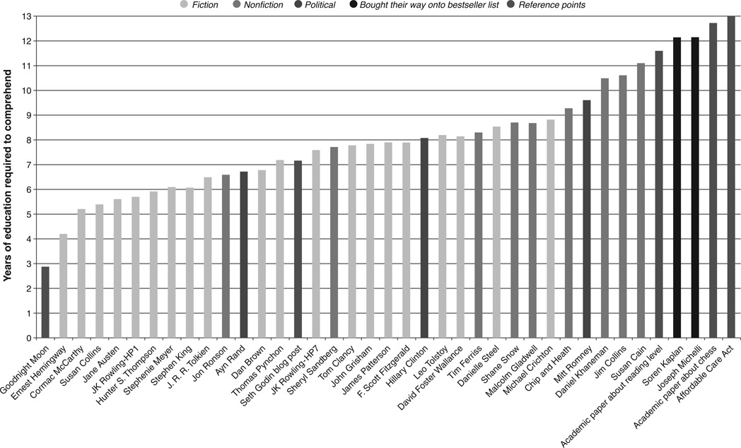
FK scores typically range from 0 to 100, although there’s a sentence in Moby Dick that scores −146.77 and one in Proust that scores −515.10. Journalist and head of Contently, Shane Snow,5 produced a great study6 of the FK scores generated by different authors and sources, which is well worth the detour. Above is a typical chart, with text analysed from children’s classic Goodnight Moon (FK of less than 3) and the Affordable Care Act (aka Trump’s favourite Obamacare) (FK 13).
As we’re particularly interested in this book in how organisational storytelling is mediated through print, broadcast, and online media outlets, the following table gives typical Flesch-Kincaid scores for a variety of different channels.
The FK score is accompanied by a grade level. This represents the U.S. school grade a reader needs to have attained to be able to understand the text in question with ease. The test, scores, and grade levels are based on well-validated psychological tests. Essentially, the longer the words and the longer the sentences, the harder they are to understand; to “parse”, as linguists say. Longer processing time of interminable sentences mean the start of these sentences fall out of working memory. This makes us fail to understand, lose interest, and become less engaged.
Table 2.1 Typical Flesch Kincaid scores for different publications
| Source | FK ‘reading ease’ score |
|
|
|
| BuzzFeed (list post) | 96 |
| Harry Potter and the Chamber of Secrets | 85 |
| Cosmopolitan magazine | 78 |
| Guardian homepage | 64 |
| The Economist | 43 |
| Apple iTunes Terms & Conditions | 33 |
| Standard insurance policy | 10 |
Technical topics based on scientific or medical breakthroughs are often full of technical terms. These are often polysyllabic words derived from Latin or Greek. They go on for ages. String a few of those together and soon you’ve got an incomprehensible sentence. Keeping language simple and easy to understand drives engagement and interest. It has the same effect as an enthusiastic person talking about one of their passions in an entertaining but straightforward way.
Do this simply, clearly, authentically. Be you. If you’re Eric, be very Eric. Not Jeremy or Bobby-Ann.
In our ever-more digital world, when people want to find out about your organisation, company, or brand, they look online. Whether they’re about to buy from you or they just want to comment on your customer service, most people find that what you say in your own (or owned) media channels says a lot about you. About whether you deserve their loyalty or the sharp edge of their tongue.
The language you choose is a critical first step in shaping perceptions of your organisation, as it is for your competitors. Sure, it’s important what influencers say in editorials, blogs, and social media, but getting people to understand what you do and why you do it really starts with the story you tell about yourself.
Summing Up
In this chapter, we’ve focused on the basics of how to tell stories with data and statistics. The advice from General Motors’ Steve Girsky not to make it too hard for people to discern your narrative demands clarity and consistency.
Choosing the right data and statistics can make the difference between winning and losing – an election campaign, a sales battle with a competitor, the hearts and minds of your audience.
The always-on nature of modern media means organisational storytellers need to choose and use the right data and statistics sparingly – and be prepared to give a fuller explanation “if asked”.
Don’t blind you audience with science – always be selective in your choice of data and statistics.
More is very rarely more.
People respond to stories more than they do to numbers. Data and statistics should be the underpinning or the foundation of your stories, not the stories themselves.
Be simple. Avoid decimals and fractions. But don’t make your numbers too suspiciously round.
Use big numbers – not too big so that you become literally incomprehensible.
Don’t show your workings-out, but be prepared to share how you got to your answer – including the intricacies of your methodology and calculations – if pressed by the knowledgeable or interested.
Compound data together to create variables that summarise the meaning of your story. But be careful you don’t lose important details along the way.
Tell your audience what you’re going to tell them. Tell them. And then tell them what you’ve told them. Over and over and over again. That’s the way to create a truly memorable earworm.
Use context where it helps to advance your case. But be aware of what you’re hiding if you fail to set the data you choose to use in its proper context.
Be simplest of all in the language you use – short sentences and simple, short words.
Being clear is not the same as dumbing down.
Give It a Go
Keep it simple, smarty-pants
The simpler the text, the easier it is to understand. The easier copy is to understand, the fewer times people need to read it before they understand it – ideally just the once. And the quicker they understand it, the quicker they can respond to it. Buy your product. Support your cause. Decide that you are the party or candidate they want to vote for.
Go to your organisation’s About Us page. If you don’t have an About Us page (unlikely), how about your most recent personal statement or biography. Highlight and copy the text into a new Pages or Word file and save it. Then go to one of the online readability tools available. Readability Formulas is free (www.readabilityformulas.com), and I subscribe to www.readable.io for a modest annual fee. Paste the copy into the text window and find out how simple or complex your copy is.
I favour Flesch–Kincaid, which – like many of the other tools available – is based on words per sentence and syllables per word. If your text has scored higher than you’d hoped in reading age and lower than you’d expected for readability, save a fresh copy of the text and start working on it. Make the sentences shorter. Replace long, Latinate, abstract words with short, pithy, Anglo-Saxon equivalents. Cut out all the fat. And then run the textual analysis again. You’ll be surprised how quickly you can make even complex text much more readable, much more understandable, and much more likely to trigger action for your audience. Build language complexity analysis into your regular, storytelling routine.
Simples.
Data-Driven Stories
This Girl Can
| What’s the organisation? |
| Sport England, a representative body providing services and funding for sport in England |
| What’s the brand? |
| Women’s participation in sport |
| What’s the campaign? |
| This Girl Can |
| What’s the story? |
| How data about the drags and drivers of women’s participation in sport changed attitudes and behaviours. |
| How did data drive the story? |
| The planning of the campaign was shaped by research among 14-60-year-old women that showed one of the principle reasons why they didn’t get involved was because they were afraid of what others thought of them taking part. |
| What was the outcome of the campaign? |
| An additional 1.6m U.K. women regularly taking part in sport, a sustainable and sustained increase from 2014 to 2017. |
Changing attitudes and beliefs with a data-driven storytelling campaign is one thing. Changing the behaviour of millions of people is nothing short of a miracle. But it’s exactly what Sport England’s This Girl Can campaign achieved in less than two years.
The benefits of sport and regular exercise are well-established. To individual health and wellbeing. To mental as well as physical health. And to society at large, particularly a society beginning to be weighed down by an epidemic of obesity and inactivity, with knock-on costs already taking up scarce health service resources. Society would be better off – physically, spiritually, and financially – if more people regularly took part in sport.
The message about the long-term benefits of sport and exercise are failing to get through, despite up to 13 years of regular weekly exercise at school. Something is clearly going wrong at school age, because more than a third of the least physically active school girls agree with the statement that they feel like their body is on show in PE lessons and this makes them like PE less.
Once school’s out and games cease to be compulsory, active participation in sport in England falls off dramatically. The lack of participation in sport after school age is particularly common among English women. Research commissioned by Sport England showed that 2m fewer women aged 14–60 play regular sport compared with men of the same age.
Sport England also found that more than 75% of the women not regularly playing sport say they would like to, but the research discovered that the fundamental factor holding them back is fear of being judged by others: the fear of what others will think about their physical appearance and ability when they see them exercising. A quarter said that they “hate the way I look” when taking part in sport. And – wrongly – most women believe they are alone in their fears, whereas the research pointed to this being a universal truth.
Sport England and its ad agency FCB Inferno put research, data, and statistics at the heart of their communications development and planning process. They knew they needed to produce an emotional, emotive campaign to help women understand they were not alone in their fears and anxieties and to empower them to understand the very real value – to themselves, their families, and their communities – if they did become involved in sport and exercise.

Part of the reason for the campaign’s impact and success has been its use of real women, not airbrushed celebrities, in its films – real women who have overcome the anxieties that are holding back many millions of their peers across the country. By using emotive imagery and film, the campaign was able to address very real, very specific concerns that have been holding women back from active participation in sport, including the unjustified misconception that getting sweaty and red in the face is just not feminine. This misconception was held by almost half of the women surveyed by Sport England. It was overtly addressed by the two of the campaign taglines, “Sweating like a pig. Feeling like a fox” and “Damn right I look hot”. And perhaps most memorably of all, at a time when women’s football in the U.K. is finally coming of age, “I kick balls. Deal with it”.
At every step of the creative and executional process, the campaign used data and statistics as the rational underpinning to unlock the insights that made the campaign so powerful and effective. As a result of the campaign, 1.6m more women took part in sport regularly than before it aired. What’s more, the rate of change – the rate at which women are taking up sport compared with men – is now to women’s advantage.
The second This Girl Can campaign broke in early 2017, focusing on older women participating in sport. Early results already suggest that it is likely to be just as impactful.
Key takeaway: Data and statistics can be used as the foundations of incredibly powerful public education campaigns that actively and sustainably change behaviour.
Notes
1 www.youtube.com/watch?v=GGgiGtJk7MA
2 Storytelling with Data (Wiley), pp. 177–8.
3 www.gov.uk/government/statistics/public-expenditure-statistical-analyses-2015
5 https://shanesnow.contently.com