
The Windows Phone User Interface
Applications that run on Windows Phone devices are referred to as Windows Phone apps. Microsoft released the Windows Phone 7 mobile operating system, which was the successor to Windows Mobile, in October 2010. Windows Phone 7 became popular among .NET developers because it enabled them easily to build and publish apps to a public app store. Windows Phone 7 app development leveraged the .NET Framework, which simplified the transition for .NET developers from desktop and web development to the mobile app development space. Developers could use either Silverlight or XNA with C# to build mobile apps, and they could release their apps to the Windows Phone Marketplace.
In October 2012, Microsoft released Windows Phone 8, which was based on the Windows NT kernel. Windows Phone 8 included a small subset of APIs in common with the Windows 8 operating system, thus enabling about 30 percent code reuse between the two platforms. It also introduced new app models to enable developers from various programming backgrounds to develop Windows Phone apps using their language of choice. Windows Phone 8 apps could be created using C++ and DirectX, HTML5 and JavaScript, or Silverlight and C#. Code reuse between Windows Store and Windows Phone apps was accomplished through the use of portable class libraries, which included a set of APIs that were common between the two platforms. Portable class libraries are external DLLs, which are compiled independently and added as a reference to each platform-specific project. The Windows Phone Marketplace was renamed to the Windows Phone Store around this time as well.
In 2014, Windows Phone 8.1 was released, which included a converged Windows Runtime API, enabling up to 90 percent code reuse, including a shared XAML framework between Windows Store and Windows Phone apps. Windows Phone 8.1 provided many more options for developers. They were now able to select from a new the Windows Runtime app model to create Windows Phone apps. The Windows Runtime app model lends itself to the concept of universal apps for Windows, which enables the two platforms to share UI code, assets, and files through Shared Projects. A Shared Project serves as a file linker, which simply copies the shared files into each platform-specific project at compile time. The result is that the shared files are compiled within each platform’s executable code. Windows Phone applications developed using the Windows Runtime app model are referred to as Windows Phone Store apps.
Since this book’s primary focus is on XAML, this chapter will focus on designing the user interface for Windows Phone Store apps. We will show you how to tailor your application to support various screen sizes, as well as how to style your user interface through the use of themes, templates, and resources. Finally, we will discuss the various ways that you can present data collections to provide an interactive, engaging user experience.
 Note In April 2015, Microsoft announced that its new operating system, Windows 10, will enable developers to create applications that can run on any Windows 10–enabled device, including tablets, phones, wearables, Xbox, and HoloLens. When Windows 10 is released, .NET developers will be able to develop XAML/C# applications that run cross-platform. The XAML fundamentals we cover in this book will help to prepare you for this next wave of application development.
The Basics
Many of the core concepts surrounding XAML UI design, which were discussed in Chapter 8, are relevant in this chapter, and they serve as the foundation for the next two chapters. If you skipped Chapter 8, now is the time to go back and read it before moving forward.
Before you can develop apps for Windows Phone 8.1, you must install the Windows Phone SDK, which is available with Visual Studio 2013 Update 2 or newer. The Windows Phone 8.1 SDK includes the Windows Phone and Windows Runtime APIs, emulators, and universal app templates. If you do not have access to a licensed edition of Visual Studio, we recommend installing Visual Studio Community 2013 with Update 4, which is available free of charge from the Visual Studio Downloads page at https://www.visualstudio.com/en-us/downloads.
Note that you must select the Windows Phone SDK check box when installing Visual Studio 2013, because it is not selected by default. During the installation process, in the “Optional features to install” step, select the Windows Phone 8.0 SDK, as shown in Figure 9-1. Although the label indicates that you will be installing the Windows Phone 8.0 SDK, you can rest assured that the Windows Phone 8.1 SDK will be installed.

Figure 9-1. Installing the Windows Phone SDK with Visual Studio 2013
The range of Windows Phone devices on the market today is extensive. Nokia Lumia devices are the most popular in the marketplace. A wide range of handheld devices is offered, from high-end tablets to modest low-end devices. As a Windows Phone developer, you will need to design your app to support different screen sizes and resolutions to ensure that it renders properly across multiple devices. Your app must support a minimum screen width of 384px, when displayed in portrait mode, and 640px, when displayed in landscape mode. We will discuss how to configure your app to support portrait and landscape mode in the “Page Orientation” section, later in this chapter.
Table 9-1 lists the screen resolutions of the emulator images that are available in the Windows Phone 8.1 SDK.
Table 9-1. Windows Phone 8.1 Emulator Resolutions and Aspect Ratio

To determine the device’s resolution and current orientation, you can use the DisplayInformation class, from the Windows.Graphics.Display namespace, which exposes events to allow you to monitor changes in the display. It also includes read-only properties, which provide information such as the number of pixels per logical inch, raw dots per inch along the x- and y-axes of the display screen, the number of physical pixels for each layout pixel, and the current device orientation. You can use this information to gather pertinent information about the device on which the application is running. Listing 9-1 provides a code sample that calculates the device’s display resolution using the RawPixelsPerViewPixel as a multiplier against the current application window’s height and width measurements. Listing 9-2 illustrates the XAML markup needed to display the resulting measurements onscreen.
Deploying this code to the WXGA 4.5-inch emulator results in the display shown in Figure 9-2.
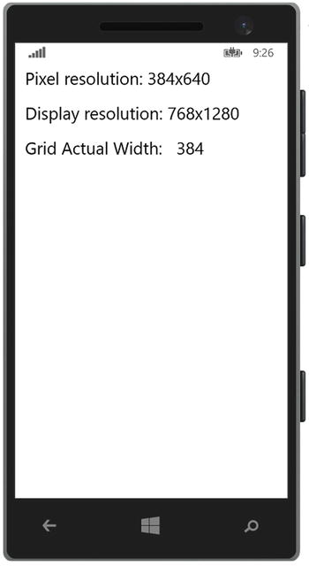
Figure 9-2. The device’s resolution information is displayed in the WVGA 4.5-inch emulator
Notice that the actual width of the controls on the page are based on pixel resolution. You shouldn’t concern yourself too much with each device’s pixel measurements since you should not be using fixed measurements when designing your pages.
If you rely on fixed measurements, you will notice that controls in your app may render just fine in one resolution but may appear too small or too large in another resolution. By using dynamic layouts and allowing the Windows Runtime system to handle the way in which elements are organized within the page, it ensures that your app will look consistent across devices regardless of the screen's pixel density.
Within Windows Phone applications, the system will automatically scale UI elements based on the following scale factors:
- 1.0: 100 percent, no scaling
- 1.4: 140 percent scaling
- 2.4: 240 percent scaling
The system determines which scale factor to use based on the device’s physical screen size, screen resolution, screen DPI, and form factor. Notice that in Listing 9-1, we used the RawPixelsPerViewPixel property on the DisplayInformation class to determine the scale factor.
Although the Windows system handles scaling automatically, there are some measures that you should take when including images within your application. First, use vector-based graphics as much as possible since they scale up or down quite well. If you need to use bitmap images, add them as resources within your application and provide a separate image for each scaling factor.
The application will automatically load the proper image based on the device’s scale factor. Therefore, for each original image that you include in your project, be sure to provide images scaled at 140 percent and 240 percent of the original image size within the application as well. These images must be added to the same folder within your application, and you should follow the naming convention: name.scale-scalefactor.ext. Figure 9-3 illustrates this naming convention.

Figure 9-3. Including images to support multiple scale factors
Within your XAML, you can simply reference the image as follows: <Image Source="Images/star.png" />
Windows Phone will retrieve the appropriate image based on its determination of the scale factor to use based on the current device.
Run the app in each of the emulators. You should notice a result similar to that depicted in Figure 9-4.
Tip Notice in Figure 9-4 that the original image, star.scale-100.png, is not displayed. The Windows Phone 8.1 emulators only provide images with a scale factor greater than 1.0, so you will not see the original image when testing in the emulator.

Figure 9-4. Star image automatically loaded by Windows based on the scale factor
As mentioned earlier, the Windows system determines which scale factor to use based on various properties of the current device, and it loads the image that is based on the calculated scaling factor threshold. When referencing the image from XAML using the base name of the file, without the scale factor included, Windows will locate the required file as long as you follow the file naming convention discussed earlier in this section.
Although XAML handles file loading without any effort on your part, you may encounter a situation where you will need to load bitmap images manually from the code-behind file. In this case, use the RawPixelsPerViewPixel property to determine which bitmap image to load based on the scale factor calculation: RawPixelsPerViewPixel * 100. On Windows Phone, there are only three scale factors for which you must account, so determining which image to load will take only a few lines of code, as shown in Listing 9-3.
Run the app in the various emulator configurations. The results should match those depicted in Figure 9-4.
As mentioned earlier, the Windows Phone 8.1 emulators only provide images with a scale factor greater than 1.0. However, there are Windows Phone devices that will have a scale factor of 1.0 (specifically, for those users who purchased a Windows Phone 8.0 device and upgraded the device’s OS to Windows Phone 8.1 when it became available). If you design your application’s user interface to look properly on devices with a minimum screen resolution of 384×640 and you provide images to be rendered at the three scale factors discussed earlier, then you will ensure that the Windows system will scale up accordingly on higher-resolution devices, and your UI will look and behave in a consistent manner across devices.
Themes, Resources, and Styles
Windows Phone systems use themes to control the visual representation of the system applications and third-party applications. A theme consists of a set of resources that define how visual elements are displayed on the device, and it is comprised of predefined settings for pages and UI controls, such as background colors, accent colors, font styles, and font sizes, for example.
The Windows Phone SDK provides two background color themes: Dark mode and Light mode. Dark theme mode displays with a black background, while Light theme mode displays with a white background.
Twenty accent colors are available in both Dark and Light theme modes, as shown in Figure 9-5.

Figure 9-5. Accent colors available in Windows Phone 8.1
To configure your theme on a Windows Phone, launch the Settings app, and select the start + theme item from the list. Figure 9-6 depicts the start + theme screen, which contains the selection lists for the background and accent color settings.
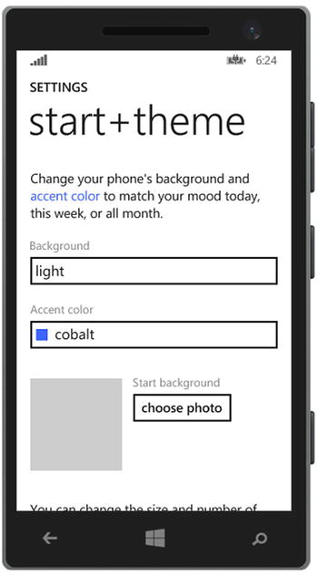
Figure 9-6. Windows Phone devices run in Dark or Light theme modes, along with a configured accent color
The reason that theming on Windows Phone is important to you is because any Windows Phone app that you may develop will automatically inherit the device’s selected theme by default, unless you override the default theme with your own theme. However, it is still important to understand how themes work and to ensure that your application is visibly appealing when run on a device that is set either to Dark or Light theme mode.
Avoid explicitly configuring font text color to use White or Black; otherwise, you run the risk of the font disappearing against the same color background when the device theme is changed. Instead, make use of the predefined resources for Windows Phone to configure styles for visual elements in your application.
Theme Resources
The Windows Phone SDK provides multiple collections of predefined theme resources that you can leverage when styling your application. When configuring elements to use theme resources, you can be sure that the styles applied will correlate to the current theme that the device is currently configured to run.
Brush resources are available that define the standard color themes that are utilized within Windows Phone applications. It is best to use a brush resource, rather than a specific color, to ensure that your application adapts to any theme changes that are applied by the user. For example, using a predefined theme resource to set font color ensures that the color is not washed out against the current background theme. In Dark theme mode, the font color will be set to White, while in Light theme mode, the color will be set to Black. Table 9-2 lists the SolidColorBrush resources available on Windows Phone.
Table 9-2. SolidColorBrush Resources
|
Name |
Description |
|---|---|
|
PhoneAccentBrush |
SolidColorBrush of the foreground color |
|
PhoneForegroundBrush |
SolidColorBrush of the foreground and border color |
|
PhoneBackgroundBrush |
SolidColorBrush of the default background color for pages and controls |
|
PhoneContrastBackgroundBrush |
SolidColorBrush used for the background color of contrasting elements |
|
PhoneContrastForegroundBrush |
SolidColorBrush used for the foreground color of contrasting elements |
|
PhoneDisabledBrush |
SolidColorBrush used for the disabled foreground and border color |
|
PhoneSubtleBrush |
Subtle foreground and border color brush |
|
TransparentBrush |
Provides transparent background on elements that apply this brush |
|
PhoneSemitransparentBrush |
Provides a partially transparent background brush |
|
PhoneChromeBrush |
SolidColorBrush used to match the Application Bar background in the current theme |
If you require a resource type that returns Color rather than a SolidColorBrush type, Color resources are available that are in line with the available Brush resources, such as PhoneBackgroundColor, PhoneForegroundColor, PhoneDisabledColor, and so forth.
To reference a theme resource within your XAML markup, set the value of the property to a named ThemeResource as follows:
<object Property="{ThemeResource NamedResource}" />
For example, to set the Foreground color on a TextBlock to the device’s accent color, add this markup to your page:
<TextBlock Foreground="{ThemeResource PhoneAccentBrush}" />
Font resources are available that define the font style and sizes you can leverage in your application, as listed in Table 9-3.
Table 9-3. Font Size Resources
|
Name |
Value |
|---|---|
|
TextStyleSmallFontSize |
10.659 |
|
TextStyleMediumFontSize |
16 |
|
TextStyleLargeFontSize |
18.139 |
|
TextStyleExtraLargeFontSize |
25.5 |
|
TextStyleExtraLargePlusFontSize |
29.86 |
|
TextStyleExtraExtraLargeFontSize |
34.139 |
Similar to Brush resources, configure the FontSize of your TextBlock elements to use the named ThemeResource:
<TextBlock FontSize="{ThemeResource TextStyleMediumFontSize}" />
Similar to predefined resources, the Windows Phone SDK provides predefined styles that you can use to maintain a consistent look and feel across TextBlock controls within your application. When adding a page to a Windows Phone 8.1 application, the Page background is configured to use the ApplicationBackground themed resource by default:
<Page Background="{ThemeResource ApplicationPageBackgroundThemeBrush}">
You can find the complete list of XAML theme resources that are available for your Windows Phone 8.1 applications on the MSDN site: http://bitly.com/XAMLThemeResources.
When designing a Windows Phone Store application, it is important to understand the application architecture. Similar to WPF applications, the starting point for a Windows Phone application is the Application class, which determines the page that will be loaded on startup, contains shared resources and properties, and allows you to override, or register, application life-cycle events enabling custom behavior to be handled when the application is launched, activated, suspended, or resumed from a suspended state. Table 9-4 describes these key events.
Table 9-4. The Main Application Life-Cycle Events on Windows Phone
|
Life-Cycle Event |
Override Event |
Description |
|---|---|---|
|
Launched |
The override event is OnLaunched. |
Windows Phone generates boilerplate code to handle this event. It is imperative that you leave that code intact; however, you may include additional code logic within this event. The LaunchActivatedEventArgs parameter is passed into this event, which provides useful information such as how the app was launched, the TileId that the user tapped to launch the app (if applicable), and the application’s previous execution state. |
|
Activated |
The override event is OnActivated. |
Override this event if you want to perform custom actions, such as updating and displaying any notifications that the user might have missed while the application was deactivated. |
|
Suspending |
No override. You must register an event handler. Here’s an example: this.Suspending += this.OnSuspending; |
Register an event handler for the Suspending event if you need to store the application’s state, such as user data, to persistent storage. Your app may be automatically terminated by the operating system if it is running low on resources or shut down before the user is able to resume the app, so it is imperative to store application data at that point in time in order to ensure that the user does not experience data loss when returning to your app. |
|
Resuming |
No override. You must register an event handler. Here’s an example: this.Resuming += this.OnResuming; |
Register an event handler for the Resuming event if you need to restore the application’s state from the data that was cached when it was suspended. |
Windows Phone enables you to design your pages such that they can be viewed in portrait and/or landscape mode. As long as you ensure that your layouts are dynamic, when the orientation is changed, your UI will adapt according to the changed height and width measurements based on the new orientation.
Within Windows Phone Store apps, you can set the supported orientations within the Application tab in the app’s package manifest, named Package.appxmanifest. Double-click the package manifest in the Visual Studio Solution Explorer. You should see a view similar to what is depicted in Figure 9-7.

Figure 9-7. Selecting the app’s supported screen orientations in the package manifest
The package manifest contains metadata about your application, including your application’s entry point, which is the Application class by default. It also includes the tile images and application logo, device features or capabilities that your application will leverage, hardware that the device must support for your app to work as expected, and packaging details that will be displayed in the Windows Phone Store when the app is published.
You may also select which orientations your application will support by ensuring that each supported orientation is checked, as shown in Figure 9-7. Configuring your application’s orientation setting in the package manifest will ensure that all of the pages within your app will support the selected orientations.
Alternatively, you may prefer to set the supported orientations from each page’s code-behind individually. The advantage to this approach is that you can set the supported orientation to a different value on a page-by-page basis by setting the value of the AutoRotationPreferences property on the DisplayInformation class.
For example, let’s say you are developing a game in which the main game play screen must run in landscape mode only, while the app’s settings page will be displayed in portrait mode only. In the OnNavigatedTo event within your MainPage, include the following line of code to support landscape and landscape flipped orientations: DisplayInformation.AutoRotationPreferences = DisplayOrientations.LandscapeFlipped | DisplayOrientations.Landscape;
In the OnNavigatedTo event within your SettingsPage, simply set the AutoRotationPreferences property as follows:
DisplayInformation.AutoRotationPreferences = DisplayOrientations.Portrait;
In Windows Phone Store applications, you can perform custom logic within each page when the page is navigated to or navigated away from. This is made possible by overriding the OnNavigatedTo and OnNavigatedFrom events in the page’s code-behind file.
The OnNavigatedTo event is triggered when the page is ready to be displayed within the frame. The OnNavigatedFrom event is triggered when the page will no longer be displayed in the frame, either because the app is loading an alternate page in the frame or because the app is about to be suspended.
In Windows Phone 8.0, information pertaining to the event that triggered page navigation would be passed into each of these events by way of a NavigationEventArgs object. This information could be used to load page data in the next page being loaded if your application was designed in a master/detail format. Additionally, you would leverage the navigation events to load or save page state. However, in Windows Phone Store apps, it is recommended that you leverage the NavigationHelper class to load and save both page and application state. This class is generated when you select the Pivot or Hub template when creating a new Windows Phone 8.1 application or when you add a new page using the BasicPage template.
The NavigationHelper class provides event handlers for navigation, as well as page and application state management. To access the NavigationHelper class within your page, you must first initialize the class by passing in your page instance.
If you want to manage page or application state, you can then wire up the LoadState and SaveState events within the code-behind of your pages. When you create a page using the BasicPage template, this code is generated for you, as shown in Listing 9-4.
When the page is loading, leverage the NavigationHelper_LoadState event to retrieve application state from your chosen data store location, whether it is local storage, a local database, or in the cloud.
When the app is suspending or when the user is navigating to an alternate page, make use of the NavigationHelper_SaveState to store any transient UI data so that it can be retrieved and loaded into the page when the user navigates back to the page or resumes the application.
Even the simplest of applications may require page navigation to at least one additional page, if only to load a basic Settings or Support page for the user. When developing a Windows Phone Store application from one of the available built-in templates, the application’s navigation code to launch the main page is generated for you in the OnLaunched event in the App.xaml.cs file, as shown in Listing 9-5. This is an example of the way that navigation is handled in Windows Phone Store applications, and it serves as the approach that you will take in managing navigation for any other pages.
What did you notice about how navigation is handled? It appears that a frame, rather than the main window, controls navigation.
Windows Phone Store applications run within a single window. When the application launches, a frame is created and is set as the window’s content, which can be accessed through the Window.Current.Content property. The frame serves as the host container for pages, not the window. In this way, it is the frame that triggers and tracks navigation between pages. To utilize the frame to navigate to a specific page, simply cast the Window.Current.Content property as a frame and then call the Navigate method, passing in the type of page that you want to load, as was demonstrated in Listing 9-5.
What happens when you need to pass information to the next page? For example, if your main page displays a list of items, what happens when a user taps an item? Will it navigate to a detailed page containing more information about the item selected? In this case, you may choose to pass a unique item ID so that the Details page knows which item information to load into the page. You can simply pass in this additional information to the target page as the second parameter in the Navigate method as follows:
Frame.Navigate(typeof(DetailsPage), itemId);
The second parameter expects an object type, so you are not limited by the data that you want to send to the next page. Now that you’ve passed the necessary information to the Details page, how is it received and processed before the next page loads? If you take another look at the code in Listing 9-5, you will see that the frame is passing the argument to the DetailsPage, which in turn receives the information in its NavigationEventArgs parameter. It then passes it on to the OnNavigatedTo event in the NavigationHelperClass, which triggers the LoadState event to be raised in the target page. Your original parameter will be passed into the LoadStateEventArgs object, which you can retrieve from its NavigationParameter property, as shown in Listing 9-6.
Backward page navigation occurs when users travel back through the history of pages that they have loaded within the application, similar to hitting the Back button in a browser window. The behavior to which Windows Phone users have grown accustomed involves traveling through the page history, referred to as the backstack, using the device’s back key. This is related to Windows Phone original design principles. In Windows Phone Silverlight apps, the device’s back key would navigate through the backstack. Once at the main page, if there were no further pages within the backstack, hitting the back key would then close the application and return the user either to another previously launched app or to the Start screen.
In Windows Phone Store apps, this has changed. The device’s back key closes the app by default, even when there are pages in the backstack. Therefore, you will first need to override this behavior to check for a backstack history and then navigate through the backstack, instead of closing the application.
As mentioned earlier, the frame is responsible for tracking page navigation. The frame stores the history of navigation within its BackStack property, which returns a list of PageStackEntry objects. The PageStackEntry list is comprised of the pages that were loaded by the application in the order they were loaded. To navigate back to the previous page within your app, you should check to determine whether there are pages on the backstack using the Boolean property Frame.CanGoBack. If it returns true, there are page entries within the frame’s BackStack, and you may then initiate the backward navigation by calling the GoBack() method on the frame.
The next step is to include this code when the device’s hardware back key is pressed. You can achieve this by wiring up the HardwareButtons.BackPressed event, which is contained within the Windows.Phone.UI.Input namespace. You can register this event within each page, as shown in Listing 9-7.
Once you manually handle backward navigation, you must cancel the default backward navigation behavior by setting e.Handled = true. This will ensure that your application is not closed accidentally.
Additionally, if a page within your application displays a pop-up dialog, you will want to account for this in your BackPressed event as well. The first check to include will determine whether the pop-up dialog is open. If it is, the first tap of the hardware back key should close the pop-up. The next tap of the hardware back key should then check whether there is a page in the BackStack to allow backward navigation. If so, it should then navigate to the previous page. Finally, if there is no pop-up dialog open or any pages in the BackStack, the tap of the back button should then close the application. This action requires no code, since it is the default behavior when the button is tapped. Be sure to cancel navigation only when you are performing an action as a result of the button tap. Canceling backward navigation if neither of the earlier conditions is met will cause your user to be stuck within your application with nowhere to go. This will ensure that your application will fail certification when submitted to the Windows Phone Store.
Tip When creating a Windows Phone Store application using either the Pivot or Hub template, you will not need to handle the BackPressed event of the device’s back button manually, because this code is already wired up within a NavigationHelper class. It includes commands that handle backward navigation, and it provides a common override for the hardware’s BackPressed event. This is a cleaner implementation, which saves you from writing the same code within each page to manage the BackPressed event manually.
Windows Phone Store apps now include the option to cache pages upon navigation. This is configured using the NavigationCacheMode property on each page, which accepts one of the following enumeration values:
- NavigationCacheMode.Disabled: Always load a new instance of the page when navigating to the page.
- NavigationCacheMode.Enabled: The page is cached, but this may be destroyed if the cache limit is exceeded.
- NavigationCacheMode.Required: The page is cached, and the cache instance is loaded when the user navigates to the page.
In this way, you can configure whether a new instance of the page will always be created each time user navigates to the page or whether a loaded instance of the page will be saved in the cache and then loaded from cache on subsequent visits to that page. Caching pages will result in improved application performance. By default, the NavigationCacheMode is set to Disabled. If you want to make use of page caching, you will need to configure the NavigationCacheMode explicitly within each page’s constructor.
A template is used in XAML to configure the presentation of data within a view. A common scenario in which templates are utilized includes designing the display for a collection of items. Since the items may be objects of any type, you need to tell the host container what information to display from that object and how to present it.
A DataTemplate represents the visual display of an object, and it supports data binding to user controls that are included in the template, if the controls expose dependency properties to which to bind. There are various ways to define a DataTemplate. To define a DataTemplate in XAML, you simply need to wrap the desired content within a DataTemplate element, as follows:
<DataTemplate>
    <StackPanel Orientation="Horizontal">
        <Image Source="{Binding CompanyLogo}" />
        <TextBox Text="{Binding CompanyName}" />
    </StackPanel>
</DataTemplate>
A DataTemplate is similar to a Page in that it expects a single object to be set as its content. Therefore, to support multiple items within a DataTemplate, you must use a container control, such as a StackPanel or Grid. The content of a DataTemplate is contained within a property called VisualTree.
You can define a DataTemplate within the application resources dictionary in the App.xaml file or within a specific page’s resources dictionary; however, you must then assign it a unique key value.
<DataTemplate x:Key="MyDataTemplate">
Now that you have the DataTemplate defined as a resource, which makes use of data binding, you are likely asking yourself the following questions:
- How do I make use of a DataTemplate within a view?
- Where do I set the DataContext so that the DataTemplate knows from where to retrieve the data-bound properties?
- Does the DataTemplate always have to be defined as an application or page resource?
Well, to answer the first question, collection-based controls, such as the ComboBox, ListView, and GridView are able to leverage a DataTemplate as long as it is assigned to the control’s ItemTemplate property.
We will discuss the answers to the second and third questions in the next section, as we cover the ItemTemplate property in detail.
Controls that display an items list, such as the ComboBox, ListView, and GridView controls, expose a property named ItemTemplate, which is used to set and retrieve a single DataTemplate object. The template assigned to the ItemTemplate property will be applied to each item displayed within the control.
Another option for configuring a DataTemplate, aside from defining it as a page or application resource, is to define it as the content for the control’s ItemTemplate property in XAML. For example, to configure the ItemTemplate for a ListView, you would include the following markup:
<ListView ItemsSource="{Binding Companies}" >
    <ListView.ItemTemplate>
        <DataTemplate>
            <StackPanel Orientation="Horizontal">
                <Image Source="{Binding CompanyLogo}" />
                <TextBox Text="{Binding CompanyName}" />
            </StackPanel>
        </DataTemplate>
    </ListView.ItemTemplate>
</ListView>
The markup for GridView or ComboBox will be similar, just replacing ListView in the element tag with the name of the desired control. When configuring a DataTemplate in this way, you will not need to set a key on the template, because the template is applicable only to this control, and it cannot be referenced by any other control.
When the DataTemplate is defined within the application or page resource dictionary, you must set the ItemTemplate property to refer to this resource using the template’s assigned key as follows:
<ListView ItemTemplate="{StaticResource MyDataTemplate}">
As mentioned in the previous section, data templates support data binding, but how does the template know where the data is coming from? The list item’s object serves as the DataContext for the binding. Therefore, when binding properties within the DataTemplate, they must map to properties that exist within the list item; otherwise, a binding error will occur silently at runtime, and data will not be displayed within the list.
Displaying Collections
The most common types of mobile applications involve displaying and managing lists in some way, shape, or form. How many apps do you use that deal with data collections? Popular apps that come to mind include Twitter, Facebook, Vine, and SnapChat. Then there are the standard utility apps, such as e-mail, address book, and device settings. All of these applications allow you to view and manage data.
In Windows Phone Store applications, you can use the ListView or GridView control to display a collection of items. To populate either of these controls, set the ItemsSource property either within XAML or in the code-behind. Within XAML, you can use data binding to set the control’s ItemsSource to a static collection defined as a resource in the page. Here’s an example:
<ListView ItemsSource="{StaticResource Companies}">
However, in most cases, the collection will change while the user has the application open. Items can be added, removed, or modified through user interaction, application updates can be received from a web service, or both. In this case, your good MVVM practices will come in handy to make short work of this task. Simply add an ObservableCollection within the view model that you created for your view, and bind the collection to the ItemsSource property, as follows:
<ListView ItemsSource="{Binding Companies}">
As mentioned within the “Templates” section earlier in this chapter, each item displayed within the ListView or GridView will use the ItemsSource collection as the DataContext by default. As long as the controls defined within your control’s DataTemplate is configured to bind to properties exposed by the collection item’s type, then data will flow through to the UI, populating the collection-based control as expected.
ListView
A ListView is used to display items in a vertical, scrolling list. Oftentimes, the lists are configured such that when a user taps an item, the application navigates to a Details page to display more information about the selected item. Figure 9-8 depicts an example of using the ListView control within the main page of the application to display a list of companies.

Figure 9-8. Items within the ListView control are displayed as a vertical, scrolling list
Notice that the ListView items consist of a combination of controls, using an ItemTemplate, as discussed in the previous section. This enables you to design items that are visually appealing by displaying data in a unique way, incorporating images, text, and any other controls to display item information.
The ListView control’s selection behavior may be configured using the SelectionMode property, which may be set to one the following enumeration values:
- Single: A single item is selected when the user taps the item. SelectionMode is set to Single by default.
- Multiple: Displays a check box next to each item in the list, enabling multiple item selections. The user must place a check mark next to each item of interest.
- None: Item selection is not enabled.
When an item is tapped in the list, the ListView’s SelectionChanged event is triggered, as long as its SelectionMode is set to Single or Multiple. It is possible to wire up a handler to this event to provide custom logic based on list item selections, such as navigating to another page. This may be accomplished in XAML by setting the SelectionChanged attribute to the name of your event handler. Here’s an example:
<ListView x:Name="CompanyListView" SelectionChanged="OnListViewSelectionChanged">.
Or, you may register the event in the page’s code-behind as follows:
CompanyListView.SelectionChanged += OnListViewSelectionChanged;
The SelectionChanged event expects two parameters: an object that represents the sender and the event argument type, SelectionChangedEventArgs. Since you named the event handler OnListViewSelectionChanged, you need to add the following handler within the code-behind.
private void OnListViewSelectionChanged(object sender, SelectionChangedEventArgs e)
{
}
The SelectionChangedEventArgs exposes two properties of interest: AddedItems and RemovedItems. The AddedItems collection contains the item (or items) that the user selected in the ListView. The RemovedItems collection contains the item (or items) that were deselected.
Alternatively, you can determine which item was selected by checking the ListView’s SelectedItem property when running in single selection mode or by checking the SelectedItems collection when running in multiple selection mode. Let’s take a look at how this all comes together.
Listing 9-8 illustrates an example of wiring up the SelectionChanged event on the ListView control within the XAML markup. Notice that you don’t specify a SelectionMode. In this case, the ListView will enable single item selection by default.
Following along with the example shown in the XAML markup, set the ListView control’s ItemsSource to an ObservableCollection, where each item in the list represents a Company model. Design the ItemTemplate to display the company’s logo and name. The Company model is defined as follows:
public class Company
{
    public string CompanyName { get; set; }
    public string LogoImagePath { get; set; }
    public string Headquarters { get; set; }
    public int YearFounded { get; set; }
}
Next you will need to add some logic to the custom event handler that was added to the code-behind. In this example, you simply want to navigate to a Details page when an item is tapped in the list. To accomplish this, add a page to the project that will be used to display additional information about the selected item. As mentioned in the “Page Navigation” section earlier in this chapter, use the BasicPage template when adding a new page to the project so that the navigation helper methods are generated as well. Within this new page, named DetailsPage, include XAML markup to display the company name, logo, and additional details about the company. Listing 9-9 depicts sample XAML markup to accomplish this, along with some basic styling and spacing to provide a clean, polished look.
Note that the LayoutRoot Grid has its DataContext set to a SelectedCompany property. Ideally, you will create a ViewModel for the DetailsPage, which exposes this property. Momentarily, you will need to set the ViewModel’s SelectedCompany property to the company that the user tapped on the MainPage. To achieve this, you need to make sure you are passing the selected company to the DetailsPage.
Within the MainPage code-behind, in the OnListViewSelectionChanged event handler, add the code to check the SelectedItem property on the ListView control, and navigate to the DetailsPage passing the selected Company as a parameter to the secondary page, as shown in Listing 9-10.
Last but not least, within the NavigationHelper_LoadState in the DetailsPage, retrieve the selected Company object from the LoadStateEventArgs.NavigationParameter property and set it to the ViewModel’s SelectedCompany property, as shown in Listing 9-11.
Run the application, and tap an item in the list to view additional details about the company, as shown in Figure 9-9.
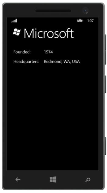
Figure 9-9. Navigating to a details page containing more information about the company that was tapped in the ListView
The GridView is similar to the ListView, except that it renders items in a grid rather than as a list. Items within the collection are displayed horizontally and wrap around to the next row. Its behavior is similar to the WrapPanel control discussed in Chapter 8, in the section “Container Controls.” The GridView is suited for displaying an image gallery or for creating a cardview-style layout.
The GridView shares many of the same properties and events as the ListView control because both items derive from the same type: ListViewBase. In the ListView demo, we referenced properties and events that are also available in the GridView. We can change the element markup on the MainPage to reference GridView instead of ListView and run it without errors. The display may not be as appealing, as shown in Figure 9-10, but it works nonetheless.

Figure 9-10. Modified MainPage to render the collection in a GridView control
The layout defined in the ItemTemplate for the ListView control does not look as appealing when used within a GridView. Let’s change it so that only the company logos are displayed. Remove the TextBlock from the GridView’s ItemTemplate markup, and add a Margin to the StackPanel to provide proper spacing between each company logo, as follows:
<GridView.ItemTemplate>
    <DataTemplate>
        <StackPanel Margin="5,10,0,0">
            <Image Source="{Binding LogoImagePath}"
                   Stretch="None"/>
        </StackPanel>
    </DataTemplate>
</GridView.ItemTemplate>
Run the application. The changes to MainPage should appear, as shown in Figure 9-11.

Figure 9-11. Modifying the ItemTemplate within the GridView to display company logos only
With the MainPage displayed, tap an item in the GridView to navigate to the DetailsPage. It just worked without requiring any additional code changes. The implementation details of handling the SelectionChanged event is no different from what we demonstrated for the ListView control.
In Chapter 8, we discussed the various container controls that you can utilize to manage the layout of user controls within a view. In Windows Phone 8.1, many of those container controls are available, including the StackPanel, Grid, and Canvas to name a few. All of the knowledge that you acquired about these controls in Chapter 8 is transferable to Windows Phone because the markup and behavior is the same. In this chapter, we will focus on the various content presentation controls that are available in Windows Phone 8.1.
Presentation controls are another form of container controls. The difference from standard container controls is that the approach used to arrange UI controls within a single page is transparent to the user. Your users don’t care if you used a StackPanel over a Grid, and why would they? As long as they can do whatever it is they need to do in your app, then that is all that matters, and five-star reviews will follow, right? Well, not quite.
You really have to impress your user and provide them with a great experience within your application. Presentation controls will help you to do just that. They are a set of advanced controls that set the tone for the manner in which a user will interact with your application. However, they should be used only when it makes sense to do so, such as for applications that will provide multiple sections or lists of data and when you want to present it in an appealing, easy-to-navigate layout. For applications, such as games or simple utility apps, these controls will not be necessary.
Hub
The Hub control is used to display a series of sections containing data or controls. The user can view the various sections by panning from side to side. In Windows Phone 8.0, this was known as the Panorama control. The visual elements defined within the Hub control extend beyond the bounds of the screen’s width so that as a user swipes left or right, it feels as though they haven’t left the main page. They are just shifting their view to see the items that are off-screen.
The layered effects of a background image, data overlay, and built-in animations within the Hub control provide an appealing visual user experience when panning across the sections, giving the user the feeling of scrolling across the page of a magazine.
Since the main purpose of the Hub control is to allow users to move through the view from side to side, this control is supported in Portrait mode only.
The Hub control is comprised of the following main elements:
- Background image: Setting a background image on a Hub control is optional. However, this is a major aspect that adds to the visual appeal of this control.
- Hub header: This consists of plain text and/or an image representing the application. For example, use an image that matches the one displayed on the application’s tile. Ideally, the header will enable users to identify easily which application they are using.
- Hub section: This contains controls or additional data in a logical grouping. For example, a Hub section may contain a gallery of images, while another section is comprised of status updates from a social media feed. A Hub control may be made up of one or more Hub sections; however, for performance reasons and for an optimal user experience, do not exceed five sections.
- Hub section header: Including a section header is not required. If a header is specified, make sure that it describes the intent of the section with a single word or short phrase.
- Thumbnails: These may be used as a navigation source to display additional data or media on a secondary page.
Let’s take a look at a Hub control in action. Launch Visual Studio to create a new project, and select the Hub App (Windows Phone) template, as shown in Figure 9-12.

Figure 9-12. Creating a new Hub app using the Visual Studio template
Once the project is loaded into Visual Studio, take a moment to inspect the XAML that was generated in the HubPage.xaml file, as shown in Listing 9-12.
The Hub template provides a working example out of the box. To provide examples of the different layouts, you can implement it in each section within your own application. Run the application, and swipe from left to right to navigate through the sections. Figure 9-13 illustrates the view that you will see when looking at each of the available sections.

Figure 9-13. The Hub control provides an appealing panning effect when swiping across to view the hub sections
Each Hub section uses a DataTemplate to configure the section’s appearance, layout, and UI controls. Within each section, you can lay out the UI elements as needed, making use of the ListView or GridView controls to host item collections and wiring up SelectionChanged events to trigger navigation to supplementary details pages, as we discussed in the previous section.
Pivot
The Windows Phone Pivot control enables the display of one or more data sets as a list, with each list being displayed as a Pivot Item. The user can navigate between the Pivot Items by swiping from right to left, or from left to right. The Pivot control is useful for displaying large data sets and filtering on a specific data set. You can allow users to drill down to view more details about a specific item displayed in the Pivot Item’s list by tapping the item to navigate to a secondary page containing further information.
Now take a moment to create a Windows Phone Pivot app to inspect the markup and code that is automatically generated. Launch Visual Studio and select the Pivot App (Windows Phone) template. Once the project is loaded in Visual Studio, take a moment to inspect the XAML that was generated in the PivotPage.xaml file, as shown in Listing 9-13.
Similar to the Hub template, the Pivot App template provides a working example out of the box. Figure 9-14 depicts a Pivot control with two Pivot Items.

Figure 9-14. The Pivot control displays content within Pivot Items, which can be viewed by swiping from side to side
Each item is comprised of a ListView to display the same data collection styled in various ways. In a real-world application, the lists would be distinct and separate, providing different collections of pertinent data. For example, a Recipes app may provide sections to separate breakfast, lunch, dinner, and dessert recipes.
In the previous sections, we demonstrated how to display items within collections-based controls, triggering navigation to an alternate page when items in the list are tapped. However, what happens when you want to perform an action on the selected item aside from page navigation? How would you provide menu actions to enable users to add or delete items from the list?
The Windows Phone SDK includes an Application Bar, which should be used for this purpose, as shown in Figure 9-15.

Figure 9-15. An Application Bar provides quick access to actions that can be performed on the current page
Note that we are leveraging the Companies application, which was developed as part of the “Displaying Collections” section earlier in this chapter. Simply modify the CompanyListView control to enable multiple item selection by setting its SelectionMode property to Multiple, and remove the event registration for the OnSelectionChanged event, since we will take action on selected items only when an Application Bar button is tapped.
Now, let’s add the Application Bar to the page, as depicted in Figure 9-15. The Application Bar within a Windows Phone application must reside at the bottom of the page, according to Windows Phone Design Principles. The Application Bar is able to display up to four action buttons. These buttons should be used for quick actions that affect the data on the current page.
The Application Bar also provides an area for secondary commands, or menu items, which the user can access by tapping the ellipsis button, as shown in Figure 9-16.

Figure 9-16. Tap the ellipsis button to reveal AppBar button labels and additional menu items
Secondary commands can be used to initiate actions that may not necessarily be relevant to the current page. For example, providing an action to rate the application or a link to navigate to a settings page are good candidates for secondary command actions.
To add an Application Bar within a Windows Phone page, add the following markup within the Page element:
<Page.BottomAppBar>
        <CommandBar>
            <AppBarButton Label="add"
                          Icon="Add"
                          Click="AddAppBarButton_Click" />
            <CommandBar.SecondaryCommands>
                <AppBarButton Label="settings"
                           Click="SettingsButton_OnClick" />
            </CommandBar.SecondaryCommands>
        </CommandBar>
</Page.BottomAppBar>
As you can see, the Application Bar is represented with the CommandBar element. To position the Application Bar at the bottom of the page, add the CommandBar markup to the Page.BottomAppBar element. You may display only one Application Bar on a page at a time, and it must reside at the bottom of the page.
The CommandBar contains two collections for storing commands: PrimaryCommands and SecondaryCommands. In Windows Phone 8.1 applications, the PrimaryCommands collection represents the image buttons that are displayed on the Application Bar. The PrimaryCommands collection is the default property on the CommandBar in a Windows Phone 8.1 application. Therefore, by adding the AppBarButton elements directly inside the CommandBar element, they will be added to the PrimaryCommands collection.
Primary command buttons must include an image to represent its corresponding action so that the user is easily able to identify and understand its intended purpose. Set the button’s Icon property to a glyph from the Segoe UI Symbol font by referencing its enumerated member name. To obtain a list of the symbols available for the AppBarButton.Icon property, refer to the Symbol enumeration documentation on the Windows Dev Center site, located at http://bitly.com/AppBarSymbol. Next, set the button’s Label property to include a short description of the button’s action.
Finally, register the button’s Click event to wire up an event handler in the page’s code-behind, which will enable you to add the necessary logic that will be executed when the button is tapped. Listing 9-14 depicts an example of managing the deletion of selected ListView items from the main page of the application.
The SecondaryCommands collection contains AppBarButton elements that represent additional menu items, which are displayed when the Application Bar’s ellipsis button is tapped. The AppBarButton elements are configured in the same manner as those within the PrimaryCommands collection, except that there is no need to define an Icon property, since this property is ignored when the AppBarButton is defined as a secondary command.
Summary
This chapter provided an overview of designing compelling user experiences in your Windows Phone Store applications using XAML and C#. You learned the basic structure of a Windows Phone Store application and how you can design your application for various screen sizes and page orientations. We also discussed the various presentation controls available and how you can use them to display application content while maximizing screen real estate. Finally, you learned how to incorporate Windows Phone 8.1 features within your application, including adding page navigation, leveraging themes and resources, displaying collections within ListView and GridView controls, and configuring the Application Bar.
In the next chapter, we will explore the XAML used to design the user interface for Windows Store applications, as well as how to share data with other applications using Share contracts.