
The WPF User Interface
Windows Presentation Foundation (WPF) is a graphical system that was first made available in the .NET 3.0 Framework. It supports the creation of sophisticated user interfaces in Windows applications using Extensible Application Markup Language (XAML), as discussed in Chapter 1. XAML enables an abstraction of the visual elements within an application from the main business logic. Designers have fine-grained control over the look and feel of the application without requiring any coding knowledge. In turn, developers can focus on working on the main functionality of the application without getting bogged down in the UI design details.
Although this chapter focuses on the WPF user interface, the majority of the concepts discussed here are applicable when developing other XAML-based applications, such as Silverlight, Windows Store, and Windows Phone applications.
The Basics
There are some basic points to understand when developing XAML-based applications. In this section, we will take a look at the basic structure of a WPF application and discuss some common controls that will serve as the basis for each view that you design within your application.
Application Class
The starting point for a WPF application is the Application class, which determines the window that will be loaded on startup. It also contains shared resources and properties, and it allows you to override application life-cycle events, which enables custom behavior to be handled during application launch, activation, deactivation, and exit. Table 8-1 lists the events that are raised for each of those application states along with information about when they are triggered and when it may be useful to consider overriding the events to include custom code.
Table 8-1. Application Events
|
Life-Cycle Event |
Triggered When... |
Override This Method When... |
|---|---|---|
|
Startup |
The Application.Run() method is called. |
You need to process command-line arguments, initialize application resources and properties, or instantiate one or more windows. |
|
Activated |
The application becomes the foreground application. This occurs when the application loads its first window or when the user forcibly brings the application window to the foreground by returning the focus to the application when switching between application windows on the desktop. |
You want to perform custom actions, such as updating and displaying any notifications that the user might have missed while the application was deactivated. |
|
Deactivated |
The application window loses focus because the user has switched to an alternate application in the desktop. |
You want to store the application’s state. |
|
SessionEnding |
The user ends the Windows session by logging off or shutting down the operating system. |
You want to store the application’s state or data changes before the application exits. |
|
Exit |
The Application.Shutdown() method is called or when a Windows session is ended by logging off or shutting down the operating system. |
You want to store the application’s state or data changes before the application exits. |
|
DispatcherUnhandledException |
An exception is thrown by the application that is not handled. |
You want to deal gracefully with unhandled exceptions or raise a user-friendly error message before the application shuts down. This would also be a good opportunity to log unexpected crashes in the application to assist with troubleshooting when the application is in production. |
The application within a markup file is named App.xaml, and it also includes a code-behind file named App.xaml.cs. For more information about the code-behind file, refer to the section “The Code-Behind File” later this chapter.
Listing 8-1 shows an example of the App.xaml markup that is automatically generated when you first create a WPF project.
- The first attribute, x:Class, contains the fully qualified name of the class in the application’s code-behind.
- The next attribute, xmlns, defines the main namespace for the application. This is the WPF core classes namespace, and it must be included in the root element of every WPF view in the project.
- The third attribute, xmlns:x, is the XAML namespace declaration, and it also must be included in the root element of every WPF view.
- The last attribute, StartupUri, indicates the window that will be displayed when the application first loads.
Windows, Pages, and User Controls
A single view within a WPF application consists of a markup file ending with the extension .xaml. At a minimum, the markup file will consist of the following:
- The root element that represents the view, such as a Window, NavigationWindow, Page, or UserControl. For the remainder of the book, when we refer to view, it refers to any of these element types.
- The WPF core classes namespace declaration: xmlns="http://schemas.microsoft.com/winfx/2006/xaml/presentation".
- The XAML namespace declaration: xmlns:x="http://schemas.microsoft.com/winfx/2006/xaml".
- One or more visual elements that will be displayed within the view at runtime. Each visual element may have custom markup that defines its appearance and behavior. We will discuss this in depth in the section “Resources and Styles” later in this chapter.
Listing 8-2 shows the default markup that is generated when a window is added to a WPF project.
By default, a title along with a default height and width are defined. These are properties of the window. You can change the values of these properties directly in the markup file or in the code-behind file. Alternatively, you can choose to provide default values for other properties of the window right within the markup as well.
The Code-Behind File
So far, you have learned that each view is defined using a markup file. The markup file defines how the view is going to look. However, if you would like the view to respond to user actions or perform additional functions, you will need a class that allows you to tie in code that interacts with the view.
This is known as a code-behind file. This is the location where you will provide code to react to user events, such as a button click or list item selection, as well as to load and/or save data to a backing data store. However, it is best to keep code-behind files as lightweight as possible and to encapsulate business logic within a separate class. This is accomplished using the Model-View-ViewModel (MVVM) pattern, along with data binding. If you are unfamiliar with the MVVM pattern, refer to the section “The MVVM Design Pattern” in Chapter 1. We will discuss the details of data binding in the “Data Binding” section later in this chapter.
The code-behind file must be given the same name as its associated markup file, including the .xaml extension followed with the extension of the target programming language of the application. For example, a window in WPF named MainWindow.xaml must contain a code-behind file named MainWindow.xaml.cs in your C# project. By convention, the class is also named to match its given file name. The class must inherit from the same class that is defined in the markup file. Listing 8-3 shows the code-behind for MainWindow. You can see that it inherits from Window, which aligns with its defined markup in Listing 8-2.
If you wanted to change MainWindow to a NavigationWindow, you would need to change the markup element from <Window></Window> to <NavigationWindow></NavigationWindow> in the XAML. Then you would need to change the class definition to inherit from NavigationWindow in the code-behind; otherwise, you will receive compilation errors when trying to build and run the application.
Additionally, you can dynamically create controls and add them to the view from the code-behind, as well as modify various properties of existing controls. To access a control that is defined in your view’s markup, you simply need to provide a unique name within the control’s Name attribute in the markup, which you can then reference in your code-behind, as depicted in Listing 8-4 and Listing 8-5.
First Look
Let’s create a WPF project and start experimenting with XAML. Launch Visual Studio and create a new project. Select the WPF Application template within the New Project dialog, as shown in Figure 8-1. Give the project the name, WpfDemo, and then click OK.

Figure 8-1. Creating a new WPF application
Once the project loads into Visual Studio, the MainWindow markup file should be displayed in the view, as shown in Figure 8-2.

Figure 8-2. WPF project created and loaded into Visual Studio
First, notice that the App.xaml file was generated and added to the project automatically, along with a primary Window named MainWindow and an App.config file. Drill down into the App.xaml markup file. It should be similar to what was depicted in Listing 8-1. Place your cursor in the markup after the StartupUri value’s closing quote and hit the spacebar. What do you notice?
Visual Studio provides IntelliSense within your XAML files to make it easier for you to add new elements, set property values, and wire up events right within the markup.
Now take a moment to look at the respective code-behind file. It’s pretty well empty, right? You aren’t required to override application life-cycle events, but if you needed to, this is where you would handle it. Take a moment to experiment to see which Application events you can override aside from the main application life-cycle events.
Now let’s move on to the MainWindow markup. By default, the WPF template sets the root element of this view to a Window. As mentioned earlier, your view can be one of four types: Window, NavigationWindow, Page, or UserControl.
- A Window serves as the container for your application’s content. You can use this class to act as the primary application window or as a secondary window such as a dialog box.
- A NavigationWindow is similar to a Window, but it automatically includes browser-style navigation buttons in the view.
- A Page is used to package content, and it may be contained or dynamically loaded within a Window or NavigationWindow. It is ideal to design your application such that a single window serves as the main host container whose content is dynamically changed based on user actions. Designing separate pages that can be swapped in and out at runtime simplifies this task a great deal.
- A UserControl is a custom, reusable control that can be added to one or more content pages.
XAML Designer
With the MainWindow.xaml file loaded into Visual Studio, you can see that you have the option to view and modify the XAML directly, or you can drag and drop controls from your Toolbox onto the window in the XAML Designer. You can choose to view the markup only, to view the XAML Designer only, or to have both the markup and the XAML Designer displayed at the same time. When you make a change to the window’s markup, the resulting change is immediately rendered in the Designer and vice versa.
Within the XAML Designer, you can also select a control and modify its properties through the Properties pane in Visual Studio. Notice that as you change property values within the Properties pane, the selected control’s markup is updated to reflect these changes, as shown in Figure 8-3.
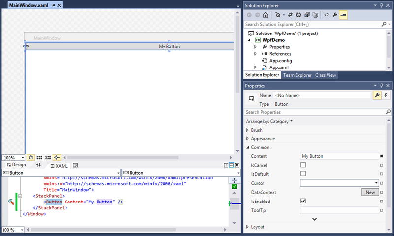
Figure 8-3. The XAML Designer displays the Properties pane for the selected control
Container Controls
A view consists of one or more UI controls. This is accomplished by setting its Content property, which can be any Common Language Runtime object, except for a Window or NavigationWindow. However, the Content property can be set to only a single object.
This works just fine if your view contains a single control or element, such as a string, button, or image; however, that makes the view pretty useless. Most often, your view will be comprised of a set of controls that allow the user to perform meaningful actions, such as logging into the application, navigating to another screen, and saving changes to data.
To create a view with a purpose, you can set its Content property to a container control, which in turn serves as the host to one or more UI controls.
Windows Presentation Foundation includes a variety of container controls that you can use within your views, as listed in Table 8-2.
Table 8-2. WPF Container Controls
|
Container |
Description |
|---|---|
|
Canvas |
You place controls within this container using absolute positioning using an offset from any corner of the container. It is the least flexible of all container controls. |
|
DockPanel |
You place controls within this container that you want easily to dock to a specific side: Top, Bottom, Left, or Right. It also allows you to configure the last child element to fill the remaining available space in the container. |
|
Grid |
You place controls within cells in a tablelike layout with defined rows and columns. By default, a Grid contains a single cell (that is, one row, one column), but you can easily define more rows and columns within the markup through the Grid’s RowDefinitions and ColumnDefinitions properties, respectively. Grid row heights may be defined with varying row heights. The same applies to Grid column widths. |
|
StackPanel |
Controls placed within this cell are automatically stacked side-by-side or top-to-bottom. The StackPanel contains an Orientation property, which drives the direction in which the controls are stacked. Potential values are Vertical or Horizontal. If the StackPanel is set to stack controls in a vertical layout (that is, side-by-side) and the controls extend beyond the bounds of the screen, the controls will be cut off in the window. |
|
TabControl |
Controls are placed within one or more tab items. Each tab item’s content may be set to a single control, which can be any UI element or container control. |
|
UniformGrid |
Controls are laid out in a grid pattern. This is different from a standard Grid because as controls are added or removed, the UniformGrid automatically adjusts to keep an even distance between the controls. |
|
WrapPanel |
This is similar to the StackPanel in that rows are stacked side-by-side or top-to-bottom, depending on the value of the Orientation property. However, when the controls extend beyond the bounds of the width of the screen, the controls will wrap around to create an additional row in which the control will display. |
Content Property
The Content property of a view can be defined in markup or in the code-behind. A view is a type of ContentControl. The Content property is the default property on a ContentControl. Within your XAML, if you place a control between the start and end element tags of your view, it is set as the Content of that control. Alternatively, you can explicitly include the View.Content start and end element tags that will contain the desired control.
For example, the XAML depicted in Listing 8-6 and Listing 8-7 provide the same end result. That is, an empty Grid is set as the content of the Window.
Controls that expose a Content property are derived from ContentControl. Some common examples of ContentControl include Button, CheckBox, Expander, Frame, GroupBox, ListBoxItem, NavigationWindow, RadioButton, Page, TabItem, and Window.
Attached Properties
Attached properties are essentially a global set of properties that can be set by any element. A common use of an attached property is to enable a child element to define unique values for properties that are part of its parent control but affect its own presentation within the view.
For example, a Canvas arranges its child elements based on a defined offset of its boundaries. The Canvas exposes the following attached properties for this purpose: Top, Left, Right, and Bottom. Each child element must indicate where its placement should be within the Canvas by defining values for these offsets. Although the properties belong to the Canvas, the child element has access to setting them because they affect the child’s placement within the container. To use an attached property in markup, you must use the format AttachedPropertyProvider.PropertyName.
Listing 8-8 illustrates the approach of adding multiple controls to a Canvas control and defining their placement within the container using the Canvas’s attached properties.
Layouts
Proper UI design can make or break an application. A good UI needs to provide the user with the ability to view or modify data without overwhelming them with a wall of controls plastered across the application’s window from top to bottom.
Using tab or expander controls helps to segregate the data and thus makes it easier for users to drill down to sections of data they are seeking. Historically, applications oftentimes show or hide controls based on a user’s selection. However, whenever one or more controls were hidden, you would see a glaring void in the window, with large gaps of empty space being wasted. To circumvent this ugliness, developers chose to disable controls instead of hiding them, which was a bit better. These are just a few examples of the design challenges developers faced in the past.
Fixed vs. Dynamic Layouts
If you have ever developed Windows Forms applications, you will understand the struggles encountered when dealing with resizable forms and the coding involved in repositioning and resizing controls accordingly. Within Windows Forms applications, you were constricted to fixed layouts. Every form and control within Windows Forms applications was required to define its width and height. This was a painstaking process, especially as changes were made to accommodate new controls or to reorganize the layout of existing controls.
XAML has solved that problem by supporting dynamic layouts, which automatically handle the sizing of controls based on the control’s content and the view’s dimensions. You are still free to use fixed layouts if you so choose, but once you master the art of UI design using XAML, you may find that fixed layouts will be a thing of the past or used only sparingly at best.
Managing Layouts with Container Controls
Let’s take a look at how container controls handle their child elements by default so that you have a better understanding of when to use each container control to achieve your intended UI layout.
Canvas
The Canvas is used for fixed positioning of controls. Child controls do not expand to fill the space of the Canvas. A control that is added to a Canvas is sized according to just the height and width that it needs to display its own content. The child control is placed within a Canvas using offsets of the Canvas boundaries: Top, Left, Right, and Bottom. Figure 8-4 depicts the placement of multiple button controls within a Canvas.

Figure 8-4. The Canvas arranges its child elements using an offset of its bounds
When a control is added to the Canvas without defining an offset, it is simply placed in the top-left corner (that is, its Top and Left offsets are zero). If multiple child controls do not list an offset value to configure their placement within the Canvas, they will automatically be positioned in the top-left corner. The end result is that all controls are stacked on top of each other. When adding multiple controls to the Canvas, make sure that you specify offset values either from the Top or Bottom or from the Left or Right of the Canvas.
DockPanel
The DockPanel is used to dock child controls to a specific side of the container: Top, Left, Right, or Bottom. Child controls must use the DockPanel’s attached property Dock to indicate on which side of the container it should be placed. If a value for the Dock property isn’t specified, the control is docked to the left of its container, and it expands vertically to match the height of its parent control. Figure 8-5 illustrates the difference in how controls are displayed when using a DockPanel.

Figure 8-5. DockPanel docks child elements side-by-side by default
When multiple controls are docked to the same side, they do not overlap. Instead, they are docked side-by-side for controls that are docked left or right. They are docked top-to-bottom for controls that are docked at the top and are docked bottom-to-top for controls that are docked at the bottom. You can see an example of this behavior in Figure 8-6.

Figure 8-6. Docking behavior with multiple child controls
Grid
The Grid is used to organize controls within a table layout. You can define the number of rows and columns within the Grid using the Grid’s RowDefinitions and ColumnDefinitions properties, respectively. If the markup doesn’t include definitions for rows and columns, the Grid will contain a single cell by default.
Within a single row definition, you can choose to specify a row’s height using the Height attribute. Similarly, you can specify a column’s width using the Width attribute. The Height and Width attributes accept one of three potential value types.
- Double value: Representing the height or width of a row. A unit of measure may also be specified with the value, such as pixels (px), inches (in), centimeters (cm), or points (pt). If a unit of measure is not indicated, then the default unit of measure applied is pixels.
- Auto: Literal value indicating that the row’s height will automatically adjust to fit the tallest control that is placed in the row.
- Asterisk (*): Known as star sizing, which results in the row taking up the available remaining space. The asterisk can also be preceded by a number, which indicates the weight of available space that the row will take up in relation to the other available rows. If a value for Height is not specified on a row, it automatically applies star sizing. The same applies for columns where Width is not specified.
Listing 8-9 depicts an example of the use of each of these value types within a Grid.
Based on the code example in Listing 8-9, the first row will be set to a fixed height of 80 pixels. The last row will use only as much space as is needed to display the cell’s contents. The second and third rows will take up the remaining available space. However, notice that the third row’s height includes a weighted star size value. In this case, the third row will take up double the available space as that used by the second row. Figure 8-7 displays the Grid in the XAML Designer, which provides rulers that show the rows and columns available based on the RowDefinitions and ColumnDefinitions shown in Listing 8-9.

Figure 8-7. The effects of various sizing approaches on Grid rows and columns
Take another look at the Grid in Figure 8-7. Do you notice anything missing? We defined four rows and four columns, but the figure shows only three rows and three columns. Why is that?
As mentioned earlier, the row that is autosized will only take up the space needed to fit the contents of its cells. Since there are no controls in the row, the autosized row is collapsed. The same applies for the autosized column. As controls are added to the Grid, you will notice a change in the layout. Not only will there be the expected number of columns and rows visible, but the height and width of the star-sized rows and columns will shrink. The remaining amount of available space will be reduced based on how much space the autosized row and column requires.
Just as with the Canvas, you can define the row and column in which each control will be placed by specifying a value for the Grid’s attached properties within the control’s markup, as shown in Listing 8-10. If a control does not specify the row within which it should be placed, it is placed within the Grid’s first row by default. Rows are referenced through a zero-based index. Therefore, the Grid’s first row is referenced as row 0. The same concept applies to a Grid’s column.
In Listing 8-10, notice that the Grid.Row and Grid.Column attached properties are used to specify within which cell a button will be placed. Buttons that do not specify a Grid.Row value are placed in the first row by default.
The Grid.ColumnSpan attached property is used to enable a control to utilize the space across multiple columns. In the same respect, you can use the Grid.RowSpan attached property to configure a control to span multiple rows, as illustrated in Figure 8-8.

Figure 8-8. An example of how to use the Grid’s attached properties to place controls within the Grid
StackPanel
The StackPanel is used to stack controls vertically or horizontally. The StackPanel contains an Orientation property, which drives the direction in which controls are stacked. The Orientation property’s value may be set to Vertical or Horizontal. If an Orientation value isn’t provided, the default orientation is set to vertical. Listing 8-11 shows an example of StackPanel markup, and Figure 8-9 depicts the result.
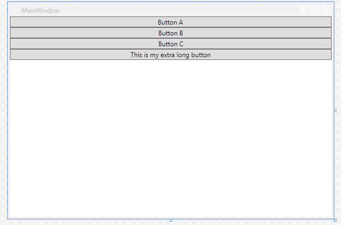
Figure 8-9. Child control placement within a vertical StackPanel
TabControl
A TabControl is used to group controls within one or more tab items. A TabControl defines the tabs it will contain through the Items property. Each TabItem within the collection may specify a Header, which will be displayed in the item’s tab strip. The TabControl may be configured to display the tab strip at the Top, Left, Right, or Bottom. This is accomplished by setting the TabStripPlacement attribute on the TabControl. If a TabStripPlacement value isn’t specified, the default placement of the tab strip is set to Top.
A TabItem may contain a single control or a container control, which in turn may host multiple controls, as shown in Listing 8-12.
Figure 8-10 shows the resulting TabControl within the WPF application.

Figure 8-10. A TabControl is used to separate child elements into logical sections
UniformGrid
A UniformGrid is similar to the Grid in that controls are arranged within cells in a gridlike layout using rows and columns. However, this differs from a standard Grid because, as controls are added, the UniformGrid automatically generates rows and columns needed while maintaining an even distance between the controls. Listing 8-13 shows the sample markup for a UniformGrid within XAML. Figure 8-11 illustrates the resulting view that is displayed.

Figure 8-11. A UniformGrid maintains equal distance between its child controls
Alternatively, you can specify that a UniformGrid has a fixed number of rows and columns by specifying values for the Rows and Columns attributes, respectively, as shown in Listing 8-14.
If the number of rows and columns that you specify generates more cells than controls that are available to fill the grid, the remaining cells will simply contain whitespace. However, if the number of controls within the grid outnumber the cells available, because you set the rows and columns values too low, the remaining controls will be cut off.
WrapPanel
A WrapPanel is similar to the StackPanel in that rows are stacked side-by-side or top-to-bottom depending on the value of the Orientation property. However, when the controls extend beyond the bounds of the width of the screen, the controls will wrap around to create an additional row in which the control will display. Listing 8-15 shows sample markup using a WrapPanel, and the resulting view is depicted in Figure 8-12.

Figure 8-12. WrapPanel automatically moves a control to the next row if it will extend beyond the bounds of the screen
Margins and Padding
Up until now, you may have noticed that the controls do not provide proper spacing when added to the view. This is ideal to ensure that controls aren’t squeezed together and there is adequate spacing between controls. To achieve this, you can set the Margin property on any UI control to configure the amount of space to include around the exterior rectangle of a control.
The Margin property is defined as a thickness structure. When defined in XAML, a margin is configured using a string, which may include one, two, or four comma-separated double values. The string value supplied for the Margin property in XAML is converted to the thickness structure’s values for the Left, Top, Right, and Bottom sides of a rectangle, as detailed in Table 8-3.
Table 8-3. Effects of Setting Margin on an Object in XAML
|
Approach |
Result |
Example |
|---|---|---|
|
Margin="left" |
The specified unit of measure is applied to all sides of an object. |
Margin="10" |
|
Margin="left,top" |
The first unit of measure specified is applied to the left and right sides of an object. The second unit of measure is applied to the top and bottom sides of an object. |
Margin="10,20" |
|
Margin="left,top,right,bottom" |
Each specified unit of measure is applied only to its corresponding side: left, top, right, and bottom. |
Margin="10,20,10,15" |
Padding is used to configure the amount of space between the control’s boundaries and its contents, such as the text within a button (for example, interior spacing). Similar to Margin, the Padding property is defined as a thickness structure, and it can be set in a similar manner as detailed in Table 8-3.
The code depicted in Listing 8-16 shows an example of using the Margin and Padding properties on a TextBox.
Figure 8-13 illustrates the effects of setting the Margin and Padding properties on a TextBox.

Figure 8-13. Comparing the effects of margin and padding on a TextBox
Resources and Styles
Now that you have a good handle on how to arrange your controls and how to provide adequate spacing between controls, the next step is to understand how to apply custom styles and theming within your WPF application.
Resources
A resource is an object that can be used throughout your WPF application, depending on where it is defined. The most common uses of resources include styles, templates, and color brushes. You can also use a single value or array of values as resources. A collection of resources can be defined at the application, view, or container level. Listing 8-17 illustrates how to define a resource that consists of an array of string values for a window within your application.
Resources can be referenced as static or dynamic resources.
Static
A static resource is referenced using the StaticResource markup extension. Referencing a static resource will result in the resource being retrieved only once the XAML is loaded. If the resource changes after the initial load, the changes will not be reflected in the UI for any controls using this resource. Listing 8-18 shows an example of referencing the MyListItems array as a StaticResource to populate the ListBox Items collection.
Dynamic
A dynamic resource is referenced using the DynamicResource markup extension. Doing so will result in the resource being retrieved when the XAML is loaded and at subsequent times whenever the resource changes. Reference a resource as a DynamicResource when you expect that the resource will change during its lifetime in the application and you want to have these changes reflected in the UI or, alternatively, if the resource will not exist at design time but will be added from the code-behind when the application runs. Listing 8-19 illustrates setting the TextBlockLabel resource as a DynamicResource on the TextBlock.
Notice there is also a Button within the XAML whose Click event is wired up to the AddItemButton_OnClick event in the code-behind file. Every time the button is clicked, the TextBlockLabel resource will be updated, as shown in Listing 8-20.
Run the application and click the button a few times. What do you notice? Do you experience the same result as shown in Figure 8-14?

Figure 8-14. The TextBlock text is updated when the resource is updated
In the Window’s XAML, change the TextBlock Text property’s reference to indicate StaticResource instead of DynamicResource. Run the application again, and click the button a few times. Do you notice anything different?
You should notice that no matter how many times the button is clicked, the TextBlock’s Text always indicates “Not Clicked.”
It is important to understand the distinction between static and dynamic resources as well as the implications of using them within your XAML.
Styles
Each XAML UI control comes with a default look and feel, defined as a style. However, you can easily override the default style for any object in WPF using the Style property. A major benefit of defining a Style is the ability to define it once within your application and apply that style to all controls of a specific type or only to those controls that are explicitly configured to use it. You also have the flexibility to define a custom style, which will apply only to controls within a single view or to a single control.
To define a Style for an object, you must set its TargetType property to the desired object type. Once the TargetType is set, you will be able to define property values that are applicable to that object type using Setter elements within the Style.
Each Setter element must have a value set for its Property and Value attributes. The Property attribute specifies which property on the control to set. The Value attribute specifies the value that will be applied to the property, as shown in Listing 8-21.
Now that you know how to define a Style, you are probably wondering where to include this markup. A Style can be defined at the application, view, container, or control level.
Application-Level Styles
To avoid having to define the same style individually whenever a control is used within your application, you can choose to define a Style at the application level, which will apply to all controls of a common type. This enables you to define the style in one place so that if you decide to change the theme of your application, you need to change the style definitions in only one location.
To define a Style that applies to all controls of a specific type across your application, you must include the Style definition as part of the Application.Resources collection within the App.xaml file. Listing 8-22 depicts a TextBox Style, which configures default values for its Margin, Padding, FontFamily, and FontSize properties.
View-Level Styles
Similarly, you can define a Style within a single view by including it within the view’s resources collection. In this case, the Style defined in the application’s main window for a specific object will overrule an application-level style definition for the same control. The example shown in Listing 8-23 depicts a TextBox Style defined within the main windows of a WPF application. This Style will take precedence over the application-level TextBox Style definition. Any TextBox added to the window will have a font size of 12 pixels with red font. It will not include any of the Margin or Padding property values defined in the application-level Style definition.
If you want to combine the Style definitions from both the application and view resources, you can simply specify that Style is based on the control’s default style by setting its BasedOn attribute within the Window.Resources Style definition as follows:
<Style TargetType="TextBox" BasedOn="{StaticResource {x:Type TextBox}}">
In this way, the Style defined for the TextBox at the application level will be applied to the control first, and then the Style defined for the TextBox in the window will be applied next. The following property values will be applied to all TextBox controls that are added to the window:
- Left Margin = 10 pixels
- Top Margin = 10 pixels
- Right Margin = 10 pixels
- Bottom Margin = 10 pixels
- Left Padding = 5 pixels
- Top Padding = 5 pixels
- Right Padding = 5 pixels
- Bottom Padding = 5 pixels
- Font Family = Segoe UI
- Font Size = 12
- Font Text = Red
Container-Level Styles
Similarly, you can define a Style as part of a container’s Resources collection, as shown in Listing 8-24. Any controls within that container that have a Style defined as a container’s resource will have the custom Style applied to it. Remember that the Style will override any styles defined at the application or view level, unless the BasedOn attribute is used, as discussed in the “View-Level Styles” section, earlier in this chapter.
Control-Level Styles
Additionally, you can define a Style for a single control by setting the control’s Style property directly, as shown in Listing 8-25.
Alternatively, you can provide a Key for a Style definition within the application or view resources collection in order to apply the Style to specific controls. This is accomplished by setting the Style property on a control to a StaticResource referencing the Style definition by its Key value, as shown in Listing 8-26.
Data binding is the mechanism that manages the flow of data between the application’s UI and a data provider. It involves a target and a source. The target is the object that will receive the data. The target is generally the property on a control in the view, such as the Text property of a TextBox. The source is the object that serves as the data provider. When configuring data binding for a target object, you can specify the manner in which data will flow, known as the Mode. Table 8-4 describes each Mode.
Table 8-4. Direction of Data Flow
|
Mode |
Description |
|---|---|
|
OneWay |
When the source property changes, the target property is automatically updated. Changes to the target property do not affect the source property. This is the default behavior when no Mode is specified. |
|
OneWayToSource |
When the target property changes, the source property is automatically updated. Changes to the source property do not affect the target property. |
|
OneTime |
The source property changes the target property when it is first initialized. Any subsequent changes to the source property are not propagated to the target. |
|
TwoWay |
Changes to the source property are automatically propagated to the target property. Also, changes to the target property are propagated to the source property. |
XAML Markup
Data binding can be set on an element’s property within XAML or in the code-behind. You can configure the property to receive data from a data provider or from another element within the view.
To configure data binding for a property on a control when the data is coming from another element’s property, use the following syntax:
<object Property="{ElementName=NameOfElement, Path=ElementPropertyName}" />
As an example, Listing 8-27 shows how to enable or disable a TextBox based on whether a CheckBox in the view is selected.
If you run the sample code in Listing 8-27 within a WPF application, you will notice that the TextBox is disabled when the MainWindow loads. Select the CheckBox and notice that the TextBox becomes enabled. This is accomplished through the data binding service. You did not need to write any code in the code-behind to manage this behavior.
To configure data binding for a property on a control when the data is coming in from an exposed property on a data provider, use the following syntax:
<object Property="{Binding Path=SourcePropertyName}" />
For example, to set the Text property on a TextBlock to display the value of a StatusMessage string property from a ViewModel class, use the following syntax:
<TextBlock Text="{Binding Path=StatusMessage}" />
If you add this TextBlock markup to the MainWindow markup in Listing 8-27, what will happen? Well, nothing of course. The CheckBox and TextBox will continue to function as expected, but the TextBlock will remain empty. The reason for this is that you do not have a data provider that exposes a StatusMessage property, nor have you told the view the source of the data, otherwise known as the DataContext. Let’s get a data provider in place first.
ViewModel and INotifyPropertyChanged
As discussed in Chapter 1, it is best to implement the Model-View-ViewModel pattern in your WPF applications to encapsulate your business logic within a separate class. The ViewModel class will serve as the data provider to the view. The ViewModel may retrieve data from one or more sources, such as a database or a web service.
For this example, create a folder named ViewModels. Within that folder, add a simple view model, named MainViewModel, to the WPF application that you were working with from the section “XAML Markup,” previously in this chapter. Set the namespace of this class to WpfDemo.ViewModels. The MainViewModel will expose a single public string property named StatusMessage.
For the view to receive notifications of property changes from the view model, the view model must implement the INotifyPropertyChanged interface. This simply requires declaring and managing the PropertyChanged event within the view model, as shown in Listing 8-28.
Each property that will participate in data binding within a view must raise the PropertyChanged event in the property’s setter, as shown in Listing 8-29. In this way, whenever the property within the view model changes, the WPF system will automatically send a notification to view, causing any controls that are affected by the change to refresh.
The majority of the code needed for data binding is now in place. The final piece of the puzzle is to specify a DataContext in the view.
DataContext
The view’s DataContext provides a handle to the data provider that will feed data to the UI. The DataContext can be set in the view’s code-behind, as shown in Listing 8-30. This sets the DataContext to the view. All controls within the view will use the DataContext of its parent by default, unless the controls specify an alternate DataContext.
Alternatively, you may set the DataContext within the view’s markup by defining the MainViewModel as a resource in the window and then setting the container control’s DataContext to the MainViewModel resource, as shown in Listing 8-31. A child control within the StackPanel will automatically have its DataContext set to the DataContext of its parent, unless it is explicitly configured to use an alternate DataContext.
The code in Listing 8-31 is configured to update the StatusMessage property in the view model with the contents of the TextBox’s Text property. Notice that its binding mode is set to TwoWay binding. This will cause any changes in the TextBox to be propagated to the StatusMessage property in the view model. The update to the StatusMessage property will cause the PropertyChanged event to be fired. The TextBlock’s Text property is configured to receive updates from the StatusMessage property. Notice that its binding mode is set to OneWay. Once the StatusMessage property fires the PropertyChanged event, the TextBlock’s Text property will be updated to reflect the new value.
Run the application to test it. Select the CheckBox to enable the TextBox. Enter a message in the TextBox and then hit the Tab key to ensure that focus is moved from the TextBox. The result should be that the TextBlock is updated to display the message that was entered in the TextBox, as illustrated in Figure 8-15.

Figure 8-15. Using data binding to display and update a property value between the view and its view model
As shown in this simple example, data binding removes the need to set explicitly the state of a control from the code-behind file. The larger the application grows, the easier it will be to maintain as long as you adhere to the MVVM pattern.
Dependency Properties
As mentioned earlier, data binding involves a target and a source, where the target is the object that will receive the data. The target is generally the property on a control in the view. For a property to be eligible to participate in data binding, a DependencyProperty must back it. The purpose of a DependencyProperty is to enable the modification of a property’s value through external inputs, such as data binding.
Within your WPF application, if you peek at the TextBox definition, you will see that it has a handful of dependency properties defined, as shown in Figure 8-16.

Figure 8-16. TextBox dependency properties
It is important to understand this concept for two reasons. The first reason is to understand which properties can leverage data binding. Also, when you create your own WPF user controls that expose custom properties and you want to set those property values using data binding in your WPF views, you will need to know how to define them as dependency properties in your control. This can be accomplished by ensuring that you do the following:
- Register the properties in your custom control as a DependencyProperty.
- Use GetValue within your property’s getter to retrieve the value from the DependencyProperty.
- Use SetValue within your property’s setter to set your DependencyProperty value.
When registering a property as a DependencyProperty, you must follow a specific naming convention, ensuring that the suffix Property is appended to the property name and is declared as a static read-only property, as follows:
public static readonly DependencyProperty MyCustomTextProperty = DependencyProperty.Register("MyCustomText", typeof(string), typeof(MyCustomControl));
In the DependencyProperty.Register method, you must pass in the actual name of the property, the property’s type, and the owner’s type.
Next you will need to define the property’s getter and setter using the following format:
public string MyCustomText
{
    get { return (string)GetValue(MyCustomTextProperty); }
    set { SetValue(MyCustomTextProperty, value); }
}
Finally, you will need to define the DataContext for your user control. The DataContext tells your view who is the data provider. Within your user control, you can set the DataContext to itself. However, setting the DataContext on the user control itself does not work. You will need to set the DataContext on the content of the user control, as follows:
(this.Content as FrameworkElement).DataContext = this;
Listing 8-32 shows the complete example of a basic string property backed by a DependencyProperty in a user control.
To use this custom control in your WPF View, you will need to define the user control’s namespace in XAML and then add the control, as shown in Listing 8-33.
Instead of binding to a Text property, as you did with TextBlock in the previous example, notice that now you are binding to the MyCustomText property of the user control.
Summary
This chapter provided an overview of using XAML in your Windows Presentation Foundation applications, covering only the fundamental concepts. You learned the basic structure of a WPF application, understanding that XAML enables you to keep your UI components separate from your application’s logic. You also learned the various ways to lay out controls within a view, as well as how to style controls. Finally, you learned how to implement the MVVM pattern and data-binding techniques to manage data flow within the application.
We have only scratched the surface of the capabilities that the Extensible Application Markup Language provides when you are designing XAML-based applications. For a deep dive on using XAML within your WPF applications, we highly recommend reading Pro WPF 4.5 in C#: Windows Presentation Foundation in .NET 4.5 by Matthew MacDonald (Apress, 2012).
In the next chapter, we will show you how your XAML knowledge can transcend desktop to mobile applications, enabling you to develop engaging Windows Phone 8.1 applications. We will cover the basic structure of a Windows Phone app and how you can design your application for various screen sizes and page orientations.