© Yiyi Sun 2019
Yiyi SunPractical Application Development with AppRunhttps://doi.org/10.1007/978-1-4842-4069-4_8

8. Third-Party Library Integration

Yiyi Sun1 
(1)
Thornhill, ON, Canada
 

In Chapter 7, we discussed how to build the structure of single-page applications. In this chapter, we will build an administrative dashboard on the home page of the SPA boilerplate that was created by using the AppRun CLI. This will demonstrate how to use AppRun to build a complex user interface and administrative interface.

An administrative interface is for administrators to configure and manage web applications. It usually is a stand-alone web application or a restricted area of an application. The administrative interface is important because it is the management tool of the applications and systems. For a consumer-facing e-commerce web application, the administrative interface is for the owner to manage the production, prices, and orders. In a line-of-business application, the administrative interface is for managing the business processes, back-end databases, and systems.

In many cases, the administrative interface has a dashboard on its home page. The administrative, or admin, dashboard provides the overall status of the applications being managed. It is a special kind of interface that usually has a complicated layout involving a lot of visualization widgets. You should try to design one that is pleasing to view and easy to use. Often it also needs to be responsive for different devices and screen sizes. The front-end part is an important part of the administrative interface and is what we will focus on in this chapter. The back end of the administrative interface is data-driven and requires security trimming, which means it displays the content based on the user permissions. The back end is beyond the scope of this chapter.

There are many third-party libraries in the JavaScript ecosystem that have already provided excellent data visualization on the front end. In general, there are two purposes for using third-party libraries: to build the page layout and style the elements as widgets and to create the widgets from the libraries. You will learn how to use the stateless components introduced in Chapter 4 to build the layout and style the elements. Also, you will learn how to integrate third-party libraries into the AppRun components using the extended AppRun architecture.

Example: An Admin Dashboard

The example application we will build is a single-page application that has an administrative dashboard on the home page. First, we will create the SPA project using the AppRun CLI as discussed in Chapter 7. We will modify the code of the Home page component to make it look like Figure 8-1 (and Figures 8-2, 8-3, and 8-4 in the following sections).
../images/467411_1_En_8_Chapter/467411_1_En_8_Fig1_HTML.jpg
Figure 8-1

SPA Home page as an admin dashboard

The example admin dashboard mimics a real-world application. The top navigation is the first-level navigation that has menus to load various web pages such as the Home page, the About page, and the Contact page.

The top navigation is from the SPA boilerplate. The sidebar navigation is the second-level navigation that has the menus for the page. For example, the Home, Events, Team, and More menus are part of the Home page. We will explore more about the UI first.

Responsive UI

The example application UI is responsive to the screen size. On the computer screen, it displays all the top navigation menus and sidebar menus (see Figure 8-1). When running on mobile devices, the top navigation menus are collapsed inside the hamburger menu at the top right of the screen; the sidebar menus are also collapsed to a row of icon menus (see Figure 8-2).
../images/467411_1_En_8_Chapter/467411_1_En_8_Fig2_HTML.jpg
Figure 8-2

The admin dashboard on a mobile device

The responsive layout of the top navigation comes from the SPA boilerplate out of the box. We will create the side navigation menus in the “Sidebar Menu” section of this chapter. Also, we will create the side navigation menus based on an array contains the data that represents the menus dynamically.

Dashboard Widgets

The main content area of the home page has various kinds of widgets to visualize the data. There are widgets such as key performance indicator (KPI) cards, several types of notification/altering messages, a chart, and a map, as you can see from Figure 8-1 and Figure 8-2. There are also a data table widget and a widget calendar in the main content area.

The data table widget displays an example of an employee list. The data is loaded dynamically from a JSON file, which includes the employee’s name, position, office location, age, start date, and salary as a data table. The data table has many features commonly used in line-of-business applications, such as it is configurable to the number of rows, searchable/filterable, and sortable. It also includes the pagination for the list (see Figure 8-3).
../images/467411_1_En_8_Chapter/467411_1_En_8_Fig3_HTML.jpg
Figure 8-3

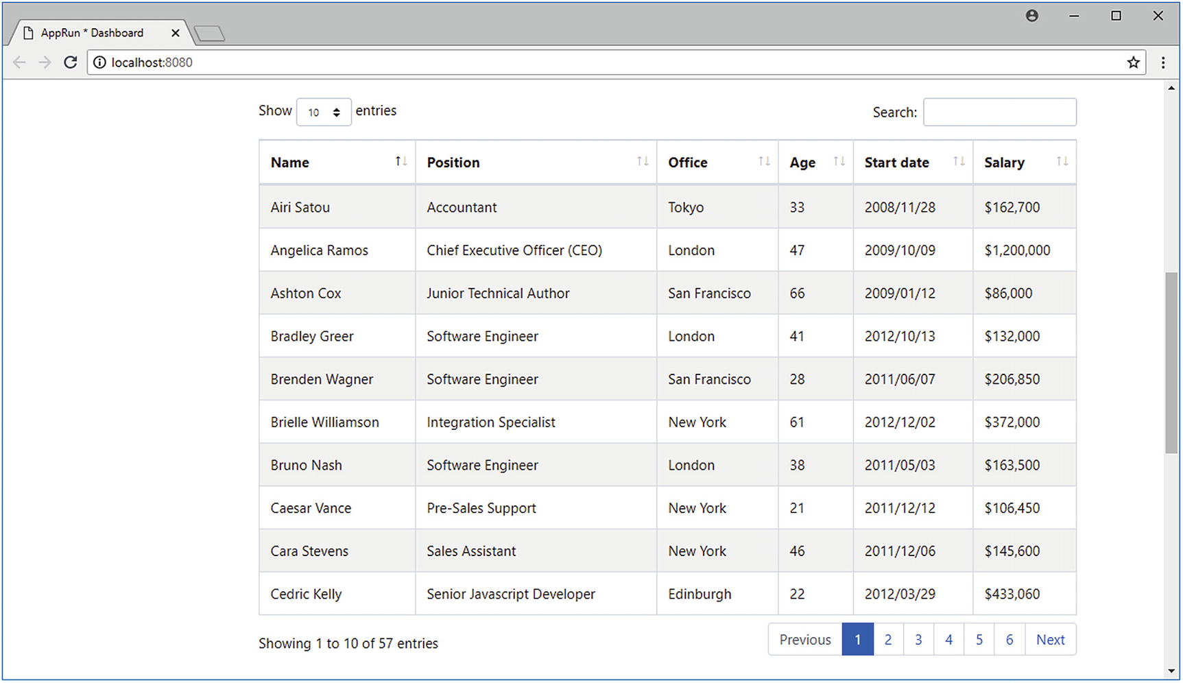
Data table on the admin dashboard

The calendar widget in the example application displays several events for July 2018. The event data is stored in an array. It is also a feature-rich widget. We can view the events in other years and months, and we can view the events monthly, weekly, or daily. Each event has a hyperlink that leads to the event’s detail screen (see Figure 8-4).
../images/467411_1_En_8_Chapter/467411_1_En_8_Fig4_HTML.jpg
Figure 8-4

Calendar on the admin dashboard

Third-Party Libraries

The dashboard specification can be overwhelming the first time you look at it. The layout is complicated. The widgets are a variety of types, such as KPIs, alerts, charts, maps, data tables, and calendars. Creating all the widgets from scratch is impossible. Our plan of attack is to use the third-party libraries as much as possible.

The good news is that the development community has developed many libraries for pretty much everything, from page layout to data visualization widgets. There is probably a JavaScript library out there for anything you can think of. There is no need to re-invent the wheel. The framework we use to develop applications should always integrate easily with other libraries.

AppRun embraces open web technologies. It respects and welcomes third-party libraries. In fact, AppRun was designed to support third-party libraries. Combining the power of many third-party libraries with AppRun is the practical application development method. Table 8-1 shows the third-party libraries we will use for the admin dashboard application.
Table 8-1

npm Scripts of This Chapter

Feature/Widget

Third-Party Library Name

Third-Party Library URL

Responsive layout

Sidebar menu

KPI cards

Notifications/alerts

Bootstrap

http://getbootstrap.com/

Chart widget

Chart.js

https://www.chartjs.org/

Map widget

D3.js

https://d3js.org/

Data table widget

DataTables (the jQuery plug-in)

https://datatables.net/

Calendar widget

FullCalendar

https://fullcalendar.io/

Extended Architecture

We will integrate the third-party libraries for more complicated dashboard widgets such as charts, maps, tables, and calendars. To do so, we will first review the extended AppRun architecture (see Figure 8-5).
../images/467411_1_En_8_Chapter/467411_1_En_8_Fig5_HTML.png
Figure 8-5

AppRun extended architecture

In the extended AppRun architecture, the event lifecycle has two optional functions: the mounted function and the rendered function. The mounted function is available only in the AppRun component architecture. The rendered function is available in the AppRun component architecture as well as in the AppRun global architecture.

When using stateful components in JSX, AppRun creates the component object behind the scenes. We don’t have access to the constructor to initialize the state. However, AppRun will call the mounted function if presented and will pass the JSX properties as the parameters to the mounted function. By using the mounted function, we can initialize the state based on the JSX properties.

The rendered function plays a different role in the AppRun event lifecycle. Upon each AppRun event, AppRun processes the event through the event handlers to get a new state. It calls the view function to turn the new state into the virtual DOM. It then renders the virtual DOM to the real DOM. Finally, if the AppRun application or AppRun components have defined the rendered function, AppRun calls the rendered function to give us an opportunity to change the actual DOM. The rendered function is the place where we can integrate with many third-party libraries perfectly.

With the AppRun extended architecture in mind, we are ready to build the example application. We will start by creating the page layout and styles.

Layout and Styles

We usually use a CSS framework to build the page layout and style the elements. For example, we will use Bootstrap for the admin dashboard application of this chapter.

Bootstrap is a free and open source front-end framework that contains the design templates for typography, forms, buttons, navigation, and other interface components. It was initially developed at Twitter as a framework to encourage consistency across internal tools. It has become one of the most popular front-end user interface frameworks for web applications.

We start developing the admin dashboard application by using the AppRun CLI–generated SPA boilerplate, which has already included the references to Bootstrap. We will use the Bootstrap CSS classes to create the admin dashboard layout, the responsive sidebar menus, and the rows and columns of the main content on the home page.

The admin dashboard layout has the structure shown in Listing 8-1.
1.   <div className="row h-100">
2.       <aside className="col-lg-2 p-0">
3.           <nav className="navbar navbar-expand align-items-start navbar-light" >
4.               <div className="collapse navbar-collapse">
5.                   {*/ menus/*}
6.               </div>
7.           </nav>
8.       </aside>
9.       <main className="col">
10.          {/* main content */}
11.      </main>
12.  </div>
Listing 8-1

Bootstrap Dashboard Layout

Because we start with using the Home component of the SPA, we do not need to worry about the full HTML layout and the responsive top navigation. We only need to focus on the area belonging to the home page. However, the admin dashboard page has many widgets and elements. If we put all the HTML elements and the CSS class into one place, the code will become long, complicated, and hard to read and maintain. To keep it clean, we use AppRun stateless components. The home page component is quite simple after all (Listing 8-2).
1.   export default class extends Component {
2.       state = 'Dashboard';
3.       view = (state) => <Dashboard>
4.           <Sidebar menus={menus} />
5.           <Widgets></Widgets>
6.        </Dashboard>;
7.       update = {
8.           '#Home': state => state,
9.       }
10.  }
Listing 8-2

Home Page Component

The capitalized JSX tags <Dashboard>, <Sidebar>, and <Widgets> are the stateless components introduced in Chapter 4. They are the calls to the Dashboard, Sidebar, and Widgets functions (Listing 8-3).
1.   const Dashboard = (_, children) => <div className="row h-100">
2.       {children}
3.   </div>
4.   const Sidebar = (props, children) => <aside className="col-lg-2 p-0">
5.       <nav className="navbar navbar-expand align-items-start navbar-light" >
6.           <div className="collapse navbar-collapse">
7.               {props.menus ? <Menus menus={props.menus} /> : "}
8.           </div>
9.       </nav>
10.  </aside>
11.  const Widgets = () => <main className="col">
12.      <CardList />
13.      <Alerts />
14.      <Row>
15.          <Column><Chart /></Column>
16.          <Column><Map /></Column>
17.      </Row>
18.      <Row className="my-4" />
19.      <DataTable />
20.      <Row className="my-4" />
21.        <Row className="my-4">
22.          <Column className="col-md-6">
23.              <Calendar id="c1" name="My Calendar" />
24.          </Column>
25.          <Column className="col-md-6">
26.              <Calendar id="c2" name="Team Calendar" />
27.          </Column>
28.        </Row>
29.  </main>
Listing 8-3

Dashboard and Sidebar Components

Using the stateless components, we break down the complicated HTML into smaller pieces from top to bottom. This abstracts away the complexity when it is not a concern at a certain stage. For example, when building the page layout, we only need to focus on that the dashboard has a sidebar and a widgets area. The elements inside the sidebar and the widgets area are considered when developing the Sidebar and Widgets functions. One level at a time is the much easier approach. The code is also easier to understand and maintain; just compare Listing 8-2 with Listing 8-1.

Once finished with the page layout, we can move to the sidebar and then the widget area.

Sidebar Menu

The sidebar navigation is the main content of the side. The sidebar navigation menus are data-driven to mimic the real-world application scenario where the menus are dynamically created based on the logged-in user’s permissions. We use a two-level menu, as shown in Listing 8-4.
1.   const menus = [
2.       { icon: 'home', text: 'Home', href: '#' },
3.       { icon: 'star', text: 'Events', href: '#' },
4.       { icon: 'book', text: 'Teams', href: '#' },
5.       { icon: 'heart', text: 'Favorites', href: '#' },
6.       { icon: 'list', text: 'More', href: '#', menus:
7.            [{ icon: 'check', text: 'Admin', href: '#' }]
8.       }
9.   ];
Listing 8-4

Menu Data

The Sidebar component uses the Menu component to create the Bootstrap menus (Listing 8-5).
1.   const Menus = ({ menus }) => <ul className="flex-lg-column flex-row navbar-nav w-100 justify-content-between">
2.       {menus.map(menu => menu.menus ?
3.           <li className="nav-item dropdown">
4.               <a className="nav-link pl-0 pr-0 dropdown-toggle" data-toggle="dropdown" href={menu.href} role="button" aria-haspopup="true" aria-expanded="false">
5.                   <i className={`fa fa-${menu.icon} fa-fw`}></i>
6.                   <span className="d-none d-lg-inline">{menu.text}</span>
7.               </a>
8.               <div className="dropdown-menu border-0">
9.                   <Menus menus={menu.menus} />
10.              </div>
11.          </li> :
12.          <li className="nav-item">
13.              <a className="nav-link pl-0 text-nowrap" href={menu.href}>
14.                  <i className={`fa fa-${menu.icon} fa-fw`}></i>
15.                  <span className="d-none d-lg-inline">{menu.text}</span>
16.              </a>
17.          </li>
18.      )}
19.  </ul>;
Listing 8-5

Menu Component

The Menu component supports nested child menus. It checks whether one menu item has child menus (line 2). If there are child menus, it creates the child menu structure (lines 3–11). Otherwise, it creates the regular menu item (lines 12–17).

The Bootstrap classes to make the menu responsive are flex-lg-column and flex-row (line 1). This means the menus should be displayed vertically in a column on a large screen. Otherwise, the menus should be displayed horizontally in a row. You can see that the Bootstrap classes are declarative. They clearly express our intention.

Rows and Columns

Inside the widget area, we use the Bootstrap CSS classes row and col to make the layout responsive. We create AppRun stateless components that have the row and col classes (Listing 8-6).
1.   const mergeClassName = (name, props) => {
2.       props = props || {};
3.       if (props.className) {
4.           name = `${name} ${props.className}`;
5.           delete props.className;
6.       }
7.       return name;
8.   }
9.   const Row = (props, children) =>  <div className={mergeClassName('row', props)}>
10.      {children || "}
11.  </div>;
12.  const Column = (props, children) => <div className={mergeClassName('col', props)}>
13.      {children || "}
14.  </div>;
Listing 8-6

Row and Column

The Row and Column components are the <div> elements that have Bootstrap row and col classes. Both the Row and Column components have input parameters called props and children. The props parameter contains the JSX tag properties. The children parameter contains the child JSX tags, which are called by the two components directly without modification.

By using the props parameter, the two components accept additional CSS classes. The mergeClassName function is used to merge the additional CSS classes with the basic CSS classes. For example, <Row className="my-4" /> adds the my-4 class to the row. By the way, my-4 is the Bootstrap 4 spacing utility class that adds top and bottom margins to the row.1

Allowing the ability to add more classes to the stateless component is such a useful feature that we will demonstrate it again when discussing the notification and alert components.

Notifications and Alerts

Notifications and alerts are messages to users. Depending on the importance of the messages, they are highlighted differently. Bootstrap has a CSS class alert for all messages and several other CSS classes for the message types, such as alert-primary, alert-secondary, alert-success, alert-danger, alert-warning, and alert-info. The class merge technique used for the rows and columns applies to the Alert component. The Alert component shown in Listing 8-7 allows us to add the CSS classes for the message types.
1.   const Alert = (props, children) => <div className={mergeClassName('alert', props)} role="alert">
2.       {children || "}
3.   </div>;
Listing 8-7

Alert Component

We can add additional classes to create different types of alerts (Listing 8-8).
1.   const Alerts = () => <>
2.       <Alert className="alert-primary">Primary</Alert>
3.       <Alert className="alert-secondary">Secondary</Alert>
4.       <Alert className="alert-success">Success</Alert>
5.       <Alert className="alert-danger">Danger</Alert>
6.       <Alert className="alert-warning">Warning</Alert>
7.       <Alert className="alert-info">Info</Alert>
8.   </>;
Listing 8-8

Different Types of Alerts

It feels natural to add extra classes to the Alert component to define the message type by using the props parameter and the mergeClassName function.

Next, we will demonstrate another technique of using the props parameter in the Card component.

Cards

The Card component is one of the most useful Bootstrap components. It defines a rectangular area on the screen for displaying specific content. It can include a header, a body, and a footer. We will build a Card component to display the KPI and to wrap the chart and map widget. The Card component is an AppRun stateless component (Listing 8-9).
1.   const Card = (props, children) => {
2.       props = props || {};
3.       return <div className={mergeClassName('card', props)}>
4.           {props.header ? <div className="card-header">{props.header}</div> : ''}
5.           {children || ''}
6.           {props.body ? <div className="card-body">{props.body}</div> : ''}
7.           {props.footer ? <div className="card-footer">{props.footer}</div> : ''}
8.   </div>
9.   }
Listing 8-9

Card Component

The Card component is composed of the header, body, and footer, which are passed in as the properties of the props parameter and are all optional. To demonstrate the Card component, we will create the CardList component. The CardList component randomly generates six KPIs to create six cards using the Card component (Listing 8-10).
1.   const CardList = () => <Row className="my-4">
2.       {[1, 2, 3, 4, 5, 6].map(i => <div className="col-sm-4 col-lg-2">
3.           <Card>
4.               <div className="card-body text-center">
5.               <div className="text-right text-green">
6.                   {(Math.random() * 10).toFixed(1)} %
7.               </div>
8.               <div className="h1 m-0">{(Math.random() * 100).toFixed(0)}</div>
9.                   <div className="text-muted">KPI #{i}</div>
10.              </div>
11.          </Card>
12.      </div>)}
13.  </Row>;
Listing 8-10

Card List

The CardList component is a row in the widget area (line 2). It also organizes the KPI cards responsively using the CSS classes col-sm-4 and col-lg-2. When creating the Card component, the contents of the card (some emphasized text and some muted text) are passed into the Card component as the children parameters (lines 4–10).

So far, we have created AppRun stateless components in a top-down fashion to manage the UI complexity. We have also demonstrated how to use the props and children parameters. We encourage you to visit the open source project at https://github.com/yysun/apprun-bootstrap to get many AppRun components for Bootstrap. There is also an open source project that has the AppRun components: Framework7 ( https://framework7.io ) is a CSS framework for developing mobile applications; see https://github.com/yysun/apprun-f7 .

Components and Widgets

By using the AppRun stateless components, we can create some simple widgets that display only with dynamic element composition and styling such as the notification/alert widget and card widget. To create more complex widgets that have a rich user interface and user interactions, we will use the AppRun stateful components that integrate with third-party libraries. We will create four stateful components to demonstrate the approaches planned in Table 8-1.

Chart

We will follow one of the examples from the Chart.js web site that generates three random datasets and displays them as a bar chart and line chart for the admin dashboard.2 We will also put the chart inside a card (see Figure 8-6).
../images/467411_1_En_8_Chapter/467411_1_En_8_Fig6_HTML.jpg
Figure 8-6

Chart component

Chart.js is a simple-to-use yet powerful library to build charts in web applications. It renders chart data into the <canvas> node. All it needs is a single <canvas> node. The general pattern of using Chart.js in the AppRun component is to create the <canvas> node in the view function and then create the Chart object in the rendered function , as shown in Listing 8-11.
1.   export default class extends Component {
2.       state = {
3.           data: { /* data of the chart */  }
4.       };
5.       view = _ => <canvas id="canvas"></canvas>;
6.       update = {};
7.       rendered = ({ data }) => {
8.           const ctx = (document.getElementById('canvas') as any).getContext('2d');
9.           new Chart(ctx, data);
10.      }
11.  };
Listing 8-11

Chart Component Pattern

The Chart component pattern renders the <canvas> node in the view function (line 5). It then creates the Chart object in the rendered function (line 9). That’s all that’s needed to create the structure of a Chart component. The rest of work is to follow the Chart.js document to develop the data structure to the charts.

We will use the color codes and the logic of generating the random datasets from the Chart.js example with the AppRun chart component pattern to get the complete component code (Listing 8-12).
1.   import app, { Component } from 'apprun';
2.   import { Card } from './ui';
3.   declare var Chart;
4.   declare var moment;
5.   const timeFormat = 'MM/DD/YYYY HH:mm';
6.   const color = Chart.helpers.color;
7.   const chartColors = {
8.       red: 'rgb(255, 99, 132)',
9.       orange: 'rgb(255, 159, 64)',
10.      yellow: 'rgb(255, 205, 86)',
11.      green: 'rgb(75, 192, 192)',
12.      blue: 'rgb(54, 162, 235)',
13.      purple: 'rgb(153, 102, 255)',
14.      grey: 'rgb(201, 203, 207)'
15.  };
16.  const newDateString = (days) => moment().add(days, 'd').format(timeFormat);
17.  const randomScalingFactor = (min = -100, max = 100) => Math.random() * (max - min) + min;
18.  export default class extends Component {
19.      state = {
20.          data: {
21.              type: 'bar',
22.              data: {
23.                  labels: [
24.                      newDateString(0),
25.                      newDateString(1),
26.                      newDateString(2),
27.                      newDateString(3),
28.                      newDateString(4),
29.                      newDateString(5),
30.                      newDateString(6)
31.                  ],
32.                  datasets: [{
33.                      type: 'bar',
34.                      label: 'Dataset 1',
35.                      backgroundColor: color(chartColors.red).alpha(0.5).rgbString(),
36.                      borderColor: chartColors.red,
37.                  data: [
38.                      randomScalingFactor(),
39.                      randomScalingFactor(),
40.                      randomScalingFactor(),
41.                      randomScalingFactor(),
42.                      randomScalingFactor(),
43.                      randomScalingFactor(),
44.                      randomScalingFactor()
45.                  ],
46.              }, {
47.                  type: 'bar',
48.                  label: 'Dataset 2',
49.                  backgroundColor: color(chartColors.blue).alpha(0.5).rgbString(),
50.                  borderColor: chartColors.blue,
51.                  data: [
52.                      randomScalingFactor(),
53.                      randomScalingFactor(),
54.                      randomScalingFactor(),
55.                      randomScalingFactor(),
56.                      randomScalingFactor(),
57.                      randomScalingFactor(),
58.                      randomScalingFactor()
59.                  ],
60.              }, {
61.                  type: 'line',
62.                  label: 'Dataset 3',
63.                  backgroundColor: color(chartColors.green).alpha(0.5).rgbString(),
64.                  borderColor: chartColors.green,
65.                  fill: false,
66.                  data: [
67.                      randomScalingFactor(),
68.                      randomScalingFactor(),
69.                      randomScalingFactor(),
70.                      randomScalingFactor(),
71.                      randomScalingFactor(),
72.                      randomScalingFactor(),
73.                      randomScalingFactor()
74.                  ],
75.              }]
76.          },
77.          options: {
78.              title: {
79.              text: 'Chart.js Combo Time Scale'
80.          },
81.          scales: {
82.              xAxes: [{
83.              type: 'time',
84.              display: true,
85.              time: {
86.                  format: timeFormat,
87.              }
88.          }],
89.          },
90.          }
91.      }
92.  };
93.  view = _ => <Card header="Chart JS">
94.      <canvas id="canvas"></canvas>
95.  </Card>;
96.  update = {};
97.  rendered = ({ data }) => {
98.      const ctx = (document.getElementById('canvas') as any).getContext('2d');
99.      new Chart(ctx, data);
100.      }
101.  }
Listing 8-12

Chart Component

Comparing Listing 8-11 with Listing 8-10, you will notice that you can plug the Chart.js code into the AppRun component to create the state (lines 7–17 and lines 19–92). The state is used to create the chart in the rendered function (line 99). The only difference is that the view function wraps the <canvas> node with a Card component (lines 93–95).

Adding a Card component to the chart is a particular requirement of the example application of this chapter. You can use the pattern (Listing 8-10) out of the box without adding the Card component. On the other hand, you can follow this example to add other elements or components if needed.

D3 Map

We will use D3.js to create an interactive map using SVG, in which every country is an SVG element that can react to the mouse hovering over it to show the highlighted color. Each country graphic also has a county code attached to it. When the country graphic is clicked, we display the country code in the card header (see Figure 8-7).
../images/467411_1_En_8_Chapter/467411_1_En_8_Fig7_HTML.jpg
Figure 8-7

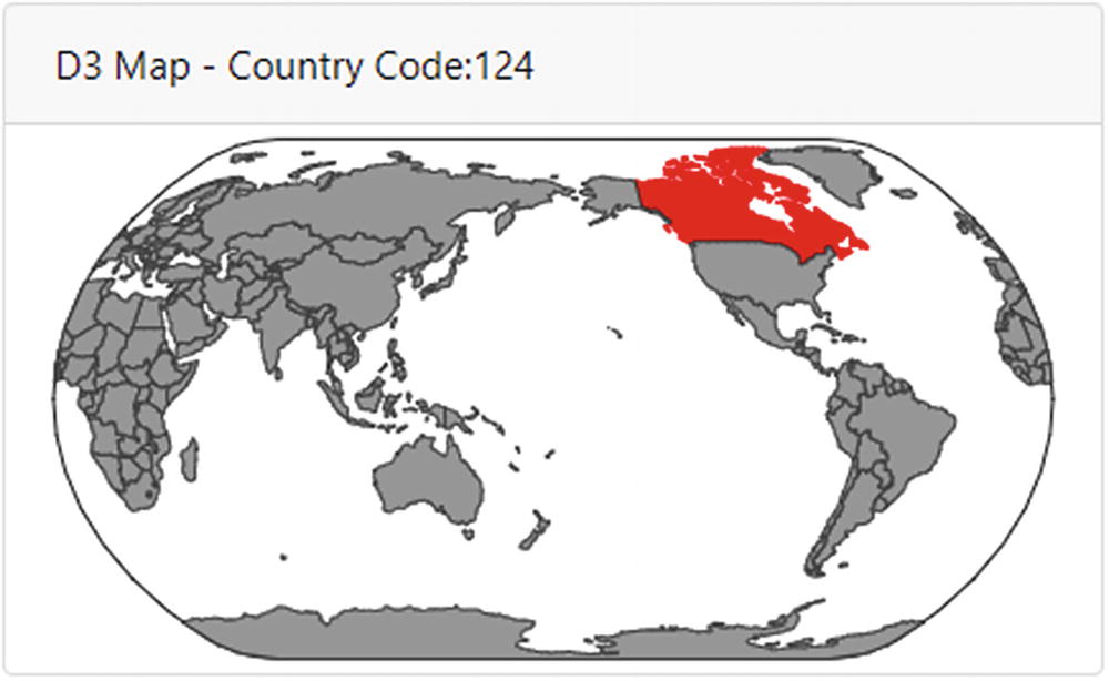
Interactive map component

D3.js (or just D3 for “data-driven documents”) is a library for producing dynamic and interactive data visualizations. It can render complicated charts and maps into the <svg> node. The pattern to use D3 in the AppRun component is to create the <svg> node in the view function and then use D3 to create the map in the rendered function, as shown in Listing 8-13.
1.   import app, { Component } from 'apprun';
2.   import { Card } from './ui';
3.   declare const d3, topojson;
4.   export default class extends Component {
5.       state = {}
6.       view = () => <svg id="svg"></svg>
7.       update = {
8.           'draw-map': (_, features) => features
9.       };
10.      rendered = (features) => { /* draw svg map using D3*/  }
11.      mounted = () => { /* load the data for the svg map*/  }
12.  }
Listing 8-13

Map Component Pattern

The map drawing code is the typical process that creates SVG elements out of a dataset. In D3’s terminology, the technique is called a join.3 We load the data for drawing the map asynchronously using the d3.json function in the mounted function of the Map component and draw the map in the rendered function to the <svg> node created in the view function (Listing 8-14).
1.   import app, { Component } from 'apprun';
2.   import { Card } from './ui';
3.   declare const d3, topojson;
4.   export default class extends Component {
5.       state = {}
6.       view = () => <Card header={<div id="map-text">D3 Map</div>}>
7.           <svg id="svg"></svg>
8.       </Card>;
9.       update = {
10.          'draw-map': (_, features) => features
11.      };
12.      rendered = (features) => {
13.          if (!features.length) return;
14.          const sphere = { type: "Sphere" };
15.          const element = document.getElementById('svg');
16.          const width = element.clientWidth;
17.          const height = width / 2;
18.          const projection = d3.geo.naturalEarth()
19.              .scale(width / 6)
20.              .rotate([180, 0])
21.              .translate([width / 2, height / 2])
22.              .precision(.5);
23.          const path = d3.geo.path().projection(projection);
24.          const svg = d3.select(element)
25.              .attr("width", width)
26.              .attr("height", height);
27.          svg.append("path")
28.              .attr("class", "background")
29.              .attr("d", path(sphere));
30.          svg.append("g")
31.              .attr("id", "states")
32.              .selectAll("path")
33.              .data(features)
34.              .enter()
35.              .append("path")
36.              .attr("d", path)
37.              .attr("id", function (d) { return d.id; })
38.              .on('click', function () {
39.                  d3.select("#map-text").text("D3 Map - Country Code:" + this.id);
40.              });
41.          }
42.          mounted = () => {
43.              const _this = this;
44.              d3.json("./world-110m.json", function (error, topo) {
45.                  if (error) throw error;
46.                  const features = topojson.feature(topo, topo.objects.countries).features;
47.                  _this.run('draw-map', features);
48.              });
49.        }
50.  }
Listing 8-14

Map Component

The Map component uses the AppRun D3 pattern in Listing 8-12, which uses the rendered function and the mounted and view functions to integrate D3.js. It is quite amazing that we can draw an interactive map by using only 30 lines of code (lines 12–41).

Data Tables

HTML tables are the commonly used way to visualize tabular data, especially in business applications. We will use DataTables, a jQuery plug-in to create the HTML table that has advanced interaction such as pagination, search, and sort (see Figure 8-8).
../images/467411_1_En_8_Chapter/467411_1_En_8_Fig8_HTML.jpg
Figure 8-8

Data table component

This is a two-step approach. First, we create regular HTML in the view function. Then, we apply the DataTables jQuery plug-in to the HTML table (Listing 8-15).
1.   import app, { Component } from 'apprun';
2.   import data from './table-data';
3.   declare var $;
4.   export default class extends Component {
5.       state = { data };
6.       view = ({ data }) => <table id="table-example"
             className="table table-striped table-bordered">
7.           <thead>
8.               <tr>
9.                   <th>Name</th>
10.                  <th>Position</th>
11.                  <th>Office</th>
12.                  <th>Age</th>
13.                  <th>Start date</th>
14.                  <th>Salary</th>
15.              </tr>
16.          </thead>
17.          <tbody>
18.              {data.map(p => <tr>
19.                  <td>{p.name}</td>
20.                  <td>{p.position}</td>
21.                  <td>{p.office}</td>
22.                  <td>{p.age}</td>
23.                  <td>{p.date}</td>
24.                  <td>{p.salary}</td>
25.              </tr>)}
26.          </tbody>
27.      </table>;
28.      update = {};
29.      rendered = state => {
30.          $('#table-example').DataTable();
31.      }
32.  }
Listing 8-15

Table Component

The Table component loads the table data from the table-data.json file (line 2). It renders the regular HTML table in the view function (lines 6–27). In the rendered function, it applies the DataTables plug-in to the HTML table (lines 28–31).

You can see it is a simple approach to add search, sort, and pagination to the HTML table by using the DataTables jQuery plug-in.

Calendar

The calendar is a UI feature that is no less complicated than the data tables. Most likely, you will not write a calendar from scratch for your applications because the FullCalendar library has implemented many calendar features for us already. Here, we will integrate FullCalendar into the AppRun application by creating a Calendar component (see Figure 8-9).
../images/467411_1_En_8_Chapter/467411_1_En_8_Fig9_HTML.jpg
Figure 8-9

Calendar component

FullCalendar is also a jQuery plug-in. We can use the same two-step approach as we used for developing the DataTables component to integrate FullCalender with the AppRun component: create the HTML element in the view function and apply the jQuery plug-in to the element in the rendered function (Listing 8-16).
1.   import app, { Component } from 'apprun';
2.   declare var $;
3.   const yyyymm = new Date().toISOString().substr(0, 7);
4.   export default class extends Component {
5.       state = {
6.           id:",
7.           name: ",
8.           events: [ /* Event Data */ ]
9.       };
10.      view = (state) => <div>
11.          <h5>{state.name}</h5>
12.          <div id={`calendar-${state.id}`}></div>
13.      </div>;
14.      update = {};
15.      mounted = ({ id, name }) => {
16.          this.setState({ ...this.state, id, name})
17.      };
18.      update = {};
19.      rendered = state => {
20.          $('#calendar').fullCalendar({
21.              header: {
22.                  left: 'prev,next today',
23.                  center: 'title',
24.                  right: 'month,basicWeek,basicDay',
25.                  title: state.name
26.              },
27.              defaultDate: `${yyyymm}-12`,
28.              navLinks: true, // can click day/week names to navigate views
29.              editable: true,
30.              eventLimit: true, // allow "more" link when too many events
31.              events: state.events
32.          });
33.      }
34.  }
Listing 8-16

Calendar Component

FullCalender is also a jQuery plug-in. We can use the same method used for the DataTables to create the Calendar component. The view function creates a <div> node as the placeholder for rendering the calendar (lines 2–12). The rendered function applies the FullCalendar plug-in to the <div> node created in the view function with an object that has the configurations for the calendar (lines 20–32).

It is so much fun to integrate many great third-party libraries into the AppRun components. Again, we must stop here and move on to summarize all the techniques we have used. The Chart component demonstrates the pattern that creates the <canvas> node in the view function and creates the chart object in the <canvas> node in the rendered function. The Map component demonstrates the pattern that creates the <svg> node in the view function and creates the D3 SVG map in the <svg> node in the rendered function. It also demonstrates how to load data asynchronously. The Table component demonstrates the pattern of using jQuery plug-ins. It creates the <table> node in the view function and applies the jQuery plug-in to the <table> node in the rendered function. The Calendar component follows the jQuery plug-in pattern. It is only different in that it creates a <div> node as the placeholder.

Source Code and Examples

You can get the source code of this chapter by cloning the GitHub project at https://github.com/yysun/apprun-apress-book . You can run the examples in this chapter using the npm scripts in Table 8-2.
Table 8-2

npm Scripts of This Chapter

Example

Script

The administrative dashboard

npm run admin

AppRun components for Bootstrap

https://github.com/yysun/apprun-bootstrap

AppRun components for Framework7

https://github.com/yysun/apprun-f7

Summary

We have seen how to use AppRun to build complex UIs in this chapter. AppRun was designed to support third-party libraries. The virtual DOM is resilient to allow other libraries to change to the DOM. Also, the extended AppRun architecture event lifecycle has the mounted and rendered functions to makes it easy to use other libraries in AppRun applications.

Using jQuery and the jQuery plug-ins is not an anti-pattern. It is welcomed and encouraged. We embrace third-party libraries and recommend you use them because it is an important AppRun application development technique.

In the next chapter, we will introduce another important technique, server-side rendering.

..................Content has been hidden....................

You can't read the all page of ebook, please click here login for view all page.
Reset
18.117.103.219