
In the previous chapter on data binding, you built a single monolithic application with Blazor. After a while, it will become harder and harder to maintain.
In modern web development, we build applications by constructing them from components, which typically are built from smaller components. A Blazor component is a self-contained chunk of user interface. Blazor components are classes built from Razor and C# with one specific purpose (also known as the principle of single responsibility) and are easier to understand, debug, and maintain. And of course, you can use the same component in different pages.
What Is a Blazor Component?
To put it in a simple manner, each CSHTML file in Blazor is a component. It’s that simple! A Razor file in Blazor contains markup and has code in the @functions section. Each page you in the MyFirstBlazor project is a component! And components can be built by adding other components as children.
Open the MyFirstBlazor project in Visual Studio (or Code) and let’s have a look at some of the components in there.
The Index Page
See SurveyPrompt? It is one of the components of the Blazor template. It takes one parameter, Title, which you can set where you want to use the component. Let’s have a good look at the SurveyPrompt component.
Examining the SurveyPrompt Component
The SurveyPrompt Component
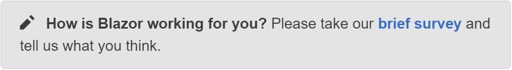
The SurveyPrompt component
The @functions code section simply contains property Title, which uses one-way databinding for rendering in the component. Note the [Parameter] attribute. It is required for components that want to expose their properties to the parent component. Parameters cannot be public properties, and the compiler will give you an error when you try to make it so.
You might wonder why [Parameter] properties can’t be public. I asked Daniel Roth, who’s on the Blazor team, and this is his answer: “Think of parameters as like parameters to a method or constructor. They are not something you should generally be able to mutate externally to the component after they have been passed in.” Steve Sanderson, who is the key author of Blazor, explains that changing the value of a parameter from code will not behave as expected because change detection will not see the change. Changing the value through data binding shows the change.
Building a Simple Alert Component with Razor
Let’s build a simple Blazor component that will show a simple alert. Alerts are used to draw the user’s attention to some message, for example a warning.
Creating a New Component with Visual Studio
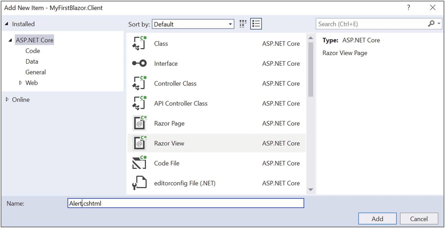
The Add New Item window
Select Razor View and name it Alert.cshtml. Click the Add button.
Creating a New Component with Code
Right-click the Pages folder of the client project and select New File. Name it Alert.cshtml.
Implement the Alert Component
The Alert Component
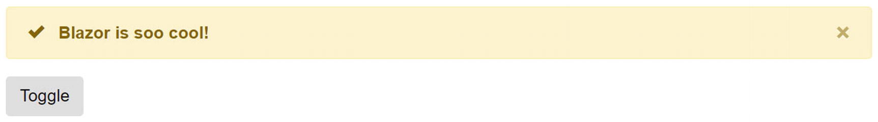
The Alert component will display whatever content you nest in it (using bootstrap styling).
The default Blazor templates use Bootstrap 4 for styling. Bootstrap ( http://getbootstrap.com ) is a very popular CSS framework, originally build for Twitter, providing easy layout for web pages. However, Blazor does not require you to use Bootstrap, so you can use whatever styling you prefer. If you so, you must update all the Razor files in the solution to use the other styles, just like in regular web development. In this book, we will use Bootstrap.
The @ChildContent will hold this content and needs to be of type RenderFragment because this is the way the Blazor engine passes it (you will look at this later in this chapter).
Visual Studio IntelliSense support for custom Blazor components
Using the Alert Component
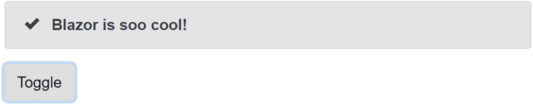
The simple Alert component before clicking the Toggle button
Separating View and View-Model
You might not like this mixing of markup (view) and code (view-model). If you like, you can use two separate files, one for the view using Razor and another for the view model using C#. The view will display the data from the view model, and event handlers in the view will invoke methods from the view model. Some people prefer this way of working because it’s more like the MVVM pattern. Let’s try this!
Creating a DismissableAlert Component
If you haven’t done this yet, open the MyFirstBlazor solution. With Visual Studio, right-click the Pages folder and select Add ➤ New Item. The Add New Item dialog should open as shown in Figure 3-2. This time select Razor Page and name it DismissableAlert. With Visual Studio Code, right-click the Pages folder, select New File, and name it DismissableAlert.cshtml. Do this again to create a new file called DismissableAlert.cshtml.cs.
The Markup for DismissableAlert.cshtml
The Code for DismissableAlert.cshtml.cs
Note that the Show and ChildContent properties are now protected properties. Otherwise you will not be able to reference them from the Razor file. Also important is to inherit here from BlazorComponent. We will come back to BlazorComponent later in this chapter.
Making the CSHTML Inherit from the View Model
So instead of putting your code in the @functions section of a Razor file you can put the code in a base class and then inherit from it in the Razor file.
Which model is best? I don’t think either one is better than the other; it is more a matter of taste. Choose the one you like.
Referring to a Child Component
Using DismissableAlert
Instead of using data binding in the interaction between the parent and child component, you can also directly interact with the child component. Let’s look at an example. Say you want the alert to disappear automatically after 5 seconds.
Adding a Timer Component
The Timer Class
Adding the Timer Component to Dismiss the Alert
Be careful using <Timer></Timer>. Any content, even blank spaces, will be seen as ChildContent, and since Timer doesn’t support any you might get compiler errors. It’s better to use a single element <Timer/>.
Using a Field to Refer to the Child Component
Now, when the timer runs out of time, it invokes its Tick method, which calls DismissAlert. DismissAlert calls the Dismiss method on the dismissableAlert reference, which should then hide the alert.
Run the application and wait at least 5 seconds. The alert does not hide itself! Why?!
Using Component-to-Component Data Binding
So why doesn’t your DismissableComponent hide itself after 5 seconds?
Look at the markup, which is in Listing 3-10, for DismissibleAlert again. It shows the component based on the Show parameter, and it gets set through data binding. The problem is that the parent Index component’s ShowAlert stays true. Changing the value of the DismissableAlert local show field will not update the Index component’s ShowAlert property. What you need is two-way data binding between components, and Blazor has that.
With two-way data binding, changing the value of the Show parameter will update the value of the ShowAlert property of the parent, and vice versa.
The DismissableAlertViewModel Class with Two-Way Binding Support
Now whenever someone or something changes the Show property’s value, the property’s setter triggers the ShowChanged delegate. This means the parent component can inject some code into the ShowChanged delegate property, which will invoke when the property is changed (internally or externally).
Remember to check if the value has changed. This will help you avoid a nasty bug where the child property updates the parent property, which triggers the child property to update, and so on ad infinitum.
Updating the UI When ShowAlert Changes Value
Run. Wait 5 seconds.

Building a Component Library
Components should be reusable. But you don’t want to reuse a component between projects by copy-pasting the component between them. In this case, it is much better to build a component library and, as you will see, this is not hard at all! What you will do here is move the DismissableAlert and Timer component to a library and then you will use this library in your Blazor project.
Creating the Component Library Project
For the moment, you cannot create Blazor component libraries from Visual Studio, so you will have to use the command-line prompt.
The dotnet new command will create a new project based on a template. The template you want is the blazorlib template. If you want the project to be created in a subdirectory, you can specify it using the -o subdirectory parameter.
This time you want to change the solution, and dotnet sln add allows you to add a project (which is the last argument) to the solution. When you go back to Visual Studio, it will tell you about a file modification, as shown in Figure 3-7.
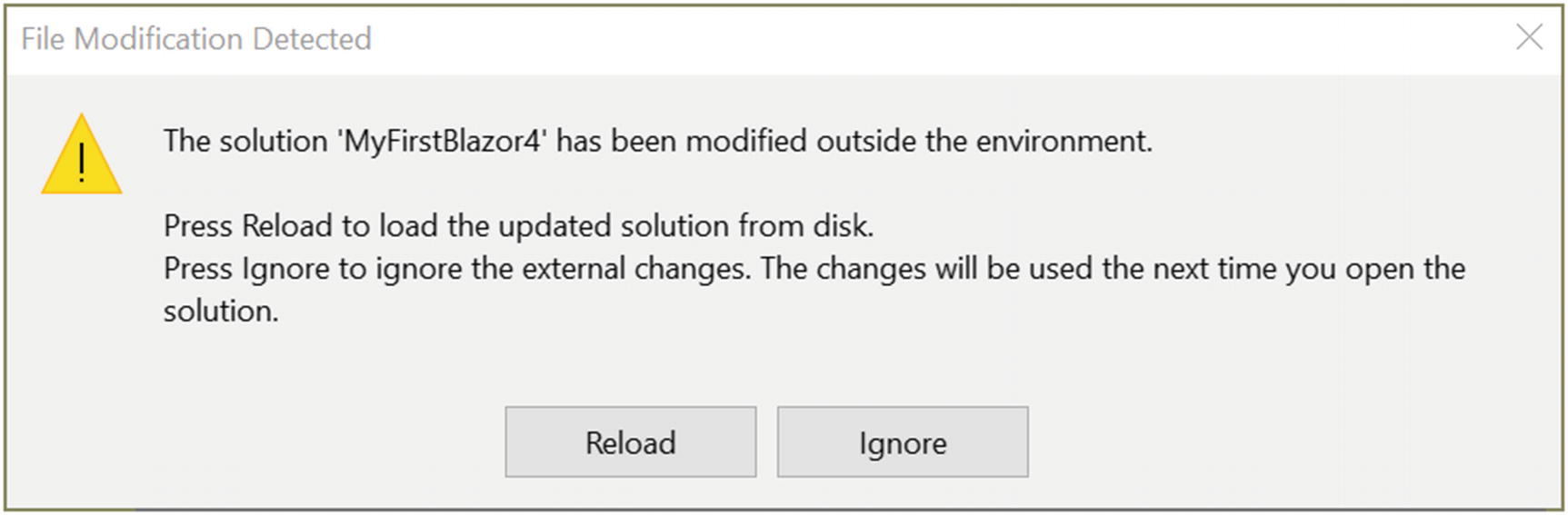
Visual Studio detected changes made to the solution
Adding Components to the Library
Previously, you built a couple of components. Some of them are very reusable, so you will move them to your library project. Start with Timer.
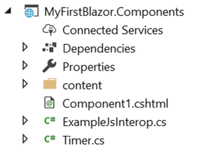
Copying the Timer.cs file to the Components project
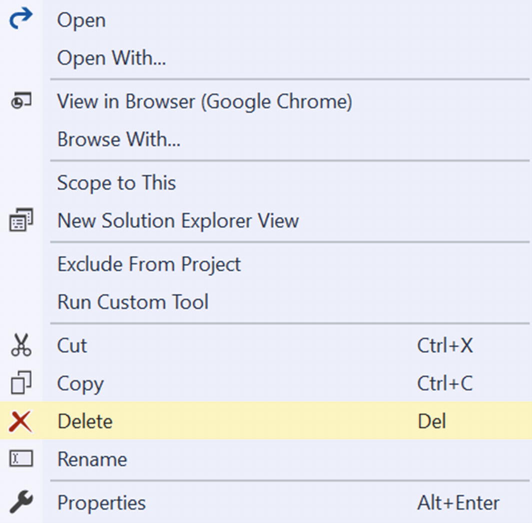
Deleting a file from a project
Dismissing the Alert
Building the solution will still trigger compiler errors from the client project because you need to add a reference from the client project to the component library, which you will fix in the next part.
Refering to the Library from Your Project
Now that your library is ready, you are going to use it in your project. The way the library works is that you can use it in other projects. Hey, you could even make it into a NuGet package and let the rest of the world enjoy your work!
Referring to Another Project with Visual Studio
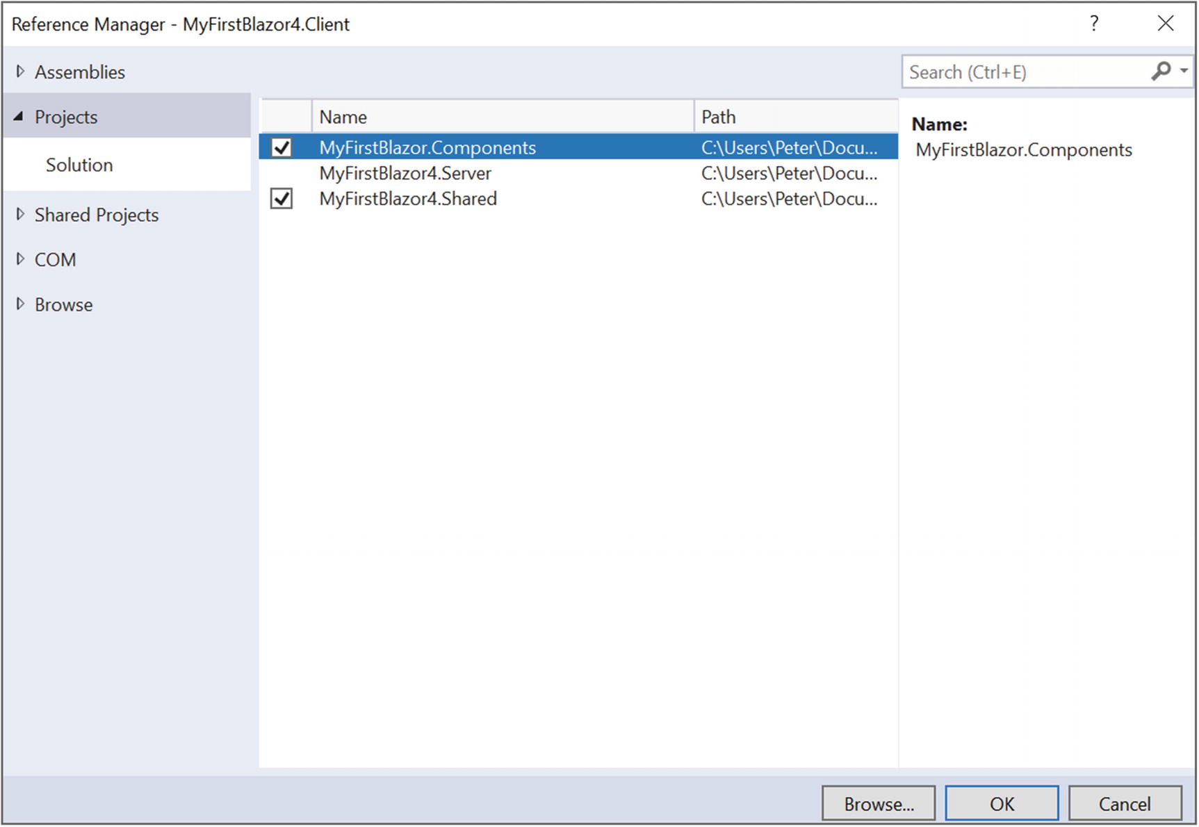
Adding a reference to another project
Make sure you check MyFirstBlazor.Components and click OK.
Referring to Another Project with Code
Adding a Reference to Another Project
Now you have added the component library to your project, but if you want to use the components in your own CSHTML files, you must refer to your component library in your CSHTML files.
Understanding Tag Helpers
ASP.NET Core introduced tag helpers. Tag helpers are custom elements that get converted to standard HTML elements at runtime. If you use regular ASP.NET Core MVC, the server will convert the tag helpers into HTML, and in Blazor the client will convert tag helpers. As a matter of fact, any Blazor component automatically becomes a tag helper. Visual Studio automatically recognizes tag helpers from the current project, but you need to give it a hand for component libraries, and you do that with @addTagHelper.
Adding Components from a Blazor Library
Here you include all custom components using a wildcard (*) from the MyFirstBlazor.Components library. From now on you can use any component from this library as a HTML tag, for example <Timer/>.
Adding a using Statement to Refer to Types from the Namespace
Build and run your solution. It should look like Figure 3-5. Congratulations. You’ve just built and consumed your first Blazor component library!
Refactoring PizzaPlace into Components
In the previous chapter on data binding you built a web site for ordering pizzas. It used only one component with three different sections. Let’s split up this component into smaller, easier-to-understand components and try to maximize reuse.
Creating a Component to Display a List of Pizzas
Open the PizzaPlace Blazor project from the previous chapter. Start by reviewing index.cshtml. This is your main component, and it has three main sections: a menu, a shopping basket, and customer information.
The menu lists the pizzas and displays each one with a button to order. The shopping basket also displays a list of pizzas (but now from the shopping basket) with a button to remove them from the order. Looks like both have something in common: they need to display pizzas with an action you choose by clicking the button.
The PizzaItem Component
The PizzaItem component will display a pizza, so it should not come as a surprise that it has a Pizza parameter. This component also displays a button, but how this button looks and behaves will differ depending on where you use it. And that is why it has a ButtonTitle and ButtonClass parameter to change the button’s look, and it also has a Selected action that gets invoked when you click the button.
The PizzaList Component
The PizzaList component displays a Title and all the pizzas from the Menu, so it takes them as parameters. It also takes a Selected action that you invoke by clicking the button next to a pizza. Note that the PizzaList component uses the PizzaItem component to display each pizza, and that the PizzaList Selected action is passed directly to the PizzaItem Selected action. The Index component will set this action, and it will be executed by the PizzaItem component.
Using the PizzaList Component in Index
Run the application and try to order a pizza. The shopping basket does not display when you click the Order buttons! Why? Because the UI does not get updated. You need to fix this. You have already seen how to do so. Think about it.
Updating the UI after Changing the State Object
Calling StateHasChanged in AddToBasket
Run and order a couple of pizzas. It works!
Think about this. Components rerender themselves after events, but only themselves. When a component makes a change affecting other components, you need to call StateHasChanged on the affected components.
Showing the ShoppingBasket Component
The ShoppingBasket Component
The ShoppingBasket component is similar to the PizzaList component, but there are some big differences. The basket class keeps track of the order using only ids of pizzas, so you need something to get the pizza object. This is done through the GetPizzaFromId delegate. Another change is the OnParametersSet method. The OnParametersSet method gets called when the component’s parameters have been set. Here you override it to build a list of (pizza, position) tuples that you need during data binding, and to calculate the total price of the order.
Tuples are just another type in C#. But modern C# offers a very convenient syntax; for example, IEnumerable<(Pizza pizza, int post)> means you have a type that is a list of pizza and position pairs.
Using the ShoppingBasket Component
Creating a Validation Component Library
The third section of the Index component is about entering and validating details about the customer. You could say that validation is a very common thing, but there is no built-in validation in Blazor so you will create a component library for validation and then use it for building the CustomerEntry component. The Customer class already implements the INotifyDataErrorInfo interface, so this part does not need to change.
This creates a new Blazor library project.
This adds the new project to your solution.
The ValidationError Component
You expect the Subject and Property parameters to be set to an object implementing either the IDataErrorInfo or INotifyDataErrorInfo interface. You use this to dynamically build the Error collection, which is then used to list any validation errors.
Remember the validation-error style you added in the previous chapter to change the color of validation errors? Move this CSS to the /content/styles.css file from the component library. This concludes the validation component library.
Adding the CustomerEntry Component
The CustomerEntry Component
The Index Component
The INotifyPropertyChanged Interface
The Customer Class Implements INotifyPropertyChanged
The Customer Class’ Name Property
The OnPropertyChanged Method
I’ll explain the implementation a bit. You should pass the name of the property in the PropertyChanged event. You could pass this name as a string to the OnPropertyChanged method, but when you change the name of the property there is a large chance you will forget to update this string. It’s better to pass nothing and have the compiler figure out the name of the property. This can be done using the CallerMemberName attribute, which will make the compiler figure out the name of the caller, in this case the name of the property!
Which kind of code is the most maintainable and bug-free code you can write? Code you did not write!
Implement the Street and City properties in the same way.
The OnInit Method
Build and run. Now when you make a change to the customer the debugging tip will update. You might think, “So what?” The customer could also be used by another component that needs to see changes.
Component Lifecycle Hooks
Every component has a couple of methods you can override to capture the lifecycle of the component. In this section, you will look at these lifecycle hooks because it’s very important to understand them very well. Putting code in the wrong lifecycle hook will likely break your component.
OnInit and OnInitAsync
When your component has been completely initialized, the OnInit and OnInitAsync methods are called. Implement one of these methods if you want to do some extra initialization after the component has been created, such as fetching some data from a server, like the FetchData component from the MyFirstBlazor project.
The OnInit Lifecycle Hook
The OnInitAsync Lifecycle Hook
OnParametersSet and OnParametersSetAsync
When you need one or more parameters for initialization, use OnParametersSet or OnParametersSetAsync instead of the OnInit/OnInitAsync methods. These methods get called after the component has been initialized and after the parameters have been data-bound. For example, you could have a DepartmentSelector component that allows the user to select a department from a company, and another EmployeeList component that takes the selected department as a parameter. The EmployeeList component can then fetch the employees for that department in its OnParametersSetAsync method.
The OnParametersSet Method
The OnParametersSetAsync Method
OnAfterRender and OnAfterRenderAsync
The OnAfterRender and OnAfterRenderAsync methods are called after Blazor has completely rendered the component. This means that the browser’s DOM has been updated with changes made to your Blazor component. You can use these methods to invoke JavaScript code that needs access to elements from the DOM (which we will cover in the JavaScript chapter).
The OnAfterRender Lifecycle Hook
The OnAfterRenderAsync Lifecycle Hook
IDisposable
If you need to run some cleanup code when your component is removed from the UI, implement IDisposable. You can implement this interface in Razor using @implements, as shown in Listing 3-38. Normally you put the @implements at the top of the CSHTML file.
Implementing the IDisposable Interface in a Component
Implementing the Dispose Method
If you’ve separated the view and view model, you implement this interface on the view model.
Using Templated Components
Components are Blazor’s building blocks for reuse. Blazor also supports templated components where you can specify one or more UI templates as parameters, making templated components even more reusable! For example, your application could be using grids all over the place. You can now build a templated component for a Grid taking the type used in the grid as a parameter (very much like you can build a generic type in .NET) and specify the UI used for each item separately! Let’s look at an example.
Creating the Grid Templated Component
Open the MyFirstBlazor project you have been using. Now add a new component (a Razor view) to the MyFirstBlazor.Client project’s Pages folder and name it Grid as in Listing 3-40. This is a templated component because it states the TItem as a type parameter using the @typeparam TItem syntax. This is like a generic type stated in C# with public class List<T> where T is a type parameter.
The Grid Templated Component
The Grid component has four parameters. The Header and Footer parameter are of type RenderFragment, which represents some HTML that you can specify when you use the Grid component (you will look at an example right after exploring the Grid component further). Look for the <thead> element in Listing 3-40 in the Grid component. Here you use the @Header razor syntax to tell the Grid component to put the HTML for the Header parameter here (same thing for the Footer).
The Row parameter is of type RenderFragment<TItem>, which is a generic version of RenderFragment. In this case you can specify HTML with access to the TItem allowing you access to properties and methods of the TItem. The Items parameter is an IReadOnlyList<TItem> which can be data-bound to any class with the IReadOnlyList<TItem> interface. Look for the <tbody> element in Listing 3-40. You iterate over all the items (of type TItem) of the IReadOnlyList<TItem> and you use the @Row(element) Razor syntax to apply the Row parameter, passing the current item as an argument.
Using the Grid Templated Component
Now let’s look at an example of using the Grid templated component. Open the FetchData.cshtml component in the MyFirstBlazor.Client project. Replace the <table> (comment the <table> because you will come back to it in later chapters) with the Grid component in Listing 3-41.
The FetchData component uses a couple of things such as @page and @inject. I will discuss them in later chapters, so bear with the example.
The FetchData Component
Now look at the <Header> parameter of the Grid component in Listing 3-41. This syntax binds whatever is inside the <Header> to the Grid’s Header parameter. In this example, you specify some table headers. The Grid puts them inside the <tr> element from Listing 3-40. Again, the <Footer> is similar.
Examine the <Row> parameter in Listing 3-41. Inside the <Row> you want to use the current item from the iteration in Listing 3-40. But how should you access the current item? By default, Blazor will pass the item as the context argument (of type TItem), so you access the date of the forecast instance as @context.Date. But you can override the name of the argument, and this is what you do with the Context parameters (provided by Blazor) using <Row Context="forecast">. Now the item from the iteration can be accessed using the forecast argument.
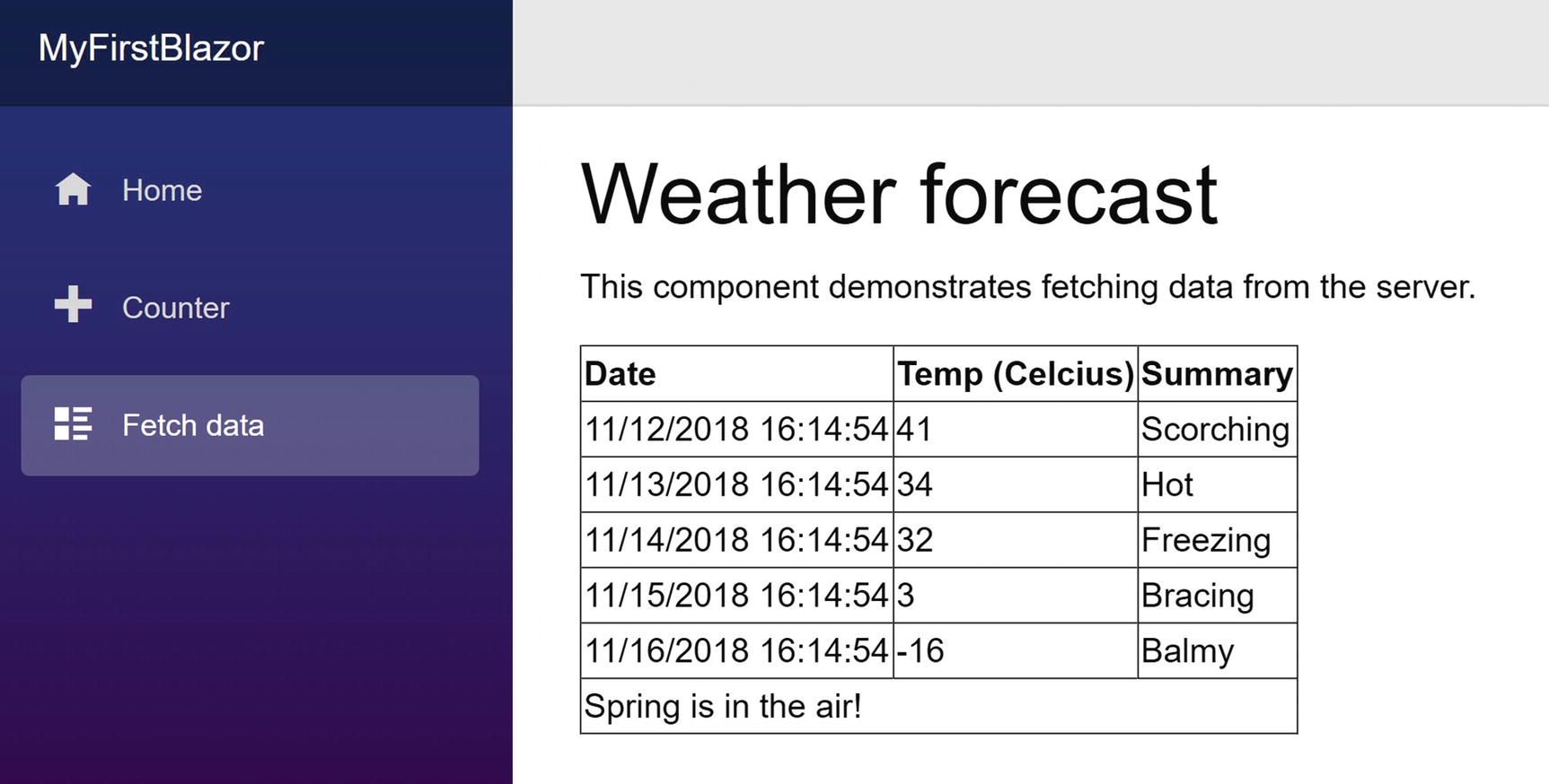
Showing forecasts with the Grid templated component
Now you have a reusable Grid component that you can use to show any list of items by passing the list to the Items parameters and specifying what should be shown in the Header, Row, and Footer parameters! But there’s more!
Specifying the Type Parameter’s Type Explicitly
Explicitly Specifying the Type Parameter
Razor Templates
The ListView Templated Component
Using Razor Templates to Specify the Render Fragment
Razor templates are a great way to reuse a UI snippet because you can invoke it in different components.
Invoking a Razor Template in Your Component
The Blazor Compilation Model

The Show All Files button
The PizzaItem.g.cs Generated File
The Original Razor
The Generated Code from Razor
If you really want, you can directly inherit from BlazorComponent and override the BuildRenderTree method and generate your custom HTML directly here. This is only interesting in some very advanced scenarios which I don’t cover in this book.
Summary
In this chapter, you explored building Blazor components and component libraries. You also learned how components can communicate with each other through parameters and data binding. You applied this learning by dividing the monolithic Index component of the PizzaPlace application into smaller components. You also saw that in Blazor you can build templated components, which resemble generic classes. These templated components can be parameterized to render different UIs, which makes them quite reusable! Finally, you had a look at component lifecycle hooks (which you will need in further chapters) and how Razor components get compiled into good old C# code.