In this chapter we will cover how to get started testing an application for accessibility issues. This includes decisions that will need to be made, automated testing, and gaps where manual testing will be necessary.
Determining Scope
So you are ready to make your application accessible, which is awesome! But how much work is it going to be? The following sections will help you gauge how much work there is to be done.
Accessibility Acceptance Level
In an ideal world, all projects would strive for the highest level of accessibility possible; however, there are often extra factors that mean this is not always possible. The first thing to do is determine the appropriate level of conformance. Each project will vary based on several factors including which country the users are in and the users that the app serves. Notwithstanding, it’s important to remember that reaching a higher level of accessibility than what the current demographic requires will open up the application to use by a currently unserved user base. Demographic research and guidance from your legal or compliance team at this juncture will help determine what an appropriate level of conformance is, and if there are any additional legal requirements that need to be fulfilled. We will focus on WCAG conformance only. See Chapter 2 for more details on the WCAG conformance levels A, AA, and AAA.
Once a level is chosen, a baseline assessment of the application can be done to determine what will need to be fixed and the amount of work it will involve. To determine what needs to be tested and how to best perform that testing, the supported browsers and assistive technologies will also need to be chosen.
Browser Support
Browsers have different rendering engines and intricacies as to how they implement the HTML, CSS, and JavaScript specifications, which may affect the available features. Because of this, the same code can have different behaviors depending on which browser it is rendered in.

Browser market share for December 20181

Desktop browser market share for December 20182

Mobile market share for December 20183
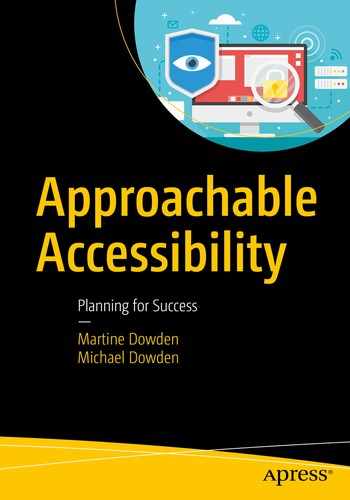
Device distribution for December 20184
Understanding the usage trends for the specific application can help guide decisions based on what they are using.
Assistive Technology Support
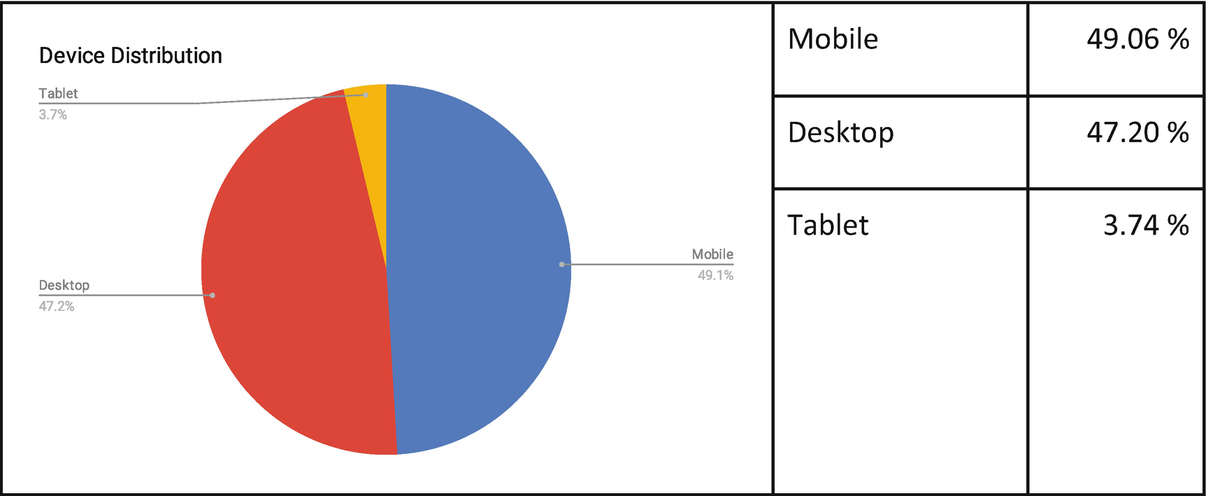
Just like browsers, assistive technologies may work in different ways even if they are the same type. For example, JAWS and NVDA, both screen readers, have their own implementation and often exhibit different behaviors when run on the same code.
Screen reader/browser combinations5
Unlike browser and device versions and types, screen reader usage cannot just be detected via analytics. Even if we could, there are some serious privacy and ethics considerations regarding this kind of data as it could easily be used in order to discriminate against disabled users. User research is currently the best and most ethical way to understand what assistive technologies users are utilizing and how.
Accessibility Statement
Once the technologies that are going to be tested and supported have been chosen, along with an accessibility level, it is recommended that an accessibility statement be drafted and published.
An accessibility statement will not only show users that you care about them and that accessibility is a primary concern but also give users information about accessibility implementation on your app.
A commitment to accessibility and inclusion of people with disabilities
Specific accessibility standards applied
Browsers and tools tested on and with
Known limitations
And most importantly, include contact information so that should a user encounter issues, or have questions or comments about the application, they have an avenue to provide feedback and get answers.
The accessibility statement will need to be updated as accessibility improvements are made to the web site or application. More information about how to write accessibility statements, including a generator tool, can be found on the W3C Web Accessibility Initiative web site at www.w3.org/WAI/planning/statements/ .
Initial Assessment
At this point it is tempting to start running accessibility checker tools on your web pages to see what is what, but there is more to be considered.
Regardless of whether you are conducting the initial assessment in-house or having an external agency perform an audit, understanding the application’s front-end architecture will help you make sure that areas are not accidentally overlooked.
Flows and Processes
Procuring a site map for all pages and flow diagrams for processes will ensure that each activity can be tested and properly evaluated. Access roles are a factor in this as well if the site has content that is only displayed for certain types of users or only if certain conditions are met. Understanding how to get to each piece of content will make testing easier and more effective. Good product documentation will help tremendously in any accessibility initiative.
When enumerating the pages and processes to test, it’s important to keep in mind that at least some of the assessment work will likely be performed by someone not familiar with the application. It is also important to identify areas of functionality that are only available based upon specific data being in place.
For the application to be considered conformant, key features and all pages comprising the steps for accomplishing the end goal of the feature must be conformant. Having a list of these features and their steps is paramount so that they all can be checked for accessibility issues. Taking an ecommerce site as an example, selecting products, adding them to a cart, reviewing the cart, and checking out, all need to be accessible for the site to be considered accessible. If any part is nonconforming, then the site does not meet conformance standards.
Third-Party Integrations

Angular Material button component accessibility details6
Breakpoints

Apress web site – Viewport size 1024 × 800 pixels7

Apress web site – Viewport size 500 × 800 pixels

Viewport less than 500px

Viewport more than 500px
In this way, viewport height and width, screen resolution, and device orientation can be targeted. Because the UI changes based on the device and viewport size, there is a potential for accessibility issues to be found only when within certain viewport size ranges or screen resolutions. Imagine this scenario if the button text color is also blue – it would be invisible for some users, but only those using specific viewport sizes. It is therefore important to know where these breakpoints are in your application to make sure testing is done for each interval or use case.
Animations and Movement
Any content that conveys a sense of motion should be assessed. This can be a loader, video, synchronized media presentations (such as time-based interactive components and slideshows), animations, tickers, etc. Context, purpose, and implementation factor into how animations and moving elements should be handled, often aspects that cannot be tested via automated tooling. In general, support should be provided to start, stop, pause, or bypass any such content.
Guideline 2.2: Enough Time
Guideline 2.3: Seizures and Physical Reactions
Keyboard Accessibility
The ability to reach all content via keyboard is essential to accessibility. Many users with motor disabilities and vision impairments rely on keyboards (or other nonpointer devices) to navigate web sites and applications. Common potential issues include lack of focus indicators, focus traps, and tab order. Voice navigation (such as with a screen reader) may also be impacted by a lack of keyboard accessibility. Additionally, because screen readers often provide their own keyboard shortcuts, it’s important to test keyboard accessibility both with and without a screen reader active to ensure access to all.
Guideline 2.1: Keyboard Accessible
Focus Indicators

Focus highlight in Firefox
In the preceding example, the focus is in the date field. It is important to note that the focus is denoted by more than just color. The outline width is also increased. This ensures that the focus will be visible even if the user is color blind.
Success Criterion 1.4.1: Use of Color
Success Criterion 2.4.7: Focus Visible
Tab Order
- 1.
Name input
- 2.
Date input
- 3.
Submit button

Tab order
Success Criterion 1.4.1: Use of Color
Success Criterion 2.4.3: Focus Order
Focus Traps
Even though focus can sometimes be restricted to a subsection of the content, such as in the context of a modal or dialog box, where the user should be limited to accessing items within the modal but not what is behind it, the user should always be able to exit the component. Focus traps occur when the user cannot navigate away from a subsection of content using keyboard navigation. This prevents keyboard users from being able to effectively navigate the application and should be avoided.
Success Criterion 2.1.2: No Keyboard Trap
Color Contrast
Even though color contrast testing is based upon mathematics and can easily be automated, color choice can often be a point of contention between designers or brand managers and accessibility testing. Making sure that brand specifications and style guides allow for the ability to meet color contrast conformance can help reduce friction in future projects.

Error message denoted by both color and an icon
Success Criterion 1.4.1: Use of Color
Success Criterion 1.4.3: Contrast (Minimum)
Success Criterion 1.4.6: (Enhanced)
Success Criterion 1.4.11: Non-text Contrast
Video and Audio Content
If the application contains video or audio content, these will require some combination of transcripts, audio descriptions, or captions based on the content.
Transcripts are a text-only version of the media’s audio track, typically in document form. They can be used in multiple ways. They can be read either on screen or through assistive devices such as refreshable braille readers and screen readers. But they can also be searched and can be used for a quick glance to get an idea of what the media is about, or even for foreign-language translations.
Audio descriptions are a little different from transcripts. They are narrations added to describe important visual information that would not otherwise be conveyed via the transcript or context. For example, information about actions, or on screen text which would not normally be announced.
Captions are a text form of the audio information that is displayed on-screen, synchronized with the corresponding audio. They make audible content available to those who do not have access to audio and help users with comprehension as it allows the user to see the content as they hear it. Captions are essential when the visual information displayed in the video is tightly coupled to the audio track.
Although some automated testing tools can detect if these exist, what they cannot test for is if they are accurate and complete. Human testing will be necessary to verify that transcripts, audio descriptions, and captions are accurate and informative.
Additionally, audio content that plays automatically for more than 3 seconds should be pausable and/or have volume controls. The quality of the recording should also be assessed for background noise levels to ensure speech is easily discernible and understandable.
Guideline 1.1: Text Alternatives
Guideline 1.2: Time-based Media
Success Criterion 1.4.2: Audio Control
Success Criterion 1.4.7: Low or No Background Audio
Alternate Text
Making sure that descriptions are relevant and convey all needed information is important to make sure users relying on them aren’t missing out on any content. If text is included in the image, it should also be included in the alternate text description.
Most automated accessibility testing tools will be able to determine if the “alt” attribute is present on images but will not be able to test the quality of the description. This will have to be evaluated manually for each image. They also cannot determine the content of the image. Text content should not be presented as images unless the presentation of the text is essential to understanding the text, such as a logotype, or can be customized by the user. Note that even for decorative images an empty “alt” attribute must be provided and not simply omitted. This signals to the screen reader that the image is there for aesthetic purposes only and can be ignored.
Guideline 1.1: Text Alternatives
Success Criterion 1.4.5: Images of Text
Touchscreen Gestures
For many users, gestures such as swiping left and right, pinching to zoom, and even tapping to select are difficult or even impossible to execute. For example, a shake gesture would be incredibly cumbersome, if not impossible, for a user who has their device attached to their wheelchair. Gestures also have issues with discoverability, including a lack of on-screen indicators to signal that they exist. If the application includes gesture-activated actions, instruction on what the gestures are and what they do should be available to the users, and alternatives to gestures should be included in the app.
Audits
An audit usually includes a report for each page that includes a list of errors with which WCAG guidelines or criteria the error references. Resolution suggestions are sometimes also included.
The initial assessment may be performed as an audit, generating a report of changes needed to attain WCAG conformance. Often accessibility projects will involve multiple audits, and ideally audits should be repeated regularly – even on conforming applications – in order to ensure that the web site or application continues to meet guidelines and is free of defects.
Internal Audit
The preceding list of initial assessment considerations is not all-inclusive but is a good start to identifying the scope and nature of work, and determining what may need cross-department collaboration. If conducting an audit of the application internally it is still essential to have an accessibility expert to guide the testing and make sure that nothing is overlooked. Depending on the testers’ accessibility experience, training may be required.
External Audit
External audits can be very beneficial because they provide an external set of eyes on the application and are done by experts who have extensive knowledge of assistive technologies and accessibility needs. These audits also gain the benefit of impartiality.
External audits are usually performed on a representative subset of pages with the understanding that findings will be applied to all pages. This provides a good base for what to look for everywhere in the application. Making sure that critical processes and pages of the application get included in the audit will help ensure accessibility of the application.
The audit usually generates a report for each page that includes a list of errors with which guidelines or criteria the error references. Resolution suggestions are sometimes also included.
Accessibility Testing
There are a wide variety of tools and techniques used to test for accessibility. For ease of discussion these have been split into three categories: Automated, Validators, and User Feedback.
Automated Testing
Some portions of testing can be done via automated tooling. These tools can be run via the command line, added to development and continuous integration pipelines, API based, or run as browser plug-ins.

Lighthouse audit tools
When running an audit with automatic tooling, most will give a list of errors which include the violation, where in the code it appears, and a link to documentation which usually references the specific requirement and success criteria being violated.

Audit results
A list of additional testing tools can be found on W3C WAI’s Web Accessibility Evaluation Tools List at www.w3.org/WAI/ER/tools/ .
Validators
HTML that is coded following the HTML specification is an important first step to making the website or web application accessible. Accessibility becomes hindered when styles and scripting are added without consideration of user needs. Making sure that the application’s HTML, whether written or generated, follows the HTML specification can help resolve issues right from the start. Markup validators can be used to automatically check the code.
User Feedback
No matter how many automated tools are leveraged, user testing and feedback are still critical to ensuring that all content is usable. Whether accessibility is being assessed internally or by an external agency, it is important to verify that any resolutions made to correct accessibility shortcomings were effective. Even if all the specifications and rules are followed to the letter, a page or interaction may not be clear. It is therefore critical to solicit user feedback and to provide them with an avenue to do so when they are engaging with the application.
At the end of the day, all of the tools and specifications exist to help guide an application in the correct direction. Conformance is a matter of documentation and best effort, but true accessibility exists only within the ability of each and every user to access information and accomplish tasks.
Summary
The role of Accessibility Statements in an accessibility initiative
Reviewing a web site or web application for complete accessibility coverage
Performing automated assessments with Lighthouse
Manually reviewing keyboard accessibility
In the next chapter we will present a roadmap you can use to make an application accessible, and keep it that way.