I never teach my pupils, I only attempt to provide the conditions in which they can learn.
—Albert Einstein, theoretical physicist
It looks like your first “Hello World” Data Studio report from Chapter 1 was just the start! What started as a personal practice session in building your first report has snowballed into your first dashboarding opportunity.
I have found that sharing what you are passionate about is always a good thing. If it’s something that really excites you, then people with similar interests are naturally pulled toward you. You will also see opportunities materialize from places you weren’t aware of before.
There is nothing more useful than learning a new technology by building a small project with it. If you can earn something for your learning projects, then you are in a very exclusive band of people and super lucky. In my case, I spent a lot of my spare time learning Data Studio, and I enjoyed it because I like the creative aspect of what Data Studio could do with my data. I would park out on my kitchen table after the kids went to sleep, and instead of slumping in front of the TV, I would try to build something cool in Data Studio.
Take a few minutes to think about what kind of projects you would like to build with Data Studio. It could be something personal like plotting the distance you exercise in a week. It could be work related like automating your own reporting.
So, let’s get started with our first little project and help our friend Hermann by making a sales report.
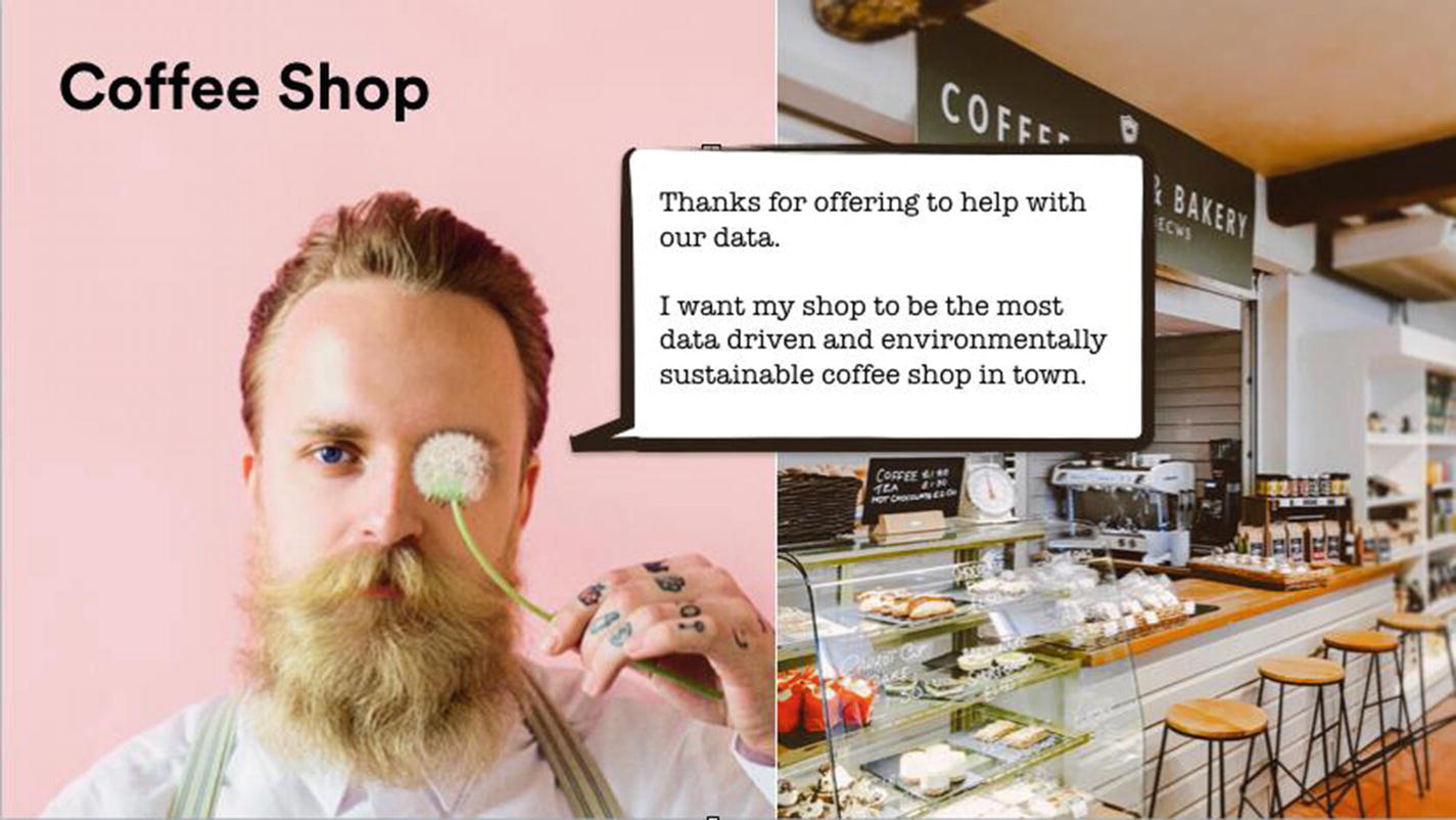
Helping Hermann’s Cake and Coffee Shop
Hermann has been running his own coffee shop and bakery for the last two years and has built up quite the loyal following. Some of his most loyal customers even call him “Uncle H” as he’s always around to share a story.
He used to be a motorbike mechanic in one of the older parts of the city but found that with all the tech companies moving in, he could make quite a lucrative business from selling them coffee and cakes. It turns out that techies really love having cool and unique places to hang out and work. Having spent most of his time hanging out with bikers, he has a lot of great stories which he would often entertain his patrons with over a nice hot drink and pastry.
Hermann’s coffee shop
How can you help him to understand a bit more about his business using your new Data Studio techniques (Figure 2-1)? He will pay you with free coffees and cupcakes for a month if you can help him to make more money.
It’s OK to do work for free while you are learning. Once you have the skills though, don’t expect to work for free. No one should ever be expected to give something for free in return for getting some “future” benefit or promotion. It is very rare for those opportunities to materialize into something lucrative. If someone wants your skills, they should pay you. When it comes to Hermann, we will let him off this time with the coffee and cakes offer after all it’s a really good way to see what we can do with Data Studio and build that first project for our portfolio.
What Information Should You Show in Your Reports?
- 1.
What is their current goal? What is their main goal for the business?
- 2.
What information do they need? What information do they need to help drive this goal?
- 3.
What is their level of data expertise? How sophisticated are they in using and understanding data?
- 4.
How should it be presented to them? What’s the best way to deliver data that is being clearly understood by the audience?
The first question is the most important one to understand. All people are trying to achieve something, so if you can make sure you have built alignment with them, it makes it easier for you to work together.
Identifying the exact information that will help them toward that goal is the next question. Typically most people will come to you with a set of requirements that they believe they need. It’s up to you as the data person to understand those requirements and make sure that they are really helping them to achieve what they need. If they don’t, you will find out really quickly because no one will look at your reports.
As you produce more reports, you will pick up experience with being able to filter out the “extra noise” and will be able to hear the various cues that indicate that the person is not sure of what they want or need and is just using their best guess. This will let you step in and guide them toward something more concrete and helpful.
The audience’s data expertise is covered in the third question, and it’s extremely difficult to gauge at the start of your working relationship with them. It’s also a question that most people will very rarely answer truthfully up front. People are generally very defensive when you ask straight out about how much they know about data. Instead of asking people outright, there are much better techniques to get this information.
I have had people tell me that they use Google Analytics “all the time” yet, when I look at their Google Analytics accounts, I can see that the accounts are hardly used (and in many cases giving inaccurate data). It’s not just at manager level, I have several experiences of working with extremely senior data directors who claimed to be experts, and I was surprised to find out that they didn’t understand simple concepts such as user conversions or bounce rate. Just because they got to their position without knowing the fundamentals of data analytics doesn’t mean you can’t teach them something new. If you are dealing with people who are not very sophisticated in terms of their data experience, then being able to give them answers in a simple and clear way will be vital.
On the other hand, some users are extremely sophisticated, and if you give them simple answers and no detail, they will quickly become frustrated and not trust the results you are giving them.
The fourth question, “How should it be presented,” is the most important one. The more you practice building dashboards, the more effective you will be at getting traction in your business.
Finding Out What Hermann Needs
Most of the world will make decisions by either guessing or using their gut. They will be either lucky or wrong.
—Suhail Doshi, the CEO of Mixpanel
When you start working with a new client or stakeholder, you need to try and understand what their need is. For Hermann’s coffee shop, it’s pretty clear. He has grown his shop organically by focusing on building relationships with customers and having a great quality set of products that people love. In the old days, that was enough, but nowadays, if you aren’t using data to drive your business, then you are only seeing a “slice” of the picture.
Hermann’s brief is to challenge you to use data to help him make more money. This is a pretty big ask and one we are unlikely to be able to fulfill. A lot of people just assume that waving the data “magic wand” on their business will suddenly materialize into money. Hermann is clearly one of these people. This is typically the part where you try and help them understand where data sits in the food chain.
Your answer should always be the same. You explain to Hermann that together we can use data to try understand better what’s going on which can help inform his decisions. Sometimes that leads to more money being made, sometimes it doesn’t.
Most business owners will look a little uncomfortable when you tell them that you might not be able to give them what they are expecting, but that’s OK. It’s better to make sure you manage people’s expectations instead of trying to deliver something that’s not realistic. The important thing is build up a good history of showing results and you will be able to use this to build trust early on with potential customers/internal teams.
The one guarantee that you can give anyone is that by making his data visible and easily accessible you can help to make smarter decisions in order to grow any business.
Back to your meeting with Hermann, you have a list of the four key questions you would like to ask him based on the previous section.
What Is His Current Goal?
Hermann tells you that he’s looking to grow the amount of sales for the coffee shop. If he is able to do this, he will be able to open up a new coffee shop in one of the other tech districts in the city.
What Information Does He Need?
Hermann says that he currently logs the takings each day in a simple Excel document that he sends off to his accountant to enter into his accounts system. He then gets a report emailed to him at the end of the week with what the top selling products were. He uses this information to order his ingredients and plan for what he’s going to sell the following week.
What Is His Level of Data Expertise?
Hermann admits to you that he’s out of his depth when it comes to data. He knows what sells but he has no idea about using some of the common tools in spreadsheets. He says that he’s quite happy with getting the overview data every week from his accountant.
How Should the Data Be Presented to Him?
The simplest technique to finding the right format is to ask the stakeholders for their old reports. Start with what they know and what they’re familiar with, as long as it’s simple to do so.
You are probably thinking to yourself. “Hold up, surely it’s better to start with something new, shiny and streamlined?”
Here is the trick though: the aim of this step is not to give them something shiny, but rather you are trying to build up trust with the client.
Let me illustrate this with a short story.
A few years ago, I heard from a designer who worked exclusively with Adobe Photoshop. He had been invited to a market research opportunity where he was given the chance to review a new rival to Photoshop. They spent a long time presenting it and showing off the product and all the features including its unique new navigation that they were extremely proud of. At the end of the session, they asked the group what improvements they would like to see. This designer said he put up his hand and said:
“Can’t you just make the navigation the same as Photoshop?”
He was met with silence. To do what he asked would have delayed the product, and also meant dropping the fancy navigation feature that they were so proud of. They didn’t listen to him and his primary need for continuity. The designer wanted to be able to deliver work without going through lots of additional learning.
Needless to say, the other tool isn’t around anymore. Adobe’s tools are still the most popular software for designers. I wonder what would have happened if that other company had listened to their target audience?
Much in the same way if you want your users to build up trust with your tools, then the simplest way to start is to replicate what they know. One of the key features that Data Studio has is that it’s super quick to prototype up new reports. Once people recognize their old friendly reports sitting on their screens, you will have their attention and can start to iterate their data reports.
When we got a copy of Hermann’s reporting, it looked like a big table with a wall of numbers. It was a list of products, with the numbers sold next to each item. Next to each item he could see a percentage sign that says whether sales have gone up or down from the previous week.
How Data Studio Can Help Hermann
- 1.
Timely information – He’s not getting timely information to make decisions. He needs to wait for the end of the week when his accountant sends the data back.
- 2.
Removing duplicated efforts – Currently Hermann has to type his sales data into a spreadsheet and then email it to the accountant. The accountant will enter the sales into an accounting program/spreadsheet and then send back the sales reports of what’s doing well. Hermann will then need to review and analyze the results.
If you can show Hermann how to use Data Studio to take his sales data and automatically process it and generate a report from the raw spreadsheet data, then you could help him to make decisions faster. He also wouldn’t need to pay the accountant to enter the data and return the data back to him. Instead he can focus on driving the improvements can come from the data.
You also suspect that since Hermann is so focused on his products, he will be able to ask much better questions of his data if he is able to take control of it himself. This might be the largest win for him in the long run.
Hermann forwards you the last few reports that he received from his accountant so you can see what reporting has changed. The good news is that we can definitely improve on it! Let’s crack on with the work.
Building a Report for Hermann’s Cake and Coffee Shop
Step 1: Upload the Data into a Google Spreadsheet
The first step is to get Hermann’s data from a Google Sheet.
For this exercise, you’ll need to download a copy of Hermann’s Cake and Coffee Shop sales data (DS – Coffee Shop.xlsx) from the source code for this book. Go to www.apress.com/9781484251553 and click the download source code button.
Take your data spreadsheet and upload it to Google Drive.
Open up Google Sheets by visiting https://docs.google.com/spreadsheets/u/0/?tgif=d.
Create a new sheet and go to File ➤ Import ➤ Upload. Browse for the DS – Coffee Shop.xlsx file and upload it.
Make sure the spreadsheet is named “DS - Coffee Shop.” If you need to fix it, double-click the file name at the top left of the sheet and change it. Hit enter or click elsewhere when you’re done.
Step 2: Clean the Data
Next, we need to do clean the data so it’s good to be consumed.
Get your data into a table format.
Ensure that each column contains only one set of data.
Check none of the fields have blank entries.
Make sure that all the fields have the data in the correct consistent format. For example, you need to make sure that dates are in the format dd/mm/yyyy.
Rubbish in…Rubbish out
You should think of your Data Studio reports as being as clean as one of those fancy filtered water dispensers that you see in offices. Having water come out of them that is not clean would immediately result in them being taken out of service and an engineer being called.
This is much in the same way your Data Studio reports should be filtered and clean for your users to consume. Any data source that is infected with bad data should result in them calling in an engineer (you!) to investigate and fix the issue.
Whenever you make a report, think about how you can let your users alert you if there is an issue with the data. I always put my contact details in the same place for all my reports so I am able to be contacted if people have questions. We’ll talk about this in a later chapter.
Where Should Cleaning Be Done?
I know a lot of people who say that it’s fine to do the cleaning of the data in the reporting tool and not in the source. I generally consider this a massive anti-pattern (a bad practice that you end up regretting).
The rule of thumb is to fix the data in source but tweak the data in Data Studio.
It keeps things simple as you only have to look in one place for any fixes to your data.
It’s less work to have to replicate your cleaning over multiple reports.
Some of the tweaks that we do in Data Studio over time, if they are clear that they are going to be there to stay, I might roll that change back into the source data just to give Data Studio that extra kick of speed.
How Is Data Cleaning Done in Professional Environments?
When you are working on doing your data cleaning in an office, you may do this work by simply modifying a spreadsheet, or in some businesses, the data teams will use a scripting language called SQL to manipulate databases with millions of lines on it.
Believe it or not, the principles behind both small spreadsheets and large databases are pretty much the same. Since SQL and databases are such massive subjects themselves (and can span volumes of their own books), we will limit ourselves hereto just doing the cleaning in the spreadsheet we created from Hermann’s weekly sales data. Luckily, it’s already pretty clean, so we can continue on.
Step 3: Create a Data Studio Report
Open up Data Studio and create a new blank report. Title it “DS - Coffee Shop.” Refer to Chapter 1 if you need a refresher on how to create a new report.
Step 4: Create a Data Connection to the Google Sheet
- 1.
Click “Add data.”
- 2.
Locate “Google Sheets” in the Google Connectors list and click it. You will need to authorize it if it’s your first time connecting a Google Sheet to Data Studio.
- 3.
Locate Hermann’s sales report: “DS - Coffee Shop.”
- 4.
Select the file and select “Menu” (the first tab in the Google Sheet).
- 5.
Click the blue connect button in the top right-hand corners, then click Add, then Add to Report.
Step 5: Create a Raw Table View of the Data
Whenever I start looking at the data that I need, I find that the easiest way to understand it is to use table control to investigate the raw data. This gives an overview of the data before we zoom down into the detail to get the information we need. It’s also handy for doing some initial quality checking and double checking that the data is there and it’s in the format we expect.
- 1.
Click “Add a chart” and select the first table icon on the top row as shown in Figure 2-2.
- 2.
Click the rectangle where you would like to place the table and you will see the data from your Google Sheet appear.
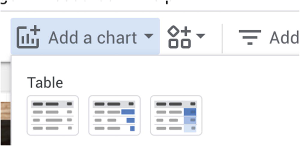
Adding a raw table to your Data Studio report
Now that we have the data successfully coming through from Google Sheets into our table, we can start to try and make the data useful to our client.
Helping Users to Ask Questions of the Data
What products are responsible for the majority of his sales?
What types of flavors are customers buying the most of?
How do the sales of these products compare vs. last year?
A raw table of data doesn’t really give us a clear indication of what’s going on with the sales. It just displayed to us a wall of text and numbers, which is difficult for our brains to process and interpret. We want the report to do the heavy processing for us to help our users understand the data. We can do this with by transforming the raw table into something more visual, such as a pie chart. By adding a pie chart to the Data Studio report, we are gifting the user an easier way to interpret the data. Humans are visual creatures and we relate to the world around us by using our senses to understand the world of us. The world of data is much the same; by adding visual features to the report that guide the user as to what the information is saying, it lets them focus on what is most important for them.
Add a Pie Chart
- 1.
Click “Add a chart” and select the first Pie Chart control (Figure 2-3).
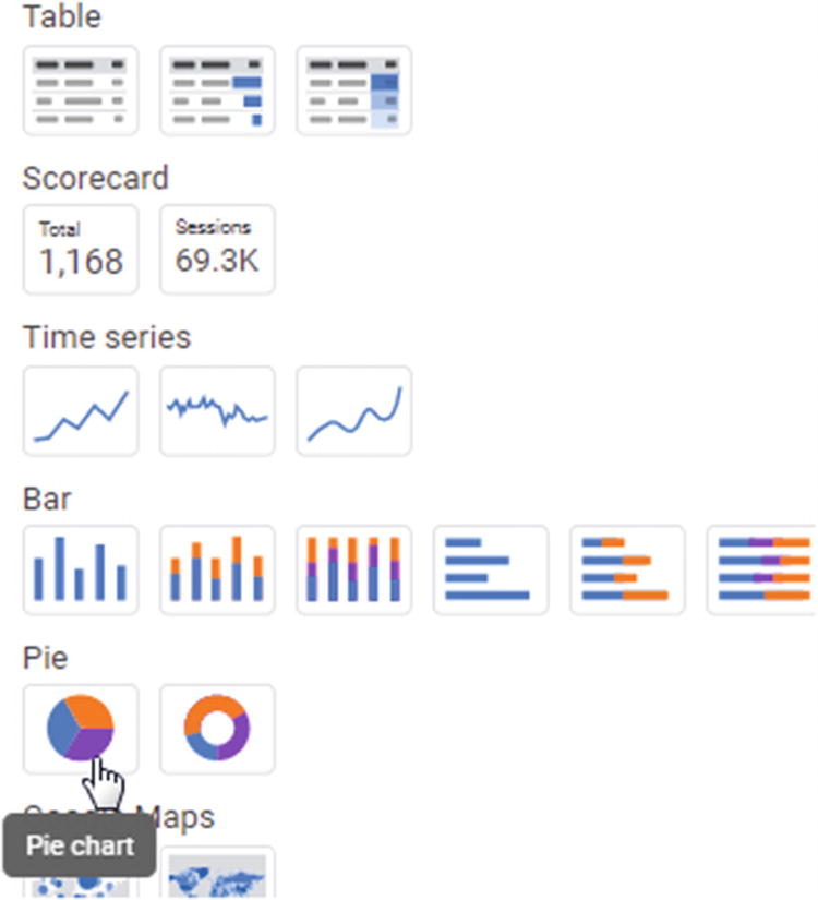
Adding a pie chart
- 2.
Click where you want to place the chart.
When we first add the pie chart, Data Studio defaults to showing the first field in the data set which is “Product Name.” It also defaults to showing us the data from this year. As you can see from Figure 2-4:Our top selling product is “Banana Loaf,” closely followed by the delicious Lavender Cupcake. Good old traditional Chocolate Cake is sitting in at third most popular.
Our top four products account for roughly 50% of our total sales.
Each one of our top four products is selling roughly the same proportion of units.
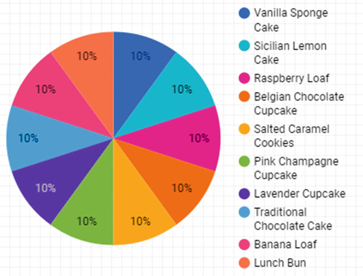
Pie chart according to product name
Step 6: Duplicate the Pie Chart and Change the Dimension to “Product Type”
- 1.
Right-click the pie chart and select Duplicate.
- 2.
Drag the pie chart immediately to the right of the original pie chart.
- 3.
Select the new pie chart and click “Product Name” in the right Panel under “Dimension” and select “Product Type.”
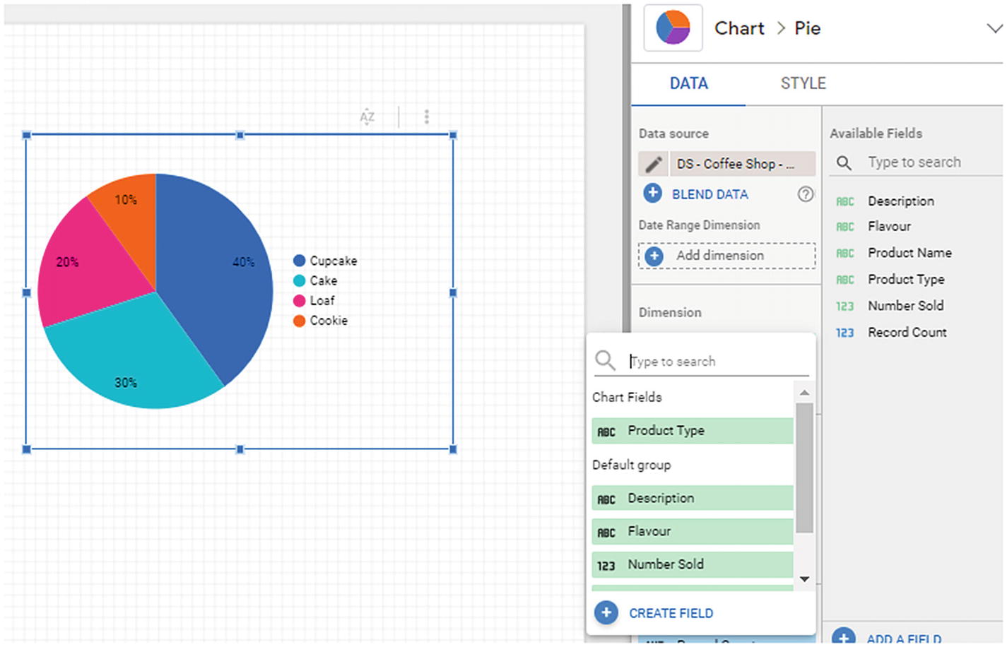
Pie chart according to Product Type
When we selected the dimension called “Product Type,” we told Data Studio to reprocess the data in our table, and instead of grouping it by product name, we should instead group it by product type. By changing this “dimension” that it uses, it changes the lens that we use to look at the data and shows it from a different perspective. Dimensions (and metrics) are the fundamental building blocks for data reporting, and we will be exploring these further in the next few chapters in the book.
Nearly 50% of our sales come surprisingly from cupcakes.
A third of our sales come from cakes.
Step 7: Use Scorecard Control to Show Sales
With all reports, it’s important to recognize that there is a hierarchy of importance. Think back to your report cards that you received from your teacher at school. The most important information that you wanted to know was what your grade was for each subject. How would you have felt if the grade was hidden away at the bottom of several paragraphs of comments about how hard you worked? You would have been very frustrated and confused about why they had hidden away such important information. Much in the same way, we need to use scorecards to highlight the most important information to readers of our report.
Typically use scorecards to show off what we typically call “KPIs,” or key performance indicators.
The best and most concise definition of KPI I have seen comes from the UK’s Company Act where they define KPIs as “factors by reference to which the development, performance or position of the business of the company can be measured effectively.”
- 1.
Click the “Add a chart” button in the main toolbar.
- 2.
Select the first icon below the word “Scorecard.”
- 3.
Click and drag a box to indicate where you want the scorecard placed (ideally in the top left of the report).
- 4.
By default, it’ll show the record count for the product names, so you’ll need to change the dimension to number sold.
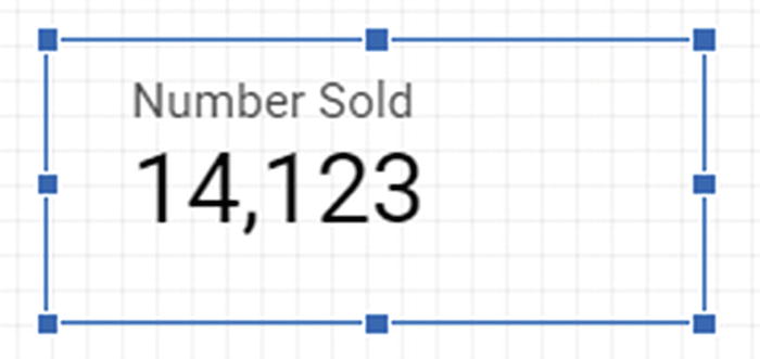
Scorecard for number sold
For Hermann, his KPI is going to be how much product he sells so this is something to show immediately in the report. We use the scorecard control to show the number of products sold at the top of the report.
When it comes to putting scorecards onto your reports, try to use as few as possible. Too many scorecards can confuse the user. If you find you are putting more than five scorecards on a report, it’s time to think whether you should use an alternative presentation like a table or bar chart.
Step 8: Add a Date Comparison to the Scorecard
I don’t set trends. I just find out what they are and exploit them.
—Dick Clark, American radio personality
People’s fashion, tastes, and trends change regularly, and it’s up to businesses to use data to respond to these changes. If you are able to follow the changes in your customers’ tastes or even seek out new customers’ tastes to exploit, then you are winning.
We are going to help Hermann start on his journey of understanding what trends are affecting his business and give him an idea of what has changed over time with his sales. We hope that by doing this we might be able to identify some opportunities that he hasn’t thought of yet.
None
Previous period
Previous year
Fixed/advanced
The “previous period” option is perhaps one of the most powerful features in Data Studio. It will take the current time period that you are looking at and compare it against the previous equivalent time period. You can thus use this control to compare week on week, month on month, or even year on year to see how your sales are changing.
We want to keep things simple for now so we are going to select “Last Year” and press “Apply” to complete our “Year on Year Scorecard.”
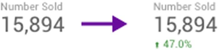
Scorecard showing comparison
Now that you know how to do basic comparisons with date ranges on scorecards, the good news is that you can do the same thing for tables too. Why don’t you try do the comparison year on year for the table of data you have and see which of Hermann’s products are responsible for driving his improvement in sales since last year.
Back to the Books
One of the most valuable things about trying to use data to solve a “real” world problem as we did in this chapter is that you begin to realize that there are gaps in your knowledge and there are new things that you need to learn.
From your first experiences using the Data Studio tool, you probably noticed there are so many new concepts and terms being used all over the place. Don’t worry, you’ll get the hang of them as we go through the book.
Data Studio’s documentation team also maintains a handy glossary of terms (https://support.google.com/datastudio/topic/6302375).
Recap
What products were selling the most for the client
What product types were most popular
How much sales had changed over time
We tried out some simple controls such as tables, scorecards, and pie charts and even started doing some basic comparisons of this year vs. last year.
In the next chapters, we will expand on this, but hopefully you now have a good feel for using the Data Studio interface to explore your data.