It is, in fact, nothing short of a miracle that the modern methods of instruction have not yet entirely strangled the holy curiosity of inquiry.
—Albert Einstein, theoretical physicist
Now that we’ve covered some basics in the previous chapters, let’s see how we can use Google Data Studio for another real-world situation: analyzing the data resulting from an online survey to gather customer information for a client. This chapter is based on a real-life project that we did for a popular travel company. For a client to get an interactive analysis of their customer data without expensive visualization tools is not only cost-efficient but also incredibly useful. It gave our client insight that they could use to develop their content and marketing strategy to better target the customers.
Finding Out What Travel Company Needs
First, we needed to find out more about our client’s needs. As a popular travel company, they wanted us to take a look at who their customers were.
Gathering the Data
The next step was to gather the data. We sent about ten thousand emails to our client’s customers and asked them to fill out a survey using SurveyMonkey.
Gender
Age range
Salary range
Marital status
Kids (and grandkids)
Job title
How often they holidayed
Reasons for going on a holiday
Did they like aspects of the website
Did they like aspects of the service
We also had free text questions, a text box allowing them to type information such as if they thought something was missing from the website, allowing more open responses to some key questions.
Once all submissions were received (about 5,000 surveys), we’re ready to prepare the data for the report.
Preparing the Data
The next step was to prepare the data before we could feed it into Data Studio. SurveyMonkey is able to export the results into an xls file, which is a format we could easily import into Google Sheets. After uploading the results to Google Sheets, we started cleaning up the data.
As discussed in Chapter 2, clean up entails ensuring that nothing in the data set is invalid. For instance, despite us using the company’s mailing list, presumably of people who wish to be contact about the service, we still received “junk” responses from people who did not want to be bothered. We also had to remove anything that is considered a null, or blank, response. We also needed to make sure that all columns have unique names. Don’t worry – every data set has issues.
In this case, we were dealing with a relatively small data set of about 5,000 surveys, and we can pull it directly from Google Sheets into Data Studio. If we had a larger data set, we could upload it into Google BigQuery first and pull it into Data Studio in a similar way.
After we cleaned up the data, we were then ready to pull it into Data Studio. Make sure you have access to the Google Sheet in the same account and the file name is appropriate.

The button to click for Google Sheets
Designing the Report
Next, we need to design the report to make it useful and aesthetically pleasing. We can do this by structuring the presentation of data and making elements consistent throughout.
It’s always nice to have elements that are consistent through the report. This promotes a sense of cohesiveness, a connection to the company’s branding, and it is aesthetically pleasing.
Getting things looking consistent means that your clients will find the report easier to read.
Header Bar
One thing you can do is add a header bar that has the company’s logo. You can do this with a plain text header as well, but a logo looks nice if you have it.
To upload a graphic, click the Image icon in the toolbar and select “upload from computer” or “by URL,” whichever is applicable for you. Then, place the logo somewhere at the top of the report page. Right-click the logo and select “Make report level.” This means that the logo will appear at the top of every page if your report has more than one page.
Color Theme
Another thing you can do is set a color theme for the report so it is consistent throughout. If the company you are producing the report for has a color scheme, you can incorporate it into your report by extracting the color scheme from an image, which can be the company’s logo or even a screenshot of their website.
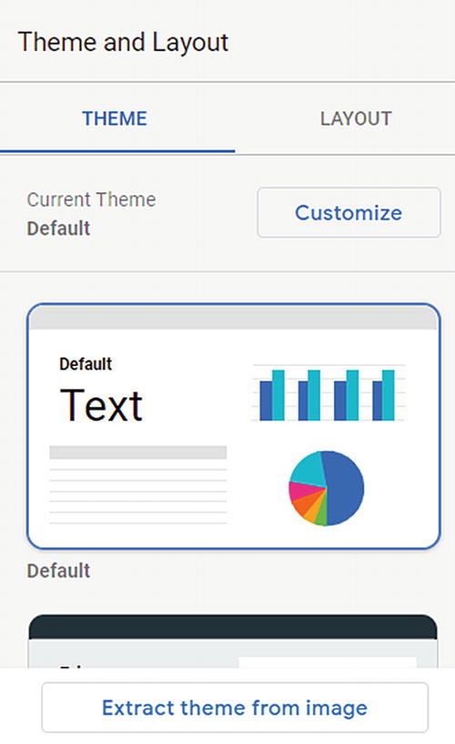
Screenshot of button to extract an image palette
You can then select from three generated themes. If you like one, click it and press apply. If you find the output of the extraction doesn’t have enough color diversity or contrast, you can manually edit the color theme to make your report better fit your company or clients style. Click the customize button in the Theme and Layout pane.
Footer Bar
Also consider creating a footer at the bottom of the report with information on how to contact you, or information here on how to get elements fixed up, if you are an agency or in house team a link to your contact details if someone wants something fixed.
You can use the text tool to type in this information and place it at the bottom of the page.
Detailed to Granular
Plan to present the data with an overview at the top, then work your way down to more detailed and granular data. It is often easier to start with a longer page, then trim it down from there.
I would also recommend using a rule of thirds or 50/50 for content – meaning that you make tables and charts either one-third, two-thirds, or 50/50 – you can draw a line two-thirds across the report and halfway so you can use these as guidelines for layout. You can use the Line tool in the toolbar for this purpose.
Getting Data onto the Page
Next, we need to add data to the report. As we mentioned earlier, it is a good idea to start with overview data before drilling down into the details. A good way to do this is to start with a pie chart.
Although pie charts are often considered to be bad for users as it is hard to interpret exact values, you can use them (or a doughnut chart) at the top for key groups to be used as filters. Almost any chart can be used with a filter by setting the Interactions – Apply Filter to be enabled. This will mean that if you click a segment within the doughnut or pie, it will apply this to the data source.
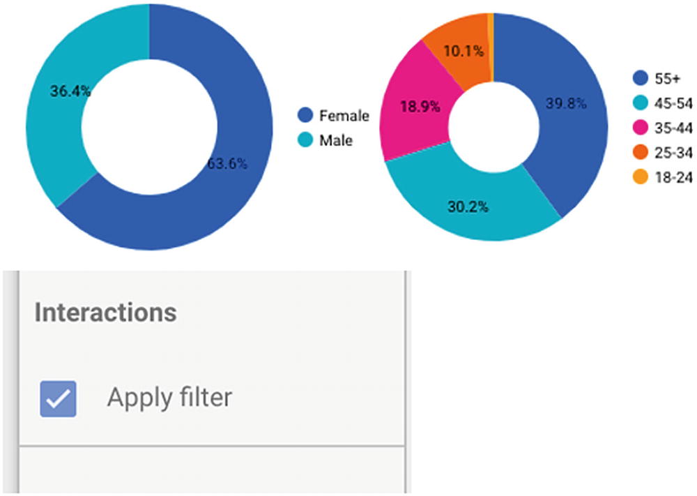
Apply Filter button
We now have a very visual way of seeing the data within the report and being able to quickly drill downward across all tables and information from the same data source. If we have multiple data sources, it will normally only apply to elements from the same source (you can also use groups of charts if you do not want filters to apply to the entire report).
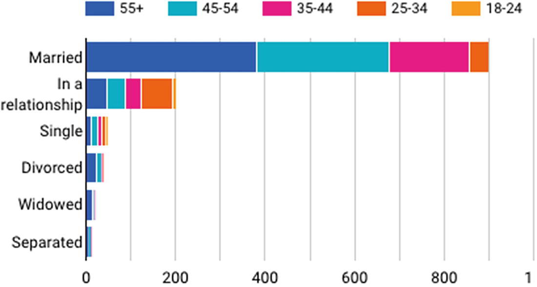
Stacked bar chart
At this point now we can see that most of the respondents in this form are married and most are over 55 years old. This prompts us to consider: Is any bias in the data? Are these people more likely to fill in a survey?
A pivot table can also give us greater insights, especially if we use a heatmap. This combined with the questions that marketers can use to make decisions.

Example of a pivot table showing purchase frequency by age
Pie chart and Treemap demonstrating how to show data that can be used as a filter
Either type can be made to apply a filter, which means that they can be used alongside the more detailed information that is driving decisions. For instance, they can be used to understand the impact of a particular feature on a website.
Free Text Analysis
There were a number of free text boxes in the survey that we can look at in several different ways. If there are enough entries, it’s possible that there will be some overlap or essentially the same response. It can be a little challenging, but with a little analysis we can take the data a little further.

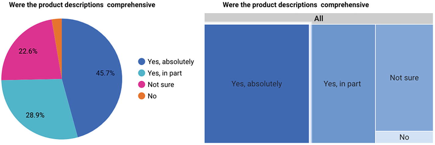
Table showing free text results for the question “Was there anything missing from the product description?”
Lowercase and Trim all responses
Case statement to consolidate common patterns
Ultimately it would be good to do smart extraction using machine learning, which can be done cheaply and increasingly easily, but that’s the subject for a separate book. For now, we can work with the tools in Data Studio.
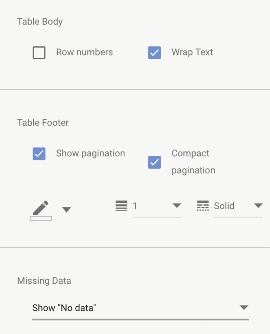
Formatting options for a table
We can also include additional classifications for common words. There are some word cloud visualizations within the community selectors, but none of these quite meet our needs. So the first part of this is almost by-hand analysis; when we spot common patterns, we can use the case statement – if there are particular themes we want to bring out, for instance – some mentioned images, some mentioned pools, and some mentioned kitchens.
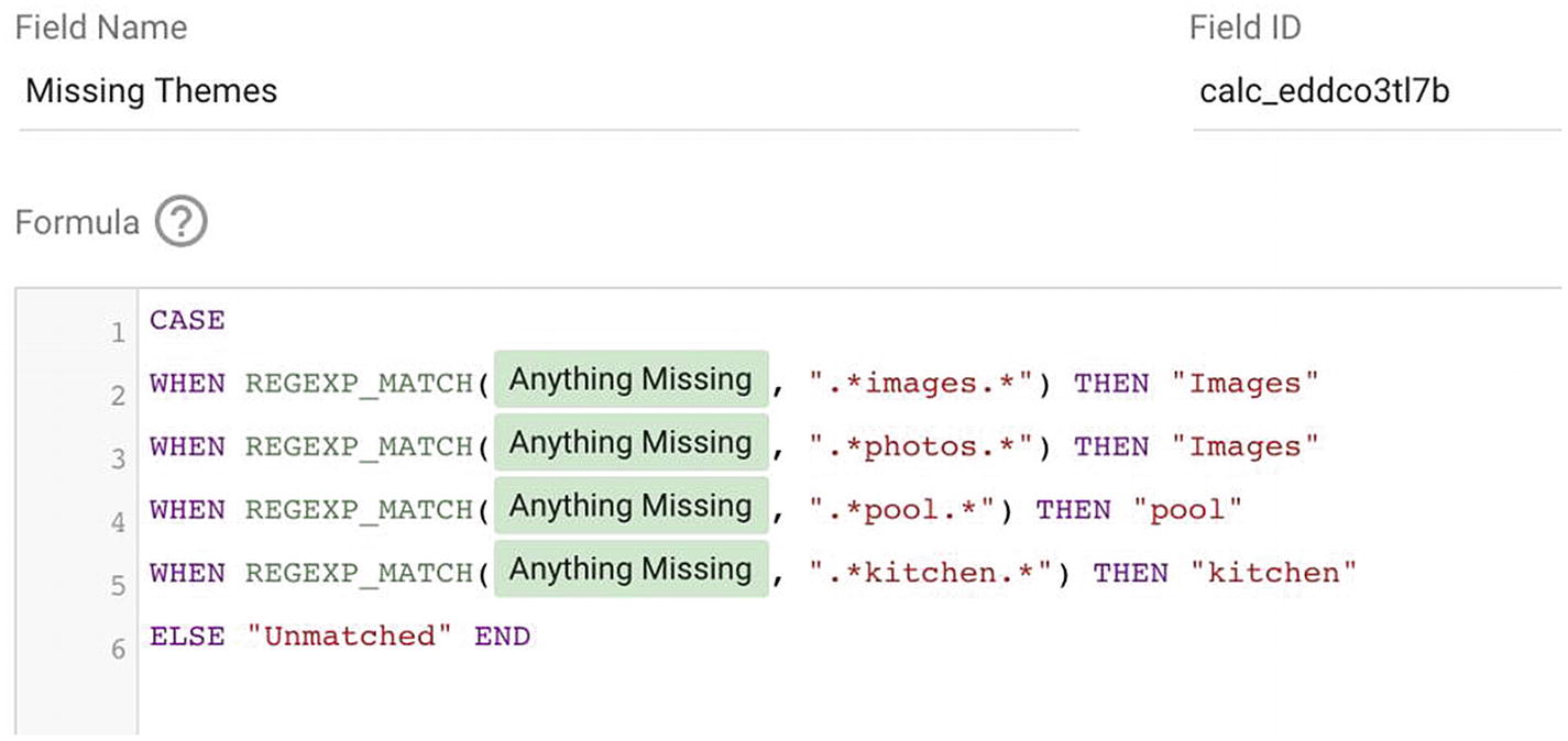
Custom field with case statement

Classified text in a drop-down filter
Final Result
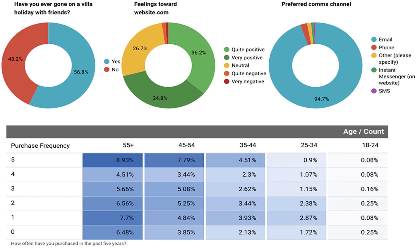
Outputting the data with heatmap pivot tables and doughnut charts
Recap
Google Data Studio isn’t just a front end for your analytics data. It can be a presentation layer for survey data, much like a tool like Excel can be, but makes the data online and accessible for everyone.
Data can be improved and cleaned within the tool using simple string functions, and additional transformations can be applied to create custom fields based on free text or by consolidating some dimensions. Ultimately Google Data Studio is a powerful way of taking data sets and presenting them in easy-to-understand ways. For some this is a far better front-end to complex back-end tools such as Google Sheets, but care must be taken to make sure the data is in the right format to start.