THE NEW PHONE WAS A MARVEL, the brainchild of a renowned tech company. It worked in a wholly different way from what came before, yet still charmed novices and technophiles alike. Industry observers called it intuitive, efficient, even fun. The gadget quickly became a status symbol, owned by a select few. As time went on, nearly everyone got one, and we now find its operation so natural that we can barely imagine phones working any other way.
The year was 1963, and the device was Bell Telephone’s Touch Tone phone.
A push-button interface replaced the rotary dial, introducing the keypad to millions. As familiar as it seems now, the layout wasn’t obvious. To get there, Bell researchers tested sixteen keypad variations, searching for the design that enabled the fastest, most reliable dialing.
“Specifically, we would like to know how push-button design influences user speed, accuracy, and preference in keying telephone numbers,” the researchers wrote (http://bkaprt.com/dft/01-01/). “How does performance improve with practice? And are there systematic procedures that users follow in keying numbers?” To find out, they lined up the buttons in a range of shapes—a rainbow, a cross, a diagonal, a circle, even a bullseye—before landing on the grid we know today (FIG 1.1). They played with button size, spacing, and typography to reduce mistakes and optimize dialing speed, which they measured to fractions of a second. They asked callers about the keypads’ comfort, testing out button tension and whether buttons should click when pressed.
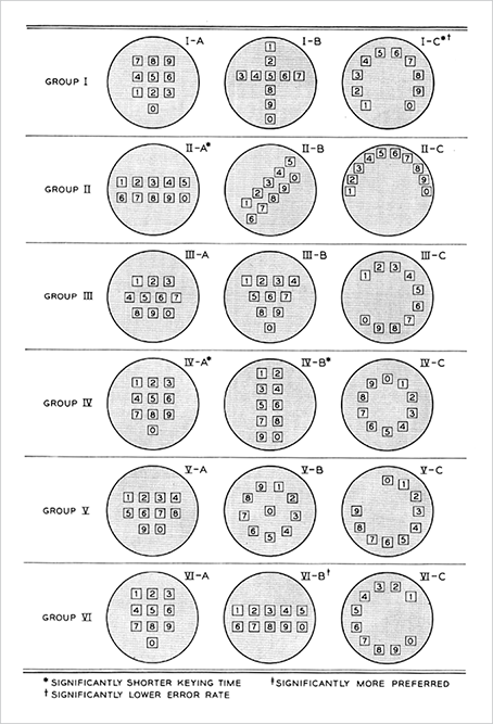
FIG 1.1: Bell researchers tried sixteen layouts, testing three at a time with six groups, for their new “push-button telephone sets.”
If Bell Telephone’s designers were invested in the keypad’s visual layout, they were far more concerned with its feel—the context of its physical use. Fast-forward to the current century and our new generation of touch-driven phones and personal devices, and today’s digital designers and researchers are learning similar lessons all over again.
TOUCH DESIGN COMBINES DIGITAL AND INDUSTRIAL DESIGN
A phone or tablet presents us with a glass slab (a literal blank slate) and invites us to impose any interface we like. Designing for the screen is nothing new for digital designers, except now these designs have to accommodate fingers and thumbs. How do your pixels feel in the hand?
This critical physical dimension calls for us to go beyond strictly visual design and take cues from other design disciplines. When we venture into touch, we verge into industrial design—the craft of shaping physical objects. In the same way real-world objects disappoint when they are physically awkward, your touchscreen interfaces will fail if they are uncomfortable in the hand. This interplay of digits with digital is the crux of designing for touch.
How we hold our gadgets
Where do hands and fingers fall on the device? This question is the linchpin for every form factor this book examines, and the answer tells you how to design your layout for comfort and efficiency. Since we hold phones, phablets, tablets, and laptops very differently, it’s no surprise that each of these touchscreen variations has its own UI needs.
Yet these devices also share many consistencies, especially in the crucial role of thumbs. Whether we’re tapping away at tiny phones or jumbo tablets, our thumbs do most of the walking. That fact helps us establish sturdy cross-device guidelines. This chapter looks at why the thumb is so important, and reveals fundamental “rules of thumb” based on how we grab screens of all sizes.
The smartphone is of course the device that we hold most. We stare at it for more than 20% of our waking hours, consulting it 221 times per day on average (http://bkaprt.com/dft/01-02/). Let’s start with that most familiar of gadgets.
HOLD THE PHONE
In 2013, researcher Steven Hoober took to the streets to observe over 1,300 people tapping away at their phones (http://bkaprt.com/dft/01-03/). He found that in nearly every case, they held their phones in one of three basic grips. At 49%, the one-handed grip was most popular; 36% cradled the phone in one hand and jabbed with the finger or thumb of the other; and the remaining 15% adopted the two-handed BlackBerry-prayer posture, tapping away with both thumbs (FIG 1.2).
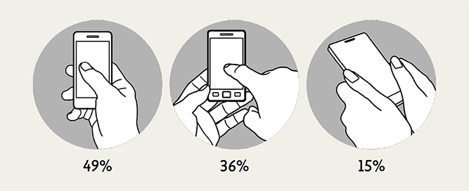
FIG 1.2: Smartphone use is defined by three basic handholds, and we often shift among them.
The study also confirmed what many of us know from our own phone habits: we change grips frequently, depending on convenience and context. We switch between one hand and two, or swap between left and right; sometimes we tap absent-mindedly while doing something else; and other times we stop and give the screen our full attention. Plus: we are nimbly ambidextrous. Hoober found that two-thirds of one-handed grips are in the right hand—a majority, but smaller than the 90% who are right handed. That means many of us favor our non-dominant hand, while using the other to write, drink coffee, hold a baby, or read a book about designing for touch.
So while few of us stick with the same grip, we show a distinct preference for one-handed use. And this is where we get to thumbs. When we hold our phones with one hand, the thumb is the only finger comfortably available for tapping. Even when we use both hands, many of us prefer mashing away with our thumb then, too. Of those who cradle their phone in one hand and tap with the other, Hoober discovered that most use their thumb on the screen. Combine all those folks, and it’s thumbs up: thumbs drive 75% of all phone interactions (FIG 1.3).

FIG 1.3: Though we often refer to “finger-friendly” designs, the thumb does most of the work.
The phone’s thumb zone
While a thumb can sweep most of the screen on all but the most oversized phones, only a third of the screen is truly effortless territory: at the bottom, on the side opposite the thumb. For example, if you hold a phone in the right hand, your thumb falls naturally in an arc at the bottom left corner of the screen—no stretching your thumb or shifting the phone required. The same arc shape applies to the two-handed cradle grip, but the arc is larger because the thumb has greater range of motion.
Comfort and accuracy don’t perfectly align, however. Within this comfort zone, a separate, fan-shaped arc draws out the most accurate targets for thumb tapping, as uncovered in a study by Qian Fei of Alibaba (http://bkaprt.com/dft/01-04/, subscription required). She also found that, for right-handed users, the bottom and top-right corners were the least accurate thumb zones (FIG 1.4).
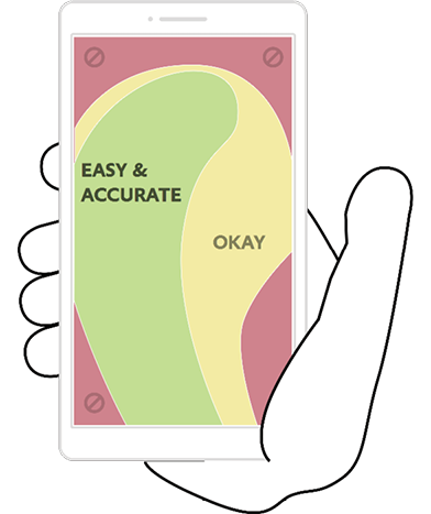
FIG 1.4: The green thumb zone is the most comfortable and accurate region of phone screens for one-handed users. Avoid the red-zone reach, or at least compensate with larger-than-usual touch targets.
What about lefties? The thumb zone flips from left to right. But this left-versus-right distinction isn’t especially crucial, since most of us switch hands easily (and frequently) depending on context. Even so, optimizing for one hand penalizes the other: the best solutions put core features at screen middle, where left and right thumb zones overlap. In the end, top versus bottom is more important than left versus right. No matter which hand you use, screen bottom is most comfortable, while the top demands a stretch. That rule holds true for all phone screens, large or small, but as phones grow to jumbo dimensions, that top-screen stretch becomes a strain.
THE PHABULOUS PHABLET
The first generation of post-iPhone devices consistently featured screens under four inches (as measured across the diagonal), an easy size for one-handed use. By mid-2014, however, a third of mobile web-browsing took place on larger screens as bigger phones shouldered into the marketplace (http://bkaprt.com/dft/01-05/). These super-sized devices fill the spectrum between phone and tablet, a category with the dubious nickname phablet, with screens as large as seven inches (FIG 1.5). My, how our phones have grown up. And down. And sideways.

FIG 1.5: Samsung’s 7″ Galaxy W and similar jumbo devices blur the line between phone and tablet. Photograph courtesy Samsung (http://bkaprt.com/dft/01-06/).
Despite phablets’ gargantuan proportions, people typically handle them like phones, and the three basic grips still apply. Unlike with smaller phones, however, phablet users switch among grips much more often to work the entire screen, and two hands are almost always required. In another study, Hoober and Patti Shank observed that phablet owners use both hands 70% of the time across holds (http://bkaprt.com/dft/01-07/, subscription required). The most popular of these grips, used 35% of the time, is holding a phablet in one hand while tapping with the index finger of the other. But the thumb remains the pointer in charge: 60% of the time, phablet owners tap away with either one thumb or both.
The phablet’s thumb zone
With so much thumb use, the thumb zone is as important for 4″–7″ screens as for smaller ones—with a caveat. Phablet folk use two thumbs more often, which creates a pair of mirrored, overlapping thumb zones at the screen’s bottom, with a swath of tough-to-reach space at the top. Despite its popularity, the double-thumb zone isn’t the one to optimize. Although we hold phablets with one hand only 25% of the time, the single-thumb grip takes on disproportionate importance for designers, because it has the least range.
This brings us to our first rule of thumb for all form factors: always accommodate the most constrained grip, so people can use your interface no matter how they choose to hold their device. On phablets, that means designers should target the single-thumb grip.
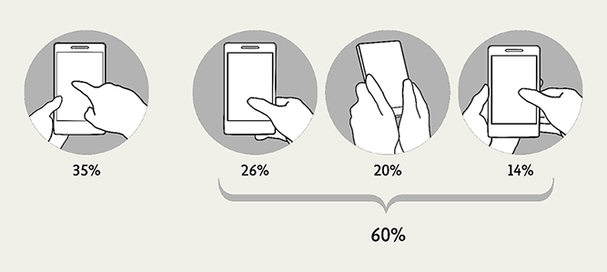
FIG 1.6: Although none of the thumb-driven grips are as common as tapping a phablet with the index finger, they cumulatively account for much more activity.
Here’s a tricky surprise: the one-handed thumb zone is smaller for phablets than for phones. As phone size increases, the thumb zone remains roughly the same shape and position—anchored to screen bottom—until the size hits a tipping point, where the grip shifts to stabilize the phablet. In that handhold, most people slide their pinky finger under the phone to keep it in place, reducing the thumb’s range (FIG 1.7).
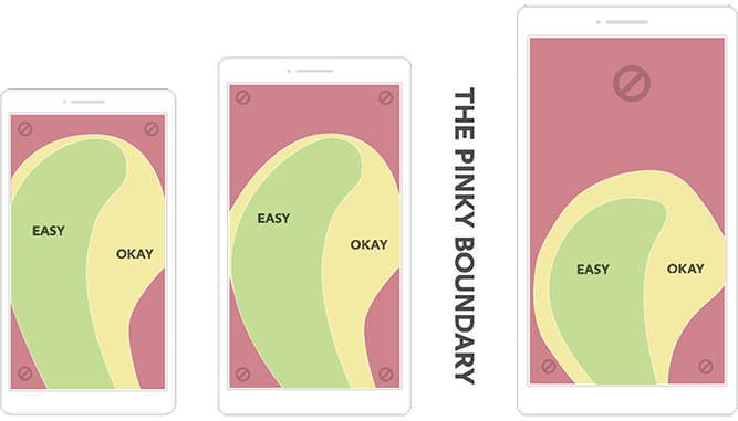
FIG 1.7: The size and shape of the thumb zone shifts when the phone’s dimensions require support from the little finger.
Even as swaths of the screen become unreachable by thumb alone, some thumb diehards stick with one-handed use, opting to “choke up” on the phone—sliding their hand higher to extend their thumb’s reach. On phablets, this grip gives people more thumb range overall than the traditional phone grip at screen bottom (FIG 1.8). We’ll look at the implications of this later in this chapter.
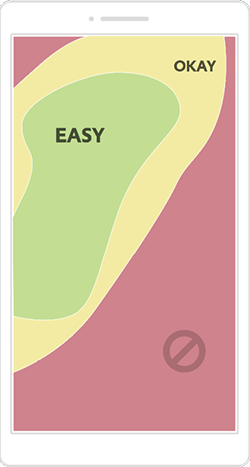
FIG 1.8: A higher one-handed grip on a phablet nets a bigger thumb zone, but the bottom half of the screen goes out of reach.
TABLETS: MORE SCREEN MEANS MORE HANDHOLDS
While phones and phablets stay true to three basic grips, there’s no such luck with tablets. More screen means more ways to hold, making things unpredictable. The rule of thumb still applies, but with a special headache: the thumb zone isn’t consistent even for individual devices; it varies depending on stance and posture.
Standing, we typically use two hands to manage a large tablet like the iPad, holding it halfway up the sides for leverage (hold it too close to the bottom, and the thing keels over). Some wrap an arm around it like a clipboard and tap with the other hand. More likely, though, we’re sitting; Hoober and Shank found that 88% of tablet use happens while seated, compared to 19% of phone use. Sitting at a table, we tend to prop up a tablet with one hand at the lower third and, again, tap with the other. Leaning back on the couch, we tend to rest the thing on the belly or nestle it in a blanket, tapping away with one hand. On top of these shifts in grip, each stance also affects how far away we hold the device: we tend to hold tablets closest while standing, and farthest while reclining. Portrait versus landscape is a mixed bag too, with a 60–40 split in favor of a vertical, or portrait, orientation.
As screens get bigger, they also get heavier, and we often lay them down altogether. Hoober and Shank observed that people put large tablets down in nearly two out of three sessions. We rest them flat on a surface (whether table or lap) 40% of the time and upright in a stand 22%. (Smaller 7″–8″ tablets are far easier to handle, and 69% of small-tablet use is handheld.) Those surface and stand positions suggest we use large tablets more like traditional monitor screens—or, closer to keyboard-touchscreen hybrids, which we’ll get to in a moment—than handheld devices.
The tablet’s thumb zone
When we do lift up our tablets, they prove too big to be held and operated with one hand, so two hands come into play. Here again, thumbs play an all-important role. We tend to grab tablets at the sides, and while the specific location wanders up and down, thumbs settle at the middle to top third of the screen. This grip makes the neighboring sides and top corners most friendly to touch (FIG 1.9). On the flip side, the top and bottom edges of tablet screens are hostile zones, because of the necessary reach. The bottom is especially tough, since thumbs are rarely near the bottom—and sometimes that portion of the screen isn’t even visible. In the laziest and perhaps most common tablet posture—lying down—the bottom bezel disappears into blankets, sweaters, or soft bellies.
We also, of course, often reach into the middle of the screen; as screen size grows, our hands field ever more surface. However, unlike a mouse cursor, which sweeps effortlessly across a screen’s sprawl, our fingers are weighed down by this thing called an arm. This meat pointer goes all the way up to the shoulder, and hefting it around the screen demands effort. An interface shouldn’t be a physical workout: group frequent controls within easy reach of thumbs. Nobody ever broke a sweat twiddling their thumbs.
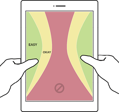
FIG 1.9: Because the tablet grip is typically at the side edges, the thumb zone changes completely from the phone’s.
HYBRIDS AND LAPTOPS: SLAP A KEYBOARD ON IT
If scaling up the screen size has such a dramatic effect on how we hold a device, it should come as no surprise that adding a keyboard shakes things up even more. Our postures, along with our hands and arms, shift yet again to accommodate the keyboard. Until recently, it was rare to spot this hybrid touchscreen-keyboard combination in the wild. And then came Windows 8.
In 2012, Windows introduced touch interaction to the desktop in a total overhaul of the world’s most-used operating system. In response, a new category of touch devices—touchscreen laptops and tablet-keyboard combos—flooded the consumer market, creating a new ergonomic environment…and fresh demands on designers.
The wrinkle is that hybrids require us to move our hands between keyboard and touchscreen. Before this generation of hybrids arrived, many dinged the concept as ergonomically untenable: shuttling hands to and fro would be too much effort, resulting in a fatigue dubbed gorilla arm. It’s a criticism leveled at the science-fiction interfaces of Minority Report and Iron Man too: Who wants to work with their arms constantly in the air? “Touch surfaces don’t want to be vertical,” a dismissive Steve Jobs said in 2010 (http://bkaprt.com/dft/01-08/). “It gives great demo, but after a short period of time you start to fatigue, and after an extended period of time, your arm wants to fall off.”
Research suggests such worries were unnecessary. A study by Intel found that people quickly embrace touch in these new devices, opting for the touchscreen 77% of the time instead of the mouse or keyboard (http://bkaprt.com/dft/01-09/). Despite the availability and precision of the old-school cursor, people said the touchscreen felt more intimate and direct. Other studies have documented this emotional resonance. One reported that people attach more value to products they “touch” on a website versus click with a mouse (http://bkaprt.com/dft/01-10/). When touch is introduced, cold pixels somehow take on the warmth and emotional investment of physical objects. We’ll look at this idea more deeply when we poke at gestural interfaces in Chapter 4.
Appeal aside, the touchscreen isn’t a complete mouse replacement, but rather a welcome addition to the mix—“like having a laptop with an extra gear,” one tester told Intel. With these hybrid devices, people move easily among touch, keyboard, mouse, and trackpad: whatever input seems most convenient. That’s a lot of back and forth, though, and you’d think that would only worsen the gorilla-arm problem. Why aren’t people’s arms going numb? Turns out people quickly figure out how to work the touchscreen without lifting their arms. A study by researcher John Whalen found that when we use touchscreen laptops, we rest our arms alongside the keyboard, keeping a loose grip at the bottom corners of the screen (http://bkaprt.com/dft/01-11/).
The hybrid’s thumb zone
This hands-on-the-corners posture defines the thumb zone for hybrids (FIG 1.10). Once again, placing touch targets within easy reach of the thumbs makes for easy tapping and, in this case, avoids the need to raise the arms.
FIG 1.10: The hot zone for thumbs on hybrid devices settles into the bottom corners, nearly opposite the hot zone for the index finger.
Not everyone adopts the bottom grip, though. Others (especially newcomers) go free-form, jabbing at the screen with their index finger as they roam the entire interface. For designers, this introduces a head-scratcher; the index finger’s hot zone is the reverse of the thumb zone. For index fingers, the center of the screen is easy to hit, and corners are troublesome.
Optimizing for thumbs means a subpar experience for the index finger, and vice versa. One layout has to win, though, and as with every other touch device, studies give the thumb the edge. After a bit of experience with the device, hybrid users soon prefer thumb use for everything, keeping arms planted alongside to thwart gorilla arm (FIG 1.11).
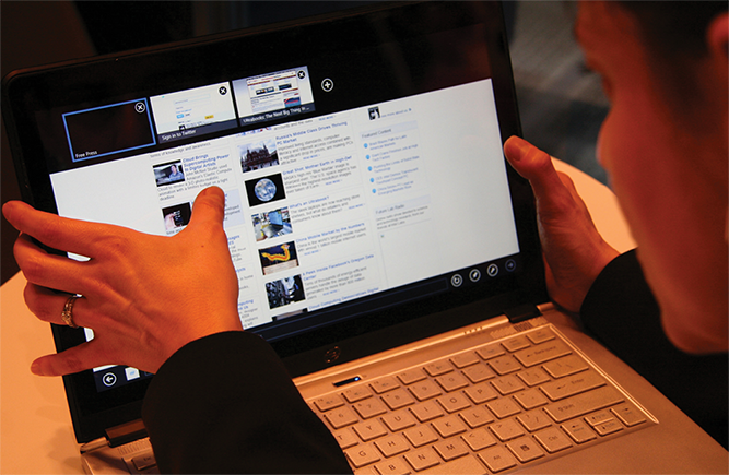
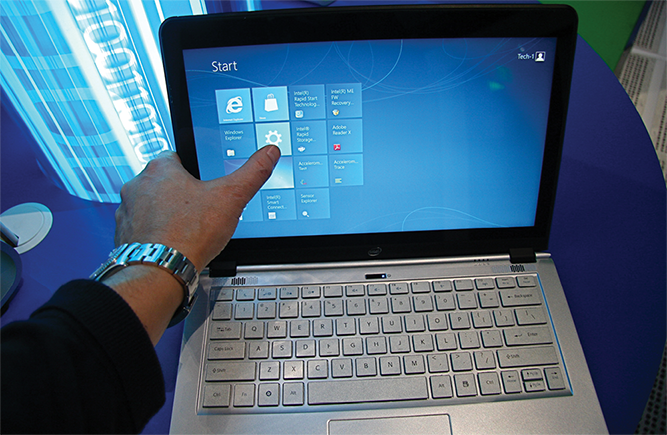
FIG 1.11: Expert users of touchscreen hybrids prefer heavy thumb use, even to reach deep into the screen. Photographs by Intel Free Press (http://bkaprt.com/dft/01-12/, http://bkaprt.com/dft/01-13/).
And that’s the most striking consistency across the form factors we’ve reviewed: thumbs do the driving no matter how large the screen. The thumb offers the most convenient range of motion with the least possible effort. This physical ease is exactly what Bell Lab’s researchers—along with every industrial designer ever—had to take into account as they designed their interfaces. These ergonomic considerations will determine the layouts for your digital interfaces too. We’ll start with some general principles for all touch designs, then dive into guidelines for different devices.
DESIGNING LAYOUTS FOR HANDHELD DEVICES
Congratulations! You now have a sturdy understanding of how fingers and thumbs fall on everyday gizmos. Time to turn that knowledge into know-how. The hand position—and, in particular, the thumb zone—tells you the most convenient locations to place controls and content. A few fundamentals hold true across device types.
The rule of thumb
With thumbs the primary pointers, this one’s a gimme: consolidate frequent controls into the thumb zones we identified earlier. Perhaps less obvious, it’s also crucial to consider what you place outside the thumb zone. Put some touch targets—like controls that change data—out of harm’s way by making them a little inconvenient. Which actions should be inviting, and which should challenge ever so slightly?
Beyond these matters of convenience and comfort, though, hands pose another physical consideration: you can’t see through them.
Hands block the view
So far we’ve focused on the toil of hands, but the eyes work too; they have to see around your clumsy mitts as you paw at the screen. “You’re a better door than a window,” my mother told me when I blocked the view. Your design has to contend with the same thing: your hands get in the way. This fact triggers a cascade of design implications.
Content above controls
Glance at any machine from recent centuries, and you’ll spot the results of a cardinal principle of industrial design: content always appears on top. Whether that content is a calculator display, a meter, or paper in a typewriter, it must appear above hand-operated controls so that fingers don’t cover the important stuff (FIG 1.12).
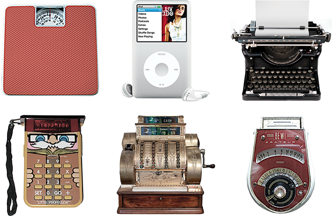
FIG 1.12: If the controls of any of these classic contraptions appeared above the “content,” your feet, hand, or arm would obstruct your work.
Until now, most digital designers haven’t had to deal with this. On the desktop, we’ve typically done the opposite of “content on top.” Desktop software puts menus at the top of the screen or window, and websites usually position navigation at the top of the page. We’ve gotten away with it, because the tiny cursor has run the show for decades, blocking only a few pixels as it flits across the screen. When you introduce touch, however, fingers and thumbs become the cursor, and they drag hands and arms behind them. It’s all too easy to lose the view.
Assume that people will lose sight of everything below an object when they touch it—and of the object itself. This affects how you label controls and confirm touches. In cursor-land, a button can highlight to indicate when it’s clicked. With touch, that color change doesn’t help anyone when it happens under a fingertip. Present that feedback confirmation above the touch instead. Text labels should likewise sit above controls.
Line of sight combines with ergonomics to dictate the layout of handheld touch interfaces. In particular, these physical constraints drive content to the middle and top of the screen, pushing controls to the sides, corners, and bottom. “Content above controls” is a simple enough rule, but it turns out to be tricky to follow, since the specifics vary according to screen size and platform environment. Operating systems and browsers stake out their own touch-friendly claims to screen space, and designers have to work around their choices. The rest of the chapter explores the caveats and implications for popular platforms and form factors, starting with the small screen.
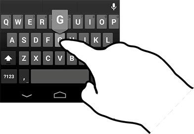
FIG 1.13: Most touchscreen keyboards flash the letter of the selected key above the touch, getting clear of the finger on the screen.
LAYOUT FOR PHONES
Fingers and thumbs turn desktop conventions on their head; this is literally true when it comes to small-screen layouts. Touchscreen phones flip primary controls like menus and navigation to the bottom of the screen. That puts tap targets in comfortable reach of the thumb, and content comfortably out of the thumb’s way. You see this pattern on iPhone, where tab bars and toolbars sink to screen bottom for quick access (FIG 1.14).
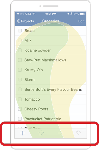
FIG 1.14: In iOS, toolbars anchor the screen bottom in convenient reach of thumbs.
But consider what’s not in the thumb zone. iOS convention positions Edit buttons in the upper right, well outside of the thumb zone—available, but only with a stretch. The reason is straightforward: edit buttons change data. Tucking them beyond easy reach is an example of defensive design, which helps people avoid mistaps or other actions they might otherwise regret.
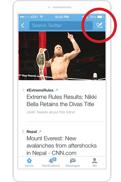
FIG 1.15: Twitter for iPhone banishes the Tweet button way off at top right, reserving the thumb zone for browsing and navigation—and avoiding unintentional tweets. (If only good layout could prevent ill-considered tweets, too, but you’re on your own there.)
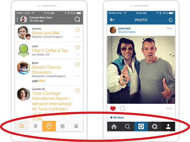
Not all data-changing controls have to be exiled from the prime real estate at screen bottom. When an app’s main task involves updating that data—and updating it again and again and again—those controls can settle back to the bottom. After all, good design optimizes recurring tasks to make them as ergonomically efficient as possible. The iPhone apps for Swarm and Instagram are useful examples, featuring the core action—checking in or posting a photo—at screen bottom, smack in the middle (FIG 1.16). Bonus: that centered position makes the button equally accessible to left and right hands.
So far, so uncomplicated. Then again, we’ve looked only at iPhone examples. The system-level controls for iOS disappear when you’re inside an app, so designers don’t have to compete for territory with the platform itself. The same isn’t true for other mobile platforms.
Make way for the operating system
When the platform elbows in to claim its own screen space, designers have little choice but to move aside, complicating our seemingly simple “content on top” guideline.
Android, for instance, beats app designers to screen bottom with system buttons hugging the baseline of every Android gadget. Android adheres to our rule of thumb, but those buttons are now locked in finger-baffling competition with app controls. If, as app designer, you follow your instinct to put controls below the content, you wind up stacking them atop Android’s system buttons (FIG 1.17). Cue mistaps.
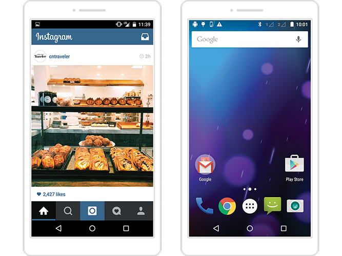
FIG 1.17: Don’t jam controls against Android’s system buttons (or any controls at screen bottom). Instagram (left) and even the stock Android homescreen make this mistake, inviting mistaps in this high-traffic zone.
It’s never a good idea to stack controls anywhere on a touchscreen interface; adjacent touch targets tempt wayward fingers and thumbs. Piling controls at the bottom compounds this mistake. For one, the high-traffic thumb zone makes tap errors likely out of sheer volume. For another, the hovering thumb limits screen visibility in that zone; mistakes come faster when you’re flying blind.
Alas, the fix is to place controls at the top of the screen, to avoid crowding Android’s system buttons (FIG 1.18). It’s not ideal: you have to stretch to reach the navigation, and when you do, your hand covers the entire screen. But these concessions are better than the bottom-stacking alternative and its inevitable mistaps. In a choice between inconvenience and outright error, inconvenience is the lesser evil.
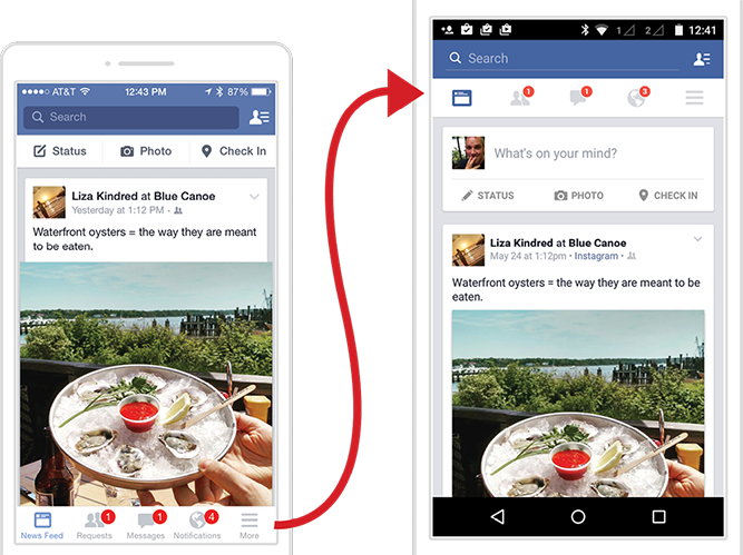
FIG 1.18: Facebook places navigation at screen bottom in iOS (left); in Android, the app shifts navigation to the top, steering clear of a traffic jam with Android’s system buttons. This in turn pushes the status/photo/check-in controls out of the toolbar and into the News Feed stream.
On small screens running Android, app navigation and controls should float to the top. This is what Android’s design guidelines require, reversing the convention for iPhone, whose physical Home button doesn’t create the same kind of competition as Android’s system buttons. Android further encourages designers to follow this pattern with the action bar, a standard navigation widget that always appears at the top of the screen.
So while “content above controls” always applies, it depends on who gets there first. For Android, it’s the operating system, and apps have to give way. In iOS, apps have freedom to claim the screen bottom...unless it’s a web app.
Make way for the browser
It’s an inconvenient fact that websites run inside an emulator we call a web browser. Put another way, websites are apps inside an app—a highly variable one at that. While browsers all do the same basic thing, the nuances in how they present web pages are a familiar headache to any web designer. In touch design, the headache pounds when you tally the ways browsers pour their own controls into the screen: buttons on the bottom, buttons on the top, buttons that disappear and reappear depending on how you scroll or where you are on the page.
This browser hodgepodge creates unpredictable UI competition with the websites within. In iPhone’s Safari, for example, browser controls live at the bottom edge, and pinning your site navigation there plops your controls atop the browser toolbar—the same problem we saw with Android’s system buttons.
Further complicating matters, the screen-bottom toolbar in mobile Safari and other browsers vanishes when you scroll down the page but reappears when you tap the bottom of the screen. If you try to tap a button or link there, you instead summon the toolbar, and your intended tap target skitters up and away, making you chase it with a second tap (FIG 1.19).
This brings me to a few sturdy design principles:
Don’t pin web navigation to screen bottom. Technical hassles conveniently reinforce this guideline. Web designers are accustomed to freezing onscreen elements in CSS using position:fixed. Trying this in mobile browsers, however, is a quick descent into madness, as fixed-positioning support is quirky and uneven in mobile. In some browsers, supposedly fixed elements shake and tremble when you scroll, others roll up the page and then snap back, and still others don’t respond to position:fixed at all. The resulting stomach acid isn’t worth the effort, since pinned navigation on phones is a bad idea to begin with.
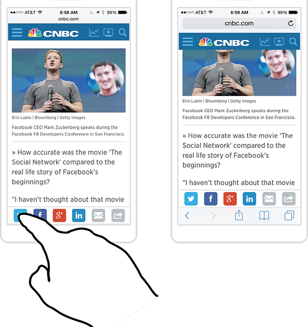
FIG 1.19: In iOS, tapping a link at screen bottom (left) conjures mobile Safari’s toolbar instead of activating the link. The page scrolls up to make room, and you have to chase the button up the page with a second tap.
Don’t pin web navigation to the top, either. Gluing a fixed toolbar anywhere on the screen is lousy on phones. Because the browser’s buttons already eat real estate, the last thing you should do is crowd out more content by cramming the top of the page with your own buttons. But phones are getting bigger and bigger, the gadget enthusiast argues. Surely we can spare the room for one measly toolbar?
While some screens have supersized, others have shrunk. We’re awash in tiny-screen smartwatch experiments, and some keyboard-bearing phones still carry postage-stamp screens. You can’t assume every screen has the generous dimensions of the most popular smartphones.
Even the biggest smartphones lose their ample height when you flip them into landscape, cutting some websites down to size. Before it was replaced with a responsive redesign, the mobile site for Barney’s department store fixed a logo and toolbar at the top. On most phones, this looked fine in portrait. But when you tipped into landscape, the content practically disappeared (FIG 1.20). Worse: if you tried to scroll by swiping on top of the logo or toolbar, nothing happened because they were fixed onscreen. You could scroll only by swiping within the sliver of content, a touch target tiny enough to be tough for clumsy thumbs. With so little available screen height, Barney’s old design failed.
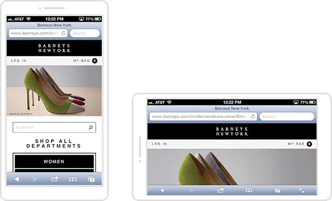
FIG 1.20: It’s barely a Blahnik! In Barney’s old mobile site, that gorgeous high heel in portrait turned into a miserable flat in landscape, squashed in a toolbar sandwich.
Putting aside a fixed toolbar, the top of the page is hostile for small-screen navigation even when you let it scroll with the rest of the page. When space is limited, don’t waste the top of the screen on housekeeping controls; get straight to the content. “Too many mobile web experiences . . . start the conversation off with a list of navigation options instead of content,” cautions Luke Wroblewski in Mobile First (http://bkaprt.com/dft/01-14/). “Time is often precious on mobile and downloads can cost money, so get people to what they came for as soon as you can.”
On the web, lead with content and confine primary navigation to page bottom. That’s page bottom, not screen bottom. If pinning controls to a fixed location on the page is poor form, the solution is to put them inside the page itself. To do so, Wroblewski champions a useful design pattern, which you can see at work at The Session website (http://bkaprt.com/dft/01-15/): the navigation appears to be tucked behind a button at the top of the screen (FIG 1.21).
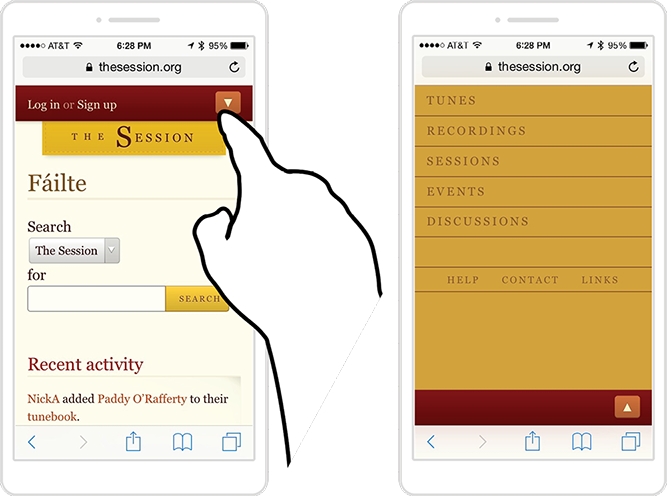
FIG 1.21: Tap the arrow-shaped menu button at the top (left), and the screen fills with navigation options. In fact, the button takes you to the navigation’s home at the bottom of the page.
The menu’s quick reveal feels like an overlay, but in reality, it’s an anchor link that jumps you to the navigation section at page bottom. Tap the arrow button or the browser’s back button to return to the top of the page. The essential markup couldn’t be simpler:
<a href=”#navigation”>Menu</a>
...
<ul id=”navigation”>
<li><a href=”/one”>Item one</a></li>
<li><a href=”/two”>Item two</a></li>
<li><a href=”/three”>Item three</a></li>
</ul>
This approach has several advantages, Wroblewski writes:
This design uses a minimum amount of navigation elements (just a single link at the top), gives people an opportunity to pivot and explore when they get to the end of content, doesn’t duplicate the content of another menu, and (best of all) only requires a simple anchor link to work. That’s right: no fancy JavaScript, overlays, or separate navigation pages to maintain—just an anchor that links to the bottom of the page. That’s like HTML 0.
HTML 0?!? But that’s like five HTMLs away from what I want! We all swoon from time to time for a bit of JavaScript-spiked interactive sugar. While I prefer the elegant simplicity of anchor-link navigation, where options conveniently appear as you finish the page’s content, others may find it too simple. If so, consider keeping the anchor-link markup, and use progressive enhancement to upgrade the menu to a more interactive experience. By providing JavaScript and CSS for supporting browsers, you can convert that navigation to an overlay that dissolves into place, or a panel that slides in from the side. For less capable browsers (or should the JavaScript fail to load), the navigation falls back to the anchor-link nav in the footer.
All together now
The simple “content above controls” rule gets complicated when the operating system or browser claims a phone’s premium real estate. In the end, though, it boils down like this:
- On iPhone, put app controls at screen bottom.
- On Android, put app controls at screen top.
- For the web, favor navigation at page bottom (not screen bottom).
Just as software platforms shift layout guidelines, so does hardware. We know handholds adapt to fit the shape, size, and weight of the gadget. So what happens to your interface layout when the touchscreen embiggens?
LAYOUT FOR PHABLETS
As screen size heads north of five inches, your layout has to accommodate the screen outside the thumb’s reach. Despite phablet users’ readiness to shift their grips to get at content, it’s our job to limit that extra effort as much as possible. Herding frequent taps into the one-handed thumb zone (the most constrained grip) is the best way to do this. Sharp readers—yes, you!—remember that even the one-handed thumb zone moves up and down the device as screen size increases. Though you can’t simply scale up your phone layout for phablets, some basics still apply.
For phablet apps, place navigation and frequent controls at screen bottom. No matter the handhold, the top of a phablet screen is always a difficult reach. As with smaller phones, follow “content above controls” to keep frequent tap targets within reach and out of the way of content. The exception is Android. Instead of piling all controls at the top as you would for smaller screens, opt to slide some frequent controls down to a separate toolbar at screen bottom (FIG 1.22). This is the split action bar design pattern, which was originally developed for tiny screens but is now proving useful for jumbo gadgets.
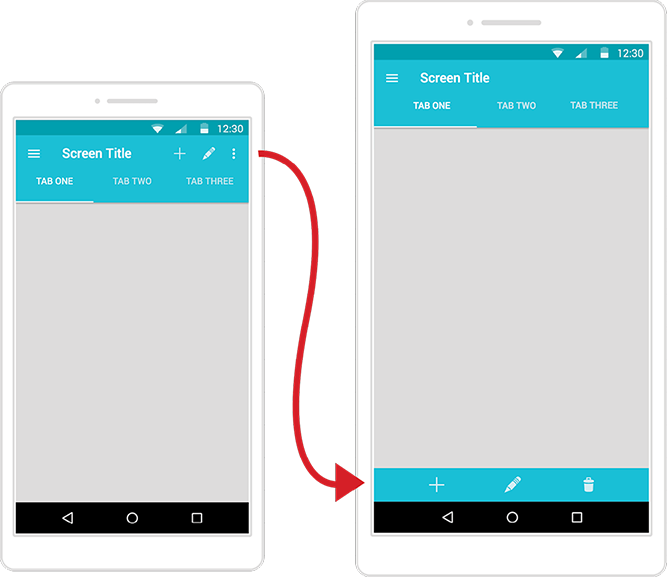
FIG 1.22: By default, Android’s action bar consolidates all navigation and options at the top of the screen (left). The split action bar (right) moves action icons to screen bottom, providing easy thumb access on phablets.
This still isn’t great. Stacking controls on phablets invites the same mistaps as it does on smaller phones. Since it’s nearly impossible to reach top screen controls one-handed, however, moving the controls into range is worth the risk. At least thumb tappers can reach the buttons in the first place. As noted earlier, platform pressures constantly force designers to compromise. When in doubt, the lesser evil is always the option that at minimum allows basic access.
A floating trigger button is a useful workaround. These buttons nest in the screen’s bottom corner, hovering in place as the rest of the page scrolls past. You can use a trigger button for a screen’s primary action—“add a photo,” “check in,” “new message”—or morph it into a mini toolbar or radial menu of related actions. (You’ll learn more about radial menus in Chapter 4.) When I led the design of Entertainment Weekly’s responsive mobile website, we used a floating trigger button to offer quick access to sharing tools across screen sizes (FIG 1.23). Tap the button to reveal a toolbar of options.
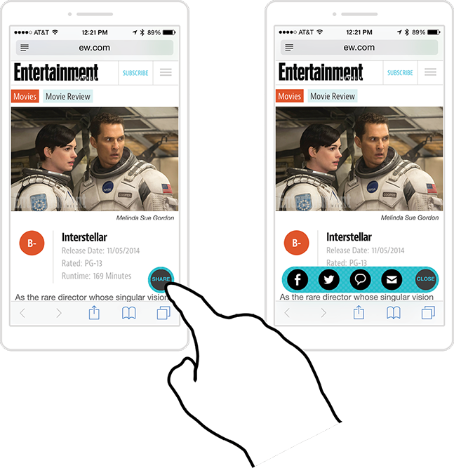
FIG 1.23: On Entertainment Weekly’s mobile site (http://m.ew.com), a floating trigger button (left) expands to show sharing options (right).
Wait, shouldn’t we avoid stacking controls at screen bottom? Yep, this is another compromise to bring phablet controls within reach. The good news: a small, expanding button lessens the stacking penalty of a full-width toolbar. In Android’s UI lingo, a trigger button is called a floating action button (FIG 1.24); check out Android’s design guidelines for more on button-spacing (http://bkaprt.com/dft/01-16/).
FIG 1.24: A floating trigger button, like the action button at bottom right, lets you include one or more primary actions at screen bottom without conflicting with Android’s system buttons.
Alternatively, show visual controls at screen top, with fallback interaction below. A second thumb-friendly option for phablets is to keep tab controls at the top but supplement them with swipe navigation in the main canvas below (FIG 1.25). This pattern works well for navigating content that is organized into tabbed views. People can reach for the tabs to switch views, but for jumbo screens, it’s more convenient to swipe the content directly. The popular pull-to-refresh gesture offers similar benefits, allowing you to tug down from anywhere on the screen without reaching for a button.
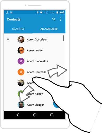
FIG 1.25: Contacts in Android offers swipeable tabs. Reach up to tap the Favorites or All Contacts tab, or swipe anywhere on the screen to move between the two. (Tabs are a standard component in the Android operating system, and swipeability is baked in for easy use by developers.)
For web navigation, stick with the anchor-link menu pattern. The technical limitations and competition with browser controls at play on small screens apply to phablets too. The best fix is a menu link at the top that jumps you down to navigation at the bottom. Admittedly, the menu link’s top-corner position is well outside the thumb zone, but that matters less than you’d think. I see this all the time in user research: people turn to main navigation as a last resort, when they can’t find what they want in the body of the page. Which means placing navigation at page bottom delivers it when it’s most needed (without any thumb stretching).
Avoid the cross-phablet stretch. Most mere mortals don’t have thumbs that can reach clear to the other side of a phablet: the left side of the screen is outside the right thumb’s striking range in one-handed use. Avoid tap targets that hug the left or right edge too tightly. In the main body of the page, favor targets that stretch at least a third into the screen—or even better, full width.
But don’t scale up gesture sizes along with screen size. Say that an interface lets you swipe across a menu to reveal actions. Use the same swipe distance you would for a phone—don’t make people span the entire phablet to trigger a feature. Just because you wield a giant phone doesn’t mean you have giant hands; size gestures to the hand, not the screen.
Move mountains. Most interfaces are fixed landscapes that we sweep across. We move to the buttons; they never come to us. But it doesn’t have to be that way. Samsung created a special One-handed Operation mode for its jumbo Android phones (FIG 1.26). When you turn on the feature, the interface shrinks to a regular phone size, everything within range for one-handed thumb tapping. In effect, you temporarily turn your big phone into a small one. Unfortunately, that huge gorgeous screen goes unused, undoing the reason for having a phablet.
Apple took a different approach in iOS with a feature it calls “reachability” (FIG 1.26). Touch the Home button twice, and the interface slides down so that the top half of an app moves to the bottom half of the screen, bringing it within thumb range, and springing back when you’re done. This makes top controls as easy to hit as if you had shifted your grip higher on the phone, without the effort. Another advantage: unlike Samsung’s take, this sliding approach doesn’t alter the size or layout of the touch targets.
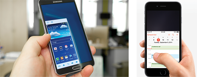
FIG 1.26: Samsung’s one-handed mode (left) shrinks phablet UIs down to manageable phone size, while Apple’s Reachability feature (right) slides the top of the screen down within reach. Left photograph by Kārlis Dambrāns (http://bkaprt.com/dft/01-17/); right photograph courtesy Apple (http://bkaprt.com/dft/01-18/).
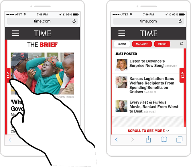
FIG 1.27: Time (http://time.com) offers a side tab that slides open a drawer full of recent news items when you tap it.
While these solutions from Apple and Samsung are at the operating-system level, websites can put sliding panels to use too. Instead of sliding the interface up or down, though, a more practical tack in web pages is sliding a menu drawer in from the edges. A small button or tab in the thumb zone conjures the menu, its options convenient for one-handed use (FIG 1.27).
A caveat: the side edges are outside the comfortable thumb zone for phablets, though still much easier to reach than the top. (You can sidestep this cross-device reach by also letting people swipe the screen to slide the drawer open in a fallback interaction.) In general, side controls make more sense for two-handed use, which is why they’re most successful on larger tablets. That’s our cue to bump up to the phablet’s big sibling.
LAYOUT FOR TABLETS
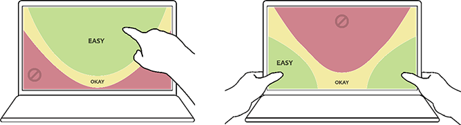
Layouts for large tablets depart sharply from smaller screens. While phones and phablets prefer screen bottom for frequent touch targets, tablet thumb zones move up and out, favoring the sides and top corners (FIG 1.28). As the top of the screen becomes more important for touch, this aligns with the visual experience too. The bigger the screen, the harder it is to take in the whole thing at a glance, as we can on a phone, and so our eyes—like our thumbs—naturally land on the top half of tablets. The design’s information hierarchy should reflect that.
FIG 1.28: iPad apps Instapaper (left) and Twitter both show good alternative placements of controls in the tablet thumb zone.
While the top corners are great for frequent touch targets, the top middle is outright hostile. Reach aside, the top middle demands that you cover the screen and all its content. The now-defunct iPad magazine The Daily offered a sliding scrubber bar at top center to scan through the issue’s pages (FIG 1.29), but when you used it, the hand covered the thumbnails. You had to resort to weird contortions to even see the issue covers while working the slider.
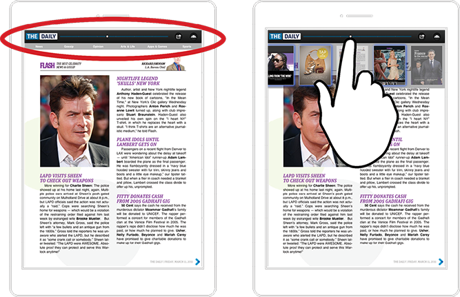
FIG 1.29: The Daily’s scrubber bar reveals page thumbnails, only to have your finger block them from view. As with most touch interfaces, the center top of the screen is a poor place for controls.
The Daily’s misstep kicks up an exception to the top-corner guideline for tablet controls. In some cases, controls should go to the bottom edge, even though the bottom is the most unfriendly region of tablets for both touch and visuals. This exception is necessary when you need to see the effects of those controls in the main canvas. When controls browse or change content, place them below or to the side of that content, never above.
The Sydney Morning Herald’s iPad app, for example, has a novel way to scan all articles in the day’s issue by dragging your finger along an index of page indicators at screen bottom (FIG 1.30). That control reveals a tall list of headlines, so it’s an acceptable compromise to place those controls at screen bottom; if the controls were at the top, your hand would cover the list when you touched them.
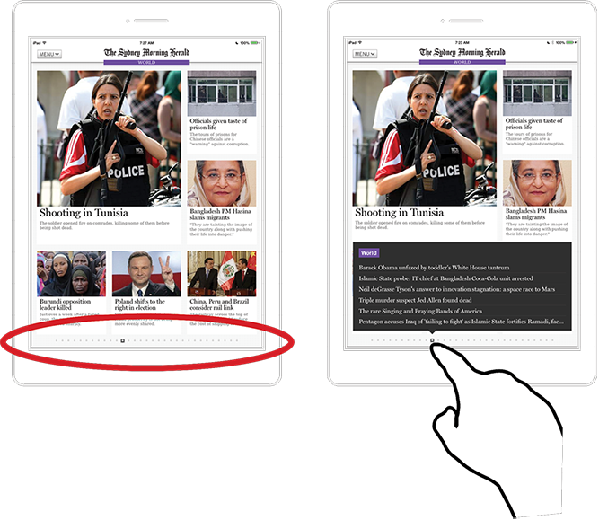
FIG 1.30: The Sydney Morning Herald’s iPad app lists the page’s headlines when you tap the page-indicator dots at screen bottom. The control’s position leaves the headlines unobscured.
So do tablet controls take top or bottom? Split it like so:
- Top corners are ideal for navigation and one-tap tools for actions like sharing, favoriting, or deleting.
- The bottom edge is acceptable for controls that browse or preview content in the canvas above. (If room allows, however, the better bet is to place these tools at the edges, which also keeps hands and fingers out of the way.)
LAYOUT FOR LAPTOPS AND HYBRIDS
The bottom edge becomes far more friendly when your touchscreen stands upright and sprouts a keyboard. The hybrid/laptop thumb zone favors the bottom edge and corners, and your layout should too.
Cluster primary controls and gestures at bottom corners and sides. This ain’t the way we usually do it, right? Most widescreen designs traditionally pin primary controls like navigation and toolbars at the top or middle of the screen, an area well outside the crucial thumb zone. Touch forces us to reevaluate. The best touch-optimized Windows apps, for example, shift frequent controls from screen center to edge regions: swipe from the right edge to pull out the Windows action bar, and swipe up from the bottom to surface the task bar (FIG 1.31).
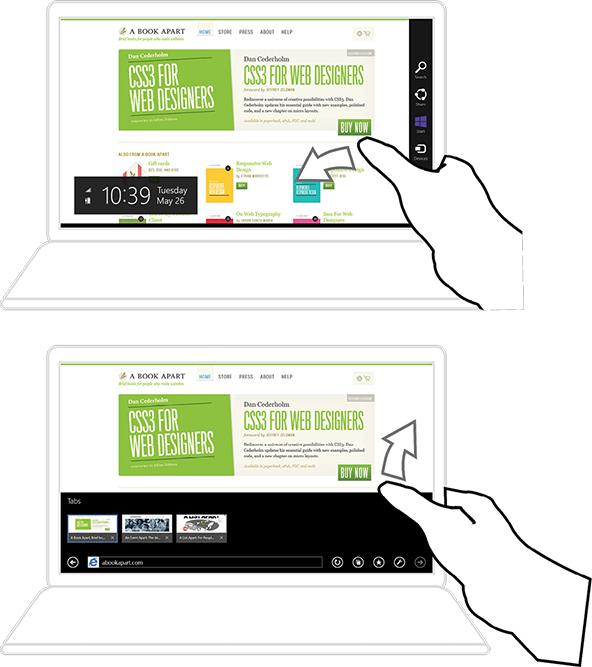
FIG 1.31: Windows system gestures optimize for hands at rest at the bottom corners. In Windows 8, swipe from the right edge (top) to summon the Charms bar—replaced by the Action bar in Windows 10—or swipe up from the bottom to summon the task bar.
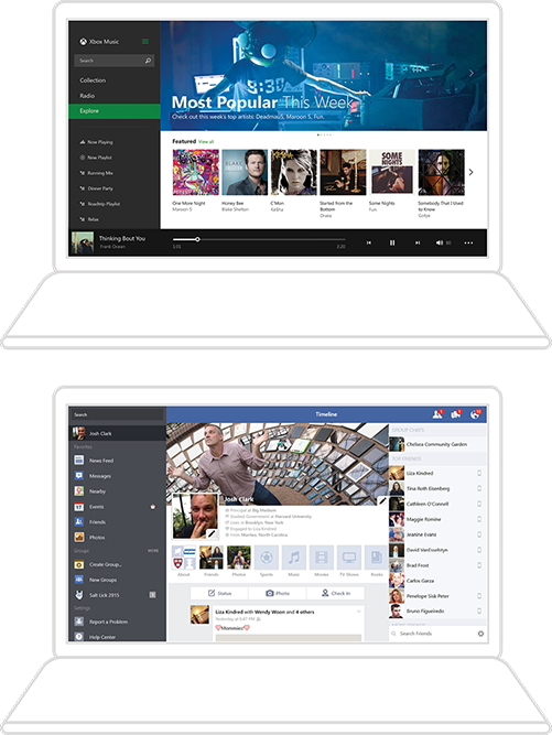
When they don’t organize primary controls in these offscreen drawers, well-behaved Windows apps align those controls along the left or right side, or across the bottom. Facebook for Windows arrays main navigation along the left edge and the chat sidebar along the right. The Xbox music app places its player controls on the bottom. In each case, primary controls are within easy reach of corner-dwelling thumbs (FIG 1.32).
Bottom-heavy works fine for native apps, but it’s more complicated for the web. Browsers are clueless at detecting what kind of input device they’re dealing with. There’s no reliable way to find out if a device has a touchscreen, a keyboard, a mouse, or some combination of all three. In other words, the browser has no idea if it’s running on a tablet, hybrid, or laptop. Native software gets much more information about the device at hand, so native app designers can do much more to tailor the touch experience to the device.
We need new web-design techniques to hedge for all types of large-screen displays. There’s nowhere to go but up: most widescreen web layouts are not yet optimized for touch on any of these devices. That’s because many of us still operate under the assumption that widescreen means desktop, and that desktop means mouse and keyboard. Both assumptions were leaky to begin with, but with tablets and hybrids they’ve stopped holding water altogether. As a result, widescreen websites challenge our clumsy fingers and thumbs with small touch targets for links and <select> menus, or they lean on hover interactions that can’t be triggered by touch at all.
We need to change the way we think about designing for larger screens. We need to change our thinking about screens, period. They deceive and distract us. What we think we know about screens often takes our designs in the wrong direction. Turns out that pixels don’t work the way most of us think they do, screen size has nothing to do with touch, and browsers don’t even know what gadgets are connected to them. This makes it tricky to adapt reliably to the physical demands that have been the focus of this chapter. The trouble for touchscreen designers is less in those mechanics than in the mechanism—the screen itself.