
If you don’t test whether your accessibility efforts work, there’s not much point in making the effort in the first place. Without testing, we can’t tell how our site will hold up when used by real people. The success of a product will depend on whether the target audience is able to achieve their goals via their chosen technologies. These goals can therefore be used as success criteria against which the product can be tested.
Making a Plan
Whenever you test or evaluate a product, you should do it against a test plan. A test plan will help you make sure you get something out of your tests, whether you’re doing a formal test against standards criteria or running through tasks with a test participant. It will also make sure your tests fit in with your overall product plan. Overtesting is unlikely to be an issue, but undertesting could make you miss problems with your site.
Your testing document should contain:
- testing methods to be used, and when they’ll be used in the process;
- how the testing methods will support the production team’s progress toward the usability targets;
- how the test results will be documented; and
- how the test results will be fed back into the process to improve the product.
While testing is underway, keep track of any decisions you make in how you approach and conduct your tests. Writing all these decisions down will help you and others remember what worked well. When you make decisions, pay attention to how your choice of testing methods and testers could bias your results.
Heuristics and Analysis
Heuristic testing—the quickest way to get started—means testing against existing goals and guidelines, often conducted by the people already working on the project. It may involve prototype evaluation, code reviews, and automated tests.
Reviews of early designs and prototypes
These reviews might take the form of heuristic evaluations or cognitive walkthroughs.
Heuristic evaluations test an interface against a set of guidelines such as the WCAG, but may also take into account any common issues that aren’t covered by the WCAG. If you’ve got your own accessibility policy, test your site against the policy’s criteria. Otherwise, the WCAG 2.0 criteria cover a lot of broad use cases.
Cognitive walkthroughs test the interface against specific tasks, trying to attempt a goal in the same way a user would. These walkthroughs could also emulate a particular setup, such as someone trying to accomplish tasks using assistive technology.
Code reviews
Code reviews can be valuable early on in the process to help identify potential problems with code. Use code reviews on finished code to assess quality and consistency issues that might not be picked up during user testing (since users aren’t exposed directly to the code).
Automated tests
Although automated testing alone isn’t enough, automated tests can ensure that your code conforms to a project’s standards criteria. When you’re planning for automated testing, be aware that not all WCAG criteria can be programmatically verified, since many criteria focus on user experience.
Conduct automated tests near the end of production—when the code is production-ready, but there is still enough time to fix problems before the site goes live. Léonie Watson recommends including a tool like Tenon API (http://bkaprt.com/afe/06-01/) in your build process because it can catch issues long before your codebase reaches production readiness.
Twitter uses automated accessibility tests as a part of its build process as well. If a developer’s code breaks the accessibility of the product, the automated test will fail and the developer is unable to deploy their work. Todd Kloots, previously a senior front-end engineer of platform at Twitter, told me he used these tests as developer education: if a developer doesn’t understand why their code is failing one of the accessibility tests, Kloots had the opportunity to spread accessibility knowledge a little further.
Device and Browser Testing
Device and browser testing involve testing your site across combinations of devices, operating systems, and browsers. Testing across these different conditions is a key part of accessibility testing.
It’s tempting to test in your favorite browser and just hope it works in all the rest—but it probably won’t. As we’ve seen, the web can be accessed from an incalculable array of devices, which makes it important to test on as many different devices and browsers as possible.
Choosing your testing suite
Ideally, we want our site to work with every device under the sun. However, we can realistically only test on a finite number of devices during the development stage, so it’s sensible to have a list of priority devices and budget for additional devices as needed.
You need to be able to justify the devices, browsers, and assistive technologies you’ve chosen for testing. Did you choose them because of their market share? Their popularity among your existing users? Just because they’re what you had lying around? What did your user research show?
It’s impossible to test on everything, but ideally you should test with:
- desktop computers running all major operating systems (Mac OS, Windows, Linux);
- the latest version of all major desktop browsers (Opera, Safari, Firefox, Google Chrome, Internet Explorer, Microsoft Edge, Brave, or whatever’s trendy nowadays) on default settings;
- mobile devices running all major operation systems (iOS, Android, Windows Phone);
- major browsers across those mobile operating systems (Safari, Firefox, Google Chrome, Opera Mini);
- assistive technologies including screen readers (JAWS, NVDU, VoiceOver, Window-Eyes, Windows Narrator, ZoomText);
- keyboard navigation; and
- a selection of prominent accessibility settings provided by the operating system and browser, such as zoom and screen magnifiers.
Virtual machines
Virtual machines such as VirtualBox and Vmware enable you to test other browsers and platforms by installing different operating systems on your computer. This can be very valuable if you’re trying to test a legacy setup like Internet Explorer 7 on Windows XP, or to test a new operating system when you can’t afford new hardware.
However, you should be wary of treating virtual machines as real devices. The hardware is still your computer’s hardware, so it may work in a way that’s less than ideal or just plain different (especially if you’re running hardware with a mismatched operating system, such as testing Windows on a Mac). For example, the Windows key on the Microsoft keyboard is used for the Start menu or system-wide shortcuts. The “⌘” or Command key in the same location on the Apple keyboard is just for shortcuts, in a similar way to Microsoft’s Control key.
If testers aren’t aware of the mismatch between hardware and software, they’ll find the product harder to use, regardless of how accessible it is.
Using a testing matrix
In a wonderful article on A List Apart, Anne Gibson recommended following a testing matrix with a list of outputs along the top and inputs along the side (http://bkaprt.com/afe/06-02/). The corresponding boxes should then be filled out as you test with each combination of input and output. The matrix is a great way to ensure your testing is thorough and takes many different setups into consideration (Fig 6.1).
Going the extra mile
If you come across issues during testing that are down to assistive technology or browser quirks, consider providing a fix for the problem rather than blaming the technology for the brokenness.
For example, imagine that the placeholder attribute is being used in form input fields to give a hint on how to fill in the field. But when the user selects that input, the placeholder text vanishes to make way for the entered text. If the user can’t remember the placeholder hint, they have to deselect the input so the placeholder shows again inside the input. This default behavior is less than ideal, and we might be tempted to dismiss the problem as “just how the browser works.” However, there are several solutions to take that placeholder text and move it outside the input when the input is selected, giving the user a chance to fill out the form field with the hint text alongside. Brad Frost has written up a great Float Label Pattern to do exactly that (http://bkaprt.com/afe/06-03/).
Going the extra mile to solve problems like vanishing placeholders is part of embracing challenges to find creative solutions. Accessibility isn’t about passing a test or ticking a box; it’s about making great experiences.

Fig 6.1: The testing matrix ensures you don’t miss a specific combination of input and output. Your testing matrix should be bigger and better!
Validators and Checkers
There are many quick testing tools for flagging problems that might hurt the user’s experience, or cause your site to render in an odd way in the browser. These validators, emulators, and checkers can be used during the design and build process to avoid common snags—whether you’re writing content or code, or designing interfaces.
Validators
If you’ve developed websites, chances are you’ve used validators to check that your code is valid. You paste in your URL or code, and the validator assesses it and presents you with a list of results for that page. The validator usually grades your work, telling you either that it’s valid or has errors (and sometimes warnings).
However, validators have a very strict approach to reading markup. They don’t understand the nuances of your code, or the reason you chose to use one HTML element over another. Everything is graded as wrong or right.
For this reason, validators are often better as a quick test to catch straightforward problems—code-typos, missing closing tags, and other small front-end errors—before a human who understands the context of your project makes a full assessment.
It’s perfectly acceptable for your code to fail validation, as long as it fails for a good reason—like vendor-specific prefixes or browser-specific hacks.
W3C
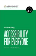
The most well-known validator is probably W3C’s markup validation tool (http://bkaprt.com/afe/06-04/), also known as the HTML validator. Among other warnings, it will inform you if you’ve missed a closing tag, quote mark, or required attribute, and if you’ve used an element where it isn’t allowed, or an element or attribute that doesn’t actually exist (Fig 6.2).
Fig 6.2: Using a meta element with a value isn’t valid HTML, but it is the format Twitter understands for its summary cards.
Sometimes the errors reported by the HTML validator can be difficult to understand—“literal is missing closing delimiter”—but, fortunately, a page on the validation website helps explain the errors in plain English (http://bkaprt.com/afe/06-05/). (“Literal is missing closing delimiter” usually means you’ve forgotten a closing quotation mark.)
WebAIM’s WAVE
When it comes to specialist accessibility validation tools, nothing beats WebAIM’s WAVE web accessibility evaluation tool. WAVE uniquely presents the original page with icons and indicators that draw attention to accessibility errors, features, and alerts. Its focus is on helping humans evaluate web pages while also educating them about accessibility.
When you paste your URL into WAVE, it tests your markup against the WCAG guidelines. Much like the W3C HTML validator, WAVE shows you a list of errors. However, it also shows you alerts, accessibility features, structural elements, HTML5 and WAI-ARIA features, and contrast errors on your page (Fig 6.3). It’s a nice boost to get recognition for the effort you’ve put into the accessibility of your site, even if it’s from a bot!

Fig 6.3: WAVE results for the Ind.ie site showing “2 X Linked image missing alternative text”. I better go fix that…
If you want to test a local URL, or a site that’s password-protected, you can use the WAVE toolbar for Firefox or Chrome. WebAIM is currently working on a toolbar for Microsoft Edge, too.
Color contrast checkers
Color contrast checkers are a great way to make sure the contrast of your text color is readable against the background for the majority of readers, particularly those with visual impairments and color blindness.
These checkers tend to follow a similar pattern: you enter a foreground and background color and the checker tells you if they’re accessible according to the W3C color-contrast ratio guidelines. Many will show you your colors in action. Some will tell you if your color palette conforms to WCAG AA or AAA levels (we’ll more look at WCAG in the next chapter). And one in particular, Color Oracle (http://bkaprt.com/afe/06-06/), will overlay the whole screen with a color filter to simulate different types of color blindness.
Readability checkers
Readability checkers test your copy for ease of reading, and usually rate the overall copy on some kind of scale, such as a school grade level. As these tests are automated, they can’t replace a real person in judging whether the text is easily understood, but they can provide a rough idea of difficulty. See Resources for readability checker recommendations.
Emulating connection speeds
As mentioned earlier, technology professionals tend to enjoy much better connection speeds than average. It can be hard for us to understand how frustrating and unusable a slow site is when we’ve got blazing fast broadband. Connection emulation tools can throttle the speed of your internet connection to mimic mobile and other poor connection speeds. Usually tools mimic a poor connection through a proxy connection—though developer tools at the operating system level can tailor the whole native experience. See Resources for recommendations.
Testing Keyboard Navigation
It’s not hard to test how easy your site is to browse using keyboard navigation. Most browsers just require the Tab key to move between interactive elements. Some browsers use a combination of the Tab key and a modifier key (such as Alt or Ctrl), or the Left and Right cursor keys, to move between all elements on the page. This is useful when navigating using a screen reader.
To access all elements on the page, you may have to enable a full-keyboard access setting in your operating system preferences. If you’re using VoiceOver on macOS, you can use the interactive training tour available from the Accessibility panel in System Preferences to familiarize yourself with the common controls (Fig 6.4).
Remember, we can’t make assumptions that someone using a screen reader is using keyboard navigation. Screen reader output and keyboard input should be tested both together and separately.
Usability Testing
Testing with people who are likely to use your site is the best way to gauge accessibility—it’s the closest you’ll get to tangible scenarios.
Much like at the user research stage, it’s best to conduct usability testing with people representative of your target audience and ask them to attempt to perform tasks based on your product’s defined user goals. While it can be easy to test early designs and prototypes with many users, people with visual impairments, or people who rely on keyboard navigation, may find it difficult to interact with prototypes before they involve production-level code, so you’ll need to factor this into your testing plan.
Try your best not to test with people who are working on the project: they will likely fail to notice the problems that might hold up other users, may not be part of the target audience at all, and are likely to have conflicting goals with other users. How the intended audience really interact with a product is often different from the assumptions of a team who may know the web much better and are much more familiar with the product itself.
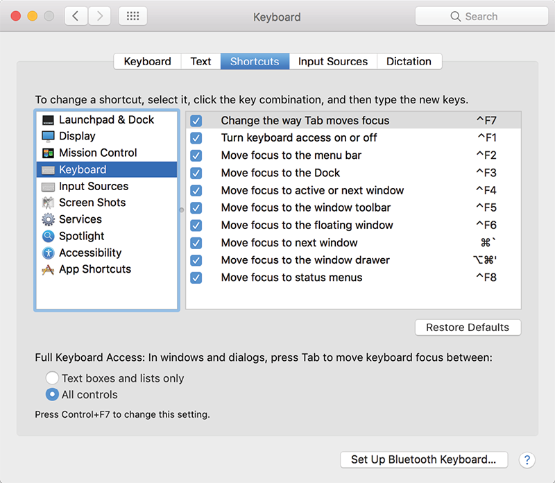
Fig 6.4: Keep in mind that screen readers can change these default keyboard commands. Léonie Watson has written a simple explanation for understanding screen reader interaction modes on her blog (http://bkaprt.com/afe/06-07/).
Finding participants
Finding participants for testing your product is similar to finding participants for user research at the start of a project. As we discussed in Chapter 3: always include people with disabilities and impairments in your testing group, and test in person to see how people use your product in context.
Choose testers who are accustomed to using the technologies they’re testing with—that way you’re testing the usability of your product, not their comfort with screen readers or keyboard navigation. In Just Ask: Integrating Accessibility Throughout Design, Shawn Henry explains:
Find people who are fairly experienced using products like yours. If people use assistive technologies with your product, you probably want people who are skilled with their assistive technology. Later in testing, you might want to include some novices, but early on you want people who can teach you well.
Testing with people who use assistive technology every day will be more thorough, and will prevent you from making decisions based on potentially false assumptions about how assistive technology is used.
Be cautious when categorizing users based on their disabilities. As we explored in Chapter 2, there is such a range of ability, experience, and preferred technology setups that we can’t possibly find a fully representative or comprehensive group of people covering “disability.” The best we can do is work with a variety of users every time we test.
Léonie Watson reminds us to find people from our target audience for accessibility testing, not just choosing any participant because they have a disability:
If you’re building an app for teenage girls, there’s no point in asking a forty year old [sic] man to test it just because he happens to use a screen reader. In the same way his attitude and skills will be different in general, his ability to use his assistive technology will also be different from someone twenty-five years his junior.
Decisions about the number of test participants usually comes down to expense, as participants are often paid for their time, and the team members running the tests may only have limited time. Small samples can end up with erroneous results. Larger, more expensive sample sizes might increase your confidence in the test results, though there may be diminishing returns, as the most critical usability problems are often discovered by the first few testers.
Running tests
Just as we discussed in Chapter 3, finding a facilitator to run tests can feel challenging, but it’s doable. Whether your project budget is large or small, there are plenty of user research consultants and agencies who know how to help, and you’ll want to work with someone who can get along well with the participants, be patient, and not lead them to complete tasks in a particular way.
It’s especially difficult to be a facilitator if you’re the designer or developer on a project. No matter how secure we are in our abilities, we don’t like to see our work not succeed. We may be tempted to give the participants clues to make up for the failings in our prototype. If there isn’t anyone on your team who can facilitate usability testing, then it’s worth looking for outside help to ensure your prototype gets tested in an objective way.
You also need someone who can observe and document the test. Recording video or audio is very useful, as you can refer back to it later and don’t need to worry about remembering every little detail (note that recording video or audio typically requires signed consent forms). Taking notes is also important—notes can help you remember when and where significant events occurred, and help you quickly locate these events in your recorded footage.
What to look for
Usability testing usually focuses on observing a user interacting with your product. The product could be anything from a robust prototype (you don’t want anything that’ll break too easily during testing!) or nearer to a finished site. Choose testing scenarios that reflect real-world use cases and involve tasks essential to the success of the product.
The benefits you’ll get from a usability test depend entirely on how well you prepare beforehand, and how much attention you pay during the test. Scripting questions and tasks can help you focus on the participant and keep the session on course. It’s also vital that the wording of your questions and tasks do not lead the participant towards a specific approach.
When the participant is working through the task, try to record the following:
- What are the participant’s expectations? Do they already know your site? If they do, how does that impact their choices? If they are familiar with your site, perhaps follow a scenario familiar to them.
- What are the participant’s first impressions? How do they approach the task? What are their initial reactions to the site?
- How does the participant flow through the task? What is the context of the scenario? How does this relate to their everyday experiences? One task at a time makes it easier to follow for both you and the participant.
- What is the participant saying and doing? Are they describing one interaction but doing something different? Are they using any particular terms and phrases to describe their interactions?
- Does the participant find any problems with the site’s accessibility? Discussing any accessibility issues you come across in context is vital to understanding how the issue affects the completion of the task at hand, and how the issue may impact other areas of the site.
These are just a few suggestions that don’t vary much from your garden-variety usability test. Just Ask—Integrating Accessibility Throughout Design also provides a practical guide to planning, conducting, and reporting usability tests with a focus on users with disabilities (http://bkaprt.com/afe/06-08/).
Ongoing Testing
Testing doesn’t end on launch day. Ongoing testing keeps accessibility at the forefront of everybody’s minds when it’s time to make post-launch decisions about the site. It also prevents a product from becoming less accessible over time as more and more changes are made. Test to find problems with your site, and then test your solutions. Don’t just assume you’ll find the right solution the first time.
Consider adding a short form to your site for ongoing testing. A simple, obvious feedback mechanism for site visitors can be a low-cost way of involving real users in testing. When you tell users that their contributions are valued, they are more likely to review and assist you in the accessibility of your product. Keep your accessibility policy in view as you assess feedback, though. All feedback should be read, replied to, and taken on board, but make sure you don’t allow the feedback of a single person to divert you from needs more broadly expressed by your target audience.
Twitter has a simple feedback mechanism in their @TwitterA11y Twitter account for accessibility feedback. The @TwitterA11y account is also used to broadcast new features and potential problems (Fig 6.5).

Fig 6.5: Have you enabled image descriptions on your Twitter settings yet? No? Go do it right now, you’ll be learning to write great alt text in no time…
Testing is really another kind of research. Testing isn’t what you do at the end of a project to prove that you’re brilliant at your job—it’s the beginning of another iterative cycle in your project’s life. Test early and often, and then test again. Regular testing will reassure you that you’re heading in the right direction, or give you new targets if the accessibility falls short.
Testing can be frustrating and difficult to face as it challenges your existing assumptions about your product and its users. But it will ultimately make your product better, and you more well-informed in your future work.
Earlier in this chapter we looked briefly at how to test against standards and guidelines to generate benchmarks to aim for. But standards and guidelines aren’t just nice ideas about accessibility, sometimes they’re legal or regulatory requirements that need to abided by. We’ll look at those next.