
Appendix A
Chapter 2 introduced you to the concept of a “brand book” for HR. I mentioned there that we created a brand book for employees (at Shutterfly) and that it was one of the smartest things we did. The authors and publisher felt that it would be helpful for you to see an instance of a brand book for employees and that there would be no better way than to show you the current version of the brand book used at Shutterfly. There is nothing like a great example. In this appendix, we have reproduced the brand book used for employees at Shutterfly with their kind permission. The copyright remains with Shutterfly, but you should be looking at it for inclusiveness and organization, so that you can create your own brand book for all of your internal messaging and consistency of the brand, voice, mission, and expectations from hire to retirement.
The following 76 pages are the pages of the complete Shutterfly brand book. We hope that you will find them useful in compiling a similar document for use in your own organization.

Style Guide / 2013
“ The
achievements of
an organization
are the results
of the combined
effort of each
individual. “
—Vince Lombardi
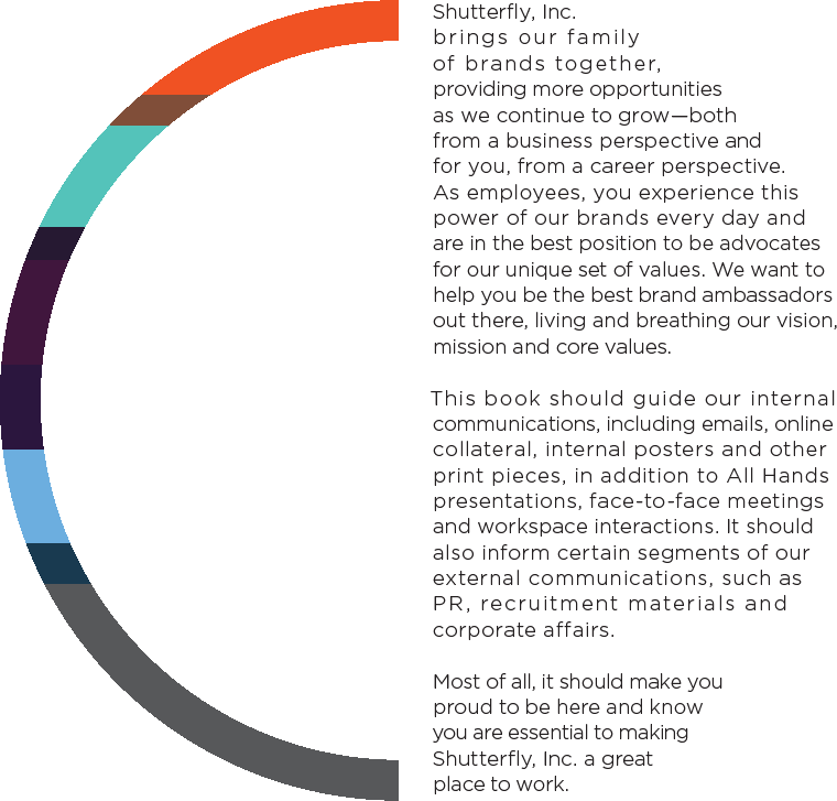
02 The Shutterfly, Inc. Expression
One Family*
*Shutterfly, Inc. is a family of brands in the business of helping people share life’s joy. We are proud to offer personalized photo products and services through Shutterfly, Tiny Prints, Treat and Wedding Paper Divas. Although our brands are distinct from one another, Shutterfly, Inc. shares a common mission, vision and values, encouraging us to have passion, inspire, act, commit and trust.
Together, we are one family.
We’re a leading manufacturer and digital personalized products, offered
(This is what we do.)
digital retailer of high-quality through a family of lifestyle brands.
Our vision is to make the world a better place by helping people share life’s joy.
(This is why we exist.)
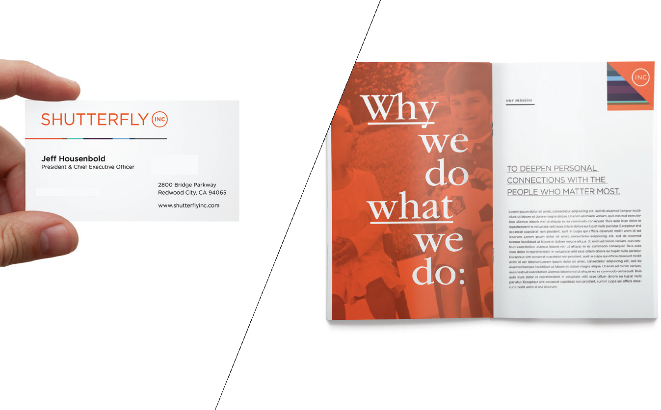
Our mission is to deepen personal connections with the people who matter most.
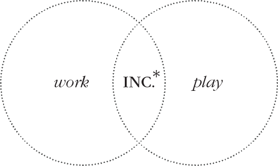
We work for
 and work
on the  ,
,  ,
,
 &
&  brands.
The “For/On” principle helps articulate the brand hierarchy for Inc. and our family of brands and sends a consistent message both internally and externally.
360 
Because our mission is to help people share life’s joy, we want to offer solutions for everyone—no matter where our customers are in their life cycle. Wedding Paper Divas offers stylish wedding invitations and stationery, Shutterfly and Tiny Prints provide birth announcements and photo gifts, and Treat allows people to personalize their correspondence for all occasions through greeting cards. Together, all our brands share the same goal of celebrating life’s milestones—both big and small.

A leading manufacturer and digital retailer of high-quality personalized products, offered through a family of lifestyle brands.
Where your photos come to life in photo books, cards and gifts.
Premium cards and stationery for all of life’s occasions.
Personalized greeting cards that really stand out.
Wedding invitations and stationery for every step of the planning process.
PASSION
Pursue excellence in everything we do Please our customers to the point that they become enthusiastic promoters of Shutterfly, Inc. Have a winning attitude
INSPIRE
Inspire customers to be creative and thoughtful with their memories Empower ourselves and each other to achieve more than we thought possible Motivate others by what we do and how we do it
ACT
Think outside the box and challenge the expected Recognize and celebrate success Lead courageously
COMMIT
Constructively challenge each other’s ideas, commit as a team and then support one another Say what we mean and mean what we say Make the company a better place
TRUST
Treat others as we want to be treated Have confidence in each other’s capabilities and intentions Care enough to give open, honest and direct feedback Seek to understand, then seek to be understood Provide timely communication to avoid surprises
*What is the Shutterfly, Inc. identity? Infused with fresh designs, modern graphics and hits of color from our family of brands, the Inc. treatment reflects the intersection of our corporate culture and unique, playful personality. Although Inc. is comprised of brands that have a very different look and feel, it is important to remember that our corporate identity is separate from each brand’s consumer identity. This means Inc. has its own visual system that is made up of core elements including logo, color, type, icons and more. We have designed tools you can use for the corporate website, internal communications and marketing collateral. Although we were inspired by elements from our brands, the Inc. creative treatment is unique and should not be confused or used interchangeably with the other brand systems.

Shutterfly, Inc. is more than just a company. It’s a unified system with a common vision, mission and values. The best way to communicate this is through our voice and tone. This is how we express ourselves. This is what we sound like. Our voice and tone are a direct reflection of our personality and are defined not only by what we say but how we say it.
Our voice and tone come from a place of confidence, as an industry leader in personal expression through our family of brands: Shutterfly, Tiny Prints, Treat and Wedding Paper Divas. We care about our employees, our customers and our community.
Shutterfly, Inc. is more than just a company—it’s our unified vision to make the world a better place by helping people share life’s joy.
And it starts here.

Shutterfly, Inc. is more than just a company–it’s our unified vision

C1 We are sure of who we are, where we’ve been and where we are going. Our voice is confident and professional but not stiff or overly corporate. We say what we mean, and we mean what we say. Our language is straightforward and easy to understand.
C2 We care about our employees, our customers and our community. That comes through in our copy. Even though we are a corporate company, our tone is real and approachable. Our language makes our employees feel that they can trust us and that we’re here for them.
C3 We may be working on different brands, but we’re all members of the Inc. family. “We,” “team,” and “together” are a part of our vernacular.
Shutterfly, Inc. vs. Inc.
Introduce the brand as “Shutterfly, Inc.” on first reference (and in all headlines and titles), and use “Inc.” thereafter to avoid wordiness.
*Always refer to the brand as “Shutterfly, Inc.” in external communications.

The Shutterfly, Inc. logo is simple and minimal. It conveys oneness with an unadorned circle. We are many brands, but we share a common mission and know we are part of something bigger. Our logo is the stamp of our company—a single graphic that unites us all. One company. One vision. One team.
We are Inc.

The Shutterfly, Inc. logo locks a Gotham-based wordmark with the Inc. circle bug. The two work together to establish hierarchy as the parent to our four consumer-facing brands. The two elements, the wordmark and the Inc. bug, should never be repositioned or manipulated, though alternate versions are available for certain spacial constraints.

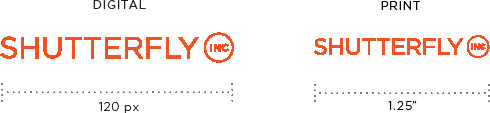
01
Clear space is determined by the width of the letters “INC”.


2.2 /The Logo—Secondary (Vertical) Version
A vertical option is available to add a casual feel when desired. Note: The logo is not simply the primary version rotated. The Inc. bug is rotated to allow the “INC” letters to read correctly. This version should only be used for vertical applications.
Logo Principles
When using the vertical logo, make sure it’s always pointing upward with the Inc. bug at the top.

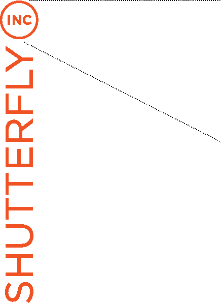

On the vertical version, the Inc. bug is rotated 90 degrees for easier legibility. This further enforces the Inc. brand as the parent in our family by emphasizing “INC”.
Alternate Version
The condensed logo should only be used when space constraints would render the standard logo too small to be legible, like in many social media applications.


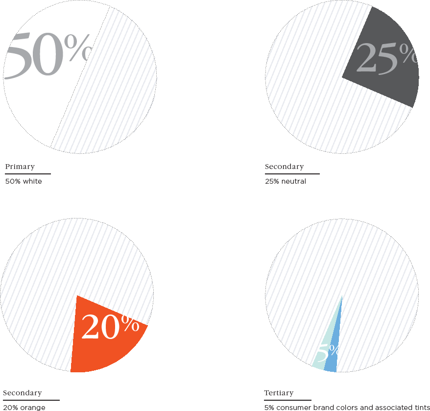
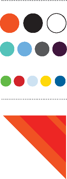
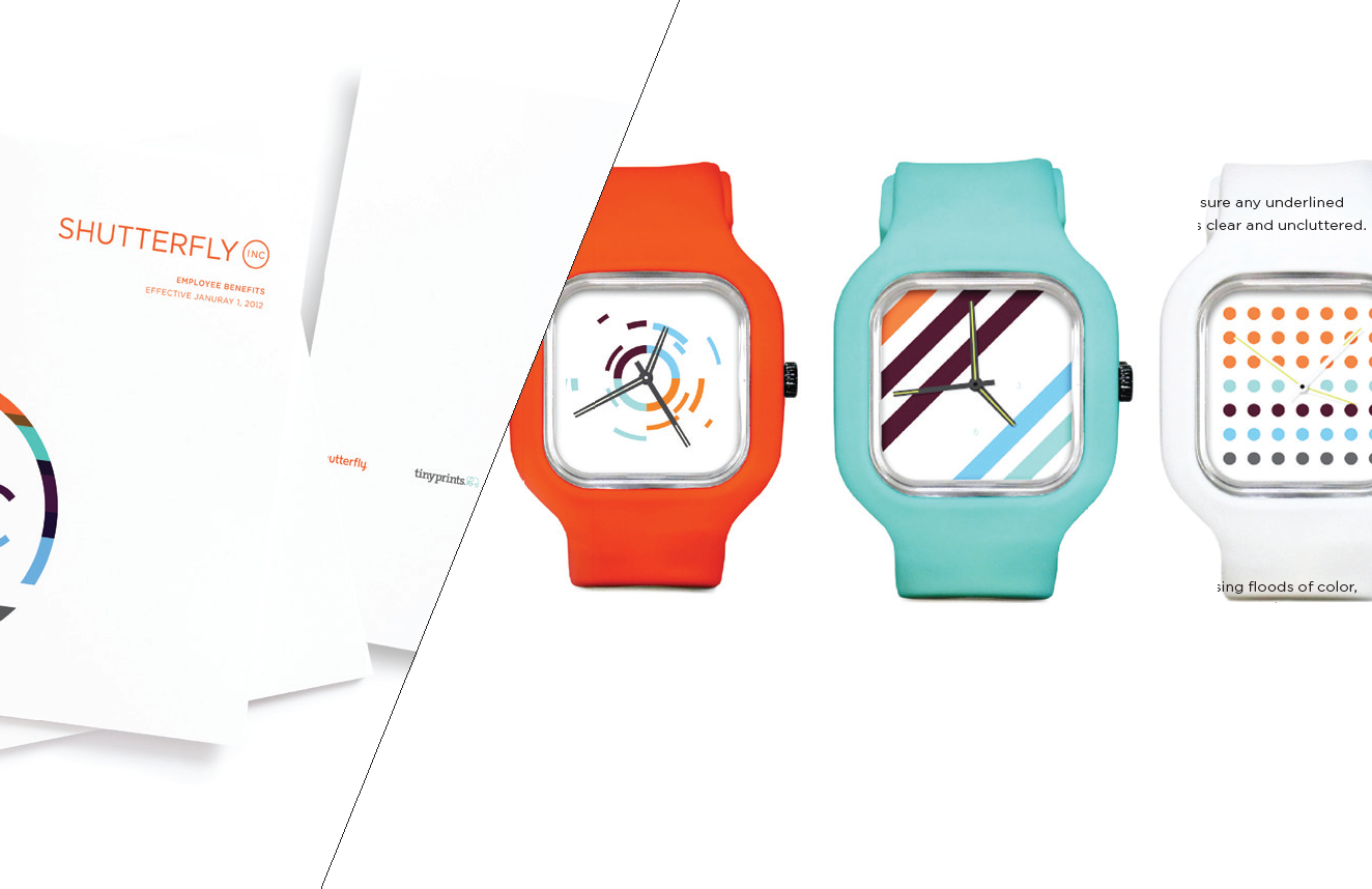
Color defines us. Whether used playfully or sparingly, it’s a powerful tool in communicating feeling and capturing the heart of our brand. The Shutterfly, Inc. color palette features a predominantly white scheme accented with Shutterfly orange and additional hues from our family of consumer brands. The consistent and repeated use of these elements helps differentiate Inc. across all of our materials.
The Shutterfly, Inc. color palette is centered around orange PMS 1665—the same Ignite orange used for the Shutterfly consumer brand. It also uses colors from our entire brand family, each including four other levels of opacity. As a general rule, orange always takes the lead, followed by white, black and gray tones to establish an editorial feel. Pops of color from the rest of the palette can be used to provide additional energy to your layout.

| Pantone 1665 c | ||
| C: 0 | R: 240 | HTML |
| M: 77 | G: 83 | F05323 |
| Y: 100 | B: 35 | |
| K: 0 | ||

| Black | ||
| C: 0 | R: 0 | HTML |
| M: 0 | G: 0 | 000000 |
| Y: 0 | B: 0 | |
| K: 100 | ||

| Pantone Black 7 c | ||
| C: 0 | R: 88 | HTML |
| M: 0 | G: 89 | 58595B |
| Y: 0 | B: 91 | |
| K: 80 | ||

| Pantone 7449 c | |||
| C: 70 | R: 64 | HTML | |
| M: 94 | G: 24 | 40173D | |
| Y: 43 | B: 61 | ||
| K: 50 | |||

| White | ||
 |
||
| C: 0 | R: 255 | HTML |
| M: 0 | G: 255 | FFFFFF |
| Y: 0 | B: 223 | |
| K: 0 | ||

| Pantone 284 c | ||
| C: 55 | R: 108 | HTML |
| M: 19 | G: 173 | 6CADDF |
| Y: 0 | B: 223 | |
| K: 0 | ||

| Pantone 3252 c | ||
| C: 62 | R: 85 | HTML |
| M: 0 | G: 195 | 55C389 |
| Y: 33 | B: 185 | |
| K: 0 | ||
When choosing colors in the Shutterfly, Inc. palette, ratios are very important. White space is your friend and helps prevent layouts from looking too cluttered. Neutrals and orange provide accents, and the tertiary palette can be used to add pops of color when necessary.
The adjacent percentages are guides to help your layouts maintain balance and an even visual tone.

Words tell our story, and the right typeface can help bring that story to life. Type can convey emotion, communicate messages and express the tone of our brand. Shutterfly, Inc. typography fuses an editorial approach with a modern aesthetic for a look that’s both professional and fun. With a range of weights and treatments, our typefaces establish a clear hierarchy across all collateral—from content-heavy to clean and direct.
The primary typeface, ITC Garamond, uses five weights: Light, Light Italic, Book, Book Italic and Bold. The strong serif presence helps portray a more editorial look, and when combined with the secondary Gotham typeface, keeps layouts looking contemporary even when a large amount of content is necessary.
Note: When Gotham cannot be used, like in web applications, use Avenir.

Gotham

 Preferred style

Light
AaBbCcDdEeFfGgHhIiJjKkLlMmNnOoPp
QqRrSsTtUuVvWwXxYyZz1234567890&@?/#
Light Italic
AaBbCcDdEeFfGgHhIiJjKkLlMmNnOoPpQq
RrSsTtUuVvWwXxYyZz1234567890&@?/#
Book
AaBbCcDdEeFfGgHhIiJjKkLlMmNnOoPpQq
RrSsTtUuVvWwXxYyZz1234567890&@?/#
Book Italic
AaBbCcDdEeFfGgHhIiJjKkLlMmNnOoPpQq
RrSsTtUuVvWwXxYyZz1234567890&@?/#
Bold
AaBbCcDdEeFfGgHhIiJjKkLlMmNnOoPpQq
RrSsTtUuVvWwXxYyZz1234567890&@?/#

Light
AaBbCcDdEeFfGgHhIiJjKkLlMmNnOoPpQq
RrSsTtUuVvWwXxYyZz1234567890&@?/#
Book
AaBbCcDdEeFfGgHhIiJjKkLlMmNnOoPpQq
RrSsTtUuVvWwXxYyZz1234567890&@?/#
Bold
AaBbCcDdEeFfGgHhIiJjKkLlMmNnOoPpQq
RrSsTtUuVvWwXxYyZz1234567890&@?/#
Note the adjacent use of scale, serif typography and added treatments such as all caps and underline. Always make sure that what you are saying is complemented by how you are saying it.
This is a _ headline.
 Though italic cannot be used for headlines, it can be effective for quoting or emphasizing.
ALL CAPS &
UNDERLINE
CAN BE USED
AS WELL.
BOLD styles
should also be
used sparingly
and never as
lead headlines to
avoid shouting.
LARGER GOTHAM FONT SIZES SHOULD STAY LIGHTER IN WEIGHT
For general content-heavy areas, use Gotham since it reads clearly at small sizes. For general content-heavy areas, use Gotham since it reads clearly at small sizes. For general content-heavy areas, use Gotham since it reads clearly at small sizes. For general content-heavy areas, use Gotham since it reads clearly at small sizes. For general content-heavy areas, use Gotham since
Typography Principles
Use Gotham for small type sizes and heavy content.
Fonts can be ALL CAPS, Sentence case, or even ALL CAPS WITH UNDERLINE.
Paragraph justification establishes alignment for blocks of content.

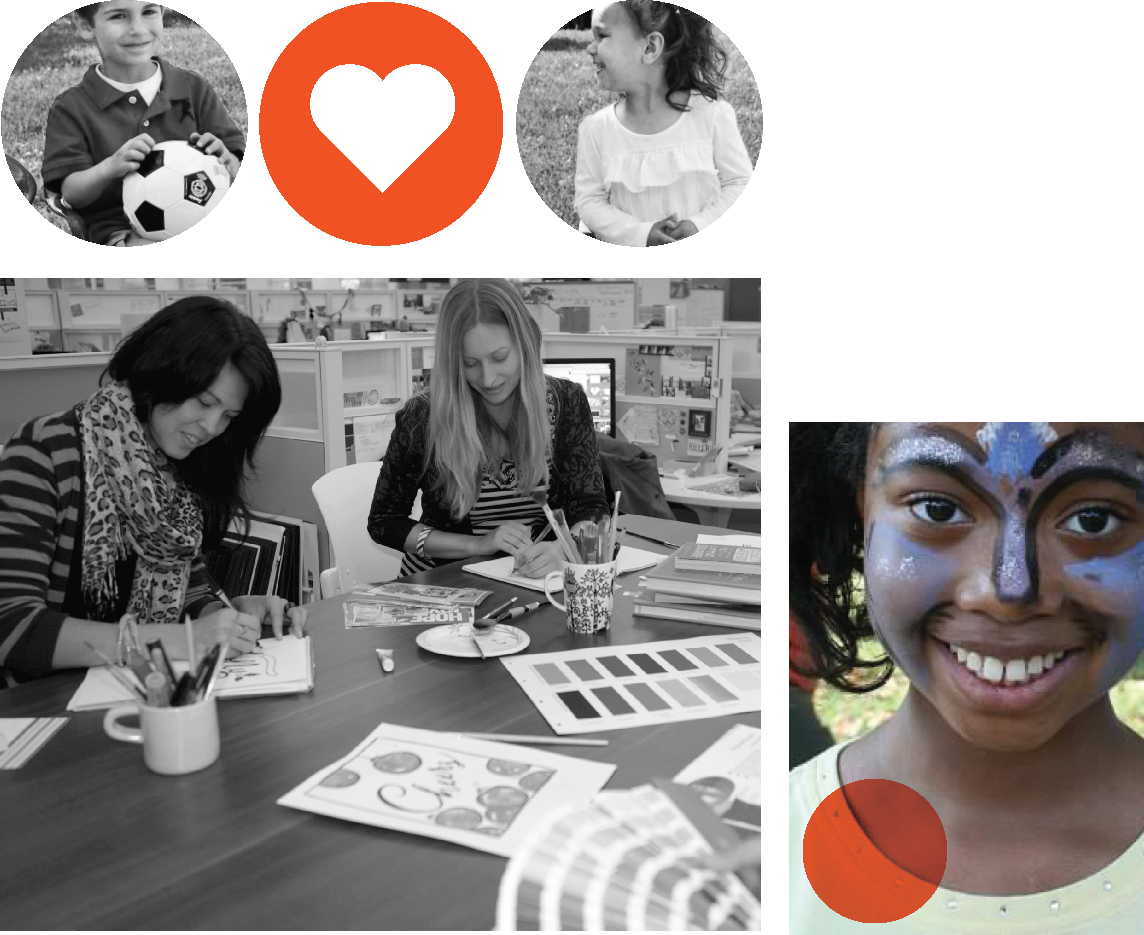
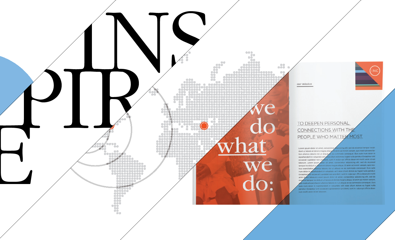
Photography shows readers who we are, complementing our messaging and infusing communications with authenticity. Featuring real subjects—our employees and our environments—in elegant, understated black and white, our photography tells our story and helps distinguish Shutterfly, Inc. from our family of consumer brands.
Our Shutterfly, Inc. photography revolves around many subjects—employees, Shutterfly Foundation projects, facilities and events. By incorporating black-and-white photography and adding color with graphic elements, we can set a specific style independent of our consumer-facing brands, while maintaining consistency from layout to layout (since most of our photography is user-generated).
Photography choices can vary in gender and age of the subject as well as focal point, but they should always capture the spirit of our corporate culture.

Photography Principles
Use circles, squares or rectangles to crop your imagery for interesting layouts.
Color and icon overlays add a layer of dimension and energy to imagery.
Cropping into your photo can make 3 it more impactful.

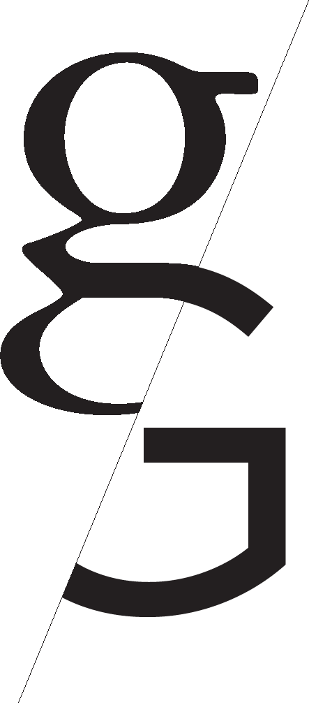
From arrows to angles, graphic treatments are an essential component of our toolkit. They support content, liven up layouts and add depth to our communications—as long as they are used with discipline and intent. Our graphics style is minimal and editorial. Copy and photography are always the focus, and graphics are used sparingly and purposefully to create a unified look.
The Shutterfly, Inc. toolkit is grouped into four main elements—arrows, color bars, shapes and angles. These elements, though flexible in implementation, should be used with discretion and a sense of discipline. Refer to the examples section for use cases and design recommendations.
Color Bars
Color bars can work vertically or horizontally and can accommodate different layout lengths and widths.
Note: Colors in the bar should never be adjusted or changed in make-up.
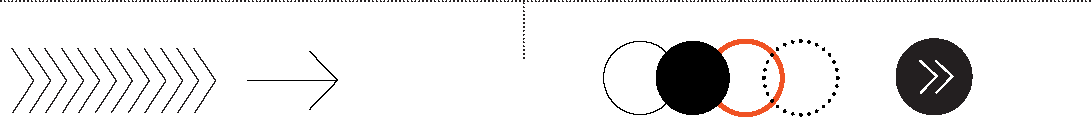
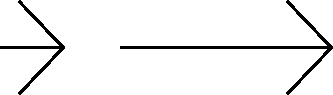
| Arrows | Shapes |
| Arrows can show progress or direction and call out important information. | Circle shapes echo the Inc. identity and can be used as an extra layer to highlight or pull copy away from other elements. |
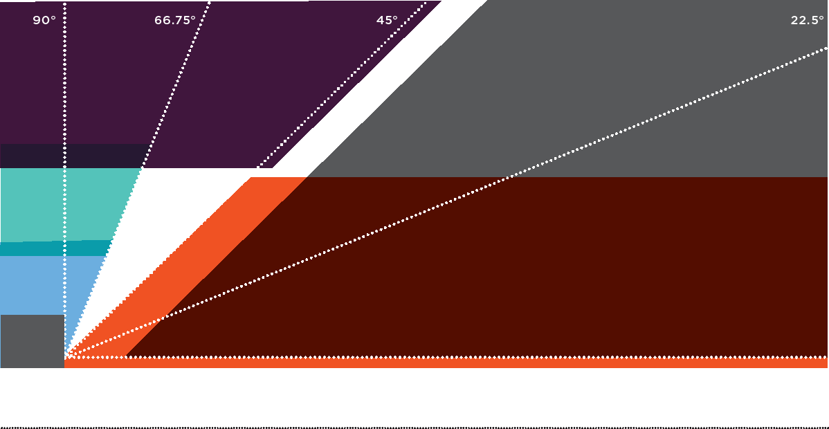
Angles
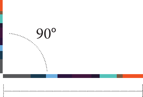
Angles and linework are based on five angles—0˚, 45˚, 66.75˚, 22.5˚ and 90˚. The angles should always lean forward to imply progress and positive motion. They can be mixed and matched according to the general look and feel of your layout.
(See diagonal line usage on the following page.)

Slash Principles
Angles should always lean forward to imply progress and positive motion.
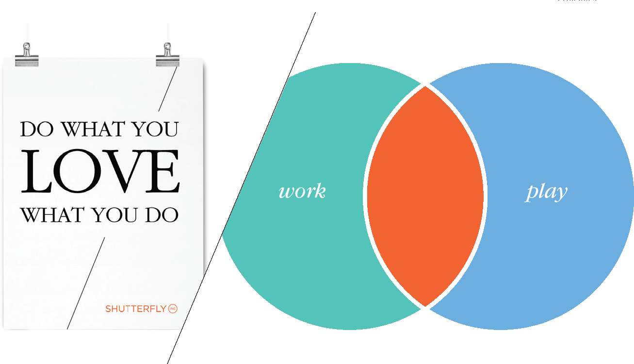
The slash element echoes the the “one to many” idea that is so central to our brand. Shutterfly, Inc. posesses many attributes—a work hard/play hard attitude, many voices with one vision, and practical products with innovative designs. The slash becomes a graphic element that has meaning even when used as a subtle always lean forward accent in any design. to imply progress and positive motion.

Iconography can add warmth and clarity to any message, no matter how complex. Shutterfly, Inc. icons are simple, friendly and expressive, allowing readers to navigate our communications with speed and ease. They can be used as helpful wayfinding elements in user-interface applications or to add context to copy-heavy collateral.
Our icon style is clear and direct and always uses the circle shape as its base. The content within is both straightforward and fun. No theme should be taken too seriously since clarity is the main priority.
The icons are primarily for marketing and user interface–based applications and can be used for wayfinding and to add visual interest in copy-intense layouts.

The icon library is created and maintained by Shutterfly, Inc.’s internal creative department. An updated reference library is available, as well as resources to help create new assets for your use.

Icon Usage
Icons can be rendered in orange, neutral or a pattern, as shown here.

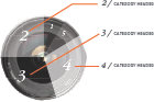
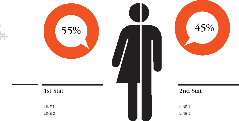
Infographics help readers process complex, data-heavy communications in a digestible and visually pleasing format. Echoing our brand expression, Shutterfly, Inc. infographics are simple and straightforward. They tell our story and communicate essential information to investors and coworkers, while always working off the basic principle that less is more.
The Shutterfly, Inc. infographic style is clean, simple and direct. Pops of color add accents while telling the main story, and though minimal in make-up, Inc. infographics evoke a contemporary style without being cold.
Above all else, infographics should be clear and relevant, avoiding superfluous use.
 |
 |
| COLOR SPEC 1 | COLOR SPEC 2 |
Infographic Principles
Try to use circles as your main design elements when creating legends or complex shapes.
3-D objects can help tell your story and provide interesting visuals.
Thick and thin line weights help separate headlines from visual elements.
Iconography and symbols can add a casual yet professional feel to graph focal points.
Have fun with colors and layers, but do not overpower or clutter the information you are trying to communicate.


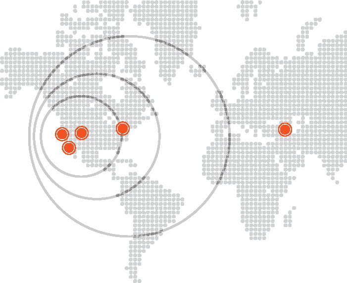
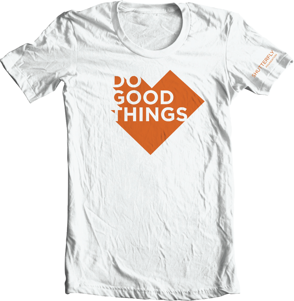
The Shutterfly Foundation is committed to making the world a better place by sharing life’s joy in the communities where we live and work. We strengthen the connection to our local communities in Charlotte, Phoenix, Sunnyvale and Redwood City through grant donations and organizational assistance. Shutterfly Foundation materials should capture this spirit of connection, while clearly communicating the details of our various programs.

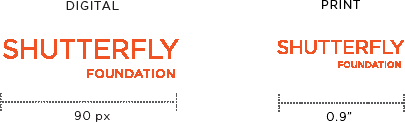
The Shutterfly Foundation loses the Inc. bug, locking up two words set in Gotham in a straightforward manner. The two work together to establish hierarchy, and they should never be repositioned or manipulated in size, scale or location.
01
Clear space is determined by the cap-height of the letter “S”.


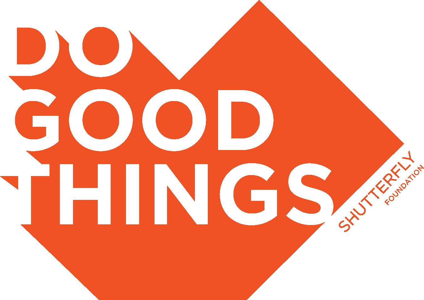
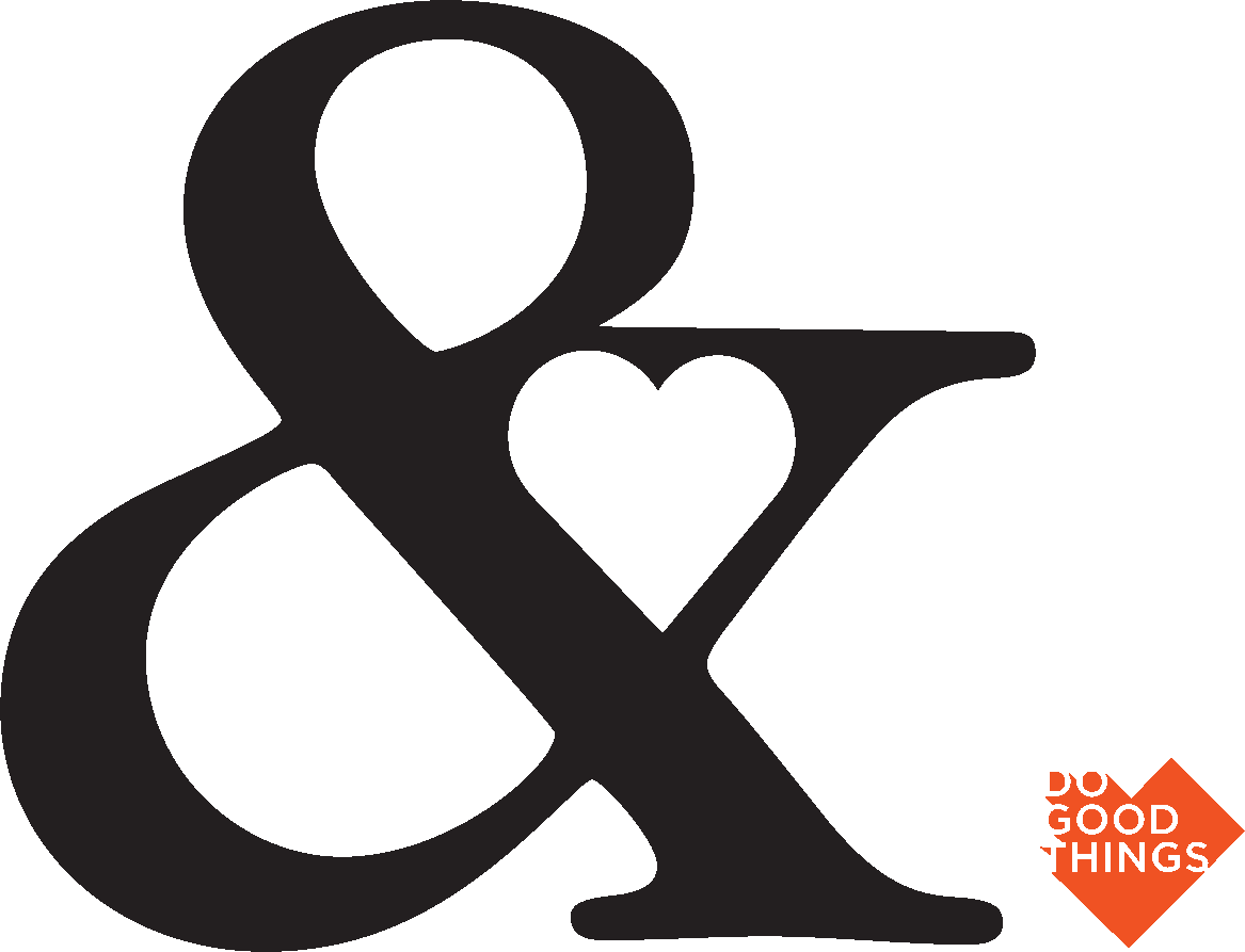
Though Shutterfly Foundation’s core elements echo the Shutterfly, Inc. expression, there are some unique attributes defining its look, including the “do good things” heart bug, an element that can serve as a sign-off or main graphic for many applications.
01
The Foundation tone is casual and playful but doesn’t sacrifice main messages.
Garamond and Gotham can play a more interchangeable role for high-level Foundation headlines, though the Inc. type principles should apply for the rest of the layout.
02
The Foundation color palette is identical to Inc.’s, but additional colors may be implemented depending on the message or event. For example, a Foundation event around the holidays could use our primary orange and a neutral, as well as a green or red tone to reflect seasonality.
Note: If a complementary color is used, it should be used to complement our core palette—not to replace it.
03
The Foundation graphic system is built around the Inc. slash, which can be incorporated even more creatively. Refer to the separate Foundation Style Guide or contact the creative team for more information.
04
The Foundation wordmark can be positioned horizontally, vertically or at an angle, as long as it is always pointing upwards.
*The following application examples reflect how versatile our kit of parts can be, while always maintaining consistency. Our style guide includes many expressive elements to convey the Shutterfly, Inc. brand, but you should always make sure your main message is clear and direct, and designs aren’t overly complicated for design’s sake.
Web Principles
Use clear typography (Avenir for heavy content, Garamond for larger headlines) with white as the dominant color for clear navigation.
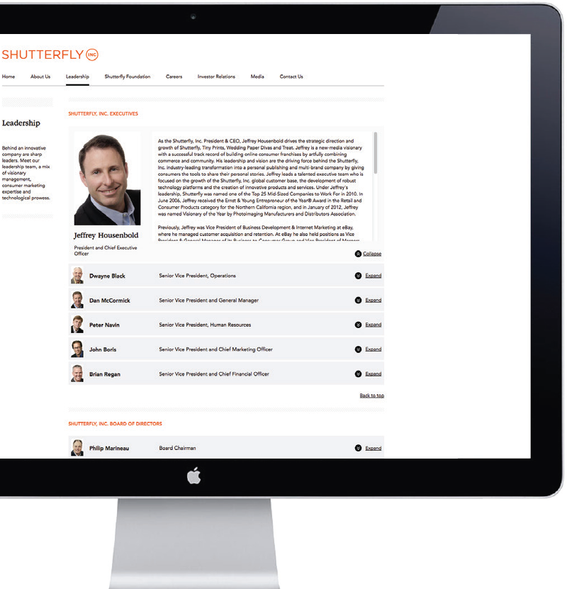
Interactive elements should be utilized whenever they can help clarify larger amounts of content, such as biographies or timelines.
When introducing color to your layouts, orange should always be the lead, but colors from the other brands can be added when appropriate.
Design Principles
Use subtle hits of the color bar when space is tight and information clarity is top priority.
Make sure any underlined text is clear and uncluttered.
When using floods of color, make sure to balance your layout with white space.
Regardless of graphic treatments, the Shutterfly, Inc. logo should always be at the top of the messaging hierarchy.
As long as the Inc. values and principles of design are followed, there are limitless possibilities of visual expression.

Thematic Principles
Themes can help express your idea simply and straightforwardly. Strong concepts let type lead the way in your design.
Foundation Principles
Since Shutterfly Foundation has a more informal vibe, more liberal use of Gotham can be implemented.
Partner with your Creative team to develop new and innovative approaches to thematic events.
*For questions or additional guidance, please don’t hesitate to consult your Brand and Creative teams.