REPRESENTATIVES
Of Design
It’s difficult to establish hard-edged boundaries around the years in which designers make an impact, in part because many of the individuals and groups noted in this section stretch across numerous decades. However, certain developments help establish broad timelines where they thrived or made their biggest impact.
Spurred by the graphic innovations and new visual languages developed through Constructivism in Russia, de Stijl in the Netherlands, and Bauhaus in Germany, it’s possible to see the genesis of graphic design, as is known today, with imagery and typography coming together more clearly and with more defined purposes, whether for matters of commerce or protest. In the 1950s, the rise of the International Typographic Style made Switzerland the center of attention; this remains one of the most influential epochs. Meanwhile, in the United States, the influx of European and Russian immigrants and a growing group of Americans gave shape to the publishing and advertising industries from the 1930s onward. What these designers shared, more than geographic location or stylistic approach, was a pioneering spirit that established the potential of graphic design.
During the late 1950s and 1960s there was a precipitous rise in the discipline of corporate identity, as many of the world’s largest corporations began a vigorous growth period fueled by highly industrialized processes and more viable communication and transportation methods. In these early years, individual designers or small design firms were able to tackle these projects, and their output defined the look and feel of business. Toward the end of the 1960s and into the 1970s the world was awash in cultural changes, and graphic designers played a remarkable role in giving visual form to the many incandescent issues of this time, illustrating the communicative potential of graphic design beyond the realm of corporate communication. In parallel, the fields of magazine and book design, music packaging, and advertising reflected a fledgling evolution in the hands of art directors.
Even before the digital revolution signaled a new era in graphic design, the late 1970s and early 1980s gave way to a reassessment of the tenets of graphic design and typography as New Wave and Postmodernism explored new theories and practices. But, certainly, the introduction of the Macintosh computer in 1984 was an explosive and divisive moment in graphic design history that catalyzed a slew of possibilities that some embraced while others rejected. By the early 1990s, the assimilation of the computer was unquestionable, and this generation of designers—whether in solo practice, small firms, or voluminous offices—has thrust the profession into nearly all other fields. These designers now stand at the verge of the next milestone.
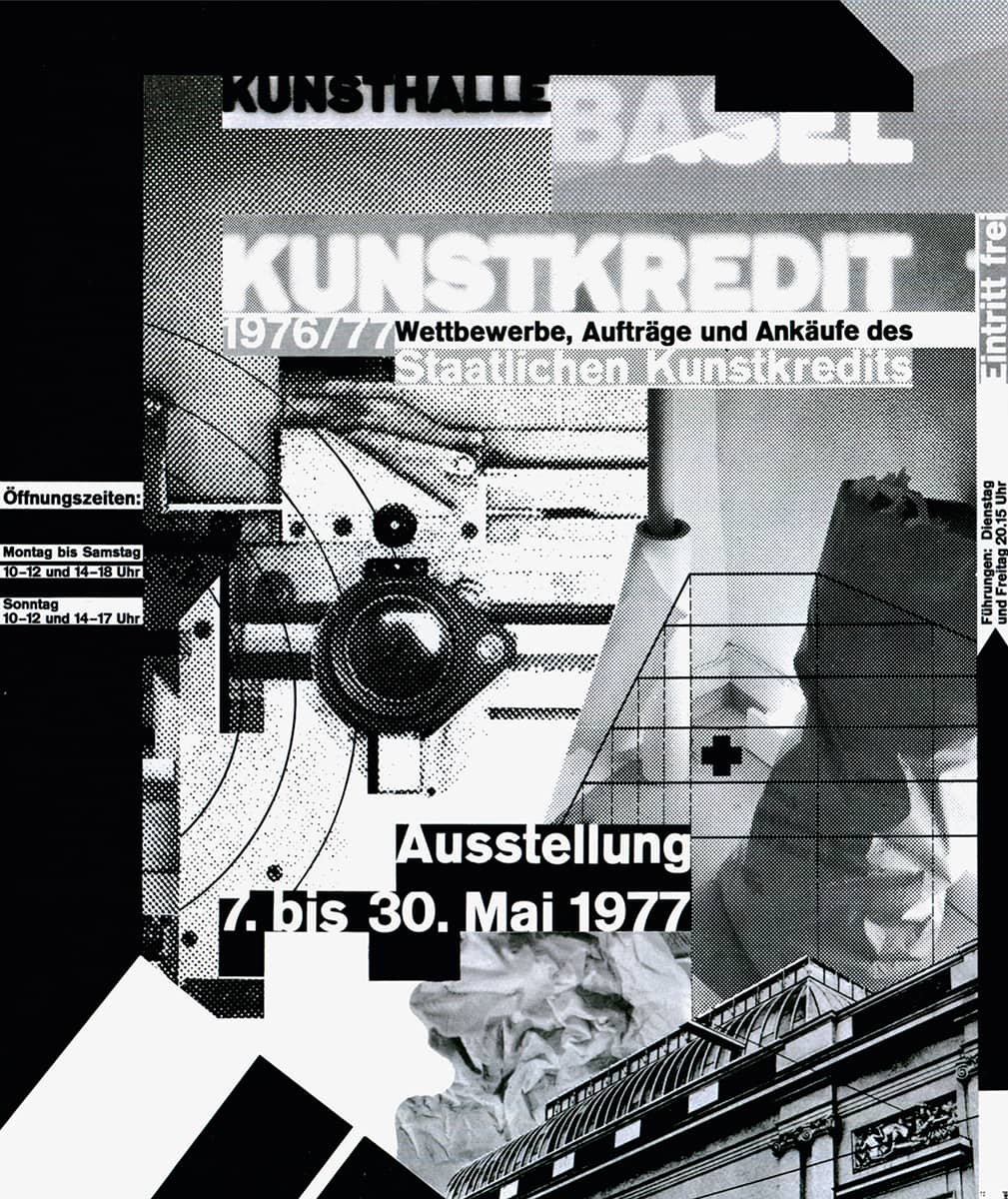
Detail of WORLDFORMAT KUNSTKREDIT BASEL 1976–1977 POSTER FOR THE CITY ORGANIZATION IN SUPPORT OF THE ARTS / WOLFGANG WEINGART / SWITZERLAND, 1977
Jan Tschichold
1902 (LEIPZIG, GERMANY) – 1974
In 1923, after graduating from the Academy for Graphic Arts and Book Production in Leipzig, Jan Tschichold began his comprehensive career as a typeface designer and book designer working freelance for various publishers. A 1923 Bauhaus exhibition in Weimar that same year proved a catalyst, exposing him to the New Typography, an approach that became synonymous with his early work, strongly manifested in the publication, two years later, of Elementare Typographie, an insert in the Leipzig journal Typographische Mitteilungen (Typographic News). This piece explained and illustrated the principles of New Typography. In 1928, Tschichold published the first of many books and manuals he would author, Die Neue Typographie (The New Typography), laden with visual examples that demonstrated his beliefs as he further rejected decoration and advocated functional and efficient design.
After seven years of teaching in Munich, Tschichold emigrated with his family from Germany to Basel, Switzerland, in 1933, fleeing the Nazi regime. He worked again as a book designer and began to distance himself from the New Typography as he embraced serif typefaces and classic arrangements, realizing that typography was more nuanced and there is more than one way to make successful design. In 1947, he moved to London when he accepted the invitation to standardize the popular Penguin Books › 274. With little consistency across hundreds of titles, Tschichold established authoritative guidelines—cemented in the Penguin Composition Rules—to ensure quality from cover to cover and making an indelible mark on the publishing industry. He returned to Basel in 1949 to continue his work for book publishers, and in 1955 he became a consultant for the pharmaceutical firm F. Hoffmann-La Roche, designing their collateral materials during the next 12 years. Straddling the extremes between centered, classic typography and asymmetric modern typography, the work of Jan Tschichold remains a vibrant example of both approaches.
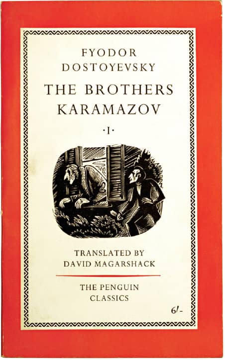
THE BROTHERS KARAMAZOV, Fyodor Dostoevsky, Translated by David Magarshack / Jan Tschichold; roundel artwork, Cecil Keeling / UK, 1958
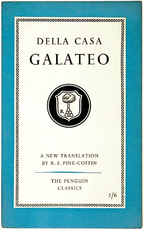
DELLA CASA GALATEO, Translated by R.S. Pine-Coffin / Jan Tschichold; roundel artwork, Cecil Keeling / UK, 1959
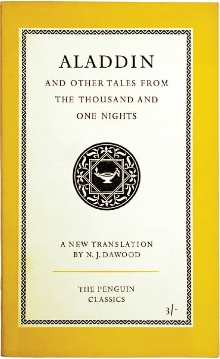
ALADDIN AND OTHER TALES FROM THE THOUSAND AND ONE NIGHTS, Translated by N.J. Dawood / Jan Tschichold / UK, 1960
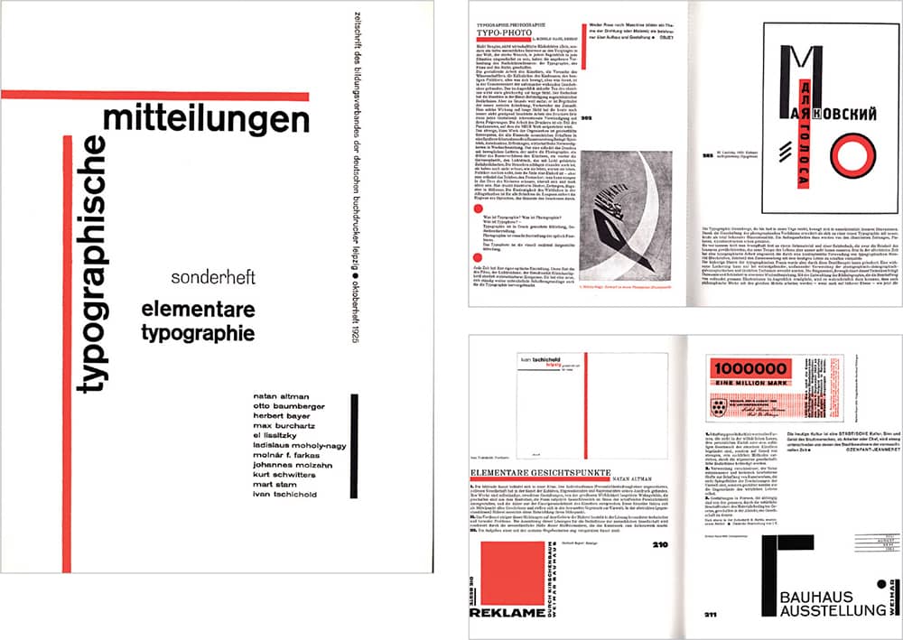
TYPOGRAPHICHE MITTEILUNGEN, Jan Tschichold / Germany, October 1925 / Images: Courtesy of the International Dada Archive, University of Iowa Libraries
William Addison Dwiggins
1880 (MARTINSVILLE, OHIO, USA)– 1956
After studying under Frederic W. Goudy at the Frank Holme School of Illustration in Chicago and working briefly in his Village Press in Massachusetts in 1904, William Addison Dwiggins established himself in 1905 as a freelance commercial artist, becoming a prolific letterer, calligrapher, and illustrator for the advertising industry. In 1923, however, when diagnosed with diabetes, he shifted disciplines and turned to book design, a field in which he already had experience, even if not positive: In 1919, after an uninspiring, brief position at Harvard University Press, he wrote, “Extracts from an Investigation into the Physical Properties of Books as They Are at Present Published,” a mock (but nonetheless scathing) critique of the field, published by the Society of Calligraphers, an imaginary club run by Hermann Püterschein, one of Dwiggins’ many pseudonyms and alter egos. Mwano Masassi, an African designer, was another, and Kobodaishi, the Buddhist patron saint of the lettering arts, whom Dwiggins “visited” in 1935 and gave him the inspiration for his typeface Electra, was likewise a fabrication.
More official writings included “New Kind of Printing Calls for New Design,” published in 1922 in the Boston Evening Transcript, in which he famously first used the term graphic design, and 1928’s Layout in Advertising, a book compiling his accrued knowledge. Designing jackets and interiors, Dwiggins made his most indelible mark through his long collaboration with Alfred A. Knopf, Inc., where he produced more than 300 works from the late 1920s through the next three decades. In his late forties, Dwiggins began a career in type design when he was asked by Mergenthaler Linotype to develop a sans serif; this, only a year later, resulted in Metroblack. Through a long association he created four other commercial typefaces—Electra, Caledonia, Eldorado, and Falcon—along with dozens of well-catalogued typefaces-in-progress that have inspired many contemporary type designers. Tangentially, Dwiggins had an avid hobby: designing and constructing marionettes, with accompanying miniature theater sets, and writing plays and performing for friends. Dwiggins passed away in 1956 in Hingham, Massachusetts.
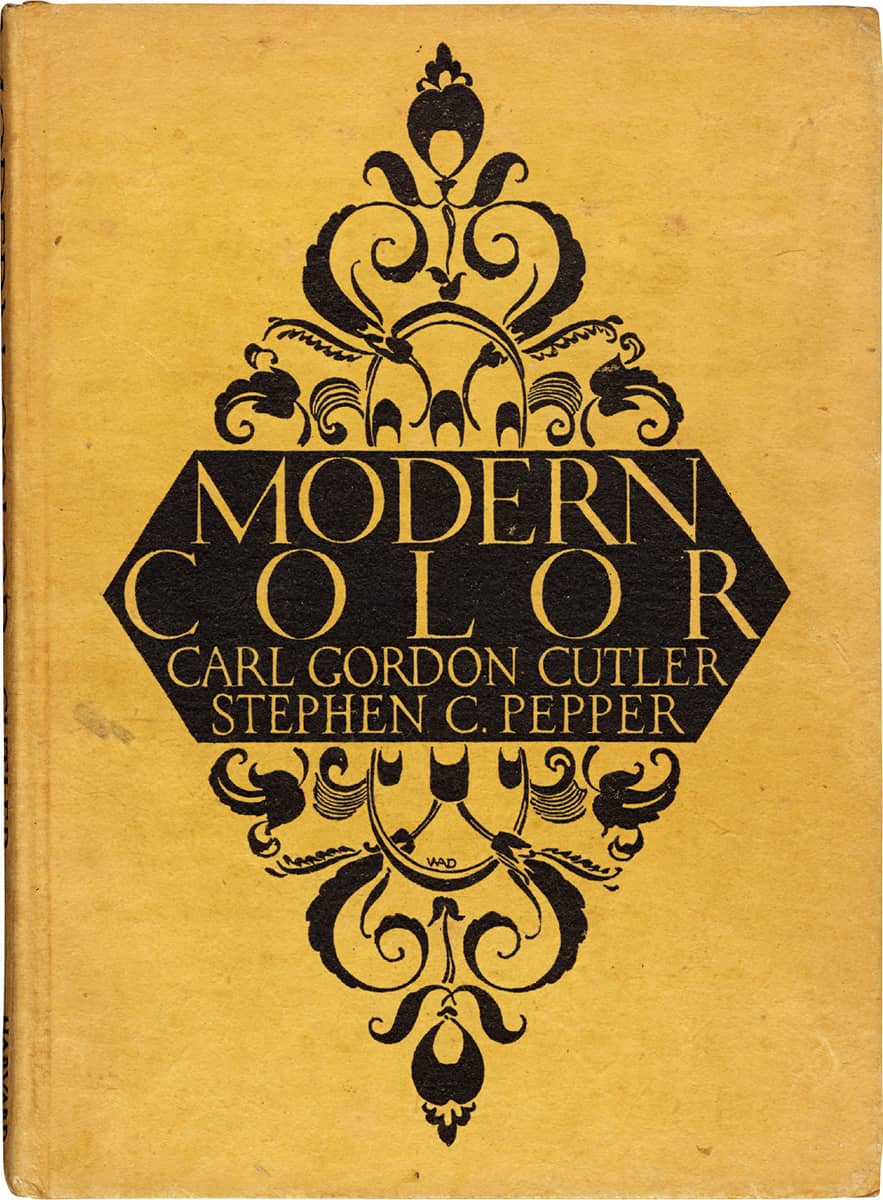
MODERN COLOR, Carl Gordon Cutler, Stephen C. Pepper / W.A. Dwiggins / USA, 1923
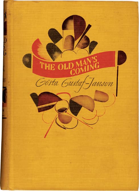
Clockwise THE OLD MAN’S COMING, Gosta Gustaf-Janson / W.A. Dwiggins / USA, 1936
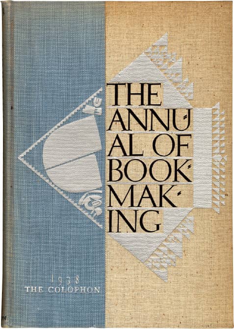
THE ANNUAL OF BOOKMAKING / W.A. Dwiggins / USA, 1938
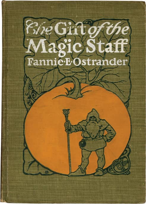
THE GIFT OF THE MAGIC STAFF, Fannie E. Ostrander / W.A. Dwiggins / USA, 1902
Alex Steinweiss
b. 1917 (BROOKLYN, NEW YORK, USA) CURRENTLY SARASOTA, FLORIDA, USA
Alexander Steinweiss attended Abraham Lincoln High in Brooklyn, where he was a member of the Art Squad, a group of students that included Gene Federico, Seymour Chwast › 171, and William Taubin, among other young talents. Guided by their visual arts teacher, Leon Friend, they worked on school publications, posters, and signs, giving them a sense of what it would be like to design once they became professionals. In 1934, Steinweiss attended Parsons School of Art, and upon graduation in 1937 found employment with Joseph Binder, a Viennese poster designer recently relocated to New York. Steinweiss spent approximately three years with Binder and then left to establish his own studio. That venture lasted just a few months because the recently reorganized Columbia Records › 300 needed an art director and its president, William Paley, offered the job to the 23-year-old Steinweiss.
At first, his responsibilities included the design of the label’s catalogs, posters, logos, and advertising. But just a few months in, he revolutionized conventional practice: The 78 rpm records were typically placed inside protective, nondescript pasteboard covers with the name of the album and artist simply stamped on the cover and spine; despite concerns of increased costs, Steinweiss took this blank canvas and designed the first album cover with original art and design. With proven success—including a 894 percent increase in sales of a reissue of Beethoven’s Ninth Symphony—Steinweiss went on to develop hundreds of covers for Columbia as its art director until 1944, and then, when he joined the U.S. Navy designing posters and booklets in an 8-to-4 job, as a freelancer for Columbia at night. Steinweiss’ covers are, in themselves, as influential as the groundbreaking fact of their existence.

SMASH SONG HITS, Rodgers & Hart / After years of albums being packaged in generic sleeves, this was the first consciously packaged album cover design / Columbia Records / 1939
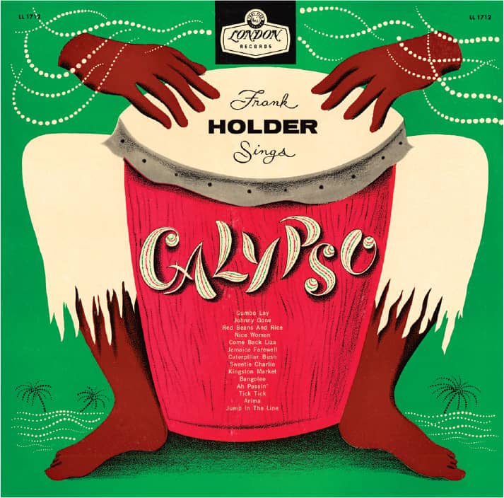
CALYPSO, Frank Holder / London Records / 1957
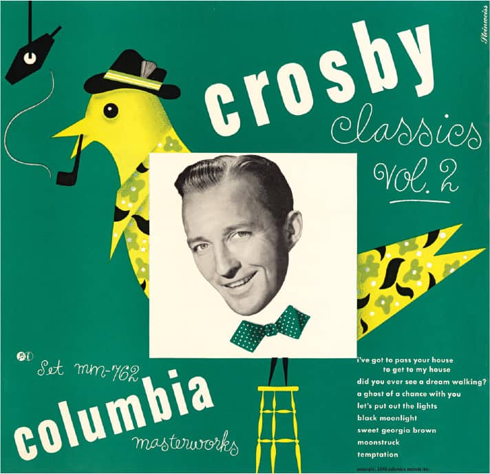
CROSBY CLASSICS VOL. 2 / Columbia Records / 1948

ENCORES, Frankie Carle / Columbia Records / 1947
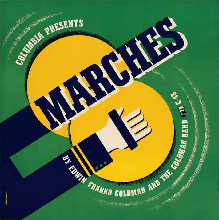
MARCHES, Edwin Franko Goldman and the Goldman Band / Columbia Records / 1941
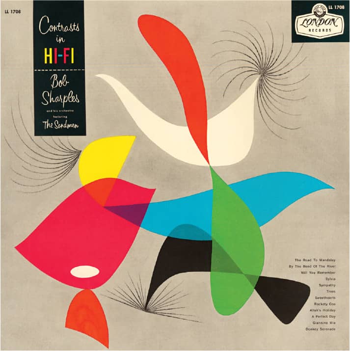
CONTRASTS IN HI-FI, Bob Sharples and His Orchestra, featuring the Sandmen / London Records / 1958
Alex Steinweiss / USA
Alexey Brodovitch
1898 (OGOLITCHI, RUSSIA) – 1971
Arriving in Paris in 1920 from revolution torn Russia, Alexey Brodovitch began his career painting sets for Ballet Russes and gradually immersing in design earning recognition through the International Exposition of Modern Industrial and Decorative Arts and by winning a poster competition for Bal Banal, a dance benefit for Russian artists. Approached to establish an advertising art department at the Philadelphia Museum and School of Industrial Art (now the University of the Arts), he moved to the United States in 1930, providing a starting point for his highly influential teachings—among his first group of students was photographer Irving Penn. Brodovitch worked across design and advertising in Philadelphia and New York, but his pivotal career point came in 1934 when Carmel Snow, new editor-in-chief of Harper’s Bazaar › 327, saw an advertising show hosted by the Art Directors Club › 245 in New York curated by Brodovitch and offered him the art director position that evening.
With an unparalleled sensibility and approach to photography, layout and typography Brodovitch governed the look of Harper’s Bazaar for the next 24 years. He commissioned work from European artists like Man Ray, Salvador Dalí, and A.M. Cassandre and American photographers like Richard Avedon, Lisette Model, and Diane Arbus—most of whom were Brodovitch’s students in his Design Laboratory class at the New School for Social Research in New York that ran from 1941 to 1959. Brodovitch collaborated with art director Frank Zachary to create the short-lived Portfolio, a luscious magazine for visual artists published for just three issues. Brodovitch published Ballet in 1945, a collection of his own photographs—blurred and full of motion—of the Ballet Russes de Monte Carlo taken between 1935 and 1937. He left Harper’s Bazaar in 1958 and moved back to France in 1966, he passed away in 1971 in Le Thor, France.
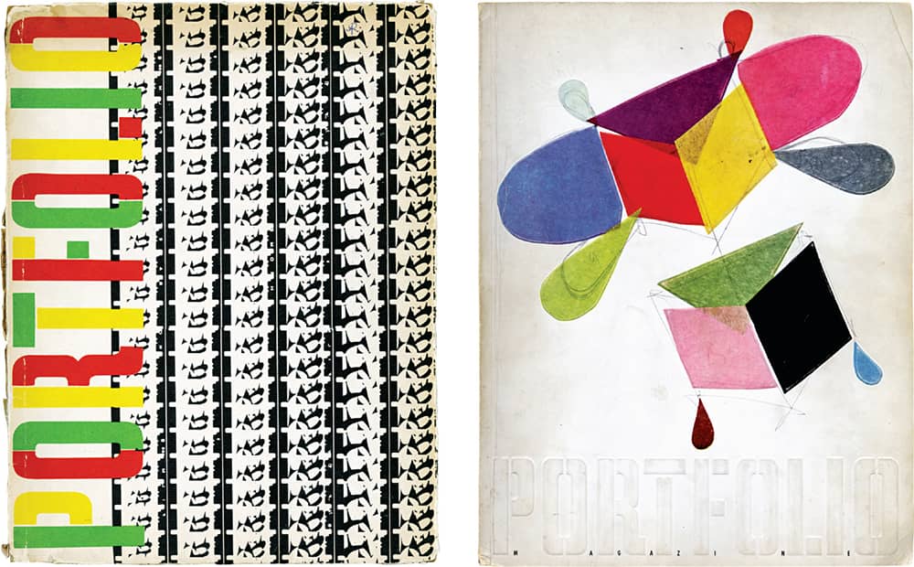
PORTFOLIO / Zebra Press / co-edition, Alexey Brodovitch, Frank Zachary; art direction, Alexey Brodovitch / USA, 1950–1951
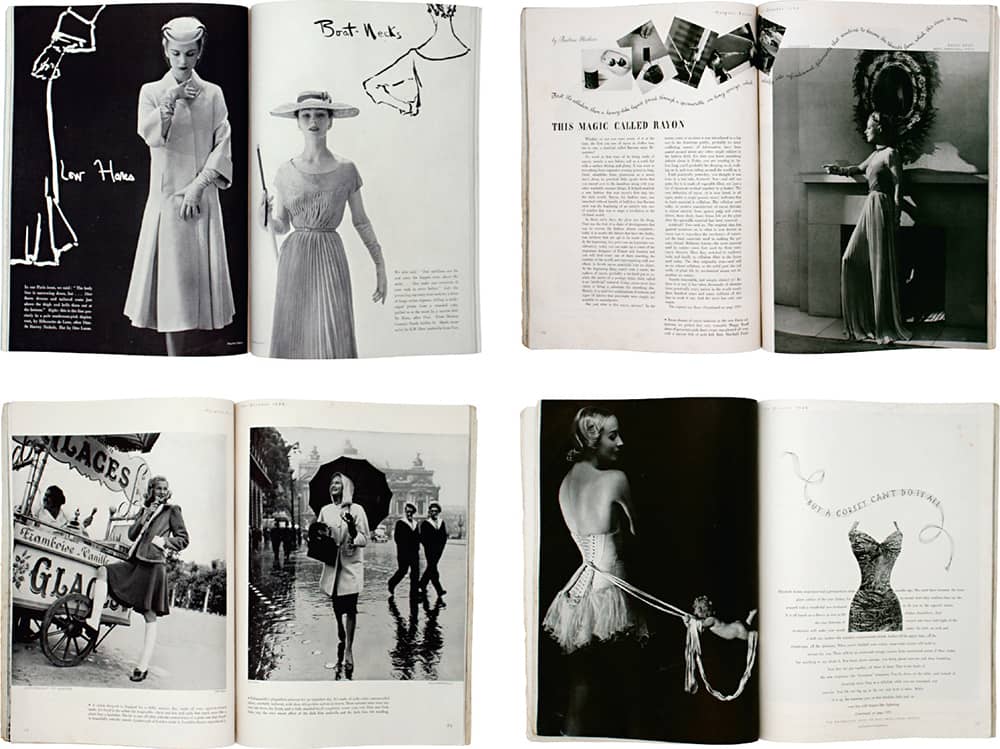
HARPER’S BAZAAR MAGAZINE / Alexey Brodovitch / USA, 1939, 1952
Alvin Lustig
1915 (DENVER, COLORADO, USA) – 1955
Investing his energy in practicing magic instead of focusing on his studies, Alvin Lustig’s interest quickly shifted when he was introduced to modern art and French posters in high school—soon the posters for his shows got all his attention. Lustig’s higher education took place at Los Angeles Community College and the city’s Art Center School, punctuated by independent study courses with acclaimed architect Frank Lloyd Wright and French painter Jean Charlot. Lustig established his first design firm in 1937, in Los Angeles; despite a slow start, it signaled the beginning of a prolific body of work that spanned platforms and disciplines—from book covers, advertising, and identity to interior design, textiles, lighting, and furniture.
In 1944, Lustig moved to New York as the director of visual research at Look magazine, a position he held for two years before going back to California. During the 1940s and 1950s he designed many book covers, including the New Classics series by New Directions › 278 (1945–1952), in which his abstract solutions represent the creative direction of the author rather than an iconic element of the story itself. His work for Noonday Press (1951–1955) can be identified by its purely typographical work.
Lustig went back to New York in 1950 as his battle with diabetes, which eventually rendered him blind, worsened. During this period he continued to work—most notably on the signage for Philip Johnson’s Seagram building in New York and the new Industrial Design › 96 magazine—aided by his wife Elaine Lustig Cohen and his studio staff. He succumbed to diabetes at the ripe age of 40.
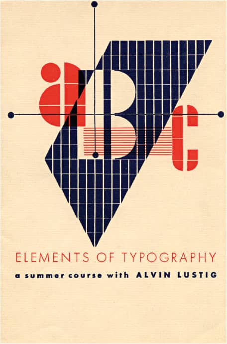
ELEMENTS OF TYPOGRAPHY: A SUMMER COURSE WITH ALVIN LUSTIG FLYER / 1939
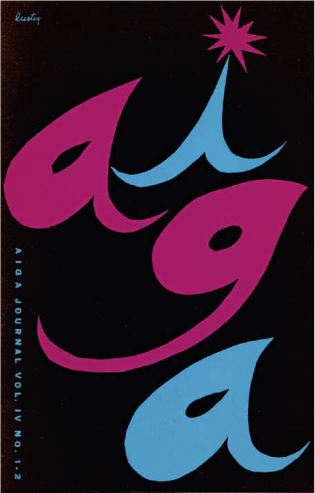
AIGA JOURNAL / 1952
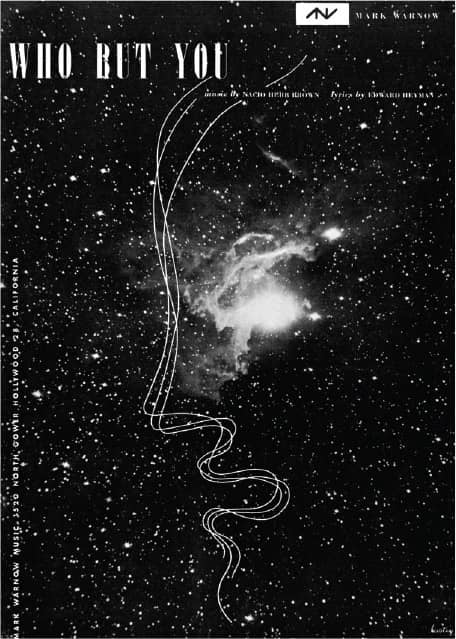
WHO BUT YOU, SHEET MUSIC COVER FOR MARK WARNOW / 1945
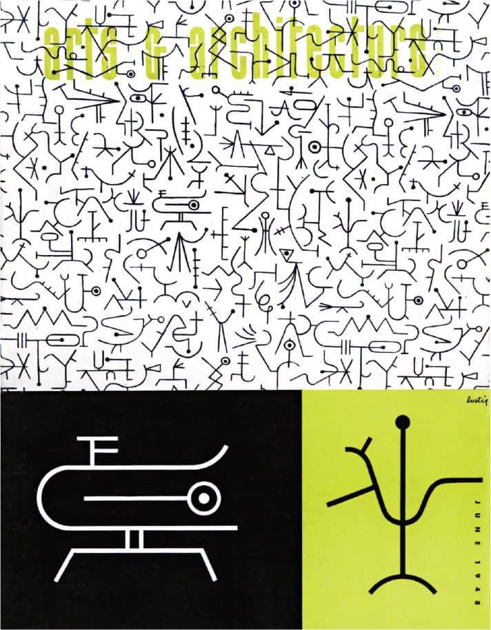
ARTS AND ARCHITECTURE LOGO AND MAGAZINE REDESIGN / 1948
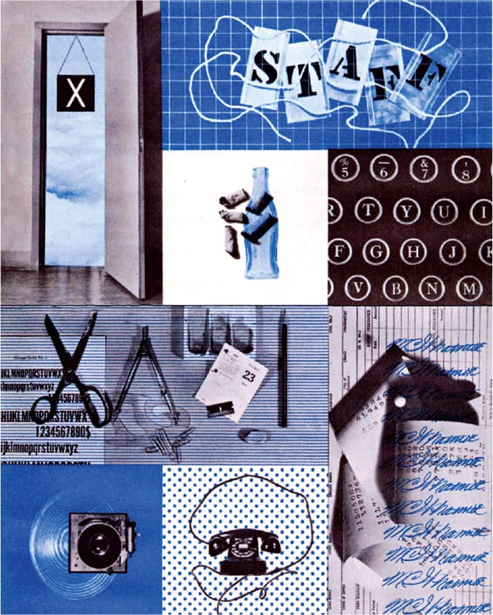
STAFF, IN-HOUSE PUBLICATION FOR LOOK MAGAZINE / 1944
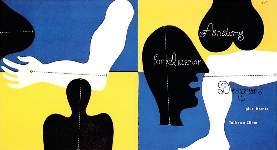
ANATOMY FOR INTERIOR DESIGNERS / Whitney Publications / 1946
Alvin Lustig / USA
Cipe Pineles
1908 (VIENNA, AUSTRIA) – 1991
Three years after arriving in the United States from Vienna, in 1926 Cipe Pineles enrolled in Brooklyn’s Pratt Institute. After struggling to find employment upon graduation—her portfolio earned her interviews, but the disappointment by employers in seeing a woman did not earn her any jobs—she found employment with Contempora, a small design firm, where one project launched her career: For cotton mill Everfast, Pineles created a series of small boxes with mannequins draped in fabric combinations of her choosing. At a party given by coworker Leslie Foster Nast, wife of publisher Condé Nast, the series caught the latter’s attention, and he recommended her for a position under the tutelage of Dr. M.F. Agha, art director for Vogue, Vanity Fair, and House and Garden magazines. Pineles spent 15 years at Condé Nast, earning an increasing charge of responsibility, becoming art director of Glamour in 1942, and gaining recognition in a male-dominated industry.
Starting in 1947, she was able to infuse two publications with her own approach and sensibilities. She was art director for Seventeen magazine, geared to teenage girls and run by editor Helen Valentine, until 1950, and later for Charm, “The magazine for women who work,” also headed by Valentine, until 1959. After a short stint at Mademoiselle, Pineles joined the design firm of her second husband, Will Burtin—her first husband, William Golden of CBS, passed away unexpectedly in 1959—and began teaching publication design at Parsons School of Design in 1962, where she taught until 1987 and also was director of publications. Pineles broke ground in the field of editorial design and, perhaps more importantly, broke the profession’s glass ceiling, becoming the first female member and Hall of Famer of the Art Directors Club › 245. She passed away in Suffern, New York, in 1991.
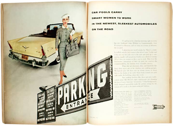
CHARM MAGAZINE / art direction, Cipe Pineles; photography, William Helburn / USA, April 1956
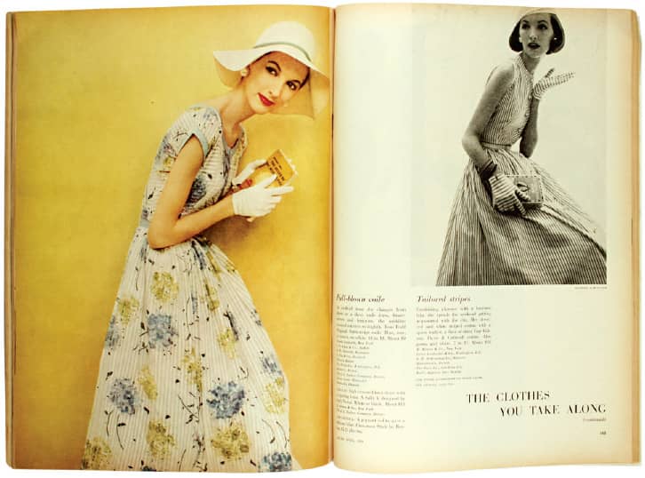
CHARM MAGAZINE / art direction, Cipe Pineles; photography, Carmen Schiavone / USA, April 1956
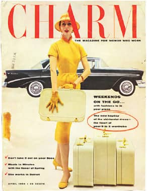
CHARM MAGAZINE / art direction, Cipe Pineles; photography, William Helburn / USA, April 1956
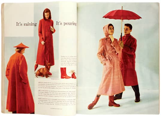
SEVENTEEN MAGAZINE / art direction, Cipe Pineles; photography, James Viles / USA, April 1949
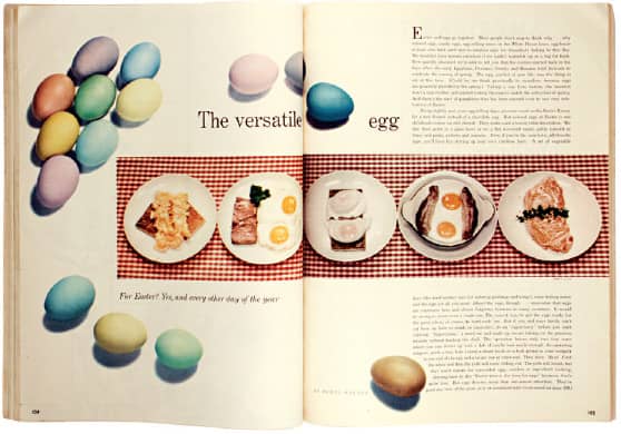
SEVENTEEN MAGAZINE / art direction, Cipe Pineles; photography, Francesco Scavullo / USA, April 1949
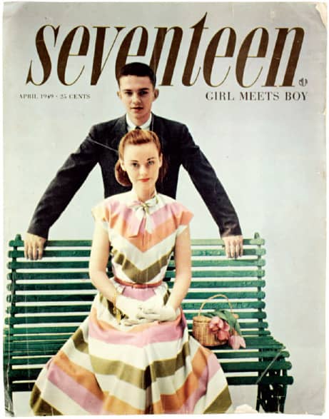
SEVENTEEN MAGAZINE / art direction, Cipe Pineles; photography, Francesco Scavullo / USA, April 1949
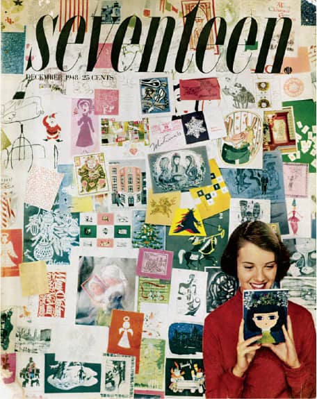
SEVENTEEN MAGAZINE / The photograph background features Pineles’ holiday cards received in 1947 / art direction, Cipe Pineles; photography, Ray Solowinsky / USA, December 1948
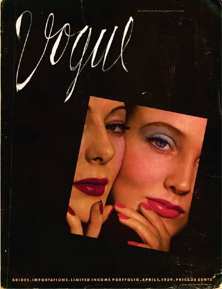
VOGUE MAGAZINE / art direction, Mehemed Fehmy Agha, Cipe Pineles; photography, Horst P. Horst / USA, April 1939
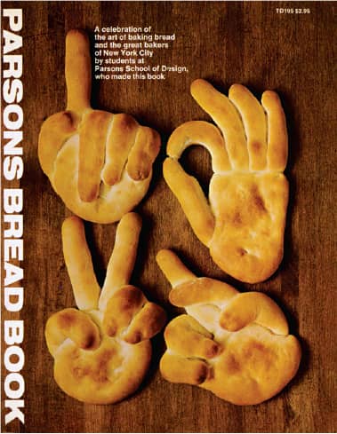
PARSONS BREAD BOOK / Through her editorial design course at Parsons School of Design, Cipe Pineles and her students produced the school’s yearbook for various years, with the 1974 edition published as a trade paperback / Parsons School of Design: instructor, Cipe Pineles Burtin; students: Senior Class of Editorial Design / Harper & Row, Publishers / USA, 1974
Lester Beall
1903 (KANSAS CITY, MISSOURI, USA) – 1969
With a degree in art history from the University of Chicago, plus painting classes at Chicago’s Art Institute, where he also found solace in the library and its collection of European art magazines, Lester Beall began his freelance career in 1927, doing advertising work for clients like the Chicago Tribune, Pabst Corporation, and Marshall Field’s. In 1935, Beall moved to New York, where he maintained a small office in addition to a home and studio in Wilton, Connecticut, beginning in 1936. One of the commissions that garnered substantial attention for his ability to blend European modernism and Russian constructivism with an American sensibility was his ongoing series of posters, done between 1937 and 1941, for the Rural Electrification Administration. This now-defunct agency of the U.S. Department of Agriculture sought to bring electricity to rural areas, and Beall’s simple, iconic red-white-and-blue posters gently explained the solution (arrows running through a faucet) and showed the result (happy children and housewives).
In 1955, after dividing his time over the years between offices in New York and Connecticut, Beall consolidated his operation in Connecticut at Dumbarton Farm, which he had purchased in 1950 and built into a fully operational office. In these years, Beall hired more employees and took on more comprehensive and complex design projects in the burgeoning field of corporate identity, designing not just the logos but detailed manuals outlining their use and regulations for clients like International Paper, Caterpillar Tractor Company, and Martin Marietta. Such manuals are now common practice but were pioneered by designers like Beall, Paul Rand › 159, and firms like Chermayeff & Geismar › 156. Beall’s body of work evolved through industries and disciplines until his death in 1969.
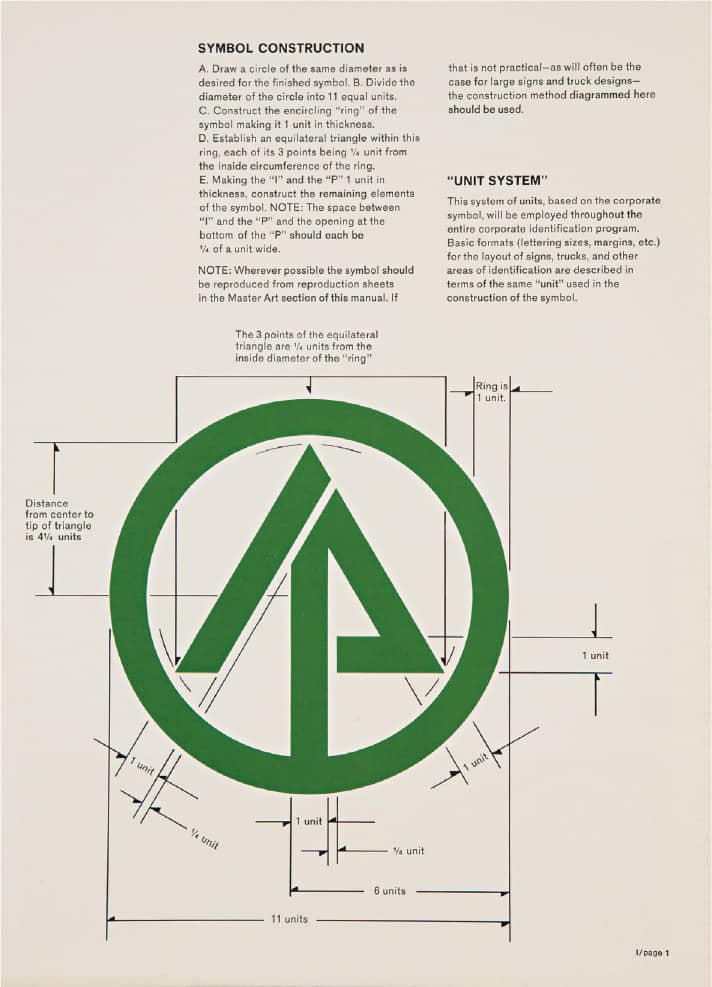
INTERNATIONAL PAPER CORPORATE IDENTITY MANUAL / 1967 / Image: Courtesy of International Paper

CATERPILLAR TRACTOR COMPANY CORPORATE IDENTITY MANUAL / 1967 / Image: Reprinted courtesy of Caterpillar, Inc.
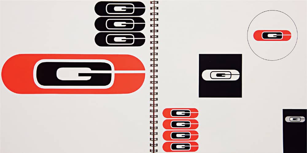
CONNECTICUT GENERAL LIFE INSURANCE CO. CORPORATE IDENTITY MANUAL / 1959
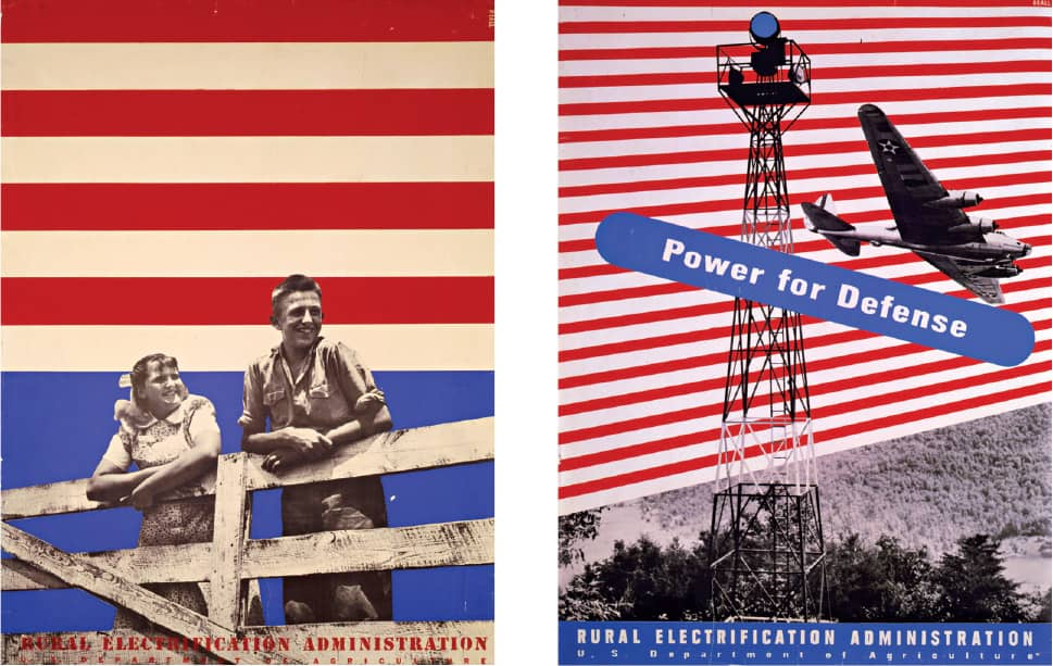
RURAL ELECTRIFICATION ADMINISTRATION POSTERS FOR THE U.S. DEPARTMENT OF AGRICULTURE / 1937–1941 / Images: Courtesy of the Library of Congress, Washington, D.C.
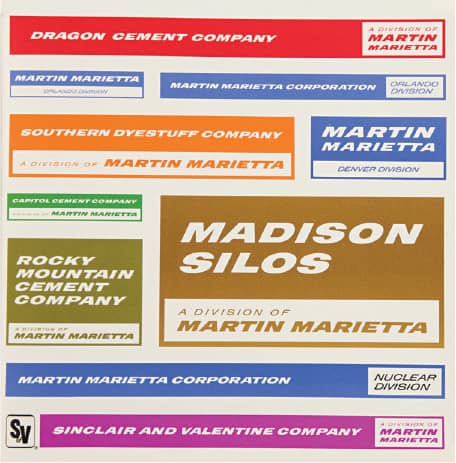
MARTIN MARIETTA CORPORATION CORPORATE IDENTITY MANUAL / 1968
Lester Beall / USA / Images: Courtesy of Lester Beall Collection, Cary Graphic Arts Collection, RIT Libraries
Bradbury Thompson
1911 (TOPEKA, KANSAS, USA) – 1995
While earning his bachelor’s degree in economics at Washburn College in Topeka, Kansas, Bradbury Thompson humbly began in the field of editorial design as the editor and designer of the college yearbook. Upon graduation in 1934, Thompson first worked for Capper Publications designing books and magazines; four years later he moved to New York, where he was art director for the printing firm Rogers-Kellogg-Stillson until 1941. In 1938 he became the editor and designer of Westvaco Inspirations for Printers, a publication started in 1925 by Westvaco Corporation (formerly West Virginia Pulp and Paper Company, now MeadWestvaco) to showcase the performance of typography, photography, art, and printing techniques on the company’s papers. Through 61 issues, until it ceased publication in 1962, Thompson demonstrated not only the aptitudes of the paper but the playfulness and variety graphic design can achieve.
Parallel to Inspirations, Thompson maintained an active practice by serving as art director for the Office of War Information’s publications division (1942–1945), art director of Mademoiselle magazine (1945–1959), and design director of Art News and Art News Annual (1945–1972). Overall, he designed the format for more than 30 magazines. He was also design consultant for Pitney Bowes and McGraw-Hill Publications and a faculty member at Yale School of Art › 129 beginning in 1956. On a more diminutive scale, Thompson became a member of the U.S. Postal Service Citizens’ Stamp Advisory Committee in 1969 and, over the course of his career, designed approximately 100 stamps. Thompson was also curious about typography itself, and in 1950 introduced Alphabet 26, a classic serif typeface in a single case, foregoing the distinction between upper and lowercase. He passed away in 1995 in New York.
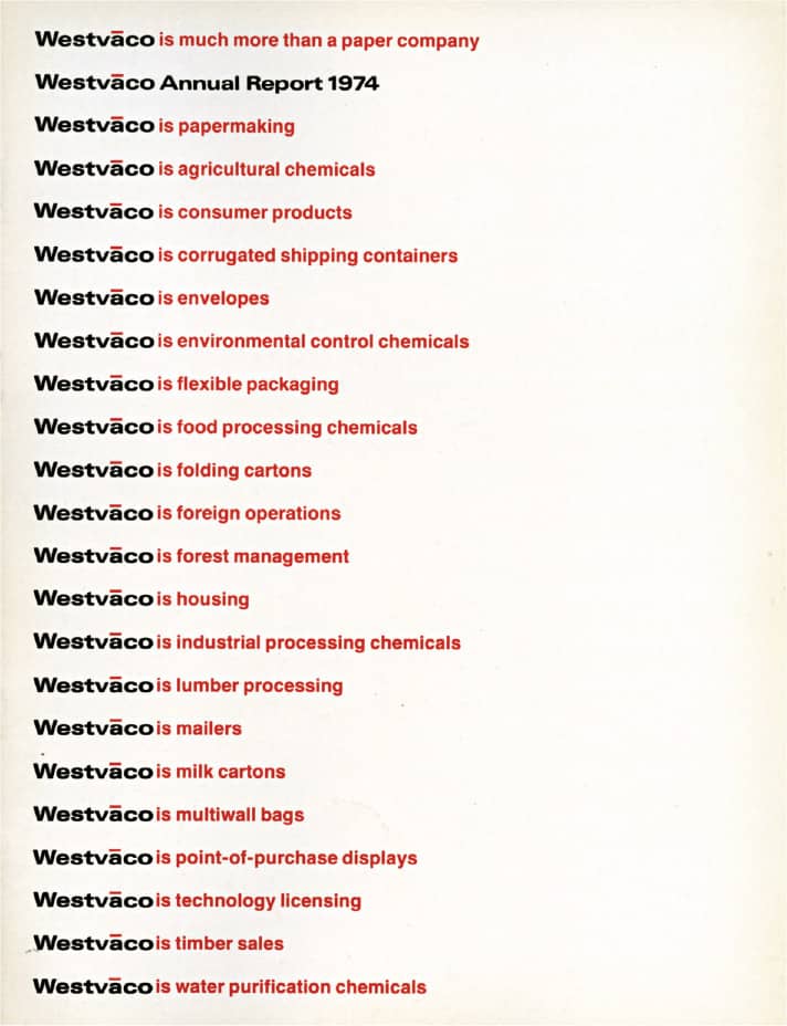
WESTVACO CORPORATION 1974 ANNUAL REPORT / 1975
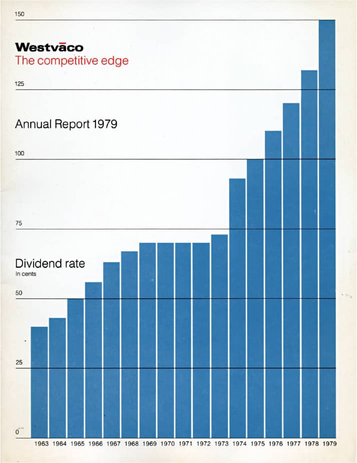
WESTVACO CORPORATION 1979 ANNUAL REPORT / 1980
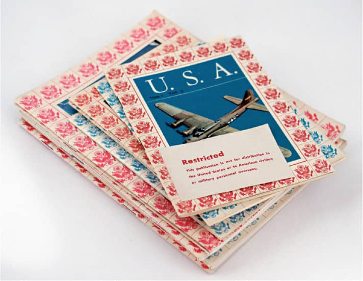
AMERICA AND USA PROPAGANDA BOOKLETS DURING WORLD WAR II / 1944
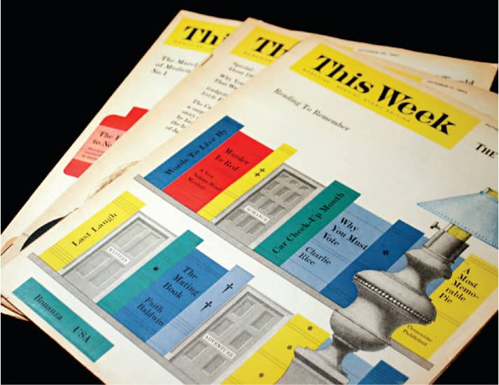
THIS WEEK MAGAZINE, SPECIAL STORY EDITION FOR THE MIAMI NEWS / October 1964
Erik Nitsche
1908 (LAUSANNE, SWITZERLAND) – 1998
After graduating from Munich’s Kunstgewerbeschule (School of Arts and Crafts) Swiss-born Erik Nitsche began his globetrotting and discipline-crossing career in Cologne, Germany, in 1928, when he joined his professor Fritz Helmut Ehmcke, who was in charge of the design and publicity of Pressa, a six-month international exhibition on the modern press. Soon after, around 1930, he headed to Paris, where he worked first for the printing house Draeger Frères and then for Maximilien Vox, who was running Le Service Typographique, a side business of the type foundry Deberny et Peignot. During his stay in Paris, Nitsche received commissions for numerous illustrations for French and German magazines.
Recognizing the troubled times ahead, Nitsche moved to Los Angeles in 1934, and then relocated to New York in 1936. There he began doing editorial illustrations for magazines like Harper’s Bazaar › 327 and Town and Country and covers for Fortune and Vanity Fair. In 1938 he was hired as art director for Saks Fifth Avenue › 319, and through the 1940s he did a variety of freelance work as well as a brief stint as art director of Mademoiselle magazine and as art director in the New York office of advertising agency Dorland International.
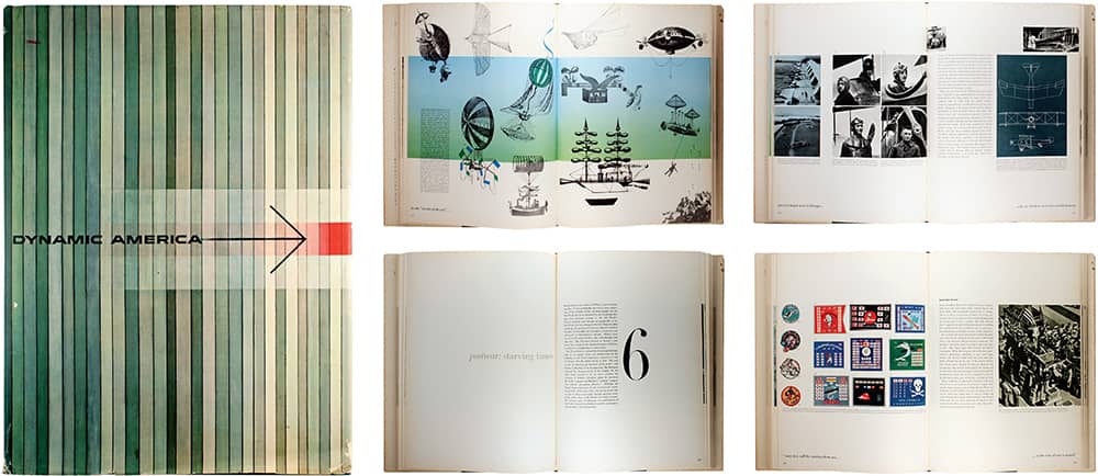
DYNAMIC AMERICA: A HISTORY OF GENERAL DYNAMICS CORPORATION AND ITS PREDECESSOR COMPANIES, Edited by John Niven, Courlandt Canby, Vernon Welsh / Doubleday and General Dynamics / Erik Nitsche / USA, 1960
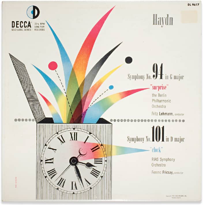
HAYDN, SYMPHONY NO. 94 IN G MAJOR AND SYMPHONY NO. 101 IN D MAJOR / Decca Records / Erik Nitsche / USA, 1952

LENINGRAD PHILHARMONIC ORCHESTRA, RACHMANINOFF SYMPHONY NO. 2 / Decca Records / Erik Nitsche / USA, 1954
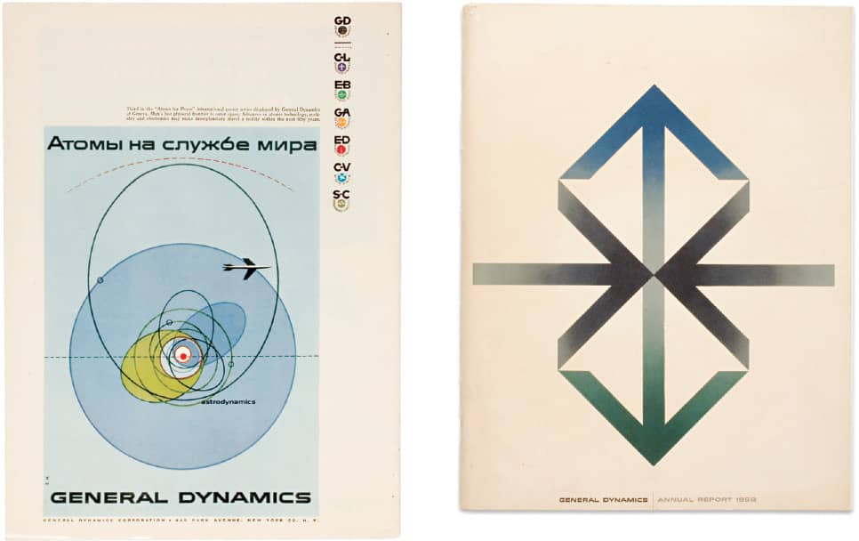
In the early 1950s, now living in Connecticut, Nitsche did posters for movies like No Way Out and All About Eve, and he designed numerous album covers for Decca Records. At this time he also began his relationship with U.S. defense contractor General Dynamics (GD), first through the Gotham Agency, which had the account and hired him to do some print ads, and later directly, when his work caught the attention of the president and CEO John Jay Hopkins, who vested GD’s identity in Nitsche’s hands. From 1955 to the early 1960s Nitsche designed a comprehensive identity program—including posters, advertising, annual reports, and more—for GD that hinged on a combination of abstract and figurative imagery with a scientific flair coupled with elegant and simple typography and layouts. An overture that concluded in the monumental Dynamic America, a 420-page book documenting the history of the company. After that, Nitsche ping-ponged between Connecticut and Europe: In the early 1960s he moved to Geneva, Switzerland, where he established Erik Nitsche International, S.A., and designed a number of pictorial books; in the 1970s he returned to Connecticut, where he worked on children’s books and other projects; in the early 1980s he left for Munich, Germany, where he designed postage stamps for the West German Ministry of Communications; and in 1996 he returned to Connecticut for medical reasons. He passed away in 1998.
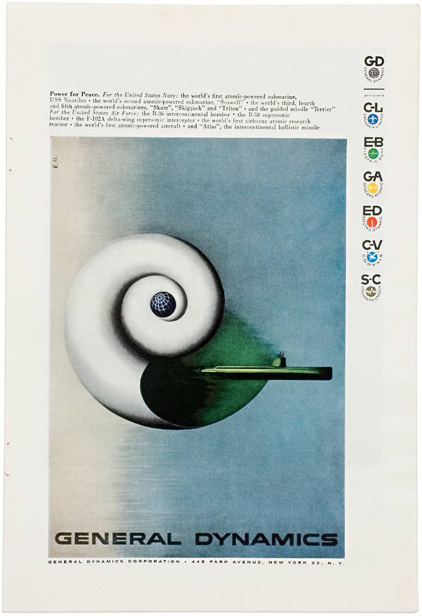
Above and Right GENERAL DYNAMICS NATIONAL ADVERTISING CAMPAIGN AND 1958 ANNUAL REPORT / Erik Nitsche / USA, 1959
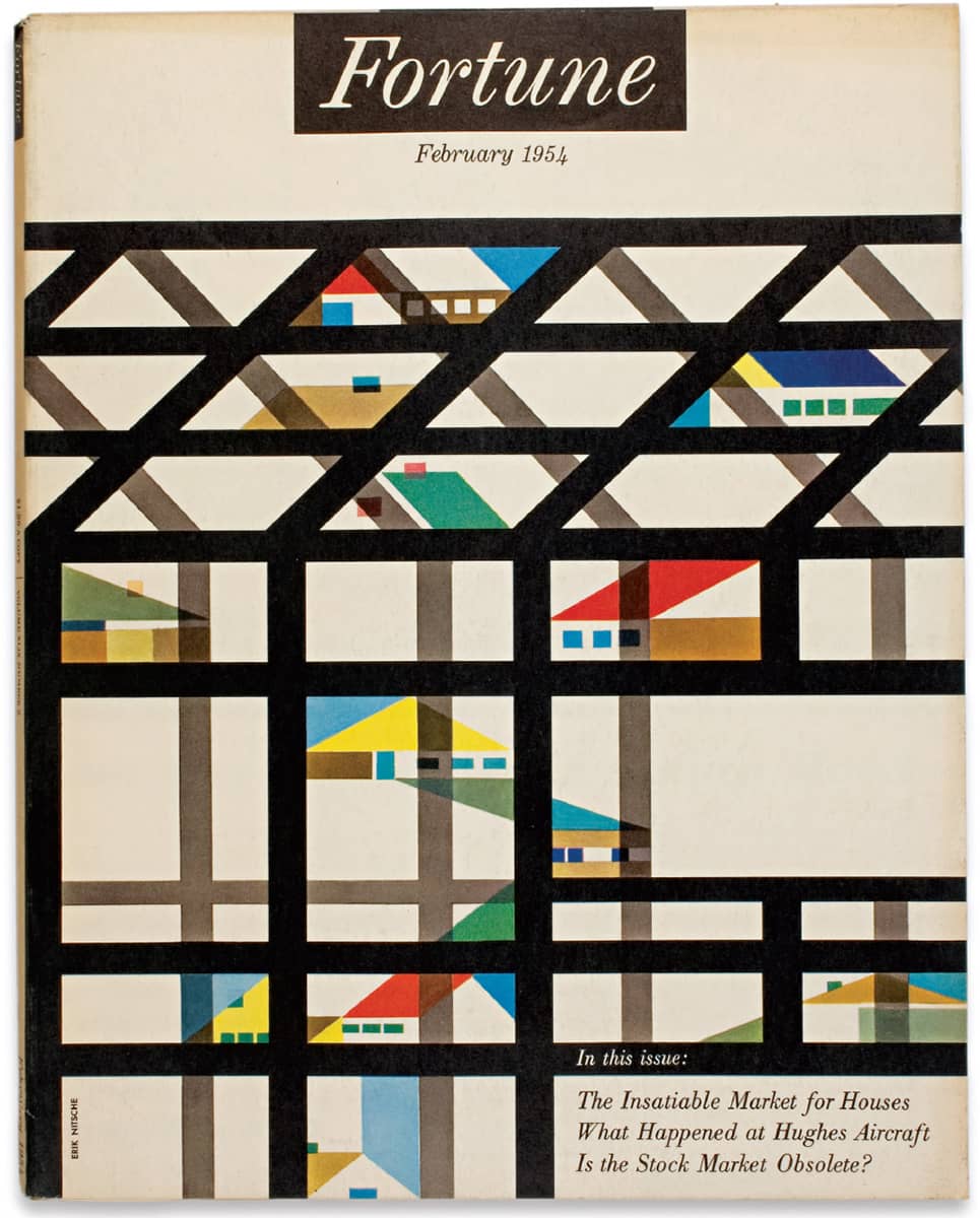
FORTUNE MAGAZINE COVER / Erik Nitsche / USA, 1954
Ladislav Sutnar
1897 (PLZEŇ, CZECHOSLOVAKIA)– 1976
Featuring a prolific career that bridges disciplines and removes the boundaries between them, Ladislav Sutnar’s life can be told in two chapters: Prague and New York. Sutnar studied at the School of Applied Arts in Prague, Charles University, and the Czech Technical University, learning painting, architecture, and mathematics respectively. Soon after graduation, Sutnar began working on wooden toys, puppets, puppetry sets, costumes, and stage direction, a passion that persisted as he also worked on exhibition design, magazines, books, teaching, porcelain products, and textiles. With several World Fairs in his portfolio, Sutnar was commissioned to design the Czechoslovak National Exhibition at the New York World Fair in 1939—with the onset of war, the exhibition was canceled, and Sutnar was sent to retrieve the materials but, instead, stayed permanently.
While looking for work alongside other exiled designers, Sutnar became art director of Sweet’s Catalog Service in 1941, a position he kept for nearly two decades. In 1944, along with architect Knud Löndberg-Holm, Sutnar published New Patterns in Product Information. Their ongoing partnership, born at Sweet’s, pioneered what is now known as information design through many publications. Sutnar also worked for a variety of clients such as Fortune, the United Nations, Golden Griffin Books, Knoll, and Bell Telephone Co.—where, although uncredited, he established the convention of delineating area codes with parentheses. In 1961 the show Visual Design in Action, a traveling retrospective of his work and a self-funded book, joined both chapters of Sutnar’s work, showcasing the prolific career that preceded his years spent as a painter.
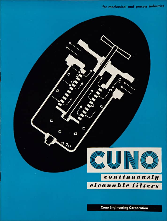
CUNO ENGINEERING CORPORATION CATALOG / Ladislav Sutnar / USA, c. 1946
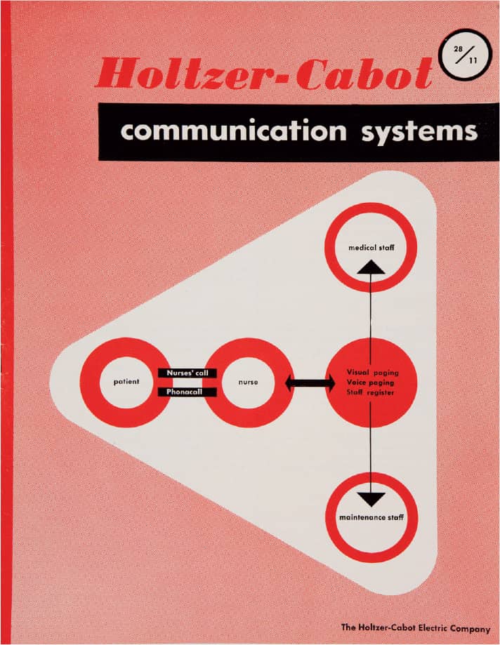
HOLTZER-CABOT ELECTRIC COMPANY CATALOG / Ladislav Sutnar / USA, c. 1944
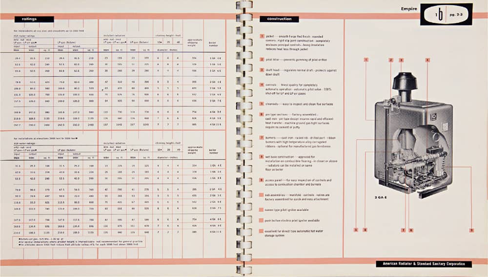
AMERICAN RADIATOR AND STANDARD SANITARY COMPANY CATALOG / Ladislav Sutnar / USA, c. 1950
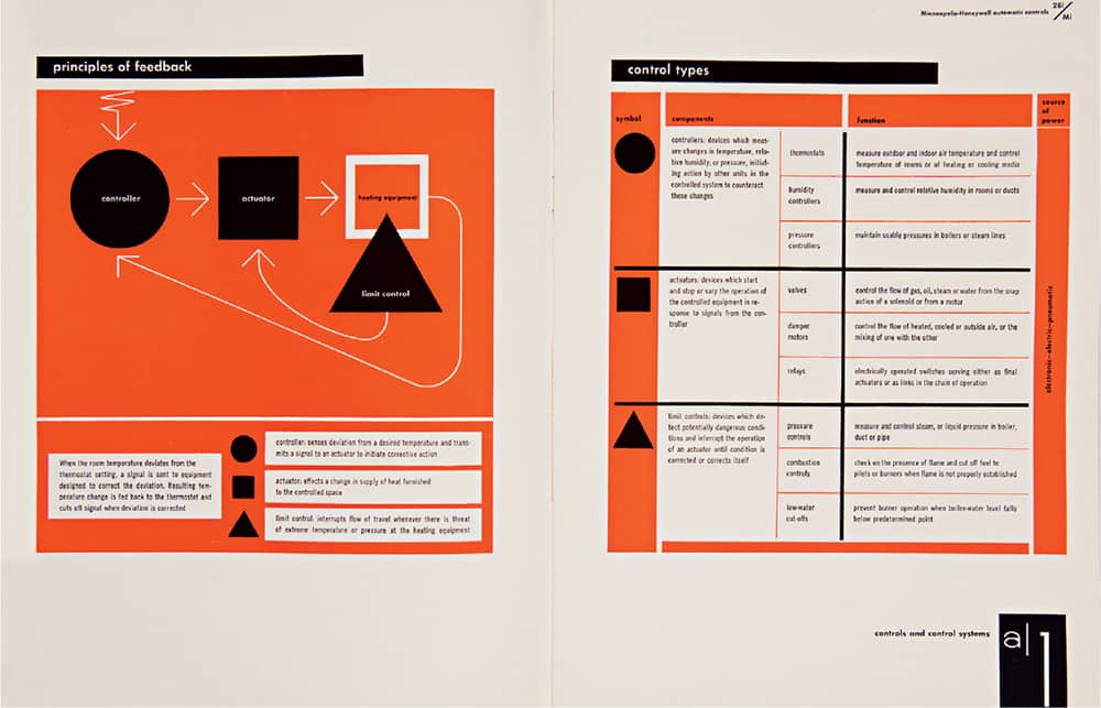
MINNEAPOLIS-HONEYWELL REGULATOR CO. AUTOMATIC CONTROLS CATALOG / Ladislav Sutnar / USA, n. d.

ADVENTURES WITH A LOGOTYPE ADDO-X BUSINESS MACHINES BROCHURE / Ladislav Sutnar / USA, c. 1956–1959

TRANSPORT: NEXT HALF-CENTURY BOOK FOR CANTERBURY PRINTING CO. / Ladislav Sutnar / USA, 1950
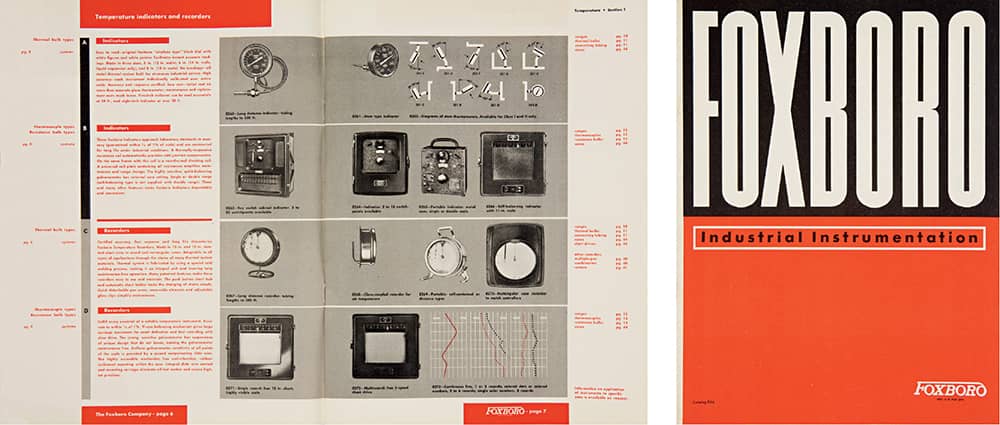
FOXBORO INDUSTRIAL INSTRUMENTATION CATALOG / Ladislav Sutnar / USA, 1943
Images: Courtesy of Ladislav Sutnar, Cary Graphic Arts Collection, RIT Libraries / Copyright: Ladislav Sutnar, reprinted with the permission of the L. Sutnar Family
Armin Hofmann
1920 (WINTERTHUR, SWITZERLAND)
After graduating from Zurich’s Kunstgewerbeschule (School of Arts and Crafts) in the late 1930s, followed by a lithography apprenticeship in Winterthur and working for a number of studios since 1943, Armin Hoffman moved to Basel in 1946 to establish his own studio and begin his longstanding influence as a faculty member of the Schule für Gestaltung Basel (Basel School of Design). In 1968 he established, with Emil Ruder, the Advanced Class of Graphic Design, where he taught until his retirement in 1986. In 1955 Hofmann taught briefly at the Philadelphia Museum School of Industrial Art and lengthily at Yale School of Art › 129, where he remained a visiting lecturer throughout his career; his teaching methods are well documented in Graphic Design Manual: Principles and Practice, published in 1965. As a graphic designer, Hofmann created posters, identities, and advertising for cultural institutions as well as corporations like J.R. Geigy Pharmaceutical Company.
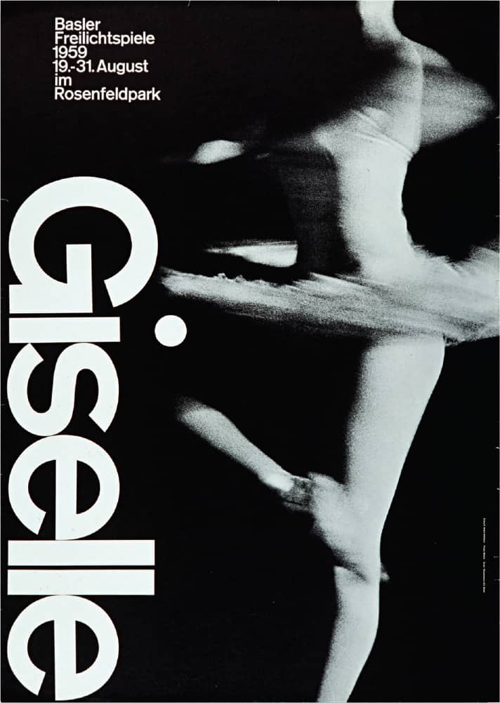
GISELLE POSTER FOR BASEL THEATRE / Armin Hoffman / Switzerland, 1959
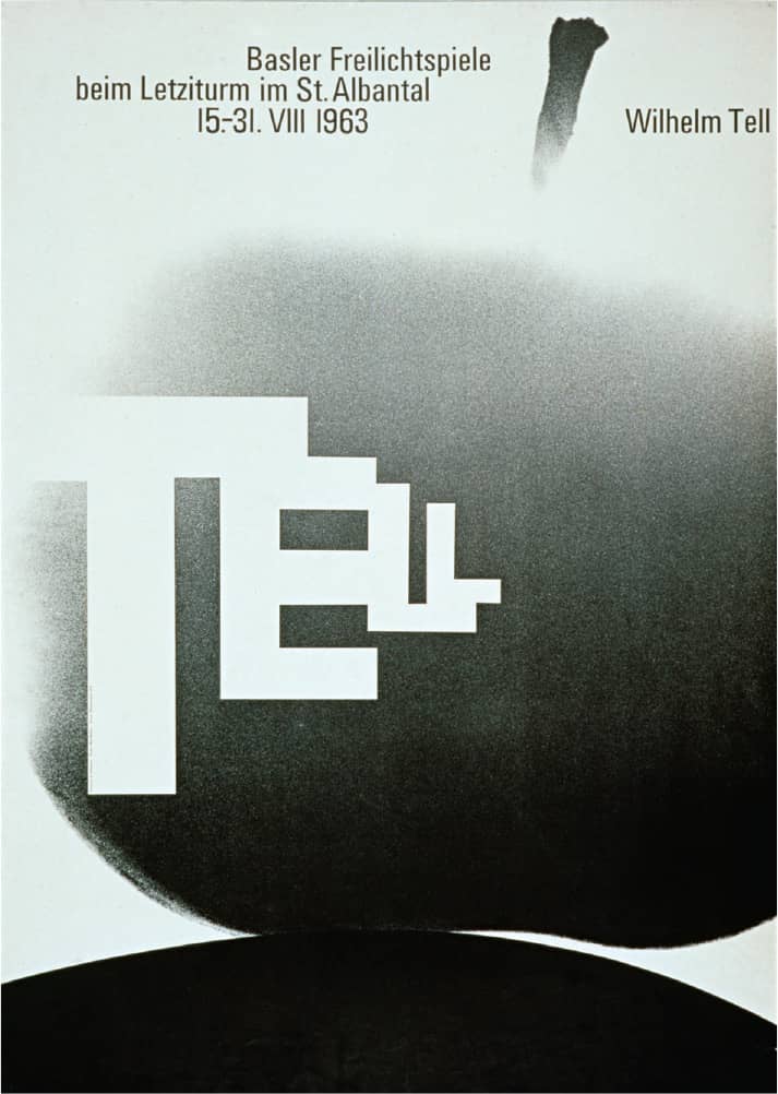
WILLIAM TELL POSTER / Armin Hoffman / Switzerland, 1963
Photos: Courtesy of Museum für Gestaltung Zürich, Poster Collection; Franz Xaver Jaggy
Joseph Müller-Brockmann
1914 (RAPPERSWIL, SWITZERLAND) – 1996
Following studies at both the University of Zurich and the Kunstgewerbeschule (School of Arts and Crafts), Josef Müller-Brockmann apprenticed under designer Walter Diggelmann before establishing his own studio in Zurich in 1936. Over his career he developed numerous projects in different industries, including his famed posters for the Tonhalle Gesellschaft Zürich, the signage system of Zurich’s airport, and his appointment as the European design consultant for IBM › 341—all of it in strict adherence to the International Typographic Style. Müller-Brockmann was also an avid educator, teaching at the Kunstgewerbeschule and at the Hochschule für Gestaltung in Ulm, Germany. Along with Richard Paul Lohse, Hans Neuburg, and Carlo L. Vivarelli, he co-founded the journal Neue Grafik › 97, which he co-edited for seven years.
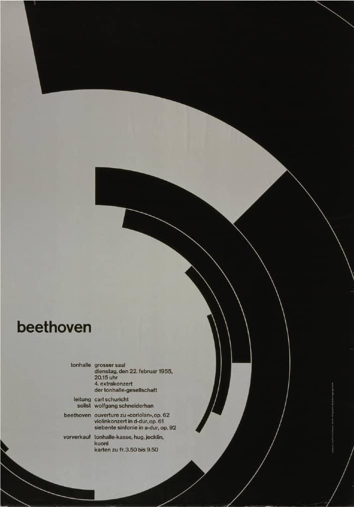
BEETHOVEN POSTER / Joseph Müller-Brockmann / Switzerland, 1955
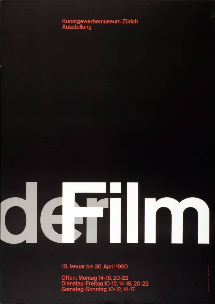
DER FILM EXHIBITION POSTER / Joseph Müller-Brockmann / Switzerland, 1960
Photos: Courtesy of Museum für Gestaltung Zürich, Poster Collection; Franz Xaver Jaggy
Wim Crouwel
b. 1928 (GRONINGEN, NETHERLANDS) CURRENTLY GRONINGEN, NETHERLANDS
Wim Crouwel attended both the Academy Minerva, School of Fine Arts and Design in Groningen (1947–1949), and the Institute of Arts and Crafts in Amsterdam (1951–1952). Crouwel established his own firm after graduation and in 1955 established a long-lasting relationship with the Van Abbemuseum, where he created some of his most iconic posters. With working experience as a graphic and exhibit designer, he co-founded Total Design in 1963 with Ben Bos, Friso Kramer, Dick and Paul Schwarz, and Benno Wissing—a multidisciplinary partnership that sought to encompass all aspects of design in a single firm, achieving unity across all fields. In 1964, the director of Van Abbemuseum left to run the Stedelijk Museum in Amsterdam, commissioning posters from Crouwel, who responded with a systematic approach whereby all the work was performed with the same underlying grid › 50. This and other adherences to grid structures earned him the nickname “Gridnik.”
Prevalent in Crouwel’s work is the use of custom letterforms, a practice that gave way to New Alphabet, a theoretical exercise, done in the late 1960s, of a monospaced type family in various weights and styles, designed solely with 90-degree angles and a 45-degree cut at the joints. Considered unusable by Crouwel, New Alphabet was famously reprised on a Joy Division album cover released in 1988 and designed by Peter Saville › 180. In 1981, Crouwel was the last of the founding partners to leave Total Design as he became a full-time professor at Delft University. He officially retired in 1993, yet he continues to design, fully embracing the technology his Macintosh offers.
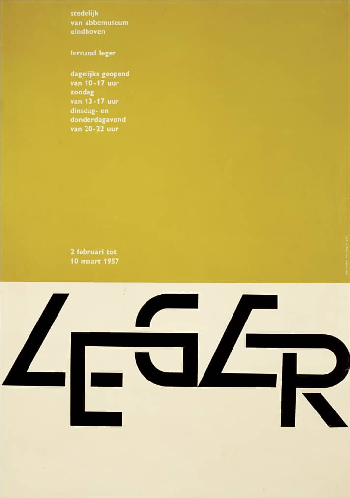
FERNAND LEGER POSTER FOR VAN ABBEMUSEUM / 1957
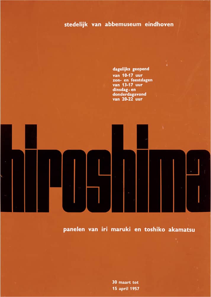
HIROSHIMA POSTER FOR VAN ABBEMUSEUM / 1957
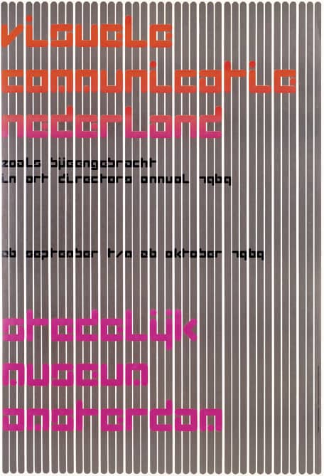
Far Left VISUELE COMMUNICATIE NEDERLAND POSTER FOR STEDELIJK MUSEUM AMSTERDAM / 1968
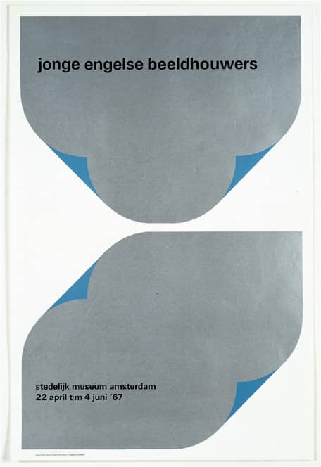
Left JONGE ENGELSE BEELDHOUWERS POSTER FOR STEDELIJK MUSEUM AMSTERDAM / 1967
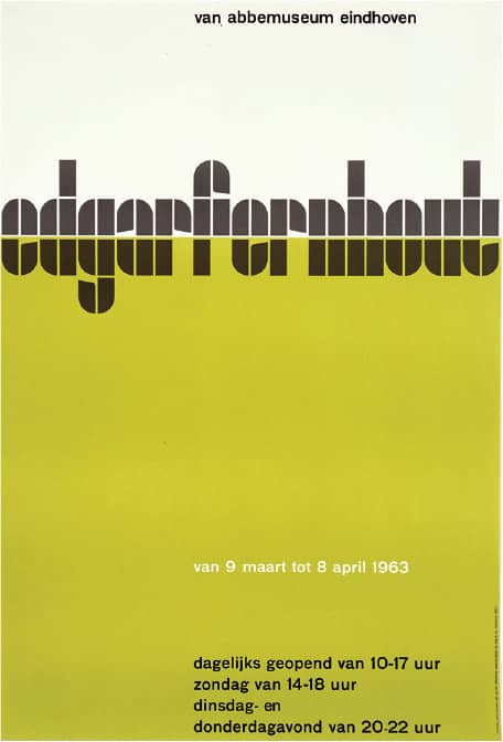
Far Left EDGAR FERNHOUT POSTER FOR STEDELIJK MUSEUM AMSTERDAM / 1963
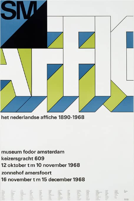
Left HET NEDERLANDSE AFFICHE 1890–1968 POSTER FOR MUSEUM FODOR AMSTERDAM / 1968
Wim Crouwel / Netherlands
Robert Massin
b. 1925 (LA BOURDINIÈRE, FRANCE)
Robert Massin began his design career in 1948 when he joined one of France’s most influential book clubs—which had supplanted traditional publishing houses and the library network after their downfall in World War II—Club français du livre, as editor of Liens, its monthly newsletter. There he had the opportunity to design his first book cover and layout, a skill he would soon master and revolutionize. Next he worked as the artistic advisor for another book club, the Club du meilleur livre, from 1952 to 1958, which he helped develop into one of the most prestigious through sophisticated and provocative design and production. Massin was then hired by Gallimard, a French publishing house, where he spent 20 years designing and art directing the covers and layouts of its 10,000 titles.
With Gallimard, Massin published two of his most recognized books: La Cantatrice Chauve in 1964 (later published as The Bald Soprano in the United States and The Bald Prima Donna in the United Kingdom), a play by Eugène Ionesco, in which he manipulated typography as a way to bring the intonation and timing of the play into the flat page; and La Lettre et l’Image (Letter and Image) in 1970, a book showcasing his vast and eccentric collection of images that reflect the relationship among letters, images, and the cultures they inhabit. In 1979 Massin left Gallimard and engaged with books in a different way: as editor for Gallimard and other publishers; from 1980 to 1982 as associate editor of Atelier Hachette/Massin, an imprint of the publishing giant Hachette; and as a writer, publishing novels and essays. Since 1984, Massin has worked as an independent designer.

LA LETTRE ET L’IMAGE, Massin / First published by Gallimard, later translated to various languages / Massin / France, 1970 (1st ed.)

COVER AND SPREADS FROM THE BOLD SOPRANO, Eugène Ionesco / Massin / France, 1965
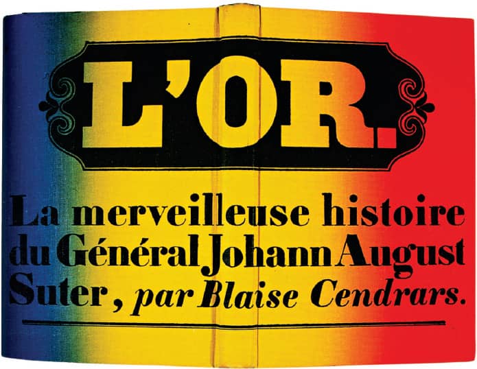
L’OR: LA MERVEILLEUSE HISTOIRE DU GÉNÉRAL JOHANN AUGUST SUTER, Blaise Cendrars, Club du Meilleur Livre / Massin / France, 1956
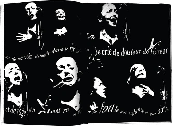
LA FOULE FINAL LAYOUT / Grove Press / Massin; lyrics, Édith Piaf; photographic interpretation, Emil Cadoo / USA, 1965
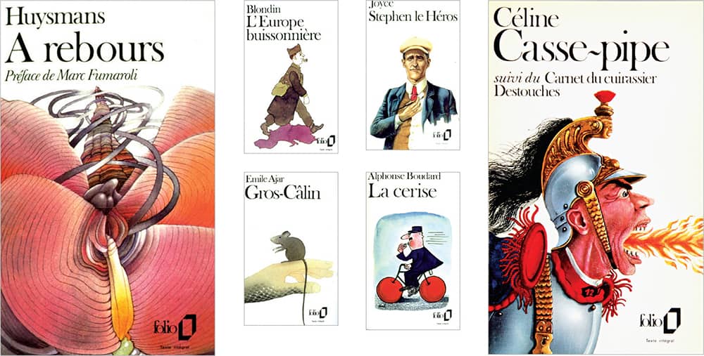
FOLIO SERIES BOOK COVERS / Gallimard / Massin / France, 1972–1974
Robert Brownjohn
b. 1925 (NEWARK, NEW JERSEY, USA) – 1970
Following a year in Brooklyn’s Pratt Institute, Robert Brownjohn left to attend Chicago’s Institute of Design in 1944, where the renowned László Moholy-Nagy took him as his protégé, and after his death in 1946, his successor, architect Serge Chermayeff, also embraced Brownjohn as his teaching assistant. It was during this time that Brownjohn’s lifelong struggle with heroin and drug addiction began. In 1951, he moved to New York and toiled in both freelance work and the city’s nightlife, and by 1956 he began a working collaboration with Ivan Chermayeff (Serge’s son) that a year later would become Brownjohn, Chermayeff & Geismar › 156 with the addition of Tom Geismar. First designing letterheads, book covers, and other small projects, their commissions soon became bigger for clients like Pepsi-Cola and Chase Manhattan Bank, but Brownjohn’s drug addiction and erratic behavior kept surfacing, and in 1960 he moved to London.
Brownjohn was first employed by J. Walter Thompson and then McCann-Erickson in 1962 as an art director; this wasn’t Brownjohn’s most prolific period, as his work and ideas went mostly unproduced, but it did establish his reputation as one of the best in London, and he was able to prove it when he designed the iconic titles for the movie From Russia with Love, where the credits are projected on a dancer—a feat he topped in the following James Bond installment, Goldfinger, where live-action sequences are projected on a gold-hued dancer. With a deeper interest in film, he left advertising and formed a partnership with filmmakers David Cammell and Hugh Hudson in 1965. He continued to work in this field as well as in design, but in 1970 he died of a heart attack at the young age of 44.
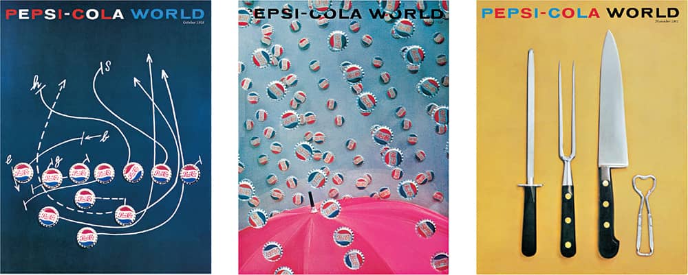
PEPSI-COLA WORLD IN-HOUSE MAGAZINE FOR PEPSI-COLA COMPANY / Brownjohn, Chermayeff & Geismar: Robert Brownjohn / USA, 1958–1961
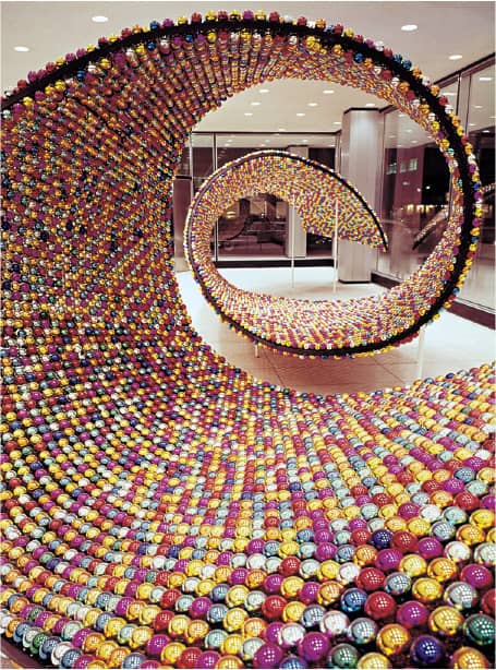
CHRISTMAS RIBBON HOLIDAY DISPLAY FOR THE PEPSI-COLA BUILDING LOBBY / Brownjohn, Chermayeff & Geismar: Robert Brownjohn / USA, 1958

VITAMIN TABLET PACKAGING / Robert Brownjohn / USA, early 1960s
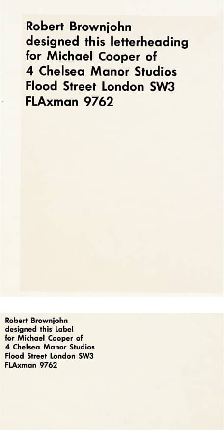
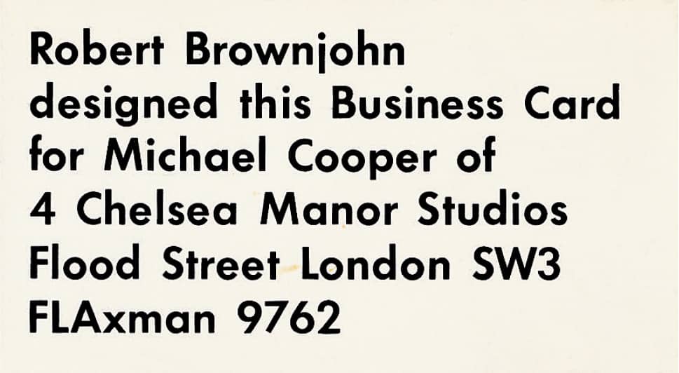
MICHAEL COOPER STATIONERY / Robert Brownjohn / USA, 1967
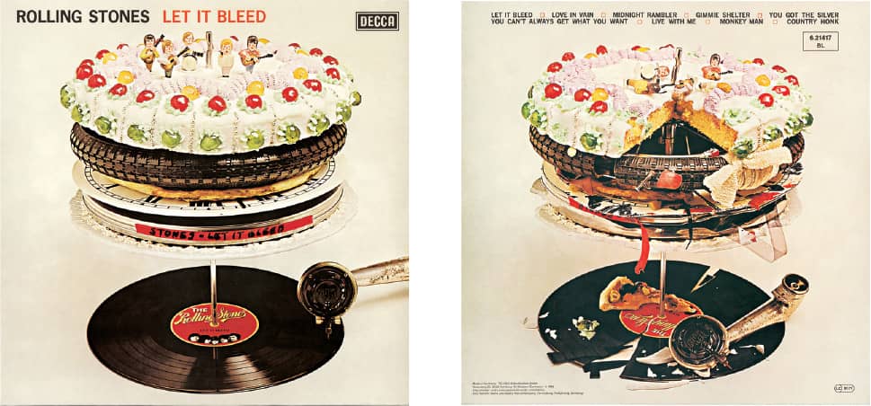
LET IT BLEED, The Rolling Stones / Decca Records / Robert Brownjohn / USA, 1969
Chermayeff & Geismar
EST. 1957 (NEW YORK, NEW YORK, USA)
During the 1960s, the practice of corporate identity was firmly established in the United States, and one of the forerunners in the field was Chermayeff & Geismar, a design firm founded in 1957 by Ivan Chermayeff, Tom Geismar, and Robert Brownjohn, who left the partnership in 1960. Chermayeff and Geismar met while they were both at the graduate program of Yale’s School of Art › 129 and Architecture. Each pursued a different track—Chermayeff worked for Alvin Lustig › 144 and CBS Records › 300, while Geismar went to the Army’s Exhibition Unit, where he designed exhibits and graphics—before coming back together. Initially, their business was comparatively small, designing business cards and letterheads for small clients, but they built up to larger commissions—from Pepsi-Cola in 1958, designing their in-house magazine Pepsi-Cola World, and Chase Manhattan Bank in 1960, designing their identity—the result, an abstract icon, was one of the first to forego figurative interpretations or an alphabetic solution.
In the ensuing 50 years, the firm of Chermayeff & Geismar has created more than 100 identity programs, including Mobil, Xerox, PBS, NBC › 344, Univision, Viacom, TimeWarner, the Smithsonian, and National Geographic. In addition to their identity output, Chermayeff and Geismar have been prolific in the realm of exhibit design and environmental graphics, creating large-scale projects like the U.S. pavilions in the 1958 and 1970 World Fairs and exhibits for the Ellis Island Immigration Museum, the Statue of Liberty Museum, and the Truman Presidential Library, among others. Posters, corporate literature, signage, and books complement their practice in an unconfined diversity of styles. In 2005, Chermayeff and Geismar separated from their partners—among them Steff Geissbuhler › 157, who had been with the firm for 30 years—and established a smaller studio.

LEXINGTON AVENUE AT 53RD STREET SUBWAY STATION MURALS AND WAYFINDING SYSTEM / architecture, Edward Larrabee Barnes Architects / 1986

ELLIS ISLAND IMMIGRATION MUSEUM / MetaForm, Inc. / 1990

UNIVISION LOGO / 1988

9 WEST 57TH STREET / architecture, Skidmore, Owings & Merrill / 1972
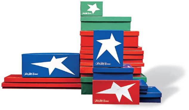
SAKS FIFTH AVENUE HOLIDAY PACKAGING / 1976

BARNEYS NEW YORK LOGO / 1981

MOBIL LOGO / 1964

NATIONAL GEOGRAPHIC LOGO / 2001

(PUBLIC BROADCASTING SERVICE) LOGO / 1983

SMITHSONIAN INSTITUTION LOGO / 1997

CHASE MANHATTAN BANK LOGO / 1960
Chermayeff & Geismar / USA
Steff Geissbuhler
b. 1942 (ZOFINGEN, SWITZERLAND) CURRENTLY NEW YORK, NEW YORK, USA
Equipped with an ability to illustrate and an education from the Basel School of Design › 128 in Switzerland, Steff Geissbuhler has developed a rich portfolio of identities, posters, corporate literature, signage, and environmental graphics that is both freely expressive and formally structured. Upon graduation from Basel in 1964, Geissbuhler first worked at J.R. Geigy Pharmaceutical Company (now Novartis), known for a strong art department headed by Max Schmid. After three years, he moved to the United States to help his Basel classmate, Ken Hiebert, establish a graphic design program at the Philadelphia College of Art (now the University of the Arts); he served there as associate professor until 1973. At the same time he freelanced for Murphy, Levy, Wurman, Architects and Urban Planners, in Philadelphia.
Interested in returning to a full-time practice, Geissbuhler spent a year at Anspach Grossman Portugal in New York before joining Chermayeff & Geismar › 156 in 1974, initially as an associate and, only two years in, as a partner. He spent the next 30 years with the firm. Among his most visible projects were identities for NBC › 344, Time Warner, Telemundo, and Merck, along with large assignments like signage for the University of Pennsylvania and architectural graphics for the IBM building in New York. These were augmented with a variety of work for cultural and educational institutions around the country. In 2005, Chermayeff and Geismar decided to form a smaller studio, and Geissbuhler established C&G Partners—a name directly derived from Chermayeff & Geismar—with partners Keith Helmetag, Jonathan Alger, and Emanuela Frigerio, founded on the legacy of his previous partners while building their own.

QUESTIONMARK POSTER FOR PUNCT’D EXHIBIT / 2003
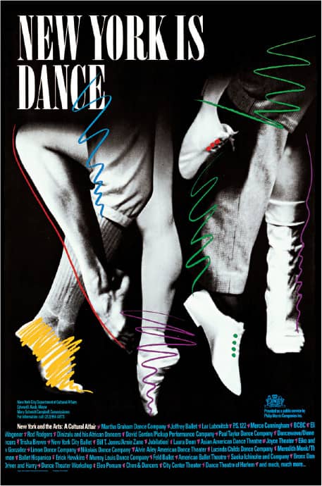
NEW YORK IS DANCE POSTER / One of nine posters promoting cultural institutions in New York City /1987
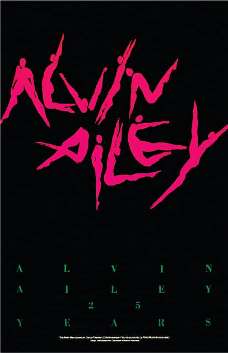
ALVIN AILEY DANCE THEATER 30TH ANNIVERSARY TOUR POSTER AND IDENTITY / 1981
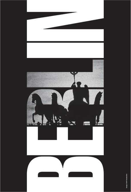
AGI CONGRESS AND EXHIBIT POSTER / 2005
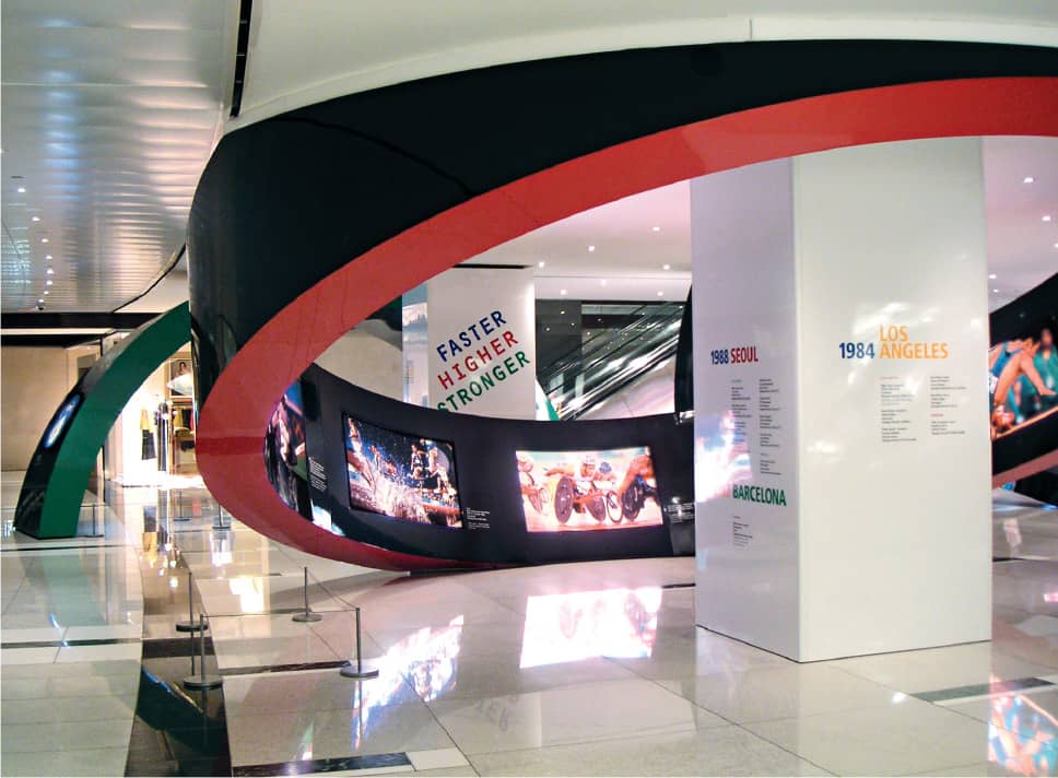
SPORTS ILLUSTRATED AT THE OLYMPICS, A PHOTOGRAPHY EXHIBIT AT THE TIMEWARNER CENTER / 2004
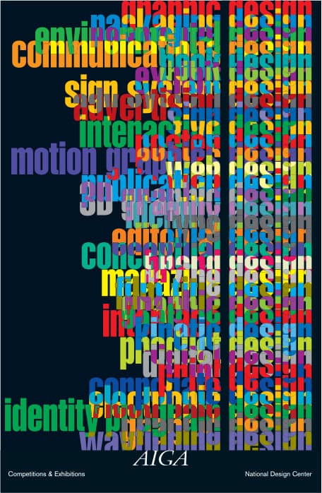
AIGA COMPETITIONS AND EXHIBITIONS POSTER / 2000

TOLEDO MUSEUM OF ART IDENTITY, GRAPHICS, AND ENVIRONMENTAL GRAPHICS / 1999

TIME WARNER AND TIME WARNER CABLE IDENTITY / 1990
C&G Partners; Steff Geissbuhler / USA
Saul Bass
1920 (NEW YORK, NEW YORK, USA) – 1996
In a career spanning the 1950s to the 1990s, Saul Bass conquered individual industries—corporate identity, film titling and marketing, packaging, and filmmaking—that are now the realm of specialized agencies with dozens of employees. He attended the vocational Art Students League of New York in 1936 and then Brooklyn College in 1944, working briefly in New York before moving to Los Angeles in 1946, where he worked and freelanced for agencies until 1952, when he established Saul Bass & Associates. His first foray into the movie industry came in 1954 with the advertising image for Carmen Jones, a production of Otto Preminger. This was followed by the motif and groundbreaking film titles for Preminger’s Man with the Golden Arm. Bass continued to work with Preminger as collaborations with Alfred Hitchcock and Stanley Kubrick blossomed in the form not only of posters and film titles but also of the designer’s influential input in cinematic sequences.
Bass’s interest in filmmaking led him to do short films for companies like Kodak and United Airlines, and Kaiser Aluminum produced Why Man Creates, the 1968 documentary that earned Bass an Oscar in that category. Beyond the film industry, Bass was a highly accomplished corporate identity designer, creating iconic logos in every conceivable market, from consumer products to airlines to nonprofits to electronic goods. Some of the biggest identity commissions, including Exxon and AT&T, came after Bass entered a partnership with Herb Yager, who had a seasoned business and marketing acumen, to form Saul Bass/Herb Yager & Associates in 1978. After a respite from film titles in the 1970s and 1980s, Bass worked with Martin Scorsese through the 1990s, creating four more opening sequences, with 1995’s Casino his last. He passed away in 1996 in Los Angeles.
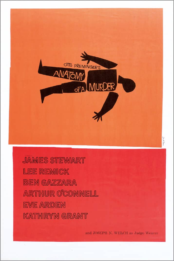
ANATOMY OF A MURDER POSTER / Columbia / 1959
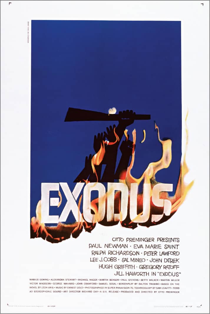
EXODUS POSTER / United Artists / 1960
Images: Courtesy of the Academy of Motion Picture Arts and Sciences

CONTINENTAL AIRLINES LOGO / 1965

UNITED AIRLINES LOGO / 1965

THE BELL SYSTEM LOGO REDESIGN / 1969

DIXIE LOGO / 1969

QUAKER OATS LOGO / 1969

WARNER MUSIC GROUP LOGO / 1974

GIRL SCOUTS LOGO / 1978

AT&T LOGO / 1984

YWCA LOGO / 1988
Saul Bass / USA
Paul Rand
1914 (BROOKLYN, NEW YORK, USA) – 1996
Through a career spanning more than 60 years, Paul Rand sustained an inimitable practice that crossed multiple disciplines without sacrificing his commitment to design with the highest quality and care. He was mostly self-taught through a voracious appetite for reading, as art and drawing classes in the early 1930s at Pratt Institute, the Art Students’ League, and Parsons School of Design were not necessarily cathartic. Rand made a significant name for himself—first, literally by changing his birth name of Peretz Rosenbaum in 1935—as art director for advertising agency William H. Weintraub & Co., where he worked from 1941 until the firm closed in 1955. Through these years and afterwards, he also created numerous book jackets and magazine covers as freelance assignments as well as designing and illustrating four children’s books written by his second wife, Ann Rand.
Best known, perhaps, was Rand’s contribution to the growing discipline of corporate identity, and most notable was his work for IBM › 341. He started there in 1956, when Eliot Noyes hired him as design consultant and over the course of three decades Rand oversaw every aspect of IBM’s identity, establishing unflinching standards for other designers to implement as well as designing numerous publications and posters himself. Other significant and comprehensive programs were for Westinghouse and Cummins, as well as logos for ABC › 344, Enron, UPS › 342, and Steve Jobs’s NeXT. Rand’s unwavering pursuit of commitment also applied to his teaching at Yale School of Art › 129, where he was exacting and brutally honest in his critiques—more than 30 years’ worth of students can attest to that. He was an avid and authoritative writer, publishing books and dozens of articles over the course of his career. Rand passed away in 1996 in Norwalk, Connecticut.
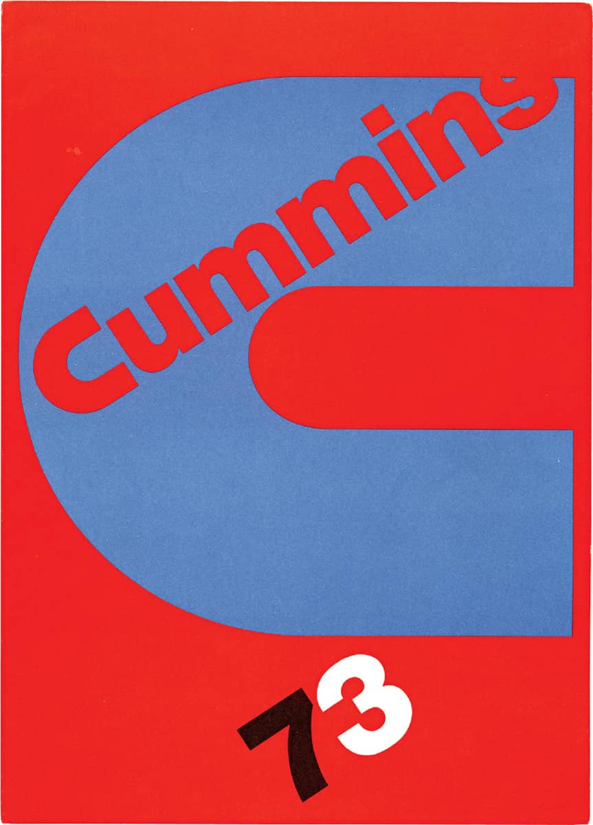
CUMMINS ENGINE COMPANY, INC. 1973 ANNUAL REPORT / Paul Rand / USA, 1974
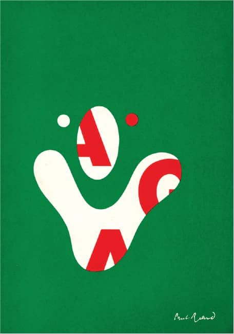
JOURNAL OF THE AMERICAN INSTITUTE OF GRAPHIC ARTS, NO. 6 / cover design, Paul Rand / USA, 1968 / Image: Courtesy of AdamsMorioka Vault, AIGA
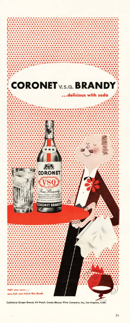
CORONET BRANDY ADVERTISEMENT SHOWCASING THE CORONET BRANDY MAN AND CARBONATED BUBBLES BACKGROUND, DESIGNED IN 1941, THAT IDENTIFIED THE CAMPAIGN / Paul Rand / USA, circa 1945–1948
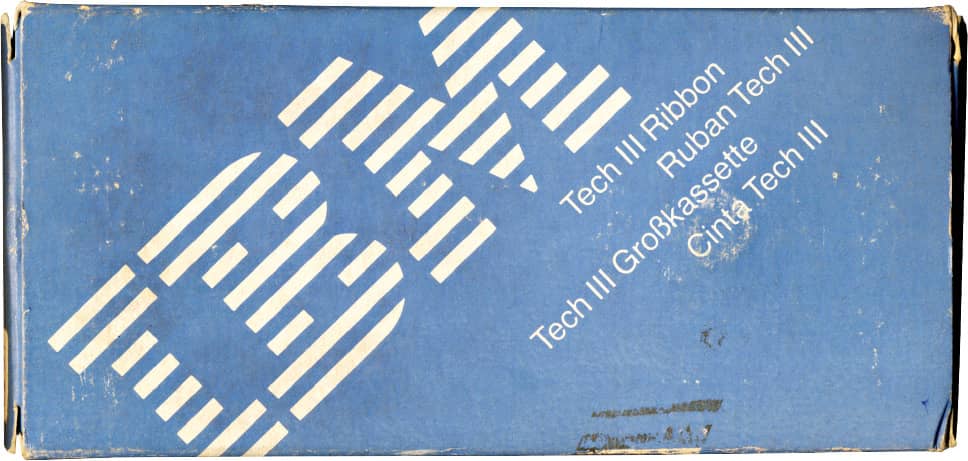
IBM TECH III RIBBON PACKAGE / Paul Rand / USA, 1971

WESTINGHOUSE LOGO / Paul Rand / USA, 1960
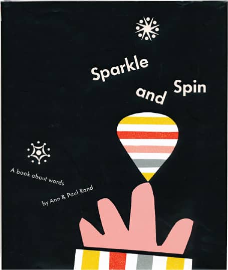
SPARKLE AND SPIN: A BOOK ABOUT WORDS, By Ann and Paul Rand / Harcourt, Brace & World / USA, 1957
Massimo Vignelli
b. 1931 (MILAN, ITALY) CURRENTLY NEW YORK, NEW YORK, USA
After studies in architecture in Milan and Venice, Massimo Vignelli was offered a yearlong fellowship with Massachusetts-based Towle Silversmiths, a silverware company in 1957. He married Lella Vignelli, with whom he established a lifelong collaborative working relationship as well, and moved to the United States. Vignelli then took a part-time teaching position at the Institute of Design at Chicago’s Illinois Institute of Technology (IIT), where he spent two years while also working at the Center for Advanced Research in Design at the Container Corporation of America. In 1960, the Vignellis returned to Milan, where they established the Vignelli Office of Design and Architecture and designed corporate identity projects, packaging, interiors, and furniture.
In January 1965, along with Chicago-based Ralph Eckerstrom, Vignelli co-founded Unimark International, a design firm with headquarters in Chicago and offices in New York, Palo Alto, and Milan. Vignelli headed the Milan office for a short time and then went to New York, planning to stay two years—but the Vignellis never left. In 1971, Vignelli left Unimark and once again established a thriving office, Vignelli Associates, with his wife. From 1980 to 2000, the firm grew exponentially until its founders decided to scale back, slow the pace, and establish a design office in their own home.
The graphic design work produced by Vignelli over five decades consistently abided by strict principles of layout and typography—manifest in devoted adherence to the grid › 50 and a penchant for a select set of classic typefaces—that parlayed into a dominant aesthetic that defined corporate identity, packaging, editorial, and environmental design in the 1960s, 1970s, and 1980s—not to mention a lasting influence well into the first decade of the twenty-first century.
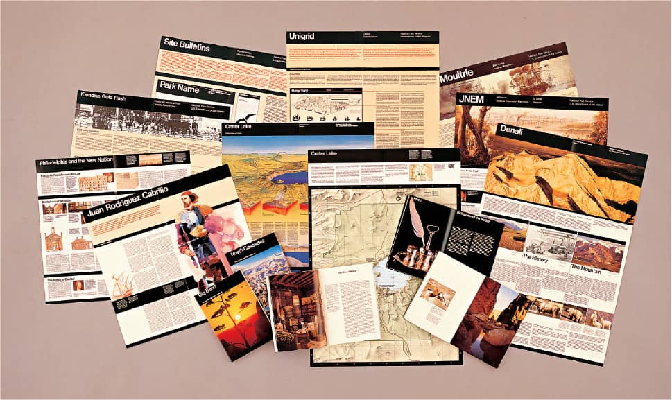
NATIONAL PARK SERVICE PUBLICATIONS PROGRAM / 1977
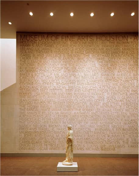
HOUSTON MUSEUM OF FINE ARTS ENVIRONMENTAL GRAPHICS AND SIGNAGE / 1999
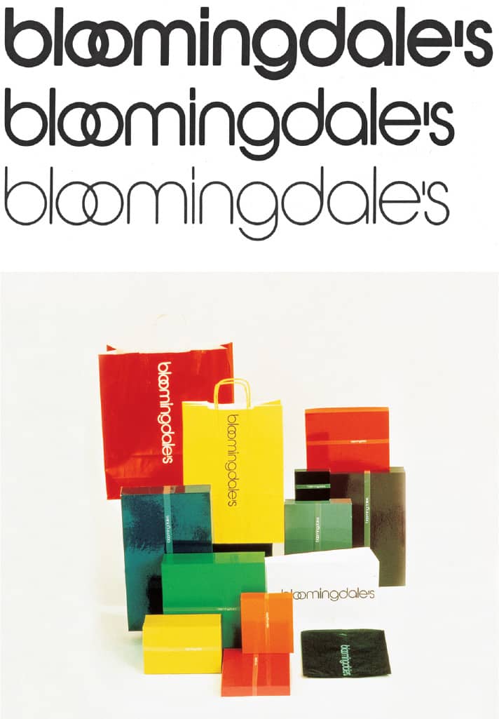
BLOOMINGDALE’S LOGO AND PACKAGING / 1972
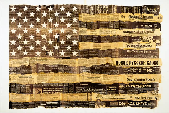
BICENTENNIAL POSTER / 1976
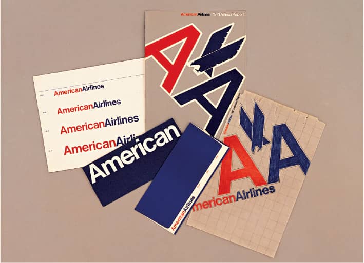
AMERICAN AIRLINES IDENTITY / 1967
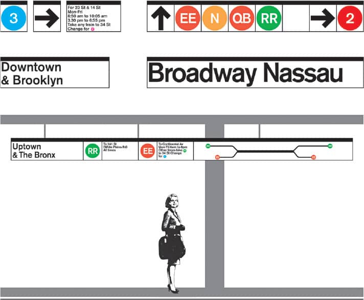
NEW YORK METROPOLITAN TRANSIT AUTHORITY SUBWAY SIGN SYSTEM / 1966
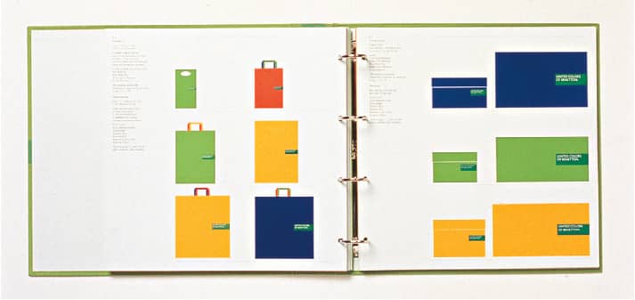
BENETTON CORPORATE IDENTITY / USA and Italy, 1995
Vignelli Associates / USA
Fletcher/ Forbes/Gill
EST. 1962 (LONDON, ENGLAND, UK)
Considering the transatlantic crisscrossing of its three founders, it is serendipity, destiny, or just luck that Alan Fletcher, Colin Forbes, and Bob Gill were able to come together in 1962 to form Fletcher/Forbes/Gill. Starting in 1949, Fletcher first attended Hammersmith School of Art, then transferred to the Central School (where he met Forbes), later enrolled in the Royal College of Art, and, lastly, earned an exchange scholarship to Yale School of Art › 129 in the United States, returning to London in 1959. Working as a freelance designer and illustrator since the early 1950s in New York, Gill moved to London in 1960 to work for advertising agency Charles Hobson—he had been given Fletcher’s phone number and called him upon arrival. After graduating from the Central School, Forbes freelanced and then worked for an advertising agency before returning to his alma mater as head of graphic design from 1956 to 1960, when he left to start his own practice. Fletcher rented studio space at his apartment, and they began to collaborate, with Gill joining them as he grew disenchanted in his job.
Fletcher/Forbes/Gill quickly became one of the most sought-after firms in London, as their combined talents offered clients impeccable typography, innovative concepts, clever executions, and, for a small design firm, unparalleled business sense (mostly by Forbes). The firm changed somewhat in 1965 when architect Theo Crosby joined and Gill left; thus began the Crosby/Fletcher/Forbes era, which saw more complex and ambitious projects for clients like BP, Penguin, Pirelli, and Reuters. At the turn of the decade, two more partners had joined: graphic designer Mervyn Kurlansky and product designer Kenneth Grange. Realizing that changing names constantly wasn’t ideal, Fletcher, while reading a witchcraft book, came upon the name of Pentagram › 162—a five-pointed star, one point for each partner—and established the famed firm in 1972.
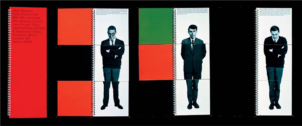
FLETCHER FORBES GILL LTD. ANNOUNCEMENT BOOK / Alan Fletcher, Colin Forbes, Bob Gill / UK, 1962–1963
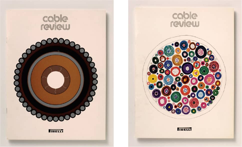
PIRELLI CABLE REVIEW 1 AND 2 / Theo Crosby, Alan Fletcher, Colin Forbes / UK, 1970
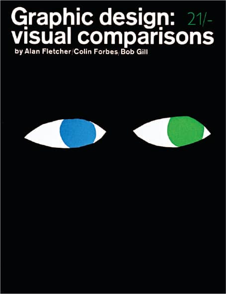
GRAPHIC DESIGN: VISUAL COMPARISONS, Alan Fletcher, Colin Forbes, Bob Gill / Studio Books London / Alan Fletcher, Colin Forbes, Bob Gill / UK, 1962–1963
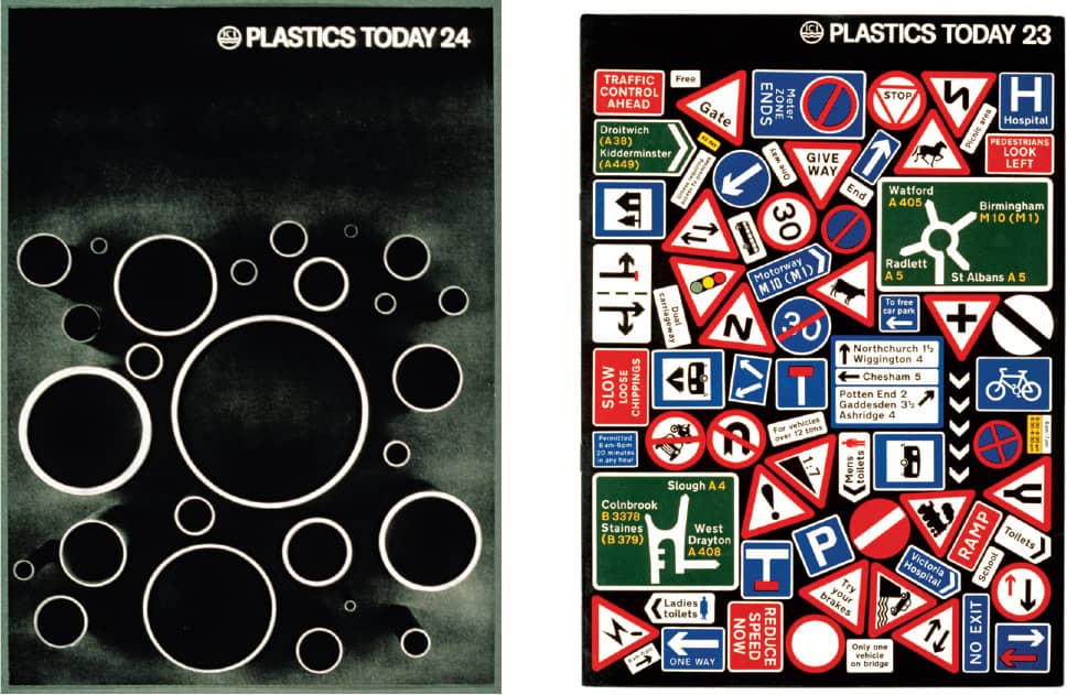
PLASTICS TODAY 23 AND 24 FOR ICI / Colin Forbes / UK, 1969
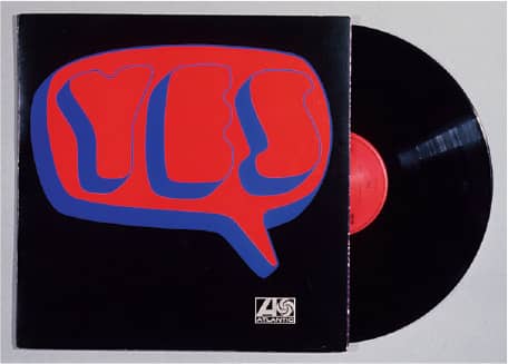
YES / Atlantic Records / Alan Fletcher / UK, 1968–1969

REUTERS LOGO / Alan Fletcher, Colin Forbes, Bob Gill / UK, 1968
Pentagram
EST. 1972 (LONDON, ENGLAND, UK) OFFICES AUSTIN, BERLIN, LONDON, NEW YORK, SAN FRANCISCO
Established in 1972 when Crosby/Fletcher/Forbes (previously Fletcher/Forbes/Gill › 161), the partnership of architect Theo Crosby and graphic designers Alan Fletcher and Colin Forbes grew to include graphic designer Mervyn Kurlansky and product designer Kenneth Grange, taking on the black magic-inspired name of Pentagram, a five-pointed star. This partnership and the blueprint it established for growth was unique in several aspects: It was multidisciplinary, allowing a single firm to offer a broad scope of practices; it gave each partner an equal salary, equity, and profit-sharing; it centralized administrative resources while allowing each partner to operate in relative independence as active designers running their own teams and responsible for their own clients; and it established a precedent so the accumulated personalities through the years could compete against large, tiered corporate agencies and firms. It was Forbes, for the most part, who was able to establish this unconventional structure as he took on the responsibility of setting the parameters for Pentagram’s growth as well as introducing, and chairing for the next 18 years, the partner meetings occurring every six months—a task that grew increasingly complex as partners around the world joined.
How designers become partners in the firm is a constant source of discussion in the industry, but an agreed set of criteria informs the selection process, which was more clearly defined around 1991, when Forbes decided to delegate his chairmanship: “A partner must be able to generate business, a partner must have a national reputation as an outstanding professional in the chosen discipline, a partner must be able to control projects and contribute to the profits of the firm, and a partner must be a proactive member of the group and care about Pentagram and the partners.” The criteria emphasize the need for each addition to be able to perform not just as a designer but as a businessperson as well—a symbiosis that does not always succeed. Across four decades, more than 35 individuals have either been partners or given the opportunity to be through the two-year probationary period, giving the firm a consistent flux as partners join and leave.

BRITISH GENIUS EXHIBITION FOR CARLTON CLEEVE / Pentagram: Alan Fletcher, Theo Crosby / UK, 1977

POLAROID ADVERTISING CAMPAIGN / Pentagram: John Rushworth / UK, 1988

PENTAGRAM PAPERS 3: BRUSHES AND BROOMS AND PENTAGRAM PAPERS 4: FACE TO FACE / Pentagram: John McConnell / UK, 1976, 1977
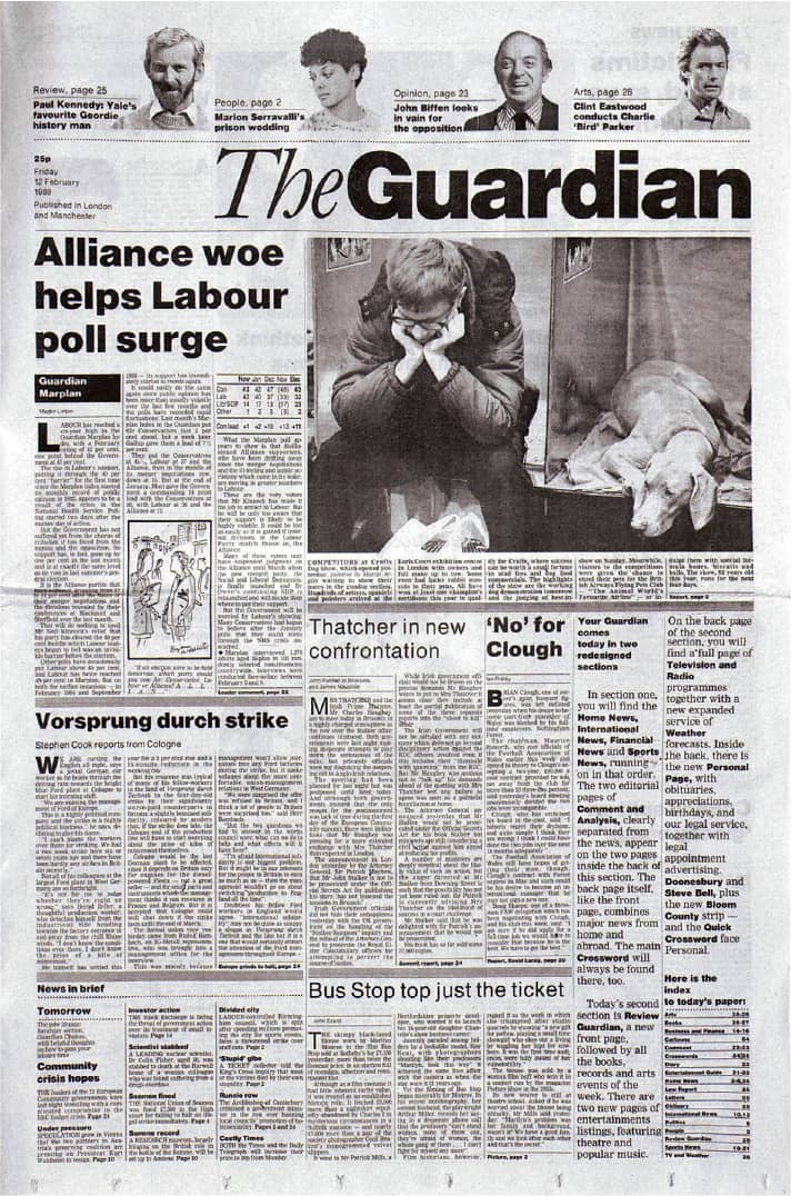
THE GUARDIAN NEWSPAPER / Pentagram: David Hillman / UK, 1988
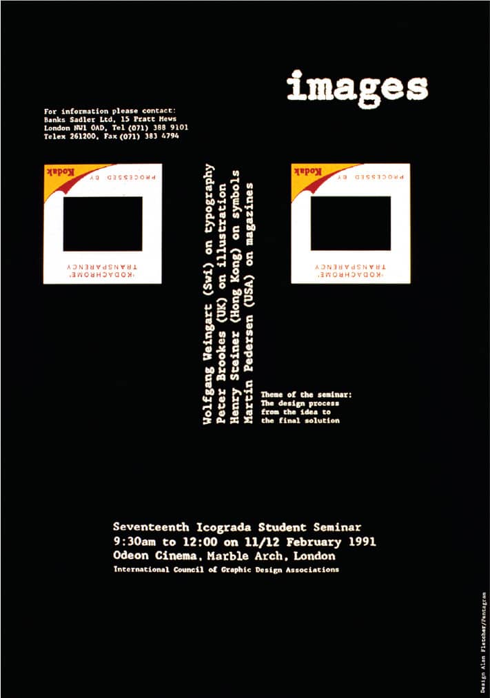
ICOGRADA’S SEVENTEENTH STUDENT SEMINAR POSTER / Pentagram: Alan Fletcher / UK, 1991

FALSE START FOR 2WICE ARTS FOUNDATION / Pentagram: Abbott Miller; photography, Joachim Ladefoged / USA, 2008
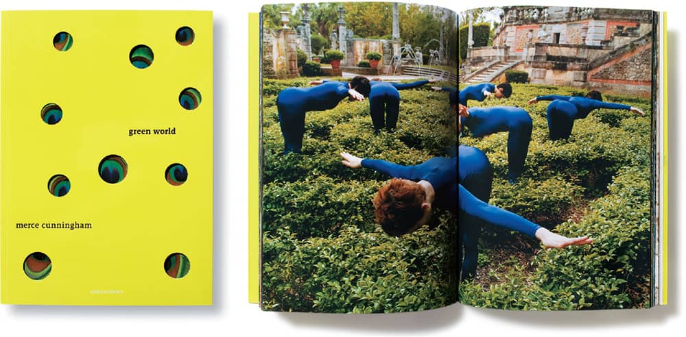
GREEN WORLD: MERCE CUNNINGHAM FOR 2WICE ARTS FOUNDATION / Pentagram: Abbott Miller; photography, Katherine Wolkoff / USA, 2007
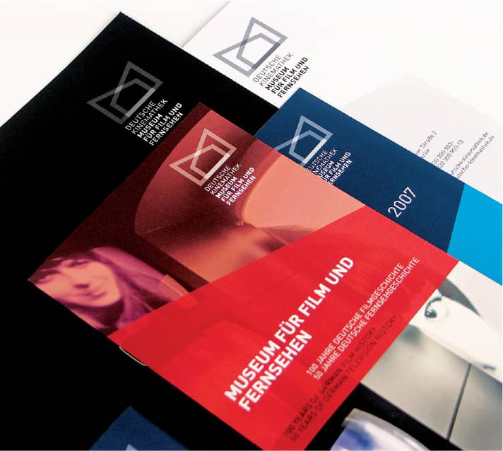
DEUTSCHE KINEMATHEK: MUSEUM FÜR FILM UND FERNSEHEN IDENTITY AND COLLATERAL / Pentagram: Justus Oehler / Germany, 2007 / Photo: Justus Oehler
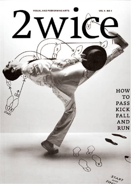
2WICE 9:2: HOW TO PASS, KICK, FALL, AND RUN FOR 2WICE ARTS FOUNDATION / Pentagram: Abbott Miller; photography, Jens Umbach, Katherine Wolkoff / USA, 2006
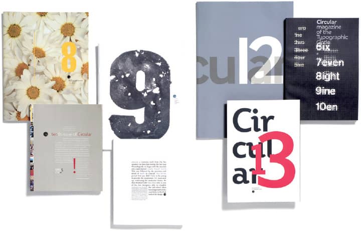
CIRCULAR FOR THE TYPOGRAPHIC CIRCLE / Pentagram: Domenick Lippa / UK, 2007 / Photo: John Ross

ARIZONA CARDINALS STADIUM ENVIRONMENTAL GRAPHICS / Pentagram: Michael Gericke / USA, 2006 / Photo: Peter Mauss/Esto
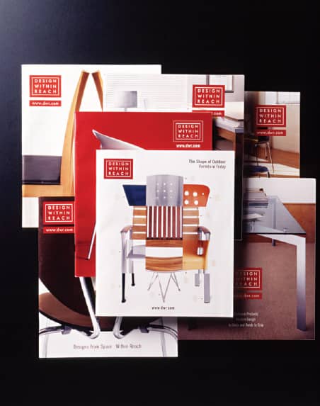
DESIGN WITHIN REACH IDENTITY AND COLLATERAL / Pentagram: Kit Hinrichs / USA, 2002–2003 / Photo: Barry Robinson

EAT IDENTITY AND PACKAGING / Pentagram: Angus Hyland / UK, 2002 / Photo: Nick Turner
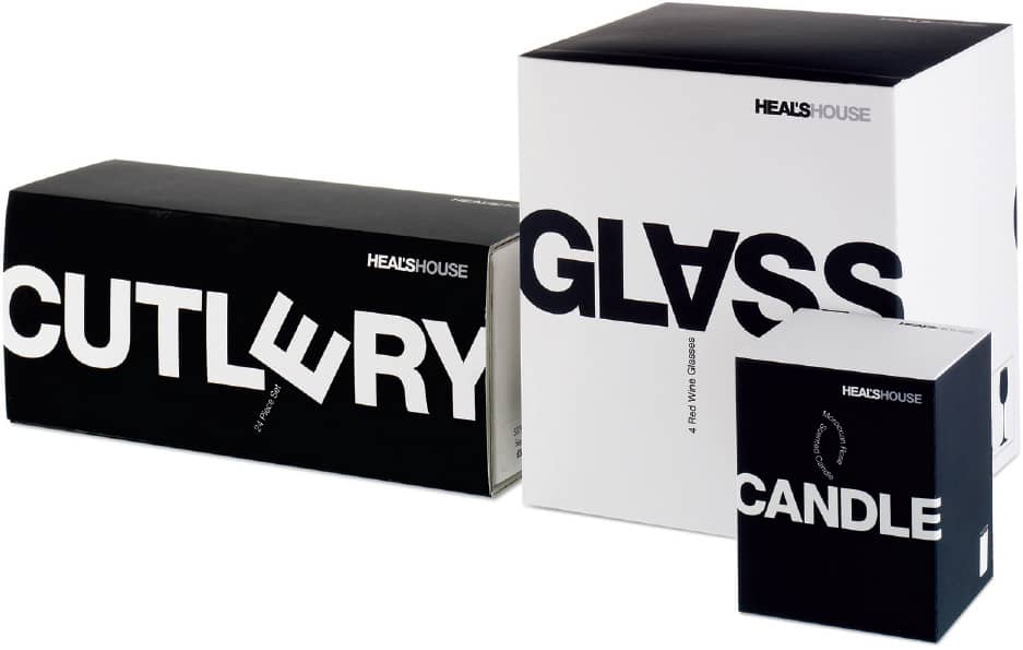
HEAL’S IDENTITY AND PACKAGING / Pentagram: Domenick Lippa / UK, 2006 / Photo: John Ross
Pentagram grew quickly; John McConnell joined in 1974, and then in 1978 Forbes launched a New York office. The firm has since expanded at an organic pace, adding partners not to boost profits or billings but when the right person comes along, and opening locations not to exploit industries or markets but to blend with the partners’ original location. Not all additions have proved successful; Peter Saville › 180 and April Greiman › 179, two of the most celebrated designers of the 1980s, did not last more than two years, and a Hong Kong office headed by London-based David Hillman operated just three years.
Consistent throughout Pentagram’s history has been a remarkably multidisciplinary practice—first, across disciplines, from corporate identity to packaging, editorial design, posters, and exhibit design; second, across client types, from nonprofit organizations to consumer brands and business-to-business corporations; and, third, across a dizzying number of markets and industries, from fashion to culture and hospitality—all without a specific or implicit adherence to any given style, resulting in an extremely diverse portfolio. In its most recent incarnation, Pentagram’s roster comprises mostly third- and fourth-generation partners—San Francisco–based Kit Hinrichs, who joined in 1986, is the longest standing—yet the principles remain the same more than 35 years later.
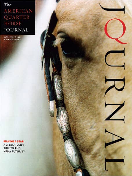
AMERICAN QUARTER HORSE JOURNAL / Pentagram: DJ Stout / USA, 2001
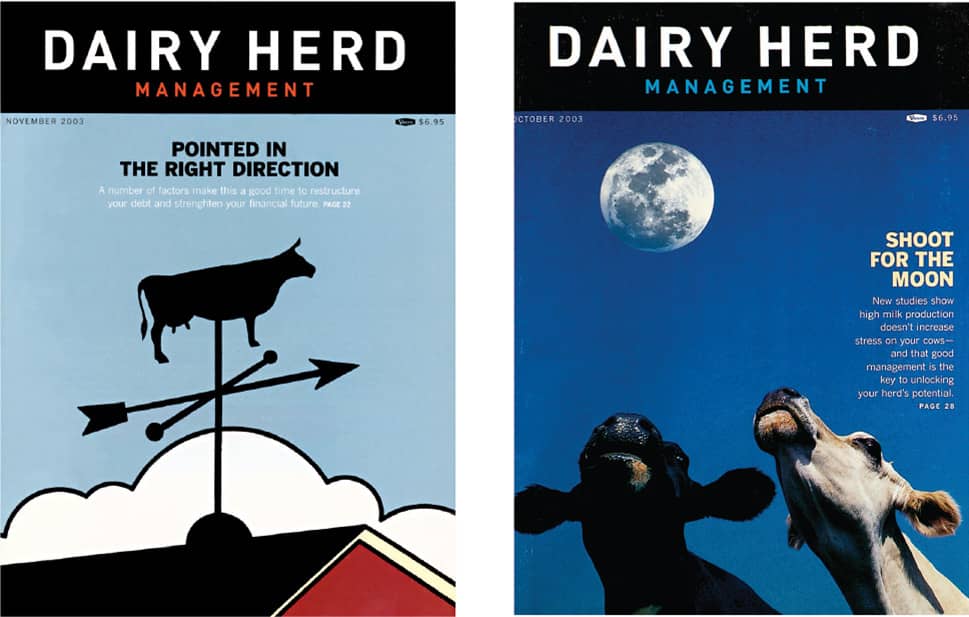
DAIRY HERD MANAGEMENT MAGAZINE / Pentagram: DJ Stout / USA, 2003
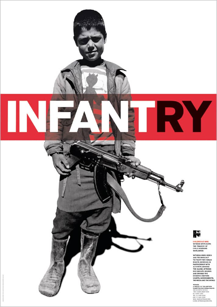
INFANTRY POSTER FOR WITNESS / Pentagram: Harry Pearce / UK, 1994
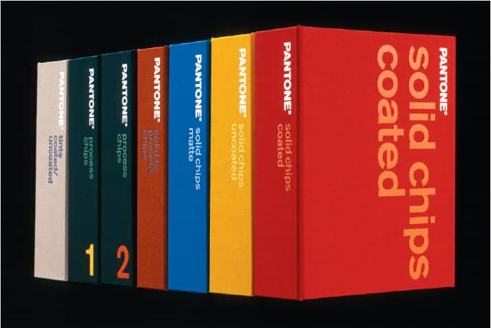
PANTONE MATCHING SYSTEM / Pentagram: John Rushworth / UK, 2000 / Photo: Nick Turner
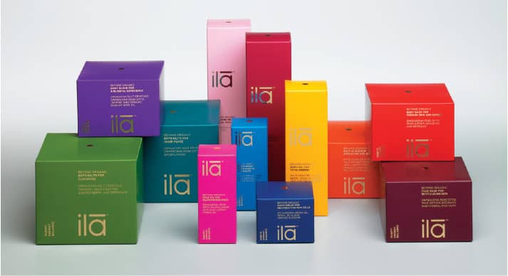
ILA NAMING, IDENTITY, AND PACKAGING / Pentagram: John Rushworth / UK, 2006 / Photo: Peter Wood
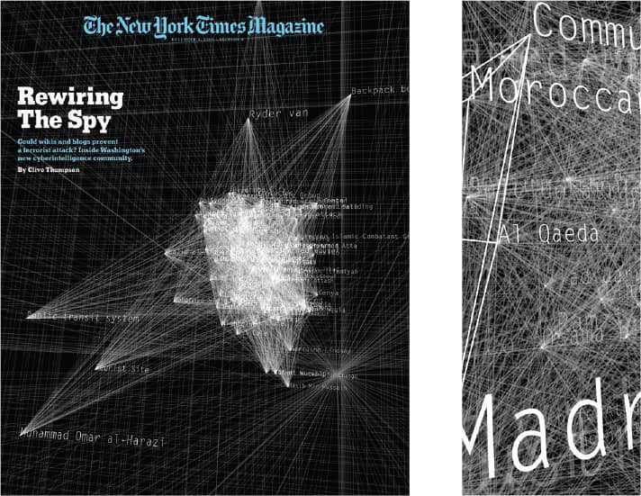
VISUALIZATION FOR THE NEW YORK TIMES MAGAZINE / Pentagram: Lisa Strausfeld / USA, 2006

SCOTCH MALT WHISKEY SOCIETY PACKAGING / Pentagram: Harry Pearce / UK, 2004 / Photo: Richard Foster
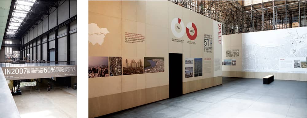
GLOBAL CITIES EXHIBITION AT THE TATE MODERN / Pentagram: Angus Hyland, William Russell / UK, 2007
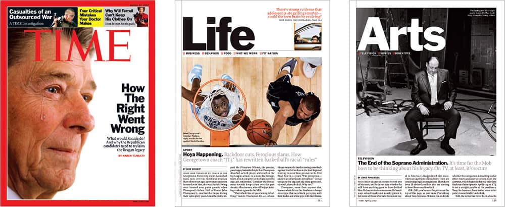
TIME MAGAZINE REDESIGN / Pentagram: Luke Hayman, Paula Scher; Time: Richard Stengel, Arthur Hochstein / USA, 2007
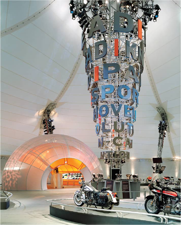
HARLEY-DAVIDSON OPEN ROAD TOUR EXHIBITION / Pentagram: Abbott Miller / USA, 2002–2003 / Photo: Timothy Hursley
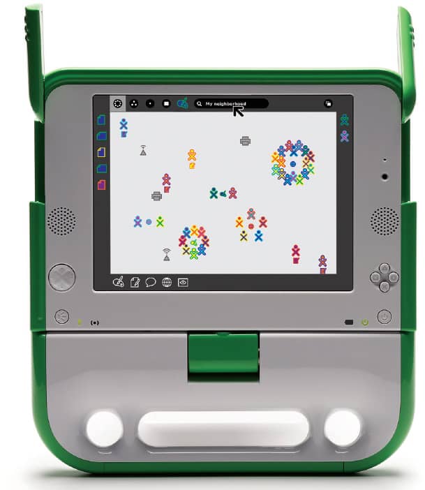
SUGAR INTERFACE DESIGN FOR THE XO LAPTOP FOR ONE LAPTOP PER CHILD FOUNDATION / Pentagram: Lisa Strausfeld / USA, 2007 / Photo: Courtesy of One Laptop per Child Foundation

ONE LAPTOP PER CHILD FOUNDATION IDENTITY / Pentagram: Michael Gericke / USA, 2007

Otl Aicher
1922 (ULM-SÖFLINGEN, GERMANY) – 1991
Not until his early twenties did Otl Aicher make his first foray into the practice of graphic design, creating the posters for a series of gatherings, the Tuesday Lectures, run by an organization he established in his hometown of Ulm at the end of World War II in 1945. The lectures led the way for the Ulmer Volkshochschule, an adult education school and one of Aicher’s first clients when he opened his design firm, Büro Aicher, in 1947.
In 1953, with Swiss designer Max Bill, Aicher established the Hochschule für Gestaltung (HfG) in Ulm, a design school for architects and product and graphic designers. In addition to teaching and holding a directorship position from 1962 to 1964, Aicher developed numerous identity projects—including the comprehensive corporate identity for Lufthansa—through the E5 (Entwicklungsgruppe 5), one of the student development teams created at HfG to work with clients outside of academia. The HfG closed in 1968 and Aicher opened Büro Aicher once again, undertaking one of his most prominent projects, the identity, signage, and iconography of the 1972 Summer Olympic Games in Munich › 357.
In 1972, Aicher and his family purchased a property, already named Rotis, where he built two additional studios and established his residence and office. Over the next two decades, Aicher maintained a healthy practice of identity, collateral, advertising, and poster work for a range of clients, from industrial manufacturers to small towns. Aicher’s new abode also served as the name for the four type families—Rotis Grotesk (sans serif), Semigrotesk, Semiantiqua, and Antiqua (serif)—that bridge sans and serif designs. In 1991, tragically, a car struck Aicher as he crossed the highway that divided his property on his lawn mower.
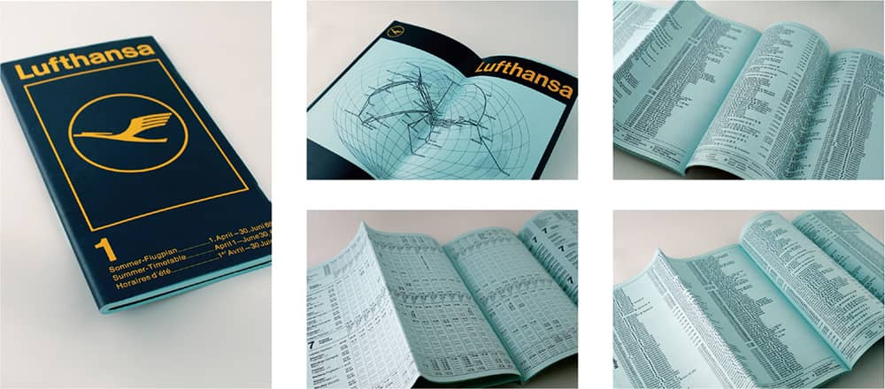
LUFTHANSA SUMMER TIMETABLE / Otl Aicher / Germany, 1968
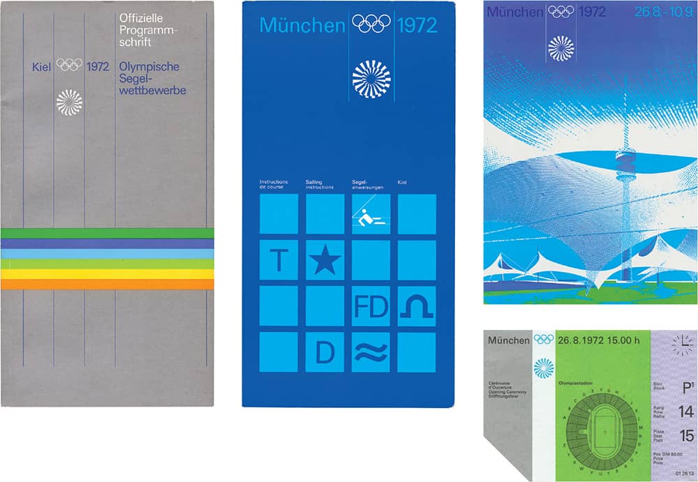
1972 SUMMER OLYMPIC GAMES IN MUNICH MATERIALS / Otl Aicher / Germany, 1966–1972
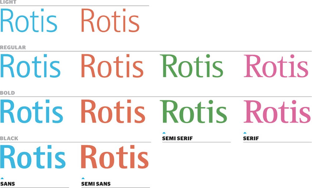
ROTIS TYPE FAMILY / Otl Aicher / Germany, 1988

BRAUN IDENTITY / Otl Aicher / Germany, 1954
Herb Lubalin
1918 (NEW YORK, NEW YORK, USA) – 1981
After graduating from Cooper Union › 129, Herb Lubalin began his career as an art director for Deutsch & Shea Advertising (1941–1942), Fairchild Publications (1942–1943), and Reiss Advertising (1943–1945), followed by 20 years with the advertising firm Sudler & Hennessey, Inc. This trajectory culminated in the establishment of his own firm, Herb Lubalin, Inc., in 1964—a firm that held various names as partnerships with Ernie Smith, Tom Carnase, Roger Ferriter, and Alan Peckolick took place and as international subsidiaries in Paris and London opened.
In retrospect, Lubalin’s body of work is not only comprehensive but consistently influential in terms of its exposure within the graphic design profession. As a logo designer, Lubalin injected visual metaphors into typography as well as creating astutely crafted wordmarks that defied traditional letter spacing. Although these are regularly overlooked, Lubalin created a number of cosmetics and sundries package designs. In the editorial realm, he designed and art directed three influential magazines › 322 with provocateur Ralph Ginzburg: Eros in 1962, which published only four issues; Fact: from 1964 to 1967; and Avant Garde, from 1968 to 1971, featuring the namesake geometric sans serif typeface › 374 laden with complex ligatures that was later released through the International Typeface Corporation (ITC) 220. Founded in 1970 by Lubalin with Edward Rondthaler and Aaron Burns, ITC embraced the growing phototypesetting technology and sought to reward typeface designers properly, as piracy was becoming rampantly easy—ITC, of course, carried Lubalin’s typefaces. Through ITC, Lubalin edited U&lc › 98, a journal of design that served as an endless catalog of their typefaces and was quickly established as a must-have publication in the industry. Herb Lubalin had an uncanny ability to visualize typographic elements in unique solutions that, with his ingenuity, daily tools, and play with emerging technologies, set him apart from his peers.

THE BIBLE LOGO / Herb Lubalin / USA, 1966
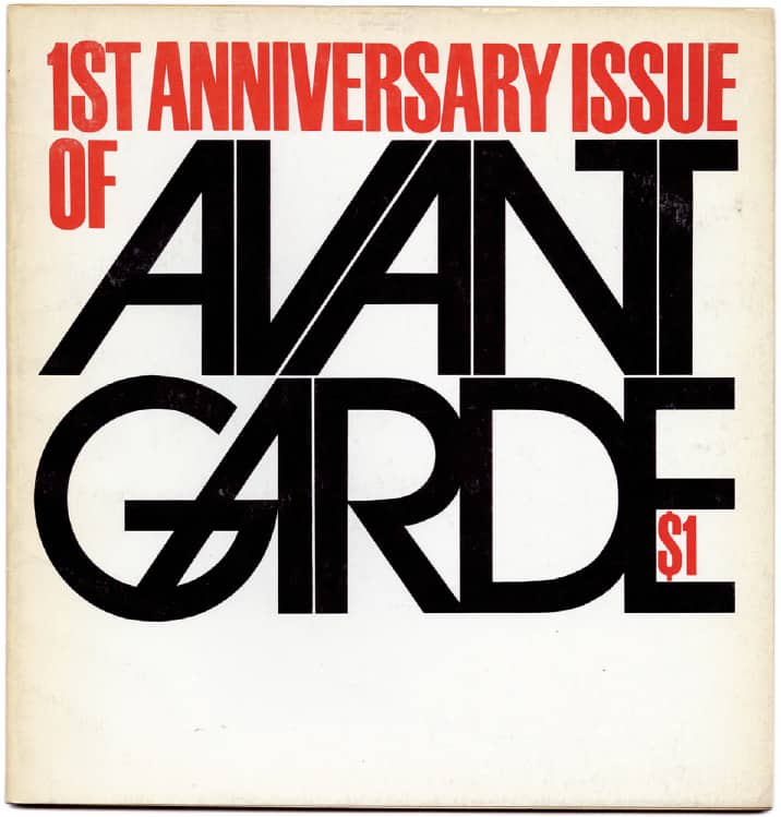
AVANT GARDE NO. 6: FIRST ANNIVERSARY ISSUE (ALTERNATE COVER) / Herb Lubalin / USA, January 1969

FAMILIES LOGO / Herb Lubalin / USA, 1980
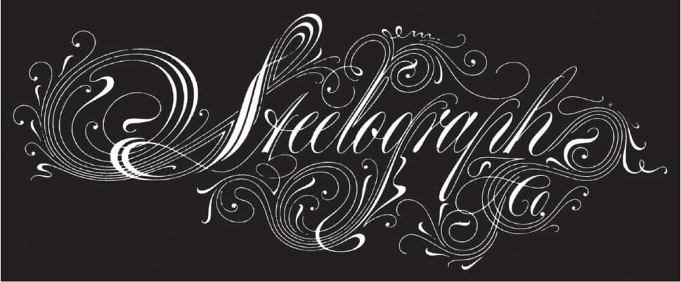
STEELOGRAPH COMPANY LOGO / Herb Lubalin / USA, n. d.

MOTHER AND CHILD PROPOSED MAGAZINE LOGO / Herb Lubalin; lettering, Tom Carnase / USA, 1967
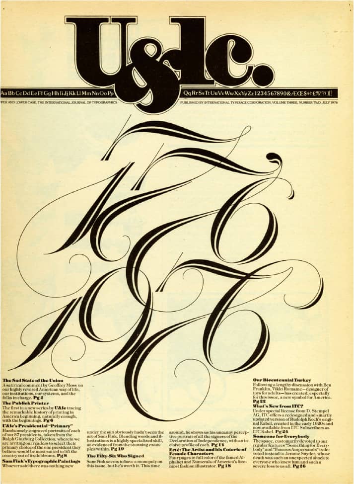
U&LC MAGAZINE 3, NO. 2 / ITC / USA, July 1976

OH! LETTERHEAD FOR LI-LIAN OH / Herb Lubalin; lettering, Tom Carnase / USA, 1964
AH! LETTERHEAD FOR ANTHONY HYDE, JR. / Herb Lubalin; lettering, Tom Carnase / USA, 1964
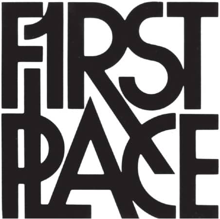
FIRST PLACE LOGO / Herb Lubalin / USA, n.d.
Images: Courtesy of The Herb Lubalin Study Center of Design and Typography at the Cooper Union School of Art
Push Pin Studios
EST. 1954 (NEW YORK, NEW YORK, USA)
While students at The Cooper Union › 131, Seymour Chwast › 171, Milton Glaser › 170, Reynold Ruffins, and Edward Sorel worked after hours as Design Plus, doing a few commissions and silkscreening without much financial success, and, after graduation in 1951, they went their separate ways: Chwast to work for the New York Times, Glaser first for Vogue and then to study etching in Italy, and Sorel and Ruffins for independent studios. However, Chwast, Sorel, and Ruffins, unfulfilled by their day jobs, began producing a promotional publication, the Push Pin Almanack (modeled after the Farmers’ Almanac with a bevy of illustrated facts, quotes, and even horoscopes), to gain freelance commissions. Back from Italy, Glaser joined them in 1952, and by 1954 they founded Push Pin Studios (Ruffins was not one of the original founders, but joined in 1955).
The Almanack was published until 1956; it gave way in 1957 to the Push Pin Monthly Graphic, but the Monthly was dropped from the title in 1961, when it was evident the publication schedule did not match the name. The Push Pin Graphic, showcasing the remarkable and unprecedented stylistic diversity of its members, became a magnet for work and acclaim for Push Pin Studios. Sorel and Ruffins left in 1956 and 1960 respectively, but Push Pin Studios had no problem attracting talent to meet demand: Paul Davis, James McMullan, and Isadore Seltzer were all part of the group throughout the 1960s and contributed to the Push Pin Graphic as well. In the early 1970s, Glaser left to start his own studio; Chwast remained in charge (and still is), expanding the pool of illustrators represented through the Push Pin Graphic, which continued its run of original content until 1980, through 86 influential issues.
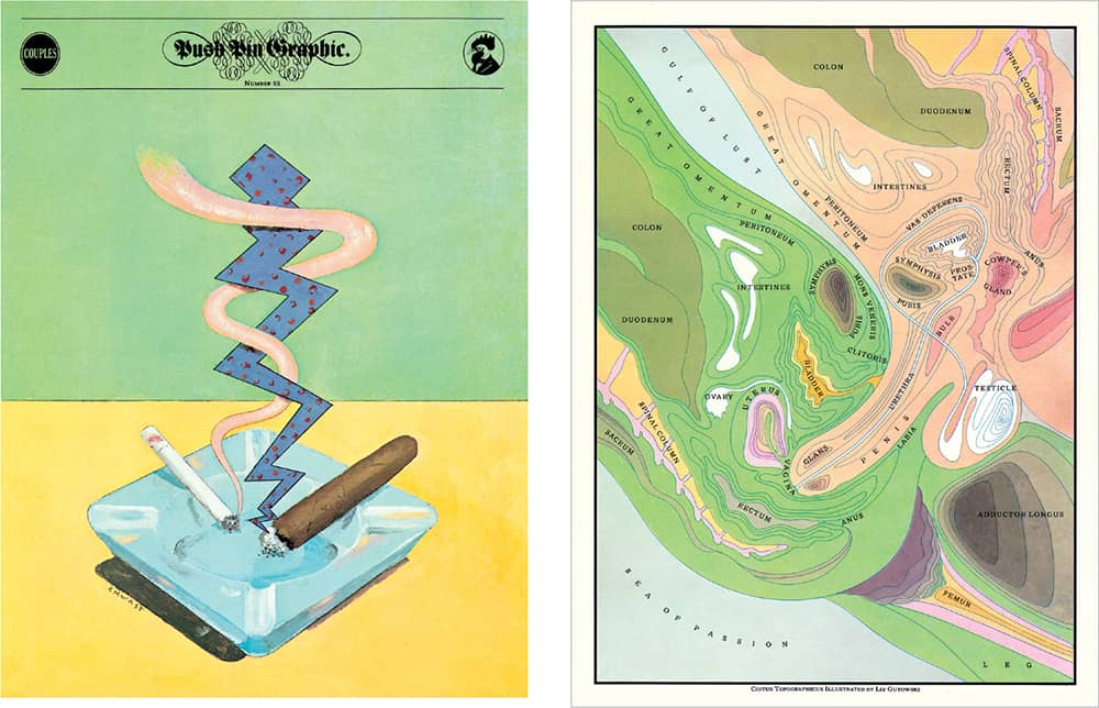
PUSH PIN GRAPHIC NO. 83: COUPLES / Push Pin Studios / USA, 1980
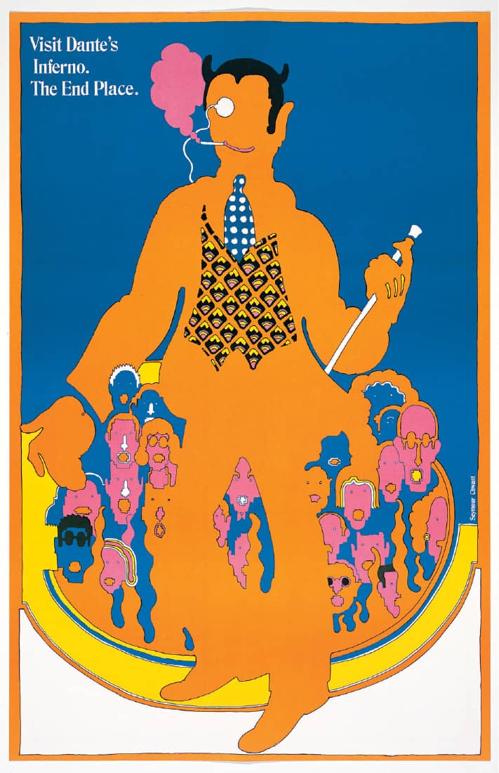
PUSH PIN GRAPHIC NO. 52 / This issue consisted of three faux-advertising posters / Push Pin Studios / USA, 1967
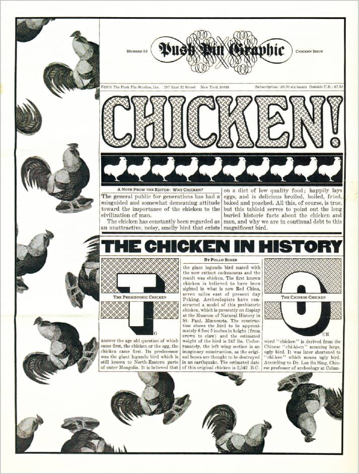
PUSH PIN GRAPHIC NO. 63: ALL ABOUT CHICKENS / The inclusion of a rooster pattern in this issue led to the use of this bird on all subsequent mastheads / Push Pin Studios / USA, 1976
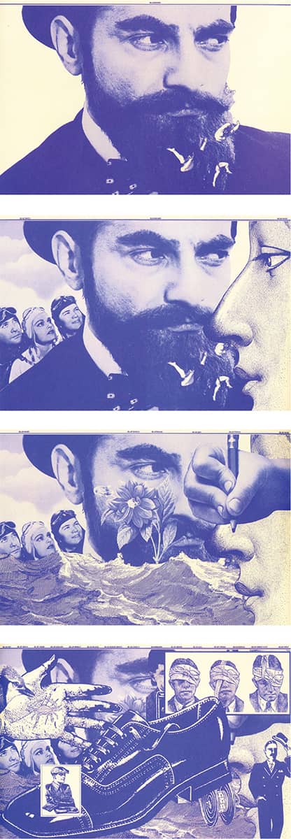
PUSH PIN GRAPHIC NO. 81: OLD BLUE / Push Pin Studios / USA, November/December 1979
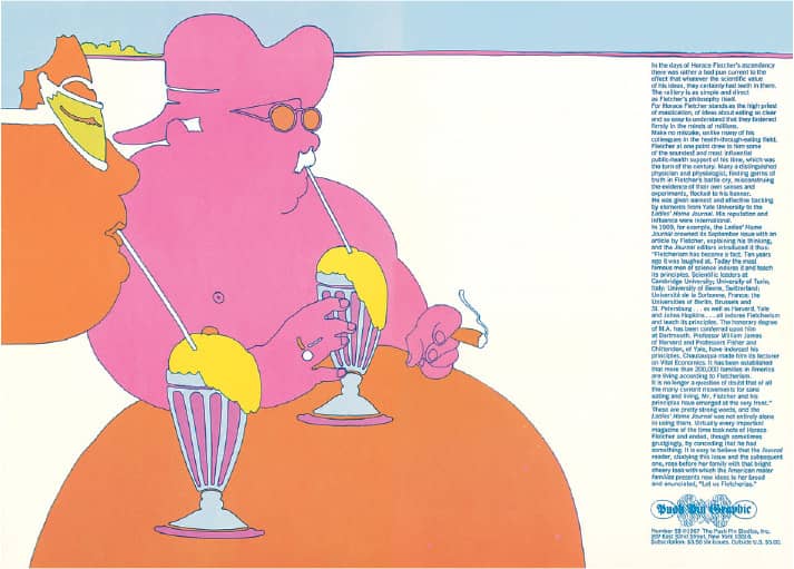
PUSH PIN GRAPHIC NO. 53: CHEW, CHEW, BABY / Push Pin Studios / USA, 1967
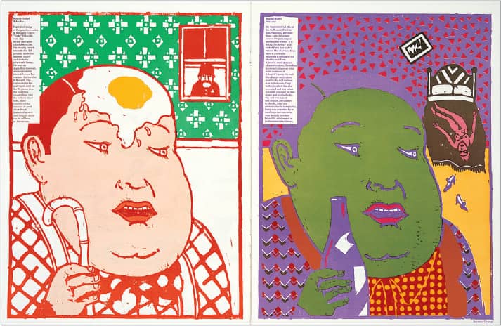
PUSH PIN GRAPHIC NO. 56: GOOD & BAD / Push Pin Studios / USA, 1971
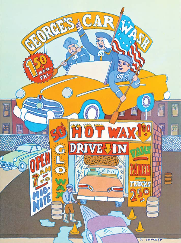
PUSH PIN GRAPHIC NO. 72: EXPLORING NEW JERSEY / Push Pin Studios / USA, April 1978
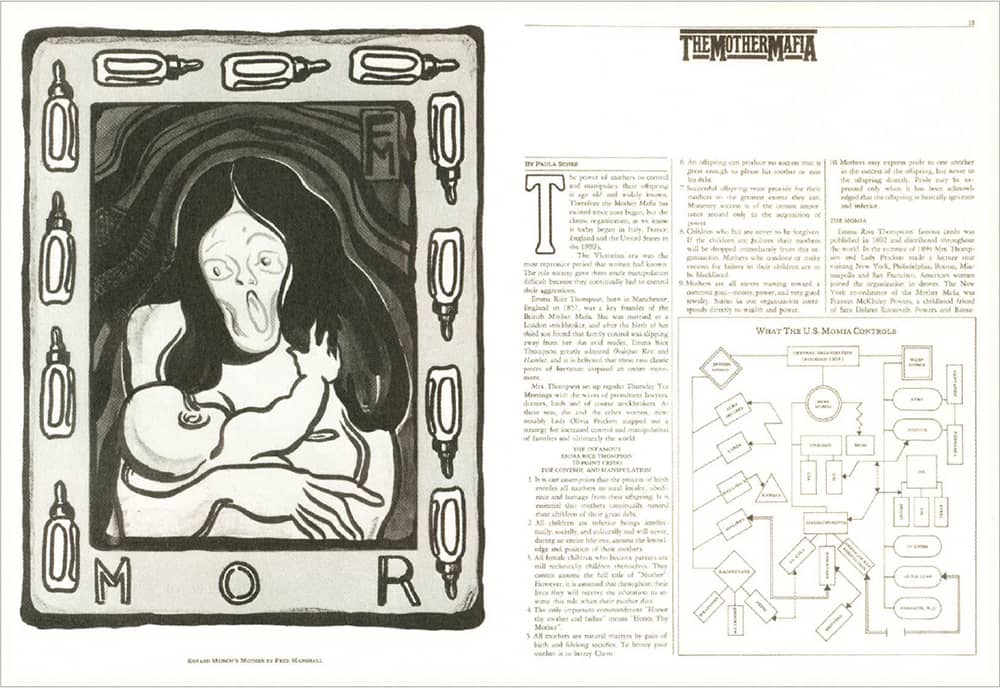
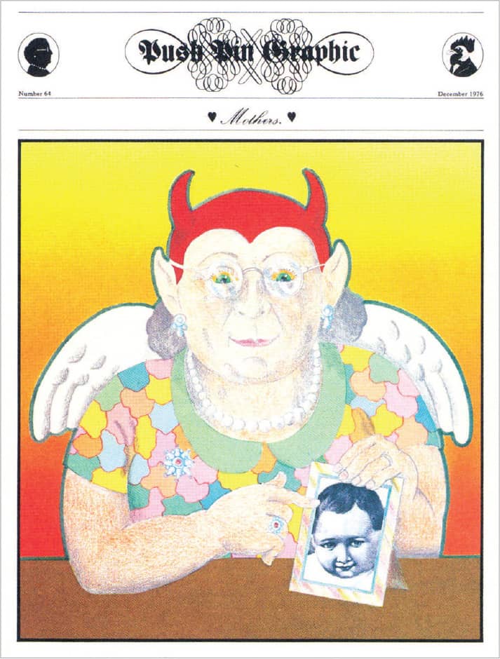
PUSH PIN GRAPHIC NO. 64: MOTHERS / Milton Glaser’s final issue / Push Pin Studios / USA, 1976
Milton Glaser
b. 1929 (NEW YORK, NEW YORK, USA) CURRENTLY NEW YORK, NEW YORK, USA
Milton Glaser—the man behind the iconic I ♥ NY › 344 logo ubiquitous in New York (and innumerable imitators) since 1975—attended the High School of Music and Art and graduated from The Cooper Union › 131 in Manhattan in 1951 before studying under Giorgio Morandi at the Academy of Fine Arts in Bologna, Italy, on a Fulbright scholarship. Shortly after his return, in 1954, Glaser and fellow Cooper Union classmates Seymour Chwast, Reynold Ruffins, and Edward Sorel co-founded Push Pin Studios › 168, where his illustrations and design helped define one of the most influential groups in the profession. Glaser left Push Pin 20 years later.
Cementing his position as a true New Yorker, Glaser co-founded New York magazine › 336 with Clay Felker in 1968, art directing it until 1977. Extending his work in the publishing industry, he established WBMG with art director Walter Bernard in 1983; designing over 50 magazines, newspapers, and periodicals until the firm closed in 2003. The majority of his work has, of course, grown from his own design firm, Milton Glaser, Inc., established in 1974, through which he has designed hundreds of posters, identities, publications, packaging, advertising, and interiors for a varied roster of clients—too many and too significant to list in a paragraph. In addition, Glaser contributes to the design community through his considered and evocative writing, soothing and challenging lectures, and his ongoing commitment to education. His weeklong summer courses, where the secrecy of what happens is equal to that of Fight Club, sell out year after year after year.
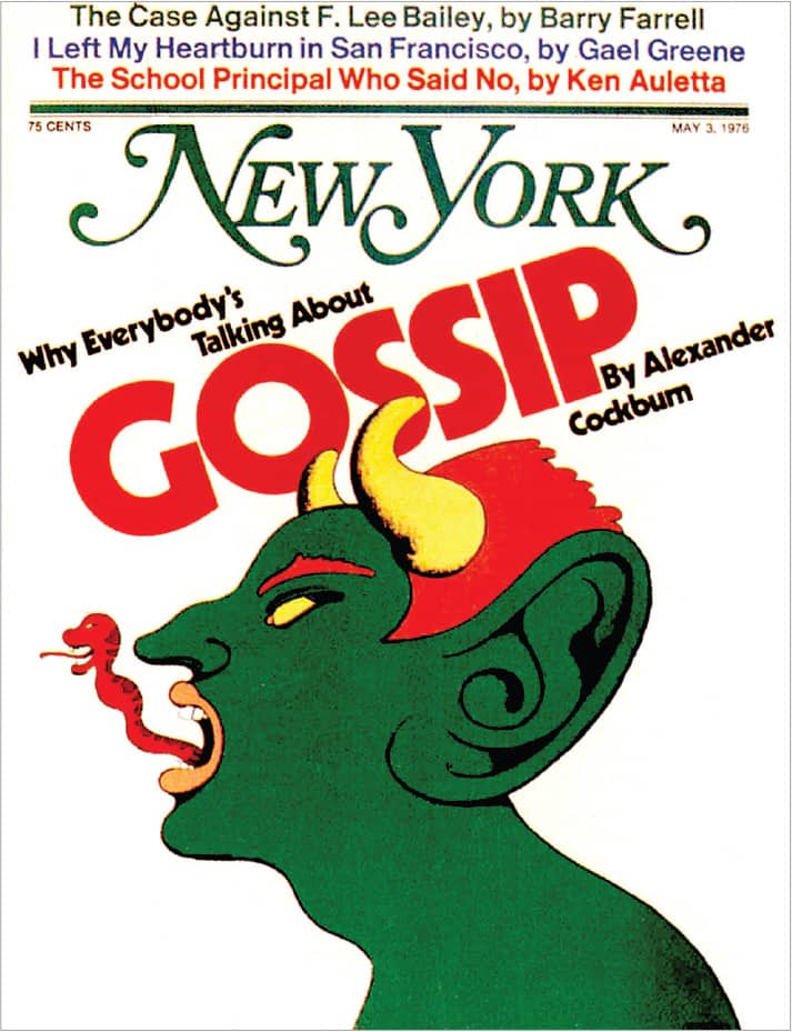
NEW YORK MAGAZINE / Milton Glaser / USA, May 3, 1976
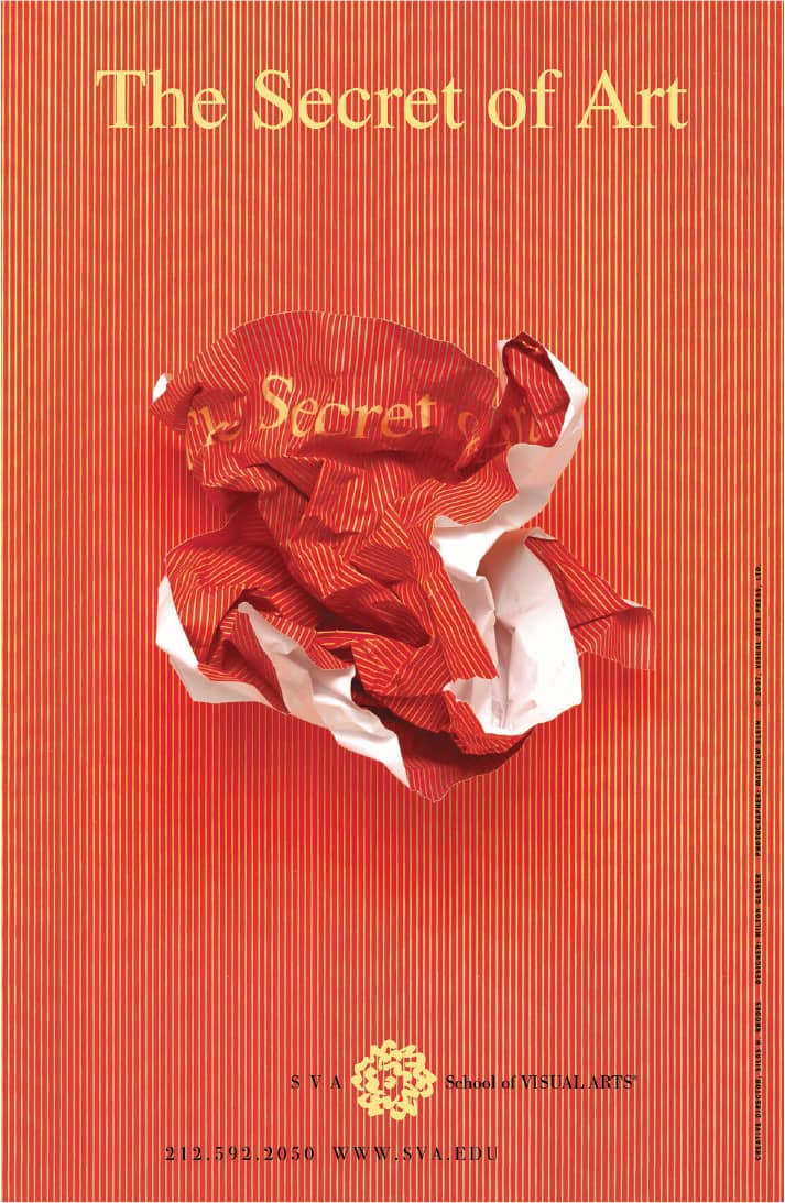
THE SCHOOL OF VISUAL ARTS POSTER / art direction, Silas H. Rhodes; design, Milton Glaser; photography, Matthew Klein / USA, 2007
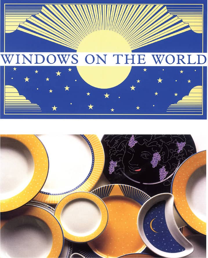
WINDOWS ON THE WORLD IDENTITY AND CHINA / Milton Glaser / USA, 1995
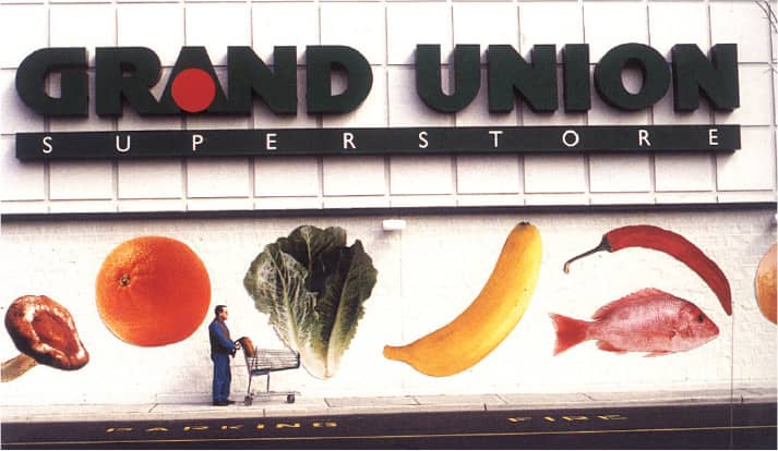
GRAND UNION IDENTITY AND ENVIRONMENTAL DESIGN / Milton Glaser / USA, 1976–1996
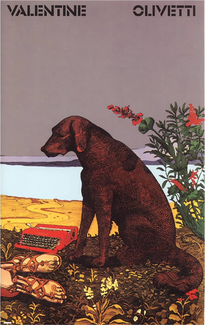
OLIVETTI VALENTINE POSTER / Milton Glaser / USA, 1968
Seymour Chwast
b. 1931 (BRONX, NEW YORK, USA) CURRENTLY NEW YORK, NEW YORK, USA
As a member of Abraham Lincoln High School’s Art Squad, along with other young prospects like Gene Federico, Alex Steinweiss › 142, and William Taubin, and under the guidance of their teacher Leon Friend, Seymour Chwast got an early taste of life as a commercial artist. Urged by Friend to enter contests, his first published piece came at age 16, in Seventeen magazine, art directed by Cipe Pineles › 145. Chwast then attended Cooper Union, where he would meet his future partners, Reynold Ruffins, Edward Sorel, and Milton Glaser › 170, with whom he would set up, still as students, Design Plus, a small design firm cranking a silkscreen printer in a warm New York loft, and later, of course, Push Pin Studios › 168 in 1954—although not through a direct route.
After graduating in 1951, Chwast worked as a junior designer in the promotions department of the New York Times and then stumbled through a series of jobs before coming back together with Ruffins and Sorel in 1953 to conceive a regular self-promotion called the Push Pin Almanack that showcased their illustration talents. When Glaser returned from studies in Italy he joined them in 1954, establishing Push Pin Studios, serving as the platform from which Chwast delivered his humorous and poignant illustrations. Over the years—as a member of Push Pin Studios, and then as the carrier of the Push Pin name when it was renamed Pushpin Group in 1981—Chwast has designed and illustrated posters, packaging, children’s books, and logos, and he continues the tradition of self-publishing with The Nose, a 24-page publication “designed to draw attention to relevant social issues as well as trivial ones.” Whether socially relevant or trivial, the issues are joyfully illustrated.
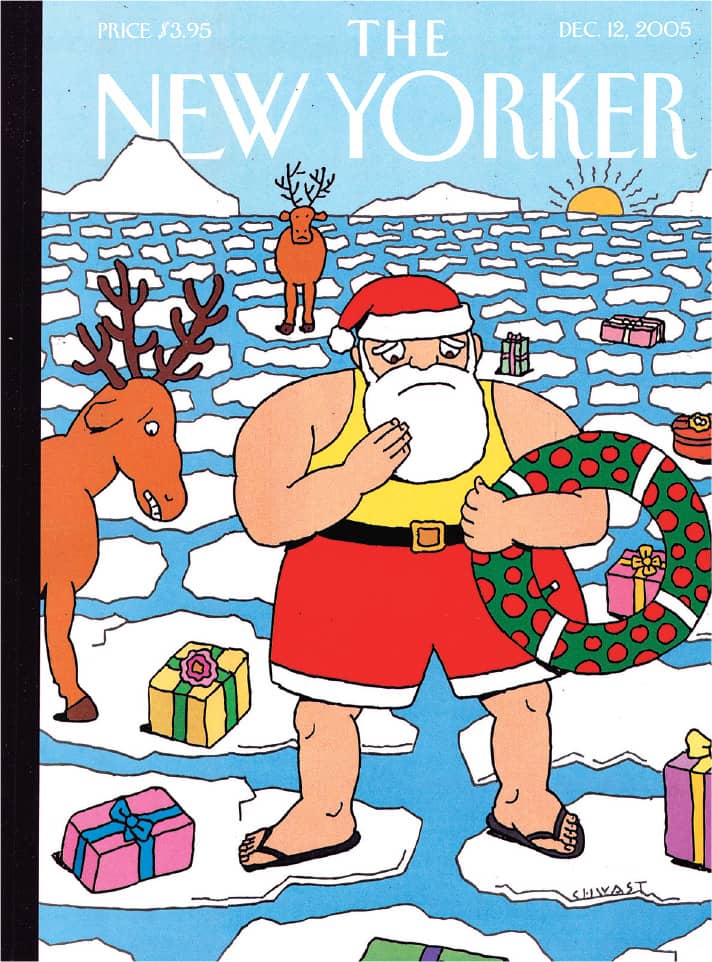
NEW YORKER COVER / December 12, 2005

SHOSHIN SOCIETY WAR IS MADNESS POSTER / 1986
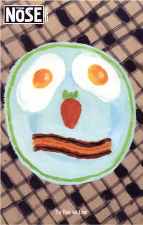
THE NOSE, NO. 6: EXPLORING THE FOOD WE JUST CAN’T GET ENOUGH OF / 2001
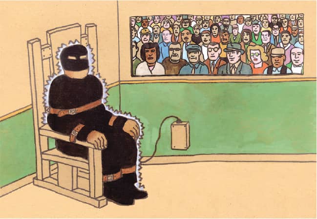
THE NOSE ILLUSTRATION / 2000
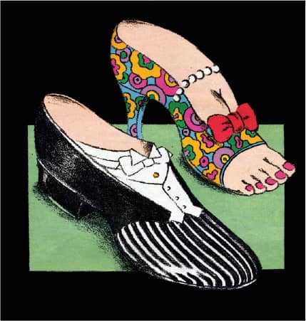
FRANKFURTER ALLGEMEINE MAGAZINE COVER ILLUSTRATION / 2000
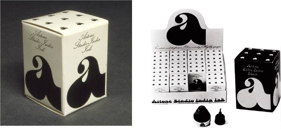
ARTONE PACKAGING / 1964
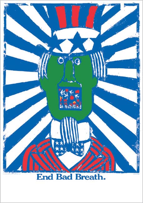
END BAD BREATH POSTER / 1968
Seymour Chwast / USA
Sister Mary Corita Kent
FRANCES ELIZABETH KENT 1918 (FORT DODGE, IOWA, USA) –1986
Raised in Hollywood, Sister Mary Corita Kent entered the Immaculate Heart of Mary Religious Community at the tender age of 18. Sister Corita continued her education by earning a bachelor’s degree from the Immaculate Heart College (IHC) and a masters in art history from the University of Southern California.
Her early work can be identified by its use of religious imagery; it was in 1955 that she first introduced words into her work, soon after meeting Charles Eames, whom she considered a source of inspiration. As the work evolved, her use of classical typography shifted to her individual handwriting, and as imagery became an item of the past, popular culture, branding, and the environment were at the heart of her work. A teacher for over 20 years, and the head of the art department of the IHC for four, Sister Corita walked away from Los Angeles and the Order in 1968 and moved to Boston. Having to earn a living, she began designing client-driven work such as book and magazine covers, advertising, greeting cards, logos, and even a U.S. postal stamp—which, with 700 million units sold, is believed to be the most popular stamp to date.
Sister Corita always spoke her mind through her art, something she felt compelled to do as she tackled the Vietnam War, social justice, racism, and poverty, among other important subjects. While her artistic style varied from decade to decade and from public to private work, her experimentation is notable and ahead of her time—especially coming from what is perceived as a conservative environment. While Sister Corita’s work is a clear influence on both designers and artists, she has not received the historic recognition that many of her peers have acquired.

POWER UP / A series of four serigraphs / Sister Corita / USA, 1965
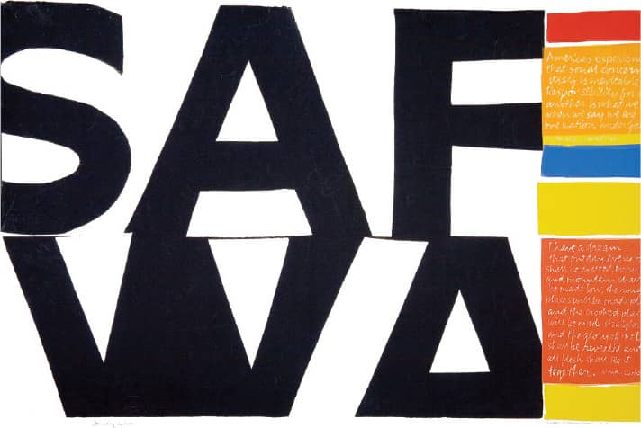
SOMEDAY IS NOW / Serigraph / Sister Corita / USA, 1964
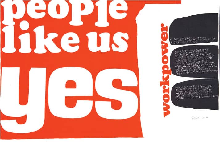
PEOPLE LIKE US YES / Serigraph / Sister Corita / USA, 1965
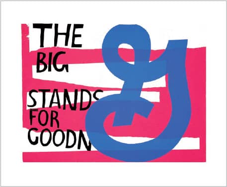
FOR ELEANOR / Serigraph / Sister Corita / USA, 1964
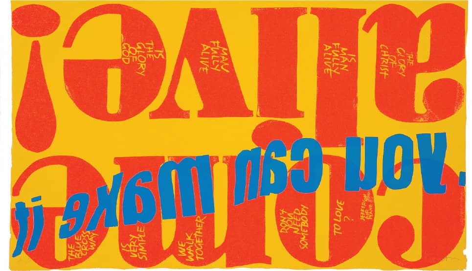
COME ALIVE / Serigraph / Sister Corita, / USA, 1967
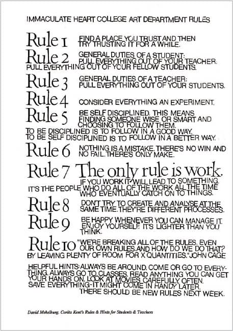
IMMACULATE HEART COLLEGE ART DEPARTMENT RULES / stamped out by David Mekelburg / USA, 1968
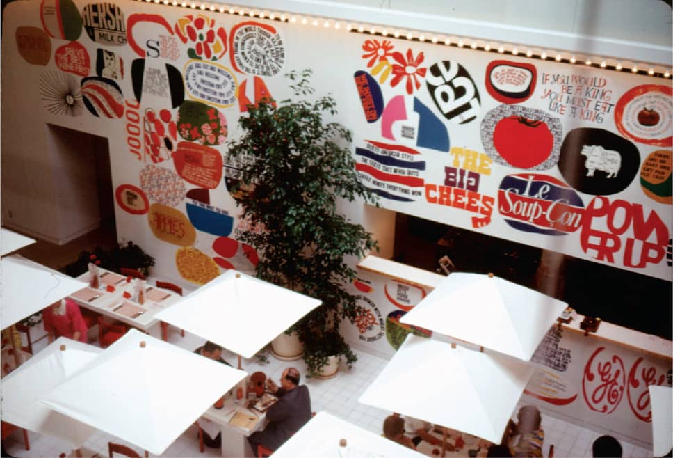
IMMACULATE HEART COLLEGE CAFETERIA INSTALLATION / Sister Corita and students / USA, c. 1966
Serigraph photography: Joshua White / Images: Reprinted with permission from the Corita Art Center Immaculate Heart Community, Los Angeles
Lou Dorfsman
1918 (NEW YORK, NEW YORK, USA) – 2008
First inclined to study bacteriology at New York University but deterred by the high tuition price, Lou Dorfsman was accepted in 1934 into the Cooper Union › 131, which covers its students’ tuition, and graduated in 1939. During his education and afterwards he held various design positions; in 1943 he joined the U.S. Army, where a punctured eardrum kept him from active duty. He served as an exhibit designer in the Army until 1946, the year he joined Columbia Broadcasting Company (CBS) under the guidance of William Golden, art director for the organization and designer of the emblematic eye logo › 344. Five years into what would be a 45-year career at CBS, Dorfsman was appointed art director for CBS Radio. Golden managed the growing CBS Television Network until 1959, when he unexpectedly passed away at the age of 48. Dorfsman was assigned as his successor.
Rising to vice president and creative director of the CBS Broadcast group by 1964, Dorfsman was the driving force not only behind the print advertising but of the full spectrum of the identity, from on-air graphics to set design to the interior signage and graphics of the New York headquarters building (designed by Eero Saarinen) to the flabbergasting, 33-foot-wide typographic cafeteria wall › 174. Dorfsman was deeply engaged with the success of the company and its programming as well. When the ratings for anchorman Walter Cronkite dropped, it was his idea that Cronkite appear on the highly rated Mary Tyler Moore Show, raising the numbers significantly for both shows; and when CBS was ready to cancel The Waltons, Dorfsman devised a print and television ad campaign bluntly aimed at saving the show, which would finish at number one that season. Dorfsman retired from CBS in 1991 and passed away in 2008 in Roslyn, New York.

CBS REPORTS: THE GERMANS / September 26, 1967
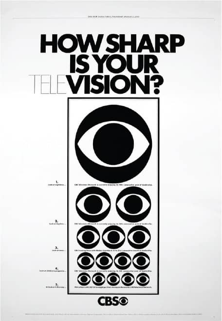
HOW SHARP IS YOUR VISION?, IN THE NEW YORK TIMES / March 16, 1969
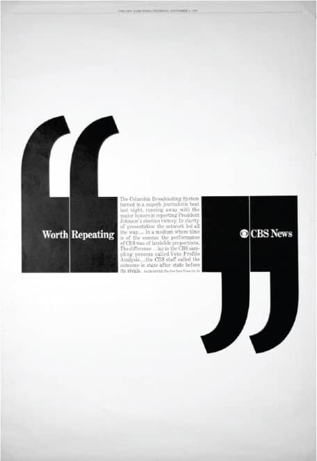
WORTH REPEATING / November 5, 1964
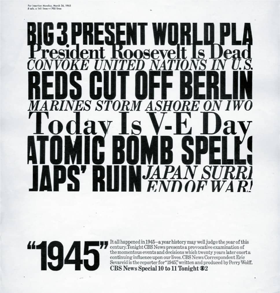
1945 / 1965
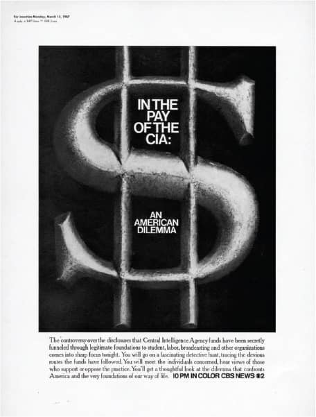
IN THE PAY OF THE CIA: AN AMERICAN DILEMMA / 1967
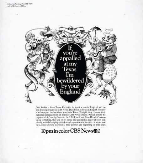
IF YOU’RE APPALLED AT MY TEXAS, I’M BEWILDERED BY YOUR ENGLAND / 1967
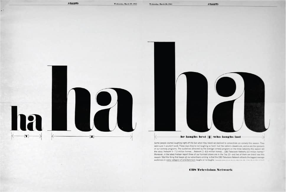
HA... HA... HA..., IN VARIETY / March 29, 1961
CBS TELEVISION NETWORK ADVERTISEMENTS / Lou Dorfsman / USA
GASTROTYPOGRAPHICALASSEMBLAGE
In 1965 the Columbia Broadcasting System (CBS) moved into its new headquarters in New York, a 38-story black granite building designed by Eero Saarinen with interiors by Florence Knoll. The signage and wayfinding graphics were designed by Lou Dorfsman › 173, CBS’s vice president and creative director, with resolute consistency. The proprietary typefaces created by Freeman Craw, CBS Didot and CBS Sans, were applied to everything from elevator buttons to wall clocks. An exception to this uniformity was made on a 33 × 8-foot wall at one end of the cafeteria. In a CBS Radio interview, Dorfsman recalls discussing the options for the wall with Knoll and CBS president Frank Stanton. Knoll suggested putting up old maps of New York, and when Dorfsman disapproved, Stanton daringly asked, “Okay, wiseguy, what would you do?” Previously, as a birthday gift, Dorfsman had given Stanton a California Job Case—a drawer with dozens of little compartments to sort metal fonts by letter—with samples of metal and wood type. Dorfsman reminded Stanton about it and proposed that a similar idea be deployed on the wall using words related to food rendered in different typefaces and food objects placed alongside. Stanton approved the idea.


SKETCHES / Herb Lubalin / USA, circa 1965
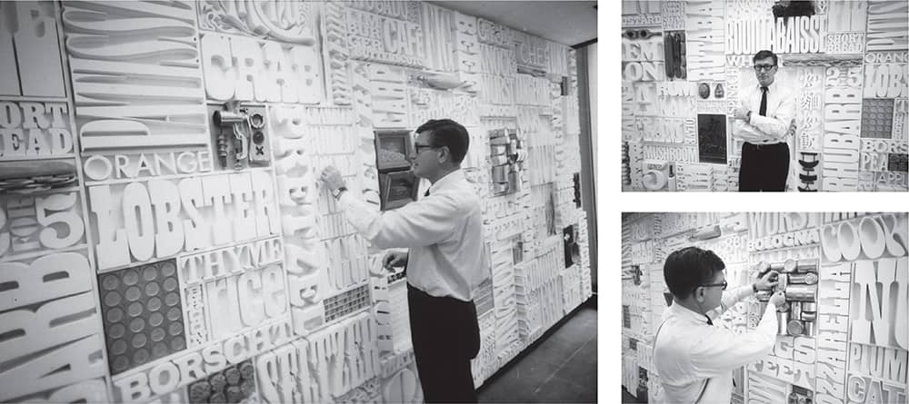
LOU DORFSMAN EXAMINES THE WALL / USA, 1966
Dorfsman did a rough sketch, commissioned the creation of a single panel, and then enlisted his friend Herb Lubalin › 167, who, along with Tom Carnase, produced a full flat rendering of the wall. More than 1,450 letters were hand-milled in thick pine and slowly assembled on the wall to create a monochromatic type assemblage. The only bursts of color were provided by the food items strategically peppered on the wall. People who recall the wall have nothing but awe for its impact, which welcomed staff and guests for more than 20 years until the late 1980s, when it was unceremoniously dismantled under new management. Dorfsman arranged for the panels to be taken by designer Nick Fasciano and stored them in his basement, where they remained for another 20 years, slowly deteriorating.
In 2007, I.D. magazine › 96 reported on the state of the wall, catching the attention of a new Atlanta nonprofit organization, The Center for Design Study, headed by Richard R. Anwyl. The Center has become an ambassador for the restoration of the wall, which has gone from Fasciano’s basement to his studio, where each letter and food sculpture is being painstakingly stripped, sanded, patched, sealed, and repainted. If someone has a large, empty wall in his or her home, this would make a rather handsome addition.

FINISHED WALL / USA, 1966
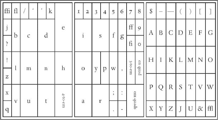
DIAGRAM OF A CALIFORNIA JOB CASE
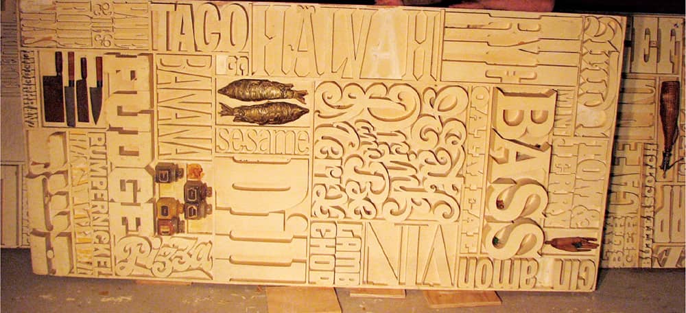
Right DISMANTLED WALL IN THE BASEMENT OF NICK FASCIANO / USA, 2007

RESTORATION PROCESS OF MORE THAN 1,450 LETTERS AT THE STUDIO OF NICK FASCIANO / USA, 2007
Studio Dumbar
ESt. 1977 (ROTTERDAM, NETHERLANDS)
Before establishing Studio Dumbar in 1977, Gert Dumbar attended the Royal Academy of Fine Arts in The Hague and the Royal College of Art in London—he returned in 1985 as visiting professor and headed its graphic design department until 1987—and worked for close to ten years with the Dutch firm Tel Design. Studio Dumbar began with Dumbar and one intern, Michel de Boer, who worked on a freelance basis for the studio after graduation, then became an employee in 1980 and is now creative director. Currently, Studio Dumbar employs around 30 employees and has built a comprehensive branding practice with contributions from strategist Tom Dorresteijn and the opening of Dumbar Branding in Shanghai, China, in 2005. But this is only the most recent manifestation of Studio Dumbar’s experience, as it has been designing and developing branding programs for complex institutions like the Dutch Police Force and the Danish Post, among other government and corporate clients, since the early 1980s.
Another aspect of Studio Dumbar is its work for cultural institutions. Dumbar and his staff have created a collection of visually explosive designs—or “free spirit projects,” as they call them, where the focus is on “pure, 100% design power.” These, over the years, have garnered criticism, mostly as complaints of being too decorative or playful, but, more so, they have attracted positive attention and talent. After Dumbar was invited to lecture at Cranbrook Academy of Art › 130 in 1985, many of its students—like Allen Hori and Martin Venezky—from that point on took internships at his studio, fostering a sense of reciprocal influence. Designers from around the world flock to Studio Dumbar, further contributing to both its uniqueness and its ability to work internationally.
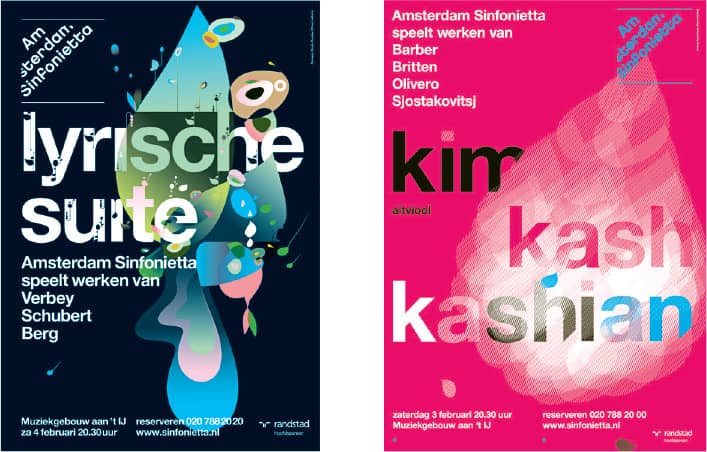
AMSTERDAM SINFONIETTA IDENTITY AND DUTCH ORCHESTRA POSTERS / Studio Dumbar / Netherlands, 2006–2007
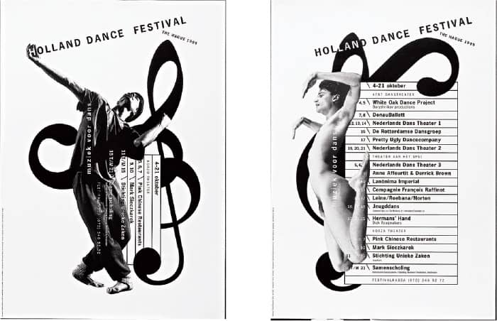
HOLLAND DANCE FESTIVAL POSTERS / Studio Dumbar; photography, Lex van Pieterson / Netherlands, 1986, 1989


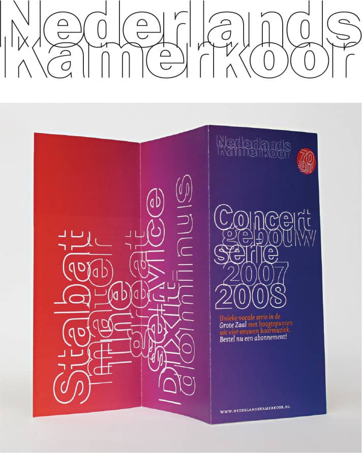
NEDERLANDS KAMERKOOR (NETHERLANDS CHAMBER CHOIR) IDENTITY / Studio Dumbar / Netherlands, 2007–ongoing
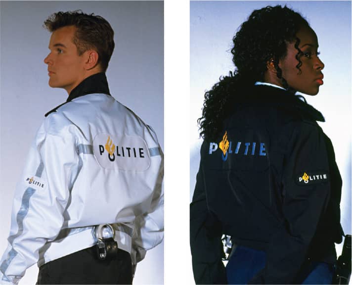
DUTCH POLICE FORCE IDENTITY FOR THE MINISTRY OF THE INTERIOR AND THE MINISTRY OF JUSTICE TO THE KINGDOM OF THE NETHERLANDS / Studio Dumbar / Netherlands, 1993 / Photos: Lex van Pieterson
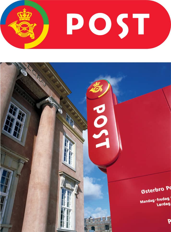
DANISH POST IDENTITY FOR POST DANMARK / Studio Dumbar / Netherlands, 1994 / Photo: Pjotr og Co.
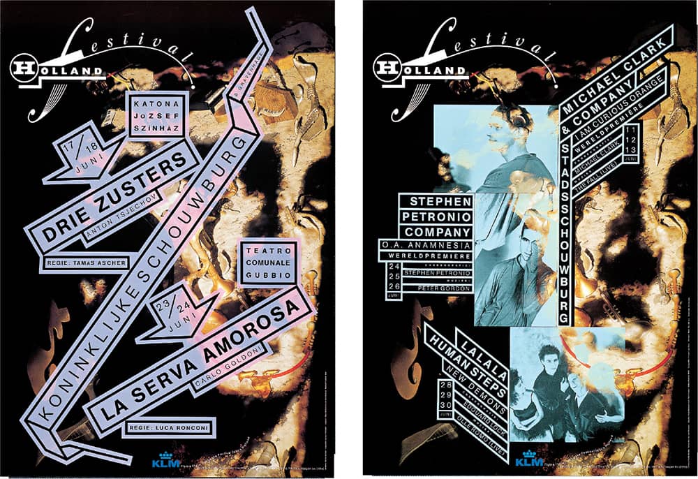
HOLLAND DANCE FESTIVAL POSTERS / Studio Dumbar; photography, Deen van Meer / Netherlands, 1995
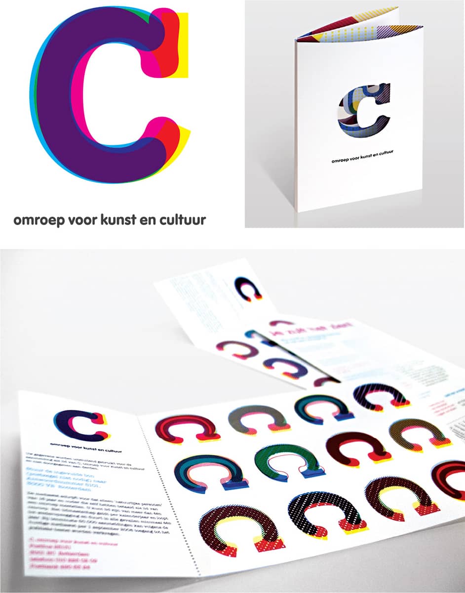
NAMING AND BRANDING OF C, THE DUTCH BROADCASTING ORGANIZATION FOR ART AND CULTURE / Studio Dumbar / Netherlands, 2006–ongoing
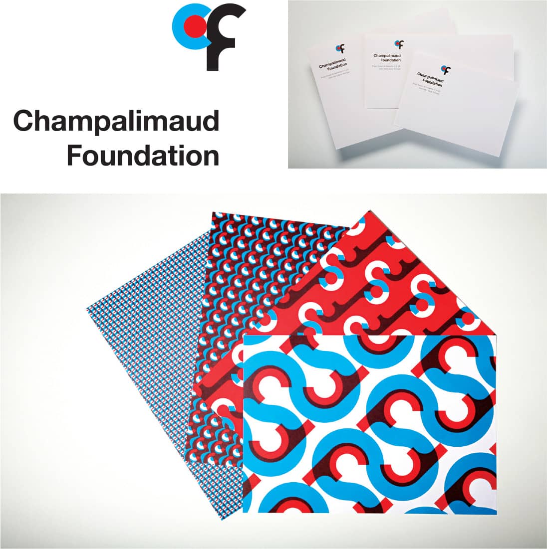
THE CHAMPALIMAUD FOUNDATION IDENTITY / Studio Dumbar / Netherlands, 2005–ongoing / Photos: Dieter Schütte
Wolfgang Weingart
b. 1941 (SOUTH OF GERMANY) CURRENTLY BASEL, SWITZERLAND
After displaying interest and aptitude in painting, Wolfgang Weingart enrolled at Merz Academy in Stuttgart, Germany, in 1958. There he was first exposed to graphic design, typography, and printing methods, and on his spare time, he was able to work with the school’s printing press and get a first glimpse of metal type and its potential. Upon graduation in 1960, Weingart began a three-year typesetting apprenticeship at Ruwe Printing in Stuttgart, where he met designer Karl-August Hanke, a former student of Armin Hofmann › 152 at the Basel School of Design › 128 in Switzerland. Hanke encouraged him to forego his apprenticeship and enroll in Basel, an idea his parents rejected. At Ruwe, Weingart learned the trade of typesetting and became enamored of the process.
With a sustained interest in Basel, a year after completing his apprenticeship, he enrolled as an independent student in 1964. Weingart’s initial reaction to the teaching method at Basel was negative, regarding it as “an impenetrable, cloister-like fortress,” and although he later acknowledged its efficacy, his restlessness grew tiresome to Hofmann and Ruder, who suggested he commit or leave. With the right decision, his stay at Basel was extended for two more years. In 1968 he became a teacher in the newly established Advanced Class of Graphic Design, where he intended to “build a curriculum in typography that would challenge revered conventions and still respect the traditions and philosophy [of Basel],” an effort Hofmann later called a “model for new typography.” Weingart has taught at Basel since then—attracting students around the world and conveying to them a vigorous sense of typographic exploration—and he is now part of the Basel School of Design’s Summer Programme.
Over the course of his career, Weingart has maintained a modest practice where his design approaches take shape. For more than 30 years, starting in 1967, he regularly collaborated with Rudolf Hostettler, editor-in-chief of Typographische Monatsblätter, a printing trade publication, and produced a string of related covers through the course of a year. He has designed books and catalogs and since 1958 has been regularly commissioned to design posters for cultural and educational institutions. His poster work in the late 1970s and early 1980s allowed him to explore, with the same energy he brought to metal type, the possibilities of layout composition through film; this kinetic, layered work played an influential role in the world of design during the 1980s.
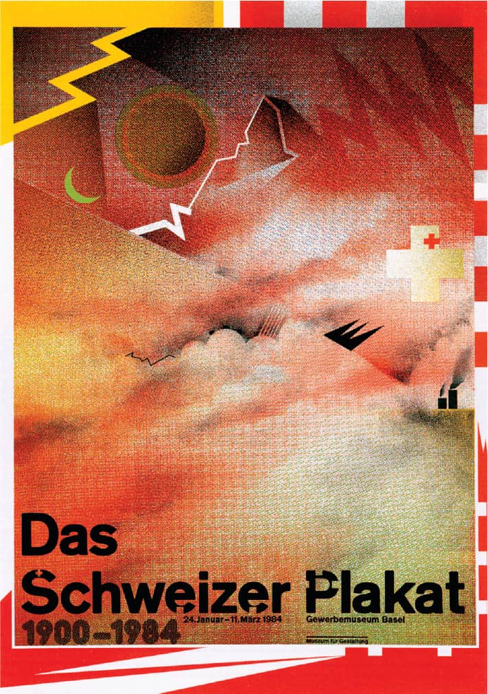
WORLDFORMAT THE SWISS POSTER, 1900–1984 FOR BIRKHÄUSER / Wolfgang Weingart / Switzerland, 1983

WORLDFORMAT 18TH DIDACTA/EURODIDAC POSTER FOR THE CONVENTION ON TEACHING AIDS / Wolfgang Weingart / Switzerland, 1980–1981
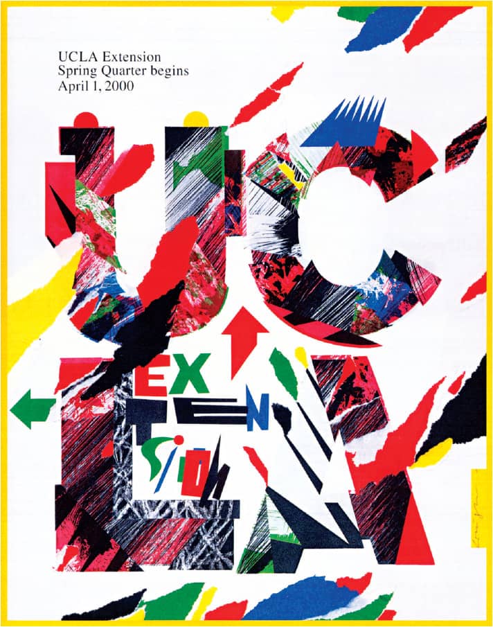
UNIVERSITY OF CALIFORNIA AT LOS ANGELES CATALOG / Wolfgang Weingart / Switzerland, 1998
April Greiman
b. 1948 (NEW YORK, NEW YORK, USA) CURRENTLY LOS ANGELES, CALIFORNIA, USA
April Greiman graduated from the Kansas City Art Institute in 1970, where teachers who had attended the Allgemeine Kunstgewerbeschule in Basel, Switzerland, first introduced her to modernism. Inspired, she pursued her graduate studies under the tutelage of Armin Hofmann › 152 and Wolfgang Weingart › 178 at Basel › 128. While the International Style was the paramount movement at the time, she had the opportunity to experiment alongside Weingart in work, labeled New Wave on its arrival to America, that deviated from the modernist path in a more intuitive and typographically versatile aesthetic. After a short period in New York, Greiman established her studio, Made in Space, in Los Angeles in 1976. From the beginning she defined herself as a generalist, opening herself to opportunities in many fields and across media, including design for the built environment and working with architects to define the identity of buildings.
Starting in 1982, she directed the graphic design department of the California Institute of the Arts › 131. There she had her first serious opportunity to explore the up-and-coming digital tools that would become pivotal in her work—something she opted to explore full-time in 1984, refocusing on her studio and the newly available Macintosh. Two years later, her contribution to the Walker Art Center’s Design Quarterly › 260 rippled through the design industry as she emblazoned a life-size digital reproduction of her naked body with all sorts of flotsam and jetsam—unlike anything the profession had seen. Since then, her work has continued to marry the exploration of digital tools with her unique sensibilities, generating an oeuvre that maintains these principles, whether the piece is a logo for a restaurant or a 75-foot mural.

CERRITOS CENTER FOR THE PERFORMING ARTS BRAND IDENTITY AND TILE MOTIFS / April Greiman; architecture, Barton Myers / USA, 1993
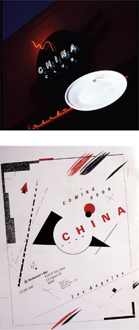
CHINA CLUB RESTAURANT AND LOUNGE BRAND IDENTITY / April Greiman / USA, 1979–1980 / Photo: Jayme Odgers

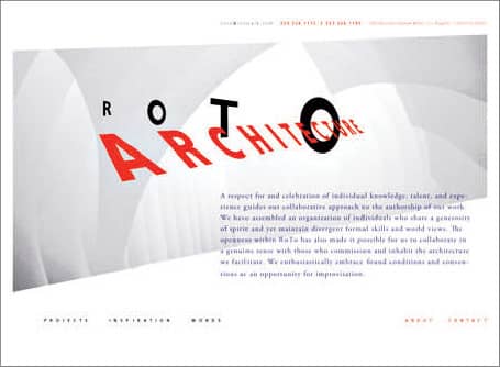
ROTO ARCHITECTURE BRAND IDENTITY AND WEBSITE / April Greiman / USA, 1999
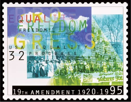
19TH AMENDMENT COMMEMORATIVE STAMP FOR WOMEN’S VOTING RIGHTS / April Greiman / USA, 1995
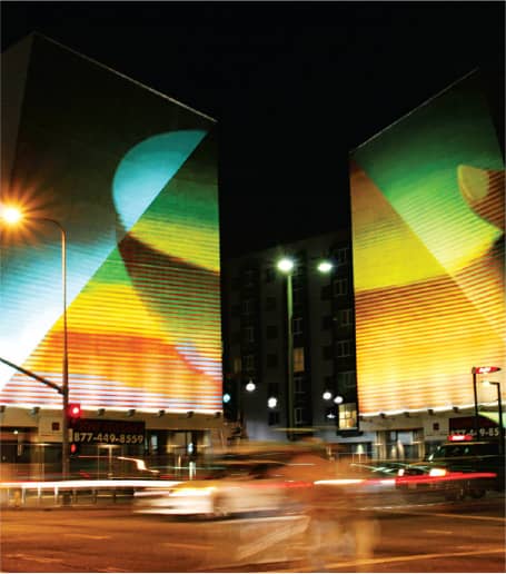
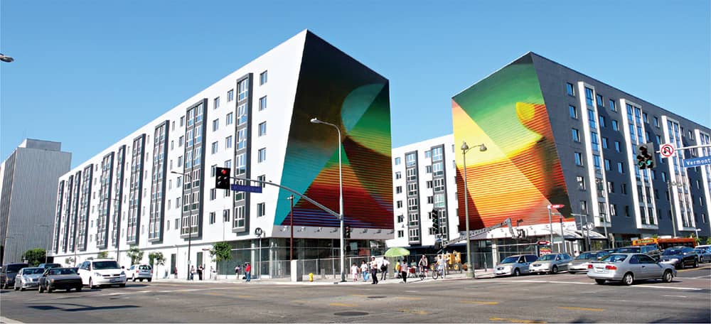
WILSHIRE/VERMONT MIXED-USE METRO STATION PUBLIC MURAL / April Greiman / USA, 2007
Peter Saville
b. 1955 (MANCHESTER, ENGLAND, UK) CURRENTLY LONDON, ENGLAND, UK
In 1978, shortly before graduating from Manchester Polytechnic, Peter Saville found himself leafing through Herbert Spencer’s Pioneers of Modern Typography, sharing the work of designers like Jan Tschichold › 140 and Armin Hofmann › 152, instead of his own, with Tony Wilson, who had just started a nightclub called Factory. It earned Saville his first commission for Factory, designing a poster. A year later Wilson and Alan Erasmus put together an album compilation of local bands and, with Saville as art director, founded Factory Records. Saville’s output through this label until 1985 was some of his most influential, including his work for Joy Division—renamed New Order after the suicide of their lead singer, Ian Curtis, in 1980—where he had unprecedented freedom. In the mid 1980s, as his interest in the music industry waned, Saville began a meandering trajectory with his studio, established in 1983 as Peter Saville and Associates (PSA) with Brett Wickens.
Although he worked in the fashion world and did album cover assignments through the late 1980s, the business side of PSA suffered, and, at the brink of bankruptcy, Saville became a partner at Pentagram › 162 in 1990. Despite excitement about the potential afforded by the renowned company and championing its structure, Saville, with Wickens at his side, left after the two-year probationary period. In 1993 both moved to Los Angeles to explore a collaboration with Frankfurt Balkind; however, while Wickens thrived and remained in Los Angeles, Saville faltered and quickly returned to London. There, in 1995, in partnership with German advertising agency Meiré and Meiré, Saville established an outpost under the name of The Apartment, a moniker inspired by the live/work pad where Saville operated. Less than three years later, Meiré and Meiré ended the relationship. Saville has continued to work commercially and serves as design consultant for several entities, including Stella McCartney and the city of Manchester.

A FACTORY SAMPLE, various artists / Factory EP / Peter Saville / UK, 1978
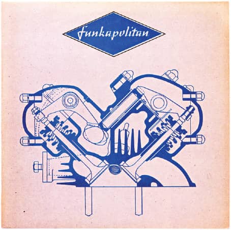
FUNKAPOLITAN / Decca Records / design, Peter Saville, Funkapolitan; illustration, Phil Irving; logotype, Geoff Halpin; artwork, Brel Wik / UK, 1982
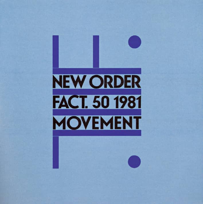
CONFUSION SINGLE, New Order / Factory / PSA / UK, 1983

MOVEMENT, New Order / Factory / design, Peter Saville, Grafica Industria / UK, 1981
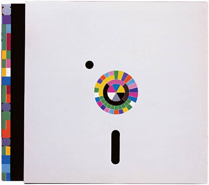
POWER, CORRUPTION, AND LIES, New Order / Factory / PSA / UK, 1983
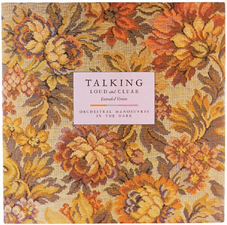
TALKING LOUD AND CLEAR SINGLE, Orchestral Manoeuvres in the Dark / Virgin / PSA; fabric supplied by Monkwell Fabrics CR 4015 / UK, 1984

THIS IS HARDCORE, Pulp / Island / art direction, Peter Saville, John Currin; design, Howard Wakefield, Paul Hetherington; photography, Horst Diekgerdes; casting, Sascha Behrendt; styling, Camille Bidault-Waddington / UK, 1998
REGRET SINGLE, New Order / London / Pentagram: Peter Saville; image manipulation, Brett Wickens / UK, 1993
Barney Bubbles
1942 (LONDON, ENGLAND, UK) – 1983
After attending Twickenham College of Art in London, Colin Fulcher (Barney Bubbles’s birth name) was employed by the Conran Design Group in 1965, working on materials for Terence Conran’s swanky Habitat retail stores and exhibitions for D&AD › 249. In 1967 he left his job, changed his name to Barney Bubbles—“[from] the liquid lightshows,” explained Julia Thrift in a 1992 article in Eye, “using oil and food colouring to create wildly coloured, bubbling backdrops for the psychedelic music of the hippy underground”—and moved into the building occupied by the music company Famepushers. In exchange for space, Bubbles designed any number of requests; this gradually moved him into the underground music scene, first working on magazines like Friends (later Frendz) and Oz, and then on album covers.
In the early 1970s he began his relationship with Hawkwind, a science fiction-inspired psychedelic group (loosely labeled hippies), designing their album covers as well as their overall identity, including painting drum kits and amplifiers. In 1976 an acquaintance of Bubbles, Jake Riviera, co-founded Stiff Records with Dave Robinson, representing punk and New Wave artists, and Bubbles became their full-time designer. To the chagrin of both audiences, Bubbles was able to work within two dueling music genres, hippies and punk, and build a body of work that gleefully appropriated past visual tropes from Art Nouveau, Art Deco, constructivism, and artists like Wassily Kandinsky. Despite graphic design history’s sparse acknowledgment of Bubbles’ contributions, the support of designers he influenced, like Malcolm Garrett and Neville Brody, among other fervent advocates, has now assured his place in the design canon. Bubbles had a troubled life outside of work that ultimately spiraled down to his suicide in 1983.
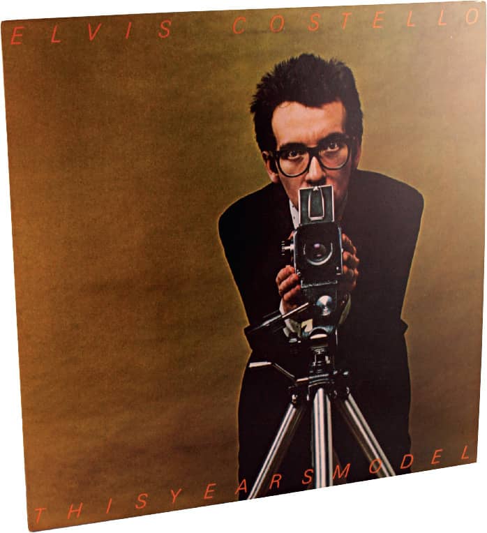
THIS YEAR’S MODEL, Elvis Costello / Columbia Records / Barney Bubbles / USA, 1978
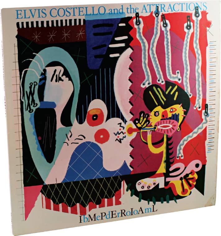
IMPERIAL BEDROOM, Elvis Costello and the Attractions / Columbia Records / Barney Bubbles / USA, 1982
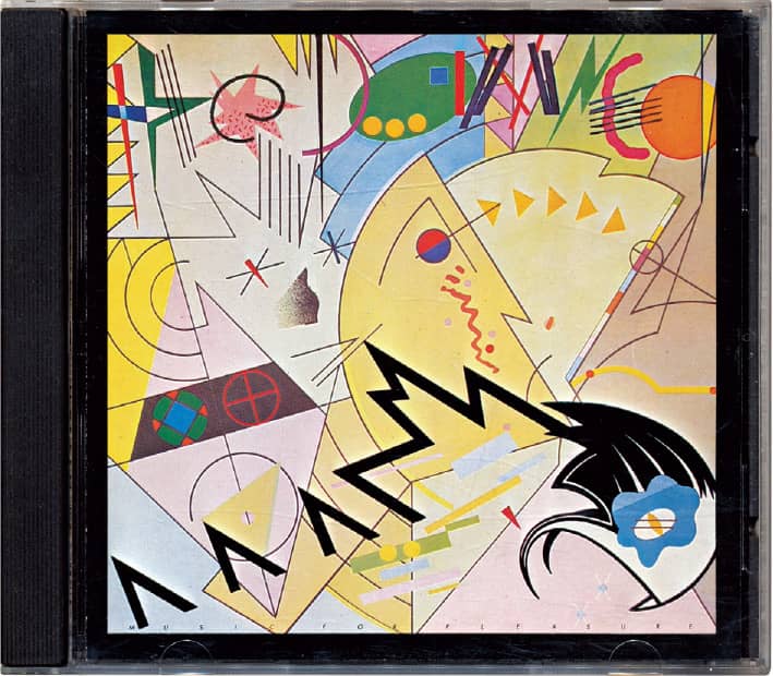
MUSIC FOR PLEASURE, The Damned / Stiff Records / Barney Bubbles / UK, 1977

IN SEARCH OF SPACE, Hawkwind / United Artists / Barney Bubbles / UK, 1971

SPACE RITUAL, Hawkwind / United Artists / Barney Bubbles / UK, 1973

UNAVAILABLE, Clover / Vertigo / Barney Bubbles / UK, 1977
Paula Scher
b. 1948 (WASHINGTON, D.C., USA) CURRENTLY NEW YORK, NEW YORK, USA
For nearly 40 years, Paula Scher has developed a highly diversified and eclectic body of work. After graduating from the Tyler School of Art in Philadelphia, she joined the advertising and promotion department at CBS Records › 300 in 1972, a position she left in the fall of 1973 to pursue a more creative endeavor at competing label Atlantic Records, where she designed her first album covers. After a year, Scher returned to CBS as art director of the cover department, where she oversaw more than 100 covers a year. Eight years later, she left CBS to work on her own, and in 1984 she co-founded Koppel & Scher with editorial designer and fellow Tyler graduate Terry Koppel. During the six years of their business, she produced identities, packaging, book jackets, and even advertising, including the famous Swatch poster based on previous work by Swiss designer Herbert Matter.
In 1991, after the studio suffered from the recession and Koppel took a position at Esquire › 326 magazine, Scher joined Pentagram › 162 as a partner in the New York office. In the years since, she has produced an enviable amount of work across a range of disciplines, from environmental design to book design, and for a diverse group of clients, from nonprofit organizations to multinational conglomerates. Most notable in these dichotomies are identities for the Public Theater › 254 and Citibank › 345, environmental graphics and signage for the New Jersey Performing Arts Center and Bloomberg L.P.’s headquarters. In conjunction with her design practice Scher has taught at the School of Visual Arts › 132 since 1982, been continuously involved with the AIGA › 244, and has written a number of articles on design.
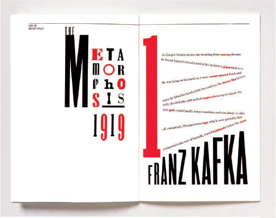
GREAT BEGINNINGS PROMOTION FOR KOPPEL & SCHER / Paula Scher / USA, 1984
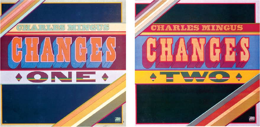
CHANGES ONE AND CHANGES TWO LP COVERS / Atlantic Records / Paula Scher / USA, 1974
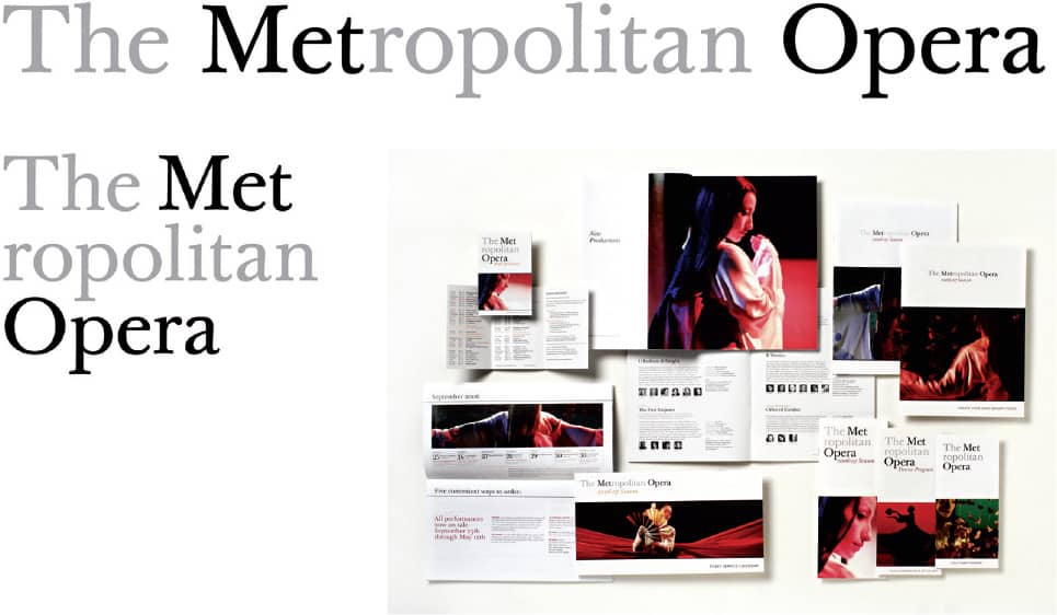
THE METROPOLITAN OPERA IDENTITY AND COLLATERAL / Pentagram: Paula Scher; design, Julia Hoffman / USA, 2006

TRUST ELVIS POSTER FOR COLUMBIA RECORDS / Paula Scher / USA, 1974

BLOOMBERG L.P. CORPORATE HEADQUARTERS ENVIRONMENTAL GRAPHICS / Pentagram: Paula Scher / USA, 2005 / Photo: Peter Mauss/Esto
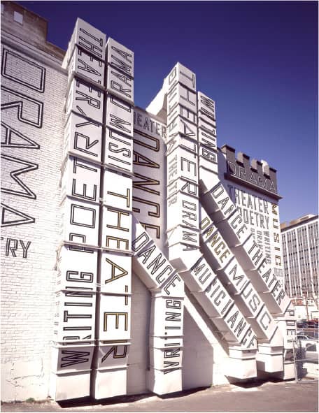
NEW JERSEY PERFORMING ARTS CENTER LUCENT TECHNOLOGIES CENTER FOR ARTS EDUCATION ENVIRONMENTAL GRAPHICS / Pentagram: Paula Scher / USA, 2001 / Photo: Peter Mauss/Esto
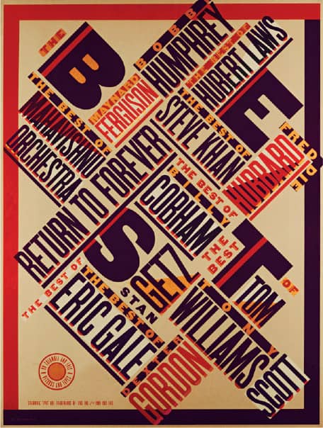
THE BEST OF JAZZ POSTER FOR CBS RECORDS / Paula Scher / USA, 1979

JAZZ AT LINCOLN CENTER IDENTITY AND ENVIRONMENTAL GRAPHICS / Pentagram: Paula Scher / USA, 2004 / Photo: Peter Mauss/Esto
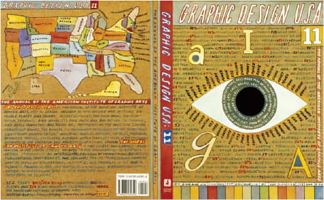
GRAPHIC DESIGN USA: 11, AIGA / Pentagram: Paula Scher / USA, 1990
M&Co.
EST. 1979 (NEW YORK, NEW YORK, USA)
Hungarian-born Tibor Kalman began his career at the Student Book Exchange at New York University (which he attended briefly); he sorted books alphabetically until the day the person responsible for window displays did not show up and Kalman talked his way into designing them. After a short adventure in Cuba, Kalman returned to the bookstore—which later became Barnes & Noble (B&N)—in 1971 as art director for the next eight years, designing shopping bags, ads, and logos. In 1979 he established M&Co. (the M is for his wife, Maira) with two former designers from B&N, Carol Bokuniewicz and Liz Trovato. The impact of M&Co. as a breeding ground for work blending wit, humor, and social consciousness through an approach sinuously shifting between deadpan and expressive wasn’t immediate, as it took a few years of doing self-described “ugly” work.
By the mid 1980s, however, with a combination of corporate clients like The Limited and hip, culturally relevant clients like the Talking Heads, and working across disciplines from collateral to product design to film titles, M&Co. attracted public attention, high-profile clients, and talented employees who today run successful firms of their own—Stephen Doyle, Alexander Isley, Emily Oberman, Stefan Sagmeister › 202, and Scott Stowell among them. With lucrative clients, M&Co. was able to express Kalman’s concern for social responsibility through holiday promotions: 1990’s gift, for example, M&Co. packaged the identical contents of the meals handed out on Christmas Day by the Coalition for the Homeless, along with a $20 bill, and a printed note challenging the recipient to donate it or spend it on a burger. In 1991, M&Co. was tasked with designing Benetton’s sociopolitical magazine Colors › 331. While this was initially produced at the studio, Kalman closed M&Co. in 1993 and moved to Italy as the full-time magazine editor. Four years later, diagnosed with cancer, he returned to New York and briefly reopened his old firm before passing away in 1999 in Puerto Rico.
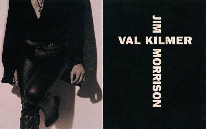
INTERVIEW MAGAZINE / Brant Publications / M&Co.: creative troublemaker, Tibor Kalman; design, Kristin Johnson; photography, Michel Comte / USA, November 1990

SECONDHAND WATCH / M&Co.: Tibor Kalman, Scott Stowell / USA, 1991
LULU WATCH / M&Co.: Tibor Kalman, Alexander Isley / USA, 1987
BANG WATCH / M&Co.: Tibor Kalman, Emily Oberman / USA, 1985

RESTAURANT FLORENT POSTCARDS / M&Co.: Tibor Kalman, Alexander Isley / USA, 1986
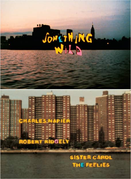
SOMETHING WILD FILM TITLES FOR RELIGIOSO PRIMITIVA / M&Co.: Tibor Kalman, Alexander Isley; direction, Jonathan Demme, Caitlin Adams / USA, 1987
STICKY FINGERS FILM CREDITS / M&Co.: Tibor Kalman, Alexander Brebner / USA, 1987
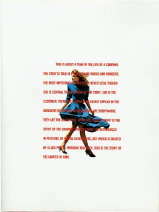
THE LIMITED 1986 ANNUAL REPORT / M&Co.: Tibor Kalman, Alexander Brebner; writing, Danny Abelson / USA, 1987
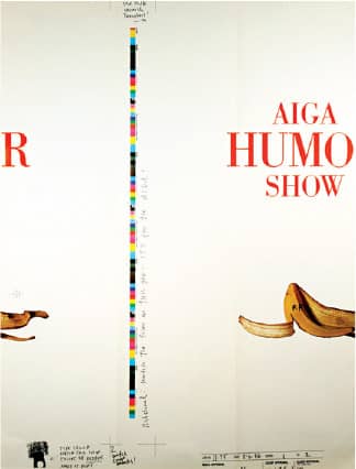
AIGA HUMOR SHOW CALL FOR ENTRIES POSTER / M&Co.: Tibor Kalman, Alexander Isley / USA, 1986
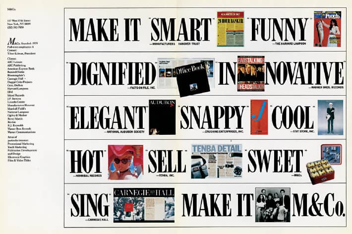
MAKE IT M&CO. ADVERTISEMENT / M&Co.: Tibor Kalman, Carol Bokuniewicz, John Shoptaugh / USA, c. 1979

INTERVIEW MAGAZINE / Brant Publications / M&Co.: creative troublemaker, Tibor Kalman; design, Kristin Johnson; photography, Michel Comte / USA, October 1990
Art Chantry
b. 1954 (SEATTLE, WASHINGTON, USA) CURRENTLY TACOMA, WASHINGTON, USA
The Rocket, a free biweekly newspaper documenting Seattle’s music scene, was first published in 1979 as a supplement to the Seattle Sun newspaper and, less than a year later, became an independent publication. The Rocket was a bastion for Seattle’s burgeoning music scene through the 1980s and into the 1990s with the explosion of Grunge, preemptively covering bands like Soundgarden and Nirvana. In 1984 Art Chantry joined as its art director, a position he held on and off until 1993, working with photographers and illustrators to shape the roughed-up style that became associated with Seattle’s music scene. Chantry often took freelance assignments as well, working with corporate clients like Nordstrom and Safeco Insurance, fringe organizations like the New City and Empty Space theaters, and cultural institutions like Seattle’s Center on Contemporary Art.
Chantry is most admired for his posters. Extracting visual cues from sources as varied as pop art, punk, psychedelia, and comic books and repurposing graphics from a well of existing materials like industrial catalogs, 1940s and 1950s clip art, and found imagery, Chantry’s posters are an eclectic collection bound together not by their style but by their process. Working within limited budgets, Chantry puts together his posters by hand cutting and pasting cobbled materials, and uses cheaper and inventive printing processes to produce unique posters. In 2000, Chantry left Seattle, as the city became expensive and the design market he helped create had become too crowded, and moved to St. Louis, Missouri. But in 2006, he returned to Tacoma to attend the School of Visual Concepts—where he had taught for 18 years—to learn the basics of creating graphic design on the computer, a method he had long rejected but, now, the only means for producing his work.
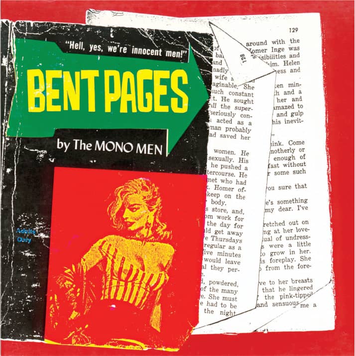
BENT PAGES, Mono Men / Estrus Records / 1995

DRUG MACHINE, Flaming Lips / Sub Pop Records / 1988
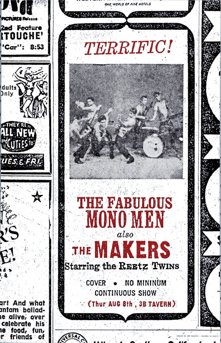
ESTRUS RECORDS, MONO MEN WITH THE MAKERS POSTER / 1995
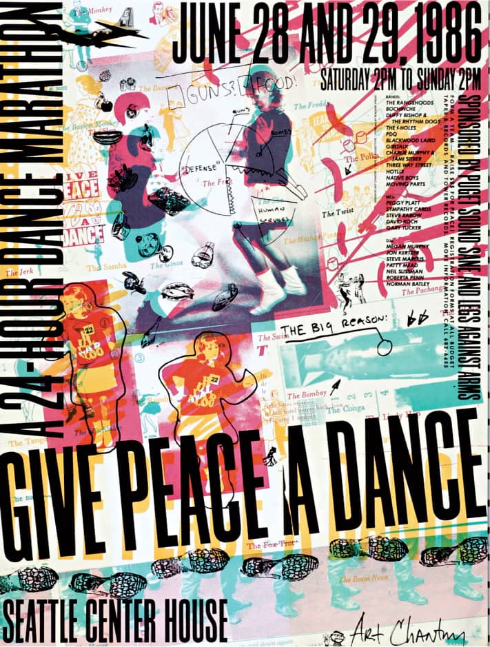
LEGS AGAINST ARMS GIVE PEACE A DANCE POSTER / 1986
Art Chantry / USA
Katherine McCoy
b. 1945 (DECATUR, ILLINOIS, USA) CURRENTLY BUENA VISTA AND DENVER, COLORADO, USA
An industrial designer from Michigan State University (1967), Katherine McCoy began her career at the Detroit offices of Unimark International, one of the first large corporate identity firms whose modernist philosophy and typographic standards she adopted. McCoy worked at several studios before founding McCoy & McCoy Associates in 1971 with her husband, Michael McCoy. That same year, the duo was asked to co-chair the Cranbrook Academy of Art › 130 design department; they then reinvented the program, guiding students through projects that joined the 2D and 3D departments for more than two decades. Starting with a modernist approach, experimentation and research led the McCoys and their students at Cranbrook to postmodernism and vernacular influences that developed into a unique voice, becoming a polarizing influence in itself during the 1980s and 1990s. McCoy has maintained a close relationship between practice and education, bridging theory, experimentation, and research through her many projects—running a studio, organizing conferences, setting up workshops, teaching, and writing.
RADICAL GRAPHICS/GRAPHIC RADICALS / Chronicle Books / Katherine McCoy; design, Erin Smith, Janice Page / USA, 1999
MCCOY & MCCOY BROCHURE / McCoy & McCoy Associates / USA, 1977
CRANBROOK DESIGN: THE NEW DISCOURSE / Rizzoli International / Katherine McCoy; design assistance, P. Scott Makela, Mary Lou Brous, Allen Hori / USA, 1991
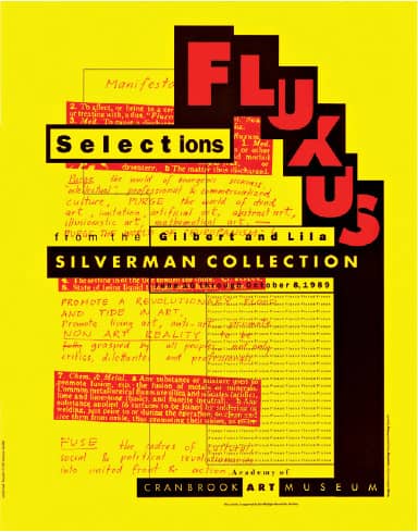
FLUXUS SELECTIONS POSTER FOR CRANBROOK ART MUSEUM / Katherine McCoy / USA, 1989
Ed Fella
b. 1938 (DETROIT, MICHIGAN, USA) CURRENTLY LOS ANGELES, CALIFORNIA, USA
Ed Fella was first introduced to design at Cass Technical High School in Detroit, where he learned lettering, illustration, and production based on the Bauhaus model. He spent the following 30 years working as a commercial artist in design and advertising and became increasingly interested in more artistic and cultural outlets, which he pursued through personal, off-the-clock projects. He eventually reveled in experimentation in 1985, when he enrolled as a graduate student at Cranbrook Academy of Art › 130 at the age of 47. His typographical compositions and loose interpretations of known styles, such as Art Nouveau, or less known, like the vernacular, appear in the hundreds of after-the-fact posters that he designs and produces himself. A self-titled exit-level designer, Fella continues to teach at CalArts › 131, where he has been since 1987.
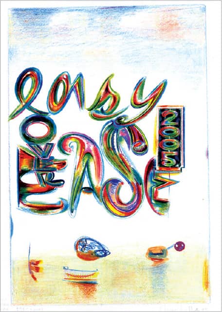
ILLUSTRATION FOR THE JAPANESE MAGAZINE RELAX: 96 / Prismacolor pencil / Ed Fella / USA, 2004
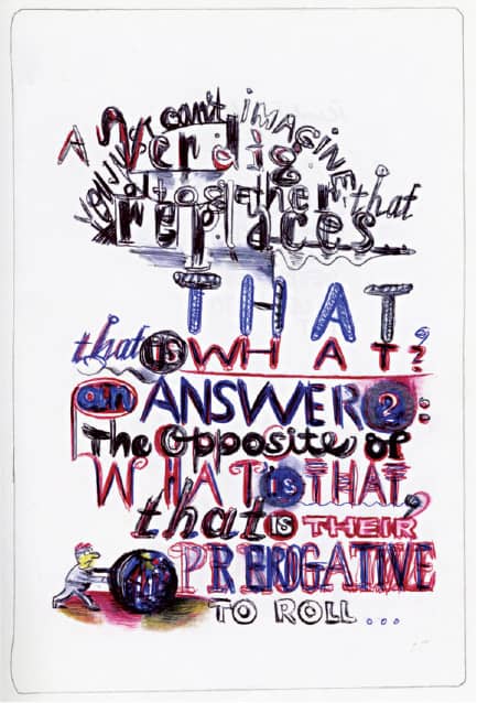
SKETCHBOOK PAGE / Four-color point pen / Ed Fella / USA, 2000
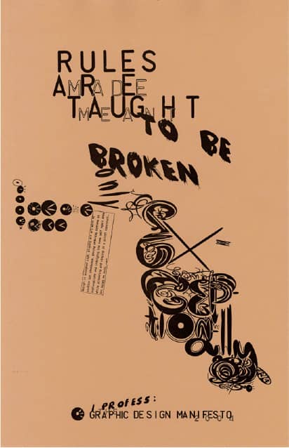
DESIGN MANIFESTO PROJECT FLYER / Offset printing / Ed Fella / USA, 2001
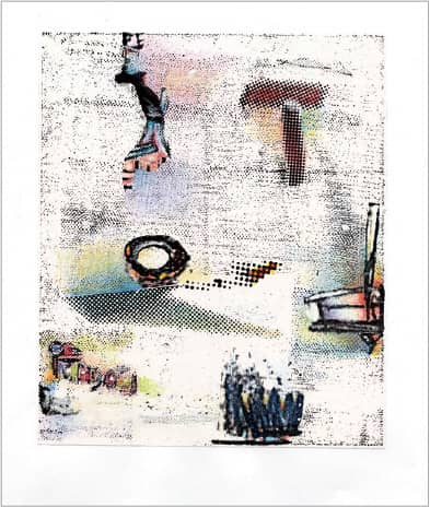
COLLAGE STUDY / Ed Fella / USA, 2005
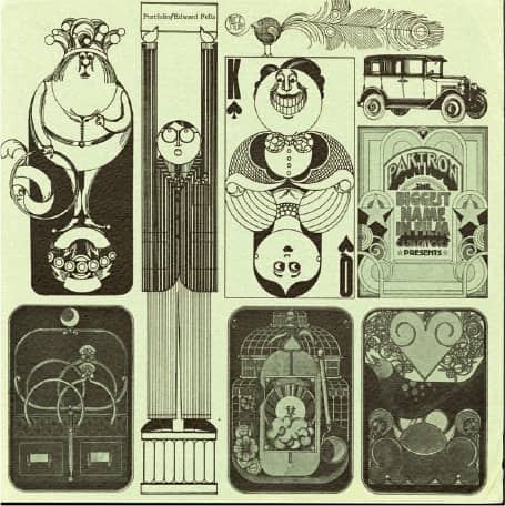
COMMERCIAL ART ILLUSTRATION STUDIO PROMOTION / Offset printing / Ed Fella / USA, late 1960s
David Carson
b. 1956 (CORPUS CHRISTI, TEXAS, USA) CURRENTLY CHARLESTON, SOUTH CAROLINA, USA
At the pinnacle of his surfing career, which unofficially began when he was approximately ten years old, David Carson was professionally ranked number eight in the world. Parallel to surfing, Carson graduated in sociology from San Diego State University (SDSU) in 1977 and worked as a high school teacher in Grants Pass, Oregon. In the early 1980s, as he approached the age of 26—an elder by surfing standards—Carson began to discover graphic design, first through a two-week workshop at the University of Arizona in 1980, then by reenrolling in the graphic design program of SDSU, transferring after one month to the Oregon College of Art and then quitting before graduation to take an internship with Surfer Publications. When the magazine he was working for closed, Carson returned to teaching in California, and in 1983 had his first opportunity to design a magazine from start to finish, the 200-page Transworld Skateboarding, which he worked on after hours for the next four years. A three-week graphic design workshop in Switzerland in 1983, where Hans-Rudolph Lutz was one of the teachers, further shifted Carson’s interest to the industry.
After one year in Boston working on Musician magazine, Carson returned to California to help launch a new magazine from Surfer Publications, Beach Culture, in 1989. Though it was short-lived, its six issues gave Carson a broad canvas to deploy his exploratory typography—unless a contents page designed using the typeface Hobo is not considered exploratory. With a brief stint as art director of Surfer, Carson was given the platform that would launch his career in 1992 when he was brought on as art director of Ray Gun › 330, a new magazine aimed at a young demographic and dubbed “the bible of music+style.” Over three years and 30 issues, Carson deployed an enthralling number of typographical maneuvers that challenged every single rule imagined, infuriating one part of the design profession and invigorating another. Since 1995, when he established his own design firm, Carson has done work for mainstream brands like Levi’s, Lucent, Microsoft, and Pepsi, and has broadened his practice to include identity, motion, advertising, and book design. He also lectures and conducts workshops around the world.
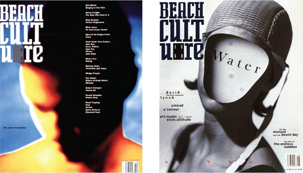
BEACH CULTURE MAGAZINE / David Carson / USA, August/September, October/November 1990
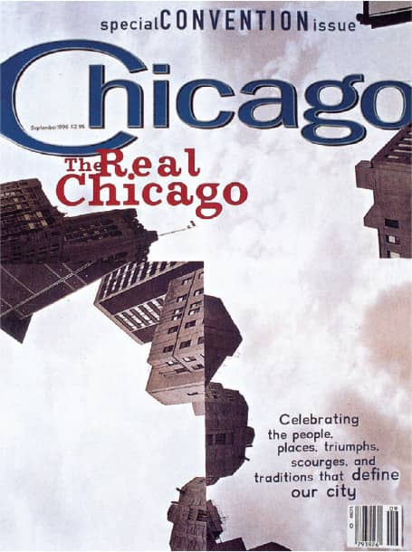
CHICAGO MAGAZINE / art direction, Kerry Robertson; design and photography, David Carson / USA, September 1996
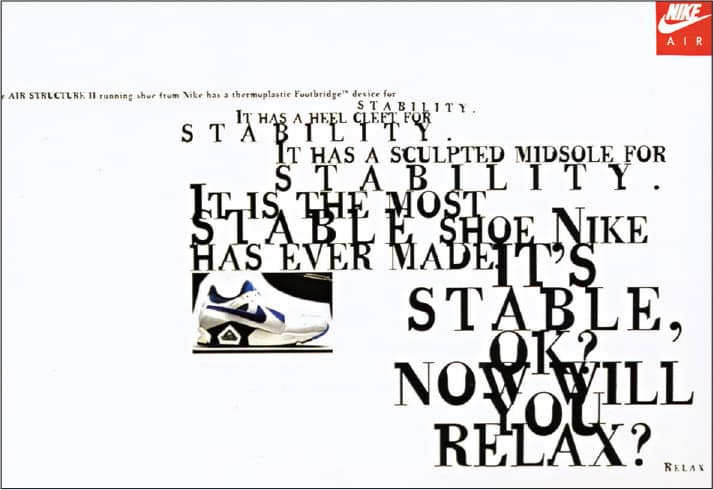
NIKE EUROPEAN ADVERTISING / Reproduced in 12 languages / Wieden+Kennedy (Amsterdam): creative direction, Susan Hoffman; design, David Carson / USA, 1994
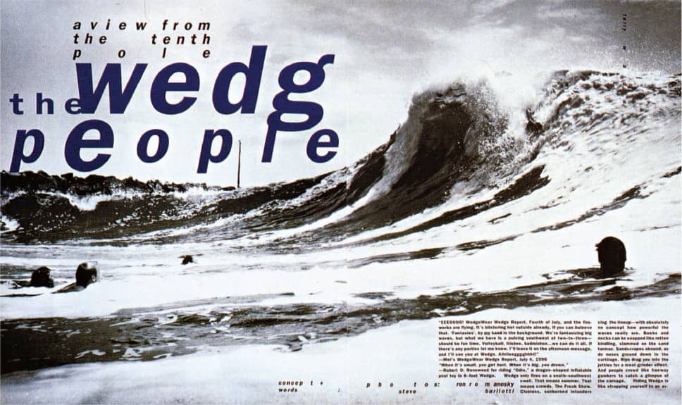
BEACH CULTURE MAGAZINE / David Carson / USA, 1991

SIXTEEN STONE, BUSH / Kirtland Records / David Carson / USA, 1994
SALVADOR DALÍ MUSEUM LOGO / David Carson / USA, 2008

FRAGILE, Nine Inch Nails, in-store release date announcement / David Carson / USA, 1999
Susan Kare
b. 1954 (ITHACA, NEW YORK, USA) CURRENTLY SAN FRANCISCO, CALIFORNIA, USA
With an art major from Mount Holyoke College (1975), and both a masters and a doctoral degree from New York University (1978), Susan Kare arrived in San Francisco to do curatorial work for the Fine Arts Museums of San Francisco. In 1982, a call from high-school friend Andy Hertzfeld, a programmer at Apple Computer, Inc., brought Kare into the design of the graphical user interface for the Macintosh’s operating system as she developed the icons and bitmap typefaces. Following Steve Jobs from Apple, Kare became creative director for NeXT, Inc., in 1986, and three years later, she established Susan Kare LLP, further perfecting and adapting her iconography work while delving into typeface, identity, and product design, often collaborating with organizations as diverse as the New York Museum of Modern Art › 121 and Facebook, for whom she designs digital virtual “gifts.”

MACINTOSH OPERATING SYSTEM ICONS FOR APPLE COMPUTER / Susan Kare / USA, 1984
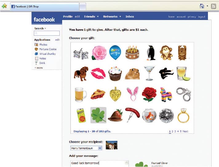
FACEBOOK ICON GIFTS / Susan Kare / USA, 2007
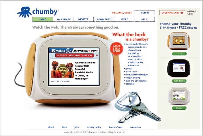

CHUMBY INDUSTRIES, INC., IDENTITY AND WEBSITE / Susan Kare / USA, 2007
Margo Chase
b. 1958 (SAN GABRIEL, CALIFORNIA, USA) CURRENTLY LOS ANGELES, CALIFORNIA, USA
With a degree in biology and two years of medical illustration studies, Margo Chase provides her clients with a detailed and layered sensibility that has become synonymous with her name. Having founded Chase Design Group in 1986, Chase has translated her interest in gothic architecture, medieval manuscripts, technology, and letterforms into a thriving business that encompasses identity, packaging, motion, editorial, exhibition, and interior design. During the late 1990s, Chase created nearly a dozen typefaces for the fledgling digital type foundry [T-26] › 229, some of which were extensions of the wordmarks created for her clients. Perhaps best known for her identity work in the entertainment industry for clients such as Madonna and the popular TV show Buffy the Vampire Slayer, Chase’s custom typography has evolved over time from manual labor to computer-developed, allowing her more time for other activities, such as competitive aerobatics as a licensed pilot.

BUFFY THE VAMPIRE SLAYER IDENTITY / Margo Chase / USA, 1997

CHARMED IDENTITY / Margo Chase / USA, 1998

BRAM STOKER’S DRACULA IDENTITY / Margo Chase / USA, 1992
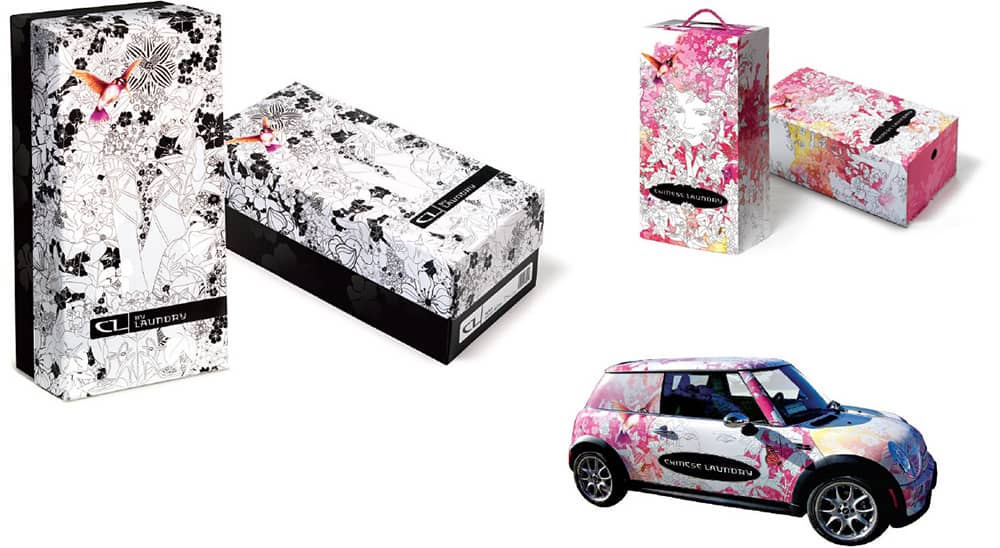

CHINESE LAUNDRY IDENTITY, PACKAGING, AND FLEET LIVERY / Margo Chase / USA, 2007
Muriel Cooper
1925 (BROOKLINE, MASSACHUSETTS, USA) – 1994
With a B.A. from Ohio State and a B.F.A. in design and a B.S. in education from Massachusetts College of Art, Muriel Cooper arrived at the Massachusetts Institute of Technology (MIT) in 1952. There she worked in the newly formed Office of Publications until 1958, when she left for Milan on a Fulbright scholarship; on her return, she ran her own design firm. Among her projects in the early 1960s was designing the now iconic logo for MIT Press where, in 1967, she became art director, responsible not just for designing hundreds of book covers but for also running the production of multitude of titles published every year—including seminal titles like Robert Venturi’s Learning from Las Vegas and Herbert Muschamp’s File Under Architecture.
In 1974, Cooper segued from MIT Press into teaching at the MIT School of Architecture. There she taught a class called Message and Means in partnership with Ron MacNeil, who had secured and installed two one-color sheet-fed offset presses, immersing the students in a full-cycle learning experience. The class was soon renamed the Visual Language Workshop (VLW) and, in the 1980s, as part of the MIT Media Lab, founded by Nicholas Negroponte in 1985, it evolved from printing to computer programming, interface design, and explorations in three dimensionality as new technologies, hardware, and ideas permeated the workshop and the organization. While Cooper was not a programmer, she understood the potential of not only the computer but also the ability of her students to fully explore this medium in the right learning environment. The efforts of the VLW found a captivated audience in a 1994 presentation by Cooper at the influential TED (Technology, Entertainment, Design) conference. Cooper was deluged with follow-up interest. Unfortunately, she passed away unexpectedly later that year in Boston, Massachusetts.
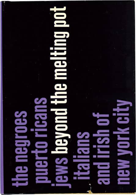
BEYOND THE MELTING POT, Nathan Glazer, Daniel P. Moynihan / Harvard University Press / 1963
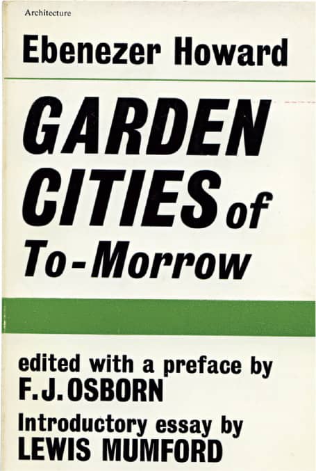
GARDEN CITIES OF TO-MORROW, Ebenezer Howard / MIT Press / 1965

GENERALIZED THERMODYNAMICS, Laszlo Tisza / MIT Press / 1978
THE NEW ARCHITECTURE AND THE BAUHAUS, Walter Gropius / MIT Press / USA, 1965
BAUHAUS, Hans Wingler / MIT Press / 1978
THE PORTABLE DRAGON: THE WESTERN MAN’S GUIDE TO THE I CHING, R.G.H. Siu / MIT Press / 1971
A PRIMER OF VISUAL LITERACY, Donis A. Dondis / MIT Press / 1973
THE RESPONSIVE HOUSE, Edited by Edward Allen / MIT Press / 1975
Images: Courtesy of the Morton R. Godine Library, Massachusetts College of Art and Design
Edward R. Tufte
b. 1942 (KANSAS CITY, MISSOURI, USA) CURRENTLY CHESHIRE, CONNECTICUT, USA
Edward R. Tufte first established an ongoing relationship with educational institutions when he received bachelor’s and master’s degrees in statistics from Stanford University, a 1968 doctorate in political science from Yale, and finally joined the faculty at Princeton University’s Woodrow Wilson School. While Tufte was teaching political economy and data analysis courses, Dean Donald Stokes asked him to take on a statistics course aimed at a group of visiting journalists; the class materials later became the basis of his book Visual Display of Quantitative Information. After working closely with statistics pioneer John Tukey on a series of seminars, Tufte relocated to Yale, where in 1982 he completed the manuscript of his first design book. Unsatisfied with his publishing options and determined to work on the design of the book himself—in partnership with designer Howard Gralla—Tufte took out a second mortgage and established the Graphics Press to self-publish his dream book.
With over 30 years in the classroom and 15 of one-day courses taught all over the country, Tufte has educated students, attendees, and readers alike in the art of visual data—from analysis to understanding to its best presentation. Called “the Leonardo da Vinci of data” by the New York Times, Tufte brings together many disciplines with design qualities that know no boundaries of time, location, or profession. A strong advocate against the popular and widespread use of PowerPoint as a medium for presenting information, Tufte uses examples from his four self-published books—each taking an average of seven years to complete—to provide followers with visual alternatives. Between his popular courses and writing activities, Tufte also devotes time to fine art and sculpture.

BOOKS BY ED TUFTE / Ed Tufte / USA, 1983–2006
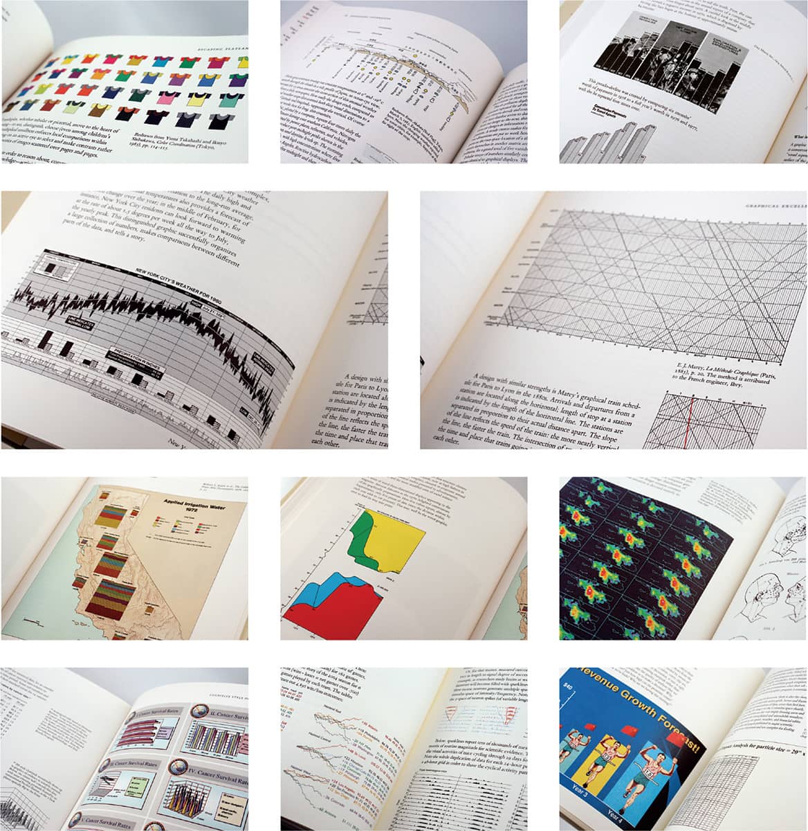
SAMPLE SPREADS FROM VARIOUS BOOKS BY ED TUFTE / Ed Tufte / USA, 1983–2006
Attik
EST. 1986 (HUDDERSFIELD, ENGLAND, UK) OFFICES LEEDS, NEW YORK, SAN FRANCISCO, LOS ANGELES
In a true story of rags to riches, Simon Needham and James Sommerville, graduates of the Batley School of Art and Design, established their business in Huddersfield in 1986 with a £1,000-grant from the Prince’s Trust (an organization that provides money for startup businesses) in the attic of Sommerville’s grandmother—yes, hence the name. During a rough patch in the late 1980s, Attik moved their operation to London, and business did pick up—but not necessarily in the industries they were hoping for. So, in 1995 they self-published Noise, a noncommercial book peppered with abstract, heavily layered layouts to lure clients in the music and entertainment industries; the Noise books (four to date and one in production) became objects of desire among designers. In 1997, William Travis, an Attik employee since 1992, headed to New York to open the first American outpost and with the burgeoning dot-com scene in the West Coast opened a San Francisco office in 1999, the same year Needham started an office in Sydney.
After some rough years following the demise of the dot-com era and the events of September 11, 2001, Attik turned its focus to integrated branding and in 2004 began a relationship with Toyota Motor Corporation, helping them launch the Scion automobile, whose subversive identity package departs from anything the automotive industry had seen or done before. In the same vein, Attik has continued to do work for the thriving and increasingly brand-aware generation of young consumers for companies like Virgin, America Online, and Nike. In 2007, Attik was acquired by global advertising agency Dentsu, giving the firm an even bigger stage on which to work. Needless to say, the £1,000-grant paid off.
SELF-PROMOTION POSTER / Attik / USA, 1990

NOISE 3 / Featuring 17 printing techniques as provided by 15 suppliers / Attik / USA, 1997

SCION CAMPAIGN IMAGE / Attik / USA, 2003

NOISE 3.5 / Attik / USA, 1997
The Designers Republic
EST. 1986 (SHEFFIELD, ENGLAND, UK)
Originally attracted from London to Sheffield for the music scene in 1979, Ian Anderson studied philosophy at the University of Sheffield and gradually became involved in the music industry. Becoming a manager for the band Person to Person, he designed their flyers and album covers, attracting attention from other bands seeking his services. Anderson first established his firm as ISA-Vision but, as more work came in, he partnered with Nick Phillips and in 1986, on Bastille Day no less, they officially founded The Designers Republic (TDR). Their early work was in the music industry designing album covers, but they catapulted into bigger commissions, despite being in the small market of Sheffield, for global clients like Coca-Cola, Nickelodeon, and Pringles, in a range of disciplines—among other notable forays are all the graphics for Wip3out, a videogame for PlayStation.
Parallel to their client work, TDR has actively engendered devotion to its own brand, one defined as much by visual style—a combination of layered colors, iconography, cooptation of cultural symbols, and reinterpretation of Japanese graphics, to point to only to a few ingredients—as by a philosophy that challenges consumerism through slogans like “Work, Buy, Consume, Die” and “Buy Nothing, Pay Now.” Despite the slogans, TDR launched the Peoples Bureau for Consumer Information, an online retail shop selling posters, T-shirts, and TDR-infused merchandise, eventually opening a store in Tokyo in 2003. TDR has exhibited work around the world, producing posters and banners around a theme and repurposing much of its own work with new meaning. Although consistently led by Anderson, TDR fostered the input of its employees, and many have gone on to establish their own successful firms, including Michael C. Place’s Build and Matt Pyke’s Universal Everything. In 2009, due to economic stress TDR had to shut down its ongoing operation.
3D-2D—THE DESIGNERS REPUBLIC’S ADVENTURES IN AND OUT OF ARCHITECTURE WITH SADAR VUGA ARHITEKTI AND SPELA MLAKAR / Laurence King / TDR™ SoYo™ North of Nowhere™ vs SVA Ljubljana / The Designers Republic Ltd. / UK, 2000

OPTIMIST THEORY™ LIMITED EDITION M5 GLOBAL PROJECT ALU-BOTTLE “LOVE BEING” FOR THE COCA-COLA COMPANY / The Designers Republic Ltd. / UK, 2004
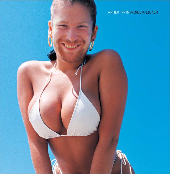
WINDOWLICKER, Aphex Twin / Warp Records Ltd. / The Designers Republic Ltd. / UK, 1999
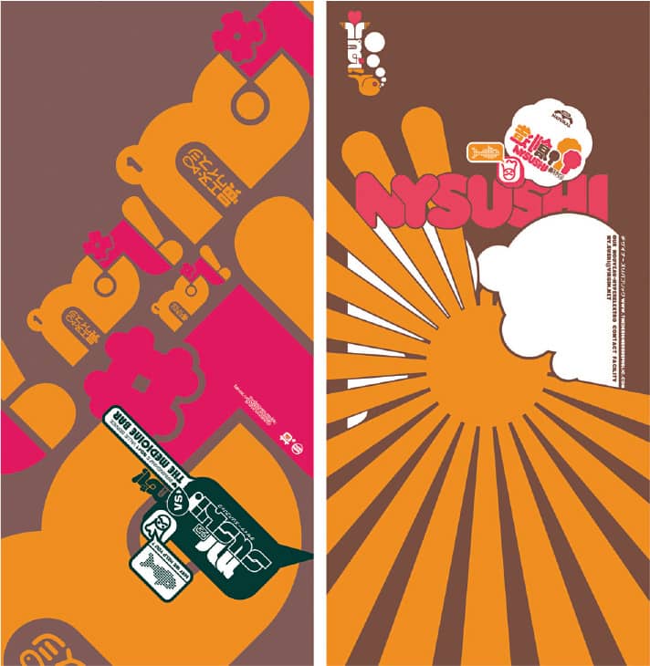
NYSUSHI SUPERFASHIONDISCOCLUB FLYER / Wildstylz Sheffield / UK, 1999

“PHO-KU CORPORATION™—WORK. BUY. CONSUME. DIE™” CUSTOMISED TERROR, ARTISTS SPACE NYC SHOW CURATED BY RONALD JONES / USA, 1995; Original Concept, 1993

DR SISSY™—DR DETH-TOY™ / TDR™ SOYO™ North Of Nowhere™ Vs The Peoples Bureau For Consumer Information / Shop33 Tokyo, 2004 / Dr Sissy™ © 1993 The Designers Republic Ltd.

WARP IDENTITY / The Designers Republic Ltd. / UK, 1989—forever

OVAL PROJECT #5 “YEAR ZERO” FOR ISSEY MIYAKE / The Designers Republic Ltd. / Japan, 1999
Chip Kidd
b. 1964 (READING, PENNSYLVANIA, USA) CURRENTLY NEW YORK, NEW YORK, USA
In a career that started in 1986 after he majored in graphic design from Pennsylvania State University, Chip Kidd has designed, as of mid-2008, nearly 1,000 book covers. The majority of them have been through his first and, so far, only full-time staff position, associate art director at Knopf Publishing Group, an imprint of Random House, Inc, historically noted for its small and celebrated in-house group of designers—including Barbara deWilde, Carol Devine Carson, and Archie Ferguson, along with editor Sonny Mehta—that reinvigorated the practice of book cover design in the mid-1980s. Kidd has also produced covers for HarperCollins, Doubleday, and Scribner, adding to his prodigious output. Media-guzzling books from David Sedaris, Michael Crichton, Dean Koontz, John Updike, and many other remarkable authors have cemented Kidd’s popularity and ubiquity.
A voracious fan of comics, their characters, and their memorabilia, Kidd co-authored and designed Batman Animated in 1998; published Batman Collected, a book showcasing his collection on the subject, in 2001; designed, edited, and provided commentary in 2001’s Peanuts: The Art of Charles M. Schulz; and is the editor of Pantheon Graphic Novels. Kidd has written two novels—and under fake credits designed their covers—The Cheese Monkeys › 108 (Scribner, 2001), which follows the adventures of Happy, an art student at a state university in the 1950s, and its sequel, The Learners (Scribner, 2008), which sees Happy, freshly graduated, as an art assistant for an advertising agency in the 1960s. To complement his writing and design, Kidd is the lead vocalist, percussionist, lyricist, and co-songwriter in artbreak.
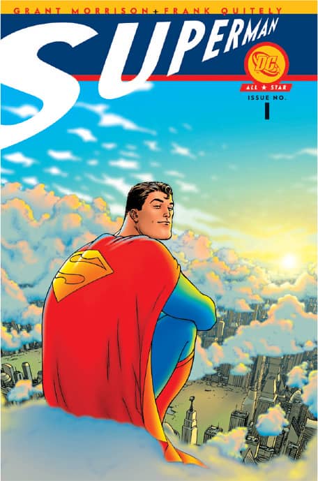
ALL-STAR SUPERMAN #1, Grant Morrison, Frank Quitely / DC Comics / Chip Kidd / USA, 2005

BUDDHA, VOLUME 4: THE FOREST OF URUVELA, Osamu Tezuka / Vertical / Chip Kidd / USA, 2006
CHIP KIDD: BOOK ONE, Chip Kidd / Rizzoli / Chip Kidd / USA, 2005
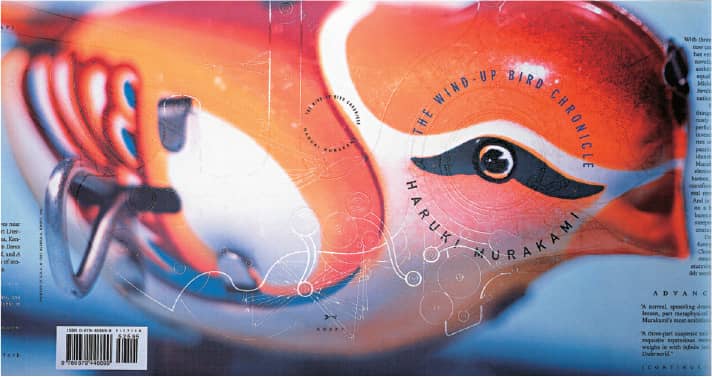
THE WIND-UP BIRD CHRONICLE, Haruki Murakami / Knopf Publishing Group, Random House, Inc. / Chip Kidd; photography, Geoff Spear; illustration, Chris Ware / USA, 1997

GEEK LOVE, Katherine Dunn / Knopf Publishing Group, Random House, Inc. / Chip Kidd / USA, 1989
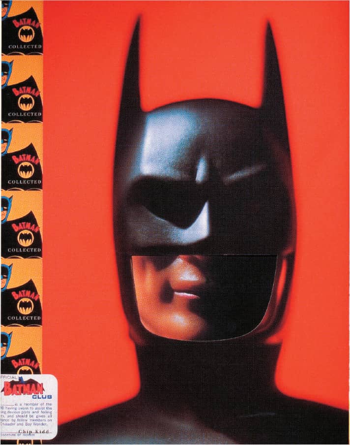
BATMAN COLLECTED, Chip Kidd / Bullfinch | D.C. Comics archives / Chip Kidd; photography, Geoff Spear / USA, 1996
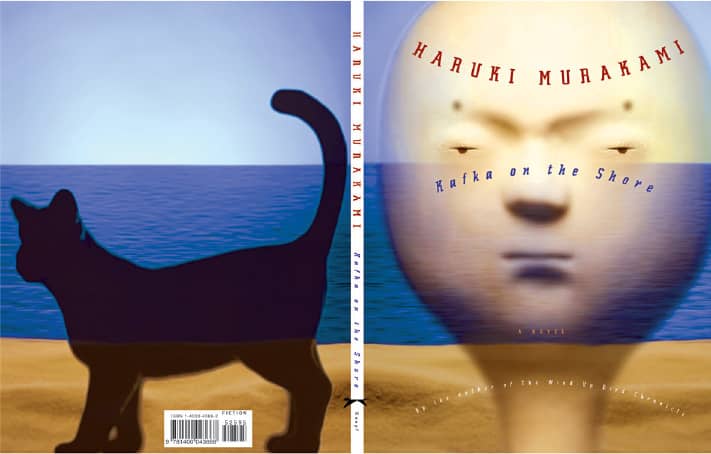
KAFKA ON THE SHORE, Haruki Murakami / Knopf Publishing Group, Random House, Inc. / Chip Kidd; photomontage, Geoff Spear; head sculpture, Eishi Takaoka / USA, 2005
Irma Boom
b. 1960 (LOCHEM, NETHERLANDS) CURRENTLY AMSTERDAM, NETHERLANDS
Upon graduation from the AKI School of Fine Art in Enschede, the Netherlands, in 1985, Irma Boom worked for the Dutch Government Publishing and Printing Office in The Hague for five years before opening her own design studio in 1991, with book design at the heart of her practice. Working with cultural institutions, publishers, and corporations, Boom’s book work is famously unexpected, innovative, and complex; she designs books that use more than 80 spot colors, or are more than 2,000 pages long, or require their own customized paper stock. Boom has been widely recognized for her books, earning the prestigious “Most Beautiful Book in the World” prize at the Leipzig Book Fair for Sheila Hicks: Weaving as Metaphor, and the Gutenberg Prize, awarded by the city of Leipzig, Germany to an outstanding designer, in 2001. This was only ten years after starting her practice, making her the youngest designer to receive the prize. Boom is a senior critic at Yale University School of Art› 129 and at the Van Eyck Akademie in Maastricht.

ROYAL DUTCH PTT POSTAGE STAMPS / Irma Boom / Netherlands, 1993
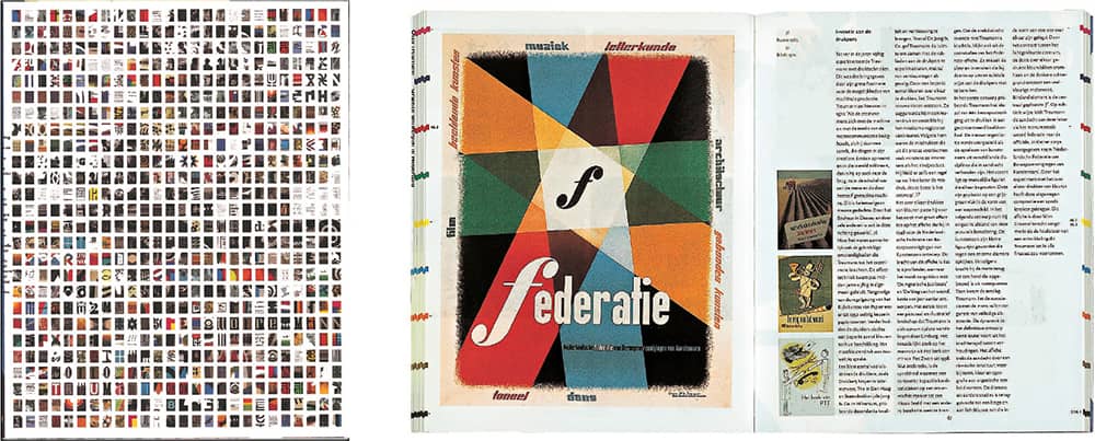
OTTO TREUMANN GRAPHIC DESIGN IN THE NETHERLANDS, Kees Broos, Tom Brandenbarg / 010 Publishers / Irma Boom / Netherlands, 2001
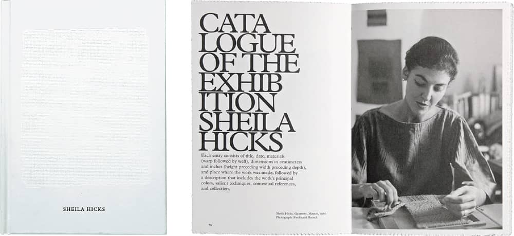
SHEILA HICKS: WEAVING AS METAPHOR, Nina Stritzler-Levine / Yale University Press / Irma Boom / Netherlands, 2006
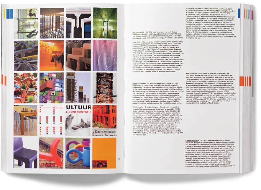
FALSE FLAT: WHY DUTCH DESIGN IS SO GOOD, Aaron Betsky, Adam Eeuwens / Phaidon / Irma Boom / Netherlands, 2004
VSA Partners
EST. 1985 (CHICAGO, ILLINOIS, USA) OFFICES CHICAGO, NEW YORK, ST. LOUIS, MINNEAPOLIS
After many years of heading a corporate identity firm, Robert Vogele established Communication Design Group, Inc., in 1982, in Chicago’s Printers Row. Three years later, emerging talents Ted Stoik and Dana Arnett joined Vogele in a partnership aptly named VSA Partners. With a balance of seasoned experience and youthful eagerness, the small firm started to grow, acquiring clients such as Harley-Davidson—which, 20 years later, is still a main client—and the Chicago Board of Trade, among others. Soon a larger office space was needed to accommodate the larger firm and a new location was scouted across the street, followed by a move to an old auto-dealing shop a decade later. As the firm grew in numbers, so did its reputation for solid work and inventive typography, most notably through annual reports › 294; the 2000 edition for IBM remains a landmark in this discipline.
In the late 1990s, VSA Partners chose to balance their print work with their newly established interactive group, a choice that held the firm afloat through the dot-com bust and allowed them to open additional offices in New York (1998), St. Louis (2003), and Minneapolis (2005). With steady leadership and dedicated teams, VSA Partners has worked across 33 industry sectors that span from boutique clients to Fortune 100 companies. They reinvigorated the Harley-Davidson brand in the 1980s; introduced Cingular’s new identity, backed by a $300 million media campaign that showered the nation with the friendly orange jack in 2000; and, most recently, designed the identity—not just once but twice—for the City of Chicago’s bid for the 2016 Summer Olympics.

CHICAGO BOARD OF TRADE 1993 ANNUAL REPORT / VSA Partners: art direction and design, Dana Arnett, Curt Schreiber / USA, 1994
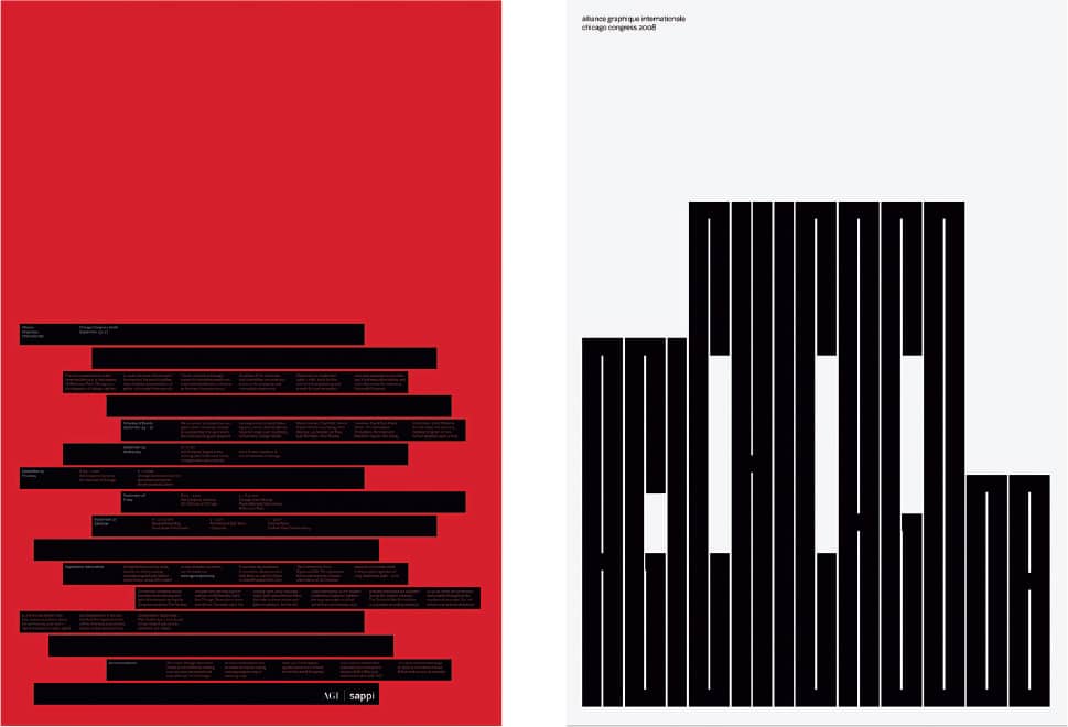
2008 AGI CONGRESS IN CHICAGO / VSA Partners: art direction, Dana Arnett; design, Jackson Cavanaugh / USA, 2008
MOHAWK OPTIONS COLLATERAL / VSA Partners: art direction, Jamie Koval; design, Dan Knuckey / USA, 2004
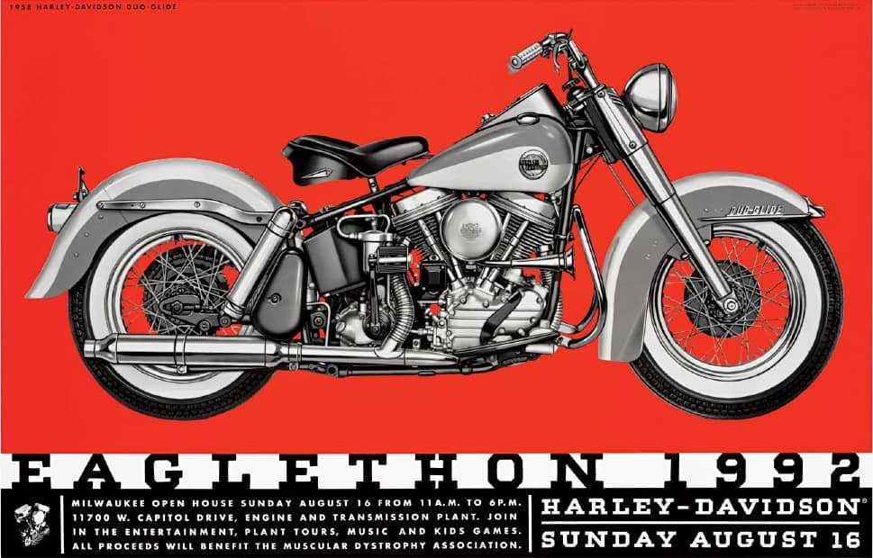
HARLEY-DAVIDSON EAGLETHON POSTER REPORT / VSA Partners: art direction, Dana Arnett, Curt Schreiber; design, Curt Schreiber / USA, 1992

CINGULAR IDENTITY / VSA Partners: art direction, Jamie Koval; design, Dan Knuckey, Ashley Lippard, Thom Wolfe, Greg Sylvester / USA, 2000

2016 SUMMER OLYMPIC GAMES CHICAGO, APPLICANT CITY / VSA Partners: art direction, Dana Arnett and Jamie Koval; design, Dan Knuckey, Luke Galambos, Kyle Poff / USA, 2006
Charles S. Anderson
b. 1958 (MINNEAPOLIS, MINNESOTA, USA) CURRENTLY MINNEAPOLIS, MINNESOTA, USA
From a single city in the United States, Charles S. Anderson has built a remarkable career. He earned a degree in graphic design from the Minneapolis College of Art and Design (MCAD) in 1981 and got his first job at Seitz Graphic Directions with celebrated MCAD teacher Peter Seitz; he spent two years there, followed by two more at Design Center. In 1985 he joined Duffy Design Group, a leading brand and packaging design firm, where he spent four years, eventually becoming partner in 1987 when they became the design arm of Fallon McElligott Advertising. Anderson left in 1989 to establish his own design firm, Charles S. Anderson Design Company (CSA), and began to invigorate modern-day design through the revival of 1930s and 1940s stock commercial clip art and midcentury American kitsch. In the wrong hands these elements might have resulted in dreary nostalgia, but in Anderson’s they created a comforting visual language with an edge.
The effects are most evident in the firm’s ongoing relationship with paper mill French Paper, which transformed from a lowly competitor when it first approached Duffy Design Group to a late-1990s design industry darling through the exuberant promotions and swatch books created with CSA. While the aesthetic delights designers, CSA has capitalized on this approach with work for national clients like Coca-Cola, Urban Outfitters, and Target. Anderson’s passion for American ephemera has turned into a complementary business, CSA Images, that has painstakingly rejuvenated hundreds of clip art images, borders, icons, and word images for digital consumption. And a collection of plastic toys that would make any child hyperventilate has been restored, photographed, and retouched to form a sumptuous collection of images. Anderson remains in Minneapolis.
HALIFAX HEALTH MEDICAL CENTER IDENTITY / art direction, Erik Johnson; design, Erik Johnson, Sheraton Green / USA, 2007
AIGA MINNESOTA DESIGN CAMP POSTER / art direction, Erik Johnson; design, Sheraton Green / USA, 2003
“GO FRENCH” CARD GAME FOR FRENCH PAPER / art direction, Erik Johnson; design, Erik Johnson, Sheraton Green, Jovaney Hollingsworth, Kyle Hames / USA, 2005
MUSCLETONE HEAVYWEIGHT PAPERS “DOUBLE-JOINTED JERRY” PROMOTION FOR FRENCH PAPER / design, Jason Schulte / USA, 1998

NIKE ICONS / art direction and design, Erik Johnson / USA, 1996

BETTY CROCKER LOGO FOR NEWSWEEK / art direction and design, Erik Johnson / USA, 1993
HEAVYWEIGHT PACKAGING PAPERS POSTER FOR FRENCH PAPER / design, Jason Schulte, / USA, 1999

BIRD BATH SOAP FOR POP INK / art direction, Erik Johnson; design, Sheraton Green, Jovaney Hollingsworth / USA, 2006
TURNER CLASSIC MOVIES IDENTITY / One of 50 interchangeable icons / design, Paul Howalt / USA, 1993
All work by Charles S. Anderson Design Company: art direction and design, Charles S. Anderson; additional credits individually noted
Luba Lukova
b. (PLOVDIV, BULGARIA) CURRENTLY NEW YORK, NEW YORK, USA
Over two decades, Bulgaria-born Luba Lukova has established a strong and opinionated voice through her simple metaphoric illustrations. She worked for a theater in her home country for three years after graduating from the esteemed and demanding Academy of Fine Arts in Sofia Bulgaria in 1986. In 1991 she traveled to the United States to see her work at the Colorado International Invitational Poster Exhibition; planning to spend a few weeks in New York on her way back, she became a permanent New Yorker when she was hired by the New York Times’s Book Review after dropping off ten slides and a copy of a Graphis poster annual that, unbeknownst to her, showcased her work. Working independently Lukova has done illustration and design work across cultural, educational, and social projects, using her unique style of rich, flat colors and economy of line that continually challenges and invites the viewer.
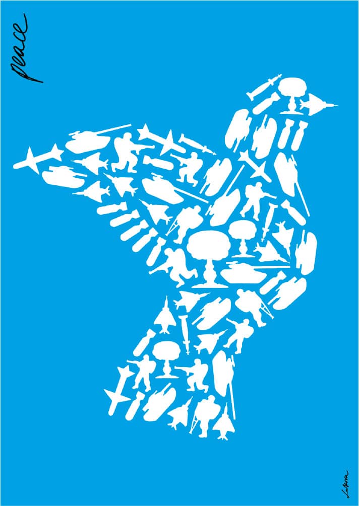
WAR RESISTERS LEAGUE PEACE POSTER / 1999
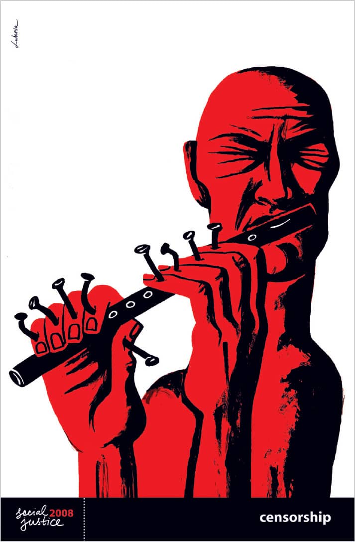
AMERICAN FRIENDS SERVICE COMMITTEE CENSORSHIP POSTER / 2003
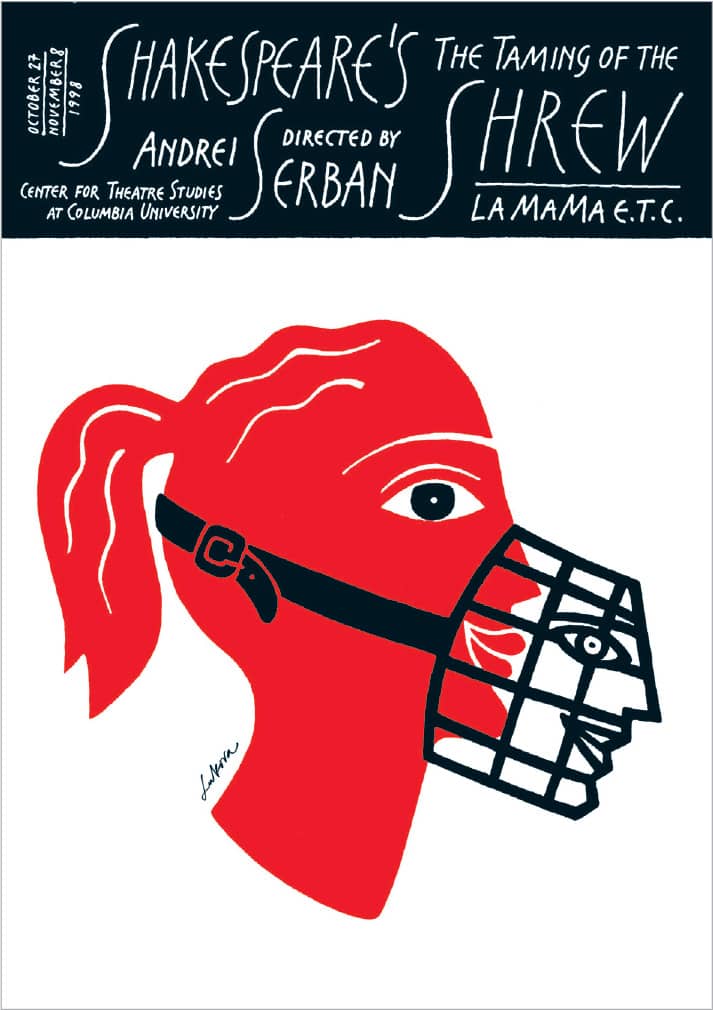
LA MAMA E.T.C., COLUMBIA UNIVERSITY, THE TAMING OF THE SHREW POSTER / 1998
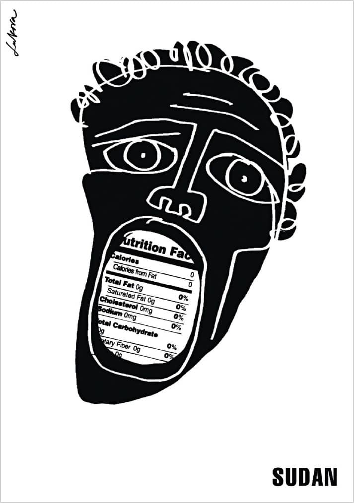
INTERNATIONAL ANTI-POVERTY LAW CENTER SUDAN POSTER / 1998
SOCIAL JUSTICE 2008, Luba Lukova / Clay & Gold / 2008
Louise Fili
b. 1951 (ORANGE, NEW JERSEY, USA) CURRENTLY NEW YORK, NEW YORK, USA
Born to Italian immigrants, Louise Fili’s first trip to Italy as a 16-year-old unleashed her fascination with packaging and photography as she collected pasta packaging, wrappers, and labels—something she continues to do as she scours flea markets across the world and photographs signs and typographic façades. After graduating from Skidmore College, Fili worked briefly for Alfred A. Knopf books in 1975 and then worked for Herb Lubalin› 167 from 1976 to 1978. She then joined Pantheon Books as art director, where she designed more than 2,000 book covers—among them The Lover › 291—in just over a decade. In 1989 she established Louise Fili Ltd., where she sought to diversify her work; her passion for cooking and her love for design blended as she delved into restaurant identity work and food packaging. Fili has a unique ability to reinterpret historical influences into modern-day products, her editorial work, and the books she has authored.
SFIDA WINE LABELS FOR MATT BROTHERS / 2000
MERMAID INN RESTAURANT IDENTITY / 2004

CALIFORNIA GRAPE SEED OIL PACKAGING FOR WILLIAMS-SONOMA / 1999

TIFFANY & CO. IDENTITY / 2007

THE PINK DOOR RESTAURANT IDENTITY / 1999
SFOGLIA RESTAURANT IDENTITY / 2006

LATE JULY ORGANIC CRACKERS PACKAGING / 2005

MARGARITA MIX PACKAGING FOR EL PASO CHILE COMPANY / 1999

LE MONDE RESTAURANT IDENTITY / 1998
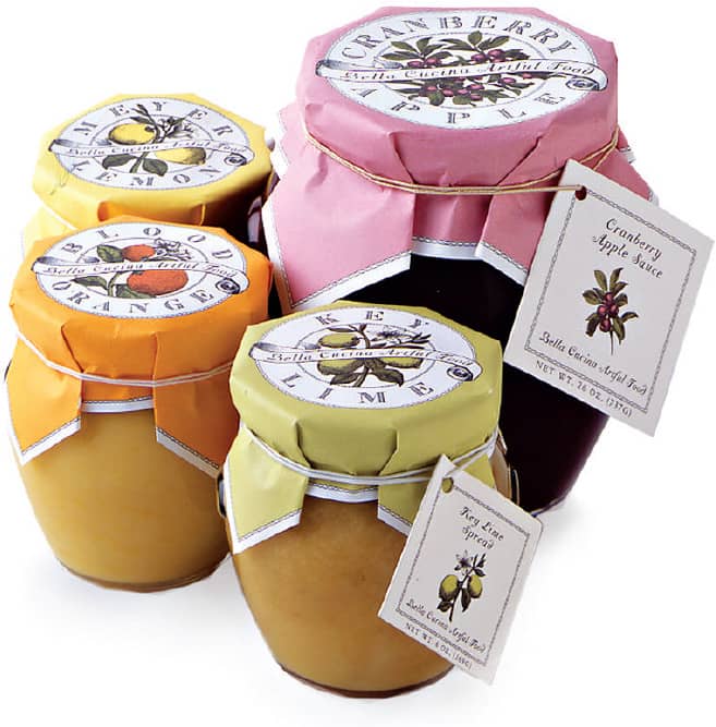

BELLA CUCINA PACKAGING / 1999–2002
Louise Fili Ltd. / USA
Modern Dog
EST. 1987 (SEATTLE, WASHINGTON, USA)
Lacking job offers after graduating from Western Washington University and a move to Seattle, Robynne Raye and Michael Strassburger established Modern Dog in 1987 with little intention of turning it into a formal business. However, for more than 20 years Modern Dog has thrived, developing numerous posters for the music and theater industries as well as advertising, packaging, and products for a diverse clientele. Its early years were a precedent for the owners’ current approach and business model, even if they wouldn’t call it that.
Working with low budgets and, by extension, low pay, Modern Dog did poster work for fringe theaters, acting as each project’s photographers, illustrators, letterers, and production artists, expressing the do-it-yourself extemporaneous attitude and aesthetic that permeates much of their work. To supplement their poster assignments, Raye procured ski manufacturer K2 as a client in 1989, designing advertisements for them in the beginning. The relationship has blossomed over ten years as K2 has became one of the leading snowboarding brands.
Since 1998, Modern Dog has been working with Blue Q, a purveyor of eclectic products—soaps, coin purses, air fresheners—for whom they develop products like magnets, breath sprays, and chewing gum, taking in a low design fee upfront but reaping the benefits in royalties. All the while, Raye and Strassburger continue to produce quick-witted posters, including a miscellany of self-promotional posters announcing their lectures around the country, some of which disappear from walls minutes after they’ve been hung. Both of them teach at Cornish College of the Arts in Seattle—and, yes, they both own dogs.
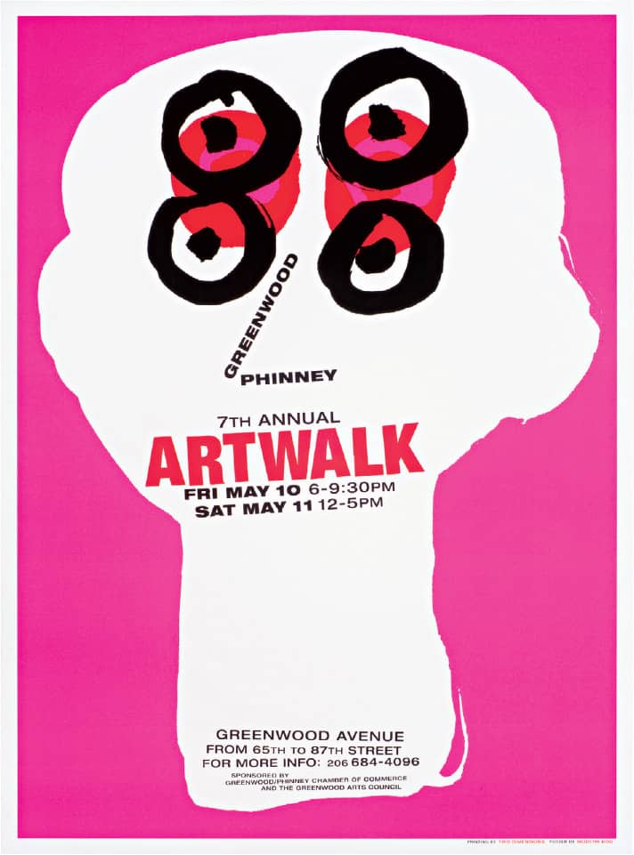
GREENWOOD ARTS COUNCIL ARTWALK POSTER / Modern Dog: design, Robynne Raye / USA, 2002

BLUE Q CAT BUTT MAGNETS / Modern Dog / USA, 2001
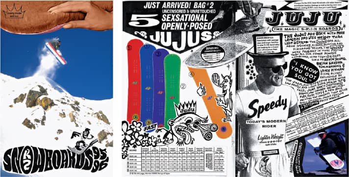
K2 SNOWBOARDS PRODUCT BROCHURE / Modern Dog / USA, 1995

OLIVE DOG PRODUCT PACKAGING / Modern Dog / USA, 2007
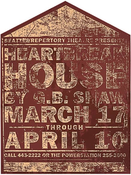
HEARTBREAK HOUSE SEATTLE REPERTORY THEATRE POSTER / Modern Dog: design, Vittorio Costarella / USA, 1993
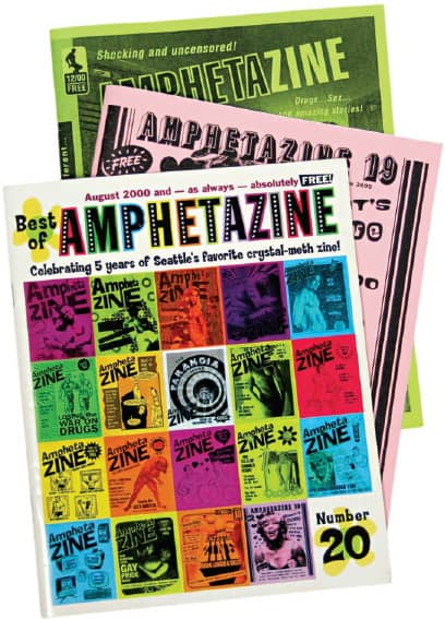
AMPHETAZINE COVERS / Modern Dog / USA, 1991–2001
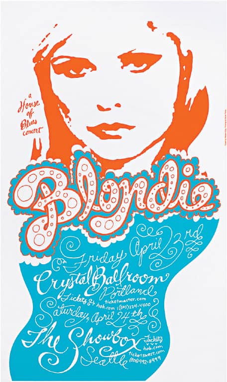
BLONDIE POSTER FOR HOUSE OF BLUES / Modern Dog: design, Michael Strassburger / USA, 2004
Aesthetic Apparatus
EST. 2002 (MINNEAPOLIS, MINNESOTA, USA)
Dan Ibarra and Michael Byzewski met in 1998 while working at Planet Propaganda in Madison, Wisconsin. The friendship soon blossomed as a shared love for printmaking and music led to homemade limited-edition concert posters. As their work gained public notice, the duo gained courage, and Aesthetic Apparatus was established in 2002, part of a new generation of gig-poster designers; their poster work has been a constant area of attraction. The use of abrupt juxtapositions, found imagery, and interesting typography identifies much of their work, as does the craft; they personally silkscreen posters in the studio—typically sold online, or at concerts, nicely supplementing their income and maintaining a steady ink flow. Aesthetic Apparatus has developed a unique and morphing style they aptly apply to diverse projects spanning identity, packaging, illustration, editorial work, and even their popular YouTube videos—including one where they scream gleefully, pointing at their process instead of speaking.
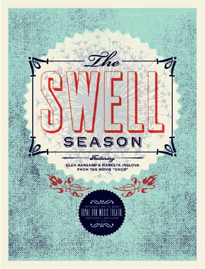
Left to Right THE SWELL SEASON POSTER FOR AEG LIVE / 2008

CAKE POSTER / 2006
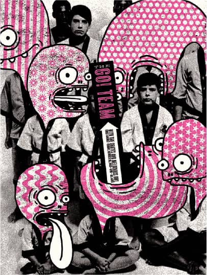
FIRST AVENUE POSTER / 2005
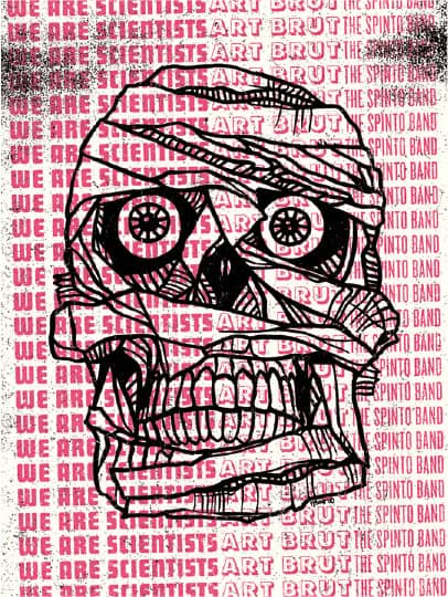
WE ARE SCIENTISTS POSTER /2006
Aesthetic Apparatus / USA
Small Stakes
EST. 2003 (OAKLAND, CALIFORNIA, USA)
After donating his design abilities to the Ramp—the basement of a church that served as a venue for music performances in Berkeley, California—in 2003 Jason Munn established Small Stakes, naming the studio after a song by Spoon about taking chances. Munn’s poster work for local independent bands began to get noticed—first using found art and later maturing into his own illustration. As the design, production, and infrastructure of his posters grew, so did his popularity. His illustratively and typographically simple and playful designs, often presented in soft-spoken flat colors, led to an array of commissions from clients such as Chronicle Books, Patagonia, and Capitol Records. Thus, the little Stake that could has expanded into new areas of design such as clothing, bags, CD packaging, and editorial illustrations.



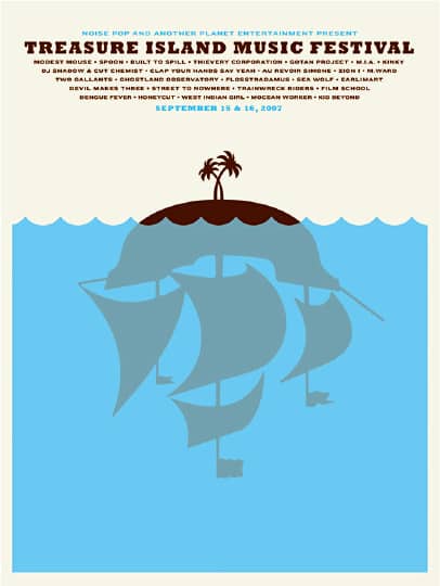
Left to Right DANIEL JOHNSON CONCERT POSTER / 2007
SFMOMA COLLEGE NIGHT WITH NOISE POP POSTER / 2006
THE BOOKS CONCERT POSTER / 2006
TREASURE ISLAND MUSIC FESTIVAL POSTER / 2007
The Small Stakes / USA
Rick Valicenti
b. 1951 (PITTSBURGH, PENNSYLVANIA, USA) CURRENTLY CHICAGO, ILLINOIS, USA
Upon receiving his BFA from Ohio’s Bowling Green State University in 1973, employment prospects for Rick Valicenti were scarce. Not willing to go unemployed, he worked for a steel mill, hard hat and all. He developed an interest in photography and enrolled in the University of Iowa, earning MA and MFA degrees in photography in 1975. Valicenti then moved to Chicago, where he found commercial photography uninspiring. Intrigued with graphic design, he managed to find employment as a paste-up production artist until 1978, when he started working for Bruce Beck, who had been running a reputable design firm. When Beck retired, Valicenti started his own business, R. Valicenti Design, in 1981, which initially did editorial and corporate collateral work. It was in 1988 that two of Valicenti’s most enduring clients, Gilbert Paper and the Lyric Opera of Chicago, first sought his services and provided canvases for him to develop his unique style of design, photography, lettering, illustration, and messaging.
In 1989, Valicenti reinvented his firm as Thirst. He became more selective in his clients and collaborators, and in 1995, looking for a better balance between life and work, he moved the office to Barrington, a Chicago suburb. Through the 1990s and into the 2000s, Valicenti and Thirst—as it is continually shaped by its employees and their unique strengths and interests—blossomed into an inimitable amalgam of client and self-initiated work. Valicenti has also displayed an entrepreneurial bent, initiating business like the type foundry Thirstype (now Village › 233), the interactive spin-off 3st2, and the digital imaging studio Real Eyes. In 2007, Valicenti relocated Thirst to Chicago.

365: AIGA YEAR IN DESIGN 29 / 3ST: design and illustration, Rick Valicenti, John Pobojewski / USA, 2007
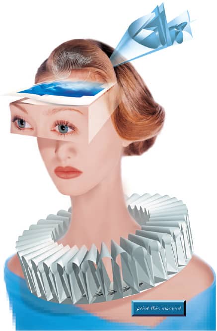
GILBERT PAPER PRINT THIS MOMENT POSTER INSERT FOR WIRED MAGAZINE / 3ST: Rick Valicenti, William Valicenti / USA, 1994
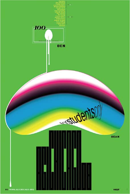
CHICAGO STUDENT DESIGN CONFERENCE 2008 POSTER FOR ALLIANCE GRAPHIQUE INTERNATIONALE / 3ST: Rick Valicenti; typography, Rick Valicenti, Dana Arnett; illustration, Rick Valicenti, Matt Daly / USA, 2008
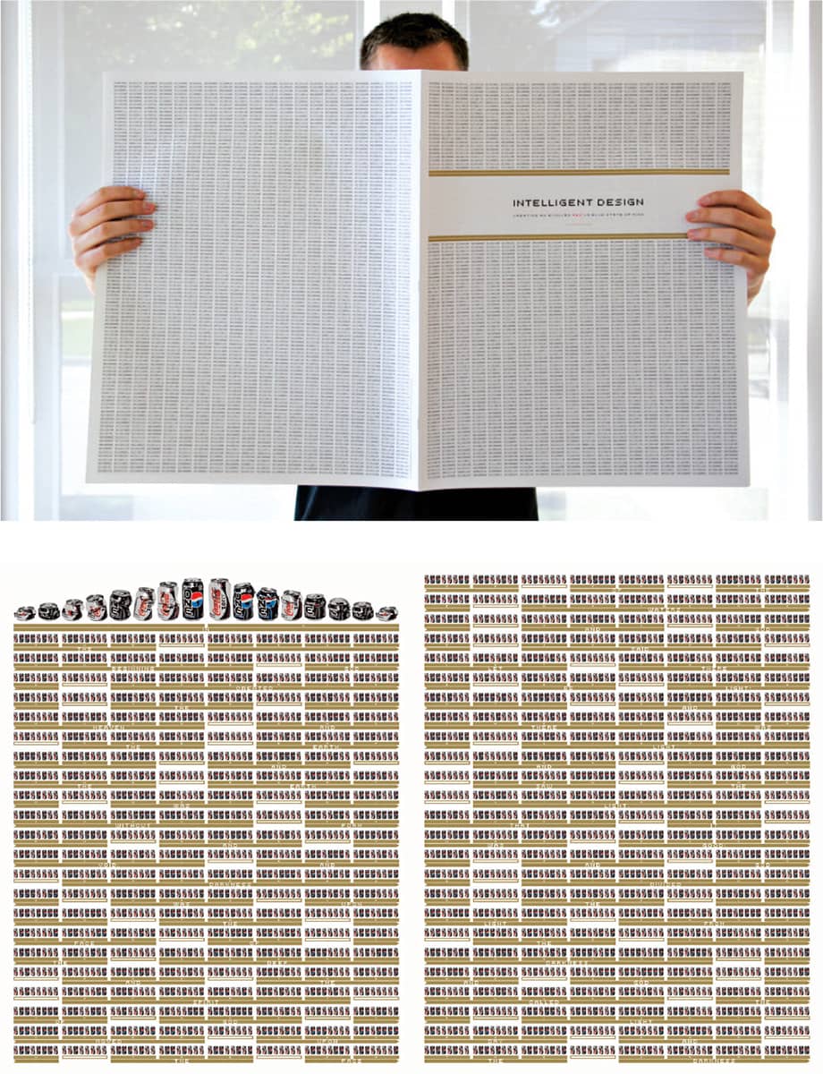
INTELLIGENT DESIGN: THE RED AND BLUE STATE OF MIND / The book of Genesis was converted to binary code and reproduced using Pepsi One cans as the 1s and Coke Zero cans as the 0s / 3ST: Rick Valicenti; illustration, Rick Valicenti, Gina Garza; typography, Rick Valicenti, John Pobojewski; programming, John Pobojewski, Robb Irrgang / USA, 2005

“SO FIVE MINUTES AGO” EDITORIAL ILLUSTRATION FOR I4DESIGN MAGAZINE / 3ST: Rick Valicenti; 3D illustration, Rick Valicenti, Matt Daly / USA, 2008
Bruce Mau
b. 1959 (SUDBURY, ONTARIO, CANADA) CURRENTLY TORONTO, ONTARIO, CANADA
Bruce Mau left the Ontario College of Art and Design in Toronto before graduating, choosing instead to join the firm Fifty Fingers in 1980. Two years later he worked at Pentagram › 162, London, immersed in a multidisciplinary environment that would become a personal trait upon his return to Toronto, where he co-founded the firm Public Good and Communications. In 1985, Bruce Mau Design opened its doors. The firm has allowed Mau to work across many disciplines, including branding, identity, editorial, product development, and environmental design—often partnering with architects on projects such as the Walt Disney Concert Hall in Los Angeles (with Frank Gehry) and the book S, M, L, XL › 283 (with Rem Koolhaas). Mau’s own 600-plus-page book, Life Style, published in 2000 and produced in eight different fabric covers, reflects the multidisciplinary background, client roster, and way of thinking that identifies him—providing insightful information and visual cues to past projects and beyond.
In 2003 Mau established The Institute Without Boundaries, a postgraduate studio-based program with the School of Design at George Brown College in Toronto, where a select group of students collaborates for a year with a public project in mind. Massive Change, a study “not about the world of design, but about the design of the world” through 11 economies—urban, movement, energy, information, image, market, material, military, manufacturing, living, wealth, and politics—resulted in a book and traveling show that exposed the first year of findings and conclusions. The second project, World House, is centered on future housing, where sustainability, ecological balance, and universality play key roles.
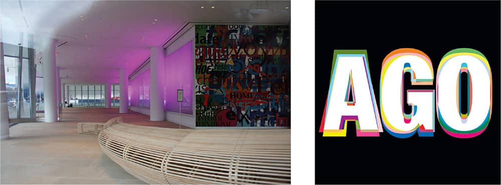
ART GALLERY OF ONTARIO IDENTITY / Bruce Mau Design / Canada, 2008

INTERACTIVECORP HEADQUARTERS / Bruce Mau Design / Canada, 2007
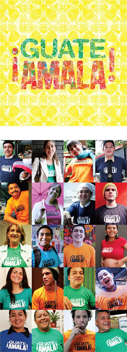
¡GUATEAMALA! IDENTITY FOR THE FUNDACIÓN PROYECTO DE VIDA / Bruce Mau Design / Canada, 2004
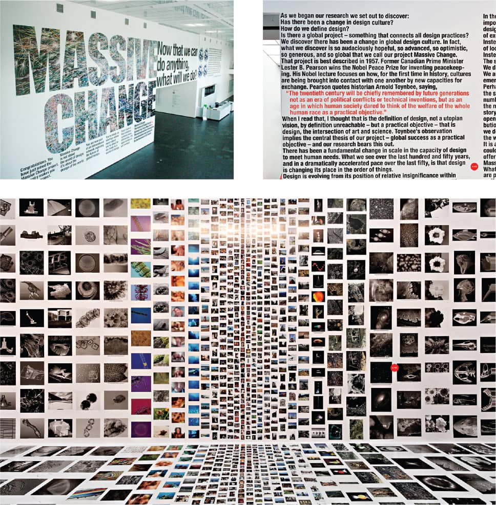
MASSIVE CHANGE EXHIBITION / Bruce Mau Design / Canada, 2004–2006
Stefan Sagmeister
b. 1962 (BREGENZ, AUSTRIA) CURRENTLY NEW YORK, NEW YORK, USA
Stefan Sagmeister was on his way to become an engineer when his involvement with Alphorn, a left-wing magazine in Bregenz, Austria, altered his course—he moved to Vienna and was accepted at the University of Applied Arts on his second attempt. In 1987, with a Fulbright scholarship, Sagmeister continued his studies at the Pratt Institute in New York. Three years later he completed his military obligations in community service and worked as a graphic designer in Vienna before joining the Leo Burnett advertising agency in Hong Kong in 1991. Back in New York, Sagmeister worked at M&Co. › 183, a dream of his, for six months before Tibor Kalman announced he was closing the studio.
This led to Sagmeister, Inc., established in 1993, which began with family and friends as clients and produced projects that soon opened the way into the music, fashion, and editorial industries. One designer and one intern often aid Sagmeister, maintaining a small and manageable studio that allows him to attend to the detail and experimentation he craves. The year 2000 was quiet for the design community. Sagmeister took the year off, feeling repetitive and somewhat stale in his work, to rethink, reevaluate, and refocus. Upon reopening his firm in 2001 he published Sagmeister: Made You Look, where he compiled his good and bad projects to date. He continues to impress and inspire through his work, lectures, and his ongoing typographic musings, titled Things I Have Learned So Far.
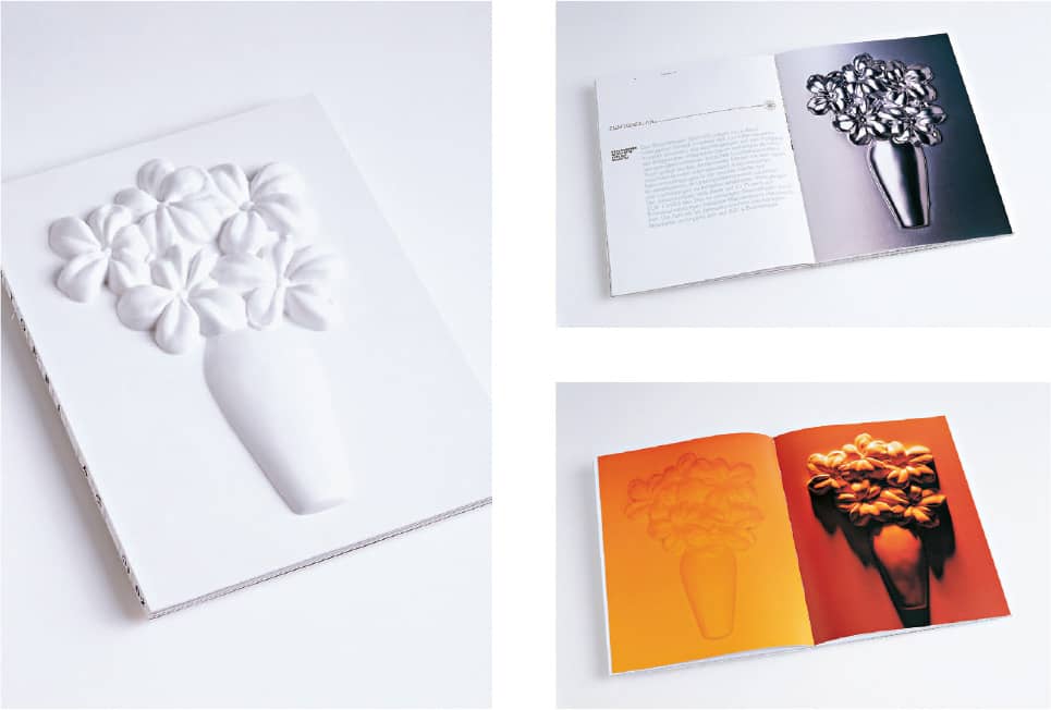
ZUMTOBEL AG ANNUAL REPORT / Sagmeister, Inc.: art direction, Stefan Sagmeister; design, Stefan Sagmeister, Matthias Ernstberger; photography, Bela Borsodi; prototype, Joe Stone / USA, 2002
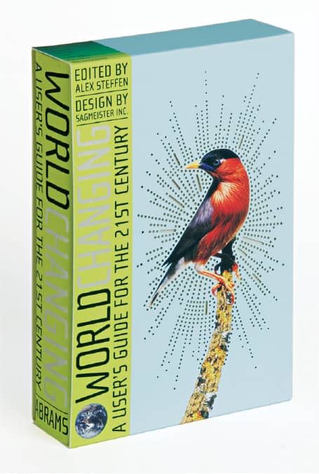
WORLDCHANGING: A USER’S GUIDE FOR THE 21ST CENTURY, Alex Steffen / Abrams / Stefan Sagmeister, Inc.: art direction, Stefan Sagmeister; design, Matthias Ernstberger, Roy Rub / USA, 2006
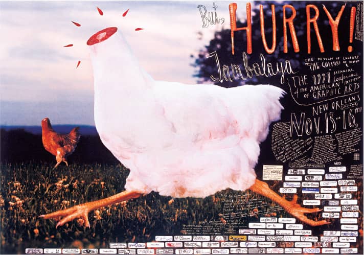
AIGA NEW ORLEANS POSTER / Sagmeister, Inc.: illustration, Stefan Sagmeister, Peggy Chuang, Kazumi Matsumoto, Raphael Rüdisser; photography, Bela Borsodi; paint box, Dalton Portella / USA, 1997
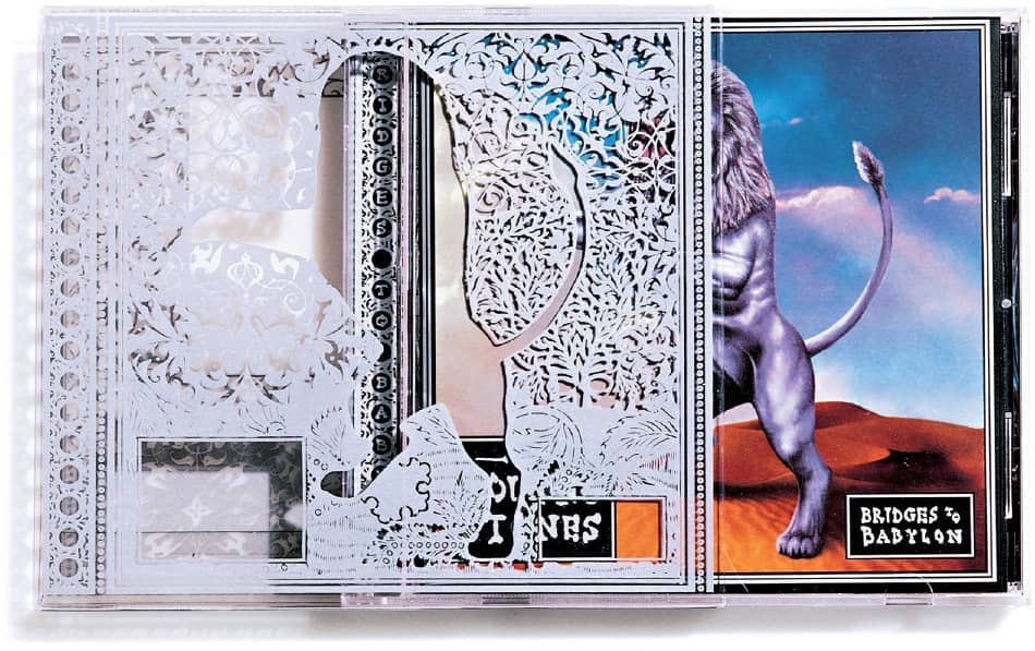
BRIDGES TO BABYLON, Rolling Stones / Virgin Records / Sagmeister, Inc.: art direction, Stefan Sagmeister; design, Stefan Sagmeister, Hjalti Karlsson; photography, Max Vadukul; illustration, Kevin Murphy, Gerard Howland, Alan Ayers / USA, 1997
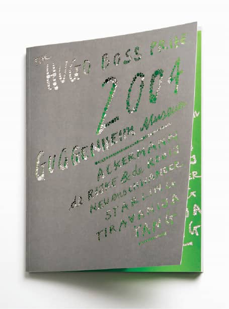
HUGO BOSS PRIZE CATALOG COVER FOR THE GUGGENHEIM MUSEUM / Sagmeister, Inc.: art direction, Stefan Sagmeister;design, Sarah Noellenheidt, Matthias Ernstberger; production, Lara Fieldbinder, Melissa Secundino / USA, 2004
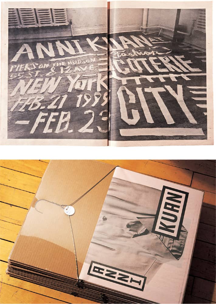
ANNI KUAN DESIGN FASHION BROCHURE / Sagmeister, Inc.: design, Stefan Sagmeister, Hjalti Karlsson; photography, Tom Schierlitz; illustration, Martin Woodtli / USA, 1999
Michael Bierut
b. 1957 (CLEVELAND, OHIO, USA)
CURRENTLY NEW YORK, NEW YORK, USA
Unlike the many designers who stumble on the profession or are not intrigued by it until the late teenage years, Michael Bierut’s determination to become a graphic designer started when he was 15 years old as he stumbled on Aim for a Job in Graphic Design/Art, a 1968 book by Columbia Records › 300 art director S. Neil Fujita, in his school library. Two books later—Graphic Design Manual by Armin Hoffman and Graphic Design by Milton Glaser › 170—Bierut was hooked. With a degree from the University of Cincinnati’s College of Design, Architecture, Art, and Planning and an internship with Chris Pullman at the Boston public television station WGBH, Bierut’s first job in 1980 was with one of the most prominent designers of the time, Massimo Vignelli › 160.
After ten years and a rise to vice president of design at Vignelli Associates, Bierut joined Pentagram › 162 in 1990 as a partner in the New York office and has since become one of the firm’s most visible personalities. He does high-profile work for organizations like Harley-Davidson, the New York Jets, Saks Fifth Avenue › 319, United Airlines, and for cultural and educational institutions like Brooklyn Academy of Music, Museum of Arts and Design, and Yale School of Architecture. He has been involved with the profession as president of the New York chapter of the AIGA › 244 (1988–1990) and then as president of the national organization (1998–2001). He is most recently and popularly one of the founders of the blog Design Observer › 113, where his endless array of topics and endless display of knowledge have earned him a devout following. His interest in all things graphic design is so legendary that an alternative to this book could have been an audio book where Bierut recites everything he knows.
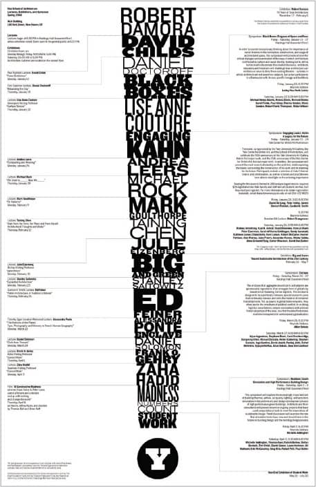
YALE SCHOOL OF ARCHITECTURE LECTURES, EXHIBITIONS, SYMPOSIA SPRING 2004 POSTER / Pentagram: Michael Bierut / USA, 2004
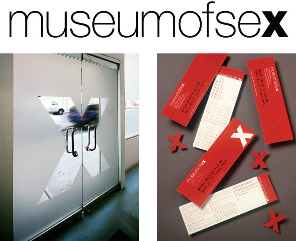
MUSEUM OF SEX / Pentagram: Michael Bierut; design, Brett Traylor / USA, 2002
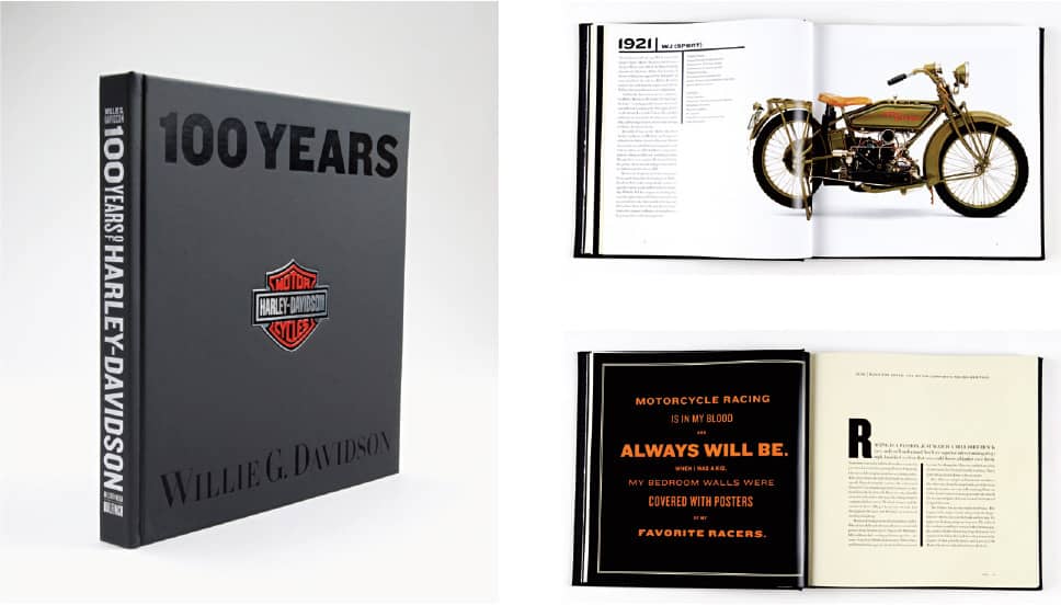
100 YEARS OF HARLEY-DAVIDSON / Pentagram: Michael Bierut; design, Elizabeth Ellis / USA, 2002
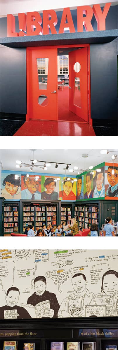
THE L!BRARY INITIATIVE / Pentagram: Michael Bierut; design, Rion Byrd; illustration, top Lynn Pauley, bottom Peter Arkle; architecture, Richard Lewis / USA, 2001 / Photo: Peter Mauss/Esto, Kevin Chu/KCJP

UNITED AIRLINES BRAND IDENTITY AND LIVERY / Pentagram: Michael Bierut, Daniel Weil; design, Brett Traylor, David Gibbs / USA, 2003–2004

TED BRAND IDENTITY / Pentagram: Michael Bierut, Daniel Weil; design, Brett Traylor, David Gibbs / USA, 2003–2004

THE NEW YORK TIMES BUILDING ENVIRONMENTAL GRAPHICS / Pentagram: Michael Bierut / USA, 2007
Brian Collins
b. 1961 (LEXINGTON, MASSACHUSETTS, USA) CURRENTLY NEW YORK, NEW YORK, USA
Brian Collins’s unparalleled level of energy and restlessness continuously shapes his professional path. After attending Parsons School of Design and Massachusetts College of Art and running a couple of independent studios in Boston, spending time in London in between, Collins joined Duffy Design Group in 1990. His third studio followed, in Minneapolis, before joining Foote Cone & Belding/San Francisco to work on Levi Strauss & Co., MTV › 352, and Amazon.com in 1995. Three years later Collins moved to New York City and began his tenure with Ogilvy & Mather’s in-house design team, the Brand Integration Group (BIG) › 205, where his passion and dedication translated into well-known clients, worldwide projects, and a long list of recognitions and awards. The first designer to participate in the World Economic Forum in Davos, Switzerland, in 2005, Collins was named Peak Performer in Design by Fast Company; a year before, the Massachusetts College of Art and Design named him Distinguished Alumnus.
More recently, Collins has divided his efforts by working on public good projects, such as the annual forum “Designism: Design for Social Change,” held at the Art Directors Club › 245 in New York City, teaching in the graduate program in design at the School of Visual Arts › 132, and his newly founded firm COLLINS:, which he established upon leaving BIG in 2007. His latest projects include the Alliance for Climate Protection “we” campaign and the CNN Grill at the 2008 Democratic and Republican National Conventions. A constant traveler, Collins can also be found speaking at many design and business conferences, where he continually motivates and inspires attendees professionally and personally.

BP HELIOS HOUSE / creative direction, Brian Collins; design, Chuck Rudy, Mark Aver, Christian Cervantes, Jung Ha, David Harlan, Allbriton Robbins, Noah Venezia; architecture, Office DA: Monica Ponce de Leon, Nader Tehrani; JohnstonMarkLee / USA, 2007

KODAK IDENTITY PROGRAM / creative direction, Brian Collins; design, Allen Hori, Weston Bingham, Christian Cervantes, Peter Kaplan / USA, 2005–2006

ALLIANCE FOR CLIMATE PROTECTION “WE” CAMPAIGN / COLLINS:: Brian Collins, John Moon, Mickey Pangilinan; The Martin Agency: Ty Harper, Raymond McKinney, Sean Riley, Mike Hughes; Village Type & Design: Chester Jenkins / USA, 2008
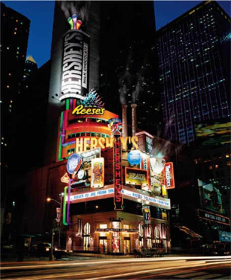
HERSHEY’S TIME SQUARE STORE / Ogilvy & Mather: creative direction, Brian Collins; design, Weston Bingham, Edward Chiquitucto, Roman Luba / USA, 2003
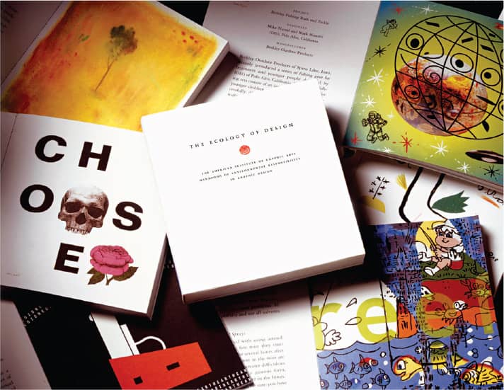
THE ECOLOGY OF DESIGN / design, Brian Collins, Sarah Nelson; project participants, R.O. Blechman, Paul Davis, Joe Duffy, Vivienne Flesher, Brad Holland, Edward Sorel, Gary Panter, Helene Silverman, Paul Rand, Mark Wald, Sharon Werner / USA, 1996
COCA-COLA GLOBAL IDENTITY / creative direction, Brian Collins; design, Richard Bates, Barry Deck, Mark Aver, Christian Cervantes, Arden de Brun, Apirat Infahsaeng, Tracy Jenkins, Peter Kaplan, Ali Madad, Charles Watlington / USA, 2006
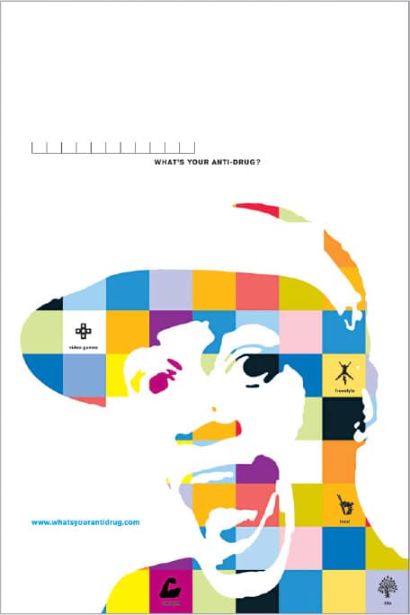
THE OFFICE OF NATIONAL DRUG CONTROL POLICY CAMPAIGN “WHAT’S YOUR ANTI-DRUG?” / Ogilvy & Mather: creative direction, Brian Collins, Charles Hall; design, Patrik Bolocek / USA, 2000
BIG
BRAND INTEGRATION GROUP, OGILVY & MATHER WORLDWIDE EST. 1996 (NEW YORK, NEW YORK, USA)
Ogilvy & Mather’s in-house Brand Integration Group, better known as BIG, was founded in 1996 by then chief creative officer Rick Boyko. The group was tasked with finding new ways to connect brands and consumers. Two years later, the fresh stewardship of Brian Collins › 204 led the firm to eradicate the dividing lines between advertising and design, as Collins set out to establish a firm that functioned more like a lab that retained the energetic, experimental nature of graduate school than an office—providing multiple seating areas in which to converse, large chalk-friendly walls on which to sketch and have fun—while working on mainstream projects. The high energy of the firm was palpable to visitors and newcomers as they walked down red-lined halls peppered with seven-foot boards showcasing every iteration and idea across all projects.
BIG distinguishes itself by an unconventional experience-driven approach to client needs: In 2002, a Hershey › 309 billboard assignment became a 12-story chocolate factory in New York’s Times Square; three years later, Dove’s international traveling photography exhibit, Campaign for Real Beauty, became a unique and memorable advertising campaign; in 2005, New York City was covered by the city’s bid for the 2012 Summer Olympic Games › 206; and 2007 brought to life BP’s Helios House, the first environmentally certified gas station, among many other projects. In 2007 Collins departed and Richard Bates assumed leadership, continuing the tradition to challenge expectations. Over the years, BIG has been exceptional in attracting talented and seasoned designers like Barry Deck, Rebeca Méndez, and Allen Hori, as well as a younger generation that included Luke Hayman, now partner at Pentagram; Alan Dye, now with Apple; and Bobby C. Martin Jr., now with Nokia.

BRAND INTEGRATION GROUP IDENTITY / BIG: Brian Collins, Alan Dye / USA, 2003
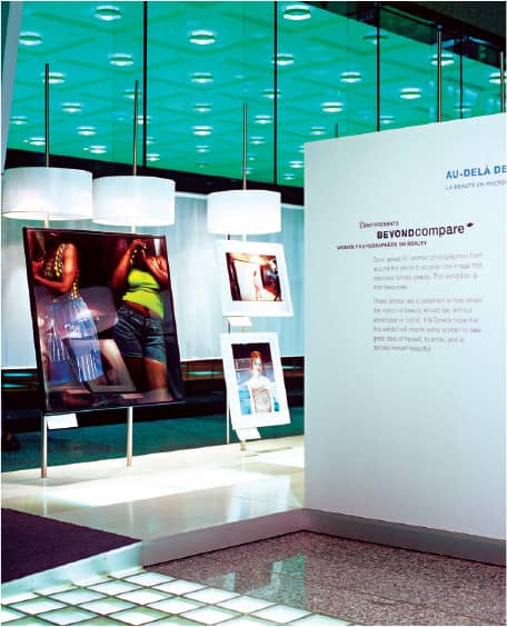
DOVE’S “REAL BEAUTY” EXHIBITION LAUNCHING ITS NORTH AMERICAN CAMPAIGN / BIG: Brian Collins, David Israel, Leigh Okies, Satian Pengsathapon / USA, 2005

SPRITE’S GLOBAL DESIGN PROGRAM / BIG: Brian Collins, Weston Bingham, Iwona Waluk, Jason Ring / USA, 2005

COCA-COLA HOLIDAY CAN DESIGN / BIG: Brian Collins, Hee Chun, Barry Deck / USA, 2005
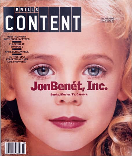
BRILL’S CONTENT MAGAZINE REDESIGN / BIG: Brian Collins, Luke Hayman / USA, 1999
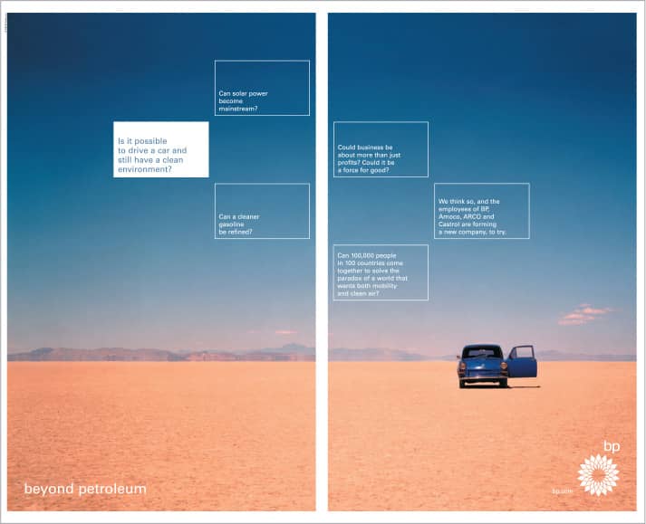
BP “BEYOND PETROLEUM” CAMPAIGN LAUNCH / BIG: Brian Collins, Michael Kaye, Rebeca Méndez, David Fowler / USA, 2000

TRIBECA FILM FESTIVAL IDENTITY / BIG: Brian Collins, David Israel, Nathalie Hennequin / USA, 2004
Wolff Olins
EST. 1965 (LONDON, ENGLAND, UK) OFFICES LONDON, NEW YORK, TOKYO
Since its founding in 1965 in Camden Town, London, Wolff Olins has been developing corporate and brand identity work that defies established conventions. This is not gratuitous praise but rather an objective assessment of their record. As an abridged library of examples: In 1971, they employed a hummingbird to identify Bovis Construction, a tropical bird native neither to the United Kingdom nor the construction industry; in 2003, they used the tagline “We are Macmillan. Cancer Support” to function as the logo for Macmillan Cancer Support; and, of course, they created the publicly conflicting and allegedly seizure-inducing logo for the 2012 Summer Olympic Games › 359 in London.
In its 40-plus years, Wolff Olins has morphed and adapted its business and creative structure while maintaining the equity of its founding partners, Michael Wolff and Wally Olins. Wolff left in 1983 to join Addison. Olins, now chairman of the brand consultancy Saffron, left in 2001, having gradually stepped back from running the business since 1997, when a management buyout team headed by Brian Boylan, a member of Wolff Olins since the late 1960s and now the chairman, took over. The firm started growing in the early 1990s, opening offices in Madrid and Barcelona (1991–2007), New York (1998–present), San Francisco (2001–2006), and Tokyo (2001–present through advertising agency Hakuhodo), and was purchased by Omnicom in 2001. In 2007, the New York and London offices became the sole hubs of Wolff Olins, with an active interchange of employees between them. The firm’s current creative lead and executive creative director is Patrick Cox, who spent from 1987 to 1995 with Wolff Olins and came back in 2002 to extend the tradition of work that challenges branding and identity dictums.
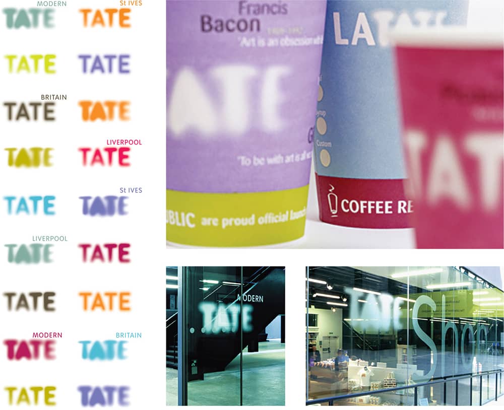
TATE IDENTITY / Wolff Olins / UK, 2000

MACMILLAN CANCER SUPPORT BRAND REINVENTION / Wolff Olins / UK, 2006

NEW MUSEUM IDENTITY / Wolff Olins / USA, 2007
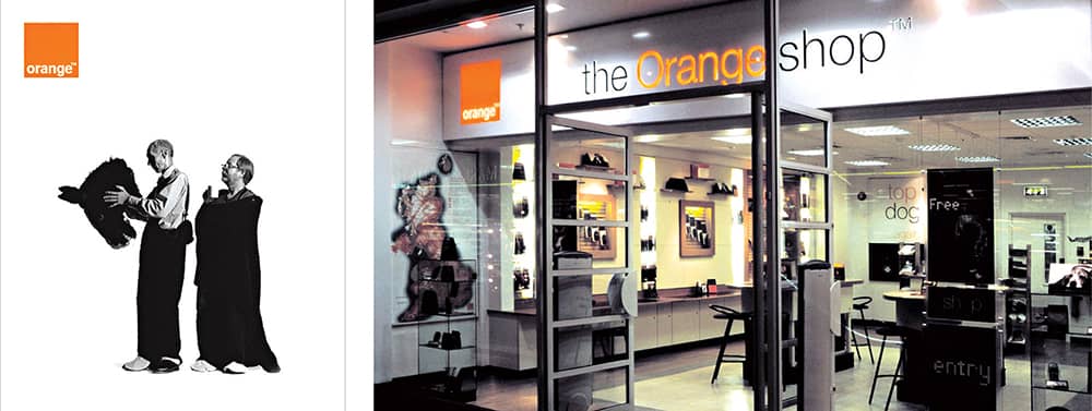
ORANGE IDENTITY / Wolff Olins / UK, 1994
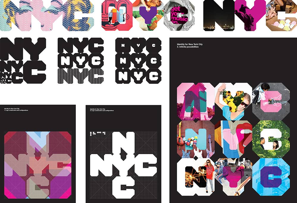
NEW YORK CITY IDENTITY / Wolff Olins / USA, 2007
Cato Partners
EST. 1971 (SYDNEY, AUSTRALIA) OFFICES AUSTRALIA, NEW ZEALAND, SPAIN, MEXICO, DUBAI, INDONESIA, SINGAPORE
Before establishing his own firm, Ken Cato graduated from the Royal Melbourne Institute of Technology in 1966 and worked in a variety of environments, including a direct mail house, a design studio, and briefly in advertising, until 1970, when he co-founded Cato Hibberd Design in Australia with Terry Hibberd. From this modest beginning, Cato’s rising trajectory has seen its share of partners and iterations. In the mid-1970s it became Cato Hibberd Hornblow Hawksbury Design; Hornblow and Hawksbury left in the late 1970s, leaving Cato and Hibberd as partners until 1982, when Hibberd retired. The business then became Ken Cato Design Company, followed by just Cato Design and, in 2003, Cato Purnell Partners. This list is not meant to confuse but rather to point out the collaborative and enterprising attitude that has defined the firm, now a global network of offices with nearly 100 employees across Australia, New Zealand, Spain, Mexico, Dubai, Indonesia, and Singapore.
Each office operates under the Cato Partners umbrella but runs independently and is often defined by local partnerships, like Cato Saca Partners in Mexico and Consulus Cato Partners in Singapore. Through its international scope, Cato Partners has worked on a remarkable number of global brands, producing identity work, environmental graphics, and packaging that resembles the work of a boutique design firm rather than that of a design conglomerate. As head of one of the most visible firms in Australia, Cato has played a significant role in bringing attention to the design community there, most notably by conceiving the first AGIdeas, the student conference hosted by the Alliance Graphique Internationale (AGI) › 247, in 1991, when their congress was held in Australia; he was also president of AGI from 1997 to 2000.

MELBOURNE SPORTS AND AQUATIC CENTRE IDENTITY AND SIGNAGE / 1996

DUBAI WORLD CENTRAL IDENTITY / Each individual city is represented by a symbol expressive of its type of activity / 2006

BENQ PACKAGING AND VISUAL LANGUAGE / Taiwan, 2008

SEVEN NETWORK EXTERNAL SIGNAGE / 2000
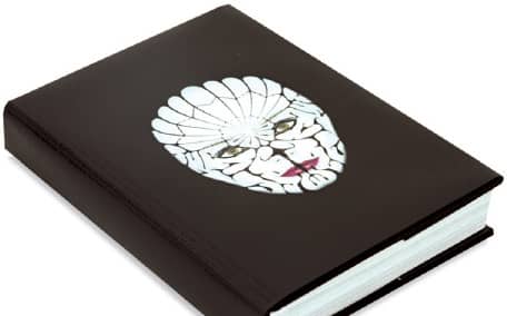
AGIDEAS 2008 INTERNATIONAL DESIGN WEEK PROGRAM / 2008
Cato Partners / Australia (except for BenQ)
Michael Johnson
b. 1964 (DERBYSHIRE, ENGLAND, UK) CURRENTLY LONDON, ENGLAND, UK
For Michael Johnson, establishing his own design firm, johnson banks, at the age of 28 in 1992 was the culmination of eight years, eight employment positions, two firings, and residence in four major cities across the world. After graduating from college, Johnson spent two years with Wolff Olins › 206 in the mid-1980s, where he was pegged as a “suit that could draw” and was unable to find his place as either a designer or consultant. He then went to work for several studios in Sydney and Melbourne, punctuated by six months in Tokyo; he came back to London to work at Sedley Place and made a final, three-year stop at Smith & Milton, where he at last found and developed his own design voice.
With modest beginnings in print design and two employees, johnson banks grew into a full-fledged design firm with six or seven full-time employees working on significantly large and comprehensive identity projects for cultural institutions and government agencies. The firm now services clients in Paris, Tokyo, and the United States.
Representative of Johnson’s design aesthetic and a process that eschews typical solutions and favors ideas are two of his postage designs for the Royal Mail. The “Fruit ‘n’ Veg” stamp set, issued in 2003, features straightforward images of fruits and vegetables but is accompanied by 76 stickers with which people can customize their stamps, à la Mr. Potato Head. In 2007, Johnson designed a set to commemorate the Beatles, using the band’s album cover artwork and employing a challenging diecut that follows the jumbled shape of what are meant to be piles of Beatles albums. Johnson has been actively involved with the Design and Art Direction (D&AD) › 249 group, including a year serving as one of the organization’s youngest presidents in its history.

BRITISH FILM INSTITUTE (BFI) IDENTITY AND BRANDING / johnson banks: Michael Johnson, Pali Palavathanan / UK, 2006
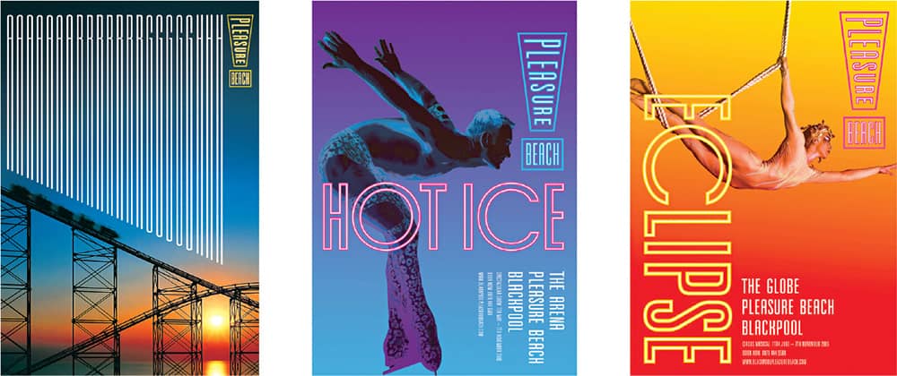
PLEASURE BEACH, BLACKPOOL, THEME PARK REBRANDING / johnson banks: Michael Johnson, Kath Tudball, Julia Woollams / UK, 2005

THE BEATLES POSTAL STAMPS COMMEMORATING THE FIFTIETH ANNIVERSARY OF LENNON AND MCCARTNEY HAVING MET / johnson banks: Michael Johnson / UK, 2007

THINK LONDON LOGO / johnson banks: Michael Johnson, Julia Woollams / UK, 2004
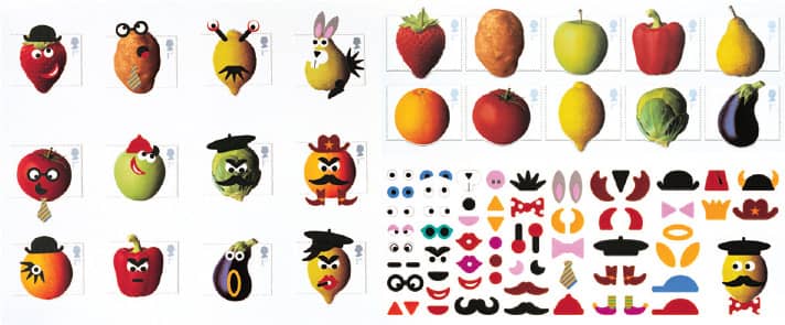
FRUIT ‘N’ VEG POSTAL STAMPS / johnson banks: Michael Johnson, Andrew Ross, Sarah Fullerton / UK, 2003

“SEND A LETTER” FROM THE JOHNSON BANKS POST OFFICE, INAUGURATED AT THE V&A MUSEUM / johnson banks: Michael Johnson, Kath Tudball, Julia Woollams / UK, 2005

MOUSE AWARDS LOGO AND AWARD / johnson banks: Michael Johnson, Kath Tudball / UK, 2008
Vince Frost
b. 1964 (BRIGHTON, ENGLAND, UK) CURRENTLY SYDNEY, AUSTRALIA
Initially working as a freelancer after graduating from West Sussex College of Design, Vince Frost was hired by the London office of Pentagram › 162 in 1989, and after a short three years he was promoted, becoming the youngest associate partner (the highest position other than partner) to date at 27 years old. In 1994 Frost set out on his own as Frost Design, beginning a slew of magazine projects with Big Magazine and Saturday Magazine for The Independent newspaper. In addition, he moved to Tokyo to serve as art director for the 1998 launch of Vogue in Japan, only to step back from the position after eight months as the publication struggled. He also collaborated with editor Dan Crowe to launch the literary magazine Zembla, which further developed Frost’s proficiency in editorial design.
In 2003, at the kind behest of his Australian wife, who wanted to be in her home country, Frost found the right professional opportunity by entering into a partnership with Garry Emery, an established Australian designer, and together they formed emeryfrost, with offices in Melbourne and Sydney. The partnership led to many significant projects and collaborations, but by the end of 2005 the designers went their separate ways, with Frost keeping his office in Sydney; he also kept an outpost in London, as he had maintained clients there, including Zembla, which eventually folded in 2005. Frost Design now comprises approximately 30 employees, and its client and project roster is numerous, diverse, and eclectic, thanks in part to the firm’s refreshing openness to the potential in any given project, whether it’s the identity for music label Mushroom Records, an album cover for the Spice Girls, or the annual report for a company called Supercheap Auto.

SYDNEY DANCE COMPANY IDENTITY / Frost Design: Vince Frost / Australia, 2005
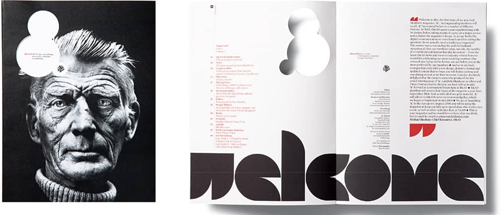
D&AD AMPERSAND MAGAZINE / Frost Design: Vince Frost / Australia, 2006
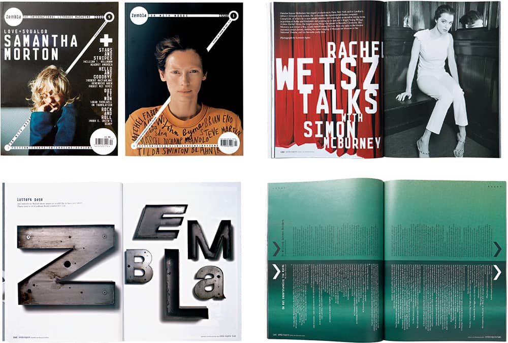
ZEMBLA MAGAZINE / Frost Design: Vince Frost / Australia, 2003
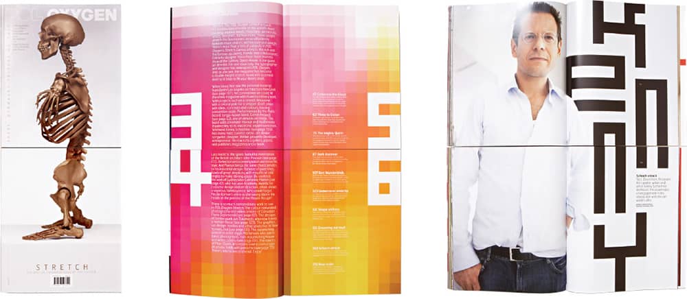
POL OXYGEN STRETCH MAGAZINE / Frost Design: Vince Frost / Australia, 2006
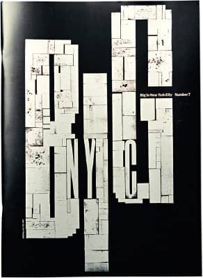
BIG MAGAZINE / Frost Design: Vince Frost / Australia, 2005
Daniel Eatock
b. 1975 (BOLTON, ENGLAND, UK) CURRENTLY LONDON, ENGLAND, UK
After studying communication design at Ravens-bourne College in London, Daniel Eatock earned an MA from the Royal College of Art › 135 in 1998 and secured a coveted position overseas in the Walker Art Center’s › 354 design department fellowship program. There he met Sam Solhaug, an architect working in the exhibit group, with whom he collaborated—first at the Walker’s carpentry shop, and later, when Eatock had returned to London and Solhaug visited in 2000 for a few weeks, at Pentagram’s › 162 own carpentry shop—on a plywood table prototype to show at the Milan Furniture Fair. They dubbed their informal collaboration Foundation 33; it soon became a formal business when their table’s promotion representative introduced them to Katie Hayes, marketing manager for Britain’s Channel 4, who gave them the opportunity to pitch the identity for the original production of the reality show Big Brother. That pitch is the now globally iconic eye that mutates in an endless number of visual styles.
With Foundation 33 growing, in 2004 it was approached by startup advertising agency Boymeetsgirl and became its design wing, but the relationship lasted just a year. In 2005 Eatock went independent and established Eatock, Ltd. Since then, he has maintained a practice that balances commissioned work with an incessant flow of creative exercises and ideas meticulously catalogued on his ever-growing website, built using his own custom web application, Indexhibit™, devised with Jeffery Vaska. Unlike other designers’ websites, which are usually fully polished and edited, Eatock’s serves as a rough repository not just of projects but of loose and unfinished ideas as well as collaborative, user-contributed collections; for no particular reason, there are at least four videos of Eatock dancing to the tune of car alarms.
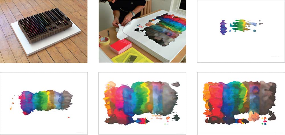
PANTONE PEN PRINT SERIES / A complete set of Letraset TRIA Pantone markers, arranged by color, was placed under a stack of 500 sheets for a month; the series is determined by the number of pages printed, where the sheet farthest from the ink received the first number, which also corresponds to the individual price of each print / Daniel Eatock / UK, 2006
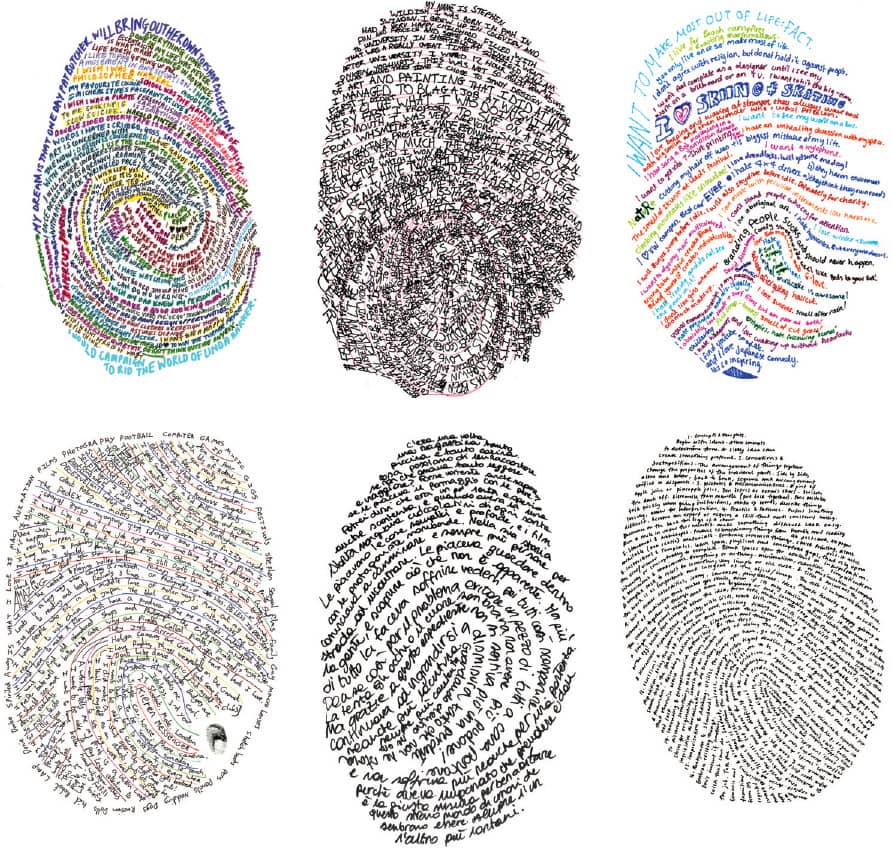
AS A CLASS ASSIGNMENT AT RAVENSBOURNE COLLEGE, students were asked to create a typographic self-portrait. Richard Holley, one of Eatock’s fellow students, wrote a short text about himself and placed it within the contours of his fingerprint in his own handwriting. Many years later, Eatock, inspired by this solution, created an ongoing invitation on his website for people to create their own “Holley Portrait” / Daniel Eatock, various / UK, 2007–ongoing
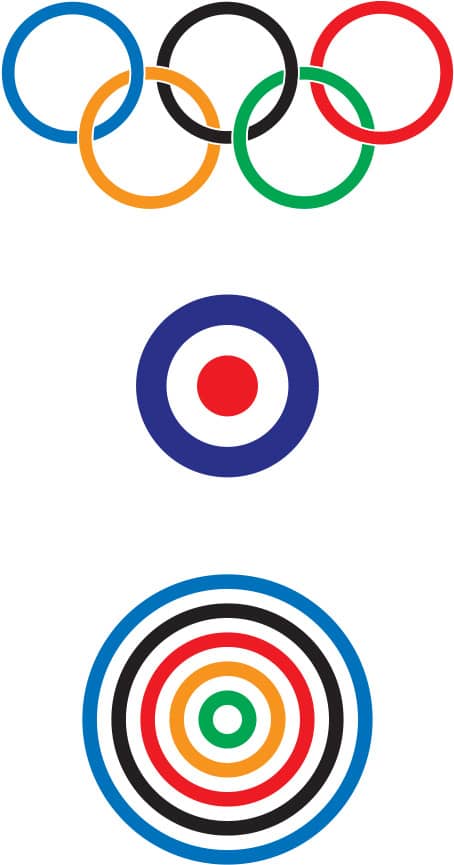
PROPOSED LOGO FOR THE SUMMER OLYMPIC GAMES 2012 / Combining the Olympic Rings and the RAF Roundel popular in the 1960s / Daniel Eatock / UK, 2007
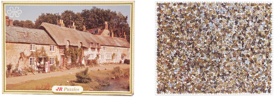
DEPFORD THRIFT MARKET DISCARDED OBJECT REDESIGN FOR THE DEPTFORD DESIGN CHALLENGE / Daniel Eatock / UK, 2007

BIG BROTHER 7 IDENTITY / Daniel Eatock / UK, 2006
