PRACTICE
In Letterforms
For all the advances in digital technology, it’s humbling to consider that some of the most ubiquitous typefaces used today were designed as far back as the fifteenth century. While most have undergone necessary nip-and-tuck restorations as production methods have changed—from metal to phototypesetting to digital—they remain true to their origins, and in their familiarity and simplicity endure as classic typographic choices.
Created and released after 1984—the proverbial line in the sand for design and digital technology—certain typefaces have become instant classics, offering contemporary interpretations and evolutions of the basic serif and sans serif forms or revivals of existing typefaces. Quickly put to use and widely spread through digital distribution, these typefaces have lasted beyond their initial offering, unusual among the many contemporary typefaces whose use is sustained for a limited period only.
Whether they are challenged by a production method’s limitations, a new technology’s potential, or by curiosity, typeface designers have continued to innovate both the technical and aesthetic attributes of letterforms in the context of both client commissions and personal explorations. Successful to different degrees and affinities, these typefaces demonstrate the ample room still left for innovation in a practice that is centuries old.
“There is no such thing as a bad typeface,” wrote Jeffery Keedy, “just bad typography.” This assessment is true, for the most part, as the best typographers and designers have always proven that even the most unpopular typefaces can perform surprisingly well in the appropriate context and execution. Nonetheless, some typefaces are handicapped by nature or by association: Certain typefaces may be poorly constructed or suffer from subjectively debatable aesthetics, while others, through their use, abuse, and misuse, become tainted and damaged goods. Regardless of cause and despite appropriate uses for these, finding alternatives is recommended.
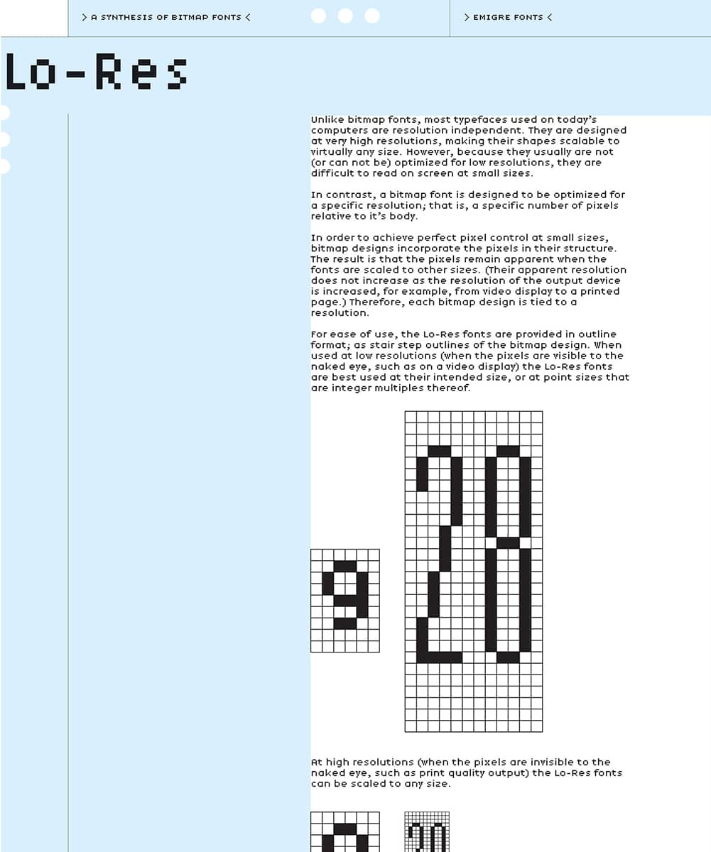
Detail of LO-RES CATALOG / Emigre: Rudy VanderLans / USA, 2001
Garamond
If you were to ask designers today about their preferred Garamond, the answers would likely be as varied as the many cuts that have been developed by hand and digitally—featuring different serif angles, x-heights, and axes—over the last 100 years, usually to a confusing degree. The first revivals came in 1918 from the American Type Founders, 1921 by Lanston, and 1922 by Monotype, which all believed to have based their designs on the work of Claude Garamond in the fifteenth century—until 1926, when Beatrice Warde, the American typographer, writer, and scholar, revealed in the British typography journal The Fleuron that the sources were instead the work of the sixteenth-century Jean Jannon, whose work closely resembled Garamond’s. The name Garamond nevertheless remained attached. The 1925 cut by D. Stempel AG was based on Garamond’s work, and so was Robert Slimbach’s version for Adobe › 223 in 1989. ITC’s rendition in 1975 by Tony Stan is the least accurate interpretation of either Garamond or Jannon’s work; it is considered by many designers the ugly duckling of the Garamonds.
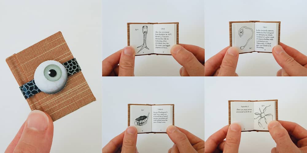
YOUR NEW GLASS EYE FOR 826 VALENCIA, MCSWEENEY’S PIRATE STORE / writing, illustration, design, production, Sasha Wizansky / USA, 2002
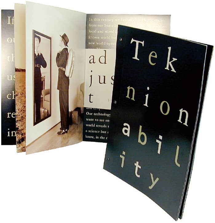
TEKNION FURNITURE SYSTEMS ABILITY PRODUCT BROCHURE / Vanderbyl Design; Michael Vanderbyl / USA, 1997
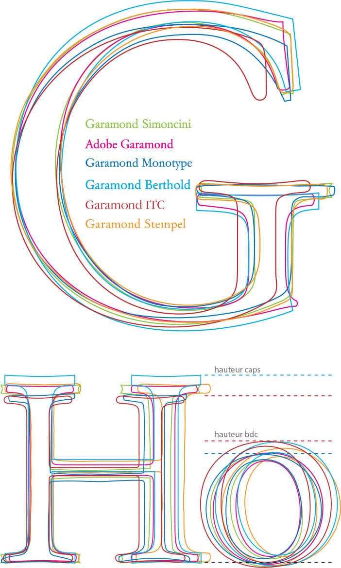
COMPARISON OF SIX GARAMONDS / Peter Gabor / France, 2006
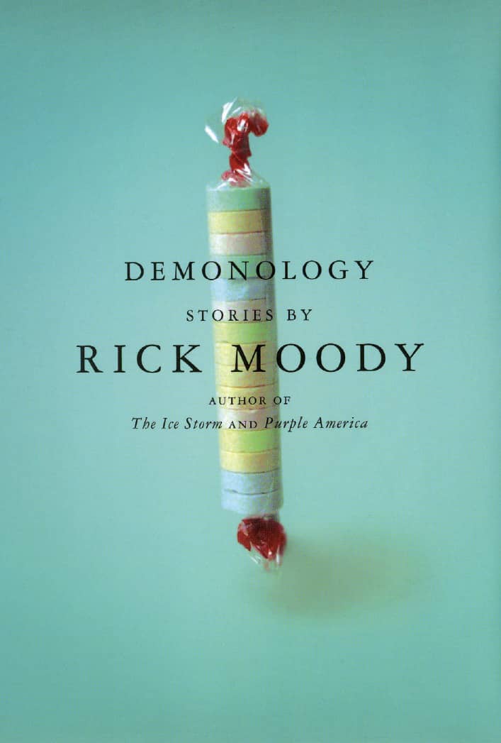
DEMONOLOGY, Rick Moody / Little, Brown / Paul Sahre / USA, 2000
Bembo
Francesco Griffo da Bologna, a typeface designer and punch cutter, was brought to Venice by the famed fifteenth-century Renaissance printer Aldus Manutius. His first project was designing a typeface for De Aetna, a book by the Italian Scholar Pietro Bembo—the namesake of the classic book typeface drawn by British designer Stanley Morison for Monotype. A slightly calligraphic quality is evident in Bembo, notably in the serifs, the transitional curves, and the length of its ascenders and descenders; these details have established Bembo as a favorite for large bodies of text, where it provides consistent color and texture, great legibility, and good use of space.

BARBARA BARRY INVITATION AND ANNOUNCEMENT / Vanderbyl Design: creative direction, Michael Vanderbyl; design, Katie Repine / USA, 2005
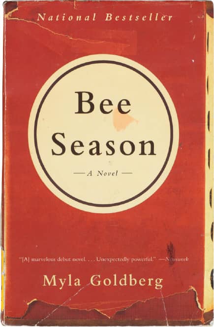
BEE SEASON, Myla Goldberg / Anchor Books, Random House / Amy C. King; photography, Barry Marcus / USA, 2001
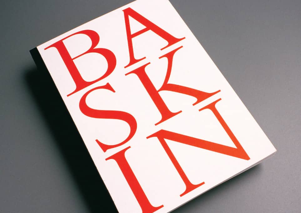
THE HUMAN CONDITION: SELECTED WORKS BY LEONARD BASKIN, STEPHEN F. AUSTIN UNIVERSITY EXHIBITION CATALOG / Summerford Design, Inc.: Jack Summerford / USA, 1996
Caslon
The first manifestation of a Caslon style came in 1722, when William Caslon I designed Caslon Old Style. Over the following decades, through the Caslon Foundry, he released variations of Caslon that were widespread in Britain and later in the United States. Benjamin Franklin was one of its fervent admirers, using it in his printing regularly. Some of the first printings of the United States Declaration of Independence and the United States Constitution were set in Caslon.
Caslon has been subject to various revivals. In 1902, American Type Founders (ATF) released Caslon 540 and three years later Caslon 3, a slightly bolder version modified to work better with evolving printing technologies. In 1990, Carol Twombly digitized a version for Adobe › 223, and in 1998 ITC › 220 released ITC Founder’s Caslon, where each size was digitized separately, just as it used to be cast separately, and ITC released it in 12-, 30-, and 42-point versions as well as a poster weight.
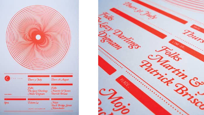
THE LAB GIG POSTER / Graham Jones / UK, 2008
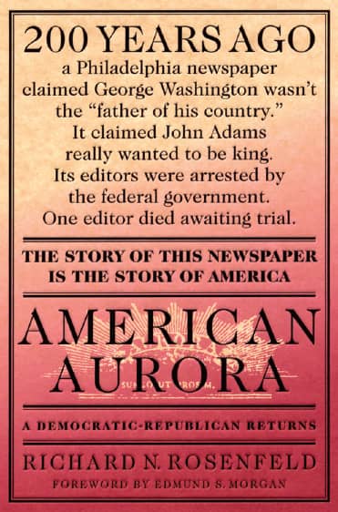
AMERICAN AURORA, Richard N. Rosenfeld / St. Martins Press / Henry Sene Yee/ USA, 1996
ANNSWERS IDENTITY / Aufuldish & Warinner: Bob Aufuldish / USA, 1999
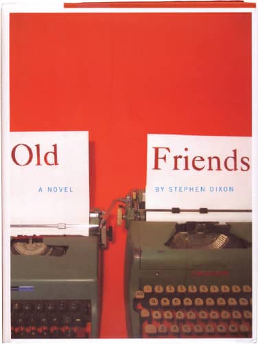
OLD FRIENDS, Stephen Dixon / Melville House Publishing / David Konopka / USA, 2004
Bodoni
As director of the Stamperia Reale, the official press of Ferdinand, Duke of Parma, Giambattista Bodoni was in charge of printing and producing official documents as well as his own. Through this office he developed Bodoni. Toward the late 1790s, Bodoni abandoned the Old Style roman serifs, and instead of tapering the serif into the horizontal strokes, he developed a more mathematical and geometric approach emphasized by the contrast of thick strokes and thin serifs, forming upright angles. Many cuts and renditions now exist of Bodoni; Morris Fuller Benton’s for American Type Founders, Inc., and Henrich Jost’s Bauer Bodoni for the Bauer foundry are two of the most common. Regardless of what version of Bodoni is used, elegance, luxury, and sophistication are qualities sure to be achieved.
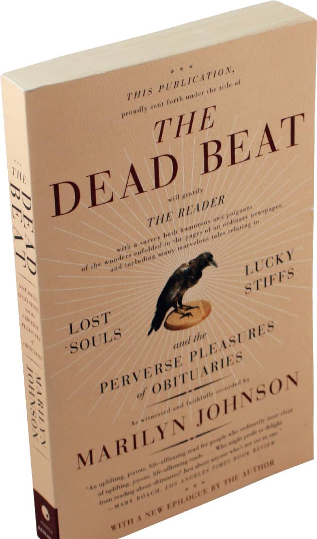
THE DEAD BEAT, Marilyn Johnson / Harper Perennial / Milan Bozic; photography, Eric Workum / USA, 2006
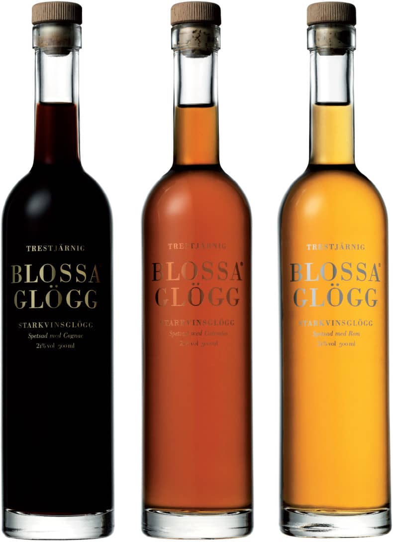
BLOSSA TRESTJÄRNIG PACKAGING FOR VIN & SPRIT / BVD: creative direction, Catrin Vagnemark; design, Susanna Nygren Barrett, Mia Heijkenskjöld / Sweden, 2003-2007
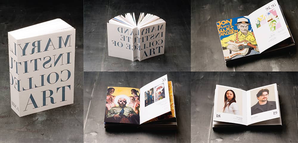
MARYLAND INSTITUTE COLLEGE OF ART ADMISSIONS PROSPECTUS 2004-2006 / Rutka Weadock Design: art direction, Anthony Rutka; design, Hwa Lee; major photography, Bruce Weller / USA, 2004
Didot
When designing Didot, Firmin Didot moved away from the handlettering and calligraphic characteristics of the era in search of a cleaner and more legible solution. This was accomplished with high contrast in the strokes and the use of hairlines and horizontal serifs with little bracketing. These changes personified the beginning of the modern style, and Didot became the French standard for over a century. As happens with older, successful typefaces, Didot has been redrawn many times, weathering the process of reinterpretation and new technologies; Adrian Frutiger’s version for Linotype may be the best regarded; but the more modern interpretation by Hoefler & Frere-Jones › 230, designed for Harper’s Bazaar › 327 and later made available for retail, features seven optical sizes—from 6 point to 96 point—that optimize each size to maintain the contrast and finesse deserved by the elegant Didot.
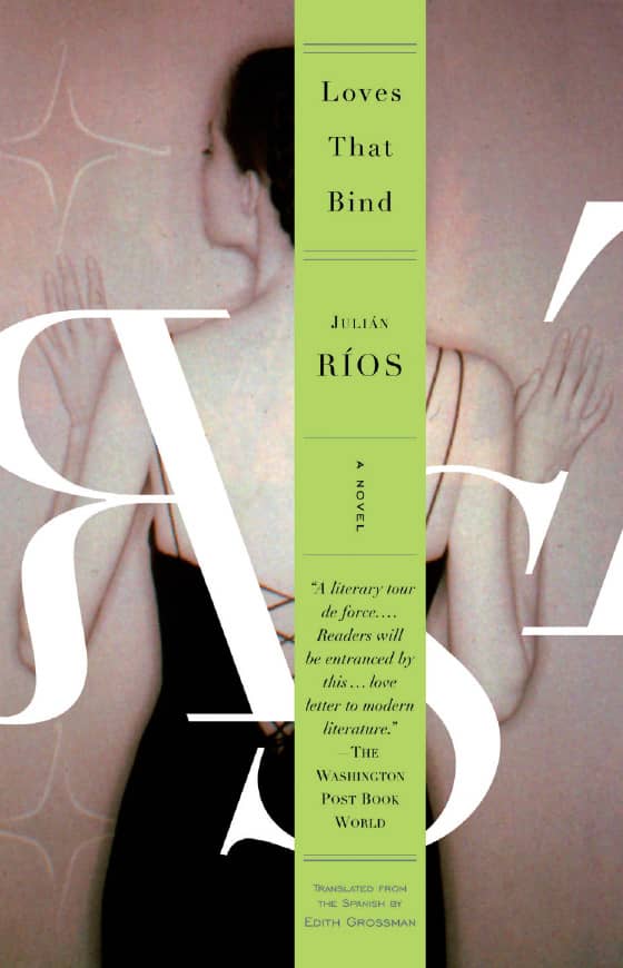
LOVES THAT BIND Julián Ríos / Random House / John Gall; photography, Deborah Samuels/Photonica / USA, 1999
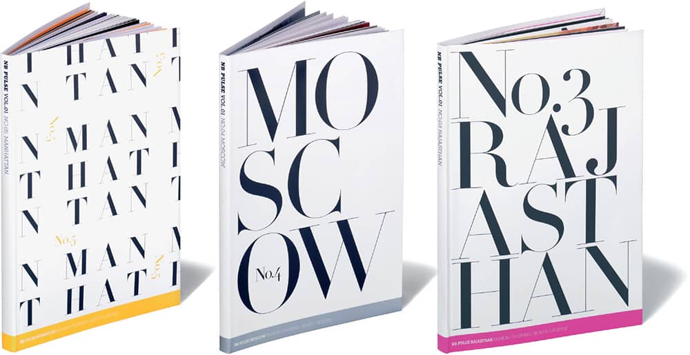
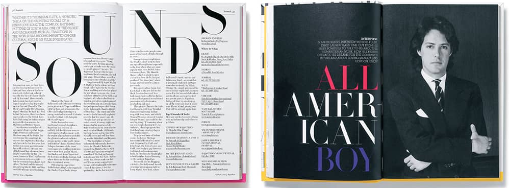
NB PULSE TRAVEL GUIDES / Studio8 Design: art direction, ZoëBather, Matt Willey; design, ZoëBather, Matt Willey, Matt Curtis / UK, 2007-2008
Trajan
Inspired by the capital letters found on the Column of Trajan in Rome, and later expanded with small caps, Trajan translated the chiseled manifestation of the original second-century source into a form fit for the twentieth century. Trajan’s rise to fame came in its overuse for movie posters and titles, which made it nearly cliché. While it can also be found in other applications, such as book covers and TV shows, Trajan’s presence in movies has unleashed a series of pleas from designers who wish to put a stop to the overexposure.
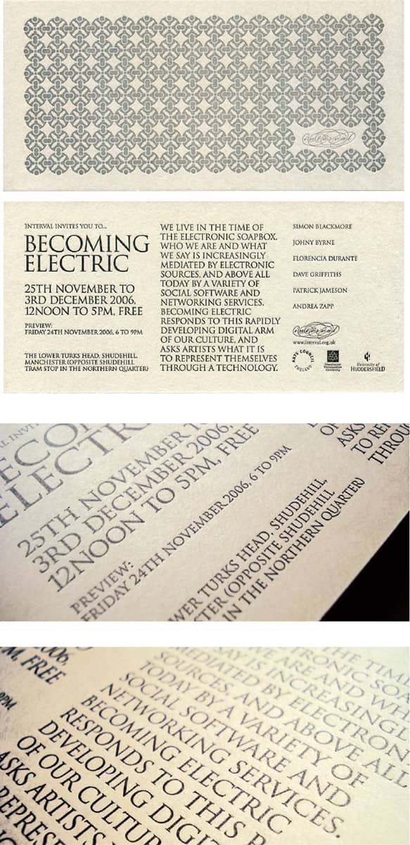
BECOMING ELECTRIC INVITATION FOR INTERVAL / Graham Jones / UK, 2006

EXAMPLES OF MOVIE TITLES TAKEN FROM POSTERS CREATED IN 2008 ALONE
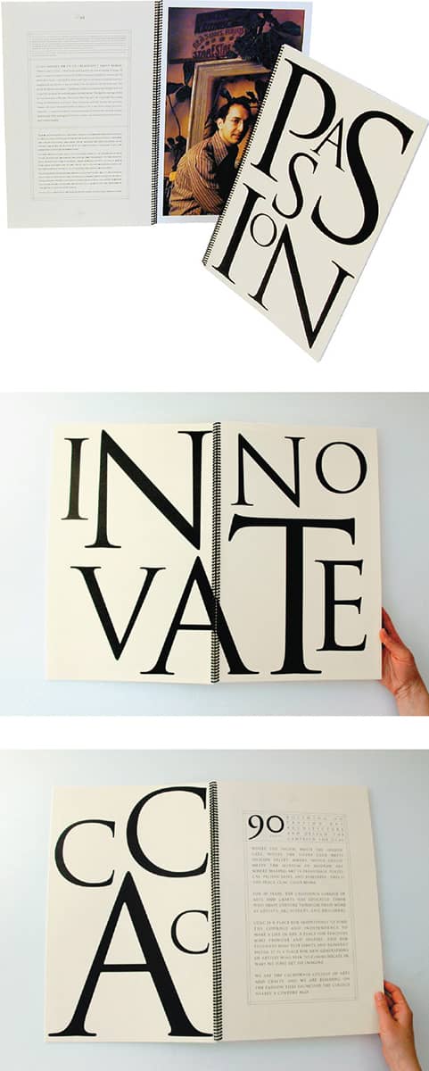
CALIFORNIA COLLEGE OF ARTS AND CRAFTS CAPITAL CAMPAIGN / Vanderbyl Design: Michael Vanderbyl / USA, 1997
Berthold Akzidenz Grotesk
Berthold Akzidenz Grotesk has been one of the most influential sans-serif typefaces, informing many sans designed more than 50 years later—in turn, Akzidenz Grotesk was informed by 1880’s Royal Grotesk. However, Akzidenz Grotesk, as it was first distributed by H. Berthold AG in the early twentieth century, was an amalgamation of typefaces created by different foundries that H. Berthold AG slowly purchased; as a result, Akzidenz Grotesk differed by point size, never quite acknowledging its varied sources or admitting any differences. Starting in the 1950s under the direction of Günter Gerhard Lange, some of the designs were unified and the family expanded to include bolder weights and condensed variations. In 2006, Berthold released Akzidenz-Grotesk Next, redrawn by Bernd Moellenstaedt and Dieter Hofrichter, to finally provide a fully unified version of this groundbreaking design.
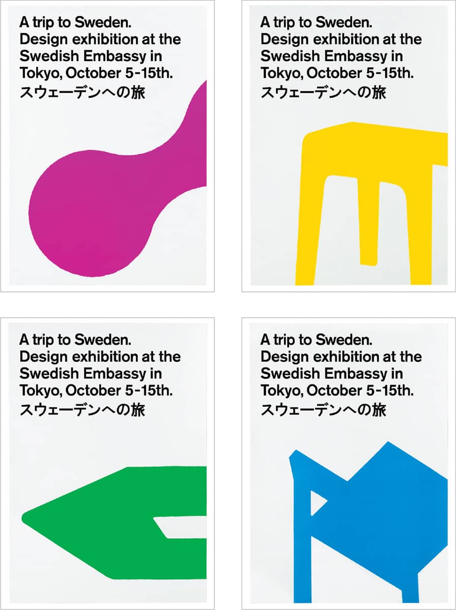
A TRIP TO SWEDEN EXHIBITION IDENTITY AND POSTER SERIES / BVD: creative direction, Susanna Nygren Barrett / Sweden, 2002

SMICKER/DUBBLERA IDENTITY / BVD: creative direction, Susanna Nygren Barrett; design, Mia Heijkenskjöld / Sweden, 2008
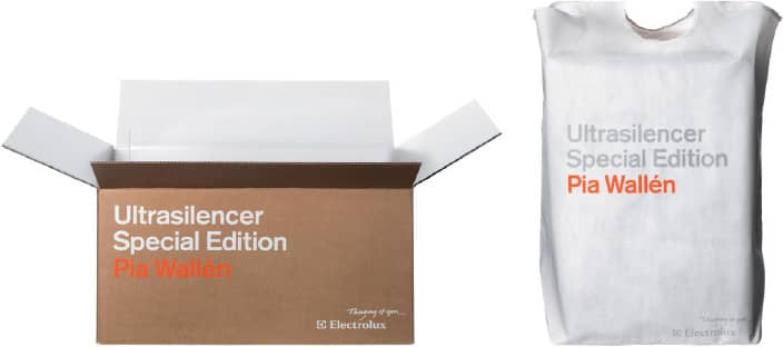
ULTRASILENCER SPECIAL EDITION PIA WALLÉN IDENTITY PROGRAM FOR ELEXTROLUX / BVD: creative direction, Susanna Nygren Barrett; design, Johan Andersson, Carolin Sundquist / Sweden, 2007
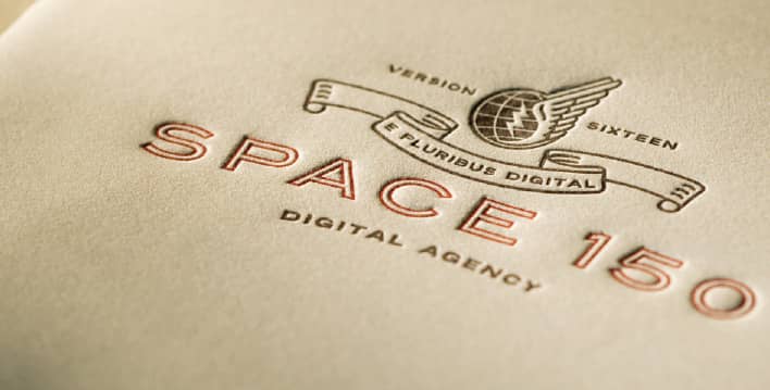
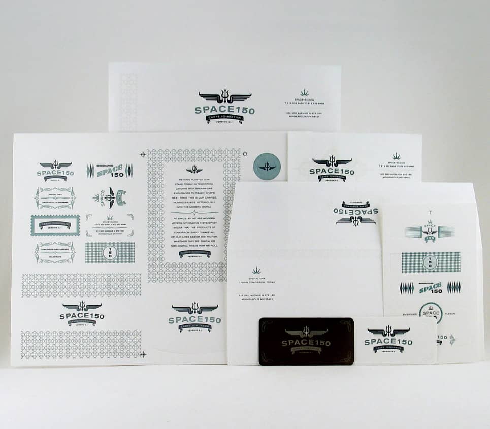
SPACE150 IDENTITY, NUMBERS 16 AND 17 / Every 150 days, Space150 changes its logo, stationery, website, and promotional materials, done either in-house or commissioned to an outside designer / Studio on Fire / USA, 2006
Franklin Gothic
Named—or not—after Benjamin Franklin, a single roman face was released in 1902. Over the following decade, Morris Fuller Benton added several weights and widths to the family. A popular choice in advertising, Franklin Gothic was expanded by ITC in 1980, when Victor Caruso added several weights in which he enlarged the x-height and condensed the lowercase forms. A decade later, David Berlow developed condensed, compressed, and extra-compressed variations, further enhancing Franklin Gothic’s versatility and popularity.
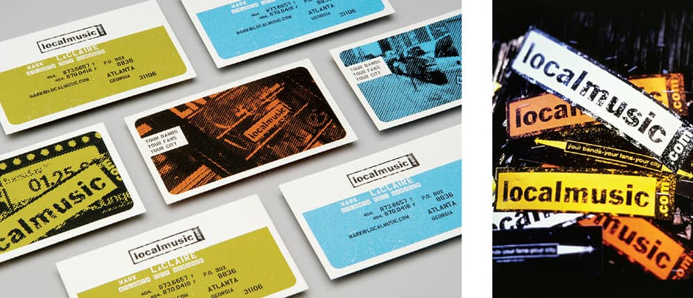
LOCALMUSIC.COM IDENTITY / Volume, Inc.: Eric Heiman / USA, 2000

BLISS TRIED + BLUE TRAVEL KIT / USA, 2008
Gill Sans
Despite being a sans serif, the underlying structure of Gill Sans reveals its serif inspirations—from the Column of Trajan to Carolingian scripts. These give Gill Sans a less mechanic feel than its contemporary sans serifs, like Futura › 371. Gill Sans is undeniably reminiscent of Johnston Sans, the typeface designed for the London Underground › 346 in 1916 by Gill’s mentor, Edward Johnston—and since Johnston was proprietary to the Underground, the availability of Gill Sans may have propelled it to its vast use in England. With its signature Q, R, a, g, and t, Gill Sans quickly became a British star, used by the BBC and Penguin Books › 274, among others. The various weights in the family provide great flexibility in its applications, small or large; Gill Sans Ultra Bold, however, stands oddly on its own with its exaggerated forms.
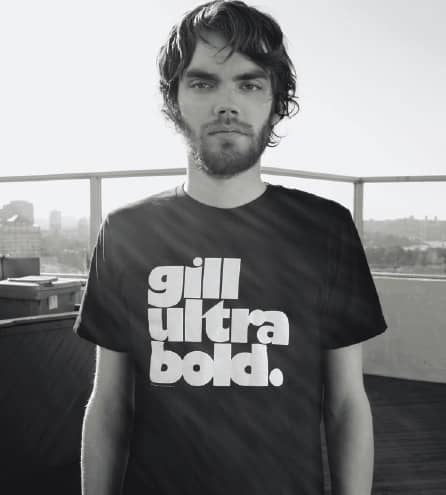
HIGHTEE GILL ULTRA BOLD T-SHIRT / Toko / Australia, 2008

BRAIN TONIQ LOGO AND PACKAGING / Paul Ambrose, Huc Ambrose / USA, 2007
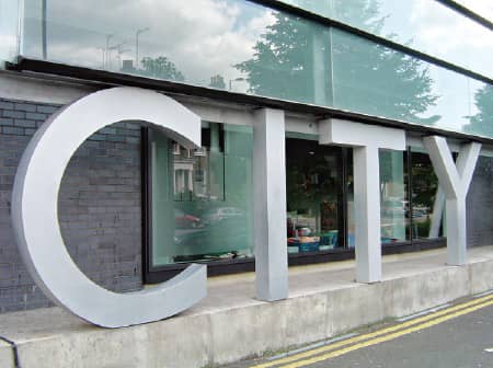
CENTER FOR BUSINESS, ART, AND TECHNOLOGY / UK, 2008 / Photo: Fernando de Mello Vargas
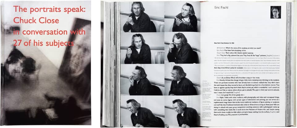
THE PORTRAITS SPEAK: CHUCK CLOSE IN CONVERSATION WITH 27 OF HIS SUBJECTS, Chuck Close / A.R.T. Press / Lausten & Cossutta Design / USA, 1997
Futura
Based on geometric forms, Futura became a representative of the Bauhaus ideals of the time—even though Paul Renner was not directly involved in it—and one of the most influential geometric typefaces, inspiring others, like Kabel and Avenir. The original design’s large family included Old Style figures, alternate characters, and even two display styles that did not quite resemble the rest of the family. Today, as for other early-twentieth-century typefaces, many versions of Futura exist. Adobe, URW, and Neufville Digital all have released digital versions varying in fidelity. A British foundry, The Foundry, offers Architype Renner, which features the rare alternates. Futura is most famously used by Volkswagen, epitomized by the radical “Lemon” print ad; the car company now owns a proprietary, customized version of Futura.
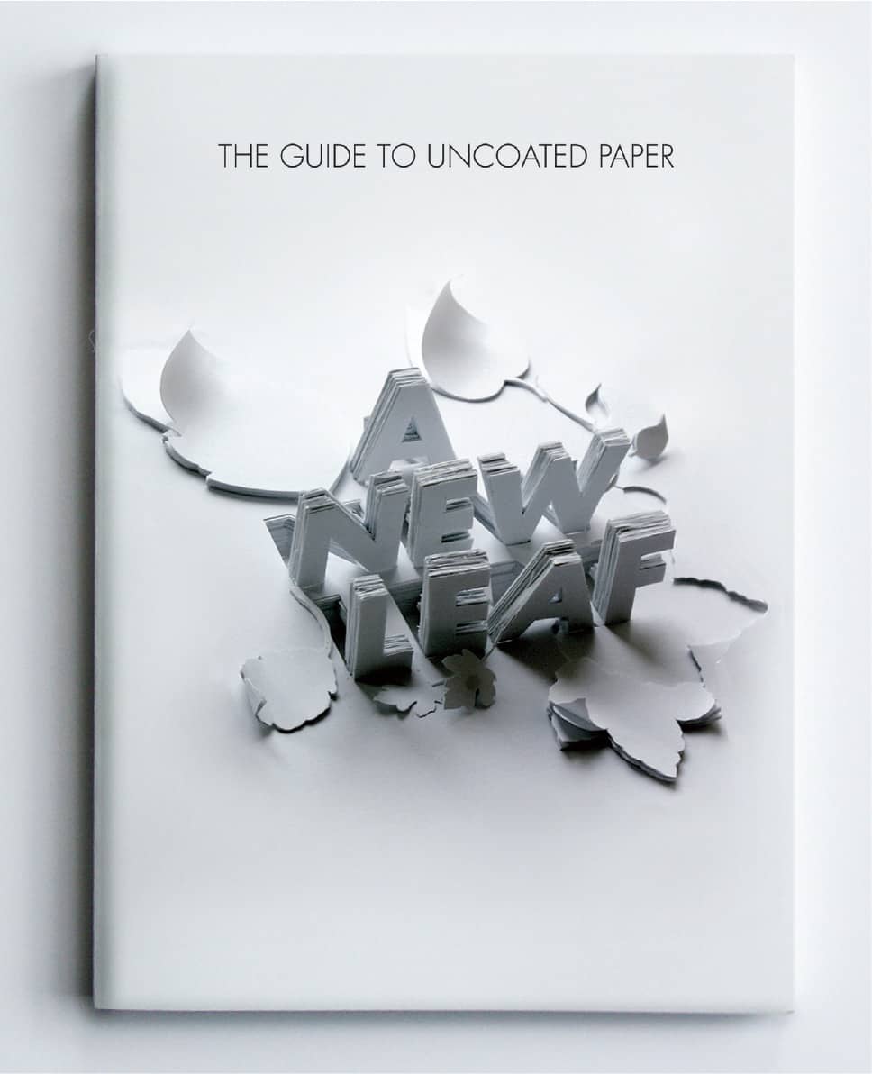
ARCTIC PAPER’S THE GUIDE TO UNCOATED PAPER / Shaz Madani / UK, 2008
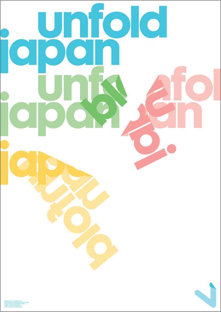
UNFOLD JAPAN: AN EXHIBITION OF CONTEMPORARY JAPANESE FURNITURE DESIGN FOR VIADUCT FURNITURE / MadeThought / UK, 2005
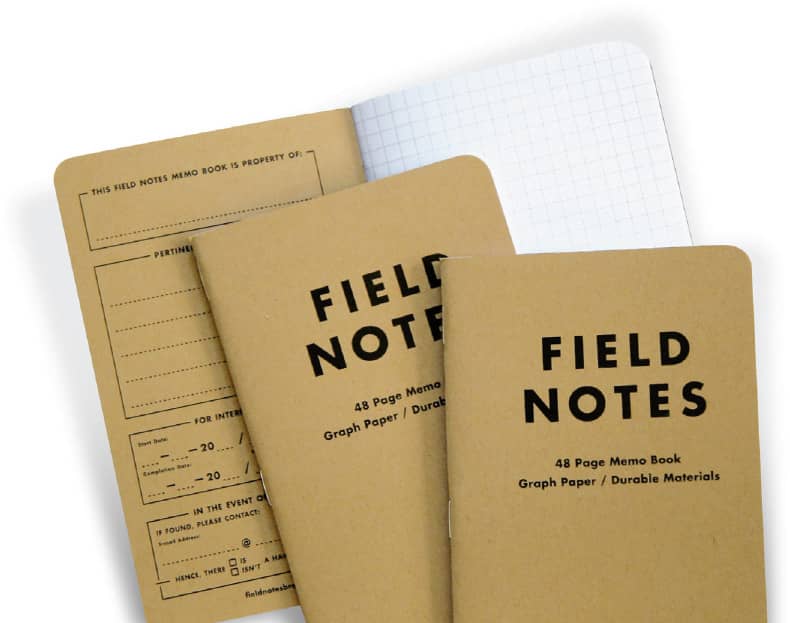
FIELD NOTES, 48-PAGE MEMO BOOKS / Draplin Design and Coudal Partners: product design, Aaron Draplin / USA, 2008
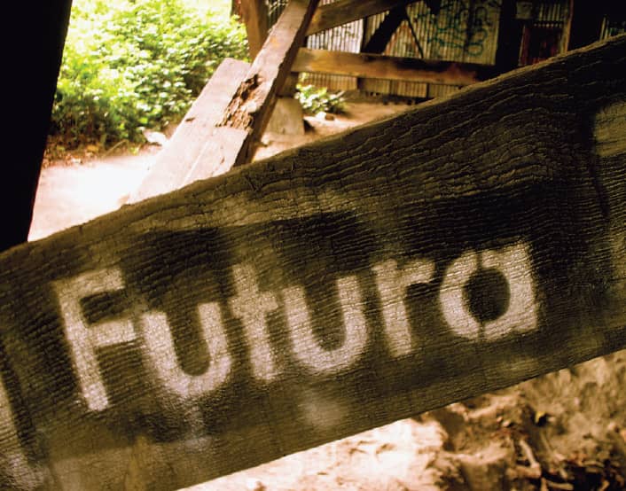
MYSTERIOUS FUTURA STENCIL UNDERNEATH THE 45TH STREET BRIDGE IN THE UNIVERSITY DISTRICT OF SEATTLE, WASHINGTON / USA, 2007 / Photo: Flickr user veganstraightedge

THE CENTURY BUILDING LOGO / Eric Kass / USA, 2007
Univers
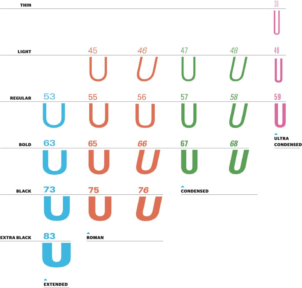
Univers was the first family to use numbers as a naming system for its various weights—21 variations when first released—built around its roman version, suited for long bodies of text, Univers 55. Based on Berthold Akzidenz Grotesk › 369, it uses optically even strokes as well as a large x-height that increases legibility when used very small or as large as billboards and buildings can handle. In 1997, in conjunction with Linotype, Adrian Frutiger reworked and expanded the Linotype Univers version to include 63 fonts, and a third digit was added to the numbering system.

BYPRODUCT EXHIBITION POSTER FOR SOUTHERN EXPOSURE / Efrat Rafaeli Design / USA, 2001
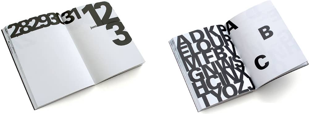
SELF-PROMOTIONAL AGENDA THAT EXPERIMENTS WITH THE USE OF TWO BLACK INKS / Estudio Ibán Ramón: art direction, Ibán Ramón; design, Ibán Ramón, Diego Mir, Dani Requeni / Spain, 2007
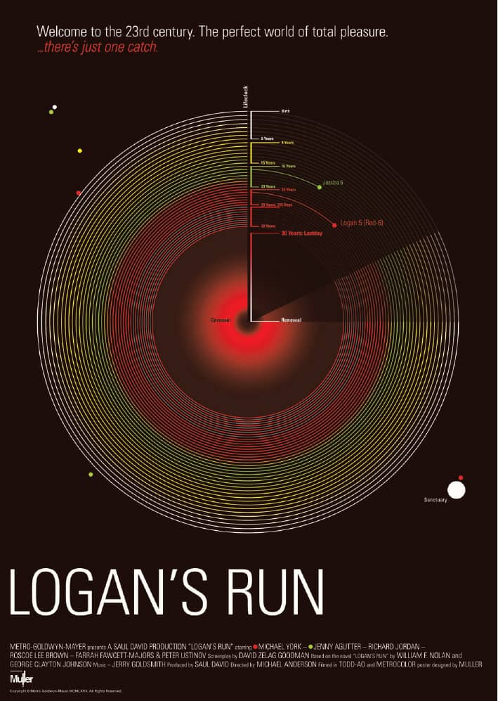
LOGAN’S RUN POSTER INCLUDED IN THE NOW SHOWING EXHIBIT BY WEAR IT WITH PRIDE / Muller; Tom Muller / USA, 2008
Helvetica
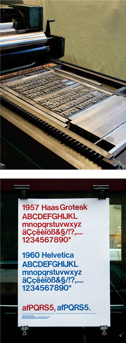
In 1957, under the direction of Edouard Hoffman at the Haas Type Foundry, Max Miedinger drew Neue Haas Grotesk, based on the increasingly popular Berthold Akzidenz Grotesk › 369, designed at the end of the previous century. Three years later, Linotype and D. Stempel AG redrew it to work with the Linotype machine—however, they renamed the typeface to avoid selling it with a competitor’s name, first to Helvetia (Latin for Switzerland) and then to Helvetica (Latin for Swiss), on Hoffman’s request.
Helvetica quickly became one of the most used typefaces in the 1960s and 1970s, specifically as a bastion for both the International Typographic Style and for corporate identity. From Switzerland to the United States, influential designers from Josef Müller-Brockmann › 152 to Massimo Vignelli › 160 exploited the neutrality of Helvetica and established it as a premier element of visual communication. Since then, Helvetica has been a polarizing choice among designers, who simply love it or hate it. In the 1990s, Dutch designers Experimental Jetset used Helvetica prominently in their work, breathing fresh air into it. In 2007, Gary Hustwit directed the documentary Helvetica, which traces its history and use and features its friends and foes.
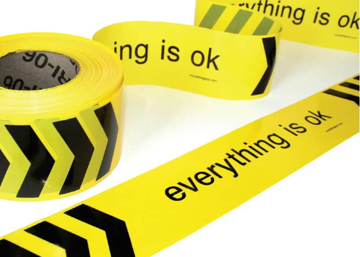
“EVERYTHING IS OK” TAPE / A social design experiment in subversive positivism / MINE™: creative direction, Christopher Simmons; design, Christopher Simmons, Tim Belonax / USA, 2006–ongoing
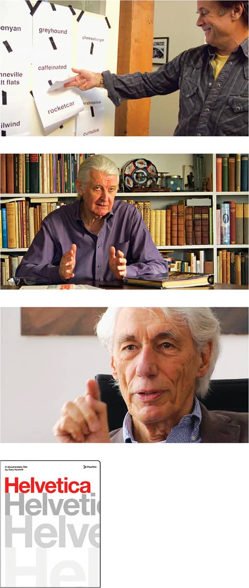
HELVETICA: A DOCUMENTARY FILM BY GARY HUSTWIT / Shown: David Carson, Matthew Carter, Wim Crouwel / A Production of Swiss Dots Ltd. in association with Veer / production and direction, Gary Hustwit / © Swiss Dots Ltd.
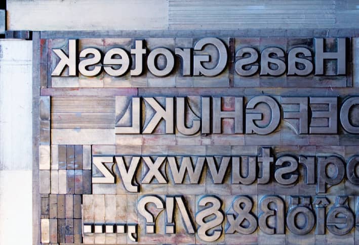
LETTERPRESS SET-UP AND POSTER COMPARING SAMPLES OF NEUE HAAS GROTESK AND HELVETICA AT 72 POINTS / Switzerland, 2008 / Photos: Sam Mallett
Avant Garde
Herb Lubalin › 167 had worked with the controversial publisher Ralph Ginzburg on the magazines Eros and Fact: in the 1960s before launching Avant Garde › 322, featuring a masthead set in what later became Avant Garde, the typeface. Originally conceived and designed by Lubalin and his partner, Tom Carnase, as an all-uppercase alphabet with a jovial set of ligatures, it was meant to be used solely on the magazine as art directed by Lubalin. In 1970, when Lubalin founded ITC › 220 with Aaron Burns and Ed Rondthaler, the foundry released ITC Avant Garde, which was quickly appropriated by design and advertising agencies—not always to great effect. The misuse of the ligatures and the overuse of the typeface was reportedly a sore (and sour) issue for Lubalin, who considered its use by others flawed.
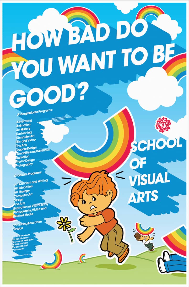
THE SCHOOL OF VISUAL ARTS POSTER / art direction, Silas H. Rhodes; design, Paul Sahre / USA, 2006
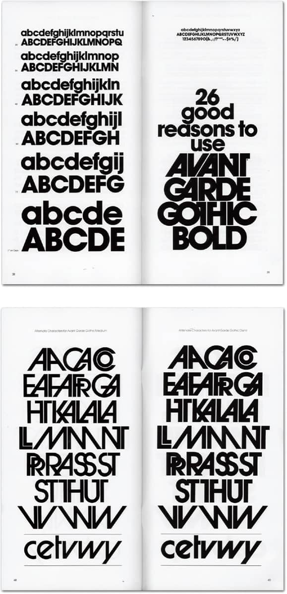
AVANT GARDE TYPE SPECIMEN / ITC / USA, 1970
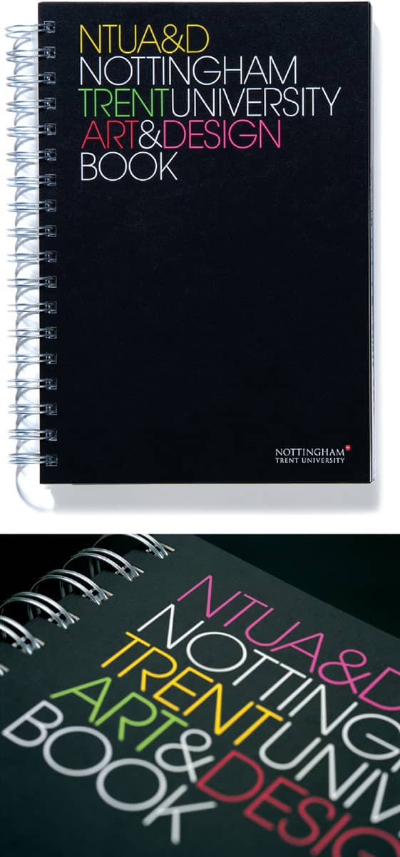

NOTTINGHAM TRENT UNIVERSITY ART AND DESIGN PROSPECTUS / Un.titled / UK, 2007
Clarendon
In the early nineteenth century, with the advent of the industrial revolution in England, typography experienced an expressive spurt in support of the production of large posters and advertisements in the form of bold (really bold, sometimes) and decorative typefaces. Clarendon was born in this period. It was bold and complemented both sans-serif and serif typefaces. Robert Besley was able to register Clarendon in 1845 under the Ornamental Designs Act of 1842, which protected his design, but the protection lasted three years only, and his design was quickly and broadly pirated. The friendly contour of Clarendon—achieved by the soft curve that joins the slab serifs with the stems—along with its varied weights, has maintained designers’ interest for more than 150 years.
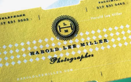
HAROLD LEE MILLER IDENTITY / Eric Kass / USA, 2007
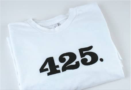
PART OF PROJECT M’S BUY-A-METER PROJECT / T-shirt sold for $425 to raise funds for households in need of fresh water in Hale County, Alabama / Project M / MINE™: design, Christopher Simmons / USA, 2007
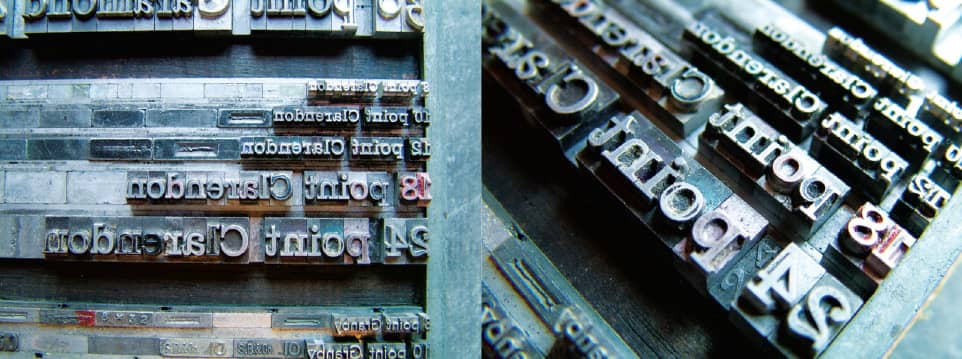
CLARENDON METAL TYPE, FROM THE COLLECTION OF TYPORETUM / UK, 2008 / Photo: Justin Knopp
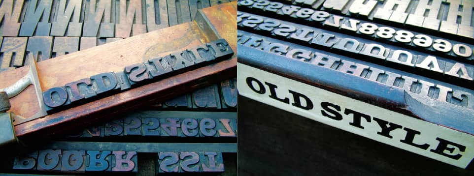
OLD STYLE WOOD TYPE, A PRECEDENT FOR CLARENDON, FROM THE COLLECTION OF TYPORETUM / UK, 2008 / Photo: Justin Knopp
Copperplate Gothic
While it is officially categorized as a sans serif and has Gothic in its name—another way of saying sans serif—Copperplate Gothic features some of the industry’s finest, sharpest, tiniest serifs, suggestive of stone carving. Designed in all caps, its intended use was for personal stationery—a realization that still stands, as Copperplate Gothic is usually offered in templates from print shops and online business card printers. Nonetheless, Copperplate Gothic has been used properly and poorly in every imaginable context: food packaging, film titles, corporate identities, and flyers around the world. Despite having no lowercase, Copperplate is readable at small sizes and longer bodies of text because of its wide structure.
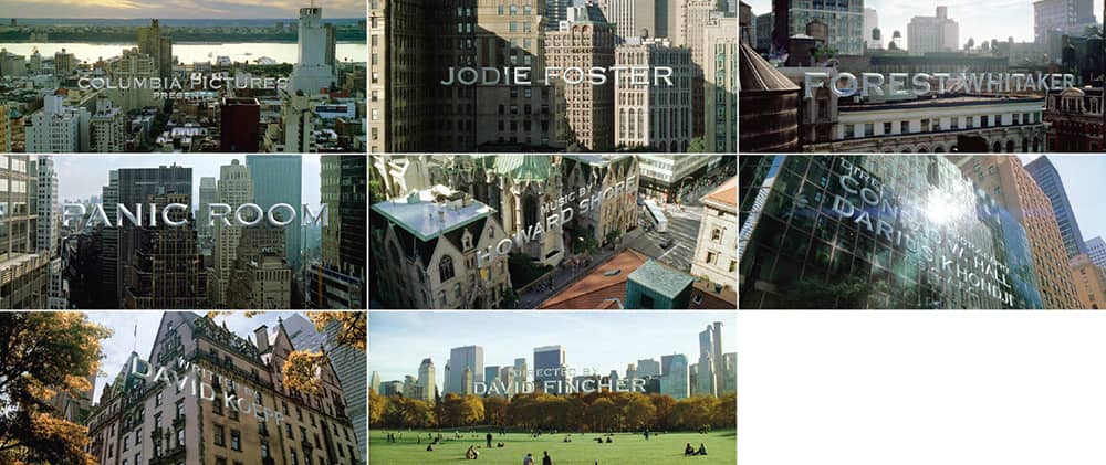
PANIC ROOM TITLE SEQUENCE / Columbia Pictures / director; David Fincher / Picture Mill: William Lebeda; production, CafeFX; visual effects, Kevin Tod Haug / USA, 2002
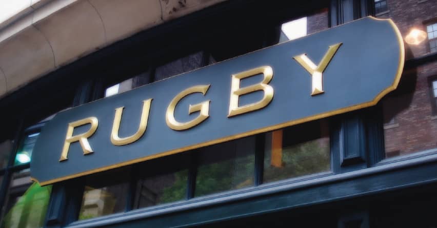
RALPH LAUREN’S RUGBY STOREFRONT IN NEW YORK / USA, 2008
FF Meta
In 1985, Sedley Place Design was charged with redesigning the identity for the Deutsche Bundespost (the West German Post Office). The design team was convinced that neither Helvetica › 373 nor Univers › 372 would work, so they commissioned Erik Spiekermann › 226 to develop a corporate typeface that would withstand usage in postage stamps, livery, and documents. The result was PT 55, a narrow typeface with a large x-height and a distinctive style. Despite the work that went into it, the typeface was not used and was shelved.
In 1989, as Spiekermann launched FontShop International › 227, he and Just Van Rossum updated the PT 55 drawings to create FF Meta—named after the studio Spiekermann founded in 1979 (and left in 2001)—it was released in 1991 under the FontFont label. Over the next years, more weights, along with small caps, were released. The typeface’s quirky ruggedness and versatility in text and display settings made it a popular selection in the 1990s. In 2007, after three years of collaboration with Christian Schwartz › 231 and Kris Sowersby, Spiekermann released FF Meta Serif, finally giving FF Meta a worthy serif companion.
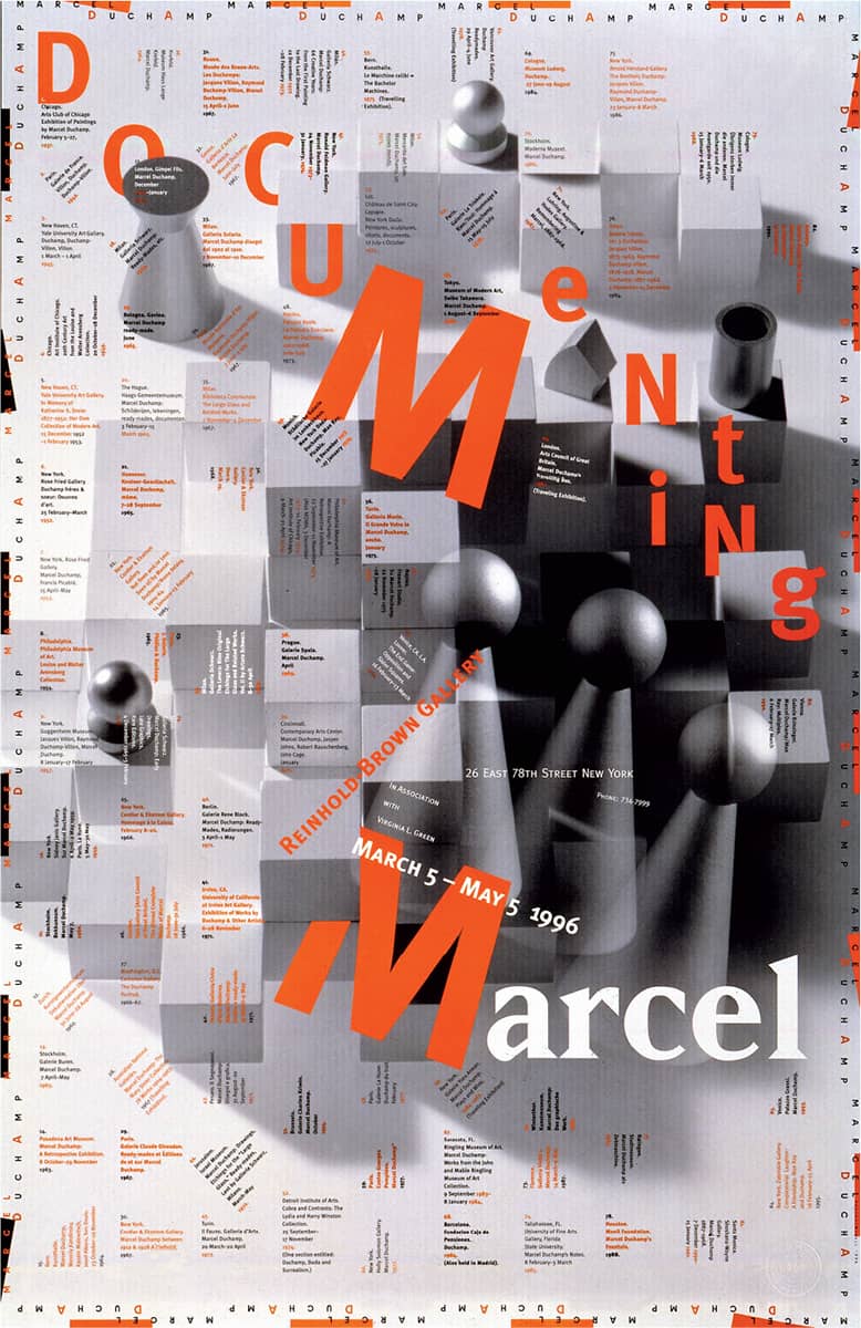
DOCUMENTING MARCEL EXHIBITION POSTER / Skolos-Wedell: design, Nancy Skolos, Thomas Wedell; photography, Thomas Wedell / USA, 1996
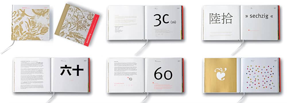
BOOK, CELEBRATING THE SIXTIETH BIRTHDAY OF BUSINESSMAN WINFRIED ROTHERMEL / Anja Patricia Helm / Germany, 2006
FF DIN
DIN stands for Deutsche Industrie Norm (German Industrial Standard), the standards established since 1917 by the German Institute for Standardization in Berlin in agreement with the German Federal Government. For example, DIN 25449 sets the standards for design and construction of concrete components in nuclear facilities, and DIN 1451 is the standard for typography used in transportation and administrative documents of the German Government, as established in 1936. Within DIN 1451, two typefaces are defined: DIN Mittelschrift and its condensed companion, DIN Engschrift. While many variations resemble and precede DIN 1451, it was DIN Mittelschrift that Albert-Jan Pool used to design FF DIN for FontFont—a type family that now counts approximately 30 weights. Its austere look and friendlier contours than those of other sans serifs have made FF DIN one of the most pervasive typefaces since the late 1990s, establishing it as a contemporary typeface with German engineering—not a bad combination.
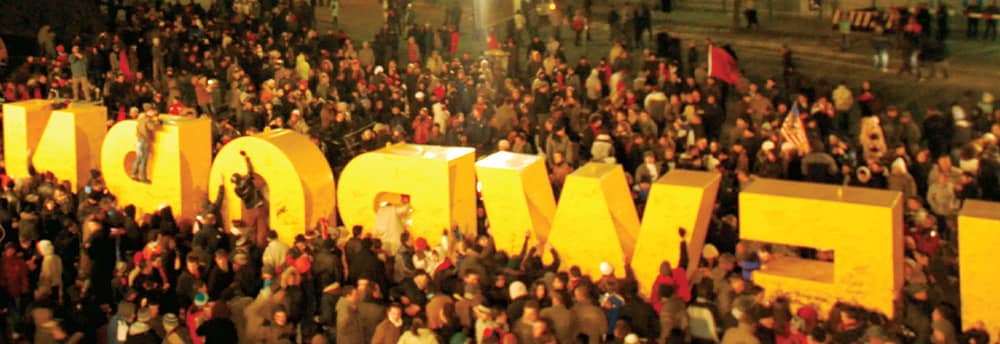
“NEWBORN” SCULPTURE, DESIGNED TO COMMEMORATE THE 2008 DECLARATION OF INDEPENDENCE OF KOSOVA / Ogilvy Kosova, Kosova, 2008 / Photo: Valdet Bujupi
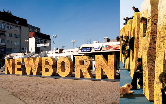
THE “NEWBORN” SCULPTURE SITS IN FRONT OF THE YOUTH CENTER IN PRISHTINA—ITS TEAM CELEBRATES AMONG ITS NOOKS AND CRANNIES / Ogilvy Kosova, Kosova, 2008 / Photo: Jeton Kacaniku
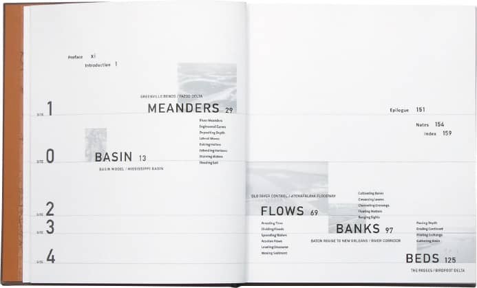
MISSISSIPPI FLOODS: DESIGNING A SHIFTING LANDSCAPE, Anuranda Mathur, Dilip Da Cunha / HVADesign: Henk van Assen / USA, 2001
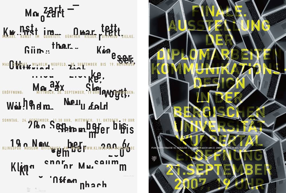
UNIVERSITY OF WUPPERTAL COMMUNICATION DESIGN DEPARTMENT DIPLOMA EXHIBITION POSTER / Uwe Loesch / Germany, 2006, 2007
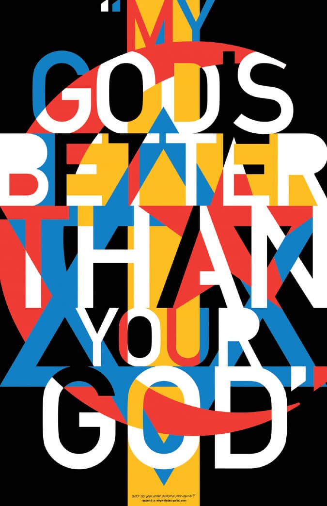
MY GOD’S BETTER THAN YOUR GOD SELF-PUBLISHED PROTEST POSTER / The Design Consortium: design, Ned Drew / USA, 2006
Gotham
In 2000, the men’s lifestyle magazine GQ approached Hoefler & Frere-Jones › 230 with a clear brief: to design a proprietary sans-serif typeface with a geometric structure that felt fresh and masculine. Armed with extensive photographic research of New York vernacular lettering, Tobias Frere-Jones developed Gotham, into which he translated the more engineered language of the signage found across the city. While Gotham is based on all-uppercase signage, Frere-Jones designed a range of weights that go from thin to black and include lowercase and italics. In 2002, after GQ’s exclusivity came to an end, Gotham was released for retail purchase. It instantly became a favorite of designers, who praised its adaptability to any number of projects and industries. In other words, Gotham is like a good pair of jeans: It looks good with anything.
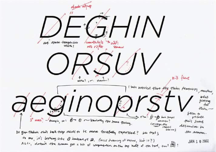
Above and Below GOTHAM SKETCH AND FINAL RENDITION / Hoefler & Frere-Jones / USA, 2000
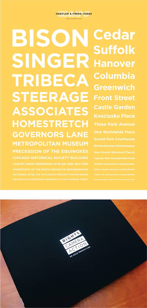
RIGHTS, CAMERA, ACTION BROCHURE FOR THE AMERICAN CIVIL LIBERTIES UNION / Hyperakt: creative direction, Julia Vakser; design, Julia Vakser, Matthew Anderson, Deroy Peraza / UA, 2008
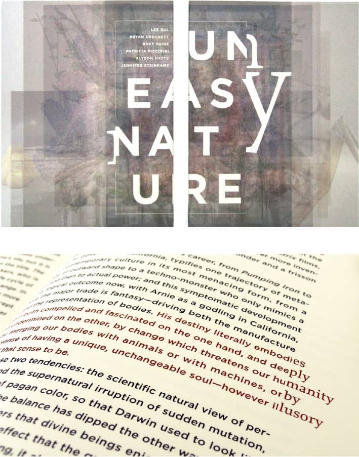
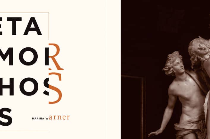
UNEASY NATURE EXHIBITION CATALOG FOR THE WEATHERSPOON ART MUSEUM / Volume Inc.: Eric Heiman / USA, 2006
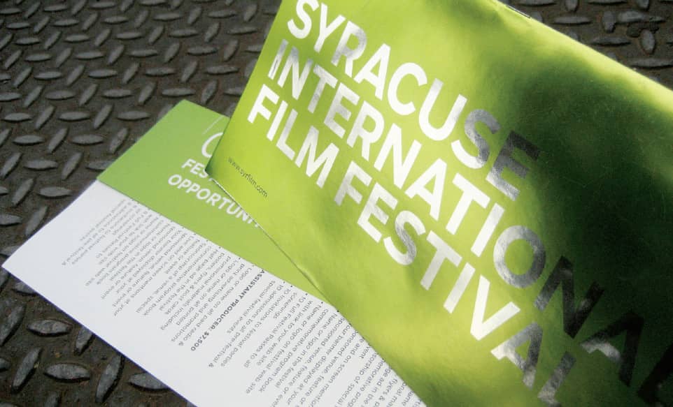
SYRACUSE INTERNATIONAL FILM FESTIVAL IDENTITY AND MARKETING MATERIALS / Hyperakt: creative direction; Julia Vakser, Deroy Peraza; design, Matthew Anderson, Jonathan Correira / USA, 2007
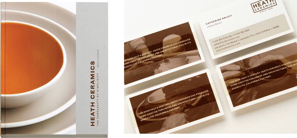
HEATH CERAMICS BOOK COVER AND IDENTITY / Volume Inc.: Eric Heiman / USA, 2004, 2006
Knockout
During the mid- to late nineteenth century metal-cast typefaces were replaced with heavily condensed and expanded wood type lettering manufactured in large sizes taking shape as decorative alphabets as well as slab and sans serifs. These were commonly used for printing posters, typically associated with traveling entertainment shows. From this tradition, Tobias Frere-Jones designed the 32 styles of Knockout, ranging from the ultra-condensed and light to the generously extended and black. Foregoing the typical nomenclature and structure of type families (i.e., regular, italic, bold, bold italic), Knockout features a numbering system similar to that of Univers › 372, where the first digit defines the style and the second the weight—these are accompanied by matching boxing weight class names, from Junior Heavyweight to Ultimate Sumo. Knockout is based on Frere-Jones’ previous work for Sports Illustrated’s proprietary typeface Champion Gothic.
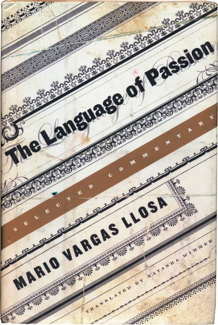
THE LANGUAGE OF PASSION, Mario Vargas Llosa / Farrar, Straus and Giroux / Kathleen DiGrado / USA, 2003
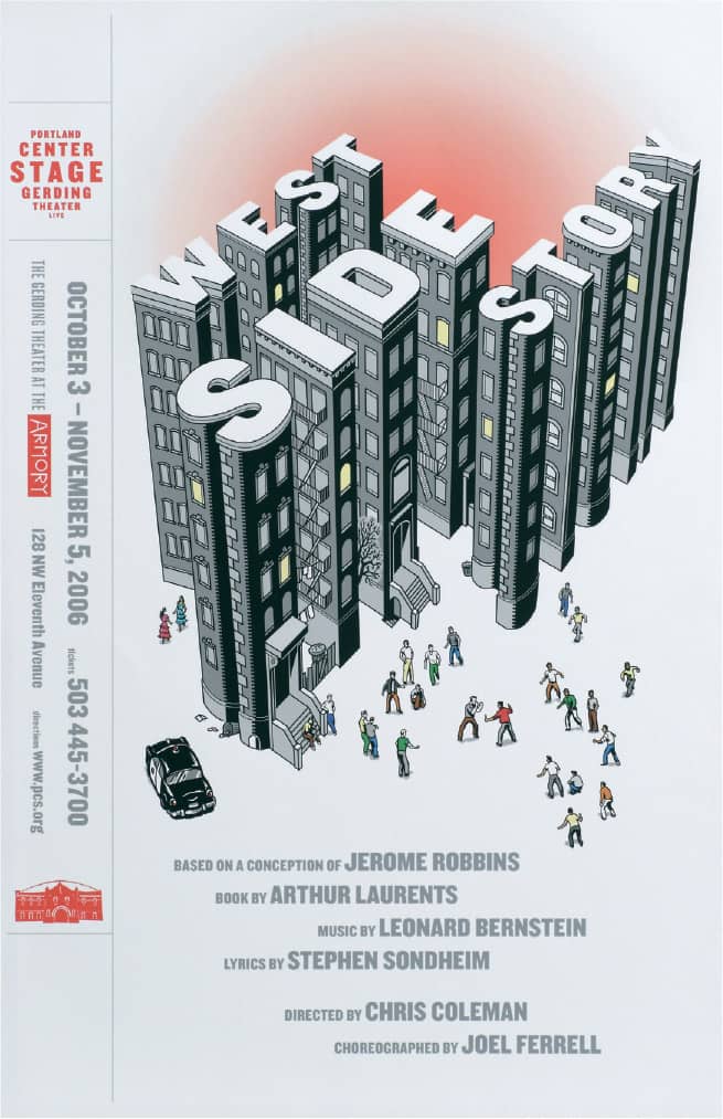
WEST SIDE STORY POSTER / Sandstrom Partners: creative direction, Marc Cozza; illustration, Howell Golson / USA, 2006
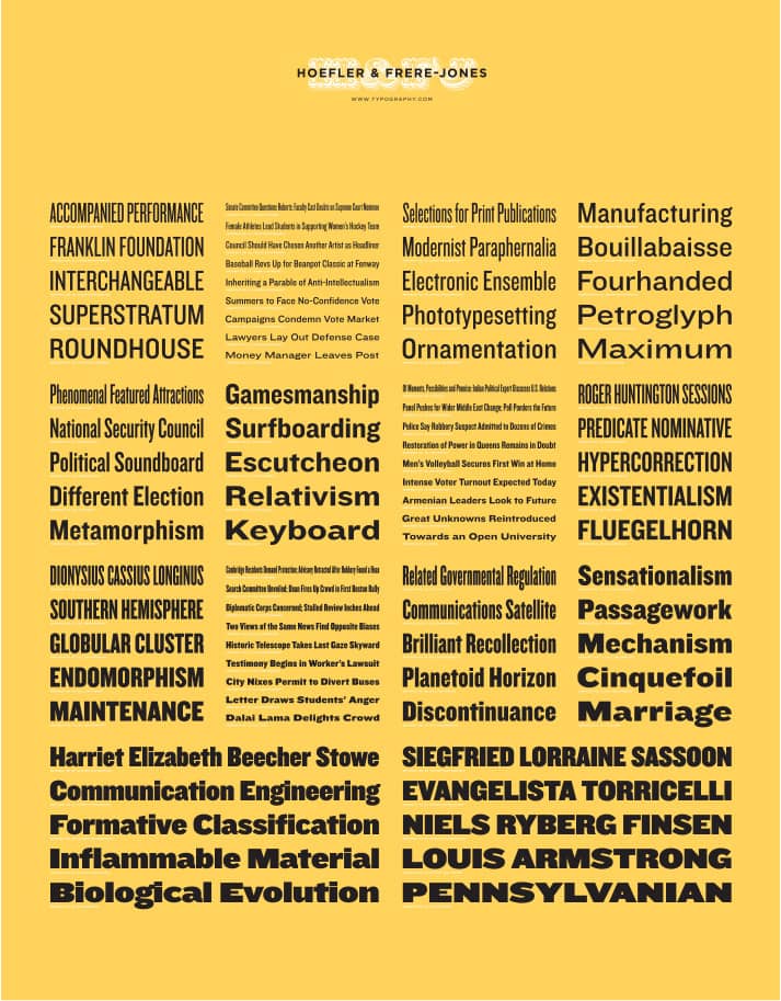
KNOCKOUT / Hoefler & Frere-Jones / USA, 1994

HAPPINESS AND OTHER DISORDERS, Ahmad Saidullah / Key Porter Books / Ingrid Paulson Design; photography, Prill Mediendesign & Fotografie/istockphoto / USA, 2008
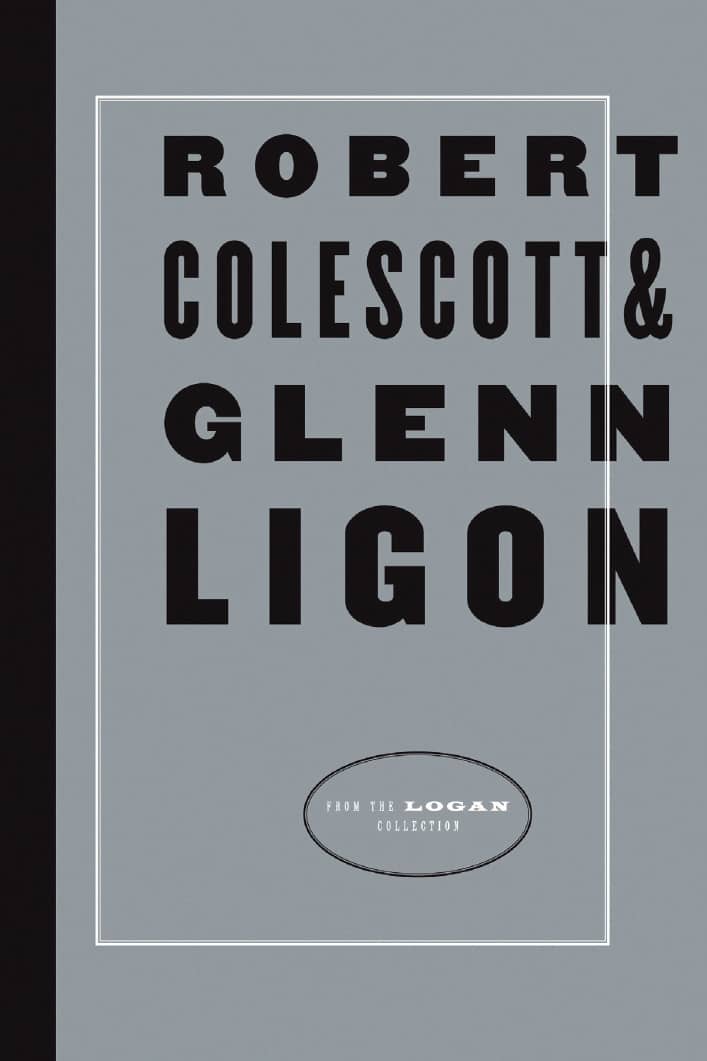
THE ROBERT COLESCOTT & GLENN LIGON EXHIBITION CATALOG FOR THE UNIVERSITY OF DENVER VICTORIA H. MYHREN GALLERY / Aufuldish & Warinner: Bob Aufuldish / USA, 2004
FF Scala
Frustrated with his limited typographic choices—a mere 16 typefaces using PageMaker 1.0, running on one of the first Macintosh computers—while working at the Vredenburg Music Centre in Utrecht, Martin Majoor decided to develop a typeface to suit his needs, including small caps, ligatures, and Old Style numbers. He named the typeface after the Teatro alla Scala in Milan. In 1990, FontShop International › 227 released FF Scala, the most serious text face at that point released under the FontFont label. FF Scala Sans was released three years later; it cemented FF Scala’s popularity through its consistent versatility and one of Majoor’s drivers: “Two typefaces, one form principle.”
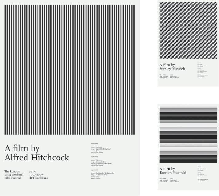
2007 HORROR FILM FESTIVAL POSTER SERIES / Thomas Brooks / UK, 2007
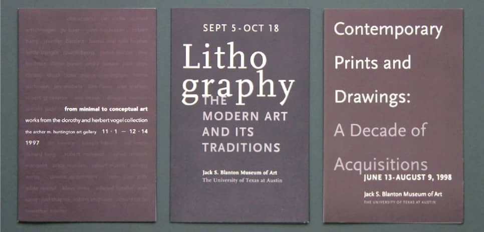
JACK S. BLANTON MUSEUM OF ART EXHIBITION INVITATIONS / HVADesign: Henk van Assen / USA, 1998
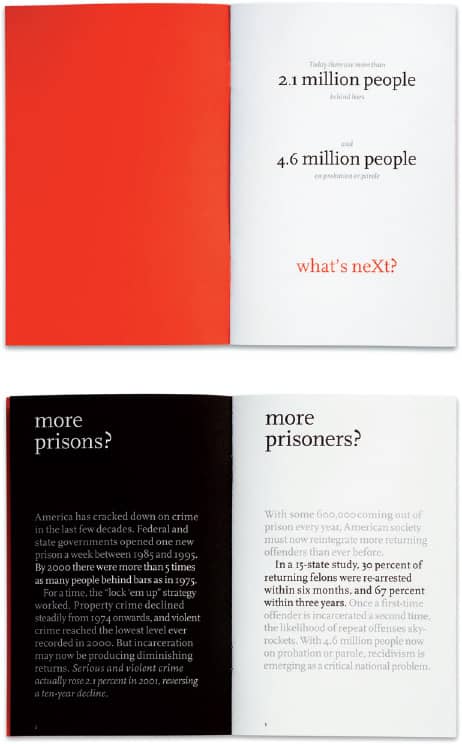
Left REDUCING CRIME: WHAT’S NEXT? AMERICA WORKS PROGRESS REPORT / Kym Abrams Design: creative direction, Kym Abrams; design, Eric Czerwonka; writing, Valjean McLenighan / USA, 2002
HOEFLER TEXT
In the late 1980s and early 1990s, type foundries began translating their most important typefaces to digital fonts at a time when the technology was not highly advanced nor the processes perfected—with “the world’s greatest typefaces,” as Jonathan Hoefler notes, “quickly becoming some of the world’s worst fonts.” Hoefler began work on an expanded family that strived to establish a standard for what typeface design and development in the digital age could be.
Included in the ambitious family are roman, bold, and black weights, each featuring roman and italic small caps, swash and alternate swash italics, alternate ligatures, and engraved capitals, among many other characteristics inspired by fine printing. Apple became aware of Hoefler’s work and turned to him to apply it to their TrueType GX format, a technology for the creation and use of fine typography in their operating system. TrueType GX did not fully succeed, but a limited family of Hoefler Text has been included as part of the Macintosh’s Operating System since OS7 in 1991. It now remains to be seen if this typeface’s wide availability will turn it into the next Times New Roman.
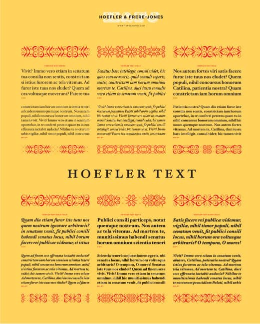
HOEFLER TEXT / Hoefler & Frere-Jones / USA, 1991
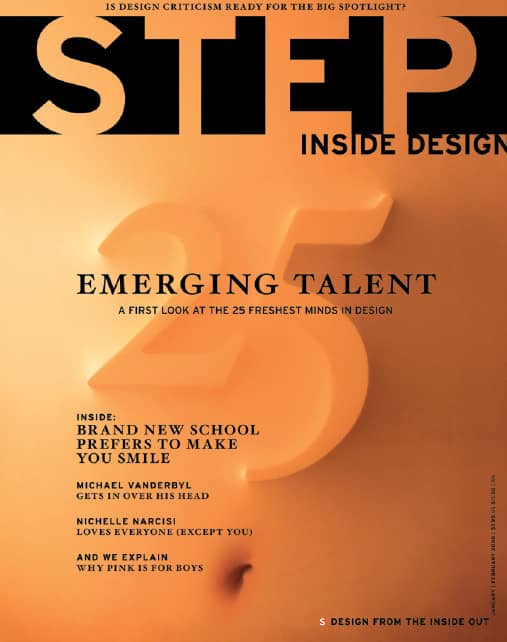
STEP INSIDE DESIGN 24, NO. 1 / MINE™: Christopher Simmons; art direction, Michael Ulrich; editing, Tom Biederbeck / USA, January/February 2008
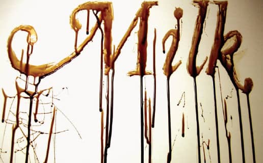
HOEFLER TITLING, THE DISPLAY-SIZE COUNTERPART TO HOEFLER TEXT, SET IN A VISCOUS AND CAFFEINATED MILKY SUBSTANCE / Gemma O’Brien / Australia, 2008
Mrs. Eaves
The notion of revival in typeface design typically entails redrawing existing letterforms to better fit the moment’s printing processes and technologic advances. With Mrs. Eaves, Zuzana Licko › 225 set out to reinterpret an old classic, designed for today’s readers, while embedding her own aesthetic in it. Licko’s choice was Baskerville, a typeface designed by John Baskerville in the 1750s. His work had been seriously criticized at the time for poor legibility due to its high contrast in thicks and thins. Baskerville, who was also a printer, developed a deep black ink and smooth, glossy papers previously unseen; these may have accounted for his work’s exalted contrast but they did not aid his popularity.
Wanting to retain the lightness and openness characteristic of the source and stemming from the controversial, misunderstood contrast, Mrs. Eaves features a smaller x-height that compensates for the reduced contrast. With its roman, italic, bold, small caps, and petite caps weights and its wide range of ligatures, Mrs. Eaves became an instant choice for designers. Its elegance and versatility made it ubiquitous in the 1990s, as it stood apart from the grunge and display typeface craze of the time. In 2002, Emigre Fonts released Mrs. Eaves in OpenType, making the endless options of ligatures and number styles easily available with 1,150 glyphs.
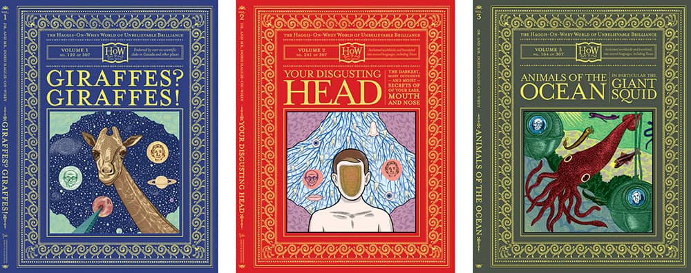
THE HAGGIS-ON-WHEY WORLD OF UNBELIEVABLE BRILLIANCE BOOK SERIES / Plinko: art direction, Dave Eggers, Plinko; illustration, Michael Kupperman / USA, 2003-2006
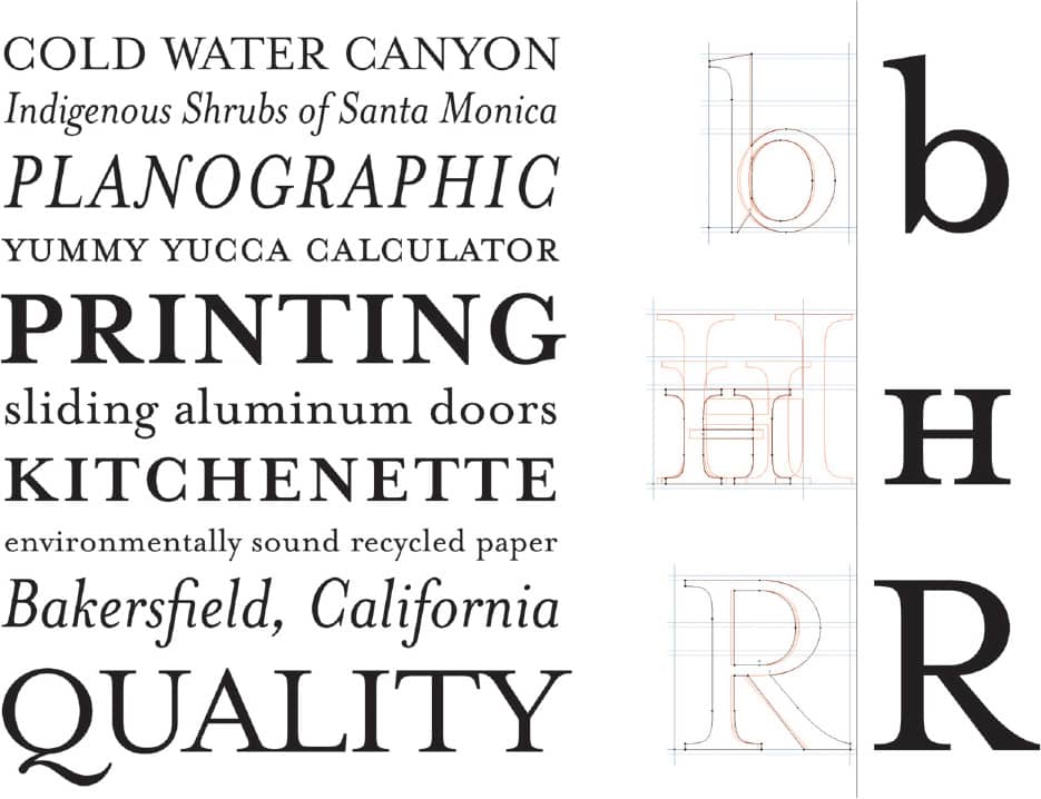
MRS. EAVES / Emigre Fonts; Zuzana Licko / USA, 1996
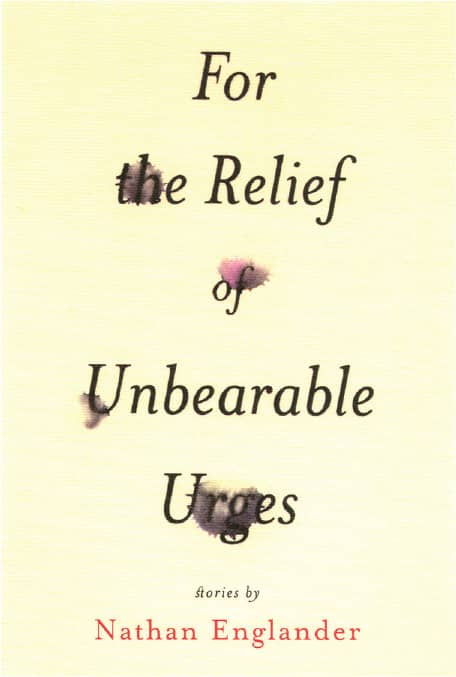
FOR THE RELIEF OF UNBEARABLE URGES, Nathan Englander / Vintage / Barbara deWilde / USA, 1999

SYNERGY V3 LINE PACKAGING FOR SYNERGY WORLDWIDE / Moxie Sozo; Leif Steiner / USA, 2008
Bell Centennial
In 1976, AT&T turned to Mike Parker, director of typographic development at Linotype, who then commissioned Matthew Carter › 221 to update Bell Gothic, the typeface designed by Chauncey H. Griffith and used in the company’s phone books since 1937. The requirements for the new typeface were demanding: Fit more characters per line, reduce the need for abbreviations, and increase legibility at very small sizes printed on very light newsprint. Matthew Carter’s design slightly condensed the characters and increased their x-height while incorporating more open counters and deep ink traps into the family’s four styles: Name and Number, Address, Sub Caption, and Bold Listing. Its success is certainly proven in its use and performance in phone books, and Bell Centennial enjoys an alternate life in the hands of designers enthralled with the way the ink traps and other peculiarities look at larger sizes.
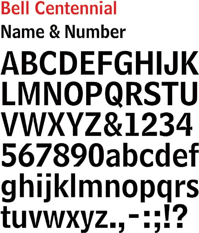
BELL CENTENNIAL NAME & NUMBER / Commissioned by AT&T / Matthew Carter / USA, 1976-1978
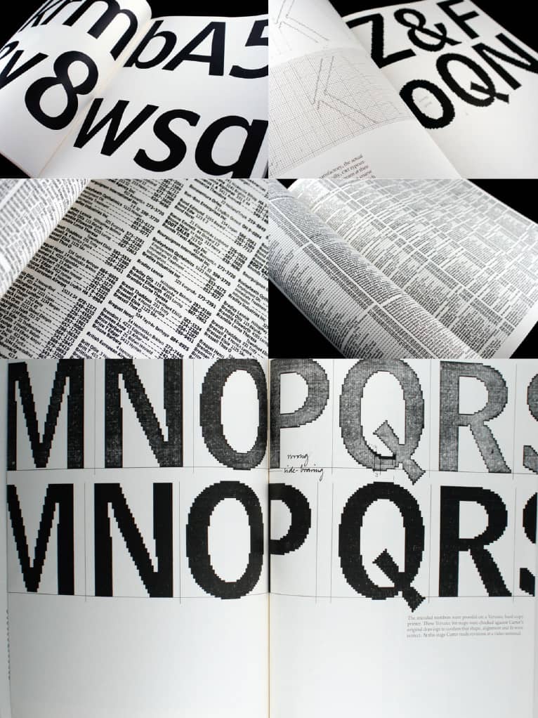
TYPE AND TECHNOLOGY MONOGRAPH NO. 1 BY THE CENTER FOR DESIGN AND TYPOGRAPHY, THE COOPER UNION / Matthew Carter / USA, 1982
Template Gothic
Inspired by an old hand-drawn laundry sign that Barry Deck took home after it had been replaced by a new one, Template Gothic was designed to look “as if it had suffered the distortive ravages of photomechanical reproduction,” Deck explains. At the time, he was a student at CalArts › 131, where Ed Fella › 185 and Jeffery Keedy were promoting type experimentation. After a class trip to Emigre › 224, Rudy VanderLans asked Deck if they could release Template Gothic—and it soon became a praised and scorned representative of the experimental 1990s.
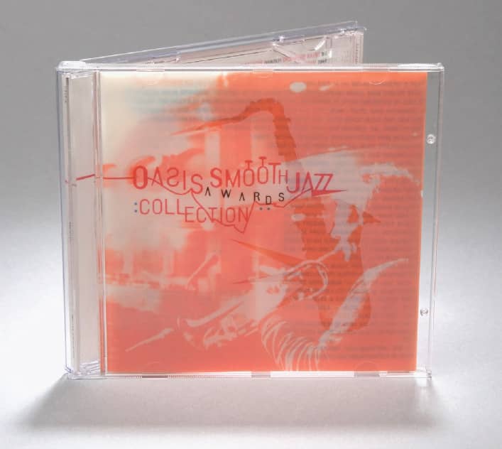
OASIS SMOOTH JAZZ AWARDS COLLECTION, various artists / Native Language / Infinite ZZZ: art direction, Joel Venti; design, Jawsh Smyth / USA, 2000
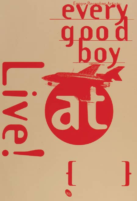
EVERY GOOD BOY LIVE SHOWS POSTER / Emigre: Rudy VanderLans / USA, 1993
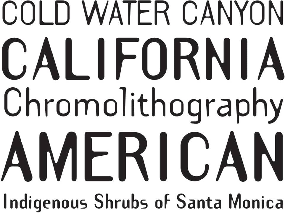
TEMPLATE GOTHIC / Emigre Fonts: Barry Deck / USA, 1990
FF Blur
FF Blur was developed in a period of enthusiastic technological experimentation. Neville Brody took the opportunity to explore how typography and technology could be bridged through messaging and perception. Using Photoshop’s Blur filter and Autotrace feature, exaggerated contours and emphasized bitmaps were obtained and three weights released: light, medium, and bold, each with its own unique effect. FF Blur, like other experimental typefaces of the 1990s, allowed for a new kind of visual aesthetic enabled by the broadening embrace of the computer.
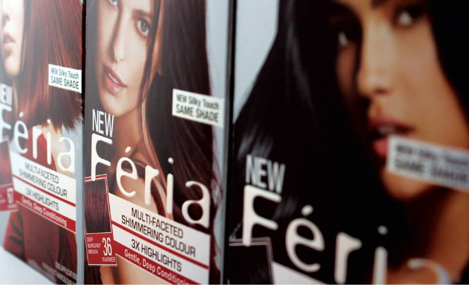
FÉRIA BY L’OREAL PARIS / USA, 2008
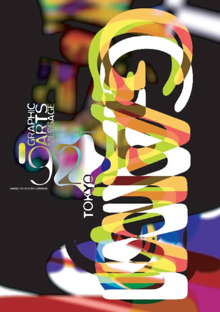
GRAPHIC ARTS MESSAGE EXHIBITION SEMINAR WORKSHOP POSTER FOR TOO CORPORATION / Research Studios / Japan, 1992
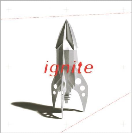
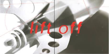
LIFT OFF BROCHURE FOR UNISOURCE / Pressley Jacobs Design, Inc. / USA, 1997
LO-RES
From the first editions of the Macintosh in 1984 and 1985, typefaces could be designed in their coarsest resolution only and, without the aid yet of Adobe’s PostScript language, resulting in bitmap fonts. In these early days of digital type, Zuzana Licko › 225 developed a range of bitmap typefaces and supplied them to Rudy VanderLans for use in the first editions of the influential Emigre magazine › 100. At the time, the layouts and fonts met with mixed feelings, but their uniqueness blossomed in the context of Emigre’s font business › 224. Originally released as Emigre, Emperor, Oakland, and Universal, these fonts were repackaged as the Lo-Res family in 2001. These bitmap fonts are designed for specific sizes, based on the vertical number of pixels of the grid, and are best scaled onscreen by full integers—for example, Lo-Res 9 must be set at 9 points to look sharp, and its next optimized size is 18 points. The Lo-Res family ranges from 9 to 28 and features narrow, serif, and sans-serif options. In the twenty-first century, these groundbreaking designs now exude nostalgia.
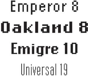
LO-RES / Emigre: ZuzanLicko / USA, 1985 and 2001
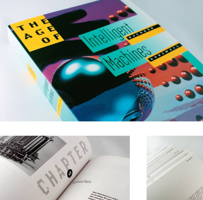
THE AGE OF INTELLIGENT MACHINES, Raymond Kurzweil / The MIT Press / USA, 1992
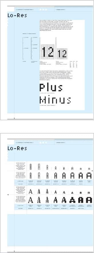
LO-RES CATALOG / Emigre: Rudy VanderLans / USA, 2001
Bello
After design and typeface development became highly mechanized by the computer, a slow movement to bring back the hand-drawn and handmade—produced through the computer nonetheless—started to emerge in the early 2000s. One of the catalysts broadly embraced was Bello Pro, a brush script rendered by hand and perfected on the computer. Taking advantage of the blooming OpenType font format, Bello Pro was able to produce a convincing script where every single character connected with the other, regardless of the combination—something past script typefaces could not anticipate or address fully—by providing contextual characters that reacted to what was beside them. Bello Pro features a sturdy small caps companion that complements the free-flowing nature of the script, as well as beginning and ending swashes and more than 60 ligatures that add flair as well as mimic a more natural script.
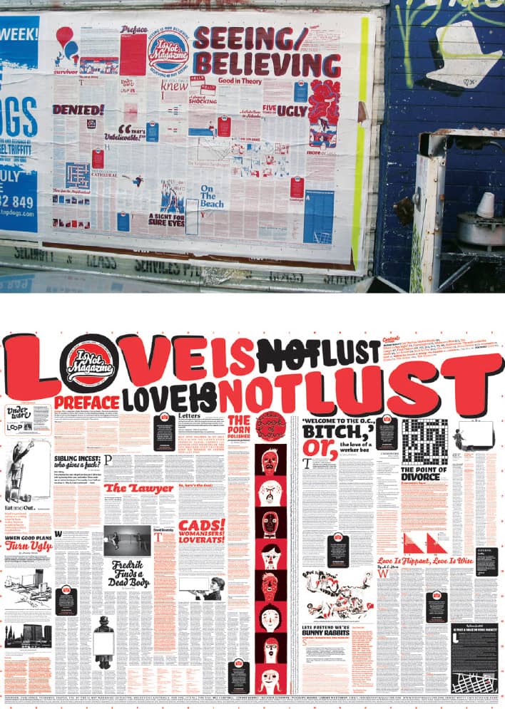
IS NOT MAGAZINE / Mel Campbell, Stuart Geddes, Natasha Ludowyk, Penny Modra, Jeremy Wortsman / Australia, 2005-2008
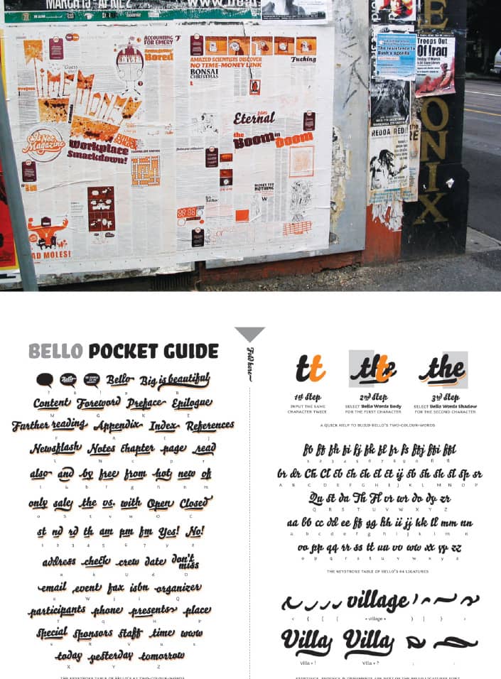
BELLO / Underware / Netherlands, 2005
Ed Interlock
As head of the publishing department of Photo-Lettering, Inc. (known as PLINC), a New York-based phototypesetting shop that provided headline and display lettering to advertising agencies in the 1930s until it closed in the 1980s, Ed Benguiat drew nearly 500 alphabets. Some were digitized by ITC › 220, but the majority live only in the film-based archives of PLINC, purchased by House Industries › 228 in 2003. Working with Benguiat, Ken Barber, House Industries’ typography director and lettering expert, selected a range of styles to develop as OpenType typefaces that would do justice to Benguiat’s fluid hand-lettering. The Ed Benguiat Collection, launched in 2004, features Ed Script, Ed Gothic, Ed Roman, Ed Brush, and Ed Interlock—and while they all take advantage of the versatility of OpenType, it is Ed Interlock that wildly exploits the technology.
As the name implies, Ed Interlock’s appeal is its ability to lock one letter to the next in a complex way usually achieved only by hand as drawn for a specific application. With 1,400 ligatures, Ed Interlock reacts to the letters being set and proposes the best and most interesting lock-up; in addition, it maintains a visual balance between top and bottom lock-ups. Programmed by Tal Leming, a type technology specialist, House Industries cheekily calls this “Artificial Edtelligence.”
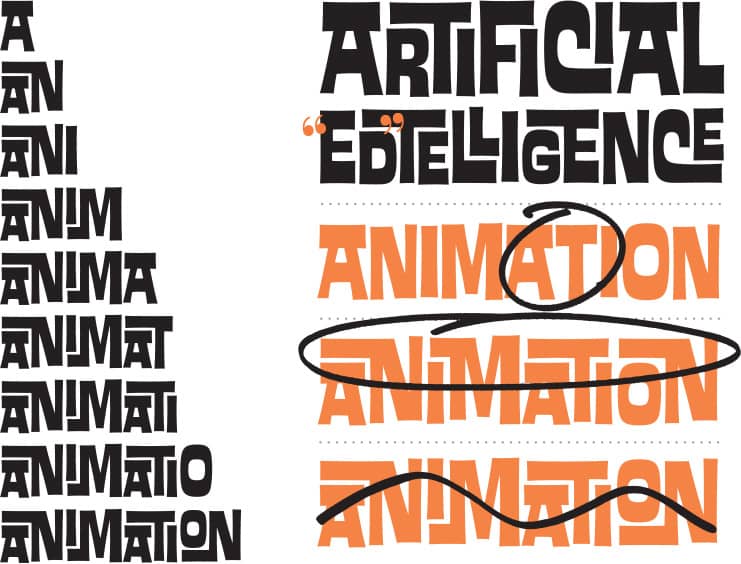
ED INTERLOCK NOTES AND ANIMATION OF CONTEXTUAL SUBSTITUTION ROUTINES / House Industries: design, Ken Barber / USA, 2004

ED BENGUIAT FONT COLLECTION PACKAGING / House Industries / USA, 2004 / Photo: Carlos Alejandro

ED BENGUIAT FONT COLLECTION MAILER / House Industries / USA, 2004
Times New Roman
In 1931, the Times of London commissioned Stanley Morison, a typography consultant to the Monotype Corporation, to oversee the production of a new typeface for the newspaper. Drawn by Victor Lardent, a draftsman in the Times’ publicity department, and based on Robert Granjon’s Plantin, the typeface made its debut in 1932.
While this is the prevailing assumption of its origins, the type historian and director of typographic development at Mergenthaler Linotype Co. in the 1960s and 1970s, Mike Parker, tells a different story. In a 1994 article called “W. Starling Burgess, Type designer?” for Printing History, the journal of the American Printing History Association, Parker wrote that it had been Starling Burgess, a Boston aeronautical engineer and naval architect with an interest in typography, who in 1903 designed the roman version that preceded Morison’s design for the Lanston type foundry. Burgess’ work found its way to Monotype’s archives in London, where Frank Hinman Pierpont, an American type designer who headed the matrix factory and drawing office, produced what would become Times New Roman. Morison presented Pierpont’s design to the Times without crediting him and downplaying his involvement.
What is clear is that Times New Roman is one of the most pervasive typefaces—perhaps to a fault. With time and its inclusion as a default font in both PC and Macintosh computers and in Microsoft’s Office products, used in an inconceivable amount of documents issued by government organizations, schools, libraries, grocery stores, dentists, and anyone with a computer, Times New Roman’s gravitas has diminished.

5,0 ORIGINAL BEER PACKAGING / Feldmann+schultchen design studios: AndrÉ Feldmann, Arne Schultchen, Florian Schoffro, INGE-Marie Hansen, Kati Lust, Edgar Walthert / Germany, 2007
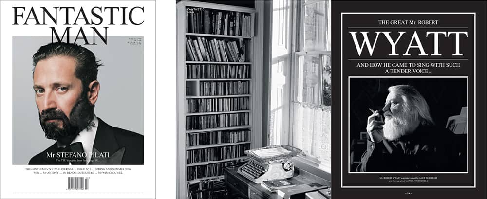
FANTASTIC MAN MAGAZINE NO. 3 / Top Publishers / Netherlands, 2006
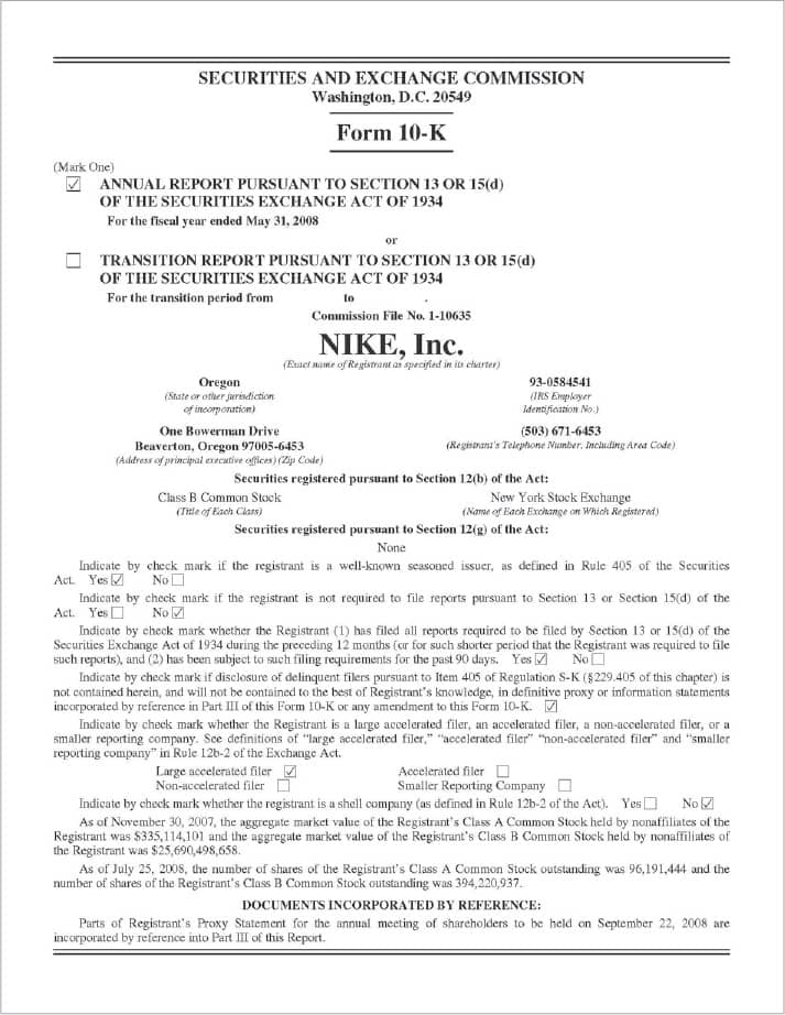
NIKE, INC., FORM 10-K / USA, 2008
Arial
Arial, or Sonoran San Serif, as it was first named, was originally designed and used for Xerox and IBM’s truck-sized xerographic (laser) printers in the 1980s. Based on the Monotype Grotesque series, it sports softer curves and diagonally cut strokes to increase legibility but, just as well, it dubiously features the same proportions as Helvetica. Microsoft, which tapped Monotype to provide TrueType fonts, added Arial to its Windows 3.1 operating system in 1992, and it instantly and globally became the type du jour for PowerPoint presentations, Word documents, and websites across the world, much to the chagrin of designers who consider it Helvetica’s bastard child.
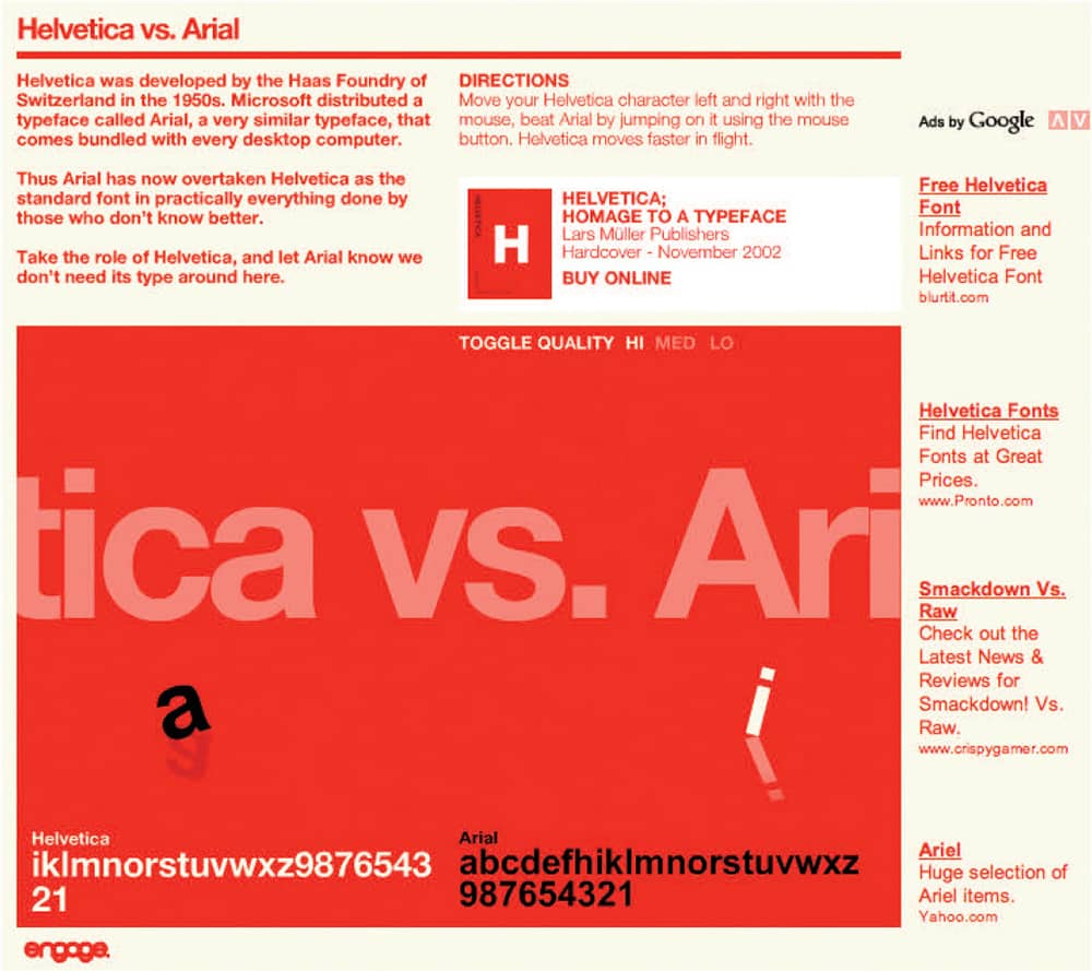
HELVETICA VS. ARIAL, A PLACE TO STOMP ON ARIAL AND RELEASE YOUR FURY / engage studio / UK, 2003
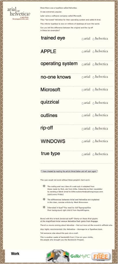
ARIAL OR HELVETICA? A QUIZ TO TEST YOUR RECOGNITION SKILLS / I Live On Your Visits: Derren Wilson / UK, 2003
Papyrus
Inspired by the ancient Middle East, imagined as what 2,000-year-old vernacular would look like set on papyrus, and hand-rendered as calligraphy on textured paper, Papyrus was acquired by Letraset after ten other type companies passed on it. Over a six-month period, Papyrus was created by hand using traditional materials such as Rapidographs, French curves, and Wite-Out. Papyrus’ popularity increased when it was bundled with Apple’s Mac OS X in 2001. Its handwritten feel made it a darling for designing tea packaging, yoga studio identities, film opening titles, CD covers, real estate advertising, newsletters, lingerie stores, personal business cards, anything organic, and much more.
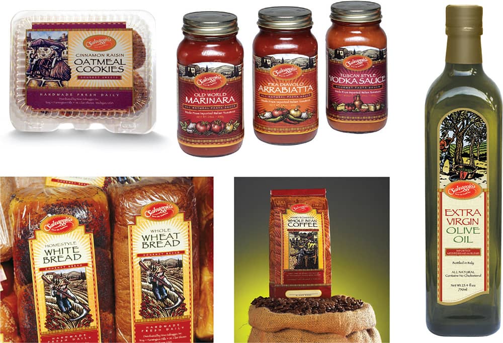
SALVAGGIO’S PACKAGING FOR NINO SALVAGGIO INTERNATIONAL MARKETPLACE / Goldforest: creative direction, Michael Gold, Lauren Gold; design, Carolyn Rodi / USA, 2006
Comic Sans
Comic Sans is constantly under criticism and scrutiny by designers who are appalled by the design and its wide use across the globe. First designed as a support typeface for the interface of Microsoft Bob—a friendlier alternative to interacting with Windows 95—it was never intended for public release. Yet, Comic Sans was released as part of Windows 95 alongside Trebuchet, Webdings, and Verdana. Today it can be found in almost every street in the world and online, whether as a conscious choice, a default selection, or in disdain, as in the efforts of bancomicsans.com.
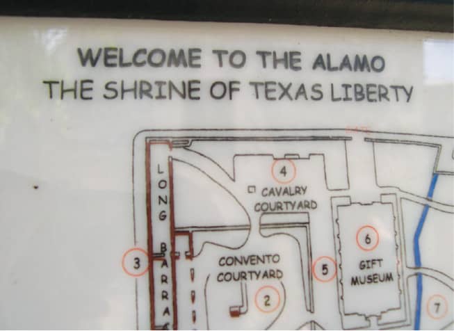
Photos: Rani Goel

Photo: Rani Goel
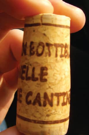
Photo: Dan Raynolds
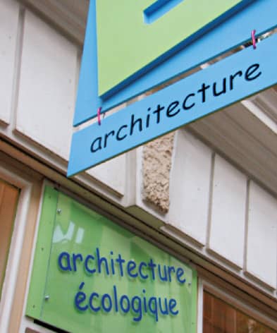
Photo: Jan-Anne Heijenga
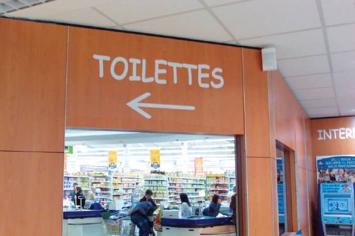
Photo: Ben (Crouchingbadger) Ward
COMIC SANS IN USE
Fajita
Based on the typeface Sarah Elizabeth, found in one of the many Dan X. Solo type compendia, Fajita was developed in two weights, Mild and Picante, that include different accented characters. Since its release, Fajita can be found on awnings and menus across the country that specialize in Mexican or TexMex food—slowly blending them all into one simple stereotype. While Fajita may not be the greatest typographic accomplishment, its impact in visually pigeonholing the food industry for a specific demographic is worth noting.
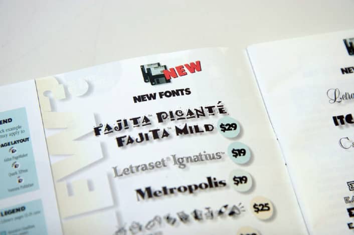
IMAGE CLUB CATALOG / Splorp: Grant Hutchinson / Canada, 1993

MOCK-UP SAMPLES OF FAJITA IN USE / Splorp: Grant Hutchinson / Canada, 1993
COOPER BLACK
Seeking a career in illustration, in 1899 Oswald Bruce Cooper enrolled in Chicago’s Frank Holme School of Illustration, where one of his teachers was Frederic W. Goudy, one of the most prolific American type designers. Cooper eventually steered into lettering and design away from illustration, himself becoming a teacher at Holme. Fred Bertsch, who ran an art service business next door, became friends with Cooper, and in 1904 they established Bertsch & Cooper, combining Bertsch’s business savvy and Cooper’s talent. Beginning with local clients, they created lettering for advertising and soon found themselves with bigger commissions for national campaigns. With the wider exposure, the Barnhart Brothers & Spindler (BB&S) type foundry took notice of Cooper’s work and approached him to design a type family based on his lettering. Apprehensive at first, Cooper agreed, and in 1918 he designed a roman typeface with rounded serifs that was simply called Cooper and later renamed Cooper Oldstyle. Two years later, he designed Cooper Black, taking the rounded serifs of the original typeface to their broadest extreme to create the heaviest typeface to date, both literally and figuratively: As a metal font at 120 points, the full alphabet weighed more than 80 pounds, and, when typeset, it unequivocally commanded attention with its sheer mass.

EASYJET LIVERY / © easyJet airline company limited / USA
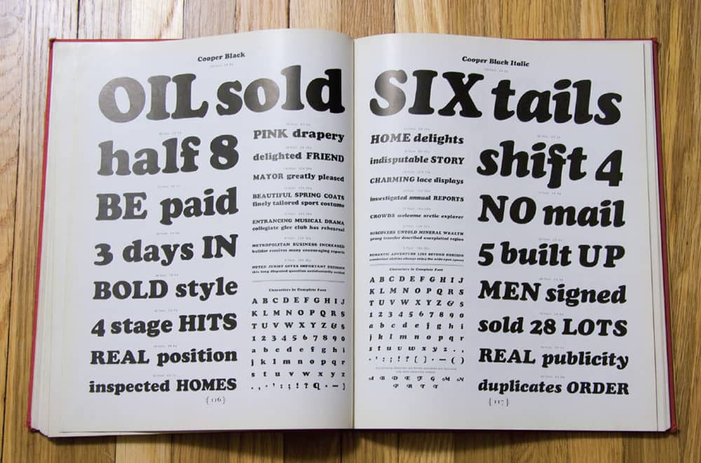
COOPER BLACK TYPE SPECIMEN / USA, 2007 / Photo: Matthew Desmond
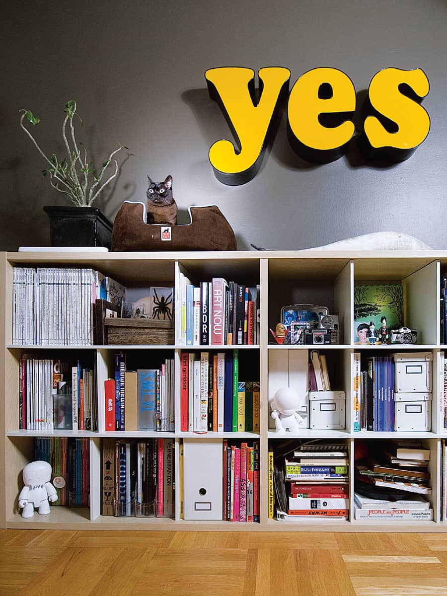
COOPER BLACK AT HOME / Francis Chan / Canada, 2007
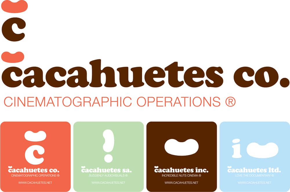
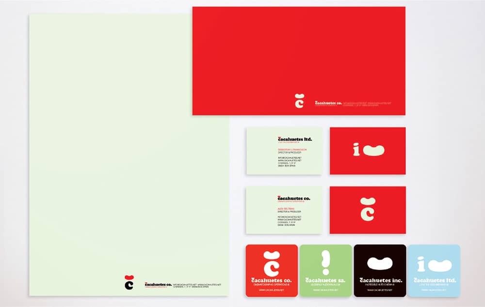
CACAHUATES, INC., IDENTITY / Tea Time Studio; developed with aBe / Spain, 2004-2006
Cooper Black became the best-selling typeface of BB&S, and it spurred a trend in black typefaces from its competitors, including an eerily derivative design, Goudy Heavyface, by Cooper’s former teacher. Cooper Black also became a de facto selection for advertising, with its exuberant friendliness and boldness. In 1924, Cooper designed the italic companion to his original roman and, two years later, Cooper Black Italic further popularizing Cooper’s type designs. Cooper Black and its italic counterpart enjoyed success through the 1930s, but other bold typefaces like Futura › 371, Univers › 372, and Helvetica › 373 gradually replaced them through the 1960s and 1970s. The Cooper typefaces were briefly resurrected in advertising in the latter decades, but they eventually became a default choice for store signs, flyers, and other dull applications. At the turn of the century, Cooper Black and its italic enjoyed a resurgence, first with revivals like Oz Black by Patrick Giasson in 1999 and Rosemary by Chank Diesel in 2000, and second by oozing a sense of advertising nostalgia unto graphic designers. Used ironically and with a knowing wink, Cooper Black has reappeared not just in advertising but in books and magazines, motion graphics, and even corporate and brand identities.
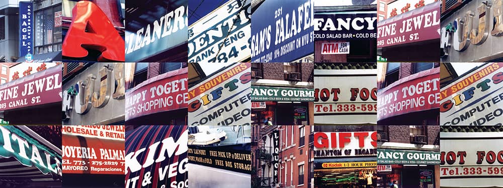
COOPER BLACK, AS FOUND IN THE STREETS OF CHICAGO AND NEW YORK / USA, 2004-2006
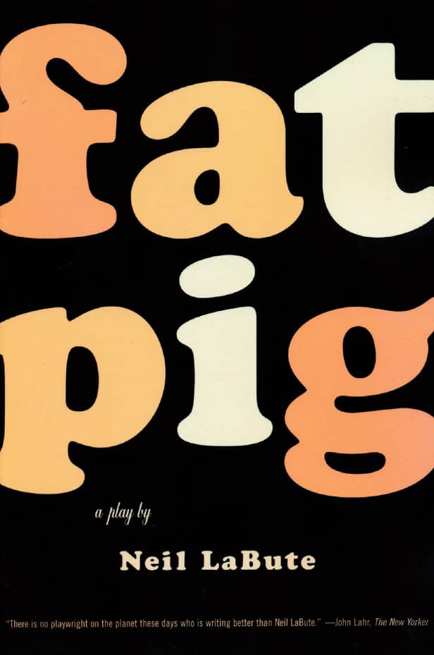
FAT PIG, Neil LaBute / Faber and Faber, an affiliate of Farrar, Straus and Giroux / Charlotte Strick / USA, 2004
