PRINCIPLES
Of Typography
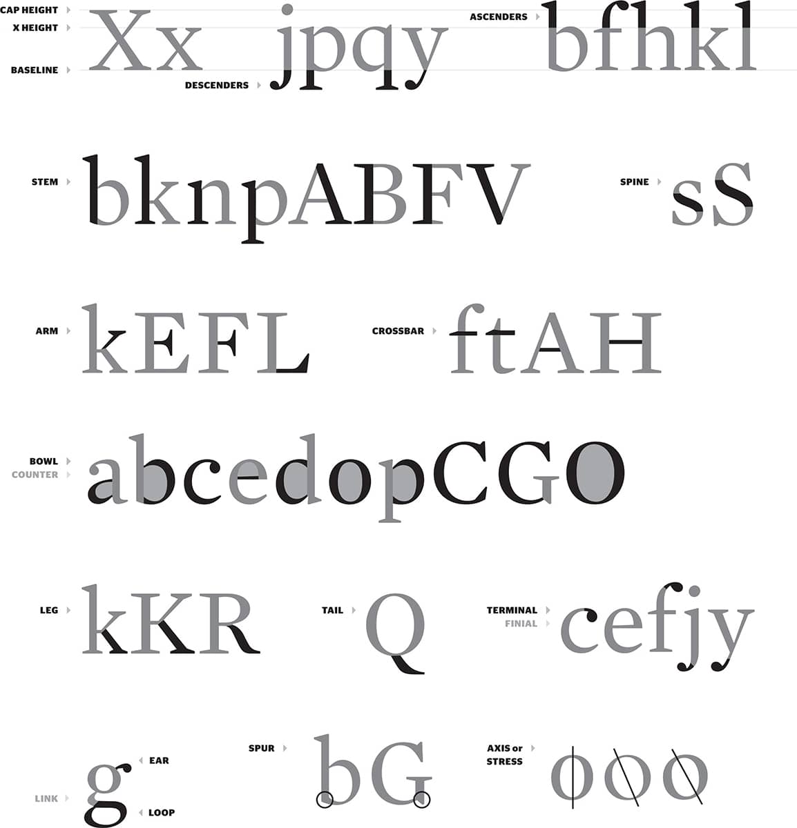
It is unlikely that a graphic designer would be fired from a reputable job for referring to the ear of the lowercase letter g as “that cute thing that sticks out on top” or for not knowing the difference between a terminal and a finial, but it certainly does no harm to learn the proper terms for the elements from which the characters of the alphabet are constructed.
The abundance of type families can sometimes be daunting—a feeling magnified by their myriad weights, styles, and variants, with a semantically confusing collection of terms that are easily misunderstood and repeatedly miscommunicated. Is it typeface or font? Italic or oblique? Is this condensed or compressed? Just how old are old-style figures? Grasping the breadth and alternatives offered within each type family may ease the pain of selecting the most appropriate. Scrolling through the Font drop-down menu and selecting whichever type family is highlighted after you count to ten is also a valid option.
Over the course of the twentieth century, significant efforts have been made to coin the ultimate set of terms to classify the evergrowing collection of typefaces. In the 1920s, French typographer Francis Thibaudeau classified typefaces by the shape of their serifs into Elzevirs, Didots, Egyptians, and Antiques. In 1954, another French typographer, Maximilien Vox, proposed a more comprehensive system based on a historical approach; categories included Classics (subdivided into Humanistic, Garaldic, and Transitional), Moderns (Didonic, Mechanistic, Lineal), and Others (Incised, Script, Manual, Black Letter, and Non Latin). This system was adopted in 1962 by the Association Typographique Internationale (ATypI) and later by Adobe to organize its immense library. Other notable attempts were made by Italian typographer Aldo Novarese in 1956 and Canadian typographer Robert Bringhurst in 1992, as well as by the digital type foundries looking to organize their offerings in a manner more accessible to a growing audience of type buyers. This section features a classification based on the way designers refer to typefaces in daily parlance, because seldom is the occasion when a creative director recommends his or her designer to try a Mechanistic instead of an Elzevir.
Perhaps the activity that occupies the largest part of graphic designers’ time is typesetting—quite simply, arranging letters into words, words into sentences, sentences into paragraphs, paragraphs into layouts. A few principles and semantics on spacing, organization and proper punctuation use are imperative for competent typesetting.
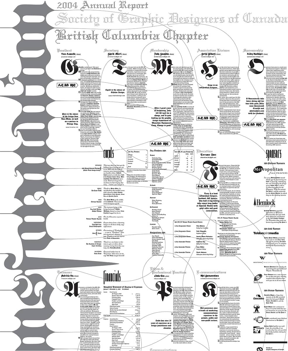
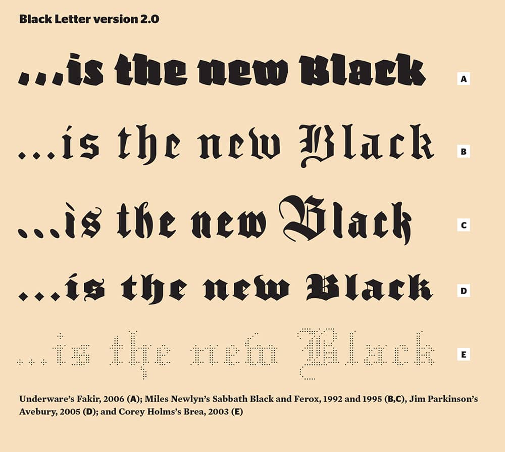
Detail of SOCIETY OF GRAPHIC DESIGNERS OF CANADA, BRITISH COLUMBIA CHAPTER, 2004 ANNUAL REPORT / Typeset in ten different Black Letter typefaces / Marian Bantjes / Canada, 2007
Anatomy
Genealogy
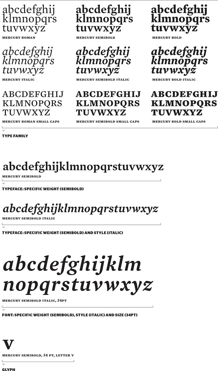
During the end credits of a 2007 episode of the game show Wheel of Fortune, host Pat Sajak asked co-host Vanna White what her favorite font was—“I use Arial, and I use Geneva,” she swiftly replied. Aside from the surprising topic of the banter, it was the choice of words that point to the misunderstandings, even among graphic designers, about the actual semantics of typography, especially as graphic design’s language seeps into the mainstream more and more. What Sajak should have asked is “What is your favorite type family?” Otherwise, White’s response should have been specific to the weight, style, and point size of Arial and Geneva that she favors.
When type was cast in metal, and specific weights, styles, and point sizes were stocked by printers, a font referred to a single variant of these alternatives—for example, Helvetica Bold at 55 points. In the realm of digital technology, font refers to the digital file that stores the information and scalable characteristics of the typeface or, in other words, the design. A typeface is a single weight or style with singular features and aesthetic. The aggregation of typefaces with common design elements executed through a set of weights and styles is a type family.
Typeface and font are the most commonly misused terms, freely exchanged between each other—a problem enabled, in part, by software applications that lump typographic choices under “Font” menus and palettes.
Weight

The quickest, most efficient, and most traditional way of calling attention to a word, sentence, or paragraph may be the simple act of making it bold—more effective, of course, if there is something less bold to contrast it with. Bold weights, specifically for serifs, did not come into play until the nineteenth century, but they have slowly become de rigueur with the introduction of tightly packaged type families with myriad weights, like Adrian Frutiger’s Univers › 372 in the mid-twentieth century. Today, it is rare to encounter a regular- or medium-weight typeface without bolder, or even lighter, counterparts. While it would be easy to peg this affluence on advancements in font development software, creating different weights of a typeface is far less simple than it would appear, and each weight must be optically redrawn. The examples show the relationship between the various weights and the challenge of maintaining a slightly fluctuating height while altering the widths to redefine the weight—from super-invisible-thin to you-must-be-blind-to-miss-it-black.
Width

It’s hard to imagine how the endless lists of credits crammed onto today’s movie posters would look if no one had dabbled in condensing the alphabet. So it’s fitting that, in the late nineteenth century, posters for the era’s entertainment industry, like the circus, employed an array of wood-carved typefaces that were produced in a dizzying variety of condensed and extended widths. These weren’t necessarily thought of as type families with shared design features; instead, they were grouped rather objectively by the printer to fit longer words with condensed typefaces and shorter words with extended ones. It wasn’t until the 1900s that typefaces like Morris Fuller Benton’s Cheltenham were designed in various widths from the start and billed as a type family.
Today’s multiwidth type families are significantly more purposeful in their design and construction. As shown, the key to maintaining uniformity is keeping the width of the stems consistent while extending horizontally, allowing for minor adjustments in height and weight—as opposed to the recurring crime of simply scaling an existing typeface horizontally, mangling the proportions of the original design. While condensed/compressed and wide/extended are the most common widths, no law prohibits designing a typeface as narrow as a pencil or as wide as a ferry.
Style

Like peanut butter and jelly, roman and italic typefaces work together for a seamless combination of distinctive flavors. While the oldest italic can be traced to Francesco Griffo at the end of the fifteenth century, it wasn’t until the seventeenth century that combining roman with italic (sometimes from different typefaces) in the same line blossomed as a way to make distinctions within text, and it wasn’t until the early twentieth century that roman typefaces were drawn hand in hand with their italic counterparts. Italics, as shown, are a flowing interpretation of the roman characters, with a more pronounced start and end of the penstrokes. They are drawn at angles as subtle as 2 degrees or as precipitous as 25. Some of the characters in italics are drawn differently—for example, the lowercase a, drawn as a double-story in roman and single story in italic, or the f with an extension of its stem—and italics are commonly 5 to 10 percent narrower than roman characters. Obliques, in contrast, are simply the roman characters sloped, with no optical corrections or modifications, resulting in wider characters and a lack of design intent. In other words, using obliques is akin to combining peanut butter with pickle relish.

Small capitals and old-style figures carry a sophisticated air of tradition and Old World charm—the former with its dollhouse furnishings size, the latter with its playful ascenders and descenders. Old-style figures were the most commonly used form of numbers from the sixteenth to the early nineteenth century, when titling figures, as tall as the uppercase letters, slowly displaced them. Not until late in the twentieth century did digitally produced typefaces embrace this style once again.
Small caps, on the other hand, have always been part of the visual lexicon of typography; they were common companions to their roman counterparts since the sixteenth century, and they have survived the butchering of their proportions by desktop publishing and software applications that deceivingly shrink uppercase letters to fit the lowercase x-height at the push of a button. Small capitals, titling, and old-style figures all must be drawn individually to achieve the proper structural relationships between them.

Making typography big—big as in display sizes like 100-point, 160-point, 300-point—in the computer is not difficult whatsoever, and there is nothing wrong about doing so. However, with infinitely scalable typography, design elements drawn to function at small sizes will appear gargantuan, even unsightly, when blown out of proportion. When typefaces were cast in metal and each individual font size was created independently, it was possible to modulate the contrast of the design elements to maintain a similar texture through different point sizes, but with digital typography, all sizes are created equal. Some type families, like the ones shown, include display styles drawn specifically for reproduction at larger point sizes by exaggerating the contrast of the design. Vice versa, it’s important to avoid using a display style at small point sizes.
Serif
Moving beyond the admittedly cute moniker of “little feet,” serifs are the finishing strokes in all letters other than O, o, and Q. Serifs are either unilateral, protruding in one direction only, like the top left serif on F; or they are bilateral, as when they protrude in two directions, like the bottom serifs on F.
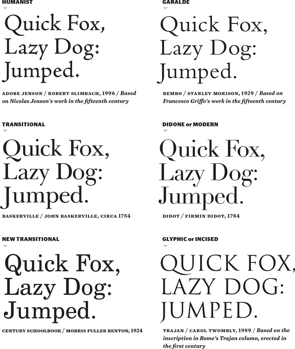
Since the fifteenth century, the shape of these little feet has defined the evolution of serif (or Roman) typefaces as typographers reacted to the work of their predecessors and adapted to new printing technologies. Humanist serifs, developed during the Renaissance, represent a shift away from the black letter used in the first decades of movable type. In the sixteenth century, Garaldes—taking their name from Claude Garamond and Aldus Manutius—featured more contrast between thick and thin strokes. Transitionals, with more defined serifs and a more vertical structure, paved the way for a distancing from calligraphic letterforms with the introduction of the Didones—the name derives from Firmin Didot and Giambattista Bodoni—or Moderns in the eighteenth century, with their simplified serifs and high contrast. And in the nineteenth century the New Transitionals were an evolved blend of the typefaces before them, produced to meet the new processes enabled by the Industrial Revolution.
Certainly, the origin of many of these typefaces can’t be ignored: Roman inscriptional texts dating to the first century, like the famed Trajan › 368 column. These serifs, Glyphic or Incised, are representative of chisel on stone, as opposed to pen on paper—although one theory suggests these incisions were first drawn with a brush and then chiseled, leaving the true origins of the serif unclear. The result can be subtle, as in the flared serifs of the namesake Trajan, or it can be robust, with big, triangular serifs and abrupt joints within each character, like this book’s Mercury.
Sans Serif
In the typographic equivalent of circumcision, sans serifs are stripped to the bare minimum by losing the serif appendages. They first appeared broadly in the mid-nineteenth century (they are referred to as Gothics) with the introduction of typefaces carved from wood. The increased production of sans serifs in all widths and sizes remains today, as sansserifs prove to be quite malleable.
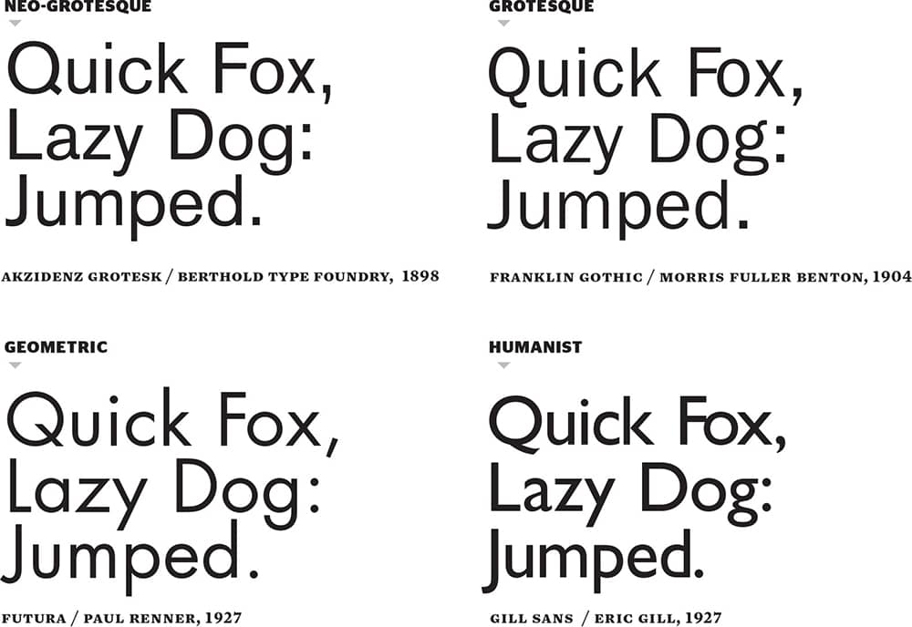
While it wasn’t the very first sans serif, Akzidenz Grotesk › 369, released in the 1890s, represents the mechanic structure of the Neo-Grotesques, which featured nearly even widths, as opposed to the Grotesques, which retained some characteristics of pen-drawn typefaces through slight contrast of thicks and thins. Geometric sans serifs, like Futura › 371 and Kabel from the 1920s, represent even more logic-driven letterforms peeled of any possible decoration. Humanist sans serifs were rooted in the calligraphic traits of fifteenth-century serifs rather than the evolution of woodtypes.
Slab Serif
While slab serifs are typically classified within serifs, their different visual attitude—defined by their thick, square-ended serifs—begs for its own category. Also a popular style during the mid-nineteenth century (Clarendon › 375 was first produced in 1845), slabs have evolved into a combination of structures, like the Clarendons and Egyptians, which are constructed more like serifs, and the Geometrics, which are based on sans serifs designed to sport slabs. And not all slabs are created equal: Geometrics and Egyptians lack brackets, the curvy connectors that segue stems and arms with the serifs, like the Clarendons.
Some Notes on Possibly Confusing Terms
Grotesque, from the German word Grotesk, was, indeed, from a lack of compliments and the abrupt change in the status quo these typefaces represented. Gothic was the American term for sans serifs, even though Gothic also refers to Black Letter › 68, which in turn is sometimes wrongly labeled as Old English, a style all its own. Lineale is another term for sans, and (just for trivia) in Spain it is referred to as Palo Seco (“dry stick”). For some time, slab serifs were referred to as Clarendons and later as Egyptians, but as more slabs have been developed, certain design characteristics have helped group them.
Black Letter
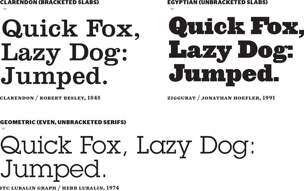
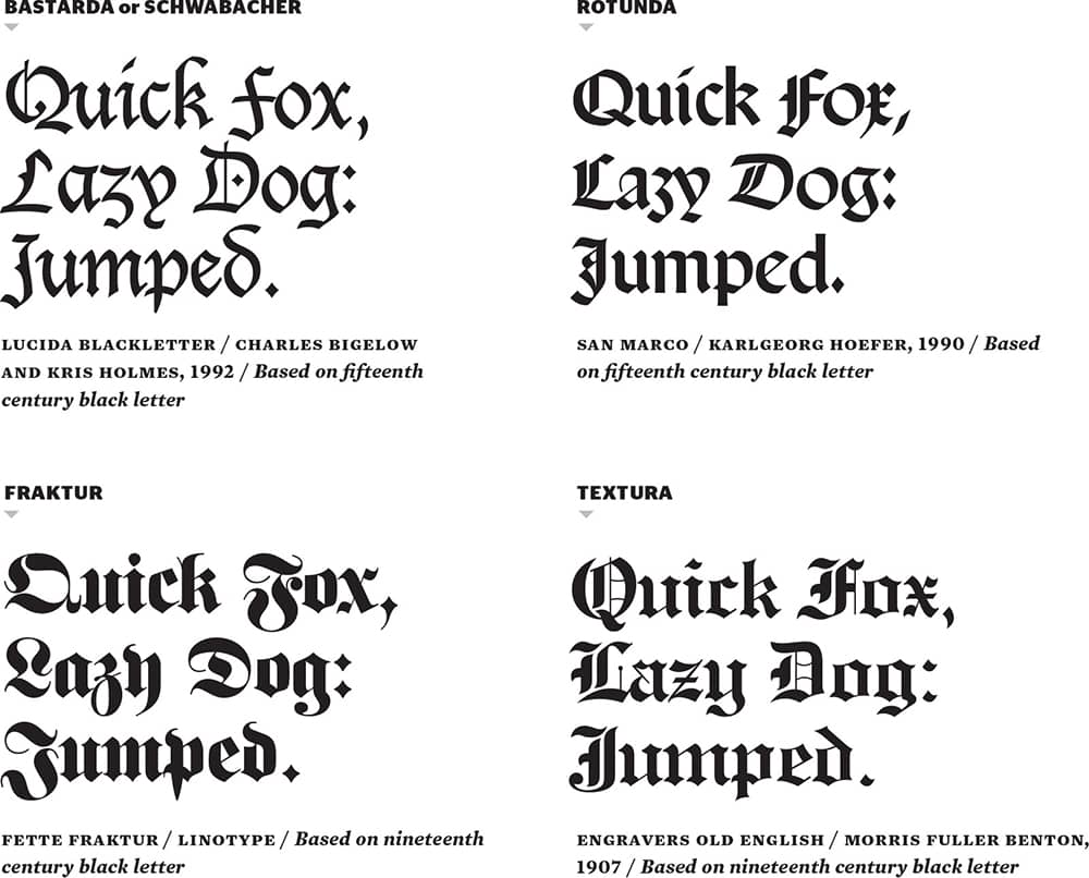
Newspaper nameplates, beer labels, religious scriptures, and tattoos, as well as heavy metal bands, hip-hop moguls, and pop starlets, all employ Black Letter, a typographic style used for more than 600 years. Its first use is hard to pinpoint, as Black Letter was a gradual and diverse evolution of varied sources like Carolingian, Old English, and the handcrafted work of scribes dating as far back as the ninth century in France, Italy, and Germany. Black Letter became de rigueur between the fifteenth and sixteenth centuries, especially after Johannes Gutenberg’s momentous printing of the Bible in 1452, with the introduction of movable type in Germany—and even though the style spread and evolved from this country, the link between the two has been inextricable, possibly for the worse.
During the 1930s, Black Letter—the fraktur style specifically—was appropriated by the Nazi regime and used in its propaganda. In 1941, however, Adolf Hitler, through his secretary Martin Bormann, decreed that fraktur was not to be used anymore for its alleged Jewish origins. Complaints of illegibility may have played a bigger role. Despite this dark period, Black Letter remains one of the most used and versatile typographic choices, and it has enjoyed modern-day revivals by some of the industry’s most celebrated type designers.
Script
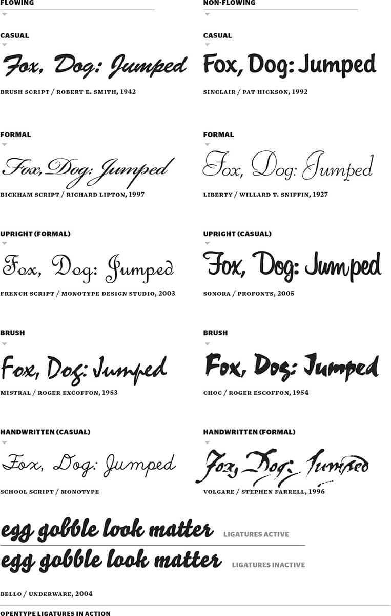
Just like handwriting, script letterforms are infinitely different and have been around since humans have put pen to paper with the intent of writing—doodling came along when they were forced into meetings. Script typefaces have long strived to translate the inherently dynamic, fluid, and imperfect act of writing into metal, wood, photo, and digital typefaces, amounting to an inordinate amount of choices in a dizzying number of approaches.
Script typefaces run a wide gamut of characteristics, and classifying them can be a frustrating task. They can be divided by their subjective aesthetics (formal versus casual); by the connections, or lack thereof, of its letters (flowing versus nonflowing); by the tool used (felt pen, quill pen, or brush, among others); and by other variables, such as upright, reverse, and handwritten scripts. In their variety, scripts have been pigeonholed for specific uses—formal scripts for wedding invitations, casual scripts for diners, and handwritten scripts for get-well cards, for example.
But scripts have enjoyed a renaissance in the twenty-first century, with young type designers like House Industries › 228, Underware › 232, and Alejandro Paul breathing new life and vibrancy into them with the help of OpenType. This format allows fonts to react to character placement—so a word like feel is rendered with two different glyphs for the letter e, or by having a dozen ways of connecting the e to other letters, giving the text the cadence of handwriting, where no two characters are drawn exactly alike. Pointing to the popularity of scripts are font retailers like Veer › 233, whose inventory of exclusive and stock scripts are top sellers over serif and sans serif typefaces.
Bitmap
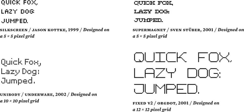
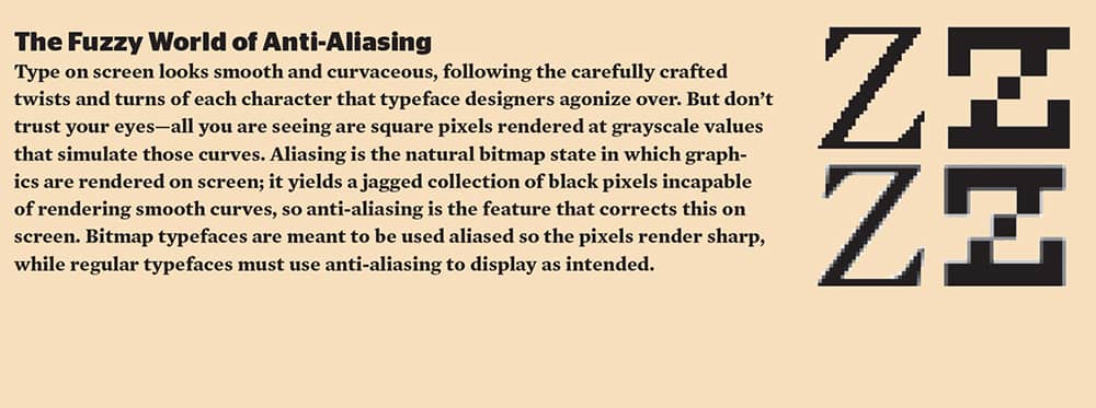
Bitmap fonts, made out of black on white pixels set in a grid, are designed to render appropriately at specific sizes on screen. Originally, these were developed to meet the coarse resolutions rendered by early operating systems (OS) and printers in the 1980s, and as technology allowed for type to render more smoothly—at least at sizes bigger than 9 points—their use was slowly discontinued in the mid 1990s. But later that decade, bitmap fonts experienced a resurgence through their use in web design, as they appeared sharp and clear no matter which monitor or OS the end-user had. In less than ten years, designers and type dabblers have generated a large sum of bitmap fonts, as they are comparatively easy to develop and distribute. And despite the intended use of some bitmap fonts at 5 points, 7 points, or 9 points on screen, designers have felt compelled to use them in print applications at vertiginous three-figure sizes.
Monospace
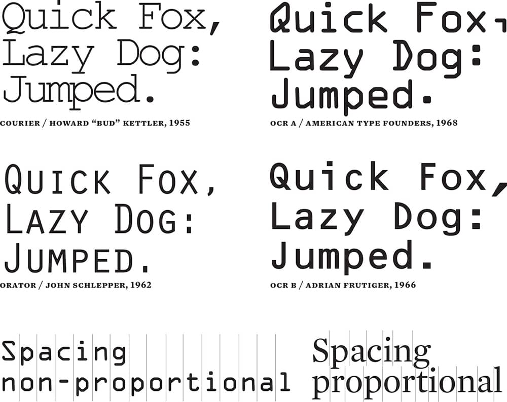
Monospace typefaces take their cue from typewriters, where all letters conform to a specific physical width, resulting in letterforms that must expand or condense to make the best use of the allotted space—hence the wide is and tight ms. They are also referred to as nonproportional, in contrast to typical proportional typefaces, where each character is a different width. Another feature of monospace typefaces—which can be seen as a pro or a con—is that they are spaced perfectly evenly, creating nicely aligned columns of text. This is helpful for creating the financial tables of an annual report, and has proven to be the best practice among programmers for writing code. The odd spacing, unusual letterforms, and a propensity for futuristic and typewriter designs limit the applications of monospace fonts.
Grunge
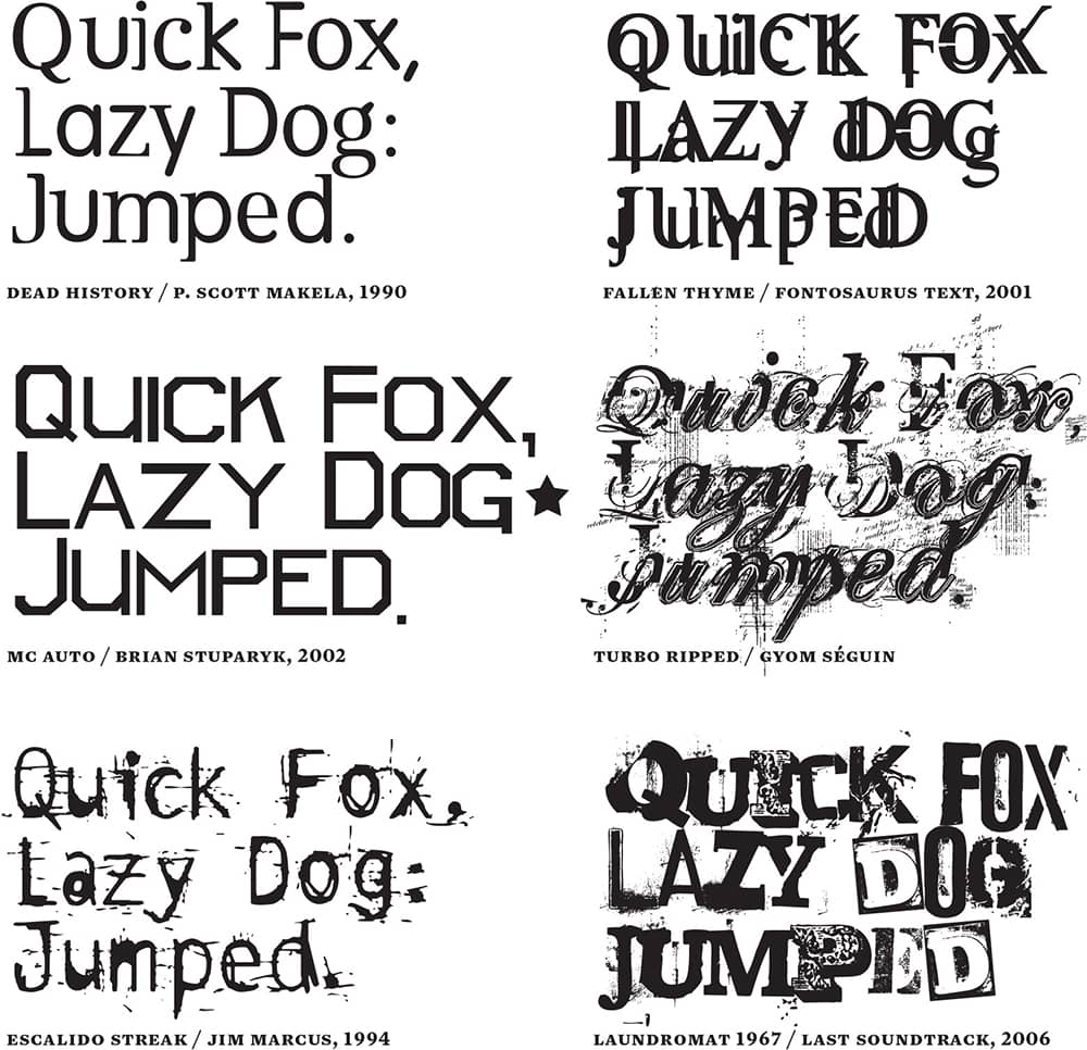
Somewhere at the intersection of Kurt Cobain’s unkempt appearance, the wide availability of the type design software Fontographer, and the mainstream climax of postmodernism and deconstructive typography from the 1980s, a new breed of amalgamated, scratchy typefaces populated the 1990s and early 2000s, in parallel with the increased (and eventually decreased) popularity of the Grunge musical movement, from which these typefaces got their label. There are no clear definitions for Grunge typefaces, but they share a jarring aesthetic and philosophy that contrasts with the conventions of classic typography. They also have in common the appropriation of existing typefaces as well as the visual vernacular to generate new designs. Early examples in 1990, like Barry Deck’s Template Gothic › 382, based on a sign in his local laundromat, and P. Scott Makela’s Dead History, a fusion of the serif Centennial with the bubbly sans VAG Rounded, cemented the feasibility of creating a new hybrid, imperfect language developed through the emerging font development software that could turn anyone into a type designer. This led to a boom of amateur type designers and digital type foundries—including Emigre › 224, [T-26] › 229, GarageFonts, Plazm, and Thirstype › 200—whose work defined much of the look of the 1990s.
Undeclared
If comedian Jerry Seinfeld had a typographic sense of humor, he would surely ask, “What’s the deal with Optima? I mean, is it a serif? or is it a sans serif?” These two typefaces, Optima and Copperplate Gothic, have long baffled designers with their flared serifs attached to sans serif structures.

AMERICAN WOOD TYPE
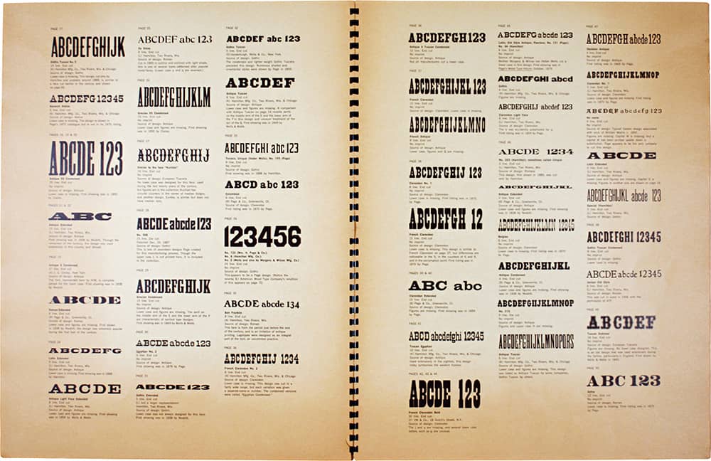
In the middle of the nineteenth century, an alternative to metal typesetting and printing arrived in the form of wood type. Less costly and more versatile, wood type prompted an influx of new display typeface designs ranging from sans serifs to slab serifs and Tuscans that were eagerly used for posters and broadsides in wild assemblages of widths, weights, and sizes. Enthusiasm for this print method waned toward the end of the century, especially as metal typesetting evolved into a more mechanized practice with the introduction of Linotype and Monotype machines. However, wood type alphabets lingered in print shops around the United States, and one of their most ardent collectors was Rob Roy Kelly, a prolific and influential graphic design educator and historian. A graduate of Yale School of Art and Architecture, Kelly taught for more than 30 years at Minneapolis College of Art and Design (MCAD), Kansas City Art Institute, Carnegie Mellon University, Western Michigan University, and Arizona State University. At MCAD he established a printmaking course where he used his wood type collection with the students, who queried him about its origins and uses. In 1957, Kelly began to organize his collection. He delved deeper into the topic, documenting the role of wood type in the history of printing and typography.
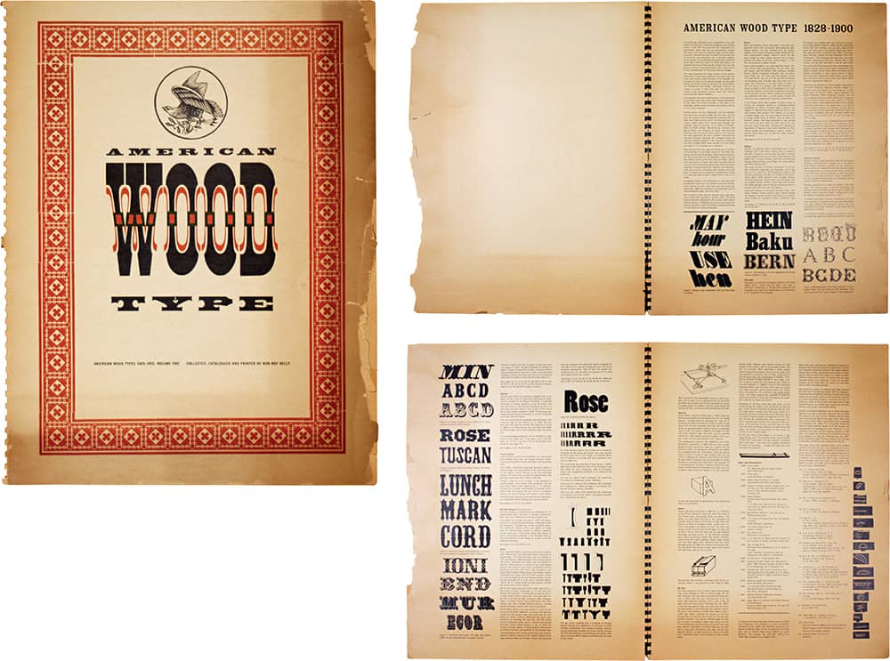
FOLIO OF AMERICAN WOOD TYPE, VOL. 1 / Rob Roy Kelly / USA, 1965
Working primarily from a 1906 type specimen issued by the Hamilton Manufacturing Company, one of the largest producers of wood type in the United States, and from other specimens at Columbia University, the Henry E. Huntington Library and Art Museum, the Newberry Library, and the New York Public Library, Kelly created a comprehensive classification system and established the date and manufacturing origins of most typefaces in his collection. In 1963 he published an early version of his findings in the Walker Art Center’s Design Quarterly no. 56, and in 1967 he published American Wood Types 1828–1900, Volume One, an imposing 17 × 22-inch publication. Its acclaim was followed by the 1969 publication of American Wood Type, 1828–1900: Notes on the Evolution of Decorated and Large Types and Comments on Related Trades of the Period, which was reprinted in 1977. The publication’s broader availability helped it find its way into the hands of graphic designers who, facing the unflinching dominance of Helvetica › 373, parlayed Kelly’s research into a revival of a visual language long forgotten. Toward the end of the 1960s Kelly sold his collection to the New York Museum of Modern Art › 121, which then sold it to the University of Texas at Austin, where it now resides as a research collection › 124 available to students once more.
Typesetting
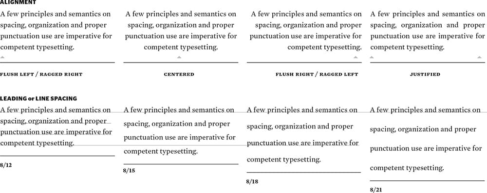
The space between lines of text is typically referred to as leading —pronounced like the metal, lead, not like leader—which comes from the days of metal typesetting when bars (also called strips or slugs) of lead of different thicknesses were placed between lines of text to create spacing. Colloquially, leading is defined by saying “8 over 12” or writing 8/12, meaning 8-point type size with 12-point leading. As the example shows, when using equal increments in leading, in this case 3-point, it is possible to horizontally align paragraphs with different leading values.
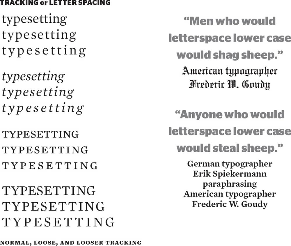
Tracking is the overall spacing between each letter. It is possible to track as tight or as loose as the heart desires but, as the example shows, Goudy and Spiekermann may be right. Small caps and uppercase letters do benefit from more generous letterspacing.
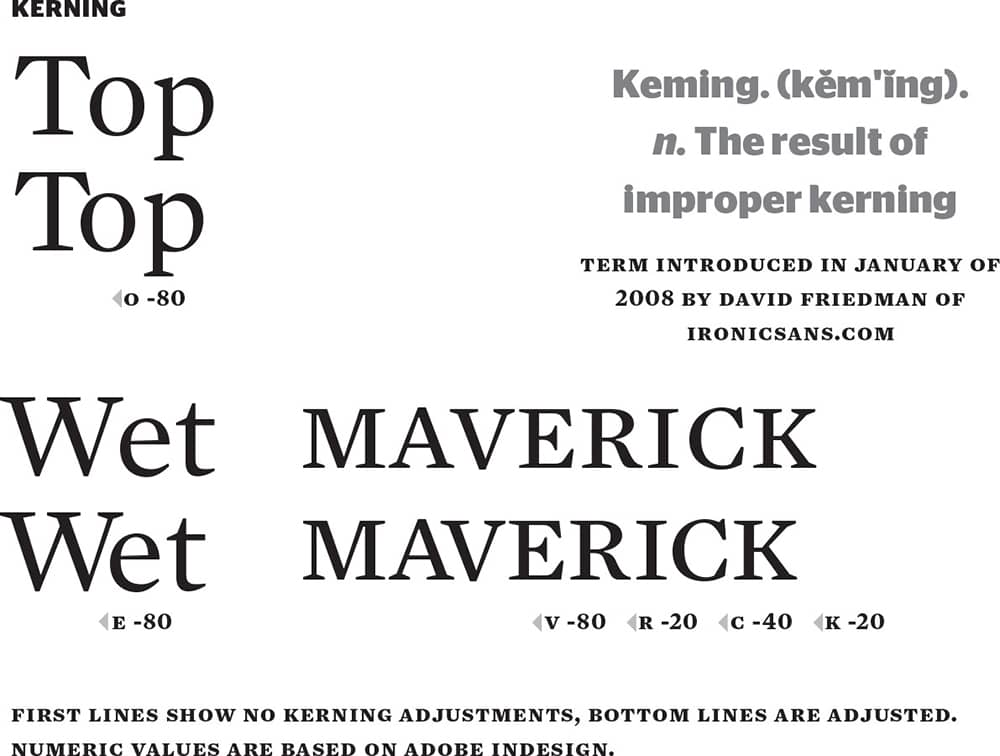
Kerning is the space between two specific letters. It is adjusted independently from the tracking. Digital typefaces are equipped with thousands of kerning pairs that provide a good start, but invariably tweaking must be performed, especially on text set at bigger sizes, where the spacing is more pronounced. In some circles, good kerning skills are what separate the true professionals from the dabblers.
ORPHANS and WIDOWS
Perhaps the activity that occupies the largest part of graphic designers’ time is typesetting—quite simply, arranging letters into words, words into sentences, sentence into paragraphs, paragraphs into layouts.
A few principles and semantics on spacing, organization, and proper punctuation use are imperative for competent typesetting.
Perhaps the activity that occupies the largest part of graphic designers’ time is typesetting—quite simply, arranging letters into words, words into sentences,
Orphans, above, occur when the first line of a paragraph begins at the end of a column or page. Widows, below, occur when the last line of a paragraph is the first in a column or page. To paraphrase Robert Bringhurst in The Elements of Typographic Style, orphans have no past, but they do have a future, and widows have a past but not a future. Typically, however, a single word left alone at the end of a paragraph is referred to as an orphan.
Perhaps the activity that occupies the largest part of graphic designers’ time is typesetting—quite simply, arranging letters into words, words into sentences, sentence into paragraphs, paragraphs into layouts.
A few principles and semantics on spacing, organization, and proper punctuation use are imperative for competent typesetting.
Perhaps the activity that occupies the largest part of graphic designers’ time is typesetting—quite simply, arranging letters into words, words into sentences, sentence into paragraphs, paragraphs into layouts.
HANGING PUNCTUATION
Perhaps the activity that occupies the largest part of graphic designers’ time is typesetting—quite simply, arranging letters into words, words into sentences, sentence into paragraphs, paragraphs into layouts. “A few principles,” he said “and semantics on spacing, organization, and proper punctuation use are imperative for competent typesetting.”
The default setting for paragraphs in layout programs is to begin every line of text at the same vertical edge, whether the alignment is flush left or right, but when a line of text begins with a quotation mark the vertical texture of the text is broken by a smaller glyph, as above. The alternative is to hang the punctuation outside of the vertical edge so all the words are aligned to the origin of the edge, creating a smoother texture, as below. With justified alignment, this also applies to commas and periods on the right edge.
Perhaps the activity that occupies the largest part of graphic designers’ time is typesetting—quite simply, arranging letters into words, words into sentences, sentence into paragraphs, paragraphs into layouts. “A few principles,” he said “and semantics on spacing, organization, and proper punctuation use are imperative for competent typesetting.”
PUNCTUATION

QUOTATION MARKS
One of the biggest peeves in proper typesetting is the widespread misuse of quotation marks, which are typically substituted by prime marks, more dismissively called dumb quotes. Quotation marks have an opening and a closing glyph and can be distinguished by their curliness in serif typefaces and their angularity in sans serif typefaces.

PRIME MARKS
A single prime mark denotes feet, and a double prime mark inches. Nothing more, nothing less.

HYPHEN
Hyphens join words and break syllables. In this case, the absent hyphen in “a man eating shark” would indicate a culinary experience rather than a threat.

EN-DASH
En-dashes indicate ranges and can usually be read as “to.” They are the width of an n.

EM-DASH
Em-dashes break, interrupt, or punctuate a sentence with additional narrative. Lazy typists use two hyphens instead of a proper em-dash. Make sure your design does not suffer from this. They are the width of an m.

ELLIPSIS
In typesetting, ellipses have their own glyph with slightly compact spacing, which tends to look more natural than three periods in a row.
Legibility
Beyond the physical, optical ability to better distinguish between 24-point-type and 6-point-type, legibility relates to the ease or complexity required to decipher, distinguish, and understand a visual message, taking into consideration its context, its environment, and the audience for which it is intended: A prickly 1970s flyer for a punk band is as legible as a formal engraved wedding invitation set in a Spencerian script; it is simply a matter of context. There are indeed cases where legibility can be hindered or exalted by the designer; every choice, from type size to tracking, leading, color selection, and layout, has the potential to influence legibility. The trouble, however, has always been defining what is good and bad.
Designers and typographers have long battled about the appropriateness of certain design mannerisms. Most notable was the legibility haze from the 1980s and 1990s, starting with the avant-garde layouts of Emigre › 100 magazine and its novel typefaces that were neither, say, a Helvetica › 373 or a Garamond › 364. Parallel to Emigre was the robustly layered and deconstructed work coming out from Cranbrook Academy of Art › 130 as a reaction to modernism. Joining the fray in the 1990s was David Carson › 186, whose work for Beach Culture and Ray Gun › 330 magazines literally neglected legibility in favor of aesthetics. Steven Heller › 238 questioned Emigre’s impact, calling it a “blip in the continuum” in his 1993 essay “Cult of the Ugly,” and proponents of clarity and functionality met these manifestations of design with ardent opposition, with Massimo Vignelli › 160 as the most vociferous. Of course, these visual (and verbal) confrontations had neither winner nor loser, but the accompanying dialog and the extremes to which legibility was pushed and pulled demonstrated the malleability of typography in the hands of graphic designers.
