PRINCIPLE 5
CLARIFY COMPLEXITY
“Complexity isn’t what it used to be. It’s more—and different.”
YVONNE HANSEN, Information Design
Visual complexity is a paradox. On the one hand, complexity is a compelling feature known to capture a viewer’s attention and stimulate interest. Rather than looking at an entire picture, viewers tend to look at the informative portions, particularly those with intricate detail, patterns, and occlusions. On the other hand, complexity only arouses curiosity up to a point. When a visual is extremely complex, viewers may tend to avoid it altogether.1
Although complexity has always surrounded us, the visual depiction of complex objects, systems, and concepts has become increasingly prevalent. Complex subjects are depicted as infographics in newspapers and magazines; as animated segments in newscasts and documentaries; as exhibits in museums; as instructional graphics in textbooks and online courses; as procedural and assembly instructions in product manuals; and as accompaniments to articles in academic journals.
Objective complexity refers to the properties inherent in a system, information, or task. Systems are considered complex when they have many parts or components that interrelate. Information is complex when it is voluminous, dense, and lacking in structure. Tasks become complex when many cognitive operations and strategies are required to complete them.2 Task complexity also increases when a person’s attention is divided while performing simultaneous operations, like using a cell phone while driving. In these situations, both tasks compete for attention, which is limited in capacity.3
On the other hand, subjective complexity is based on individual perception and relates to a person’s relevant skills, knowledge, and abilities. “What is highly complex to one person may be much less complex to another person. Rather than a feature of the environment, complexity primarily seems to be in the eye of the beholder,” write cognitive researchers Jan Elen and Richard Clark.4
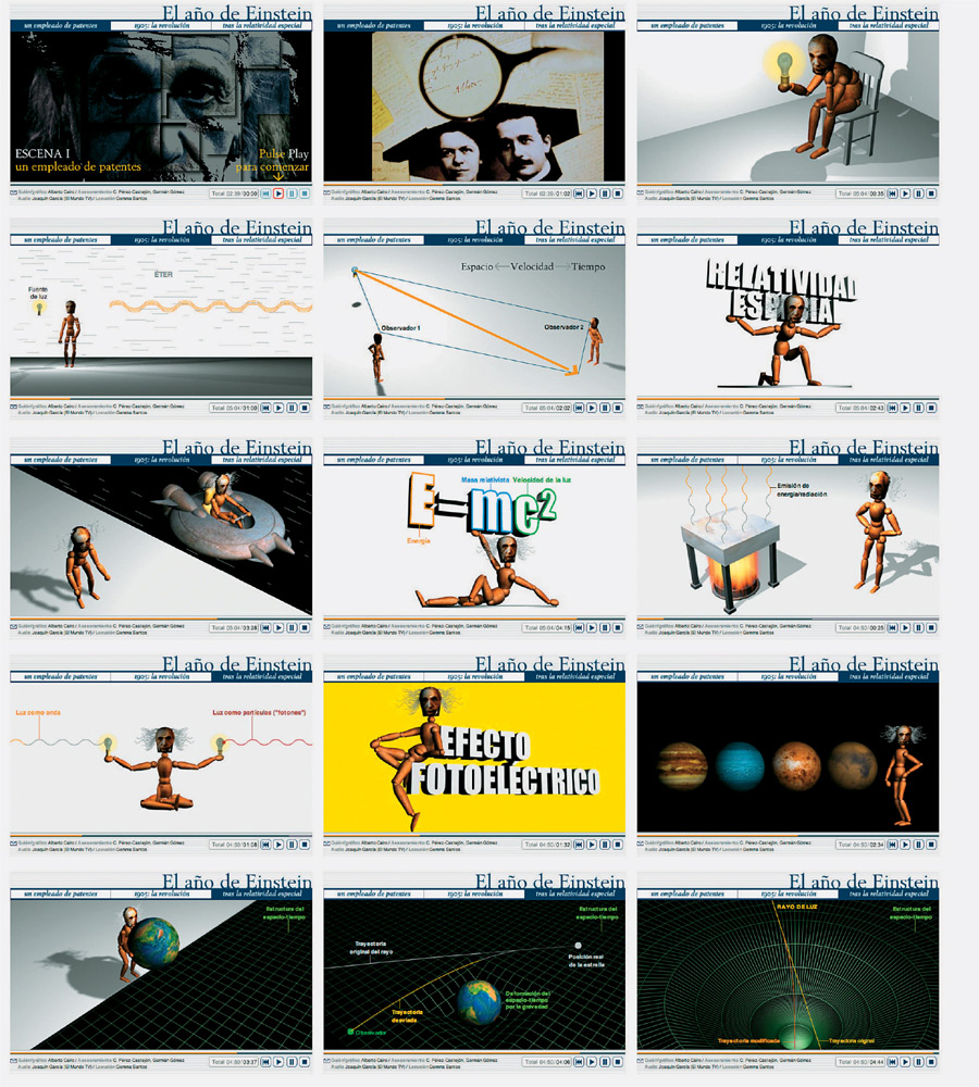
The frames of this multimedia documentary made for Spain’s newspaper El Mundo explain Albert Einstein’s landmark discoveries from 1905. Breaking complex concepts into small segments can help viewers understand complexity.
Alberto Cairo, United States
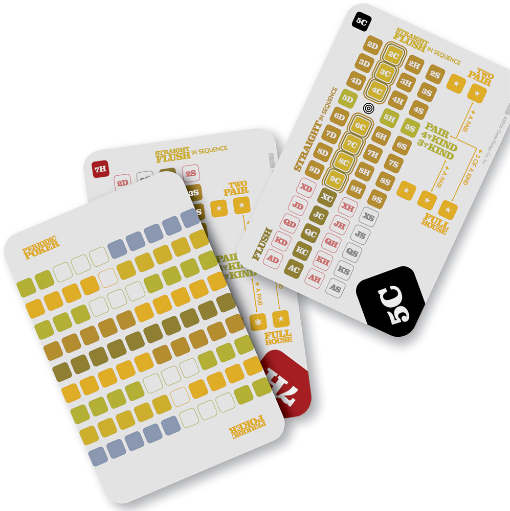
The complexities of poker are clarified with this deck that includes an on-card explanation of the additional cards needed for the best poker hand.
Drew Davies, Oxide Design, United States
Explaining Complex Concepts
The explanation of complex concepts often results in visually complex graphics. Complex graphics are information rich, conveying meaning through an increased use of detail, patterns, shapes, text, color, density, and diversity of elements. Viewers may have difficulty with these visuals because there are a greater number of pictorial stimuli to discriminate, identify, and process. Also, it takes longer to search through and to locate relevant information when a graphic is complex. One eye-tracking study found that visually complex Web pages produce a more scattered and disordered eye-scanning path than Web pages with fewer elements.5
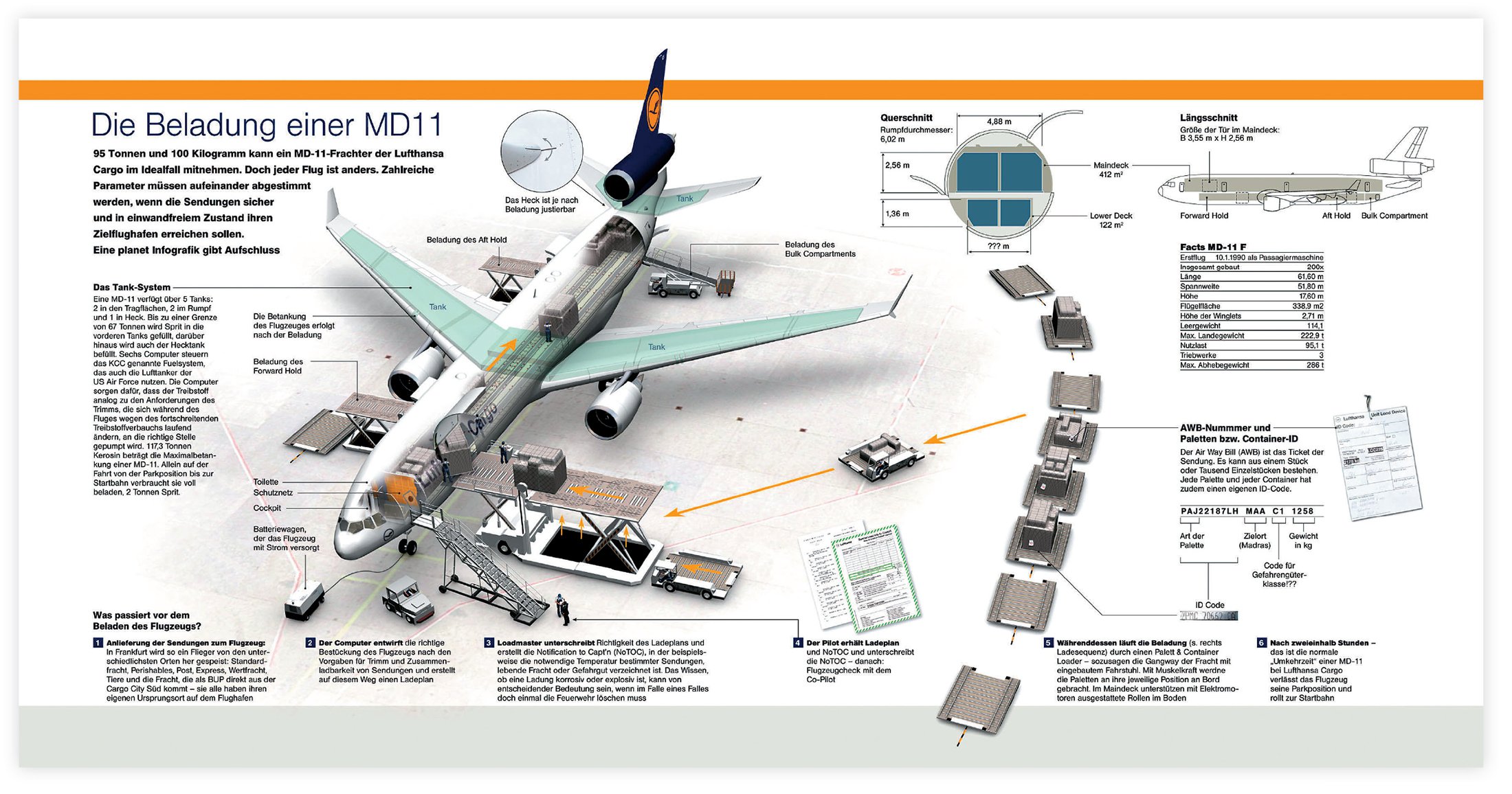
A complex explanation requires a visually complex graphic, as shown in these depictions of the import process at Frankfurt Airport for Planet magazine.
Jan Schwochow, Golden Section Graphics, Germany
The challenge for visual communicators is to provide a full and complete graphical explanation while accommodating the limits and strengths of human cognitive architecture. It is most effective when designers use techniques to clarify information rather than to simplify it. Although simplification is highly effective for many communication needs, some concepts and systems are too deep and too rich to pare down. As Evelyn Goldsmith writes in her book Research into Illustration, “Just as a verbal exposition sometimes needs to consider a number of issues in order to present an argument in its true perspective, so a drawing can lose much of its communicative value if in an attempt at simplicity it is denied an appropriate context.”
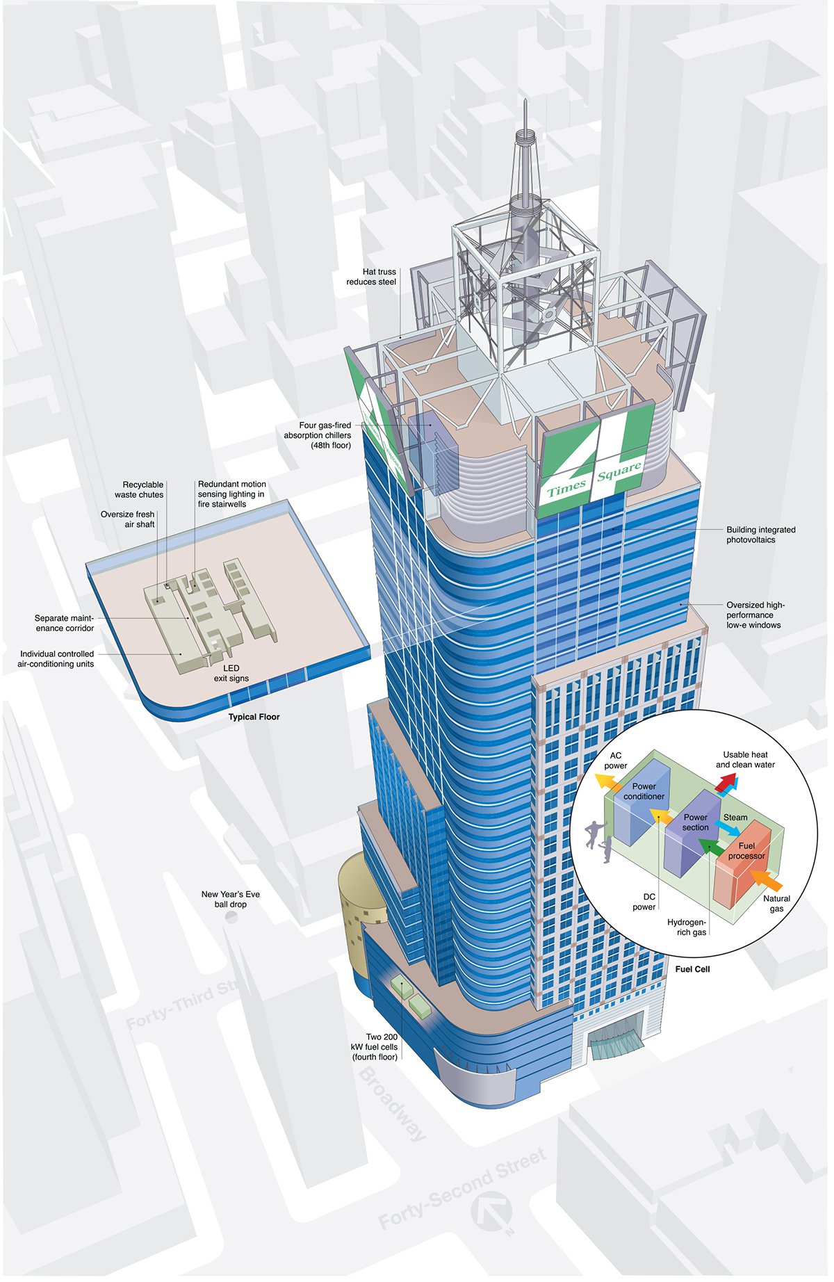
The features of the high-energy-performance Condé Nast Building are illustrated through call-outs and spot enlargements to make the explanation more effective.
Mathew Luckwitz, grafPort, United States
Cognition and Complexity
In a complex world, we are bound to seek all kinds of explanations to better understand it. We rely on previous knowledge, which is structured in mental representations or schemas, to perform cognitive tasks and to assimilate new information. Our schemas are often fuzzy and incomplete. Explanations help us refine them so they are more accurate. Our schemas may have conflicting and illogical concepts. Explanations help dissolve cognitive dissonance.
Regardless of whether it is visual or verbal, a complex explanation places a great demand on working memory. The more the informational components of an explanation interact, the greater the cognitive load. This is because understanding an interdependent system is more difficult than understanding elements in isolation.6 For example, cognitive load is greater in trying to understand how an entire computer network operates than in trying to understand how one component, such as a router, functions.
Fortunately, our cognitive architecture is equipped to handle complex information. When we come upon something new and complex, it is theorized that we gradually build up schemas into large entities in working memory in order to have more information simultaneously available.7 This ensures that the limited capacity of working memory will not be strained, as it can only accommodate a few entities at a time.
We also construct mental models to help us understand complex systems. Mental models, which are based on schemas, are broader representations of how different aspects of the world operate. They integrate what is common about a particular type of system or phenomena. For instance, a person who has an accurate mental model of how computer printers work will be able to use this mental model to operate almost any printer. While studying an explanatory graphic, viewers will construct a network of knowledge to understand it and will enhance their mental models with this new information.
Two important contributors to building accurate mental representations are coherency and context. Coherency refers to the consistent logic that makes an explanation meaningful. Coherent explanations might involve understanding cause and effect or the steps of a process. They contain a structure that makes sense. Just as verbal explanations require coherency, so do visual ones. Designers can ensure graphical explanations are coherent by ensuring that the order for viewing information is clear, extraneous information is limited, and the graphic is visually unified and logical.
The context of an explanation is the framework within which new information is assimilated. In picture comprehension, context is a constraining feature that determines what objects to expect and what not to expect in a particular type of visual. As a result, context helps to guide the viewer’s attention and influences how a picture is interpreted. It so strongly influences meaning that when something is perceived as out of context, it often does not make sense. Providing context in a complex visual explanation, such as showing the big-picture view and the detail in an inset, goes a long way in helping a viewer understand a concept.
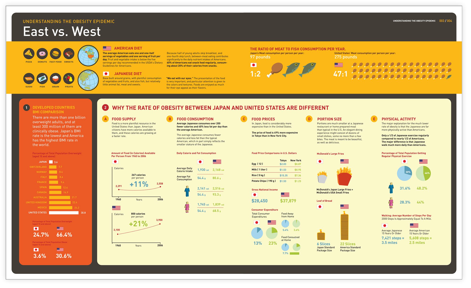
This visually coherent information graphic explains the causes of obesity in the United States as compared to Japan.
Alan Lau, United States

In this medical illustration for online patient-education materials, presenting the visual context of the stomach provides a reference for the viewer to understand the detail.
Joanne Haderer Müller, Haderer & Müller Biomedical, United States
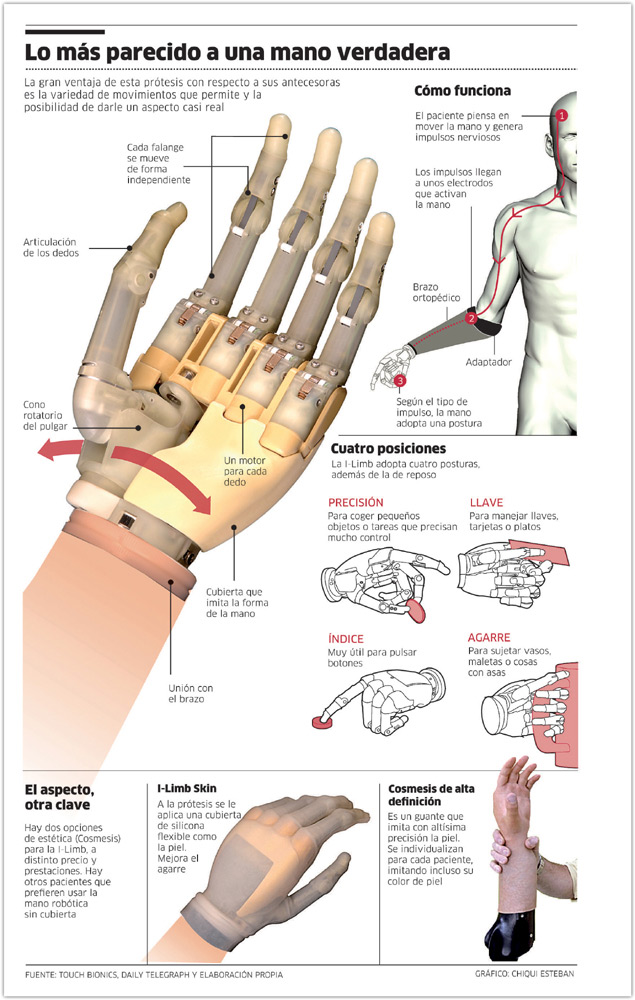
In this explanation of how a mechanical hand works for the Público newspaper, the main illustration with call-outs provides the context for the smaller explanatory segments that surround it.
Chiqui Esteban, Público, Spain
Applying The Principle
It is well known that viewers have an easier time understanding simpler graphics than complex ones. Increased complexity can interfere with the viewer’s ability to decode and interpret a visual. Thus, designers must find effective ways to clearly convey meaning without overwhelming the audience. A complex visual explanation does not require extraneous and distracting detail. It does, however, require the detail necessary for providing a coherent explanation.

In this poignant rendering of a woman with diabetes for the New York Times, a transparent view portrays the organs thought to be associated with the disease.
Bryan Christie, Bryan Christie Design, United States
Several visual approaches can facilitate building accurate schemas and appropriate mental models without overloading the audience. One is to segment complex content into smaller units to minimize the amount of information processed at one time. Organizing information into smaller chunks allows schemas to slowly build up so that content can be gradually understood and ultimately integrated into one whole. Segmenting can take many forms. A designer can present simpler visuals first and then progressively reveal more complex components. Or a complex task can be broken down into simpler steps that form a chronological sequence. Alternately, information can be divided into frames and animated. Any of these approaches can potentially decrease the cognitive demands placed on the viewer.
A second approach to clarifying complexity is to expose parts and components that are normally concealed. This can include a straightforward portrayal of what is normally hidden from sight, creating a variety of interior views, such as cutaways and cross sections or using pictorial devices to show movement. These approaches reveal the inner form of an object or system, conveying new meaning about how things are structured and how they function.
A third technique for clarifying complexity is to reveal the inherent structure of the information, which conveys its organizing principle. Inherent structure is based on an intuitive understanding of how information is ordered. For example, in a calendar, information is structured in months and days. In a graphic about soil, information is structured in layers. This cognitively natural approach provides a somewhat abstract path to facilitating comprehension. When a graphic is visually organized so that it makes conceptual sense, it helps viewers get the message.
The success of creating a complex visual explanation depends on whether the visual techniques meet the goal for which the graphic is created and accommodate the prior knowledge of the viewer. When clarifying complexity, designers and illustrators must balance the cognitive requirement for detail with the knowledge that viewers can become overwhelmed with too much visual information.

These Christmas Cheat Sheets (one for male and one for female) were created to provide a person’s clothing sizes to potential gift givers. The form is organized by the inherent structure of the information.
Simon Cook, United Kingdom
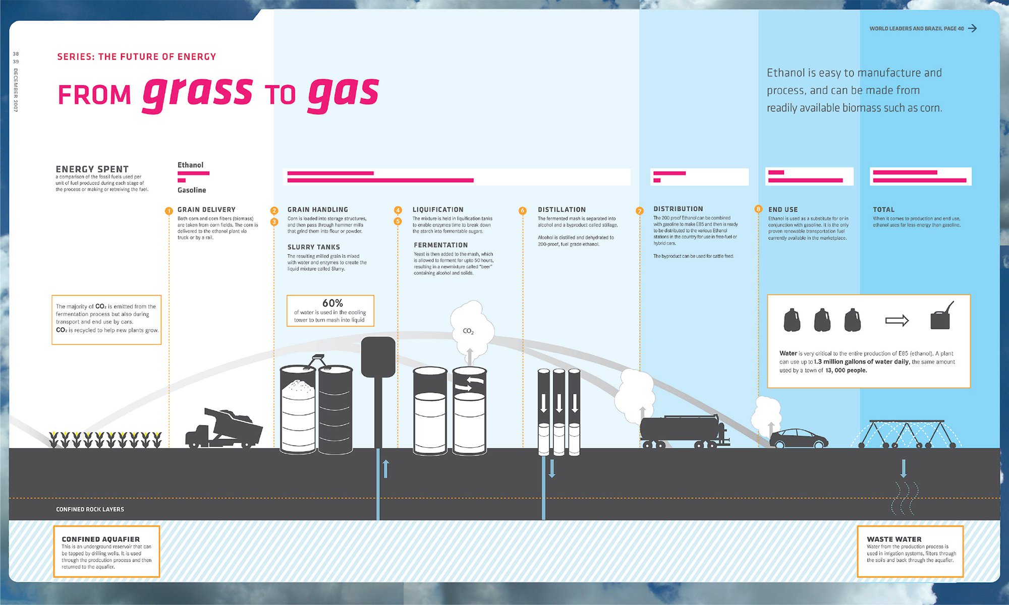
Text and images in this information graphic are sequenced to pace the information presentation of the ethanol manufacturing process.
Nivedita Ramesh, University of Washington, United States

Information has an inherent structure. A poster celebrating a library’s 400-year anniversary is structured out of 400 books.
Boris Ljubicic, Studio International, Croatia
SEGMENTS AND SEQUENCES
Providing a complex visual explanation in one spatial layout can result in a cluttered composition of disorganized ideas. It takes thoughtful restraint and controlled logic to pace an explanation or to organize it into a sequence with a beginning, middle, and end.
Research has shown that when the entirety of an explanation is presented all at once, people are less likely to comprehend it.8 In particular, people feel overwhelmed when confronted with complex information for which they have little prior knowledge. Essentially, the amount of processing required to understand the information exceeds what the person can hold in working memory. One effective way designers can avoid creating cognitive overload is to segment information into digestible pieces.
Information segmentation is particularly effective because it is a natural cognitive strategy we use to decompose our world into smaller units. Babies segment sounds when they learn to speak; authors segment books into chapters and topics; designers segment graphics into dominant and subordinate elements; and songwriters segment songs into verse and chorus. We routinely use segments to internally manage our world. As we experience the activities in our life, we naturally parse them into temporal segments and think of them as separate events. We do this because when information is in smaller entities, it is easier to manage in working memory and easier to fit into existing schemas for future storage and retrieval.9

In this explanation of how to use Netflix for Stanford magazine, dividing the visual into small chronological steps helps to avoid cognitive overload.
Nigel Holmes, United States
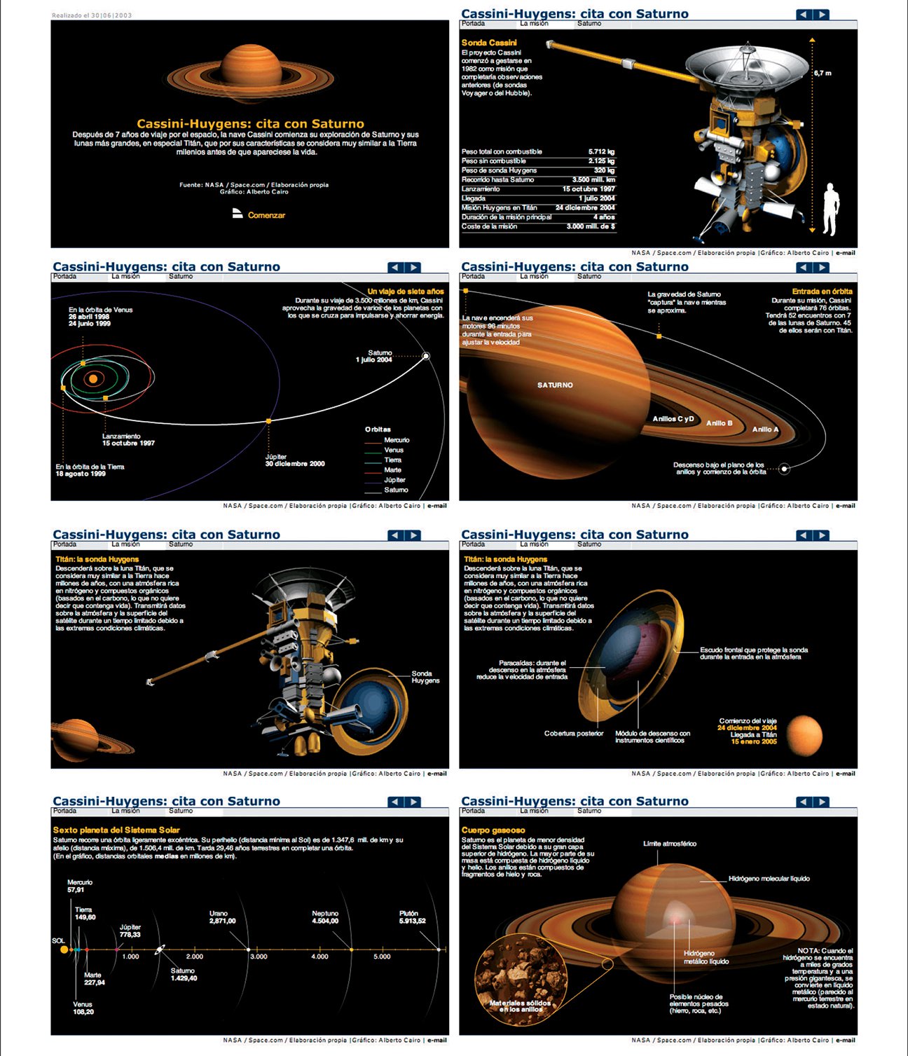
NASA’s Cassini-Huygens mission to explore Saturn is a complex online explanation created for El Mundo. Breaking it into interactive segments controls the pace of the presentation, which helps viewers slowly build their comprehension.
Alberto Cairo, United States
Graphic designers can segment information by dividing a visual into small but meaningful units. Each unit groups conceptually related information. Segmenting slows the pace at which information is introduced, allowing viewers to take the time to process a minimal number of concepts before moving on to the next one. People understand and learn more deeply when information is presented in smaller segments rather than larger ones.
Segmenting is a risk when a viewer cannot combine the individual segments into one coherent mental model. The segment must be maintained in working memory until the person views the next portion of the graphic. Some viewers may be unable to integrate across units of information when a composition is visually fragmented. To avoid this, ensure that the viewer gets the holistic view of a concept or system while studying the smaller segments. This can be achieved in several ways: depicting the big-picture view to provide context; introducing the overriding concept at the start; providing visual continuity to the information; and slowly building on previous concepts. In addition, the designer should ensure that a segmented visual connects elements by directing the viewer’s eyes using the compositional techniques or pictorial devices discussed in Principle 2, Direct the Eyes.
Sequencing is a special type of segmenting that presents information in a chronological order, similar to how it would occur in the real world. This is an effective approach for explaining a procedure, a set of steps, cause and effect, or a complex idea where one principle builds on the next. When creating a sequence, prioritize the information to determine its logical order and display it from left to right or top to bottom. Ensure that the relevant details are displayed for each step, avoiding too much simplification so that information associated with the concept or task does not get lost.
An advantage to sequencing is that it groups important visual information together, often through proximity, a connecting line, or a visual boundary. When items are perceptually organized into a group, they are represented together in visual working memory. This enhances the probability that the information will be encoded as one group into long-term memory.10 Sequential presentations are also processed faster and tend to increase comprehension.11
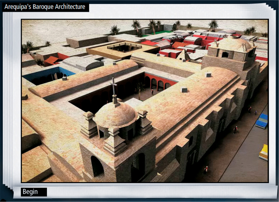
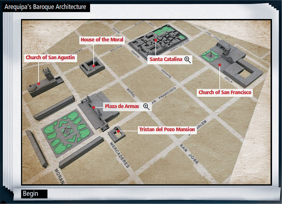
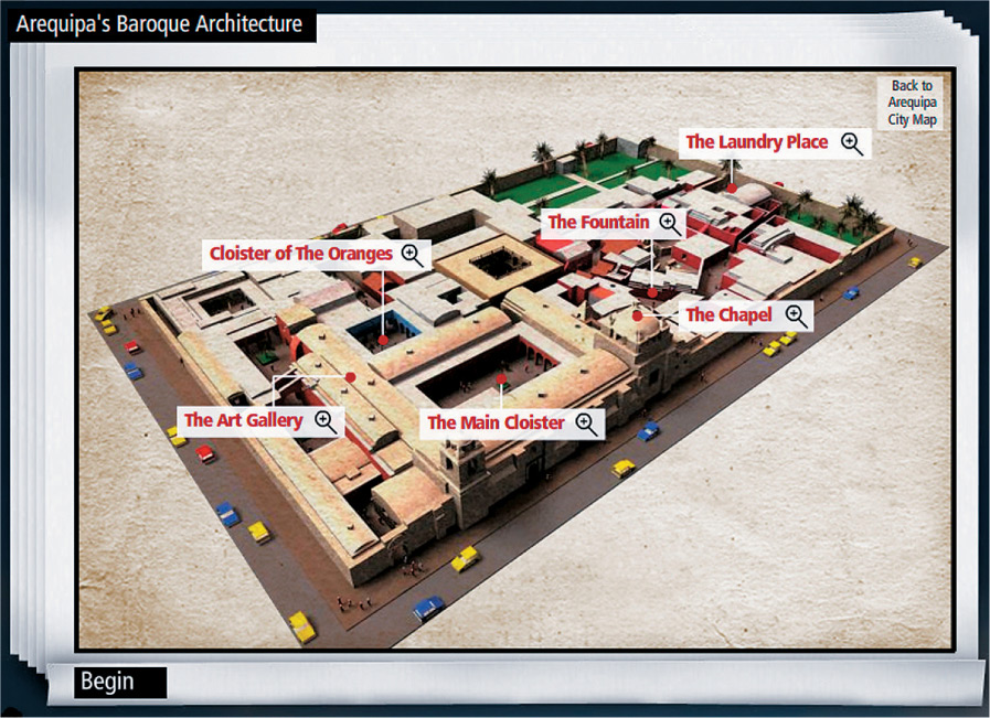
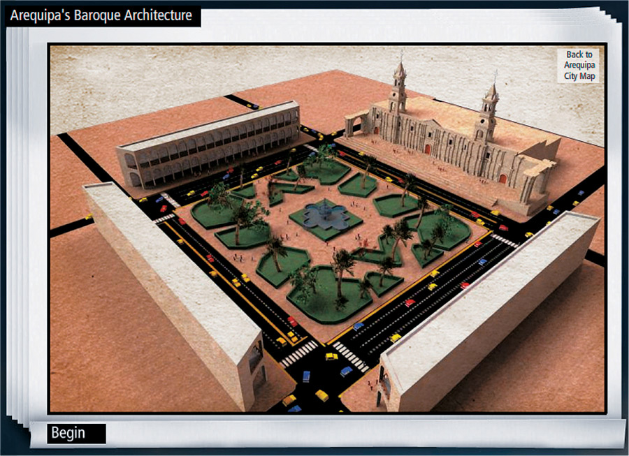
Renderings and descriptions of the architecture in Arequipa, Peru, are presented in multiple interactive segments to gradually present the information.
Vu Nguyen, Biofusion Design, United States

This visual guide breaks down the assembly and disassembly of a medical device into a sequence of clear and discrete steps. This approach facilitates comprehension, allowing working memory to process one step at a time.
Aviad Stark, Graphic Advance, United States
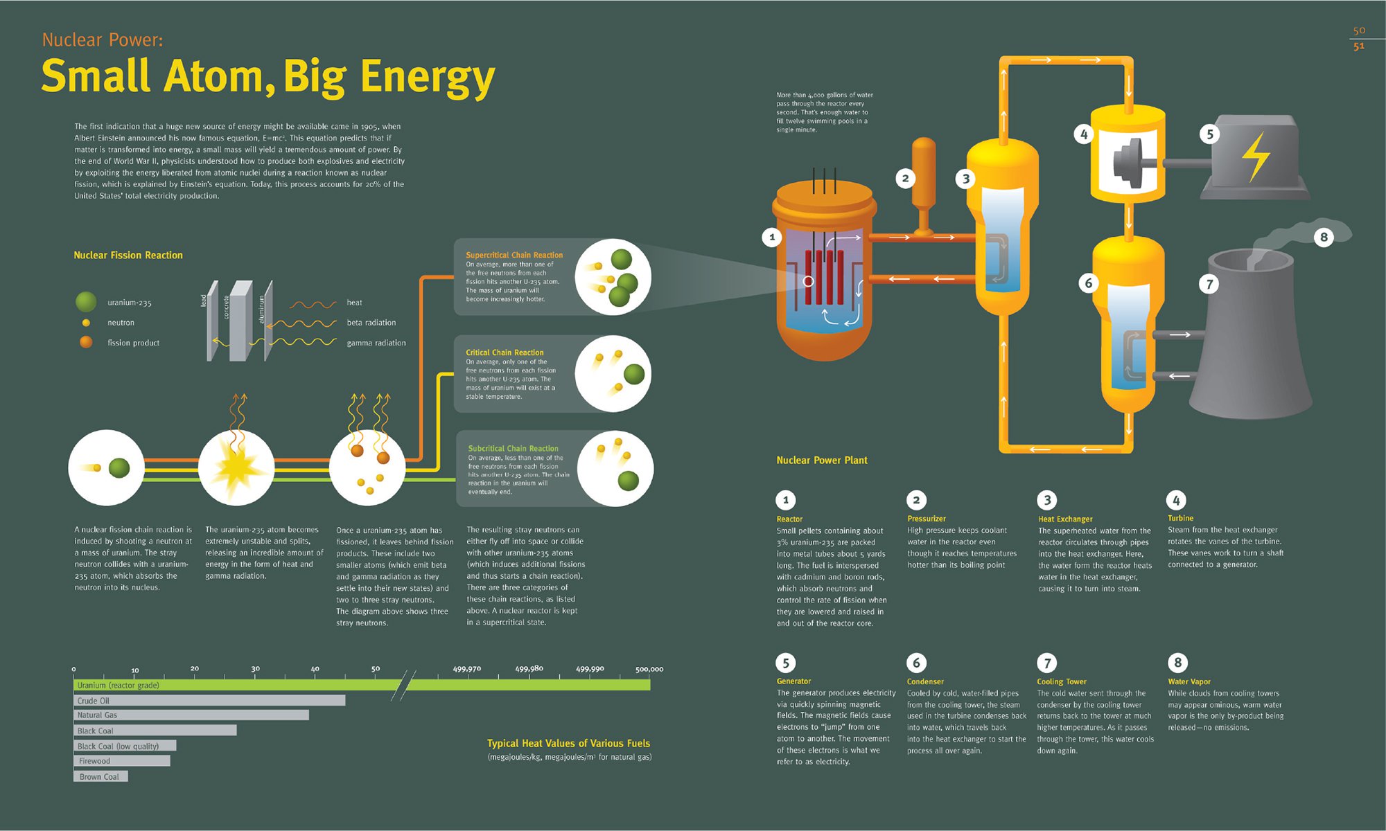
In this visualization of how nuclear power is generated, the procedure is clearly sequenced to make a complex process comprehensible.
Kimberly Fulton, University of Washington, United States
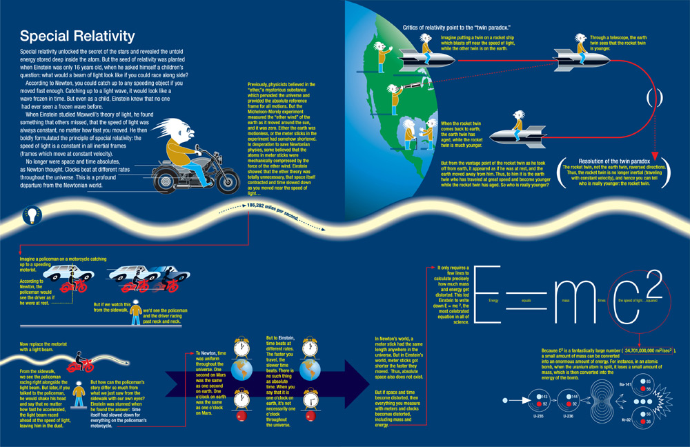
An explanation of Einstein’s theory of special relativity for Discover magazine is incrementally presented in small segments so one concept can build on the next.
Nigel Holmes with Michio Kaku, United States
SPECIALIZED VIEWS
Although our visual system is remarkably intelligent, it does have its physical limitations. Many structures and mechanisms are invisible to the unaided eye, and many processes can only be seen through their outcomes. Revealing what is physically hidden and depicting unobservable phenomena through special forms of representations and pictorial devices are effective ways to portray complex systems. Cutaways, magnifications, and other interior views work well for depicting structural information. Techniques that depict movement are valuable for communicating functional information.
Specialized views comprise any technique that allows a person to see through the obstructions of the surface and beyond tightly assembled components. These types of graphics are based on the conventions of technical illustration, defined as “a technique used to graphically present complex parts and assemblies so that professional and lay people alike can understand their form and functionality.”12 As graphic designers and generalist illustrators increasingly create explanatory graphics, they find ways to make complex content more accessible and engaging.
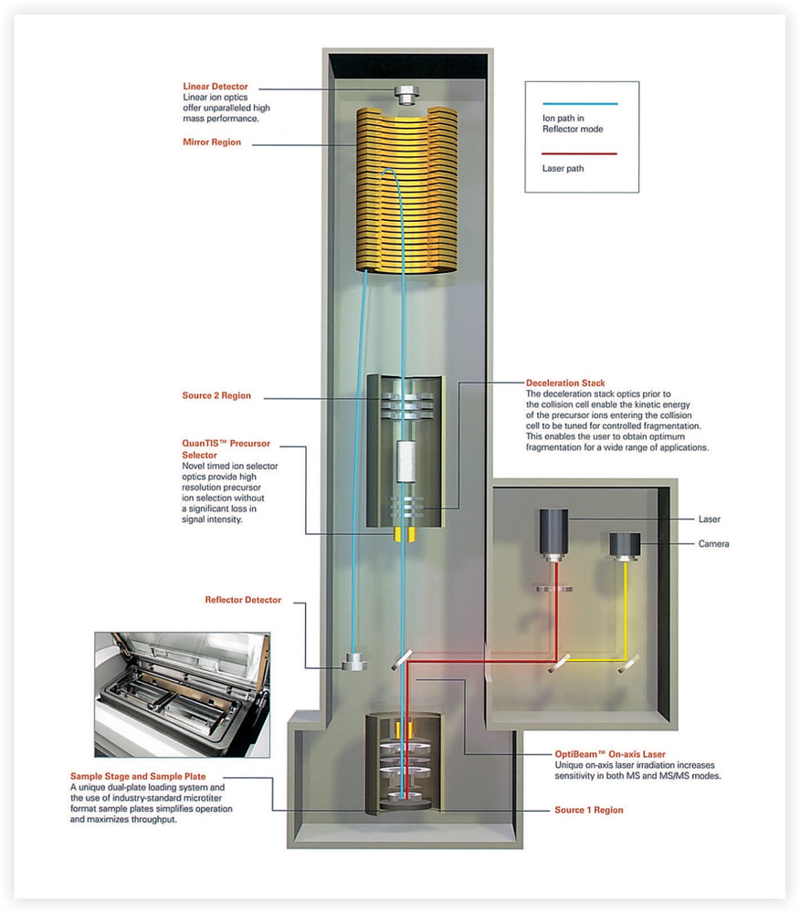
In promotional materials for a scientific device used for protein analysis, the interior view and call-outs help clarify the optics technology inside.
Amy Vest, Applied Biosystems Brand & Creative Group, United States
To break through the complexity barrier, designers must keep in mind that novices use different cognitive strategies than experts. “Experts are expert not only because they know more but critically because they know differently,” write David Evans and Cindy Gadd in Cognitive Science in Medicine. When learning about physical systems, the internal representations of a novice focus on the static physical structures with minimal understanding of how things function and operate. Experts have a more integrated model that incorporates the structure, functions, and behaviors of a system.13
Contrary to many of the recommendations in this book, increased realism in a graphic may be more effective than highly schematized drawings when viewers will need to apply their knowledge about a physical system to a real system. In this case, highly schematized drawings that omit too much detail can lead to misunderstandings.14 These findings validate the principle that clarifying rather than simplifying complexity is most effective.

The explanations of physical objects and systems often require specialized views because we can often only see the tip of the iceberg, as illustrated here for Scientific American.
David Fierstein, David Fierstein Illustration, Animation & Design, United States

Cutaway views help people understand a system’s components and how they are configured, as shown in this intricately detailed rendering of the Hubble Space Telescope created for NASA.
George Ladas, Base24 Design Systems, United States
Interior Views
Cutaways, cross sections, and transparent views are established ways of portraying the interior structure of a system. Complex objects and systems are difficult to imagine when their parts are obscured. Cutaways usually remove around one-fourth of the surface so a particular interior region is visible. The view inside is often rendered through a window or tear. As a convention, a jagged or rough edge along the viewing window conveys that a cut has been made, and its inner texture often conveys the quality of the enclosing skin. Interiors are often shown as cross sections, which depict an object cut off at right angles to its axis. Even more revealing are transparent or phantom views that make the exterior surface of an object invisible so the full internal structure is exposed.
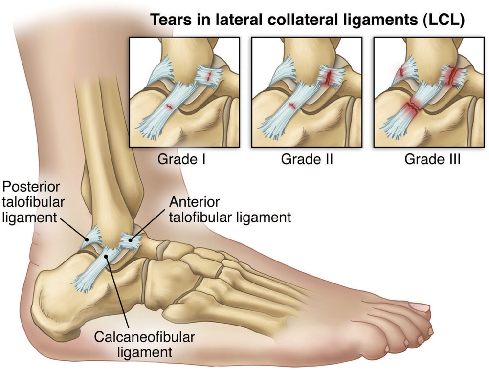
This visual depiction of an ankle sprain for patient-education materials reveals and magnifies a targeted area of the skeletal system to clarify a complex concept.
Joanne Haderer Müller, Haderer & Müller Biomedical Art, United States
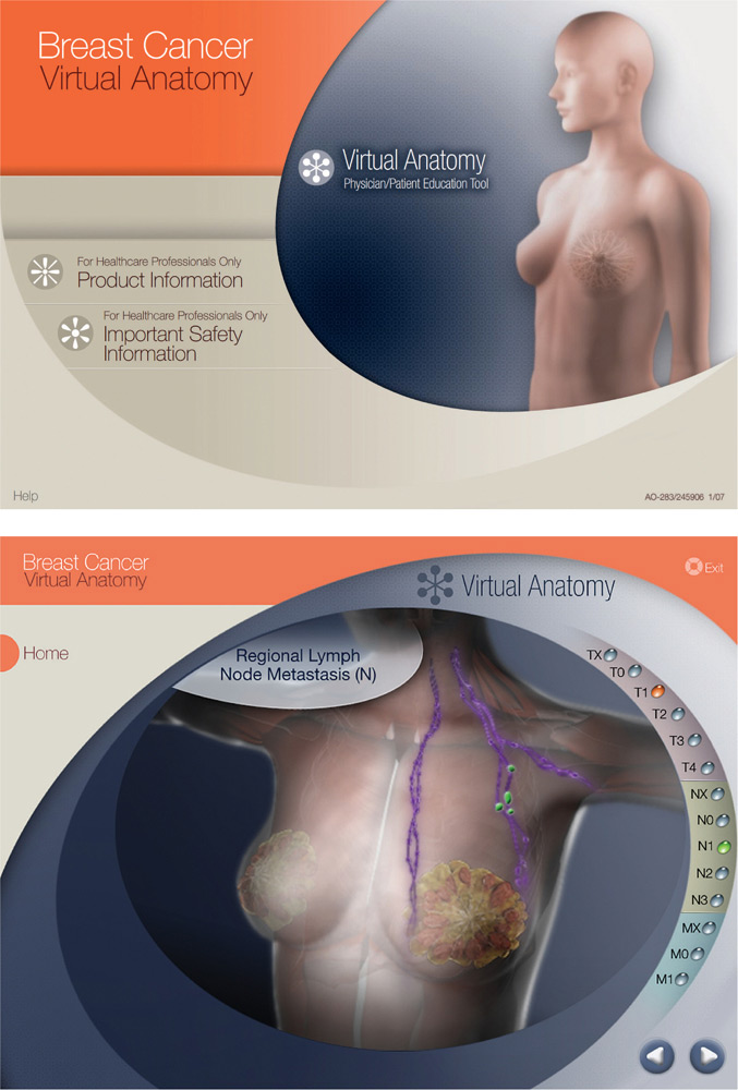
In this virtual anatomy presentation, a transparent view of the human body enables physicians to visually explain the progression of breast cancer to their patients.
Nicola Landucci, CCGMetamedia, United States
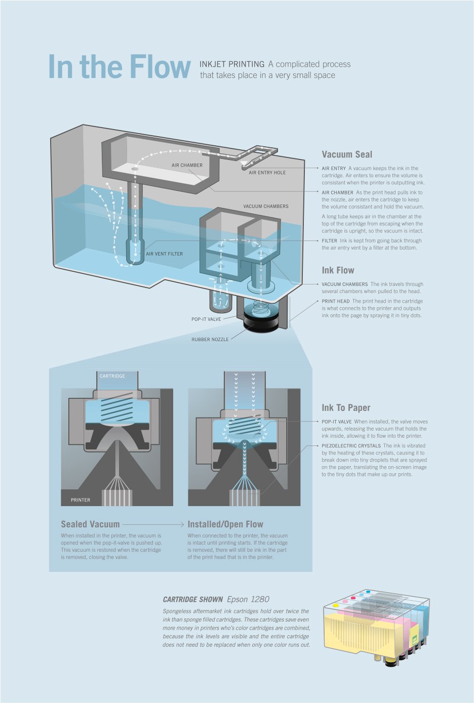
This explanation of the inkjet printing process is shown through several specialized views that will help a viewer build a correct mental model. The transparent view portrays the system and how it functions. Cross-sectional views provide details about how a cartridge operates.
Jacob Halton, Illinois Institute of Art, United States
Exploded Views
When a machine, architectural structure, or organism has hidden parts that cannot be fully seen with a standard interior view, an exploded version can provide even greater clarification. Exploded views show the components of an object in their correct arrangement, though slightly separated and spread along a common axis, to reveal how they fit together. This is one way to show both the details of the individual parts, their relationships, and the order in which they are assembled.
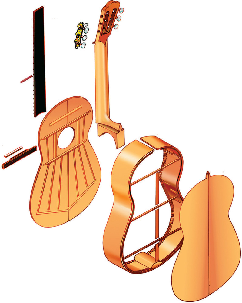
Pictorial graphics that show how the parts of an object are assembled, as in this exploded view of a classical guitar, provide a greater understanding of a system’s structure.
George Ladas, Base24 Design Systems, United States
If the proportions of the exploded pictorial graphic do not fit within the constraints of the layout, the parts may be moved out of alignment. Flow lines can then indicate where the parts fit into the assembly. Call outs are helpful for naming the parts that may be referenced in a verbal explanation. Although exploded views typically convey structure, the drawing can also convey function with the addition of arrows to indicate movement.
Depending on the purpose of the graphic and the qualities of the object, exploded views do not necessarily require a realistic rendering. It is not uncommon for the parts of a device to be portrayed as a line drawing because the components are recognizable by shape. This type of simplification may be helpful when the graphic is used for the purposes of assembly or disassembly. When exploded views are rendered for homes and buildings, increased realistic detail is often appealing. Because exploded views usually eliminate any type of occlusion, viewers get a better understanding of structure.
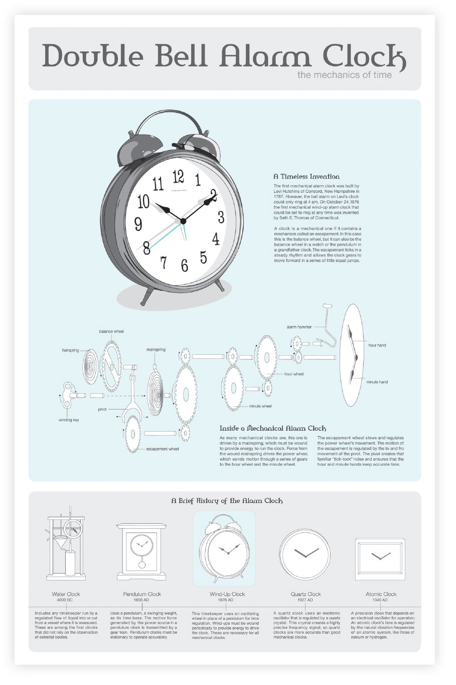
The exploded view in this information graphic about the mechanical alarm clock clarifies its internal structure and how the gears move.
MaryClare M. Crabtree, Illinois Institute of Art, United States
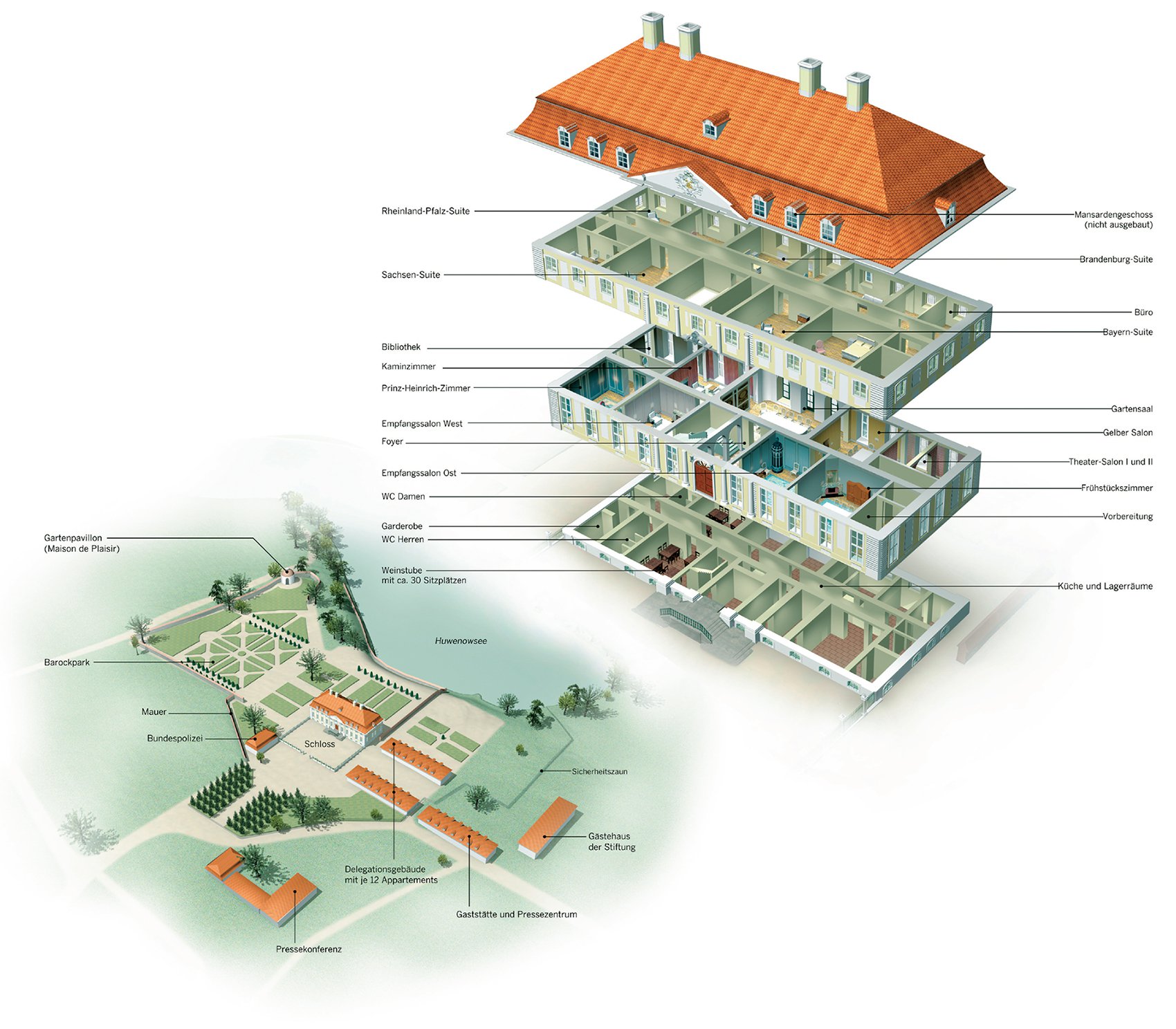
An exploded view of Castle Meseburg for the German Sunday paper Welt am Sonntag allows for an extremely detailed view of the interior.
Jan Schwochow, Katrin Lamm, Juliana Köneke, Jaroslaw K. Kaschtalinski, Golden Section Graphics, Germany
MAGNIFICATION
Magnification or zoom-ins portray a level of detail that offers a fine-tuned perception of an object. Increasing the level of detail is valuable for focusing on the crucial aspects of a device or system. Usually, the detail is enlarged and arranged as an inset or in a shape of a contrasting color. To highlight the detail, the magnified area can be pulled away from the main illustration but remain connected with lines, arrows, or a zoom effect. An advantage to enlarging individual areas of an object is that the main illustration provides the needed reference for context. This provides a holistic view before the viewer delves into the details.
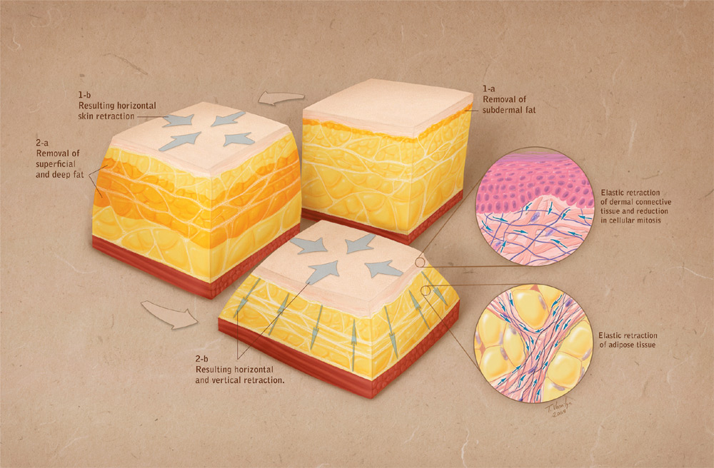
Detailed areas of skin are magnified to better explain how skin retracts as a result of liposuction.
Travis Vermilye, Travis Vermilye Medical & Biological Illustration, United States
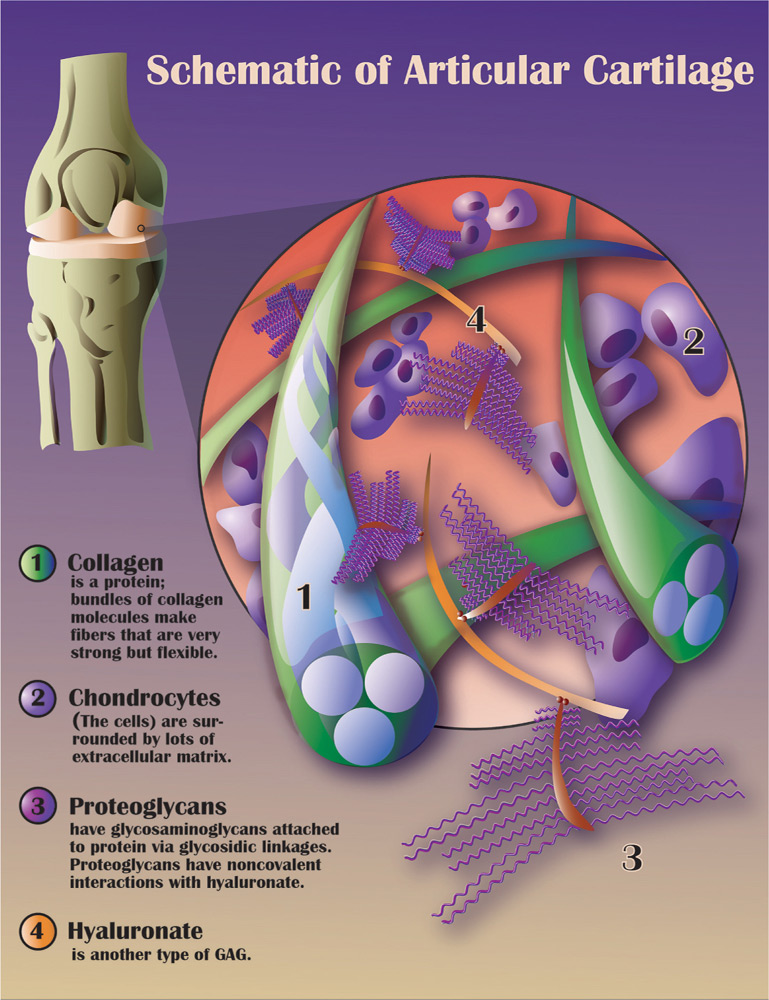
This visual explanation of articular cartilage uses a stylized approach to depict the magnified area of the illustration.
Melisa Beveridge, Natural History Illustration, United States
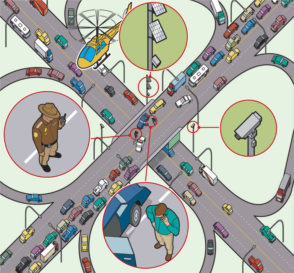
In this overview of how a traffic accident is reported for CIO Insight magazine, the significant areas of the graphic are magnified to help the audience understand the explanation.
Colin Hayes, Illustrator, United States
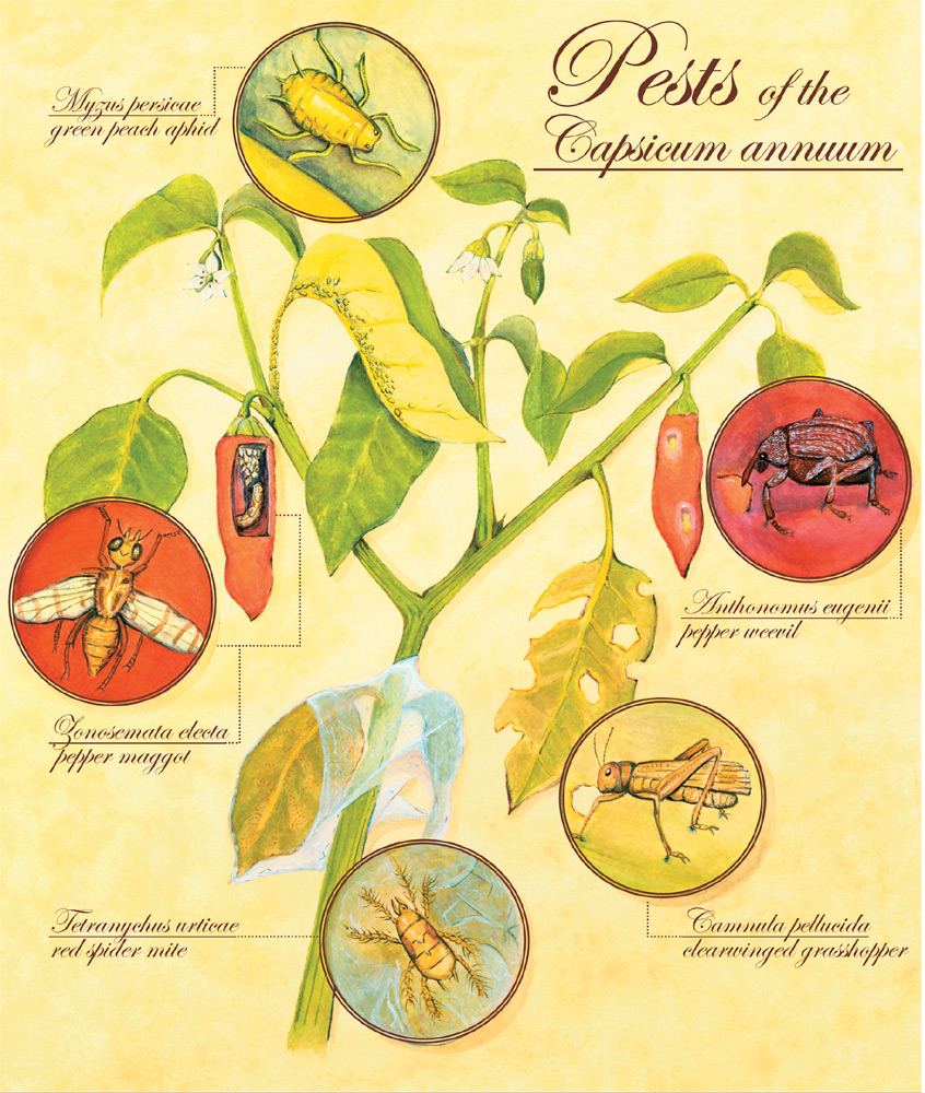
This elegant illustration uses magnification to show the pests of the pepper plant along with the damage they cause.
Melisa Beveridge, Natural History Illustration, United States
IMPLIED MOTION
Although static interior views are effective at showing structure, they don’t clarify the dynamic aspects of a system or concept. Representing motion is important, however, for explaining the workings of a machine, the assembly of a product, human movement, and the dynamics of unseen forces. They clarify the ambiguity that might occur from a structural view and help a viewer to build a dynamic mental model that represents how something moves. Several powerful techniques can create the mental impression of movement. These include motion lines, stroboscopic movement, action arrows, and motion blur.
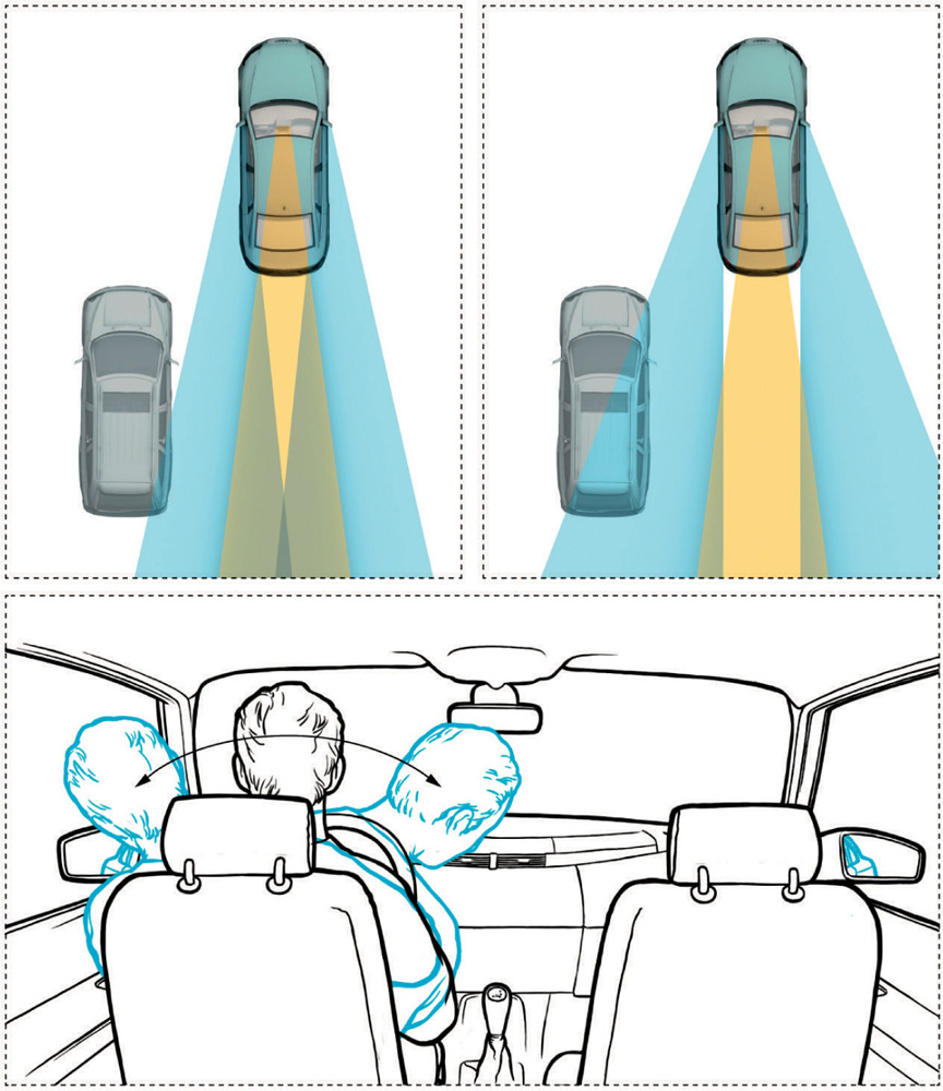
Arrows convey the correct approach for using side mirrors while passing a car in a graphic for Popular Mechanics magazine.
Jaroslaw Kaschtalinski, Golden Section Graphics, Germany
Motion lines are the set of streaking lines placed behind an object or person to suggest speed. Several studies that examined motion lines found this technique to be quite successful at conveying the impression of quick movement and the direction of motion.15 Stroboscopic movement, on the other hand, simulates motion by depicting a progression of images that are similar in size and shape but differ in their position or pose. The difference between each image creates the rhythm of the motion. A ghosting technique that creates a transparent object or person makes the transition between images seem even smoother.
A common way to depict motion and its direction in scientific and technical illustrations is with arrows. The arrows are often curved to convey a sense of action. Because the arrow symbol seems to have limitless uses, action arrows often depend on context to be understood. Another technique for showing movement is motion blur. This is often depicted in photographs. A disadvantage to blur is that much of the object’s detail can be lost with this approach.
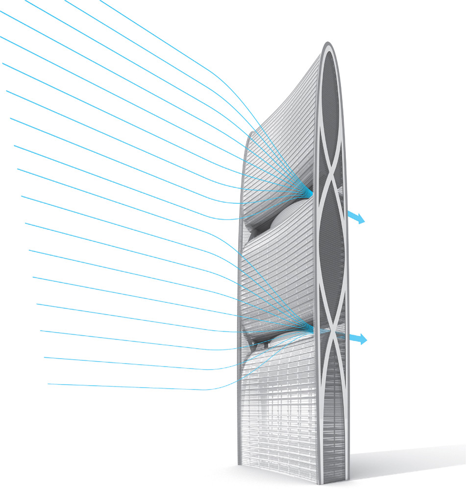
Arrows demonstrate the ventilation in an eco building—the Pearl River Tower in China.
Bryan Christie, Bryan Christie Design, United States
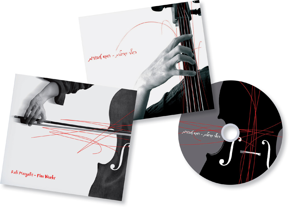
This CD packaging for cellist Rila Margalit communicates the complex notion of virtuoso ability through the expressive use of motion lines.
Ira Ginzburg, B.I.G. Design, Israel
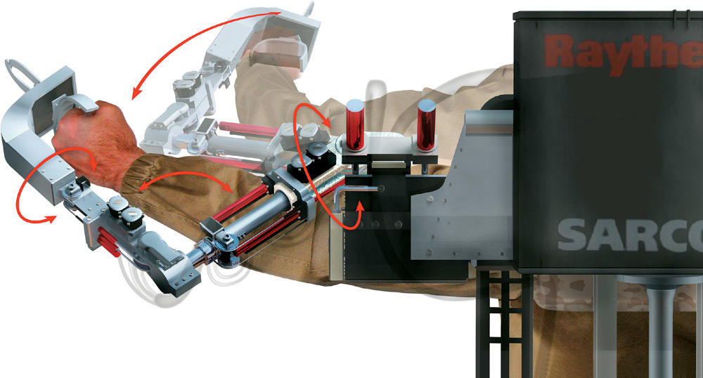
Viewers understand that the curvature of arrows depicts movement in the context of an explanatory graphic, as in this one about a robotic arm for Popular Science magazine.
Kevin Hand, United States

The use of ghosted stroboscopic movement deftly simulates the action of a snowboard move.
Kevin Hand, United States
INHERENT STRUCTURE
An inherent structure underlies information just as the spokes of an umbrella underlie its covering. Visual communication depends upon structure, and viewers rely on it as a feature that conveys the nature of a graphic. In the radial structure of the genome map shown, the organizing principle transmits a sense of energy, of a biological or mathematical form—a basis for life. The lack of visual hierarchy conveys that all chromosomes have equal importance and are generated from the same source. Thus, the sensory impression of the graphic’s structure helps us interpret its meaning.
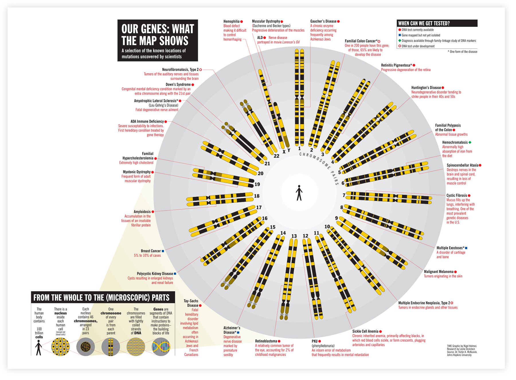
A radial structure, which seems to reflect life itself, is used to map some of the known mutations in the human genome in this information graphic for Time magazine.
Nigel Holmes, United States
Our visual and cognitive systems make sense of the world by understanding structure, which is based on the relationships between entities. Phillip Paratore describes this in his book Art and Design: “Meaning emerges from relationships. Nothing exists or is perceived in isolation. A design acquires its form and meaning from the relationships on which it is based. In pictorial design, this is called composition; in music, orchestration; in nature, ecology. The process of developing meaning through the organization of relationships is analogous in all fields, in all media and for all artists.”
Memory for content improves whenever information is organized. The theory behind this is that spatial and physical features of the visual structure may be encoded along with the semantic structure of the information. Consequently, when information in memory is well organized, it is thought to be easier to retrieve and to integrate with new information.16 Researchers have found that memory improves dramatically when people apply hierarchical organization to large amounts of information.17 This is the basis for the learning strategy known as information mapping, in which people are taught to represent concepts in spatially constructed diagrams to improve their memory of it.
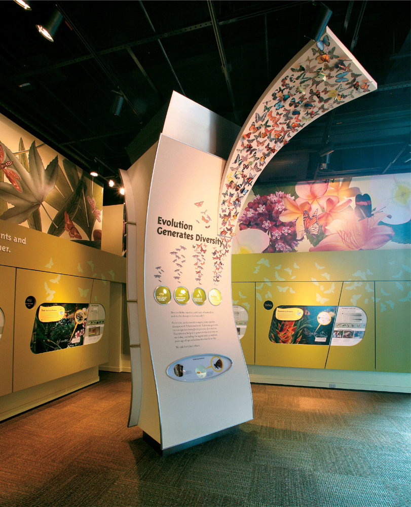
The structures of these exhibit displays, showing the coevolution of butterflies and plants, are based on organic shapes and seemingly random arrangements to emphasize the diversity of nature generated by evolution.
Vivien Chow, Edmund Li, Fang-Pin Lee, Pauline Dolovich, Tony Reich, and Stephen Petri, Reich + Petch, Canada

In this exhibit portraying biological evolution for the Smithsonian Institution, the evolutionary relationships of mammals are conveyed by their placement on the double-helix structure of the DNA molecule.
Vivien Chow, Edmund Li, Fang-Pin Lee, Pauline Dolovich, Tony Reich, and Stephen Petri, Reich + Petch, Canada
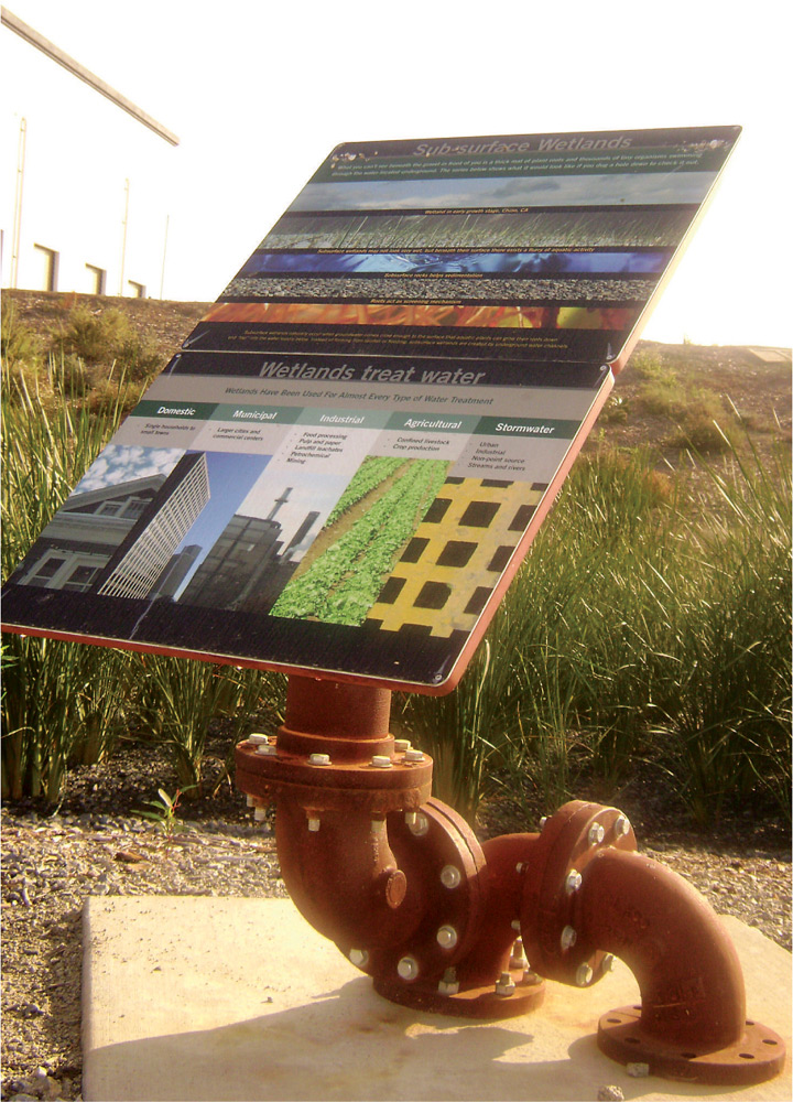
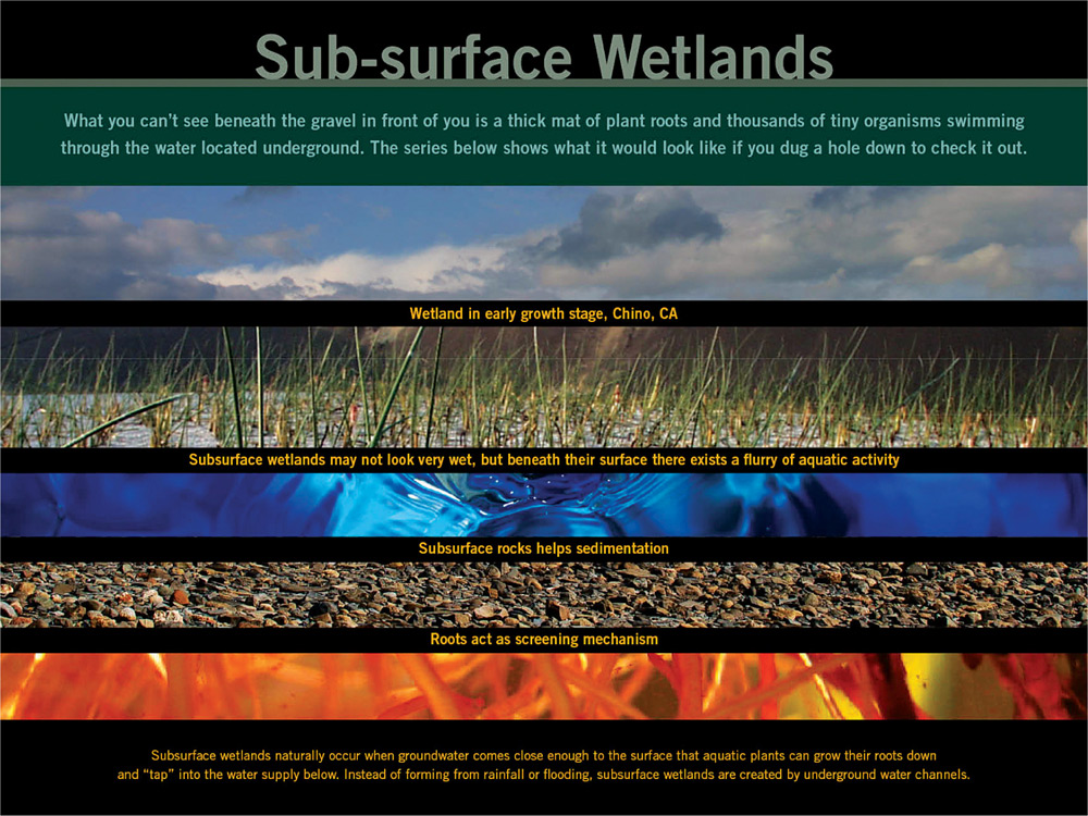
The layered visual structure of this exhibit signage mirrors the actual structure of the subsurface wetlands that it explains.
Claudine Jaenichen and Richard Turner, Jaenichen Studio, United States
Establishing structure usually involves more than just ordering elements in an aesthetic arrangement. It entails finding the conceptual basis of the graphic’s meaning and expressing this through visual language. Visual structures are as varied as there are types of information. For example, the designers of an exhibit that explains mammal evolution and diversity used the structure of the DNA molecule as the organizing principle.
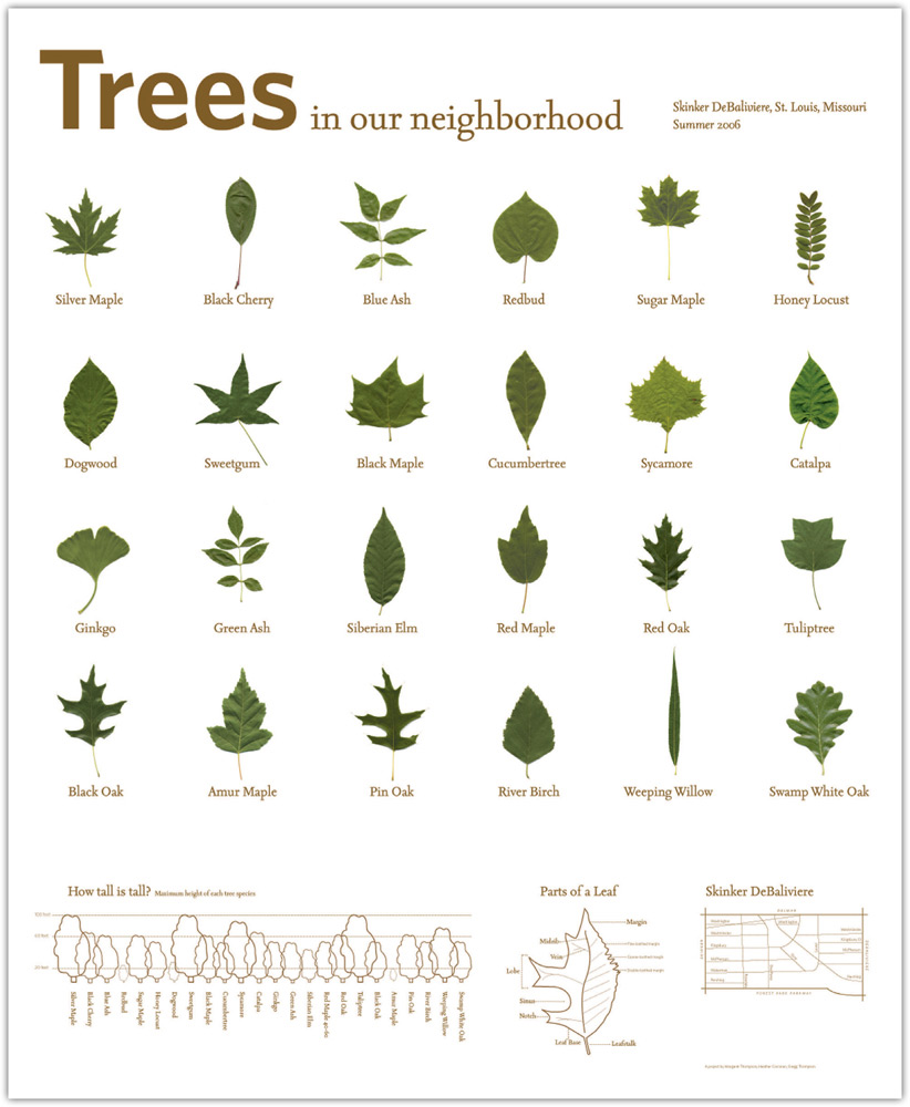
Some information is best organized by physical attributes, when the conceptual purpose is to help viewers discriminate between visual forms, as in field guides. When a set of varied forms are arranged in proximity to one another, the viewer can make comparisons and understand the similarities and differences between objects. It is one way that viewers can build knowledge through inference.
Structuring visual elements according to their organizing principle can have a profound effect on how someone perceives information. In his book Information Anxiety 2, Saul Wurman writes, “Each way of organizing permits a different understanding; each lends itself to different kinds of information; and each has certain reassuring limitations that will help make the choices of how the information is presented easier.”
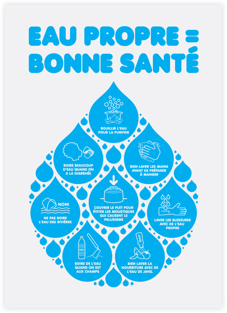
In this informational poster about the proper uses of water, the information is arranged in a droplet structure. This enables viewers to quickly get the gist of the visual, promoting a preunderstanding of the message.
Nathanaël Hamon, Slang, and Jaana Davidjants, Wiyumi, Germany
Graphic designers may find Wurman’s approach to information architecture useful. Known by the acronym LATCH, his recommendation is to order information by location, alphabet, time, category, and hierarchy. Wurman states that this organizational system is the basis for almost all of the structured information we encounter, from telephone directories to entire libraries. Many of these organizational structures are so embedded in our cognitive strategies, we use them without much thought, as when we alphabetize a filing system.
The LATCH system is particularly helpful when considering how to organize large amounts of information. For example, a catalog of retail goods can be sorted by alphabetical order or category of item. A brochure of seasonal performances can be ordered by performance category, season of event, or a hierarchy ranging from the most popular to the least known. For designers, the essence of this approach is to translate the organizing principle into an effective visual form.
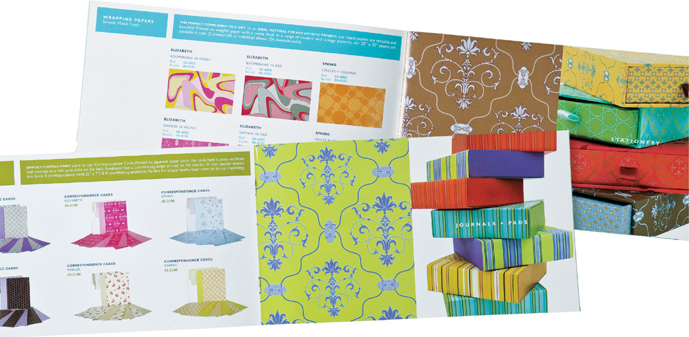
When information is organized into logical categories, as in this paper catalog, it enhances the perception of the products.
Wing Chan, Wing Chan Design, United States