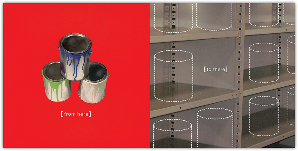
PRINCIPLE 2
DIRECT THE EYES
“If the viewer’s eyes are permitted to wander at will through a work, then the artist has lost control.”
JACK FREDERICK MEYERS, The Language of Visual Art
Although we think of the brain as a system that can process massive amounts of data in parallel, the quantity of input coursing through the optic nerve every second is actually more than the brain can squeeze into conscious awareness. Thus, we shift our visual attention from one location to another in a serial manner to extract the information we want. An interesting feature in the environment may attract our eyes, or an internal goal may direct our attention. Likewise, when viewing a graphic we attend to what is most compelling. Prominent features in a graphic compete for our attention, so if we are not given visual direction we may dwell on the wrong information or become overwhelmed with too much information. To find meaning in what we see, we must selectively attend to what is important. A designer or illustrator can assist this process by purposefully guiding the viewer’s eyes through the structure of a graphic. This is one of the more essential techniques visual communicators can employ to ensure that viewers comprehend their intended message.
Directing the eyes serves two principal purposes—to steer the viewer’s attention along a path according to the intended ranking order and to draw the viewer’s attention to specific elements of importance. When our eyes scan a picture, we do not glance randomly here and there. Rather, our eyes fixate on the areas that are most interesting and informative. We tend to fixate on objects, skipping over the monotonous, empty, and uninformative areas. This is not surprising, since we are continually seeking meaning in what we see. But it does mean that each individual may scan the same picture in his or her unique way depending on what the person considers informative.
Nevertheless, there are common tendencies and biases in how we move our eyes around a picture. The initial scanning process often starts in the upper left corner as the point of entry. We are biased toward left-to-right eye movements and top-to-bottom movements. Diagonal movements of the eye are less frequent. After the first several fixations, we most likely get the “gist” of a picture, and then our eye movements are influenced by the picture’s content, its horizontal or vertical orientation, and our own internal influences. It is debatable whether the directional orientation of one’s writing and reading system contributes to eye movement preferences.
The eye movements of the viewer are critical to graphic comprehension. Unlike other forms of communication, such as reading, listening to music, or watching a movie, the time spent looking at a graphic can be remarkably brief. Purposefully directing the eyes makes it likely that a viewer will pick up the most relevant information within a limited time frame. The designer can guide the viewer’s eyes by using techniques implicit to the composition, such as altering the position of an element or enhancing the sense of movement. The designer can also guide the viewer to specific information by signaling the location with visual cues like arrows, color, and captions. Visual cues do not carry the primary message; their function is to orient, point out, or highlight crucial information.
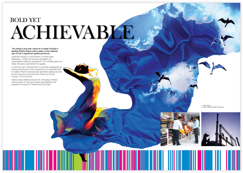
In these promotional graphics for a textile house, bold fabrics attract attention and guide the eyes to the copy and photographs explaining the company’s operations.
Sudarshan Dheer and Ashoomi Dholakia, Graphic Communication Concepts, India
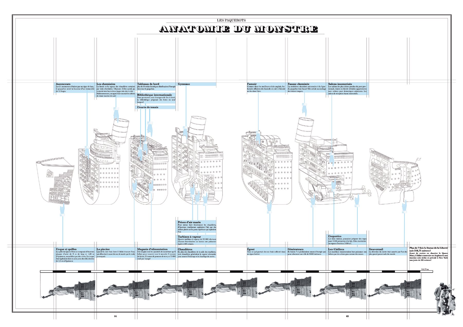
In this visual study of early transatlantic liners created for a student project, the pointing finger is a visual cue styled to fit the early era of transatlantic liners.
Chronopoulou Ekaterini, La Cambre School of Visual Art, Belgium
Both compositional and signaling techniques are effective at guiding the eyes because they make use of prominent features that are picked up early in the perceptual process. Even though eye movements are also controlled by the viewer’s expectations and search goals, research shows that using compositional and signaling techniques to direct the eye can be quite effective. In one experiment that gauged eye movement based on compositional techniques, an experienced artist explained to the study authors precisely where he intended observers of his art to look. Observers were then allowed to view the art for thirty seconds while their eye movements were recorded. The scanning paths of the subjects proved to be in “considerable concordance” with what the artist intended.1
Signaling the viewer with arrows and color is known to be effective when used in explanatory and informational graphics. Studies show that when an area of a graphic is highlighted as it is being discussed, such as in a multimedia environment, viewers retain more information and are better able to transfer this information than those who did not view the highlighted visuals.2 Other research has demonstrated that the use of arrows as pointing devices reduces the time it takes to search for specific information in a visual field.3
Importance of Attention
The cognitive mechanism that underlies eye movement control is selective attention. When we extract sensory data from a picture, it is momentarily registered in our sensory memory in fleeting images. We must detect and then attend to these images through the process of selective attention to transfer visual information into working memory. Through selective attention, we send visual information onward through the visual information–processing system.
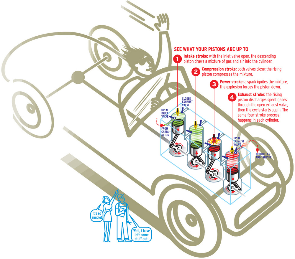
This information graphic created for Attaché magazine explains how gasoline engines work, using a sequence of numbers to guide the viewer’s attention.
Nigel Holmes, United States
Cognitive researchers study eye movements because eye movements reflect mental processes. We typically move our eyes, and sometimes our head and body, to view an object with the fovea—the part of the eye with the sharpest vision. When doing this, our focus of attention usually coincides with what we are seeing. But the relationship between eye movement and attention is not absolute. We can move our attention without moving our eyes, as when we notice something in peripheral vision while looking straight ahead at someone speaking. In this circumstance, the movement of attention precedes the movement of the eyes.4 Because attention and the eyes can be dissociated, intentionally directing the eye helps to ensure they are aligned.
As discussed in Principle 1 (Organize for Perception), attention can be captured preattentively through the bottom-up processing driven by a stimulus, or it can be captured during conscious attention through top-down processing. Designers can take advantage of either type of processing to direct the viewer’s attention. Incorporating contrast or movement into a design will trigger attention through bottom-up processes. Indicating the steps of a sequence through numbers and captions will activate attention through top-down processes.
Enhancing Cognitive Processes
Promotes speedy perception. When an observer’s visual attention shifts to a predetermined location or along a preconceived path, it enhances how the person understands a graphic in many ways. Directing the eyes promotes the efficiency and speed of visual perception, enhances visual information processing, and improves comprehension. Specifically, when a viewer scans a complex graphic, it takes time to get oriented, to determine what is most important, and to extract essential information. Viewers are known to overlook important details in complex illustrations unless they are shown where to attend. When a viewer is directed to a precise location, however, search time is reduced and efficiency is increased.
Improves processing. During preattentive processing, attention is unconsciously directed to features that are most salient. Studies have demonstrated that viewers can be distracted by powerful but irrelevant visual information that captures their attention even against their intentions.5 Directing the eyes can help ensure that irrelevant information is neither dwelled upon nor processed. Moreover, when a viewer is quickly guided to the essential information, it diminishes the demands placed on working memory that would have been applied to finding important information. More resources are then available for organizing and processing information as well as assimilating new information.6 This results in better understanding and retention.
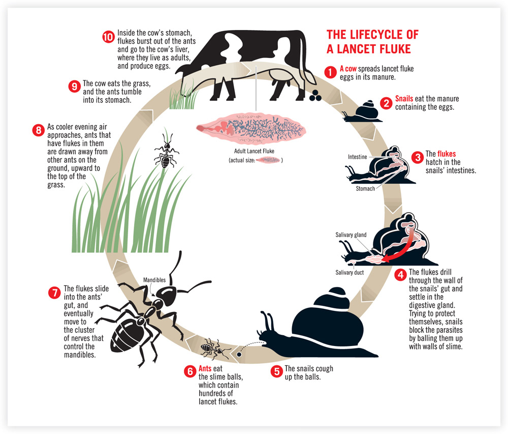
This circular format portraying the life cycle of a parasite directs the eyes with a continuous arrow and a number sequence, providing a structure that facilitates comprehension.
Nigel Holmes, United States
Increases comprehension. Directing the eyes can also assist in the comprehension of a picture. The types of visual cues used in informational and instructional graphics, such as arrows and highlights, are more likely to be understood than if instructions were presented in a written form. Comprehension is also aided by visual cues that provide structure, such as adding numeric captions to emphasize the order of a process. Organization is known to improve comprehension because it provides a cognitive framework. Well-organized information helps viewers construct coherent representations in working memory, making it easier to assimilate new information into existing schemas.
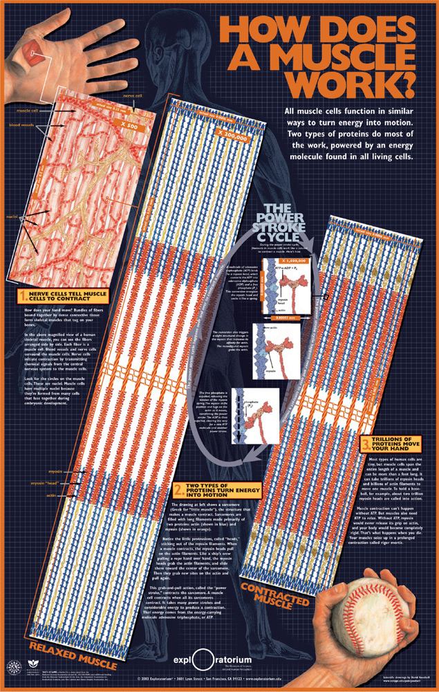
By leading the viewer along a diagonal path from the context graphic in the upper left through masagnified views of muscle fibers to the bottom right, this poster for the Exploratorium reveals how muscles function.
Mark McGowan, David Goodsell, Exploratorium, United States
Applying The Principle
In the visual arts, the focal point, the magnetic area to which the eyes are drawn, is a principal aspect of a composition. “If a design has no focal point, drawing attention inward, it may seem to fall apart, making it difficult for the viewer to organize what is going on,” write Paul Zelanski and Mary Pat Fisher in Design Principles and Problems. All of the elements within the frame of a composition have a relationship to one another and to the whole. The focal point can be the largest shape in a graphic or the one with the brightest color; it can be isolated from other elements or placed in a compelling position. We perceive it because our brains are wired to seek and detect differences. To our visual processing system, these differences are informative, causing the eye to pause and extract information. Creating several focal points with varying degrees of weight gives rise to a relative order of importance that guides the viewer’s attention and eyes through the flow of information.
Several compositional techniques can be used to direct the eyes. Positioning and emphasis are two powerful ways to achieve this. Positioning refers to the importance associated with an element’s location. Emphasis refers to the stress given to an element. In addition to structure, movement also guides the eyes. A picture tends to move and flow according to the directionality and energy of line, shape, and texture. For example, the downward flow of wine pouring from a bottle directs the viewer’s eyes along the vertical axis into the wine glass. When the patterns of a texture move in a specific direction, this also guides the eyes. Position, emphasis, and movement provide a visual language for orienting and directing the viewer’s vision along an intended path.
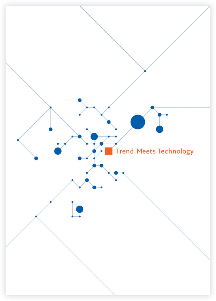
The diagonal lines of this graphic draw the viewer into its kinetic center, as the eyes jump to several focal points derived from contrasts in color, shape, and size.
Shinnoske Sugisaki, Japan
In addition, explicit techniques that are overlaid onto a graphic call attention to critical attributes and provide directional information. Explicit cues facilitate attention when used alone or in combination, as long as they are placed correctly and used judiciously. The designer should ensure that the chosen cues are appropriate to the cognitive characteristics of the audience. For example, a younger audience may not know that a dashed line implies directionality. Also, children are not as adept as adults at shifting their attention to important information.
Whether guiding the eyes through a graphic or directing the eyes to a specific location, designers should consider the informative purpose of the graphic, its degree of visual complexity, and the characteristics of the audience when deciding on an approach. Implicit, compositional techniques have an aesthetic dimension that will enhance promotional graphics. For instance, powerful lines that guide the eye are also appealing to the senses. Explicit cueing techniques that indicate location are appropriate in information and instructional graphics and diagrams.
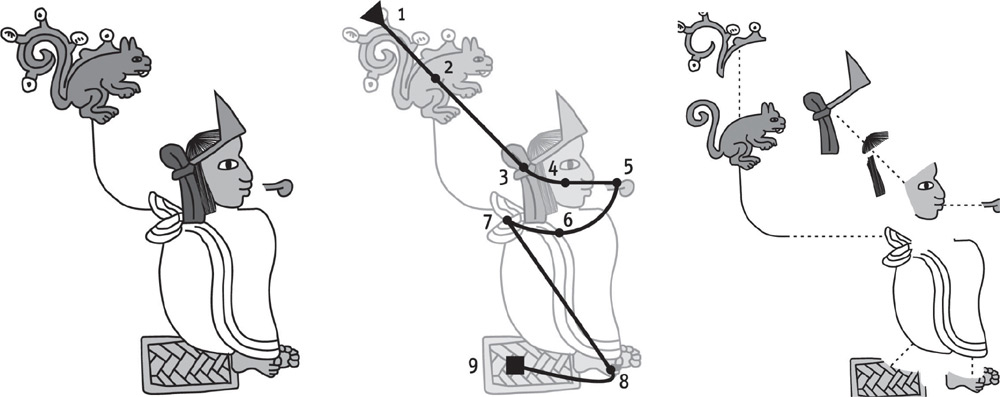
These explanatory line drawings illustrate how ancient Aztec writing is formed. Visual cues include numbers, arrows, and dashed lines, all of which direct the eye.
Lorenzo De Tomasi, Italy

The cover image of this wine merchant’s brochure uses a compositional technique to guide the viewer’s eyes through the flowing motion of pouring wine.
Christine Kenney, IE Design + Communications, United States
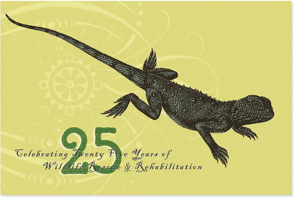
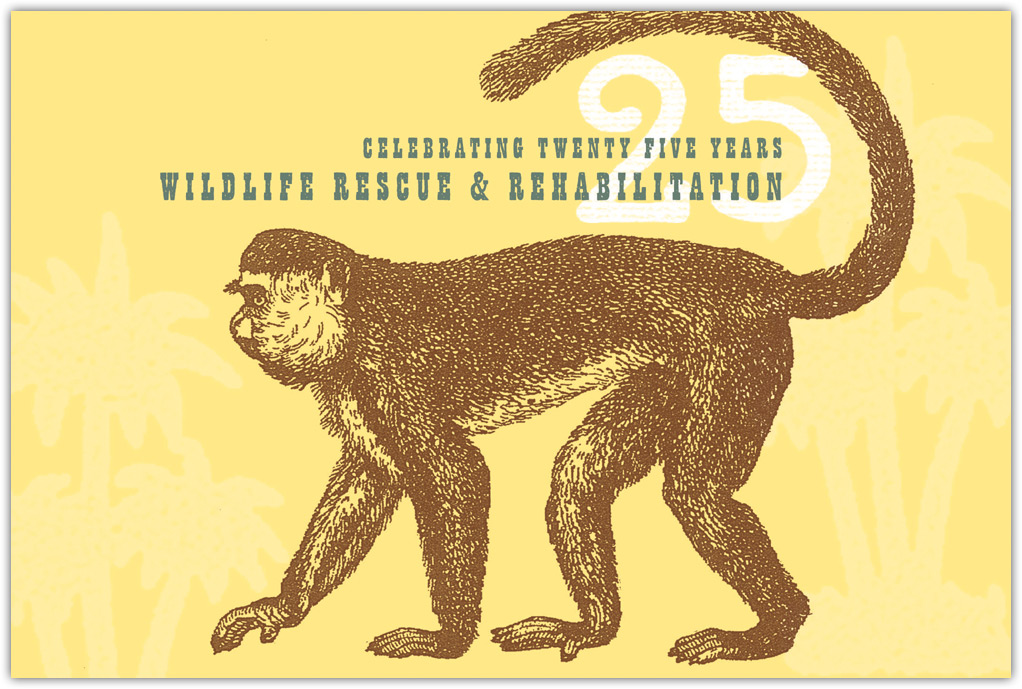
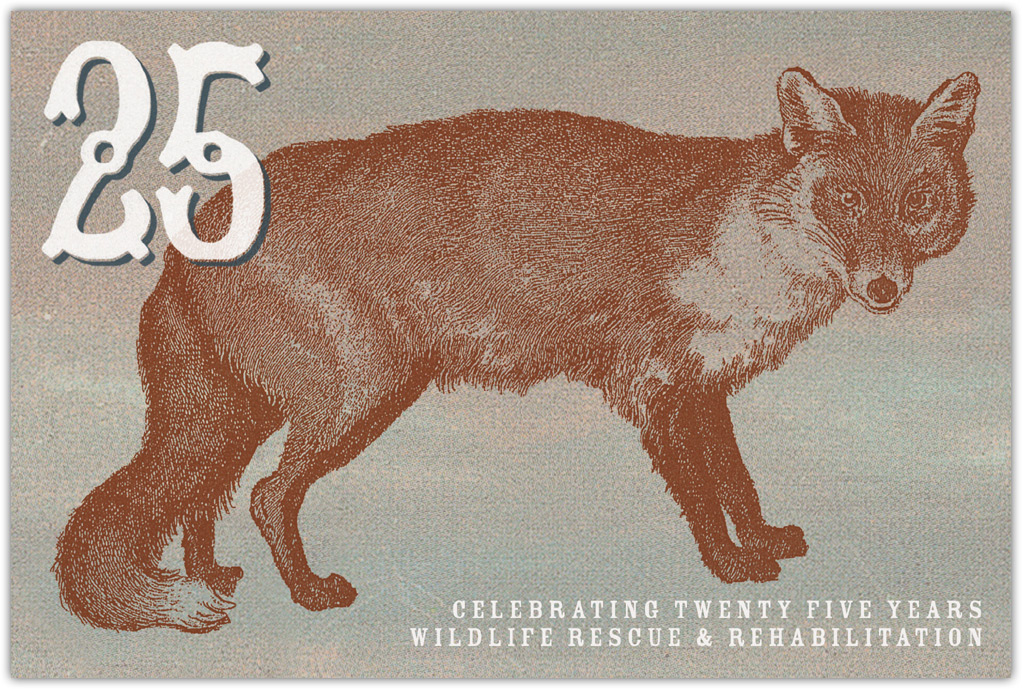
The directionality of the images and detailed textures direct the eyes in these twenty-fifth-anniversary cards for the Wildlife Rescue Foundation.
H. Michael Karshis, HMK Archive, United States
POSITION
The boundaries that define the edges of a graphic, referred to as the frame, have a powerful effect on a composition. Regardless of whether it encloses a postcard, a page, a poster, or a screen, the frame creates meaning for the elements it bounds. Among aesthetic theorists, it is generally accepted that the position of an object within a frame creates a perceptual force or tension that affects the perceived importance of an object and hence where we place our attention.7
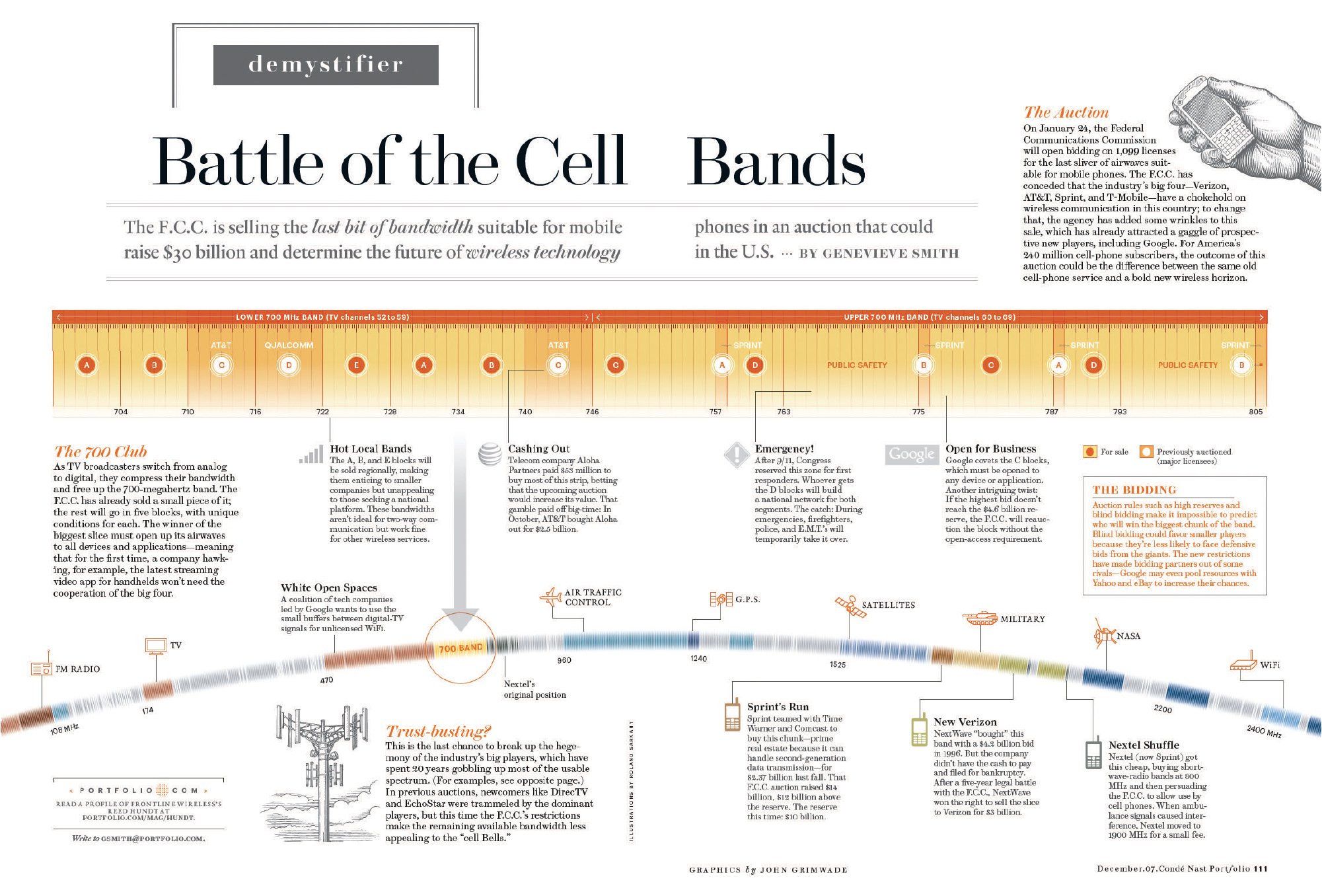
This information graphic for Condé Nast Portfolio establishes an effective visual hierarchy to explain the auction of mobile bandwidths.
John Grimwade and Liana Zamora, Condé Nast Publications, United States
Through the thoughtful placement of elements, a designer can establish a visual hierarchy to direct the viewer’s eyes. The position of each component conveys a progression of relative importance, starting with the element of the highest rank and continuing to those with lesser rank. For example, in a magazine spread, the information graphic might be the most dominant element, followed by a headline and then explanatory text. A standard visual hierarchy consists of three levels—primary, secondary, and equivalent.
Our understanding of positioning in a frame is a metaphor for how we view hierarchies in the world. We speak of people who have important positions as being at the top. Likewise, we have an expectation of this convention in pictures. We anticipate that elements at the top of a page will be the most important.
In fact, research shows that objects in the top half of a picture are considered to be more active, dynamic, and potent. In other words, they have more visual weight.8 Another study found that viewers spend more time viewing areas appearing on the left and upper half of the field than on areas located on the right and lower half. This appeared to be true in both symmetrical designs and in a double-page spread.9 Of one thing we can be certain: Varying the position of an object in a frame changes its impact on the observer.
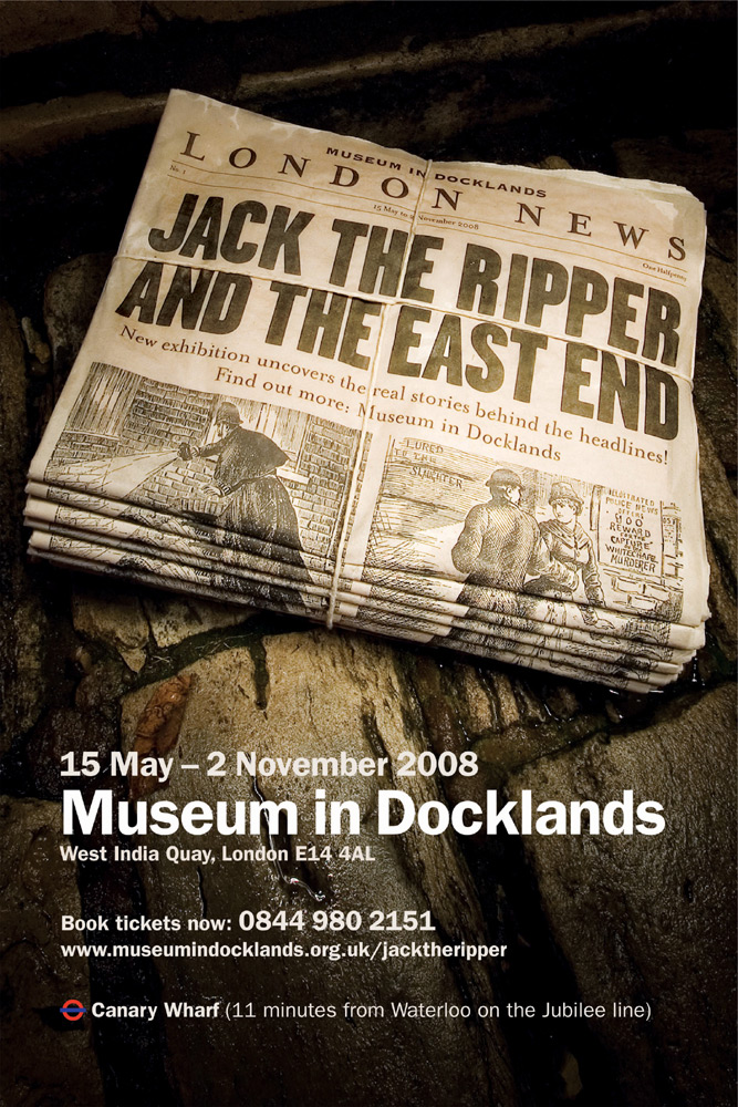
In this poster for a London museum, the designer used a classic approach to positioning by placing the name of the historical exhibition above the fold in an old-timey newspaper design.
Cog Design, United Kingdom
EMPHASIS
A design needs varying degrees of emphasis to capture and guide the viewer’s attention. Without emphasis, a graphic feels flat and lifeless, offering a limited sensory experience and diminished possibilities for directing the eye. On the other hand, a design with emphasis is energetic. It attracts the eyes with prominent areas of focus, creating a dominant-subordinate hierarchy by endowing important elements with relative weight and stress. As the observer instinctively moves from the most prominent component to the least, emphasis directs the eyes around a graphic.
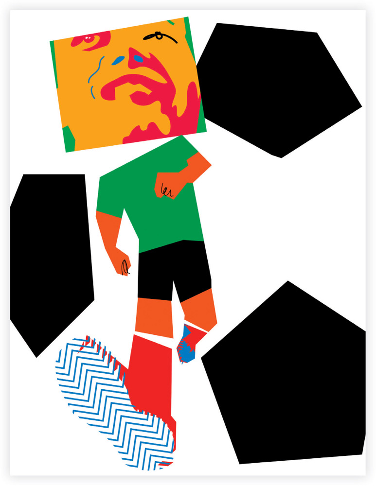
The disconnected body parts create incongruence and emphasis in this FIFA World Cup poster.
Jonas Banker, BankerWessel, Sweden
Emphasis can be accomplished through techniques that create contrast, which is characterized by a dramatic change in visual information. When we glance at a picture, contrast attracts our attention. We sense that areas of sameness are not as informative as areas of difference. It is through contrast that we discriminate foreground from background and differentiate shapes, textures, and patterns. Through contrast, prominent elements of a graphic emerge and become more visible than their surroundings.
A successful design uses contrast at varying levels so that every element has a place in the hierarchy, avoiding a competition for dominance. An element is most likely to be perceived as a primary focal point when the change is abrupt and the polarity between the element and its surroundings is vivid. The primary focal point must create impact. Secondary and tertiary elements should be progressively toned down.
The options for creating contrast are achieved by juxtaposing elements that differ along one or more dimensions of size, tone, color, texture, and shape. In his book Art and Visual Perception, Rudolf Arnheim notes that when all other factors are equal, the visual weight of an element is most dependent on its size. Others suggest that contrast in tonal values has the greatest impact. Regardless of the attribute selected, any contrast between elements should enhance the message, as the audience will interpret a difference as meaningful.
Incongruence can also be used to create emphasis because it provides a focal point. Incongruence refers to the placement of an unexpected object in a familiar context, such as a bathtub in the middle of the desert. It can also be achieved by using an attribute in an unexpected way, such as reversing the size of people so that babies are larger than their parents. Incongruence attracts our attention because we construct schemas of how the world looks, sounds, and works. Incongruence challenges our schemas because what we see is unfamiliar and fails to match our prior knowledge. Our interest is heightened as we attempt to mentally accommodate an unusual juxtaposition or an unconventional attribute.

In this poster promoting a summer club party, the designer uses vivid color contrasts and intricate shapes to provide emphasis.
Sorin Bechira, X3 Studios, Romania
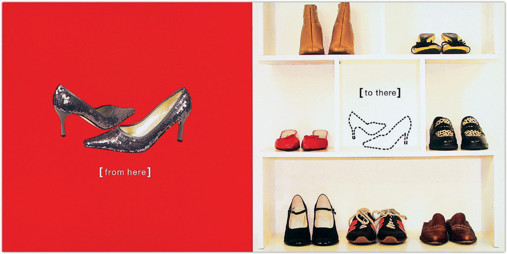
Isolation is one way to establish prominence, as shown in these postcards for retail merchandising software.
Luis Jones, Fusion Advertising, United States
The unexpected shape of a foot creates emphasis through contrast and surprise in this graphic for the Guardian newspaper.
Jean-Manuel Duvivier, Jean-Manuel Duvivier Illustration, Belgium
MOVEMENT
When a graphic conveys a dynamic sense of movement, our eyes seem to glide across its surface. Movement can be explained as an energetic force or tension embodied in and between the lines, textures, shapes, and forms of a graphic. Movement is more than the repetition of patterns; rather, it sweeps the viewer’s attention through a picture. It is a powerful way for graphic designers to direct the viewer’s eye to the important elements in a graphic.
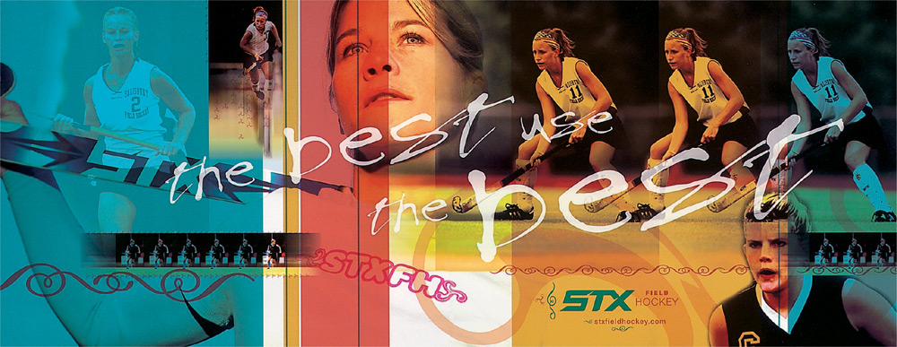
In this field hockey equipment catalog, motion shots create the perception of movement and capture the intensity of the sport.
Greg Bennett, Siquis, United States
When we perceive movement in a static picture, we perceive its directionality, sensing whether it moves in fits and starts, rounds back onto itself, or takes us off the page. Rudolf Arnheim suggests that the direction of visual forces in a picture is determined by three factors: the attraction exerted from the visual weight of surrounding elements, the shape of objects along their axes, and the visual direction and action of the subject.10
That we can perceive directionality and movement in a static two-dimensional picture is a remarkable feat of the eyes and brain. We perceive kinetic information in a still picture because we know the experience of our own physical movement and we understand the motion of objects. In fact, our ability to perceive movement in a static graphic is associated with regions of the brain that we use for observing physical motion. In one study, researchers found that action photographs activated areas of the brain that are sensitive to real motion, whereas photos depicting people in still positions did not activate these areas. According to the study’s authors, motion cues in a graphic appear to create the perception that an object is leaping out from its static surroundings.11 Although this study was based on photographs of people in action, it is likely that our perception of compositional movement is also due to motion-detecting neurons.
This promotional poster for an artist’s lecture exemplifies how the visual direction of shapes can create dynamic movement.
Ian Lynam, Ian Lynam Creative Direction & Design, Japan
Graphic designers can exploit the expressive quality of lines and shapes to create movement based on the rhythm of elements. For example, curved lines and undulating shapes create smooth and flowing movement. Jagged lines create tension and make the eyes dart and pause. It is interesting to note that movement that extends in a left-to-right direction is considered easier to perceive. In a survey of art from many cultures, including Chinese, Japanese, Indian, Persian, and Western, this left-to-right asymmetry of emphasis was found to be a common phenomenon.12 The survey found that across cultures, important elements tended to be located to the left of those that were less important, causing the eyes to flow in a rightward movement. Thus, the left-to-right preference may be neurological rather than cultural.
Designers can also create movement by creating the illusion of three-dimensional perspective, which draws the viewer’s eyes into the depth of field. Viewers deduce depth perception in a picture because of their knowledge of how things appear in the physical world. Objects that are larger in size are assumed to be in the foreground. Viewers also perceive the illusion of depth because converging lines create a sense of depth and cooler colors create a sense of distance. Depth perception also creates a visual hierarchy. Most viewers consider objects in the foreground more important than objects in the distance.
Three-dimensional perspective effectively directs a viewer’s attention further into the depth plane, as illustrated in this cover for SMT magazine.
Christopher Short, United States
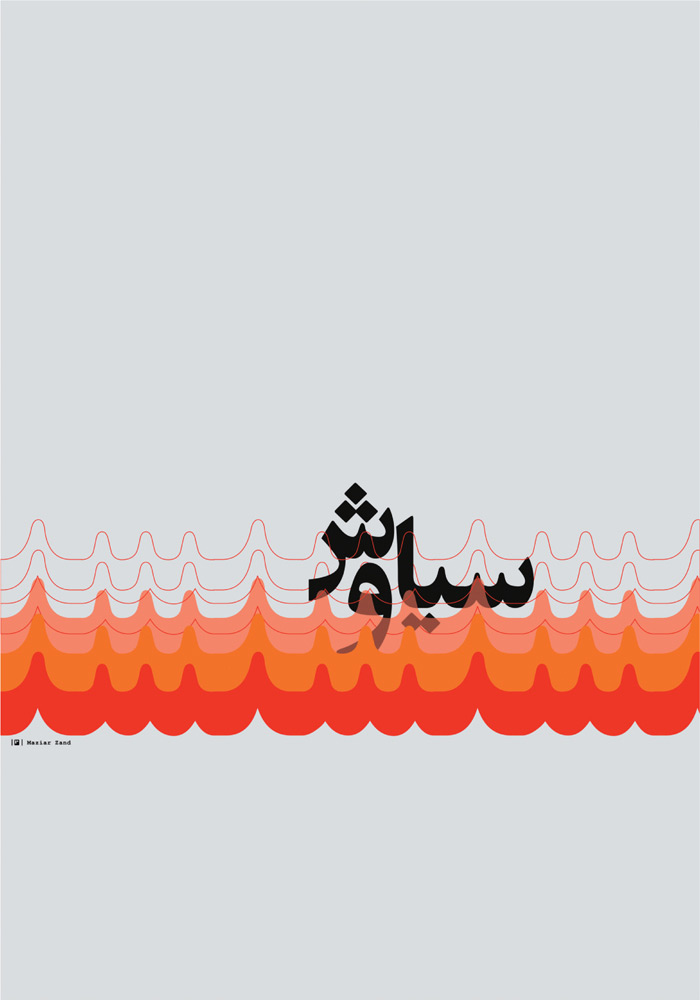
The movement of fire carries the viewer across the page in this typography poster, based on a Persian traditional tale.
Maziar Zand, M. Zand Studio, Iran
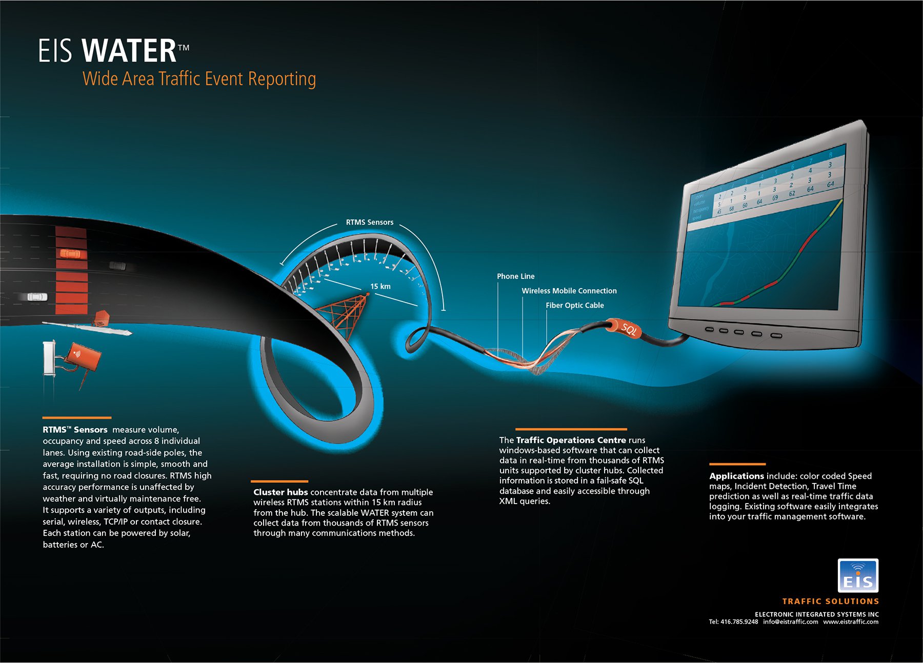
The undulating visualization of this traffic event–reporting system guides the viewer through the information flow—from an explanation of the hardware to the software and finally to the end-user advantages.
Patrick Keenan and Alan Smith, The Movement, Canada
Shapes and lines create rhythmic movement in this AIGA poster reflecting a 1930s artistic style.
Dale Sprague and Joslynn Anderson, Canyon Creative, United States
The curvature of this biological graphic moves the viewer through the mechanisms and processes of gene expression.
Daniel Müller, Haderer & Müller Biomedical Art, United States
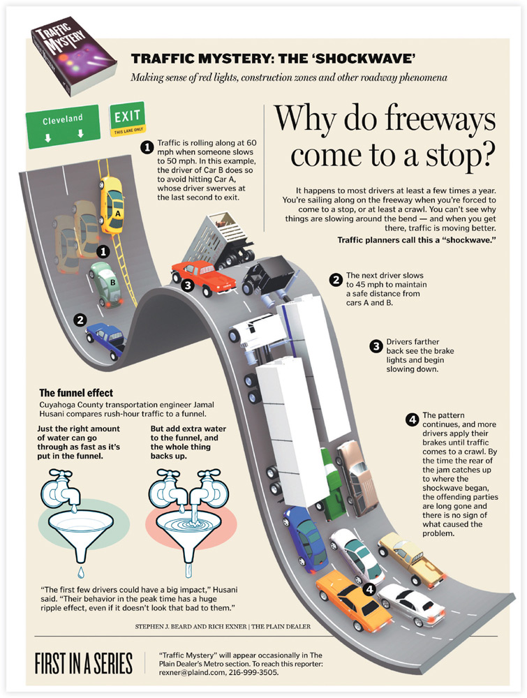
In this information graphic for the Cleveland Plain Dealer, the curves in the highway take the viewer along a path to the most important information.
Stephen J. Beard, Plain Dealer, United States
EYE GAZE
It isn’t surprising that we are drawn to pictures of people—our brains appear to have specialized mechanisms for detecting and recognizing human faces. Regardless of whether the face appears as a photograph, a painting, a sketch, or a simple schematic figure, specific neural networks are activated in the brain upon perceiving anything configured as a face.13 In addition, specialized regions of the brain respond to the recognition of at least one facial feature in isolation—the eyes.14 We are attuned to detecting faces and eyes because we are communicative beings, and facial expressions convey important emotional and interpersonal information.

A secondary and intriguing characteristic of facial awareness is that we automatically shift our eyes in the direction where someone else is looking. In a long list of studies, eye gaze has been found to orient a viewer’s attention.15 According to researchers Stephen Langton and Vicki Bruce, “Neuropsychological, neurophysiological, and behavioral evidence is emerging in support of the position that there is a functionally specific mechanism devoted to the task of detecting eyes and computing where in the environment eye gaze is directed.”16 Support for this specialized mechanism is found in the fact that infants as young as three months of age can detect the direction of an adult’s gaze and will shift their own attention in that direction.17
Although it is unclear whether this is innate or learned, gaze perception triggers what is known as joint attention, or shifting our eyes in the direction of someone else’s gaze. As a survival mechanism, it is clear that shifting attention to where someone else is looking could prove quite helpful in times of danger. As a social mechanism, joint attention could provide significant information about another person’s momentary interest and perhaps their psychological state.
This seemingly automatic ability transfers to pictures. When an observer views a static image of a face, it triggers the viewer’s attention to look in the direction of the subject’s gaze. Graphic designers can take advantage of this eye gaze reflex to focus attention on a particular graphic by using photographs or illustrations that depict a person gazing in the desired direction.
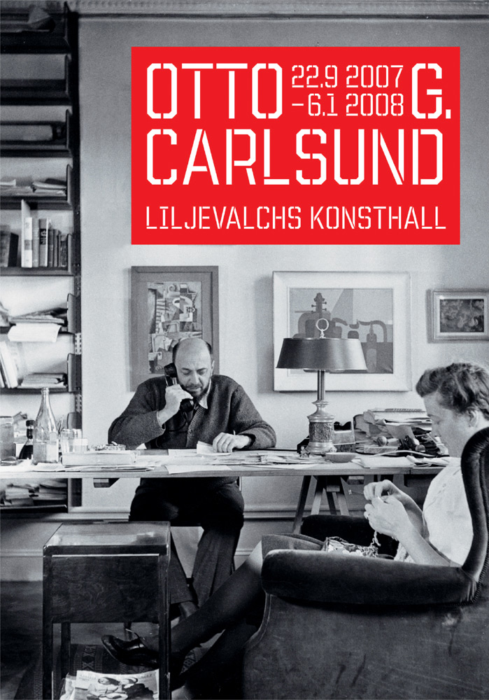
This poster for an art exhibition features the artist and his wife gazing downward, absorbed in their tasks. Following the direction of their gaze takes the viewer deeper into the graphic.
Ida Wessel, BankerWessel, Sweden
The performer’s hypnotic stare in this theater program guide makes it difficult to look away.
Francheska Guerrero, Unfolding Terrain, United States
In this CD cover for typographer Kurt Weidemann, the designer’s eye gaze leads the viewer to the contents of the CD.
A. Osterwalder, P. Bardesono, S. Wagner, A. Bromer and M. Drozdowski, i_d buero, Germany
Illustrated depictions of eye gaze also direct the eyes to crucial areas of a picture.
Jean-Manuel Duvivier, Jean-Manuel Duvivier Illustration, Belgium
VISUAL CUES
Some of the first tasks a viewer performs when scanning a picture are to search for informative areas, prioritize the information, and select what is most important. The time it takes to locate important information depends on the number of eye fixations that a viewer makes, because the eyes fix on static points much of the time during the search process. Visual complexity makes it more difficult to find important information and increases the number of fixations needed to perform a search.
These information graphics for Bloomberg Markets magazine show the value of signaling even for brief visual explanations.
Eliot Bergman, Japan
Designers can facilitate the early tasks of searching, prioritizing, and selecting by signaling the viewer’s attention to the location of the most essential information. This involves adding visual cues such as arrows, color, and captions to a graphic. Visual cues optimize the viewing experience by providing a shortcut to relevant information, rendering the need for a visual search unnecessary. Furthermore, visual cues have been shown to improve a person’s recall of information.18 They also enable a viewer to attend to a single area of visual information rather than dividing attention among competing stimuli. There is evidence that when a viewer’s attention is divided, the size of the perceived visual field is actually reduced, whereas a visual cue pointing to a target increases the perceived visual area. This speeds up the search for important information.19
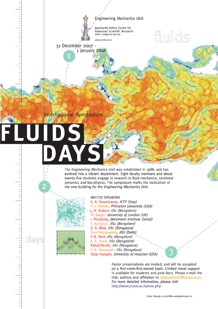
In this scientific symposium poster, numbers and dashed lines are visual cues that lead the viewer to the essential information.
Surabhi Gurukar, Apostrophe Design, India
Arrows and the Like
The arrow is an ever-present pictorial device frequently found in explanatory graphics, diagrams, and wayfinding. It is used so often because it is exceedingly effective; the arrow not only directs our attention and our eyes, it guides cognition. Because the arrow is derived from an asymmetric shape—a triangle—it brings a sense of dynamism to a graphic.
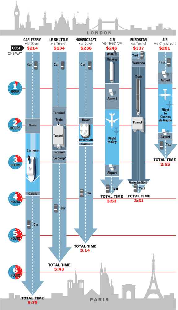
Bold arrows in this information graphic for Condé Nast Traveler represent the time it takes to travel from London to Paris by various modes of transport. The arrows are the dominant element that leads the viewer from one piece of essential information to the next.
John Grimwade, Condé Nast Publications, United States
The arrow is a symbol, and as such it stands for something else and must be decoded by the viewer. The viewer must recognize the triangular shape of the arrow’s head, shaft, and tail as one perceptual unit and associate this shape with one or more “arrow schemas” stored in long-term memory. For those familiar with the arrow symbol, its recognition and meaning are easy and automatic. Upon perceiving a visual cue like an arrow, the viewer rapidly evaluates its directional meaning. Context plays an important part in arrow comprehension. We do not interpret any triangle lying on its side as an arrow, but in the appropriate context, such as in a diagram or when representing a “continue” or “play” button, we interpret a sideways triangle as an arrow.
When the arrow points to a specific location, it helps the viewer filter out extraneous information and focus on the essentials. Cueing the observer’s selective attention to important information is the first step in comprehension. When designing the pointer arrow, it must be sufficiently dominant to capture the viewer’s attention, but it should not overpower the holistic perception of the graphic.
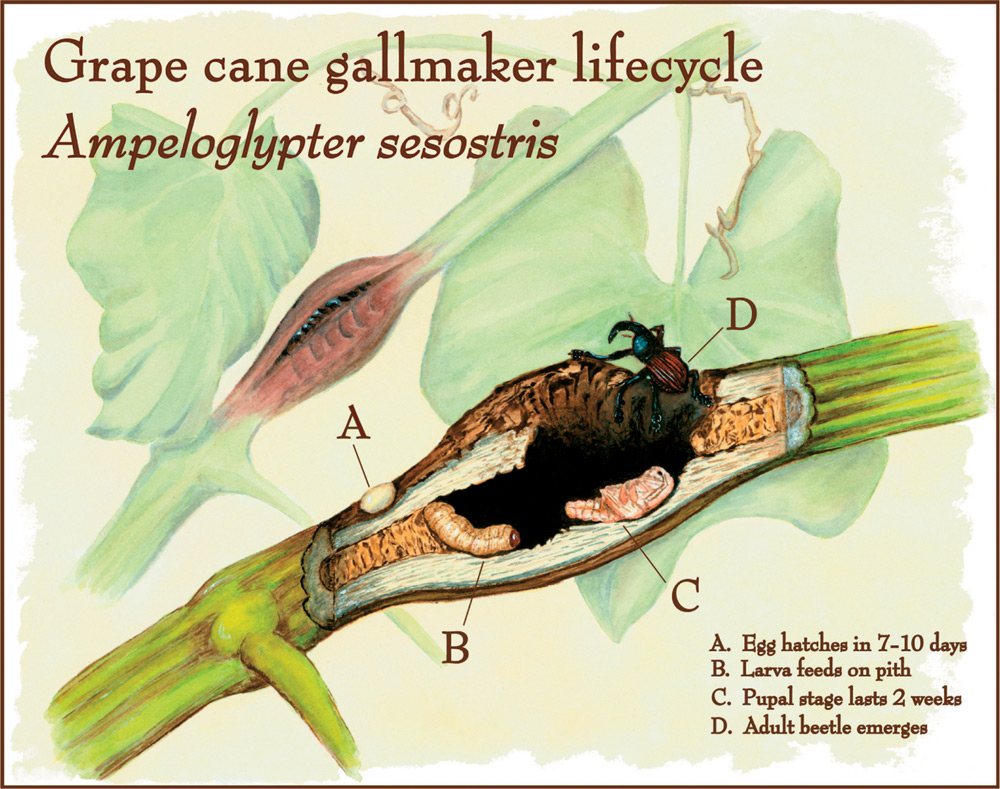
Unobtrusive lines both point to crucial information and effectively blend with the graphic in this illustration of a beetle’s life cycle.
Melisa Beveridge, Natural History Illustration, United States

These graphics are part of a comprehensive signage program explaining environmental content in a wetlands park. In both signs, arrows are well integrated into each graphic as pointers to associated information.
Claudine Jaenichen and Richard Turner, Jaenichen Studio, United States
Color Cues
In a rich array of visual information, viewers need a way to filter out what is extraneous in order to attend to the information that is relevant to their task. Time and again, color has proven to be a compelling way to attract attention and prompt the viewer to attend to the most relevant details. As an explicit cueing device, contrast in color—in the form of a circle, a line, or other shape—acts as a signal to direct the eyes. Color is one of the primitive features we detect in preattentive vision, and it can play a dominant role in guiding attention and reinforcing a message.
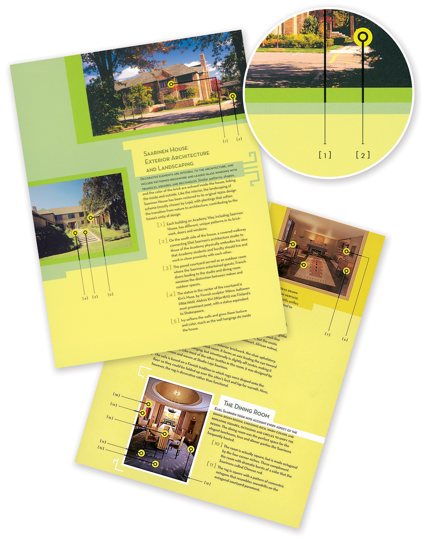
In this visitor’s guide for a house and garden tour, the designer uses color cues to signal the location of the most important aspects of the house. Explanatory information associated with each cue is detailed below.
Francheska Guerrero, Unfolding Terrain, United States
Color facilitates the interpretation and comprehension of visual information in several ways. In complex visuals, it helps viewers rapidly search through a large quantity of visual information to locate what is most important. Also, viewers have an easier time noticing and distinguishing between objects in a colored graphic as compared to a monochrome one because color often emphasizes figure—ground contrasts. In addition, when a color cue becomes a visual attribute of an object, it helps to make the information memorable.
Color cues are effective in most types of visual communications. During animation sequences, color cues are needed because important information can fly by quickly. In maps and diagrams, color cues are often used to indicate key information. In learning materials, the explicit use of color cues is known to help students comprehend and retain information. There is evidence that color helps us organize and categorize visual information.20 For information to get noticed quickly, a color cue must vary sufficiently from the background and surrounding objects. Designers should avoid using too many colors.
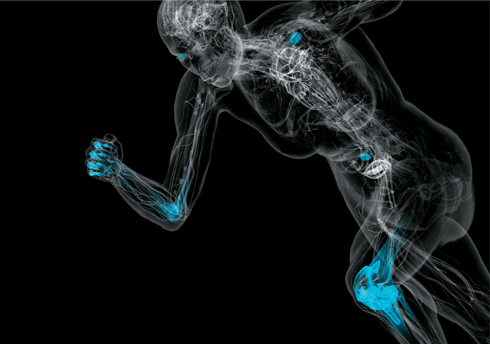
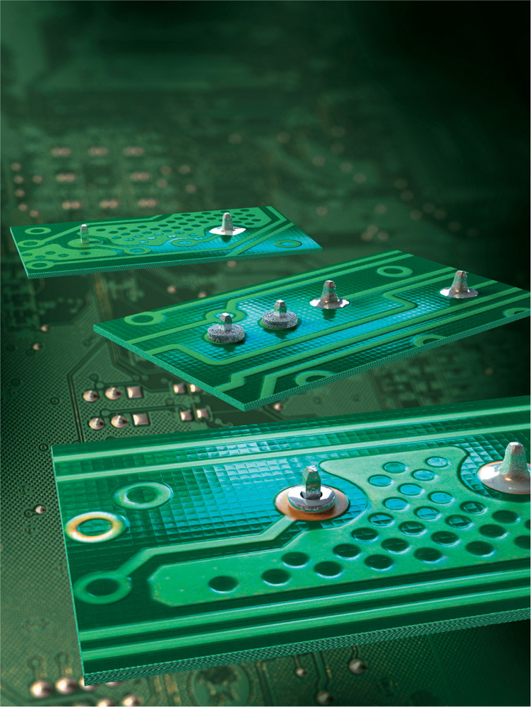
Color cues highlight medical device implants in this futuristic superwoman rendered for Wired magazine.
Bryan Christie, Bryan Christie Design, United States
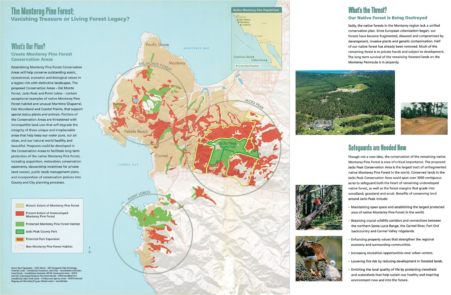
This informational brochure promotes pine forest conservation. The maps use bright colors as visual cues to show the few regions of undeveloped, protected forest where Monterey pines still stand.
Karen Parry and Louis Jaffe, Black Graphics, United States