RESEARCH METHOD
46 Heuristic Evaluation

An agreed-upon set of usability best practices can help detect usability problems before actual users are brought in to further evaluate an interface.
A heuristic evaluation is an informal usability inspection method1 that asks evaluators to assess an interface against a set of agreed-upon best practices, or usability “rules of thumb.” Unlike usability tests that require participation of actual users, heuristic evaluations enlist members of the team—from the novice computer programmer to the expert usability professional—to inspect an interface and detect the baseline usability problems that should be fixed before user testing begins.
When heuristics are thoughtfully written, and applied repeatedly during an iterative design process, the team’s knowledge of usability heuristics can create a disciplined yet practical culture to finding and fixing certain classes of usability problems. Rather than making design decisions based on intuition and personal preferences, a set of manageable and meaningful principles can focus the team’s efforts regarding the types of changes to fix. Over time, the principles will become more intuitive to everyone on the interdisciplinary team.
Even though double experts—evaluators who are familiar with the subject matter domain as well as in usability practices—may be the most likely to identify usability issues,2 the method was designed to be used by experts and novices (who are trained on heuristics) alike. In an attempt to hedge against the bias any one evaluator can bring (based on their mindset or experiences), it is recommended that three to five evaluators independently perform assessments of the interface first, then aggregate their findings into a single report.3
Although the heuristic evaluation method will rarely provide opportunities to identify breakthrough opportunities in the design, it can help to detect critical but missing dialogue elements early in the design process.4 Heuristic evaluation reports list which problems are inconsistent with the heuristics, and include plenty of screenshots and call outs. It is also common to include examples and screenshots of heuristics that are working well in the report. Visually reporting both the positive and negative findings brings balance to the report, recognizes the good work that is already represented in the design, and serves as motivation to keep doing more heuristic evaluations.
When used in the middle phases of the design process (or even as soon as low-fidelity prototypes are available) heuristic evaluations can identify baseline usability problems that can be fixed before actual participants are brought in, which will make the usability tests more effective. Not only that, but as team members observe more usability tests, it is likely they will become better at detecting usability problems for heuristic evaluations—a likely indication that attitudes toward user-centered design improve with the experience of observing people using the products that we design.
1. Heuristic evaluation is widely acknowledged as one of Jakob Nielsen’s Discount Usability Engineering methods. The benefit of discount usability methods is twofold—not only do the users benefit from a more usable product, but it may also cost less and is less resource intensive for organizations to perform.
2. Nielsen, Jakob. “Finding Usability Problems Through Heuristic Evaluation.” Proceedings of the SIGCHI Conference on Human Factors in Computing Systems, 1992.
Desurvire, Heather, Jim Kondziela, Michael E. Atwood. “What is Gained and Lost When Using Methods Other Than Empirical Testing.” SIGCHI Conference on Human Factors in Computing Systems, 1992.
3. Nielsen, Jakob, and Rolf Molich. “Heuristic Evaluation of User Interfaces.” ACM CHI ’90 Conference Proceedings, 1990.
4. See note 3 above.
5. Nielsen, Jakob. Usability Engineering. Boston, MA: Academic Press, 1993.
6. Ginsburg, Suzanne. Designing the iPhone User Experience. Boston, MA: Addison Wesley, 2010.
Further Reading
Nielsen, Jakob. Usability Inspection Methods. New York: John Wiley & Sons, 1994.
Heuristics should be thoughtfully written and carefully considered to reflect the context of the product. A good place to start is Nielsen’s 1994 heuristics,5 which are adapted here and applied to iPhone apps.6
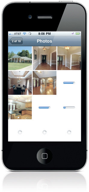
1. Visibility of app status
The Redfin app keeps people informed about how quickly their images are downloading.
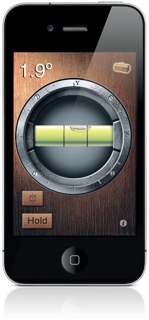
2. Match between app and the real world
The iHandy app acts the way a traditional level does, providing measurements about the user’s environment.
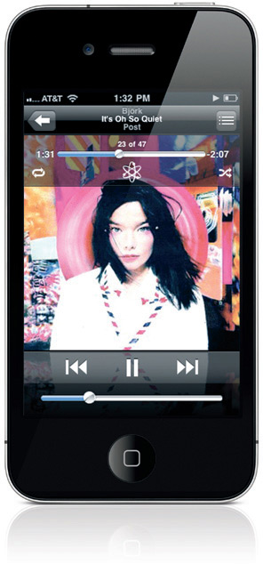
3. User control and freedom
The iPod provides users volume, fast forward, reverse, next, and previous song at all times.

4. Error prevention
The Amazon app requires two confirmations before removing a book from your wishlist.
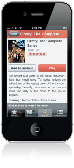
5. Consistency and standards
Whether you are using Netflix on a computer, TV, or as an app, the language and behaviors are consistent.
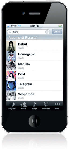
6. Recognition rather than recall
iPod provides visuals of all songs and albums to facilitate selection.
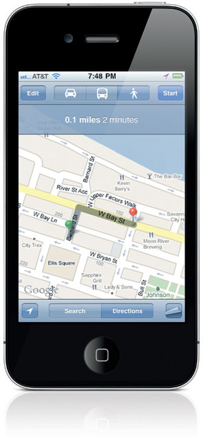
7. Flexibility and efficiency of use
Maps provide car, public transportation, and walking routes depending on the user’s method of transit.

8. Aesthetic and minimalist design
Facebook’s “Upload Images” functionality contains no superfluous buttons or information.
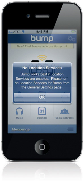
9. Help users recognize, diagnose, and recover from errors
If you aren’t using Location services, Bump tells you both the issue and solution in plain language.
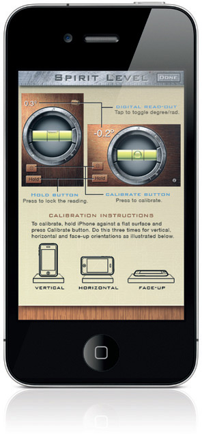
10. Help and documentation
If you need help using the iHandy Level app, instructions are contextual, concise, specific, and visual.
