
Mixture Profiler Overview
The Mixture Profiler shows response contours for mixture experiment models, where three or more factors in the experiment are components (ingredients) in a mixture. The Mixture Profiler is useful for visualizing and optimizing response surfaces resulting from mixture experiments.
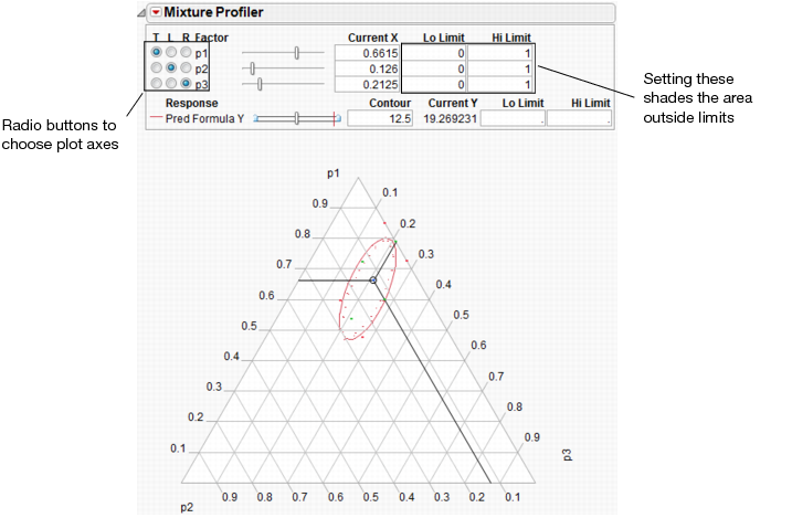
Figure 6.2 shows an example of the Mixture Profiler for the sample data in Plasticizer.jmp. To generate the graph shown, select Mixture Profiler from the Graph menu. In the resulting Mixture Profiler launch window, assign Pred Formula Y to the Y, Prediction Formula role and click OK. Delete the Lo and Hi limits from p1, p2, and p3.
Many of the features shown are the same as those of the Contour Profiler and are described on “Contour Profiler Platform Options”. Some of the features unique to the Mixture Profiler include:
• A ternary plot is used instead of a Cartesian plot. A ternary plot enables you to view three mixture factors at a time.
• If you have more than three factors, use the radio buttons at the top left of the Mixture Profiler window to graph other factors. For detailed explanation of radio buttons and plot axes, see “Explanation of Ternary Plot Axes”.
• If the factors have constraints, you can enter their low and high limits in the Lo Limit and Hi Limit columns. This shades non-feasible regions in the profiler. As in Contour Plot, low and high limits can also be set for the responses.
Figure 6.2 Mixture Profiler
Explanation of Ternary Plot Axes
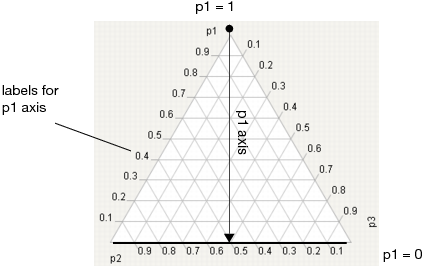
The sum of all mixture factor values in a mixture experiment is a constant, usually, and henceforth assumed to be 1. Each individual factor’s value can range between 0 and 1, and three are represented on the axes of the ternary plot.
For a three factor mixture experiment in which the factors sum to 1, the plot axes run from a vertex (where a factor’s value is 1 and the other two are 0) perpendicular to the other side (where that factor is 0 and the sum of the other two factors is 1). See Figure 6.3.
For example, in Figure 6.3, the proportion of p1 is 1 at the top vertex and 0 along the bottom edge. The tick mark labels are read along the left side of the plot. Similar explanations hold for p2 and p3.
For an explanation of ternary plot axes for experiments with more than three mixture factors, see “More than Three Mixture Factors”.
Figure 6.3 Explanation of p1 Axis.
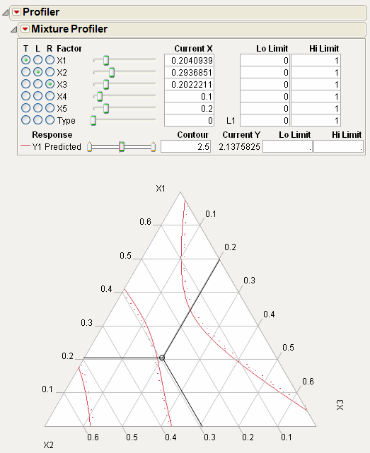
More than Three Mixture Factors
The ternary plot can only show three factors at a time. If there are more than three factors in the model that you are profiling, the total of the three on-axis (displayed) factors is 1 minus the total of the off-axis (non-displayed) factors. Also, the plot axes are scaled such that the maximum value a factor can attain is 1 minus the total for the off-axis factors.
For example Figure 6.4 shows the Mixture Profiler for an experiment with 5 factors. The Five Factor Mixture.jmp data table is being used, with the Y1 Predicted column as the formula. The on-axis factors are x1, x2 and x3, while x4 and x5 are off-axis. The value for x4 is 0.1 and the value for x5 is 0.2, for a total of 0.3. This means the sum of x1, x2 and x3 has to equal 1 – 0.3 = 0.7. In fact, their Current X values add to 0.7. Also, note that the maximum value for a plot axis is now 0.7, not 1.
If you change the value for either x4 or x5, then the values for x1, x2 and x3 change, keeping their relative proportions, to accommodate the constraint that factor values sum to 1.
Figure 6.4 Scaled Axes to Account for Off-Axis Factors Total
Mixture Profiler Platform Options
The commands under the Mixture Profiler red triangle menu are explained below.
Show Current Value
Shows or hides the three-way crosshairs on the plot. The intersection of the crosshairs represents the current factor values. The Current X values above the plot give the exact coordinates of the crosshairs.
Show Constraints
Shows or hides the shading resulting from any constraints on the factors. Those constraints can be entered in the Lo Limits and Hi Limits columns above the plot, or in the Mixture Column Property for the factors.
Up Dots
Shows or hides dotted line corresponding to each contour. The dotted lines show the direction of increasing response values, so that you get a sense of direction.
Contour Grid
Draws contours on the plot at intervals that you specify.
Remove Contour Grid
Removes the contour grid if one is on the plot.
Factor Settings
Is a submenu of commands that enables you to save and transfer the Mixture Profiler settings to other parts of JMP. Details on this submenu are found in the discussion of the profiler on “Factor Settings”.
Customizing the Mixture Profiler
Customize the Mixture Profiler by right-clicking on the plot, and selecting Customize.
Choose from the following property options:
Contour
Alter line color, fill color, and level of line transparency. If there are multiple contour lines on the plot, each will appear individually on the list of options.
Component Constraints
Alter component constraint properties.
Linear Constraints
Alter linear constraint properties.
Grid Lines
Use Axis Settings window to modify grid lines.
Reference Lines
Use Axis Settings window to modify reference lines.
Double-click an axis on the plot to view the Axis Settings window. Here you can specify axis properties in detail, such as tick marks, grid lines and reference lines.
Crosshairs
Alter the properties of the crosshairs on the plot.
Marker
Alter the properties of the plot marker.
Linear Constraints
The Mixture Profiler can incorporate linear constraints into its operations. To do this, a Constraint Table Script must be part of the data table. See “Linear Constraints” in the “Profiler” chapter for details about creating the Table Script.
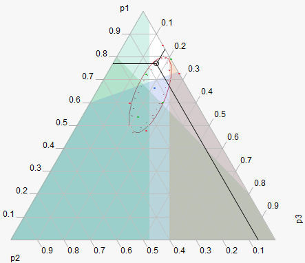
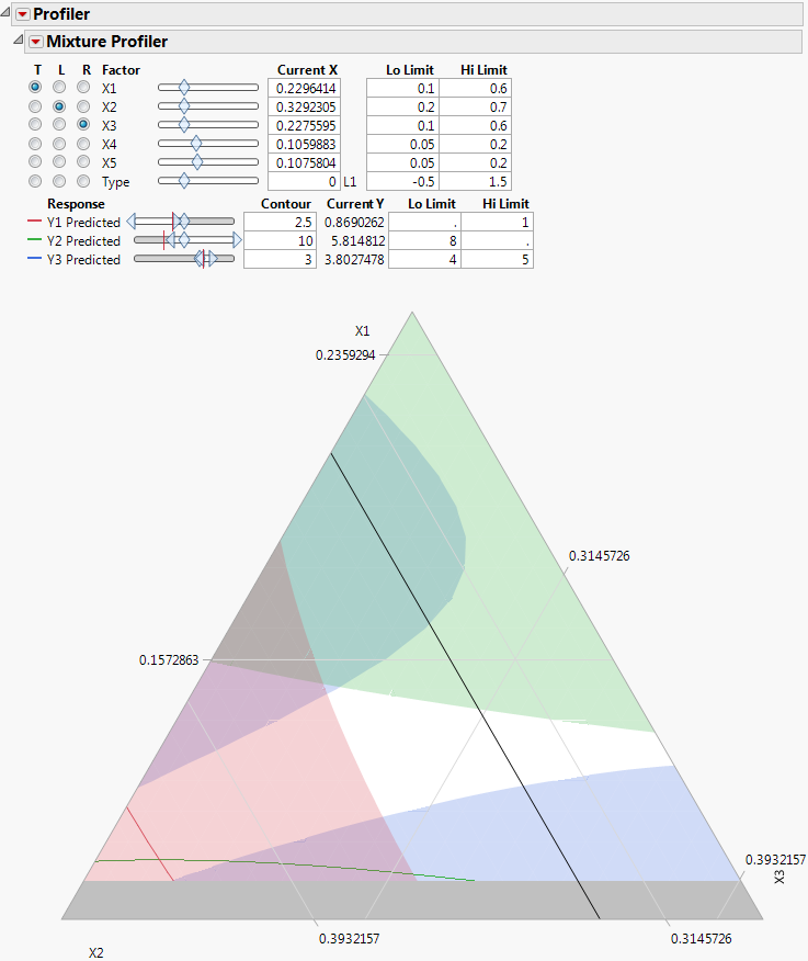
When using constraints, unfeasible regions are shaded in the profiler. Figure 6.5 shows an example of a mixture profiler with shaded regions due to four constraints. The unshaded portion is the resulting feasible region. The constraints are below:
• 4*p2 + p3 ≤ 0.8
• p2 + 1.5*p3 ≤ 0.4
• p1 + 2*p2 ≥ 0.8
• p1 + 2*p2 ≤ 0.95
Figure 6.5 Shaded Regions Due to Linear Constraints
Examples
Single Response
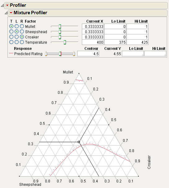
This example, adapted from Cornell (1990), comes from an experiment to optimize the texture of fish patties. The data is in Fish Patty.jmp. The columns Mullet, Sheepshead, and Croaker represent what proportion of the patty came from that fish type. The column Temperature represents the oven temperature used to bake the patties. The column Rating is the response and is a measure of texture acceptability, where higher is better. A response surface model was fit to the data and the prediction formula was stored in the column Predicted Rating.
To launch the Mixture Profiler, select Graph > Mixture Profiler. Assign Predicted Rating to Y, Prediction Formula and click OK. The output should appear as in Figure 6.6.
Figure 6.6 Initial Output for Mixture Profiler.
The manufacturer wants the rating to be at least 5. Use the slider control for Predicted Rating to move the contour close to 5. Alternatively, you can enter 5 in the Contour edit box to bring the contour to a value of 5. Figure 6.7 shows the resulting contour.
Figure 6.7 Contour Showing a Predicted Rating of 5
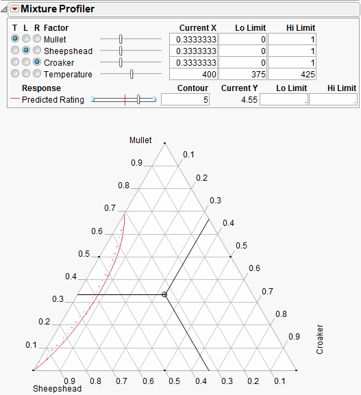
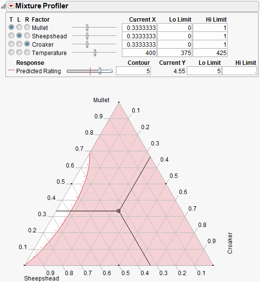
The Up Dots shown in Figure 6.7 represent the direction of increasing Predicted Rating. Enter 5 in the Lo Limit edit box. The resulting shaded region shown in Figure 6.8 represents factor combinations that will yield a rating less than 5. To produce patties with at least a rating of 5, the manufacturer can set the factors values anywhere in the feasible (unshaded) region.
The feasible region represents the factor combinations predicted to yield a rating of 5 or more. Notice the region has small proportions of Croaker (<10%), mid to low proportions of Mullet (<70%) and mid to high proportions of Sheepshead (>30%).
Figure 6.8 Contour Shading Showing Predicted Rating of 5 or More.
Up to this point the fourth factor, Temperature, has been held at 400 degrees. Move the slide control for Temperature and watch the feasible region change.
Additional analyses might include:
• Optimize the response across all four factors simultaneously. See the “Custom Profiler” chapter or “Desirability Profiling and Optimization” in the “Profiler” chapter.
• Simulate the response as a function of the random variation in the factors and model noise. See the “Simulator” chapter.
Multiple Responses
This example uses data from Five Factor Mixture.jmp. There are five continuous factors (x1–x5), one categorical factor (Type), and three responses, Y1, Y2 and Y3. A response surface model is fit to each response and the prediction equations are saved in Y1 Predicted, Y2 Predicted and Y3 Predicted.
Launch the Mixture Profiler and assign the three prediction formula columns to the Y, Prediction Formula role, then click OK. Enter 3 in the Contour edit box for Y3 Predicted so the contour shows on the plot. The output appears in Figure 6.9.
Figure 6.9 Initial Output Window for Five Factor Mixture
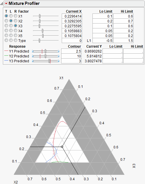
A few items to note about the output in Figure 6.9.
• All the factors appear at the top of the window. The mixture factors have low and high limits, which were entered previously as a Column Property. See the Using JMP book for more information about entering column properties. Alternatively, you can enter the low and high limits directly by entering them in the Lo Limit and Hi Limit boxes.
• Certain regions of the plot are shaded in gray to account for the factor limits.
• The on-axis factors, x1, x2 and x3, have radio buttons selected.
• The categorical factor, Type, has a radio button, but it cannot be assigned to the plot. The current value for Type is L1, which is listed immediately to the right of the Current X box. The Current X box for Type uses a 0 to represent L1.
• All three prediction equations have contours on the plot and are differentiated by color.
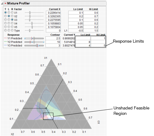
A manufacturer desires to hold Y1 less than 1, hold Y2 greater than 8 and hold Y3 between 4 and 5, with a target of 4.5. Furthermore, the low and high limits on the factors need to be respected. The Mixture Profiler can help you investigate the response surface and find optimal factor settings.
Start by entering the response constraints into the Lo Limit and Hi Limit boxes, as shown in Figure 6.10. Colored shading appears on the plot and designates unfeasible regions. The feasible region remains white (unshaded). Use the Response slider controls to position the contours in the feasible region.
Figure 6.10 Response Limits and Shading
The feasible region is small. Use the magnifier tool  to zoom in on the feasible region shown with a box in Figure 6.10. The enlarged feasible region is shown in Figure 6.11.
Figure 6.11 Feasible Region Enlarged
The manufacturer wants to maximize Y1, minimize Y2 and have Y3 at 4.5.
• Use the slider controls or Contour edit boxes for Y1 Predicted to maximize the red contour within the feasible region. Keep in mind the Up Dots show direction of increasing predicted response.
• Use the slider controls or Contour edit boxes for Y2 Predicted to minimize the green contour within the unshaded region.
• Enter 4.5 in the Contour edit box for Y3 Predicted to bring the blue contour to the target value.
The resulting three contours do not all intersect at one spot, so you will have to compromise. Position the three-way crosshairs in the middle of the contours to understand the factor levels that produce those response values.
Figure 6.12 Factor Settings
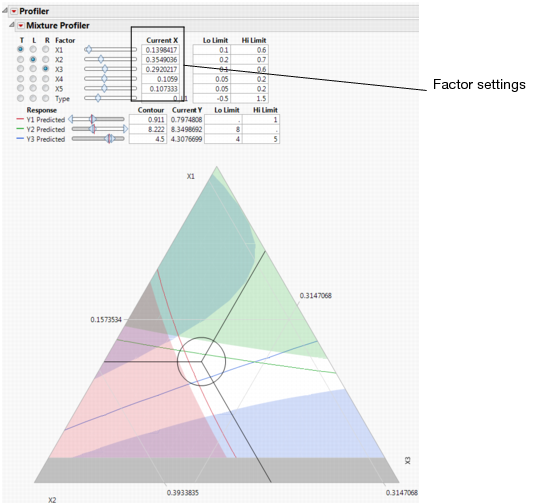
As shown in Figure 6.12, the optimal factor settings can be read from the Current X boxes.
The factor values above hold for the current settings of x4, x5 and Type. Select Factor Settings > Remember Settings from the Mixture Profiler red triangle menu to save the current settings. The settings are appended to the bottom of the report window and appear as shown below.
Figure 6.13 Remembered Settings

With the current settings saved, you can now change the values of x4, x5 and Type to see what happens to the feasible region. You can compare the factor settings and response values for each level of Type by referring to the Remembered Settings report.
..................Content has been hidden....................
You can't read the all page of ebook, please click here login for view all page.