Chapter 5: Descriptive Statistics – Univariate Analysis
Generating Descriptive Statistics for Continuous Variables
Investigating the Distribution for Systolic Blood Pressure
Adding a Classification Variable in the Summary Statistics Tab
Describing Categorical Variables
Editing the SAS Code Generated by the One-Way Frequencies Statistics Task
Introduction
Before you begin any statistical test, you should spend some time "getting to know your data." This chapter describes ways to examine both continuous and categorical data using a variety of techniques, including descriptive statistical measures such as means and standard deviations as well as graphical techniques such as histograms and bar charts.
One of the reasons this step is so important is that understanding your data is necessary in choosing appropriate statistical tests to perform. Also, describing your data, especially using graphical techniques, is one way to spot possible errors in your data.
Generating Descriptive Statistics for Continuous Variables
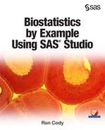
Let's use the SASHELP data set Heart to demonstrate how to produce descriptive statistics for continuous and categorical variables. Start by selecting Summary Statistics from the Statistics tab on the Tasks menu. It looks like this:
Figure 1: Selecting Summary Statistics from the Statistics Task Menu
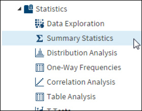
Double-click this selection to bring up the following screen:
Figure 2: DATA Tab for Summary Statistics
Because you want to analyze data from the Heart data set in the SASHELP library, you click the Select a Table icon, choose the SASHELP library and the Heart data set. This data set contains variables such as Sex, Status (dead or alive), Height, Weight, and several variables related to health risks such as blood pressure, smoking, and cholesterol.
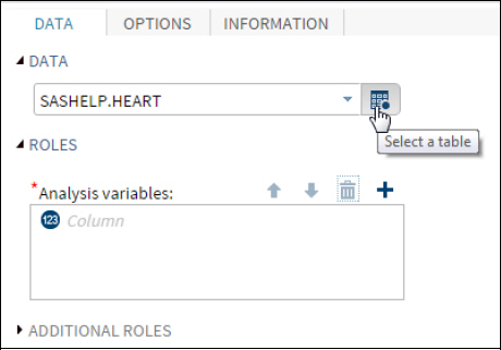
The next step is to select variables to analyze. Click the plus sign to bring up a list of variables in the Heart data set. You can select variables in two ways. One is to hold down the Ctrl key and left-click each of the variables that you want to select. The other method is to click one variable, hold down the Shift key, and then click a variable farther down in the list. All the variables from the first to the last will be selected. You can even combine these two methods to select variables from the list. For this example, you want to select the variables Height, Weight, Diastolic (diastolic blood pressure), and Systolic (systolic blood pressure). Because these variables are all in order in the list, you can use the Shift-key method to select them. It looks like this:
Figure 3: Selecting Variables for Analysis
Once you click OK, you can click the OPTIONS tab to select or deselect statistics and plots that you want to generate (Figure 4).
Figure 4: Click the OPTIONS Tab

Options for Summary Statistics are as follows:
Figure 5: OPTIONS for Summary Statistics

Notice that many of the statistics boxes are already checked. You can select additional statistics or click on a box to deselect a statistic that has already been selected. In this example, the Number of missing values and a request for the median have been added to the default list. It is very useful to see both the number of nonmissing observations along with the number of observations with missing values.
One other useful statistic is the 95% confidence interval (95% CI) for the mean. The 95% confidence interval for the mean is useful to determine how accurately your sample mean estimates the mean of the population from which you drew your sample.
To request this statistic, click the triangle to the left of the heading Additional Statistics. This reveals a further set of choices as shown in Figure 6.
Figure 6: Additional Statistics

When you check the box for Confidence limits for the mean, the line below, labeled Confidence level, displays the default value of 95% for the CI. You can select other intervals, but 95% is the one most commonly used.
Finally, you can also select plots from the option list. Here you are requesting a histogram and box plot for the selected variables (Figure 7 below).
Figure 7: Requesting a Histogram and Box Plot

You are ready to click the Run Icon.
The first section of output shows basic statistics for the selected variables.
Figure 8: Descriptive Statistics for Selected Variables

You see the mean, standard deviation, minimum, maximum, median, the number of nonmissing values, and the number of missing values for each of the analysis variables. The last two columns in the table represent the lower and upper 95% confidence interval for the mean.
The next section of output consists of a histogram and box-plot for each variable. To save space, only two histograms, one for Height and one for Systolic, are shown in the two figures that follow.
Figure 9: Histogram and Box Plot for Height

You can see that the distribution for Height is fairly symmetric and does not appear to have too many extreme values.
Figure 10: Histogram and Box Plot for Systolic

The histogram and box plot for Systolic was included to show a variable that is positively skewed, easily seen by the long tail on the right side of the histogram and by the outliers on the box plot (the circles on the right side of the plot). Notice that the mean, displayed as a diamond on the box plot is to the right of the median (displayed as a vertical line in the box), another indication that the data values are positively skewed.
Investigating the Distribution for Systolic Blood Pressure
At this point, you may want to further investigate the distribution of systolic blood pressure. One way to do this is to select Distribution Analysis from the list of Statistics tasks. Make sure that the Heart data set is selected on the DATA tab and Systolic is selected as the analysis variable. Click the OPTIONS tab to bring up the following menu:
Figure 11: Options for the Distribution Analysis Tab

Because you have already produced a histogram from the Summary Statistics tab, you first want to deselect the box next to Histogram. Next, you have a choice of options for checking for normality. In this example, you are requesting a Q-Q (Quantile-Quantile) plot with added inset statistics. A Q-Q plot displays the quantiles of one distribution on the x-axis and the quantiles of another distribution on the y-axis. A quantile is the proportion or percent of a distribution that falls below a given value. For example, 25% of the data values will fall below the 25th percentile The Q-Q plot produced by SAS displays the quantiles of a theoretical distribution (in this case, a normal distribution) on the x-axis and the actual quantile for your sample distribution on the y-axis. You may recall that if you have normally distributed data, the Q-Q-plot will be a straight line.
Two popular statistics that quantify deviations from normality, Skewness and Kurtosis, are selected to be displayed in an inset box on the Q-Q-plot. Clicking the Run icon produces the following plot:
Figure 12: Q-Q-Plot for Systolic

The straight line on the plot represents a normal distribution with the same mean and standard deviation as the variable Systolic. The circles on the plot represent values of systolic blood pressure from your sample data. At the bottom of the Q-Q plot, you see that the theoretical normal distribution has a mean (Mu) equal to 136.91 and a standard deviation (Sigma) equal to 23.74.
To help you understand this Q-Q plot, look at the right side of the plot. The circles above the straight line on this part of the plot indicate that your sample data includes values of systolic blood pressure that are higher (more extreme) than you would expect if the systolic blood pressures were normally distributed. This confirms the strong positive skewness that you saw in the histogram.
Values for Skewness and Kurtosis close to zero result from distributions that are close to normal. Positive values for skewness, as in this plot, indicate a positively skewed distribution (extreme values in the right tail). Positive values for kurtosis (as in this example) indicate both that the distribution is too peaked (leptokurtic) and that the tails are too heavy. Negative values for kurtosis indicate that the distribution is too flat (platykurtic) and that the tails are too light. Modern interpretation of kurtosis puts emphasis on the tails being too heavy or too light and deemphasizes the concepts of the distribution being too peaked or too flat.
When it is time to run statistical tests on systolic blood pressure and various categorical variables of interest, you may be concerned that the distribution for the variable Systolic deviates quite noticeably from a normal distribution. Because the sample size of the Heart data set is so large (over 5000), you may feel comfortable in running parametric tests such as t tests and ANOVA. Those types of decisions will be explored in later chapters that discuss inferential statistics.
Adding a Classification Variable in the Summary Statistics Tab
Suppose you want to compare the variable Height for males and females. You can go back to the Analysis variables section of the DATA tab and select Height and, in the box labeled Classification variables, add the variable Sex. Your DATA tab should now look like this:
Figure 13: Adding a Classification Variable

Under the Plots option, you can select a histogram and box plot to display distributions of Height for males and females (Figure 14 below).
Figure 14: Requesting Histograms and Box Plots

When you run this program, you see the following:
Figure 15: Histogram of Height by Sex

As expected, the center of the distribution for Sex=Male (bottom histogram) is shifted to the right compared to the distribution for Sex=Female.
You can see similar differences in the box plots (Figure 16 below).
Figure 16: Box Plots for Height and Sex

The box plots also show more outliers in the female distribution of Height compared to the male distribution. This may be partly due to the smaller interquartile range (the distance from the top to the bottom of the box) for the females compared to the males.
Describing Categorical Variables
Descriptive statistics for most categorical variables consist of frequency tables and bar charts. You may also want to display two-way tables to investigate relationships between two categorical variables (described in the next chapter).
The first step in generating frequency tables and bar charts is to double-click the One-Way Frequencies selection on the Statistics tab, as follows:
Figure 17: Selecting One-Way Frequencies

This brings up the DATA and OPTIONS tabs for this selection. For this example, three variables, Status, Sex, and Chol_Status were selected as analysis variables. Clicking the Options tab brings up the following screen:
Figure 18: DATA and OPTION for One-Way Frequencies

The box under Plots allows you to suppress plots. The default action is to produce plots (bar charts in this case). You also have options to include percentages and cumulative statistics. For this example, you want to include percentages and exclude cumulative frequencies and percentages. It's now time to click the Run icon.
To save space, only the output for Status is shown here.
Figure 19: Output from One-Way Frequencies (Variable Status)

The frequency table shows the number of people in each category (Alive versus Dead) as well as a bar chart displaying the frequencies graphically.
By default, the option to produce plots produces two charts: one showing frequencies (counts), the other showing cumulative frequencies (displayed in Figure 20):
Figure 20: Cumulative Frequency Plot

Editing the SAS Code Generated by the One-Way Frequencies Statistics Task
This is a good time to show you how to edit the SAS code produced by any of the SAS Studio tasks to customize the programs. Click the Code tab, and the SAS program generated by the One-Way Frequencies request appears in the right pane. It looks like this:
Figure 21: SAS Code Generated by the Request for One-Way Frequencies

This program uses the FREQ (frequency) procedure to produce the frequency tables and plots for the One-Way Frequencies task. You provide a list of variables that you want to analyze in the TABLES statement. Following this list, you see a forward slash. A general rule in SAS procedures is that statement options (TABLES is considered a statement) are placed following a forward slash. Thus, NOCUM and PLOTS= are options that affect how the tables and charts appear. As you probably guessed, NOCUM is the instruction to omit cumulative statistics from the frequency table. Two plots, one a simple frequency plot and the other a cumulative frequency plot, are requested by the two plot requests (FREQPLOT and CUMFREQPLOT).
Let's modify this program in two ways: First, you want to add a customized title to the output; second, you want to omit the cumulative frequency plot. Here's how to do it:
The first step is to click the EDIT button at the top right of the code pane (see Figure 22 below).
Figure 22: Clicking the EDIT Button to Edit the Program

This action allows you to edit the task-produced program. To provide a customized title for the output, you use a TITLE statement. This consists of the keyword TITLE, followed by your title text, placed in single or double quotation marks. If any part of the title text contains a single quotation mark, be sure to use double quotation marks to enclose the title. Next, move the cursor to CUMFREQPLOT and delete it. The resulting program should now look like this:
Figure 23: The Edited Program

If you submit the program again, you will see your customized title and the bar chart showing cumulative frequencies will not be produced.
Conclusions
Before you conduct statistical tests on your data, it is a good idea to explore your data with the descriptive techniques (both tables and graphical output) described in this chapter. Knowing the shapes of distributions for continuous variables may affect your choice of statistical tests to perform. Frequency analysis will allow you to determine how many people (observations) belong to each category of a categorical variable. Both of these tasks also have the ability to uncover data errors.
Problems
5-1: One of the SASHELP data sets is called BMT (bone marrow transplant data). Compute summary statistics for the variable T (disease-free survival time). Remove the minimum and maximum value from the summary, and include the number of missing observations and the median. Also generate a histogram and box plot for this variable.
5-2: Using the same data set as problem 5-1, compute summary statistics for the variable T, broken down by the variable Group. Request a histogram and a comparative box plot.
5-3: Create a temporary SAS data set (call it BP) from the Excel workbook Blood_Pressure.xlsx. Using this data set, study the distribution of the two variables SBP and DBP. What does the Kolmogorov-Smirnov test tell you about these two variables? Include a request for a histogram and a Q-Q plot.
5-4: Using the BP data set from question 5-3, compute summary statistics for SBP with Drug as a classification variable. Add a request for a histogram and a comparative box plot.
5-5: Using the BP data set from question 5-3, compute frequencies for the two variables Drug and Gender. Omit cumulative statistics from the output. Suppress all plots.