Chapter 13: Analyzing Categorical Data
Describing the Heart_Attack Data Set
Producing One-Way Tables with Formats
Using Formats to Reorder the Rows and Columns of a Table
Computing Chi-Square from Frequency Data
Analyzing Tables with Low Expected Values
Introduction
Quite a bit of data used in the health sciences deals with frequency counts and proportions. For example, you may have data from a cohort study where one group of subjects has high cholesterol and another group has low or normal levels of cholesterol. You then follow these groups and count number of heart attacks that occur in each group after a predetermined period of time. One of your goals would be to determine if the proportion of subjects who had heart attacks (myocardial infarctions, in doctor-speak) was higher in the high-cholesterol group. Remember, that even if there were no relationship between cholesterol level and heart attack (a good choice of a null hypothesis for this study), there could still be differences in the incidence of heart attacks in the two groups that make up your sample data. You need to determine if the difference that you observe has a low probability of occurring if the null hypothesis is true.
This chapter covers tests to compare proportions, as in the hypothetical example stated here, and other tests of association.
Describing the Heart_Attack Data Set
Many of the examples in this chapter use a data set called Heart_Attack. A screen shot of the worksheet containing the data is shown in Figure 1. (Note: This data set was generated for instructional purposes and is not actual data.)
Figure 1: First Few Rows in the Heart_Attack Worksheet

The information in this file is coded as follows:
| Variable Name | Description | Values |
| Gender | Gender of Subject | F=Female, M=Male |
| Age | Age in years | |
| Age_Group | Age Group | 1=<60, 2=60-70, 3=71 and older |
| Chol | Total Cholesterol | |
| High_Chol | Is Cholesterol level high? | 1=Yes, 0=No |
| Heart_Attack | Did subject have a heart attack? | 1=Yes, 0=No |
Besides looking at simple frequencies for variables such as Gender, Age_Group, High_Chol, and Heart_Attack, you will also want to examine risk factors for heart attacks by generating two-way tables. Because the variable Heart_Attack has only two values, you could also use binary logistic regression (described in the previous chapter) to explore the relationship between risk factors and heart attacks.
Computing One-Way Frequencies
Before you can use SAS Studio to analyze this data set, you need to use the Import Utility to convert the workbook into a SAS data set. As a reminder:
Tasks and Utilities ▶ Utilities ▶ Import Data
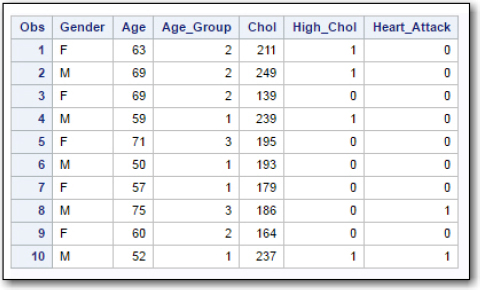
This process was used to create a SAS data set called Heart_Attack that was stored in the BOOKDATA library. The listing in Figure 2 was created by using the List Data task (with the option to list the first 10 observations):
Figure 2: First 10 Observations in the SAS Data Set Heart_Attack
To compute one-way frequencies, double-click One-Way Frequencies in the statistics task list, to bring up the following screen (Figure 3):
Figure 3: Demonstrating the One-Way Frequency Task

Next, enter information on the Data tab (Figure 4):
Figure 4: Data Tab Selections

Choose the Heart_Attack data set stored in the permanent BOOKDATA library on the Data tab. Next, select the variables Gender, Age_Group, High_Chol, and Heart_Attack in the Analysis variables box.
Before you run the procedure, click the Options tab to select additional options (Figure 5):
Figure 5: One-Way Frequencies Options

In this example, you have chosen to suppress plots and to deselect the default option to include cumulative frequencies and percentages. You are now ready to run the procedure. The output is shown in Figure 6:
Figure 6: Frequency Tables
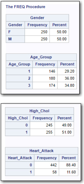
You see the frequency and percent for each unique value of these variables. Although this is useful information, it could be improved by replacing the values of Age_Group (1,2,3), Gender (F,M), and the two variables High_Chol and Heart_Attack (0,1) with labels. You can define formats to associate each of these unique values with labels. That is the topic of the next section.
Creating Formats
You will need to write a few lines of SAS code to create the formats that you will use to label the values in these tables. You create formats with a SAS procedure called PROC FORMAT. Figure 7 is a program that creates three formats and then creates a copy of the Heart_Attack data set where these formats are associated with the appropriate variables.
Figure 7: Adding Formats to the Data Set
*Adding formats to the Heart_Attack Dataset;
proc format; ①
value $gender 'F' = 'Female' ②
'M' = 'Male';
value Yesno 0 = 'No' ③
1 = 'Yes';
value Age_Group 1 = '< 60' ④
2 = '60-70'
3 = '71+';
run;
data Heart_Attack; ⑤
set bookdata.Heart_Attack; ⑥
format Gender $Gender. ⑦
Heart_Attack High_Chol Yesno.
Age_Group Age_Group.;
run;
title "Listing the First 10 Observations from Heart_Attack";
proc print data=Heart_Attack(obs=10); ⑧
run;
The first line of the program is a comment statement stating the purpose of the program. Remember that comment statements start with an asterisk and end with a semicolon.
① PROC FORMAT is used to create SAS formats.
② Use a VALUE statement to define each format that you want to create. Follow the keyword VALUE with a format name. Format names are a maximum of 32 characters and must contain only letters, digits, and the underscore character. One additional rule is that format names cannot end in a digit. Finally, if the format is to be used with character data (such as Gender), you use a dollar sign as the first character in the format name. (Note: the $ character counts as one of the 32 characters in the format name.) Although the format $Gender is going to be used with the variable called Gender, the format name can be anything you want. It could have been named $Oscar.
Following the format name, you define labels for each value that you wish to label. Because Gender is a character variable, the values 'M' and 'F' must be in single or double quotation marks. Following each value (or a list of values separated by commas), you type an equal sign and the format label. This label also belongs in single or double quotation marks.
You can read more about how to create formats in several of the SAS Press books including Learning SAS by Example (Cody, 2007) or An Introduction to SAS University Edition (Cody, 2015).
③ The Yesno format will be used for the two variables High_Chol and Heart_Attack. Because these variables are numeric, the format name does not start with a $.
④ The last format will be used to label the three Age_Group values.
⑤ The DATA statement is creating a new data set called Heart_Attack. Because this data set name does not contain a period, this data set is a temporary data set and will be stored in the WORK library. You could have also used WORK.Heart_Attack for the data set name.
⑥ The SET statement reads observations from an existing SAS data set. Essentially, this makes a copy of the permanent data set BOOKDATA.Heart_Attack and creates a temporary SAS data set with the same name. The only difference is that the new temporary data set will include the associations between certain variables and formats because of the FORMAT statement in the next line.
⑦ The FORMAT statement associates variable names and formats. In this format statement, the format $Gender will be used to format the variable Gender. Notice the period following the format name. This tells the DATA step that $Gender is a format and not a variable name. Because the format Yesno is going to be used with the two variables, Heart_Attack and High_Chol, you list both of these variables and follow them with the format name Yesno. Again, notice that there is a period after the format name. Finally, the format Age_Group is associated with the variable Age_Group. You end the DATA step with a RUN statement.
⑧ PROC PRINT is used to list the first 10 observations in the new data set Heart_Attack. As an alternative, you could use the List Data task to list these observations. The listing is displayed in Figure 8:
Figure 8: First 10 Observations from Data Set Heart_Attack (with formats)

Notice that the formats that you created are displayed in this listing. Because the association between the variables and formats was executed in a DATA step, this association will be maintained in other SAS procedures such as the one-way or two-way tables.
It is important to remember that the actual values for the formatted variables still exist in the SAS data set. The formats labels only appear when you use certain procedures that present data, such as the listing above or the tables that you will be producing in this chapter.
Producing One-Way Tables with Formats
If you rerun one-way frequencies (see Figure 6) with the WORK data set Heart_Attack (the one with associated formats), the one-way frequency tables will now display formatted values. Only two tables (for the variables Age_Group and Heart_Attack) are shown here in Figure 9:
Figure 9: One-Way Frequencies with Formatted Values

These tables have a clear advantage over the unformatted tables produced earlier. For example, it saves you the trouble of going back to your coding scheme to see what age groups 1, 2, and 3 represent. Take a moment to look at the table showing frequencies for heart attacks. Notice that the values (No followed by Yes) are in the same order as in the original unformatted table. The reason for this is that the One_Way task orders values in a frequency table by the internal values of the variables. Because the original values were 0 (No) and 1 (Yes), the table is displayed with 'No' as the first category listed, followed by 'Yes'. You will see how to change the order of values in one-way frequencies tables or in 2-by-2 tables later in this chapter. (I know you excited about this, but just hold on a minute.)
Creating Two-Way Tables
To see relationships between variables, such as if high levels of cholesterol increase the incidence of heart attacks, you will want to produce two-way tables. The first step is to double-click Table Analysis in the statistics task menu (Figure 10):
Figure 10: Creating a Two-Way Table

Next fill in the Data tab.
Figure 11: Completing the Data Tab for Two-Way Table

Notice that the Heart_Attack data set in the WORK library (the one with formats) is selected as the data source. Next, you get to choose which variables form the rows of the table and which variables form the columns. Every variable selected in the Row variables box will be paired with every variable in the Column variables box. It is typical to choose the outcome variable (in this case, having a heart attack or not) as a column variable and the other variables such as High_Chol as row variables.
There are many more options to choose from in the Table task compared to the One-Way task. Click the Options tab to get started (see Figure 12):
Figure 12: Options for the Two-Way Table

Check Suppress plots if you do not want plots. Next, you have a choice of what percentages you would like to display. Here, you have chosen to see row and column percentages. Because you don’t want to see cumulative frequencies (not usually useful), make sure that this box is unchecked.
As you can see, there are many options in the statistics menu. Two of the more common options, Chi-square and Odds ratios and relative risks (also known as risk ratios), were chosen for this example. It's time to run the task. Here are the results. (Note: to save space, only one table was included here. You can see a display that includes odds ratios and relative risks later in Figure 19 in this chapter.)
Figure 13: Table of Cholesterol Level versus Heart Attack

The box in the upper-left corner of the output is the key to the three numbers in each box. The top number is a frequency count. For example, there were 231 subjects who did not have high cholesterol and who did not have a heart attack. The second number in each cell is a row percentage. In this example, 94.29% of the subjects who did not have high cholesterol did not have a heart attack. Finally, the third number in each cell is a column percentage: 52.26% of the subjects who did not have a heart attack also did not have high cholesterol.
Although all the information you need is included in this table, it is preferable to rearrange the order of values in the rows and columns so that the first column is Yes (had a heart attack) and the top row is Yes (had high cholesterol). You can use formats (plus an added option of PROC FREQ, the procedure that produces these tables) to reorder the rows and columns.
Using Formats to Reorder the Rows and Columns of a Table
There is an option in PROC FREQ called ORDER= that allows you to select several ways to order values in a table. The default order is by internal value. That is why the tables printed so far placed 'No' before 'Yes', 0 before 1, and the age groups in order from 1 to 3. You can set ORDER=Formatted to request that the values in a table are ordered by the formatted values rather than the non-formatted (internal) values.
The program shown in Figure 14 uses a trick that is popular with SAS programmers: The formats are written to force the values for 'Yes' to come before the values for 'No' and for "Male' to come before 'Female'. Here is the program:
Figure 14: Rewriting the Formats
*Adding formats to the Heart_Attack Dataset;
proc format;
value $gender 'F' = '2:Female'
'M' = '1:Male';
value Yesno 0 = '2:No'
1 = '1:Yes';
value Age_Group 1 = '< 60'
2 = '60-70'
3 = '71+';
run;
data Heart_Attack;
set bookdata.Heart_Attack;
format Gender $Gender.
Heart_Attack High_Chol Yesno.
Age_Group Age_Group.;
run;
The numbers (1 and 2) as part of the format labels for the two formats $Gender and Yesno, force the tables to be ordered the way you prefer. (Even though '1' and '2' are digits, '1' comes before '2' alphabetically.) By the way, the three labels for the Age_Group format are already in alphabetical order, so there is no need to add digits to these format labels. There is one more thing to do before you create the tables. You need to edit the SAS code produced by the Tables task to add the option ORDER=Formatted. Once you have filled out the Data and Options tables with your preferences, click the Edit icon in the code window (Figure 15):
Figure 15: Editing the Code Generated by the Tables Task

Now you can add the ORDER=Formatted option like this:
Figure 16: Adding the ORDER= Option to PROC FREQ
proc freq data=WORK.Heart_ATTACK order=formatted;
tables (High_Chol) * (Heart_Attack) / chisq relrisk nopercent
nocum plots=none;
run;
Now, click the Run icon. The table is now in the preferred order (see Figure 17):
Figure 17: New Two-Way Table with Order Changed

The top left cell represents subjects who have high cholesterol and who also had a heart attack.
The table statistics are displayed in Figure 18:
Figure 18: Table Statistics

The value of Chi-square and the p-values are the same as before. So, why was it so important to change the order of the rows and columns in the table? The answer is that the odds ratios and relative risks for the relationship between cholesterol and heart attack now show the risk of having a heart attack if you have high cholesterol (Figure 19):
Figure 19: Odds Ratio and Relative Risk
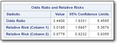
Remember that the program doesn't know if you conducted a case-control study (where you use the Odds Ratio) or a cohort study (where you will use the Relative risk). Because this was a cohort study, you can report that a person is 3.0196 times more likely to suffer a heart attack if he or she has high cholesterol. The table also shows the confidence limits for the odds ratio and relative risks. Notice that these intervals do not include 1. An odds ratio or relative risk of 1 would mean that a person with high cholesterol was not at a higher or lower risk of having a heart attack. You expect this because of the significant chi-square value.
Although it is not shown here, running the Tables task with the new formats places 'Male' before 'Female' for the columns and 'Yes' before 'No' on the rows. The resulting relative risk (about 1.5) is the increased risk for a heart attack for males compared to females.
Computing Chi-Square from Frequency Data
When you already have a 2-by-2 table with frequency counts, you can still use the Table analysis task to compute chi-square and related statistics. Suppose you already have a table with the data from Figure 13. You can put the data from this table in an Excel worksheet as follows:
Figure 20: Worksheet Containing Counts

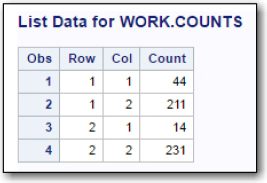
The next step is to convert this data into a SAS data set using the Import utility. Figure 22 (below) is a listing of the SAS data set created from the frequency data. The WORK data set was called Counts.
Figure 21: Data Imported into a SAS Data Set
Start the Table analysis task and use the Data tab to identify the variable Row as the row variable and the variable Col as the column variable.
Figure 22: Table Analysis Data Tab

In order to tell the task that you already have frequency data, click Additional Roles at the bottom of the Data screen (Figure 23.
Figure 23: Identifying the Variable Representing Frequencies

Click the plus sign and select the variable Count as the variable that represents the frequency data. Finally, select the Options tab and select the statistics that you want. Because this data is the same as presented in this chapter, only the 2-by-2 table is shown (below), so you can see that starting from frequency data results in the same table when you had raw data.
Figure 24: Resulting Table

Analyzing Tables with Low Expected Values
The final topic in this chapter deals with 2-by-2 tables with expected values less than 5. You may recall that one of the assumptions for computing chi-square in a 2-by-2 table is that all of the expected values are 5 or more. When this is not the case, a popular alternative to chi-square is Fisher's Exact test.
There are statisticians who prefer chi-square with a correction for continuity instead of Fisher's Exact test. SAS produces both statistics, so you can take your pick.
Let's use the table displayed in Figure 25 to demonstrate how to analyze tables with small expected values.
Figure 25: Table with Expected Values Less than 5

Remember that the 2-by-2 frequency table displayed in Figure 25 contains actual counts, not expected values. You can easily compute the expected value for each cell or let SAS do it. Let's do the latter. You can click the Data tab and check the box to display expected values. This adds expected values to each cell. It looks like this:
Figure 26: Displaying Expected Values for Each Cell

The bottom number in each cell is the expected value for that cell. Notice that two cells have expected values less than 5. To perform Fisher's Exact test, click Exact Test on the Options tab and check the box for Fisher's Exact test (Figure 27):
Figure 27: Selecting Fisher's Exact Test

It's time to run the task. Figure 28 and Figure 29 show values for the continuity adjusted chi-square (3.5267, p = .0604) and Fisher's Exact test (two-sided value p = .0361):
Figure 28: Chi=Square and Adjusted Chi-Square

Figure 29: Fisher's Exact Test

Conclusions
Analysis of frequency data is one of the major tools in analyzing health outcomes where the recorded values are dichotomous or ordinal in nature. The two tasks, One-Way Frequencies and Table Analysis, provide you with all the tools you need. In addition, this chapter showed you how to create formats and to use formats to control the order of values in one-way or two-way tables
Problems
13-1: Starting with the file Risk.csv, use the import utility to create a temporary SAS data set called Risk. Use the One-way Frequencies task to create one-way frequencies for the variables Age_Group, Chol_High, Gender, and Heart_Attack. Use the appropriate options to omit plots and to omit cumulative frequencies and percentages.
13-2: Using the SAS data set Risk from problem 13-1, construct a 2 x 2 table with the variable Chol_High on the row dimension and Heart_Attack on the column dimension. Include a calculation of chi-square, odds ratio, and relative risk. Omit all plots.
13-3: Repeat problem 13-2 except add the necessary statements (and edit the task) so that column 1 is Heart_attack = 1 and row 1 is Chol_High = 1.
13-4: Given the table below, create a SAS data set and compute chi-square for the table. What is the odds ratio for the risk factor = Yes?
Table of Risk_Factor by Outcome
| Risk_Factor | Outcome | ||
| Frequency | Bad | Good | Total |
| 1-Yes | 50 | 15 | 65 |
| 2-No | 25 | 40 | 65 |
| Total | 75 | 55 | 130 |
13-5: Given the table below, compute Fisher's exact test and the continuity-corrected chi-square:
Table of Risk_Factor by Outcome
| Risk_Factor | Outcome | ||
| Frequency | Bad | Good | Total |
| 1-Yes | 5 | 3 | 6 |
| 2-No | 2 | 15 | 17 |
| Total | 7 | 18 | 25 |