Introduction
One of the best things about being an artist is having an excuse to actually stop and look around.
Seeing is a rare and luxurious activity these days. My paintings in watercolor and acrylic are inspired by the things I see and my impressions of them. When I paint I’m not attempting to replicate what’s in front of me. I’m searching for subjects that I want to look at and experience deeply, for a long, focused time. I enjoy the process of translating them into my own vision of the world. I try to avoid the clichéd scene but I don’t want to deprive myself of possibilities either, so I try to look deeper than the obvious. I try to experience a subject as closely and as intimately as possible.
Sometimes it’s the atmospheric effects of mist through the trees that intrigues me as much as the trees themselves. Sometimes it’s the riot of contrasting color in the garden more than the actual blooms that I love. Sometimes it’s the sound of a wave booming under a seaweed covered ledge that makes me want to capture my impression of the sea on paper. My heightened experience of the woods, the garden, and the crashing waves involves all my senses: seeing, hearing, feeling, and even smelling. That’s what I am interested in capturing in my work.
I like to think my way of working is a continuation of the way the Impressionists approached painting. I have always felt their influence, both for the beauty of their work and for their philosophy. Originally the Impressionists insisted their artwork was based solely on an analytic reaction to a scene. But ultimately it became clear that their impressions were vastly informed by their feelings, expectations, and desires—in fact, very romantic. I like that and I like being part of the continuum of painting impressionistic landscapes.
In this book I am pleased to walk you through my creative steps. I have chosen three landscape themes—woods, garden flowers, and water—inspired by the natural features of the granite New Hampshire island where I live. I will show you several approaches and various ways to think about them. Each theme is considered separately with images and step-by-step demonstrations. The demonstrations detail the progress from concept to finished painting. I hope to share my way of seeing as well as the thought process and continual problem solving that develops as I paint.
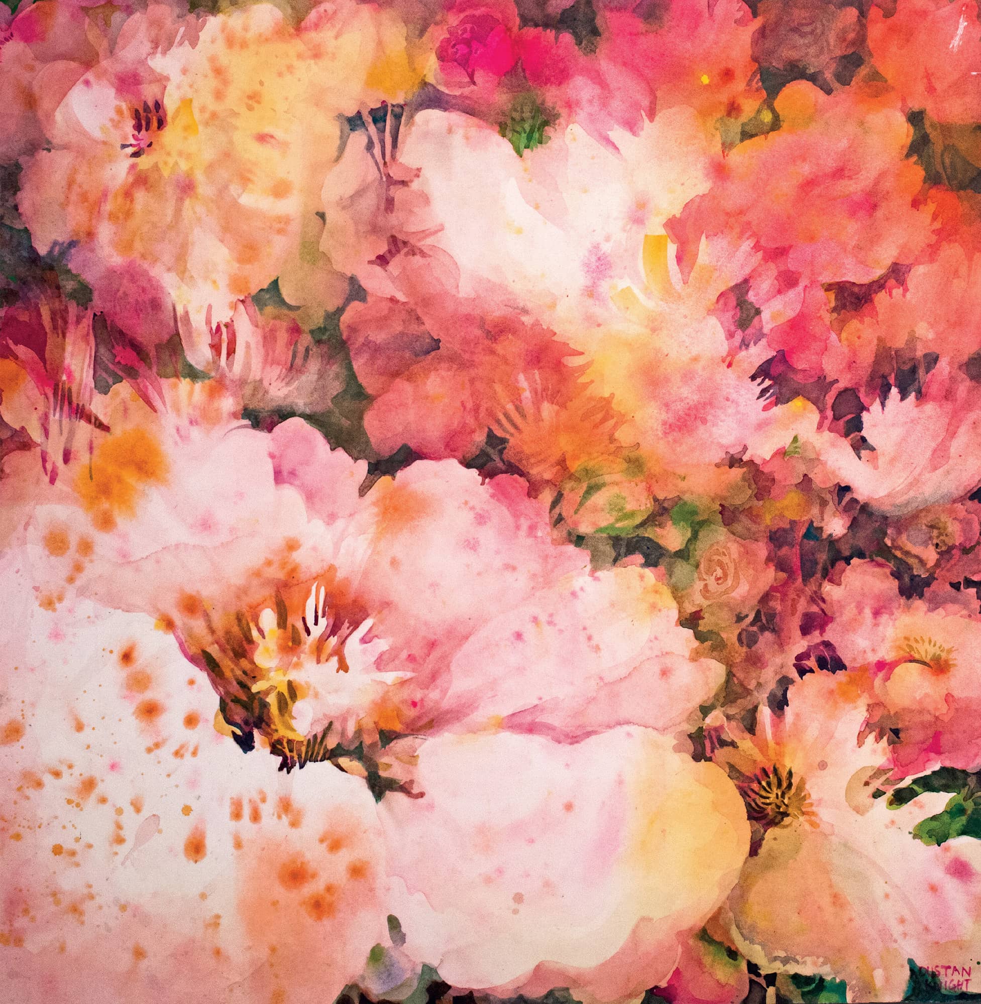
Rebecca’s Flower. Watercolor. 36" × 36" (91.5 × 91.5 cm).
Approaches and Impressions
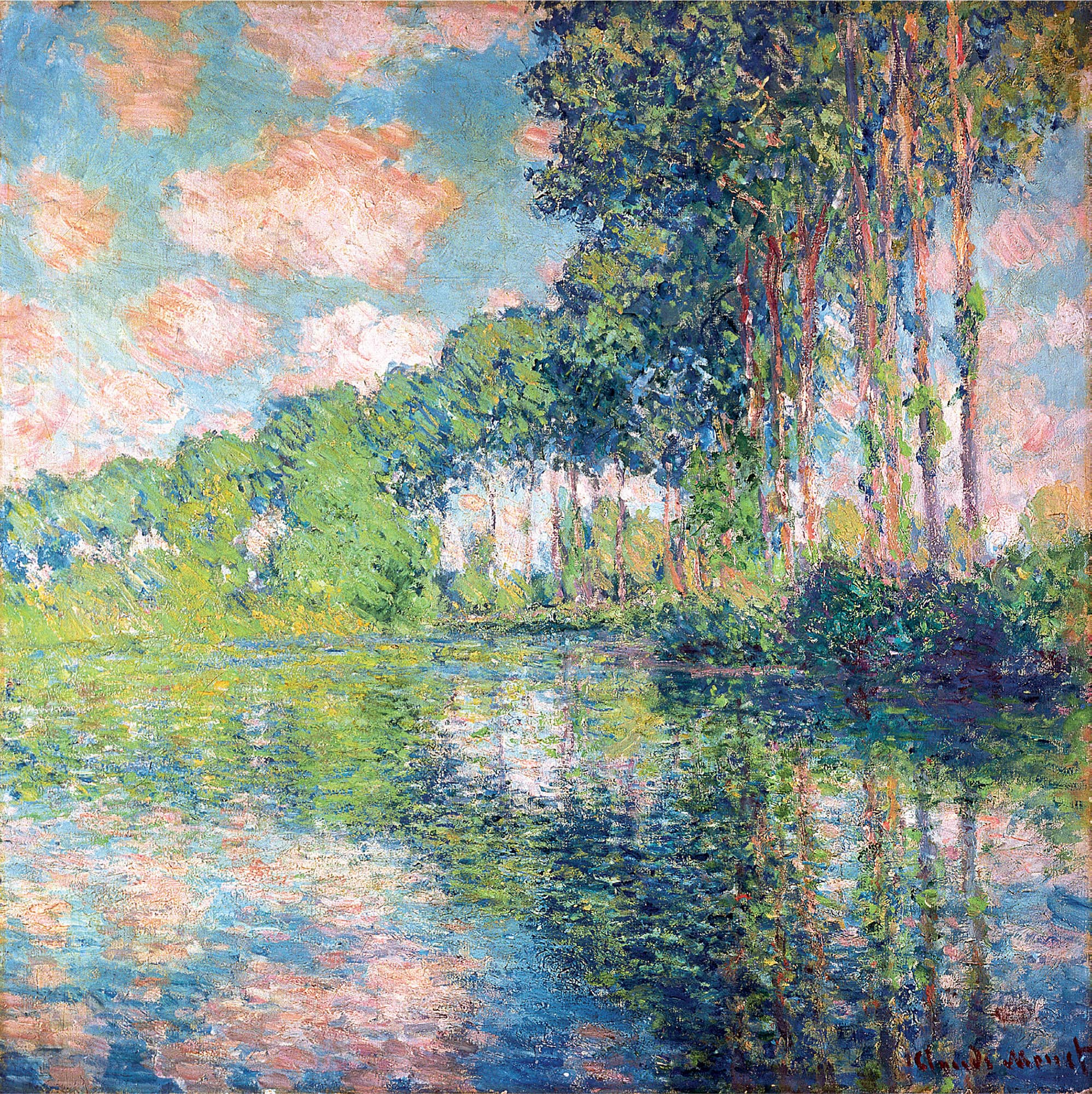
Poplars on the Epte, c. 1891. Oil on canvas. Claude Monet, French, 1840–1926. Scottish National Gallery, Edinburgh. Bridgeman Images.
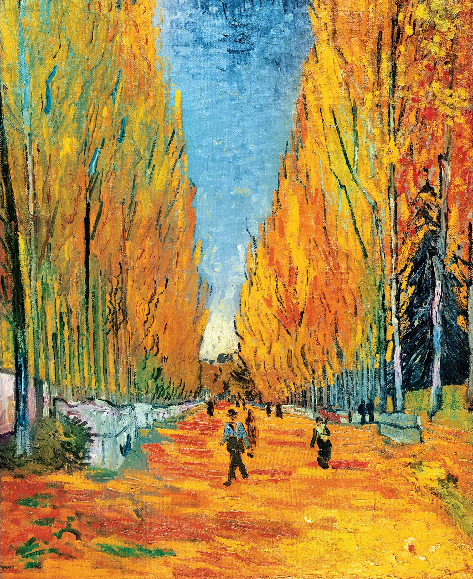
L’Allée des Alyscamps, 1888. Oil on canvas. Vincent van Gogh, Dutch, 1853–1890. Private Collection. Bridgeman Images.
It’s hard for me to imagine anyone having fun painting before Monet and Renoir. Before they tossed a sandwich into a knapsack, packed their tubes of paint, and headed outdoors to look for something to paint, art was stifling, jammed with parameters for correctness and tiresome allegories for subjects.
Thank goodness the Impressionists shucked the Royal Academy of Art and depended on their own eyes to see and their own inner vision to express what they saw. That’s what I respond to in their landscapes and this is a book about what I’ve learned from that relationship—my own impressionistic approach to teaching and painting landscapes in watercolor and acrylic.
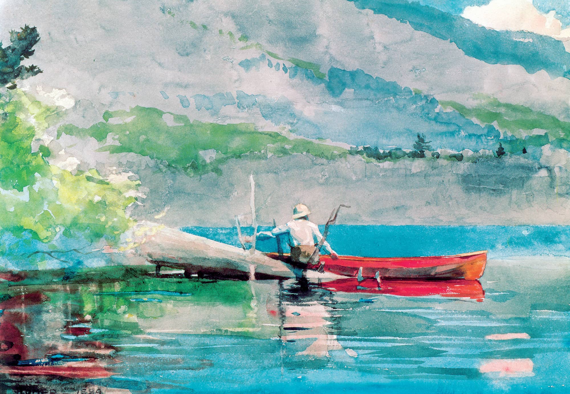
The Red Canoe, 1884. Watercolor on paper. Winslow Homer, American, 1836–1910. Private Collection. Bridgeman Images.
One of the highlights of teaching, for me, was to take my students on a field trip to the works-on-paper archives at the Museum of Fine Arts in Boston. The curator would arrange watercolors on low easels for the class to discuss. Being able to see how Sargent scraped white into a shadow with a pen knife or where Homer dragged a wax candle across his paper as a resist made me feel as though I was sitting on the grass beside them, watching them paint.
Sargent and Homer painted in a broad, loose style with bouncing color and visible brushwork capturing the feeling of light. They picked up the color in one area and used it in another as a detail. They seemed to work from bigger to smaller, looser to more detailed, light to dark, and sometimes back to light again. Childe Hassam painted about 10 miles (16 km) off the shore from my own studio in New Hampshire, and I can tell by looking at his paintings that the air is similar and the breeze smells the same. The connection is still there. The conversation continues.
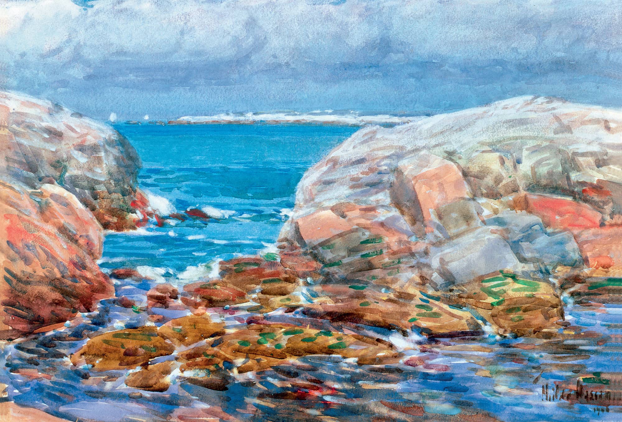
Duck Island, Isles of Shoals, 1906. Watercolor on paper. Childe Hassam, American, 1859–1935. Private Collection. David Findlay Jr. Fine Art, NYC. Bridgeman Images.
Tools and Materials
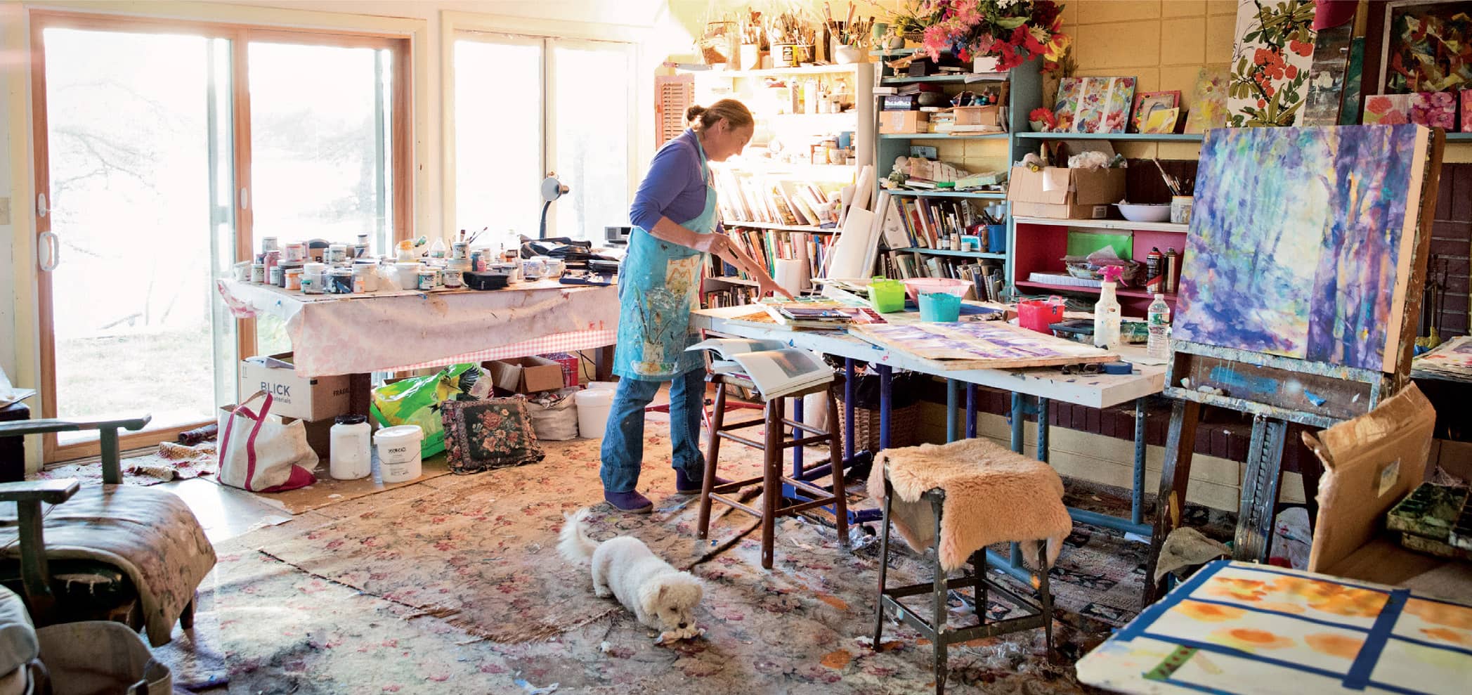
Creative moments in the studio
Paper, canvas, paint, brushes: your art materials are truly a matter of your personal choice. Choose wisely because stocking your studio or outdoor painting kit can get expensive. I’ve outlined my personal choices here, as well as a few suggestions for saving money.
Watercolor Paper
Watercolor paper comes in various thicknesses or pounds—the higher the number, or poundage, the thicker and more substantial the paper. I recommend using at least a 140 lb (300 g/m2) paper, which will hold up to being soaked with water, scratched, and reworked. At the upper range, 300 lb (640 g/m2) paper is expensive and so heavy it’s almost rigid. At the other end, 90 lb (185 g/m2) paper buckles as soon as you drop water on it, making painting with it frustrating. I suggest staying away from it.
You can buy watercolor paper in large sheets, rolls, and blocks. Blocks are pads that are glued around the edges and are particularly useful for outdoor painting. The glued edges hold the paper taut when it’s wet, so that it dries flat. Once your painting is dry, you use a box cutter or craft knife to cut around the glued edge to remove the sheet from the block.
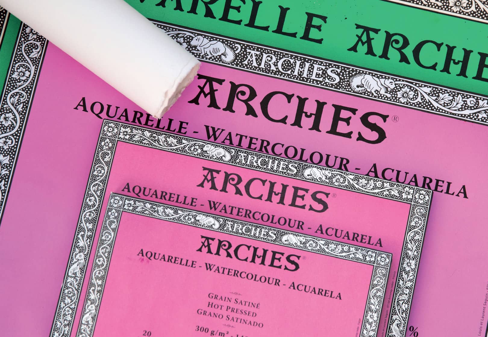
My first choice for watercolor paper is Arches bright white, in 140 lb (300 g/m2) weight or heavier. There are several sizes of blocks. You’ll want to take at least two with you when you work outdoors so that you can shift from one to the other while allowing your paintings to dry.
You can easily fold and tear large, individual sheets of watercolor paper to your desired dimensions. Good quality paper tears beautifully and leaves a lovely edge. Use masking tape to attach the edges of a loose sheet of paper to a sturdy support board before you start painting or applying water. Leave the tape in place until the paper dries to prevent it from buckling.
There are three paper-surface types: Hot press has a smooth surface. Cold press has a medium-textured surface. Rough has a highly-textured, bumpy surface. The surface is important because it determines the look of your watercolor washes. On smooth paper, the water and color flow freely, allowing lots of unexpected things to happen. A rough surface catches color and water unevenly, often creating a dry-brush effect. Cold press is a good paper for beginners. As you become more advanced, hot-press papers and the newer synthetic papers are a lot of fun to try.
Canvas for Acrylic
If you’re just starting in acrylic, I suggest purchasing pre-stretched, prepared canvas in the size that works best for you. You might also try hardwood or particle-board panels like those made by Ampersand. I don’t recommend canvas covered cardboard because it warps easily.
Further along, you’ll have time to learn about stretching canvas and preparing the surface with gesso. But even in choosing pre-stretched canvas, you’ll want to be aware of the surface quality. Cotton duck canvas has a rough surface. More expensive linen canvas has a smoother surface that is lovely; painting on it is like working on paper. But for the money, especially for larger canvases, cotton duck is just fine.
I like to buy canvases with stretchers that are at least 2" (5 cm) deep. They stand out on the wall when hung, and if I paint the edges, I don’t need to frame the painting.
Brushes
There are three basic styles of brushes: flats, rounds, and wash brushes. Flats carry the most pigment. They are best for filling larger areas, though we usually let the water do the work in watercolor paintings.
Rounds are the best for drawing strokes. There are all sorts of tip types: long, thin riggers; big, chubby Goliaths; filberts; and fans. For watercolor, a slightly chubby round holds water well, and a fine tip allows you to control where you make contact with the paper.
Watercolorists use a wide-wash brush to get a lot of water on the paper quickly. This can be important because as soon as the paper begins to dry, the surface can get streaky: A flat-wash brush allows the water and pigment to blend across large areas.
For acrylic, synthetic sables are the best for shoveling up paint and putting it on canvas where you want it. Acrylic painters often use fine-tipped watercolor brushes for detailed work.
Ultimately, for watercolor and acrylic, you’ll want rounds and flats in various sizes. Those who work with acrylics will also benefit from having wider, flat brushes to transfer larger and thinner amounts of paint to the canvas. The size of brush you use will depend on the size of your paper or canvas. The smaller and more detailed the painting, the smaller the brush. Your choice of brush size will also depend on your preference for the size of your brush marks in a painting. I usually work with larger brushes so the brushstrokes are looser.
Because acrylic paint has some heft to it, your brushes need to be a little stiffer than watercolor brushes, though not as stiff as oil brushes. Avoid pig bristle. In fact, for anyone starting out in watercolor or acrylic, I would recommend buying one of the wonderful sets with synthetic brushes in various sizes. These are available in an affordable range and will get you used to working with round and flat brushes.
Of course, if you are game for it, there are many fancy, niche brushes to try, but remember, a brush is only as good as its handler. The best and the most expensive watercolor brushes are the Kolinsky sables. I have a few of these, but because I work spontaneously and often with various mediums at the same time, I prefer working with medium-priced brushes that I can be rougher with. Whatever the quality of your brushes, take good care of them. Never leave them standing in water, and always clean them before putting them away.
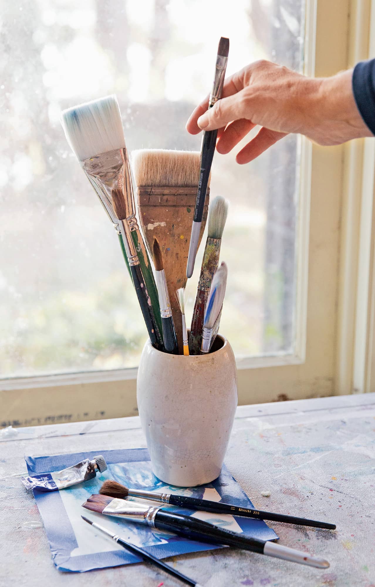
A well-loved ½" (1 cm) flat brush.
Paint
The cost of paint is directly related to the quality of the color. Paint is made up of color (pigment), medium (water soluble for watercolor, latex for acrylic), and small amounts of driers.
Bargain paints have weaker colors. Professional grades have brighter, more intense colors created by using more pure pigment and less medium. I usually suggest that my students buy fewer colors of better grade paint rather than lots of cheaper tubes. Watercolor paints, in general, cost more than acrylics because they use more pigment and less medium.
Some of the best paint brands have student-grade lines, such as Cotman Watercolors by Winsor & Newton. I encourage you to visit the big online art supply stores when you are shopping for paint. These sources can really help you to keep your costs down. (See resources.)
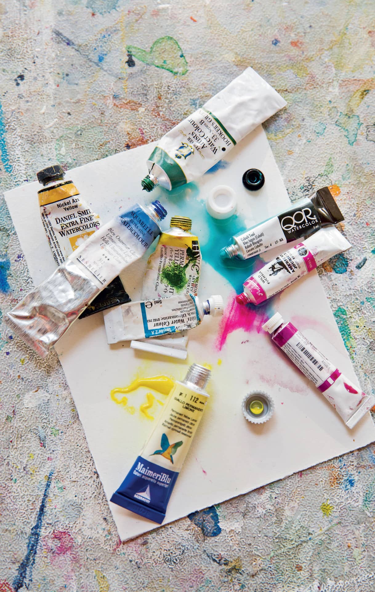
I love trying new brands and colors of watercolor paint as long as they are professional grade. My regulars include Sennelier, Winsor & Newton, Graham, Daniel Smith, Holbein, Maimeri, Turner, and Cheap Joe’s American Journey.
Choosing Colors
Start with the three primaries: red, yellow, and blue. Then gradually add to these by sampling some of the variations. Cadmium red is a warm, yellowish red. Scarlet or alizarin crimson is a bluer, blood red. Cadmium yellow light is like sunlight in a tube. Lemon yellow is a more transparent, greener yellow. Ultramarine blue has a touch of purple. Cerulean blue is considered a warmer blue. Cobalt blue is a beautiful china blue.
For watercolor, I do not recommend using black or white. They can be very sneaky, turning your beautiful colors opaque and gray.
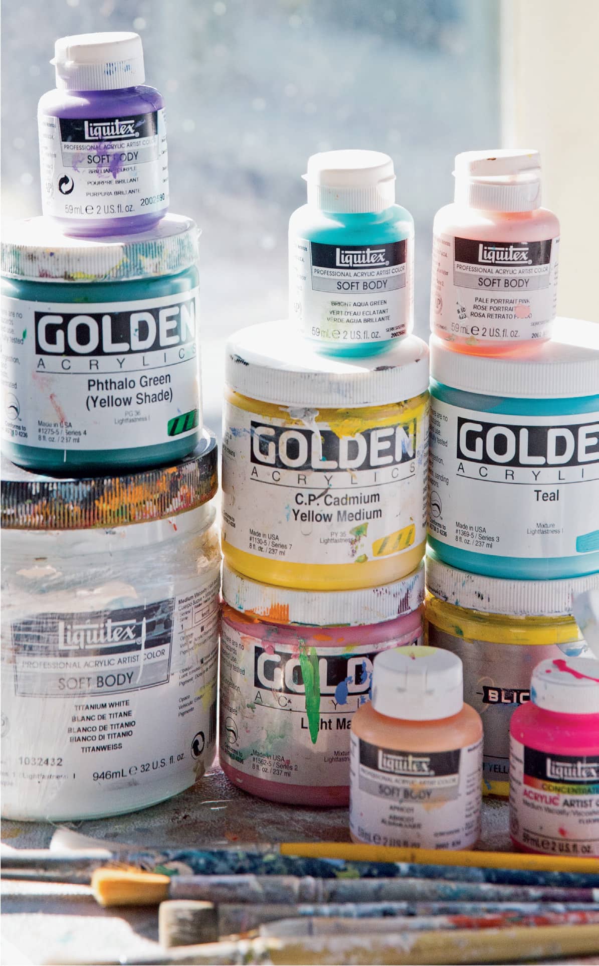
For acrylics, I stick with Golden and Liquitex paints. Their densities range from heavy body (like paste) and more fluid (like cream) that are fun to try. Both brands also have a wide range of additive mediums.
