PAINTING THE WOODS
I FINISH MOST OF MY PAINTINGS IN THE STUDIO, but I start them outdoors. This is a personal choice that works well for me. I am not a renderer of what’s in front of me. I don’t feel the need to match colors or chase changing shadows. I like to get a deep impression of a subject or scene and then turn away from it so I can do a new version based on my memory and what I felt, as much as what I saw.
I enjoy the physical distance created by returning to the studio to develop the image. It’s a process, often leading to a finished watercolor on paper and then to an acrylic on canvas with many sketches in between. By freeing myself from the actual location and going to my studio I can work on the aspects of the scene I really like, such as the softness of light falling through the trees, or the transparent delicacy of a flower petal. As soft as an impressionistic painting may appear, there’s structure behind it, and steps to getting there.
The woods are among my favorite subjects. I spend a lot of time wandering through them looking at things. I particularly enjoy early mornings. Light seems to have more personality in the morning than at any other time of day. The presence of light slanting through the trees can be almost mystical in the way it unites ephemeral and solid nature.
Mornings are wonderful opportunities to notice how light streaks across a flat stone, intensifying the blue lichen and bedazzling raindrops on the edge of a leaf. When you begin seeing light and noticing the effect it has on everything, then your way is open to noticing what usually goes unnoticed.
I work in New Castle, an island on the New Hampshire coast. Most of the trees here are pines: straight, smooth-skinned white pine and crooked, scaly-barked pitch pine, with an occasional fir or hemlock, and remnants of the original hardwood forests of oak and maple.

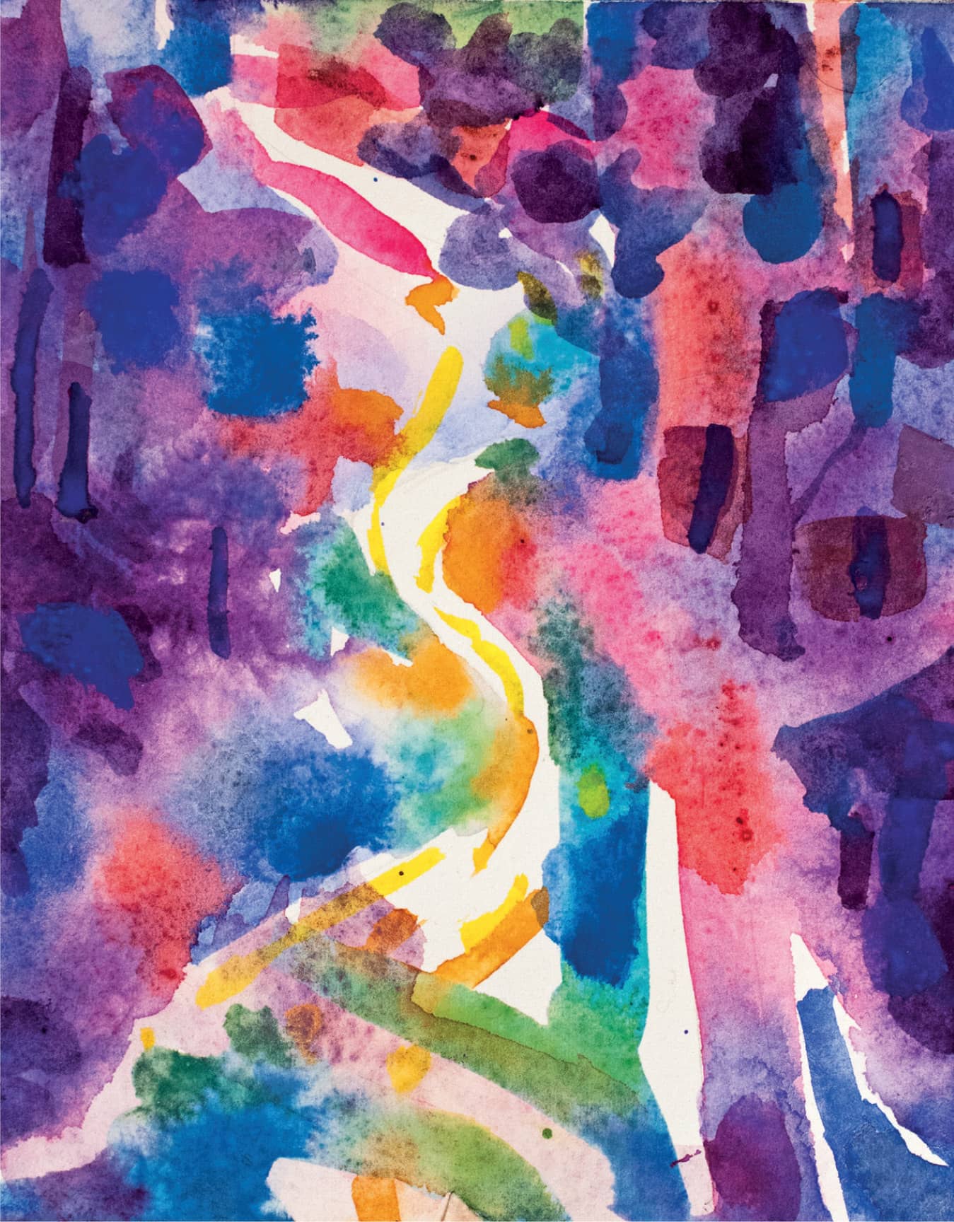
Woodland Road. Acrylic. 36" × 36" (91.5 × 91.5 cm). The woody hillside rising up and the light in the center offer a soft passage through the painting. Notice the overglazing of thinned white paint.

Ocean Fog Along the Road. Acrylic on canvas. 10" × 14" (25.5 × 35.5 cm). This was a fast painting, playing with the drama created by the fog through the trees.
I think what continues to attract me to the woods is that I can move through the trees with the island’s promise of sea and sky just beyond them. I love the feeling of the architectural shapes arching up around me like a cathedral. Colored light filters through the foliage like light through a church window. Breezes shake the leaves, making the light flit about.
Mornings invite me to step out and open myself to experience the magic of a fresh day. Maybe the ground is covered by fog that, having thickened in the cool shadows of night, is quickly disappearing in the morning light. Or maybe the fog is from the ocean, socked in and settling down like a gray blanket. Sometimes there is snow, sometimes drifting autumn leaves. The woods may be familiar but they’re never the same.
When I set out to look around, thinking about my next painting, I take a lot of phone snaps. Here is the thing, once I’ve taken the pictures, I don’t rely on them very much. I keep them as reminders of what attracted me: how magical the light looked on a lichen-covered branch or how it outlined the texture of moss against granite. I don’t paint from them. Painting from a photo lacks the excitement of seeing. The snapshot is my reminder of the scene, but it’s not the scene. When I paint, I want to create from the experience of what excited me about what I saw in nature, and the impression of what I see in my mind.

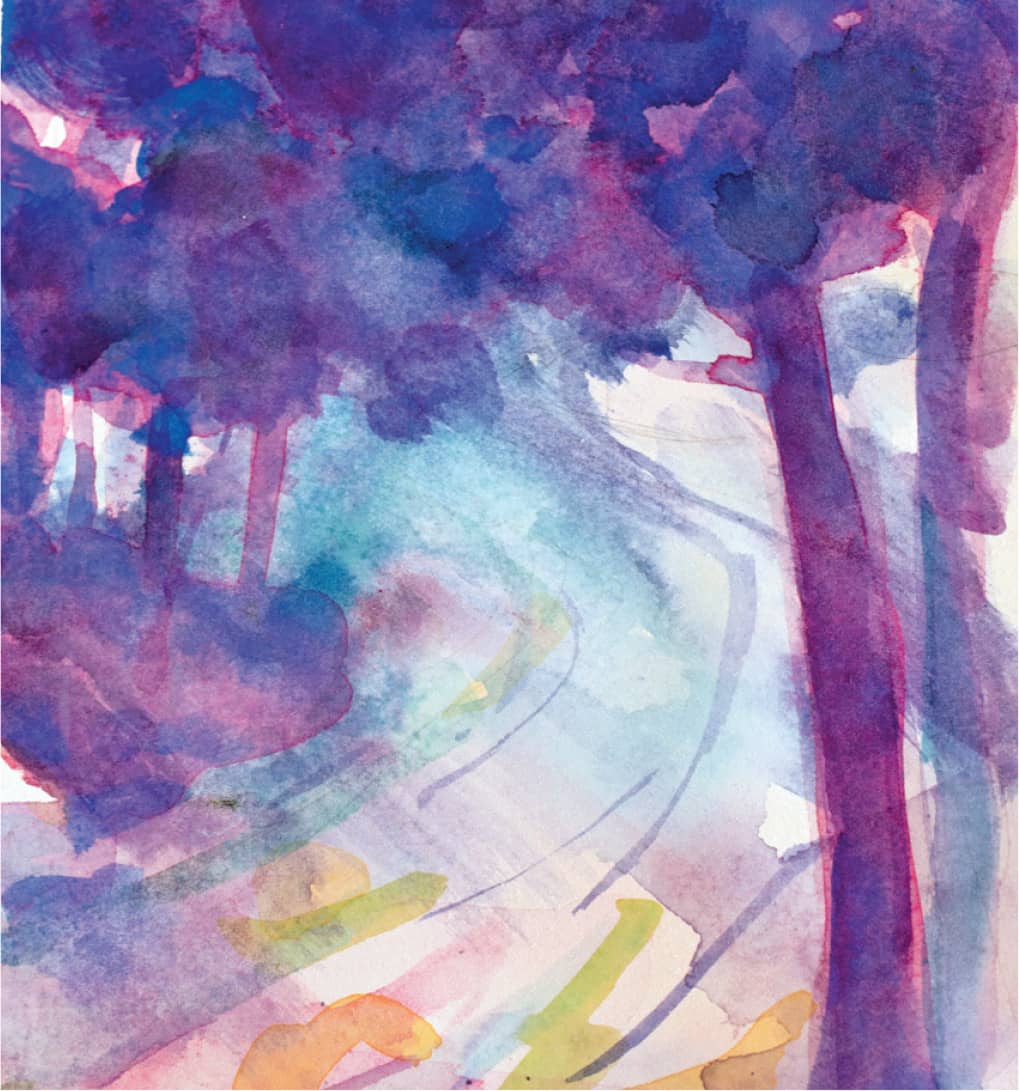
Berry Brook. Watercolor. 20" × 16" (51 cm × 40.5 cm). Green light filtering through the trees colors the mossy rocks and the water in the brook.
Demonstration: Painting the Woods in Watercolor
The Approach
Choosing a place you’re deeply familiar with as a subject can make painting both easier and more complicated. The physical reality of the place is apt to be layered in memories of things you’ve experienced, good and bad. The challenge is to try to see your familiar surroundings as if you’ve never been there before.
There’s a narrow dirt road that cuts across the center of this island. When I was young, it was an overgrown footpath where the boys would dare each other to bike at night and teenagers would go to do teenager things. Now the road has been leveled and widened and there are more houses on it. But it’s still a dirt road and it still has a picturesque mystery. This summer I’ve been walking my dog there in the early morning. Something keeps drawing me back, so I decide it’s a good subject for a watercolor demonstration.
PHOTOGRAPHY
Step 1. I begin, as I do every painting, with phone snaps. Every time I click the shutter I’m making a decision about what I see. When I realize I’ve taken ten photos of sunlight falling in patterns across the road and the silhouette of an old pitch pine tree, I know there is something going on there for me. The light is inviting. Perhaps there’s a story unfolding, with the dirt road disappearing into the darkness of the woods. Where will it take me?

Finding inspiration
PENCIL SKETCH THE EXPERIENCE
Step 2. The next day I bike back at the same early hour. Here’s my first test. Does the spot still capture my interest? Is the magic I felt yesterday still there? If it’s gone, I look for other locations.
To really engage with a painting, I have to know I’ve made the right choice and put any other choices out of my mind. This helps me keep a clear impression of what I want to do in my mind.
This step is not just about sketching; it’s about taking notes of what drew me to the spot. I always bring along a small spiral- bound sketchbook, pencils, and an eraser, so that I can jot down notes—and not just about what I see. I write down whatever I notice: what attracts or repels me, what the scene reminds me of, what I smell, what I hear, what the sun feels like on my neck, whether I’m hungry, whether I can smell the trees. I try to write down enough details so that I can re-create those impressions in my mind when I get back to the studio.
I also make quick pencil sketches of the views I liked when I was photographing, and when I do, I notice more details. Drawing demands more attention. Even with quick sketches I notice the way the shadows lengthen and pool across the road, the way that colors lurk and change in the foliage. When I sketch I’m not trying to replicate the scene, I’m trying to capture my experience of the road. In many ways these early stages of “seeing” my painting before it’s begun are my favorite moments of being an artist.
Back on my bike

Sketching my impressions
WATERCOLOR SKETCHES
Step 3. Next I bring out my tiny outdoor painting kit—this is the minimum I need to sketch an on-site watercolor. I can carry everything in a small carpet bag on my bike. I have a pencil, a flat plastic lid with some dabs of dried paint on it—red, yellow, and blue—a ¼" (6 mm) flat, synthetic sable brush, a spray bottle filled with water, and a stack of 6" × 6" (15 × 15 cm) watercolor scrap paper, or a watercolor block.
There’s a freedom in working with such an abbreviated palette. As I begin my sketches, I’m not trying to match colors with nature; instead, I’m approximating color families and values. As I look at the scene in front of me, I’m thinking about the main shapes, but also the transitions at their edges: what makes them stand out or blur together.

Balancing my outdoor watercolor kit in one hand while I sketch
Step 4. My quick watercolor sketches of the view record only my impressions—no details. I try different combinations of color to find out which capture the light and shadows the way I want to remember them when I go back to the studio. I may use greens and golds or try for a quieter mood with cool purples. As the sun comes out, I use strong, bright, exciting colors. All three sketches express different impressions of the same location at different moments. Though the colors differ in the sketches, similarities begin to appear: the weight of the trees framing the road, the way the shadows fall at an angle. Without really thinking about it, the painting I want to do is evolving in my mind. I’m ready to take the sketches to my studio and get to work.

ABOVE AND BELOW Woods and dirt road color sketches

In the Studio: Research, Dialogue, and Visualizing
In my studio, my relationship with the on-site experience changes. First of all, there’s a shift from responding directly to the situation in front of me to working in a more deliberate, thoughtful fashion. But another important change is that this is where I become more critical of my work.
Sketching on site, I work quickly and don’t stop to evaluate the quality of my work: I’m only trying to capture my impression of the scene on paper. In the studio, I slow down and make critical decisions. It’s a necessary transition—the trick is preventing the deliberateness of thinking from suffocating the immediacy of the fresh impression.
I put on a Sarah Vaughan CD and sit down to look through my sketches and photographs and reread my sketchbook notes. I pull out some art books by artists who’ve explored the same ideas I am interested in and flip through images that seem to have some relevance to what I’m beginning to develop in my mind. For instance, I might find Wolf Kahn’s landscapes and Monet’s garden pond images important in that moment. I’m not thinking about copying what they do, or expecting their approach to provide solutions for me, not at all. For me, looking at other artists’ work when I’m getting ready to paint is like a conversation. It doesn’t matter how many centuries have gone by since they were working. There’s still a give and take and an exchange of ideas when I look at their work and think about mine. It can be very energizing.
I look through my on-site sketches again and begin to design the watercolor in my mind. I like the way the trees in the foreground of my sketches frame the road as it winds away. I like the way the road curves invitingly and disappears mysteriously.
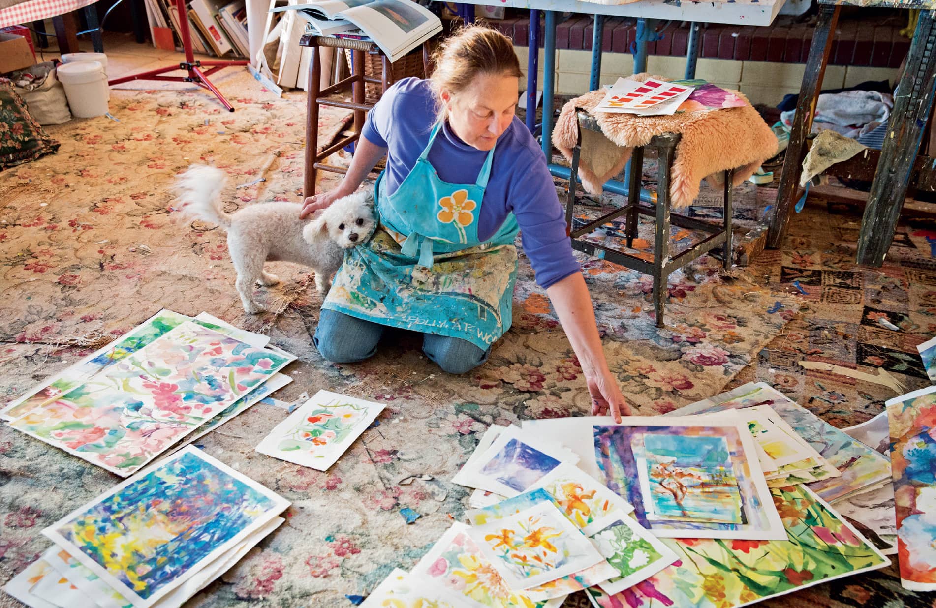
Lilly helps me look at sketches.
I want the design to be simple, clear, and strong. It’s the choices I make about color, value, and contrasts that will make the painting special. The Impressionists often painted the most unassuming subjects—a field, an orchard, the woods—but their compositions are not accidental.
I begin a fresh series of sketches to work out my plan for my painting: design, value, and color.
I want to begin easily, without concern about process, or materials, or finishing a great work of art. Sometimes I am unstoppable, but usually I waver between caution and laziness, exuberance and fuzziness. So I start small.
Tape a grid of smallish squares or rectangles on a large sheet of Arches 140 lb (300 g/m2) bright white hot press paper using artist tape, which is available in art supply shops. I do this because it lets me try my ideas in sequence. I like to see the sequence of the stages all together and the similarity of size and format. It’s a kind of story board of the painting to be. The tape visually separates the panels clearly and creates clean edges when I take it off at the end.
Dividing a large sheet of paper into small frames
Step 1. Design. I begin with a design sketch in pencil on paper. This is where I work out the vertical and horizontal proportions. I’ll try several designs using light pencil marks, simplifying the shapes until I find the most balanced, attractive composition.

STEP 1. The first step toward the studio watercolor is creating a design I like in pencil.
Step 2. Value. The value sketch can be in pencil to shade in the design sketch, establishing lights and darks. Values are the sequential range from white to black that you see in a black and white photograph. I often darken the shapes along the edge of a painting and use lighter values in the center. This establishes a center of interest and pulls the viewer into a light-filled place.
In my second sketch I choose a single color, purple, to work out where the darkest and lightest areas of the painting will be. Then I begin to build and fit in the middle values.
One universal truth about looking at paintings—all paintings—is that your eye is attracted first to the areas of highest contrast. It’s like the start of a story. Think about that when you start a painting—where do you want the viewer’s eye to focus first? I decide to focus the high contrast in my painting at center front, where the dark shadows of the trees cross the pale dirt road and lead you in.

STEP 2. Choosing the values—the darks and lights—is an informative step. In this painting, I want to create the perception of depth. If the background is dark, the road will look like a tunnel into the darkness. If the foreground is dark, the background will become more atmospheric.
Step 3. Color. Now that I have a good design and feel for the values, I work out my color scheme. Inspired by the Monet paintings I’ve been looking at, I decide to use predominately blues, purples, and red. I want the painting to feel like New England—a cool, shady woods with a warm, sunny road. My dominant woodsy color will be a combination of French ultramarine blue and pink-red quinacridone red. For the road through the center, I will add yellow, warm green, and turquoise.
In many ways, the most difficult part of creating the painting—making all the decisions in the studio—is now done. Now I can move ahead with my watercolor painting.
STEP 3. Choosing a color scheme is personal. For me it helps express my feelings about the scene such as the jostling warms and cools of this location.
Step 4. I tape the edges of a large piece of watercolor paper to a board and divide the paper into smaller squares and rectangles with tape. Working on several small paintings at once allows me to try out variations on my basic idea. With light pencil marks, I sketch the design.
Using a 2" (5 cm) flat brush, I paint the first wash of lightly tinted color to establish the size and placement of the major shapes. My earlier value sketch tells me where the whitest areas will be.
When the first wash has dried, I go back in and paint the tree. Leaving the road as bare, white paper, I stroke rich cobalt blues into the right foreground tree trunk with a #10 round brush. This tree is an important part of the design because it places the viewer just outside the scene by its position between us and the road. It also gives the road a bit of mystery.

STEP 4. I do a watery first wash of the painting with a big wash brush, ghosting in the main shapes. I like the idea of light pinks shining among the darker trees.
Step 5. I use my big wash brush to paint the tree shadows across the road. The angled shadows were important to me during the early stages of sketching. They have become a critical part of the painting, offering a diagonal shape through the center, with flickering lights and darks to attract the eye.

STEP 5. I build up layers of color, allowing each to dry before applying the next. As I add color and detail, I work using larger to smaller brushes and painting larger to smaller areas.
Step 6. I lay in washes of transparent colors to create dark, rich tones. Placing pure colors beside and on top of one another makes the trees look denser and the dirt road more interesting. I use a thirsty brush technique (see here to here) to lift damp color out from between the trees, and I smudge the surface to look like mist.

STEP 6. I add layers of color to build up dark, rich tones. I use the thirsty brush technique to lift color out.
Step 7. Now I explore variations on my idea by adding violets and saturated purples to one painting, creating a glowing, bounced-light effect that adds vibrancy to the woods. To another, I purposefully leave the center misty and mysterious. Finally, I add a range of cool blues and sweep pale greens across the dirt road. The shadows appear cool, wet, and heavy, and the light glows clear and fragile across the painting’s center.

STEP 7. One version with glowing, bright colors.
STEP 7. Another version stays soft and loose through the center.
Step 8. After deciding which of the variations I like best, I can either complete my color work by adding the final contrasts and details, or put it aside and start fresh, knowing exactly where I’m going as I begin a larger exhibition painting. (Ultimately, I decide to finish up the cooler purple version by adding small, dark branches and smudging and softening the areas of light on the road.)
These important considerations require me to step outside the creative interior of my thoughts and plan this painting’s future home. Do I want to exhibit it? Do I have the perfect place for it in my own home? Sometimes I’m so involved in the painting that I brush these thoughts away and plunge ahead. Ultimately, though, if you exhibit and expect to sell your work, these are practical concerns you’ll need to think about. Creating an exhibition piece takes time, planning, and energy.
STEP 8. Morning Woods. Watercolor. 20" × 20" (51 × 51 cm). The finished painting successfully captures my impression of a cool summer morning, after I add final details.
Special Watercolor Technique: Lifting with a Thirsty Brush
How to Create the Look of Mist
The “thirsty brush” technique allows you to lift paint off of your watercolor painting. You might want to do this to create the effect of mist moving through woods, or perhaps an area of blinding sunlight in a garden.
Step 1. The most important tools for the thirsty brush technique are clean water and a clean brush. Choose a round medium size brush, such as a #8 or #10.
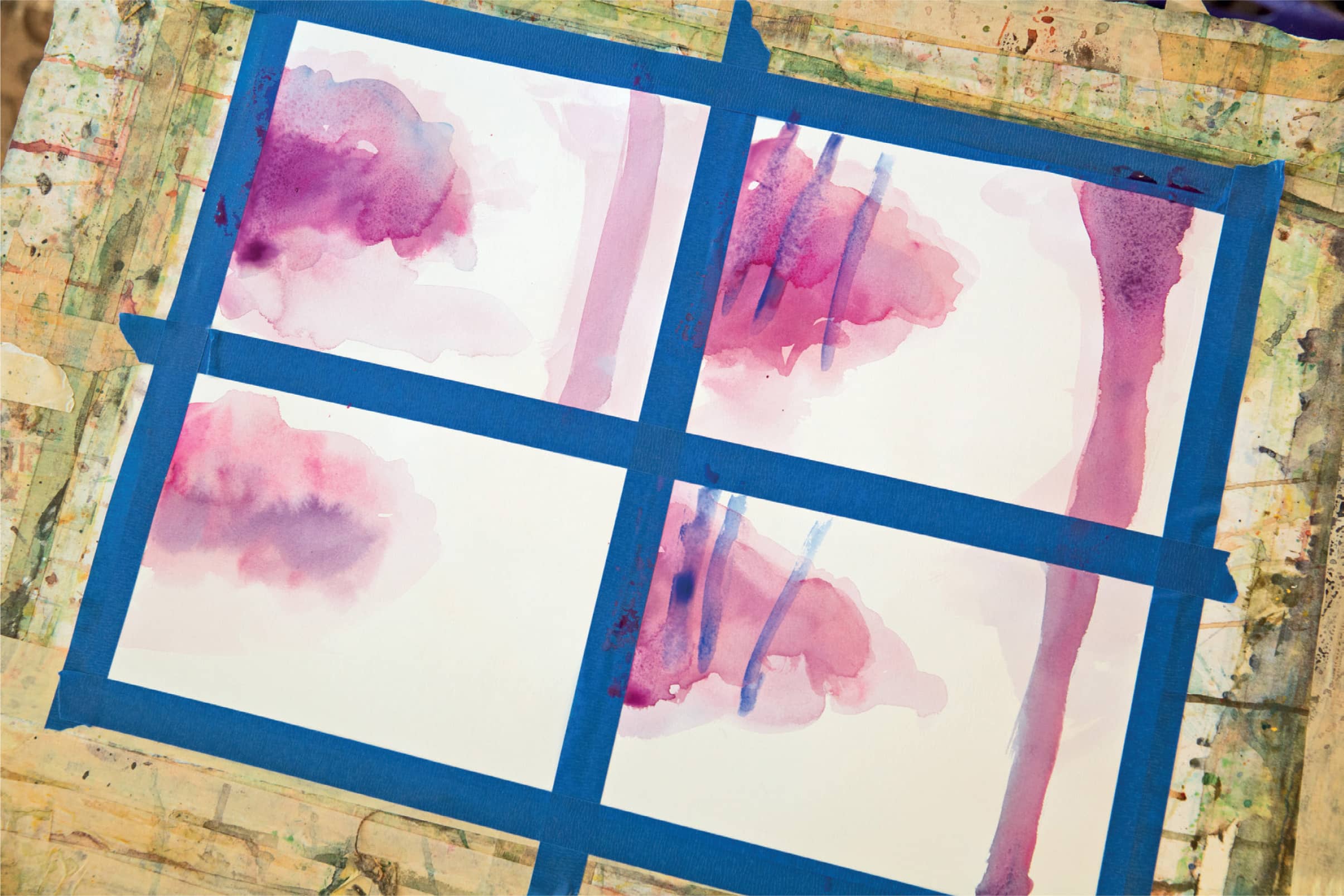
I’ll demonstrate this technique on a view much like the watercolor I just completed, using a similar palette: cobalt and ultramarine blue, quinacridone red, cobalt violet, and dioxide purple. I tape sheets of watercolor paper onto a support board and set up my paper as a grid of four, so that I can test the technique several different ways.
These blues and reds I’ve chosen are staining pigments that will not lift completely from the paper. That’s what I want. (If I wanted to lift them off completely, I would use lifting watercolor medium, which you can purchase at art supply stores or online. Alternatively, I’d start out with Yupo synthetic paper instead of Arches. Yupo does not absorb color and wipes cleanly back to white.)
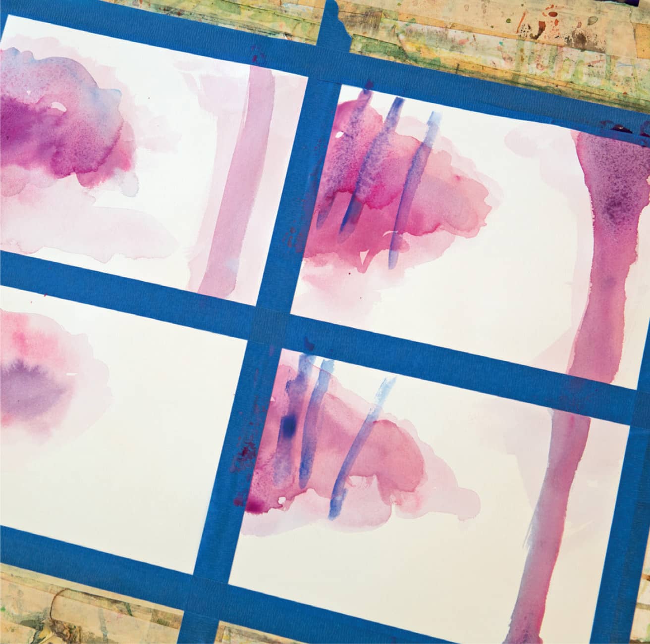
STEP 1. I divide my paper into a grid of four with tape so I can test this technique several different ways using blue, violet, and red staining pigments.
Step 2. I make a thin puddle of clean water on the paper where I want to create the wooded area and the tall tree. I drop wet violet paint into the puddle and watch it spread. As it begins to dry, I drop in wet purple and let it spread on top of the violet.
This is where dividing the paper into grids comes into play. It takes practice to get the feeling of how wet the paint and paper should be to achieve the effects that you want in watercolor. One attempt may be too runny, another too uneven, a third just perfect. Approach the technique with an open mind and see what happens.

STEP 2. I drop color into clear, wet areas and then drag and spread colors with my brush.
Step 3. As I get ready to use the thirsty brush technique, I want the paper to be just damp. You can judge how wet the paper is by gently laying the back of your hand on the paper surface. If the paper is cool against your hand, it’s damp.
I stroke on the darker blue tree trunks. Now I want to lift off some of the color so it looks like mist is filtering through the woods.
Step 4. While the tree trunks are still wet, I clean a brush with water, and then gently squeeze out the moisture by running the bristles between my fingers. The brush is now “thirsty.” I can brush it across newly painted areas and it will lift up the wet paint. I can re-wet a dry area, let the paint color loosen for a moment or two, and use the thirsty brush to lift up the color. The trick is to wipe the lifted pigment off your thirsty brush between each stroke, otherwise you just smudge lifted paint back onto the painting.

STEP 4. Squeeze the brush between your fingers to get rid of excess water. The brush is now “thirsty.”
Step 5. Once the diffused color is dry and I’ve lifted the areas of pigment to create the impression I desire, I can go back and add darker details. To reinforce the feeling of mist, I keep the foreground richer in color, detail, and shadow.

STEP 5. After lifting the wet color with the thirsty brush, I can go back and add details.
Gallery
I love painting watercolors of the woods—there are so many variations. Here are a few of my favorites.

Early Spring Morning. Watercolor. 20" × 30" (51 × 76 cm).

Snowy Woods. Watercolor. 24" × 24" (61 × 61 cm).

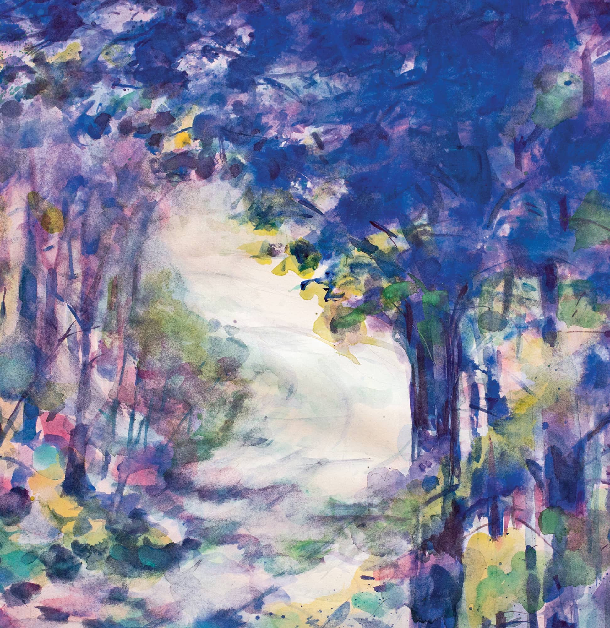
Island Trail. Watercolor. 40" × 30" (101.5 × 76 cm).
Demonstration: Painting the Woods in Acrylic

Switching from Watercolor to Acrylic
When an image looks great in watercolor, I often want to see what it will look like in acrylic on canvas. I enjoy working with acrylic. Compared to watercolor, acrylic is easygoing and lazy. The paint lands where you put it and stays there. It has great versatility, going smoothly from thin to thick and impasto. I remind myself that it dries quickly and is unmovable once it dries. When you paint with acrylic, be vigilant about keeping your brushes from drying and hardening.
My technique for using acrylic involves a physical building up of color in a process similar to the way the French Impressionists used their oil paints. Textural paint on canvas has a lot of visual weight, and can create a painting with more physical presence than a watercolor. The size of the canvas, too, of course, will contribute to its impact.
GETTING READY
For this painting, with the road disappearing into misty woods, I want the canvas large enough so that you can feel it pull you into the painting.
I make changes to my studio when I move from watercolor to acrylic. I clean and put away my sable brushes and take out my synthetic acrylic brushes. I round up my extra palettes and paper toweling and place my jars of paint within easy reach.
I like the colors I used in my misty woods watercolor and choose similar pigments: ultramarine and cobalt for some rich purply blues. Cerulean and phthalo (phthalocyanine) blue for some greener blues, though I want to keep this painting on the purple side. I have alizarin crimson, which is similar to quinacridone red, to mix a range of purples. I also have white, cadmium yellow light, and burnt umber, a deep, rich brown.
In the Studio
Step 1. I start with a prepared canvas and begin much as I did with the watercolor, except that I do my sketching directly with paint, rather than starting with pencil. I use a single 1" (2.5 cm) flat brush or a #12 round, and a single color to rough in my dominant shapes and dark areas, leaving the curve of the road untouched for the moment.
With acrylic, I can work from darkest colors to the lightest, which is different than painting with watercolors. It’s a more logical progression. I build up layers of color over the entire canvas. As the painting develops, I pause frequently, put the brush down, and reassess the painting.
Acrylic has great flexibility and I can easily make adjustments to the painting as I go along by just painting over areas I’m unhappy with. I want this painting to feel magical and misty, so I will keep the surface smooth and creamy.

STEP 1: I use a bold blue to begin placing design elements.
Step 2. Once my loose, painted drawing is dry, I add more color to the trees and background. I can be pretty free at this point, experimenting with color. I look back at the sketches I did for the watercolor to get a feel for light versus dark comparisons and to see which color variations I like the most. A loose, sketchy application of rich color adds to the impressionistic feeling.
I want to create the sense of light coming through the trees, the way it does in the morning when the mist is rising. I mix up some light pink and blend it into the canvas with my hand, almost as a color stain.

STEP 2: I add pink light coming through the trees.
Step 3. And now the mist. Once the pink light has dried, I invite the mist to sift in from the left side of the image. I visualize it as being lighter in the far back of the space, darker and richer closer to the front. I add the white paint in layers, applying it first with a brush, and then blending it with my hand so that it becomes soft and wispy. The layers become whiter and more opaque as they cover each other. I remember clearly the caress of the damp sea fog against my face and how the moisture made the pages of my sketchbook stick together.

STEP 3. I use both my brush and my hands to blend paint into soft mist.
Step 4. Acrylic paint allows me to cover an area with mist and then pull out the tree trunk and then cover it again. I step back to look and I’m pleased with what is happening on the canvas. The mist gives the impression of moving and swirling the way it does when it blows in from the sea, blotting out a tree shape here and then thinning to reveal a branch over there. The purply blues create a feeling of mystery in the painting, but there is golden light coming through. Nothing is static. The composition is simple but it’s alive.
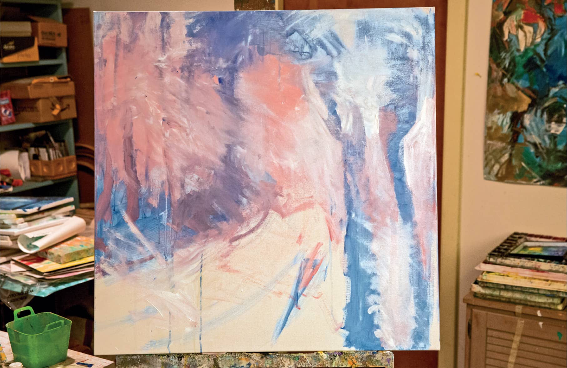
STEP 4. I step back to assess my painting. The white mist covers the entire painting and dims the foreground and the tree trunks to the right.
Step 5. I decide the trees need more detail in the bark, but wisps of mist can still streak across them. They will be darker and crisper the closer they are to the viewer. I build up the leaves of the front tree so that it appears three dimensional. To do that, I make the leaves in front the darkest, then lighter as the road curves away.

STEP 5. The mist recedes and the trees re-emerge as I add visual interest to the trunks and branches.
Step 6. The progression of this demonstration gives a clear idea of the wonderful flexibility of the acrylic medium. I love the way I can try different patterns of brushwork, vary lights and darks, and combine colors. All of these things are very helpful when I go to add dappled sunlight to the dirt road. As the painting progresses, I put down some pale cadmium yellows to add color to the white of the road. I decide to shift the light and lightly wisp on some darker cobalt blue and then move the light onto the shadow by layering on a delicate rose pink. I like that when I change my mind there are traces of the previous paint or brushwork visible. This works really well to suggest the filtering light.
The acrylic layers are softly brushed across each other so that I can see the layers underneath. I can try different colors and then lessen their intensity with the additional layers. The process allows me to create the feeling I get when I walk through the sun-dappled road—soft shifting bits of light and color falling around me.
Step 7. When I near the end of a painting, I love to sit in the chair in my studio and just look at it. I don’t force anything I just sit and look. Often the painting will start “talking” to me and I will see areas that I need to adjust. When the painting settles down and has nothing more to say, it’s finished. Allowing your painting to talk to you is an important part of the process.


Woodland Road. Acrylic. 36" × 36" (91.5 × 91.5 cm).