
Chapter 9. Color, style, and appearance
- Global appearance options
- Color
- Lines and points
- Size and aspect ratio
Whereas the previous few chapters dealt with very local aspects of a graph (such as an individual curve, a single text label, or the details of tic mark formatting), the present chapter addresses global issues. We begin with a long and important section on color. Color is an exciting topic, and it opens a range of options for data visualization; I’ll explain gnuplot’s support for color handling in detail.
Next, we discuss a few details that matter if you want to modify the default appearance of point types, dash patterns, and the automatic selection of visual styles. The overall size and aspect ratio of the graph are the subjects of the closing section of this chapter.
9.1. Color
Color is an important element in visualization. At the base level, colors are often easier to distinguish than dash patterns or different symbol shapes. But colors open many more options for visualization—in fact, colors by themselves are sufficient to represent semantic information (we’ll come back to this in appendix D). And finally, color is just plain fun!
At the same time, color adds complexity: what colors look good, and which are suitable for representing information? And then there’s the problem of representing color in computer systems. In appendix D, we’ll have more to say about choosing colors for visualization; here we’re only interested in the technicalities of specifying color in gnuplot.[1]
To find the pertinent information in the standard gnuplot reference documentation, use the command help colorspec.
There are three fundamentally different ways to select a color in gnuplot:
- Through explicit specification, either by using a known color name (such as "red") or by giving its red-green-blue (RGB) components (like "#FF0000"). An explicit color specification is indicated by the keyword rgb.
- By indexed lookup from a selection menu of discrete colors. (For example, lc 1 picks the first color from an existing list of color styles.) Indexed lookup is the default and doesn’t use a special keyword.
- By mapping a value into a continuous color gradient. Color gradients are called palettes in gnuplot terminology (with keyword palette) and are the principal topic of appendix D. In this chapter, we’ll give only a brief preview.
Each one of these methods can be used in two ways:
- Fixed— A specific color is selected for a given data set, to distinguish this data set from any other.
- Variable or data-dependent— The color is determined by the value of the data plotted so that the curve changes its color depending on location. Data-dependent coloring is switched on with the keyword variable in place of an explicit color name or index, and with palette z for gradient-mapped colors.
Keeping all these possibilities straight is one of our primary goals in this section!
No matter which way you use color, a color specification always requires the line-color keyword for graph elements (not just lines, but all graph elements, like points or boxes) and the textcolor keyword for all forms of text labels.
Tip
Remember: all color specifications are preceded either by the keyword linecolor (or lc) for graph elements or by textcolor (or tc) for text labels.
9.1.1. Explicit colors
The most fundamental way to indicate a color is to specify it explicitly. You can do so by giving its name or by spelling out its components.
Color Names
Several colors can be referred to by their name. Gnuplot knows 111 predefined color names (corresponding to only 95 distinct colors; the duplications are mostly due to both grey and gray being valid spellings). You can see all the color names and their corresponding RGB values using the show colornames command. Note that gnuplot’s list of color names isn’t identical to the list of X11 colors.[2]
The Wikipedia pages for “X11 color names” and “Web colors” contain more information about commonly used color names. The amusing history of color names used in graphical user interfaces can be found in the article “‘Tomato’ versus ‘#FF6347’—the Tragicomic History of CSS Color Names” by Julianne Tveten (Ars Technica, October 11, 2015); http://mng.bz/R56B.
RGB Components
The most common way in computer graphics to indicate an arbitrary color is through its RGB (red-green-blue) values: a triple of numbers giving the relative intensities of the red, green, and blue components that make up the desired color. By convention, each component is represented through a single byte, so that each RGB component lies between 0 and 255. Conventionally, the components are written as two-digit hexadecimal numbers (from 00 to FF), and an entire triple can be represented through a string of the following format:
rgb "#RRGGBB"
This is the X11 format. You can also write the string explicitly as a hexadecimal constant in the format "0xRRGGBB". Here are three equivalent ways to specify the same color:
rgb "red"
rgb "#FF0000"
rgb "0xFF0000"
Instead of representing the RGB triple as a string, you can also use the integer value corresponding to the value of the three bytes making up the triple. It may be convenient to use the hexadecimal representation of the integer, instead of the representation to base 10. The following are equivalent:
rgb 0xff0000
rgb 16711680
Here’s a function that takes the three components (as integers between 0 and 255) and packs them into an equivalent integer value:
pack( r, g, b ) = 2**16*r + 2**8*g + b
This gives you an additional way to obtain the color red:
rgb pack( 255, 0, 0 )
HSV Color Model
The RGB color model has the advantage of corresponding directly to the way a computer display operates, but it’s not particularly intuitive for a human to use. (Quickly, what does #2e8b57 look like?)
The HSV (hue-saturation-value) scheme is an alternative to the RGB color description and the most popular intuitive color model. The hue describes the shade of the color (by convention, a hue value of 0 corresponds to red followed by yellow, green, cyan, blue, and magenta at equal intervals). The saturation measures the richness of the color, from pale pastel shades to full saturation. Finally, the value element of the HSV triple describes the lightness of the color, from very dark to very bright. All HSV values vary from 0 to 1.[3]
The Wikipedia page for the HSL and HSV color models provides more detail.
Gnuplot’s built-in function hsv2rgb( h, s, v ) takes a triple of HSV values, performs the conversion to RGB, and returns an integer-packed representation of the corresponding RGB triple. This gives you yet another way to specify the color red (remember that red corresponds to a hue value of 0):
rgb hsv2rgb( 0, 1, 1 )
Table 9.1 shows all these forms together, this time for the color magenta, which is a mixture of full red and full blue components. (Its hue value in the HSV model is 5/6.)
Table 9.1. Equivalent ways to specify a color explicitly (here, magenta)
|
Description |
Example |
|---|---|
| Color name | rgb "magenta" |
| X11 RGB string | rgb "#FF00FF" |
| String with hex constant | rgb "0xFF00FF" |
| Integer in hex format | rgb 0xff00ff |
| Packed integer | rgb 2**16*255 + 2**8*0 + 255 or rgb 16711935 |
| Conversion from HSV | rgb hsv2rgb( 5/6., 1, 1 ) |
Tip
The input values to the hsv2rgb() function must all lie in the interval [0:1]. The function silently replaces values outside this interval with the nearest legal value (so, 1.1 becomes 1.0, and -0.1 becomes 0). In particular, the hue parameter does not wrap around for values greater than 1.0—you must map it into the unit interval yourself!
You can use the expression x - floor(x) to reduce an arbitrary hue value to the unit interval. You may want to define a more general version of the hsv2rgb() function that removes the restriction on the hue value:
hsv( h, s, v ) = hsv2rgb( h - floor(h), s, v )
9.1.2. Alpha shading and transparency
So far, we’ve assumed that colors are fully opaque, so that an object drawn on top of another completely hides its background. But gnuplot can do more: several terminals allow for transparent colors.[4]
All cairo-based terminals support transparency, but several of the older terminals don’t. In particular, neither the PostScript terminal nor the GD-based bitmap terminals can handle transparency.
Making Colors Transparent
Indicating that a pixel should be transparent requires additional information. In practice, you add a fourth byte to the RGB components; this is often called the alpha channel. In gnuplot’s string representation, it precedes the RGB value:
rgb "#ααRRGGBB"
rgb "0xααRRGGBB"
Transparency information is encoded in the highest-order bit, as follows:
- α = 0 : fully opaque
- α = 255 : fully transparent
This convention has the advantage that a fully opaque color rgb "#00RRGGBB" has the same numerical value as rgb "#RRGGBB", so opaque colors don’t require special treatment.
Alpha Blending
So, what happens when two transparent colors are overlaid? Obviously, the color “underneath” is still visible—but how? It turns out that there is no obvious answer to this question—the cairo graphics library defines 29 (!) different operators to combine two pixels containing alpha-channel information![5]
Even in gnuplot, the answer isn’t unique: lines and similar graph elements are combined using cairo’s OVER operator (the library’s default), but filled objects use the SATURATE operator. (You can’t specify an operator explicitly.)
To make the behavior of these two operators concrete, let’s assume that you want to add a new object of color α1X1 to an existing color α0X0, resulting in color α2X2. (Here X stands for any one of the three RGB components.) The new color is then calculated separately for each RGB component according to the following formulas:

These formulas aren’t so helpful to predict the outcome, but you can use them retrospectively to understand what happened. Two general observations hold (see figure 9.1):
- The two source colors don’t commute: it matters which color is in the background and which is newly added. The color that is added on top of an existing background tends to prevail.
- When all pixels are of the same hue, things are simpler: the hue basically stays, and only the intensity increases (in a roughly additive way).
Figure 9.1. Alpha blending in action. The color that is added to an existing background tends to prevail; adding it to a background of the same hue just increases the intensity.

Uses for Transparent Colors and Alpha Blending
Transparent colors can be useful when you’re visualizing large data sets consisting of many points. If such data is plotted in a scatter plot, points frequently overlap. With fully opaque colors, overlapping points completely obscure each other, making the local density of points indistinguishable. But with partially transparent colors, overlapping points contribute additively, so that a higher color intensity reveals a higher point density.
Figure 9.2 shows such a scatter plot. The plot command is as follows:

Figure 9.2. Using alpha blending to visualize point density in a dense data set. All data points are drawn both with blue disks and red rims. Because contributions from overlapping points add visually, regions of high point density show up as areas of high color intensity. Regions where the density is high enough for the rims to contribute significantly appear red.

All points are first drawn as filled circles (pt 7) in blue ![]() and then again as unfilled circles (pt 6) in red
and then again as unfilled circles (pt 6) in red ![]() . Adding an outline to the circles significantly improves the appearance of the graph; giving the outline a different color
sets off areas of truly high point density even more strikingly.
. Adding an outline to the circles significantly improves the appearance of the graph; giving the outline a different color
sets off areas of truly high point density even more strikingly.
You may want to experiment further with this—for example, I’ve obtained good results when using the same color (say, blue) for both disk and outline, but making the outline slightly larger than the disk itself (for example, ps 1.5 for the outline, but ps 1 for the disk).
9.1.3. Selecting a color through indexed lookup
The methods explained so far in this section let you select individual colors. When that’s what you want, these techniques are convenient: plot sin(x) lc rgb "red" does exactly that—it plots the sine in red.
It gets trickier if you want to plot several curves at once. To distinguish them, each should be plotted in a different color, and it would be convenient if gnuplot would do so automatically. In other words, now you want colors to be chosen from a discrete selection (rather than specified individually).
This is exactly what gnuplot does: as I explained in section 6.2, gnuplot maintains a set of distinct colors and (by default) uses the next one for each new function or data set. (Later in this chapter, you’ll learn how to customize the overall selection of colors available in this way.)
Colors (and line types and styles more generally) are identified by a positive integer. If you want to override gnuplot’s automatic choice of color, or if you want to pick a particular color from the predefined set, you do so by supplying the appropriate integer value:
plot "data" u 1:2 w l lc 2, "" u 1:3 w l lc 2
This plots both the second and third columns against the first using the second color from the predefined set of colors for both data sets.
All of this is straightforward. There’s only one possible glitch: don’t confuse lc 1 with lc rgb 1. The former specifies the first color from the selection of predefined colors (whatever color this may be!). The latter selects a specific color by giving its RGB components as an integer-packed value. (The value 1 corresponds to "#000001", which is almost black.)
Special Color Indices
Gnuplot knows about two special color indices: black and bgnd. The first is a shorthand to obtain a black line through indexed lookup (that is, without having to identify a color explicitly). It’s mostly convenient for drawing graph elements like arrows, borders, and labels: set arrow 1 from 0,0 to 1,1 lc black. (Note the absence of either quotes or the rgb keyword.)
All contemporary terminals allow an explicit background color to be set using the background keyword: set terminal pdfcairo background rgb "grey" (see chapter 10). This color is then available through the bgnd index for all graphs sent to this terminal. This is mostly useful to rub out or erase parts of the graph:
set object 1 circle at 0,0 radius 1 fill solid fc bgnd front
This clears a circular area of radius 1, centered at the origin, by filling it with the background color.
9.1.4. Mapping a value into a continuous gradient
Continuous color gradients (called palettes in gnuplot) are the topic of appendix D. But a discussion of color in gnuplot would be incomplete without mentioning them, so I’ll give a brief preview here.
First, you need to define a gradient, for example like this:
set palette defined ( 0 'blue', 0.5 'white', 1 'red' )
This defines a color gradient from blue over white to red; white is centrally located in the mapped interval. You can now use any of the colors from this gradient in a plot like this:
plot sin(x) lc palette frac 0.25
This plots the curve in the color that is halfway between blue and white. (The keyword palette can be abbreviated to pal.)
When you select a color from a palette using the frac keyword, the numeric argument must lie in the interval [0:1]. You can also map the gradient to a different interval using set cbrange. (The identifier cb stands for color box.) For example, set cbrange [-5:5] maps the color gradient into that interval. You can now specify a color by providing a value from this interval together with the cb keyword. The following plot command produces the same curve as the previous listing, because -2.5 lies at the same relative position within the interval [-5:5] as 0.25 lies within the interval [0:1]:
set cbrange [-5:5]
plot sin(x) lc pal cb -2.5
Remapping a gradient to a specific numeric range makes sense when you want to indicate a specific numeric value with a color. That’s the topic of the next section and—in much more detail—of appendix D.
9.1.5. Using data-dependent colors
Gnuplot can change the color of a line or point based on the values of the data. As usual, there are three ways to do this: explicitly (using the rgb keyword), by indexed lookup (using an integer index), and using a gradient (with the palette keyword). In any case, you must supply an additional column with the using specification of the plot command; the color information is always taken from the last (rightmost) column in the using specification. (Value-dependent color is only available for data—if you want to use it with functions, you have to fake it using the "+" pseudofile—see section 4.4.)
Explicit and Indexed Data-Dependent Colors
Let’s consider an example. Here’s a very short data file:
# x      y         color
1        2.0       1
2        2.1       2
3        1.9       3
4        2.0       4
5        2.0       5
Either of the following two commands will work:
![]()
The first thing to notice is that although the plot style is linespoints, three columns are specified: the last (rightmost) is used for color information. Next, notice the keyword variable in the color specification: that’s what turns on data-dependent coloring. If variable follows the rgb keyword, the value in the third (color) column is taken as an integer-packed RGB (or αRGB) tuple; if variable is used by itself, the entry in the color column is taken as the index of the color to use. (It’s not possible to use color names or RGB strings together with variable.)
A Worked Example Using Explicit Data-Dependent Colors
In practice, you’ll almost never read either the color value or the color index from a file. Instead, think of the third column in the using specification as a place to perform some creative inline transformation (see section 3.3) to calculate a data-dependent color. Let’s consider a few examples.
Remember DLA clusters, like the one in figure 1.2? For each particle, the data set contains not only the particle’s coordinates but also the sequence order in which it was added to the cluster. If you map the latter information onto a color spectrum, you can generate “tree rings” that indicate how the cluster grew (see figure 9.3).
Figure 9.3. A DLA cluster (see section 1.1.2) using the HSV color model to indicate the order in which particles were added to the cluster

An easy way to turn sequence numbers into colors is to map them onto the hue value in the HSV model. Using the hsv2rgb() built-in function, you can do this on the fly (on a 100,000 particle cluster, in this case):
plot "dla" u 2:3:(hsv2rgb($1/100000.,1,1)) w d lc rgb var
This graph shows clearly that a DLA cluster tends to grow mostly at the rim. Despite the tenuous structure, it’s rare for a particle to penetrate deeply into an existing cluster; it’s much more likely to get caught by one of the branches extending outward.
Although it worked reasonably well in this example, in general you should use caution when mapping a quantity to the rainbow spectrum of the HSV color model. One problem is that this particular color spectrum doesn’t have any inherent sense of ordering: is yellow larger than blue, or vice versa? Another problem is that the spectrum closes in on itself: red represents both very small and very large values. In this example, it doesn’t matter, because the geometric structure of the cluster provides the required sense of ordering; but in more general cases, a rainbow plot like this can be highly confusing. Carefully designed color gradients are almost always a better idea. Fortunately, gnuplot makes this easy—a topic we’ll come back to in appendix D.
Worked Examples Using Indexed Data-Dependent Colors
Indexed data-dependent colors make sense when the data contains an attribute that assumes only a discrete set of values (or levels). In listing 9.2, some attributes (such as the physical dimensions, the year of presentation, and the available horsepower) are numeric and can have essentially any value. But others, such as the number of cylinders and the country of manufacture, assume only a finite number of discrete values. Those can be represented through distinct, indexed colors. (See listing 9.1 for the commands and figure 9.4 for the resulting plot.)
Figure 9.4. Using indexed color to visualize discrete values or levels in a data set. For a set of current “supercars,” the date of presentation and the available horsepower are visualized through the location on the graph, and the number of cylinders is represented via color. Compare listing 9.2 for the data and listing 9.1 for the commands.

Listing 9.1. Command for figure 9.4 using data from listing 9.2 (file: supercars.gp)
unset key set xlabel "Year"; set ylabel "Horsepower" set for[k=1:3] label k sprintf( "% d Cylinders", 4*(k+1) )at 2003.75,1200+k*50 point pt 7 lc k offset 11,-0.175 right plot [2003:2014][500:1400] "supercars" u 1:2:($3/4-1) pt 7 ps 1.0 lc var,
Listing 9.2. Data for figure 9.4 (file: supercars)
# Year   PS     Cyl    Len     Height   Weight    Country  Name
2005     1014   16     4462    1159     1888      France   "Bugatti Veyron"
2006     1061   8      4475    1092     1270      USA      "SSC Aero"
2012     1261   8      4655    1079.5   1244      UK       "Hennessey Venom GT"
2011     940    8      4293    1120     1435      Sweden   "Koenigsegg Agera"
2005     806    8      4293    1120     1456      Sweden   "Koenigsegg CCX"
2009     1104   8      4665    1198     1688      Denmark  "Zenvo ST1"
2005     650    8      4460    1114     1100      Germany  "Gumpert Apollo"
2009     750    12     4601    1222     1630      UK       "Aston Martin 0ne-77"
2011     700    12     4780    1136     1575      Italy    "Lamborghini Aventador"
But data-dependent indexed colors can also be used to represent metadata. Here’s a clever trick:[6] consider a data file containing several data sets, separated by double blank lines. The index of each data set is available in the pseudocolumn -2 (see section 4.4). You can use this information to let gnuplot select a different color for each data set, by using the value of the pseudocolumn as an index into the set of predefined colors:
The idea for this application was taken from the standard gnuplot reference documentation.
plot "data" u 1:2:(1+column(-2)) w lp lc var
Because this example uses indexed lookup, the keyword rgb is absent. You need to use the column() function, because the dollar-sign shorthand doesn’t work for a negative column number. And finally, you need to add 1 to the return value, because data sets in a file are counted starting at 0, whereas line colors are counted starting at 1.
Color Gradients
Indexed and explicit colors work well for discrete colors, but if you want a curve that changes color continuously, then color gradients are the way to go. Using data-dependent color with a continuous gradient is similar to what you’ve seen so far, except the keyword is z instead of variable. Assuming an appropriate color gradient has been defined, the following command will color the curve according to the gradient. Again, you need to specify a third column for the color information:
plot "data" u 1:2:3 w l lc palette z
Figure 9.5 shows a way that a color gradient can be used with a regular curve. The idea is that this curve monitors an important quantity that must not exceed some threshold. The graph uses a color gradient to change the appearance of the curve depending on the value of the monitored quantity. It’s easy to set up the gradient and create the plot (more details in appendix D):
set palette defined ( 0 'green', 3 'green', 4 'red', 5 'red' )
plot [][0:5] "monitoring" u 1:2:2 w l palette z lw 2
Figure 9.5. Gradient-mapped color. The control curve changes its color if the monitored quantity exceeds its safe value.

9.1.6. The built-in color sequences
For many years, the default color sequence for the most common terminals consisted of full-intensity red, green, and blue, followed by magenta, cyan, and yellow, because these are the three basic colors of computer graphics and their binary combinations. It’s a simple sequence, but not a very good one: the colors are bright and garish, and yellow is exceptionally difficult to see against a white background. Moreover, this sequence of colors (with its emphasis on red and green) is particularly challenging for people who are color-blind! There are also more subtle problems, having to do with color perception: the blue line, for example, always seems “heavier” than any of the other colors and tends to dominate a graph.
In gnuplot 5, you can choose from three different color sequences, using the set colorsequence command (see figure 9.6):
set colorsequence [ default | classic | podo ]
Figure 9.6. The three built-in color sequences that can be selected using set colorsequence, and the custom sequence used for the color illustrations in this book. (See section 12.6 for details.)

The three color schemes are identified using keywords:
- default—A terminal-independent sequence of eight colors
- classic—The original behavior, which differs from terminal to terminal but usually produces the red/green/blue sequence mentioned earlier
- podo—A terminal-independent sequence of eight colors, intended to be easy for color-blind people to distinguish[7]Bang Wong, “Points of View: Color Blindness,” Nature Methods 8 (2001): 441.
Unfortunately, none of these three options constitutes a particularly good choice, in my opinion: the new default scheme, for instance, may be much less garish than the classic scheme, but its colors are so muted that I now find it difficult to distinguish different lines! The set colorsequence facility is also strangely limited (for example, you can’t extend or modify the provided color choices), so you’ll probably want to construct your own sequence of colors (and other line properties) from scratch. That’s what I do, and that’s the topic of section 9.3.
Tip
Because the three built-in color sequences aren’t very good, you should consider defining and using a custom sequence.
9.1.7. Tips and tricks
Color specifications tend to be clumsy: they’re both lengthy and obscure. It may therefore be a good idea to introduce shorthands. Here are some ideas to get you started.
Instead of using a hex string, you can assign its value to a semantically named variable:

This isn’t ideal, because you still have to type the keyword rgb every time. You can absorb it into the variable if you use gnuplot’s macro facility (see section 5.2):
blue = "rgb '#0000ff'"
plot "data" u 1:2 w l lc @blue
You can even include the lc keyword in the macro:
green = "lc rgb 'green'"
plot "data" u 1:2 w l @green
Rather than use color names, you may also want to consider semantic names for colors:
alarm = "red"
normal = "#00cd00"
The options are endless—adapt them to your needs.
9.2. Lines and points
Gnuplot graphs are constructed from lines and points: these are the fundamental building blocks. (In keeping with the usage in the gnuplot documentation, the term point here and in the following refers to the symbol used to represent a single data point.) All aspects of lines and points can be customized: the width, color, and dash pattern of lines, and the shape, size, and color of points.
This isn’t news—I introduced all these concepts at the beginning of chapter 6 and have been using them ever since. (Table 6.1 provides a handy summary.) Most of these properties are straightforward and won’t need explanation beyond what you can find in the table. But there are a few exceptions: the selection of available point types deserves a few words, and so do user-defined dash patterns.
9.2.1. Point types and shapes
Each terminal provides a set of shapes or points that can be used to represent a single data point. Because these shapes are relatively low-level graph elements, they’re hard-coded into the implementation of each terminal driver. In general, a gnuplot user can’t change the existing shapes or add new ones.[8] All commonly used terminals provide at least a dozen (or so) different shapes, but some terminals define many more (the old PostScript terminal defined 75 distinct point types!). In practice, fewer than about 10 point types are sufficiently different that they can be distinguished visually.
You may be able to use symbols beyond those provided by gnuplot by using a single character from a suitable font as a point symbol—see section 6.3.1. Some terminals, such as tikz, permit user-defined point shapes.
The sequence of shapes has been unified across all (contemporary) terminals, at least for the first few point types (see figure 9.7). Although you can’t change the shape of the symbol, you can modify its size, line width, and color using the pointsize (or ps), linewidth (or lw), and linecolor (or lc) properties.
Figure 9.7. Available point symbols

Point shapes are usually indicated using their index: plot ... w p pt 7 represents each data point with a filled circle. You may want to define symbolic names for point types:

9.2.2. Dash pattern
The ability to customize dash patterns is a new feature in gnuplot 5; support in older terminals may be spotty. A dash pattern can be specified inline or defined separately using set dashtype. Once a dash pattern has been defined this way, you can reference it by its (integer) index. There are two ways to specify a dash pattern: using a symbolic string or using a tuple that gives the relative lengths of solid and empty line segments.
Symbolic Strings
A dash pattern can be defined using a symbolic string consisting of the symbols shown in table 9.2. The dash pattern can consist of up to four non-whitespace characters; leading whitespace and any further characters are ignored. Figure 9.8 shows some examples.
Table 9.2. Symbols for dash patterns
|
Numeric |
Description |
|
|---|---|---|
| . (dot) | (2,5) | A dot followed by a short space |
| - (dash) | (10,10) | A dash followed by a space |
| _ (underscore) | (20,10) | A long dash followed by a space |
| ␣ (whitespace) | (...,10) | A space |
Figure 9.8. Top: Dashed lines resulting from various combinations of the standard dash symbols or given by an explicit numeric tuple (as shown on the left—the pattern for the bottom line is given by an explicit numeric tuple). Bottom: Effect of the different line-cap styles. The line end and the added cap are shown in different colors.

Symbolic strings can conveniently be used inline in a plot command. The following two commands are equivalent:

Explicit Tuples
The most general way to specify a dash pattern is to supply a tuple of numeric values. These values represent the length of subsequent solid and empty line segments. There can be at most eight elements in the tuple (so that a dash pattern can have at most four solid parts); the first entry in the tuple is interpreted as solid. Here are two examples (compare figure 9.8):
![]()
Lengths of line segments are measured in units of the line width. A tuple entry of 2 (not 1!) results in a line segment that is as long as it is wide.
Or so it may appear. If you’re using very short line segments, you’re likely to run into an obscure subtlety: line caps. The cairo library defines three types of line ends: butt, round, and square (see figure 9.8, bottom),[9] which can be selected when choosing a cairo-based gnuplot terminal (see section 10.2.3). Unless the chosen style is butt, the line extends by half a line width past its actual end point. But the default style for the cairo-based terminals in gnuplot is square, meaning all solid line segments in a dash pattern appear longer by half the line width at both ends—and the empty segments appear that much shorter. You now have two options: select the butt option when setting the terminal (for example, set terminal wxt butt) or take the extent of the line caps into account when setting up the dash pattern. (You may find it amusing to work out why the dash pattern (2,2) using butt line caps is equivalent to the dash pattern (0,4) when using square.)
9.3. Customizing color, dash, and point sequences
Let’s first establish when a predefined sequence of colors (and possibly of other line properties, such as dash patterns) is relevant: it comes into play only if you’re plotting many functions (or data sets) and you want to let gnuplot automatically choose a different line color (or pattern) for each new curve. If you don’t use gnuplot’s automatic style selection, because you specify the plotting style explicitly for each curve instead, the existence of a predefined color sequence is immaterial. The topic of this section therefore applies only to a very limited purpose.
That being said, letting gnuplot choose line styles automatically is such a huge convenience (in particular when you’re doing casual and exploratory work) that it can’t be ignored. (It matters less when you’re preparing presentation graphics, because in that case you naturally want to have full control over all aspects of the plot.)
Gnuplot’s automatic style selector chooses from a sequence of line types. Line types are gnuplot’s original method for specifying appearance options, and nowadays they sit rather awkwardly next to the more modern paradigm (based on the set style facility; see section 9.4). Line types are still essential for gnuplot’s automatic assignment of visual styles to different curves but otherwise have lost much of their previous importance; in particular, line types are no longer used as containers for general appearance options.
A line type is a combination of all graphic line attributes together with a point type and the other point attributes. By construction, every terminal provides an (in principle) infinite sequence of different line types. This guarantees that gnuplot never runs out of different styles, no matter how many curves you plot. In practice, not all of these line types look different, of course—gnuplot uses only about a dozen different colors and dash patterns before it repeats itself. But every new line gets its own line type, with a unique numerical index.
9.3.1. Customizing line types
You can customize the default sequence of colors and other properties using the set linetype command:
set linetype {int:idx} [ lineoptions ]
Here, the first argument is the index of the line type that you wish to modify; it’s followed by specifications of graphical attributes (line color and width, point type and size, and so on—see the tip at the end of section 6.2.3 for an explanation of lineoptions). The terminal-specific default values prevail for attributes that aren’t changed explicitly.
Tip
Line types are persistent: they prevail until changed explicitly. In particular, line types aren’t affected by calls to reset. (They’re reinitialized by reset session.)
In practice, you’ll only want to redefine a few (the first few) line types and have gnuplot cycle through them repeatedly when plotting many curves. But because the number of available line types is always infinite, gnuplot has no way of knowing when to begin cycling: you have to tell it explicitly. You do so with the command set linetype cycle:
set linetype cycle {int:period}
Let’s consider an example. You want curves to be drawn with alternating thin red and wide black lines (only two styles, in other words); the red line should use an empty square as point symbol and the black line a filled circle ( pt 4 and pt 7, respectively—see figure 9.7). The following commands achieve this behavior. Because there are odd precedence rules between explicit customizations and set linetype cycle, it’s necessary to wipe out previous settings first:

Unfortunately, the set linetype cycle facility applies only to line properties, but not to point types! It also obeys non-obvious precedence rules, which make its behavior surprising and hard to predict.[10] My recommendation, therefore, is to avoid it and instead set all line types explicitly:
At the time of this writing, this entire area appeared to be somewhat in flux. Check the gnuplot standard reference documentation for up-to-date details.
set for [i=1:64:2] linetype i lw 1 lc rgb "red" pt 4
set for [i=2:64:2] linetype i lw 2 lc rgb "black" pt 7
This will give you the desired behavior for the first 64 curves you include in a graph (and, of course, you can always increase the upper limit in the loop as far as necessary).
The same method can be used, even if you want more than two distinct line types—just increase the step size in the loop accordingly!
9.3.2. Special line types
Every terminal defines two special line types that can’t be modified by the user; see table 9.3. Line type 0 is frequently useful to add reference or grid lines to a plot. Line type -1 can be used to add arrows or other decorations, with the guarantee that they appear solid black.
Table 9.3. Special line types defined by all terminals
|
Line type |
Description |
|---|---|
| linetype 0 | A minimally visible line; often a thin dotted line in black or gray |
| linetype -1 | A solid black line |
9.4. Global styles
You can control all graphical aspects of plot elements inline by spelling out the desired appearance options as part of the plot (or set arrow or set object) command. But you can also define global styles. There are three primary reasons to do so:
- Convenience— Instead of listing all the desired options explicitly (possibly more than once, if you plot more than one data set or have more than one arrow or other decoration), you can refer to a style with just its identifier.
- Semantics— You can set up and refer to styles based on their function (such as “important” in bright red or “reference” as a dotted hairline).
- Display targeting— Imagine that you need graphs that look good in different contexts: clear and crisp on the screen, bold and bright in a presentation, and black-and-white in a print publication! Using collections of styles (stylesheets) for each intended use, this becomes much easier than having to redo all the graphs by hand.
You create styles using the set style command and can define them for lines and points, arrows, objects, and so on. In addition to defining global styles, set style is also used to fix the options on some special-purpose plots—we won’t discuss these applications here but in their proper context (appendix E).
9.4.1. Data and function styles
By default, functions are plotted with lines (with lines), and data from files is plotted using both lines and points (with linespoints). These defaults can be changed using these commands:
set style data ...
set style function ...
For example, to plot data using with lines, you say set style data lines.
9.4.2. Line styles
You define line styles using set style line. This command takes an integer index of the style you want to create or change, followed by a combination of line options that define the desired appearance of the style (see the tip at the end of section 6.2.3 for the lineoptions shorthand):
set style line {int:index} [ lineoptions ]
set style line {int:index} default
Unless explicitly overridden, all aspects of a line style default to the corresponding value of the line type of the same index. The keyword default restores a line style to the equivalent line type.
This begs the question: what’s the difference between line styles and line types? In brief:
- Line types are persistent: all of their properties prevail until explicitly changed. Every terminal provides an infinite number of line types and their properties. When assigning lines to curves automatically, gnuplot chooses from the available line types only.
- Line styles aren’t persistent: they’re deleted by calls to reset. The properties of line styles default to those of the line type with the same index, unless explicitly redefined. Line styles aren’t available for automatic assignment to data sets and functions.
I use the following little mnemonic to remember which is which:
- Line-T-ypes are sys-T-em settings.
- Line-S-tyles are u-S-er preferences.
My recommendation is to prefer line styles over line types whenever possible and to restrict the use of line types to the automatic selection feature (where line types are required).
Here are some examples that give you an idea how line styles can be used:
solid     = 100
dotted    = 101
important = 102
reference = 103
strut     = 104

set style line solid lw 1 lc rgb "green" pt 5
set style line dotted lw 1 lc rgb "blue" dt '.'

set style line important lw 2 lc rgb "red" pt 0
set style line reference lw 0.5 lc rgb "grey" dt (2,4)

set style line strut lw 2 lc black
9.4.3. Arrow styles
You can predefine arrow styles using set style arrow. The available appearance options are summarized here—they should all be familiar from section 7.3.2:
set style arrow {idx:index} default

set style arrow [{idx:tag}] [ nohead | head | heads | backhead ]
                [ size {flt:length} [,{flt:angle}]
                  [,{flt:backangle}]
                  [fixed] ]
                [ nofilled | empty | filled | noborder ]
                [ front | back ]
                [ lineoptions ]
Given all the different appearance options for arrows (in particular with regard to arrow heads), it may make sense to define common arrow types, for example like so:
nohead = 100
filled = 101
outline = 102
bold    = 103

set style arrow nohead nohead
set style arrow filled size screen 0.025, 30, 45 filled
set style arrow outline size screen 0.025, 30, 45 empty
set style arrow bold lw 2 lc rgb "red"
Of course, using symbolic names for the arrow styles is entirely optional. You can now create an arrow by referencing one of these styles:
![]()
Remember that it’s a good idea to use the screen coordinate system to define the arrow head: this way, the head size won’t change if the plot range changes!
9.4.4. Fill styles
Several plot styles and decorations can be filled with a color or pattern. This section introduces the syntax of fill specifications. The three pertinent keywords are fill-color (or fc), fillstyle (or fs), and border (or bo).
Two of these don’t present surprises: fillcolor must be followed by a color specification (see section 9.1), and border must be followed by any combination of line options (see the tip at the end of section 6.2.3). The keyword noborder suppresses the border. That leaves fillstyle, which does warrant some discussion.[11]
At the time of this writing, the border and noborder keywords are permissible only if they follow immediately after the fillstyle or fs directive on the command line.
There are three forms of fill specifiers:
fillstyle empty
fillstyle [transparent] solid [{flt:density}]
fillstyle [transparent] pattern [{idx:style}]
The first one leaves the area empty. The second one fills the area with color; an optional numerical argument between 0 and 1 is interpreted as density, with 1.0 standing for full intensity and 0.0 for an invisible fill color. If the optional transparent keyword is present, then the density value is interpreted as the value of the α channel for the fill color.
It’s also possible to fill closed areas with cross-hatched patterns: that’s what the pattern keyword does. All contemporary terminals define a set of eight different patterns (use the test command to see them—this command will be formally introduced in section 10.1.3); you select one of them through an integer argument after pattern. If the transparent keyword is present, then the background remains visible through the grid pattern.
Tip
Areas may appear unfilled even if you set an explicit fill style using fill-style, unless a fill color has also been selected using fillcolor.
Using set style fill, you can set a global default for many filled styles, such as with boxes, with candlesticks, with filledcurves (all in chapter 6), and with histograms (appendix E). It also becomes the default fill style for circles, ellipses, and polygons—but not for rectangles: for those, you have to use their own set style rectangle command. See the standard reference documentation for details.
9.4.5. Other global styles
In addition to the applications just discussed, you can use the set style command to express other global appearance preferences. In particular, you can create predefined styles for objects (or shapes) in a way similar to that discussed for arrows. Check the gnuplot standard reference documentation for set style circle, set style ellipse, and set style rectangle.
The other available applications of set style are more specific. The command set style textbox applies only to boxed labels (see section 7.3.3). Again, the standard reference has the details.
Finally, set style boxplot and set style histogram apply only to special-purpose plotting styles that I haven’t yet introduced. I’ll do so in appendix E.
9.5. Overall appearance: aspect ratio and borders
In addition to the graph elements that go onto a plot, there are some features that determine its general appearance: its size and aspect ratio, and the presence or absence of borders and margins.
9.5.1. Size and aspect ratio
We have to distinguish between the size of the plot and the size of the canvas. The latter determines the size of the output file (or screen), whereas the former affects the size of the graph on the canvas. The canvas size is specified using the following command
set terminal {enum:terminaltype} size {flt:x},{flt:y}
which we’ll discuss in chapter 10 on files and output devices. Here, we’re interested in the size of the plot on the screen or canvas, which is controlled by the set size command:
set size [ [no]square | ratio {flt:r} | noratio ]
         [ {flt:x} [,{flt:y}] ]
The numeric values x, y scale the plot with respect to the screen. For values less than 1.0, the graph doesn’t fill the entire screen; for values greater than 1.0, only part of the graph is shown. If y is omitted, the plot is scaled in both directions by x. For example, set size 0.5 reduces the extent of the plot by half along both axes, while keeping the overall canvas size fixed.
If the size of the graph is smaller than the size of the canvas, it’s not clear where on the canvas the graph should be located. You can fix the graph’s position on the screen using the set origin option:
set origin {flt:x},{flt:y}
The arguments give the origin of the graph in screen coordinates (see figure 7.2 in chapter 7 for an overview of gnuplot’s coordinate systems).
The ratio option and its relatives (square and noratio) provide a shorthand to control the aspect ratio of the plot: that is, the ratio of the y-axis length to the x-axis length. Setting set size ratio 2 therefore results in a plot that’s twice as tall as wide, and set size square is a synonym for set size ratio 1.
Negative values for the ratio have a special meaning: set size ratio -1 scales the graph so that the length of the x-axis unit is equal to the length of the y-axis unit. For ratio -2, the y-axis unit has twice the length of the x-axis unit; for ratio -0.5, the x-axis unit is twice the y-axis unit’s length. Figure 9.9 demonstrates all these settings.
Figure 9.9. Controlling overall image size and aspect ratio with set size. Clockwise from top left: default settings, aspect ratio 10/7; set size ratio 1, full plot size, aspect ratio 1:1; set size 0.5, reduced plot on a full-size canvas, default aspect ratio; set size ratio -1, full plot size, x unit with the same apparent length as the y unit.

With nosquare and noratio, you reset the aspect ratio of the graph to the default value of the terminal. Note that neither command resets the scale given by x, y.
It’s possible to give contradictory hints to gnuplot when prescribing both scale values in addition to the aspect ratio. In such cases, gnuplot attempts to maintain the desired aspect ratio without exceeding the minimum area given by the scale values. You can always avoid these situations by fixing only two of the values. My recommendation is to control the size of the plot on the canvas through either the x or y scale value and to control the aspect ratio using the ratio option. The effect of both of these options is intuitively clear, and no ambiguity is possible.
9.5.2. Borders
By default, gnuplot draws borders on all four sides of the plot. This is suitable if the graph will be used in a larger text document (because it gives the plot a “frame” separating it from surrounding text) but can feel cluttered for a standalone diagram; but it’s simply unsuitable for special diagrams that don’t fit neatly in a rectangular box. For these reasons, gnuplot gives you the ability to control all parts of the border using the set border option:
set border [ {int:mask} ] [ front | back | behind ] [ lineoptions ]
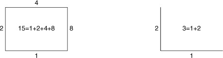
The only argument that isn’t familiar by now is mask (see figure 7.3 for layers, and the tip at the end of section 6.2.3 for the meaning of lineoptions). This argument is a bit mask in the form of an integer, each bit referring to one side of the border (see figure 9.10). The bit positions are counted clockwise from the bottom, so that a mask value of 1 refers to the bottom, 2 to the left, 4 to the top, and 8 to the right: 15 (=1+2+4+8) paints borders on all four sides. (Additional bits are used for three-dimensional plots using splot—we’ll discuss them in appendix C.) To draw borders on some but not all sides, you switch on only those you want to see:
![]()
Figure 9.10. The set border command takes as its first argument an integer that encodes the choice of borders to switch on in the form of a bit mask. The graph indicates which borders correspond to which bit (in decimal representation) and also gives the overall mask value for two common cases: borders on all sides and borders on the bottom and left.
If tic marks are drawn on the border (as is the default), unsetting the border does not unset the tic marks. They must be controlled separately using the options discussed in chapter 8.
Creating an Empty Space Between Axes and Data
With the set offsets command, you can introduce an empty space between the data and the borders. This can be desirable to avoid interference between the data and tic marks and other axes decorations. The set offsets command controls the size of the empty space on all four sides:
set offsets {flt:left}, {flt:right}, {flt:top}, {flt:bottom}
By default, the arguments are interpreted as given in the first coordinate system; using the keyword graph, you can also specify the arguments as fractions of the size of the overall graph. Gnuplot extends the plot ranges to make room for the empty space as required by set offsets—keep this in mind when using this command.
Clipping Data Points Close to the Borders
The set clip option controls how gnuplot plots points that are too close to or outside the plot area:
set clip points
set clip [ one | two ]
The first version, set clip points, is relevant only when you’re using a style that shows discrete plotting symbols (with points, with linespoints, and so on). If it’s active, symbols that would touch or overlap the borders of the plot are suppressed. Exactly how many points are clipped depends on the symbol size: for larger symbols, more points need to be clipped. (See chapter 6 for more detail on styles and ways to influence the symbol size.)
The second version controls how gnuplot plots line segments connecting points if at least one of the points falls outside the currently visible plot range. If set clip one is active, line segments are drawn if at least one of the end points falls into the visible plot range. If set clip two is active, line segments are drawn even if both end points are outside the current plot range but a straight line connecting them crosses the visible range. In no case are parts of the line segment drawn outside the visible range. By default, set clip one is on, but set clip two is off.
9.5.3. Margins
The empty areas outside a plot’s borders make up the margins (see figure 7.2). By default, gnuplot calculates the size of the margins automatically, based on the presence or absence of tics, axis labels, a plot title, and other decorations placed outside the borders. If necessary, you can fix margins manually using the set margin command.
Traditionally, there have been four different commands, for each of the margins separately. Gnuplot 5 also contains a version that combines all four into one:

The argument is interpreted differently depending on whether the keyword screen is present:[12]
The gnuplot standard reference documentation states the syntax as at screen, but the at keyword is optional and will be ignored henceforth.
- Without screen, the argument is interpreted as the width of the margin around the graph, measured in character widths or heights. Supplying a negative value restores automatic calculation of an appropriate margin width.
- With screen present, the argument is interpreted as the absolute position of the graph’s border, measured in screen coordinates. Using screen ignores and overrides the current values of set size and set origin.
It’s important to clearly distinguish between these two modes of operation! (See figure 7.2 for the meaning of screen; see section 9.5.1 for set size and set origin.)
The set margin command combines all four separate commands into a single invocation. Each argument can be either a desired width (in character units) or an absolute position (if preceded by the screen keyword). You can combine both modes in a single invocation: a command like set margin 10, screen 0.9, -1, -1 is valid.
9.5.4. Internal variables
You can inspect gnuplot’s internal size and margin information by examining the values of several internal variables. (See section 5.5 for general information on internal variables.) The variables that are of interest in the current context all have the prefix GPVAL_TERM_. You can list them and their values as follows:
show variables GPVAL_TERM_
There are seven such variables; table 9.4 explains what they represent.
Table 9.4. Internal variables that contain information about the size of the canvas and the position of the borders
|
Variable name |
Description |
|---|---|
| GPVAL_TERM_XSIZE, GPVAL_TERM_YSIZE | Size of the entire canvas (or screen) in the horizontal and vertical directions. |
| GPVAL_TERM_XMIN, GPVAL_TERM_YMIN | Positions of the bottom and left borders with respect to the canvas. These are the lower limits of the graph in both directions. |
| GPVAL_TERM_XMAX, GPVAL_TERM_YMAX | Positions of the top and right borders with respect to the canvas. These are the upper limits of the graph in both directions. |
| GPVAL_TERM_SCALE | Conversion factor between the units of the canvas size and the location of the borders. Variables representing the size must be divided by this variable to be comparable to the other variables in this table. |
Frequently, the numerical value of these variables is less useful; what really matters are various ratios. For example, the position of the left border in screen coordinates (see figure 7.2 for the different coordinate systems) is
GPVAL_TERM_XMIN/(1.0*GPVAL_TERM_XSIZE/GPVAL_TERM_SCALE)
In this expression, the multiplication with 1.0 is necessary to force floating-point evaluation of the fraction. In general, the units of the variables representing the canvas size are different from the units representing the location of the graph borders. The variable GPVAL_TERM_SCALE holds the conversion factor: you must always divide the variables holding the size by this variable, as in the expression given earlier.
9.6. Summary
In this chapter, we focused less on individual graph elements and their properties and instead discussed several topics that influence the overall appearance of a graph. Color, and the way it’s made available in gnuplot, occupied the first part of this chapter. The discussion was pretty technical; appendix D will return to the color topic, but then we’ll emphasize how to employ color for visualization tasks.
Next, we described how the appearance of lines and points can be controlled in minute aspects. Gnuplot 5 gives you the ability to define custom dash patterns for lines, and we explained how to do that.
The last part of this chapter explained how to control the overall appearance of a graph, such as the presence or absence of graphical borders around a plot, and how to modify the size and aspect ratio of the entire graph. Gnuplot’s defaults for all these properties are probably sufficient for the vast majority of your work, but there are situations where being able to go beyond the basics can give your graphs a palpable lift.