
Appendix E. Special plots
In this appendix, we’ll discuss several “special” plotting options. All of them produce graphs that are visually and semantically more complicated than the line-and-point plots we’ve been dealing with so far.
First, you’ll learn about gnuplot’s multiplot feature. This is a way to combine different plots into a single graph. The individual components may either be arranged on a regular array (that’s the more common case) or be placed arbitrarily (for example, to create insets within a larger graph).
In the remainder of the appendix, we’ll introduce three types of plots that summarize entire data sets in some way. First, we’ll discuss box-and-whisker plots: a popular method to visualize the distribution of points in a simple and robust fashion. Then we’ll turn to parallel coordinates. This is a relatively new type of plot that’s intended to reveal structure in multidimensional data sets, but gnuplot makes them easy to create. The final section deals with gnuplot’s support for drawing histograms: pretty and popular, they’re most suitable for presentations and information graphics.
Except for the first topic (multiplot), the material in this appendix is rather specialized, and not everyone may have a need for it. Make sure you catch the multiplot features, but feel free to skip the rest if it’s not relevant to you right now.
E.1. Multiplot
Gnuplot’s multiplot feature allows you to combine several plots into a single graph. This can be useful for a number of purposes:
- To make arrays of related graphs
- To create insets: graphs within a graph (for example, to show some details at greater magnification)
- For special effects, such as multiple, clearly separate plots aligned on a common axis
E.1.1. Using multiplot mode
Multiplot mode is enabled like an option through a set multiplot command and remains active until an unset multiplot command has been issued. When multiplot mode is active, the usual gnuplot> prompt is replaced by a multiplot> prompt. All plot (or splot or replot or test, but not test palette) commands issued at this prompt are directed to the same graph, and you can control their relative location by giving additional directives to the set multiplot command. Any other option modified while in multiplot mode is applied to all subsequent plots. This is the normal gnuplot behavior; multiplot mode doesn’t change that. Any option or decoration you want to apply to only one of the plots in a multiplot combination has to be explicitly set before and unset after the respective plot command. (This doesn’t apply to decorations positioned with screen coordinates: because there’s only a single screen coordinate system even for a multiplot graph, they’re global objects.)
Different terminals may exhibit different behavior regarding the time when plots become visible. Some show each plot right when the corresponding plot has been issued; others may delay generation of the entire array of graphs until multiplot mode is switched off again.
There’s one very important limitation to keep in mind: you can’t change the terminal while in multiplot mode! This implies that you may have to change the way you use gnuplot: it’s not possible to build up a graph iteratively using an interactive (screen) terminal and then, finally, export it to a graphics file format, because this would require a change of terminal before the last step. Instead, the file-based terminal has to be selected first, with all other commands following. Personally, I write all my commands to a command file (using a text editor) and then run it using load, while using an interactive terminal. When I’m satisfied with the resulting graph, I insert a terminal and output setting at the top of the command file, and run it one final time to export the graph to file. Because multiplot mode is mostly a tool for generating final presentation graphics (as opposed to doing exploratory data analysis, which must be interactive to be useful), this works quite well. (Also see section 12.2 on using external editors in general.)
There’s one additional gotcha to be aware of when using multiplot mode: if you want to capture the commands for the plot using save, you must issue the save command before leaving multiplot mode. (Otherwise, only the commands for the last plot in the multiplot set will be saved to file!) And remember to exit multiplot mode using unset multiplot, not using Ctrl-D (which terminates gnuplot).
Tip
When using multiplot mode, it makes the most sense to prepare a command file with all plot and appearance commands and to load it into gnuplot using load. Using multiplot mode interactively is just too fickle and frustrating.
E.1.2. Layout options and the set multiplot command
The multiplot feature can be used in two different ways. You can specify the layout of a tabular array of graphs as part of the set multiplot command and let gnuplot figure out sizing and positioning of all components in the overall graph automatically. Or you can take control of all aspects of the layout yourself and arrange the individual graphs using set size and set origin. All of this will become much clearer once we look at some examples.
The set multiplot option has the following sub-options:
set multiplot [ title "{str:title}" ] [ font "str:font [,int:size]" ]
              [ layout {int:rows},{int:cols}
                [ rowsfirst | columnsfirst ] [ downwards | upwards ]
                [ scale {flt:xfactor}[,{flt:yfactor}] ]
                [ offset {flt:xoff}[,{flt:yoff}] ]
                [ margins {flt:left},{flt:right},{flt:bottom},{flt:top}
                   [ spacing {flt:horizontal} [, {flt:vertical} ] ] ]
              ]

set multiplot [ prev | next ]
The title directive is equivalent to set title (see section 7.3.3) for regular plots: it can be used to give an overall title to the entire assembly of graphs. (The set title command can still be used to assign a title to each of the individual component graphs.) All other directives (besides title) are only meaningful in combination with the layout keyword, which is a convenience feature to create arrays of graphs easily. In the following sections, I’ll first guide you through some examples using the layout facility before explaining how to place graph components explicitly.
Tip
The layout feature of gnuplot’s multiplot mode may seem daunting at first, but—once mastered—it takes the pain out of multipanel graphs. I highly recommend that you learn how to use it and prefer it over explicit placement of individual graphs whenever possible.
The layout directive takes two mandatory integer arguments, which describe the number of rows and columns in the resulting array of graphs. This array will be filled with subsequent plot commands. The order in which subsequent panels are filled can be controlled through the rowsfirst, columnsfirst, downwards, and upwards keywords (see figure E.1). The default is rowsfirst downwards.
Figure E.1. Choosing the layout direction in multiplot mode: rowsfirst downwards (left; this is the default) and columnsfirst upwards (right)

Each new plot command moves to and fills the next array location (when using layout). You can skip one location by using set multiplot next instead of a plot command: gnuplot will leave the next location in the sequence blank. You can back up using set multiplot prev.
Individual plots can be scaled and shifted from their (automatically assigned) size and position using the scale and offset keywords. The arguments to scale are multiplicative scale factors for the x and y size of the individual plots (if only one is given, it’s applied to both axes). Using the offset directive, you can shift all graphs by the same amount; the arguments are interpreted as coordinates in the screen system (see section 7.2), so that offset 0.25, 0.1 shifts everything by a quarter of the overall width of the graph to the right and by a tenth of the height up.
The margins and spacing directives must be used together (and together with the layout option). They create a regular array of equally sized graphs that are properly aligned, even if only some of these graphs have marginal labels. (This will become much clearer when we look at an example in section E.1.4.) One important limitation: set multiplot layout doesn’t nest—you can’t have a small array of graphs as a panel in a larger array.
E.1.3. Regular arrays of graphs with layout
The layout feature makes it truly easy to generate multipanel graphs (as in figure E.2): just see how short and clear the following listing is! (It’s important to use a complete do for loop here, and not just an inline loop: if I had used an inline loop, all six curves would have been drawn to a single plot, instead of six plots with a single curve in each.)
Figure E.2. A regular array of small plots created in multiplot mode. See listing E.1.

Listing E.1. Commands for figure E.2. (file: chebyshev.gp)

If you want to have more control over the way individual plots are assembled to form a plot, you can’t use layout; instead you have to handle everything yourself using set size and set origin. You’ll see an example in a moment (in section E.1.5), but first, let’s turn to another problem: tic marks and axes labels in a multiplot array.
E.1.4. Accommodating marginal labels with margins and spacing
Figure E.2 is pretty and was easy to do. Yet it isn’t fully satisfactory: it feels cluttered. Can’t we remove some of the decorations, so that we have more room for the graphs, but do so without losing any information? An obvious candidate are some of the tic labels: all the individual graphs show exactly the same plot range (both horizontally and vertically), and hence there’s no need to repeat the tic labels on all the graphs. Just a single set of tic labels around the outer edges of the entire array would be sufficient. In fact, that’s exactly what you see in figure E.3.
Figure E.3. A regular array of small plots. All individual plots are of the same size and therefore line up, although some of them have marginal notes whereas others don’t. See listing E.2.

You now need to switch on tic and axis labels for some, but not all, of the graphs. As a result, the commands in the next listing aren’t nearly as nice as the previous version (in listing E.1).
Listing E.2. Commands for figure E.3 (file: marginals.gp)

Before each plot command, the tic labels for both axes are turned either on or off. The title is dropped from the top of the plot (and hence from the set multiplot command), but axis labels are attached to some of the plots.
An essential change has occurred in the set multiplot command: it now includes the margins and spacing keywords. When these keywords (which must be used together) are included in the set multiplot command, then the individual graphs are drawn so that their graph area (that is, the area within their borders) is exactly the same size for all of them—regardless of whether an individual graph has marginal labels (such as tic or axis labels). In contrast, if the margins and spacing keywords aren’t included, then gnuplot draws the individual plots such that their screen area (that is, their total extent, including their margins) is the same. (See section 7.2 for the definition of graph and screen coordinates, specifically figure 7.2.)
To put it differently: when margins and spacing are included in the set multi-plot command, then gnuplot ignores the margins of individual plots and instead arranges plots with equally sized graph areas on a regular array. In this case, it’s the user’s responsibility to make sure there’s enough room for any marginal notes attached to individual graphs. By contrast, when using set multiplot layout without the margins and spacing keywords, then gnuplot shrinks the graph area of individual plots to make room for that plot’s margins. In this case, you can be sure the margins fit into the multiplot array, but the individual plots may not all be the same size (and, in consequence, their borders may not line up).
The numerical arguments to margins and spacing control the extent of the margins around the outer edge of the array of plots and the internal spacing between individual plots, respectively. Two different systems of measurement are available: character widths and heights, and fractions of the total screen size. Character widths must be indicated through the char keyword, and fractions of the screen width through the screen keyword. If neither is found, screen is assumed.[1]
For gnuplot 5.0, only screen is available; char is available for gnuplot versions beginning with 5.1.
The margins sub-option behaves similarly to the set margins command (see section 9.5.3): when the char system is used, then the arguments are interpreted as the width of the margins around the array of subplots; if the screen system is used, then the arguments are interpreted as the absolute position of the outer boundaries of the array of subplots. In contrast to set margins, the keyword doesn’t need to be repeated for each argument, but applies to all subsequent numbers (until the next appearance of either screen or char).
Graphs Sharing a Common Axis
Here’s another example that demonstrates the features just introduced. Occasionally, you may want to show two or more graphs together, aligned on a common axis, to facilitate comparison between curves in both graphs. Of course, it’s possible to put all the curves into a single plot (as in section 8.1), but sometimes doing so would lead to an overly cluttered graph—for example, if you wanted to compare not just two curves, but two entire sets of curves.
To make this concrete, let’s assume I want to compare the log-normal probability density function and its cumulative distribution function for an entire set of parameters. I could place all these curves into a single graph, but the graph would appear crowded, and it would be difficult to distinguish the curves properly from each other.
Instead, let’s put them into two different graphs, aligned on a common axis, as shown in figure E.4. By now, you know how to create a multipanel plot using multiplot mode (see the following listing), so I only need to point out a few details.
Figure E.4. Showing two plots side by side using multiplot mode (see listing E.3)

Listing E.3. Commands for figure E.4 (file: sidebyside.gp)

First come the definitions of the two functions to plot ![]()
![]() . You also define the set of parameters, as a whitespace-separated string (because gnuplot doesn’t have an array type)
. You also define the set of parameters, as a whitespace-separated string (because gnuplot doesn’t have an array type) ![]() .
.
The spacing value in set multiplot is 0, so that the two graphs will touch each other. So that the axis labels for the vertical axis don’t clobber each other where
the two graphs meet, the first label (for y=0) in the top graph is suppressed ![]() (see section 8.3.3 for details of the set ytics option).
(see section 8.3.3 for details of the set ytics option).
E.1.5. Graphs within a graph
Sometimes it’s useful to place small graphs inside a larger one: for example, to show a detail of the overall graph at greater magnification, or to provide some form of ancillary information (as in figure E.5). This can’t be accomplished using layout, so you have to roll your own.
Figure E.5. A larger graph with insets showing ancillary information. See listing E.4.

Listing E.4 shows how it’s done.[2] Let’s step through this example carefully and point out some details and potential pitfalls.
This example is taken from the thermodynamics of phase transitions: if you heat a magnet beyond its critical temperature, it loses all magnetization. In the graph, the thick curve shows the magnetization as a function of temperature, and the three insets show the typical form of the free energy as a function of the magnetization for three different temperatures: below, at, and above the critical value. Below the critical temperature, the free energy develops two minima at nonzero values of the magnetization, indicating that a magnetized phase is stable. Right at the critical temperature, these two minima coalesce, yielding a curve that’s flat at the origin. Above the transition temperature, there’s only a single minimum at zero: the magnetization of the sample is now zero.
In this example, the main curve is drawn first, and then the small insets are added to it. Options (such as their size) that apply to all insets are defined first. Because the insets are small, all decorations and margins are removed, to reduce clutter.
The insets are placed on the existing graph individually by specifying the location of their bottom-left corner using the set origin command. By default, gnuplot doesn’t clear the area where the insets will be placed, and therefore it’s necessary to do so explicitly using the clear command. The subsequent plot command then draws one of the insets on the cleared area.
Listing E.4. Commands for figure E.5 (file: insets.gp)


E.2. Box-and-whisker plots
Box-and-whisker plots (or boxplots for short) are a simple and robust way to visualize univariate point distributions. They serve the same purpose as kernel-density estimates (see section 3.5.2). Boxplots are somewhat easier to use, because they don’t depend on an adjustable parameter (kernel-density estimates require a choice for the bandwidth). This convenience comes at a price: boxplots lose some detail of the represented data set (in particular, boxplots are unable to identify data sets having multiple maxima—an important limitation to keep in mind!) and aren’t very intuitive.
E.2.1. Individual box-and-whisker plots
Boxplots are created using the familiar plot command together with the with boxplot style. (The boxplot keyword can’t be abbreviated!) At least two parameters must be supplied in the using specifier. The first is the horizontal position at which the boxplot will be drawn (usually this is a numeric constant, but it can also be a column number so that the horizontal position will be read from file). The second entry in the using specifier indicates which column from the data file to represent via box and whiskers. (This means the first column in the using specifier gives the horizontal position and the second column the vertical “data”—just as for any other plot style.) To create a boxplot of the data from listing 3.4, you’d use this command (see figure E.6):
Figure E.6. A box-and-whisker plot, when drawn using only default appearance options

plot "measurements" u (1):1 w boxplot
It’s not a problem to have multiple boxplots in the same graph (for easy comparison). You can also combine the boxplot style with other styles, such as lines or points.
Semantics of Box-and-Whisker Plots
The various elements of box-and-whisker plots represent different properties of the underlying data set. Boxplots usually represent various percentiles: for skewed point distributions, these quantities are more informative than the (more familiar) mean and standard deviation. (The boxplot style uses gnuplot’s stats command to find the median and percentiles. Check section 5.6 for details on the calculation.)
- The box indicates the interquartile range: the top and bottom boundaries of the box are chosen such that one quarter of points falls outside and below the box, and one quarter outside and above the box.
- The location of the median is indicated by a marker inside the box. The median divides the data set in two equal parts: half of all data points have a value less than the median, and half of the points have a value greater than the median.
- The construction of the whiskers is more complicated (and more ambiguous). Traditionally, whiskers extend to the most extreme
data point that lies within 1.5 times the interquartile range from either edge of the box. The process is as follows: draw
a line that’s 1.5 times the height of the box outward from either end of the box, and then trim the line back to the last
data point within its range. This location marks the end point of the whisker. (See figure E.7.)
Figure E.7. Construction of a box-and-whisker plot from the data set. (The individual data points are shown on the left.)

- Points that fall outside the range of the whiskers are considered outliers and are indicated with individual symbols.
The complicated prescription for constructing the whiskers requires an explanation. The idea is to indicate the actual extent of the “tails” of the distribution, while distinguishing them clearly from true outliers.
What are outliers? A point is considered an outlier only if it’s exceptionally far away from the other points. It isn’t enough for a point to be the smallest or largest value in a data set: a data set that’s very compact (so that all points cluster close together) doesn’t have any outliers—but it still has a smallest and a largest value! All this means true outliers are points that are far from the center of the distribution, when measured in units of the width of the distribution. The method for constructing whiskers reflects this: only points far from the center in comparison to the interquartile range are considered outliers. (Look at figure E.7: it has an outlier at its upper range, but its lower part is sufficiently compact that no point is considered an outlier.)
Once outliers have been identified, each whisker is trimmed back toward the most extreme data point still within the range of the respective whisker. The length of each whisker therefore indicates the true extent of the tail of the distribution on either side of the distribution.
You can customize the precise determination of the whiskers using set style boxplot:
set style boxplot [range {flt:range} | fraction {flt:frac}]
If invoked with the range keyword, followed by a floating-point number, the whiskers are constructed in the way just explained, and the numerical argument is used as the factor by which the interquartile range is multiplied to determine the original extent of the whisker. This is the default behavior, and the default value of the multiplier is 1.5.
But it’s also possible to designate a fixed fraction of points as outliers. This is done with the fraction keyword. It must be followed by a numeric argument between 0.5 and 1.0, which indicates the fraction of regular (that is, non-outlier) points. For example, set style boxplot fraction 0.9 treats 10% of points as outliers. As before, the whiskers will extend to the data point furthest from the center that isn’t considered an outlier.
Appearance Options
In addition to the options just discussed, which control the semantics of the boxplot, there are also options that merely modify the visual appearance of the plot. Boxplots are similar to the with candlesticks style (see section 6.3.2), and many of the options mentioned there apply to the present situation as well. In particular, you can use set bars (see section 6.3.2) to customize the length of the bars at the end of the whiskers; set boxwidth controls the width of the central box, and set style fill its fill style. Instead of using global options, you can also use inline directives. For example, to have the central box lightly shaded, you can use
plot "measurements" u (1):1 w boxplot fs solid 0.2
Similarly, the box width can be specified inline, as a third entry to the using specifier. This makes it possible to have the box width be data-dependent. (Compare figure 14.14 and listing 14.9 for an example.)
Finally, there are some additional sub-options to set style boxplot:
set style boxplot [ [no]outliers] [pointtype | pt {int:pointtype}]
                  [ candlesticks | financebars ]
By default, outliers are indicated with filled circles (point type 7). The point type can be overridden in the plot command or changed globally using set style boxplot. If there are several outliers with the same value, then they’re plotted as individual points in a horizontal row. The keyword nooutliers suppresses the visual representation for individual outliers. It isn’t possible to draw horizontal box-and-whisker plots with gnuplot at this time, but you can use the financebars appearance in conjunction with the boxplot style instead of the candlesticks appearance (see section 6.3.2).
By default, gnuplot draws a box around the plotted data. I’ve argued elsewhere (see the sidebar in section 8.3.2) why this makes sense. For box-and-whisker plots, this additional boundary is less important, and you may want to switch it off (using the set border command—see section 9.5.2). But if you choose to do so, you should retain the left border and its tic marks: otherwise, there’s no way for an observer to infer quantitative information from the plot! (See figure E.8 and listing E.5 for an example.)
Figure E.8. A serial box-and-whisker plot. The distribution of sepal lengths is shown separately for each type of flower.

Tip
Many of gnuplot’s default appearance options aren’t particularly suitable for box-and-whisker plots. You can improve the quality of your graphs by customizing borders, tic marks, and tic labels. But it’s essential to retain enough information that an observer can still infer numeric values from the graph!
E.2.2. Serial box-and-whisker plots
So far, we’ve only considered individual box-and-whisker plots for single data sets. But the technique becomes significantly more useful when you’re dealing with an entire series of data sets, distinguished by a discrete label. For example, imagine that some experiment has been repeated several times, each time subject to a different treatment level. It would be nice to see a graph of all point distributions at once, showing a separate boxplot for each different treatment level. Fortunately, gnuplot let’s you do just that.
All you have to do is to include a fourth column in the using specifier. The value of this fourth column is interpreted as the treatment level, and a separate boxplot is constructed for each new value of the level. (Of course, the values in the fourth column should form a discrete set—frequently it will be a string.) All the resulting box-plots are then shown together and on the same scale, facilitating comparison across treatment levels.
We’ll demonstrate this feature using one of the most famous data sets in the history of statistics: Fisher’s Iris data.[3] The data set consists of size measurements of different parts of Iris flowers. For each flower, four quantities were measured (sepal length and width, and petal length and width, all in centimeters). Three different kinds of Iris are considered (I. Setosa, I. Versicolor, and I. Virginica), and for each kind, the data set contains values for 50 instances. The question is whether it’s possible to determine the type of plant from the measurements in the data set.
A quick internet search will turn up multiple sources; I use the version found in the UCI Machine Learning Repository at http://archive.ics.uci.edu/ml/datasets/Iris.
Figure E.8 shows the sepal length as box-and-whisker plots separately for each type of flower. The commands for this graph are in the next listing. (The file format of the data set available at the UCI repository is comma-separated, not whitespace-separated, requiring a call to set datafile separator!)
Listing E.5. Commands for figure E.8. (file: iris1.gp)

This graph follows the suggestions made at the end of the previous section: it does away with most decorations, but retains the numerical scale along the left edge. You’ll also notice that gnuplot automatically labels each boxplot with the corresponding level (that is, the entry in the fourth column in the using expression).
Appearance Options for Serial Box-and-Whisker Plots
Most of what you learned for a single box-and-whisker plot carries over to serial boxand-whisker plots. The first entry in the using specification (which previously gave the horizontal location of the boxplot) now gives the horizontal position of the first (left-most) boxplot in the series. The spacing between successive boxplots is controlled using set style boxplot, which also allows you to customize some other appearance aspects:
set style boxplot [ separation {flt:s} ]
                  [ labels [ off | auto | x | x2 ] ]
                  [ [un]sorted ]
- Using the separation keyword, you can control the distance between boxes. The argument is the desired separation in x axis units; its default is 1.
- By default, the value of the fourth column (the level) is printed as a tic label on the horizontal axis. The axis can be selected using x (below) or x2 (above). Choosing auto places the labels on whichever axis is indicated by the axes keyword inside the plot command (see section 8.1.2). The keyword off suppresses printing of labels.
- Boxplots are sorted by the first appearance of their level in the data file. (It isn’t necessary for the data file to be grouped by level, hence the first appearance of a level determines the sort order.) This can be changed using the sorted option. Levels are assumed to be strings, so the sort order is alphabetical, not numeric. An arbitrary sort order isn’t possible at this time.
Here are three further things to keep in mind:
- As you saw in figure E.8, gnuplot automatically places a string label for the level in the margin. These labels are equivalent to tic marks and tic labels; you can customize their appearance using set xtic.
- Although I don’t show an example here, it’s absolutely possible to combine multiple data sets in a single graph. For example,
if you want to plot both sepal length and width in a single plot, you can do so as follows:
plot "iris.data" u (1):1:(.5):5 w boxplot, "" u (5):2:(.5):5 w boxplot
This creates boxplots for the sepal lengths of the three types of flower starting at x=1, together with corresponding boxplots of the sepal widths, starting at x=5. - It’s unfortunately not possible to draw each level in a separate color or style at this time.
Worked Example: An Array of Serial Boxplots
In figure E.8, you can see the distribution of sepal lengths for all three types of flowers at once—but wouldn’t it be great if you could compare all four measured quantities for all types of flowers in a single graph? The multiplot mode that was explained earlier in this appendix makes this easy.
Figure E.9 shows all four measurements in a 2×2 matrix of serial boxplots. Looking over these graphs, it immediately stands out that I. setosa is distinguished by petals that are smaller, in both length and width, than those of the other two variants. Because the boxplots display outliers explicitly, you know for sure that even the largest instance of I. setosa in this data set was smaller than the smallest instance of either of the other two types!
Figure E.9. An array of serial box-and-whisker plots. The distribution of all four observed quantities is displayed for all flower types separately. (See listing E.6.)

You can see the commands for figure E.9 in the next listing. Notice that I retained the borders around the individual plots in this case: this helps to distinguish them from one another in the array of graphs.
Listing E.6. Commands for figure E.9 (file: iris2.gp)
set datafile separator "," unset xtics; set ytics 1 set bars 0; unset key; set multiplottitle "From left to right: I. Setosa, I. Versicolor, I.Virginica"
E.3. Parallel coordinates
Graphs using parallel coordinates are a relatively new idea. Their purpose is to reveal structure in multivariate data sets: that is, data sets that have more than two or three attributes per record. In contrast to some other multivariate visualization techniques, parallel coordinates aren’t limited to data sets containing only a few records. The parallel-coordinates technique therefore scales well, both in the number of attributes and in the number of records. The downside is that plots of parallel coordinates are neither pretty nor particularly intuitive. You aren’t likely to exhibit them in a presentation, but they may serve as an intermediate discovery tool.
To understand parallel coordinates, let’s go back to the Iris data set introduced in section E.2.2. For the moment, consider just the first record in that data set. It has the following values in its five columns:
Sepal length      5.1 cm
Sepal width       3.5 cm
Petal length      1.4 cm
Petal width       0.2 cm
Name              Iris setosa
To construct a parallel-coordinates plot, you draw a coordinate axis for each attribute; but in contrast to other types of graphs, all axes are arranged in parallel. The values for every record are then marked on each coordinate axis and connected with lines. For the first record from the Iris data set, the result is shown in figure E.10.
Figure E.10. Parallel-coordinates plot for a single record

This procedure is repeated for all records in the data set (see figure E.11). Now this plot can be examined for possible structure in the data set. Look for clusters or gaps along one of the axes: those can be used to classify data sets into groups. You can also look for outliers and for correlations among data sets: positively correlated quantities show up as parallel (or nearly parallel) lines, whereas negative correlation is indicated by lines crossing each other. From figure E.11, for instance, a cluster of records with relatively small values for petal length and width stands out: those belong to I. setosa—something you already knew from figure E.9. But from the parallel-coordinates plot, it becomes also obvious that short sepal length implies long sepal width (and vice versa)—a fact that isn’t so easy to discern from figure E.9.
Figure E.11. Parallel-coordinates plot for the entire Iris data set

Having seen what graphs of parallel coordinates are and how they’re used, let’s understand how to create them with gnuplot. (Support for this feature is still new. The basic functionality works well, but you’ll frequently find that you need to change the default appearance yourself.)
E.3.1. Creating parallel-coordinates graphs
You create graphs of parallel coordinates in gnuplot using the plot command together with the with parallelaxes style. The individual columns that are used for the axes are listed as entries in the using specifier. The basic command to create figure E.11 is therefore
set datafile separator ","
plot "iris.data" u 1:2:3:4 w parallelaxes
A word of warning: the current implementation arbitrarily limits the number of columns to seven.[4] If you want to use more columns, you need to employ multiplot mode—see section 14.2.5 for a worked example.
The details of the implementation may have changed by the time you read this. Check the release notes for the most up-to-date information.
Appearance Options for Parallel Coordinates
You can use the set paxis command to control the appearance of individual axes in a parallel-coordinates plot:
set paxis {int:n} [ range {range-options} | tics {tic-options} ]
This command combines the functionality of the set _range and the set _tics commands familiar from chapter 8. The mandatory first argument to set paxis is an integer between 1 and 7 that identifies which of the parallel axes the options should be applied to. (The axis with index 1 is always the left-most one.) Only a single axis can be identified with each invocation to set paxis; if you want to make adjustments to several axes, you need to do so explicitly or use an inline loop (set for[k=1:7] paxis k ...).
The range keyword must be followed by a legal range specification (like so: set paxis 1 range [0:10]). The tics keyword acts like the familiar set xtics or set ytics; all options available to those commands apply in the current case as well.
The appearance of the parallel axes can be customized using[5]
This feature wasn’t documented in the standard gnuplot reference documentation at the time of this writing.
set style parallel [ front | back ] [ lineoptions ]
By default, the axes and the associated tic marks are drawn in front of the data. The axes are drawn as thick black lines; you may find that you want to reduce the thickness. (See the tip at the end of section 6.2.3 for all the appearance aspects covered by lineoptions.)
E.3.2. Worked example: Iris data, again
I hope the preceding discussion has convinced you that gnuplot’s parallel-coordinates feature is remarkably easy to use, despite the intimidating appearance of the resulting graphs. In order to get the most value out of these graphs, it’s nonetheless necessary to augment gnuplot’s functionality. In this section, you’ll first see ways to improve the appearance of the plot and then learn how to highlight a subset of records. The latter is an essential capability when using parallel-coordinates plots. (Chapter 14 shows some additional tricks applicable in particular to data sets containing a large number of records.)
Improving Appearance
Similar to the situation you encountered for serial box-and-whisker plots (section E.2.1), gnuplot’s defaults aren’t the most suitable for parallel-coordinates plots, either. (As you may have found out already, the graphs resulting from the simple command given earlier look quite different than figure E.11.) You can improve the appearance of the plot by adapting the defaults appropriately. Here’s how it’s done.
Listing E.7. Commands for figure E.11 (file: iris3.gp)

Because there are exactly four parallel axes (located at positions 1 through 4), the plot range is restricted in the plot command to that interval. This gets rid of the margins that gnuplot leaves by default on both sides of a parallel-coordinates plot and maximizes the area available for the plot. Whether you want to switch off the borders around the entire graph is a personal choice. I prefer the appearance of the graph without them—in particular the horizontal lines at top and bottom feel visually constraining.
Highlighting a Subset of Records
The purpose of parallel-coordinates plots is to identify structure in a data set. The visual presentation makes it easy to see where lines cluster (for example, in figure E.11, there is an obvious cluster of lines with small petal length). This leads to the next question: how are lines that cluster for some attribute distributed elsewhere? If you could just select the lines in the cluster so that they’re highlighted everywhere, then this question would be answered. In this section, I’ll show you how to do this, but there’s more: you’ll also learn how to take the type of flower into account and to include it in the highlighting (see figure E.12).[6]
After this section was written, I noticed that the Wikipedia page for parallel coordinates also uses Fisher’s Iris data to demonstrate this technique and includes a figure very similar to figure E.12. As I said, it’s one of the best-known and most-frequently used data sets in all of statistics!
Figure E.12. A parallel-coordinates plot for the entire Iris data set. Records are color-coded based on the flower type.

The name of the flower is given in the data set as a string. To plot it, you must map the names to numbers. The most convenient way to do such transformations is probably using an external scripting language, but it can be done entirely in gnuplot, too. The following function (cls is short for class)
cls(s) = s eq 'Iris-setosa' ? 1:(s eq 'Iris-versicolor' ? 2:3)
consists of two nested conditionals and maps the names to the value 1, 2, or 3. To include the names in the plot, remember that all of gnuplot’s commands to control tic labels are available for each axis in a parallel-coordinates plot. With
set paxis 5 tics ( "I. Setosa" 1, "I. Versicolor" 2, "I. Virginica" 3 )
you can place informative labels on the tics of the new, fifth axis.
The last trick is to use data-dependent coloring for the lines themselves (see section 9.1.5)! You remember: if you use linecolor variable (or lc var for short), then the right-most entry in the using specifier is interpreted as the index of a color from gnuplot’s sequence of linetypes (and their associated colors). Because the function cls(s) already maps the flower names to the values 1, 2, and 3, you can use these values directly as a color index: each flower type is drawn with a different line type (and therefore a different color). You can find all the commands in the next listing. (One last comment: instead of adjusting the left and right margins explicitly, here I decided to manage the horizontal extent of the plot entirely through the plot range. That’s sheerly a matter of convenience—you can do it either way.)
Listing E.8. Commands for figure E.12 (file: iris4.gp)
set datafile separator ',' unset key unset border unset ytics set xtics ( "Sepal Length" 1, "Sepal Width" 2,
E.4. Histograms
The histogram styles are a bit of a departure from gnuplot’s usual processing model, in that they have the concept of a data set. The overall appearance of the plot depends on both row and column information simultaneously.
Histograms are the result of counting statistics. For the sake of discussion, let’s assume that there are three political parties (Red, Blue, and Green), and you want to show the number of votes for each party. The outcome of a single election can be shown easily using, for instance, the histeps style.
But what to do if elections are held annually, and you want to show the results for a number of years in one plot? To make matters concrete, let’s consider a specific data file, shown next.
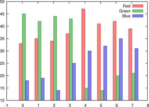
Listing E.9. Data for figures E.13 and E.14 (file: elections)
# Year  Red   Green Blue  Spending
1990    33    45    18    21
1991    35    42    19    18
1992    34    44    14    25
1993    37    43    25    27
1994    47    15    30    28
1995    41    14    32    33
1996    42    20    35    35
1997    39    21    31    32
One possible solution would be to plot the data as a regular time series (see figure E.13—ignoring the last column for the time being):

Figure E.13. Election results as a time series. The data file is shown in listing E.9.

Often this is exactly what you want, but this format can be clumsy, in particular if there are many competing parties or if there is a lot of variation year over year. The histogram style offers an alternative.
Using set style histogram clustered generates a sequence of histograms (see figure E.14). Each histogram corresponds to one row in the input file (in this example, this corresponds to one year):
set style fill solid 0.5 set style histogram clustered plot "elections" u 2 t "Red" w histograms,
Figure E.14. Election results using set style histogram clustered. This is the same data set as in figure E.13.
Instead of repeating the with histograms style directive multiple times in the plot command, you can select the global style to use histograms for all data sets:
set style fill solid 0.5
set style histogram clustered
set style data histograms
plot "elections" u 2 t "Red", "" u 3 t "Green", "" u 4 t "Blue"
For all the histogram styles, it’s usually a good idea to have the boxes filled to make them more easily distinguishable, and so this option is enabled here. You can control the spacing between consecutive histograms using the optional gap parameter to the set style command: set style histogram clustered gap 2. The size of the gap is measured in multiples of individual boxes in the histograms. (To create gaps within each histogram, so that neighboring boxes don’t touch each other, use set boxwidth.) Keep in mind that the way gnuplot reads the data file for histograms is a bit unusual: each new row generates a new histogram cluster, but the histogram style accepts only a single column in the using directive. You therefore have to list the file repeatedly in the same plot command to generate meaningful histograms, as shown previously.
Finally, the labels gnuplot places along the x axis aren’t very meaningful. You can either set explicit labels for each histogram using the set xtics add command or read a textual label from the data file using the function xticlabels() (xtic() for short). The effect of the latter is demonstrated in figure E.15. (For more information on tic labels, see chapter 8.)
Figure E.15. Election results using set style histogram rowstacked. This is the same data set yet again. Note the effect of the xtic() function, which is used to read x axis labels directly from the data file.

In addition to the clustered histogram style we looked at so far, there is also a stacked style. Using this style, the individual boxes aren’t placed next to one another, but stacked on top of each other, so that each vertical box forms an entire histogram. By default, adjacent boxes touch each other, but as usual, you can use set boxwidth to control the width of individual boxes (see figure E.15):
set style fill solid 0.5
set style histogram rowstacked
set style data histograms
plot "elections" u 2:xtic(1) t "Red", "" u 3 t "Green", "" u 4 t "Blue"
There are two additional histogram styles, which I won’t describe here in detail, because they’re similar to the ones we discussed already. The set style histogram errorbars style is similar to the clustered style, except that it reads two values for each box, the second being the uncertainty in the data, represented with a standard error bar. The set style histogram columnstacked style is equivalent to the row-stacked style, except that each vertical box is built from a single column (not row) in the input file.
One last directive related to histograms is newhistogram (see figure E.16). It can be used to have several sets of clustered histograms on the same plot. An example will suffice:

Figure E.16. Several histograms can be combined in a single graph using newhistogram.

The syntax for the newhistogram command is a bit unintuitive (I still tend to get it wrong), so let me point out the salient features: the newhistogram keyword is followed by a mandatory string label (an empty string is permitted) and a mandatory comma, and then the rest of the plot command follows, starting with the filename.
In addition to the commands that are directly related to the histogram feature, this example includes some appearance options: tic labels are rotated so that they don’t overlap each other, and the bottom margin has been increased to make room for both the rotated tic labels as well as the histogram label supplied to the newhistogram keyword. Finally, I began each of the two histogram labels with some newlines: otherwise, they interfere with the tic labels.
Histograms such as those discussed in this section look good and are frequently used in business presentations or in the media. But they make it difficult to see trends in the data, and in particular quantitative comparison of data can be difficult. (Gnuplot offers some additional features that I didn’t mention; check the standard reference information if you want to know more.)