
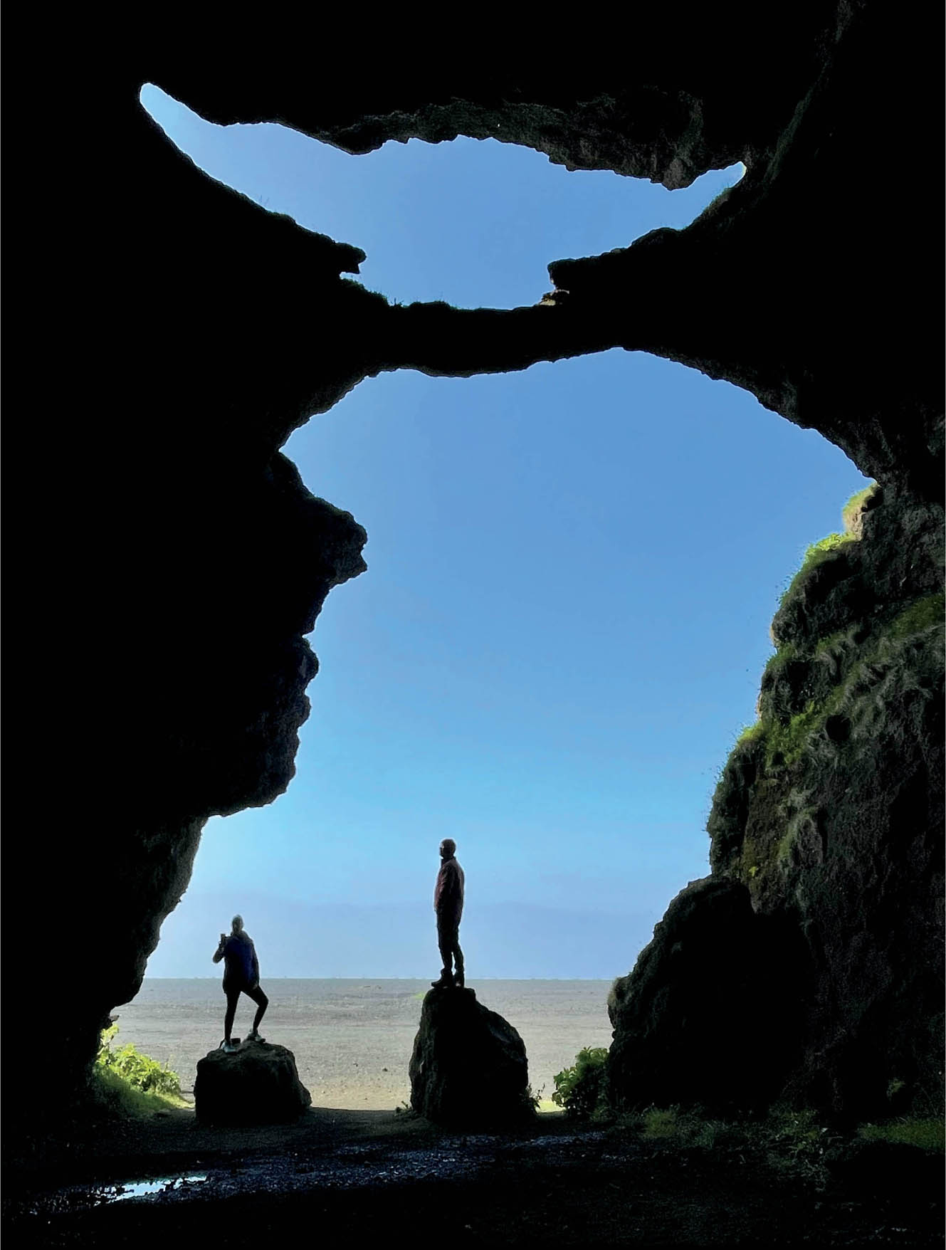
Yoda Visits a Cave—On the south coast of Iceland my workshop group visited a cave. Iceland has been inhabited for over a millennium and in the early years, when survival was tenuous, caves like this one were crucial to the survival of the Viking civilization.
This image uses positive and negative space to present a visual pun. It’s easy to see the figures standing silhouetted in the cave’s entrance. Can you also see that Yoda walks among us? Perhaps you also see Aladin’s lamp, or the profile of a face.
iPhone 12 Pro Max.

At first glance, the whole issue of positive and negative space seems really straightforward. The subject is the positive space and the background is the negative space.
While it is generally true that the subject is the positive space and the background is the negative space, like many simple statements this turns out to be far more complex in the real world. This complexity often starts with the question of what exactly the subject is.
Keep in mind that positive and negative space is one more formal mechanism for analyzing the design within an image. In this sense, positive and negative space can be used in parallel with other mechanisms such as shapes, entry and exit points, and so forth. Take your pick! A starting place is often to contemplate what modality is key to a given image.
It’s important to note that the relationship of positive and negative space has a major impact on the context of the subject within an image. Generally, when the context is clear, so are the assignments of space as positive or negative, and vice versa. Depending on the intent of the creator, some images benefit from clarity of context, and others (such as abstractions, see page 210) do not.
The Color of Space
I want to get something off my chest at this point: this section should really have been called “color does not define positive or negative space,” but I thought “The Color of Space” was catchier. So, yeah, positive and negative space analysis is pretty much not about color. Sometimes color plays a role, but it’s only a bit player and supporting actor, and not the lead.
Put another way: color does not define positive or negative space, and in a color image, the color is irrelevant to positive and negative space.
In a monochrome image, generally either black or white could be the positive space, and either white or black could be the negative space. There’s no rule about this and I have seen many examples of each. It’s probably more common for positive space to be black, and negative space to be white. A great example of this is Trees in the Fog on pages 208–209, where the black silhouettes of the trees are positive space and the white spaces between the trees are negative space.
Color is a good place to start looking for positive and negative spaces in an image. On the other hand, it is very clear that any color could be either kind of space depending on the image. For example, in Havana Cross on page 139, the cross in the sky is really the positive space even though it is seen through the buildings, and even though it is the sky. The uniform color of the surrounding buildings helps make them the background of the image rather than the foreground, and therefore the negative space. This is in marked contrast to a normal architectural photo where a building is the subject and the positive space, and the sky would usually be the background or negative space.
Another example is shown to the right in Towers of San Gimignano. This is an image with a fairly typical configuration for a landscape photo. Part of what makes it striking are the vibrant colors in the clouds. But, as the image is constructed, these beautiful clouds are part of the background. If it were framed somewhat differently so the clouds were the primary subject with one or two towers in the background, then the brightly colored clouds would be considered positive space.

Towers of San Gimignano—With sunset coming on in a light rain, I hurried to find a high vantage point in the fabulous Tuscan city of San Gimignano, Italy. The towers of San Gimignano are notorious because they were built as status symbols—the higher the tower, the greater the status. As the rain passed, I photographed across the towers during the oncoming sunset.
With a landscape photo of approximately this composition, normally the landscape and buildings are the subject—meaning the positive space—and the sky is the negative space. That analysis works well for this image.
Towers of San Gimignano can hardly be called a minimalist image. But, in fact, analysis of positive and negative spaces is useful whether or not an image is minimal, and helps one understand compositional space even in a very full and colorful landscape like this one.
Nikon D810, 28-300mm Nikkor zoom at 28mm, seven exposures with shutter speeds ranging from 1/125 to 0.8 of a second, each exposure at f/8 and ISO 64, tripod mounted.
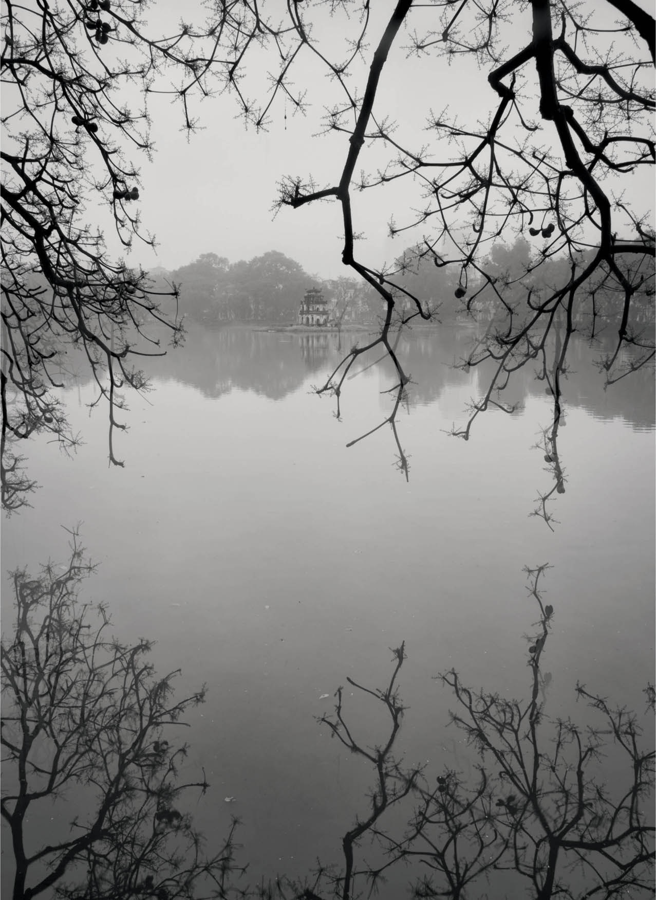
Hoan Kiem Lake—Hanoi, Vietnam, is a city with many charms and constant bustle. On a steamy, early evening, I took refuge from the city’s blaring motorbikes and the press of people on the banks of Hoan Kiem Lake. Located in the center of old Hanoi, this lake has an ancient crumbling tower, a temple on an island, and peaceful vistas.
In making this image, my idea was to use the dark branches to create the feeling reminiscent of an antique Asian brush painting.
There’s some complexity to this image regarding positive and negative space. Are the branches in the lower portion reflections or actual branches? In fact, they are reflections. The best way to read the image is that the branches are the positive space and the lake, tower and all, is the negative space. But stare at the image long enough, and it’s possible to go the other way: the tower and waterscape can be read as the subject and positive space, and the dark branches merely a negative intrusion into this primary space.
Nikon D810, 28-300mm Nikkor zoom at 28mm, 1/13 of a second at f/22 and ISO 64, tripod mounted.

Rubin’s vase, developed by Danish psychologist Edgar Rubin, is a famous example of ambiguous use of positive and negative space. Depending upon how you look at the image, it is either a white vase on a black background, or two black silhouettes with white space between them.
That Which Is Not Said
The relationship between positive and negative space is often undoubtedly complex. This is another way of putting the truism: that which is not said is as important as that which is said.
Good photographers have long known that to make a good image, you need both foreground and background. A portrait can be wonderfully emotive, but if the background is undistinguished, then the image as a whole doesn’t work. Recognizing this, street photographers will sometimes find the right background and then wait patiently for the right foreground subject to come along.
Once one is clear that attention must be paid to the background (negative space) as much as the foreground (positive space), it is possible to work with positive-negative relationship in a more thoughtful way. Nothing can exist without its opposite. In that sense, think of the negative space as an actual subject just as much as the positive space.
So this means that negative space is not just a default area that happens to be there. It’s as important in any image as the positive space. Think of it this way: If you are creating a portrait, you don’t just “plop” the subject somewhere. You are thoughtful about positioning, lighting, and camera angles.
The same kind of thought needs to go into “that which is not said,” negative space: create it, use it, appreciate it, and don’t just fill it because it is there.
The Importance of the Background
As I’ve noted, the background is as important as the foreground. Positive and negative space are partners and must work together with balance and in harmony.
An image breathes in its background. If you have no negative space or only very little negative space, then the image can seem to be claustrophobic. The eye wanders through an undifferentiated mass of subject with no place to pause and contemplate. On the other hand, if there’s too much negative space, then the image loses clarity of context. The negative space swallows the clarity and becomes an entry point that has no exit (for more about entry and exit points, turn to page 136).
I like to think of the question of how much negative space an image needs as one that deserves a “Goldilocks” solution: not too much space, but not too little space. It’s really a question of visual balance.
Balance was in my mind when I composed Hoan Kiem Lake, shown on page 202. It was really a challenge to compose this image so that the lake provided respite from the curved and gnarled branch silhouettes. Too much space, and compositional cohesion would be lost. Too little space, and the background would not assume its position of importance in the composition.
What’s the best way to approach acknowledging the importance of negative space in an image? I often like to see my compositions in terms of their negative space before I even consider the positive space (take a look at the sidebar above about LAB color for one helpful technique for viewing positive and negative space). Looking at negative space first runs counter to our normal way of seeing, but it can be very helpful as a technique for creating interesting compositions.

Dandelion—I photographed this dandelion in the field, underexposing the image and using a tripod. Back in the studio, I allowed the background of the image to go very dark.
In this version of the image, clearly the white dandelion is the positive space, and the black background is the negative space. The relationship between positive and negative space remains the same in Dandelion Inversion on page 124, even though black has been exchanged for white, and white for black, using an LAB color L-channel inversion.
Nikon D850, 50mm Zeiss macro, 1/13 of a second at f/20 and ISO 200, tripod mounted.
Nothing Could Exist without Its Opposite
The complex interrelationship between positive space and negative space is rarely simple.
At first glance, Lady Boot Arch, right, shows a massive arch formation in the foreground, representing the positive space, with a star-trail-studded sky as the background and negative space.
Look at the image a little longer and the hole in the arch, the “lady boot,” becomes the real subject of the photograph, and therefore the positive space. The negative space has become a positive space, and this is a complete shift of perception.
This analysis is great as far as it goes, but looking at the image a little longer still, one might wonder about the role of the snowy mountains in the distant background. My point here is that images can be complex, and not to be too dogmatic.
An analysis of positive and negative space is an important compositional tool, and one that I often use when I contemplate a subject, but not the be-all and end-all of every photographic composition.
The way I like to think of it is that the relationship of positive to negative space strongly suggests the context of the image. By context, I mean the “story” that the image is telling, and the relationship of the subject to that story.
In a photograph, “story” refers to a narrative that the photograph may be showing or telling. From a compositional viewpoint, the story of an image also responds to a number of questions: What is important in the image? What does the photographer want the viewer to feel? And, what are the takeaways from the image?
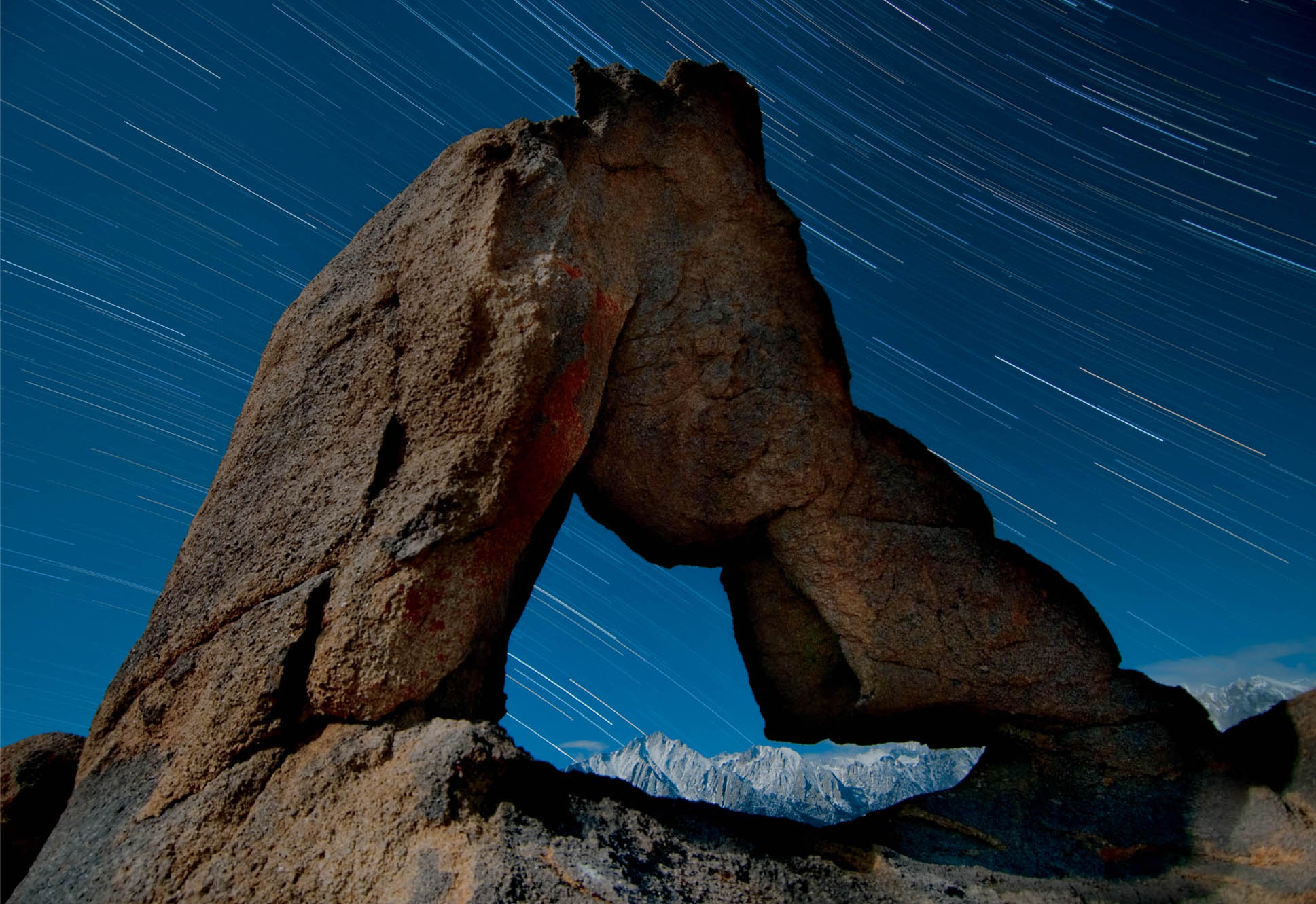
Lady Boot Arch—Between the lowest point in the continental United States, Death Valley, and the highest point, Mount Whitney, lies a tremendous and gorgeous “badlands” of tumble-down desert, canyons, valleys, and boulder formations. One particularly spectacular area, above Lone Pine, California, is known as the Alabama Hills.
Lady Boot Arch is one of the most spectacular formations in the Alabama Hills. I made this photograph at night with the snow-crested Sierra Nevada mountains showing through the arch.
On the face of things, the subject—or positive space—of this photo is the arch, and the start-rail-filled sky is the negative space. Look again! This arch has a hole in it, supposedly in the shape of a lady’s boot. If you take the boot as the subject of this photo—meaning the positive space—then the arch and sky all become background—or negative space.
Nikon D300, 12-24mm Nikkor zoom at 12mm; Background (star trails): forty-two 1 minute exposures at f/4 and ISO 200; Foreground (arch): three exposures, one at 90 seconds at f/14 and ISO 200, one at 211 seconds at f/14 and ISO 200, one at 390 seconds at f/8 and ISO 640, all tripod mounted.
The way the photographer has delineated the subject matter using positive space, and using negative space as the demarcation for the positive space, tells the viewer a great deal about the story of the image.
Some stories that are told—and every image has a story—are bold and direct. You don’t have to wonder much about what is going on. Other photographs have an element of slyness. They can work by misdirection. These images often cause the viewer to stop and think twice about what they are seeing. The scale of the subject matter may be entirely unclear, important elements may be reversed or optically confused, and what is being shown may not even be clear. A sly image of this sort can be much more powerful than a literal image, but requires working with negative space.
To create an image that takes advantage of ambiguity, it’s important to both look at the shapes that are being captured and also to look at the world with negative space in mind. Remember, the positive cannot exist without the negative.
By shaping the negative first, one is altering the sense of the positive in a way that brings out the space in otherwise less seen portions of the image—for example, in deep shadow areas.
Working with positive and negative space is only one tool in the photographic composition arsenal. It’s not always useful. But when applied—particularly to images that are intended to contain ambiguity—it is extremely powerful.

Trees in the Fog—On the Pacific coast of San Francisco, California, I came to photograph the crashing surf on the ocean, but it was totally obscured by fog. Turning around, in the opposite direction I saw intense, orange street lighting coming through the trees across the beach parking lot.
In this image, the silhouettes of the trees are the positive space, and the negative space is the fog itself with beams of light accentuating the fog.
The takeaway here is that the positive space of the trees needs the negative space of the lit fog between the trees. Without the fog—the negative space—there would be no image.
Nikon D300, 18-200mm Nikkor zoom at 56mm, 52 seconds at f/4.8 and ISO 100, tripod mounted.