
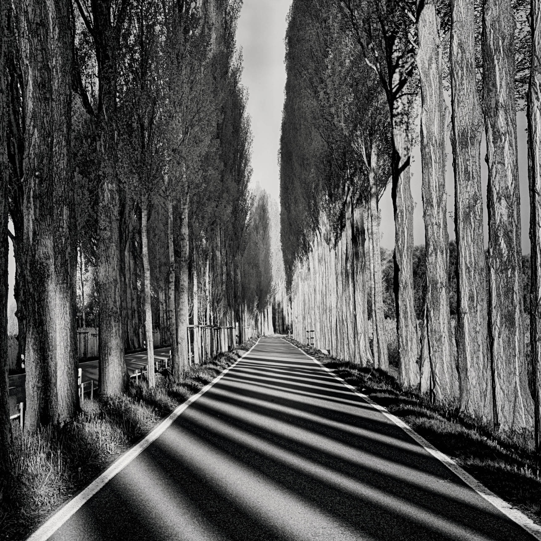
Reichenau Causeway—This bike-path causeway leads to Reichenau Island, a World Heritage Site that lies in Lake Constance, which forms the border between Germany, Austria, and Switzerland. The causeway was completed in 1838 and stretches from the ruins of Schopflen Castle and the eastern end of Reichenau Island.
Waking before sunrise, I pulled on some warm clothing and headed out with my gear to the causeway to photograph the lines created by shadows, the rows of trees, and the demarcation of the bike path.
Nikon D850, 28-300mm Nikkor at 92mm, five exposures with shutter speeds ranging from 1/50 to 0.4 of a second, each exposure at f/22 and ISO 64, tripod mounted.

Consider the line. The line may be the simplest form in geometry. And in our perception.
Or not. Not quite.
The point is simplest. Maybe.
But lines are made up of an aggregation of points.
Points themselves are aggregations of points, until you go down in scale to the molecular, atomic, or subatomic level. To put this another way, zoomed way out, a circular photograph—such as made by an 8mm round, wide-angle fisheye—can appear to be a single point or dot.
Zooming in, if there is enough resolution, the closer you get, the more you can see the points within that make up the point. Resolution willing—perhaps you are in Photoshop on a large, high-resolution monitor at 1,000 percent magnification—each of these points that you have previously enlarged can themselves be enlarged. And so on. The world at large is composed of worlds in the macro-aggregate. (This concept is illustrated on pages 20–21).
But let’s get back to the line. In terms of how we see the world and view photographs, lines are perhaps the most basic of all forms, and are a better starting place in the quest to understand and work with composition than the point.
Starting with a line, you can go almost anywhere.
Aggregations of lines make up shapes. As they make the shapes, lines help provide the illusion of depth, perspective, and contrast. Lines are the hard-working soldiers—you might say, “line workers”—that build the scaffolding that is composition, and form the underlying basis for composition in art.
So, let’s consider the line. Particularly the expressive line.

Line Dance—This image is a seemingly simple composition that presents an irregular upright line and its reflection in the upper-left quadrant. This line was formed by an old piling in San Francisco Bay, with the motion of the bay water calmed and abstracted with a long shutter speed (10 seconds).
The apparent simplicity of the image belies the contrast between the spacial simplicity of the smooth water and the abrupt verticality of the line. In this case, the result works as an image, and appears simple—but this contrast between a straight vertical line and an abstract horizontal background can be tricky to pull off.
The things that bring us the most joy are not overly complicated. Perfection in an image usually involves creating a sense for the viewer of unforced simplicity.
Nikon D300, 18-200 Nikkor at 200mm, 10 seconds at f/32 and ISO 100, tripod mounted.
Some lines just sit there. They don’t do anything. Think of the light blue horizontal lines on a sheet of notebook paper as an example. These lines are the utilitarian bureaucrats in the world of composition. Basically, one should pay no attention to them unless an image embraces regularity as an underlying scaffolding.
Other, more dynamic and interesting lines convey questions, thoughts, and emotions. These lines are expressive and have meaning that is conveyed by what they are.
How can a mere line do this? How can a simple line convey so much? To analyze these questions, we can begin by thinking about some characteristics of a line:
- Weight—this refers to the thickness of a line and is a holdover from the time when lines were created by pressing a stylus, so the “weight,” or thickness, of the line depended on how hard the stylus was pressed.
- Color—lines are easier to see in monochromatic composition, but play a vital role in color composition as well.
- Direction—even lines that are not explicitly directional often have an implied visual movement and direction.
- Curvature—how much or how little the line curves.
The weight of a line really means how dark the line is, and thus also involves color. A very dark line splits space, and may convey determination, or possibly anger. When a line is very faint, or light, it might indicate indecision, or even tension over whether the line itself should exist.
A faint line cannot be used to anchor a composition that is primarily linear, as are Line Dance, on pages 20–21, and Reichenau Causeway, on page 18. If you are going to use lines as the crucial aspect that dominates other shapes of a composition, you must be fearless and bold. The very rarity and unlikeliness of this kind of composition gives it power and grace, but the fewer the elements in the composition, the trickier it is to pull off.
Color may seem to be an obvious characteristic of a line (at least in a color composition). What perhaps is less obvious is that the choice of color conveys an underlying emotion to the viewer. Bright colored lines in oranges and red often are happy, while dark colored lines in black, brown, and somber hues can be unhappy.
Photographically speaking, it is often easiest to see how lines form a composition when working in the absence of color, in black and white. Another way to put this is that our eyes love color, but they are often misled by color, and the underlying composition is best seen and constructed without color; thus, one way to check your composition can be to view your image in monochrome.
A composition that presents an inherently sad subject (perhaps involving loss or memory), but uses bright colors, will strike viewers as dissonant, though they may have no idea why. Conversely, a happy subject in dark colors may often make viewers think that conflict is around the next bend—for example, a storm may be coming.
Almost all lines in a composition have an implicit direction. Absent an arrowhead at the end of the line, it may not be fair to say that a line is directional in a cartoonish sense, but the truth is that lines by their very nature guide our vision. We look along lines, and usually we do the looking in one direction only, even if we then retrace the visual path.
Our eye follows the line and we are guided in how to approach the composition, where to enter it, and where to leave it (see pages 136–157). Certainly, as a photographic artist, once one understands the “look along” nature of lines, one realizes that one way, or direction, of looking is usually preferred.

Penobscot Crossing—On a rainy day, I rode the elevator up the tower of the Penobscot Narrows Bridge to the glass-enclosed observatory at the top, which is said to be the highest bridge observatory in the world. In the rain the lines and shapes of this interesting bridge in coastal Maine became an abstraction from above, particularly when crossed with the wake of a motor boat.
Since I was photographing through both glass and moisture, I decided to maximize selective focus and minimize depth of field by choosing f/4 as my aperture. This also enabled me to use a fast enough shutter speed (1/2000 of a second) to freeze the motion of the boat and its wake.
Looking at this composition, its lines are very apparent: the bridge makes a big white vertical line, crossed by the horizontal line of the boat wake.
Nikon D810, 28-300mm Nikkor at 28mm, 1/2000 of a second at f/4 and ISO 800, hand held.


Tree Line—Photographing in the Parc de Sceaux near Paris, France, I was amazed, as I often am, by the complexity of the lines and structure in the trees. In the midst of all this complexity, one of the most important jobs of the photographer is to find visual coherence and an organizing principle.
Sometimes the best thing you can do when photographing is to take your time and observe. Look left, look right, look at your feet, and look up! Many people forget to look up, and this can be a mistake because it’s easy to overlook something interesting.
Glancing upward, I saw that the sky and daylight beyond the trees coming down to the park path created a single light line in marked contrast to the complex, fractal-like shapes of the trees.
I decided that this line of light would be the anchor for my composition. So I got down quite low to the ground with my camera on the tripod and used a very wide-angle lens (15mm) to photograph the trees from below with the line of light centering the composition.
Nikon D800, 15mm Zeiss Distagon, 1/30 of a second at f/22 and ISO 200, tripod mounted.
With a preferred direction, one can then work to enhance the directional bias, and to make sure that the entire composition is in sympathy with the implied direction, or at least that the direction is used to enhance the composition.
Using direction in this fashion creates the possibility for entry and exit points in a composition: an entry point is where most viewers start looking at an image, and an exit point is where the gaze leaves the photo, even if this does not occur consciously to the viewer. For more about entries and exits, see pages 136–157.
A straight line is often not considered curved. (Actually, and more technically, a straight line is a kind of curve.) But in order for a line to convey emotion, it is the wiggles and waggles, or simple swoops that count most. Lines without curvature are rare in life and photography, and are almost always man-made. But when they do occur, they can create bold compositions because of the iconoclastic nature of an uncurving line.
A line conveys emotion. A line conveys power. So how can you use the emotive power of lines in your work? Here are some ideas for thought.
Take a simple stylus—such as a pen, pencil, marker, crayon, etc.—and a piece of paper. Draw lines. Which lines matter the most? Which lines convey emotion all by themselves?
With a color landscape photograph, explore the nature of the lines in the landscape. Can you diagram where the lines are, and which lines are important? Next, convert the color landscape to monochromatic. It should be easier to see the role of lines in the composition now. Verify this. Finally, with the role lines play in the black-and-white version of your image made clear, work in post-production to emphasize the impact of lines in this composition.
Create a photograph. Your photo can use any kind of subject matter that makes simple use of what is essentially a single line. In other words, one line or a few lines should be the entire basis of the image.
Want to take this a step further? Make sure the line is essentially straight—and either horizontal or vertical, but not both. In this exercise, the entire composition comes from this “straight” line.
Other than points, lines are probably the most basic shape. We’ll be building on lines to understand compositions of far greater complexity. But in the meantime, lines will take you a good distance, and get you started on the important work of understanding the basics of photography as two-dimensional design.

The image of the long-exposure and exposure-duration-bracketed image shown in Haifoss Variation 4, opposite, has been photographically stylized into a very simple graphic that can be represented by three downward lines plunging into a semi-circle.

Haifoss Variation 4—On a bright but overcast day in the Icelandic Highlands, my workshop group photographed the magnificent series of waterfalls around the Haifoss Gorge.
As I was exploring the scenery with my camera, it occurred to me that a great way to make an abstract composition from the flowing water would be to isolate the water from the background scenery. Furthermore, I could extend the dynamic range of the final image and add to the effects that long shutter speed durations could make by varying the apparent solidity of the water. Accomplishing this goal in broad daylight would require stopping down the lens, using a low ISO, and adding a neutral density filter. In addition, multiple different exposures would be needed.
I call this effect exposure-duration bracketing—this is not exactly HDR because it doesn’t blend exposures per se, but it is a close cousin to HDR techniques with a bit of added flexibility. Exposure-duration bracketing is one of those photographic techniques that is usually hit-or-miss, meaning that you have to try a number of times before you get good results (as you can see from the title, this one was my fourth variation).
The point of this particular variation of the Haifoss Falls image was to create a highly stylized photo where three lines of water appear to plunge into a pool at the bottom of the image frame. In “real life” at motion-stopping shutter speeds, the water is fast flowing and wild, and does not create the cleanly delineated lines you see in this composition.
Nikon D850, 28-300mm Nikkor at 116mm, +4 neutral density filter, circular polarizer, three exposures, one each at 2.5, 5, and 10 seconds, each exposure at f/36 and ISO 200, tripod mounted and combined in Photoshop.

Navajo Bridge at Night—Near Lees Ferry, Arizona, US Highway 89A crosses the Colorado River. Two spans of the Navajo Bridge cross Marble Canyon. Prior to the completion of the Navajo Bridge, the only way to get across the Colorado was by ferry. To this day, there are very few alternative crossings during the long journey of this great river from the Colorado Mountain highlands to the Gulf of Mexico.
The original span of the Navajo Bridge opened in 1929 and today is used as a footbridge. A wider, second span of the bridge was completed in 1995 and is the highway crossing used by cars and other vehicles.
Standing on the footbridge during a dark-of-the-moon night, I turned my camera south to face the newer span and photographed down Marble Canyon as the cars whizzed past. Using a long shutter speed (9 minutes) rendered the car lights as bright horizontal strokes.
Nikon D300, 10.5mm Nikkor rectilinear fisheye, fourteen exposures, each exposure at f/2.8 and ISO 400, tripod mounted; Navajo Bridge and River: single exposure at 9 minutes; Star Trails: created via a stacked composite of thirteen exposures, each exposure at 4 minutes.

Wings of Man—I photographed a specimen butterfly on a light box, and then, using Photoshop, I made three duplicate images and inverted them using the LAB color space. After manipulating the colors using LAB, I composited the three versions to create the sense that the butterfly was coming to life and flying up, off the background.
The diagram to the right shows the line that is the organizing path for this image. In other words, the viewer’s eye follows the butterfly’s path from the lower left up and toward the right, into flight.
Nikon D300, 100mm Zeiss Makro-Planar, 2 seconds at f/8 and ISO 100, tripod mounted.


Apple Slice Play Date—It’s great fun to photograph fruits and vegetables on a light box. The real hard part is slicing fruits and veggies thin enough without pulling out a box of band-aids!
I was working on an elaborate composition of apples that formed a mandala shape on the light box (for more about mandalas turn to page 49). Four of the apples were particularly interesting looking and I placed them in a compositional line.
The line seemed a little too regular to me so I nudged every other apple slightly on the diagonal. As I looked at the composition that was emerging, it seemed to me that the first apple on the left looked like a mischievous face.
An interesting thing about this composition is that the apples do form a line moving from the left to the right. However, somewhat unusually, there is a “bounce back”: after my eye reaches the apple on the right, my gaze returns in the opposite direction along the line back to the apple on the left.
Nikon D850, 50mm Zeiss Makro-Planar, six exposures with shutter speeds ranging from 1/40 to 0.8 of a second, each exposure at f/22 and ISO 64, tripod mounted.