
Now that we've been through the process, it's time to have a little fun by following the preceding steps from start to finish using actual network data. Think of this as a bit of a case study where we put the theoretical process to work with a real dataset. The goal here is to get you acquainted with many of the capabilities within Gephi and to see how they might be used when you create your own graphs first hand.
So let's follow the process outlined earlier, walking through each step. Only this time, we're going to come up with an idea, retrieve the data for it, and create a network graph.
Choosing a topic for a network graph is not an easy task, given the hundreds of thousands of possibilities available to us, courtesy the Web and its numerous datasets. Even when a topic area is narrowed down to a specific genre (say, infrastructure networks), there are often multiple potential networks that could be created. Let's pursue the infrastructure network idea for this illustration and then find a suitable dataset that we can work with to create a compelling graphic.
Note
This is a very broad topic, as infrastructure is manifested in many different settings and places and can have multiple meanings. For our purposes, it is merely referring to a set of physical places (nodes) that connect to form a network. This could be a series of connected routers that physically enable the Internet, a set of physical plants and connections forming a power grid, and so on.
There are many places where infrastructure network data can be found, but for the sake of simplicity, we'll work with an example available on the Gephi website. This dataset examines a Power Grid, specifically referred to by Watts and Strogatz as "An undirected, unweighted network representing the topology of the Western States Power Grid of the United States". The file can be found on multiple locations across the Web, including https://gephi.org/datasets/power.gml.zip.
Once this file is unzipped, you'll note that it is in the .gml Graph Modeling Language (GML) format, which is another form of the XML-style graph formats that are frequently used for the creation of networks using one of many tools that support this format.
In the current situation, the data is already neatly formatted for us in the .gml format, making the import step extremely simple. Prior to completing the import, let's examine the file in a text editor to get a better idea of the structure of .gml, as it is often encountered when searching for network datasets.
Here's a glance at the beginning of the file:
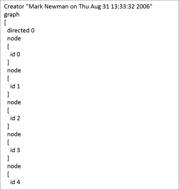
For those of you acquainted with XML or JSON, this will have a familiar look to it, with the highest level representing the graph, followed by the attribute level, which then incorporates each individual node. Likewise, when we move further into the file, we see how the nodes are connected to one another using edge attributes:
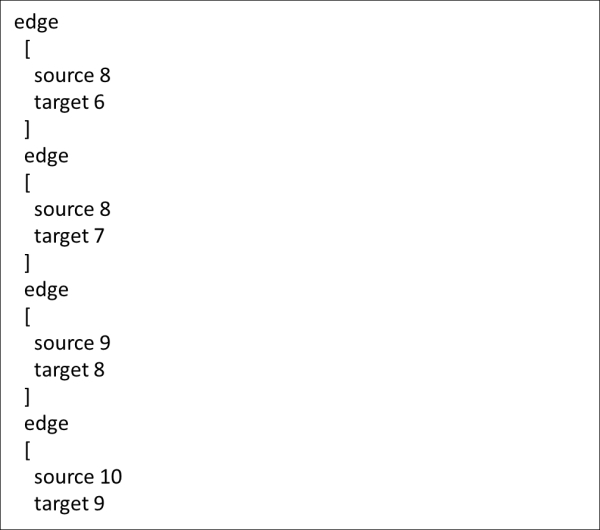
Note how each edge contains two previously created nodes and simultaneously provides the source and target attributes required by Gephi. Based on the node and edge values, we can also detect this as a barebones dataset without labels, weights, color fields, or any other sort of identifier values. Therefore, we'll need to add any of these values once we've brought the data into Gephi. That's alright for this example, but there's a good chance that you'll want future datasets to be richer prior to importing them into Gephi, as opposed to making manual edits using the Gephi data laboratory.
Now that we've had a preview of the data, it's time to launch the import process. Depending on the data type, there are different approaches to import the data. We won't spend a lot of time on this, as there is plenty of information available on the Gephi site and in the discussion forums. Here are some quick tips to import your data file based on the formats:
- For MySQL data, simply navigate to File | Import Database | Edge List, and set up the database driver and location information.
- For multiple CSV files (one for nodes and another for edges), navigate to Data Laboratory | Import Spreadsheet and follow the prompts for both node and edge tables.
- The Excel and CSV files can also be imported using the
Excel/CSV Converterplugin. Once that has been installed, navigate to File | Import Spigot and follow the prompts. - If you are working from graph file formats, including output from other network graph software, simply navigate to File | Open and locate your source file. This is where you can import anything, such as
.gml, GraphML, Pajek.netfiles, Tulip.tlpfiles, and several additional formats. A graph information window will follow, allowing you to identify the column attributes that are being imported.
For our example, we'll use the last option, which will create a Gephi graph directly from the .gml file. So, let's proceed with that step and then move on to view the actual graph.
Network data loaded into Gephi will not look very interesting at first glance. If our dataset runs into the hundreds or thousands of nodes, the initial view will appear very crowded and certainly won't shed a great deal of insight into the structure of the network. You need not worry about this—Gephi provides a multitude of options to rectify this very quickly.
Let's take a first look at the network after importing the data:
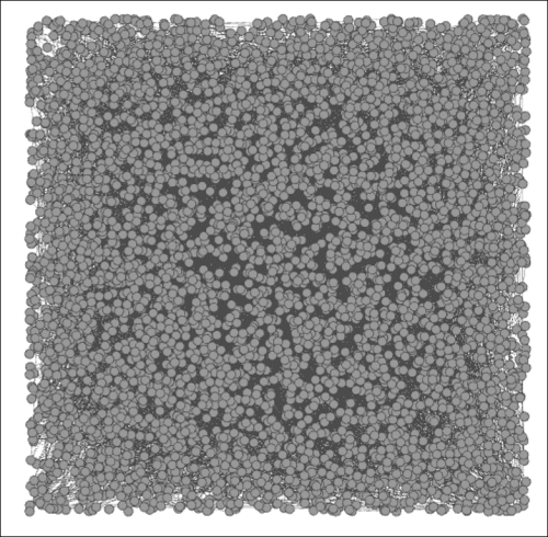
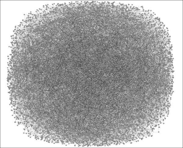
The initial network view
This looks much like what we might have anticipated, given the nearly 5,000 nodes and more than 6,500 edges in the network (as shown in Gephi's Context tab, which is often located in the upper-right corner of the workspace). The initial shape doesn't provide a clue to the network structure either, as Gephi simply created an incredibly congested square. This square layout, without an apparent form or function will, however, provide a great opportunity to utilize many of the capabilities within Gephi.
Let's take an opportunity here to see how this network looks using several different layout algorithms. We'll take a deeper look at layouts in Chapter 3, Selecting the Layout, but viewing some of the layouts now will help us see some quick examples of how they work with this data. Rather than moving directly to an effective layout, it might be more useful to survey a handful of approaches with our dataset.
Gephi makes it exceptionally simple to test multiple layout algorithms, which can be observed doing their work in real time. Over the next few pages, we'll see the results generated by a few different algorithms in an effort to make some sense out of the network. Feel free to replicate the results using your own version of Gephi, and by all means, don't feel constrained by the layouts selected here; try a few others on your own, play with some of the settings, and learn more about your network through different approaches.
If you installed the recommended plugins from Chapter 1, Fundamentals of Complex Networks and Gephi, your version of Gephi will have each of the following layout options available already. If not, you can install them now or simply follow along with the text and get the plugins at a future date. The following layouts will be shown in an order:
- Force Atlas (the faster Force Atlas 2 will be explored in Chapter 3, Selecting the Layout)
- Fruchterman-Reingold
- Radial Axis
- Yifan Hu
- ARF
At the end of this exercise, we will select a single layout that seems to provide the best initial results and then begin modifying the graph to make it tell a more effective story. So, let's begin with our survey of layout algorithms.
The Force Atlas layout is a classic force-based algorithm that draws linked nodes closer while pushing unrelated nodes farther apart. For this illustration, we'll retain the default settings, although we have the ability to tweak attraction, repulsion, and gravity criteria, among others. Chapter 3, Selecting the Layout, will take a deeper look at how to work with many of these settings to optimize a graph, but for now, let's run with the default. Also, be aware that many force-based algorithms will run indefinitely if allowed to, but in many cases, you will notice very little incremental improvement beyond a few minutes of runtime depending on the size of the network.
Let's take a look at the network after 10 minutes of runtime on my own laptop. Note that your time might vary considerably depending on the processing power of your machine; more processors are better, as network algorithms are very demanding! Take a look at the following:
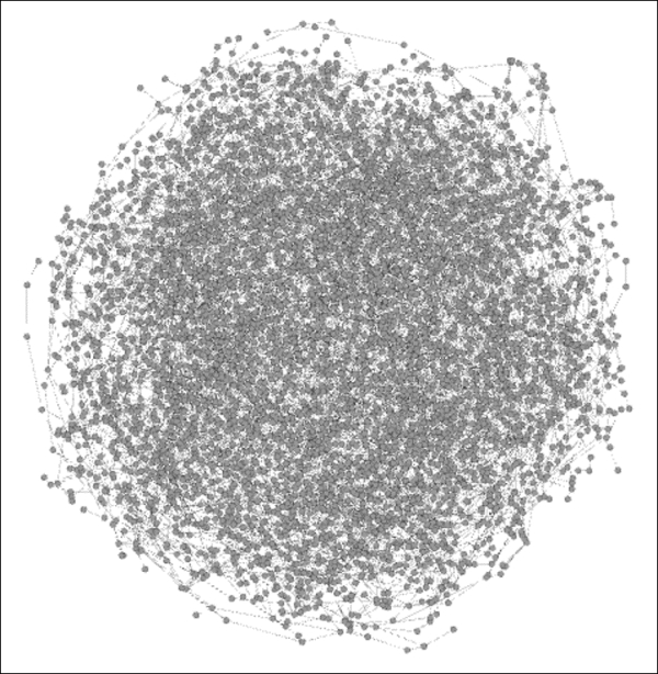
The Force Atlas layout
There's certainly improvement compared to where we started, yet there is still a very high level of density in the center of the graph. On a positive note, the edge of the graph is showing connected nodes that have been pushed out from the center. However, our results might have been improved by increasing the default repulsion setting in order to spread the graph out or by reducing the gravity criteria, which would move nodes away from the center of the graph.
Next is the Fruchterman-Reingold layout, which is another force-based approach that has slightly different settings available. While we are still working with the defaults, it is possible to adjust settings for this algorithm—although not to the same degree as with the Force Atlas model. The primary adjustments we can make here involve the graph size area and the gravity. Thus, a dense network can be forced to spread out by manipulating the graph area rather than adjusting repulsion or attraction settings. Here's the result using the same 10 minutes allotted to the Force Atlas method:
The Fruchterman-Reingold layout
A first appraisal suggests that the Fruchterman-Reingold layout was not very effective with this dataset, as it failed to spread out the network as effectively as the Force Atlas layout managed. Instead, we are left with the dreaded hairball effect, potentially overcome by some clever interactivity and modifications to color or node size, but overall, this method was not particularly effective for this network.
One of the beauties of working with Gephi lies in the sheer number of layout algorithms as well as the variety of options. In cases where traditional force-based methods are not as effective as we would like, Gephi provides the ability to turn to other approaches, including the Radial Axis layout. This algorithm positions nodes along radial axes using a predetermined number of radians. This method is not force-based, giving it a significant speed advantage. Instead, users specify how they wish to group nodes, how the nodes should be laid out, and several additional selections. Here is the same network seen through the Radial Axis approach:
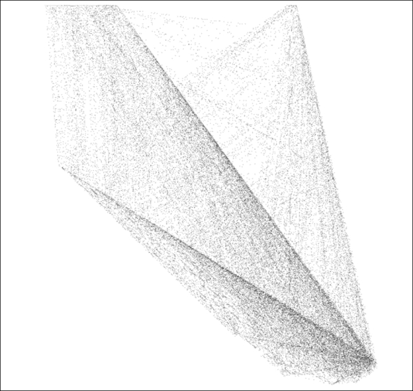
The Radial Axis layout
Note
Note how the use of forced axes spreads the nodes out, enabling far greater visibility of the edges running between each pair of nodes. This might or might not be the best algorithm for this network, but it clearly demonstrates another option as we seek to portray the network in the most flattering light.
Yifan Hu is another force-based algorithm but one that is designed to run more quickly than many of the other force-based algorithms while still providing a reasonably accurate result. Yifan Hu also has the advantage of shutting itself down after optimizing the network. The following result was achieved in just over 2 minutes of runtime:
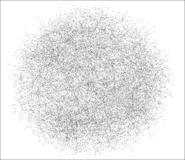
The Yifan Hu layout
Now we seem to be making more progress, as our network has spread out considerably, allowing some separation of nodes and edges and becoming considerably more understandable than some of our prior efforts. This is still certainly nowhere near a finished work, but it has done a better job of illustrating the network structure.
Finally, we'll turn to the Attractive and Repulsive Forces (ARF) ARF algorithm. This, as you might have guessed, is another force-based algorithm, which allows users to adjust settings to better optimize the network display. In this case, as with the other layouts, the default settings will be applied.
As these layouts have helped demonstrate, a network of this nature is not easily drawn due its complex structure. In contrast, many social networks, web networks, and citation networks will have far greater levels of clustering, more hubs, and additional attributes that often make them far easier to graph. In our infrastructure example, where there are nearly as many nodes as edges, it becomes far more difficult to spread the network out, as there are few, if any, hubs that dominate the graph, and clustering is effectively nonexistent:
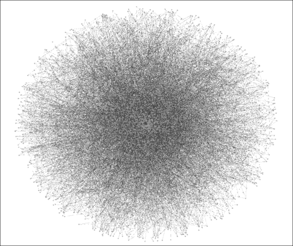
The ARF layout
Running the ARF algorithm for 10 minutes spreads the graph out at the edges but leaves a dense cluster in the center of the graph, which makes it very difficult to detect connections between nodes. Setting the repulsion value higher might have improved the output, but the default settings have left us with a bit of a hairball in the center of the network.
After assessing each of the five layouts, it looks as though Yifan Hu has provided the clearest picture of the network, so we will use it for the remainder of this chapter. The Radial Axis layout also cleaned up the network but feels less intuitive with the current network, where we would hope to see all connections across the power grid as opposed to groupings of connections based on selected attributes, which is the approach taken by the Radial Axis layout. This is not a negative commentary on the other methods; in fact, in another situation with a different dataset, our choice might be completely different.