
Let us take a look at some examples of visualizing arrays as images. The following function will create a matrix of color values for the Mandelbrot fractal. Here we consider a fixed point iteration, that depends on a complex parameter c:
Depending on the choice of this parameter it may or may not create a bounded sequence of complex values zn.
For every value of c, we check if zn exceeds a prescribed bound. If it remains below the bound within maxit iterations, we assume the sequence to be bounded.
Note how, in the following piece of code,meshgrid is used to generate a matrix of complex parameter values c:
def mandelbrot(h,w, maxit=20):
    X,Y = meshgrid(linspace(-2, 0.8, w), linspace(-1.4, 1.4, h))
    c = X + Y*1j
    z = c
    exceeds = zeros(z.shape, dtype=bool)

    for iteration in range(maxit):
        z  = z**2 + c
        exceeded = abs(z) > 4
        exceeds_now = exceeded & (logical_not(exceeds))
        exceeds[exceeds_now] = True
        z[exceeded] = 2  # limit the values to avoid overflow
    return exceeds

imshow(mandelbrot(400,400),cmap='gray')
axis('off')
The command imshow displays the matrix as an image. The selected color map shows the regions where the sequence appeared unbounded in white and others in black. Here we used axis('off') to turn off the axis as this might be not so useful for images.

Figure 6.9: An example of using imshow to visualize a matrix as an image.
By default, imshow uses interpolation to make the images look nicer. This is clearly seen when the matrices are small. The next figure shows the difference between using:
imshow(mandelbrot(40,40),cmap='gray')
and
imshow(mandelbrot(40,40), interpolation='nearest', cmap='gray')
In the second example, pixel values are just replicated.
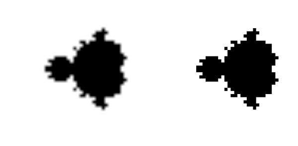
Figure 6.10: The difference between using the linear interpolation of imshow compared to using nearest neighbor interpolation
For more details on working and plotting with images using Python refer to [30].