
Chapter 7: Fluent Design System for Windows Applications
The Fluent Design System is a set of application design principles created by Microsoft and implemented across multiple desktop, mobile, and web platforms. The Fluent Design System for Windows is the set of controls, patterns, and styles for applications built for Windows 10 and Windows itself. In fact, it is the implicit styling for all WinUI controls.
It is important to learn the tenets of Fluent Design and how to implement these in your WinUI applications. We will also explore the Fluent XAML Theme Editor application for Windows. This application assists developers in creating a theme for their applications, including color schemes and style elements such as borders and corners. Developers can then easily import the resources to implement the theme.
In this chapter, we will cover the following topics:
- Learning the concepts of Fluent Design
- How to find the latest information about Fluent Design
- Incorporating Fluent Design concepts into WinUI applications
- Using the Fluent XAML Theme Editor to customize and use a UI theme
- Using the UWP resources gallery to explore built-in resources available to WinUI applications
- Exploring the Fluent Design toolkits for design applications such as Figma, Sketch, Adobe XD, Photoshop, and Illustrator
By the end of this chapter, you will understand the Fluent Design System for Windows applications. You will also know how to incorporate these design standards into your WinUI applications.
Technical requirements
To follow along with the examples in this chapter, the following software is required:
- Windows 10 version 1803 (version 17134) or newer
- Visual Studio 2019 version 16.9 or newer with the following workloads: .NET Desktop Development, Universal Windows Platform Development
The source code for this chapter is available on GitHub at this URL: https://github.com/PacktPublishing/-Learn-WinUI-3.0/tree/master/Chapter07.
What is the Fluent Design System?
The Fluent Design System is a cross-platform system to guide developers in creating beautiful, intuitive applications. The website for Fluent Design (https://www.microsoft.com/design/fluent/) has dedicated pages with resources for developers on many platforms:
- Android
- iOS
- macOS
- Web
- Windows
- Cross-platform (React Native)
Fluent Design aims to be simple and intuitive. While it maintains its design philosophy across platforms, it also adapts aspects of its design to feel native on every platform. In Chapter 1, Introduction to WinUI, we discussed the origins of some of the current Fluent Design concepts in the Metro design that was introduced with Windows Phone. While the look and feel of Microsoft's designs have evolved over the years, some of the principles remain. The three core principles of the Fluent Design System are the following:
- Natural on every device: Software should adapt to the device where it's running, whether it's a PC, tablet, game console, or AR headset.
- Intuitive and powerful: The UI anticipates users' actions and pulls them into the experience while using the app.
- Engaging and immersive: The design pulls from real-world elements, using light, shadow, texture, and depth.
The driving philosophy behind the design is to adapt and feel natural. The device and the app should feel comfortable and anticipate the user's actions.
This is a very abstract and high-level explanation, so far. Let's explore the specifics of Fluent Design for Windows in the next section.
Exploring Fluent Design for Windows
For Windows applications, Fluent Design encompasses several areas. When compared to other design systems, Fluent is more universal. Apple's Human Interface Guidelines (https://developer.apple.com/design/human-interface-guidelines/) have only been widely adopted on iOS and macOS. Google's Material Design (https://material.io/) system has seen wider adoption but only has toolkits available for Android, Flutter, and the web.
Fluent Design is most often compared with Material Design, as they share some concepts when it comes to shapes and texture, but Fluent Design uses transparency to much greater effect than Material Design. Choosing Fluent Design provides a rich toolset that you can use in WinUI and any other development platforms.
Let's explore some of these design aspects and how they apply to your WinUI applications.
Controls
A control equates to a single element of user input or interaction. We have already explored many of the controls available in WinUI in Chapter 5, Exploring WinUI Controls and Libraries. This is what some of the common WinUI controls look like in light and dark modes with the default accent color in Windows 10:
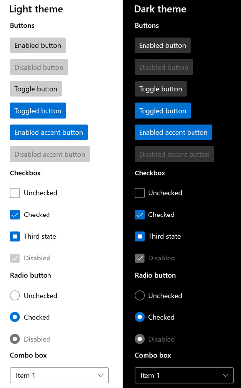
Figure 7.1 – Some common controls in light and dark modes
By default, the WinUI controls make use of Fluent styles. We will see how to override the default Fluent styles in our WinUI controls later in the chapter.
Patterns
Patterns are groups of related controls or a group of controls that becomes a single new element. This group could be added to a composite control for re-use. Some examples of patterns in WinUI are the following:
- Search: In its simplest form, a search pattern needs to have controls for accepting input, invoking the search, and displaying the search results. An additional element may be added for suggesting searches before any input is received. Assistants such as Microsoft's Cortana do this based on a user's calendar, contacts, news preferences, and so on. Adding an autosuggest list based on user input is a common feature of modern search controls. You could also integrate chat controls with some artificial intelligence (AI) such as Microsoft's Bot Framework to ask some follow-up questions based on the initial search parameters (Microsoft Docs example: https://docs.microsoft.com/en-us/windows/uwp/design/controls-and-patterns/search).
- Forms: Forms are a very common control pattern. They consist of groups of related labels, input controls, and command buttons that collect a related set of data elements. Some common forms with potential for re-use are user account creation forms and forms for collecting user feedback. Forms should follow the Fluent Design guidelines for spacing, flexible layout, and using typography for creating a hierarchy (Microsoft Docs example: https://docs.microsoft.com/en-us/windows/uwp/design/controls-and-patterns/forms).
- List/details: The list/details control pattern is seen so frequently that we probably don't notice it most of the time. You may think our My Media Collection application follows this pattern (with the items list and a page to view and edit item details), but this pattern describes how to show these views on the same page. This is typically achieved with a ListView control and a SplitView control to separate the list from the selected item's details. Based on the available width on the page, the two views can either be stacked vertically or displayed side by side (Microsoft Docs example: https://docs.microsoft.com/en-us/windows/uwp/design/controls-and-patterns/list-details).
Each of these patterns encapsulates the elements of Fluent Design to create a composite control that can be reused across applications. You may have control patterns in your projects that could be added to a shared control library for ease of reuse. Shared libraries like these can save time and ensure that good design practices are followed across teams.
Layout
The layout design is important to ensure that an application adapts to any screen size or orientation. Flexibility is a key tenet of a well-designed layout. When a page is resized, the contents can adapt by repositioning controls, adding/removing items, changing the flow of items, replacing controls with others that better fit the current available space, or simply resizing items. This is typically handled in XAML with Visual States. You can define a different VisualState for each size threshold to which your page must adapt, possibly defined as Narrow, Default, Wide, and ExtraWide. Each VisualState updates control properties to adapt to the new layout. Microsoft Docs has a great example of this at https://docs.microsoft.com/en-us/windows/uwp/design/layout/layouts-with-xaml. WinUI includes several different layout panels that can help developers create the right layout for their pages and respond to changes in size, orientation, and resolution.
Input
There are Fluent recommendations for responding to user input. There are guidelines for reacting to the traditional mouse and keyboard input that developers have been handling for decades. Modern applications can do things such as pan, zoom, rotate, or scroll based on mouse input. A keyboard may be a physical keyboard or an onscreen keyboard for mobile and touch users.
Input can come in other forms with today's hardware:
- Pen/stylus
- Touch
- Touchpad
- Gamepad/controller
- Remote control
- Surface Dial (see https://docs.microsoft.com/en-us/windows/uwp/design/input/windows-wheel-interactions)
- HoloLens
- Voice
User input can also be simulated with the input injection APIs. An example of where this might be useful is creating a Show Me How or Guided Tour feature in your app. Your code can execute some pre-defined steps, guiding the user through performing some action on the page. This API is beyond the scope of this book. To read about an example of using input injection to intercept mouse input and turn it into touch input, read this article on Microsoft Docs: https://docs.microsoft.com/en-us/windows/uwp/design/input/input-injection.
Style
Style encompasses multiple aspects of Fluent Design:
- Icons: Good icons should be simple and convey the application's purpose.
- Color: The color choice is important. Allowing users to customize their colors is also a great way to make your app feel personal to them. WinUI makes it easy to adapt the user's light or dark theme choice and highlight color with theme brushes.
- Typography: Microsoft recommends that Windows applications all use the Segoe UI font. Selecting the font size can help convey a hierarchy within the app, like a book or document layout. To this end, Microsoft defined a type ramp (available at https://docs.microsoft.com/en-us/windows/uwp/design/style/typography#type-ramp), which has static resources that can be leveraged in WinUI to select the right size for a control's intended use.
- Spacing: Spacing between and within controls is important for readability and usability. WinUI controls allow a Standard or Compact density to be selected. More information about sizing and Fluent densities can be found here: https://docs.microsoft.com/en-us/windows/uwp/design/style/spacing.
- Reveal highlight: This style element uses illumination to draw focus to important parts of the user interface. An example of this is illuminating a button or checkbox as the mouse pointer moves across it.
- Reveal focus: Drawing attention to focusable elements is important for larger displays , such as an Xbox or Surface Hub. This is achieved through lighting effects with Fluent.
- Acrylic: This is a type of WinUI brush that creates texture with transparency. This texture gives a feeling of depth to the user interface.
- Corner radius: Fluent Design promotes the idea that rounded corners promote positive feelings within users. WinUI controls have a rounded corner radius consistent with Fluent Design recommendations.
These are just some of the aspects of style defined by Fluent Design. You can read more about them at Microsoft Docs: https://docs.microsoft.com/en-us/windows/uwp/design/style/.
Note
In 2021, Microsoft is revamping its UI styles in an effort codenamed Sun Valley. The new styles have a softer appearance with rounded corners. WinUI controls will be picking up these styles, and in fact, they are already available in WinUI 2.6. To read more about the new visual styles coming to WinUI, check out this blog post by Martin Zikmund: https://blog.mzikmund.com/2021/02/enabling-the-sun-valley-visual-styles-in-windows-ui-2-6-preview/.
Many of the aspects of Fluent style are made available to our WinUI apps via XAML styles and other static resources. Next, we will look at how we can update our sample application to respond to changes in a user's Windows theme.
Incorporating Fluent Design in WinUI applications
It is time to incorporate a few of the Fluent Design principles into the application and polish the UI a little. Most of the WinUI controls are already designed to meet Fluent standards, but there were a few attributes we added without understanding Fluent Design.
Updating the title bar
Before we even get into the XAML to improve the styles, let's fix the application's title bar. Until now, the title bar always read MyMediaCollection without any spaces or indication of the current page:
- First, to fix the spacing, open Package.appmanifest from the Solution Explorer window. On the page that opens, update Display name to My Media Collection. If you like, you can also change Description.
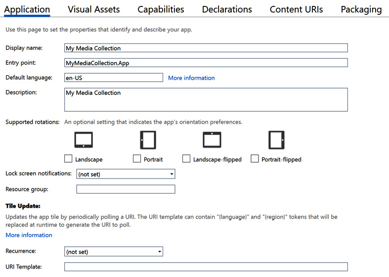
Figure 7.2 – Updating information in Package.appmanifest
Updating Display name will change the application's title bar text.
- Optionally, you can also update the AssemblyTitle, AssemblyDescription, and AssemblyProduct attributes in Properties |AssemblyInfo.cs. However, they will not impact the title bar. For .NET assemblies, this information appears in the file properties in Windows Explorer:
[assembly: AssemblyTitle("My Media Collection")]
[assembly: AssemblyDescription("Catalog and track your music, movies and books!")]
[assembly: AssemblyConfiguration("")]
[assembly: AssemblyCompany("")]
[assembly: AssemblyProduct("My Media Collection")]
[assembly: AssemblyCopyright("Copyright © 2020")]
[assembly: AssemblyTrademark("")]
[assembly: AssemblyCulture("")]
- Next, in MainPage.xaml.cs, add an event handler for the Loaded event of the page. In the event handler, add some code to set the Title of the current window to Home. This will prepend the specified text to the title bar, followed by a dash. When we launch the application, the title bar should read "Home - My Media Collection":
public MainPage()
{
this.InitializeComponent();
Loaded += MainPage_Loaded;
}
private void MainPage_Loaded(object sender, RoutedEventArgs e)
{
Window.Current.Title = "Home";
}
- Finally, make the same changes in ItemDetailsView.xaml.cs, but set the window's title to Item Details.
Now, when you run the application, you should see the title bar text update as you navigate between the list of items and the item details. Let's make some changes to the styles of MainPage next.
Changing the style of MainPage
Currently, the main page of our application doesn't have many styles. We set the FontWeight of a few TextBlock controls to Bold to set them apart as important items, but this doesn't follow the Fluent Design guidelines for typography. There is also a purple border separating the ListView header from its items:

Figure 7.3 – The current main page of MyMediaCollection
Hardcoding colors is not a good practice. Even if you were using custom colors as product branding, you could centralize those in Application.Resources:
- Let's work our way down the XAML file and make some improvements. First, update the text of the first TextBlock from Media Collection to Home, matching the text in the window's title bar. Wrap it in a horizontally aligned StackPanel and add a preceding SymbolIcon control to display a Home symbol. Finally, remove the hardcoded font size and weight attributes and set the Style attribute to import the SubheaderTextBlockStyle StaticResource. Those changes should look like this:
<StackPanel Orientation="Horizontal">
<SymbolIcon Symbol="Home" Margin="8"/>
<TextBlock Text="Home"
Style="{StaticResource SubheaderTextBlockStyle}"
Margin="8"/>
</StackPanel>
- We should also remove the FontWeight attribute from the Media Type label and use a Fluent style resource:
<TextBlock Text="Media Type:" Margin="4"
Style="{StaticResource SubtitleTextBlockStyle}"
VerticalAlignment="Bottom"/>
- Next, change the surrounding Grid to a StackPanel and remove the Grid.ColumnDefinition definitions. In addition to simplifying the layout, this will set the Home symbol and text to sit above the rest of the controls on the page, reinforcing the hierarchy. The full block of code will look like this:
<StackPanel>
<StackPanel Orientation="Horizontal">
<SymbolIcon Symbol="Home" Margin="8"/>
<TextBlock Text="Home"
Style="{StaticResource SubheaderTextBlockStyle}"
Margin="8"/>
</StackPanel>
<StackPanel Orientation="Horizontal"
HorizontalAlignment="Right">
<TextBlock Text="Media Type:"
Margin="4"
Style="{StaticResource SubtitleTextBlockStyle}"
VerticalAlignment="Bottom"/>
<ComboBox ItemsSource="{x:Bind ViewModel.Mediums}"
SelectedItem="{x:Bind ViewModel.SelectedMedium, Mode=TwoWay}"
MinWidth="120"
Margin="0,2,6,4"
VerticalAlignment="Bottom"/>
</StackPanel>
</StackPanel>
- Next, update HeaderTemplate of ListView to replace the purple BorderBrush attributes with SystemAccentColor from ThemeResource. This will make sure that the border's color picks up the user's preferred accent color from their selected Windows theme. Also, change each TextBlock to use a built-in Style instead of setting FontWeight:
<ListView.HeaderTemplate>
<DataTemplate>
<Grid Margin="4,0,4,0">
<Grid.ColumnDefinitions>
<ColumnDefinition Width="100"/>
<ColumnDefinition Width="*"/>
</Grid.ColumnDefinitions>
<Border BorderBrush="{ThemeResource SystemAccentColor}"
BorderThickness="0,0,0,1">
<TextBlock Text="Medium"
Margin="4,0,0,0"
Style="{StaticResource TitleTextBlockStyle}"/>
</Border>
<Border Grid.Column="1"
BorderBrush="{ThemeResource SystemAccentColor}"
BorderThickness="0,0,0,1">
<TextBlock Text="Title"
Margin="4,0,0,0"
Style="{StaticResource TitleTextBlockStyle}"/>
</Border>
</Grid>
</DataTemplate>
</ListView.HeaderTemplate>
- Finally, let's define the end of the list area by adding a border between the bottom of ListView and the command buttons. Do this by wrapping the buttons' StackPanel with a Border control, again using SystemAccentColor. Margin= "4,0" is shorthand that is equivalent to Margin= "4,0,4,0":
<Border Grid.Row="2"
BorderBrush="{ThemeResource SystemAccentColor}"
BorderThickness="0,1,0,0"
Margin="4,0">
<StackPanel Orientation="Horizontal"
HorizontalAlignment="Right">
<Button Command="{x:Bind ViewModel.AddEditCommand}"
Content="Add/Edit Item" Margin="8,8,0,8"/>
<Button Command="{x:Bind ViewModel.DeleteCommand}"
Content="Delete Item"
Grid.Column="1"
Margin="8"/>
</StackPanel>
</Border>
- Run the application and check out the restyled user interface. It looks much better. You can now easily see the hierarchy of data, however limited it may be in our simple application:
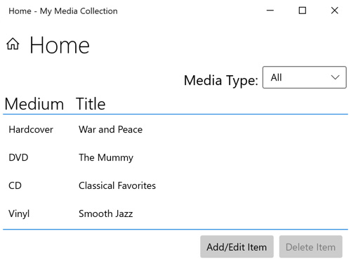
Figure 7.4 – The newly styled My Media Collection home page
Before moving on to the details page, let's see how the page looks if we select the dark mode in Windows. Open Windows Settings, go to Personalization | Colors, and select Dark from the Choose your color dropdown (if you normally use Dark, try changing it to Light):

Figure 7.5 – My Media Collection running in dark mode
Everything on the page switches to dark mode without any code changes. Great!
If you have a good reason to keep your application in light or dark mode, you can update Application.xaml to add a single attribute to the Application element using this command:
RequestedTheme="Dark"
This will apply the Dark theme to the entire application. If you have a reason to only force this theme on part of the application, the RequestedTheme attribute can be applied to a Page or Control. Now, let's apply the same types of styles to the details page.
Changing the style of ItemDetailsPage
We want to update ItemDetailsPage.xaml to make sure it has the same overall look and feel as the main page:
- Open the file and start by updating Item Details. Give it the same SubheaderTextBlockStyle used on Home and wrap it in a horizontally aligned StackPanel. Precede TextBlock with SymbolIcon , which uses the Edit symbol:
<StackPanel Orientation="Horizontal">
<SymbolIcon Symbol="Edit" Margin="8"/>
<TextBlock Text="Item Details"
Style="{StaticResource SubheaderTextBlockStyle}"
Margin="8"/>
</StackPanel>
- Next, modify Grid following the new StackPanel to have top and bottom borders. Also, modify Margin to have 4px on either side of Grid:
<Grid Grid.Row="1"
BorderBrush="{ThemeResource SystemAccentColor}"
BorderThickness="0,1,0,1"
Margin="4,0,4,8">
That's all we need to change on this page. Run the application again and navigate to the details page to see how it looks:

Figure 7.6 – The restyled Item Details page
This looks good. Now the styles of the pages match, and the added border lines match the color of the highlighted active input field.
Let's now shift gears and review a few tools that can help designers and developers when implementing Fluent Design.
Using the Fluent XAML Theme Editor
We've seen how easy it is to pick up the default color and theme resources from the user's Windows settings, but what if you or your company wants to create a custom theme for an application. Maybe that theme needs to be shared across a suite of applications. You could create a XAML file with ResourceDictionary in Visual Studio and code all the markup by hand for a new style. Visual Studio's IntelliSense will help in some regards. However, there is an easier way.
Microsoft has created an open source tool called the Fluent XAML Theme Editor. It is available on the Windows Store at https://www.microsoft.com/en-us/p/fluent-xaml-theme-editor/9n2xd3q8x57c, and the source is available on GitHub here: https://github.com/Microsoft/fluent-xaml-theme-editor. This application provides an easy-to-use visual designer to create a ResourceDictionary XAML that you can drop into your projects.
Note
The Fluent XAML Theme Editor adjusts the styles for the built-in UWP controls, but these same styles will work with our WinUI controls as well.
To install the application, open the Microsoft Store app, search for fluent xaml in the search field, and you will find Fluent XAML Theme Editor in the search results. Click it in the search results to view the product page:
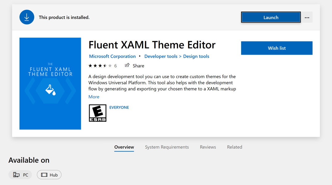
Figure 7.7 – The Fluent XAML Theme Editor page in the Microsoft Store
If you have the app installed, there will be a Launch button. If it is not installed, you can click the Install button. When it completes its installation, you will find the app in your Start Menu.
When you first launch the app, it will launch with the default style, displayed in both light and dark themes. On the right-hand panel, you will find controls for changing the colors, shapes, and typography (coming soon):

Figure 7.8 – The Fluent XAML Theme Editor for Windows
Colors
On the Colors tab, you can select one of the default profiles from the Color Presets dropdown. In addition to the default preset, there is Lavender, Forest, and Nighttime. There are also options to load additional presets or save your current color settings to a new preset. These color presets are saved in JSON format.
Note
Any colors you specify here will override the Windows system accent color that will get picked up by WinUI applications by default. Unless your application has a good reason to follow another theme, it is usually best to let WinUI use the user's chosen accent colors. Designing a custom theme should be undertaken by an experienced design team.
Clicking on any of the colors in the current preset will launch a color picker window where you can adjust the current color:
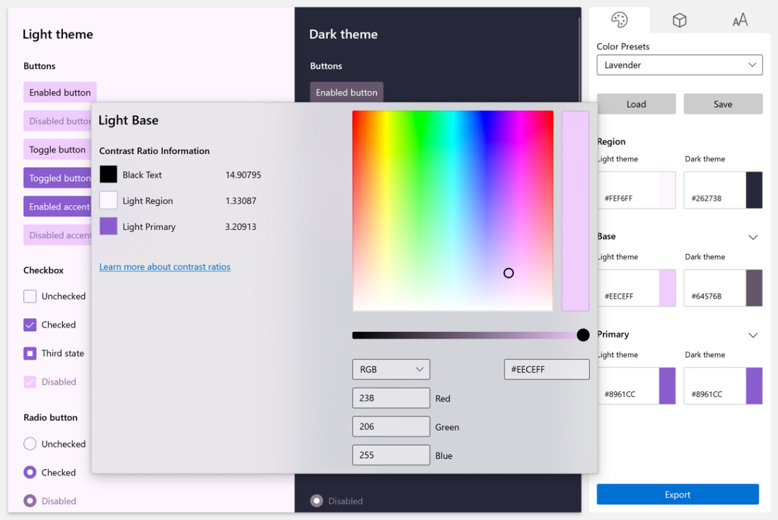
Figure 7.9 – Adjusting a preset color with a color picker
The Region, Base, and Primary colors can be adjusted for light and dark themes independently.
Shapes
The Shapes panel provides controls to adjust the Corner Radius of the Controls and the Overlay, as well as the default Border Thickness for the theme.
Shape presets can also be saved and loaded. The app comes with two presets: Default and No Rounding, Thicker Borders. The difference is subtle but noticeable:
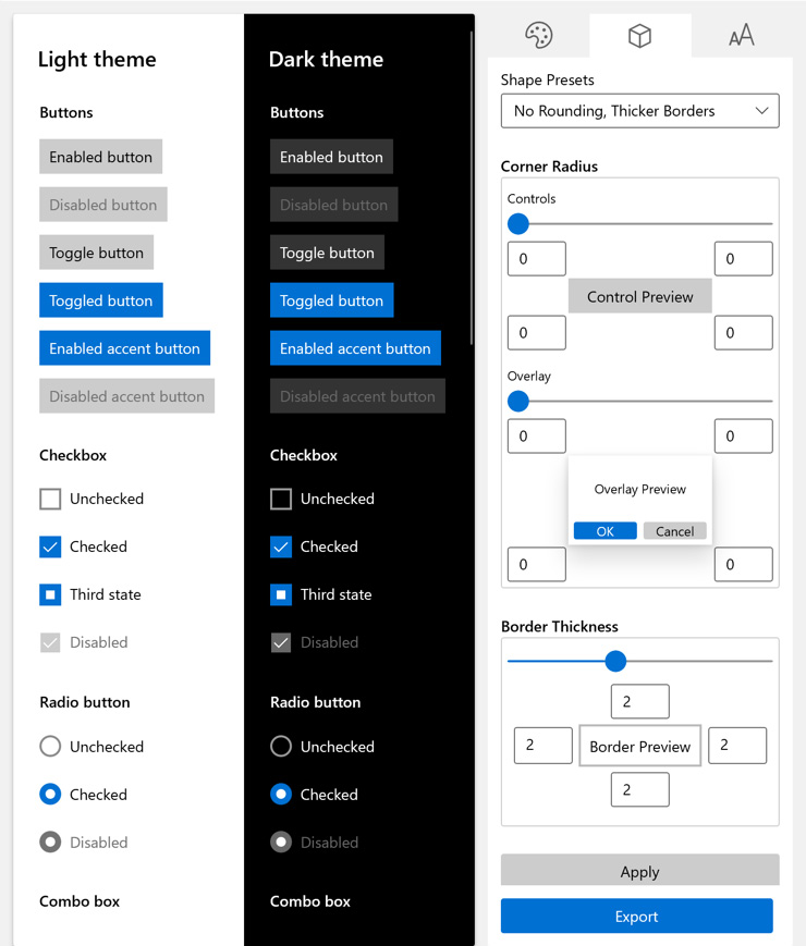
Figure 7.10 – Shapes with No Rounding, Thicker Borders applied
When you are done adjusting the color and shape settings, use the Export button to open a new window containing a ResourceDictionary with your theme data. You can copy the XAML and paste it into a Resources section in your project:
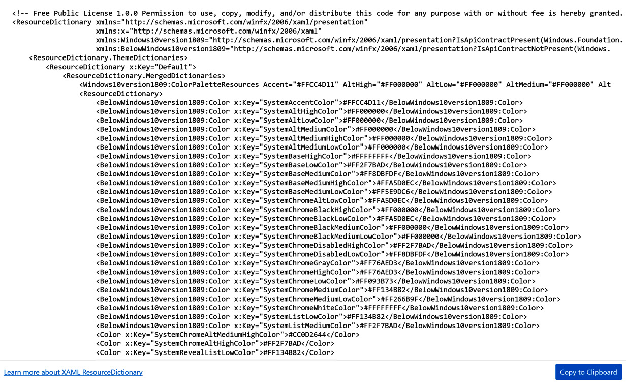
Figure 7.11 – Exporting a theme from the Fluent XAML Theme Editor
Next, let's look at a great way to find and discover resources you can use in your WinUI app.
Using the UWP Resources Gallery
Another great tool to help WinUI developers while they are styling their application is the UWP Resources Gallery. While this tool does have UWP and not WinUI in its name, all the resources you can discover in the tool also exist in WinUI 3.0. This app is open source and is available on the Windows Store at https://www.microsoft.com/en-us/p/uwp-resources-gallery/9pjjl433vx9r. A WinUI developer named Marcel Wagner maintains the open source project on GitHub at https://github.com/chingucoding/UWP-Resources-Gallery.
After installing the app, you will see that there several are types of resources you can browse or search:
- Icons: In this section, you can search for Segoe MDL2 icons such as the Home and Edit symbols we used in our application. Select an icon from the list to display details about how it can be used in XAML or C#:
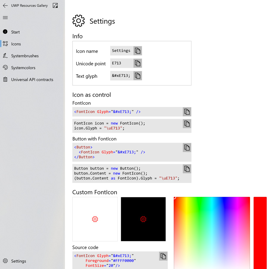
Figure 7.12 – Details about the Settings symbol in UWP Resources Gallery
- Systembrushes: In this section, you can search or browse all the system-defined system brushes available in UWP. Click the Info icon on any of these brushes to display the XAML definition and the ThemeResource snippet for the resource.
- Systemcolors: Like the Systembrushes section, the Systemcolors section provides browsing and searching for all the available color resources. Click on the Info icon to get a ThemeResource snippet you can copy to your XAML. If there are specific definitions for a color resource for light and dark themes, these are also displayed on the Info popup.
- Universal API contracts: This section displays the UWP API contracts available for each release of Windows 10. This section is less useful for WinUI 3.0 developers, as the same capabilities are available for all compatible Windows platforms.
Now, we will take a quick look at some additional Fluent Design tools geared toward designers.
Design resources and toolkits for Fluent Design
While a deep dive into user interface design is beyond the scope of this book, we will briefly review some of the Fluent Design toolkits available for popular design tools. The Fluent Design toolkits for all of these tools can be downloaded from Microsoft Docs at https://docs.microsoft.com/en-us/windows/uwp/design/downloads/:
- Figma: This is a design and prototyping tool with free and paid options, depending on the team and project size. You can find out more about Figma on its website: https://www.figma.com/.
- Sketch: This is another popular tool for designing and prototyping applications individually or with teams. There is not a free plan, but Sketch does have a free trial period. Sketch is available at https://www.sketch.com/.
- Adobe XD: XD is Adobe's design/prototype tool. Like Figma, Adobe XD has free and paid options for designing apps with their tool. Check out XD at https://www.adobe.com/products/xd.html.
- Adobe Illustrator: This is a powerful vector design tool from Adobe. There is a free trial available. Download the Fluent Design toolkit and get started with Adobe Illustrator at https://www.adobe.com/products/illustrator.html. Inkscape (https://inkscape.org/) is a free vector image editor that can also work with Adobe Illustrator (AI) files.
- Adobe Photoshop: This is probably one of the best-known raster image editors. Adobe also has a free trial for Photoshop at https://www.adobe.com/products/photoshop.html.
The Fluent Design toolkit for Photoshop includes several PSD files. It is also possible to work with PSD files in free image editors such as GIMP (https://www.gimp.org/) or Paint.NET (https://www.getpaint.net/). Paint.NET requires an open source plugin, available at https://www.psdplugin.com/.
Summary
We have learned a lot about Fluent Design, design resources, and the tools available to WinUI developers in this chapter. You will be able to use these tools and techniques in your WinUI application design or recommend them to designers at your company. We also updated the My Media Collection app to be more compliant with Fluent Design recommendations.
In the next chapter, we will examine the Windows Control Toolkit, an open source bundle of Windows controls for WinUI, UWP, WPF, and WinForms.
Questions
- Which platforms have Fluent Design implementations?
- What is a control pattern?
- Which font does Microsoft recommend using for Fluent Design?
- Which aspect of style is specific to devices with larger screens?
- What are the names of the two spacing densities available in Fluent Design?
- Which attribute can be set in Application.xaml to override a user's light/dark theme selection?
- Which design tools have Fluent Design toolkits available?