Chapter 1: Introduction to WinUI
WinUI is a set of open source controls and libraries that Windows developers can leverage in their Universal Windows Platform (UWP) and Win32 applications. UWP developers use the Windows software development kit (SDK) to build their applications and are required to select a target SDK version in a project's properties. By extracting the UWP controls and user interface (UI) components from the Windows SDK and releasing them as a set of open source libraries under the name WinUI, Microsoft is able to release versions at a faster cadence than Windows itself (as Windows SDK versions are linked to those of Windows). This separation also enables the controls to be used on older versions of Windows 10. While building UWP and Win32 applications with WinUI is the current recommendation, it is important to learn where WinUI and UWP fit in the larger Windows development landscape.
In this book, you will learn how to build applications for Windows with the WinUI 3.0 libraries. Throughout the course of the book, we will build a real-world application using recommended patterns and practices for Windows application development.
Before we start building our WinUI app, it's important to have a good foundation in Windows client development, the different types of Extensible Application Markup Language (XAML) UI markup, and how WinUI compares to other Windows desktop development frameworks. Therefore, in this first chapter, you will start by learning some background on UWP and WinUI.
In this chapter, we will learn about the following topics:
- What UWP is and why Microsoft created yet another application framework
- How XAML can be leveraged to create great UIs on many device sizes and families
- Why WinUI was created and how it relates to UWP
- Where WinUI fits in the Windows developer landscape
- What WinUI 3.0 brings to the table
Don't worry! It won't take very long to cover the background stuff, and it will help provide some context as you start building your WinUI app. In the next chapter, you will get your hands on some code when you create your first WinUI project.
Technical requirements
To follow along with the examples in this chapter, the following software is required:
- Windows 10 version 1803 or newer. You can find your version of Windows in Settings | About.
- Visual Studio 2019 version 16.9 or newer with the following workloads: .NET Desktop Development and UWP Development.
- WinUI 3.0 project templates—at the time of this writing, the templates can be downloaded from Visual Studio Marketplace at https://marketplace.visualstudio.com/items?itemName=Microsoft-WinUI.WinUIProjectTemplates. After WinUI 3.0 is released, the templates will likely be included with Visual Studio.
The source code for this chapter is available on GitHub at this URL: https://github.com/PacktPublishing/-Learn-WinUI-3.0/tree/master/Chapter01.
Note
The WinUI 3.0 site on Microsoft Docs has up-to-date guidance on setting up a developer workstation for WinUI development: https://docs.microsoft.com/en-us/uwp/toolkits/winui3/.
Before UWP – Windows 8 XAML applications
Before UWP applications were launched with Windows 10 in 2015, there were XAML applications for Windows 8 and 8.1. The XAML syntax and many of the application programming interfaces (APIs) were the same, and they were Microsoft's next step in an attempt to achieve universal app development across desktop, mobile, and other platforms (Xbox, mixed reality, and so on). A XAML app could be written for Windows 8 and Windows Phone. These projects would generate separate sets of binaries that could be installed on a PC or a Windows Phone.
These apps had many other limitations that modern UWP apps do not. For instance, they only ran fullscreen, as shown in the following screenshot:
Figure 1.1 – Windows 8 fullscreen app (sourced from Stack Overflow; reproduced under CC BY-SA 4.0 – https://creativecommons.org/licenses/by-sa/4.0/)
Many other early restrictions on Windows 8 apps have been lessened or completely removed in UWP app development. Figure 1.2, which follows, documents these changes:

Figure 1.2 – Windows 8 and Windows 10 app comparison table
Windows application UI design
The term Metro Style was used to define the design and layout of Windows 8 apps. Metro Style apps were designed to be usable with touch input, mouse and keyboard, or a stylus. Microsoft's introduction of the first Windows Phone was a driving factor for Metro Style design. Metro Style later became Modern UI design, with the introduction of Surface devices. Aspects of Metro live on today, in UWP apps and Windows 10.
Live Tiles were born with Metro Style. These tiles on the user's Windows 8 home screen and Windows 10 Start menu can update to display live updates to users without having to open the app. Most of Microsoft's own apps for Windows support Live Tiles. The Weather app can show live updates to current weather conditions on the tile, based on the user's current location. You will explore Live Tiles further in Chapter 5, Exploring WinUI Controls and Libraries.
Windows Runtime (WinRT)
Another term that has its roots in Windows 8 app development is WinRT. The letters RT became a source of great confusion. WinRT was short for Windows Runtime, the underlying APIs used by Windows XAML apps. There was also a version of Windows 8 called Windows RT that supported Advanced RISC Machines (ARM) processors. The first Surface PC was the Surface RT, which ran the Windows 8 RT operating system.
Although WinRT can still be used today to define the WinRT APIs consumed by UWP apps, you will not see the term as often. We will also avoid using WinRT in this book and instead refer to the APIs as the UWP or Windows APIs.
User backlash and the path forward to Windows 10
While Microsoft pushed hard to win over users with Modern UI design, a new app model, Surface PCs, and Windows 8 and 8.1, the idea of a fullscreen, touch-first app experience and a deemphasized Windows desktop was never embraced by customers. It turns out that Windows users really like the start menu experience they used for years with Windows XP and Windows 7.
The next step in Windows app development was a big one—so big, in fact, that Microsoft decided to skip a number in their versioning, jumping straight from Windows 8.1 to Windows 10.
Windows 10 and UWP application development
While taking a leap forward with the launch of Windows 10, Microsoft also blended the best of what worked in previous versions of Windows. They brought back the start menu, but its contents look an awful lot like the Windows 8 home screen experience. In addition to an alphabetized list of all installed apps, there is a resizable area for pinned app tiles. In fact, when running Windows in Tablet Mode, the start menu can transform into the Windows 8-style home screen experience for better usability on a touchscreen.
When Microsoft launched Windows 10, they also introduced UWP applications to Windows developers. While UWP apps have their roots in the XAML apps of Windows 8, there are some key differences that give developers some major advantages when building apps for the platform.
A key advantage is in the Universal aspect of these apps. Microsoft builds versions of Windows 10 to run on different device families, listed as follows:
- Desktop (PC)
- Xbox
- Mobile (Windows Phone)
- HoloLens
- IoT
- IoT Headless
- Team (Surface Hub)
UWP developers can build apps to target any of these devices. There is a single base set of Windows APIs shared across all these targets, and specialized SDKs available for the device-specific APIs of some families—for example, there is a Mixed Reality Toolkit and SDK for HoloLens development. With UWP, it is possible to create a single project to target many device families—for instance, you can create a project that creates apps for Desktop, Xbox, and Team families.
Because the UWP XAML for building the app's UI is the same, the learning curve for cross-device development is lowered and code reusability is very high. The nature of XAML provides a UI flexibility to adapt to different device sizes and aspect ratios.
Language choice with UWP development
While the underlying UWP APIs were written in C++, UWP developers can choose from a number of programming languages when building apps for Windows. UWP projects can be created with any of these popular languages:
- C#
- C++
- F#
- Visual Basic .NET (VB.NET)
- JavaScript
You may be surprised to see JavaScript on the list. During the Windows 8.x days, developers could create JavaScript apps with APIs known as WinJS apps. Today, Microsoft has created a branch of React Native for Windows developers, known as React Native for Windows. These JavaScript client apps have full access to the same Windows APIs as other UWP apps and can be packaged and deployed through the Windows Store.
Note
React Native for Windows is an open source project hosted by Microsoft on GitHub at https://github.com/Microsoft/react-native-windows.
While many of the UWP apps developed for Windows 10 by Microsoft are created with C++, most other developers choose C#. We will also use C# when building our app throughout the course of this book.
Lifting app restrictions
As discussed earlier, apps built for Windows 8 had a number of restrictions that have been either removed or relaxed with UWP.
First and foremost, today's UWP apps can run in resizable windows, just like any other Windows desktop application. The trade-off is that developers now need to test for and handle the resizing of their app to almost any size. The dynamic nature of XAML can handle much of the resizing very well, but below a certain minimum size, scroll bars will need to be employed.
For end users, one of the benefits of using UWP apps is the inherent security they provide due to the limited access of apps to the PC's filesystem. By default, each app can only access its own local storage. In 2018, the Windows developer team announced a new feature for UWP developers. By adding some app configuration declaring which additional types of access the app requires, applications can request access to additional parts of the filesystem. Among them are the following:
- User libraries, including Documents, Pictures, Music, and Videos
- Downloads
- Removable devices
Note
There are additional filesystem permissions that can be requested. See the Microsoft documentation for an entire list: https://docs.microsoft.com/en-us/windows/uwp/files/file-access-permissions.
Any additional permissions requested will be declared on the app's listing on the Windows Store.
Some less common scenarios are now available to UWP apps on Windows 10. Developers can add some configuration and startup code to enable multiple instances of their app to launch. While it would seem that the point of a UWP app is the XAML UI, it is now possible to create a UWP console app. The app will run at the command line and have access to Universal C runtime calls. Developers who want to get started with console apps can find project templates on Visual Studio Marketplace, at https://marketplace.visualstudio.com/items?itemName=AndrewWhitechapelMSFT.ConsoleAppUniversal.
UWP backward compatibility
No UWP app is compatible with any version of Windows before Windows 10. Beyond this, each UWP app must declare a Target Version and a Minimum Version of Windows with which it is compatible. The target version is your recommended version, which will enable all of an app's features and functionality. The minimum version is, unsurprisingly, the minimum version of Windows that users must have to be able to install an app from the Windows Store.
Visual Studio will prompt you to select these versions when creating a new UWP project. If the two are the same, it keeps things simple. You will have all of the APIs of that SDK version available to the app. If the target version is greater than the minimum version, you need to add some conditional code to light up the features of any versions greater than the minimum. The app must still be useful to users running the minimum version; otherwise, it is advisable to increase the minimum. If any of the newer APIs or controls are fundamental to the app, it is also recommended that the minimum version be increased to one where those are available.
Note
For more information on writing the conditional or version adaptive code, see the Microsoft documentation here: https://docs.microsoft.com/en-us/windows/uwp/debug-test-perf/version-adaptive-code.
If you are creating .NET libraries that will be referenced by your UWP project and you would like to share them across other platforms, perhaps by a Xamarin mobile app, a .NET Standard version should be targeted by the shared library project. The most common .NET Standard version today is .NET Standard 2.0. To reference a .NET Standard 2.0 project from a UWP project, the target version of the UWP project should be 16299 or later.
The primary benefit of WinUI over UWP is that it lessens the dependency of Windows apps on a particular version of Windows. Instead, the controls, styles, and APIs are maintained outside of the Windows SDK. As of this writing, the minimum version required for a WinUI 3.0 app is 17134 or higher, and the target version must be set to 18362 or higher. Check the latest WinUI documentation for the current minimum requirements.
The hope for WinUI is to bring a greater number of controls and features to more supported versions of Windows 10 as the project matures.
What is XAML?
XAML is based on Extensible Markup Language (XML). This would seem like a great thing as XML is a flexible markup language familiar to most developers. It is indeed flexible and powerful, but it has some drawbacks.
The primary problem with Microsoft's implementations of XAML is that there have been so many variations of the XAML language created for different development platforms over the years. Currently, UWP, Windows Presentation Foundation (WPF), and Xamarin.Forms applications all use XAML as their UI markup language. However, each of these uses a different XAML implementation or schema, and the markup cannot be shared across the platforms. In the past, Windows 8, Silverlight, and Windows Phone apps also had other different XAML schemas.
If you have never worked with XAML before, you're probably ready to see an example of some UI markup. The following XAML is a fragment that defines a Grid containing several other of the basic WinUI controls (you can download the code for this chapter from GitHub here: https://github.com/PacktPublishing/-Learn-WinUI-3.0/tree/master/Chapter01):
<Grid Width="400" Height="250" Padding="2"
HorizontalAlignment="Center"
VerticalAlignment="Center">
<Grid.RowDefinitions>
<RowDefinition Height="Auto"/>
<RowDefinition Height="*"/>
</Grid.RowDefinitions>
<Grid.ColumnDefinitions>
<ColumnDefinition Width="Auto"/>
<ColumnDefinition Width="*"/>
</Grid.ColumnDefinitions>
<TextBlock Grid.Row="0" Grid.Column="0"
Text="Name:"
Margin="0,0,2,0"
VerticalAlignment="Center"/>
<TextBox Grid.Row="0" Grid.Column="1"
Text=""/>
<Button Grid.Row="1" Grid.Column="1" Margin="0,4,0,0"
HorizontalAlignment="Right"
VerticalAlignment="Top"
Content="Submit"/>
</Grid>
Let's break down the XAML here. The top level of a UWP window is Page. UWP app navigation is page-based, and this top-level navigation happens within a root Frame container in the App.xaml file in the project. You will learn more about page navigation in Chapter 4, Advanced MVVM Concepts. A Page must contain only one child, usually some type of layout panel such as a Grid or StackPanel. By default, a Grid is inserted as that child. We will discuss other types of panels that serve as a good parent container in the next chapter. I made a few modifications to the Grid.
Height and Width properties provide a static size for the example, and HorizontalAlignment and VerticalAlignment properties will center the Grid on the Page. Fixed sizes are uncommon at this level of the XAML and limit the flexibility of the layout, but they illustrate some of the available attributes.
A Grid is a layout panel that allows developers to define rows and columns to arrange its elements. The rows and columns can have their sizes defined as fixed, relative to each other, or auto-sized based on their contents. For more information, you can read the Microsoft Docs article Responsive layouts with XAML: https://docs.microsoft.com/en-us/windows/uwp/design/layout/layouts-with-xaml.
The Grid.RowDefinitions block defines the number and behavior of the grid's rows. Our grid will have two rows. The first one has Height="Auto", which means it will resize itself to fit its contents, provided enough space is available. The second row has Height="*", which means the rest of the grid's vertical space will be allocated to this row. If multiple rows have their height defined like this, they will evenly split the available space. We will discuss additional sizing options in the next chapter.
The Grid.ColumnDefinitions block does for the grid's columns what RowDefinitions did for the rows. Our grid has two columns defined. The first ColumnDefinition has its Height set to Auto, and the second has Height="*".
TextBlock defines a label in the first Grid.Row and Grid.Column. When working with XAML, all indexes are 0-based. In this case, the first Row and Column are both at position 0. The Text property conveniently defines the text to display, and the VerticalAlignment in this case will vertically center the text for us. The default VerticalAlignment for a TextBlock is Top. The Margin property adds some padding around the outside of the control. A margin with the same amount of padding on all sides can be set as a single numeric value. In our case, we only want to add a couple of pixels to the right side of the control to separate it from TextBox. The format for entering these numeric values is "<LEFT>,<TOP>,<RIGHT>,<BOTTOM>", or "0,0,2,0" here.
The TextBox is a text entry field defined in the second column of the grid's first row.
Finally, we've added a Button control to the second column of the grid's second row. A few pixels of top margin are added to separate it from the controls above. The VerticalAlignment is set to Top (the default is Center) and HorizontalAlignment is set to Right (the default is Center). To set the text of the Button, you don't use the Text property like we did with the TextBlock, as you might think. In fact, there is no Text property. The Content property of the Button is used here. Content is a special property that we will discuss in more detail in the next chapter. For now, just know that a Content property can contain any other control: text, an Image, or even a Grid control containing multiple other children. The possibilities are virtually endless.
Here is the UI that gets rendered by the preceding markup:
Figure 1.3 – WinUI XAML rendered
This is a very simple example to give you a first taste of what can be created with XAML. As we move ahead, you will learn how powerful the language can be.
Creating an adaptive UI for any device
In the previous example, the Grid had fixed Height and Width properties. I mentioned that setting fixed sizes can limit a UI's flexibility. Let's remove the fixed size properties and use the alignment properties to guide the UI elements, to render how we want them to at different sizes and aspect ratios, as follows:
<Grid VerticalAlignment="Top" HorizontalAlignment="Stretch" Padding="2">
The rest of the markup remains unchanged. The result is a TextBox that resizes to fit the width of the window, and the Button remains anchored to the right of the window as it resizes. See the window resized a couple of different ways here:
Figure 1.4 – Resized windows
If you were using this app on a tablet PC, the contents would resize themselves to fit in the available space. That is the power of XAML's adaptive nature. When building a UI, you will usually want to choose relative and adaptive properties such as alignment to fixed sizes and positions.
It's this adaptive layout that makes XAML work so well on mobile devices with Xamarin, and this is why WPF developers have loved using it since its launch with Windows Vista.
Powerful data binding
Another reason why UWP and other XAML-based frameworks are so popular is the ease and power of their data-binding capabilities. Nearly all properties on UWP controls can be data-bound. The source of the data can be an object or a list of objects on the data source. In most cases, that source will be a ViewModel class. Let's have a very quick look at using UWP's Binding syntax for data binding to a property on a ViewModel class, as follows:
- First, we will create a simple MainViewModel class with a Name property, like this:
public class MainViewModel : INotifyPropertyChanged
{
public event PropertyChangedEventHandler
PropertyChanged;
private string _name;
public MainViewModel()
{
_name = "Bob Jones";
}
public string Name
{
get
{
return _name;
}
set
{
if (_name == value) return;
_name = value;
PropertyChanged?.Invoke(this, new
PropertyChangedEventArgs(nameof(Name)));
}
}
}
The MainViewModel class implements an interface called INotifyPropertyChanged. This interface is key to the UI receiving updates when data-bound properties have changed. This interface implementation is typically wrapped either by a Model-View-ViewModel (MVVM) framework, such as Prism or MvvmCross, or with your own ViewModelBase class. For now, we will directly invoke a PropertyChanged event inside the Name property's setter. We will learn more about ViewModels and the INotifyPropertyChanged interface in Chapter 3, MVVM for Maintainability and Testability.
- The next step is to create an instance of the MainViewModel class and set it as the ViewModel for our MainPage. This happens in the code-behind file for the page, MainPage.xaml.cs, as illustrated in the following code snippet:
public sealed partial class MainPage : Page
{
public MainPage()
{
this.InitializeComponent();
this.ViewModel = new MainViewModel();
}
public MainViewModel ViewModel { get; set; }
}
We have added a ViewModel property to the MainPage and set it to a new instance of our MainViewModel class in the constructor.
Tip
Any code added to a page's constructor should be added after the call to InitializeComponent().
- Now, it's time to add the data-binding code to the XAML markup for the TextBox, as follows:
<TextBox Grid.Row="0" Grid.Column="1" Text="{x:Bind
Path=ViewModel.Name, Mode=TwoWay}"/>
Some markup has been added to set the Text property using the x.Bind markup extension. The data-binding Path is set to the Name property on the ViewModel, which has been assigned in the code-behind file in the preceding Step 2. By setting the data-binding mode to TwoWay, updates in the ViewModel will display in the UI, and any updates by the user in the UI will also be persisted in the Name property of the MainViewModel class. Now, running the app will automatically populate the name that was set in the constructor of the ViewModel, as illustrated in the following screenshot:

Figure 1.5 – Data binding the TextBox
- To illustrate data binding to another property on another UI element on the page, we will first modify the grid to add a name, as follows:
<Grid x:Name="ParentGrid"
VerticalAlignment="Top"
HorizontalAlignment="Stretch"
Padding="2">
- Now add another RowDefinition to the Grid to fit the new UI element in the page:
<Grid.RowDefinitions>
<RowDefinition Height="Auto"/>
<RowDefinition Height="Auto"/>
<RowDefinition Height="*"/>
</Grid.RowDefinitions>
- Next, add a TextBlock element and use the Binding markup extension to bind its Text property to the ActualWidth of the ElementName set to ParentGrid. We are also adding a TextBlock to label this as the Actual Width:
<TextBlock Grid.Row="1" Grid.Column="0"
Text="Actual Width:"
Margin="0,0,2,0"
VerticalAlignment="Center"/>
<TextBlock Grid.Row="1" Grid.Column="1"
Text="{Binding ElementName=ParentGrid,
Path=ActualWidth}"/>
- Next, update the Submit Button to appear in Grid.Row 2.
- Now the new TextBlock control displays the width of the ParentGrid when the page is loaded. Note that it will not update the value if you resize the window. The ActualWidth property does not raise a property change notification. This is documented in the FrameworkElement.ActualWidth docs: https://docs.microsoft.com/en-us/uwp/api/windows.ui.xaml.frameworkelement.actualwidth:
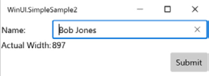
Figure 1.6 – Data binding to another element
The Submit button does not function yet. You will learn how to work with Events and Commands with MVVM in Chapter 5, Exploring WinUI Controls and Libraries.
Styling your UI with XAML
When working with XAML, styles can be defined and applied at almost any scope, global to the application in App.xaml, in the current Page inside a Page.Resources declaration, or inside any level or nested control on the page. The Style property specifies a TargetType property, which is the data type of the elements to be targeted by the style. It can optionally have a Key property defined as a unique identifier, similar to a class identifier in Cascading Style Sheets (CSS). That Key property can be used to apply the style to only selected elements of that type. Only one Key property can be assigned to an element, unlike with CSS classes.
In the next example, we will modify the page to define a Style property for all buttons on the page, as follows:
- Start by moving the Submit button to be nested inside a StackPanel element. A StackPanel element stacks all child elements in a horizontal or vertical orientation, with vertical being the default orientation. Some of the button's properties will need to be moved to the StackPanel element, as it is now the direct child of the Grid. After adding a second button to the StackPanel element to act as a Cancel button, the code for the StackPanel and Button elements should look like this:
<StackPanel Grid.Row="1" Grid.Column="1"
Margin="0,4,0,0"
HorizontalAlignment="Right"
VerticalAlignment="Top"
Orientation="Horizontal">
<Button Content="Submit" Margin="0,0,4,0"/>
<Button Content="Cancel"/>
</StackPanel>
A new margin has been added to the first button to add some space between the elements.
- Next, we will add a Style block to the Page.Resources section to style the buttons. Because no Key is assigned to the Style block, it will apply to all Button elements that do not have their styles overridden in an inner scope. This is known as an implicit style. The code for this is shown here:
<Page.Resources>
<Style TargetType="Button">
<Setter Property="BorderThickness"
Value="2" />
<Setter Property="Foreground"
Value="LightGray" />
<Setter Property="BorderBrush"
Value="GhostWhite"/>
<Setter Property="Background"
Value="DarkBlue" />
</Style>
</Page.Resources>
- Now, when you run the app, you will see that the new style has been applied to both the Submit and Cancel buttons without adding any styling directly to each control, as illustrated in the following screenshot:

Figure 1.7 – Styled buttons
If we moved the Style block to the Application.Resources section, the defined style would get applied to every button in the entire app unless the developer had individually overridden some of the properties in the style. For instance, if the Submit button had a Background property set to DarkGreen, only the Cancel button would appear as dark blue.
We will spend more time on styles and design in Chapter 7, Windows Fluent UI Design.
Separating presentation from business logic
We looked briefly at the MVVM pattern in the earlier section on data binding. MVVM is key to the separation of presentation logic from business logic in UWP application development. The XAML elements only need to know that there is a property with a particular name somewhere in its data context. The ViewModel classes have no knowledge of the View (our XAML file).
This separation provides several benefits. First, ViewModels can be unit tested independently of the UI. If any UWP elements are referenced by the system under test, the UI thread is needed. This will cause tests to fail when they're running on background threads locally or on a Continuous Integration (CI) server. See Chapter 3, MVVM for Maintainability and Testability for more information on unit testing WinUI applications.
The next benefit of View/ViewModel separation is that businesses with dedicated user experience (UX) experts will sometimes work on designing the XAML markup for an app while other developers are building the ViewModels. When it is time to sync up the two, the developer can add in the necessary data-binding properties to the XAML, or perhaps the UX designer and developer have already agreed upon the names of the properties in the shared data context. Visual Studio includes another tool geared toward designers in this workflow, called Blend for Visual Studio. Blend was first released by Microsoft in 2006 as Microsoft Expression Blend, as a tool for designers to create UIs for WPF. Support was later added for other XAML languages such as Silverlight and UWP. Blend is still included with the UWP development workload when installing Visual Studio.
A final benefit we will discuss here is that a good separation of concerns between any layers of your application will always lead to better maintainability. If there are multiple components involved in a single responsibility or if logic is duplicated in multiple places, this leads to buggy code and unreliable applications. Follow good design patterns, and you will save yourself a lot of work down the road.
Now that you have a good understanding of the history of UWP applications, it's time to look at WinUI: what it is, and why it was created.
What is WinUI?
The WinUI library is a set of controls and UI components that have been extracted from the Windows SDK. After this separation, many controls have been enhanced and others have been added. The libraries have been made available as open source on GitHub and are maintained by Microsoft and the Windows developer community.
So, if these WinUI libraries came from UWP libraries in the Windows SDK, you may be wondering why you should choose WinUI as your UI framework instead of UWP. UWP has been around since the launch of Windows 10 and is quite robust and stable. There are actually several very good reasons to consider WinUI.
Choosing WinUI brings with it all the benefits of open source. Open source software (OSS) is typically very reliable. When software is developed in the open by an active developer community, issues are found and resolved quickly. In fact, if you find an issue with an open source package, you can fix it yourself and submit a pull request to have the fix made available to the rest of the community. Open source projects can iterate quickly without having to remain in sync with product groups in a large enterprise such as the Windows team. Windows releases feature updates on a regular cadence now, but this is still less frequent than with a typical control library.
The best reason to use WinUI is its backward compatibility. When using a UWP control, the features and fixes in a specific version of the control cannot be deployed in apps to older versions of Windows. With WinUI, so long as you are targeting the minimum version of Windows supported by WinUI as a whole, you can use those new controls and features in multiple Windows versions. Controls not previously available to UWP developers on one version of Windows are now available there as WinUI controls.
For instance, Microsoft did not introduce the Fluent UI design to Windows until the Fall 2017 release (version 16299). However, WinUI controls can be included in apps targeting a minimum Windows version of 10.0.15063.0, the Spring 2017 release. The controls in WinUI support Fluent UI styles. WinUI adds controls and other features that are not available at all in UWP and the Windows SDK.
The first WinUI release
The first version of WinUI was released in July 2018 as a preview release for Windows developers. It was released as the following two NuGet packages:
- Microsoft.UI.Xaml: The WinUI controls and Fluent UI styles.
- Microsoft.UI.Xaml.Core.Direct: Components for middleware developers to access the XamlDirect API.
3 months later, WinUI 2.0 was released. Despite the version number, it was the first production release of WinUI. The release included more than 20 controls and brushes. A few notable controls included the following:
- TreeView: A staple of any UI library.
- ColorPicker: A rich visual color picker with a color spectrum.
- DropDownButton: A button with the ability to open a menu.
- PersonPicture: An image control for displaying an avatar. It has the ability to fall back to displaying initials or a generic placeholder image.
- RatingControl: Allows users to enter star ratings for items.
Let's add a few of these controls to our WinUI project and see how they look. Change the contents of the StackPanel to look like this:
<StackPanel Grid.Row="1" Grid.Column="1" Margin="0,4,0,0"
HorizontalAlignment="Right"
VerticalAlignment="Top"
Orientation="Horizontal">
<PersonPicture Initials="MS" Margin="0,0,8,0"/>
<DropDownButton Content="Submit" Margin="0,0,4,0">
<DropDownButton.Flyout>
<MenuFlyout Placement="Bottom">
<MenuFlyoutItem Text="Submit + Print"/>
<MenuFlyoutItem Text="Submit + Email"/>
</MenuFlyout>
</DropDownButton.Flyout>
</DropDownButton>
<Button Content="Cancel"/>
</StackPanel>
A PersonPicture control with the initials MS has been added as the first item in the StackPanel, and the first of the two buttons has been replaced by a DropDownButton control. The Submit DropDownButton control has a FlyoutMenu serving as a drop-down list, and there are two MenuFlyoutMenuItem elements. Now, users can simply click the Submit button, or they can select Submit + Print or Submit + Email from the drop-down list.
Note
DropDownButton is only available in Windows 10 version 1809 and later. If you use this control in a production application, you should set this as your minimum version for the project.
This is how the new window appears with the DropDownButton menu shown:
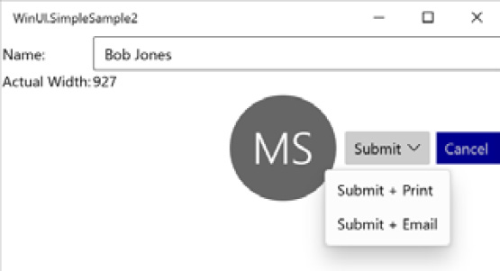
Figure 1.8 – Adding a PersonPicture and DropDownButton control
We're only scratching the surface of what the first release can do for Windows developers. Don't worry, as we will dive much deeper in the chapters ahead. Let's briefly look at what was added in subsequent versions leading to WinUI 3.0.
The road to WinUI 3.0
There have been five additional minor releases of WinUI following v2.0, in addition to many incremental bug fixes and prerelease versions.
WinUI 2.1
The WinUI 2.1 release brought a number of new controls and features to the library. These are some highlights:
- TeachingTip: Think of TeachingTip as a rich, context-sensitive tooltip. It is linked to another element on the page and displays informative details about the target element to help guide users with non-intrusive content as needed.
- AnimatedVisualPlayer: This hosts Lottie animations. Lottie files are a popular animation format created in Adobe After Effects used by designers across Windows, the web, and mobile platforms. There are libraries available to host Lottie animations for most modern development frameworks.
Note
Get more information about Lottie files on their website at https://airbnb.design/lottie/ and check out this great repository of Lottie animation files: https://lottiefiles.com/
- CompactDensity: Adding this resource dictionary to your app can provide the ability to switch between Compact and Normal display modes. CompactDensity will reduce the spacing within and between elements on the page, providing up to 33% more visible content to users. This Fluent UI design concept was introduced to developers at Microsoft's Build 2018 conference.
WinUI 2.2
This release brought many enhancements to existing features. However, the single new control added to the library is one that many Windows developers will find useful.
The TabView control creates a familiar tabbed user experience on the screen. Each tab can host a page in your WinUI project.
WinUI 2.2 enhancements
A few of the notable updated controls and libraries in version 2.2 are listed here:
- NavigationView: The NavigationView control was enhanced to allow the back button to remain visible when the panel is collapsed. Other visual updates maximize the viewable content of the control.
- Visual Styles: Many of the WinUI visual styles were updated, including CornerRadius, BorderThickness, CheckBox, and RadioButton. The updates all make the WinUI visuals more consistent and in line with Fluent UI design guidelines.
WinUI 2.3
In the WinUI 2.3 release, the ProgressBar received some updates, and a couple of new controls were added to the library.
There are now two modes available when creating a Progress Bar in a WinUI application: Determinate and Indeterminate. A determinate progress bar has a known amount of the task to complete and a known current state of the task. An indeterminate control indicates that a task is ongoing without a known completion time. Its purpose to similar to that of a busy indicator.
New controls in WinUI 2.3
The following are a few new controls in this update:
- NumberBox: A NumberBox control is an input editor that makes it easy to support numeric formatting, up/down incrementing buttons, and inline mathematic calculations. It is a seemingly simple but practical and powerful control.
- RadioButtons: You might be thinking: Radio buttons have always been available. How is this a new control? RadioButtons is actually a control that groups a set of RadioButton (singular) controls, making it easier to work with them as a single unit.
WinUI 2.4
When it was released in May 2020, two new features were made available in WinUI 2.4: a RadialGradientBrush visual and a ProgressRing control.
The brush is similar in use to the RadialGradientBrush used by WPF developers. It makes it easy to add a gradient to a visual element that radiates out from a central point.
The ProgressRing control, as it sounds, recreates progress bar functionality in a circular format. The control is available with a determinate state and an indeterminate state in version 2.4. An indeterminate ProgressRing control displays a repeating animation and is the default state of the control.
Several controls were updated in version 2.4. The TabView control was updated to provide more control over how tabs are rendered, including Compact, Equal, and Size to Content modes. TextBox controls received a dark mode enhancement to keep the content area of the control dark, with white text by default. Finally, the NavigationView control was updated with hierarchical navigation, with Left, Top, and LeftCompact modes.
WinUI 2.5
WinUI 2.5 was released in December 2020 and included a new InfoBar control. Several control enhancements and bug fixes were also included in the release.
The InfoBar control provides a way to display important status messages to users. The control can display an alert or informational icon, a status message, and a link or button allowing users to take action on a message. There is also an option to display a close button to the right of the message. By default, the control includes an icon, message, and close button. Microsoft Docs provides usage guidelines for this new control: https://docs.microsoft.com/en-us/windows/uwp/design/controls-and-patterns/infobar.
Several updates are also available in version 2.5. The ProgressRing control received enhancements to the determinate state of the control. The NavigationView control was updated to provide customizable FooterMenuItems. In previous versions of the NavigationView control, the footer area could be shown or hidden but not customized.
We've seen what was available to UWP developers in WinUI 2.x. Now, let's see what you get with WinUI 3.0.
What's new in WinUI 3.0?
Unlike WinUI 2.0 and the incremental versions that followed, WinUI 3.0 is a major update featuring more than new and improved controls and libraries to use with UWP and .NET 5 apps. In fact, the primary goal of WinUI 3.0 was not to add new controls and features beyond its current UWP counterparts. For version 3.0, the team has made WinUI a complete UI framework that can sit atop the UWP or Win32 application platforms.
Goodbye UWP?
So, what is happening to UWP? Will my UWP apps stop working?
As previously mentioned, the plan for the UWP UI libraries is to keep providing important security updates, but they will not receive any new features going forward. All new features and updates will be developed for WinUI. New WinUI projects will support all types of Windows UI client. For existing Win32 applications, developers can incrementally upgrade parts of an application to WinUI with the Xaml Islands interop control. New applications will be developed in WinUI with either .NET Core, written in C# or VB, or with native C++. These clients will sit on top of either the Win32 platform or UWP. This is all possible because WinUI is developed completely in C++.
Note
Some features discussed in this book will not be available in the first stable Release To Manufacturing (RTM) version of WinUI 3.0, coming in March 2021 with Project Reunion v0.5. XAML Islands will not be available and UWP clients will not be fully supported initially. For a full list of what is planned for the first stable release of WinUI 3.0, you can reference the team's roadmap on GitHub: https://github.com/microsoft/microsoft-ui-xaml/blob/master/docs/roadmap.md#winui-30-feature-roadmap.
The fact that WinUI is developed in C++ enables React Native for Windows client apps to interoperate with the WinUI platform. Between React Native and the Uno Platform, WinUI has some great cross-platform potential.
Let's look at this new app model in the following screenshot:
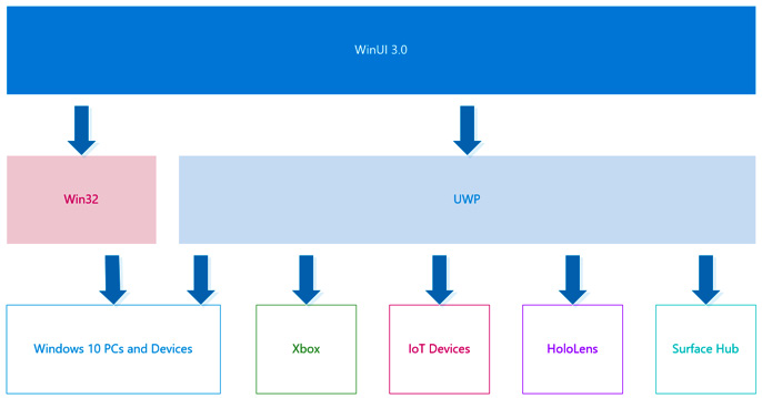
Figure 1.9 – The WinUI 3.0 app model
As you can see, there will be multiple paths available for developers to create apps for Windows PCs and tablet devices such as the dual-screen Surface Duo. Other Windows devices, such as Xbox and HoloLens, will need to follow the UWP app model under the WinUI layer.
New features for WinUI 3.0
Are there any new features in WinUI 3.0?
While it sounded like the team was so busy creating a UI framework to replace the UWP UI libraries, they did find some time to add a few new features. The major new control available in version 3.0 is the new WebView2 control based on the Microsoft Edge Chromium browser. Compatibility is also a feature. All XAML and Composition features available in the Spring 2019 Windows SDK will be backward-compatible, back to the Windows Creators update and later.
Project Reunion and WinUI
WinUI 3.0 is bringing UWP and Win32 application developers together on a single set of UI libraries, but that is only the beginning. At Microsoft's Build 2020 conference, the Windows team announced Project Reunion, a long-term plan for bringing all Windows developers together on a single platform. WinUI 3.0 is focused on the UI layer, while Project Reunion will encompass WinUI and the entire Windows developer platform. In 2021, Microsoft will release three versions of Project Reunion and WinUI 3.x, as follows:
- March 2021: The first Project Reunion release, version 0.5, will feature the first supported release of WinUI 3.
- May 2021: This Project Reunion version 0.8 will include several enhancements to WinUI 3.
- October 2021: This will be the Project Reunion 1.0 release, with more improvements to WinUI 3.
To read more about Project Reunion and to follow its progress, you can check out their GitHub repository at https://github.com/microsoft/ProjectReunion. Now, let's see how WinUI compares to other Windows development frameworks.
WinUI compared to other Windows development frameworks
Where does WinUI fit in the overall landscape of Microsoft's Windows development frameworks? Let's draw some comparisons to help answer that question, starting with those that are most similar to WinUI.
WinUI versus UWP
This is a tricky comparison because most WinUI apps today are UWP apps at their core. In fact, WinUI 2.x are controls for UWP applications. When considering WinUI 3.0, think of WinUI as the UI framework and UWP as the application platform layer. They share the same XAML schema, base visuals, and underlying Windows APIs. Any UWP app that has the same minimum and target versions of Windows specified can add the WinUI 2.x libraries to leverage the new and updated features.
A key difference between apps that use WinUI versus traditional UWP apps is access to new and updated controls and other visual elements without requiring an updated Windows SDK. This enables developers to bring apps with the same look and features to more users across multiple versions of Windows 10. This differentiator makes for happier developers and users.
WinUI versus WPF
WinUI and WPF have many similarities. Both are application frameworks, and both types of apps rely on XAML to define UI elements. This means that they both offer the same separation of UI and business logic when implementing the MVVM pattern. WPF XAML has the same concepts of styles, resources, data binding, and adaptiveness of the UI layout.
WinUI advantages
A significant performance advantage of WinUI—and UWP apps in general—is the availability of compiled bindings. We will discuss compiled bindings in more detail later. For now, just know that using them offers a performance boost over traditional data binding in both UWP and WPF. Compiled bindings are identified by the use of the x:Bind syntax in XAML, rather than Binding.
Another advantage of WinUI over WPF is that it is more secure by default. Sandboxed access to users' filesystems and devices can give users a sense of ease, knowing that malicious behavior has limits to which hardware and data it can access. WPF apps' access is only limited by the configuration of Windows User Account Control (UAC) on the PC.
WPF advantages
The primary advantage of WPF applications is the fact that they are not directly tied to minimum versions of Windows 10. WPF apps target a .NET Framework or .NET Core version. Any version of Windows that supports the target .NET version can run that WPF app. This significantly increases the potential user base of WPF apps. In fact, WPF apps can be deployed and run on Windows 7, something not possible with UWP or WinUI.
Note
There is a project called Uno Platform that enables WinUI XAML to run on iOS and Android, leveraging Xamarin and on the web with WebAssembly. These WinUI web apps can run in the browser on previous versions of Windows, including Windows 7. The Uno Platform goal and tagline is WinUI Everywhere.
Learn more about Uno Platform at https://platform.uno/.
Learn more about WebAssembly at https://webassembly.org/.
The secure-by-default nature of WinUI apps provides WPF apps with a greater degree of flexibility and power. Many types of applications will require full access to the Windows filesystem or to particular devices and drivers—for example, it would be much easier to create a custom file manager application with complete access to a computer's filesystem. While WinUI apps can now request this access in newer versions of Windows 10, this is available by default in any version with WPF.
A new WPF advantage emerged with the releases of .NET Core 3.x and .NET 5. .NET developers can now create WPF apps with .NET Core, bringing performance and deployment advantages of .NET Core to WPF developers. For instance, applications targeting difference versions of .NET Core can be deployed side by side on a machine without creating version conflicts.
The difference in deployment models can be debated as to which framework has an advantage. The easiest way to deploy a WinUI app is through the Windows Store. The easiest way to deploy a WPF app with .NET Framework is via an installer package. WPF apps can be deployed through the Store through Windows Containers, and WinUI apps can be deployed without the Store with MSIX installers. WinUI deployment will be covered in detail in Chapter 12, Build, Release, and Monitor Apps with Visual Studio App Center and Chapter 13, Packaging and Deployment Options and the Windows Store.
WinUI versus Windows Forms (WinForms)
WinForms is a .NET UI framework that was introduced with .NET Framework 1.0. Developers can easily create a WinForms UI with the visual design surface in Visual Studio, which generates C# or VB code that creates the UI at runtime. Most of the advantages and disadvantages of WPF also apply to WinForms: security, deployment, and .NET Core—WinForms apps can also be created with .NET Core 3 and later.
WinUI advantages
Similarities between WinUI and WPF are their primary advantages over WinForms: data binding, adaptive layout, and a flexible styling model. These advantages all stem from the use of XAML for UI layout. Another advantage of XAML is offloading render processing from the central processing unit (CPU) to the graphics processing unit (GPU). WinUI controls inherit the Windows 10 styles by default and have a more modern appearance than WinForms controls. WinUI applications also handle dots per inch (DPI) scaling and touch input well. The WinForms UI framework matured before touch input and DPI scaling were a concern for Windows developers.
A primary advantage of WinUI over WPF also applies to WinForms: security by default.
WinForms advantages
In addition to the advantages that WinForms shares with WPF over WinUI—greater access to Windows, .NET Core apps, and Windows compatibility—WinForms also has a well- deserved reputation for rapid UI development. If you need to create a simple Windows application in a minimal amount of time, the drag-and-drop WinForms designer is easy and intuitive. Many experienced Windows developers still default to WinForms when tasked with creating a simple utility or UI test harness for a .NET library.
Summary
We have covered a lot of the history of Windows application development in this chapter. We learned about the origins of UWP and its roots in Windows 8 apps, and learned of the benefits of XAML when building Windows UIs. We had a taste of what some simple WinUI app code and UIs look like. Finally, we examined the recent history of WinUI versions and how the new version 3.0 is a complete replacement for the UWP UI libraries and a viable option for WPF developers going forward.
This will give you a good foundation of what's to come as we start building an app with WinUI in the chapters ahead. In the next chapter, you will set up your development environment, learn about the app project that we will create throughout the book, and create your first WinUI 3.0 project. When we get to Chapter 3, MVVM for Maintainability and Testability, we will refactor the app to use the MVVM pattern. This will set us up with a solid, maintainable design as we later add to and extend the app throughout the rest of the book.
Questions
- Which version of Windows first introduced UWP apps to developers?
- What is the name of the pattern commonly used by WinUI and other XAML developers to separate UI logic from business logic?
- WinUI and WPF apps can share the same XAML. True or false?
- Which was the first Microsoft UI framework to use XAML to define the UI?
- What was the version number of the first WinUI release?
- What is one of the benefits of developing with WinUI over WinForms?
- Can WinUI apps only be developed with .NET languages?
- Challenge: Create a Style that will apply to Button elements.