
Chapter 6: Model Interpretability Using SHAP
In the previous two chapters, we explored model-agnostic local explainability using the LIME framework to explain black-box models. We also discussed certain limitations of the LIME approach, even though it remains one of the most popular Explainable AI (XAI) algorithms. In this chapter, we will cover SHapley Additive exPlanation (SHAP), which is another popular XAI framework that can provide model-agnostic local explainability for tabular, image, and text datasets.
SHAP is based on Shapley values, which is a concept popularly used in Game Theory (https://c3.ai/glossary/data-science/shapley-values/). Although the mathematical understanding of Shapley values can be complicated, I will provide a simple, intuitive understanding of Shapley values and SHAP and focus more on the practical aspects of the framework. Similar to LIME, SHAP also has its pros and cons, which we are going to discuss in this chapter. This chapter will cover one practical tutorial that will explain regression models using SHAP. Later, in Chapter 7, Practical Exposure to Using SHAP in ML, we will cover other practical applications of the SHAP framework.
So, here is a list of the main topics of discussion for this chapter:
- An intuitive understanding of the SHAP and Shapley values
- Model explainability approaches using SHAP
- Advantages and limitations
- Using SHAP to explain regression models
Now, let's begin!
Technical requirements
The code tutorial with the necessary resources can be downloaded or cloned from the GitHub repository for this chapter: https://github.com/PacktPublishing/Applied-Machine-Learning-Explainability-Techniques/tree/main/Chapter06. Python and Jupyter notebooks are used to implement the practical application of the theoretical concepts that are covered in this chapter. But I recommend that you only run the notebooks after you go through this chapter for a better understanding. Additionally, please look at the SHAP Errata section before proceeding with the practical tutorial part of this chapter: https://github.com/PacktPublishing/Applied-Machine-Learning-Explainability-Techniques/blob/main/Chapter06/SHAP_ERRATA/ReadMe.md.
An intuitive understanding of the SHAP and Shapley values
As discussed in Chapter 1, Foundational Concepts of Explainability Techniques, explaining black-box models is a necessity for increasing AI adoption. Algorithms that are model-agnostic and can provide local explainability with a global perspective are the ideal choice of explainability technique in machine learning (ML) . That is why LIME is a popular choice in XAI. SHAP is another popular choice of explainability technique in ML and, in certain scenarios, is more effective than LIME. In this section, we will discuss about the intuitive understanding of the SHAP framework along with how it functions for providing model explainability.
Introduction to SHAP and Shapley values
The SHAP framework was introduced by Scott Lundberg and Su-In Lee in their research work, A Unified Approach of Interpreting Model Predictions (https://arxiv.org/abs/1705.07874). This was published in 2017. SHAP is based on the concept of Shapley values from cooperative game theory, but unlike the LIME framework, it considers additive feature importance. By definition, the Shapley value is the mean marginal contribution of each feature value across all possible values in the feature space. The mathematical understanding of Shapley values is complicated and might confuse most readers. That said, if you are interested in getting an in-depth mathematical understanding of Shapley values, we recommend that you take a look at the research paper called "A Value for n-Person Games." Contributions to the Theory of Games 2.28 (1953), by Lloyd S. Shapley. In the next section, we will gain an intuitive understanding of Shapley values with a very simple example.
What are Shapley values?
In this section, I will explain Shapley values using a very simple and easy-to-understand example. Let's suppose that Alice, Bob, and Charlie are three friends who are taking part, as a team, in a Kaggle competition to solve a given problem with ML, for a certain cash prize. Their collective goal is to win the competition and get the prize money. All three of them are equally not good in all areas of ML and, therefore, have contributed in different ways. Now, if they win the competition and earn their prize money, how will they ensure a fair distribution of the prize money considering their individual contributions? How will they measure their individual contributions for the same goal? The answer to these questions can be given by Shapley values, which were introduced in 1951 by Lloyd Shapley.
The following diagram gives us a visual illustration of the scenario:
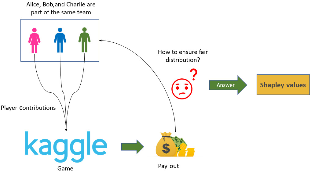
Figure 6.1 – Visual illustration of the scenario discussed in the What are Shapley values? section
So, in this scenario, Alice, Bob, and Charlie are part of the same team, playing the same game (which is the Kaggle competition). In game theory, this is referred to as a Coalition Game. The prize money for the competition is their payout. So, Shapley values tell us the average contribution of each player to the payout ensuring a fair distribution. But why not just equally distribute the prize money between all the players? Well, since the contributions are not equal, it is not fair to distribute the money equally.
Deciding the payouts
Now, how do we decide the fairest way to distribute the payout? One way is to assume that Alice, Bob, and Charlie joined the game in a sequence in which Alice started first, followed by Bob, and then followed by Charlie. Let's suppose that if Alice, Bob, and Charlie had participated alone, they would have gained 10 points, 20 points, and 25 points, respectively. But if only Alice and Bob teamed up, they might have received 40 points. While Alice and Charlie together could get 30 points, Bob and Charlie together could get 50 points. When all three of them collaborate together, only then do they get 90 points, which is sufficient for them to win the competition.
Figure 6.2 illustrates the point values for each condition. We will make use of these values to calculate the average marginal contribution of each player:
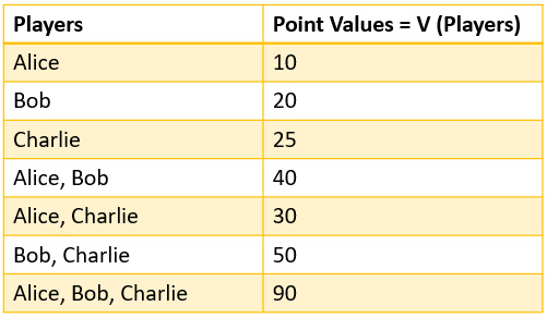
Figure 6.2 – The contribution values for all possible combinations of all the players
Mathematically, if we assume that there are N players, where S is the coalition subset of players and ![]() is the total value of S players, then by the formula of Shapley values, the marginal contribution of player i is given as follows:
is the total value of S players, then by the formula of Shapley values, the marginal contribution of player i is given as follows:

The equation of Shapley value might look complicated, but let's simplify this with our example. Please note that the order in which each player starts the game is important to consider as Shapley values try to account for the order of each player to calculate the marginal contribution.
Now, for our example, the contribution of Alice can be calculated by calculating the difference that Alice can cause to the final score. So, the contribution is calculated by taking the difference in the points scored when Alice is in the game and when she is not. Also, when Alice is playing, she can either play alone or team up with others. When Alice is playing, the value that she can create can be represented as ![]() . Likewise,
. Likewise, ![]() and
and ![]() denote individual values created by Bob and Charlie. Now, when Alice and Bob are teaming up, we can calculate only Alice's contribution by removing Bob's contribution from the overall contribution. This can be represented as
denote individual values created by Bob and Charlie. Now, when Alice and Bob are teaming up, we can calculate only Alice's contribution by removing Bob's contribution from the overall contribution. This can be represented as ![]() . And if all three are playing together, Alice's contribution is given as
. And if all three are playing together, Alice's contribution is given as ![]() .
.
Considering all possible permutations of the sequences by which Alice, Bob, and Charlie play the game, the marginal contribution of Alice is the average of her individual contributions in all possible scenarios. This is illustrated in Figure 6.3:
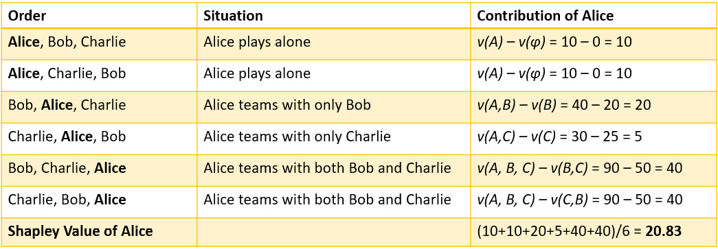
Figure 6.3 – The Shapley value of Alice is her marginal contribution considering all possible scenarios
So, the overall contribution of Alice will be her marginal contribution across all possible scenarios, which also happens to be the Shapley value. For Alice, the Shapley value is 20.83. Similarly, we can calculate the marginal contribution for Bob and Charlie, as shown in Figure 6.4:
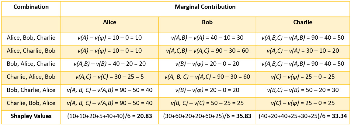
Figure 6.4 – Marginal contribution for Alice, Bob, and Charlie
I hope this wasn't too difficult to understand! One thing to note is that the sum of marginal contributions of Alice, Bob, and Charlie should be equal to the total contribution made by all three of them together. Now, let's try to understand Shapley values in the context of ML.
Shapley values in ML
In order to understand the importance of Shapley values in ML to explain model predictions, we will try to modify the example about Alice, Bob, and Charlie that we used for understanding Shapley values. We can consider Alice, Bob, and Charlie to be three different features present in a dataset used for training a model. So, in this case, the player contributions will be the contribution of each feature. The game or the Kaggle competition will be the black-box ML model and the payout will be the prediction. So, if we want to know the contribution of each feature toward the model prediction, we will use Shapley values.
The modification of Figure 6.1 to represent Shapley values in the context of ML is illustrated in Figure 6.5:
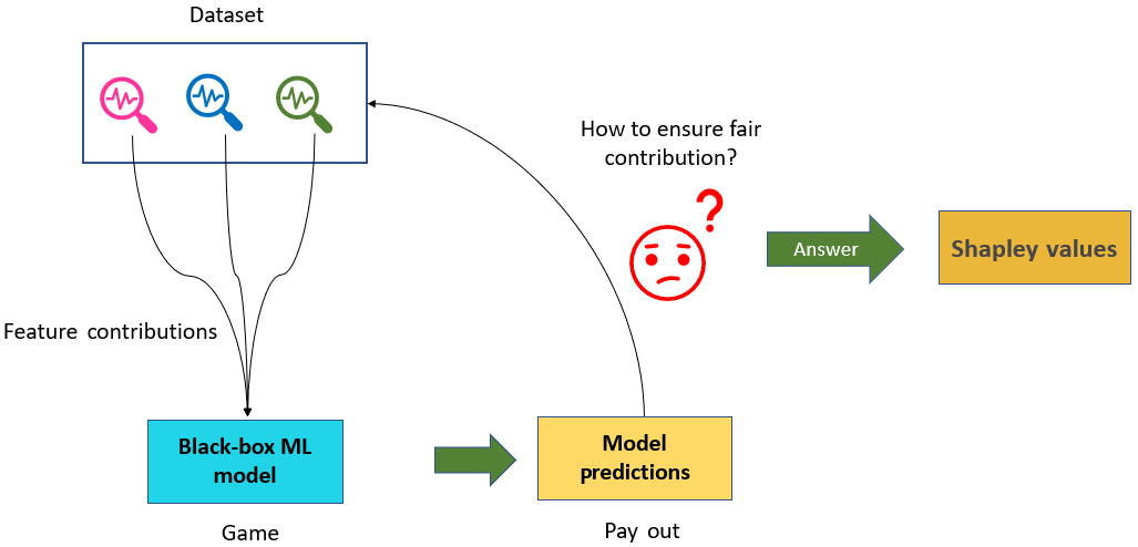
Figure 6.5 – Understanding Shapley values in the context of ML
Therefore, Shapley values help us to understand the collective contribution of each feature toward the outcome predicted by black-box ML models. By using Shapley values, we can explain the working of black-box models by estimating the feature contributions.
Properties of Shapley values
Now that we have an intuitive understanding of Shapley values and we have learned how to calculate Shapley values, we should also gain an understanding of the properties of Shapley values:
- Efficiency: The total sum of Shapley values or the marginal contribution of each feature should be equal to the value of the total coalition. For example, in Figure 6.4, we can see that sum of individual Shapley values for Alice, Bob, and Charlie are equal to the total coalition value obtained when Alice, Bob, and Charlie team up together.
- Symmetry: Each player has a fair chance of joining the game in any order. in Figure 6.4, we can see that all permutations of the sequences for all the players are considered.
- Dummy: If a particular feature does not change the predicted value regardless of the coalition group, then the Shapley value for the feature is 0.
- Additivity: For any game with a combined payout, the Shapley values are also combined. This is denoted as
 , then
  . For example, for the random forest algorithm in ML, Shapley values can be calculated for a particular feature by calculating it for each individual tree and then averaging them to find the additive Shapley value for the entire random forest.
So, these are the important properties of Shapley values. Next, let's discuss the SHAP framework and understand how it is much more than just the usage of Shapley values.
The SHAP framework
Previously, we discussed what Shapley values are and how they are used in ML. Now, let's cover the SHAP framework. Although SHAP is popularly used as an XAI tool for providing local explainability to individual predictions, SHAP can also provide a global explanation by aggregating the individual predictions. Additionally, SHAP is model-agnostic, which means that it does not make any assumptions about the algorithm used in black-box models. The creators of the framework broadly came up with two model-agnostic approximation methods, which are as follows:
- SHAP Explainer: This is based on Shapley sampling values.
- KernelSHAP Explainer: This is based on the LIME approach.
The framework also includes model-specific explainability methods such as the following:
- Linear SHAP: This is for linear models with independent features.
- Tree SHAP: This is an algorithm that is faster than SHAP explainers to compute SHAP values for tree algorithms and tree-based ensemble learning algorithms.
- Deep SHAP: This is an algorithm that is faster than SHAP explainers to compute SHAP values for deep learning models.
Apart from these approaches, SHAP also uses interesting visualization methods to explain AI models. We will cover these methods in more detail in the next section. But one point to note is that the calculation of Shapley values is computationally very expensive, and the algorithm is of the order of ![]() , where n is the number of features. So, if the dataset has many features, calculating Shapley values might take forever! However, the SHAP framework uses an approximation technique to calculate Shapley values efficiently. The explanation provided by SHAP is more robust as compared to the LIME framework. Let's proceed to the next section, where we will discuss the various model explainability approaches used by SHAP on various types of data.
, where n is the number of features. So, if the dataset has many features, calculating Shapley values might take forever! However, the SHAP framework uses an approximation technique to calculate Shapley values efficiently. The explanation provided by SHAP is more robust as compared to the LIME framework. Let's proceed to the next section, where we will discuss the various model explainability approaches used by SHAP on various types of data.
Model explainability approaches using SHAP
After reading the previous section, you have gained an understanding of SHAP and Shapley values. In this section, we will discuss various model-explainability approaches using SHAP. Data visualization is an important method to explain the working of complex algorithms. SHAP makes use of various interesting data visualization techniques to represent the approximated Shapley values to explain black-box models. So, let's discuss some of the popular visualization methods used by the SHAP framework.
Visualizations in SHAP
As mentioned previously, SHAP can be used for both the global interpretability of the model and the local interpretability of the inference data instance. Now, the values generated by the SHAP algorithm are quite difficult to understand unless we make use of intuitive visualizations. The choice of visualization depends on the choice of global interpretability or local interpretability, which we will cover in this section.
Global interpretability with feature importance bar plots
Analyzing the most influential features present in a dataset always helps us to understand the functioning of an algorithm with respect to the underlying data. SHAP provides an effective way in which to find feature importance using Shapley values. So, the feature importance bar plot displays the important features in descending order of their importance. Additionally, SHAP provides a unique way to show feature interactions using hierarchical clustering (https://www.displayr.com/what-is-hierarchical-clustering/). These feature clustering methods help us to visualize a group of features that collectively impacts the model's outcome. This is very interesting since one of the core benefits of using Shapley values is to analyze the additive influence of multiple features together. However, there is one drawback of the feature importance plot for global interpretability. Since this method only considers mean absolute Shapley values to estimate feature importance, it doesn't show whether collectively certain features are impacting the model in a negative way or not.
The following diagram illustrates the visualizations for a feature importance plot and a feature clustering plot using SHAP:
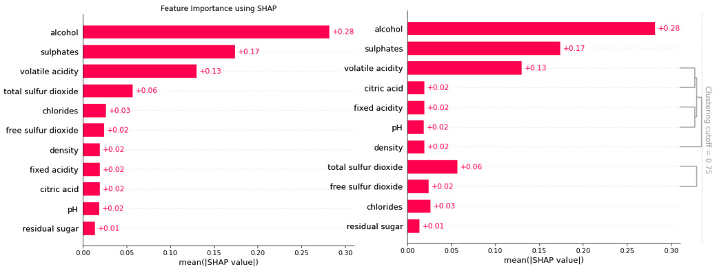
Figure 6.6 –A feature importance plot for global interpretability (left-hand side) and a feature clustering plot for global interpretability (right-hand side)
Next, let's explore SHAP Cohort plots.
Global interpretability with the Cohort plot
Sometimes, analyzing subgroups of data is an important part of data analysis. SHAP provides a very interesting way of grouping the data into certain defined cohorts to analyze feature importance. I found this to be a unique option in SHAP, which can be really helpful! This is an extension of the existing feature importance visualization, and it highlights feature importance for each of the cohorts for a better comparison.
Figure 6.7 shows us the cohort plot to compare two cohorts that are defined from the data:
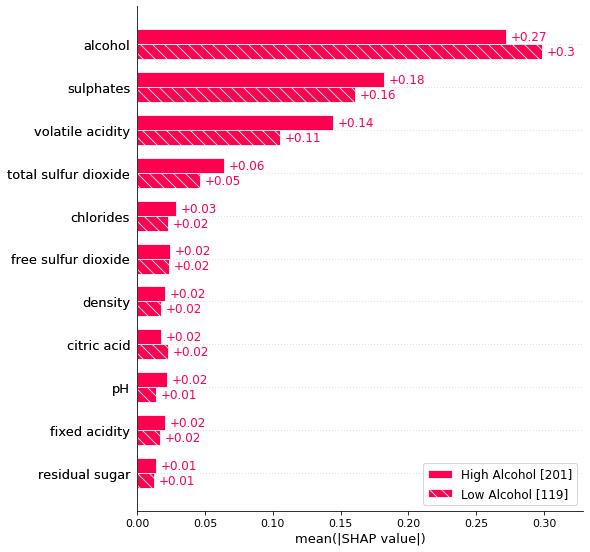
Figure 6.7 – A cohort plot visualization to compare feature importance between two cohorts
Next, we will explore SHAP heatmap plots.
Global interpretability with heatmap plots
To understand the overall impact of all features on the model at a more granular level, heatmap visualizations are extremely useful. The SHAP heatmap visualization shows how every feature value can positively or negatively impact the outcome. Additionally, the plot also includes a line plot to show how the model prediction varies with the positive or negative impact of feature values. However, for non-technical users, this visualization can be really challenging to interpret. This is one of the drawbacks of this visualization method.
Figure 6.8 illustrates a SHAP heatmap visualization:
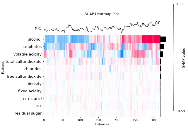
Figure 6.8 – A SHAP heatmap plot
Another popular choice of visualization for global interpretability using SHAP is summary plots. Let's discuss summary plots in the next section.
Global interpretability with summary plots
A summary plot is another visualization method in SHAP for providing global explainability of black-box models. It is a good replacement for the feature importance plot, which not only includes the important features but also the range of effects of these features present in the dataset. The color bar indicates the impact of the features. The features that influence the model's outcome in a positive way are highlighted in a particular color, whereas the features that impact the model's outcome negatively are represented in another contrasting color. The horizontal violin plot for each feature shows the distribution of the Shapley values of the features for each data instance.
The following screenshot illustrates a SHAP summary plot:
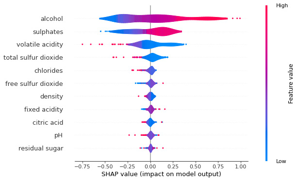
Figure 6.9 – A SHAP violin summary plot
In the next section, we will discuss SHAP dependence plots.
Global interpretability with dependence plots
In certain scenarios, it is important to analyze interactions between the features and how this interaction influences the model outcome. So, SHAP feature dependence plots show the variation of the model outcome by specific features. These plots are similar to the partial dependence plots, which were covered in Chapter 2, Model Explainability Methods. This plot can help to pick up interesting interaction patterns or trends between the feature values. The features used for selecting the color map are automatically picked up by the algorithm, based on the interaction with a specific selected feature.
Figure 6.10 illustrates a SHAP dependence plot:
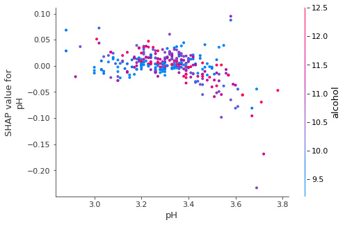
Figure 6.10 – A SHAP dependence plot for the pH feature
In this example, the selected feature is pH, and the feature used for selecting the colormap is alcohol. So, the plot tells us that with an increase in pH, the alcohol value also increases. This will be covered in greater detail in the next section.
In the next section, let's explore the SHAP visualization methods used for local explainability.
Local interpretability with bar plots
So far, we have covered various visualization techniques offered by SHAP for providing a global overview of the model. However, similar to LIME, SHAP is also model-agnostic that is designed to provide local explainability. SHAP provides certain visualization methods that can be applied to inference data for local explainability. Local feature importance using SHAP bar plots is one such local explainability method. This plot can help us analyze the positive and negative impact of the features that are present in the data. The features that impact the model's outcome positively are highlighted in one color (pinkish-red by default), and the features having a negative impact on the model outcome are represented using another color (blue by default). Also, as we have discussed before, if the Shapley value is zero for any feature, this indicates that the feature does not influence the model outcome at all. Additionally, the bar plot centers at zero to show the contribution of the features present in the data.
The following diagram shows a SHAP feature importance bar plot for local interpretability:
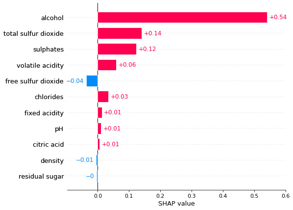
Figure 6.11 – A SHAP feature importance bar plot for local interpretability
Next, let's cover another SHAP visualization that is used for local interpretability.
Local interpretability with waterfall plots
Bar charts are not the only visualization provided by SHAP for local interpretability. The same information can be displayed using a waterfall plot, which might look more attractive. Perhaps, the only difference is that waterfall plots are not centered at zero, whereas bar plots are centered at zero. Otherwise, we get the same feature importance based on Shapley values and the positive or the negative impact of the specific features on the model outcome.
Figure 6.12 illustrates a SHAP waterfall plot for local interpretability:
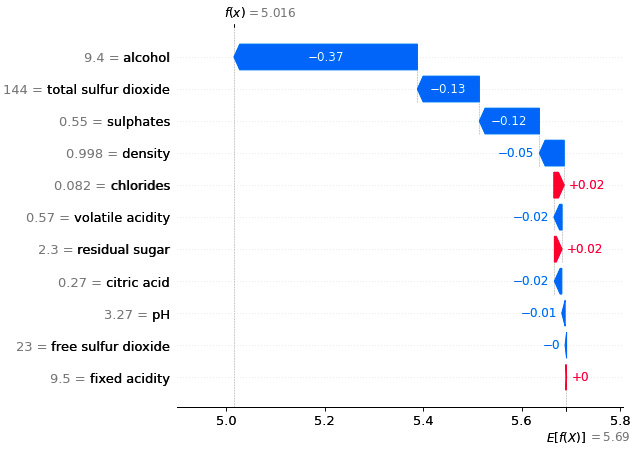
Figure 6.12 – A SHAP waterfall plot for local interpretability
Next, we will discuss force plot visualization in SHAP.
Local interpretability with force plot
We can also use force plots instead of waterfall or bar plots to explain local inference data. With force plots, we can see the model prediction, which is denoted by f(x), as shown in Figure 6.13. The base value in the following diagram represents the average predicted outcome of the model. The base value is actually used when the features present in the local data instance are not considered. So, using the force plot, we can also see how far the predicted outcome is from the base value. Additionally, we can see the feature impacts as the visual highlights certain features that try to increase the model prediction (which is represented in pink in Figure 6.13) along with other important features that have a negative influence on the model as it tries to lower the prediction value (which is represented in green in Figure 6.13).
So, Figure 6.13 illustrates a sample force plot visualization in SHAP:
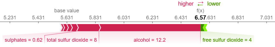
Figure 6.13 – A SHAP force plot for local interpretability
Although force plots might visually look very interesting, we would recommend using bar plots or waterfall plots if the dataset contains many features affecting the model outcome in a positive or a negative way.
Local interpretability with decision plots
The easiest way to explain something is by comparing it with a reference value. So far, in bar plots, waterfall plots, and even force plots, we do not see any reference values for the underlying features used. However, in order to find out whether the feature values are positively or negatively influencing the model outcome, the algorithm is actually trying to compare the feature values of the inference data with the mean of the feature values of the trained model. So, this is the reference value that is not displayed in the three local explainability visualization plots that we covered. But SHAP decision plots help us to compare the feature values of the local data instance with the mean feature values of the training dataset. Additionally, decision plots show the deviation of the feature values, the model prediction, and the direction of deviation of features from the reference values. If the direction of deviation is toward the right, this indicates that the feature is positively influencing the model outcome; if the direction of deviation is toward the left, this represents the negative influence of the feature on the model outcome. Different colors are used to highlight positive or negative influences. If there is no deviation, then the features are actually not influencing the model outcome.
The following diagram illustrates the use of decision plots to compare two different data instances for providing local explainability:
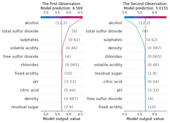
Figure 6.14 – SHAP decision plots for local interpretability
So far, you have seen the variety of visualization methods provided in SHAP for the global and local explainability of ML models. Now, let's discuss the various types of explainers in SHAP.
Explainers in SHAP
In the previous section, we looked at how the data visualization techniques that are available in SHAP can be used to provide explainability. But the choice of the visualization method might also depend on the choice of the explainer algorithm. As we discussed earlier, SHAP provides both model-specific and model-agnostic explainability. But the framework has multiple explainer algorithms that can be applied with different models and with different types of datasets. In this section, we will cover the various explainer algorithms provided in SHAP.
TreeExplainer
TreeExplainer is a fast implementation of the Tree SHAP algorithm (https://arxiv.org/pdf/1802.03888.pdf) for computing Shapley values for trees and tree-based ensemble learning algorithms. The algorithm makes many diverse possible assumptions about the feature dependence of the features present in the dataset. Only tree-based algorithms are supported such as Random Forest, XGBoost, LightGBM, and CatBoost. The algorithm relies on fast C++ implementations in either the local compiled C extension or inside an external model package, but it is faster than conventional Shapley value-based explainers. Generally, it is used for tree-based models trained on structured data for both classification and regression problems.
DeepExplainer
Similar to LIME, SHAP can also be applied to deep learning models trained on unstructured data, such as images and texts. SHAP uses DeepExplainer, which is based on the Deep SHAP algorithm for explaining deep learning models. The DeepExplainer algorithm is designed for deep learning models to approximate SHAP values. The algorithm is a modified version of the DeepLIFT algorithm (https://arxiv.org/abs/1704.02685). The developers of the framework have mentioned that the implementation of the Deep SHAP algorithm differs slightly from the original DeepLIFT algorithm. It uses a distribution of background samples rather than a single reference value. Additionally, the Deep SHAP algorithm also uses Shapley equations to linearize computations such as products, division, max, softmax, and more. The framework mostly supports deep learning frameworks such as TensorFlow, Keras, and PyTorch.
GradientExplainer
DeepExplainer is not the only explainer in SHAP that can be used with deep learning models. GradientExplainer can also work with deep learning models. The algorithm explains models using the concept of expected gradients. The expected gradient is an extension of Integrated Gradients (https://arxiv.org/abs/1703.01365), SHAP, and SmoothGrad (https://arxiv.org/abs/1706.03825), which combines the ideas of these algorithms into a single expected value equation. Consequently, similar to DeepExplainer, the entire dataset can be used as the background distribution sample instead of a single reference sample. This allows the model to be approximated with a linear function between individual samples of the data and the current input data instance that is to be explained. Since the input features are assumed to be independent, the expected gradients will calculate the approximate SHAP values.
For model explainability, the feature values with higher SHAP values are highlighted, as these features have a positive contribution toward the model's outcome. For unstructured data such as images, pixel positions that have the maximum contribution toward the model prediction are highlighted. Usually, GradientExplainer is slower than DeepExplainer as it makes different approximation assumptions.
The following diagram shows a sample GradientExplainer visualization for the local explainability of a classification model trained on images:
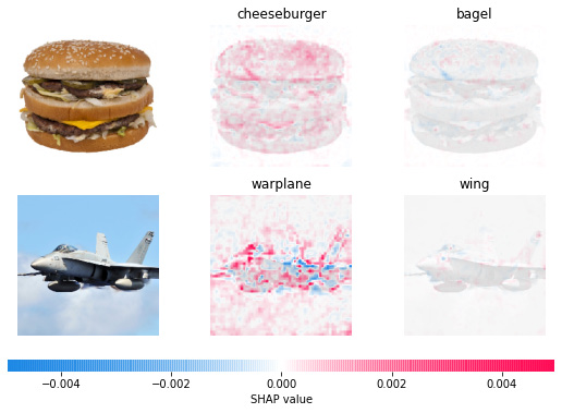
Figure 6.15 – Visualizations used by SHAP GradientExplainers for local explainability
Next, let's discuss SHAP KernelExplainers.
KernelExplainer
KernelExplainers in SHAP use the Kernel SHAP method to provide model-agnostic explainability. To estimate the SHAP values for any model, the Kernel SHAP algorithm utilizes a specifically weighted local linear regression approach to compute feature importance. The approach is similar to the LIME algorithm that we have discussed in Chapter 4, LIME for Model Interpretability. The major difference between Kernel SHAP and LIME is the approach that is adopted to assign weights to the instances in a regression model.
In LIME, the weights are assigned based on how close the local data instances are to the original instance. Whereas in Kernel SHAP, the weights are assigned based on the estimated Shapley values of the coalition of features used. In simple words, LIME assigns weights based on isolated features, whereas SHAP considers the combined effect of the features for assigning the weights. KernelExplainer is slower than model-specific algorithms as it does not make any assumptions about the model type.
LinearExplainer
SHAP LinearExplainer is designed for computing SHAP values for linear models to analyze inter-feature correlations. LinearExplainer also supports the estimation of the feature covariance matrix for coalition feature importance. However, finding feature correlations for a high-dimensional dataset can be computationally expensive. But LinearExplainers are fast and efficient as they use sampling to estimate a transformation. This is then used for explaining any outcome of linear models.
Therefore, we have discussed the theoretical aspect of various explainers in SHAP. For more information about these explainers, I do recommend checking out https://shap-lrjball.readthedocs.io/en/docs_update/api.html. In the next chapter, we will cover the practical implementation of the SHAP explainers using the code tutorials on GitHub in which we will implement the SHAP explainers for explaining models trained on different types of datasets. In the next section, we will cover a practical tutorial on how to use SHAP for explaining regression models to give you a glimpse of how to apply SHAP for model explainability.
Using SHAP to explain regression models
In the previous section, we learned about different visualizations and explainers in SHAP for explaining ML models. Now, I will give you practical exposure to using SHAP for providing model explainability. The framework is available as an open source project on GitHub: https://github.com/slundberg/shap. You can get the API documentation at https://shap-lrjball.readthedocs.io/en/docs_update/index.html. The complete tutorial is provided in the GitHub repository at https://github.com/PacktPublishing/Applied-Machine-Learning-Explainability-Techniques/blob/main/Chapter06/Intro_to_SHAP.ipynb. I strongly recommend that you read this section and execute the code side by side.
Setting up SHAP
Installing SHAP in Python can be done easily using the pip installer by using the following command in your console:
pip install shap
Since the tutorial requires you to have other Python frameworks installed, you can also try the following command to install all the necessary modules for the tutorial from the Jupyter notebook itself if it is not installed already:
!pip install --upgrade pandas numpy matplotlib seaborn scikit-learn shap
Now, let's import SHAP and check its version:
import shap
print(f"Shap version used: {shap.__version__}")The version that I have used for this tutorial is 0.40.0.
Please note that with different versions, there can be different changes to the API or different errors that you might face. So, I will recommend you to look at the latest documentation of the framework if you encounter any such issues. I have also added a SHAP Errata (https://github.com/PacktPublishing/Applied-Machine-Learning-Explainability-Techniques/tree/main/Chapter06/SHAP_ERRATA) in the repository for providing solutions to existing known issues with the SHAP framework.
Inspecting the dataset
For this tutorial, we will use the Red Wine Quality Dataset from Kaggle: https://www.kaggle.com/uciml/red-wine-quality-cortez-et-al-2009. The dataset has already been added to the code repository so that it is easy for you to access the data. This particular dataset contains information about the red variant of the Portuguese Vinho Verde wine, and it is derived from the original UCI source at https://archive.ics.uci.edu/ml/datasets/wine+quality.
Wine Quality Data Set
The credit for this dataset goes to P. Cortez, A. Cerdeira, F. Almeida, T. Matos and J. Reis. Modeling wine preferences by data mining from physicochemical properties.
We will use this dataset to solve a regression problem. We will load the data as a pandas DataFrame and perform an initial inspection:
data = pd.read_csv('dataset/winequality-red.csv')data.head()
Figure 6.16 illustrates a snapshot of the data:
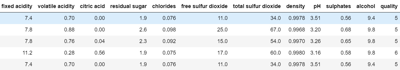
Figure 6.16 – Snapshot of the pandas DataFrame of the Wine Quality dataset
We can check some quick information about the dataset using the following command:
data.info()
This gives the following output:
RangeIndex: 1599 entries, 0 to 1598
Data columns (total 12 columns):
# Column Non-Null Count Dtype
--- ------ -------------- -----
0 fixed acidity 1599 non-null float64
1 volatile acidity 1599 non-null float64
2 citric acid 1599 non-null float64
3 residual sugar 1599 non-null float64
4 chlorides 1599 non-null float64
5 free sulfur dioxide 1599 non-null float64
6 total sulfur dioxide 1599 non-null float64
7 density 1599 non-null float64
8 pH 1599 non-null float64
9 sulphates 1599 non-null float64
10 alcohol 1599 non-null float64
11 quality 1599 non-null int64
dtypes: float64(11), int64(1)
memory usage: 150.0 KB
As you can see, our dataset consists of 11 numerical features and 1,599 records of data. The target outcome that the regression model will be learning is the quality of the wine, which is an integer feature. Although we are using this dataset for solving a regression problem, the same problem can be viewed as a classification problem and the same underlying data can be used.
The purpose of the tutorial is not for building an extremely efficient model, but rather to consider any model and use SHAP to explain the workings of the model. So, we will skip the EDA, data normalization, outlier detection, and even feature engineering steps, which are, otherwise, crucial steps for building a robust ML model. But missing values in the dataset can create problems for the SHAP algorithm. Therefore, I would suggest doing a quick check of missing values at the very least:
sns.displot(
data=data.isna().melt(value_name="missing"),
y="variable",
hue="missing",
multiple="fill",
aspect=1.5
)
plt.show()
The preceding lines of code will result in the following plot as its output:
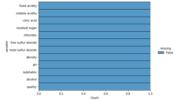
Figure 6.17 – The missing plot visualization for the dataset
Fortunately, the dataset doesn't have any missing values; otherwise, we might have to handle this before proceeding further. But we are good to proceed with the modeling step as there are no significant issues with the data.
Training the model
Since I do not have any pretrained model for this dataset, I thought of building a simple random forest model. We can divide the model into a training and a testing set using the 80:20 split ratio:
features = data.drop(columns=['quality'])
labels = data['quality']
# Dividing the data into training-test set with 80:20 split ratio
x_train,x_test,y_train,y_test = train_test_split(
features,labels,test_size=0.2, random_state=123)
To use the random forest algorithm, we would need to import this algorithm from the scikit-learn module and then fit the regression model on the training data:
from sklearn.ensemble import RandomForestRegressor
model = RandomForestRegressor(n_estimators=2000,
max_depth=30,
random_state=123)
model.fit(x_train, y_train)
Important Note
Considering the objective of this notebook, we are not doing an extensive hyperparameter tuning process. But I would strongly recommend you to perform all necessary best practices like EDA, feature engineering, hyperparameter tuning, cross-validation, and others for your use cases.
Once the trained model is ready, we will do a quick evaluation of the model using the metric of coefficient of determination (R2 coefficient):
model.score(x_test, y_test)
The model score obtained is just around 0.5, which indicates that the model is not very efficient. So, model explainability is even more important for such models. Now, let's use SHAP to explain the model.
Application of SHAP
Applying SHAP is very easy and can be done in a few lines of code. First, we will use the Shapley value-based explainer on the test dataset:
explainer = shap.Explainer(model)
shap_values = explainer(x_test)
Then, we can use the SHAP values for the various visualization techniques discussed earlier. The choice of the visualizations depends on whether we want to go for global explainability or local explainability. For example, for the summary plot shown in Figure 6.9, we can use the following code:
plt.title('Feature Importance using SHAP')shap.plots.bar(shap_values, show=True, max_display=12)
To provide local explainability, if we want to use the decision plot shown in Figure 6.14, we can try the following code:
expected_value = explainer.expected_value
shap_values = explainer.shap_values(x_test)[0]
shap.decision_plot(expected_value, shap_values, x_test)
To use a different explainer algorithm, we just need to select the appropriate explainer. For Tree Explainers, we can try the following code:
explainer = shap.TreeExplainer(model)
shap_values = explainer.shap_values(x_test)
The usage of this framework to explain the regression model while considering various aspects has already been covered in the notebook tutorial: https://github.com/PacktPublishing/Applied-Machine-Learning-Explainability-Techniques/blob/main/Chapter06/Intro_to_SHAP.ipynb.
In the next chapter, we will cover more interesting use cases. Next, let's discuss some advantages and disadvantages of this framework.
Advantages and limitations of SHAP
In the previous section, we discussed the practical application of SHAP for explaining a regression model with just a few lines of code. However, since SHAP is not the only explainability framework, we should be aware of the specific advantages and disadvantages of SHAP, too.
Advantages
The following is a list of some of the advantages of SHAP:
- Local explainability: Since SHAP provides local explainability to inference data, it enables users to analyze key factors that are positively or negatively affecting the model's decision-making process. As SHAP provides local explainability, it is useful for production-level ML systems, too.
- Global explainability: Global explainability provided in SHAP helps to extract key information about the model and the training data, especially from the collective feature importance plots. I think SHAP is better than LIME for getting a global perspective on the model. SP-LIME in LIME is good for getting an example-driven global perspective of the model, but I think SHAP provides a generalized global understanding of trained models.
- Model-agnostic and model-specific: SHAP can be model-agnostic and model-specific. So, it can work with black-box models and also work with complex deep learning models to provide explainability.
- Theoretical robustness: The concept of using Shapley values for model explainability, which is based on the principles of coalition game theory, captures feature interaction very well. Also, the properties of SHAP regarding efficiency, symmetry, dummy, and additivity are formulated on a robust theoretical foundation. Unlike SHAP, LIME is not based on a solid theory as it assumes ML models will behave linearly for some local data points. But there is not much theoretical evidence that proves why this assumption is true for all cases. That is why I would say SHAP is based on ideas that are theoretically more robust than LIME.
These advantages make SHAP one of the most popular choices of the XAI framework. Unfortunately, applying SHAP can be really challenging for high-dimensional datasets as it does not provide actionable explanations. Let's look at some of the limitations of SHAP.
Limitations
Here is a list of some of the limitations of SHAP:
- SHAP is not the preferred choice for high-dimensional data: Computing Shapley values on high-dimensional data can be computationally more challenging, as the time complexity of the algorithm is
 , where n is the total number of features in the dataset.
 - Shapley values are ineffective for selective explanation: Shapley values try to consider all the features for providing explainability. The explanations can be incorrect for sparse explanations, in which only selected features are considered. But usually, human-friendly explanations consider selective features. So, I would say that LIME is better than SHAP when you seek a selective explanation. However, more recent versions of the SHAP framework do include the same ideas as LIME and can be almost equally effective for sparse explanations.
- SHAP cannot be used for prescriptive insights: SHAP computes the Shapley values for each feature and does not build a prediction model like LIME. So, it cannot be used for analyzing any what-if scenario or for providing any counter-factual example for suggesting actionable insights.
- KernelSHAP can be slow: Although KernelSHAP is model-agnostic, it can be very slow and, thus, might not be suitable for production-level ML systems for models trained on high-dimensional data.
- Not extremely human-friendly: Apart from analyzing feature importance through feature interactions, SHAP visualizations can be complicated to interpret for any non-technical user. Often, non-technical users prefer simple selective actionable insights, recommendations, or justifications from ML models. Unfortunately, SHAP requires another layer of abstraction for human-friendly explanations when used in production systems.
As we can see from the points discussed in this section, SHAP might not be the most ideal framework for explainability, and there is a lot of space for improvement to make it more human-friendly. However, it is indeed an important and very useful framework for explaining black-box algorithms, especially for technical users. This brings us to the end of the chapter. Let's summarize what we have learned in the chapter.
Summary
In this chapter, we focused on understanding the importance of the SHAP framework for model explainability. By now, you have a good understanding of Shapley values and SHAP. We have covered how to use SHAP for model explainability through a variety of visualization and explainer methods. Also, we have covered a code walk-through for using SHAP to explain regression models. Finally, we discussed some advantages and limitations of the framework.
In the next chapter, we will cover more interesting practical use cases for applying SHAP on different types of datasets.
References
For additional information, please refer to the following resources:
- Shapley, Lloyd S. "A Value for n-Person Games." Contributions to the Theory of Games 2.28 (1953): https://doi.org/10.1515/9781400881970-018
- The Red Wine Quality dataset from Kaggle: https://www.kaggle.com/uciml/red-wine-quality-cortez-et-al-2009
- The SHAP GitHub project: https://github.com/slundberg/shap
- The official SHAP documentation: https://shap.readthedocs.io/en/latest/index.html