Chapter 10
Descriptive Statistics
In This Chapter
![]() Using the Descriptive Statistics tool
Using the Descriptive Statistics tool
![]() Creating a histogram
Creating a histogram
![]() Ranking by percentile
Ranking by percentile
![]() Calculating moving averages
Calculating moving averages
![]() Using the Exponential Smoothing tool
Using the Exponential Smoothing tool
![]() Sampling a population
Sampling a population
In this chapter, I describe and discuss the simple descriptive statistical data analysis tools that Excel supplies through the Data Analysis add-in. I also describe some of the really simple-to-use and easy-to-understand inferential statistical tools provided by the Data Analysis add-in — including the tools for calculating moving and exponential averages as well as the tools for generating random numbers and sampling.
 Descriptive statistics simply summarizes large (sometimes overwhelming) data sets with a few, key calculated values. For example, when you say something like, “Well, the biggest value in that data set is 345,” that’s a descriptive statistic.
The simple-yet-powerful Data Analysis tools can save you a lot of time. With a single command, for example, you can often produce a bunch of descriptive statistical measures such as mean, mode, standard deviation, and so on. What’s more, the other cool tools that you can use for preparing histograms, percentile rankings, and moving average schedules can really come in handy.
Perhaps the best thing about these tools, however, is that even if you’ve had only a little exposure to basic statistics, none of them are particularly difficult to use. All the hard work and all the dirty work gets done by Excel. All you have to do is describe where the input data is.
Note: You must usually install the Data Analysis tools before you can use them. To install them, go to File⇒Options. When Excel displays the Excel Options dialog box, select the Add-Ins item from the left box that appears along the left edge of the dialog box. Excel next displays a list of the possible add-ins — including the Analysis ToolPak add-in. (The Analysis ToolPak is what the Data Analysis tools are called.) Select the Analysis ToolPak item and click Go. Excel displays the Add-Ins dialog box. Select Analysis ToolPak from this dialog box and click OK. Excel installs the Analysis ToolPak add-in.
 In Excel 2007, you choose the Office⇒Excel Options command to display the Excel Options dialog box.
Using the Descriptive Statistics Tool
Perhaps the most common Data Analysis tool that you'll use is the one for calculating descriptive statistics. To see how this works, take a look at the worksheet shown in Figure 10-1. It summarizes sales data for a book publisher. In column A, the worksheet shows the suggested retail price (SRP). In column B, the worksheet shows the units sold of each book through one popular bookselling outlet. You might choose to use the Descriptive Statistics tool to summarize this data set.

Figure 10-1: A sample data set.
To calculate descriptive statistics for the data set shown in Figure 10-1, follow these steps:
- Click the Data tab’s Data Analysis command button to tell Excel that you want to calculate descriptive statistics.
Excel displays the Data Analysis dialog box, as shown in Figure 10-2.
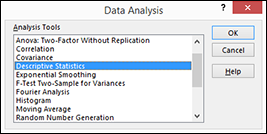
Figure 10-2: The Data Analysis dialog box.
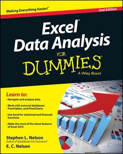
- In Data Analysis dialog box, highlight the Descriptive Statistics entry in the Analysis Tools list and then click OK.
Excel displays the Descriptive Statistics dialog box, as shown in Figure 10-3.

Figure 10-3: The Descriptive Statistics dialog box.
- In the Input section of the Descriptive Statistics dialog box, identify the data that you want to describe.
- To identify the data that you want to describe statistically: Click the Input Range text box and then enter the worksheet range reference for the data. In the case of the worksheet shown earlier in Figure 10-1, the input range is $A$1:$C$38. Note that Excel wants the range address to use absolute references — hence, the dollar signs.
To make it easier to see or select the worksheet range, click the worksheet button at the right end of the Input Range text box. When Excel hides the Descriptive Statistics dialog box, select the range that you want by dragging the mouse. Then click the worksheet button again to redisplay the Descriptive Statistics dialog box.
- To identify whether the data is arranged in columns or rows: Select either the Columns or the Rows radio button.
- To indicate whether the first row holds labels that describe the data: Select the Labels in First Row check box. In the case of the worksheet shown in Figure 10-1, the data is arranged in columns, and the first row does hold labels, so you select the Columns radio button and the Labels in First Row check box.
- To identify the data that you want to describe statistically: Click the Input Range text box and then enter the worksheet range reference for the data. In the case of the worksheet shown earlier in Figure 10-1, the input range is $A$1:$C$38. Note that Excel wants the range address to use absolute references — hence, the dollar signs.
- In the Output Options area of the Descriptive Statistics dialog box, describe where and how Excel should produce the statistics.
- To indicate where the descriptive statistics that Excel calculates should be placed: Choose from the three radio buttons here — Output Range, New Worksheet Ply, and New Workbook. Typically, you place the statistics onto a new worksheet in the existing workbook. To do this, simply select the New Worksheet Ply radio button.
- To identify what statistical measures you want calculated: Use the Output Options check boxes. Select the Summary Statistics check box to tell Excel to calculate statistical measures such as mean, mode, and standard deviation. Select the Confidence Level for Mean check box to specify that you want a confidence level calculated for the sample mean. (Note: If you calculate a confidence level for the sample mean, you need to enter the confidence level percentage into the text box provided.) Use the Kth Largest and Kth Smallest check boxes to indicate you want to find the largest or smallest value in the data set.
After you describe where the data is and how the statistics should be calculated, click OK. Figure 10-4 shows a new worksheet with the descriptive statistics calculated, added into a new sheet, Sheet 2. Table 10-1 describes the statistics that Excel calculates.
Table 10-1 The Measures That the Descriptive Statistics Tool Calculates
Statistic
Description
Mean
Shows the arithmetic mean of the sample data.
Standard Error
Shows the standard error of the data set (a measure of the difference between the predicted value and the actual value).
Median
Shows the middle value in the data set (the value that separates the largest half of the values from the smallest half of the values).
Mode
Shows the most common value in the data set.
Standard Deviation
Shows the sample standard deviation measure for the data set.
Sample Variance
Shows the sample variance for the data set (the squared standard deviation).
Kurtosis
Shows the kurtosis of the distribution.
Skewness
Shows the skewness of the data set’s distribution.
Range
Shows the difference between the largest and smallest values in the data set.
Minimum
Shows the smallest value in the data set.
Maximum
Shows the largest value in the data set.
Sum
Adds all the values in the data set together to calculate the sum.
Count
Counts the number of values in a data set.
Largest(X)
Shows the largest X value in the data set.
Smallest(X)
Shows the smallest X value in the data set.
Confidence Level(X) Percentage
Shows the confidence level at a given percentage for the data set values.
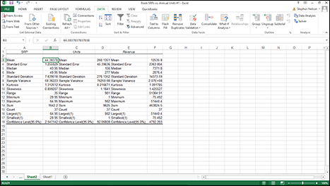
Figure 10-4: A new worksheet with the descriptive statistics calculated.
Creating a Histogram
Use the Histogram Data Analysis tool to create a frequency distribution and, optionally, a histogram chart. A frequency distribution shows just how values in a data set are distributed across categories. A histogram shows the same information in a cute little column chart. Here’s an example of how all this works — everything will become clearer if you’re currently confused.
To use the Histogram tool, you first need to identify the bins (categories) that you want to use to create a frequency distribution. The histogram plots out how many times your data falls into each of these categories. Figure 10-5 shows the same worksheet as Figure 10-1, only this time with bins information in the worksheet range E1:E12. The bins information shows Excel exactly what bins (categories) you want to use to categorize the unit sales data. The bins information shown in the worksheet range E1:E12, for example, create hundred-unit bins: 0-100, 101-200, 201-300, and so on.
Figure 10-5: Another version of the book sales information worksheet.
To create a frequency distribution and a histogram using the data shown in Figure 10-5, follow these steps:
- Click the Data tab’s Data Analysis command button to tell Excel that you want to create a frequency distribution and a histogram.
- When Excel displays the Data Analysis dialog box (refer to Figure 10-2), select Histogram from the Analysis Tools list and click OK.
- In the Histogram dialog box that appears, as shown in Figure 10-6, identify the data that you want to analyze.
Use the Input Range text box to identify the data that you want to use to create a frequency distribution and histogram. If you want to create a frequency distribution and histogram of unit sales data, for example, enter the worksheet range $B$1:$B$38 into the Input Range text box.
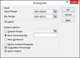
Figure 10-6: Create a histogram here.
To identify the bins that you use for the frequency distribution and histogram, enter the worksheet range that holds the bins into the Bin Range text box. In the case of the example worksheet shown in Figure 10-5, the bin range is $E$1:$E$12.
If your data ranges include labels (as they do in Figure 10-5), select the Labels check box.
- Tell Excel where to place the frequency distribution and histogram.
Use the Output Options buttons to tell Excel where it should place the frequency distribution and histogram. To place the histogram in the current worksheet, for example, select the Output Range radio button and then enter the range address into its corresponding Output Range text box.
To place the frequency distribution and histogram in a new worksheet, select the New Worksheet Ply radio button. Then, optionally, enter a name for the worksheet into the New Worksheet Ply text box. To place the frequency distribution and histogram information in a new workbook, select the New Workbook radio button.
- (Optional) Customize the histogram.
Make choices from the Output Options check boxes to control what sort of histogram Excel creates. For example, select the Pareto (Sorted Histogram) check box, and Excel sorts bins in descending order. Conversely, if you don't want bins sorted in descending order, leave the Pareto (Sorted Histogram) check box clear.
Selecting the Cumulative Percentage check box tells Excel to plot a line showing cumulative percentages in your histogram.
Optionally, select the Chart Output check box to have Excel include a histogram chart with the frequency distribution. If you don’t select this check box, you don't get the histogram — only the frequency distribution.
- Click OK.
Excel creates the frequency distribution and, optionally, the histogram. Figure 10-7 shows the frequency distribution along with a histogram for the workbook data shown in Figure 10-5.
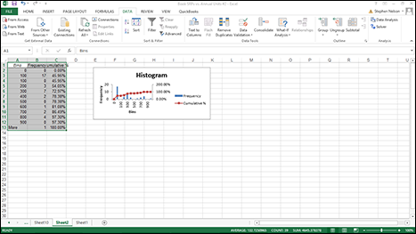
Figure 10-7: Create a frequency distribution to show how values in your data set spread out.
Note: Excel also provides a Frequency function with which you use can use arrays to create a frequency distribution. For more information about how the Frequency function works, see Chapter 9.
Ranking by Percentile
The Data Analysis collection of tools includes an option for calculating rank and percentile information for values in your data set. Suppose, for example, that you want to rank the sales revenue information shown in Figure 10-8. To calculate rank and percentile statistics for your data set, take the following steps.
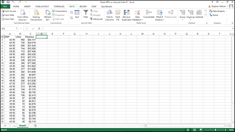
Figure 10-8: The book sales information (yes, again).
- Begin to calculate ranks and percentiles by clicking the Data tab’s Data Analysis command button.
- When Excel displays the Data Analysis dialog box, select Rank and Percentile from the list and click OK.
Excel displays the Rank and Percentile dialog box, as shown in Figure 10-9.
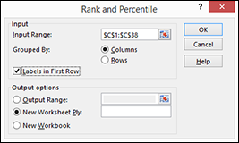
Figure 10-9: Calculate ranks and percentiles here.
- Identify the data set.
Enter the worksheet range that holds the data into the Input Range text box of the Ranks and Percentile dialog box.
To indicate how you have arranged data, select one of the two Grouped By radio buttons: Columns or Rows. To indicate whether the first cell in the input range is a label, select or deselect the Labels In First Row check box.
- Describe how Excel should output the data.
Select one of the three Output Options radio buttons to specify where Excel should place the rank and percentile information.
- After you select an output option, click OK.
Excel creates a ranking like the one shown in Figure 10-10.
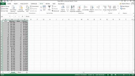
Figure 10-10: A rank and percentile worksheet based on the data from Figure 10-8.
Calculating Moving Averages
The Data Analysis command also provides a tool for calculating moving and exponentially smoothed averages. Suppose, for sake of illustration, that you’ve collected daily temperature information like that shown in Figure 10-11. You want to calculate the three-day moving average — the average of the last three days — as part of some simple weather forecasting. To calculate moving averages for this data set, take the following steps.

Figure 10-11: A worksheet for calculating a moving average of temperatures.
- To calculate a moving average, first click the Data tab’s Data Analysis command button.
- When Excel displays the Data Analysis dialog box, select the Moving Average item from the list and then click OK.
Excel displays the Moving Average dialog box, as shown in Figure 10-12.
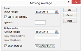
Figure 10-12: Calculate moving averages here.
- Identify the data that you want to use to calculate the moving average.
Click in the Input Range text box of the Moving Average dialog box. Then identify the input range, either by typing a worksheet range address or by using the mouse to select the worksheet range.
Your range reference should use absolute cell addresses. An absolute cell address precedes the column letter and row number with $ signs, as in $A$1:$A$10.If the first cell in your input range includes a text label to identify or describe your data, select the Labels in First Row check box.
- In the Interval text box, tell Excel how many values to include in the moving average calculation.
 You can calculate a moving average using any number of values. By default, Excel uses the most recent three values to calculate the moving average. To specify that some other number of values be used to calculate the moving average, enter that value into the Interval text box.
 - Tell Excel where to place the moving average data.
Use the Output Range text box to identify the worksheet range into which you want to place the moving average data. In the worksheet example shown in Figure 10-11, for example, I place the moving average data into the worksheet range B2:B10. (See Figure 10-12.)
- (Optional) Specify whether you want a chart.
If you want a chart that plots the moving average information, select the Chart Output check box.
- (Optional) Indicate whether you want standard error information calculated.
If you want to calculate standard errors for the data, select the Standard Errors check box. Excel places standard error values next to the moving average values. (In Figure 10-11, the standard error information goes into C2:C10.)
- After you finish specifying what moving average information you want calculated and where you want it placed, click OK.
Excel calculates moving average information, as shown in Figure 10-13.
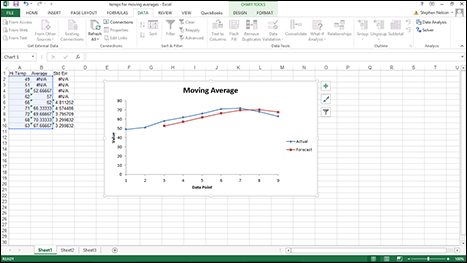
Figure 10-13: The worksheet with the moving averages information.
Note: If Excel doesn't have enough information to calculate a moving average for a standard error, it places the error message #N/A into the cell. In Figure 10-13, you can see several cells that show this error message as a value.
Exponential Smoothing
The Exponential Smoothing tool also calculates the moving average. However, exponential smoothing weights the values included in the moving average calculations so that more recent values have a bigger effect on the average calculation and old values have a lesser effect. This weighting is accomplished through a smoothing constant.
To illustrate how the Exponential Smoothing tool works, suppose that you’re again looking at the average daily temperature information. (I repeat this worksheet in Figure 10-14.)
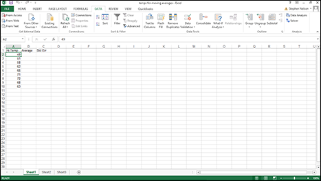
Figure 10-14: A worksheet of temperature information.
To calculate weighted moving averages using exponential smoothing, take the following steps:
- To calculate an exponentially smoothed moving average, first click the Data tab’s Data Analysis command button.
- When Excel displays the Data Analysis dialog box, select the Exponential Smoothing item from the list and then click OK.
Excel displays the Exponential Smoothing dialog box, as shown in Figure 10-15.
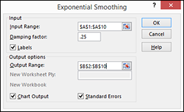
Figure 10-15: Calculate exponential smoothing here.
- Identify the data.
To identify the data for which you want to calculate an exponentially smoothed moving average, click in the Input Range text box. Then identify the input range, either by typing a worksheet range address or by selecting the worksheet range. If your input range includes a text label to identify or describe your data, select the Labels check box.
- Provide the smoothing constant.
Enter the smoothing constant value in the Damping Factor text box. The Excel Help file suggests that you use a smoothing constant of between 0.2 and 0.3. Presumably, however, if you’re using this tool, you have your own ideas about what the correct smoothing constant is. (If you’re clueless about the smoothing constant, perhaps you shouldn't be using this tool.)
- Tell Excel where to place the exponentially smoothed moving average data.
Use the Output Range text box to identify the worksheet range into which you want to place the moving average data. In the worksheet example shown in Figure 10-14, for example, you place the moving average data into the worksheet range B2:B10.
- (Optional) Chart the exponentially smoothed data.
To chart the exponentially smoothed data, select the Chart Output check box.
- (Optional) Indicate that you want standard error information calculated.
To calculate standard errors, select the Standard Errors check box. Excel places standard error values next to the exponentially smoothed moving average values.
- After you finish specifying what moving average information you want calculated and where you want it placed, click OK.
Excel calculates moving average information, as shown in Figure 10-16.
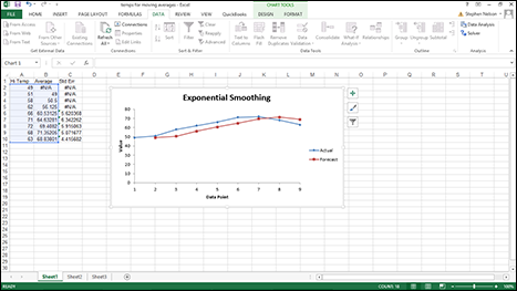
Figure 10-16: The average daily temperature worksheet with exponentially smoothed values.
Generating Random Numbers
The Data Analysis command also includes a Random Number Generation tool. The Random Number Generation tool is considerably more flexible than the =Rand() function, which is the other tool that you have available within Excel to produce random numbers. The Random Number Generation tool isn’t really a tool for descriptive statistics. You would probably typically use the tool to help you randomly sample values from a population, but I describe it here in this chapter, anyway, because it works like the other descriptive statistics tools.
To produce random numbers, take the following steps:
- To generate random numbers, first click the Data tab’s Data Analysis command button.
Excel displays the Data Analysis dialog box.
- In the Data Analysis dialog box, select the Random Number Generation entry from the list and then click OK.
Excel displays the Random Number Generation dialog box, as shown in Figure 10-17.

Figure 10-17: Generate random numbers here.
- Describe how many columns and rows of values that you want.
Use the Number of Variables text box to specify how many columns of values you want in your output range. Similarly, use the Number of Random Numbers text box to specify how many rows of values you want in the output range.
You don't absolutely need to enter values into these two text boxes, by the way. You can also leave them blank. In this case, Excel fills all the columns and all the rows in the output range. - Select the distribution method.
Select one of the distribution methods from the Distribution drop-down list. The Distribution drop-down list provides several distribution methods: Uniform, Normal, Bernoulli, Binomial, Poisson, Patterned, and Discrete. Typically, if you want a pattern of distribution other than Uniform, you'll know which one of these distribution methods is appropriate. For example, if you want to pull random numbers from a data set that's normally distributed, you might select the Normal distribution method.
- (Optional) Provide any parameters needed for the distribution method.
If you select a distribution method that requires parameters, or input values, use the Parameters text box (Value and Probability Input Range) to identify the worksheet range that holds the parameters needed for the distribution method.
- (Optional) Select a starting point for the random number generation.
You have the option of entering a value that Excel will use to start its generation of random numbers. The benefit of using a Random Seed value, as Excel calls it, is that you can later produce the same set of random numbers by planting the same “seed.”
- Identify the output range.
Use the Output Options radio buttons to select the location that you want for random numbers.
- After you describe how you want Excel to generate random numbers and where those numbers should be placed, click OK.
Excel generates the random numbers.
Sampling Data
One other data analysis tool — the Sampling tool — deserves to be discussed someplace. I describe it here, even if it doesn’t fit perfectly.
Truth be told, both the Random Number Generation tool (see the preceding section) and the Sampling tool are probably what you would use while preparing to perform inferential statistical analysis of the sort that I describe in Chapter 11. But because these tools work like (and look like) the other descriptive statistics tools, I describe them here.
With the Sampling tool that's part of the Data Analysis command, you can randomly select items from a data set or select every nth item from a data set. For example, suppose that as part of an internal audit, you want to randomly select five titles from a list of books. To do so, you could use the Sampling tool. For purposes of this discussion, pretend that you’re going to use the list of books and book information shown in Figure 10-18.
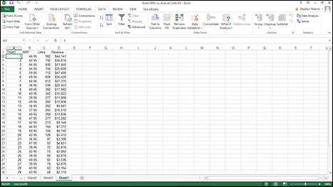
Figure 10-18: A simple worksheet from which you might select a sample.
To sample items from a worksheet like the ones shown in Figure 10-18, take the following steps:
- To tell Excel that you want to sample data from a data set, first click the Data tab’s Data Analysis command button.
- When Excel displays the Data Analysis dialog box, select Sampling from the list and then click OK.
Excel displays the Sampling dialog box, as shown in Figure 10-19.
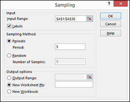
Figure 10-19: Set a data sampling here.
- Identify the input range.
Use the Input Range text box to describe the worksheet range that contains enough data to identify the values in the data set. For example, in the case of the data set like the one shown in Figure 10-18, the information in column A — TitleID — uniquely identifies items in the data set. Therefore, you can identify (or uniquely locate) items using the input range A1:A38. You can enter this range into the Input Range text box either by directly typing it or by clicking in the text box and then dragging the cursor from cell A1 to cell A38.
If the first cell in the input range holds the text label that describes the data — this is the case in Figure 10-18 — select the Labels check box.
- Choose a sampling method.
Excel provides two sampling methods for retrieving or identifying items in your data set:
- Periodic: A periodic sampling method grabs every nth item from the data set. For example, if you choose every fifth item, that’s periodic sampling. To select or indicate that you want to use periodic sampling, select the Periodic radio button. Then enter the period into its corresponding Period text box.
- Random: To randomly choose items from the data set, select the Random radio button and then enter the number of items that you want in the Number of Samples text box.
- Select an output area.
Select from the three radio buttons in the Output Options area to select where the sampling result should appear. To put sampling results into an output range in the current worksheet, select the Output Range radio button and then enter the output range into the text box provided. To store the sampling information in a new worksheet or on a new workbook, select either the New Worksheet Ply or the New Workbook radio button.
Note that Excel grabs item information from the input range. For example, Figure 10-20 shows the information that Excel places on a new worksheet if you use periodic sampling and grab every fifth item. Figure 10-21 shows how Excel identifies the sample if you randomly select five items. Note that the values shown in both Figures 10-20 and 10-21 are the title ID numbers from the input range.
Figure 10-20: An example of periodic sampling.
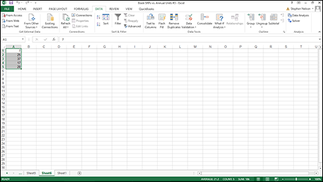
Figure 10-21: An example of random sampling.