Chapter 11
Inferential Statistics
In This Chapter
![]() Discovering the Data Analysis t-test tools
Discovering the Data Analysis t-test tools
![]() Performing a z-test
Performing a z-test
![]() Creating a scatter plot
Creating a scatter plot
![]() Using the Regression tool that comes with Data Analysis
Using the Regression tool that comes with Data Analysis
![]() Using the Correlation tool that comes with Data Analysis
Using the Correlation tool that comes with Data Analysis
![]() Implementing the ANOVA data analysis tools
Implementing the ANOVA data analysis tools
![]() Comparing variances from populations with the f-test Data Analysis tool
Comparing variances from populations with the f-test Data Analysis tool
![]() Using the Fourier Data Analysis tool
Using the Fourier Data Analysis tool
In this chapter, I talk about the more sophisticated tools provided by the Excel Data Analysis add-in, such as t-test, z-test, scatter plot, regression, correlation, ANOVA, f-test, and Fourier. With these other tools, you can perform inferential statistics, which you use to first look at a set of sample observations drawn from a population and then draw conclusions — or make inferences — about the population’s characteristics. (To read about the simpler descriptive statistical data analysis tools that Excel supplies through the Data Analysis add-in, skip back to Chapter 10.)
Obviously, in order to use these tools, you need pretty developed statistical skills, a good basic statistics course in college or graduate school, and then probably one follow-up course. But with some reasonable knowledge of statistics and a bit of patience, you can use some of these tools to good advantage.
Note: You must install the Data Analysis add-in before you can use it. To install the Data Analysis add-in, choose File⇒Excel Options. When Excel displays the Excel Options dialog box, select the Add-Ins item from the left box that appears along the left edge of the Excel Options dialog box. Excel next displays a list of the possible add-ins, including the Analysis ToolPak add-in. Select the Analysis ToolPak item and click Go. Excel displays the Add-Ins dialog box. Select Analysis ToolPak from this dialog box and click OK. Excel installs the Analysis ToolPak add-in.
 In Excel 2007, you choose Office⇒Excel Options to install the Data Analysis add-in.
The sample workbooks used in the examples in this chapter can be downloaded from the book's companion website. See this book's Introduction for instructions on how to access the website.
Using the t-test Data Analysis Tool
The Excel Data Analysis add-in provides three tools for working with t-values and t-tests, which can be useful when you want to make inferences about very small data sets:
- t-Test: Paired Two Sample for Means
- t-Test: Two-Sample Assuming Equal Variances
- t-Test: Two-Sample Assuming Unequal Variances
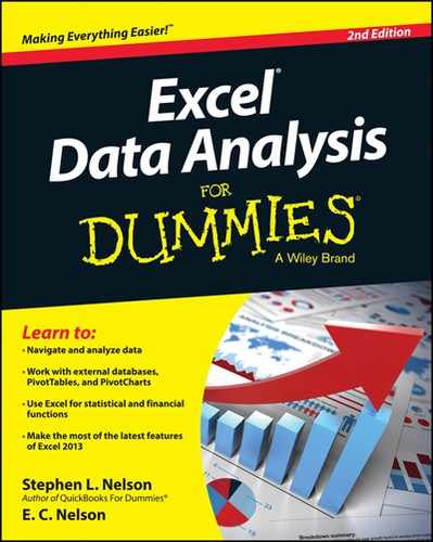
Briefly, here’s how these three tools work. For sake of illustration, assume that you’re working with the values shown in Figure 11-1. The worksheet range A1:A21 contains the first set of values. The worksheet range B1:B21 contains the second set of values.
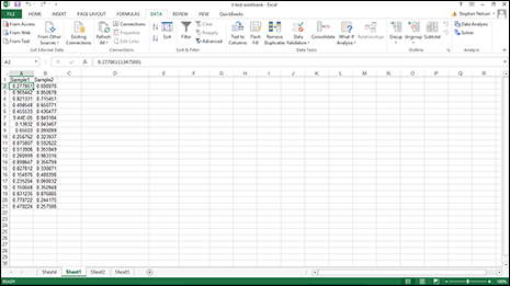
Figure 11-1: Some fake data you can use to perform t-test calculations.
To perform a t-test calculation, follow these steps:
- Choose Data tab’s Data Analysis.
- When Excel displays the Data Analysis dialog box, as shown in Figure 11-2, select the appropriate t-test tool from its Analysis Tools list.
- t-Test: Paired Two-Sample For Means: Choose this tool when you want to perform a paired two-sample t-test.
- t-Test: Two-Sample Assuming Equal Variances: Choose this tool when you want to perform a two-sample test and you have reason to assume the means of both samples equal each other.
- t-Test: Two-Sample Assuming Unequal Variances: Choose this tool when you want to perform a two-sample test but you assume that the two-sample variances are unequal.
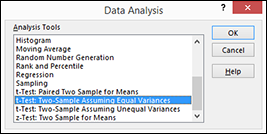
Figure 11-2: Select your Data Analysis tool here.
- After you select the correct t-test tool, click OK.
Excel then displays the appropriate t-test dialog box. Figure 11-3 shows the t-Test: Paired Two Sample Assuming Equal Variances dialog box.
 The other t-test dialog boxes look very similar.
Figure 11-3: The t-Test: Paired Two-Sample Assuming Equal Variances dialog box.
- In the Variable 1 Range and Variable 2 Range input text boxes, identify the sample values by telling Excel in what worksheet ranges you've stored the two samples.
You can enter a range address into these text boxes. Or you can click in the text box and then select a range by clicking and dragging. If the first cell in the variable range holds a label and you include the label in your range selection, of course, select the Labels check box.
- Use the Hypothesized Mean Difference text box to indicate whether you hypothesize that the means are equal.
If you think the means of the samples are equal, enter 0 (zero) into this text box. If you hypothesize that the means are not equal, enter the mean difference.
- In the Alpha text box, state the confidence level for your t-test calculation.
The confidence level is between 0 and 1. By default, the confidence level is equal to 0.05, which is equivalent to a 5-percent confidence level.
- In the Output Options section, indicate where the t-test tool results should be stored.
Here, select one of the radio buttons and enter information in the text boxes to specify where Excel should place the results of the t-test analysis. For example, to place the t-test results into a range in the existing worksheet, select the Output Range radio button, and then identify the range address in the Output Range text box. If you want to place the t-test results someplace else, select one of the other option radio buttons.
- Click OK.
Excel calculates the t-test results. Figure 11-4 shows the t-test results for a Paired Two Sample Assuming Equal Variances test. The t-test results show the mean for each of the data sets, the variance, the number of observations, the pooled variance value, the hypothesized mean difference, the degrees of freedom (abbreviated as df), the t-value (or t-stat), and the probability values for one-tail and two-tail tests.
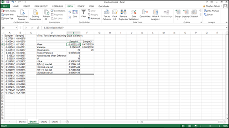
Figure 11-4: The results of a t-test.
Performing z-test Calculations
If you know the variance or standard deviation of the underlying population, you can calculate z-test values by using the Data Analysis add-in. You might typically work with z-test values to calculate confidence levels and confidence intervals for normally distributed data. To do this, take these steps:
- To select the z-test tool, click the Data tab’s Data Analysis command button.
- When Excel displays the Data Analysis dialog box (refer to Figure 11-2), select the z-Test: Two Sample for Means tool and then click OK.
Excel then displays the z-Test: Two Sample for Means dialog box, as shown in Figure 11-5.
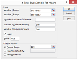
Figure 11-5: Perform a z-test from here.
- In the Variable 1 Range and Variable 2 Range text boxes, identify the sample values by telling Excel in what worksheet ranges you've stored the two samples.
You can enter a range address into the text boxes here or you can click in the text box and then select a range by clicking and dragging. If the first cell in the variable range holds a label and you include the label in your range selection, select the Labels check box.
- Use the Hypothesized Mean Difference text box to indicate whether you hypothesize that the means are equal.
If you think that the means of the samples are equal, enter 0 (zero) into this text box or leave the text box empty. If you hypothesize that the means are not equal, enter the difference.
- Use the Variable 1 Variance (Known) and Variable 2 Variance (Known) text boxes to provide the population variance for the first and second samples.
- In the Alpha text box, state the confidence level for your z-test calculation.
The confidence level is between 0 and 1. By default, the confidence level equals 0.05 (equivalent to a 5-percent confidence level).
- In the Output Options section, indicate where the z-test tool results should be stored.
To place the z-test results into a range in the existing worksheet, select the Output Range radio button and then identify the range address in the Output Range text box. If you want to place the z-test results someplace else, use one of the other options.
- Click OK.
Excel calculates the z-test results. Figure 11-6 shows the z-test results for a Two Sample for Means test. The z-test results show the mean for each of the data sets, the variance, the number of observations, the hypothesized mean difference, the z-value, and the probability values for one-tail and two-tail tests.
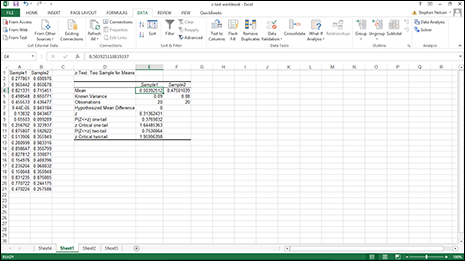
Figure 11-6: The z-test calculation results.
Creating a Scatter Plot
One of the most interesting and useful forms of data analysis is regression analysis. In regression analysis, you explore the relationship between two sets of values, looking for association. For example, you can use regression analysis to determine whether advertising expenditures are associated with sales, whether cigarette smoking is associated with heart disease, or whether exercise is associated with longevity.
Often your first step in any regression analysis is to create a scatter plot, which lets you visually explore association between two sets of values. In Excel, you do this by using an XY (Scatter) chart. For example, suppose that you want to look at or analyze the values shown in the worksheet displayed in Figure 11-7. The worksheet range A1:A11 shows numbers of ads. The worksheet range B1:B11 shows the resulting sales. With this collected data, you can explore the effect of ads on sales—or the lack of an effect.
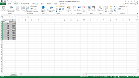
Figure 11-7: A worksheet with data you might analyze by using regression.
To create a scatter chart of this information, take the following steps:
- Select the worksheet range A1:B11.
- On the Insert tab, click the XY (Scatter) chart command button.
- Select the Chart subtype that doesn't include any lines.
Excel displays your data in an XY (scatter) chart, as shown in Figure 11-8.
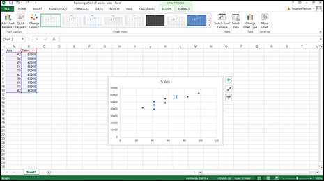
Figure 11-8: The XY (scatter) chart.
- Confirm the chart data organization.
Confirm that Excel has in fact correctly arranged your data by looking at the chart.
If you aren't happy with the chart’s data organization — maybe the data seems backward or flip-flopped — click the Switch Row/Column command button on the Chart Tools Design tab. (You can even experiment with the Switch Row/Column command, so try it if you think it might help.) Note that in Figure 11-8, the data is correctly organized. The chart shows the common-sense result that increased advertising seems to connect with increased sales.
- Annotate the chart, if appropriate.
Add those little flourishes to your chart that will make it more attractive and readable. For example, you can use the Chart Title and Axis Titles buttons to annotate the chart with a title and with descriptions of the axes used in the chart.
In Chapter 7, I discuss in detail the mechanics of customizing a chart using the Chart Options dialog box. Refer there if you have questions about how to work with the Titles, Axes, Gridlines, Legend, or Data Labels tabs. - Add a trendline by clicking the Add Chart Element menu’s Trendline command button.
To display the Add Chart Element menu, click the Design tab and then click the Add Chart Element command. For the Design tab to be displayed, you must have either first selected an embedded chart object or displayed a chart sheet.
Excel displays the Trendline menu. Select the type of trendline or regression calculation that you want by clicking one of the trendline options available. For example, to perform simple linear regression, click the Linear button.
In Excel 2007, you add a trendline by clicking the Chart Tools Layout tab’s Trendline command. - Add the Regression Equation to the scatter plot.
To show the equation for the trendline that the scatter plot uses, choose the More Trendline Options command from the Trendline menu.
Then select both the Display Equation on Chart and the Display R-Squared Value on Chart check boxes. This tells Excel to add the simple regression analysis information necessary for a trendline to your chart. Note that you may need to scroll down the pane to see these check boxes.
In Excel 2007 and Excel 2010, you click the Charting Layout tab’s Trendline button and choose the More Trendlines Option to display the Format Trendline dialog box. Use the radio buttons and text boxes in the Format Trendline pane (shown in Figure 11-9) to control how the regression analysis trendline is calculated. For example, you can use the Set Intercept = check box and text box to force the trendline to intercept the x-axis at a particular point, such as zero. You can also use the Forecast Forward and Backward text boxes to specify that a trendline should be extended backward or forward beyond the existing data or before it.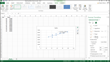
Figure 11-9: The Format Trendline pane.
- Click OK.
You can barely see the regression data in Figure 11-9, so in Figure 11-10, I remove the Format Trendline pane, resize the chart, and move the regression data so it’s more legible.
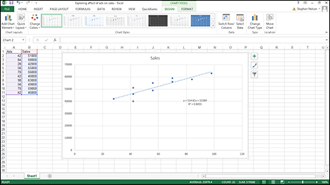
Figure 11-10: The Scatter Plot chart with the regression data.
Using the Regression Data Analysis Tool
You can move beyond the visual regression analysis that the scatter plot technique provides. (Read the previous section for more on this technique.) You can use the Regression tool provided by the Data Analysis add-in. For example, say that you used the scatter plotting technique, as I describe earlier, to begin looking at a simple data set. And, after that initial examination, suppose that you want to look more closely at the data by using full blown, take-no-prisoners, regression. To perform regression analysis by using the Data Analysis add-in, do the following:
- Tell Excel that you want to join the big leagues by clicking the Data Analysis command button on the Data tab.
- When Excel displays the Data Analysis dialog box, select the Regression tool from the Analysis Tools list and then click OK.
Excel displays the Regression dialog box, as shown in Figure 11-11.
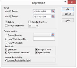
Figure 11-11: The Regression dialog box.
- Identify your Y and X values.
Use the Input Y Range text box to identify the worksheet range holding your dependent variables. Then use the Input X Range text box to identify the worksheet range reference holding your independent variables.
Each of these input ranges must be a single column of values. For example, if you want to use the Regression tool to explore the effect of advertisements on sales (this is the same information shown earlier in the scatter plot discussion in Figure 11-10), you enter $A$1:$A$11 into the Input X Range text box and $B$1:$B$11 into the Input Y Range text box. If your input ranges include a label, as is the case of the worksheet shown earlier in Figure 11-10, select the Labels check box.
- (Optional) Set the constant to zero.
If the regression line should start at zero — in other words, if the dependent value should equal zero when the independent value equals zero — select the Constant Is Zero check box.
- (Optional) Calculate a confidence level in your regression analysis.
To do this, select the Confidence Level check box and then (in the Confidence Level text box) enter the confidence level you want to use.
- Select a location for the regression analysis results.
Use the Output Options radio buttons and text boxes to specify where Excel should place the results of the regression analysis. To place the regression results into a range in the existing worksheet, for example, select the Output Range radio button and then identify the range address in the Output Range text box. To place the regression results someplace else, select one of the other option radio buttons.
- Identify what data you want returned.
Select from the Residuals check boxes to specify what residuals results you want returned as part of the regression analysis.
Similarly, select the Normal Probability Plots check box to add residuals and normal probability information to the regression analysis results.
- Click OK.
Excel shows a portion of the regression analysis results for the worksheet shown earlier in Figure 11-7, as depicted in Figure 11-12 including three, stacked visual plots of data from the regression analysis.
There is a range that supplies some basic regression statistics, including the R-square value, the standard error, and the number of observations. Below that information, the Regression tool supplies analysis of variance (or ANOVA) data, including information about the degrees of freedom, sum-of-squares value, mean square value, the f-value, and the significance of F. Beneath the ANOVA information, the Regression tool supplies information about the regression line calculated from the data, including the coefficient, standard error, t-stat, and probability values for the intercept — as well as the same information for the independent variable, which is the number of ads in the example I discuss here. Excel also plots out some of the regression data using simple scatter charts. In Figure 11-12, for example, Excel plots residuals, predicted dependent values, and probabilities.
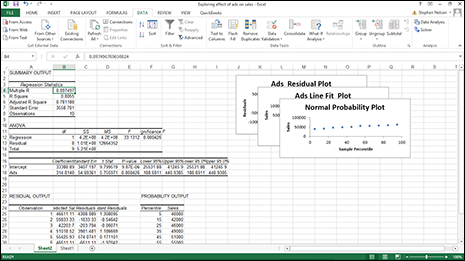
Figure 11-12: The regression analysis results.
Using the Correlation Analysis Tool
The Correlation analysis tool (which is also available through the Data Analysis command) quantifies the relationship between two sets of data. You might use this tool to explore such things as the effect of advertising on sales, for example. To use the Correlation analysis tool, follow these steps:
- Click Data tabs Data Analysis command button.
- When Excel displays the Data Analysis dialog box, select the Correlation tool from the Analysis Tools list and then click OK.
Excel displays the Correlation dialog box, as shown in Figure 11-13.
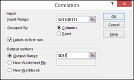
Figure 11-13: The Correlation dialog box.
- Identify the range of X and Y values that you want to analyze.
For example, if you want to look at the correlation between ads and sales — this is the same data that appears in the worksheet shown in Figure 11-7 — enter the worksheet range $A$1:$B$11 into the Input Range text box. If the input range includes labels in the first row, select the Labels in First Row check box. Verify that the Grouped By radio buttons — Columns and Rows — correctly show how you've organized your data.
- Select an output location.
Use the Output Options radio buttons and text boxes to specify where Excel should place the results of the correlation analysis. To place the correlation results into a range in the existing worksheet, select the Output Range radio button and then identify the range address in the Output Range text box. If you want to place the correlation results someplace else, select one of the other option radio buttons.
- Click OK.
Excel calculates the correlation coefficient for the data that you identified and places it in the specified location. Figure 11-14 shows the correlation results for the ads and sales data. The key value is shown in cell E3. The value 0.897497 suggests that 89 percent of sales can be explained through ads.
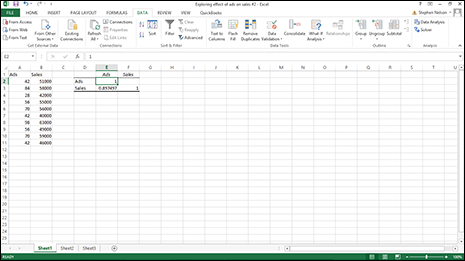
Figure 11-14: The worksheet showing the correlation results for the ads and sales infor-mation.
Using the Covariance Analysis Tool
The Covariance tool, also available through the Data Analysis add-in, quantifies the relationship between two sets of values. The Covariance tool calculates the average of the product of deviations of values from the data set means.
To use this tool, follow these steps:
- Click the Data Analysis command button on the Data tab.
- When Excel displays the Data Analysis dialog box, select the Covariance tool from the Analysis Tools list and then click OK.
Excel displays the Covariance dialog box, as shown in Figure 11-15.
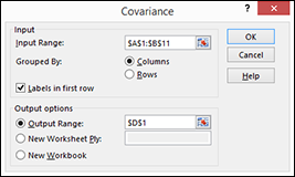
Figure 11-15: The Covariance dialog box.
- Identify the range of X and Y values that you want to analyze.
To look at the correlation between ads and sales data from the worksheet shown in Figure 11-7, for example, enter the worksheet range $A$1:$B$11 into the Input Range text box.
Select the Labels in First Row check box if the input range includes labels in the first row.
Verify that the Grouped By radio buttons — Columns and Rows — correctly show how you've organized your data.
- Select an output location.
Use the Output Options radio buttons and text boxes to specify where Excel should place the results of the covariance analysis. To place the results into a range in the existing worksheet, select the Output Range radio button and then identify the range address in the Output Range text box. If you want to place the results someplace else, select one of the other Output Options radio buttons.
- Click OK after you select the output options.
Excel calculates the covariance information for the data that you identified and places it in the specified location. Figure 11-16 shows the covariance results for the ads and sales data.
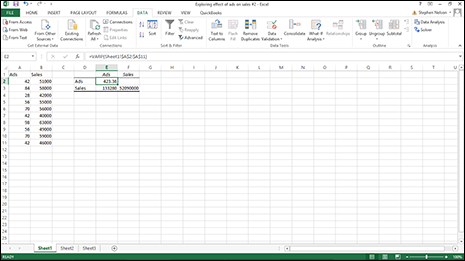
Figure 11-16: The worksheet showing the covariance results for the ads and sales information.
Using the ANOVA Data Analysis Tools
The Excel Data Analysis add-in also provides three ANOVA (analysis of variance) tools: ANOVA: Single Factor, ANOVA: Two-Factor With Replication, and ANOVA: Two-Factor Without Replication. With the ANOVA analysis tools, you can compare sets of data by looking at the variance of values in each set.
As an example of how the ANOVA analysis tools work, suppose that you want to use the ANOVA: Single Factor tool. To do so, take these steps:
- Click Data tab’s Data Analysis command button.
- When Excel displays the Data Analysis Dialog box, choose the appropriate ANOVA analysis tool and then click OK.
Excel displays the appropriate ANOVA dialog box. (In this particular example, I chose the ANOVA: Single Factor tool, as shown in Figure 11-17.) But you can also work with two other versions of the ANOVA tool: a two-factor with replication version and a two-factor without replication version.
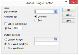
Figure 11-17: The Anova: Single Factor dialog box.
- Describe the data to be analyzed.
Use the Input Range text box to identify the worksheet range that holds the data you want to analyze. Select from the Grouped By radio buttons — Columns and Rows — to identify the organization of your data. If the first row in your input range includes labels, select the Labels in First Row check box. Set your confidence level in the Alpha text box.
- Describe the location for the ANOVA results.
Use the Output Options buttons and boxes to specify where Excel should place the results of the ANOVA analysis. If you want to place the ANOVA results into a range in the existing worksheet, for example, select the Output Range radio button and then identify the range address in the Output Range text box. To place the ANOVA results someplace else, select one of the other Output Options radio buttons.
- Click OK.
Excel returns the ANOVA calculation results.
Creating an f-test Analysis
The Excel Data Analysis add-in also provides a tool for calculating two-sample f-test calculations. f-test analysis enables you to compare variances from two populations. To use the f-Test Analysis tool, click the Data Analysis command button on the Data tab, select f-Test Two-Sample for Variances from the Data Analysis dialog box that appears, and click OK. When Excel displays the F-Test Two-Sample for Variances dialog box, as shown in Figure 11-18, identify the data the tools should use for the f-test analysis by using the Variable Range text boxes. Then specify where you want the f-test analysis results placed using the Output Options radio buttons and text boxes. Click OK and Excel produces your f-test results.
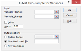
Figure 11-18: The F-Test Two-Sample for Variances dialog box.
f-test analysis tests to see whether two population variances equal each other. Essentially, the analysis compares the ratio of two variances. The assumption is that if variances are equal, the ratio of the variances should equal 1.
Using Fourier Analysis
The Data Analysis add-in also includes a tool for performing Fourier analysis. To do this, click the Data tab’s Data Analysis command button, select Fourier Analysis from the Data Analysis dialog box that appears, and click OK. When Excel displays the Fourier Analysis dialog box, as shown in Figure 11-19, identify the data that Excel should use for the analysis by using the Input Range text box. Then specify where you want the analysis results placed by selecting from the Output Options radio buttons. Click OK; Excel performs your Fourier analysis and places the results at the specified location.
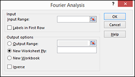
Figure 11-19: The Fourier Analysis dialog box.