
Chapter 13. Visualizing Time Series and Other Functions of an Independent Variable
The preceding chapter discussed scatterplots, where we plot one quantitative variable against another. A special case arises when one of the two variables can be thought of as time, because time imposes additional structure on the data. Now the data points have an inherent order; we can arrange the points in order of increasing time and define a predecessor and successor for each data point. We frequently want to visualize this temporal order, and we do so with line graphs. Line graphs are not limited to time series, however. They are appropriate whenever one variable imposes an ordering on the data. This scenario arises also, for example, in a controlled experiment where a treatment variable is purposefully set to a range of different values. If we have multiple variables that depend on time, we can either draw separate line plots or we can draw a regular scatterplot and then draw lines to connect the neighboring points in time.
Individual Time Series
As a first demonstration of a time series, we will consider the pattern of monthly preprint submissions in biology. Preprints are scientific articles that researchers post online before formal peer review and publication in a scientific journal. The preprint server bioRxiv, which was founded in November 2013 specifically for researchers working in the biological sciences, has seen substantial growth in monthly submissions since. We can visualize this growth by making a form of scatterplot (Chapter 12) where we draw dots representing the number of submissions in each month (Figure 13-1).
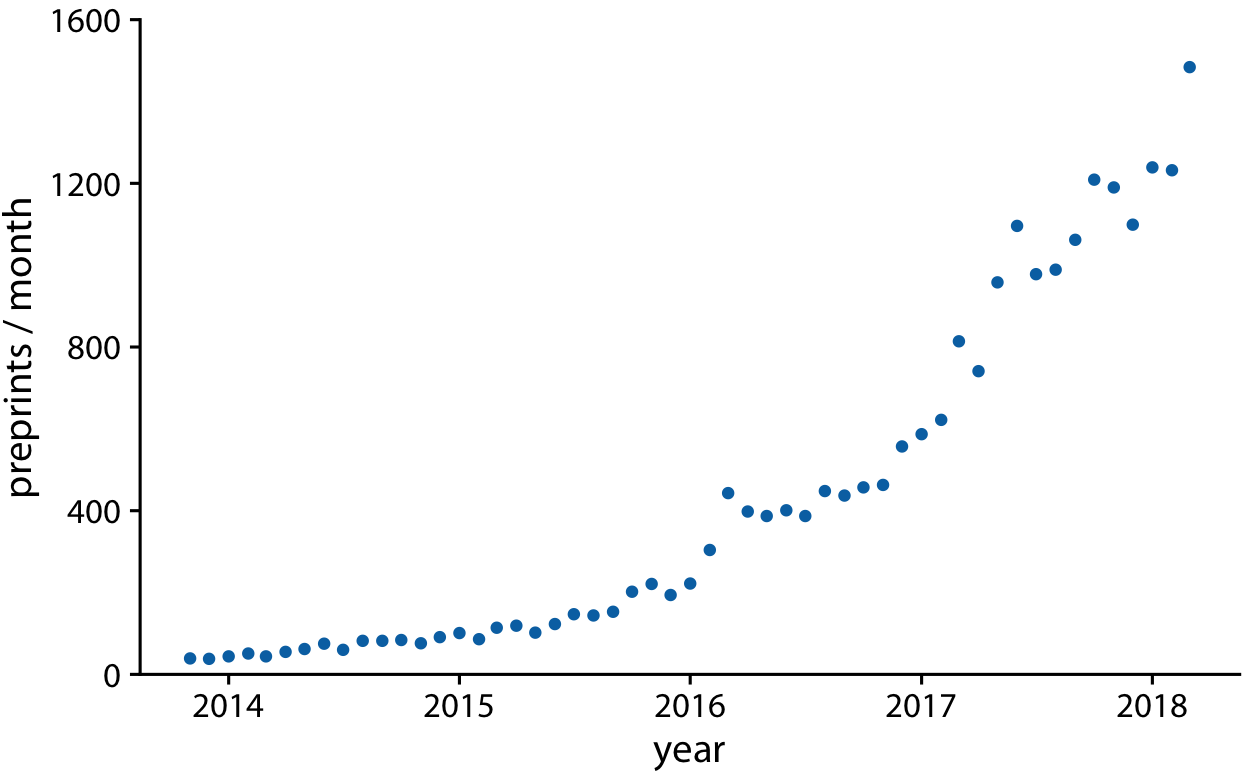
Figure 13-1. Monthly submissions to the preprint server bioRxiv, from its inception in November 2013 until April 2018. Each dot represents the number of submissions in one month. There has been a steady increase in submission volume throughout the entire 4.5-year period. Data source: Jordan Anaya, http://www.prepubmed.org.
There is an important difference, however, between Figure 13-1 and the scatterplots discussed in Chapter 12. In Figure 13-1, the dots are spaced evenly along the x axis, and there is a defined order among them. Each dot has exactly one left and one right neighbor (except the leftmost and rightmost points, which have only one neighbor each). We can visually emphasize this order by connecting neighboring points with lines (Figure 13-2). Such a plot is called a line graph.
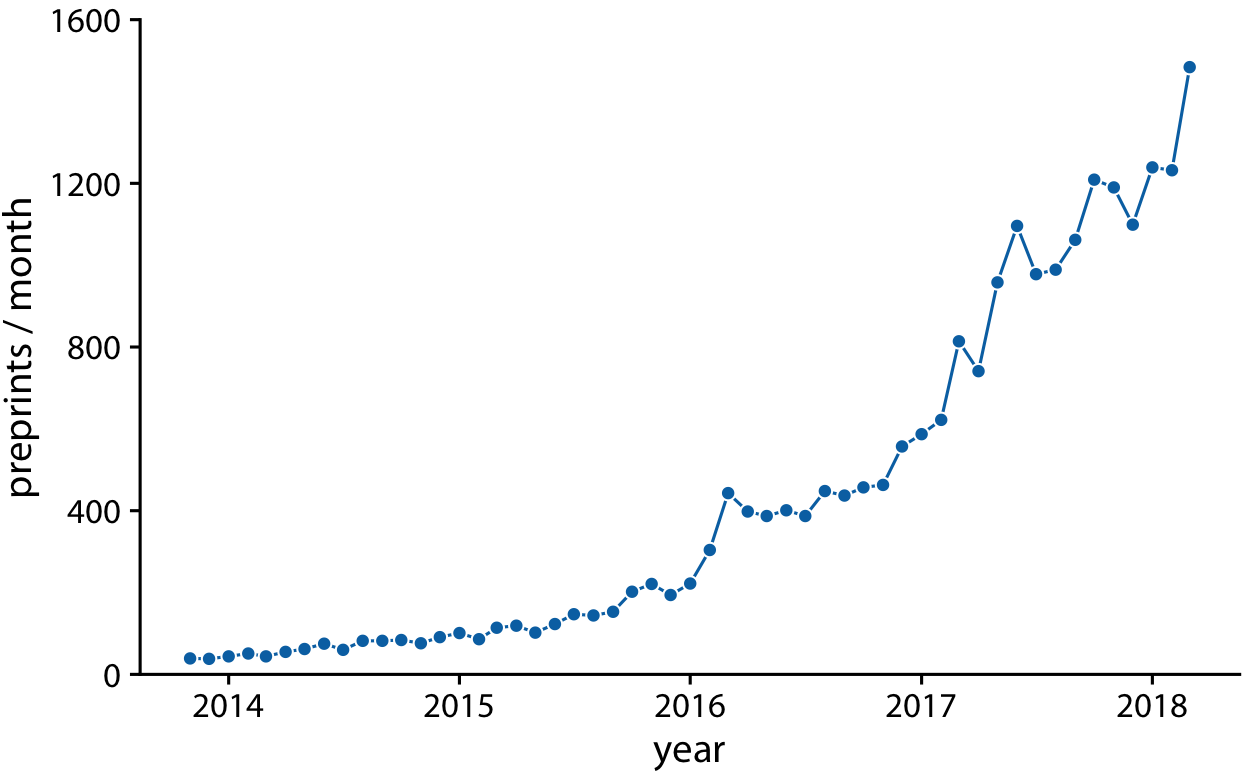
Figure 13-2. Monthly submissions to the preprint server bioRxiv, shown as dots connected by lines. The lines do not represent data and are only meant as a guide to the eye. By connecting the individual dots with lines, we emphasize that there is an order between the dots: each dot has exactly one neighbor that comes before it and one that comes after. Data source: Jordan Anaya, http://www.prepubmed.org.
Some people object to drawing lines between points because the lines do not represent observed data. In particular, if there are only a few observations spaced far apart, had observations been made at intermediate times they would probably not have fallen exactly onto the lines shown. Thus, in a sense, the lines correspond to made-up data. Yet they may help with perception when the points are spaced far apart or are unevenly spaced. We can somewhat resolve this dilemma by pointing it out in the figure caption, for example by writing “lines are meant as a guide to the eye” (see caption of Figure 13-2).
Using lines to represent time series is generally accepted practice, however, and frequently the dots are omitted altogether (Figure 13-3). Without dots, the figure places more emphasis on the overall trend in the data and less on individual observations. A figure without dots is also visually less busy. In general, the denser the time series, the less important it is to show individual observations with dots. For the preprint dataset shown here, I think omitting the dots is fine.
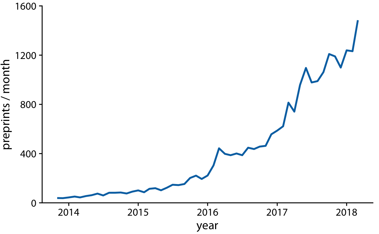
Figure 13-3. Monthly submissions to the preprint server bioRxiv, shown as a line graph without dots. Omitting the dots emphasizes the overall temporal trend while deemphasizing individual observations at specific time points. It is particularly useful when the time points are spaced very densely. Data source: Jordan Anaya,
http://www.prepubmed.org.
We can also fill the area under the curve with a solid color (Figure 13-4). This choice further emphasizes the overarching trend in the data, because it visually separates the area above the curve from the area below. However, this visualization is only valid if the y axis starts at zero, so that the height of the shaded area at each time point represents the data value at that time point.
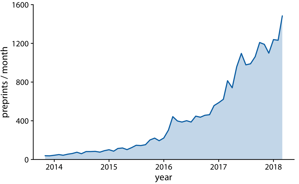
Figure 13-4. Monthly submissions to the preprint server bioRxiv, shown as a line graph with filled area underneath. By filling the area under the curve, we put even more emphasis on the overarching temporal trend than if we just draw a line (Figure 13-3). Data source: Jordan Anaya, http://www.prepubmed.org.
Multiple Time Series and Dose–Response Curves
We often have multiple time courses that we want to show at once. In this case, we have to be more careful in how we plot the data, because the figure can become confusing or difficult to read. For example, if we want to show the monthly submissions to multiple preprint servers, a scatterplot is not a good idea, because the individual time courses run into each other (Figure 13-5). Connecting the dots with lines alleviates this issue (Figure 13-6).
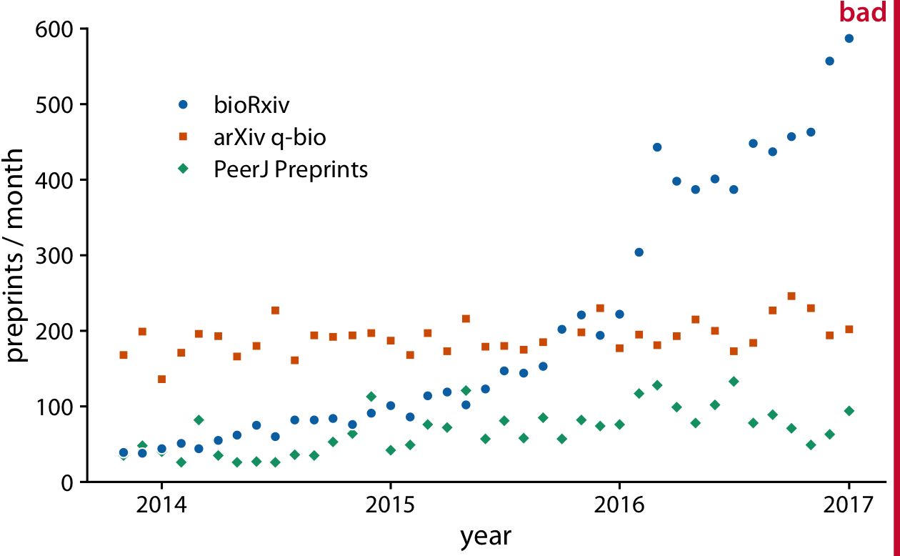
Figure 13-5. Monthly submissions to three preprint servers covering biomedical research: bioRxiv, the q-bio section of arXiv, and PeerJ Preprints. Each dot represents the number of submissions in one month to the respective preprint server. This figure is labeled “bad” because the three time courses visually interfere with each other and are difficult to read. Data source: Jordan Anaya, http://www.prepubmed.org.
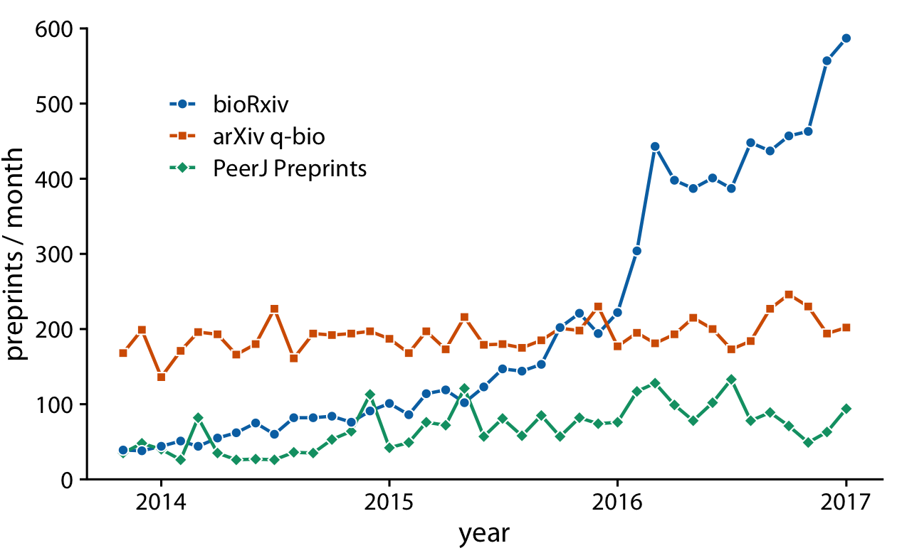
Figure 13-6. Monthly submissions to three preprint servers covering biomedical research. By connecting the dots in Figure 13-5 with lines, we help the viewer follow each individual time course. Data source: Jordan Anaya, http://www.prepubmed.org.
Figure 13-6 represents an acceptable visualization of the preprints dataset. However, the separate legend creates unnecessary cognitive load. We can reduce this cognitive load by labeling the lines directly (Figure 13-7). I have also eliminated the individual dots in this figure, for a result that is much more streamlined and easy to read than the original starting point, Figure 13-5.
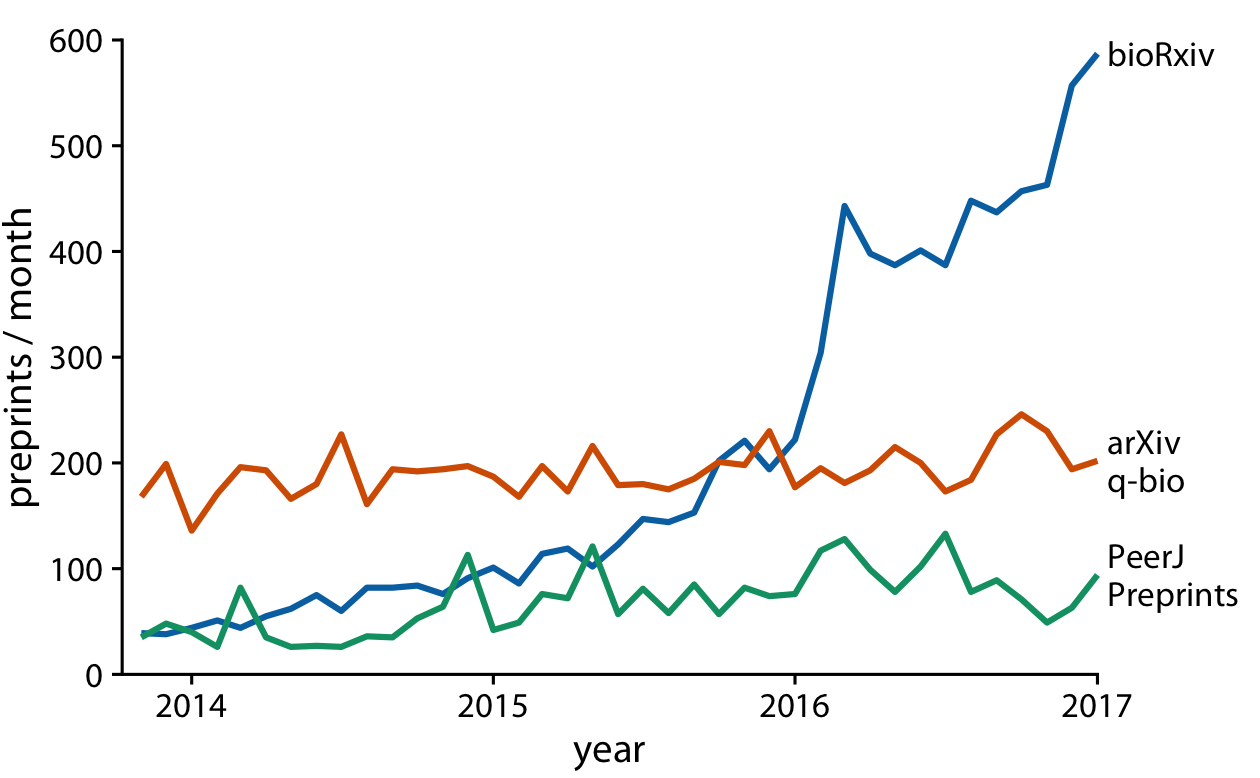
Figure 13-7. Monthly submissions to three preprint servers covering biomedical research. Directly labeling the lines instead of providing a legend reduces the cognitive load required to read the figure, and eliminating the legend removes the need for points of different shapes. This enables us to streamline Figure 13-6 further by eliminating the dots. Data source: Jordan Anaya, http://www.prepubmed.org.
Line graphs are not limited to time series. They are appropriate whenever the data points have a natural order that is reflected in the variable shown along the x axis, so that neighboring points can be connected with a line. This situation arises, for example, in dose–response curves, where we measure how changing some numerical parameter in an experiment (the dose) affects an outcome of interest (the response). Figure 13-8 shows a classic experiment of this type, measuring oat yield in response to increasing amounts of fertilization. The line graph visualization highlights how the dose–response curves have a similar shape for the three oat varieties considered but differ in the starting point in the absence of fertilization (i.e., some varieties have naturally higher yield than others).
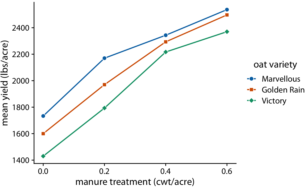
Figure 13-8. Dose–response curve showing the mean yield of oat varieties after fertilization with manure. The manure serves as a source of nitrogen, and oat yields generally increase as more nitrogen is available, regardless of variety. Here, manure application is measured in cwt (hundredweight) per acre. The hundredweight is an old imperial unit equal to 112 lbs or 50.8 kg. Data source: [Yates 1935].
Time Series of Two or More Response Variables
In the preceding examples we dealt with time courses of only a single response variable (e.g., preprint submissions per month or oat yield). It is not unusual, however, to have more than one response variable. Such situations arise commonly in macroeconomics. For example, we may be interested in the change in house prices from the previous 12 months as it relates to the unemployment rate. We may expect that house prices rise when the unemployment rate is low, and vice versa.
With the tools from the preceding sections, we can visualize such data as two separate line graphs stacked on top of each other (Figure 13-9). This plot directly shows the two variables of interest, and it is straightforward to interpret. However, because the two variables are shown as separate line graphs, drawing comparisons between them can be cumbersome. If we want to identify temporal regions when both variables move in the same or in opposite directions, we need to switch back and forth between the two graphs and compare the relative slopes of the two curves.
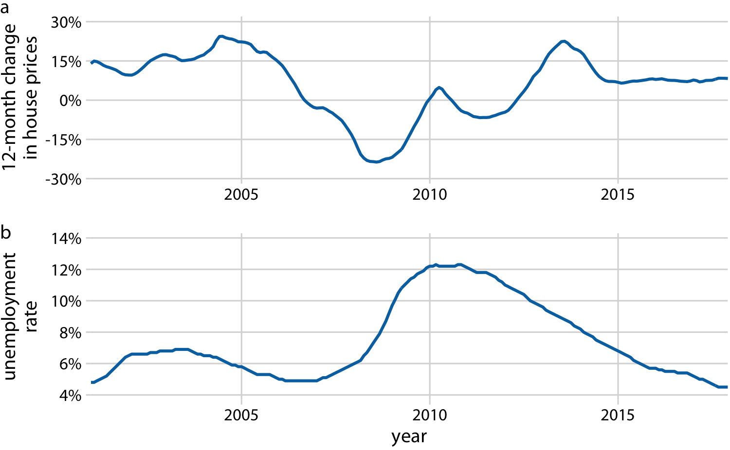
Figure 13-9. Twelve-month change in house prices (a) and unemployment rate (b) over time, from January 2001 through December 2017. Data sources: Freddie Mac House Prices Index, US Bureau of Labor Statistics.
As an alternative to showing two separate line graphs, we can plot the two variables against each other, drawing a path that leads from the earliest time point to the latest (Figure 13-10). Such a visualization is called a connected scatterplot, because we are technically making a scatterplot of the two variables against each other and then are connecting neighboring points. Physicists and engineers often call this a phase portrait, because in their disciplines it is commonly used to represent movement in phase space. We have previously encountered connected scatterplots in Chapter 3, where I plotted the daily temperature normals in Houston, TX, versus those in San Diego, CA (Figure 3-3).
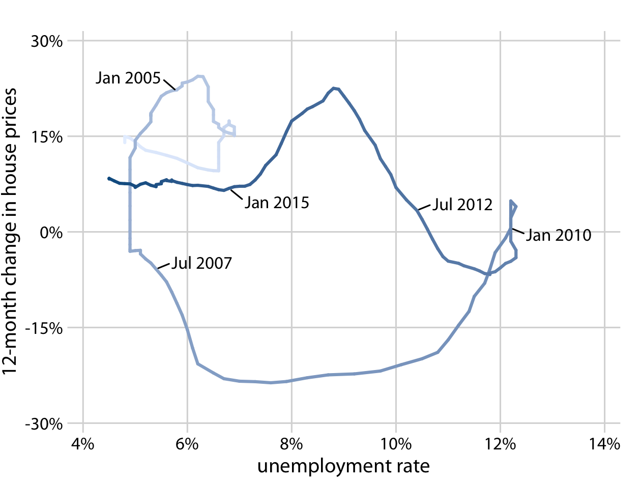
Figure 13-10. Twelve-month change in house prices versus unemployment rate, from January 2001 through December 2017, shown as a connected scatterplot. Darker shades represent more recent months. The anticorrelation seen in Figure 13-9 between the change in house prices and the unemployment rate causes the connected scatterplot to form two counterclockwise circles. Original figure concept: Len Kiefer. Data sources: Freddie Mac House Price Index, US Bureau of Labor Statistics.
In a connected scatterplot, lines going in the direction from the lower left to the upper right represent correlated movement between the two variables (as one variable grows, so does the other), and lines going in the perpendicular direction, from the upper left to the lower right, represent anticorrelated movement (as one variable grows, the other shrinks). If the two variables have a somewhat cyclic relationship, we will see circles or spirals in the connected scatterplot. In Figure 13-10, we see one small circle from 2001 through 2005 and one large circle for the remainder of the time course.
When drawing a connected scatterplot, it is important that we indicate both the direction and the temporal scale of the data. Without such hints, the plot can turn into a meaningless scribble (Figure 13-11). In Figure 13-10 I used a gradual darkening of the color to indicate direction; alternatively, one could draw arrows along the path.
Is it better to use a connected scatterplot or two separate line graphs? Separate line graphs tend to be easier to read, but once people are used to connected scatterplots they may be able to extract certain patterns (such as cyclical behavior with some irregularity) that can be difficult to spot in line graphs. In fact, to me the cyclical relationship between change in house prices and unemployment rate is hard to spot in Figure 13-9, but the counterclockwise spiral in Figure 13-10 reveals it. Research reports that readers are more likely to confuse order and direction in a connected scatterplot than in line graphs, and less likely to report correlation [Haroz, Kosara, and Franconeri 2016]. On the flip side, connected scatterplots seem to result in higher engagement, and thus such plots may be effective tools to draw readers into a story.
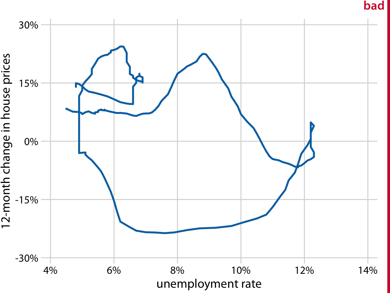
Figure 13-11. Twelve-month change in house prices versus unemployment rate, from January 2001 through December 2017. This figure is labeled “bad” because without the date markers and color shading of Figure 13-10, we can see neither the direction nor the speed of change in the data. Data sources: Freddie Mac House Prices Index, US Bureau of Labor Statistics.
Even though connected scatterplots can show only two variables at a time, we can also use them to visualize higher-dimensional datasets. The trick is to apply dimension reduction first (see Chapter 12). We can then draw a connected scatterplot in the dimension-reduced space. As an example of this approach, we will visualize a database of monthly observations of over 100 macroeconomic indicators, provided by the Federal Reserve Bank of St. Louis. We perform a principal components analysis (PCA) of all indicators and then draw a connected scatterplot of PC 2 versus PC 1 (Figure 13-12a) and versus PC 3 (Figure 13-12b).
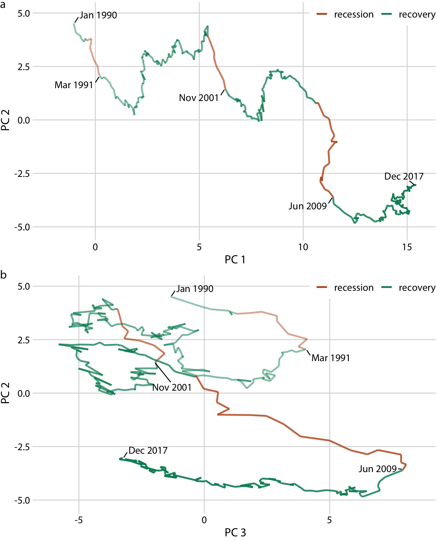
Figure 13-12. Visualizing a high-dimensional time series as a connected scatterplot in principal components space. The path indicates the joint movement of over 100 macroeconomic indicators from January 1990 to December 2017. Times of recession and recovery are indicated via color, and the endpoints of the three recessions (March 1991, November 2001, and June 2009) are also labeled. (a) PC 2 versus PC 1. (b) PC 2 versus PC 3. Data source: M. W. McCracken, St. Louis Fed.
Notably, Figure 13-12a looks almost like a regular line plot, with time running from left to right. This pattern is caused by a common feature of PCA: the first component often measures the overall size of the system. Here, PC 1 approximately measures the overall size of the economy, which rarely decreases over time.
By coloring the connected scatterplot by times of recession and recovery, we can see that recessions are associated with a drop in PC 2 whereas recoveries do not correspond to a specific feature in either PC 1 or PC 2 (Figure 13-12a). The recoveries do, however, seem to correspond to a drop in PC 3 (Figure 13-12b). Moreover, in the PC 2 versus PC 3 plot, we see that the line follows the shape of a clockwise spiral. This pattern emphasizes the cyclical nature of the economy, with recessions following recoveries and vice versa.