5
Completely Randomized Design with Multiple Treatment Factors
Introduction
Processes and natural phenomena generally involve multiple variables or “factors,” for example, cookies. Producing cookies from a box of mix requires adding certain amounts of other ingredients to the mix, mixing the dough by hand or mixer for a specified time, preheating an oven, and then baking cookies for a specified time at a specified temperature. A cake-mix manufacturer like Betty Crocker or Duncan Hines needs to know how the various factors (steps and ingredients in the recipe) affect cookie quality, perhaps as measured by a panel of tasters. The manufacturer can then use this information to determine the preparation and baking instructions on the box. In addition to maximizing quality, the manufacturer would like the process settings (recipe) to be “robust,” meaning that if you and I don’t get the ingredients or settings quite right or if our ovens don’t quite achieve the desired temperature, we will still get good cookies. Similar “multifactor” problems need to be solved in many other contexts. It is not a coincidence that the silicon chips that so much of our technology relies on are called “cookies” in their production.

In Chapter 2, we described how treatments (or blocks) may be defined by two or more factors and those factors could be either crossed or nested. They can also be either qualitative or quantitative. In this chapter, we continue the discussion of experiments that have a completely randomized design (CRD) and extend applications of this design to situations in which the treatments in the experiment are structured according to two or more factors. The conduct of the experiment—random assignment of treatments to individual units in a single group of homogeneous eus—is the same as in the previous chapters, but the factorial structure of the treatments calls for different graphical displays and different quantitative analyses (primarily analysis of variance (ANOVA)) than we have covered so far.
Some authors use the term, “factorial experimental design,” but I do not. Experimental design pertains to the organization of experimental units and the assignment of treatments to those experimental units. If, as in this chapter, the treatments are combinations of two or more factors, that treatment structure doesn’t change the design. It is still a CRD. We could say that we have a “factorial treatment design” in our CRD experiment. In the next chapter, we will see factorial treatment designs in the context of another family of experimental designs, the randomized block design.
Design Issues
In addition to the issues faced in determining a particular CRD, the issues in a multifactor experiment are first the choice of factors and then the choice of levels for each factor in the experiment. We suppose initially that a full factorial set of treatment combinations will be included (meaning, e.g., that with one four-level factor and one five-level factor, the experiment would include all 20 possible treatment combinations). You can quickly see that if many factors with many levels are included in an experiment, the number of treatment combinations can become unwieldy. But if you have too few levels, you may have inadequate coverage of the factor space. In choosing a design, there can be trade-offs between the numbers of factors, factor levels, and replications to resolve. Designing an experiment that uses only a fraction of the full set of factorial treatment combinations is another option that will be discussed later. Methods for finding “optimal designs” in unwieldy circumstances are discussed in Chapter 7.
The two primary examples in this chapter are CRDs with two-factor treatments. In the first example, both factors are qualitative, and in the second, both factors are quantitative. This distinction is reflected in both the design and the analysis.
Example 1 (Two qualitative factors): Poisons and antidotes
In an experiment first reported in Box and Cox (1964) and then included in the Box, Hunter, and Hunter (BHH) (2005, p. 318) text, laboratory animals were exposed to a poison and then treated with an antidote. The response measured is survival time. The goal was to identify the antidote or antidotes that were most effective in combating the poisons. No other information was given about the experiment, which means I can make up a story and set it in modern times.
This experiment may cause some uneasiness, so let’s set it in a national security context. If our soldiers are ever in a chemical or biological warfare environment and are exposed to poison, we want them to be carrying antidotes that they can take that will delay the effect of the poison long enough for them to reach an aid station or field hospital and receive life-saving treatment, if at all possible. There are many potential poisons and possible antidotes. We obviously cannot test them on people, so if we’re going to learn anything useful about antidotes, we’ll need to learn it from laboratory animals (my apologies to PETA). It’s up to biology experts then to transfer that information to the human scale, if possible.
The experiment (continuing my invented story) was conducted by a university laboratory under a government contract. The government agency chose the three poisons to span a range of threats, knowing that they had different levels of lethality and perhaps attacked different organs. The four antidotes, let us suppose, were provided by four pharmaceutical companies competing for a contract. A desirable outcome would be to find one or more antidotes that are effective against all of the poisons in the experiment.
Running the experiment with all the combinations of these two factors means that the experiment had 12 treatments (3 poisons × 4 antidotes). Based perhaps on preliminary experimentation, it was decided that there would be four replicates (let’s say rats, again) of each of the 12 treatments, randomly assigned. The investigators established a detailed protocol for exposing an animal to a poison and then administering an antidote. Pre-1964, someone would then sit in the lab with a stopwatch (graduate students did this sort of work) and record the animal’s survival time. Today, we will suppose each rat had an electronic chip implanted that would record the time of death and send the data to a monitoring computer. The experiment’s data are in Table 5.1
Table 5.1 Animal Survival Times (in tenths of hour).
Source: Box, Hunter, and Hunter (2005, p. 318), used here by permission of John Wiley & Sons.
| Poison | Antidote | |||
| A | B | C | D | |
| I | 31 | 82 | 43 | 45 |
| 45 | 110 | 45 | 71 | |
| 46 | 88 | 63 | 66 | |
| 43 | 72 | 76 | 62 | |
| II | 36 | 92 | 44 | 56 |
| 29 | 61 | 35 | 102 | |
| 40 | 49 | 31 | 71 | |
| 23 | 124 | 40 | 38 | |
| III | 22 | 30 | 23 | 30 |
| 21 | 37 | 25 | 36 | |
| 18 | 38 | 24 | 31 | |
| 23 | 29 | 22 | 33 | |
Analysis 1: Plot the data
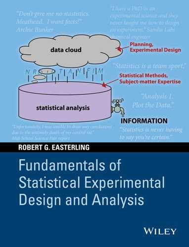
The experiment’s data are plotted in Figure 5.1, which shows the rat survival times (in tenths of an hour) versus the antidote for the three poisons separately. As has been stated before, it is important that initial data plots include all the dimensions in the data, as is done here.
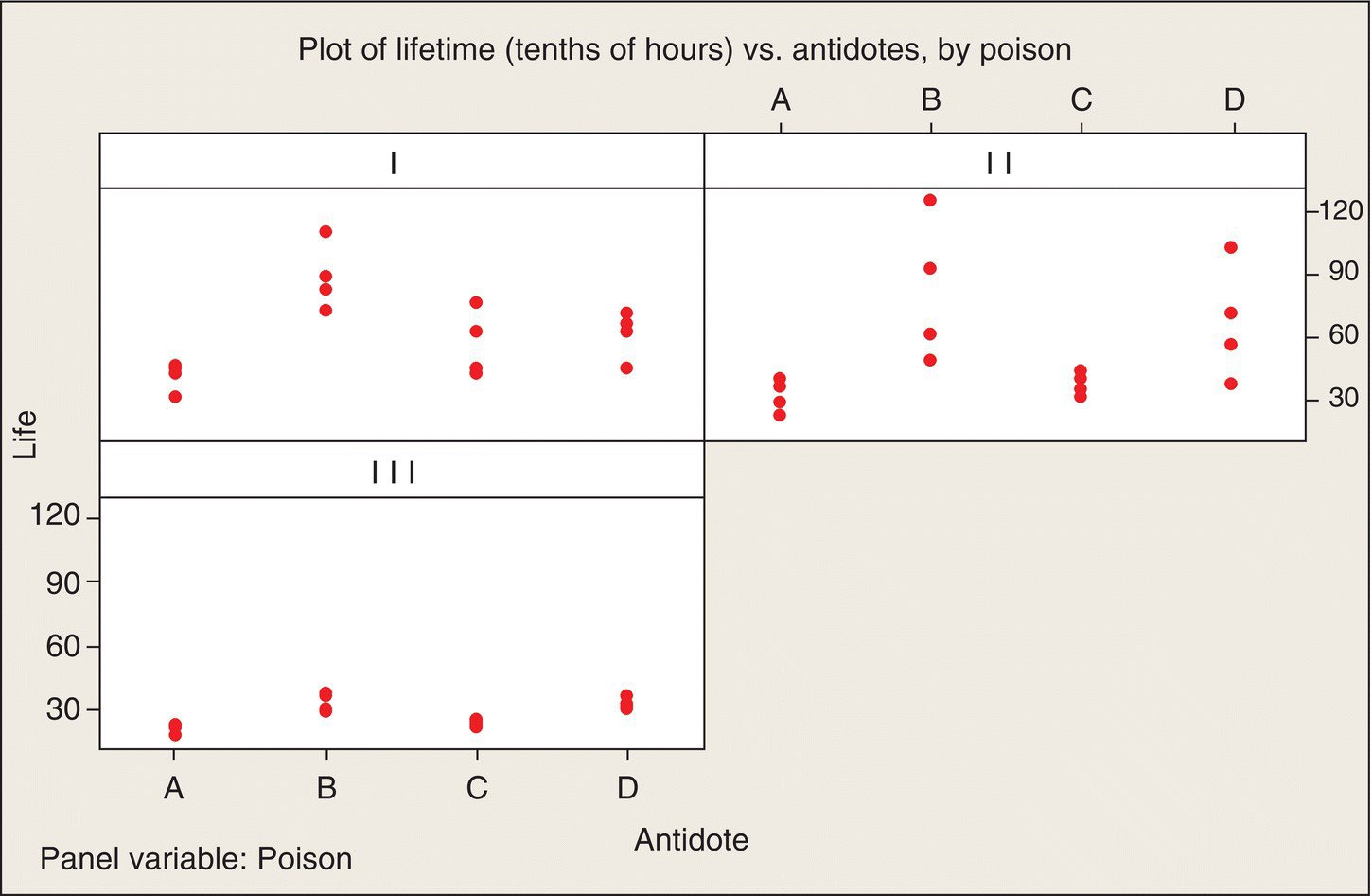
Figure 5.1 Data Plot: Poison—Antidote Experiment.
Eyeball analysis
We see in Figure 5.1 a very similar pattern across all three poisons: antidotes B and D look to be consistent winners (they result in the longest lifetimes) for all three poisons. The poisons also differ in their lethality—in particular, Poison III results in considerably shorter lifetimes than the other two poisons. We also see that the variability within each group of four animals differs appreciably among the 12 treatment combinations. Intuitively, the pattern makes sense: if a poison is slow acting, there is apt to be more variability in the longer survival times than there is for poisons that act quickly and survival times are short.
BHH decide to use a transformation of the data to make the data standard deviations more homogeneous. (Aside. The article by Box and Cox in 1964 is a very influential, oft-cited paper on transformations.) The reason for making a transformation is that we want to be able to use the statistical model of 12 independent random samples of four observations from Normal distributions with the same variances as our starting point—our model for “data we might have gotten”—for evaluating whether the apparent poison and antidote differences we see in Figure 5.1 are “real or random.” To enhance the appropriateness of this evaluation, we would like the 12 sets of data to have more homogeneous variances.
BHH’s analysis led them to chose to analyze the reciprocal, 1/(lifetime), of the data. I will call this transformed response the death rate. In reliability applications, the term sometimes used is “force of mortality.” Low death rates are advantageous—they correspond to longer lifetimes. Figure 5.2 is a plot of these death rates, expressed in units of hour−1, and shows that this transformation did make the within-group variances much more similar.
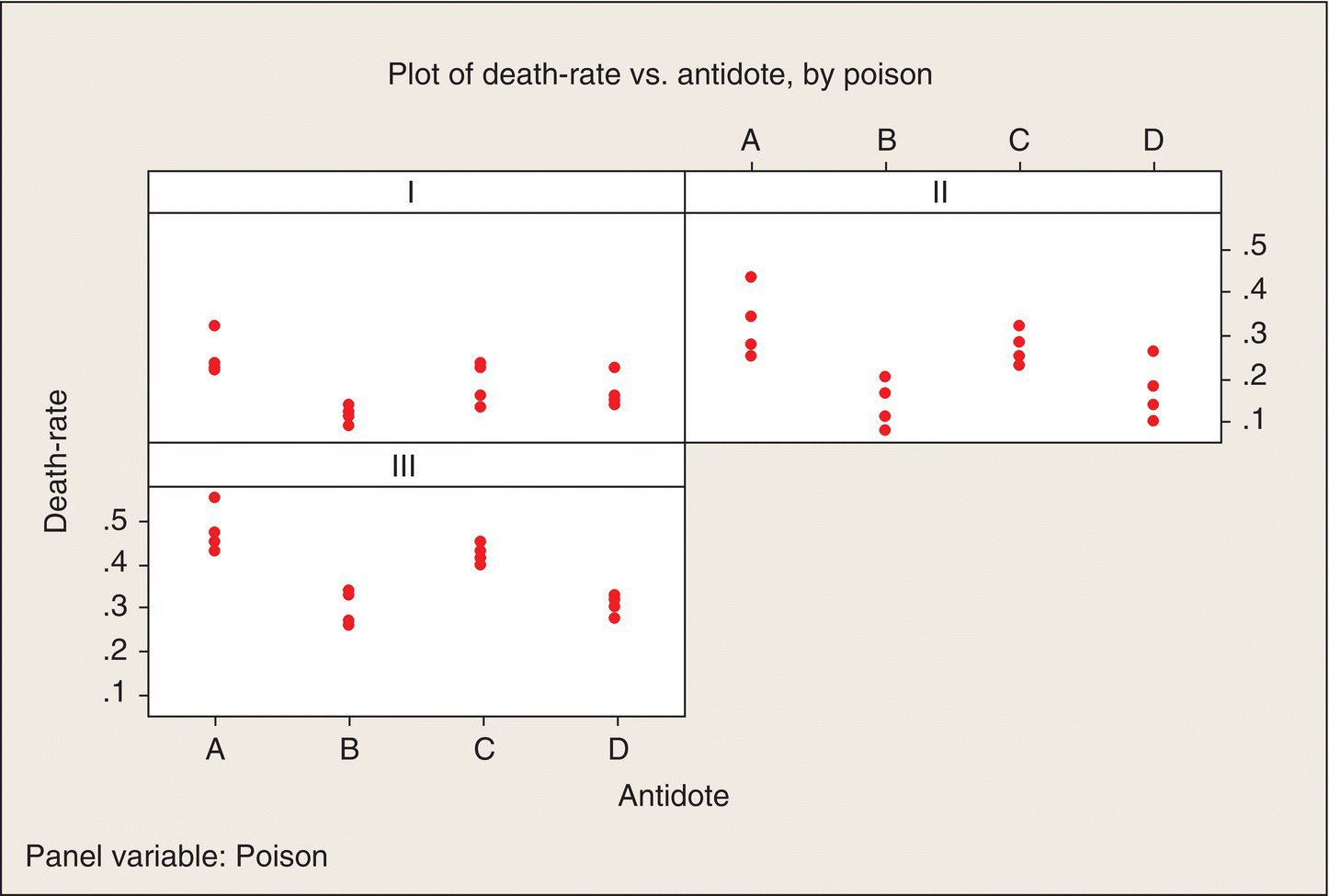
Figure 5.2 Plot of Death Rates versus Antidotes, by Poisons.
As with the original data, we see some definite patterns among both poisons and antidotes in Figure 5.2. Antidotes B and D consistently result in lower death rates. Could this pattern just be random or are there some real poison and antidote effects underlying these patterns? As you might expect, ANOVA will be the tool by which we address this question.
Before getting into ANOVA intricacies, let’s stop for a moment and admire the value of the factorial structure of poisons and antidotes. All four antidotes are tested against all three poisons. This balance and symmetry help us see patterns. We can make side-by-side antidote comparisons poison by poison. We can find consistent differences and inconsistent differences. Other treatment structures (combinations of poisons and antidotes) without this factorial balance and symmetry would not be so accommodating and informative.
For example, if we asked each poison manufacturer, “What antidote(s) should we use to treat your poison?” one might say A and D, another might say B, C, and D, and the third might say A and C. If we designed our experiment accordingly, overall patterns would be very difficult to see with this sort of mishmash. And overall patterns are very important here. If we find one antidote that is effective against all three poisons, then that means the field kits we provide soldiers need only contain that antidote. Otherwise, the kit might require two or more antidotes, and the soldier would have to identify the poison and then take the right antidote. When time is of the essence, this is not good.
Interaction
As a starting point, we could analyze these data as we would for a CRD with 12 qualitative treatments. The ANOVA would have 11 df for treatments, and the F-test would tell us whether the variation among average death rates for those 12 treatments was “real or random.”
The factorial treatment structure, though, permits us, indeed requires us, to go further: we can separate out the variability among antidotes, averaged over poisons (and it is the balanced, factorial structure that makes the antidote averages comparable). The corresponding ANOVA entry would be an SS for antidotes based on 3 df, in this case, because it pertains to the variability among four antidotes. Similarly, the variation among the three poisons, averaged over antidotes, would have 3 − 1 = 2 df. That leaves 6 df, from the treatments’ 11 df (11 − 2 − 3 = 6), left over. What sort of variability is that reflecting?
The answer is interaction—the interaction between poisons and antidotes. To explain interaction, let’s start with a picture—what Minitab calls an “interaction plot.” The average death rates for the four rats in each poison/antidote group are tabulated in Table 5.2. The interaction plot, Figure 5.3, is a plot of these means versus the levels of one of the factors, for each level of the other factor, overlaid.
Table 5.2 Average Death Rates (units of hour−1) by Poisons and Antidotes.
| Average Death Rate | Antidote | |||
| Poison | A | B | C | D |
| I | .25 | .12 | .19 | .17 |
| II | .33 | .14 | .27 | .17 |
| III | .48 | .30 | .43 | .31 |
| Average | .35 | .19 | .30 | .22 |
Figure 5.3 Interaction Plot. Average death rate versus poison, by antidote.
Figure 5.3 shows that Antidote B is consistently the best: it has the lowest death rate (longest survival time) for all three poisons. Antidote D is close to B in effectiveness, particularly against Poison III. Antidotes A and C are consistently the least effective. Moreover, the poison-to-poison patterns for all four antidotes are fairly consistent: the death rates are somewhat higher for Poison II than for Poison I and are substantially higher for Poison III than for Poison II. The four lines are nearly parallel.
Perfectly parallel lines would be a case of no interaction. Of course, with only four rats per poison/antidote combination, experimental error (variation among the lifetimes of these rats) means that this plot of the treatment means is not apt to be exactly parallel, even if the (unknown) underlying means exhibited no interaction (plotted as parallel lines). That’s why we need the ANOVA’s F-test to tell us whether apparent interaction (nonparallel lines) is “real or random” (more pronounced than could be due just to random variation).
By way of contrast, if the lines in Figure 5.3 crisscrossed substantially, this would depict high interaction. In that case, the best antidote might be different for each poison; there would be no consistent winners. Soldiers would have to carry several poison-specific antidotes.
An interaction plot of the means in Table 5.1 can also be done reversing the roles of the two factors: Figure 5.4 is the result.
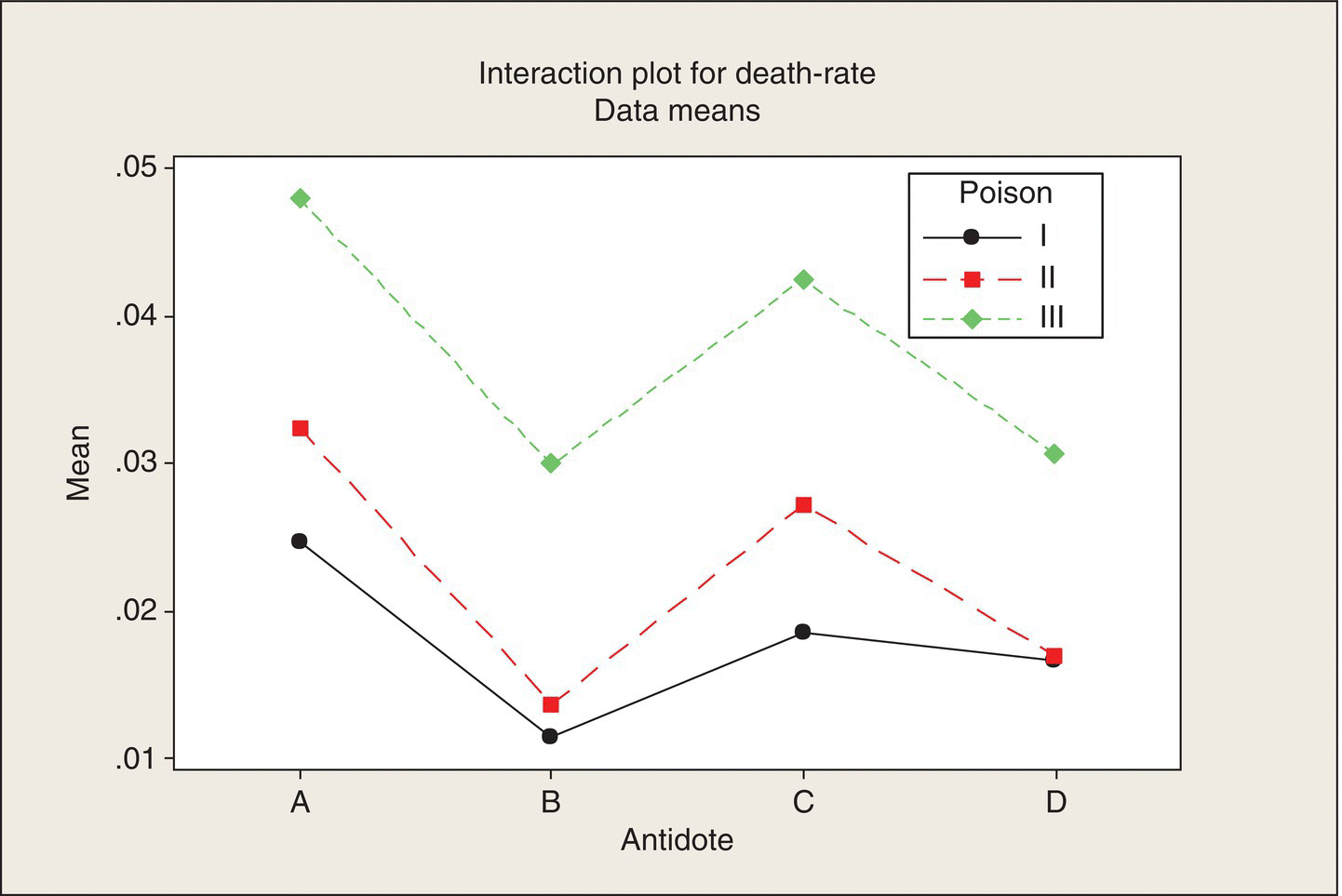
Figure 5.4 Interaction Plot. Average death rate versus antidote, by poison.
This plot focuses on the poison differences, and the near-parallel lines in this orientation indicate that the poison differences are quite consistent across antidotes. Poison I is consistently the least lethal (low death rate, high lifetime), Poison II is intermediate, and Poison III is the most lethal. The choice of plot depends on which factor is of primary interest—antidote in this example. Minitab includes an option to plot both interaction plots in separate panels on the same plot.
ANOVA
Formulas for the ANOVA entries in a multifactor experiment are given in many texts and will not be repeated here. We will trust the software to do the correct calculations and go directly to the ANOVA for this experiment (Table 5.3). What we have to know in order to use the ANOVA properly is which mean squares (MS) to compare in order to make the appropriate “real or random” evaluations. By the fact that this experiment was carried out as a CRD with 12 treatments arranged in a 3 × 4 structure, with four replications per treatment combination, we can calculate separate MS for interaction, antidotes, and poisons and compare them to the error MS, which is “pure error,” calculated from the variability among the four experimental units in each treatment, pooled across all 12 treatment combinations.
Table 5.3 ANOVA for Death Rate.
| Source | DF | SS | MS | F | P |
| Poison | 2 | .349 | .174 | 72.6 | .000 |
| Antidote | 3 | .204 | .068 | 28.3 | .000 |
| Interaction | 6 | .016 | .0026 | 1.1 | .39 |
| Error | 36 | .086 | .0024 | ||
| Total | 47 | .655 |
Interpretation of the ANOVA for a multifactor experiment starts at the bottom. That is, we (should) consider first the F-statistic for interaction. The observed F-statistic of 1.1 falls near the middle of the F-distribution based on 6 and 36 df, as the P-value of about .4 indicates. Thus, the interaction MS is indistinguishable from the error MS. There is no evidence of underlying interaction. Our eyeball-analysis conclusion of consistent antidote and poison differences is quantitatively supported by the ANOVA.
Moving up a line, the F-test for comparing the antidotes compares the four antidote means, averaged across poisons. The denominator is again the error MS. The F-ratio of 28.3, on 3 and 36 df, with a resulting P-value of essentially zero, is off the chart: there are definite differences among antidotes, as our eyeball analysis told us. The fact that poison/antidote interaction was not significant means that it is meaningful to compare antidotes averaged across poisons. If there had been significant interaction, this would have been an indication that comparing antidotes averaged across poisons might not be appropriate. Significant interaction means that the differences among antidotes are not consistent across poisons. Averaging across poisons could wrongly suggest a consistent winning antidote.
Lastly, moving up one more line, because the poisons were selected to be different, the highly significant (off the chart) F-test for poisons, averaged over antidotes, is confirmation that the poisons were different, as planned, not a surprise or a finding on which to act.
The Minitab graphical output in Figure 5.5 shows graphically the source of the significant difference among antidotes. There is substantial separation between Antidotes A and C (high death rates, short lifetimes) versus B and D, which are statistically tied (substantially overlapping confidence intervals).
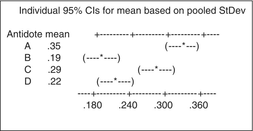
Figure 5.5 Antidote Average Death Rates.
Generalizing the ANOVA for a CRD with two factors
As noted previously, if we had done the ANOVA for a CRD with 12 treatments, four experimental units per treatment, the treatment line in the ANOVA would have had 11 df. In Table 5.2 ANOVA, those 11 df have been partitioned into poisons (2 df ), antidotes (3 df ), and poison by antidote interaction (6 df ). In general, if the first factor, A, has a levels and the second factor, B, has b levels, then there will be a − 1 df for factor A, b − 1 df for B, and the product (a − 1)(b − 1) df for the A–B interaction. The df for these three lines in the ANOVA add up to ab − 1. The corresponding SSs add up to equal the treatment SS for the 12 treatments. In the general case of r replicates in each treatment, the error SS and MS are based on ab(r − 1) df: r − 1 df for pure error in each treatment, pooled across ab treatments.
The partitioning of treatment SS into main effect and interaction SS is due to the crossed factorial structure of the two factors. The term sometimes used is to say the two factors are “orthogonal.” Just any old 12 combinations of poisons and antidotes would not have this property. They would not provide a clean separation of what are called the “main effects” (average effects) of A and B and the interaction effect of A and B. One of the most important contributions of statistical experimental design is the development of efficient and informative multifactor designs that provide this clean separation. This is not to say that multifactor treatment designs that do not have a crossed factorial structure cannot be analyzed to obtain and evaluate estimated main effects and interactions. Methods based on general linear models can be used. Morris (2011) and Milliken and Johnson (2009) are experimental design texts that illustrate these analyses in a wide variety of contexts.
Antidote B versus Antidote D
The graphical display in Figure 5.4 indicates that there may not be a real difference between Antidotes B and D. Thus, if we want to pick a winning antidote, we may not have enough evidence to justify picking the narrow winner, B, over D. We can quantify this evidence by a significance test of the difference in mean death rates and by a confidence interval on the underlying mean difference.
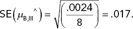
The average death rates from Table 5.1 are ybarB = .19 and ybarD = .22. Each of these means is based on 12 observations (four rats for each of three poisons). Therefore, the variance of the difference between these two means is 2σ2/12 = σ2/6, where σ is the experimental error standard deviation—the variability among experimental units that receive the same treatment. This standard deviation is estimated by the square root of the error MS in the ANOVA table (Table 5.2), namely, ![]() . The standard error (SE) of the difference between two antidote means is given by substituting s for σ in the variance of the difference and then taking the square root:
. The standard error (SE) of the difference between two antidote means is given by substituting s for σ in the variance of the difference and then taking the square root:
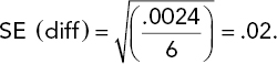
This is the yardstick against which we evaluate the observed difference in means via the t-statistic:
The degree of freedom associated with this t-statistic is the error df, which is 36. The resulting P-value is .07 (one tail).
The 95% confidence interval for the underlying mean difference in death rates is given by
If the government agency wants stronger evidence, say, a one-tail P-value less than .025 (which would correspond to a two-sided 95% confidence interval that did not cover a difference of zero) in order to make a contract award, then there is not enough evidence here to choose Antidote B over D. A runoff experiment would be required. The sorts of power and sample size analyses done in Chapter 3 could be used to size the experiment.
Estimation of effects
Let’s suppose we want to estimate the survival time distribution (for lab rats) for a particular poison/antidote combination. In particular, let’s look at the strongest poison, Poison III, and the best antidote, B.
One straightforward way to approach this problem is to consider only the four survival times for that case. This would yield a fairly imprecise estimate of survival time for that poison/antidote combination. Our analysis findings, so far, in particular the finding of no interaction between poisons and antidotes, enable us to do a more precise analysis. This analysis requires some preliminaries.
Common terminology in the analysis of two- or more-factor experiments is to consider the effects of the factors. Let ybarall denote the overall mean of the data, that is, the mean of all 48 death rates. That mean is .26 hour−1. The antidote effects are defined as the differences between the antidote means and the overall mean:
- A effect: .35 − .26 = .09
- B effect: .19 − .26 = −.07
- C effect: .29 − .26 = .03
- D effect: .22 − .26 = −.04
(Note: If I had carried more digits in these means, the four effects would have added to zero.)
Thus, B and D, which have negative effects, decrease the death rates; A and C increase it, relative to the average antidote effect.
The poison effects are:
- Poison I effect: .18 − .26 = −.08
- Poison II effect: .23 − .26 = −.03
- Poison III effect: .38 − .26 = .12
Because we found that there was no interaction in the data, the antidote effects apply to any of the three poisons in the experiment. Thus, the estimated mean death rate for Antidote B applied to Poison III is the Poison III mean of .38 plus the effect of Antidote B (which is negative).
Est. mean death rate for Poison III, Antidote B = μ^B,III^ = .38 − .07 = .31.
Note that this estimate is based on all 48 data points in the experiment, not just the four data points pertaining to that particular poison/antidote combination. When the expressions for the various means are expanded algebraically, one can see that this estimate is a weighted sum of the mean death rates in the 12 poison/antidote treatment combinations. Those weights are given in Table 5.4.
Table 5.4 Weights in Estimated Mean Death Rate: Poison III, Antidote B.
| Poison | Antidote | |||
| A | B | C | D | |
| I | −1/12 | 1/4 | −1/12 | −1/12 |
| II | −1/12 | 1/4 | −1/12 | −1/12 |
| III | 1/6 | 1/2 | 1/6 | 1/6 |
Note that the largest positive weight (1/2) is for the III/B combination. All the Antidote B cells have positive weights as do all of the Poison III cells. All other poison/antidote combinations have negative weights. The weights sum to 1.0.
Now, what is the SE of this estimate? Each cell mean has a variance of σ2/4. The cell means are all independent; they’re based on separate data. Theory tells us that the variance of a weighted sum of quantities that all have the same variance is equal to the sum of the coefficients squared times that common variance. In Table 5.3, the squared coefficients sum to 1/2. Thus, the variance of the estimated mean is σ2/8. If we had estimated the III/B mean from the III/B data only, that estimate would have a variance of σ2/4. Thus, by using all of the data, we have reduced the variance by a factor of two. This additional precision, thank you very much, was brought to you by the finding of no interaction. Instead of having an antidote effect depend on the poison, we found that the antidote effect was independent of poison, and thus, we estimated the antidote effect averaged over poisons. Ditto for the poison effect.
Substituting the error MS for σ2 provides the SE of this estimated mean and also confidence intervals on the underlying mean death rate for the III/B combination of poison and antidote:
Note that we are using the error MS based on all the data; thus, the SE is based on 36 df. If we had used only the III/B data, the standard deviation of those data would have been based on only 3 df. Thus, by being able to use all the data to estimate the III/B mean and the error variance, we improve the variance of the estimate and improve the precision with which we estimate that variance, compared to using only the III/B four observations. As mentioned earlier, the term used to describe this aspect of a statistical analysis is “borrowing strength.” The clever device of analyzing the reciprocals (the death rates), rather than the lifetimes, homogenized the variances and resulted in a no-interaction pattern among the cell means.
The preceding analysis has been mostly illustrative. It shows how all the data are used in estimating death rates for particular situations and how such “borrowing strength” is reflected in SEs for estimates of interest. The software, based on the underlying mathematical models, will calculate the effects and estimated means and their SEs, directly.
Now, when dealing with a variable such as lifetime, we’re probably not interested so much in average or median lifetimes as we are in distribution extremes, such as: What survival time will be exceeded by 99%, say, of lab rats (and ultimately, troops) exposed to Poison III and then treated by Antidote B? Answering that question is the topic of the next subsection.
Prediction intervals
In Chapter 4, we calculated prediction intervals for sales increases associated with a particular shampoo display. By following the same approach, we can use the results of this experiment to predict the lifetime of a rat exposed to one of the experiment’s poisons and then injected with one of the experiment’s antidotes.
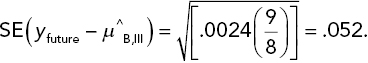
Let the symbol, yfuture, denote a future individual death rate (reciprocal lifetime) for a rat exposed to the III/B combination. A point prediction of yfuture would be the previous (p. 134) estimated mean death rate for that combination, namely, μ^B,III = .31. We need to account for two sources of uncertainty in using this estimated mean to predict a future outcome: (i) individual death rates will vary, with a standard deviation, σ, and (ii) the estimated mean is imprecise: its standard deviation is ![]() .
.
Consider the difference yfuture − μ^B,III. The variance of this difference, obtained by summing the variances of the two terms in this difference, is σ2(1 + 1/8). If we replace σ2 by the error MS and then take the square root, we obtain the SE of the difference:
The difference divided by its SE has a t-distribution, in this case based on 36 df. Thus, we can write, for example,
That is, the middle 98% of a t(36 df ) distribution is given by the interval ±2.43. (I just wanted to use a confidence level other than 95% to show it can be done.) If we plug in the estimated mean and the SE of the difference and then rearrange this inequality so that yfuture is in the middle, we get what is in essence a 98% confidence interval on the future death rate ( = the reciprocal lifetime) of a single rat. The result is
The statistical terminology is to call a confidence interval on a future observation a statistical prediction interval.
Taking the reciprocals of the end points of this prediction interval for death rates yields the following 98% prediction interval for survival time: (2.3, 5.6) h. We’re worried about short survival times, so the conclusion here would be that with 99% confidence, a future survival time (for a random rat subjected to the III/B combo) would be at least 2.3 h.
Probability estimation and tolerance intervals
The statistical model for “data we might have gotten” in this experiment is that the death rates for rats given a particular poison/antidote combination have a Normal distribution. We don’t know the mean and standard deviation of that distribution, but the experimental data provide us estimates of the mean and standard deviation of the distribution. For the Poison III/Antidote B combination, the estimated mean is .31 and the estimated standard deviation is ![]() . We can use these estimates to estimate survival probabilities.
. We can use these estimates to estimate survival probabilities.
Consider a particular survival time of interest, call it L*. (The choice of this limit would be based on a biological analysis pertaining to what constitutes an adequate survival time.) We want to estimate the probability that a rat will survive at least L* hours. Denote this probability by Prob(L > L*), where L denotes survival time. We can relate this probability to the probability distribution of death rate by
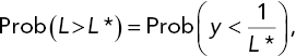
where y = 1/L. The statistical model under consideration is that y has a Normal distribution. For the Poison III/Antidote B case, we can estimate this probability by using the estimated mean and standard deviation given in the preceding paragraph. Thus, for example, the estimated probability of exceeding a lifetime of 2.3 h is equal to the probability that y < 1/(2.3) = .435, where y has a Normal distribution with mean .31 and standard deviation .049. That probability, using software or tables of the Normal distribution, is .995.
This estimated survival probability, of course, is imprecise: it is based on data-based estimates, not known parameters. We need a confidence interval on the underlying survival probability. Consider the previous calculated 95% confidence interval on the III/B mean: .31 ± .035 = (.275, .345). If we calculate the probability that y < .435 for Normal distributions with means at either end of this interval and a standard deviation of .049, we will obtain an approximate 95% confidence interval on the underlying survival probability.
(This calculation is an approximation because we haven’t accounted for the uncertainty in the estimated standard deviation. However, because the t-distribution with 36 df is negligibly different from the standard Normal distribution, the approximation is not bad. An exact calculation is possible but beyond the scope of this text. Search online for “statistical tolerance intervals.”)
Setting the mean equal to .275 yields a survival probability of .9995. Setting the mean equal to .345 yields .967. Thus, with 95% confidence, the probability of surviving 2.3 h is between .967 and .9995.
This analysis can be repeated for other values of L*. Doing so leads to the survival curves in Figure 5.6. Reading the three curves at L* = 2.3 h gives the point estimate and (approximate) 95% confidence interval for the survival probability calculated in the preceding paragraphs.
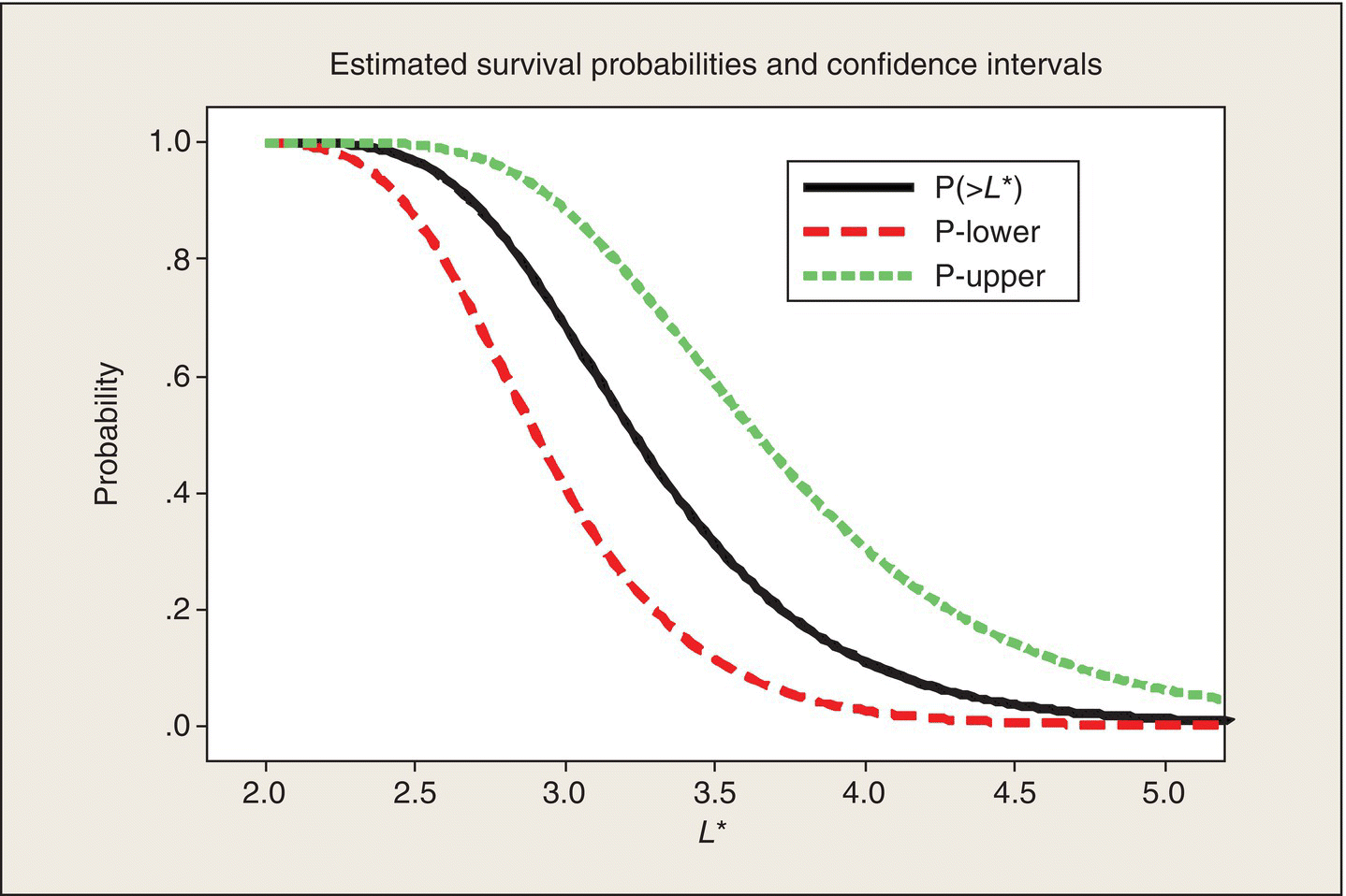
Figure 5.6 Estimated Survival Curve and 95% Statistical Confidence Intervals.
We can also read horizontally in Figure 5.6 and determine confidence intervals on particular percentiles of the survival time distribution. For example, drawing a horizontal line at a survival probability of .5 and then reading the L* values at which this line intersects the curves tell you that the estimated median lifetime is 3.23 h ( = 1/.31) and that with 95% confidence, the median lifetime is between 2.90 and 3.64 h. Statistical confidence limits on percentiles of a distribution are called statistical tolerance intervals.
At this point, this analysis is just illustrative and somewhat academic. If the government agency had done the rat–human calibration and decreed that to be viable, an antidote, when applied to a rat that has been exposed to Poison III, should demonstrate at least a 95% survival probability at 2.5 h, and then we could focus the analysis on this criterion. The nominal survival probability at 2.5 h is .97, but the lower end of the corresponding 95% confidence interval is .87 and thus does not meet the agency’s criterion. More data, or a better antidote, would be needed.
This and the previous subsection provide two sorts of statistical inferences:
- With 99% confidence, the lifetime of a future random rat subjected to the III/B combination will exceed 2.3 h.
- With 97.5% confidence, at least 96.7% of rats of the type used in the experiment would survive at least 2.3 h.
These are complementary, not contradictory. The first statement pertains to a single future individual; the second pertains to the proportion of a “population.”
Further experiments
The experiment considered here is apt to lead to further experiments, rather than to a contract. One such possibility mentioned previously (p. 133) is an experiment that amounts to a runoff between Antidotes B and D.
Alternatively, even if the contract is given to the maker of Antidote B based on this initial experiment, there is much to be learned about Antidote B before it goes into the field to be used by troops. For example, what might be the effects of different dose levels of poison and antidote on survival time, and what might be the effects of different delay times between the exposure to a poison and the administration of the antidote? Follow-on experiments would be needed to answer these questions. Presumably, prior to this experiment, the poison and antidote dosages and the antidote/delay times were discussed and the decision made to hold them fixed in these experiments. Now that the number of antidotes has been whittled down to one or two, the next step could be to design and run experiments to address these additional factors. It is typical in a design process to consider many factors of potential interest and then, in order to keep the experiment manageable, to decide to hold some factors fixed at specific levels and vary others as specified by the experimental design. At the end of this chapter, we will discuss experiments with large numbers of factors.
Another direction for follow-on experimentation is to do experiments on another variety of laboratory animals in order to help build a basis for extrapolating the findings to humans. We might also want to consider other poisons. Subject-matter knowledge is essential to sorting out and prioritizing all of this.
Example 2 (Two quantitative factors): Ethanol blends and CO emissions
The development of clean and efficient fuel sources is one of society’s major objectives. This example experiment tackles that problem.
Blending ethanol with gasoline reduces carbon dioxide and carbon monoxide emissions from automobile engines, but does not eliminate these emissions. The emissions generated by ethanol–gasoline mixtures depend on several factors pertaining to the fuel mixture and engine characteristics. BHH (2005, Chapters 10 and 11) give an example (used here with the permission of John Wiley & Sons) of a designed experiment for investigating the effects of two such factors on an automobile engine’s carbon monoxide (CO) emissions.
The two factors studied are x1 = ethanol concentration and x2 = air–fuel ratio. These are both quantitative factors. (Indeed, labeling the factors by x’s, as opposed to A and B, suggests that our analysis is going to be aimed at fitting a mathematical function to the data.) The ethanol factor is a fuel-mix variable; the air–fuel factor is an engine/carburetor design variable. In the experiment, each factor had three equally spaced levels, and all nine combinations (crossed factors) constituted the treatments in the experiment. The factors and their levels (Fig. 11.17 in BHH 2005) are:
(The units for these variables are not given. However, as discussed later, these are dimensionless ratios, generally expressed as percentages.) The BHH analysis is based on coding the levels of x1 and x2 as −1, 0, 1, but we will use the original variables.
A little Wikipedia (2011) research indicates that these are pertinent variables and realistic and meaningful levels for these variables in ethanol–gasoline-mixed fuels are in use at present. In particular, x1 is the proportion by volume of ethanol in the ethanol–gasoline-mixed fuel. E10, for example, which corresponds to x1 = .1 (=10%), is a conventional level required in many states and countries. E25 was used in Brazil in 2008. Thus, x1 ranging from .1 to .3 pretty well matches actual ethanol-mixed fuel.
The air–fuel ratio, x2, is also known as the “percent excess combustion air” relative to the amount of free oxygen that is required to combine with all of the fuel. An x2 value of 14.7% is the nominal ratio for gasoline. A higher ratio is a lean fuel mix; a lower ratio is a rich fuel mix. This experiment covered the range on x2 of 14 − 16%.
It was decided to run the experiment by making two runs on a test engine for each of the nine combinations of x1 and x2 levels. Experimental protocol would dictate details of a “run” (e.g., duration and throttle level) and the method by which the engine is purged and set up between runs. Protocol would also specify how emissions during the run would be captured and measured for CO (carbon monoxide). The CO measurements obtained were in units of micrograms per cubic meter (μg/m3). To guard against any time trends, the 18 runs were conducted in a random order.

What we do not know about the experiment’s design is why it was decided to run the experiment with each treatment factor at three levels or why it was decided to do two runs at each of the nine treatment combinations. Presumably (I’ll conjecture), prior testing and perhaps theory indicated that the relationships between these two variables and CO emissions were not linear. Three levels are the minimum required in order to detect and fit a nonlinear relationship. Moreover, just because of the physics involved, there was apt to be an interaction between x1 and x2. Thus, more than two levels would be required to detect and characterize these relationships. Both the cost of experimentation and subject-matter knowledge may have supported the decision not to run the tests at four or five levels of the two treatment factors. The number of replications could have been cost driven. It’s possible that this was an exploratory experiment that would be followed by further experimentation aimed at zeroing in on, with good precision, the (x1, x2) region that minimizes CO emissions, without unduly sacrificing performance.
There are other ways to run an experiment that would result in two measurements of CO at nine combinations of x1 and x2, so it is important to detail the experiment’s design. The analysis could be different or even impossible, depending on how the experiment is conducted. Some design options are:
- The 18 runs could be blocked: one “block” of single runs of the nine treatment combinations, in a random order, could have been done first, followed by a second block of nine runs in a separately randomized order. The two blocks might be done on different days. Or they might have been done on two different test engines. These experiments would be randomized block designs, discussed in the next chapter. The analysis, as we shall see, would necessarily reflect this block structure.
- Another conceivable way the experiment might have been conducted would be to have had 18 test engines available and then randomly assign the nine treatment combinations to two engines each. This would still be a CRD, but the inferences would be different. In the experiment that was actually run, experimental error would be the variability of repeated runs on the same engine. If this 18-engine experiment was run, experimental error would be the variability among different engines run under the same treatment combination. One would expect the latter to have the larger experimental error variation. However, the inference would be broader because 18 engines were involved, not just one.
- One other possibility is that the people running the tests might have looked at the list of test conditions listed in a random order provided by the project’s friendly, local statistician (FLS) and said to themselves, “This crazy mixed-up order of testing that the boss specified will be too time-consuming. It will be easier and quicker if we set the test engine’s carburetor for one fuel–air ratio and then make all six of the runs called for at that ratio consecutively. Furthermore, those six runs could be more conveniently ordered, say, by doing two consecutive runs with the low ethanol level, then two with the middle ethanol, and then two at the high ethanol. Then we will adjust the carburetor to change to the next fuel–air ratio and repeat those six runs and then do the same at the third fuel–air ratio.” Such “convenient” experiments destroy the key design features of randomization and replication and make analysis and interpretation iffy, at best. If the experiment does not provide valid estimates of experimental error, you cannot expect valid conclusions about factor effects and interactions.
This discussion shows how important the procedural details of an experiment are. If a colleague, or client, walked into your office and said, “I’ve got 18 data points, two each at nine combinations of x1 and x2. Please analyze these data,” you can’t do the analysis until you know the data’s pedigree, how they were obtained. The whole process works best if the FLS, or you, after reading this book, are involved in the design of the experiment, not just the number plotting and crunching at the end.
Data displays
We start with the same sort of data plot as we used for the poison/antidote experiment. Figure 5.7 plots CO versus x1, with separate panels for the three x2 values. We can see that increasing the amount of ethanol (x1) in the mixed fuel has quite different effects at the three levels of x2. At x2 = 14, the x1 effect is positive; at x2 = 16, the effect is negative. At the middle value, x2 = 15, the relationship is not monotonic. In other words, the eyeball impression from these data is that there is quite substantial interaction between x1 and x2.
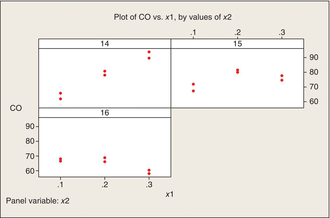
Figure 5.7 Plots of CO versus x1, by Values of x2.
An alternative way to plot the data is to plot CO versus x2, with separate panels for the three levels of x1 (Fig. 5.8). Again, a different plot of the same data shows that the interaction is quite apparent—the relationship of CO to x2 is quite different for the three levels of x1. Both plots show that CO emissions are minimized at high ethanol content (x1 = .3) and high air–fuel ratio (x2 = 16). Both plots also show that the variability between the two replications at each of the nine treatment combinations is reasonably homogeneous across the nine treatment combinations.
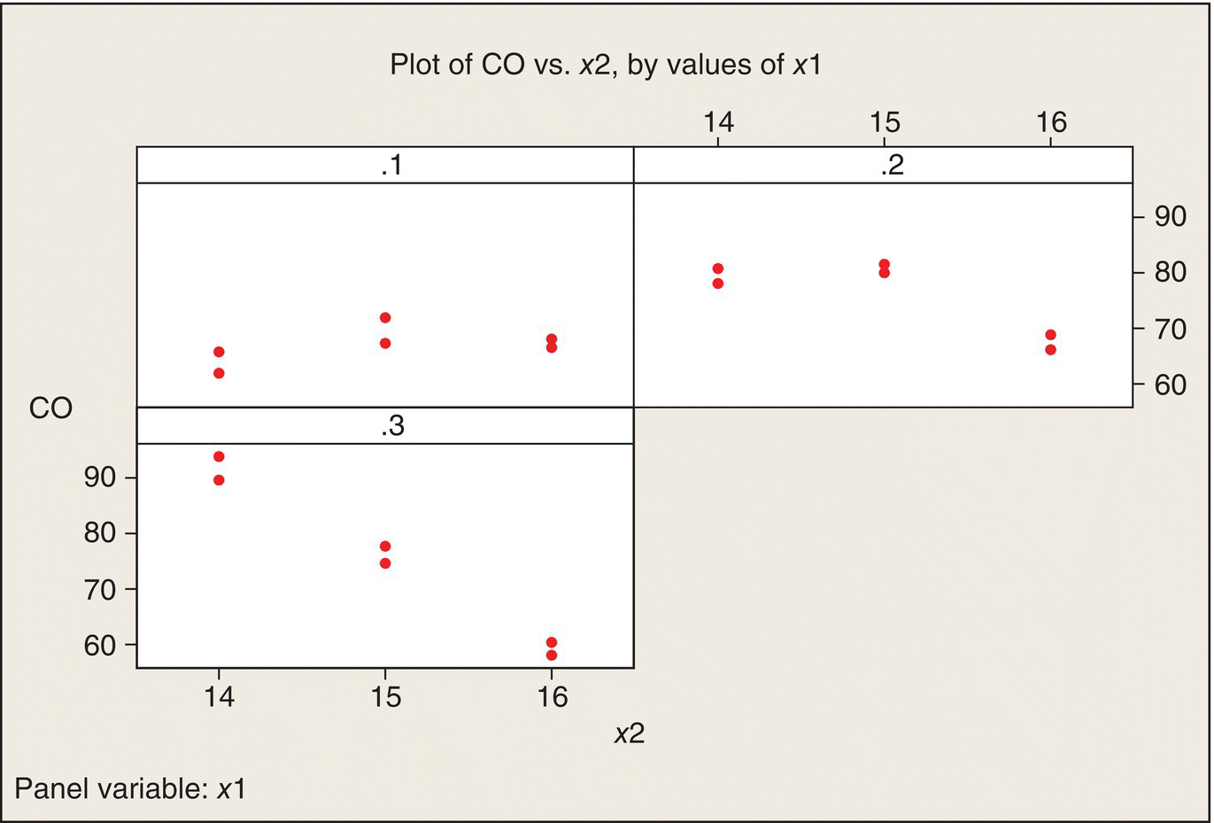
Figure 5.8 Plots of CO versus x2, by Values of x1.
Given that the variability within the 18 pairs of runs is quite consistent, we can also do an interaction plot of the data means at the nine (x1, x2) treatment combinations (Fig. 5.9).
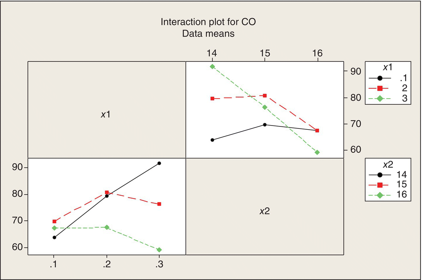
Figure 5.9 Interaction Plots for Ethanol Experiment.
It is clear that there is interaction—the effect of each of the factors differs greatly across the levels of the other factor. But the nature of the synergistic, combined effects of x1 and x2 are not easy to see because these plots treat the panel variable (the variable labeling each of the three panels) as a qualitative factor, which it isn’t. There are better ways to show the data that make use of the fact that both x1 and x2 are continuous quantitative variables.
Figure 5.10 shows the nine design (x1, x2) points, labeled by the average CO emissions at those points. As you look at this plot, you can see a ridge: maximum CO occurs at the lower right-hand corner and declines as you move diagonally to the upper left-hand corner. CO falls off on either side of this ridge. The lowest CO is at the upper right-hand corner (which is the combination of a high air–fuel ratio and high ethanol content, which makes sense: the more air and ethanol in the mix, the less CO will be emitted). The next lowest CO is diagonally opposite (which is more difficult to intuit). The fact that these are quantitative factors makes it meaningful to interpolate between the design points, to visualize peaks, valleys, and ridges.
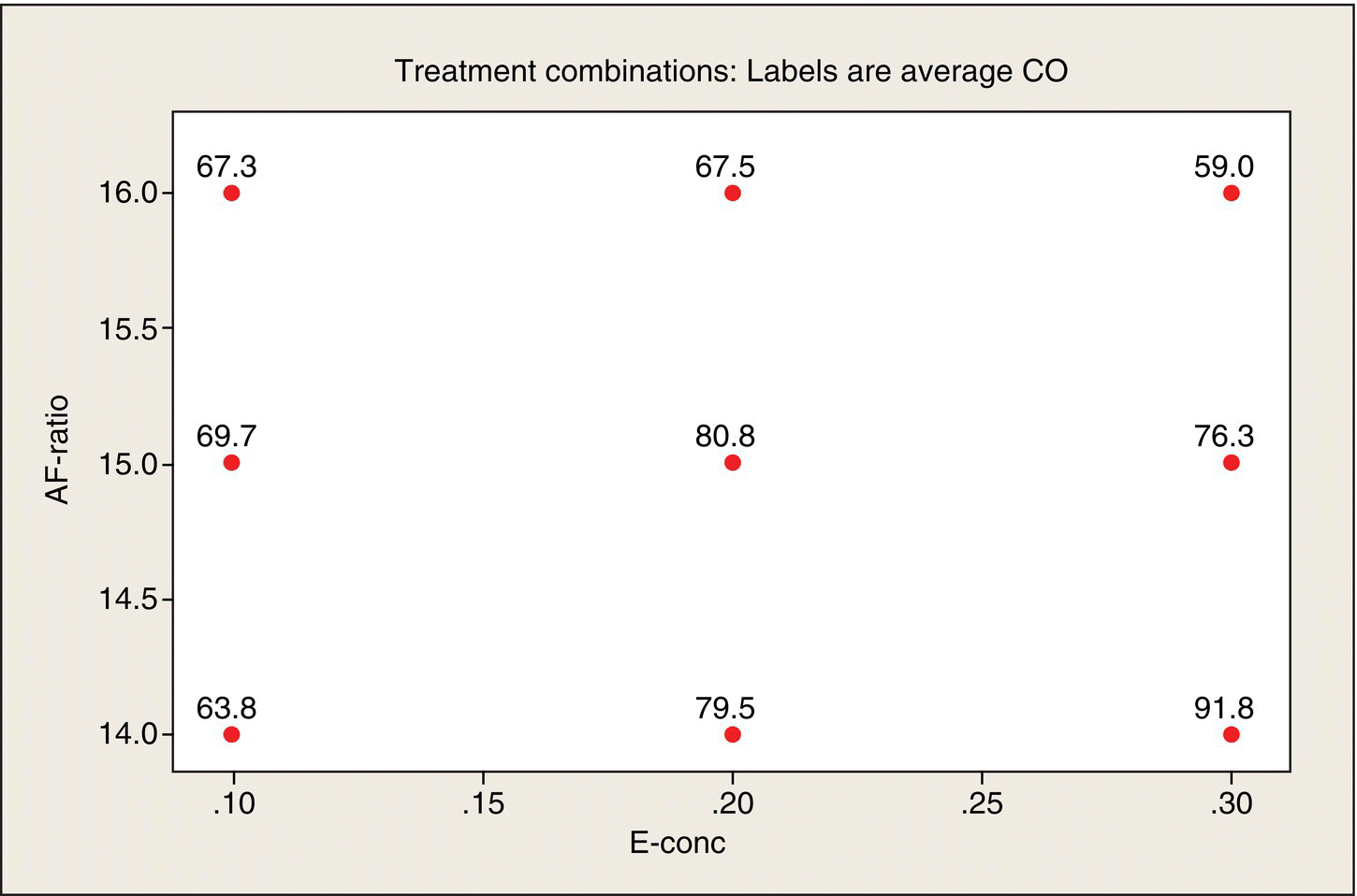
Figure 5.10 Average CO Emissions by x1, x2 Combinations.
Rather than just imagine contours sketched through the points in Figure 5.10, we can have software create a contour plot (Fig. 5.11). The ridge is quite apparent in this picture of the data. This display provides us a much clearer picture of the relationship of CO to x1 and x2 than does the interaction plot (Fig. 5.9.)
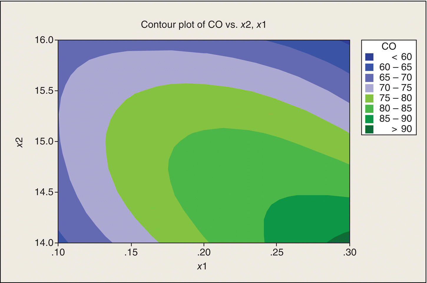
Figure 5.11 Contour Plot of CO versus x1 and x2.
Message: Do not do interaction plots for two (or more) quantitative factors.
Discussion
Our goal is to find x1 and x2 settings that would minimize CO emissions. The data thus far suggest either the lower left corner or the upper right corner of the (x1, x2) experimental region. The shape of the contours, though, suggests that if we move beyond these two corners, we might reduce CO even further. Whether or not this is feasible requires subject-matter knowledge. An automobile engine might not even run for (x1, x2) combinations outside of the experimental region in this experiment. An engine that doesn’t run is one way to minimize CO emissions, but is not what you (or Charlie Clark, Chapter 1) want in an automobile. If feasible, though, we would want to run further tests in the regions indicated by the contour plot, rather than settle on the best (x1, x2) combination or combinations found in this experiment.
Before making final recommendations, though, we would need to consider other characteristics of engine performance, such as power and engine temperature. We don’t want combinations of fuels and carburetor settings that don’t provide adequate power or run so hot they damage the engine.
Regression analysis and ANOVA
In Chapter 4, which dealt with CRD experiments with a single quantitative factor, the analysis approach was curve fitting, also known as regression analysis: fitting a mathematical function, or model, to describe the relationship between a single factor, x, and the response, y. With two quantitative factors in the present example, we extend the regression analysis in Chapter 4 of y as a function of single x-variable to a multiple regression analysis of y as a function of both x1 and x2.
The simplest mathematical model would be a linear model: CO = b0 + b1x1 + b2x2. A contour plot of this function would have parallel straight lines. Such a model would not describe the ridge seen in our contour plot (Fig. 5.9) of these data.
A model that can have ridge-like contours is the second-order function:
Table 5.5 gives the regression analysis results for fitting this model. Let’s discuss what all this is telling us.
Table 5.5 Regression Analysis of CO Emissions Data.
| The regression equation is | ||||
| CO = − 1046 + 1586 x1 + 135 x2 − 457 x1-sq − 4.13 x2-sq − 90.6 x1x2 | ||||
| S = 2.53; DF = 12 | ||||
| Predictor | Coef | SE coef | T | P (2-tail) |
| Constant | −1046 | 284.8 | −3.67 | .003 |
| x1 | 1586 | 143.3 | 11.07 | .000 |
| x2 | 135 | 37.9 | 3.56 | .004 |
| x1-sq | −457 | 126.3 | −3.62 | .003 |
| x2-sq | −4.13 | 1.26 | −3.27 | .007 |
| x1x2 | −90.6 | 8.93 | −10.15 | .000 |
The first line of Table 5.5 is the least-squares fitted equation. With this equation, we can predict what the CO emissions would be for any (x1, x2) combination in the experimental region. The residual standard deviation for this fit is s = 2.53 μg/m3. This represents experimental error, which is the variability of measured emissions between the two replicates run at each (x1, x2) combination, and possible lack of fit of the second-order model to the data. The ANOVA in Table 5.6 evaluates lack of fit.
Table 5.6 ANOVA for CO Quadratic Model.
| Source | DF | SS | MS | F | P |
| Regression | 5 | 1604.7 | 320.9 | 50.3 | .000 |
| Residual error | 12 | 76.5 | 6.38 | ||
| Lack of fit | 3 | 31.7 | 10.58 | 2.13 | .17 |
| Pure error | 9 | 44.8 | 4.98 | ||
| Total | 17 | 1681.2 |
The table of predictors in Table 5.5 gives each coefficient and its SE. (Conceptually, an SE of a coefficient estimate is analogous to the SE of a treatment mean or of a difference between treatment means, which we have considered in the previous chapters. The experimental design affects these SEs through the spread of the (x1, x2) points in the design and the number of replications at the design points.) Each coefficient is then evaluated for its significance relative to a coefficient of zero. We’re asking: Is the difference between a coefficient and zero (in which case the coefficient estimate could just be due to the inherent variability of the data) “real or random?” Here, the large t-values, in absolute value, and the corresponding small P-values tell us that all five terms in the model (not counting the intercept) are making real contributions to the fit.
But the significance of all terms does not necessarily mean that we have a good fitting model. We can evaluate goodness of fit graphically and by an ANOVA.
Figure 5.12 shows the observed values of CO emissions plotted versus the “fitted values.” Also shown is the 45° line as a reference. For a perfect fit, the observed values would fall on this line. A poorly fitting model would have systematic departures from a straight line. Visually, because in most cases the fitted value falls between replicate observations at the experimental points, Figure 5.12 does not indicate a poorly fitting model.
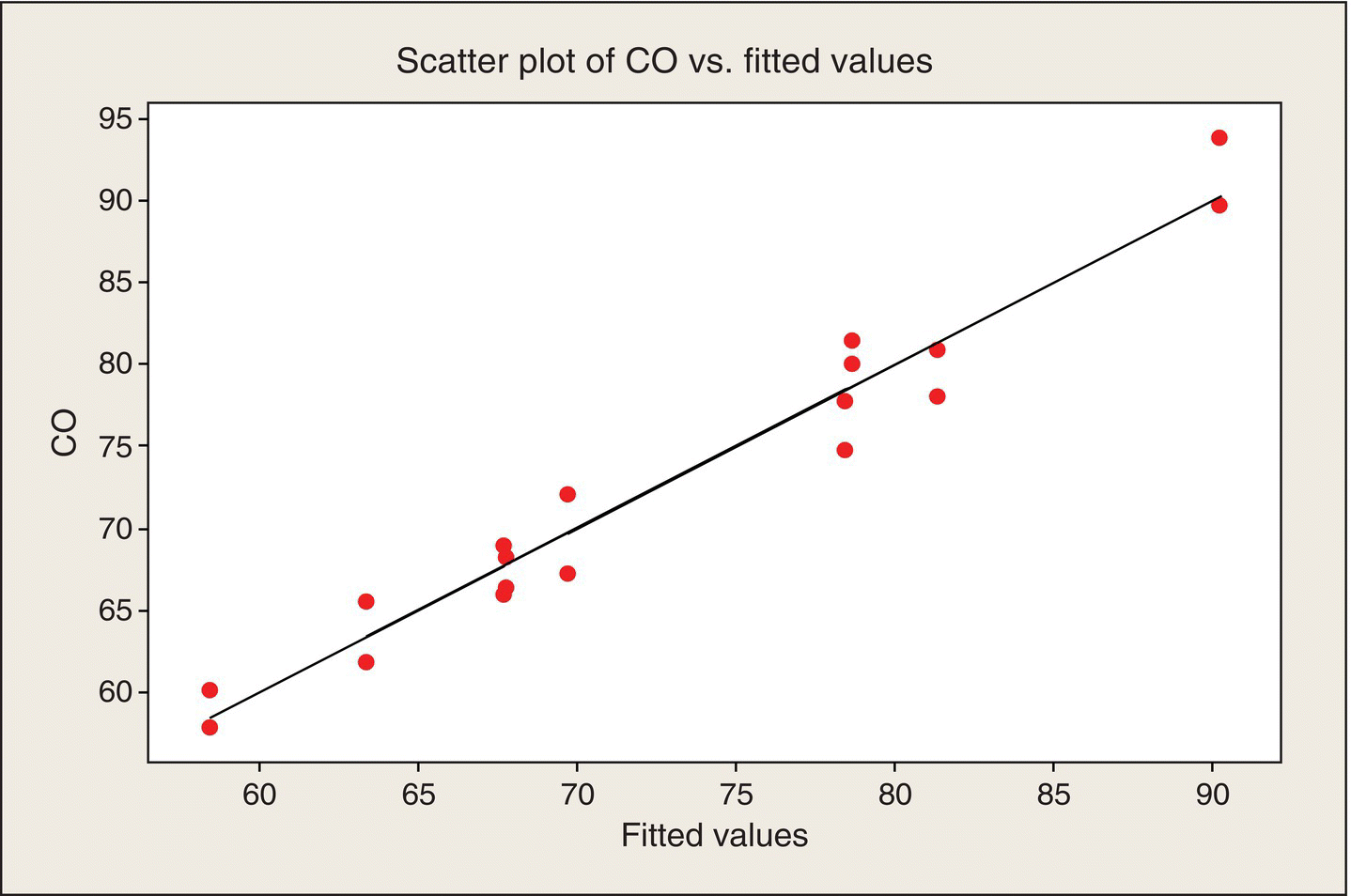
Figure 5.12 Scatter Plot of Observed CO Values versus Fitted Values.
We can substantiate the visual impression of a satisfactory fit by an ANOVA of the data. That ANOVA separates the residual variability between “pure error” (the variability among the pairs of replications) and lack of fit (the additional error because the second-degree function doesn’t adequately describe the underlying relationship between CO and x1 and x2). Table 5.6 gives this ANOVA.
The F-test statistic comparing lack of fit to pure error in Table 5.4 is equal to 2.13, based on three numerator and nine denominator df. The resulting P-value of .17 indicates that there is not strong evidence of lack of fit. The ANOVA confirms the visual impression in Figure 5.10. Also, the highly significant F-statistic (F = 50.3, P ~ 10−7) for the overall model assures us, no surprise, that our fitted model is much better than nothing.
Discussion
This analysis had a very nice (crisp, clear, readily communicated) outcome—due in large part to the experimental design, especially the balance and symmetry of the 3 × 3 factorial structure of the treatments and the replication in the experiment. The result is a simple, well-fitting model, validatable in the sense that we could do a goodness of fit statistical test of the model. The only downside is that we learned that low CO was only achieved in two corners of the experimental region.
In contrast, the situation in an ethanol research lab might be that over some period of time, various researchers might have done various tests at some collection of (x1, x2) points, but not in a coordinated way. Suppose you have 18 such runs. They are not likely to have covered the (x1, x2) space in a way that provides such a clear picture of the combined effects of these factors. Experimental protocol would likely not have been consistent over these runs, either. There may have been other process variables and protocols that were not controlled in the historical set of runs, but were in the designed experiment. (BHH 2005 and other authors discuss the pitfalls of drawing conclusions from haphazardly collected data.)
Anecdote: Bill Hunter once recounted that when he worked for a chemical company, he did an analysis of some collected process data and came to the conclusion that water content had little effect on the process. The process engineers guffawed: “If you don’t run the process at precisely the right water content, you get an explosion! Therefore, we control water content very tightly.” The collected data thus had water content controlled very tightly and too tightly for the process output to vary, explosively, over that range. Data mining of the haphazardly collected data might lead to a second-degree model, maybe even very similar to the one yielded by the experimental data, but all of these concerns about the way the data were assembled would limit our confidence in the model. We might have to run a designed, controlled experiment to validate it.
Bottom Line: Designed experiments provide a stronger basis for learning and actions than do data obtained without the discipline that an experimental design imposes.
This model also gives us a much better understanding of the effects of ethanol concentration and air–fuel ratio on carbon monoxide emissions than we would have gotten if we had analyzed this experiment ignoring the quantitative nature of these two factors in the experiment.
At this point, it is appropriate to share one of Professor Box’s most widely quoted remarks: “All models are wrong; some models are useful.” (BHH 2005, p. 440). This means that all mathematical models are approximations to real-world relationships. Even science-based models make simplifying assumptions about nature, such as uniform material properties, so they are approximations (wrong but often still useful). In the ethanol case, we are not assuming that the “true” relationship between CO and x1 and x2 is a second-order function. It just does a good job of usefully approximating what may be a very complex, higher-dimensional relationship. There are other variables, say, x3, x4, …, that may have an effect, but not enough to preclude using the selected and fitted model to draw some conclusions about how to minimize CO emissions and to point the way to further experimentation. For more on this topic, see Wikiquote (2014) and its references.
Response Surface Designs
Because of the utility of quadratic mathematical functions relating quantitative factors to experimental responses, statisticians have developed experimental designs that facilitate fitting these models. These designs are called “response surface designs.” For two x-variables, these designs take the form of 2 × 2 factorial plus a “star.” The (x1, x2) coordinates at which experiments are run are given in Table 5.7 and shown graphically in Figure 5.13.
Table 5.7 Response Surface Design for Two x-Variables.
| x1 | x2 |
| −1 | −1 |
| −1 | 1 |
| 1 | −1 |
| 1 | 1 |
| 0 | 0 |
| −a | 0 |
| a | 0 |
| 0 | −a |
| 0 | a |
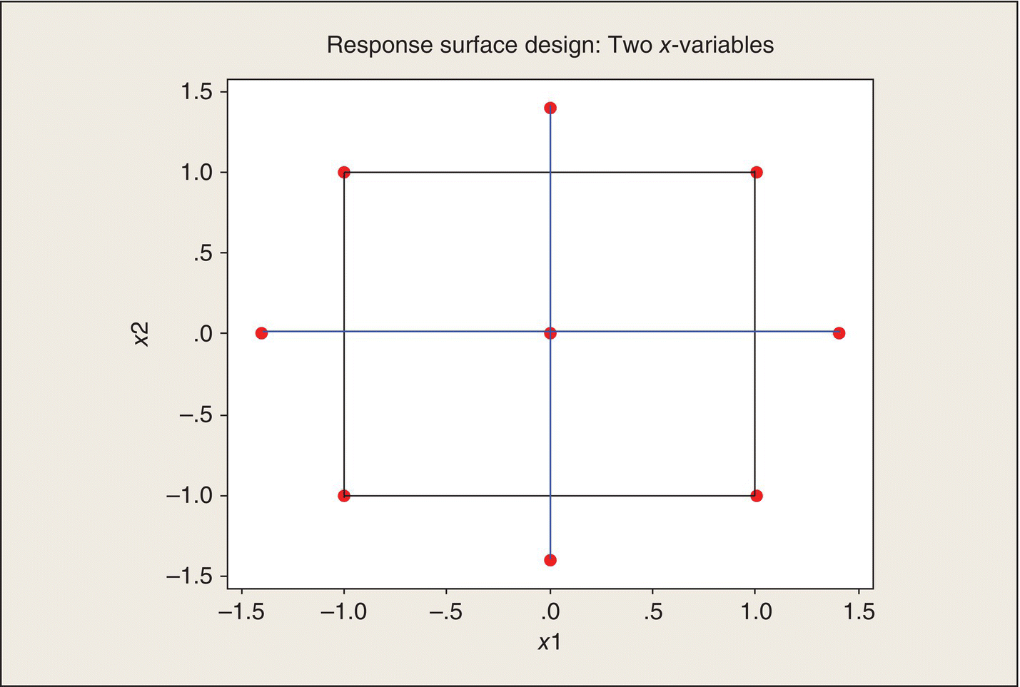
Figure 5.13 Response Surface Design for Two x-Variables in Coded Units. 2 × 2 factorial points connected by black lines; “star” points connected by blue lines; axial points at ±1.4.
The “star” portion of the design consists of the center point and two axial points on each axis. Defining the axial points by ![]() has some desirable model-fitting properties, but context constraints are also important considerations. The preceding ethanol experiment, which had a 3 × 3 set of factorial treatment combinations, was the special case of a = 1.
has some desirable model-fitting properties, but context constraints are also important considerations. The preceding ethanol experiment, which had a 3 × 3 set of factorial treatment combinations, was the special case of a = 1.
When fitting mathematical functions to data, it is important to consider transformations of the x-variables or the response variable. Theoretical considerations or empirical evidence can suggest using logarithms, reciprocals, geometric functions, etc. rather than the values directly measured. If transformations are known ahead of time, the experiment should be designed in terms of the transformed x-variables.
Depending on context and cost considerations, the whole response surface design can be replicated r times. When experimental units and tests are expensive, it is generally recommended that only the center point be replicated. Replication provides an estimate of “pure error” variation and is necessary for evaluating lack of fit of a candidate model. Note also that having treatment combinations that include five levels of each x-variable also provides a way to evaluate the fit of second-degree polynomial models. For much more information about response surface designs and examples, see, for example, Myers, Montgomery, and Anderson-Cook (2009).
Extensions: More than two treatment factors
Two-factor treatments are the easiest to illustrate and the place to start in thinking about multifactor experiments, interactions among factors, and main effects of factors. Many issues and processes of interest in science, industry, and government, though, involve more than two factors, maybe many more than two. In most of the examples in this book, the discussion of potential follow-on experiments pointed to the investigation of the effects of additional factors. Let’s consider the two examples of this chapter.
Example 3: Poison/antidote experiment extended
In the poison/antidote experiment, the antidotes were administered at a specified time after the laboratory animal was exposed to a poison. If these antidotes were to be used in a battlefield situation, conditions could preclude prompt administration of an antidote. Thus, one additional factor that might be addressed in subsequent experimentation is delay time. Let’s suppose the government agency sponsoring the testing of antidotes has decided to focus follow-up experiments on antidotes B and D and test these antidotes against the same three poisons used in the first experiment. The agency reps thus decide to consider the quantitative variable, delay time, as a factor (variable) in their follow-up experiment.
Another factor held fixed in the first experiment was dose level. Presumably, for that experiment, the four antidote manufacturers specified particular dose levels that their analyses indicated would be optimal in some sense. However, from the agency’s point of view, there are issues of both cost and effectiveness that could depend on dose. Thus, the government reps ask the manufacturers to specify a low, nominal, and high dose level. The nominal level would be the level tested in the first experiment. Low and high would be spaced widely enough to have a good chance of detecting a dose effect, if one exists. The dose levels would be quantitative variables, in units such as milligrams, but because the antidotes are different chemicals, their dosage levels are not in the same dimension. Thus, dosage is a nested factor: it is nested within antidotes, not crossed with them. Though we may label them low, nominal, and high, they are not necessarily the same dosages for the two antidotes.
After discussions among the sponsoring agency and the antidote manufacturers, the experiment is designed. The experiment will have the following four factors and factor levels:
- Poisons (3 levels): I, II, and III
- Antidotes (2 levels): B and D
- Delay times (4 levels): t1, t2, t3, and t4
- Doses (3 levels for each ant.): B, dB1, dB2, and dB3, and D, dD1, dD2, and dD3
The treatment combinations will be all 3 × 2 × 4 × 3 = 72 combinations of these four treatment factors. To bring more precision to the experiment and provide more sensitivity in comparing Antidotes B and D, there will be five laboratory animals (experimental units) for each treatment. (The first experiment provided an estimate of the experimental error standard deviation, σ, and a sample size analysis could have been done to determine the number of replications.) Thus, there will be a total of 360 experimental units in the experiment, each treatment combination being randomly assigned to five experimental units. Note that this experiment has 180 eus for each antidote. The original experiment had 12 eus for each antidote.
The response measured will be lifetime, after an animal has been exposed to a poison and been treated with an antidote, at a specified dose, after a specified delay time. The variable analyzed will be death rate, the reciprocal of lifetime. What will the analysis look like?
Analysis 1: Plot the data
The appropriate starting point would be scatter plots of individual death rates versus dose level for each of the 24 poison/antidote/delay time combinations. The main value of these plots is to see whether the variability within each treatment combination is reasonably consistent across the experiment. One could also see whether increasing the dose decreases the death rate (increases survival time) consistently, or more so for one antidote than the other, or differently for different delay times, etc. Additionally, one could plot death rates versus delay times for each of the 18 poison/antidote/dose combinations and look for consistencies and differences in the delay time effect.
Subsequent displays would be various presentations of the 72 treatment means. Because two of the factors are quantitative, contour plots of average death rate versus t and d (dropping the subscripts for ease of presentation), as in Figure 5.11, for each of the six poison/antidote combinations, would be appropriate. This would provide a comparison of the two antidotes’ effectiveness for each poison, as a function of delay time and dose. One could follow these plots with contour plots in time and dose for each poison and antidote, being careful to define the color bands to be the same for all six contour plots.
Analysis 2: ANOVA
Because the dose levels are different for the two antidotes, I would do separate ANOVAs for the two antidotes, as shown in Table 5.8. Each of these ANOVAs has entries for poison, delay, and dose; their two-way interactions; and their three-way interactions. Statistical software such as Minitab can do these ANOVAs. Interested readers can find the formulas for the sums of squares for each line in the ANOVA in references such as Montgomery (2012). Minitab and other software can take input that specifies the sources of variation and generate the proper ANOVA table. Or see your FLS. For our purposes, let’s focus on the structure of this table and how to interpret it.
Table 5.8 ANOVA for Poison/Antidote/Delay/Dosage Experiment.
| Source of Variation | df | |
| Antidote B | Poison (P) | 2 |
| Delay time (T) | 3 | |
| Dose (D) | 2 | |
| P × T | 6 | |
| P × D | 4 | |
| T × D | 6 | |
| P × T × D | 12 | |
| Error (B) | 144 | |
| Total (B) | 179 | |
| Antidote D | Poison (P) | 2 |
| Delay time (T) | 3 | |
| Dose (D) | 2 | |
| P × T | 6 | |
| P × D | 4 | |
| T × D | 6 | |
| P × T × D | 12 | |
| Error (D) | 144 | |
| Total (D) | 179 |
The degrees of freedom follow the pattern we’ve seen before. The df associated with each factor’s main effect is one less than the number of levels. For example, three dosage levels mean 2 df for dose; four delay times mean 3 df for delay time. For each two-way interaction, the associated df is the product of the two factors’ dfs—for example, the poison × dose interaction has 2 × 2 = 4 df. Then, for the big one, the three-way P × T × D interaction, it has 2 × 3 × 2 = 12 df.
Note that if you add the df for all of these treatment-related sources of variation, the sum is 2 + 3 + 2 + 6 + 4 + 6 + 12 = 35 df. There were 36 treatment combinations within each antidote. If we had just done an ANOVA for a one-way classification with 36 treatments, there would be 35 df for treatments in that ANOVA. What we have been able to do because of the three-factor factorial treatment structure is to separate the various interactions and main effects. We don’t just have 36 assorted treatments. We’ve got a 3 × 4 × 3 factorial arrangement of three treatment factors. Our ANOVA can and should reflect and provide for an evaluation of the variation associated with that structure.
The error lines in the ANOVA each have 144 df. Each of the 36 treatments was applied to five experimental units. Thus, there are 4 df in each of these 36 groups of eus. Thus, when the corresponding sums of squares are pooled, the pooled error has 36 × 4 = 144 df. This pooling is done under the assumption that the underlying variances among eus in each treatment group are equal. Data plots and formal tests of significance can evaluate this assumption.
F-ratios for each effect and interaction in the table are obtained by dividing each MS by the error MS. To interpret the ANOVA, we start at the bottom. The F-ratio for the P × T × D interaction is asking: Does the effect of any one factor depend on the levels of both of the other factors? A large F-ratio and corresponding small P-value say there is no consistency of factor effects. We can’t generalize at all. To be specific for this experiment, if we had a significant three-way interaction and plotted average death rate versus dose level, for all 12 poison/delay time combinations for a given antidote, those plots would not be near-parallel lines. It’s still possible, though, to have a winning antidote, delay time, and dose level. The lines might not be parallel, but the lowest death rate might be, say, Antidote B, minimum delay time, high dose for all three poisons. All is not lost when you have a significant three-way interaction.
The two-way interactions correspond to two-way tables of mean responses for a pair of factors, averaged over the third factor. A significant three-way interaction tells you that this collapsing across one factor may not be appropriate, for the purpose of evaluating the effects of any pair of factors. The pattern of two-way and three-way interactions reflects the lack of consistency seen in data plots. The ANOVA is quantifying patterns seen in corresponding data plots, and it is gauging these patterns against the inherent variability among eus in order to determine real or random.
Analyzing the data for each antidote separately enables us to estimate and compare average death rates but also the variability of death rates. As noted earlier, the best antidote would have low average death rates and low variability about those averages.
Analysis 3: Further analyses
Estimates of average death rates for factor-level combinations of interest, confidence and prediction intervals, survival curves, and other analyses would be issue and context driven in this follow-on experiment as they were previously for the initial poison/antidote experiment. The sponsoring agency would be looking for antidotes and dosage levels that lead to the best survival times across all poisons. They would be looking at how sensitive antidote effectiveness is as a function of delay time. If different combinations led to comparable survival times, other antidote characteristics such as cost and side effects could be “factored in” (pardon the expression) to the decision process.
Example 4: Ethanol experiment extended
The two quantitative factors in the ethanol experiment were the ethanol concentration (x1) and the air–fuel ratio (x2). A third factor of interest (I suggest without much knowledge of the variables affecting CO emissions from engines that burn ethanol fuel) might be the octane level (x3) of the gasoline with which the ethanol is mixed. We learned in the first experiment that x1 and x2 both near the upper ends of the ranges considered led to reduced CO. Let’s suppose that in a follow-up experiment, we decide to consider three levels of both x1 and x2, perhaps centered on the upper right corner of the original experiment, without wandering into the region where zero CO is emitted by an engine that won’t run. Suppose the investigators’ decision is to incorporate octane, x3, at three levels corresponding to conventional gasoline into the treatment structure. Thus, there will be 3 × 3 × 3 = 27 treatments. Suppose also, as before, that the experiment will have two replications at each treatment combination for a total of 54 runs.
Analysis 1: Plot the data
Because it is difficult to display four dimensions on two-dimensional paper, a good starting point for plotting the data from this extended experiment is to produce contour plots of emissions versus x1 and x2, for each level of x3 (octane). The plots would need to have the same scales and colors in order to facilitate comparisons across octane levels.
Analysis 2: Model fitting
A full second-degree model for three x-variables has a constant, three linear terms, three squared terms, and three two-variable products, for a total of 10 parameters in the model. The purpose of curve fitting and other analyses would be to find and characterize the relationship of CO emissions to these three process variables.
As will be discussed in Chapter 7, Optimal Experimental Design methods, also known as computer-aided designs, can be especially useful in finding designs that are appropriate for complex situations.
Special Case: Two-Level Factorial Experiments
When your eu is a laboratory rat and your measurement system is a graduate student with a stopwatch, you can afford to run large experiments with many factors at moderate to many levels and many replications. If your eu is a missile, a school system, or an expensive pharmaceutical process, you cannot. These systems have a large number of factors that may affect their performance, but it is not economically possible to run experiments that explore their effects and interactions extensively. Are designed experiments out of the picture? (I have encountered consulting clients who said, “I can’t afford to run a designed experiment. I can do only a small number of tests.”) Au contraire! When data are expensive and when you can’t overwhelm an issue with data, that’s when you most need efficient experimental design in order to maximize the amount of usable information obtained for the money spent.
The place to start whittling the problem down to a manageable size is to use subject-matter knowledge, theory, and experience to reduce the number of factors to include in the experiment. This effort is apt to require subject-matter expertise in more than one area.
Of course, one reason to experiment is to find out if hitherto unevaluated or unappreciated factors may have unexpected effects, so you don’t want to reduce the experiment to confirming what is already known. Former U.S. Secretary of Defense, Donald Rumsfeld, expressed the issue poetically:
The Unknown
As we know,
There are known knowns.
There are things we know we know.
We also know
There are known unknowns.
That is to say
We know there are some things
We do not know.
But there are also unknown unknowns,
The ones we don’t know we don’t know.
February 12, 2002, Department of Defense news briefing (source: Hart Seely, SLATE online, April 2, 2003)
Experiments are for finding unknown effects of known factors, but as with the tomato fertilizer experiment, we also can find effects of factors we did not know or suspect—e.g., the fertility trend in the experimenter’s garden—if we are alert and curious and have the data.
Once a set of factors has been identified, the next way to reduce the size of the experiment is to limit the number of levels of each of the factors. For this reason, a large amount of statistical experimental design research has been devoted to the case of factors with only two or three levels. Sometimes, these experiments are called “industrial experiments,” but they have applicability in any multifactor, high-cost situation. They are also termed “screening experiments” because they may be conducted to identify the factors with the largest effects; subsequent experiments would then explore these factors more extensively. Many texts such as Box, Hunter, and Hunter (2005), Ledolter and Swersey (2007), and Montgomery (2012) deal extensively with treatment design for two-level factors. Here, I will just present a description of the main ideas of experiments with two-level factors and illustrate these ideas with two examples.
Example 5: Pot production
This example (with some enhancement on my part) is from Ledolter and Swersey (2007). It seems that a company that manufactures clay flower pots (you were expecting a different pot story?) was having problems with high rates of cracked pots. On the advice of their FLS, to find the cause of the problem and to identify possible fixes to the production process, they ran a series of experiments including one that included the following four treatment factors, each at the indicated two levels:
- Cooling rate (R): slow and fast
- Temperature (T): 2000 and 2060°F
- Clay coefficient of expansion (C): low and high
- Conveyor belt carrier (D): metal and rubberized

The low/high and slow/fast levels for factors R and C were appropriately defined and specified in appropriate units.
One can envision a conveyor belt that takes soft-clay molded pots into an oven where they are baked and then through a cooling chamber to complete the process. The pots in the experiment will be made of one of two clays, carried along on one of two types of carriers, baked at one of two temperatures, and cooled at one of two rates.
The eu was a batch of 100 pots processed in one run of the baking and cooling process. The response measured was the percent of cracked pots in a batch.
With four two-level factors, there are a total of 16 treatment combinations, and in this experiment, a total of 1600 pots produced for a single replicate of each treatment combination. The production manager (who knew statisticians like to replicate) was concerned about having to run several replications of each of these treatments; the lost production time and (potentially) many cracked pots would be costly. The FLS, though, said that it might be possible to run only one replication of each treatment combination, so only 16 batches would need to be produced and processed, but said, “First, let’s talk about interactions.”
“Interaction means that the effect of one process variable on pot cracking depends on one or more of the other three process variables. For example, would you expect the difference in crack% between the clays with low and high expansion coefficients to be similar for slow and fast cooling, or is the difference apt to depend on the cooling rate? If the latter, that’s an example of interaction. Would you also expect the difference between the two clays to depend on the baking temperature? Would the effects of any of these variables be expected to depend on which carrier the pots rode on? If we can assume that the four possible three-factor interactions and the four-factor interaction are negligible, relative to the inherent variability of the process, then we can just run one replication and have a few degrees of freedom left over for estimating that inherent variability and evaluating the fitted model relative to that inherent “error” variability.”
The process and ceramic engineers ponder these questions and decide that the only potential interaction they anticipate is between R and C. For pots that are slow cooled, the coefficient of expansion should not have as much of an effect as when they are fast cooled. Other than that, no other interactions, particularly three way and four way, seem plausible, they say.
So the experiment is conducted with one run of each of the 16 treatment combinations. The order is randomized and independent batches of clay pots are produced for each run. The design matrix and response data are given in Table 5.9. The two levels of each treatment factor are indicated by −1 and 1. For quantitative factors (R, T, and C in this experiment), these coded levels denote the low and high levels; for qualitative factors (D in this experiment), the coded levels denote the two different categories. Here, D = −1 denotes the metal carrier, and D = 1 denotes the rubberized carrier.
Table 5.9 Pot Production Experimental Results.
Source: Reproduced with the permission of Stanford University Press, reproduced Table 4.7, p. 80, Testing 1-2-3, by Ledolter and Swersey (2007).
| StdOrder | R | T | C | D | %Cracked |
| 1 | −1 | −1 | −1 | −1 | 14 |
| 2 | 1 | −1 | −1 | −1 | 16 |
| 3 | −1 | 1 | −1 | −1 | 8 |
| 4 | 1 | 1 | −1 | −1 | 22 |
| 5 | −1 | −1 | 1 | −1 | 19 |
| 6 | 1 | −1 | 1 | −1 | 37 |
| 7 | −1 | 1 | 1 | −1 | 20 |
| 8 | 1 | 1 | 1 | −1 | 38 |
| 9 | −1 | −1 | −1 | 1 | 1 |
| 10 | 1 | −1 | −1 | 1 | 8 |
| 11 | −1 | 1 | −1 | 1 | 4 |
| 12 | 1 | 1 | −1 | 1 | 10 |
| 13 | −1 | −1 | 1 | 1 | 12 |
| 14 | 1 | −1 | 1 | 1 | 30 |
| 15 | −1 | 1 | 1 | 1 | 13 |
| 16 | 1 | 1 | 1 | 1 | 30 |
Analysis 1: Look at the data
Note the layout of Table 5.9. The 16 treatment combinations of the four two-level factors are organized in what is often called the “standard order.” In column R, the levels alternate −1, 1, eight times. Then column T has a pair of −1s followed by a pair of 1s, repeated four times. Next, in column C, the levels of C are in groups of four, and then in Column D, the first eight treatment combinations all at the −1 level, followed by the next eight all at the 1 level. Thus, all 16 combinations are created.
Analysis 1 is usually plot the data. With five-dimensional data, though, that is hard to do, particularly without some analysis to pick out the important dimensions and patterns to examine. The organization of Table 5.8, though, makes it easy to look at the data—in a table in this case, rather than a plot. First, note that the top eight runs all have higher %crackeds than the bottom eight. These runs differ by factor D, the carrier. The R, T, and C combinations are the same in the top half of the table as in the lower half. We can see that the rubberized carrier appreciably decreased the percentage of cracked pots.
Next, in column C, we can compare successive groups of four runs. They differ only in the level of C. We can see that in the top half of the table that C = 1, which corresponds to the higher expansion coefficient, results in higher %crackeds than C = −1, and the same sort of difference holds in the bottom half of the table.
The T (temperature) effect can be seen by comparing successive pairs of two runs. Runs 1 and 2, at T = −1, averaged 15% cracked pots, and runs 3 and 4, which differ from runs 1 and 2 only in that they were done at T = 1, also averaged 15%. Thus, no evidence of a temperature effect there. Look at the next two pairs of two runs. Again, not much difference between the two T levels. Similar patterns pertain on down the table. It looks like the difference between temperatures of 2000 and 2060°F does not have much of an effect on pot cracking.
To see the effect of R (cooling rate), we compare successive pairs of runs: one is at R = −1, and the next is at R = 1. Generally, the R = 1 runs result in higher cracked pot percentages than the runs at R = −1, but the differences vary somewhat. This is an evidence that fast cooling causes cracked pots, but the extent of this effect may depend on one or more of the other factors. That is, R may interact with other factors.
Thus, just by looking at the table of data, properly organized, we can see patterns and arrive at recommended process variables: use the low expansion coefficient clay, cool at the lower rate, give the pots a rubberized carrier to ride in, and keep the temperature between 2000 and 2060°F. This sort of transparency—the data almost analyze themselves!—is one of the great advantages of two-level factorial treatment structures. Of course, we can’t quit here. We need to do some number crunching and data plotting to confirm and quantify what we see in the data table. After all, this is a statistics book, so you deserve the full treatment.
Analysis 2: Regression analysis
As noted, the two levels of each factor are coded −1 and 1. A unique property of two-level treatment designs is that the analysis can treat both quantitative and qualitative variables as quantitative variables. A regression fit in these variables will estimate the average difference in responses between the low and high levels of each variable. Cross-product terms will correspond to two- and more-factor interactions. Of course, with only two levels of each factor, quadratic or higher-order effects cannot be evaluated.
The assumption of no three-factor or four-factor interactions means that our candidate regression model for fitting these data will contain the four main effects and six two-factor interactions. Table 5.10 shows these 10 variables; the indicated products are obtained by multiplying the factor levels of the two variables in each product.
Table 5.10 Main Effect and Two-Factor Interaction Variables in Regression Analysis.
| R | T | C | D | RT | RC | RD | TC | TD | CD | %Cracked |
| −1 | −1 | −1 | −1 | 1 | 1 | 1 | 1 | 1 | 1 | 14 |
| 1 | −1 | −1 | −1 | −1 | −1 | −1 | 1 | 1 | 1 | 16 |
| −1 | 1 | −1 | −1 | −1 | 1 | 1 | −1 | −1 | 1 | 8 |
| 1 | 1 | −1 | −1 | 1 | −1 | −1 | −1 | −1 | 1 | 22 |
| −1 | −1 | 1 | −1 | 1 | −1 | 1 | −1 | 1 | −1 | 19 |
| 1 | −1 | 1 | −1 | −1 | 1 | −1 | −1 | 1 | −1 | 37 |
| −1 | 1 | 1 | −1 | −1 | −1 | 1 | 1 | −1 | −1 | 20 |
| 1 | 1 | 1 | −1 | 1 | 1 | −1 | 1 | −1 | −1 | 38 |
| −1 | −1 | −1 | 1 | 1 | 1 | −1 | 1 | −1 | −1 | 1 |
| 1 | −1 | −1 | 1 | −1 | −1 | 1 | 1 | −1 | −1 | 8 |
| −1 | 1 | −1 | 1 | −1 | 1 | −1 | −1 | 1 | −1 | 4 |
| 1 | 1 | −1 | 1 | 1 | −1 | 1 | −1 | 1 | −1 | 10 |
| −1 | −1 | 1 | 1 | 1 | −1 | −1 | −1 | −1 | 1 | 12 |
| 1 | −1 | 1 | 1 | −1 | 1 | 1 | −1 | −1 | 1 | 30 |
| −1 | 1 | 1 | 1 | −1 | −1 | −1 | 1 | 1 | 1 | 13 |
| 1 | 1 | 1 | 1 | 1 | 1 | 1 | 1 | 1 | 1 | 30 |
The coefficients in the fitted model are given in Table 5.11.
Table 5.11 shows that only R (cooling rate), C (clay), and their interaction, RC, along with D have significant effects (small P-values, all <.01), relative to the residual error, which is estimated from the three- and four-factor interactions. Factor T (temperature) has no significant effect by itself or in interactions involving the other factors. Our initial eyeball analysis of the data table is thus substantiated by this regression analysis. Therefore, we can ignore T (which seemed to my unscientific eye to have been varied by a very small amount, from 2000 to only 2060°F, in the experiment, which may be why no significant effect was found; maybe, the process engineers had already determined the process needed to run in this tight temperature interval in order to produce good pots). This means that the experiment reduces to a 23 set of treatments with two replications of each. The standard sort of analysis for this structure could be carried out. Because of the balanced, symmetric factorial structure of our 16 treatments, all of these single- and two-variable estimated coefficients are mutually independent. We could further reduce the model to the four significant terms and collapse the other terms into the residual error.
Table 5.11 Fitted Coefficients for a Full Four-Factor Model.
| Predictor | Coef | SE Coef | T | P |
| Constant | 17.625 | .64 | 27.6 | .000 |
| R | 6.250 | .64 | 9.8 | .000 |
| T | .500 | .64 | .78 | .47 |
| C | 7.250 | .64 | 11.3 | .000 |
| D | −4.125 | .64 | −6.5 | .001 |
| RT | .625 | .64 | .98 | .37 |
| RC | 2.625 | .64 | 4.1 | .009 |
| RD | −.250 | .64 | −.39 | .71 |
| TC | −.125 | .64 | −.20 | .85 |
| TD | .250 | .64 | .39 | .71 |
| CD | .500 | .64 | .78 | .47 |
The R by C interaction is illustrated in Figure 5.14. This plot indicates that the process yields fewer cracked pots using the clay with the lower coefficient of expansion and that the effect of the cooling rate (the higher rate leads to higher cracking rates) is less pronounced for this clay than for the clay with the higher expansion coefficient. These results make physical sense because cracks result from too-rapid expansion and contraction as temperature is ramped up then down.
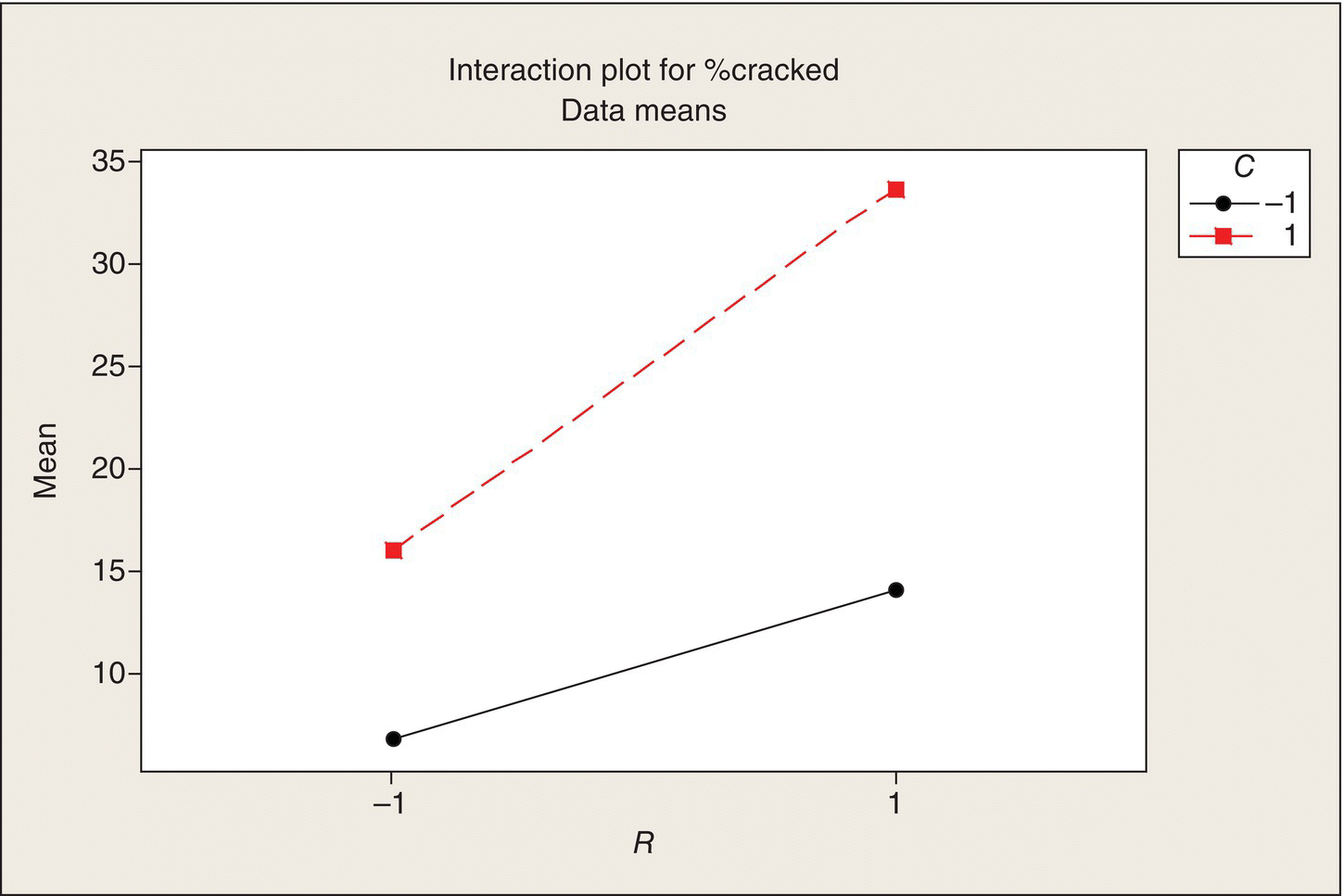
Figure 5.14 Interaction Plot for Factors R and C.
Additionally, the negative effect of D, the carrier, means that the rubberized carrier results in a lower rate of cracking than the metal plate, so that’s good to know. The coefficient of −4.2 for D is half of the overall average difference between the mean %cracked for the two carriers. This means that the rubberized carrier results in an average of about 8.4% fewer cracked pots than the metal carrier, consistently across the other process variables. Handle with care is good advice for manufacturing clay flower pots.
Analysis 2: Stepwise regression
This flower pot experiment was designed under the expectation that higher-order interactions would be negligible. That assumption justified running only one replication of the 16 treatments. It left us five degrees of freedom for estimating experimental error (a model with 11 terms was fitted to 16 data points, thus leaving 5 df for residual variation). However, once the data are obtained, we don’t have to do the analysis under the design planning assumption. In fact, further simplifications of the regression model were suggested in the previous subsection. Once we have the data, we can evaluate whether or not the data will support that assumption. We can use other ways to identify which effects and interactions are “significant” and which ones are in the noise.
“Stepwise regression” is one analysis method that can be used. In stepwise regression (see Wikipedia 2014 and references therein) one starts with a list of candidate independent variables and then uses various rules for selecting the most important explanatory variable, then the next most important variable, etc. and then stops when none of the remaining variables have enough of an effect to stand out above the residual variation. The analyst has considerable leeway in specifying selection and stopping rules, so “actual results may vary.” (Statistics means never having to say you’re certain.) For this experiment’s data, reasonable selection rules are apt to pick out the R, C, and D main effects and the RC interaction found in the previous analysis. The factorial treatment design avoids some of the difficulties that stepwise regression can encounter when there are correlations among all the candidate independent variables. With this 24 treatment design, all of the candidate variables are orthogonal, meaning that their estimated coefficients are all independent of one another, thus making the separation of winner and loser independent variables more trustworthy.
Analysis 3: “Effect sparsity” and graphical analysis
A third analysis method for this experiment is built around a concept of “effect sparsity” (Box and Meyer 1986). In this experiment, which has a 24 treatment structure, we can actually fit the full model which would consist of four single-variable terms, six two-variable products, four three-variable products, and one four-variable product: a total of 15 variables in the regression model which, with only one replication, means that there are no residual degrees of freedom for estimating the error variability. The notion of effect sparsity means that nature and good scientific and other systems are not apt to be so complex that all 15 of these terms in the model will have strong effects on the response. They will sort themselves out into the vital few and the trivial many. We can use graphical methods to facilitate this sorting. So rather than make subject-matter decisions guided by an ad hoc assumption, for example, that three- and four-factor interactions are negligible, we will give every effect and interaction a chance to stand up and be counted, comfortable in the expectation that only a few of them will—usually. Though the approach is different, the end points of this analysis and stepwise regression are similar: a simplified regression model that describes the data and provides a characterization of experimental error variation.
Table 5.11 (p. 160) gives the coefficients for the full 15-term regression model. Let’s now look at these coefficients (other than the constant or intercept term in the model) graphically. One way to compare the coefficients is by a dot plot; Figure 5.15 shows that plot.
Figure 5.15 Dot Plot of Coefficients.
Here, we see a fairly clear pattern: there are 11 coefficients clustered around zero and four coefficients clearly separated from this cluster. These four are the coefficients we earlier found to be statistically significant (very small P-values): R, C, D, and RC. It is fairly intuitive to call the cluster “noise” (random) and the separated points “signal” (real).
None of the four “significant” coefficients involve three or four factors, but in another experiment, they could have. Suppose there was a large three-variable interaction. If we had blindly fitted a model with only single variables and two-variable products, the residual error would have been inflated by this three-variable interaction, and we might not have found truly significant effects, and we would not have discovered the significant three-variable interaction. Thus, a safer analysis philosophy is to give every potential predictor a chance to be discovered, rather than rule some of them out by assumption.
Another way to display the 15 coefficients in a way that helps to sort them out is to plot them in a Normal probability plot (Fig. 5.16).
Figure 5.16 Normal Probability Plot of Estimated Coefficients.
Figure 5.16 shows a clear separation: the 11-point middle cluster looks like a random sample from a Normal distribution centered near zero, in other words like random (experimental) error, but there are four outliers, relative to this error distribution. A goodness of fit test tells you that these data just couldn’t arise by random sampling from a single Normal distribution and we can see why. The four outlying coefficients are “real” effects. The rest are noise. If none of the predictor variables (including all the products) had an effect, that is, if the %cracked pots were unaffected by any of the four experimental variables, singly or jointly, the estimated coefficients would look like noise—15 observations from a Normal distribution with a mean of zero.
The analysis can be carried further by using the error data to estimate “sigma” and then by testing the outlying coefficients against this sigma to get an approximate t-statistic and P-value. Statistical software such as Minitab can carry out this enhanced graphical analysis.
Much experimental design literature analyzes two-level multifactor experiments in terms of estimating main effects and interaction effects rather than in terms of regression analysis. In the present experiment, the estimated main effect of factor R is the difference between the average %cracked for the eight runs at which R = 1 and the average for the eight runs at which R = −1. So the effect of R is the average change in the response variable as R goes from −1 to 1. In a regression analysis, the coefficient of R is the slope, which is the change in the average response per unit change in x. The change in x is from −1 to 1 = 2 coded units. Thus, the regression coefficient is one-half of the effect of R.
Now, consider interactions and cross-product terms in a regression model. The interaction is given by the difference between the average response when the product of coded variables = 1 and the average response when the product = −1. For example, see the RT column in Table 5.9. The estimated RT interaction effect is the difference between the average response for the eight runs at which RT = 1 and the average response for the eight runs at which RT = −1. The regression coefficient of RT is one-half of that difference.
Let us now illustrate this correspondence between an “effects” analysis and the regression analysis carried out previously. Table 5.12, which is the Minitab output for the cracked pot experiment, gives both the effects and the regression coefficients. As discussed, the latter are one-half times the former.
Table 5.12 Effects and Regression Coefficients for Flower Pot Experiment.
| Term | Effect | Coef |
| Constant | 17.625 | |
| R | 12.50 | 6.250 |
| T | 1.00 | .500 |
| C | 14.50 | 7.250 |
| D | −8.25 | −4.125 |
| R*T | 1.25 | .625 |
| R*C | 5.25 | 2.625 |
| R*D | −.50 | −.250 |
| T*C | −.25 | −.125 |
| T*D | .50 | .250 |
| C*D | 1.00 | .500 |
| R*T*C | −1.50 | −.750 |
| R*T*D | −1.75 | −.875 |
| R*C*D | .25 | .125 |
| T*C*D | −.75 | −.375 |
| R*T*C*D | 1.50 | .750 |
Minitab output also includes the Normal probability plot of the effects (rather than the coefficients as in Fig. 5.16). This plot, Figure 5.17, is the same as Figure 5.16 but with the scale changed by a factor of two.
Figure 5.17 Normal Probability Plot of Effects and Interactions.
Figure 5.17 includes Lenth’s pseudostandard error (PSE) (Lenth 1989). The blue line overlay in Figure 5.13 is the Normal distribution with mean zero and standard deviation equal to the PSE. The software does the work of separating signal and noise and calculating an SE against which to evaluate the outlying points. The color coding indicates the significance of the resulting pseudo-t-tests. The significant effects and interactions (or coefficients) are labeled so you don’t have to look them up. The result is qualitatively the same as that obtained by reducing the model by stepwise regression or ad hoc model simplification to just the four terms highlighted and consigning everything else to residual variability. All of these analyses confirm what our initial eyeball analysis of the table of experimental results suggested. The flower pot manufacturer has learned how to run the process, within the scope of this experiment, to minimize the percentage of cracked pots, as follows: use clay with a low expansion coefficient, a slow cooling rate, and rubberized carriers. The experimental results were 2.5% cracked pots for that condition, averaged over the runs at the different temperatures. (Oh, yes: make sure the temperature is held between 2000 and 2060°F. We don’t know what happens outside of that range.) The fitted model gives a predicted rate of 2.6% for that set of design parameters. By way of comparison, the worst condition in the experiment had nearly 40% cracked pots.
Is the best process found in this experiment good enough or is more improvement needed and feasible? That requires more information about the context. Running the process with the slow cooling rate slows the process, reducing the throughput rate. Does the increased yield offset the longer production time? Can we increase the cooling rate somewhat without decreasing the yield by too much? The current experiment with only two cooling rates means we can only do a straight-line interpolation between those two rates. More experimentation at intermediate rates could tell us if there is a bend in the curve. Can we run the process at an even slower cooling rate and get even closer to 100% yield? Further experimentation could address this question. Economic analyses are required to tell us about the costs and benefits incurred by trading process time for process yield.
Fractional Two-Level Factorials
Example 6: E-mail marketing
The preceding pot production example shows how “effect sparsity” makes it possible to run multifactor two-level experiments with only one replication and still be able to separate real effects from “noise,” or experimental error variability. However, as the number of two-level factors in an experiment, say, k, increases, the required number of runs, 2k, can be too large to be feasible. For example, Ledolter and Swersey (2007, p. 228), present a case study (Case 5—summarized here with the permission of author Gordon H. Bell, president of LucidView) involving an experiment with 13 two-level variables in a potential e-mail marketing campaign by an office supplies retailer. The variables included the e-mail design (simple or “stronger”) and color (white or blue), the offer of a free gift (or not) with a purchase, product pictures (few or many), and the subject line (two versions). In addition, two other two-level variables were used to identify customer segments—effectively three blocks of experimental units (customers). The objective of the experiment was to identify an e-mail design that would maximize sales. Details of the experiment and its context (story) are given in Ledolter and Swersey (2007).
Running all 215 = 32,768 block–treatment combinations was out of the question. (A “run” consists of sending e-mail to a large number of people and measuring the response. Different sets of people would be used for each run. A response rate of around 1% was expected.) Something less than 50 runs was feasible. What to do?
One approach is to eliminate some of the variables—hold them constant in the experiment. If we could whittle the experimental variables down to five (!), then we could run one replicate: 32 runs. We could even replicate half of them for a total of 48 runs. But the marketer wanted to learn something about all 15 variables and was not willing to arbitrarily rule eight of them out of contention. That would defeat the purpose of the experiment.
One-factor-at-a-time designs
Somebody may have come up with the following idea (I’m making this part up): our current e-mail design is essentially a control condition. Let’s run that combination in the experiment, and then let’s do an additional 13 runs where we change one factor at a time to an alternative version, or level, while holding the other 12 variables at their control setting. Thus, we would learn something about all 13 variables in only 14 runs! From those 14 runs, we could pick the winning level of each of the 13 variables and then run one more run at those selected settings to confirm (or contradict) the anticipated economic benefit of the selected design. We could replicate the whole experiment three times.
At this point, a consultant is hired and is asked about this design. He says that it is a very inefficient design. It’s called an OFAT (one-factor-at-a-time) design. He illustrates this inefficiency in the simpler case of three two-level variables, as follows.
Figure 5.18 depicts the OFAT treatment design. The vertices of the cube represent the full set of eight treatment combinations in a 23 experiment. The control condition, with coordinates (−1, −1, −1), is the lower left-hand point. Then there are three excursions from this point, one along each of the three axes. You can see in Figure 5.18 that the cube is not very well covered by the four OFAT points. Furthermore, the effect of each factor is estimated by comparing only two of the points—the pair along each axis—and this effect estimated is a local effect, relative to the control condition. There may be synergisms (interactions) among the variables that cannot be detected.
Figure 5.18 Schematic of One-Factor-at-a-Time Experiment: Three Two-Level Factors.
Now, consider what is called a fractional factorial set of treatments. There are many ways you can pick four points from the eight cube vertices, all of which could be considered a one-half fraction of a 23 full factorial, but some are better than others, for reasons that will be discussed. Figure 5.19 shows one of the good fractions.
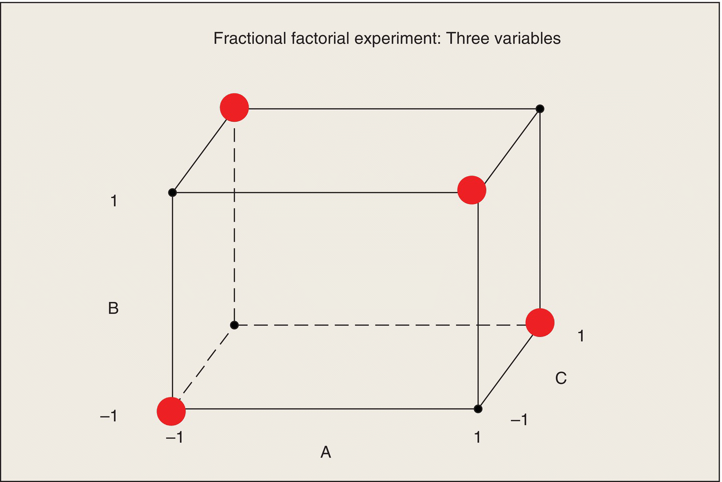
Figure 5.19 Schematic of Fractional Factorial Experiment: Three Two-Level Factors.
Figure 5.19 includes the control condition in the lower left corner, but the other three points are at the other end of diagonals across each of the three faces. These four points cover the cube better than the OFAT points, and they provide more precision in estimating the effects of the three variables.
Consider estimating the effect of variable A: the difference in average response between the A = 1 and A = −1 conditions. The two points in Figure 5.19 at A = −1 are the two points on the left face of the cube. In those two points, B occurs once at B = −1 and once at B = 1. Similarly, both C = −1 and C = 1 occur in these two points. At A = 1, the right face of the cube, the same balance and symmetry occur; B and C take on both levels, 1 and −1. Now, to estimate the effect of A, we can compare the average of the two points on the right face to the average of the two points on the left face. Under the assumption of no interactions among the three factors, the effects of B and C cancel out of this comparison, so we get a clean estimate of the A effect (or coefficient) based on all four data points. Similarly, the effects of B and C are estimated using all four data points. In contrast, the OFAT design estimated the A effect from the difference of only two points.
The key to this increased precision is the assumption of no, or at least negligible, interaction. With this set of four points, you can estimate coefficients for only three terms in the model. Under the sparsity assumption, main effects are apt to be (but not certain to be) larger than any of the interactions. With a fractional factorial, though, there is always the chance that an interaction is masquerading as a main effect. It takes further experimentation to sort out such conundrums.
Now, suppose variable A turns out to have no (appreciable) effect. Then the left and right faces of the cube can be collapsed, thus leaving a 22 set of treatments in variables B and C. Now, the interaction of B and C can be estimated (but we still would not have a data-based error against which to judge the estimated effects and interaction). This projection property is what makes the particular fractional factorial shown in Figure 5.19 useful. By way of contrast, the OFAT set of treatments just collapses into a two-factor OFAT.
Many experimental design texts get into the nitty-gritty of choosing and characterizing fractional factorials, but these details are beyond the scope of this text. Experimental design software can generate fractional factorials and tell you what can and cannot be estimated with them. So, too can good consultants.
Results: E-mail experiment
In this case, the consultant proposed a fractional factorial of 32 runs. With this fraction, in the case of no three-factor or higher-order interactions, the 15 main effects can be estimated and some two-factor interactions can also be estimated. However, each two-factor interaction is generally unseparable from (or confounded with, in the usual statistical terminology) six other two-factor interactions. We will later demonstrate that characteristic using the flower pot example. Subject-matter knowledge or further experimentation would be required to separate the interactions.
The number of customers who were sent the e-mail defined by one of the 32 run settings (block and treatment factors) ranged from 641 to 1515. A total of 34,060 customers received e-mail; no customer received multiple e-mails. The responses measured were the number and size of orders that were placed by the e-mail recipients within 1 week of the mailing. This case study pertains to “response rate,” which is the percent of e-mail recipients who placed an order within 1 week.
The results of this experiment are interesting. The control condition actually had the fourth highest return rate. The best return rate was 1.75%; the control condition return rate was 1.39%. Thus, most of the hoped-for improvements that would be achieved by jazzing up the e-mail design turned out not to be (the factor levels had been chosen to represent “bold” departures from the current e-mail design). That must have been discouraging. The only significant variables that had a positive effect were the offer of a free gift with each order and the offer of a 15% discount (the discount was already offered and the experimental alternative was no discount). The promise of free stuff trumped e-mail glitz! (Are you surprised?) That’s a worthy finding, though perhaps disappointing to e-mail-campaign designers. The study’s sponsor became a big fan of fractional factorial experiments, particularly in contrast with OFAT experiments: “He learned in 1 week what would take 6 months using standard techniques of testing one variable at a time” (Ledolter and Swersey 2007, p. 239).
Example 7: Flower pot experiment revisited
Let us suppose that instead of the full 24 set of treatment combinations used in the flower pot experiment, the consulting FLS had suggested running only eight of those 16 combinations, still with only one run of each treatment. The production manager is interested, because of the lesser time and cost, but wonders what information will be lost. “Well,” the FLS says, “Under the assumption that three-way and four-way interactions are negligible, we will still be able to estimate the main effects cleanly. With eight observations, after we estimate the four main effects, that leaves only three degrees of freedom for estimating interaction. There are six possible interactions among four variables, so we cannot estimate them all. In fact, pairs of interactions will be ‘confounded,’ that is, unseparable. However, based on your understanding of the process, that subject-matter knowledge may help you identify the active interaction if one of the interaction pairs turns out to be significant.”
We know now that the production manager opted to run the full 24 experiment, but let’s consider how this experiment might have come out if the fractional factorial set of eight treatments had been run.
First, how would the eight combinations have been selected? Table 5.13a shows all of the 16 treatment combinations of the four variables along with the two-, three-, and four-variable products. These are the 15 predictor variables used in the model fit summarized in Table 5.12a. Note that each column includes eight 1s and eight −1s.
Table 5.13 Regression Variables in 24 Factorial Treatment Design.
| Std Order | R | T | C | D | RT | RC | RD | TC | TD | CD | RTC | RTD | RCD | TCD | RTCD |
| (a) Standard order | |||||||||||||||
| 1 | −1 | −1 | −1 | −1 | 1 | 1 | 1 | 1 | 1 | 1 | −1 | −1 | −1 | −1 | 1 |
| 2 | 1 | −1 | −1 | −1 | −1 | −1 | −1 | 1 | 1 | 1 | 1 | 1 | 1 | −1 | −1 |
| 3 | −1 | 1 | −1 | −1 | −1 | 1 | 1 | −1 | −1 | 1 | 1 | 1 | −1 | 1 | −1 |
| 4 | 1 | 1 | −1 | −1 | 1 | −1 | −1 | −1 | −1 | 1 | −1 | −1 | 1 | 1 | 1 |
| 5 | −1 | −1 | 1 | −1 | 1 | −1 | 1 | −1 | 1 | −1 | 1 | −1 | 1 | 1 | −1 |
| 6 | 1 | −1 | 1 | −1 | −1 | 1 | −1 | −1 | 1 | −1 | −1 | 1 | −1 | 1 | 1 |
| 7 | −1 | 1 | 1 | −1 | −1 | −1 | 1 | 1 | −1 | −1 | −1 | 1 | 1 | −1 | 1 |
| 8 | 1 | 1 | 1 | −1 | 1 | 1 | −1 | 1 | −1 | −1 | 1 | −1 | −1 | −1 | −1 |
| 9 | −1 | −1 | −1 | 1 | 1 | 1 | −1 | 1 | −1 | −1 | −1 | 1 | 1 | 1 | −1 |
| 10 | 1 | −1 | −1 | 1 | −1 | −1 | 1 | 1 | −1 | −1 | 1 | −1 | −1 | 1 | 1 |
| 11 | −1 | 1 | −1 | 1 | −1 | 1 | −1 | −1 | 1 | −1 | 1 | −1 | 1 | −1 | 1 |
| 12 | 1 | 1 | −1 | 1 | 1 | −1 | 1 | −1 | 1 | −1 | −1 | 1 | −1 | −1 | −1 |
| 13 | −1 | −1 | 1 | 1 | 1 | −1 | −1 | −1 | −1 | 1 | 1 | 1 | −1 | −1 | 1 |
| 14 | 1 | −1 | 1 | 1 | −1 | 1 | 1 | −1 | −1 | 1 | −1 | −1 | 1 | −1 | −1 |
| 15 | −1 | 1 | 1 | 1 | −1 | −1 | −1 | 1 | 1 | 1 | −1 | −1 | −1 | 1 | −1 |
| 16 | 1 | 1 | 1 | 1 | 1 | 1 | 1 | 1 | 1 | 1 | 1 | 1 | 1 | 1 | 1 |
| (b) Sorted by RTCD | |||||||||||||||
| 2 | 1 | −1 | −1 | −1 | −1 | −1 | −1 | 1 | 1 | 1 | 1 | 1 | 1 | −1 | −1 |
| 3 | −1 | 1 | −1 | −1 | −1 | 1 | 1 | −1 | −1 | 1 | 1 | 1 | −1 | 1 | −1 |
| 5 | −1 | −1 | 1 | −1 | 1 | −1 | 1 | −1 | 1 | −1 | 1 | −1 | 1 | 1 | −1 |
| 8 | 1 | 1 | 1 | −1 | 1 | 1 | −1 | 1 | −1 | −1 | 1 | −1 | −1 | −1 | −1 |
| 9 | −1 | −1 | −1 | 1 | 1 | 1 | −1 | 1 | −1 | −1 | −1 | 1 | 1 | 1 | −1 |
| 12 | 1 | 1 | −1 | 1 | 1 | −1 | 1 | −1 | 1 | −1 | −1 | 1 | −1 | −1 | −1 |
| 14 | 1 | −1 | 1 | 1 | −1 | 1 | 1 | −1 | −1 | 1 | −1 | −1 | 1 | −1 | −1 |
| 15 | −1 | 1 | 1 | 1 | −1 | −1 | −1 | 1 | 1 | 1 | −1 | −1 | −1 | 1 | −1 |
| 1 | −1 | −1 | −1 | −1 | 1 | 1 | 1 | 1 | 1 | 1 | −1 | −1 | −1 | −1 | 1 |
| 4 | 1 | 1 | −1 | −1 | 1 | −1 | −1 | −1 | −1 | 1 | −1 | −1 | 1 | 1 | 1 |
| 6 | 1 | −1 | 1 | −1 | −1 | 1 | −1 | −1 | 1 | −1 | −1 | 1 | −1 | 1 | 1 |
| 7 | −1 | 1 | 1 | −1 | −1 | −1 | 1 | 1 | −1 | −1 | −1 | 1 | 1 | −1 | 1 |
| 10 | 1 | −1 | −1 | 1 | −1 | −1 | 1 | 1 | −1 | −1 | 1 | −1 | −1 | 1 | 1 |
| 11 | −1 | 1 | −1 | 1 | −1 | 1 | −1 | −1 | 1 | −1 | 1 | −1 | 1 | −1 | 1 |
| 13 | −1 | −1 | 1 | 1 | 1 | −1 | −1 | −1 | −1 | 1 | 1 | 1 | −1 | −1 | 1 |
| 16 | 1 | 1 | 1 | 1 | 1 | 1 | 1 | 1 | 1 | 1 | 1 | 1 | 1 | 1 | 1 |
Now, let’s sort the rows of this table by RTCD. The result is Table 5.13b.
Now, let’s suppose we choose the last eight rows of this table as our half fraction of the set of 16 variable combinations. For these eight runs, RTCD equals 1 in all cases. This means that we could not estimate the four-variable interaction, even if we wanted to, from this fraction. But that doesn’t matter because we’re going to assume that the four-variable interaction is negligible. Ditto for the four three-variable interactions. That leaves us with the single-variable and two-variable products in Table 5.14.
Table 5.14 Regression Variables in 1/2 of a 24 Factorial Treatment Design.
| Std Order | R | T | C | D | RT | RC | RD | TC | TD | CD | %Cracked |
| 1 | −1 | −1 | −1 | −1 | 1 | 1 | 1 | 1 | 1 | 1 | 14 |
| 4 | 1 | 1 | −1 | −1 | 1 | −1 | −1 | −1 | −1 | 1 | 22 |
| 6 | 1 | −1 | 1 | −1 | −1 | 1 | −1 | −1 | 1 | −1 | 37 |
| 7 | −1 | 1 | 1 | −1 | −1 | −1 | 1 | 1 | −1 | −1 | 20 |
| 10 | 1 | −1 | −1 | 1 | −1 | −1 | 1 | 1 | −1 | −1 | 8 |
| 11 | −1 | 1 | −1 | 1 | −1 | 1 | −1 | −1 | 1 | −1 | 4 |
| 13 | −1 | −1 | 1 | 1 | 1 | −1 | −1 | −1 | −1 | 1 | 12 |
| 16 | 1 | 1 | 1 | 1 | 1 | 1 | 1 | 1 | 1 | 1 | 30 |
Examination of the two-variable products shows that the RT column is the same as the CD column. Thus, we cannot separate the effects of these two predictors: they are confounded. Similarly, RC = TD and RD = TC. Note the pattern: each two-variable product is confounded with the product of the other two variables. That is a direct consequence of using the set of eight runs for which RTCD = 1.
Let’s suppose that this fractional factorial had been run and that the same results as before for these eight runs were obtained. Under the assumption that interactions involving T are negligible, the set of predictors to be considered is R, T, C, D, RC, RD, and CD. The resulting coefficients are as follows.
| Predictor | Coef |
| Constant | 18.375 |
| R | 5.875 |
| T | .625 |
| C | 6.375 |
| D | −4.875 |
| RC | 2.875 |
| RD | −.375 |
| CD | 1.125 |
The results are similar to the analysis of the full set of 16 runs in that R, C, D, and RC are the largest coefficients. Of course, this would mean that we have four signals and three noise coefficients and that is not quite what is meant by effect sparsity. The graphical analysis of effects yields Figure 5.20 (recall that an “effect” is equal to two times the coefficient). By the standard threshold for significance, none of the effects or interactions stands out from the noise.
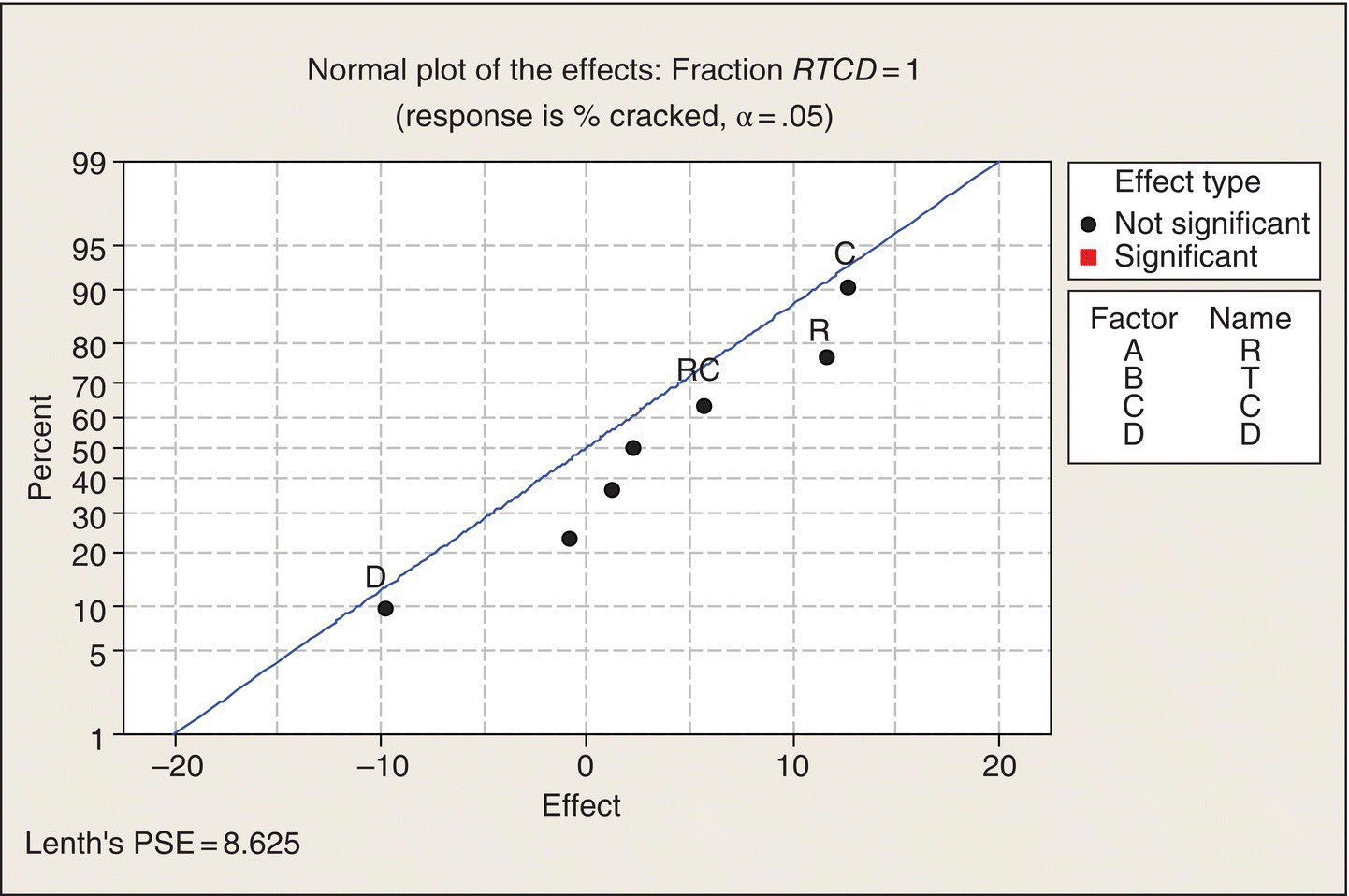
Figure 5.20 Graphical Analysis of 1/2 Fraction: RTCD = 1.
We chose the fractional factorial for which RTCD = 1 in the preceding analysis. Alternatively, the fraction for which RTCD = −1 could have been chosen. When the same analysis is carried out for this fraction, the result is summarized in Figure 5.21. Again, none of the effects or interactions stands out as “significant.”
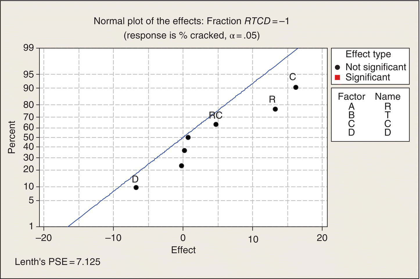
Figure 5.21 Graphical Analysis of 1/2 Fraction: RTCD = −1.
If the production manager had to make a decision on how to produce flower pots based on either of these two fractional factorial experiments, by picking the level of the factors associated with the lower cracked pot rates, he probably would have made the same decision that arose from the full factorial experiment, although the lack of statistical significance could have made him reluctant to make any decisions. He might have rationally said, “I’m concerned about the uncertainty level in the fractional experiment. Let’s run the other half fraction and see if that substantiates our tentative conclusions from the first half fraction.”
Please take this example as a cautionary note: fractional, unreplicated treatment designs can be unable to find important effects and interactions. Either more replication or additional experimentation may be required to support high-consequence decisions.
Extensions
For much more on two-level full and fractional factorial experiments, see Box, Hunter, and Hunter (1978, 2005), Montgomery (2012), or Ledolter and Swersey (2007) and references in those texts.
Assignment
- Choose a topic of interest to you and issues to investigate with an experiment that has a CRD and has three treatment factors to consider. Describe the design in detail: experimental units, treatments, response measurement, experimental protocol, and issues to be addressed. Describe your anticipated data plots and analyses.
- Consider the extended poison/antidote/dose/delay time experiment discussed in this chapter and its ANOVA given in Table 5.7. Suppose that the ANOVA for Antidote B showed that both dose and delay time were significant and that the only significant interaction was poison by dose. Draw hypothetical plots of the treatment means that could correspond to these ANOVA results.
References
- Box, G., and Cox, D. (1964) An Analysis of Transformations, Journal of the Royal Statistical Society, Series B, 26, 211–252.
- Box, G., and Meyer, D. (1986) An Analysis for Unreplicated Fractional Factorials, Technometrics, 28, 11–18.
- Box, G. E. P., Hunter, W. G., and Hunter, J. S. (1978, 2005) Statistics for Experimenters, 1st and 2nd eds., John Wiley & Sons, New York.
- Ledolter, J., and Swersey, A. (2007) Testing 1-2-3, Stanford University Press, Stanford, CA.
- Lenth, R. (1989) Quick and Easy Analysis of Unreplicated Factorials, Technometrics, 31, 469–473.
- Milliken, G., and Johnson, D. (2009) Analysis of Messy Data Volume I: Designed Experiments, 2nd ed., Chapman and Hall/CRC Press, Danvers, MA.
- Montgomery, D. (2012) Design and Analysis of Experiments, 8th ed., John Wiley & Sons, Inc., New York.
- Morris, M. D. (2011) Design of Experiments: An Introduction Based on Linear Models, Chapman and Hall/CRC Press, Boca Raton, FL.
- Myers, R., Montgomery, D., and Anderson-Cook, C. (2009) Response Surface Methodology: Process and Product Optimization Using Designed Experiments, 3rd ed., John Wiley & Sons, Inc., New York.
- Wikipedia (2011) Ethanol, http://en.wikipedia.org/wiki/Ethanol.
- Wikipedia (2014) Stepwise Regression, http://en.wikipedia.org/wiki/Stepwise_regression.
- Wikiquote (2014) George E. P. Box, http://en.wikiquote.org/wiki/George_E._P._Box.