
Chapter 11. Automation, scripting, and animation
This chapter covers
- Loops and conditionals
- Command files and batch processing
- Calling gnuplot from other programs
- Animations
In the preceding chapters, we’ve studied most commands and options that can be used from within gnuplot. But up to this point, our discussions assumed that you’d be running gnuplot interactively: entering commands, viewing plots, and then entering more commands.
But sometimes that’s not what you want. For instance, you may have a large number of data sets and just want to convert all of them to plots: it would be great to automate this task through scripting. Or you may have a cron job running nightly to scan web server logs and want it to also generate some plots showing the number of hits per hour, without requiring human intervention: that’s batch processing. Or you might want to use gnuplot as a graphing back end, while tendering control to some other program.
All these situations involve tasks that have been automated to some degree. In this chapter, we’ll study ways to do this, either using gnuplot’s own facilities or using gnuplot in conjunction with an external programming language.
11.1. Loops and conditionals
Gnuplot has support for loops and conditionals: this makes it possible to automate repeated tasks. In contrast to the inline loops that we encountered earlier (see section 5.4), the control structures introduced in this section are more general. They can be applied to any command, or any combination of commands—not just a single plot or set command, as was the case for inline loops. In addition to two different loops and a conditional construct, there’s also a special operator that calculates the sum of a set of numbers. Let’s look at all of them in detail; table 11.1 provides a summary.
Table 11.1. Gnuplot loop constructs and conditionals
|
Syntax |
Example |
|---|---|
do for [var=start:end:increment] {
  statement
  statement
 ...
}
|
do for[k=1:10] {
    print k
}
|
do for [var in tokenstring] {
 statement
 statement
 ...
}
|
do for [s in "abc uvw xyz"] {
    print s
}
|
while( condition ) {
 statement
 statement
 ...
}
|
x = 0
while( x < 10 ) {
    x = x + 1
    print x
}
|
if( condition ) {
 statement
 statement
 ...
} else {
  statement
  statement
  ...
}
|
x = 0
if( x < 0 ) {
    print "Negative"
} else {
    print "Not negative"
}
|
The do for loop is a generalization of the inline loop concept. Loops can extend over a numeric range (start and end inclusive; the increment is optional and defaults to 1). Alternatively, the do for loop can also iterate over whitespace-separated tokens in a string.
The other loop is a while loop. It executes the statements in the loop body as long as the supplied condition doesn’t evaluate to 0.
The if statement is used to construct conditionals. The else clause is optional; at present, there is no provision for repeated conditions (no elsif or similar).
Finally, the sum construct is an expression (meaning it returns a value). It iterates over a set of integers, evaluates a given expression, and adds the expression’s value to a running total. Upon completion, the value of the running total is returned. It isn’t possible to give a step size, and the evaluated term need not include the iteration variable:
sum[var=start:end] expression
The following examples will make this clearer:

At the present time, gnuplot offers only limited support for scripting. It has control structures (loops and conditionals) but neither data structures[a] nor subroutines—and of course no such thing as local variables! This shouldn’t be a surprise: gnuplot was never intended as a programming environment, and the available scripting support is little more than an ad hoc collection of convenience features, intended to take the tedium out of repeated tasks.
But see the footnote on page 15.
The problem is that control structures like loops require arrays and subroutines to work properly: they don’t make much sense otherwise. But because gnuplot doesn’t offer such facilities, existing features find themselves “press-ganged” into roles that they aren’t intended for: whitespace-separated strings, together with the word() and words() functions, are used to mimic iterable data structures; array indexes are faked through numeric suffixes on variable names; and individual command files have to stand in for subroutines. Depending on your perspective, you may find this either hideous or ingenious.
You can’t very well have “a little” programming support. Either you don’t have any, or you’ll find that each “small” feature before long leads to the addition of yet another “small” feature, until you end up with a complete programming environment anyway—simply by following the law of unintended consequences.
Because of this, I doubt the wisdom of adding programming support to gnuplot through opportunistic accretion and without clarity about the intended programming model. The evolution of programming languages over the last 30 years (and the last 15, in particular) has shown how difficult it is to create a programming environment that “wears well as one’s experience with it grows.”
11.1.1. Worked example: making graph paper
To kick off our list of examples for gnuplot’s looping constructs, let’s make some quad-ruled graph paper. This application demonstrates how repetitive tasks can be automated with loops. It also has an immediate graphical representation (see figure 11.1).
Figure 11.1. Graph paper: an easy application of gnuplot’s loops. See listing 11.1.

On commercially produced graph paper, every fifth line is printed a little wider than the remaining lines to impose some larger-scale, visual guidance to the user. In the graph in figure 11.1, I instead made every fifth line a little darker than the other lines, using different shades of grey. For best effect, it’s important to add the darker lines later to the plot than the other lines.
The commands for the graph paper in figure 11.1 are shown in listing 11.1. The size of the entire graph is set to 12.5cm×12.5cm, but the actual plot (the canvas) is scaled to 80% of that, leading to a finished 10cm×10cm square with millimeter spacing of individual lines.
Listing 11.1. Commands for figure 11.1 (file: graphpaper.gp)
set terminal pdfcairo size 12.5cm,12.5cm
set o 'graphpaper.pdf'

set size 0.8,0.8
set origin 0.1,0.1
set margins 0,0,0,0

unset key
unset tics

set style arrow 1 nohead lw 1

set for [i=1:99] arrow from i/10.,0 to i/10.,10 as 1 lc rgb 'light-grey'
set for [i=1:99] arrow from 0,i/10. to 10,i/10. as 1 lc rgb 'light-grey'

set for [i=5:95:10] arrow from i/10.,0 to i/10.,10 as 1 lc rgb 'grey'
set for [i=5:95:5] arrow from 0,i/10. to 10,i/10. as 1 lc rgb 'grey'

set for [i=10:90:10] arrow from i/10.,0 to i/10.,10 as 1 lc rgb 'dark-grey'
set for [i=10:90:10] arrow from 0,i/10. to 10,i/10. as 1 lc rgb 'dark-grey'

plot [0:10][0:10] 1/0
set o
11.1.2. Worked examples: iterating over files
It’s no surprise that gnuplot’s looping facilities come in handy whenever you’re dealing with a large number of similar files. Let’s consider two examples—one straightforward, the other one not.
Plotting Several Files
Imagine that you have a directory containing many data sets. Each data set is in a separate file, and the files are all named in a predictable fashion: data01, data02, and so on. You want to generate a plot of every data set, each in its own file, with appropriately chosen filenames. Here’s how to do it (the sprintf() function comes in handy to format the input and output filenames properly):

Making Data Comparable
The next example is more complicated. In this case, you have only three files (data1, data2, and data3), but you don’t want to plot each data set in a separate graph. Instead, you want to combine them onto a single graph so that they can be compared easily. To compare disparate data sets meaningfully, it’s often necessary to normalize the data before plotting it. For now, and to keep the exposition simple, let’s assume that you just want to subtract the respective average value from each data set before plotting it. (You’ll see another example of normalizing data for the sake of comparison in section 14.1.3.)
It’s easy enough to loop over the files and use the stats command (see section 5.6) to calculate the respective average (or mean) values. The problem is that you need to store the separate values temporarily, so that you can use them later in the plot command. Because gnuplot doesn’t have an array data structure, you need to bend over backward to accomplish this goal. I’m going to show you two different ways to get there.
In the first implementation, variables with numeric suffixes stand in as array entries. But because it’s impossible to create variables dynamically, a string containing the variable definition is constructed instead, which is then executed using eval. The subsequent plot command, using an inline loop, does the same thing—it builds up the variable name as a string and obtains the value of the corresponding variable using the value() function (see section 5.1 for information about value()):
do for[file in "data1 data2 data3"] {
  stats file u 2 nooutput
  eval sprintf( "mean_%s=%f", file, STATS_mean )
}

plot for[file in "data1 data2 data3"]
  file u 1:($2-value(sprintf("mean_%s", file)))
The second implementation may be more straightforward, but personally I find it even more ominous. It fully embraces the idea that an array is nothing more than a sequence of values and hence can be conveniently represented as a string. String operations are then used to extract the desired entry.
In the first loop, a string is built up from the values calculated by stats (don’t miss the whitespace in the sprintf() format specifier that indicates token boundaries). The plot command contains an inline loop and uses the word() function to extract each appropriate element in turn from the string of values (see table 5.1 for information about the word() function):
files = "data1 data2 data3"
means = ""
do for[file in files] {
  stats file u 2 nooutput
  means = means . sprintf( " %f", STATS_mean )
}
plot for[k=1:3] word(files,k) u 1:($2-word(means,k))
11.1.3. Worked examples: Taylor series and Newton’s method
In this section, I demonstrate two other applications of looping constructs. Both require some familiarity with calculus—feel free to skip this section.[1]
This isn’t the place to explain either Taylor series or Newton’s method; the purpose of this section is to demonstrate gnuplot’s looping features. For this reason, my presentation of the mathematical concepts is intentionally brief. The Wikipedia pages for both topics are reasonably accessible.
Taylor Series
According to Taylor’s theorem, every smooth function can be locally approximated by a polynomial: the higher order the polynomial, the better the approximation. We demonstrate this here for the function sin(x), which has the following Taylor approximation:

Using gnuplot’s sum feature, together with the ! operator to indicate the factorial, this can be written very compactly in gnuplot (also see figure 11.2—the function s(n) has been introduced to fix the key entry when there is only a single term in the series):
f(x,n) = sum[k=1:n] (-1)**(k-1)*x**(2*k-1)/(2*k-1)!
s(n) = (n==1 ? "1 Term" : sprintf( "%d Terms", n ) )
plot [-8:8][-1.2:1.2] sin(x) lw 2, for[n=1:4] f(x,n) t s(n)
Figure 11.2. Successive approximations to sin(x) using the sum facility

Newton’s Method
The other example involves Newton’s method for finding the roots of an analytic function. Newton’s method consists of an iteration of the following form:

This can be implemented using a while loop. The derivative f ′(x) is evaluated through a finite-difference approximation:
f(x) = cos(x)
steps=0; x=0.5; eps=1e-6

while( abs(f(x)) > 1e-10 && steps < 15 ) {
  df = (f(x+eps) - f(x) )/eps
  x = x - f(x)/df
  steps = steps + 1
  print steps, x, f(x)
}
With the given choice of parameters, Newton’s method converges to the first positive root of the cosine in five steps. Here’s the total output from running this snippet:
1 2.33048604607464 -0.688696509312027
2 1.38062453566562 0.189027591805359
3 1.57312250575387 -0.0023261768611035
4 1.57079632259625 4.19864216189357e-09
5 1.5707963267949 6.12323399573677e-17
11.2. Command files
Gnuplot commands can be not only entered at the command prompt but also captured in a script file. Such a file can be loaded into a gnuplot session, included in other command files, or processed by gnuplot in batch mode.
So far, we’ve encountered command files mostly as the product of the save command. The files generated by save capture the entire state of the gnuplot session at that moment: the values of all options and variables, all user-defined functions, as well as the most recent plot command. If you load such a file, it re-creates exactly the previous session state, and—in particular—it re-creates exactly the previous plot.
It’s worth emphasizing that this isn’t the only way to use command files; in particular, it isn’t necessary for command files to contain a plot or splot command. Command files without either of these commands obviously don’t generate visual output, but they can be very useful nevertheless:
- As setup or configuration scripts—Such scripts contain nothing but function definitions, customized line types and styles, or shorthands for commonly used color gradients. We’ll explore some of these possibilities in chapter 12.
- As subroutines—I mentioned earlier that gnuplot doesn’t have subroutines: it’s not possible to group several statements together into a single, callable unit. Command files provide a workaround for this limitation.
- As batch files—The contents of a command file can be processed by gnuplot in the background, without an interactive user session.
11.2.1. Scripts as subroutines
Gnuplot doesn’t have a way to group several commands or statements together into a single, callable unit. Gnuplot’s functions are expressions (they return a value), and their definitions must consist entirely of expressions as well. It isn’t possible to evaluate a gnuplot command within a gnuplot function, much less a sequence of commands.
Scripts provide a workaround. A script can contain any valid gnuplot code and is callable as a single unit. The generic export script is a good example (compare section 10.1.2):
set terminal push
set terminal pdfcairo
set output "graph.pdf"
replot
set output
set terminal pop
This sequence of commands can be run with a single invocation of load or call.
Passing Parameters to Scripts
The script in the previous example didn’t take any parameters: the name of the output file was hardwired. That’s not ideal; it would be better to supply a filename at runtime. There are two ways to do this:
- Prepopulate a gnuplot session variable, and use it in the script.
- Use call to invoke the script, and specify the parameters as part of the command.
To use the first method, the export script must be changed to use a variable:

Be sure to assign the proper value to this variable before invoking the script (assuming that the script is called export.gp):
outfile = "graph.pdf"
load "export.gp"
The alternative is to use the call command to invoke the script (instead of load). The call command accepts up to nine parameters on the command line, which are available in the script in variables called ARG1, ARG2, and so on. (The variable ARG0 is set to the name of the script file, and the variable ARGC holds the number of arguments supplied to call.) A version of the export script, suitable for call, looks like this:
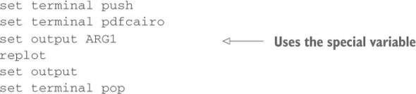
call "export.gp" "graph.pdf"
Personally, I prefer the call mechanism over prepopulating session variables, because it makes the parameter passing explicit. You need to be aware of an important limitation, though: parameters are passed by call as strings and therefore must be representable by strings (numbers are converted to strings on the fly). This makes passing functions inconvenient, whereas a function that exists in the current session can be used by the script. (You’ll see an example in a moment, when we discuss a script that implements Newton’s method.)
Simulating Local Variables
Gnuplot doesn’t have local variables: all variables that are created live in the global session space. This means if you call a script that defines variables, these variables are still part of the session when the script finishes. This may be desirable (because it provides a way to retrieve values from the script), but more often it isn’t. The problem also exists in reverse: if a variable existed in the session before the script was run, then it will have been clobbered afterward.
The solution is to give the names of all strictly internal variables a unique prefix. You can even use the undefine command to clean up the session by removing all variables with a given prefix upon completion of the script.
Further Possibilities with Scripts
Scripts may contain load and call commands. Their effect is to include the contents of the loaded file at the position of the load or call command. (Gnuplot safeguards against infinite recursive inclusion.)
When you use the command quit in a script, it doesn’t terminate the gnuplot session; instead, it terminates execution of the current script. It therefore acts similarly to a return statement in most programming languages, initiating an immediate return to the calling code (but without a return value, of course).
A Worked Example: Newton’s Method (Again)
Listing 11.2 is another implementation of Newton’s method that demonstrates some of the ideas just introduced. The script defines three internal variables, all of which are prefixed with NEWTON_ and are removed from the session on the last line of the script. Parameters are passed to the script implicitly: both the function f(x) and the starting value x must exist in the session before the script is called. Upon completion, the variable x holds the position of the found root. A sample use of this script might be as follows (the last line is the final output from the script):

Listing 11.2. Newton’s method in gnuplot (file: newton.gp)
# Must prepopulate f(x) and x before call

NEWTON_steps = 0
NEWTON_eps = 1.e-6

while( abs(f(x)) > 1e-12 && NEWTON_steps < 15 ) {
  NEWTON_df = (f(x+NEWTON_eps) - f(x) )/NEWTON_eps
  x = x - f(x)/NEWTON_df
  NEWTON_steps = NEWTON_steps + 1
}
print sprintf("f(%.12f) = %.12f in %d steps", x, f(x), NEWTON_steps)

undefine NEWTON*
11.2.2. Worked example: export script
The script in listing 11.3 is intended to demonstrate how far you can push the “script-as-subroutine” concept in gnuplot. You decide whether this is a good idea.
The purpose of the script is my old standby: saving the commands of the last plot, and exporting the plot to a file in a standard graphics file format.[2] But this script does more:
If gnuplot should ever acquire a simple export command that bundles all the required steps into a single invocation, I’ll lose one of my best sources for examples.
- It infers the desired file format by examining the extension of the target file.
- The target file can include an absolute or relative path. The script places both the command file and the graphics file in the specified directory.
- You can specify additional options when invoking this script. These options are supplied to the chosen terminal when the graph is exported.
The script makes a number of (platform-specific) assumptions:
- The filename extension indicating the desired graphics file format consists of exactly three letters.
- The path separator is / (Unix convention—you need to change this if you’re on a different platform).
The script itself is straightforward but messy, because much of the string handling has to be done explicitly. Moreover, gnuplot doesn’t follow the convention of most contemporary programming languages of using zero-offset strings and asymmetric bounds, thus necessitating the explicit conditional when splitting the argument into path and basename. (To reduce clutter, I have refrained from prefixing all internal variables to make them “private.”)
As I said, I regard this example as a “technology demonstrator” that shows how you can encapsulate complex tasks in scripts and use them like subroutines. You decide whether you think this is the right approach.
Listing 11.3. Full-featured export script (file: mega-export.gp)


11.3. Batch processing
Gnuplot can be run by itself as a standalone command interpreter, executing scripts from files—basically like a Perl or Python interpreter interpreting a program in its respective language. The only difference is that in gnuplot’s case, the final output is a graph. Running gnuplot non-interactively as a command interpreter like this is known as batch mode.
Tip
Batch mode isn’t terribly common, because you usually want to see and interact with the graph that’s created. Batch mode is useful whenever you want to create a large number of file-based graphs using a predetermined set of commands, or when you need to re-create the same graphics file again and again as the data set that’s plotted changes.
Running gnuplot in batch mode is straightforward and equivalent to the way Perl and Python behave: any files listed after the gnuplot command are expected to contain gnuplot commands. They’re executed in the order specified, as if they had been loaded using load. Alternatively, gnuplot will read commands from standard input. There are thus three ways to execute a set of command files:
- Using command-line arguments:
shell> gnuplot plot1.gp plot2.gp plot3.gp
- Reading from standard input:
shell> cat plot1.gp plot2.gp plot3.gp | gnuplot
- From within a gnuplot session:
load "plot1.gp"
load "plot2.gp"
load "plot3.gp"
Gnuplot doesn’t start an interactive session when invoked with command-line arguments: it just processes all commands (including any plot commands) and terminates. This implies that plots sent to an interactive terminal usually aren’t visible, or rather, they’re visible for a tiny moment as gnuplot opens the terminal window, draws the graph, and immediately closes the plot window again and exits.[3] It’s a common mistake to forget to set appropriate (file-based) terminal and output options in gnuplot batch files!
You can also specify the command-line flag -persist when invoking gnuplot so that the plot remains visible on the screen.
Tip
By default, gnuplot uses one of the interactive terminals for all graphical output. That’s great for interactive sessions but makes no sense when you’re using gnuplot in batch mode. Don’t forget to choose a meaningful output format and destination.
You can force an interactive session by using the special filename - (hyphen) on the command line. The following command runs a setup script before dropping you into an interactive session (you’ll need to issue an end-of-file character before quitting):
shell> gnuplot setup.gp -
11.3.1. Using gnuplot in shell pipelines
It’s possible to use gnuplot as part of a command pipeline,[4] wherein gnuplot reads both commands and data from standard input. The special filename - (see section 4.5) tells gnuplot to read data from the current source: that is, from the same input device from which the most recent command was read. So if the command was read from standard input, then plot "-" will continue reading data from standard input as well. This makes it possible to build a pipeline like the following:
Provided the platform supports pipes, of course.
shell> cat script.gp data | gnuplot
Here, the command file script.gp may be as simple as
set t pngcairo
set o "out.png"
plot "-" u 1:2 w lp
and the data file may contain any data set, as long as it has at least the two columns referenced in the plot command.
The pipeline concept can be taken a step further: remember that set output defaults to standard output (if no filename is given as argument). Now the script is even simpler
set t pngcairo
plot "-" u 1:2 w lp
but in the pipeline you need to deal with the results that gnuplot sends to standard output. The easiest way is to capture them in a file
shell> cat script.gp data | gnuplot > graph.png
but it would of course also be possible to pipe gnuplot’s output to some other postprocessing step instead.
A word of warning: to use gnuplot in a pipeline like that, both commands and data must be sent to standard input explicitly. Just listing them on the command line doesn’t work: gnuplot won’t read a combination of command and data files from the command line.
Tip
Using gnuplot in a shell pipeline may seem unusual at first, but it can be very convenient. Any pre- or postprocessing can be done in one fell swoop. Moreover, sending the graph to standard output avoids all of gnuplot’s awkward file-handling issues.
11.4. Calling gnuplot from other programs
Sometimes it’s necessary or desirable to let gnuplot be controlled by another computer program. Three situations come to mind:
- You need a level of automation and control that is difficult or impossible to achieve with gnuplot’s limited scripting capabilities.
- You want to use gnuplot to visualize data that is generated by some other program without having to save the data to an intermediate file.
- You’d like to use gnuplot as a generic graphics back end for a system that has no graphics capabilities otherwise.
You can use gnuplot this way, and it isn’t even particularly difficult—but it isn’t especially convenient, either. Gnuplot doesn’t offer an API or a robust method of interprocess communication. Gnuplot must be run as a subprocess, and all communication has to occur via pipes (where available) or otherwise through the file system. Bidirectional communication (that is, sending data back from gnuplot to the controlling process) is particularly challenging.
Tip
Before investing effort in one of the solutions sketched in the following sections, consider whether batch operations are sufficient. In batch mode, your program creates a file with gnuplot commands (and a heredoc containing the data) on disk and then invokes gnuplot on that file (in a subshell). The detour through the file system effectively decouples gnuplot from your program, which makes operations more robust and easier to debug.
In the following two sections, I demonstrate how to run gnuplot from either Perl or Python. The master process sends some data to gnuplot (via a pipe), and gnuplot creates a graphics file on disk—this is probably the most common case. The main differences between these examples concern the way Perl and Python handle subprocesses and have little to do with gnuplot itself. (The Python example also makes use of a heredoc, whereas the Perl example uses the - special file.)
11.4.1. Worked example: calling gnuplot from Perl
Perl, the “duct tape of the internet,” is (still) a common choice for gluing processes together. It lets you open a subprocess as a file handle—in the same way you’d open a file—provided the first character in the filename is a | (pipe symbol). You can then write anything to this file handle using print, and it will be sent to the standard input of the subprocess. In listing 11.4, this method is used to send both commands and data to gnuplot. The special file - is useful here, because it instructs gnuplot to read data from standard input (see section 4.5 for more information on pseudofiles). It’s important to close the file handle describing the subprocess explicitly when you’re done, because Perl won’t terminate while gnuplot is still running!
Listing 11.4. Calling gnuplot from Perl (file: driver.pl)

11.4.2. Worked example: calling gnuplot from Python
Listing 11.5 shows a simple Python program that uses gnuplot to create a graph. It uses the Popen facility from the subprocess module in the standard library. The constructor returns an object that provides a handle to the subprocess. The script sends commands to the subprocess via the stdin member of this handle. In contrast to the Perl example in the previous section, this script doesn’t use the special - filename. Instead, it creates a heredoc named $d and references it in the plot command. The heredoc is particularly useful here, because this example involves two columns of data. The - filename would require looping through the data twice: once for the first column and once for the second. The heredoc submits all the data to gnuplot in one fell swoop and then provides access to it as needed.
Listing 11.5. Calling gnuplot from Python (file: driver.py)

11.4.3. Helpful hints
Using gnuplot in such a way from another program works quite well but can appear a bit fickle at first, because you need to re-create exactly those conditions that are usually fulfilled by input coming from the interactive command-line environment. Diagnosing glitches in this area isn’t helped by error messages, which are intended for interactive use. Here’s a checklist of trouble spots to look for when things don’t work out at first:
- Commands must be separated from one another by explicit semicolons or new-lines. A common mistake is to write code like this (also see listing 11.4):
The two set commands appear to be broken down onto two separate lines, but gnuplot will see them as one consecutive string. This will work:
Instead of the newline, a semicolon could have been used as well.
- The line containing the plot command must be terminated by an explicit new-line. Gnuplot doesn’t parse a command line until it has encountered a newline. Because the plot command is the last command, it must end with an explicit newline.
- You must use an explicit using directive when using the special filename - to tell gnuplot how to parse the incoming data stream.
- For each occurrence of - in the plot command, there must be a separate data stream. Gnuplot will continue to interpret incoming data as data until it has encountered a corresponding number of end-of-file characters. (This is another reason heredocs are probably more convenient in this situation.)
- Keep in mind that some characters in gnuplot code may have a special meaning in a programming environment. For example, the $ character, frequently used to indicate the value of a column in gnuplot, is also used by Perl and Unix shells. To prevent interpretation by the programming environment, the character needs to be protected (that is, escaped). Alternatively, you can use the column() function, which eliminates the need for the $ character in gnuplot code.
- Don’t forget to separate data lines from one another using newlines as well.
One final comment: when generating many graphs from the same program, it’s usually a good idea to start gnuplot only once and use a single process instance for all the graphs, rather than starting a separate gnuplot process for each of them. This doesn’t matter much when you’re preparing two or three graphs, but when the number of graphs is large, the time savings are significant. Just be sure to reset all relevant options (and specifically the output filename) between invocations of the plot command.
If you find that you need to drive gnuplot from some other program a lot, it may be worth investing in an access layer. A quick internet search will turn up several gnuplot wrappers for a variety of languages. Most of them attempt to replicate gnuplot’s set of commands and options as an API in the host language. This approach is fundamentally mistaken in my opinion, because whenever new features are added to gnuplot or existing ones change, the access layer is no longer up to date.
Instead, I recommend building an access layer in the spirit of the thin database wrappers that exist in all common programming languages for interfacing to relational databases. They don’t try to replicate SQL in the host language; they merely provide a way to submit well-formed SQL to the database and to move data back and forth.
I think such an access layer needs to have only three basic functions:
- open()—Starts the subprocess, and maintains a handle to it. This function hides all the messy details.
- exec()—Takes a string (or an array of strings), and sends them to gnuplot. It’s the user’s responsibility to make sure the strings contain valid gnuplot commands, but the access layer may apply safeguards against common oversights, such as ensuring that each command is terminated with a semicolon or a newline.
- data()—Takes the identifier for a heredoc (such as "$d") and a two-dimensional data structure in the host language. It turns the data structure into a sequence of strings, each corresponding to one line in the data “file,” and then sends commands to gnuplot that create a heredoc under the given name, containing the supplied data. Subsequent plot commands can then reference this heredoc by its identifier.
The primary idea is to play on the strengths of the host language as much as possible, rather than try to replicate gnuplot’s command set. For example, the user should be able to build up a native data structure and manipulate it in the host language—only at the last moment does the access layer turn it into strings that can be passed to gnuplot as a “data file.” The heredoc facility comes in handy, because it means data needs to be submitted to gnuplot only once.
These are just considerations that you might find useful if you’re designing an access layer for gnuplot. Because every language is different, it doesn’t make sense to provide a skeleton implementation here: in particular, what is considered the most suitable “native” data structure is likely to differ so much from one host language to the next that little can be said in general. Also keep in mind that getting the edge cases right will require a disproportionate amount of effort (this is especially true for the serialization of the data structure into strings). A one-off, specialized implementation that takes the specifics of the intended usage into account may be able to skirt some of these issues.
Finally, be aware of the false sense of security that such an access layer instills. A proper API lets you detect and recover from error conditions in the encapsulated code (by throwing exceptions or returning error codes). This isn’t true for gnuplot, because gnuplot has no way of notifying you when things go wrong: it just spews (human-readable) error messages to standard error. It’s difficult to respond program-matically to that.
11.5. Animations
All the facilities you’ve encountered in this chapter support automation in some form: events occurring without human intervention. You can take this a step further and think about a series of graphs being created, by themselves, in sequence. In other words, you have all the ingredients for animation: moving pictures.
11.5.1. Introducing a delay
To achieve satisfactory animation, you’ll need one additional feature: a controlled delay between successive figures. This is where the pause command comes in. The pause command takes the number of seconds to wait (-1 waits until a carriage return is encountered or—if mousing is enabled—a mouse click has occurred) and an optional string argument, which is printed to the command window to prompt the user:
pause {int:seconds} [ "{str:message}" ]
The pause command is usually used in conjunction with one of the loop constructs.[5] For a first example, let’s go back to the Taylor series example from section 11.1.3 earlier in this chapter. Using pause, you can create an animated version of this example:
In previous gnuplot versions, the same effect was achieved using the reread command. When included in a command file, reread instructs gnuplot to begin executing the current file from the beginning, resulting in an infinite loop.
f(x,n) = sum[k=1:n] (-1)**(k-1)*x**(2*k-1)/(2*k-1)!

do for[n=1:8] {
  plot [-8:8][-1.2:1.2] sin(x) lw 2, f(x,n) t sprintf("%d Terms",n)
  pause 2
}
This plots a new graph every two seconds, each one representing a better approximation than the one before. (Try it yourself—there’s no point showing a static graph of an animated effect.)
11.5.2. Waiting for a user event
A second form of the pause command waits until a specific user event has occurred:
pause mouse [ {eventmask} ] [ "{str:message}" ]
The event mask can contain any combination of the following keywords, separated by commas: keypress, button1, button2, button3, close (meaning the plot window was closed), and any. If pause was terminated through a keyboard event, the ASCII value of the selected key is stored in the gnuplot variable MOUSE_KEY and the corresponding character in the variable MOUSE_CHAR. If a mouse event occurred, the mouse coordinates are stored in the variables MOUSE_X, MOUSE_Y or MOUSE_X2, MOUSE_Y2, respectively, and are available for further processing. The command pause mouse (without an event mask) is equivalent to pause -1.
11.5.3. Further examples
Some of the most striking applications of animations involve three-dimensional graphics. We’ll discuss these in detail in appendix C and appendix F, but I want to give two quick demos here (see listings 11.6 and 11.7).[6]
The file world_110m.txt required by the second listing can be found at www.gnuplotting.org/plotting-the-world-revisited/.
The logic of both listings is straightforward: a parameter-dependent graph is continuously re-created in a while loop. Because the parameter is slowly changed at the same time, no two successive graphs are exactly equal, giving the appearance of a smooth change.
It’s essential to include a delay in the loop (using pause) and to provide an explicit break condition for the loop—gnuplot doesn’t recover gracefully if the loop is stopped using Ctrl-C. You can stop the animations in the example scripts by pressing the X key on your keyboard (we’ll formally introduce the bind command in chapter 12).
Tip
Always include an explicit break condition. Gnuplot doesn’t recover if the loop isn’t stopped cleanly.
Listing 11.6. Animation demo (file: pebble.gp)
unset key; unset border; unset tics

bind "x" "end=1"

end = 0; t = 0
while( end==0 ) {
  t = t + 0.1
  splot [][][-1:1] exp(-0.2*sqrt(x**2+y**2))*cos(sqrt(x**2+y**2) - t)
  pause 0.001
}
For another stunning example of what is possible using gnuplot animations, check out the demo/games directory of the gnuplot distribution. There you’ll find, among other things, a rather addictive implementation of a Tetris-like game—entirely in gnuplot!
Listing 11.7. Animation demo (file: globe.gp)
unset key; unset border; unset tics
set hidden3d

set mapping spherical; set angles degrees
set parametric; set urange [-90:90]; set vrange [0:360]

bind "x" "end=1"

end = 0; t = 0
while( end==0 ) {
  t = (t + 1)%360

  set view 90-30*cos(t), 360-t, 1.5, 1.25

  splot cos(u)*cos(v),-cos(u)*sin(v),sin(u) w l lc rgb "grey",
        "world_110m.txt" w l lt 1
  pause0.01
}
11.6. Case study: continuously monitoring a live data stream
Monitoring a live stream[7] means animated figures that are continuously changing as they’re being updated with newly arriving data. This isn’t a situation that gnuplot was designed for, but—as it turns out—gnuplot can handle it quite gracefully.
This section was partially inspired by the blog post “Visualize real-time data streams with Gnuplot” by Thanassis Tsiodras. You can find it at http://mng.bz/N3kJ.
In this section, I’ll present several different approaches to this problem. We’ll start with a very basic, ad hoc solution; the final solution is more involved and can be regarded as the beginnings of a production-level, real-time monitoring system that uses gnuplot as its graphics back end. Some of the initial ideas use Unix tools for simplicity, but the final solution is fully general and can, in principle, be adapted to any platform.
11.6.1. Using gnuplot to monitor a file
First, let’s assume that you would like to monitor the tail end of a log file. Messages are appended to the log file asynchronously by some other process (or processes). For demonstration purposes, let’s assume that each log entry consists of a timestamp followed by the actual value. The goal is to have a constantly updated plot of the last few entries in the log file.
The minimal gnuplot script to achieve this goal is just a few lines long:
while( 1) {
  plot "< tail -200 logfile" u 0:2 w lp
  pause 0.1
}
The script consists of an infinite loop, which is executed 10 times per second (pause 0.1). The plot command uses the Unix tail facility to extract the last 200 lines from the log file. The output from tail is piped directly to gnuplot, without accessing the file system. The pseudocolumn 0 (that is, the line number in the actual data set) is used for the x coordinate. (See chapter 4 for information on pseudofiles and pseudocolumns.)
This works quite well, although the result isn’t very pretty (we’ll remedy this next). But as a minimal-effort solution, this script can’t be beat. It should be committed to memory for all situations where you have an ad hoc need for real-time monitoring of data.
A Data Generator for Testing
If you want to try the solutions described in this section and you don’t have access to a live data stream, you may find the script in listing 11.8 helpful. It generates data at random intervals; you must specify the average time between write events as a command-line parameter. So, to have the script generate about 10 events per second, you call it like this (depending on your needs, you may want to redirect the generator’s output to a file):
shell> python -u datagen.py 0.1
The -u option forces Python to use unbuffered I/O. This is important in this application, because you’re interested in seeing real-time data. Don’t forget. The generated “data” here is a sine wave. The script writes out about 20 points per period of the sine, regardless of the specified wait time between write events.
Listing 11.8. A random data generator (file: datagen.py)
import sys
import time
import math
import random

tmax = float( sys.argv[1] )

t = 0
while 1:
    dt = random.uniform( 0, 2.0*tmax )
    time.sleep(dt)
    t += dt

    print t, math.sin(0.1*math.pi*t/tmax)
A Better Monitor
Let’s improve the monitoring script given earlier. The data does contain timestamps, but so far, they’re ignored. The graph therefore gives the impression that log entries are equally spaced in time—which isn’t true.
But if you try using the timestamp as the x coordinate, the visual effect is unsatisfactory. The reason has to do with the way gnuplot handles the plot range: unless instructed otherwise, it makes sure all data points are included, and it extends the plot range to the next tic mark. But because data points occur asynchronously (at random times), the range of seconds spanned by the points in the sample changes as new points are added and old points are removed. This constant change in the plot range leads to the undesirable “flicker” effect. The following script uses a fixed plot range to avoid this problem.
Listing 11.9. A real-time data monitor (file: monitor.gp)

The first few lines of the script are used to configure the script to local conditions: you must supply the name of the log file to monitor, as well as the name of a temporary file and the number of records that will be saved to it. (We’ll come back to the latter parameter later.) The script then invokes the Unix tail utility via gnuplot’s system command to dump the configured number of data points from the end of the log file into a temporary file. The stats command is used to determine the value of the last (most recent) timestamp in this temporary file. The set xrange command then chooses a fixed plot range that is based on this value: the plot range extends 1 second into the future and 11 seconds into the past, measured from the last entry in the temporary file. (That the upper limit of the plot range isn’t made to coincide with the largest data point is sheerly for visual effect. Try it both ways: personally, I find it helpful to see explicitly where the available data ends.) The range indicators on the stats command are important: without them, stats would discard data outside the plot range and hence fail to reflect changes to the input file.
The result works quite well in practice. (Try it!) Here are a few additional ideas you may want to explore:
- The script contains three adjustable parameters: the wait time in the pause command, the number of lines that tail extracts, and the size of the plot range in seconds. All three should depend on the frequency with which entries are added to the log file. Begin by deciding how many previous seconds you want to see in the graph. If you know at what rate new lines are appended to the log file, you can figure out how many records you need to extract. The wait time in pause should be smaller (by a factor of 2–10) than the time between log-file updates to ensure smooth animation, but keep in mind that reducing this number drives up resource consumption.
- Listing 11.9 uses the Unix tail command to extract a certain number of records from the log file to a temporary file, which is then read by both stats and plot. Both the tail command and the temporary file are optional: in principle, you could rely entirely on the plot range to restrict the data and run both stats and plot directly on the log file. But if the log file is long (and what log file is ever short?), then the tail command is likely to be faster and less resource-intensive than gnuplot’s own (and very complex) data-file parser (which is invoked by both stats and plot). Furthermore, by creating a temporary file, it’s guaranteed that both stats and plot see exactly the same data: if you let both commands run on the log file in sequence, you introduce a possible race condition wherein the log file is being updated between the two commands. You decide whether any of these precautions are necessary or desirable in your situation!
11.6.2. Using a driver to monitor arbitrary data sources
The solution in the previous section is nice because it’s implemented entirely using gnuplot’s own facilities. But it also has some drawbacks:
- It’s a polling solution. Gnuplot polls its input source constantly, whether there is new data or not. As a rule, polling architectures are more resource-intensive than other solutions.
- It’s not flexible, because any processing of the data would have to be accomplished using gnuplot’s limited scripting capabilities.
The approach presented in this section is different, because it relies on an intermediate layer, written in a general-purpose programming language (Python, in this case, but it could, of course, be anything). The script in listing 11.10 acts as a filter: it gathers data from standard input and passes it on to gnuplot only if new data is available. It therefore implements a “push” model, rather than the “pull” model of the previous solutions. The script also acts as a buffer, storing the most recent set of points and passing the points to gnuplot. This is necessary because now the file system is skipped entirely, and gnuplot itself doesn’t retain data between plots.
Listing 11.10. A data monitor in Python (file: monitor.py)

The script runs gnuplot as a subprocess and communicates with gnuplot by writing to gnuplot’s standard input via a pipe. The script reads incoming data from its own standard input (not from a file), splits and parses the intake, and pushes it onto a buffer, before passing it on to gnuplot. In this case, there is no need for gnuplot’s stats command, because the determination of the plot range is now done in the Python script.
The script is straightforward. Only two Python-specific implementation details require comment:
- To achieve real-time behavior, all input and output must be unbuffered. This is the reason the script uses sys.stdin.readline() in a while loop, instead of the more familiar idiom for line in sys.stdin:. Also, make sure to run this script using Python’s -u command-line option.
- The line buf = buf[-buflen:] retains the last buflen elements in the array. If the array contains fewer than buflen elements, then all of them are retained.
It should be clear that listing 11.10 is only the beginning. Not only are all features missing that would make the program more robust (error-handling, and so on), but the function of the script could be extended in many ways:
- Observe and combine multiple input sources. The script in listing 11.10 listens to its own standard input—instead, it could keep tabs on a range of different log files, combine data from all of them, and generate a unified status plot.
- Conversely, split a single, heterogeneous input source into multiple data streams, and maintain several gnuplot processes, each of which is used to plot only a single output channel.
- Statistically manipulate the data, remove outliers, and identify trends. The results of a predictive model could be combined with the raw output so that both can be plotted together and compared easily.
- Make any other modifications you can think of ...
The options are endless but have little to do with our primary topic, which is gnuplot. Listing 11.10 is only intended to get you started.
11.7. Summary
In this chapter, you learned about ways to automate gnuplot tasks. Gnuplot provides some programming constructs, such as loops and conditionals, but for more complicated tasks, it may be more convenient to “drive” gnuplot from an external programming language as a subprocess.
Another way to automate tasks is to capture all the required gnuplot commands in scripts that can be run by themselves, as batch processes, or even as part of Unix pipelines. In chapter 12, you’ll learn about additional uses for script files.
Gnuplot’s automation capabilities enable the creation of animated graphics. We demonstrated the basic principles and then used them in a particularly interesting application: the real-time monitoring of a live data stream.