1.0
Workplace

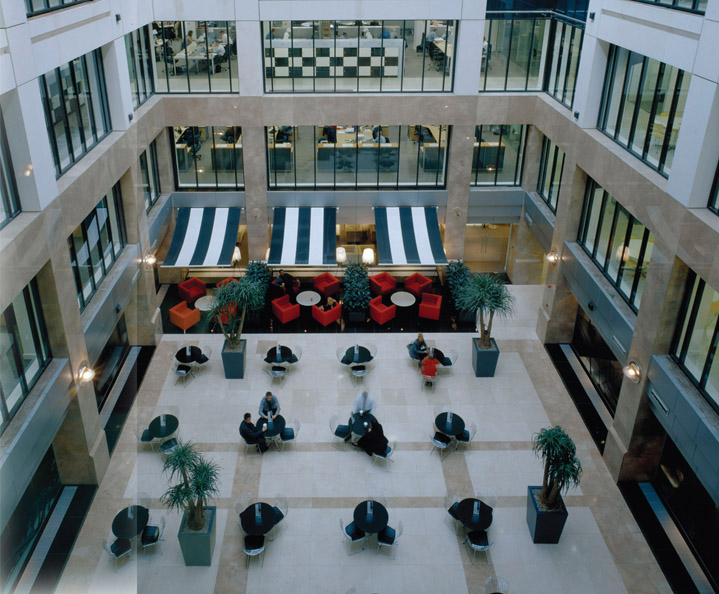
Roche Products, New Head Office
© David Barbour.

© Crown Copyright
Wherever office developments are located, the approach to staff provision and spatial standards has remained remarkably consistent over recent years. Occupational density has ranged from one person per 24 m2 to as little as one per 6 m2, while the average remains around 12 m2 per person. Similarly, light levels vary, although the average of 400 lux has become the typical provision. Generally, all projects submitted for awards, and certainly all those featured here, put a premium on the creation of a positive, efficient and delightful workplace. Many clients have entirely bought into the idea that high-quality surroundings will help attract (and retain) high-quality staff; and it genuinely does appear that clients have been happy to explore the widest possible range of options in the search for the ideal workplace.
The move to open-plan working is a common feature of most contemporary offices, although plenty of spaces are provided for meetings and conversations to be held in private. This move in terms of spatial planning accompanies a change in the perceived hierarchy of employers – a pecking order remains, but as everyone has their own value and role to play, status is no longer badged by the size or position of one’s private office. In fact, clients appear to have seized the potential of wireless working to allow staff to work flexibly anywhere, and a wide range of spaces are provided, from conventional desks, to cafes, cellular rooms, ‘breakout’ areas, light-filled atria and courtyards. ‘Plug-in-and-work’ is becoming common practice, often allied to hot-desking where people work at whichever space is available and appropriate for a specific task; centralised computers know exactly who is working where, allowing others to find them. Offices seem to be characterised by a certain informality, based on the idea that it is a person’s knowledge, capability and attitude that is important rather than where they sit. But informal does not mean uninspiring; typically, staff are grouped around perimeter windows for views and light (no longer are the best vistas reserved for board directors), while large atria, the application of colour and artworks, contemporary furniture and clear sightlines also animate the new generation of workplaces.

© eOffice
A serious consideration of staff amenity is also bound up with the provision of an appealing and motivating environment. A good number of BCO entries (perhaps because those entering will only submit their most prestigious projects) contain facilities such as a gym, showers, coffee bar, roof terrace, retail outlets, restaurants and libraries. Where businesses occupy out-of-town locations, there is often an increase in retail provision and possibly even the inclusion of a health centre; providing transport in the form of a private bus or extending the route of a public bus service is also becoming good practice.
© Stanhope plc by Hufton + Crowe
In planning terms, there seems to be a small number of office typologies emerging. Out-of-town offices, perhaps configured along the lines of a campus, often adopt the model of an internal ‘street’ along which workspaces and other facilities are ranged; bridges across this street often function as informal lounge or breakout areas. Urban developments tend to go upwards rather than outwards, so the street becomes compressed into an atrium, while roofs are deployed as terraces. In both cases, almost everything is visible, and a sense of activity and identity is provided through one sweeping gaze. Also, attention is given to the sense of entrance, of arrival; often staff and visitors are treated to a certain grandeur on entry.
© Richard Leeney Photography
Smaller developments are more difficult to characterise; often they will occupy just a single floor of a large building, or they will be conversions of buildings which come with their own curiosities and constraints. Even in these smaller, more individual, places, efforts are made to bring colour, light and openness to the working environment and amenities might be provided in simpler ways, such as the inclusion of bicycle racks, interesting graphics and coffee-making facilities that are well designed and on view rather than hidden in dark ‘kitchens’. The statistical research carried out by Davis Langdon on all the BCO award entries highlights one project which seemed to outdo all others in terms of staff amenity: there are free newspapers, free beverages, two coffee shops, an aerobics studio and much more. This is unusual, but the idea that employees are more than just workers is becoming fairly typical.
Unilever House
100 Victoria Embankment, London
Building Team
- CLIENT: UNILEVER
- DEVELOPER: STANHOPE
- OWNER/INVESTOR: SLOANE BLACKFRIARS
- ARCHITECT: KOHN PEDERSON FOX
- INTERIOR DESIGNER: PRINGLE BRANDON
- STRUCTURAL ENGINEER: ARUP
- SERVICES ENGINEER: ARUP
- QUANTITY SURVEYOR: DAVIS LANGDON
- PROJECT MANAGER: STANHOPE
- CONTRACTOR: BOVIS LEND LEASE
Building Data
- COMPLETED: APRIL 2007
- NET: 24,121 m2
- GROSS: 36,077 m2
- EFFICIENCY: 67%
- FLOORS: 10
- COST: £98,055,000
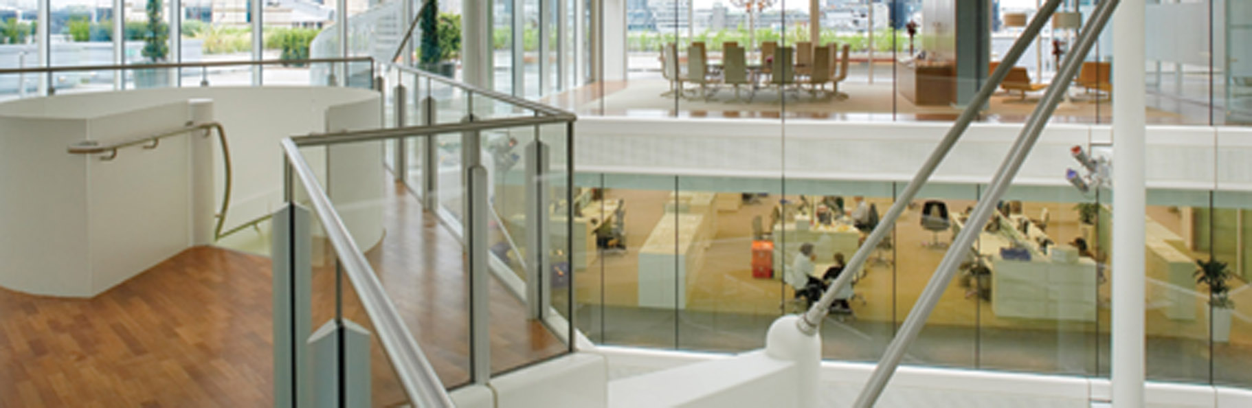
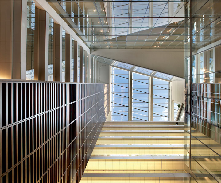
The brief was to create a working environment of the highest possible specification within this Grade II listed structure. The developer, with architect KPF, has managed to create a highly contemporary and immensely eye-catching office space which is more accessible, more sustainable and more stimulating than its forebear. Cleverly, in spite of the scale of the reinvention of this building, the design and construction team managed to make the best of a long list of original artefacts including doors, marble, parquet flooring, fireplaces, Gill lift panels and light fittings (and where some parquet flooring could not be reused, it was reassembled to create a set of tables for Bovis Lend Lease). Even internally, there are enough historic clues to remind occupants they are still in Unilever House. Circulation has been greatly improved. The original floor plates, which encompassed dispersed lift cores, have been reconfigured to create a dramatic atrium (created by linking five central light wells) with a single lift core. Adding to the drama of this space are four ‘flying carpets’ which provide extra circulation opportunities for floors five to eight. Suspended from the perimeter columns of the atrium, this multilevel structure (linked by a spiral stair) is held rigid by being twisted into tension and secured by high-strength, stainless steel tension rods. Suspending these floors in this manner enables the lower part of the atrium to be kept clear. This radical reinvention of the nine floors, stair cores and lifts was made possible by replacing much of the original complex

Unilever. This Building, Rated Excellent Through Its Breeam Assessment, Has Been Entirely Rethought – Allowing Unilever to Continue Occupying This Iconic Headquarters by the River Thames.
© Stanhope plc by Hufton + Crowe
WITH A GROSS INTERNAL FLOOR AREA OF 36,077 m2 (388,329 ft2), THE BUILDING HAS AN EFFICIENCY OF 66.7%. TYPICALLY, OFFICE SPACES ON EACH FLOOR AMOUNT TO AROUND 2,500 m2 (NET).
© Stanhope plc by Hufton + Crowe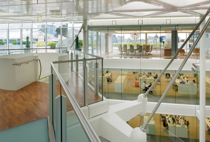
and heavy structure with lighter steel floor plate, rigidly connected to the retained elements of the building and relocated concrete firefighting cores.
Sixty per cent of the original building has been retained, although much of what we now see behind the retained facade is entirely new (and 88% of the 33,000 m3 of demolition material was recycled). Concrete roof slabs were replaced to allow for the creation of a roof garden, with openings to bring daylight into the atrium below; rooftop plant was moved to the basement; the 1970s west elevation was entirely replaced, while the original northern elevation was retained but opened up to provide a much stronger sense of access, light and transparency at ground level. Also, the principal front entrance, facing the Thames, has been reopened and enhanced. The overall feel of the re-engineered building is one of openness and interconnectivity; any sense of stuffiness has been consigned to the bin. Staff amenities have been relocated from the basement to the top floor, and directors’ offices and the boardroom itself have been moved to the sixth floor from their previous ‘near invisibility’ at the top of the building in small enclosed spaces. ‘We use the word “transformation” all too easily these days, but in this case it is totally justified,’ said the client. ‘The building has been totally transformed and in a most stunning way.’
Just as important is the performance of the building environmentally and spatially. Occupation density has been increased from 1:21 m2 to 1:12 m2, and floor plates and entrances have been configured to allow subletting for the first time. In terms of carbon emissions, as a listed building, Unilever House is permitted to use 20.5 kg of carbon per m2 per year. A target of 18.5 kg/m2/yr was set for the reinvented building, but this goal was beaten by a large margin. As built, Unilever House uses 15.99 kg/m2/yr – 22% better than the building regulations specify and 13.5% better than the target. The building’s BREEAM rating is ‘excellent’.

Previously Dispersed Lift Cores and Light Wells Have Been Reconfigured, and the Building Provided with a Central Core and Dramatic Atrium. The ‘Flying Carpets’ Can Be Seen Through the Curved Glazing.
© Stanhope plc by Hufton + Crowe
The construction of the building also benefitted from the establishment of the London Construction Consolidation Centre, a builders’ depot part funded by Stanhope and opened in 2006 just outside London’s Congestion Zone in Bermondsey. This allows products to be delivered to construction sites in central London in relative bulk on a just-in-time basis. The project was the first Stanhope scheme to benefit from this facility.
‘Irreplaceable historic facades were retained and the inside remodelled to create internal visibility, recover organisational legibility to the floor space, improve light and encourage the public back into the building. The renovated building provides an inspiring and invigorating workplace that can be shared with visitors and the public,’ said the BCO.
Roche Products, New Head Office
Welwyn Garden City
Building Team
- CLIENT: ROCHE PRODUCTS LTD
- ARCHITECT (AND INTERIOR DESIGNER): BDP
- STRUCTURAL ENGINEER: BDP
- SERVICES ENGINEER (INCLUDING LIGHTING AND ACOUSTICS): BDP
- CONSTRUCTION MANAGER: PCM
- QUANTITY SURVEYOR: CLARUS PCM
- ACCESS CONSULTANT: REEF ASSOCIATES
- CLADDING CONSULTANT: EMMER PFENNINGER PARTNER AG
- TRANSPORTATION CONSULTANT: MVA
- FIRE CONSULTANT: FABERMAUNSELL
Building Data
- COMPLETED: AUGUST 2005
- NET: 19,416 m2
- GROSS: 21,798 m2
- EFFICIENCY: 89%
- FLOORS: 3
- COST: CONFIDENTIAL (BRIEF WAS TO DESIGN WITHIN £1,800 PER m2)
‘This is an opportunity, and one that happens rarely in the life of an organisation, to evolve our working environment toward one that creates a culture of dynamic cohesion, open communication and teamwork,’ said John Melville, general manager of Roche Products. ‘Our aspirations were enshrined within a brief that called for a building that reflected the quality of Roche without being ostentatious, drew together our organisation under one roof, transforming our working environment and culture to one which attracted and retained the best staff in our industry. That is exactly what has been delivered in a fine, contemporary building that was delivered ahead of programme and within budget, and within which our effectiveness, productivity and sense of identity have all been enhanced.’
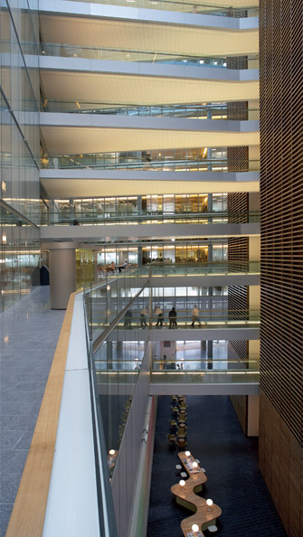
BCO guidelines were used extensively as benchmarks during the design phase of this three-storey building, which takes advantage of the sloping topography of the site to appear as a two-storey development (the entrance is located at first-floor level). This building was conceived as a modern, stand-alone pavilion, with its volume sheltering under a single, horizontal roof plane. A central atrium/street runs through the building, flanked by offices on one side and communal facilities such as conference centre and staff restaurants on the other. This simple zoning provides excellent legibility and clarity for both staff and visitors.
Prefabrication was maximised throughout the project, for reasons of speed and quality control. The atrium rooflights, which contain integral

Roche Head Office. This Building, Which Utilised Prefabrication to a High Degree in its Construction, is Generally Designed to a Column Grid of 7.5 m and a Planning Grid of 1.5 m. Facade Modules Were Designed as 1.5 m OR 3 m Units.
© David Barbour
A Three-Storey Void (or ‘Street’) Runs Through the Centre of the Building; Offices are Located to One Side, While a Conference Centre, Restaurant and Other Staff Amenities are Located on the Other.
© David Barbour
lighting and roof vents, were prefabricated. So too were the solid oak structural curtain walling panels – a UK first. Although this project is being featured here for its workplace benefits and the cultural shift it has helped engender at Roche, it is also worth noting that the building secured an ‘excellent’ BREEAM rating and makes use of an extensive network of boreholes and ammonia-based chillers with zero CO2 emissions, as well as an orientation which takes best advantage of sunlight.
The building was configured around a notion of three key spatial types: workplace, shared space and individual space. Open-plan offices are located across three floors and, in spite of their large size (60 × 90 m), no workstation is more than 7.5 m away from natural light, owing to a pair of internal atria and a landscaped courtyard which sits in the centre of the building. This principal working area also contains numerous breakout points, informal meeting zones and hot-desking for visitors and mobile staff. The whole configuration of the work area is based around the wish for staff to mix, relax and share ideas informally.
Shared accommodation is provided by an upper-floor conference centre (containing a variety of rooms that can be joined together), a restaurant that can double up as an occasional assembly space, a cafeteria and the atria/street. This internal street was designed as the vibrant heart of the building, containing all circulation mixed with viewing galleries, bridges and informal meeting places – it is a place of movement and interaction, and is even equipped with an ATM machine and dry-cleaning drop-off point.
Individual zones comprise a gym and dance studio, an acoustically isolated library, an occupational health centre and a ‘travel to work’ facility providing changing rooms and showers for cyclists.
Considerable thought has also been given to the landscaping, which contains formal lawns, water features and a perimeter promenade. The courtyard, set in the middle of the building, can also be accessed by staff, and seating is provided among the ornamental planting.
The upshot is that the cellular mindset of Roche’s staff, who were once located in 37 different buildings, is fast disappearing in an environment that clearly places a premium on communication and teamwork. The open-plan offices are large enough to soak up entire departments, but there is enough visibility throughout the height of the building to emphasise the connectivity of separate teams. ‘The office space will easily accommodate the natural ebb and flow of local team and department sizes within a dynamic office environment designed for great flexibility and comfort,’ said the client.
This project won the ‘Best of the Best’ award in 2006, the BCO’s highest accolade. ‘The place is full of contradictions. It is massive – more than 21,000 m2 – yet intimate and friendly,’ said the judges, who also praised the building’s ‘love affair with light’.
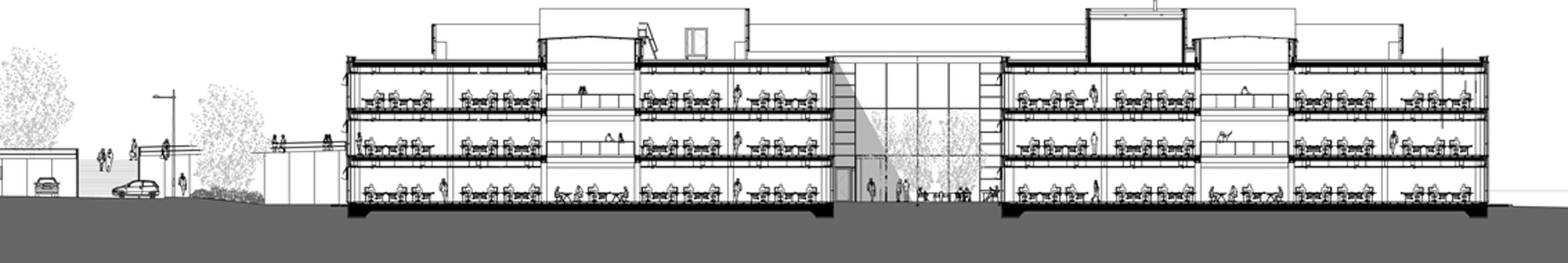
Section Through the Building, Illustrating Internal Atria (Left and Right) and the Central Courtyard.
© BDP
GCHQ
Cheltenham
Building Team
- CLIENT: GOVERNMENT COMMUNICATIONS HEADQUARTERS
- DEVELOPER: INTEGRATED ACCOMMODATION SERVICES
- ARCHITECT: GENSLER
- INTERIOR DESIGN: GENSLER
- STRUCTURAL ENGINEER: TPS CONSULT
- SERVICES ENGINEER: CROWN HOUSE ENGINEERING
- CONTRACTOR: CARILLION
Building Data
- COMPLETED: SEPTEMBER 2003
- NET: 64,272 m2
- GROSS: 103,877 m2
- EFFICIENCY: 62%
- FLOORS: 4
- COST: C.£350,000,000
The ring, or torus, shape was not an act of architectural whimsy. Part of the brief was that business units should be both integrated and autonomous, so the idea of allowing departments to inhabit specific segments of a circle was a piece of shrewd thinking. Also, this shape has the advantage of clustering all the employees very close together – no one in the organisation is more than a five-minute walk from anyone else. Furthermore, Gensler points out that the circle means that the building achieves ‘the maximum site for the minimum perimeter’, reducing the cost of building materials, surveillance and other security measures. Externally, there are no corners to hide around.
As might be expected, GCHQ was a relatively expensive building to build, coming in at £3,369 per m2 (calculated on a gross internal floor area of 103,877 m2). For the investment, staff working conditions are excellent: 80% of the space is close to a window and natural light; a landscaped courtyard at the centre of the building provides a high-quality, but secure, external space; there is a wide variety of office and meeting areas, including open and high-security spaces and ‘work anywhere’ facilities; and the building is equipped with laboratories and technical facilities of ‘often unusual specifications’.

The Glass and Steel Structure is Set on a Plinth of Cotswold Stone. Glazing is Reinforced and Set at Angles to Cloak the Building in ‘A Veil of Secrecy’.
© Crown Copyright
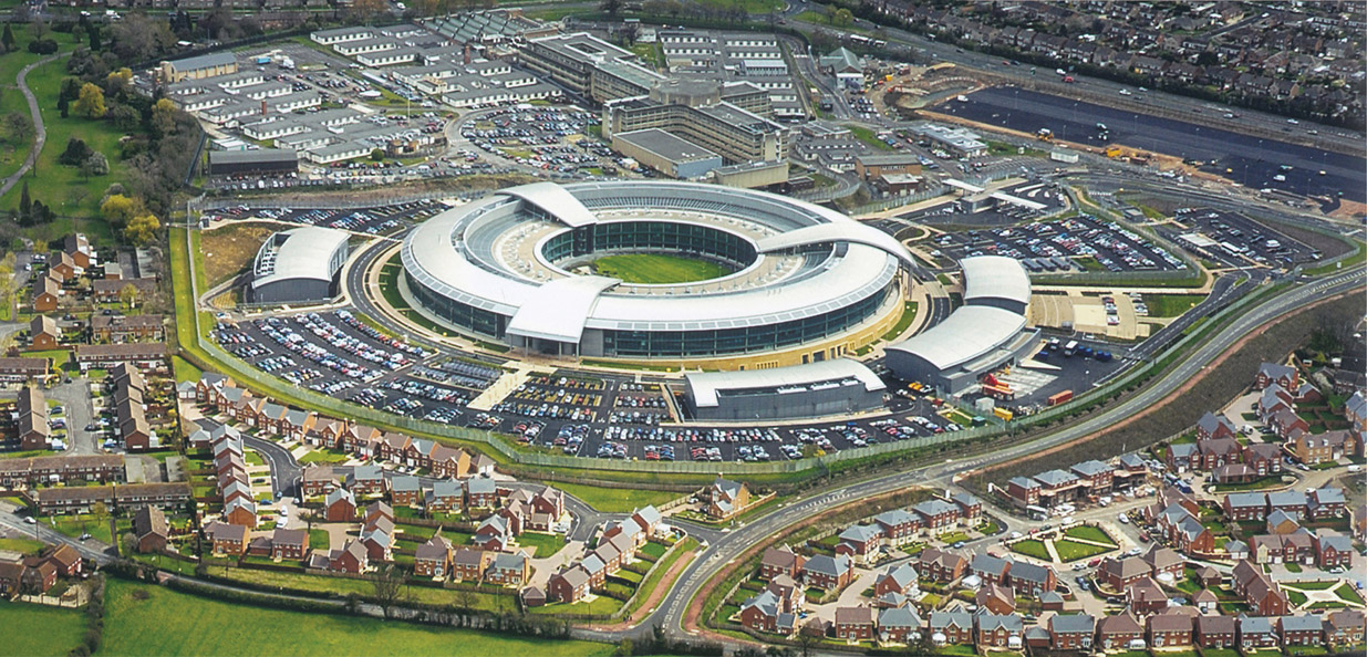
This Large Building, with a Gross Internal Floor Area of 103,877 m2, Was Not Cheap at £3,369 Per m2. But the Brief Was Complex and the Building Had to Help Managers Meet a Wide Range of Organisational Outcomes.
© Crown Copyright

The Circular Building Wraps Around an Open, Green Heart at its Centre, 80 m Wide. The Emphasis of the Building’s Design is on Integration and Knowledge Sharing – All Staff are Within A Five-Minute Walk of Each Other.
© Crown Copyright
The efficient provision of workspaces and facilities is one thing, but to create both a fortified bastion and a colourful, open-plan and delightful environment (with a ‘very good’ BREEAM assessment) is of another order entirely. ‘Like a medieval fortress, GCHQ offers an inner secure space and an outer defensive wall,’ say the architects. That defensive wall is composed of a plinth of Cotswold stone, angled glass (one can see out, but not in) and aluminium. Access is obviously highly controlled, and all goods are checked and palleted up in a remote logistics centre before being transported to the main building (which contains an inner ‘ring road’) via electric train.
The roof of the building is, rather, something of a canopy which covers a series of distinct open and closed spaces. A very open, bright and airy ‘internal street’ runs around the centre of the building linking everything, providing the ‘lungs’ of the GCHQ community. Office spaces look out over this glass-roofed zone. For all its functional requirements and the fact that this building sits at the sharp end of government intelligence gathering, it is a very civic place, full of grandeur, colour and visual warmth. ‘It’s been called the great doughnut and the hole with a million secrets, and reflects a massive change in culture by this ultra-secret organisation,’ said the BCO judging panel. ‘This is still a secret building, protected by heavy walls and restricted access. Yet even this is attenuated by clever use of glass and Cotswold stone, making the entry like that of a luxury hotel.’
This PFI project, completed in September 2003, has also managed to convert GCHQ to new and alternative working practices; the open-plan offices, desk sharing and informal, flexible spaces to suit different work styles are all innovations for this government employer. There is also a gym, and changing facilities for people who cycle to work. What the project delivers is a blend of practical advantage and delight. ‘We were looking primarily for organisational development outcomes, although we also sought efficiency, environmental and community benefits,’ said the client. ‘As well as supporting our many and varied business activities we also looked to achieve a joined-up organisation [from] our many professional and geographically distinct tribes.’
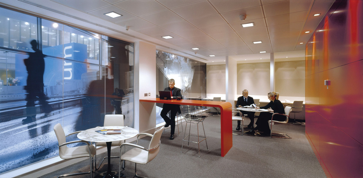
eOFFICE
I Portland Street, Manchester
Building Team
- CLIENT: eOFFICE
- OWNER: BRUNTWOOD
- INTERIOR DESIGNER: ASSEMBLYROOM
- SERVICES ENGINEER: WORKSPACE
- PROJECT MANAGER: WORKSPACE
- CONTRACTOR: WORKSPACE
Building Data
- COMPLETED: MARCH 2006 (MANCHESTER SITE)
- NET: 883 m2
- FLOORS: 1 (WITHIN AN EXISTING BUILDING)
- COST: £500,000 – INCLUDES FIT-OUT AND FURNITURE
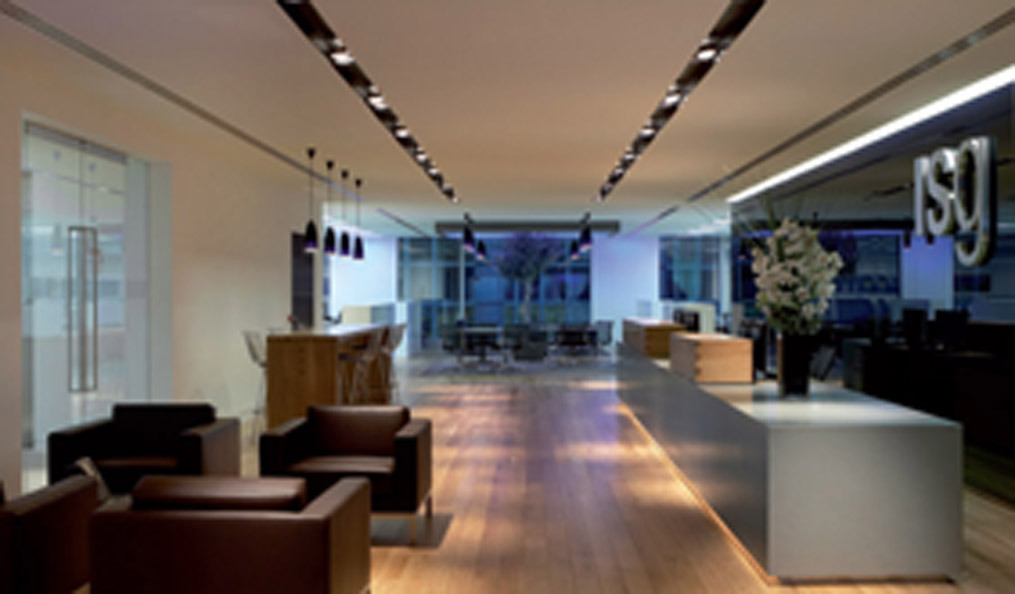
What eOffice has done is to borrow from hotel technology to enable extremely flexible communications so that businesses can operate from any desk, take a call at any phone and use wireless technology for services such as printing. They have created the facility to ‘plug in and work’. Moreover, the company has used interior designers to give its offices a slick, contemporary, colourful and almost quirky ambience. There is something of the boutique hotel or the well-appointed advertising agency about these environments, rather than the pared-back neutrality of most ‘boxes to rent’. The Manchester site provides 100 workstations in an open-plan configuration, as well as private spaces which can operate as boardrooms, and a 100-seat conference facility. A ‘working wall’ provides central storage, mail boxes and coffee-making facilities, leaving more than half of the site free of barriers or partitions. Like most modern offices, this workplace boasts informal lounge-like areas and ‘touch-down’ points, as well as more formal
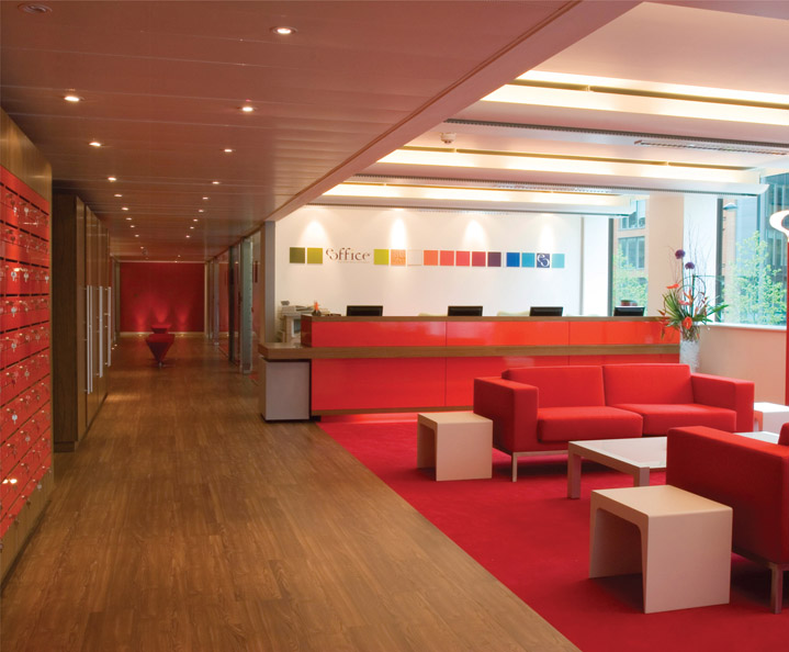
This Largely Open-Plan Office Space Contains 100 Work Stations and Private Rooms for up to Ten People. Private Lockers are Ranged Along the Left.
© eOffice
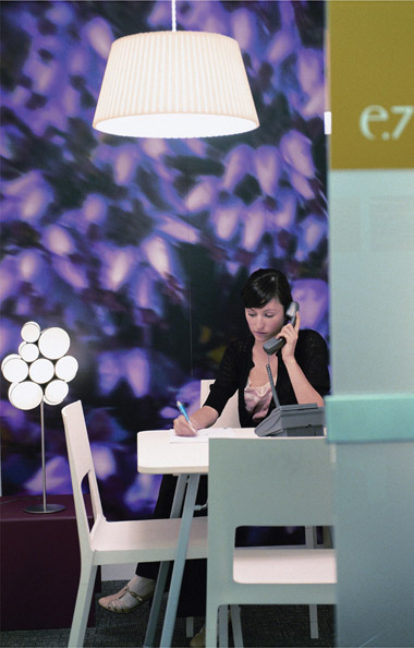
Colour is Key to this Development. The Client Aimed to Provide a Serviced office environment With A Buzz – an Entrepreneurial Community.
© eOffice
workstations, all bound up in a package of hyper-graphics, bright colours, sophisticated lighting and Hermann Miller furniture systems. ‘The objective was to develop an innovative serviced office with a strong identity,’ said the company’s award submission in 2007. ‘eOffice is designed as an environment which enables cross-fertilisation of companies; a mini-business district under one roof; a space that enables companies to network informally.’
BCO judges described the Manchester site as more like an ‘office club’ than a workplace: ‘Design and attention to detail is part of the secret. Ferrari-red casual furniture and record covers on the walls create a dynamic character from a limited budget and tight space. High-quality furniture with a range of configurations and services have made good use of a base building on a busy city centre corner.’ Judges were similarly impressed with the Birmingham branch, which they said ‘deserves an award for the pure refusal to do the proper thing and its sheer spirit of achievement’.
Part of the success of these spaces is that they are not, in fact, just spaces – the sense of community and belonging that eOffice tries to bring to their operation is just as important as the hardware and space planning. Regular events bring users together, members can communicate via an intranet, and other services such as file-sharing and email are provided on subscription. It is all very flash, and almost certainly beyond the means of many small businesses were they to try to create all this for themselves.
Furniture was Sourced from Kristalia, Magis and Hitch Milius. Members Can ‘Plug and Work’ Anywhere.
© eOffice
Pricewaterhousecoopers
Birmingham
Building Team
- CLIENT: PRICEWATERHOUSECOOPERS
- DESIGN AND COMMUNICATIONS: BDGWORKFUTURES
- PROJECT MANAGER: FAITHFUL & GOULD
- STRUCTURAL ENGINEER: FAITHFUL & GOULD
- SERVICES CONSULTANT: GW BUILDING SERVICES CONSULTANTS
- QUANTITY SURVEYOR: FAITHFUL & GOULD
- CHANGE MANAGEMENT CONSULTANT: ZZA
- CONTRACTOR: WATES
- FURNITURE: TSK
Building Data
- COMPLETED: APRIL 2004
- NET: 7,355 m2
- GROSS: 10,266 m2
- EFFICIENCY: 72%
- FLOORS: 4
- COST: £5,266,458
The brief to the designers was – as it would be from PwC – taxing. The design had to respond to a new corporate structure, and encourage cross-disciplinary working; it also had to get directors out of their individual offices, create spatial and organisational clarity, promote improved circulation, maximise natural light and deliver a flexible space where mobile working and sharing could flourish. Moreover, there had to be a clear demarcation between flexible and fixed work zones. The Birmingham office was the first of PwC’s locations to move to a cross-disciplinary culture, embracing what the company calls ‘line of service’ working as part of a strategy of becoming an integrated financial service provider rather than a collection of separate specialisms, each with its own culture. The overall idea was to bring the service industry ethos into play, one which treated staff like consumers. So PwC employees, or even their clients, can book a desk, plug in their laptop and get on with it. If staff want to find someone, they simply type a surname into one of many consoles throughout the building and the central computer indicates where to find them. Of the 900 desk spaces in the building, 800 are bookable under a ‘hotelling’ system (even private offices can be booked out when the principal occupant is absent). Staff are given lockers, archives have been moved off-site, and working files have to be retrieved from a central vault. Electronic document management has further reduced the amount of paper here. There are very few tall filing cabinets
This 10,266 m2 (Gross) Reinvention of a 1980S Building Has Redefined the Way People Use this Birmingham Office.
© Bdgworkfutures
in this office. The blinds around the central atrium have been taken down and desks moved away from its perimeter, opening up clear views and generating expansive circulation routes. Stripped of most of its cellular offices, this is the most transparent the building has ever been.
All Floorspace in this Development is Within 7.5 m of Natural Light. The building is Occupied at A Density of 7.4 m2 Per Person. Desk Lighting is Set at 400 Lux.
© BDGworkfutures
Interestingly, it appears that the most popular desks are the ones in the most open, communal spaces. Faced with the choice, people aren’t squirreling themselves away any more. With this interior of bright colours and murals of West Midlands icons, this is (intentionally) not what one would expect from a firm of accountants, auditors and business strategists.
‘Buildings are becoming catalysts for change in company culture. Employers realise that they must cast off old-fashioned working practices to survive in a business environment that is more open, interactive and flexible,’ said BCO judges in 2004. ‘At ground level, a French cafe in extraordinary colours and textures entices the staff to linger. In fact, colours give a tremendous sense of orientation, in any part of the building, as well as an uplifting spirit. The holistic approach incorporating a variety of environments and working practices has produced a distinctive and appealing workplace that has injected new life into a tired building.’
Everything about this project addresses practicality. The three-month strategic briefing was followed by a seven-month fit-out that took place while the building was occupied by the client. And the project is about more than just colour, light and flexibility (important though these things are); the building is equipped with plentiful storage, printing and copying hubs, access-controlled project rooms for eight to ten people, quiet rooms, interactive areas and breakout/vending spaces. Although open space and areas for informal chats have been incorporated into the design, the building still provides secure and private spaces for the discussion of confidential matters. Nonetheless, the multiple working environments generate a lively atmosphere throughout the building, and the relationships between work and well-being have been fully explored through the design, largely by adhering to four principles:
- smart planning improves productivity
- space is required for relaxing and talking to colleagues
- a creative environment is a stimulating place to be
- supporting flexibility and mobile working can improve the work–life balance.
‘We now have a modern 21st-century facility which is proving extremely motivational for staff,’ said David Waller, PwC Midlands’ chairman. ‘Our working environment, particularly in terms of light, visual impact and flexibility, has helped us move forward on our “people” and “great place to work” agendas, supporting our ambitions to recruit and retain the best people.’
ISG Headquarters
London
Building Team
- CLIENT: ISG
- PROJECT MANAGER: ISG
- INTERIOR DESIGNER: ORMS ARCHITECTURE DESIGN
- STRUCTURAL ENGINEER: ALAN CONISBEE ASSOCIATES
- SERVICES ENGINEER: CUNDALL
- CONTRACTOR: ISG
Building Data
- COMPLETED: OCTOBER 2006
- NET: 2,166 m2
- FLOORS: 1
- COST: £1,748,700 TO CAT B
The project occupies just a single floor of Aldgate House, and in winning its ‘Best of the Best’ award, it edged out some far higher-profile schemes, which demonstrates the thoughtfulness and attention to detail with which this particular development was carried out. What makes this 2,166 m2 floor space so successful is that it manages to encompass a huge range of spaces, colours, materials, scales and ‘attitudes’ without becoming messy. As a demonstration project, as well as for providing staff with comfortable and efficient places to work, the office almost had to become a showroom for ISG’s skills, and variety was therefore almost obligatory. Again, with ORMS Architecture Design, the company made it all work with apparent ease.
In plan, the sixth-floor office is bisected with a timber ‘boardwalk’ which runs the width of the building. Running in the other direction are the service cores, alongside which is located a multi-coloured glass ‘pavilion’ containing meeting rooms of different sizes. A pair of open, timber-clad, informal meeting spaces punch through this pavilion to frame views and prevent the floor plate from becoming overly subdivided – this is

This Carbon-Neutral Project (Achieved by Tracking the Carbon Content of all Building Materials and Offsetting) Provides Offices and A Branding Statement for the Contractor.
© Richard Leeney Photography
The Glazed ‘Pavilion’ Runs the Length of the Office Space, Punctured BY Timber-Clad Openings Which Frame Views.
© Richard Leeney Photography
This Plan Shows the Way the Office is Bisected in Two Directions. A Connected Series of Open Zones Runs North–South, While a ‘Pavilion’ of Cellular Offices Runs EAST–WEST.
© ORMS Architecture
largely an open-plan environment and the flow and adjacencies between different teams is a vital factor behind the design. In fact, a good deal of staff consultation took place at the design phase, and factors such as clear vistas, the provision of informal lounge areas, breakout spaces and the almost boutique hotel aesthetic (as well as the option to work and meet in private) flowed directly from this opinion-gathering exercise.
The Interior is Defined BY Colour, Transparency, Connectivity and Modernity. Largely Open-Plan, Discrete Rooms are Provided for Meetings, Training and Presentations.
© Richard Leeney Photography
As well as asking staff what they wanted, ISG directors drew up a project charter for both themselves and their suppliers. Thus, at the outset, a series of non-negotiable objectives were described in detail, including the commitment to delivering a carbon-neutral fit-out, creating a space that matched the corporate brand, promoting effectiveness and efficiency, minimising disruption to the business and insisting on a zero-defect regime. The carbon-neutrality was achieved by tracking the embodied energy of building materials, encouraging contractors to use public transport and recording the energy use of journeys made by private vehicle. A final calculation was made and the carbon was then offset by funding projects through the Carbon Neutral Company. More than 70% of the waste produced in the project was diverted from landfill by being separated into appropriate material streams and sent for reuse or recycling. Enhancing the efficiency of the office spaces is a sophisticated system which automatically logs staff comings and goings. On entering the office, staff swipe themselves in and receptionists can see at a glance who is present by looking at a computer screen. Reception staff are also able to print off an attendance list at the outset of an emergency. The reception area, located at the centre of the office, can also double as an event space.
The BCO judges’ only complaint was that the office contained just one shower – although they added that this single shower is ‘exquisite enough to win a prize on its own’. Well executed and obsessively considered, this space manages to balance function, comfort and ambience extremely well at a cost of £800 per m2. ‘The office is full of surprises yet free of gimmickry. It manages to be clean and crisp yet still friendly and comfortable,’ said the BCO jury. ‘ISG spent endless hours testing and fine-tuning the brief to meet what staff would like. And it worked. This is clearly a fun place to work. The layout shows vision, fluency and quality. Most of all it shows how an ageing, tired and hard-to-let deep office floor can be turned into dense but comfortable workspace through intelligence and professional skill. ISG is living in its own showroom, inviting us all to do the same. Quality is worth the effort.’
Blue Fin Building
110 Southwark Street, London
Building Team
- CLIENT AND DEVELOPER: LAND SECURITIES PROPERTIES
- OWNER: IPC MEDIA
- ARCHITECT: ALLIES AND MORRISON
- INTERIOR DESIGNER: BENNETT INTERIOR DESIGN
- STRUCTURAL ENGINEER: RAMBOLL WHITBYBIRD
- SERVICES ENGINEER: FOREMAN ROBERTS (SHELL & CORE) WSP GROUP (FIT-OUT)
- QUANTITY SURVEYOR: DAVIS LANGDON
- PROJECT MANAGER: LAND SECURITIES PROPERTIES
- CONTRACTOR: BOVIS LEND LEASE (SHELL & CORE) ISG INTERIOREXTERIOR (FIT-OUT)
- INVESTMENT/PROPERTY COMPANY: LAND SECURITIES PROPERTIES
Building Data
- COMPLETED: 2007
-
NET: 37,940 m2 (OFFICES)
3,930 m2 (STORAGE)
2,210 m2 (RETAIL)
- GROSS: 46,660 m2
- EFFICIENCY: 84.5% (AVERAGE FLOOR)
- FLOORS: 11
- COST: WITHHELD
The building, with two others nearby, replaces St Christopher House and Tabard House, both large post-war blocks with long, unbroken facades, poor floor-to-ceiling heights and restrictive structural grids which made them awkward to redevelop. Land Securities’ intention was to replace these buildings with architecture that was more permeable, while active frontages (containing shops and cafes) and carefully considered landscaping would create an urban quarter that was more in tune with the changing fortunes of Southwark – where the presence of Tate Modern, the Globe Theatre and the Millennium Bridge has transformed this backwater into something of a tourist Mecca. Bankside 1, later to be renamed the Blue Fin Building by IPC staff, was to provide large floorplates with the ability to become a multi-tenanted office block with up to three occupiers per floor, while making the most of the dramatic view of the central London skyline. IPC has sublet two entire floors and part of a further storey, demonstrating the building’s adaptability.
IPC moved just 600 m from its former headquarters, but the change to its staff environment is vast. Surveys show that employees are proud of their new building and feel stimulated by it – especially by the sense of space and light, and the almost theatrical central atrium that is
View Upwards into the Atrium. A Tenth Floor Terrace Provides Room for a Garden. The Building Frame is Composed of Reinforced Concrete Flat Slabs, Typically 330 mm Thick Supported on Concrete Columns and Reinforced Concrete Sheer Walls Located within the Cores.
© Hufton + Crowe
crossed by bridges. The move to new premises also gave the publisher the chance to reorganise the way it accommodates the staff across its 60 magazines, as well as introducing a degree of flexibility which allows editorial and project teams to quickly and cheaply expand and contract as priorities change.

This Plan, Showing a Typical Editorial Floor, Illustrates how Staff Desks are Ranged Around the Perimeter of the Building. Meeting Spaces and Service Areas Ring the Central Atrium.
© Allies and Morrison
Broadly, floors are characterised by a ‘street’ that runs around the edges of the atrium, which is separated from the open-plan editorial spaces by a row of offices, meeting and storage rooms and other cellular units. The idea is that people can circulate around the building without creating a disturbance for people at their desks, who are seated around the perimeter of the floorplates with views outwards. It is a sensible arrangement and one which recognises (in an age where the vogue for open-plan working is in danger of making the individual room an endangered species) that enclosed, private areas still play a useful role in modern life. This is certainly true of publishing environments; a company like IPC can host hundreds of visitors every day, many of whom come from widely different backgrounds and interest groups.
The design and construction team also had to contend with the demands of individual magazine titles and provide spaces for their particular needs; fashion magazines, for example, need plenty of storage space for new collections, while music titles require the facility to listen to music without disturbing others. Wine magazine Decanter was even provided with its own temperature-controlled tasting room, with a specially designed spittoon and glazing which (unlike other glass in the building) allows tasters to see the true colour of the wine. Photography studios, a demonstration kitchen and a 24-hour radio studio have also been accommodated without fragmenting the office spaces unduly.
‘Bad buildings weigh down occupiers: good ones raise the spirit. The sense of vibrancy before you even enter Blue Fin Building shows into which category it falls,’ said a BCO judging panel. ‘A tired and ugly building has been replaced by one that brings new life to this neglected area and has given IPC a new lease of life. Staff have better communications, integration and a desire to come to work in a vibrant atmosphere. The thrill of the new offices and the effect on the business was obvious.’
Part of that thrill is the collection of communal (‘heartspace’) areas at the top of the building, including a winter garden, restaurant, roof terrace and 300-seat theatre. The 11th-storey winter garden was actually a serious amendment to the original building design, brought about at the insistence of IPC. The company also insisted on structural loading changes in particular places, the omission of planned escalators, additional WCs, extra service risers and the need for standby power generation. ‘The shell and core team and IPC’s team set about creating a collaborative environment that allowed the design of the building to be monitored, changes reviewed and the blistering pace of construction maintained,’ said the architects. ‘The Land Securities and IPC teams worked as one.’

Occupied BY Magazine Publisher IPC, Which Moved Just 600 m From Its Previous Office, the Building Was Named ‘Blue Fin’ by Staff – for Obvious Reasons.
© Dennis Gilbert/VIEW
The building’s distinctive fins animate the large facades and provide both solar shading and a suggestion of randomness to counter the otherwise strict elevational grid. The extruded aluminium fins, installed at a number of rakish angles, respond to a range of factors including the orientation of each facade, the distance from neighbouring fins and the degree of shading required. The architects use an intriguing analogy to describe the overlay of fins against the rigour of equally spaced mullions – the mullions, they say, act as a drum beat behind the fins’ musical dance.
‘We visit buildings with solar shading that is often so much flimflam. This one works,’ said the BCO. ‘The Blue Fin Building works not just as a sustainable icon. It buzzes like a hive.’
A Key Objective was to Keep the Main Circulation away from the Principal Working Spaces. A Series of ‘streets’ run Around the Perimeter of the Atrium.
© Hufton + Crowe